Pen and Ink Pairing: March 2018 (Vintage Edition)

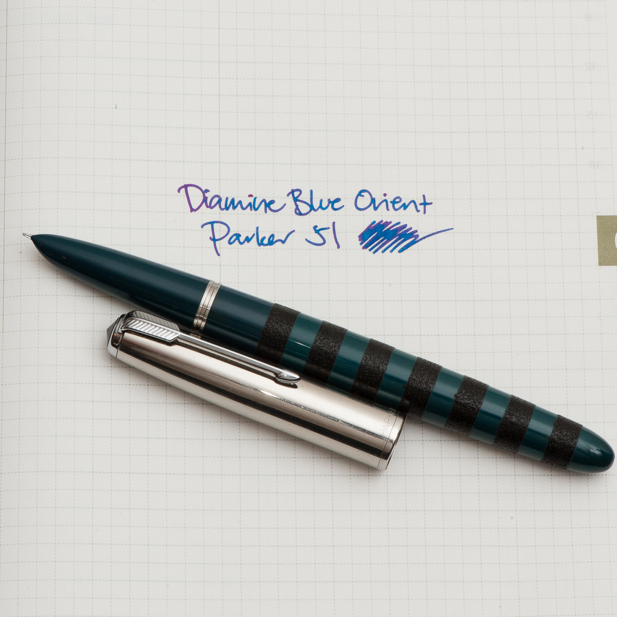
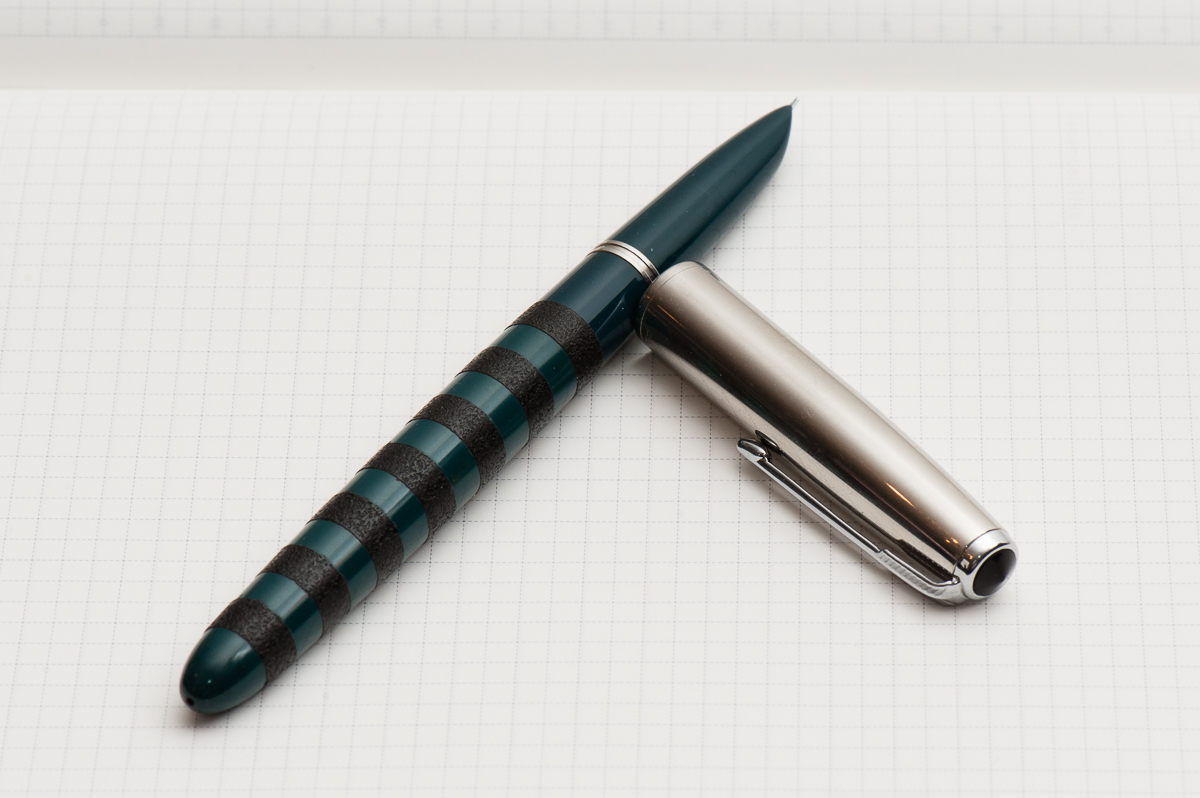
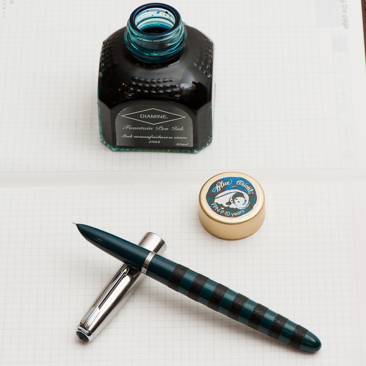
Katherine: It’s been a busy month, and I haven’t spent as much time playing with pens as I would have hoped. I’ve found that for the last couple weeks, my constant companion has been a Parker 51 Special filled with Diamine Blue Orient. The Parker 51 (review to come!) sports black ishime stripes, courtesy of Bokumondoh. I love the feel of the ishime and the visual variance that it gives an otherwise kind of boring looking pen (sorry!). Diamine Blue Orient is a limited edition ink created for FPN Philippine’s 10 year anniversary — I assume it’s honoring the beautiful oceans surrounding the islands.


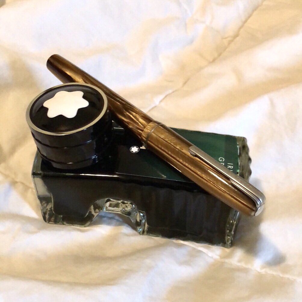
Pam:  I have been on a bit of a vintage bender recently.  Nik Pang introduced me to this understated brown Waterman that is a lever filler last month.  I have also been finding out in my ink-splorations what brands of ink I prefer as I keep getting through all the samples.  I inked up the Waterman with my favorite green, Montblanc Irish Green.  The nib is akin to a Japanese F and writes beautifully.  I chose a drier ink to highlight how fine the nib is.

On a side note, has any noticed inconsistent flows in heavily saturated inks?  Or is that just me?


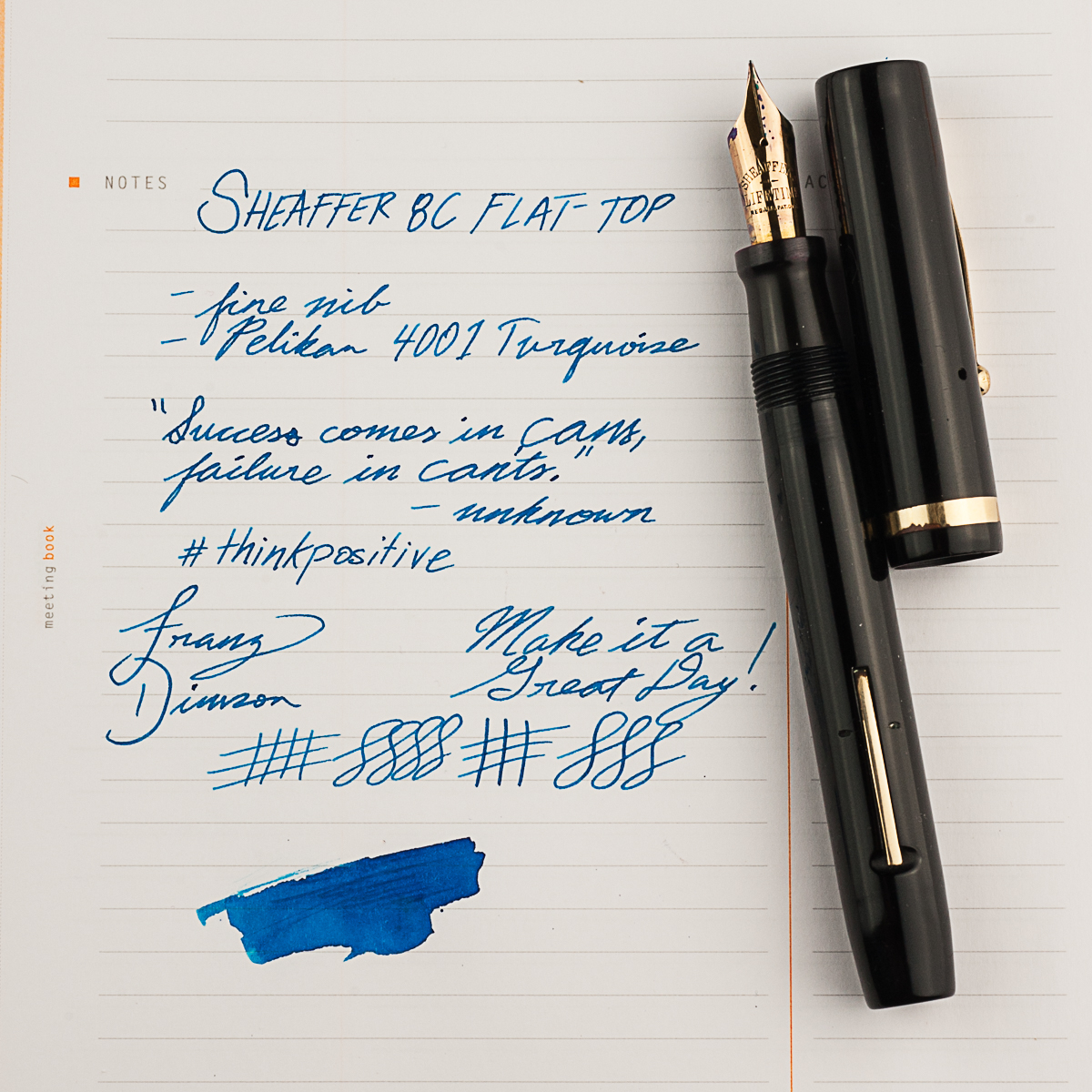
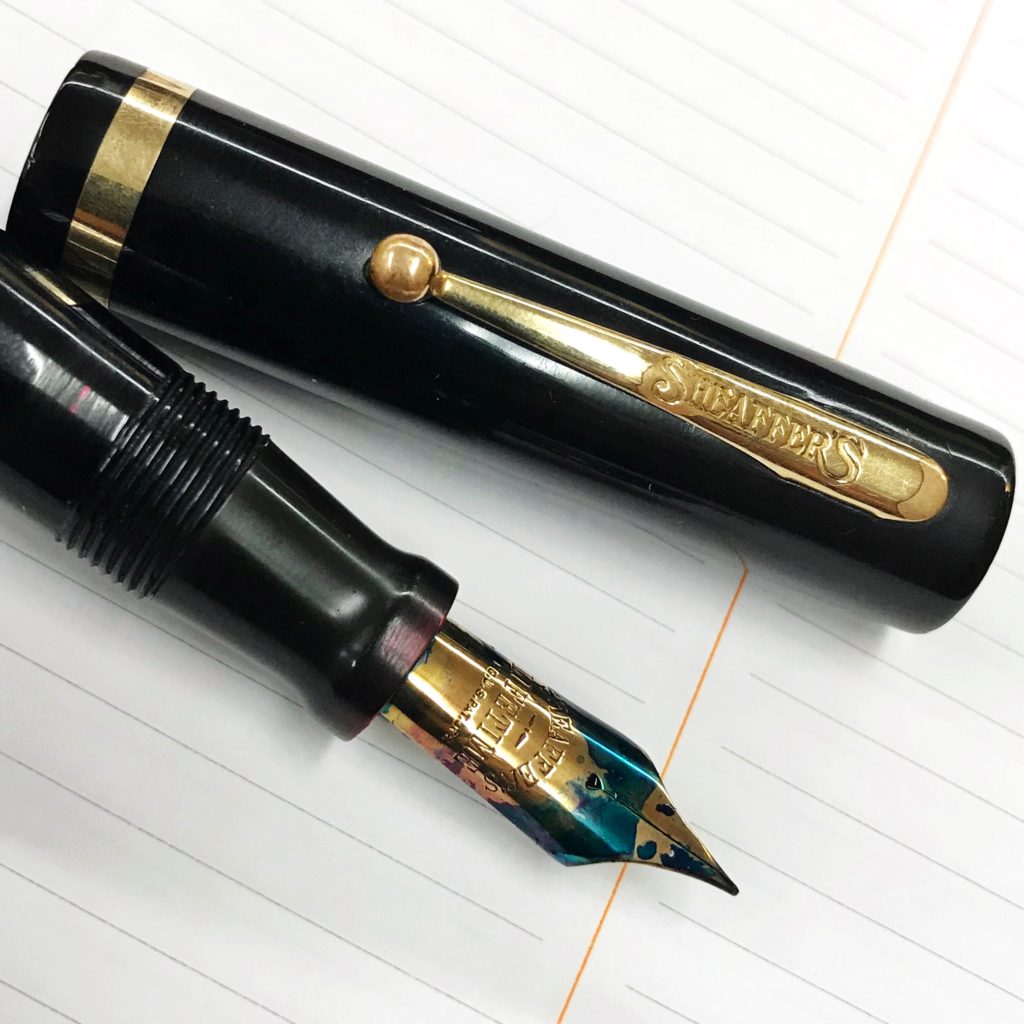
Franz: My pen for the month of March may be a vintage pen but it was a new acquisition from the LA pen show in February. My friend Jon S. knew about my apprehension about Sheaffer pens because most of the ones I come across are short and thin pens. So he showed me the Sheaffer 8C flat top pen which was from the 1920’s. And man, I loved it! He restored the pen himself and it’s in great condition as well. I’ve been using this pen at work almost everyday ever since I got it. The 8C fills my hand very well even when unposted so the bear paw is happy. =)

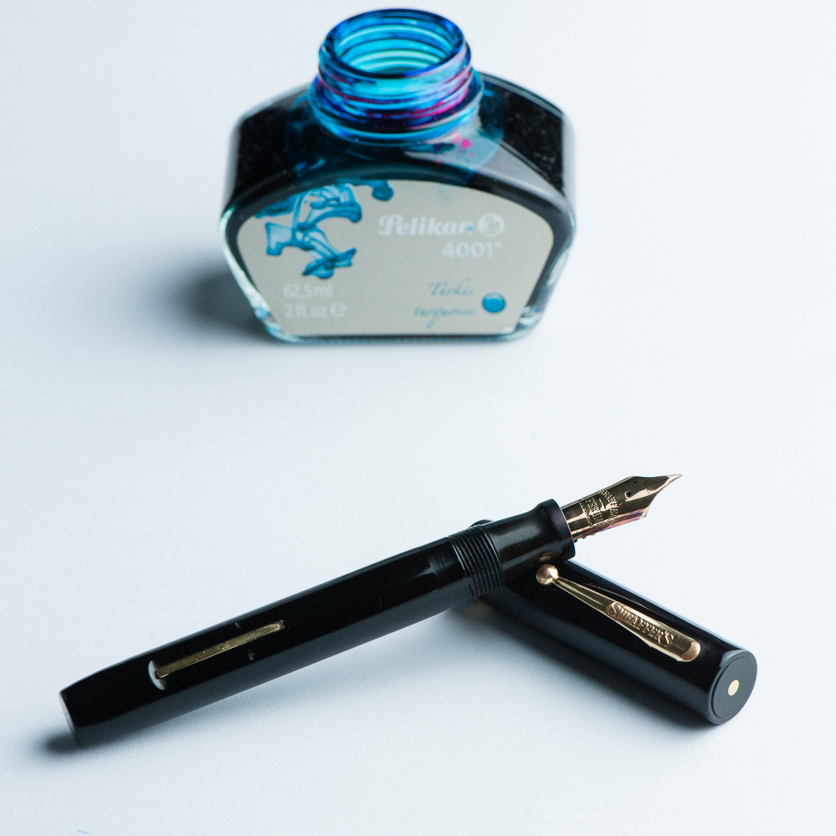
And of course I had to pair it with my favorite ink, the Pelikan 4001 Turquoise. Even if the nib is a fine width, it shows the ink color very very well. In some parts of the writing, some sheen comes through as well. There’s just something about turquoise inks that floats my boat.


Seems like the three of us have been writing with vintage pens lately. What pens have you been writing with?


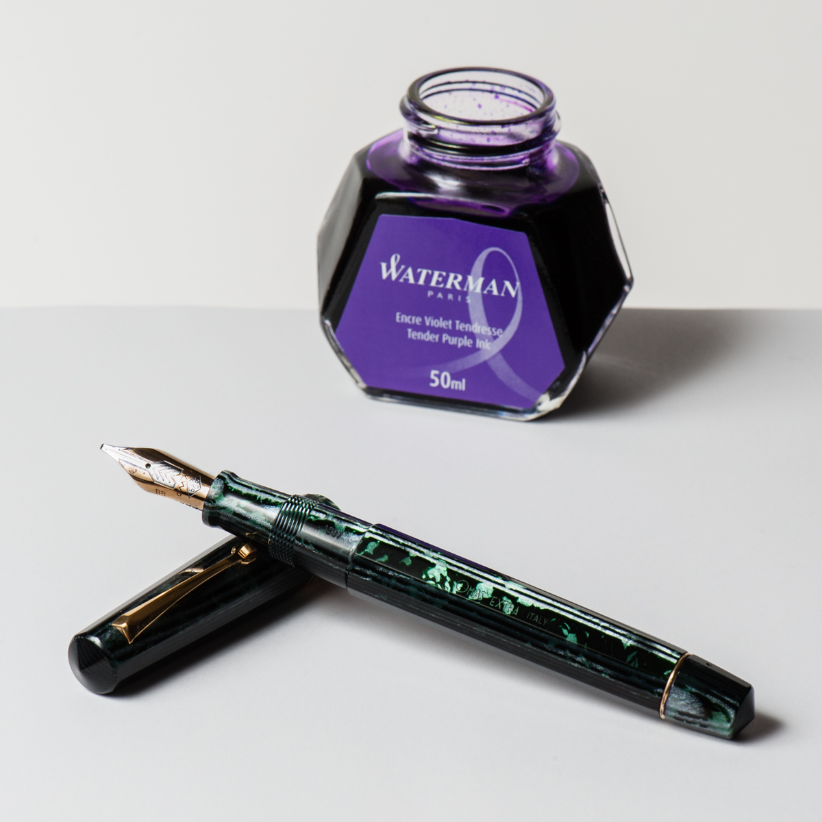
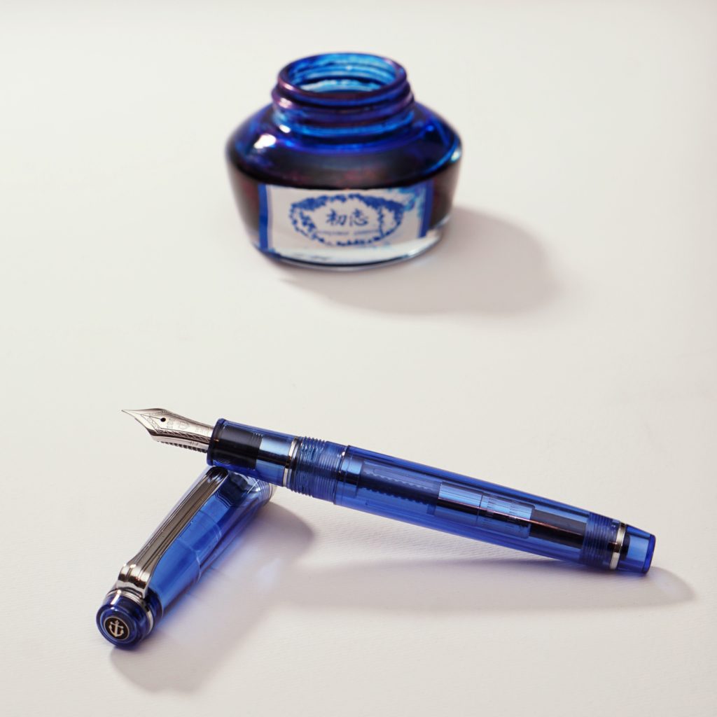
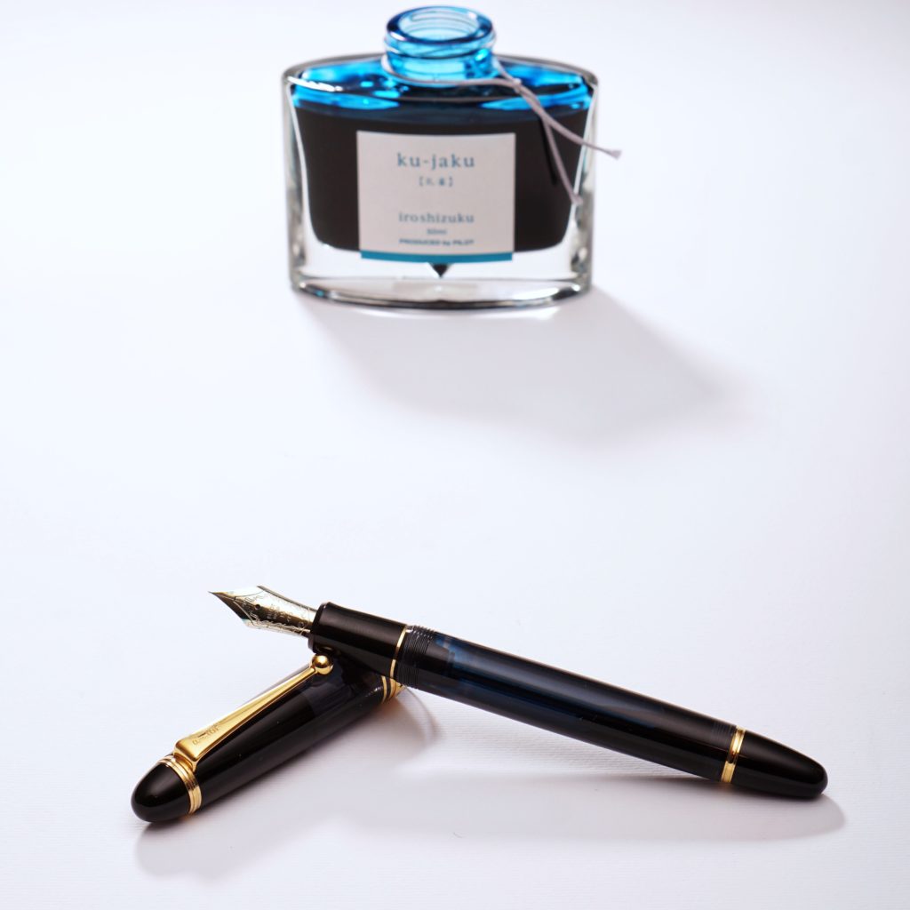
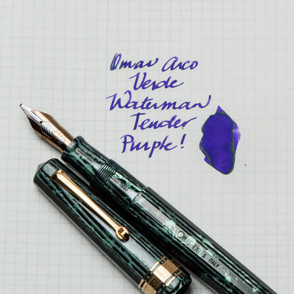
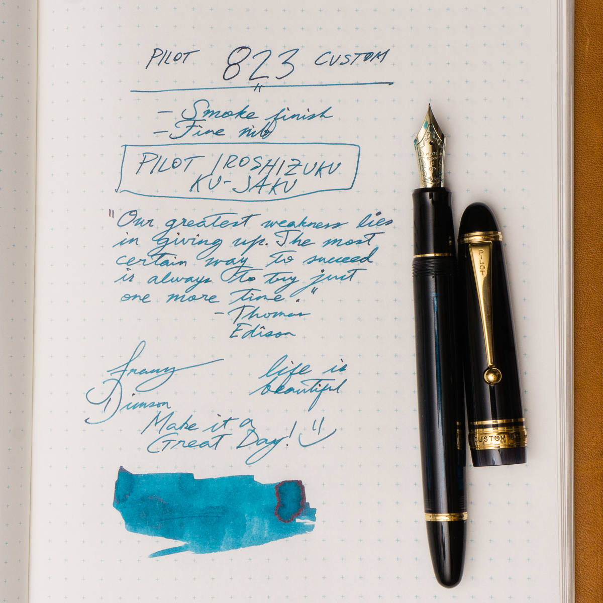
Writing Samples and Detail Photos

No Comments

Pen & Ink Pairing: Sept ’17

Shall we say, #LATEPOST? Ha!

Our apologies dear friends. We skipped our August pen and ink pairing post for we all have been swamped for the past couple of months. We did not want to skip September as well no matter how late it may be. Thank you for reading and your kind words!


Katherine: This pen was the star of my SF Pen Show 2017 Haul — an “old size” Omas Paragon in Arco Verde. It has a smooth, relatively wet (but not puddle-y!) B CI. The nib is marked BB, but I think it was narrowed a little bit, but is realistically somewhere between a B and a BB, it’s wider than my other Omas B by a hair. I paired it with Waterman Tender Purple for both contrast and how easy to clean it is. The pairing has been very fun for me — a smooth broad CI putting down vivid stokes of purple, with a hint of sheen in the wetter spots. This might end up as a “one true pairing” for me, since I suspect this will be an annoying to clean pen. 🙂


Pam:  As a great fan of alliteration, it would only seem appropriate that September would herald in the Sailor Sky with Sapphire ink.  The Sailor Sky was my second Sailor Pro Gear Slim.  The rest is how we should say, his-ssstory.  This pairing is also one my first first “ink will match the pen” type of pairings.  (I am working on being more adventurous!) It’s one of my most sustaining pairings!

Sailor Sky is a special edition color, although I don’t think it’s limited.  It’s a special edition like the 4 Seasons. (I think.) The barrel color reminds me of a summer sky.  I originally paired this pen with Bungbox Omaezaki Sea.  However, what really stuck was Bungbox First Love Sapphire, an ink that Franz has introduced me to.  To say the least, it was love at first write. I absolutely love the sheen on this ink!  It’s a very distinct blue ink with a red sheen that comes through beautifully with the F nib of the Sailor Sky.  Some people have compared it to Akkerman’s Shocking Blue.  More than anything, I highly recommend trying First Love Sapphire, you might fall for it too.

Franz: So for the month of September, my pairing is the Pilot Custom 823 in Smoke or Black Transparent finish and Pilot Iroshizuku Ku-Jaku ink. Ku-Jaku/Peacock is a deep turquoise blue and is such a nice ink color for both work and personal use. The 823 is the first pen I’ve ever inked up with Ku-Jaku. Even though the nib on the 823 is a stock fine, I still appreciate the color it lays down on paper especially on Tomoe River paper in my Nanami Cross Field journal.

The Smoke finish definitely conceals the ink color inside the barrel but you can definitely see the ink level as you write. During meetings in a professional setting, this pen doesn’t call attention to itself but I still enjoy the subtlety of its transparency and places a smile on my face. Now on to trying to remember what that meeting was about.


Writing Samples (click to enlarge)


No Comments