Hello pen friends and folk! Franz here, and I’m writing a quick recap to highlight two great things that happened at the 2018 San Francisco Pen Show this past weekend of August 24 thru 26. That would be the Pay-It-Forward Project Table, and the Pen Dash Mixer hosted by Lisa Vanness.
There were lots of events that happened at the show that I will definitely include in my lengthier annual SF Pen Show Report. But I really wanted to highlight these two before my pen show report comes out in the next couple of weeks.
Before anything else, I would like to thank the San Francisco Pen Show organizers for allowing the Pay-It-Forward table, as well as the Pen Dash Mixer to happen at the show this year. And also for continuing to have a bigger, and “funner” pen show each year!

Pay-It-Forward Project
This was the second year that the Pay-It-Forward (PIF) table made an appearance at the SF Pen Show. Even if we were not able to do a blog post, or even a social media post asking for physical and monetary donations, a LOT of generous people have donated to the table this year. Actually, some friends who weren’t even at the show and some out-of-state messaged me for a shipping address and sent oodles and oodles of pens, ink samples, and other stationery items. To all of you who have donated, you know who you are. A VERY BIG THANK YOU from myself, the Pay-It-Forward Project team, and the San Francisco Pen Show!!!
We are happy to report that we have given out 100 PIF Starter Kits (pen, ink sample, and paper) to beginners. And more than 60 donated pens were given away via the Give a Pen, Take a Pen initiative. It is definitely heartwarming to see smiles of excited newbies when they realize that they can choose a pen for free and learn from our volunteers. Makes it all worth the effort to Pay It Forward.
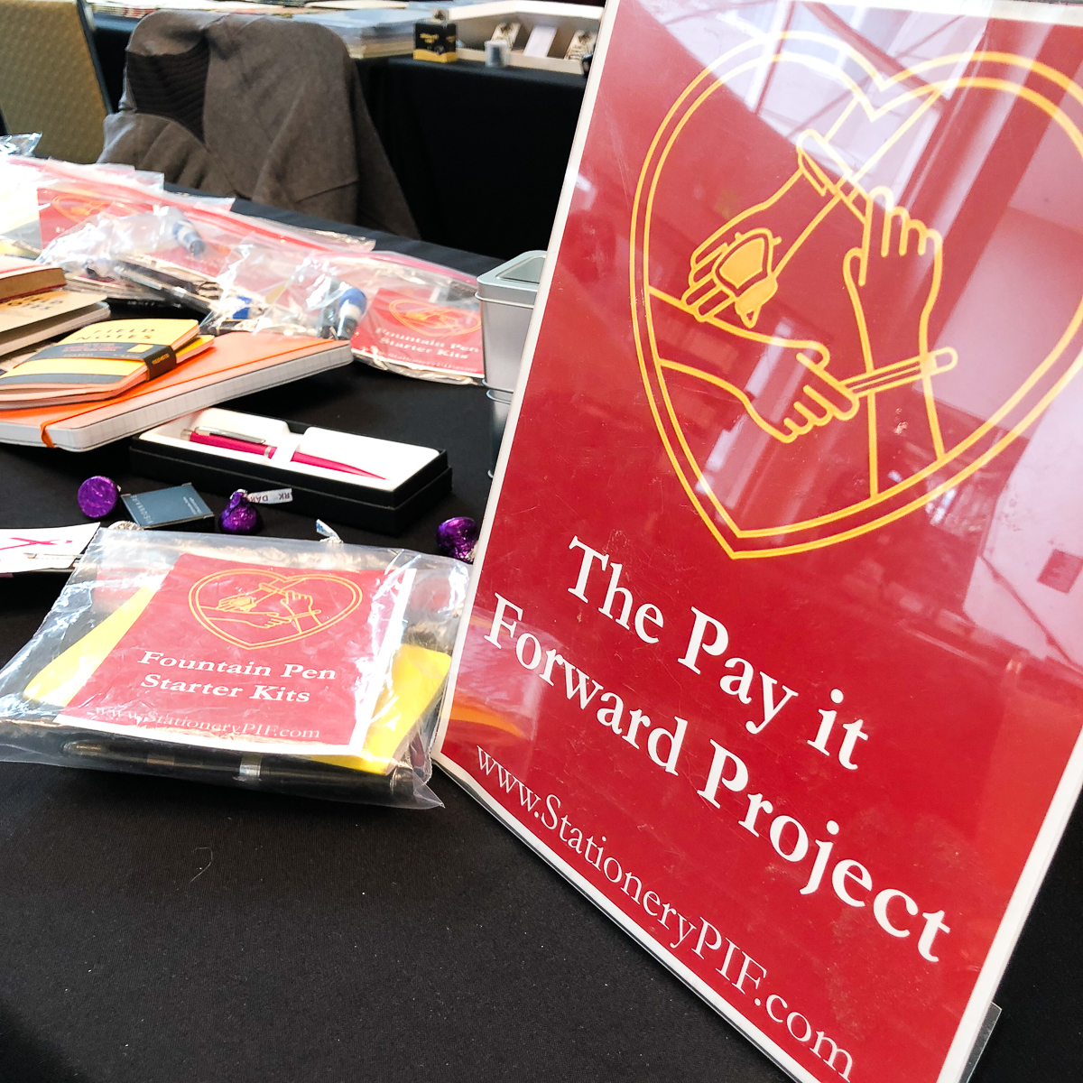
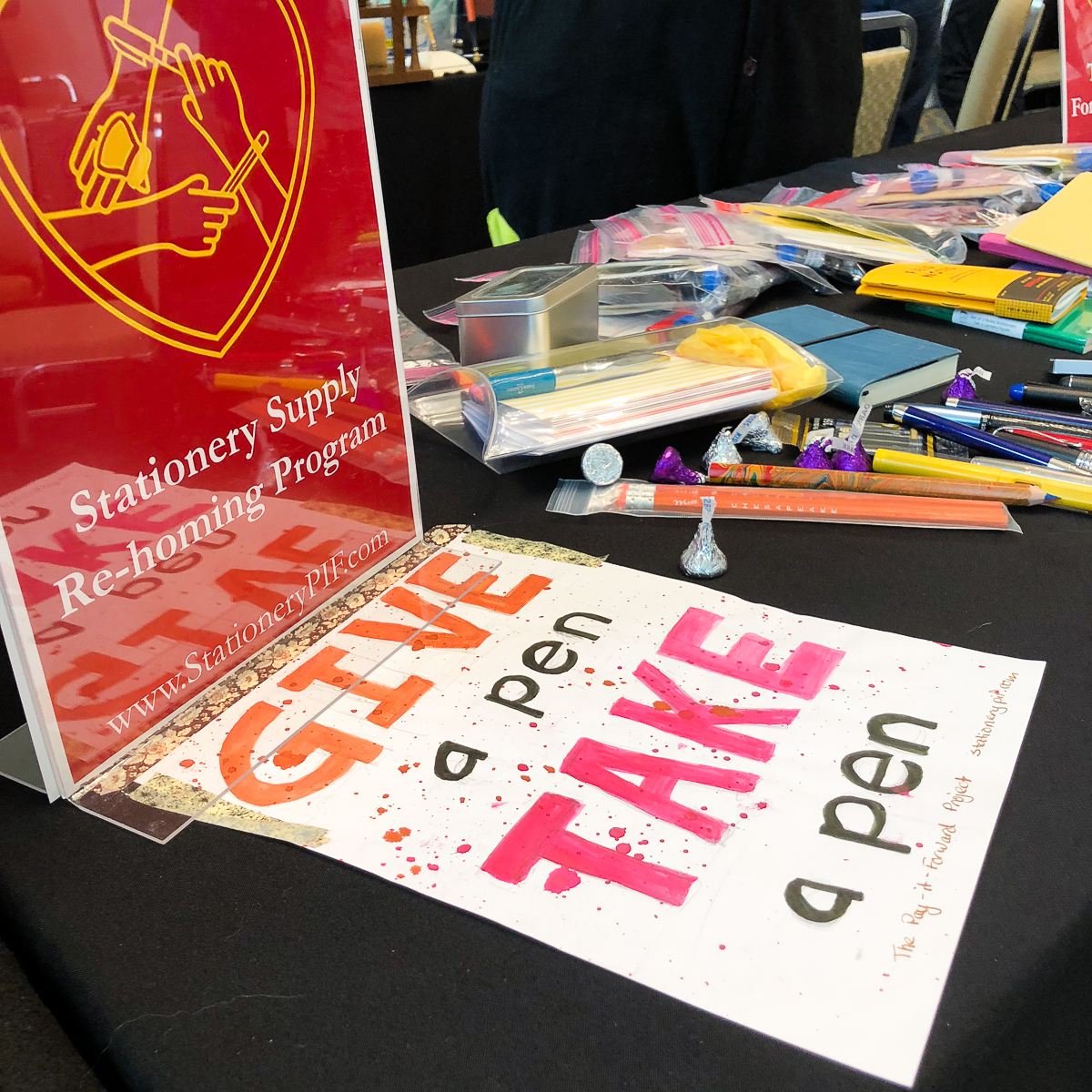
Now I’d be remiss if I did not mention this. The PIF table was staffed by a number of volunteers this year and I would like to give a shout-out of thanks to all that helped out this year. Thank you Sarah M., Carrie H., Andy D., Pam T., Tommy S., and Jim K.! If I missed anyone else who volunteered, please accept my sincere apologies. And last but not the least, a big thank you Kimberly L. for being my co-host of the PIF table this year. She did a lot of things to help prep for the PIF table at this show! And the PIF photos are by Kimberly as well.
If you want to find out more information, or donate either items or funds, please check out www.stationerypif.com for details. You can also check the schedule for the next pen show a PIF table might appear! Thank you for making this community of ours a fun and caring one!
Pen Dash Mixer
Last year’s SF Pen Show was the first time Lisa Vanness and company tried to have the Pen Dash and ever since then, they hosted it at different pen shows. This year, we had to make sure that this event continued at The Fun Pen Show. So the Pen Dash happened on Saturday at 5:30pm and it was a great success!
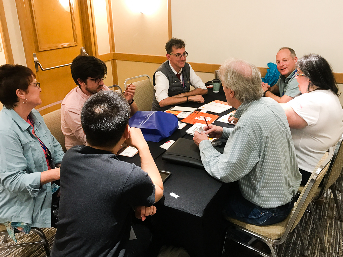
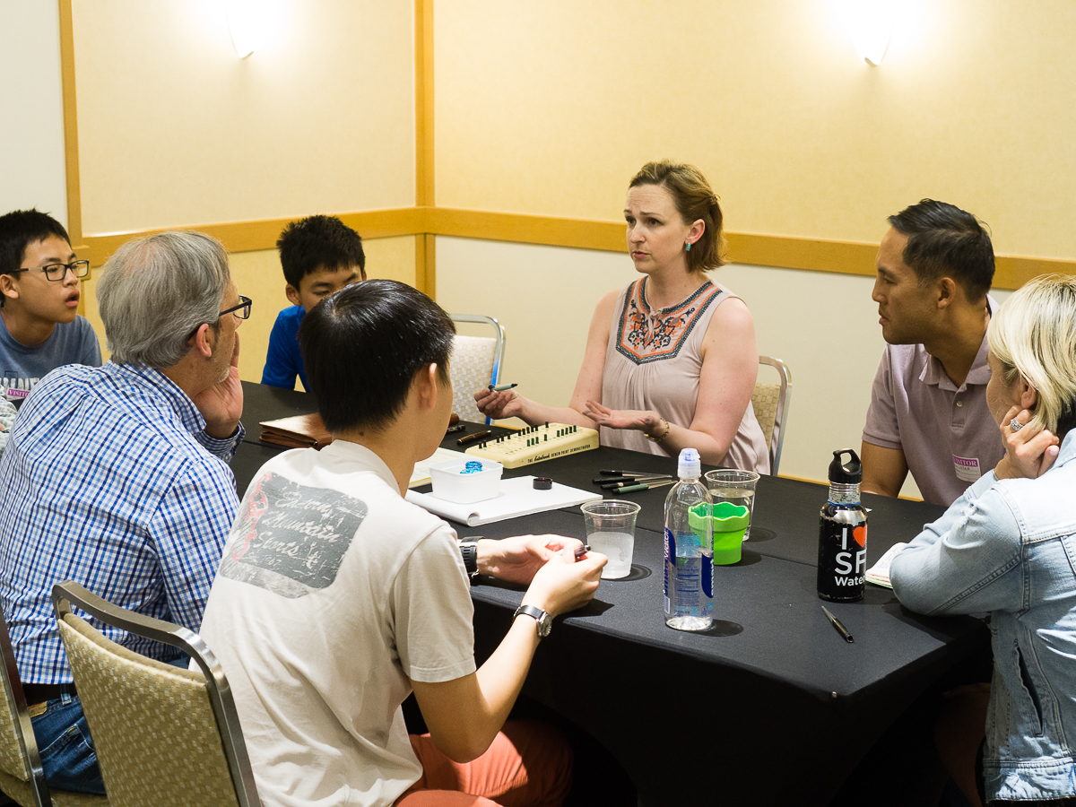
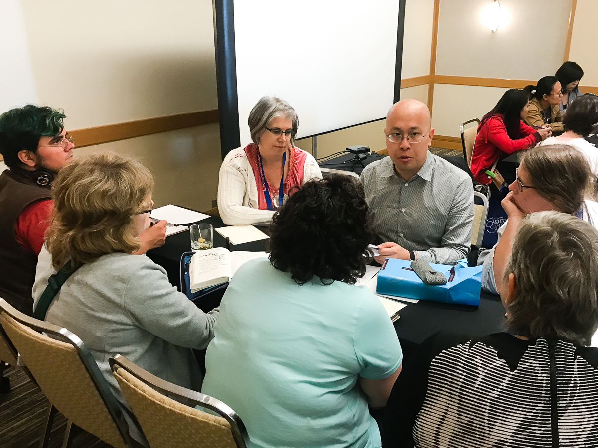
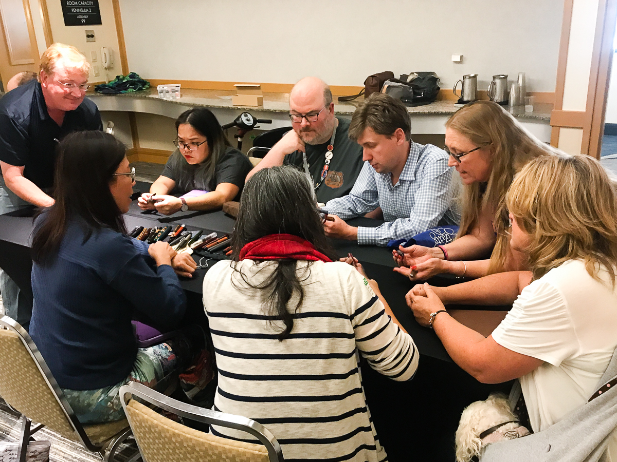
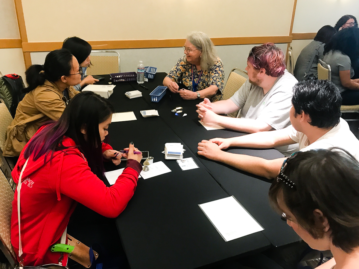
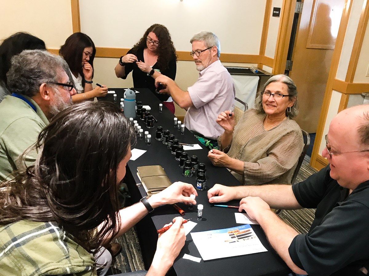
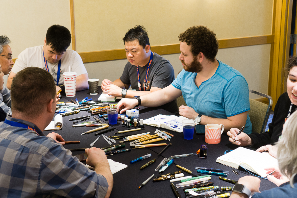
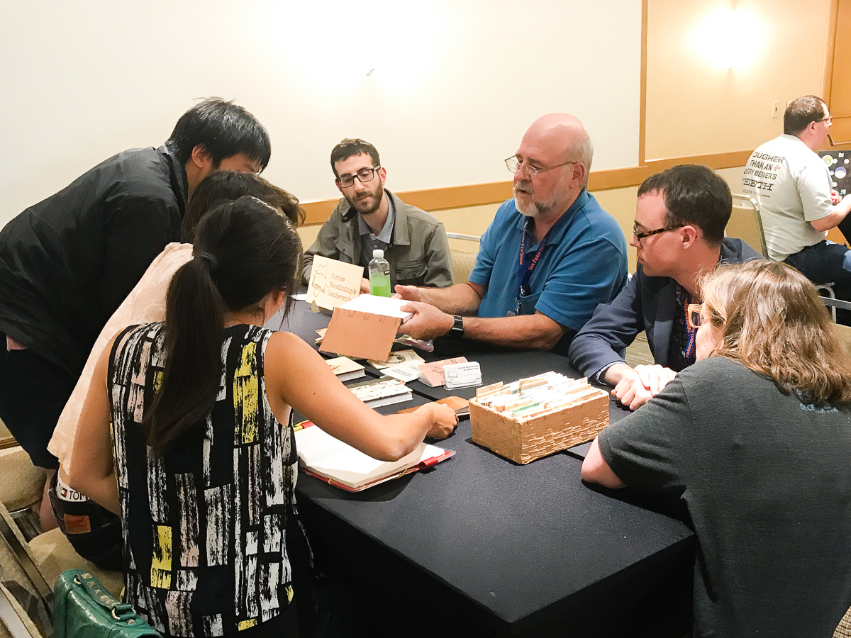
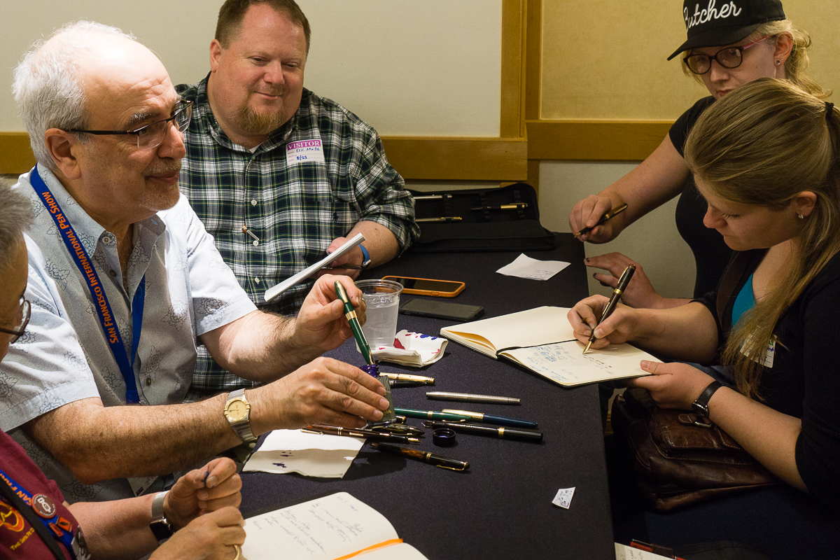
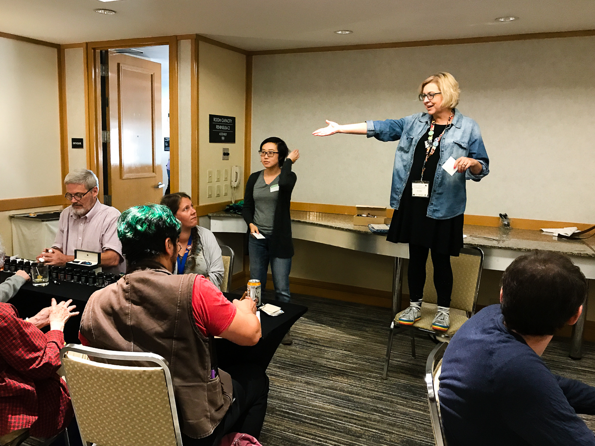
Wait, what is a Pen Dash you may ask! In a nutshell, it’s an effort to create a way for people in the community to interact with each other. But more importantly, to learn from selected table leaders or as I called them, Subject Matter Experts (SMEs). The participants will stay at the table and listen to the SMEs talk about their topic and then after a certain amount of time, the participants then change tables. So it’s kind of Speed Dating except that there is no anxiety and lots of learning.
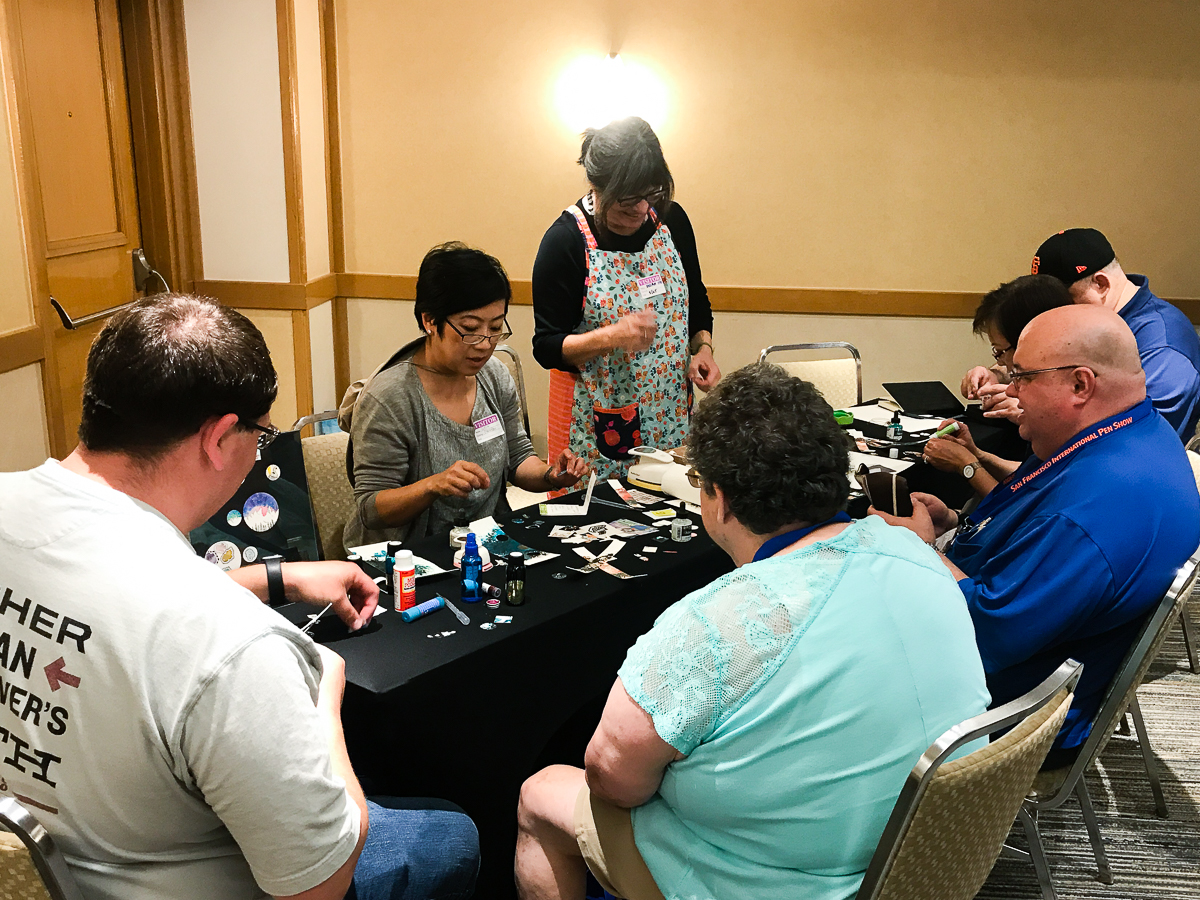
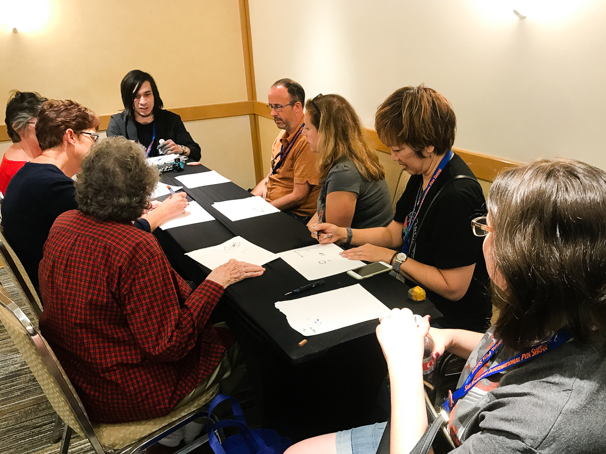
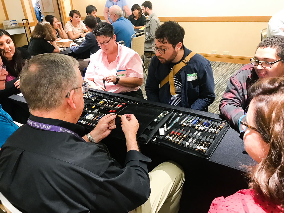
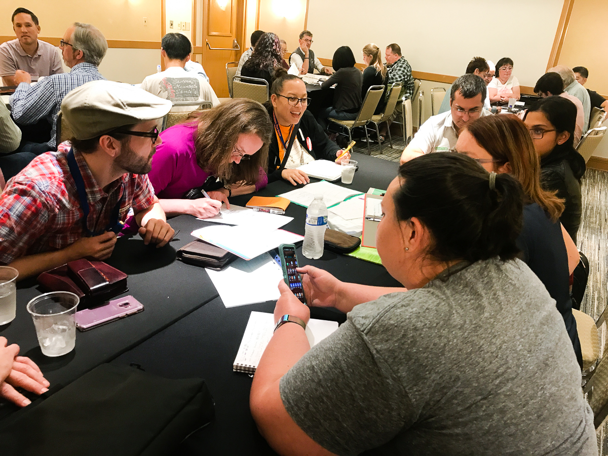
We had 13 tables separated between 3 rooms and each table had a SME to talk about a certain topic. Topics ranged from vintage and modern pens, pen customization, Japanese urushi pens, paper types, bookbinding, nib styles, creating art pieces, etc. In a span of 10-15 minutes, the SMEs will talk about their topics and answer any questions. After each time frame, the participants switched to another table to learn from another SME. The participants stayed in their respective groups within the room so each person had an equal opportunity to learn from a leader.
At the Pen Dash, we had a little over 100 participants at different ages and different levels of involvement in the stationery community. At the end of the mixer, Lisa took a chair and gave closing remarks in each room and some prizes were given away! Here’s a quick video showing some prize winners!
On behalf of Lisa Vanness and myself, Franz Dimson, we would like to thank Ana Reinert, Pam Tien, Claire Rice, and other Pen Posse volunteers for helping to make this Pen Dash a success!
And we are giving a huge shout-out of appreciation to all the table leaders/SMEs who volunteered their time, knowledge, and effort:
Ms. A. or @colors_and_beads on Instagram
