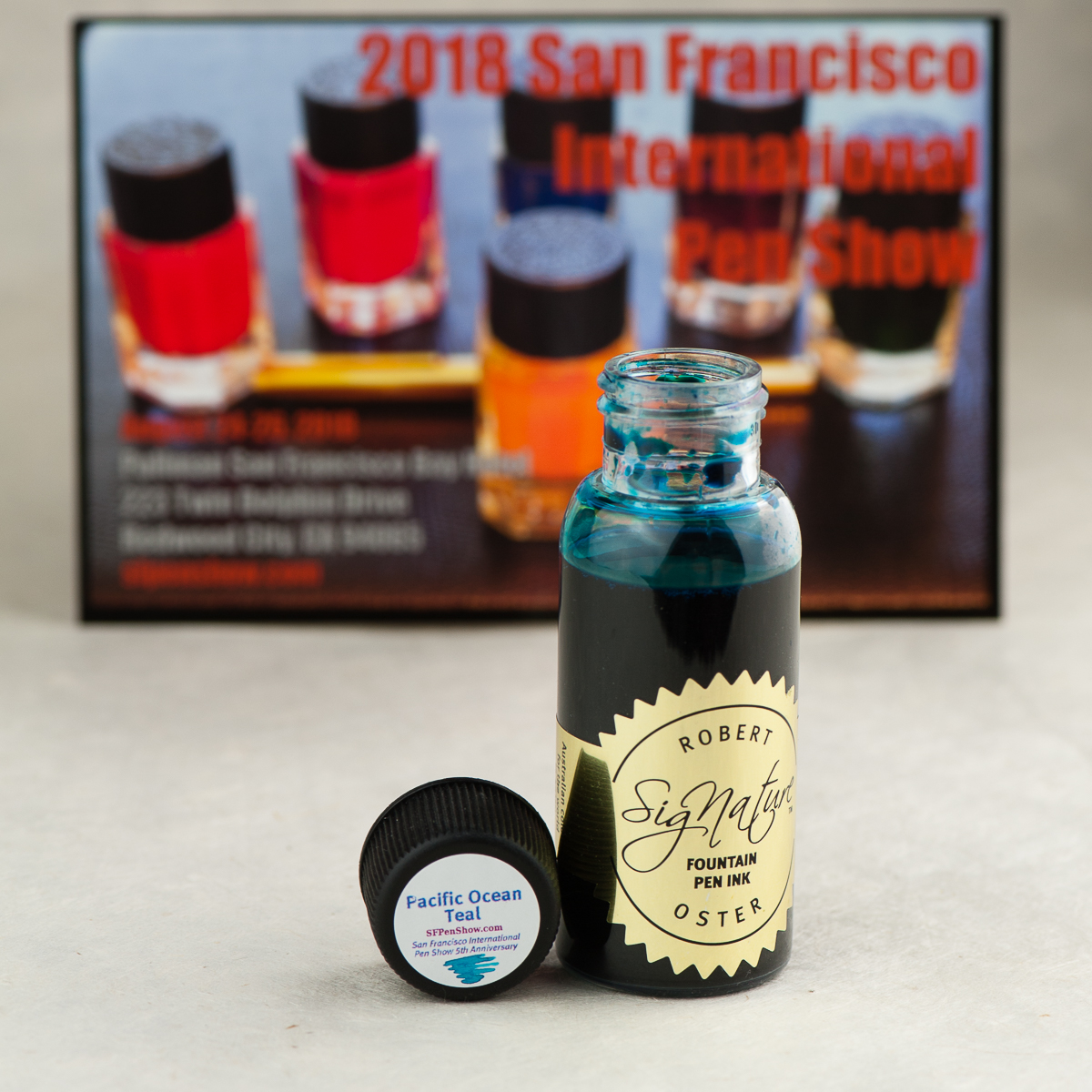
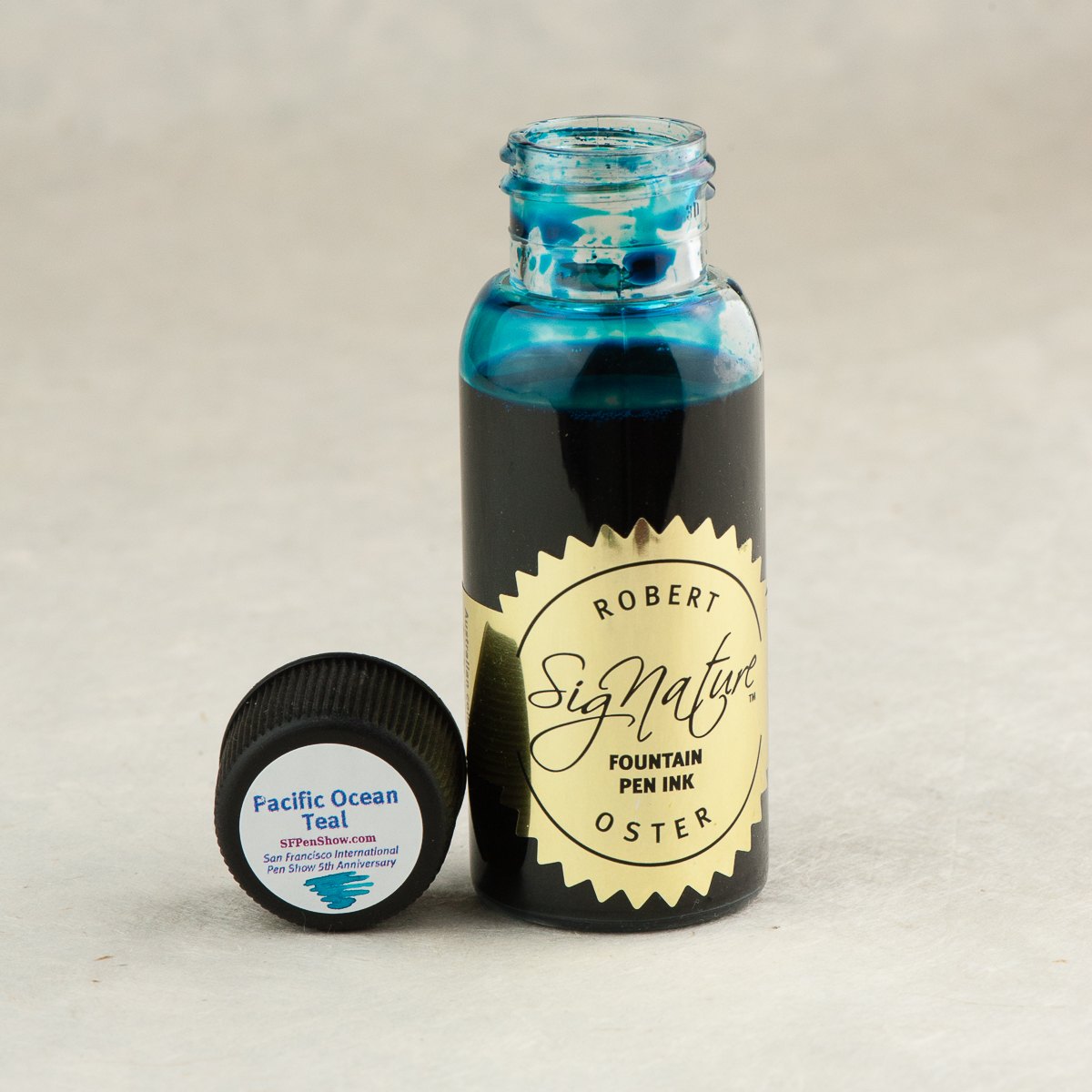
We are very thankful to have received a bottle of this Pacific Ocean Teal ink from the San Francisco Pen Show group for review. They have commissioned Robert Oster Signature Inks in Australia to create an exclusive ink for the 2018 San Francisco International Pen Show to commemorate their Fifth Anniversary. They wanted a nice teal that shades and Robert Oster delivered!
The Pacific Ocean Teal ink bottles will be on sale at the pen show happening this weekend, Friday August 24 until Sunday August 26. We are told that supplies are limited so act fast! They will be sold near the show’s registration desk in the foyer area of the Pullman SF Bay Hotel in Redwood City, California.
For more information and details of the San Francisco Pen Show, check their website at: www.sfpenshow.com.
Inky Dispositions
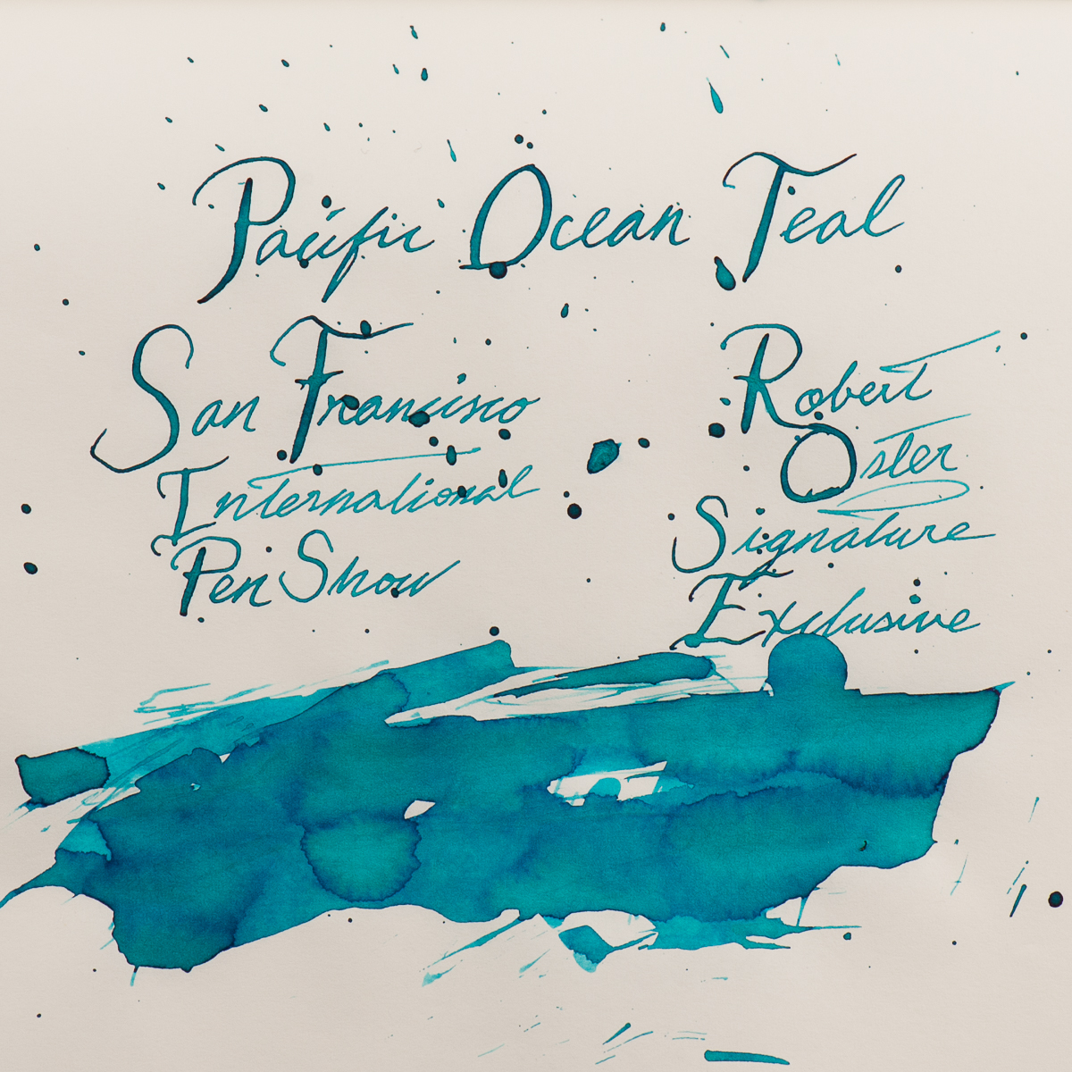
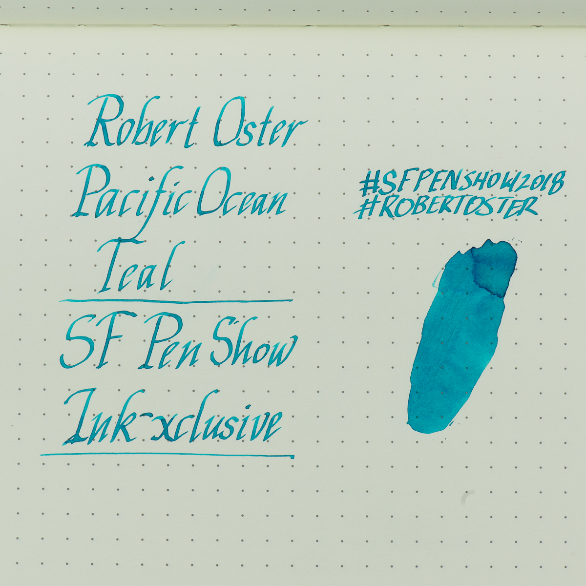
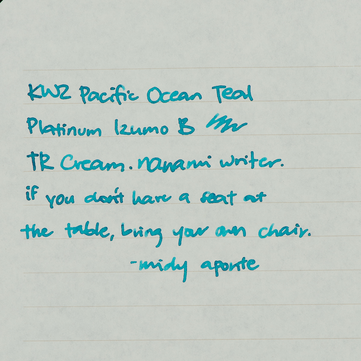
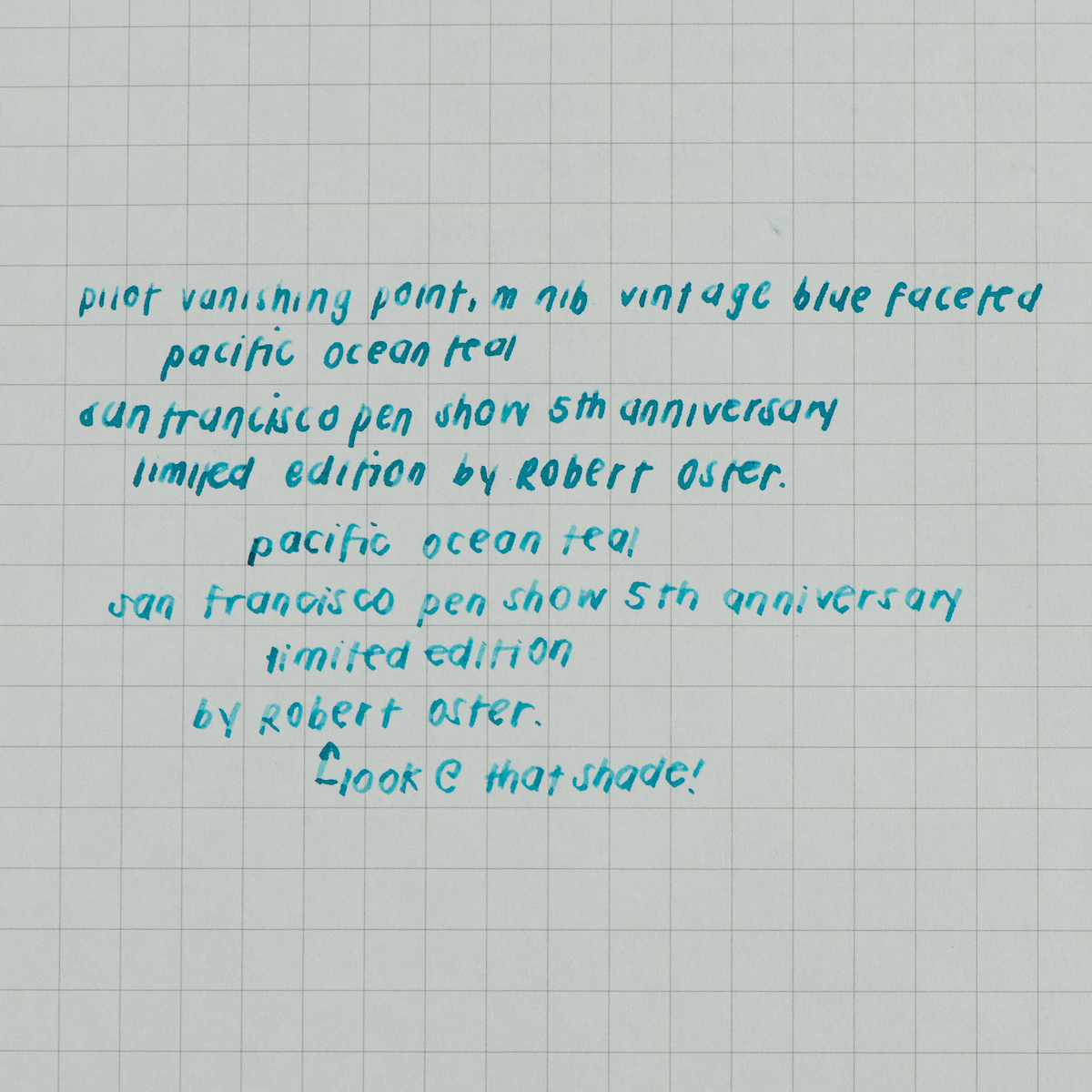
Katherine: It’s pretty! 😀 I prefer it in drier nibs (as pictured below) where it’s lighter and shows more shading. In wet nibs it just looks black. Overall it seems well behaved, and maybe a touch on the wet side. And oddly hard to photograph!
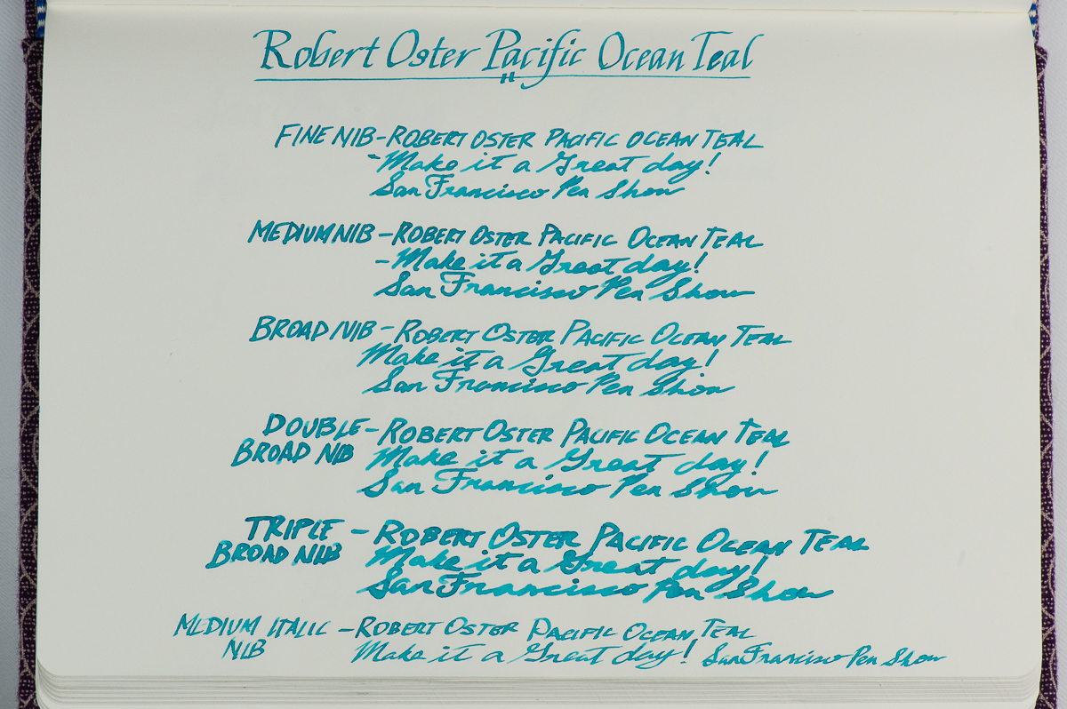
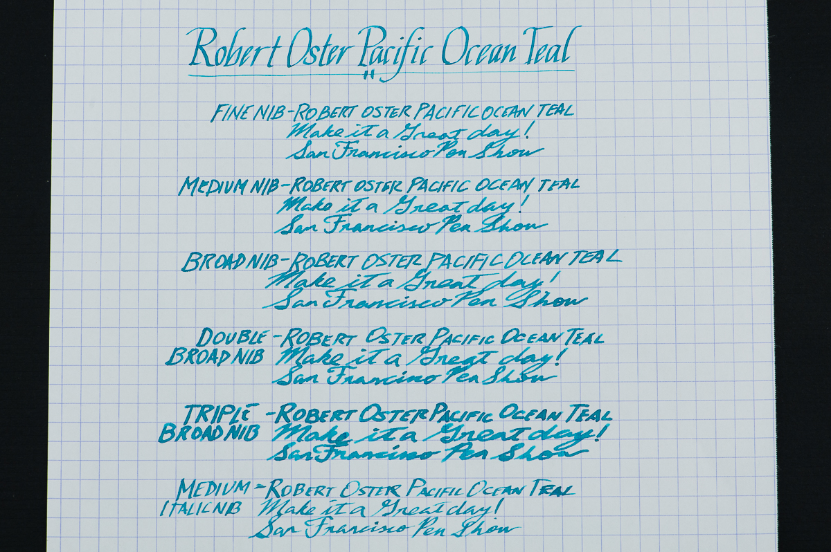
Franz: Teal, this color is in the realm of my favorite color which is blue. I say that like nobody knows it. hehe.. Anyway, inks made by Robert Oster are always well-behaved and are a treat to write with. This Pacific Ocean Teal is no exception. I’ve used the ink in different pens and they all wrote well consistently. My writing samples shown below were made via a Pelikan M800 because of the full range of nibs but I actually used a medium nibbed Vanishing Point at work with this ink and it was great as well.
The color of this ink is very close to what you find when you do an internet search for teal and that’s pretty cool. This ink may be at the medium to high in wetness for me but the dry-time isn’t too long. Some folks look for sheen and it’s there but not too much. It does show up in broad nibs or in flex writing if people really want that. But what I really like with this ink? It’s the shading for sure. You can use an extra fine nib up to even a triple broad nib and the shading is there!
Overall, I really love this ink! I don’t have many teal inks because my taste in ink color seems to lean more towards the blue side but this color is a fantastic one. I hope to get a bottle (or two) for myself at the show.
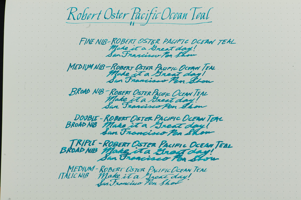
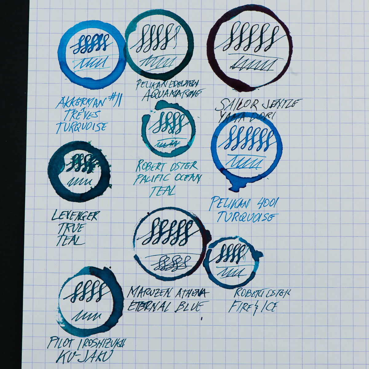
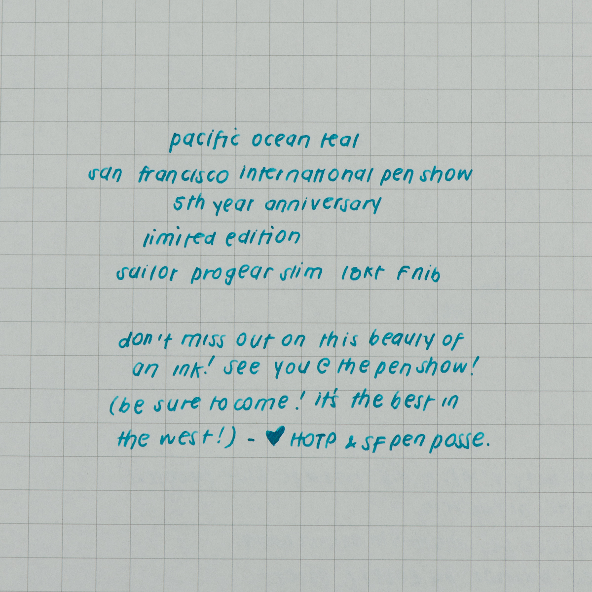
Pam: I had my reservations when I heard that the SF anniversary ink would be “teal.” Not another blue ink! However, I was pleasantly surprised. It’s. definitely within the blue family. It has the warmth and clarity of color that I loved about Iroshizuku Tsuya-kusa. The color reminds of Pelikan Turquoise. Albeit, it’s lighter than Turquoise and capable of some shading. I didn’t detect sheen when I have been using it.
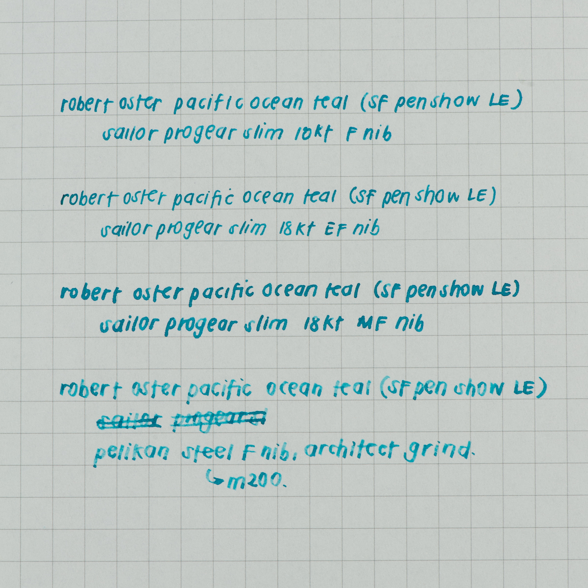
The ink is well behaved in my book, producing lines that are as expected. It may lean wet, but only by a smidge. It runs really well through EF and F nibs, which is greatly appreciated. I don’t see a loss in color or saturation unless I am using in a really dry nib like my architect.
Overall, I would recommend this ink. It’s a beautiful color, reminiscent of the ocean blue waters surround our Golden Gate. I can see it being very dynamic for a calligrapher or any that experiment with a dip nib. The shading would be pretty great with this ink. Yet, it’s still readable, pleasing to the eye and can be used on a regular basis for your flair of “blue” in the office.
Ink Circles and Comparisons
