We would like to thank Mr. Detlef Bittner of Bittner Pens for letting us review this Montegrappa Game of Thrones Baratheon fountain pen. His family pen store is located in the beautiful town of Carmel, California, and is well known in the pen shows in the United States.
And as always, the opinions here are our own and we were not compensated (monetarily, or otherwise) for this review.
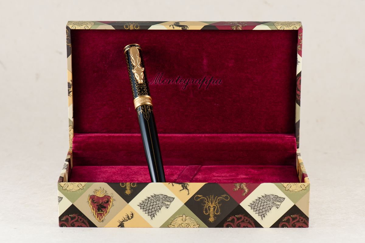
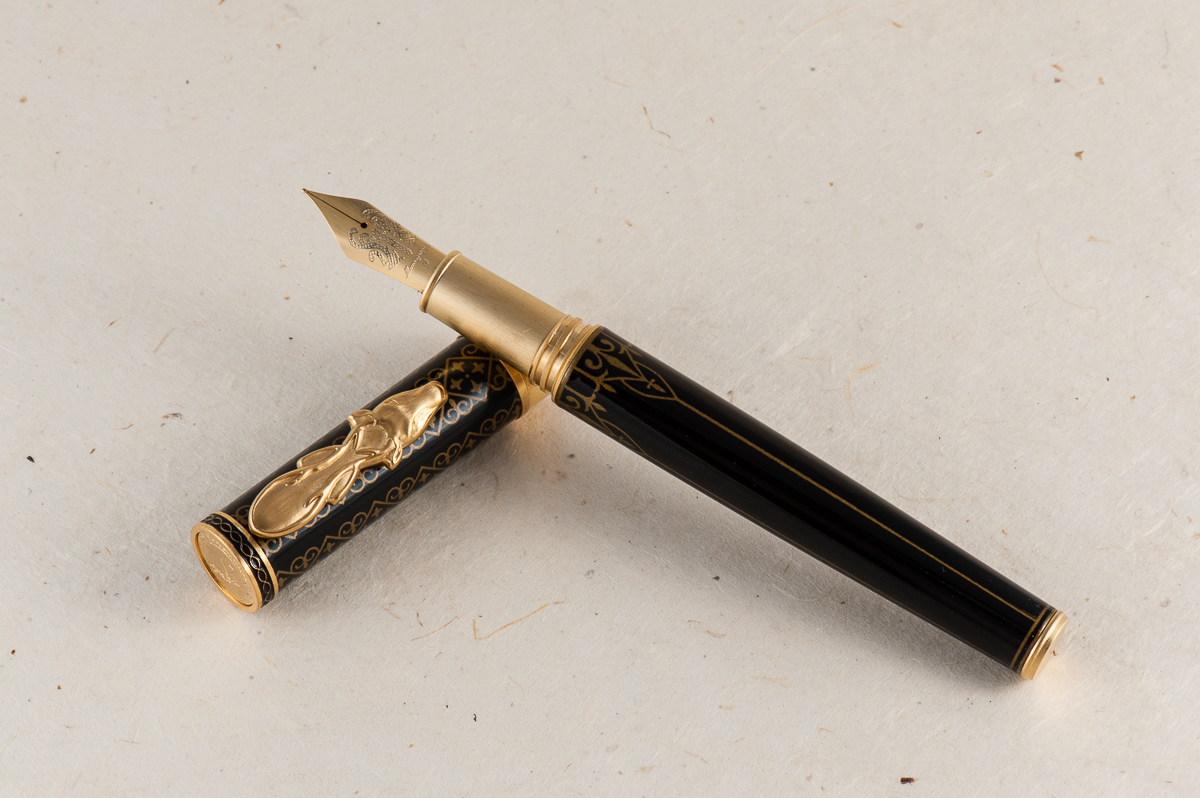
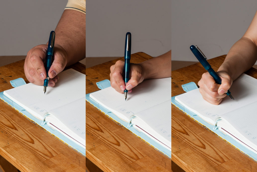
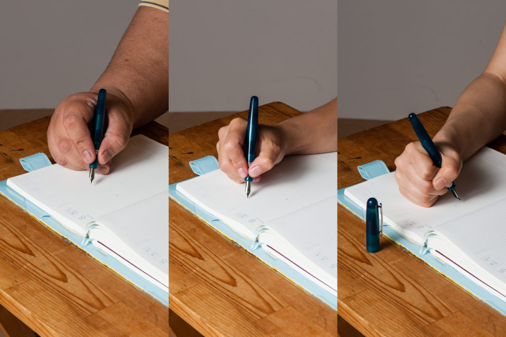
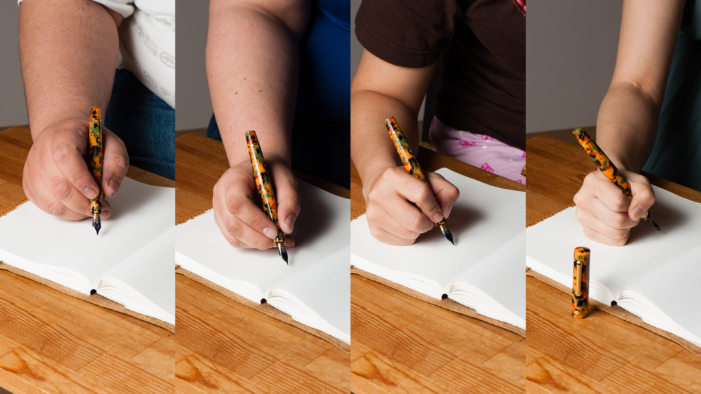
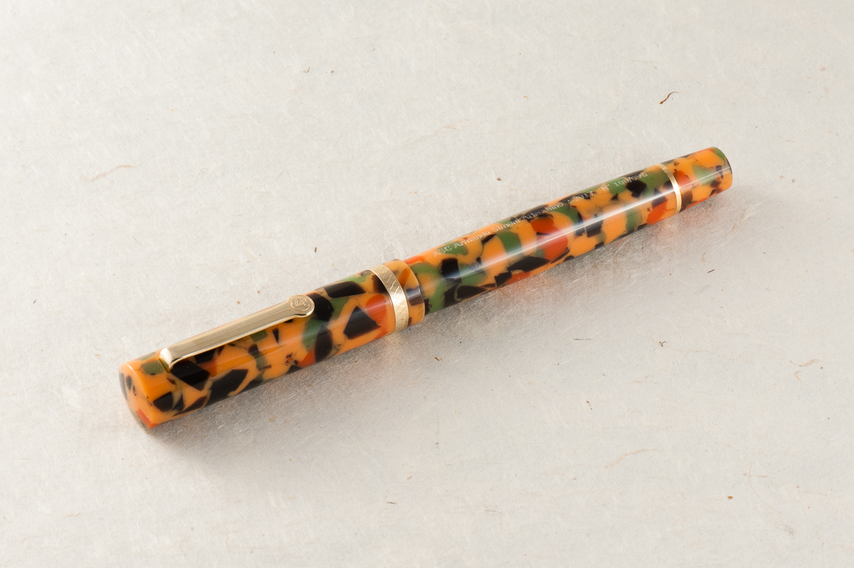
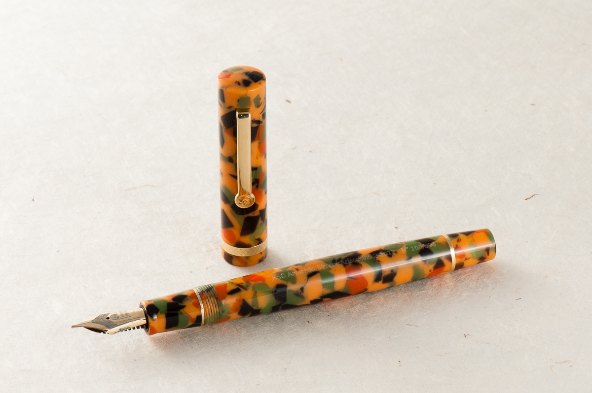
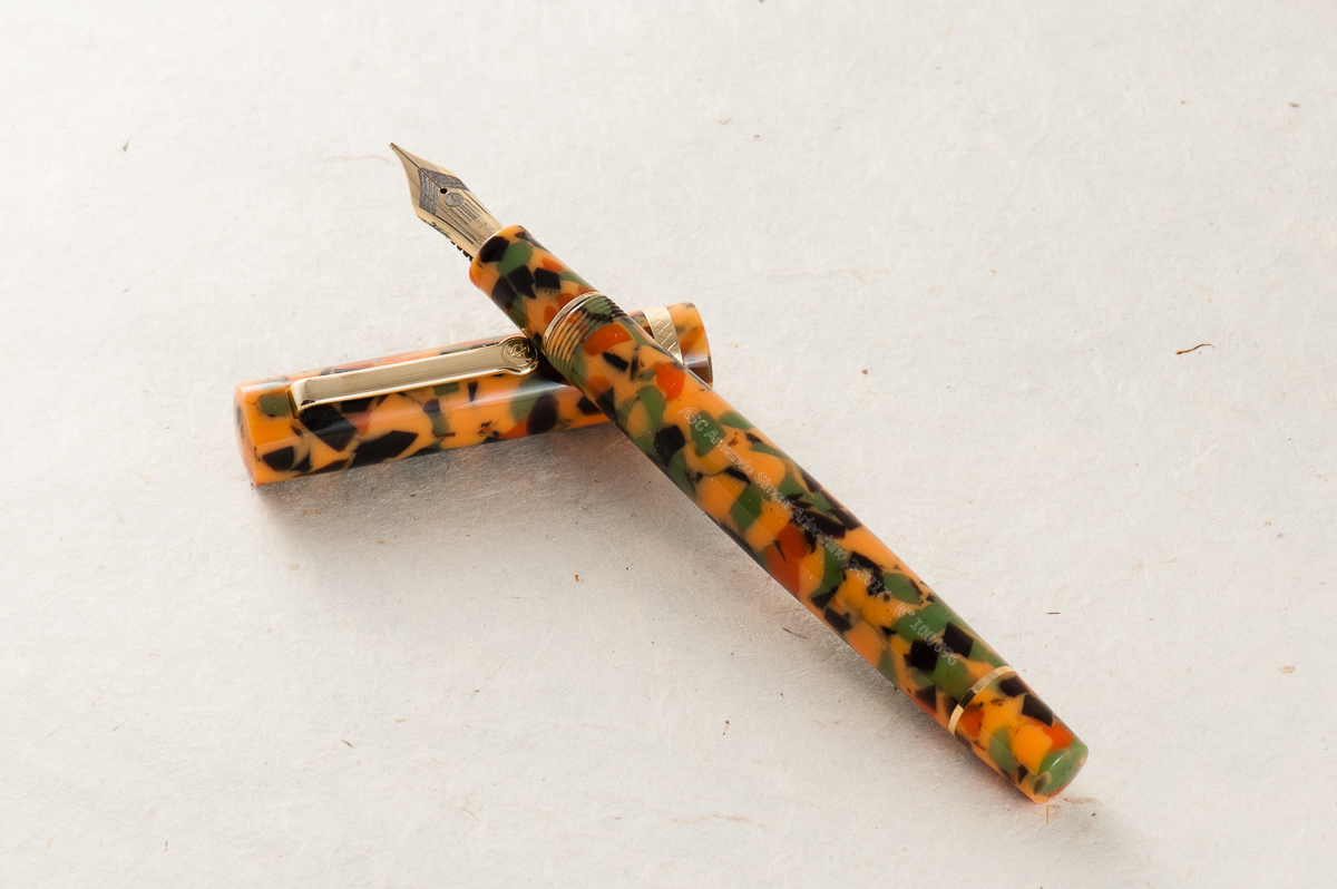
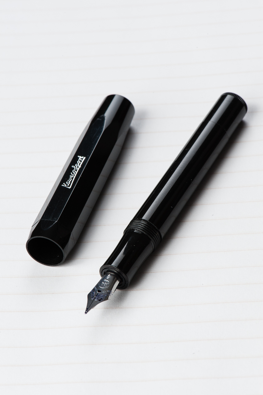
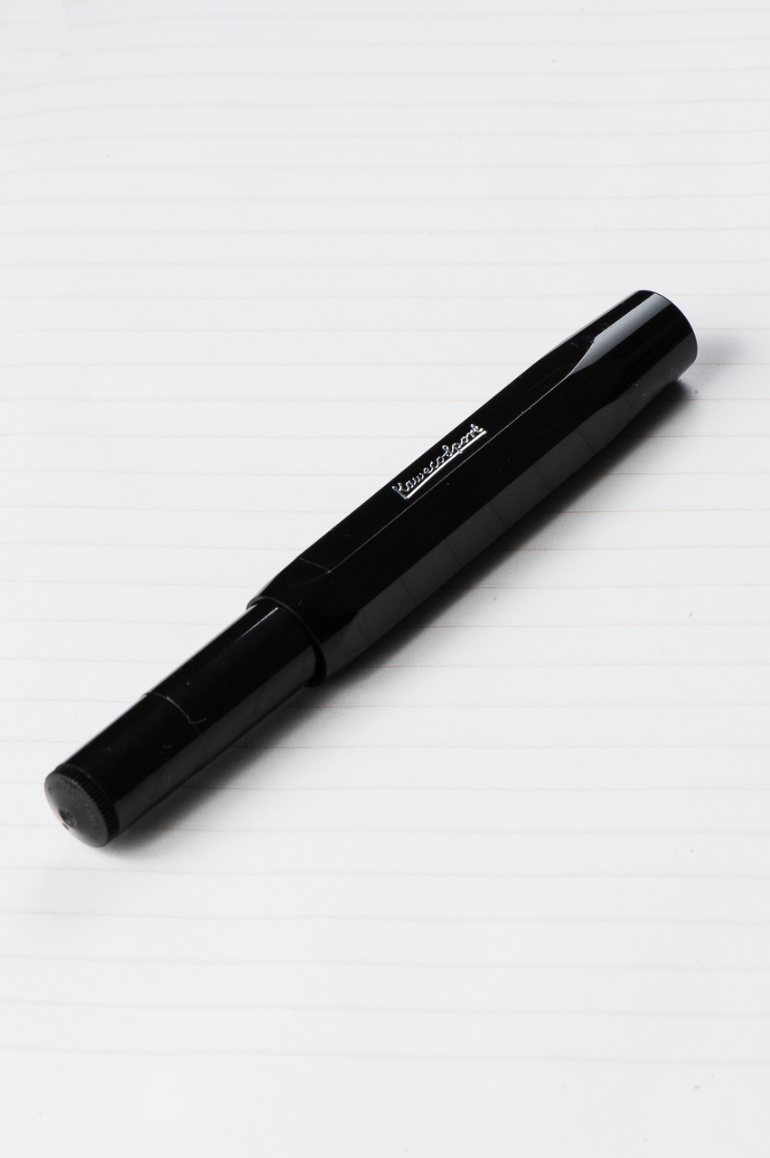
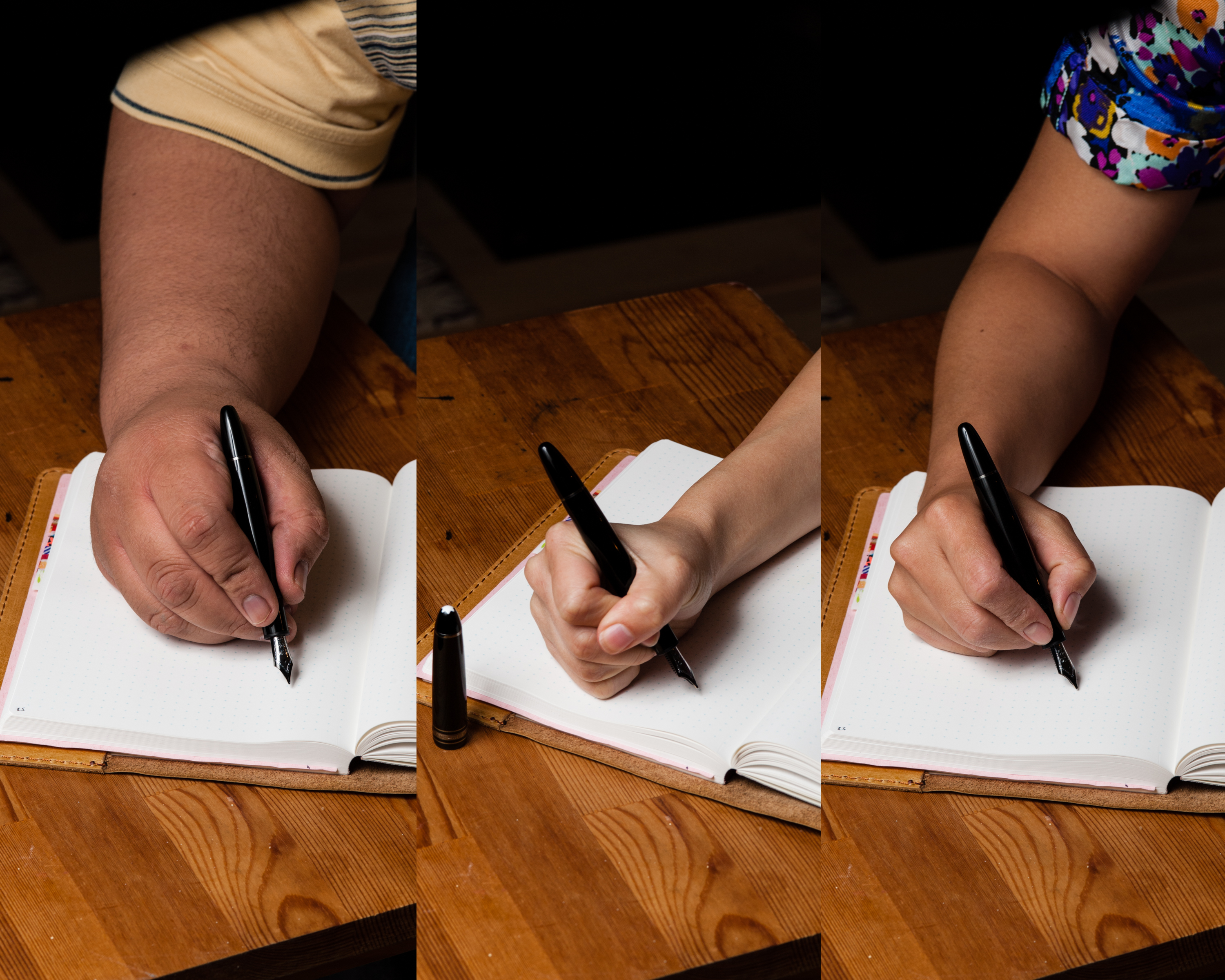
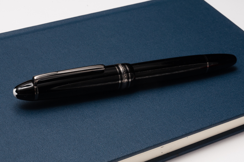
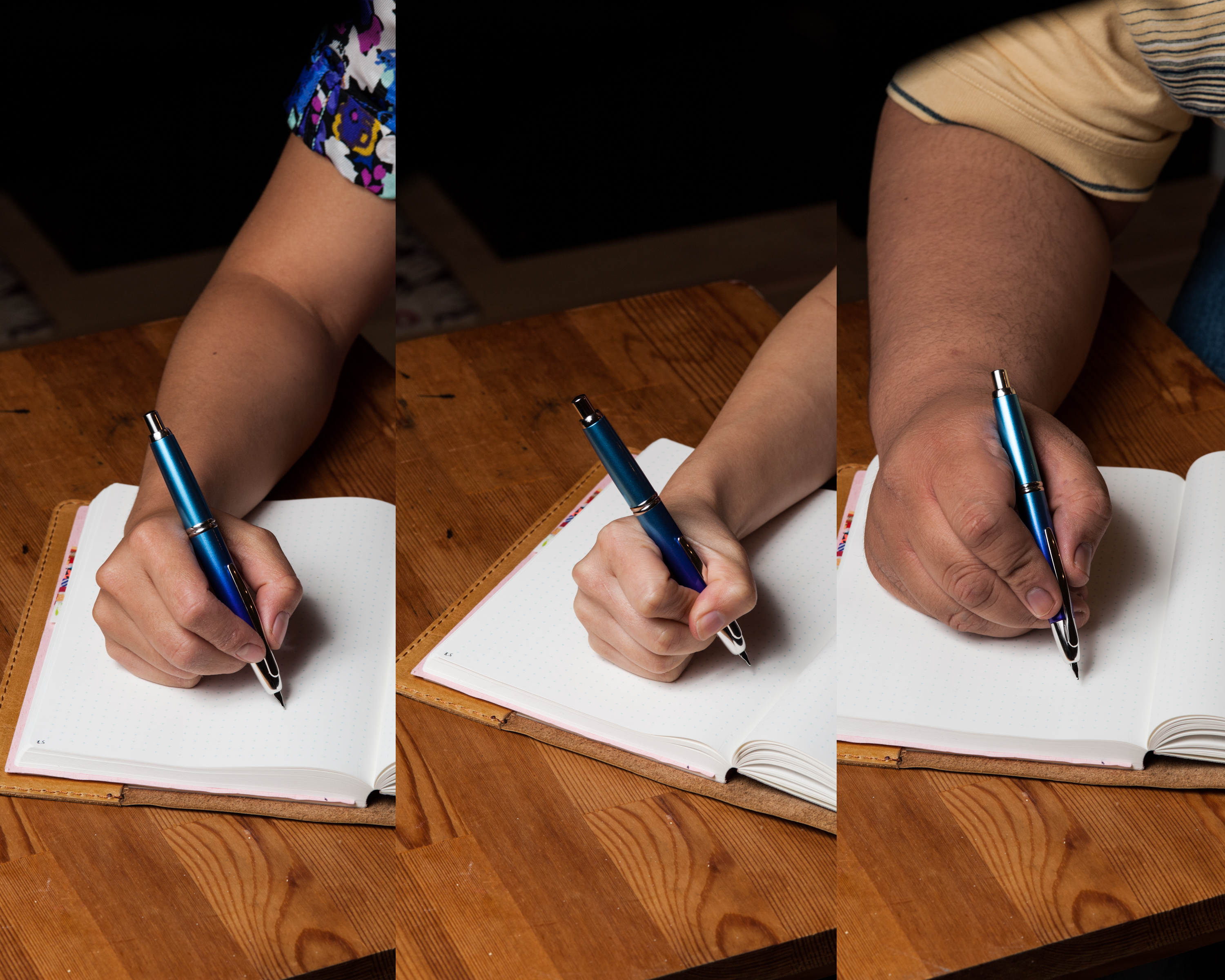
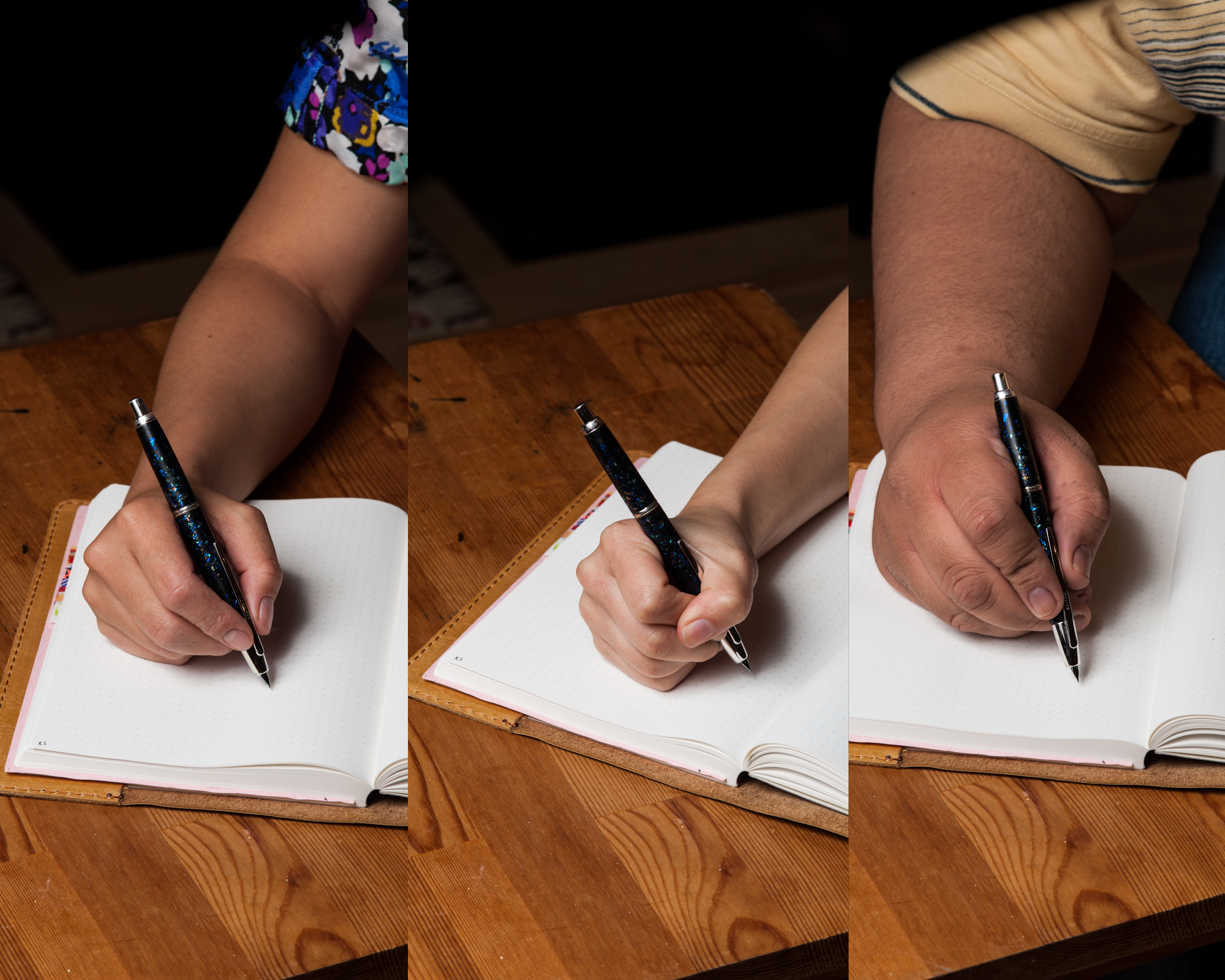
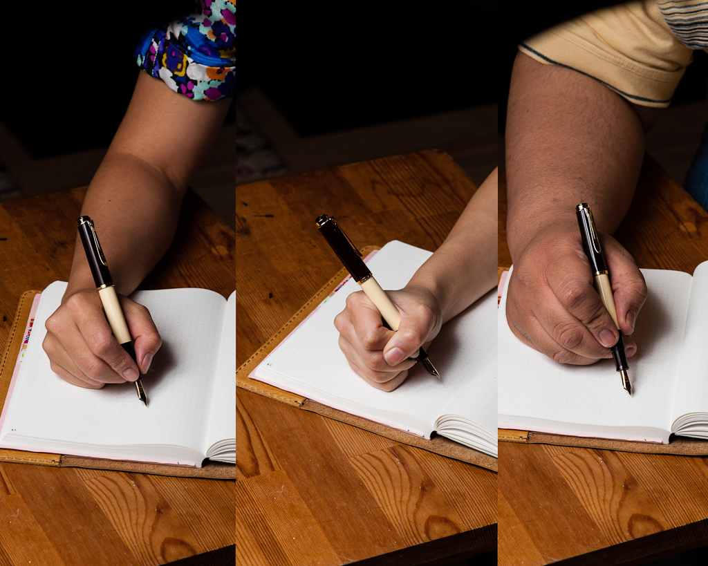
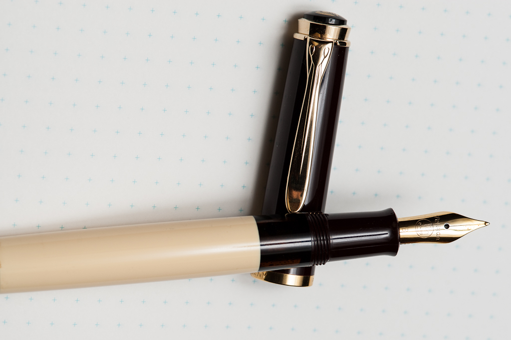
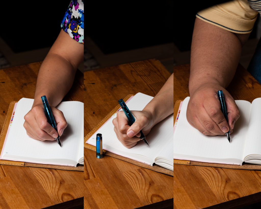
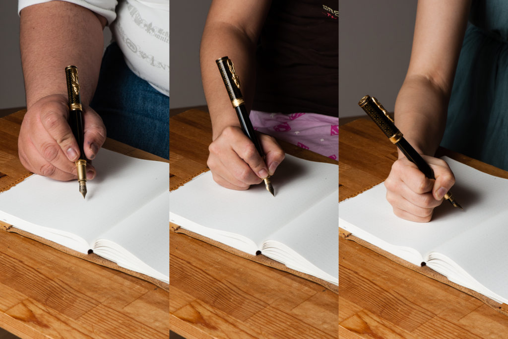
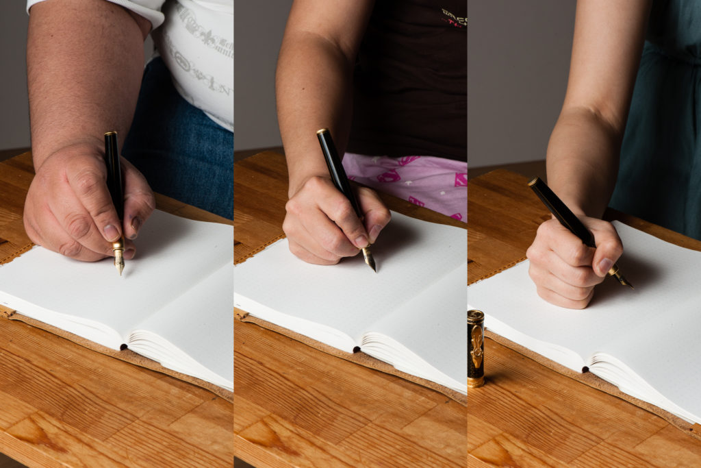
Hand Over That Pen, please!
Katherine: It’s a cool looking pen — though I was a littttle disappointed that there wasn’t more texture to the barrel, which makes it feel more mass produced and gimmicky to me. But really, I’m not sure what I expected, I think my standards may just be unreasonable here. Out of all the GoT pens, I like this one the most, which is a litttle disappointing, since the Baratheons aren’t a terribly interesting house to me.
Pam: Fan disclaimer: I am only on book 2 of the series so I have been holding out on watching the series in its entirety. Therefore, I have to say, this is a really good representation of the houses from the awesome fantasy series. My biggest gripe about the set of 4 is that I believe that they could have made a set of 5 to include the Tyrells because who doesn’t love an experienced, witty woman throwing some shade? (Think of an edgier Dowager Violet Crawley from Downton Abbey for those not familiar with the glorious shad-ability of Olenna Tyrell.)
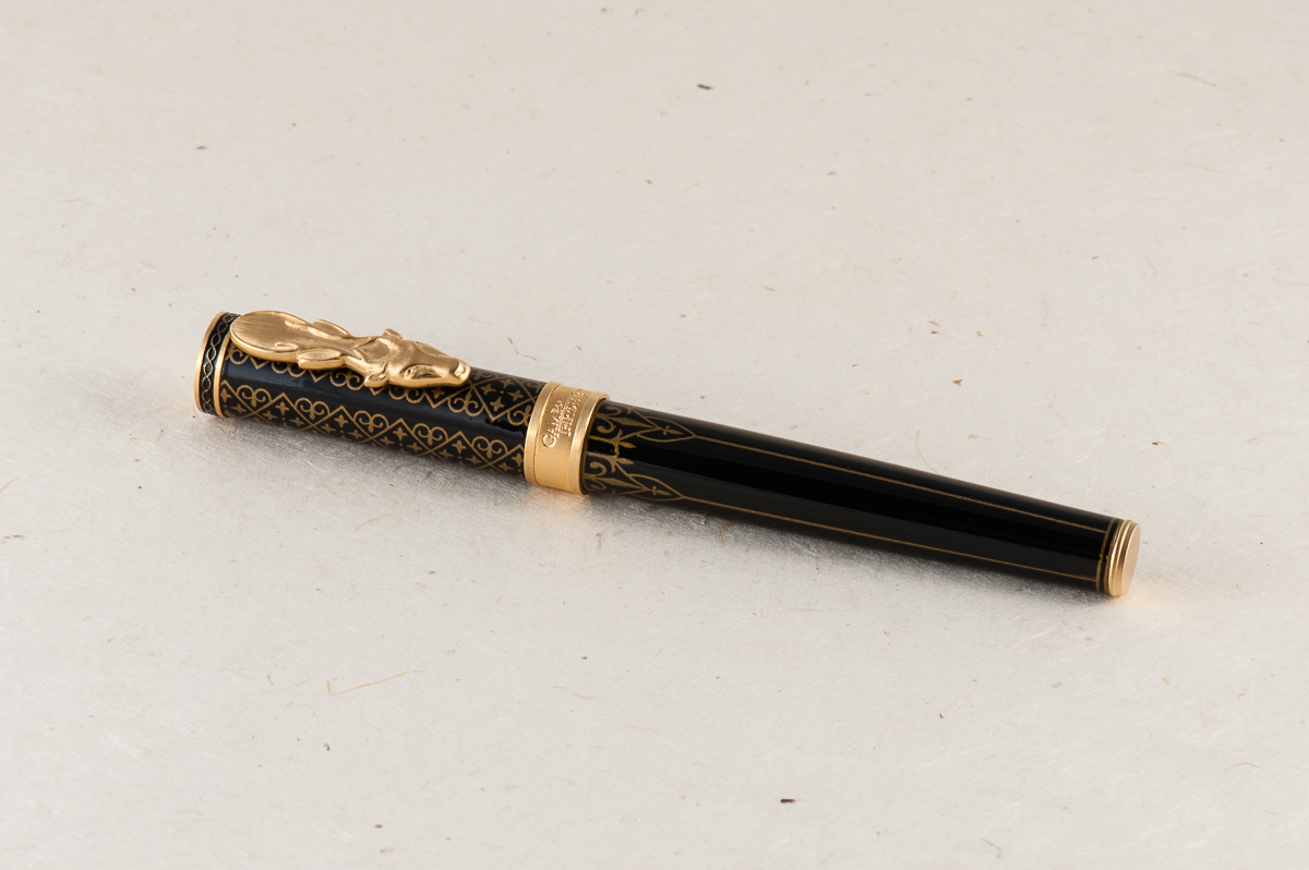
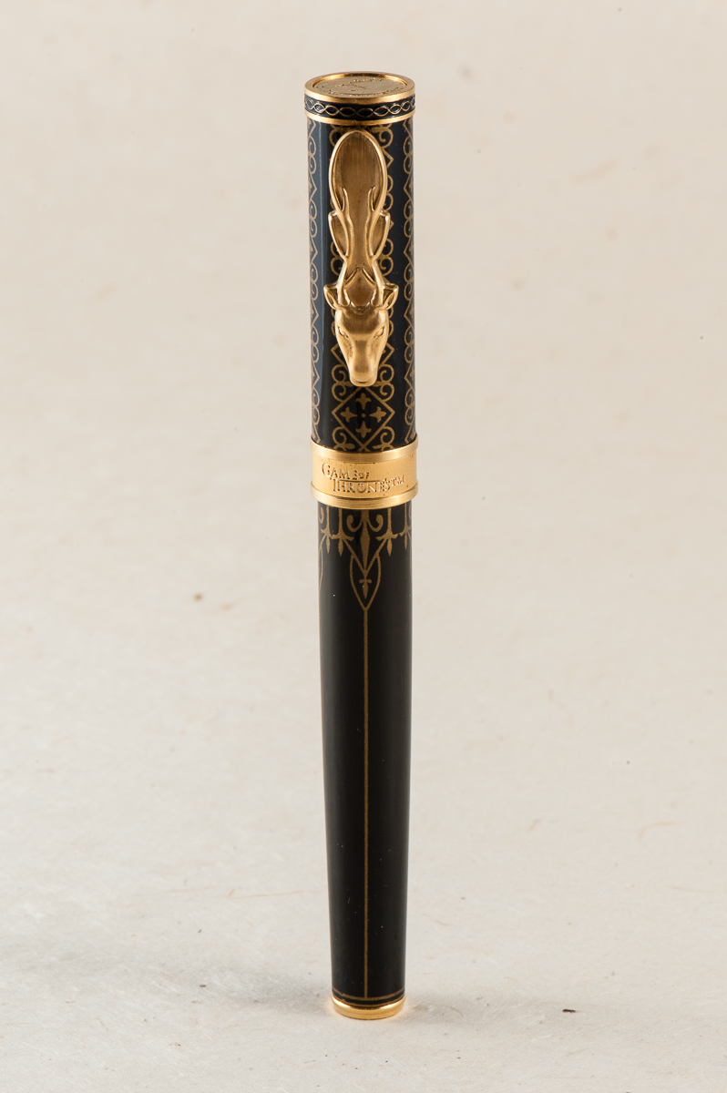
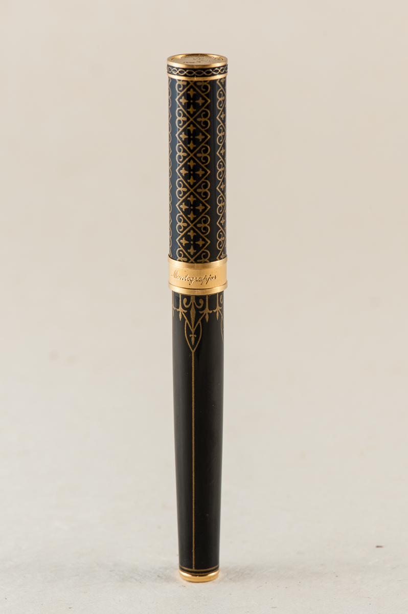
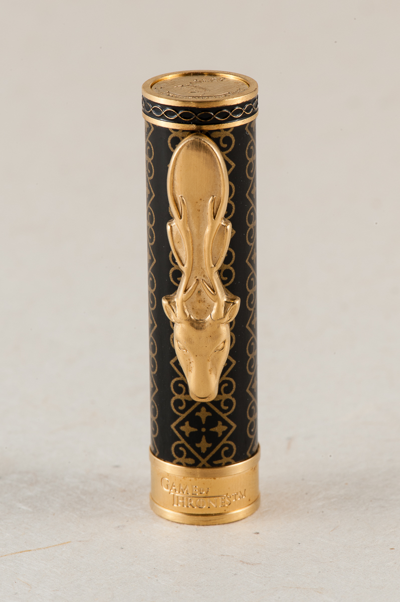
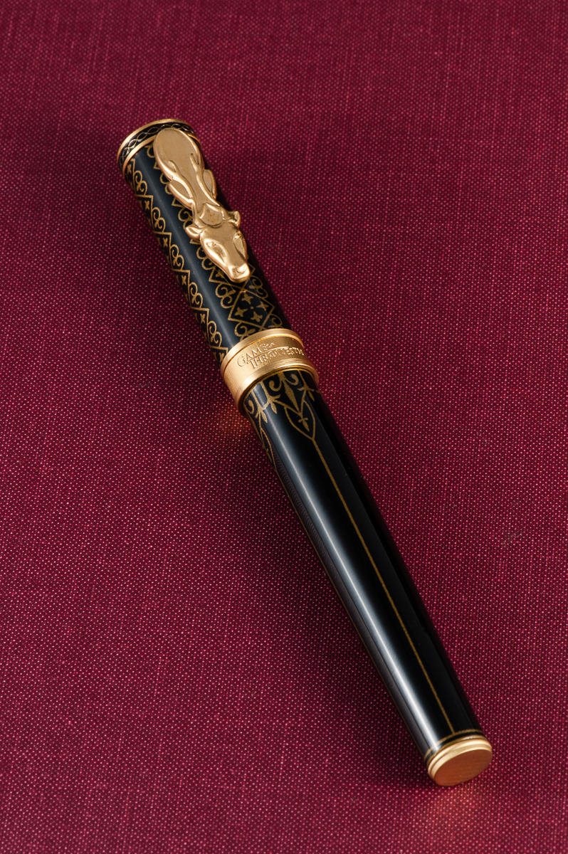
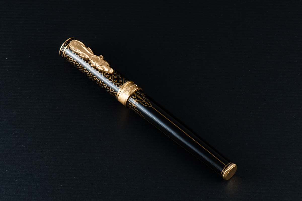
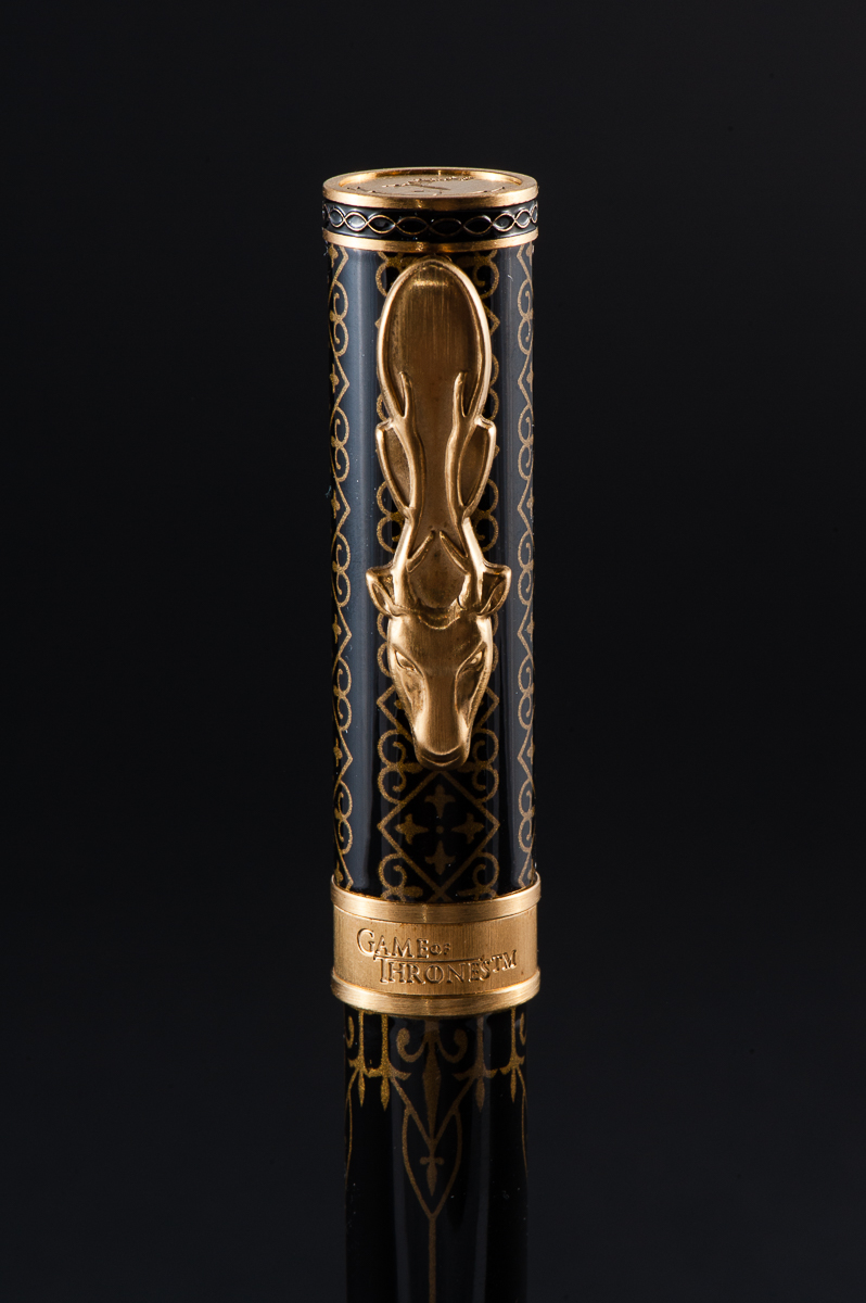
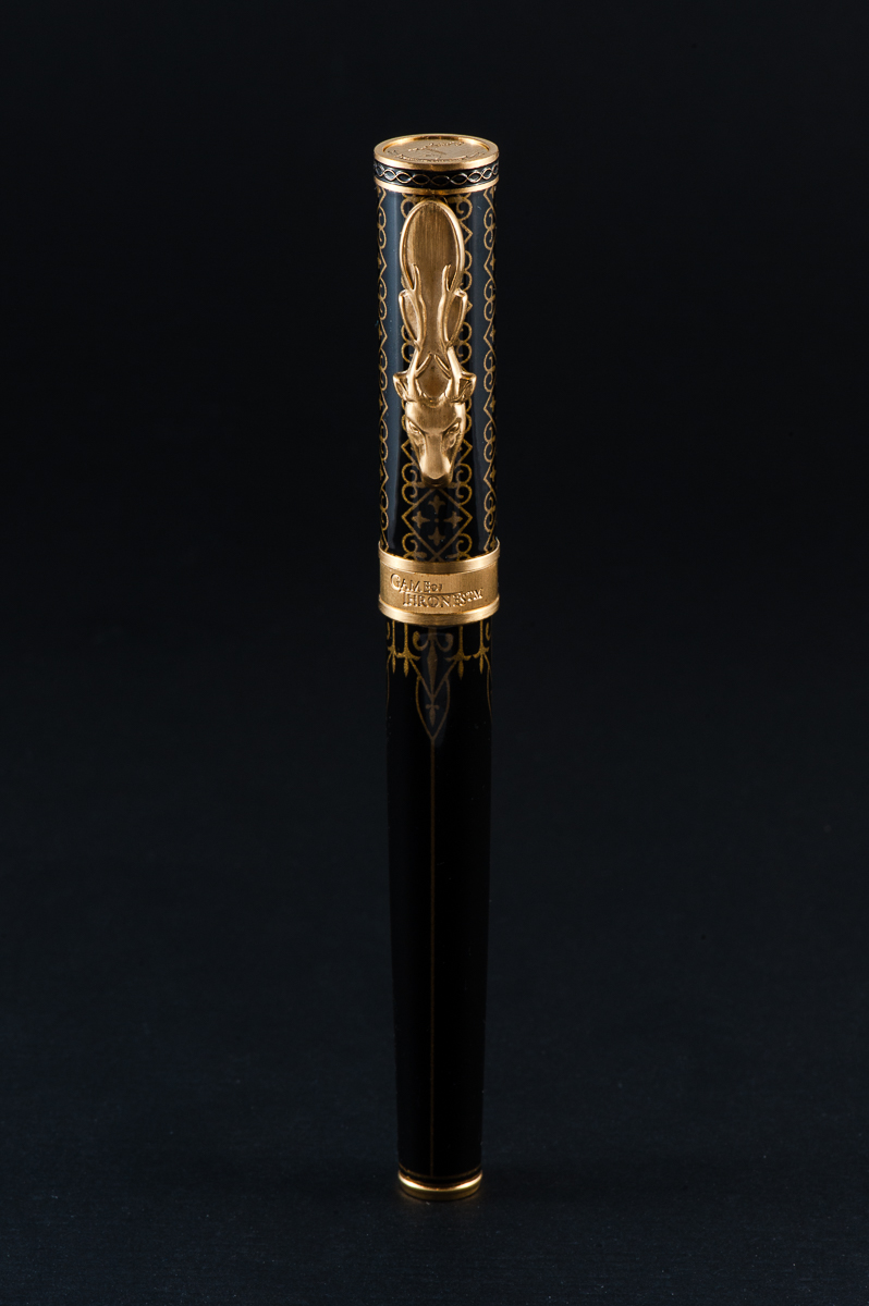
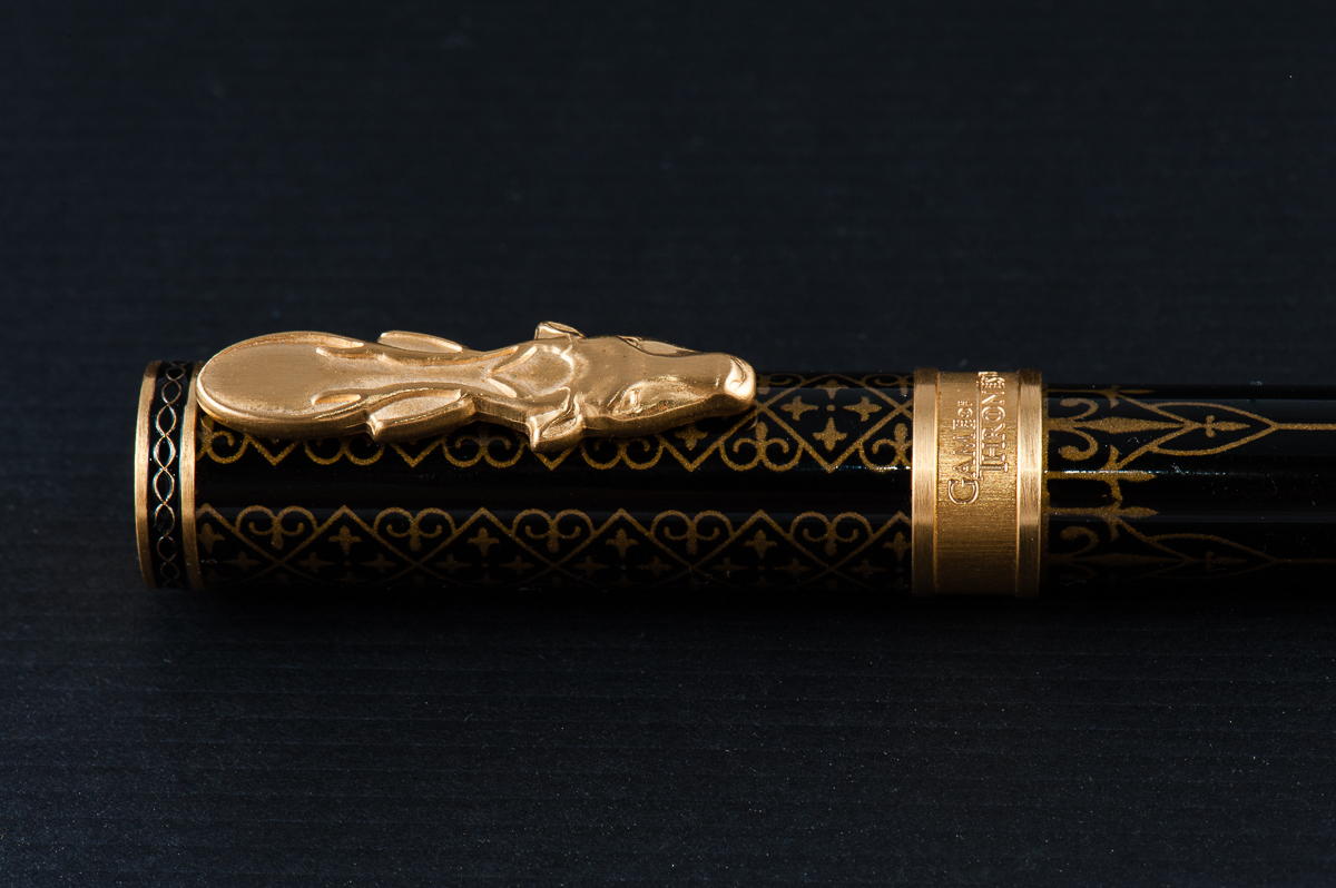
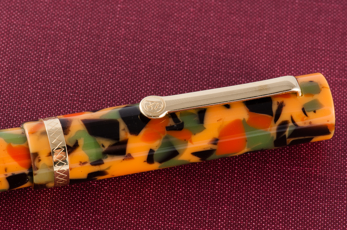
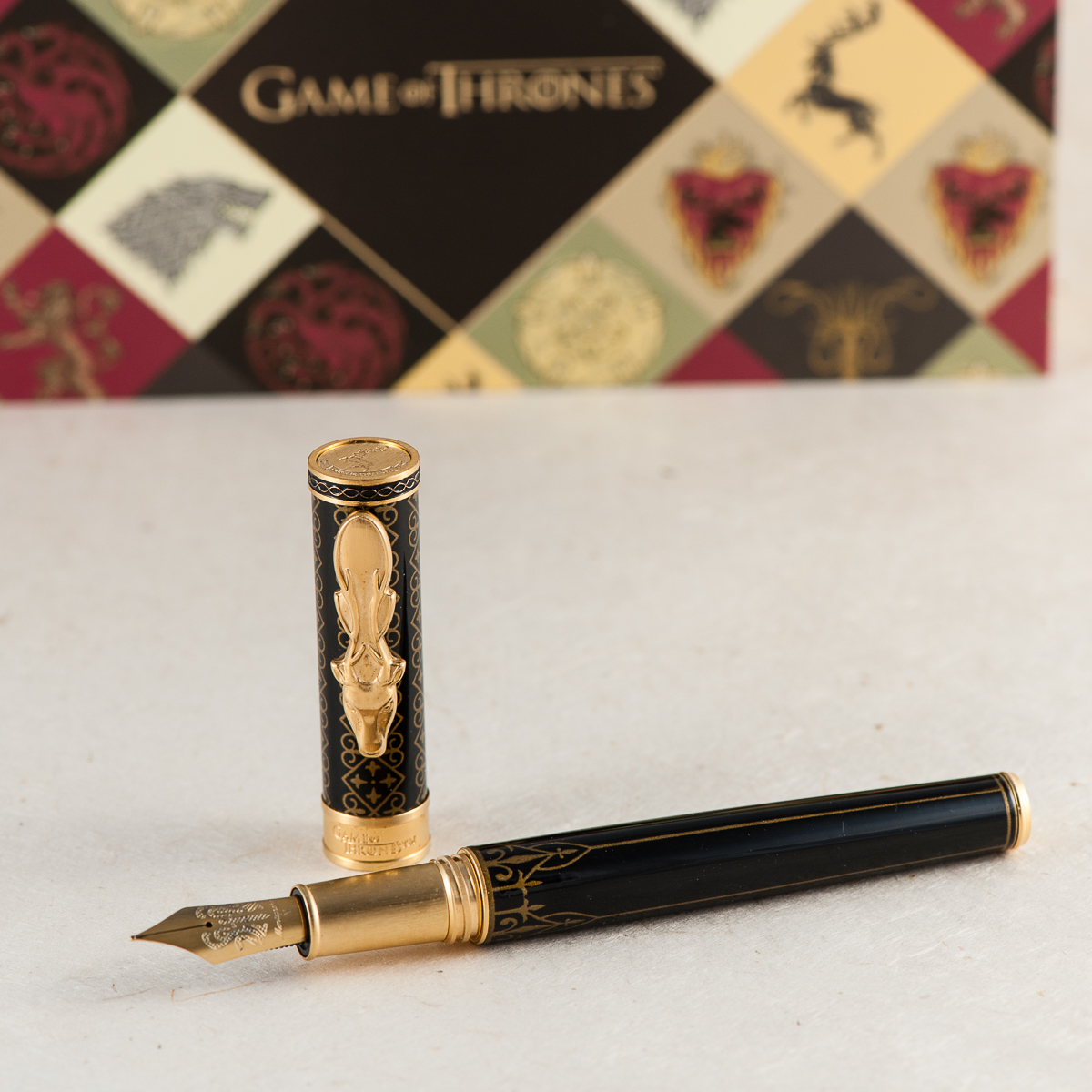
House Baratheon is one of my least favorite, but I think of all the pens, the Baratheon pen is the best made and unique of the bunch. The clip is perfect representing the Baratheon stag. I find the other clips, Lannister’s Lion, Stark’s Wolf, and Targaryen’s Dragon, to be too triangular and similar in shape and less pleasing to the eye. The stag is the most unique and well done of all the clips in my opinion. There was so much potential for the dragon on the Targaryen’s pen for it to be more serpentine in shape or maybe even wings! The rest of the decor are similar among all the pens, with the exception of the colors to represent each house.
Thank you again Bittner Pens for allowing us to borrow this beauty!
Franz: So… let me just say it. I have not watched a single episode, segment, nor even a second of Game of Thrones. *cringe*. Nothing against the show but I just haven’t given it a chance yet. So my approach with this pen review is just all about the design, performance, and of course the Hand-le-ability of the Montegrappa GoT Baratheon. I think I will let the person who has the most knowledge of the pen’s theme handle the rest of what the pen represents. Right Pam? ;-P
Just by handling the pen, I loved its overall looks and the heavier weight is more what I prefer. The brushed cap finial, cap band, and section ties up the design of the pen as well. And that clip design. Wow. Love the clip!
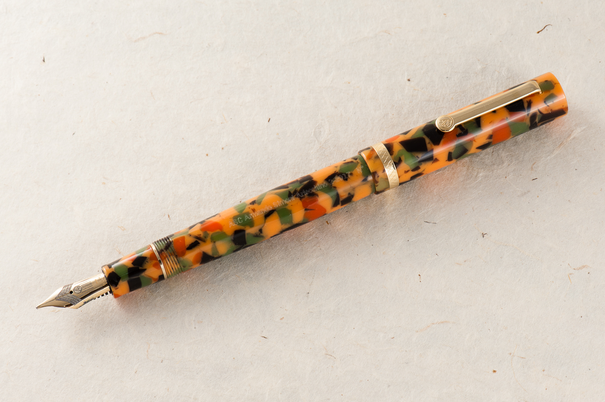
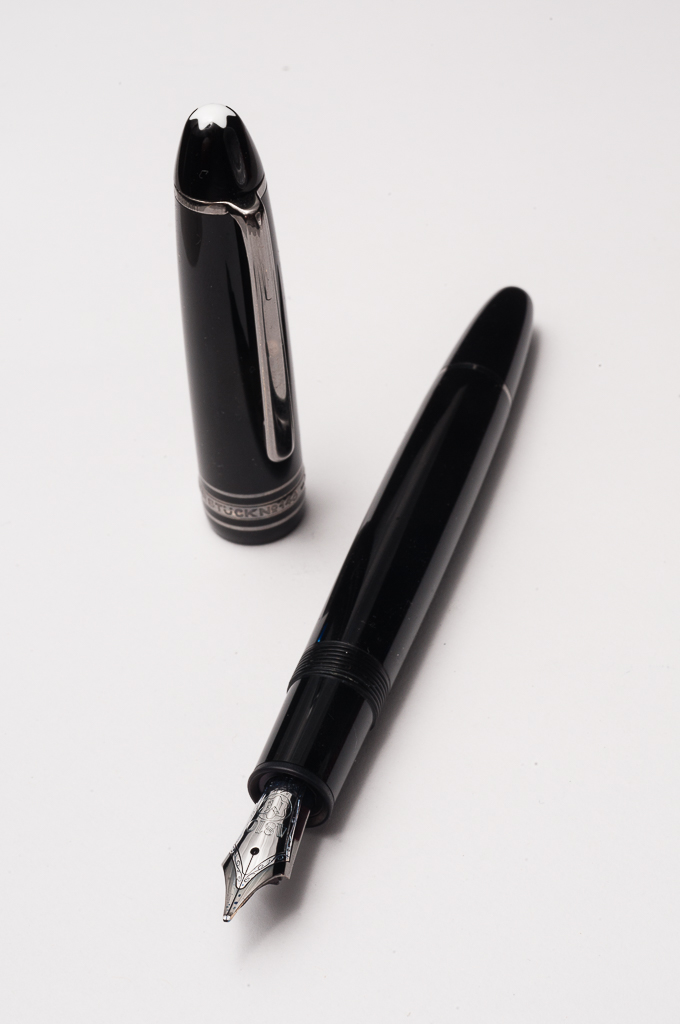
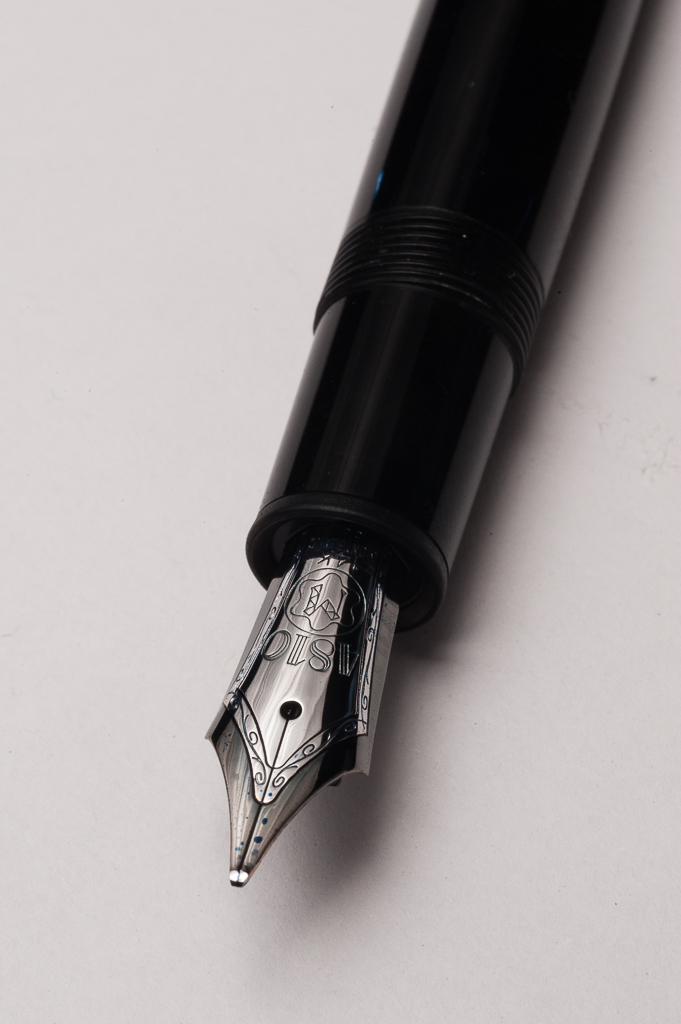
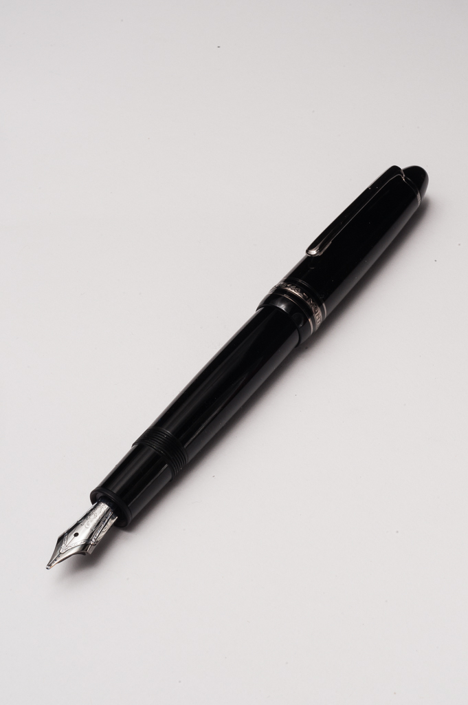
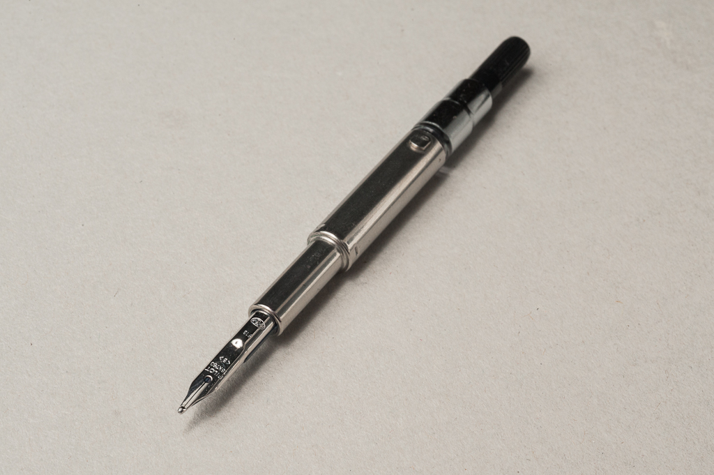
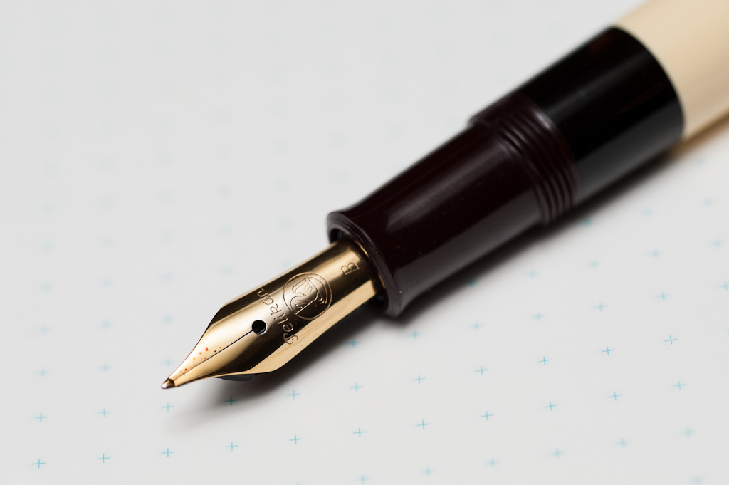
The Business End
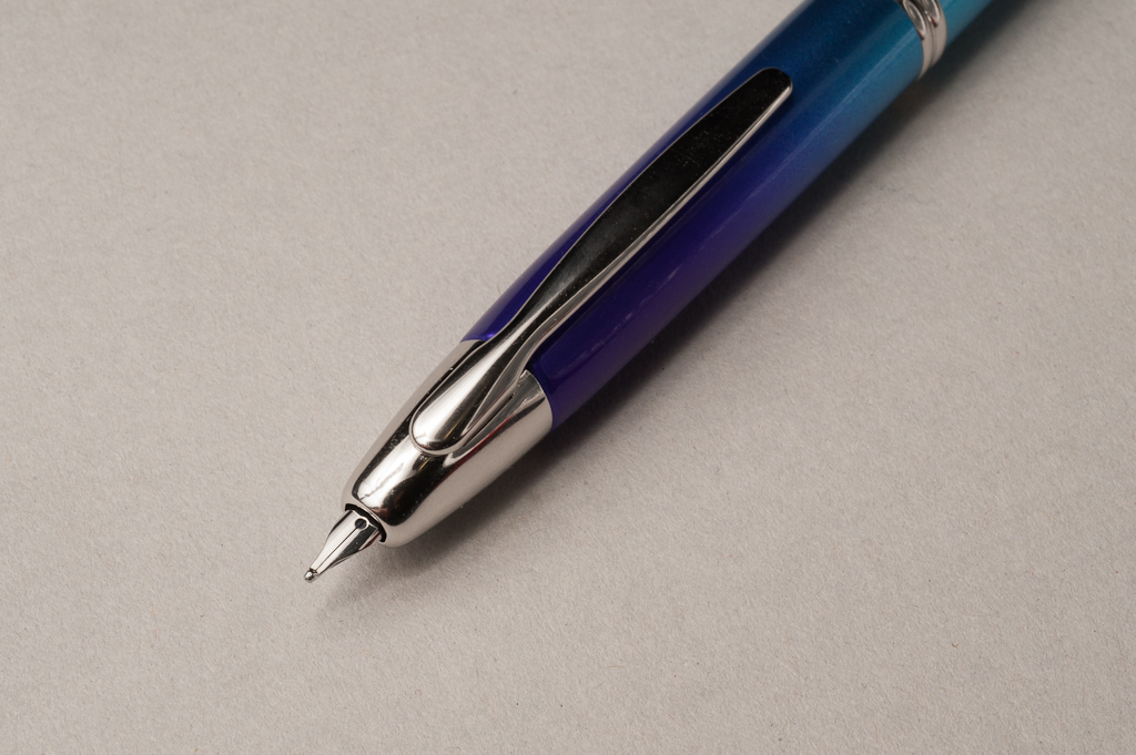
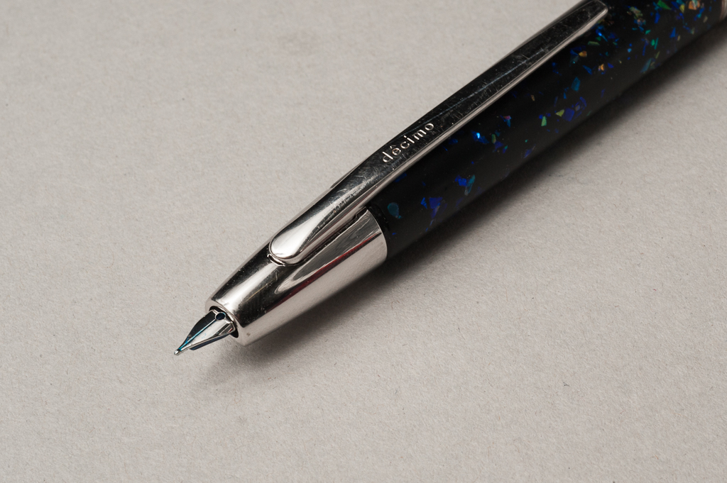
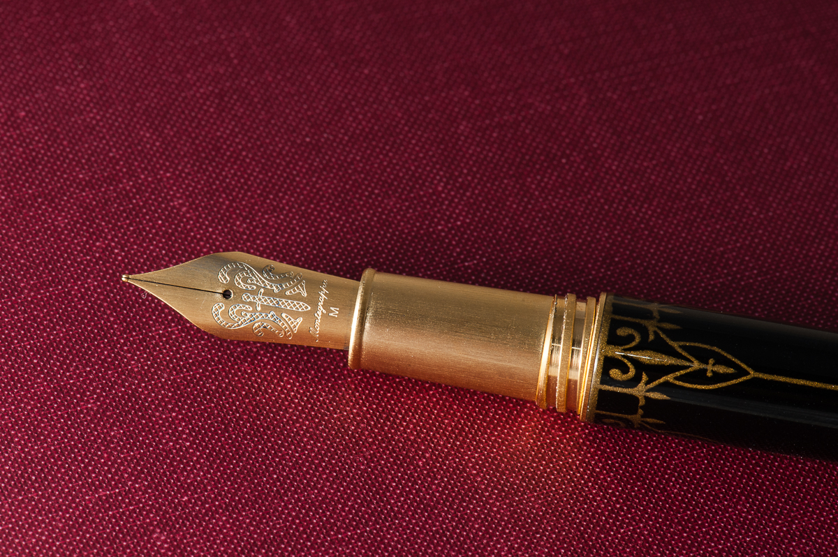
Katherine: I enjoyed this nib — it was smooth, wet (and least when dipped, but I’m pretty sure I wrote enough to get over the initial super wetness of a dip) and prettily matching. However, I wouldn’t buy this pen for the nib, it was solid, but not unique. No surprise there.
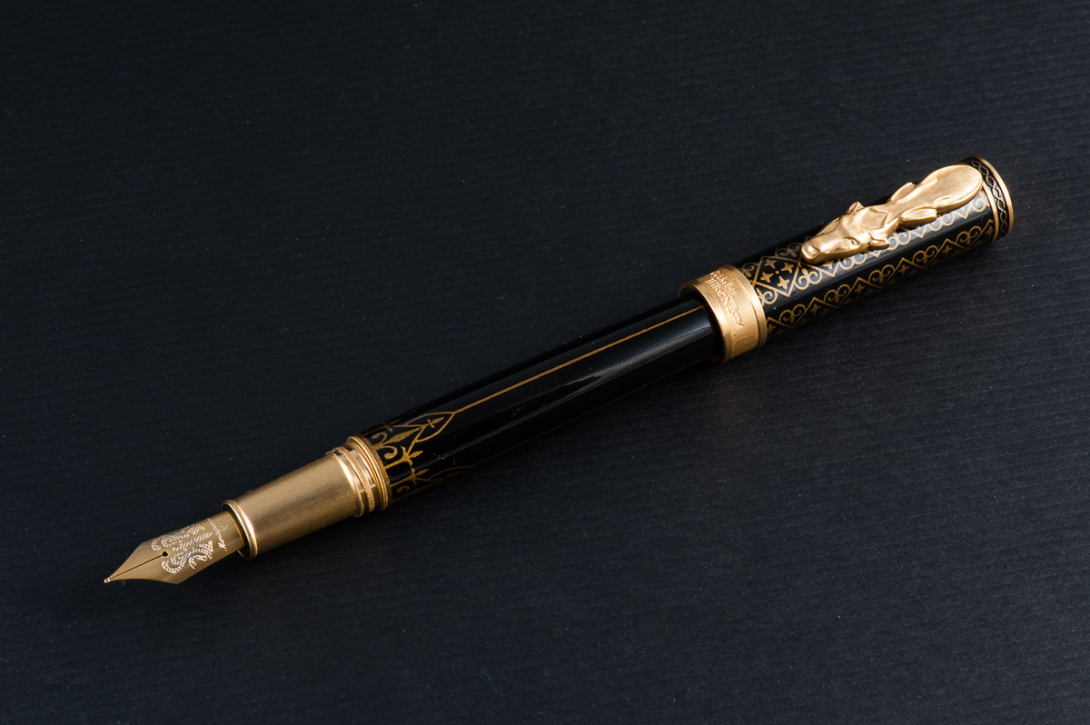
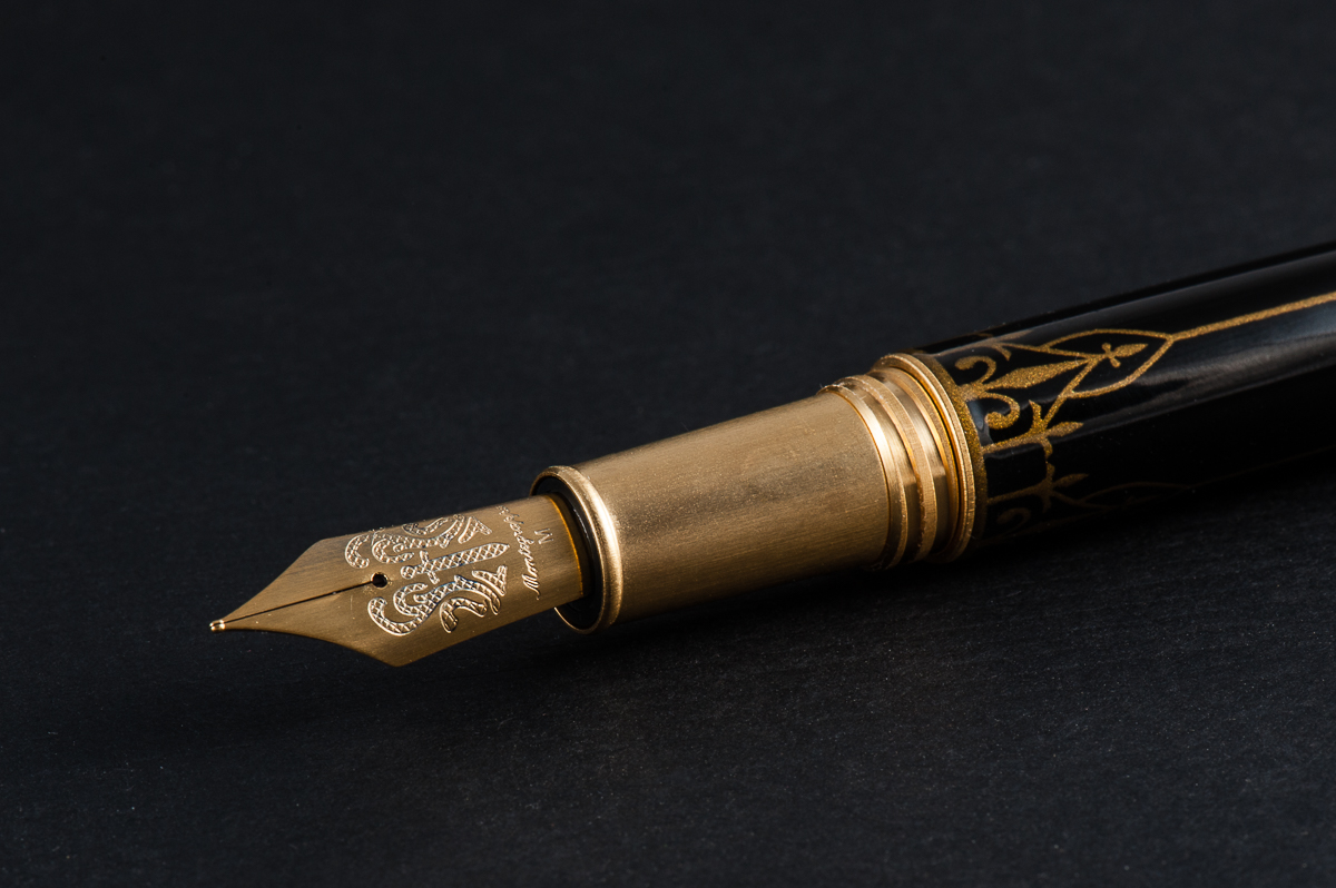
Pam: Montegrappa did not skimp on the nib and did a wonderful job making it fit in with the Game of Thrones theme. I am pretty sure that all the nibs are the same design, with a sword in the center, but a different color to match the clip colorjng. Montegrappa did a great job with that detail.
I found the nib to write wonderfully. I can’t particularly comment on flow or saturation since we dipped the pens. The nib was smooth with little feedback and was very pleasant to write with.
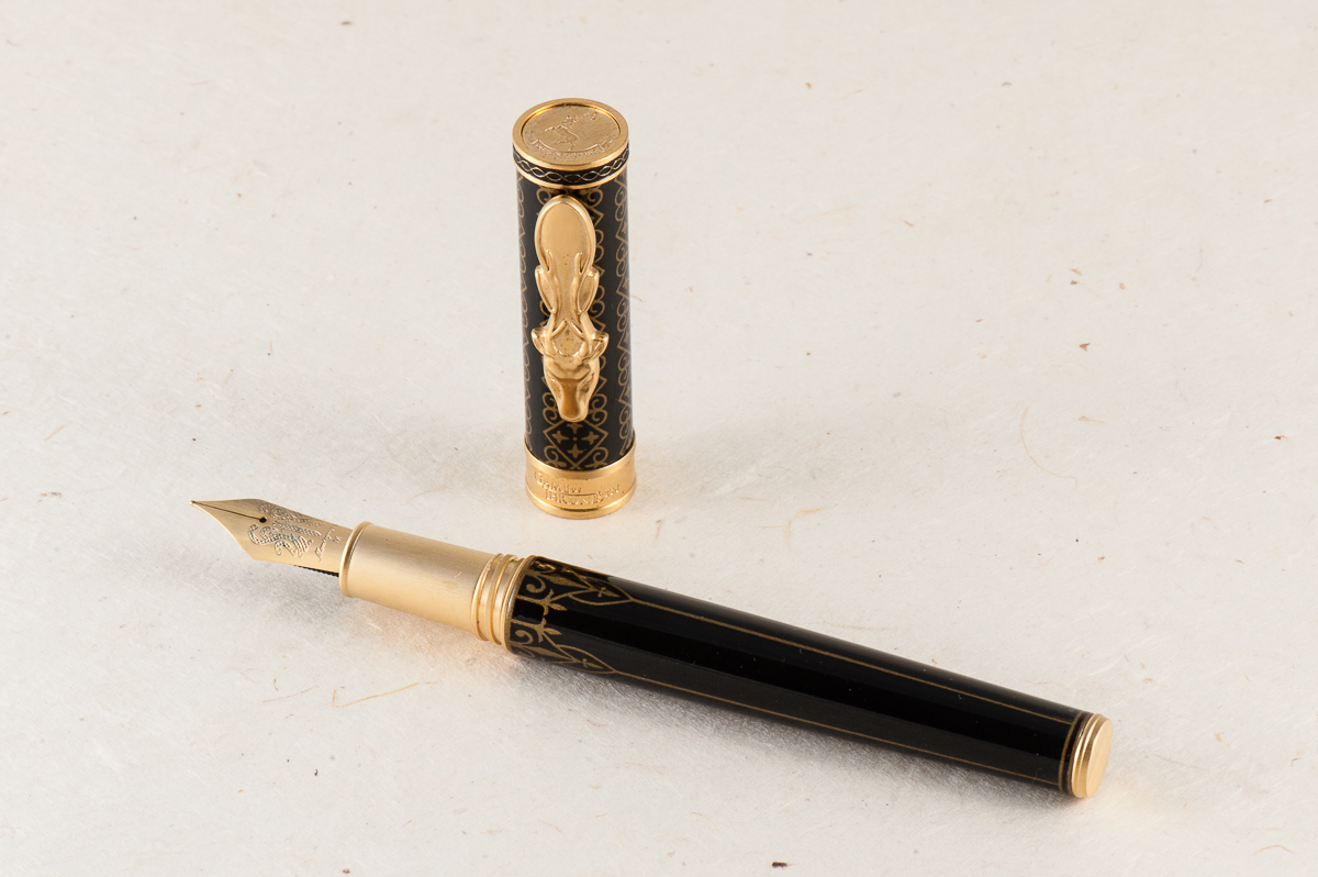
Franz: Oh yeah, the Baratheon’s steel nib also has brushed background for the engraved sword. Such a pretty thing to look at. As for its writing performance, it wrote smoothly and didn’t skip at all. It was a well tuned nib out of the box.
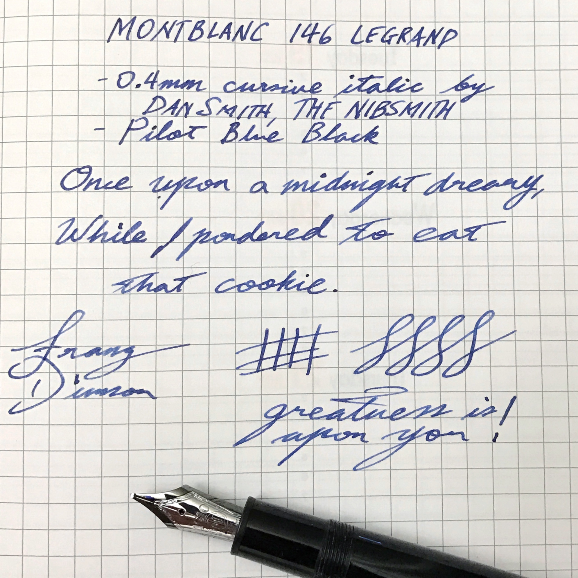
Write It Up
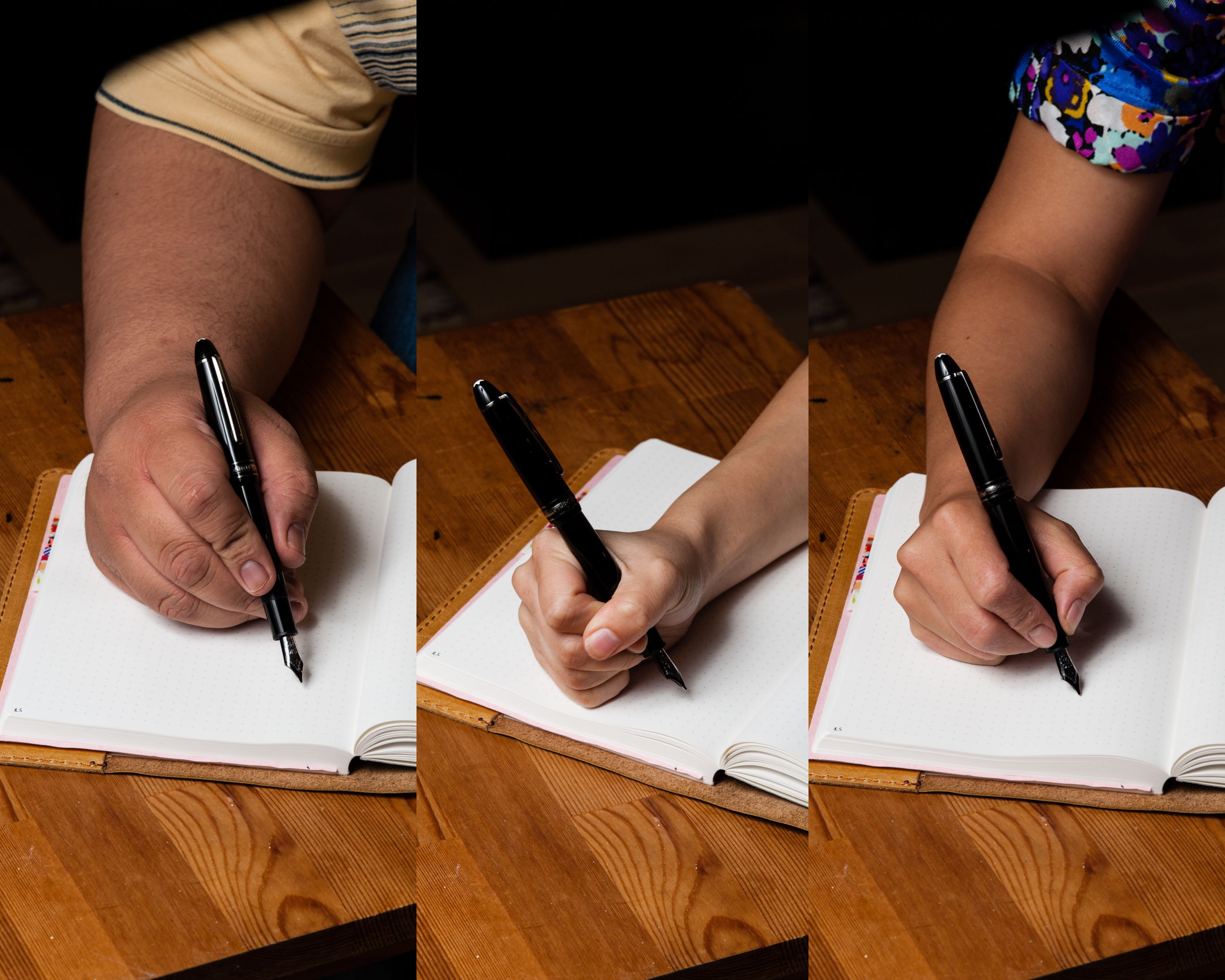
Katherine: Overall this pen was well balanced and comfortable for me… BUT, I did notice the threads. They weren’t terrible, but I did notice they were there and was a little annoyed. Nothing major, but worth mentioning because I typically don’t notice sharp threads because I hold my pens pretty far forward. Despite my grip, I still noticed the threads on this pen.
Pam: I didn’t end up writing with this pen for the 20 minute time span because it just plain hurt to do so. The step is pretty sharp on this pen and pretty unforgiving with my iron fist grip. I ended up with indentations of the step along the skin between my pointer finger and thumb. Yes, I understand that I could just loosen my grip and that would ease some misery, but the step is sharp enough that I wouldn’t recommend this pen for those with “fisty grips,” particularly if it’s around the step.
Franz: The length and girth of the Baratheon was comforable for me either when it was posted or unposted. The only issue I had was that the brushed steel section made my fingers slip closer to the nib as I wrote with it. So writing with the cap posted afforded me to grip the pen higher above the threads and my fingers did not slip anymore.
EDC-ness
Katherine: I didn’t carry this — but it seems very solidly made. The clip is solid and I’d be comfortable clipping the pen to a shirt pocket — but not springy enough for me to clip it to jeans.
Pam: Since the pen was borrowed, it stayed in the case until we were ready to write with it. The clip seems solid and able to clip onto fabrics well. The weight of the pen is considerable for this pen and I can see where it might drag down a shirt pocket. I don’t know if the clip will prevent it from slipping out. Also, given the pristine finish of the pen, I wouldn’t recommend it being thrown in a jeans pocket with your keys either. This pen would be great in a pen case on the go. Like a sword, this pen deserves a proper sheath. 😛
Franz: Since it is a pen on loan, we did not fill it up with ink and we didn’t get to use the pen at a work setting. However, as Katherine said, the clip works very nicely and clips on to my shirt pocket. The Baratheon has a cartridge/converter filling system so a full fill will last me a good 2-3 days if I would use it at work. Now something I love about the pen for its EDC-ness? The acme threads allow the cap to be unscrewed with just one turn. Love that quick deploy!
Final Grip-ping Impressions
Katherine: Ehhhh. I’m not big on franchise merchandise, and this pen was no exception. BUT, if you’re a GoT fan and you enjoy themed stuff, this pen could be perfect for you. It’s a well made, solid writer and seems like it can withstand the rigors of daily life (and hopefully your life is less stressful than any of the characters…).
Pam: I genuinely enjoyed this pen, not only due to the theme and the details involved in making these four into reality. The set of pens is a great collectors item for both fountain pen and Game of Thrones enthusiasts alike. Notably, these pens would be more of a “collectors” item for me than practical due to the price. At around $300 per pen, it’s a bit of an investment for one pen, let alone all four. That being said, the details and construction of the pen are fantastic and deserve to be rewarded. If you are in the perfect cross section of GoT and fountain pen fandoms (and your favorite house is represented with these four options), this is a great pen for you! You will get a quality writing instrument and wave your house banner high at the same time!
Franz: I truly appreciate the design of the Montegrappa GoT Baratheon pen sans the Game of Thrones knowledge. The Baratheon actually inspired me to take more pen photos than usual so please enjoy them below. The pen is comfortable for my use in terms of its dimensions, and nib performance. I just wish that metal sections did not make my fingers slip.
With an MSRP of $350, this might be a justifiable buy when you are a great fan of the show. For me, the price is just a little too high even if I do love the design and build of the pen. A pen’s value (or any other item), is both all relative, and subjective.
Once again, big thanks to Detlef Bittner of Bittner Pens for lending us this Montegrappa GoT Baratheon pen!
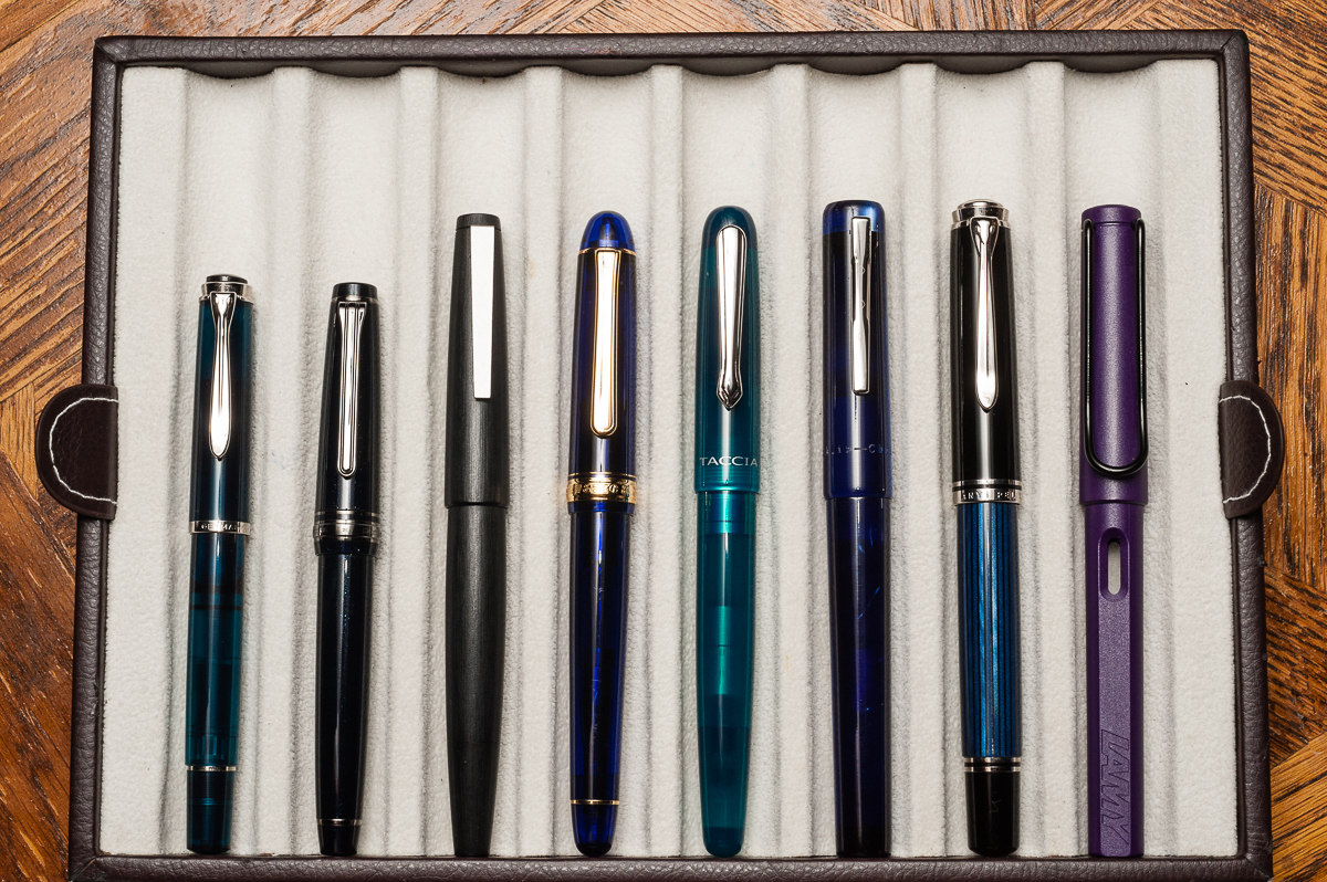
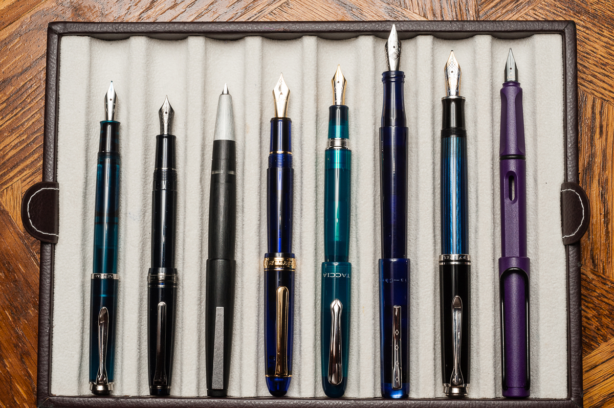
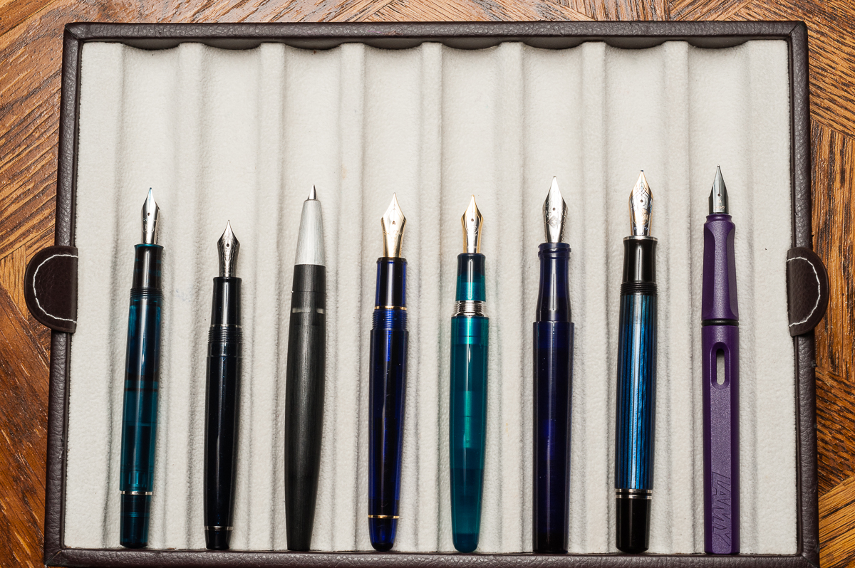
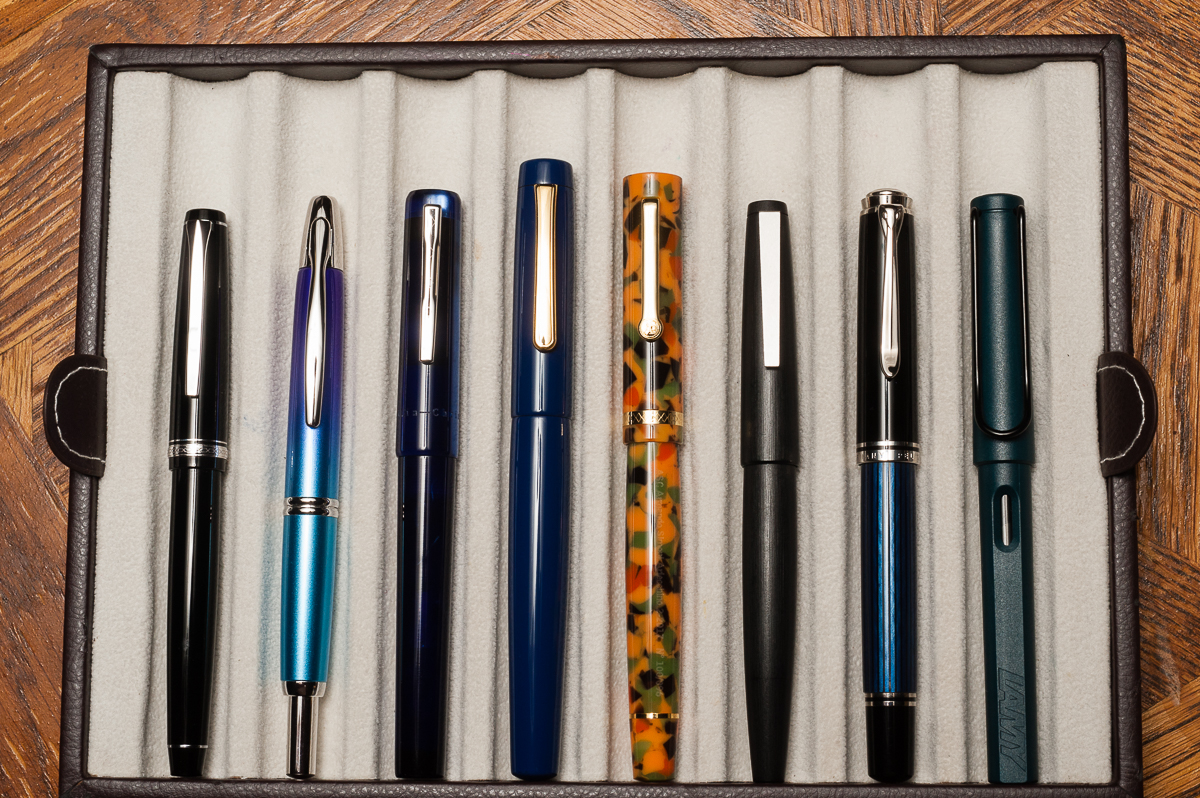
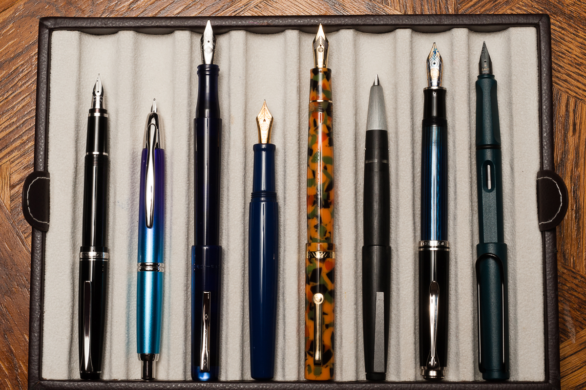
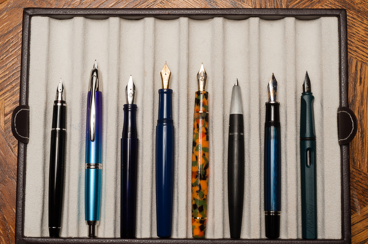
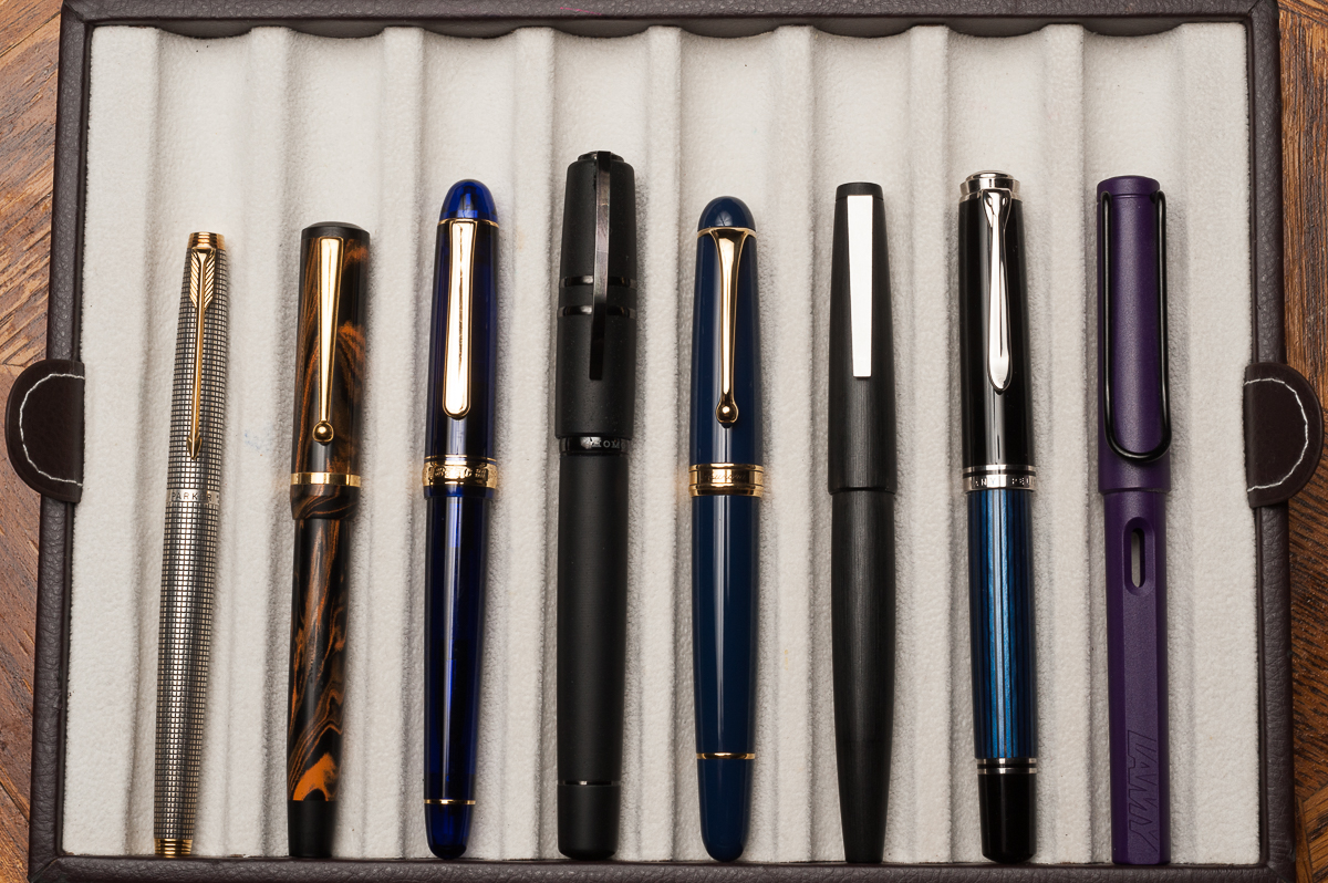
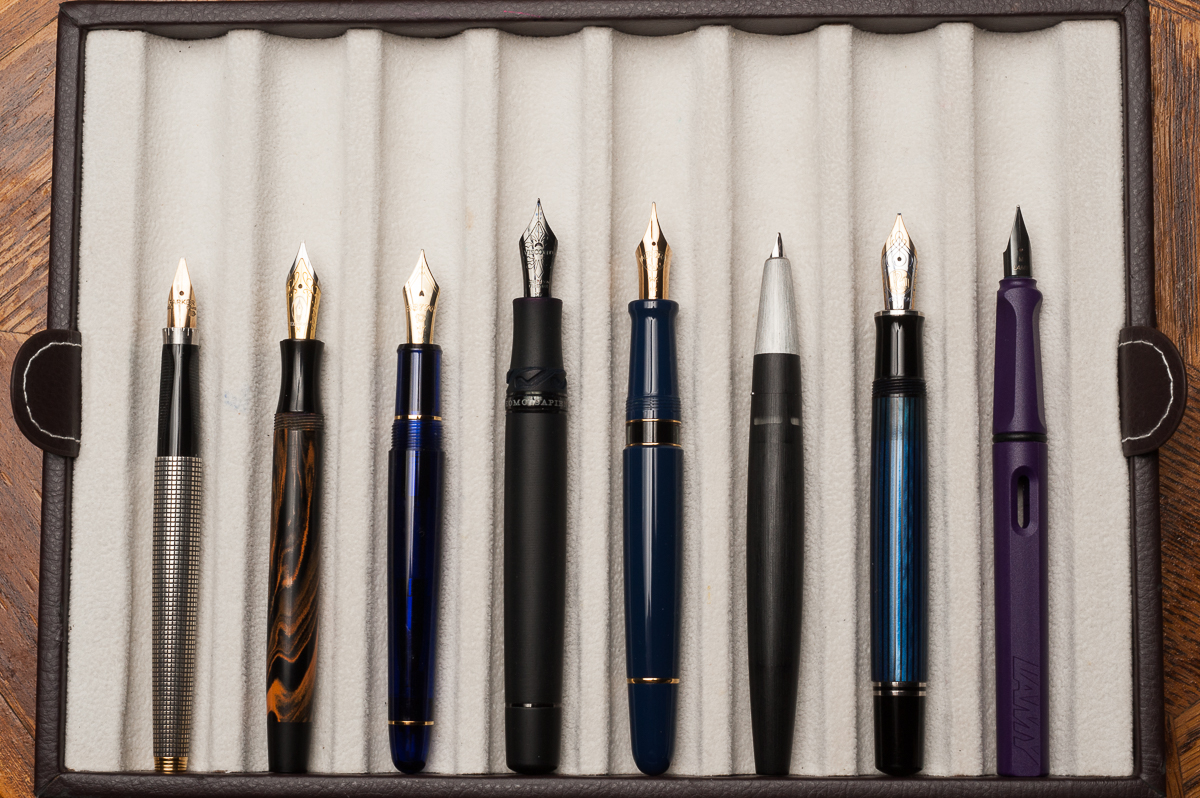
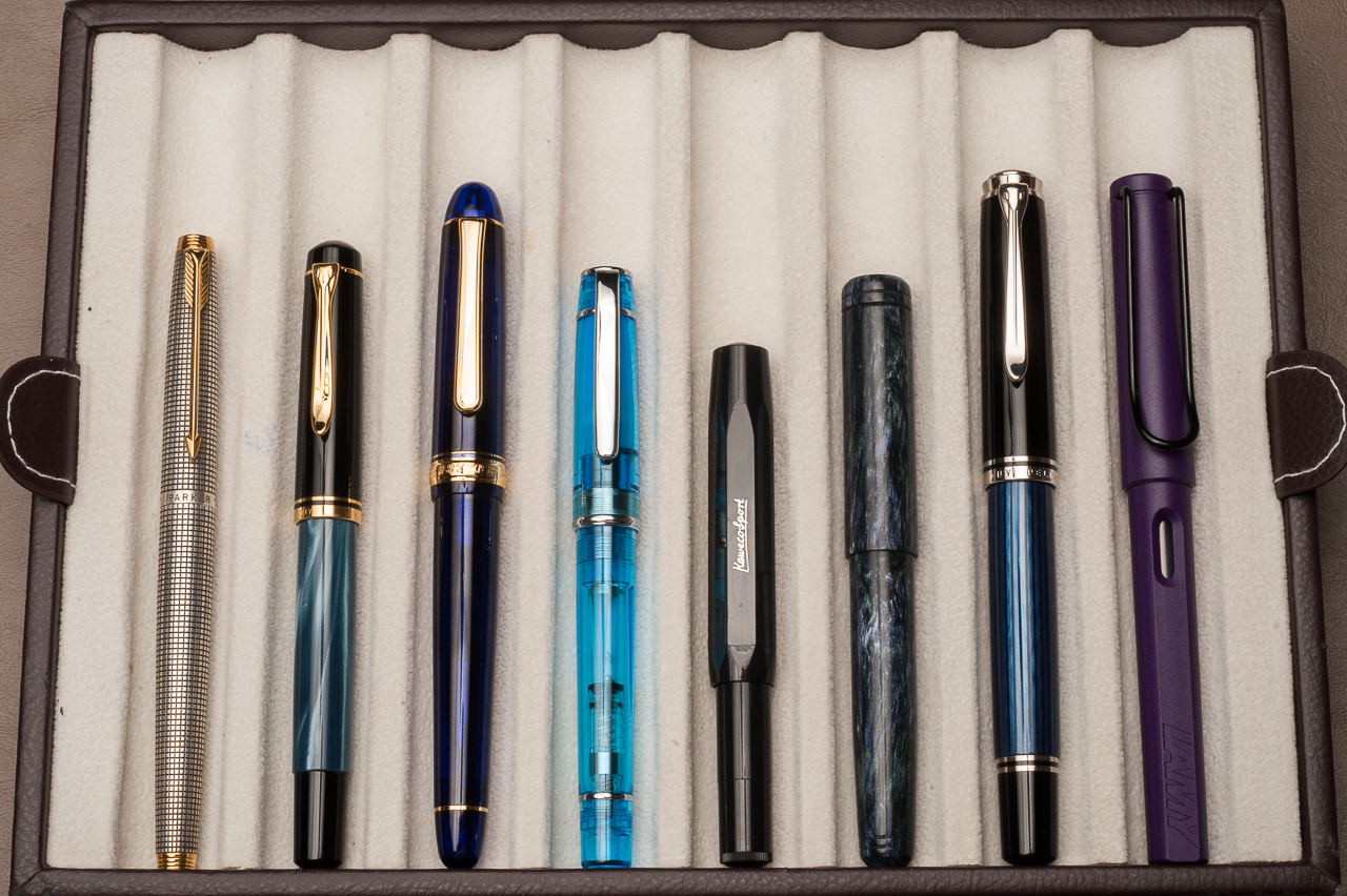
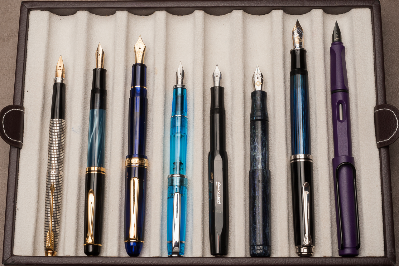
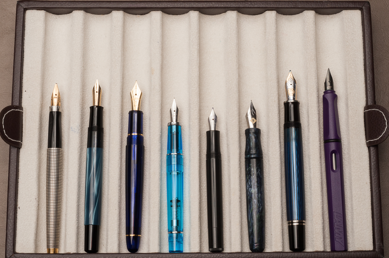
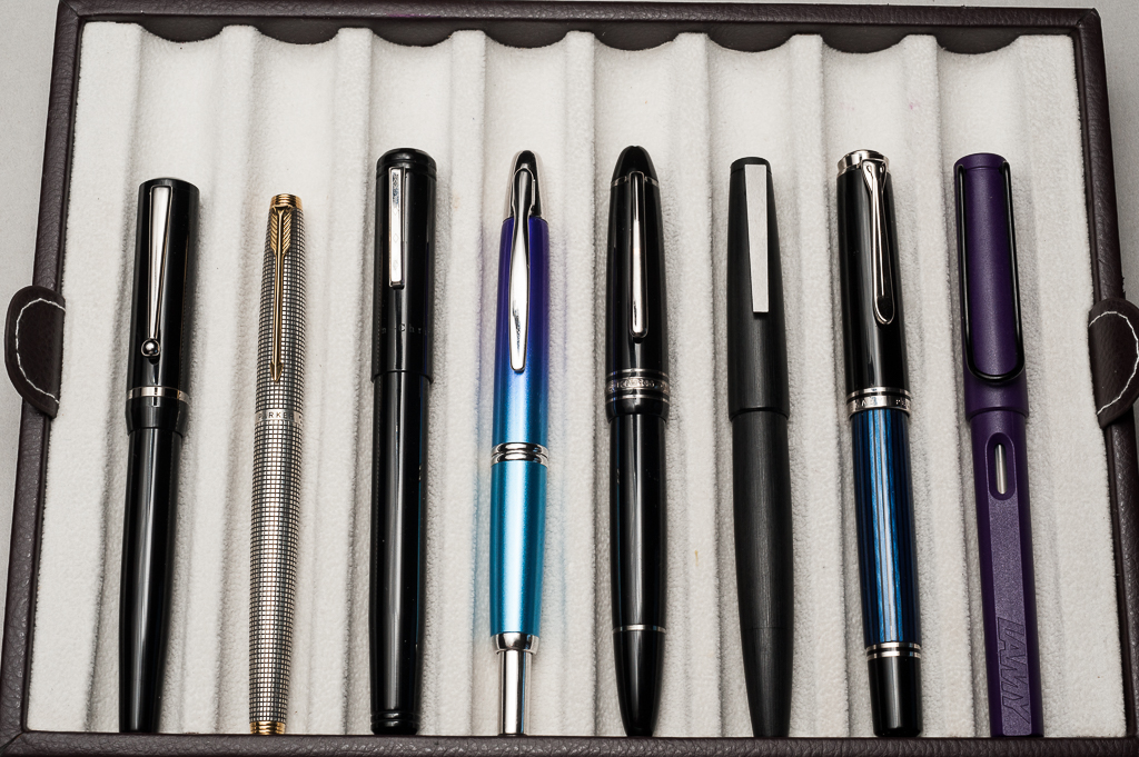
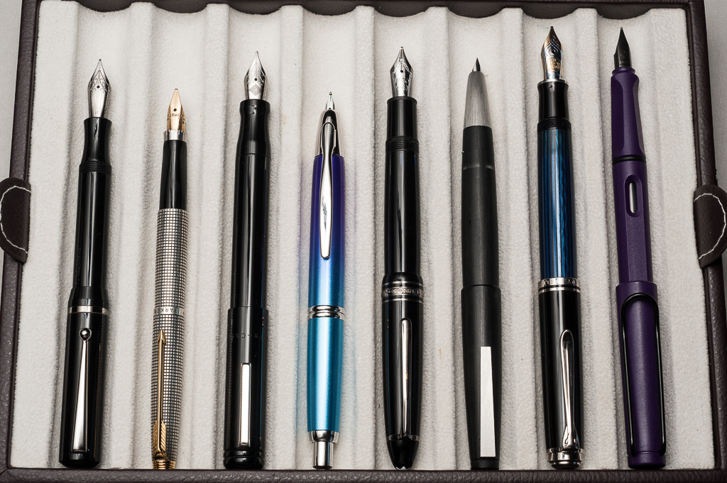
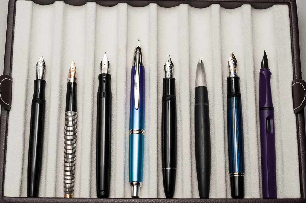
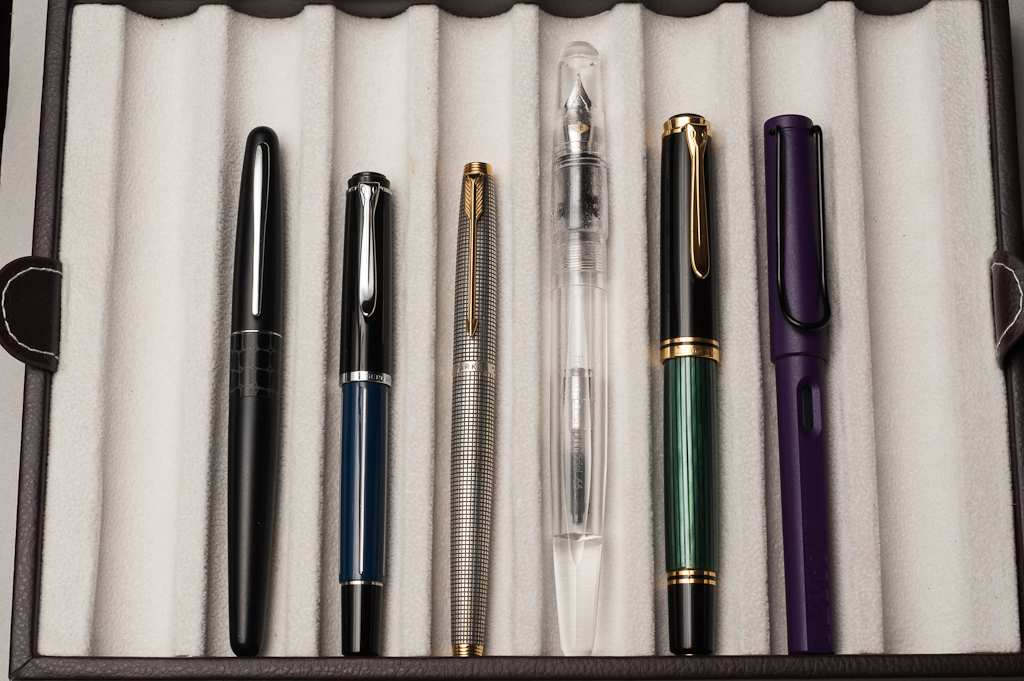
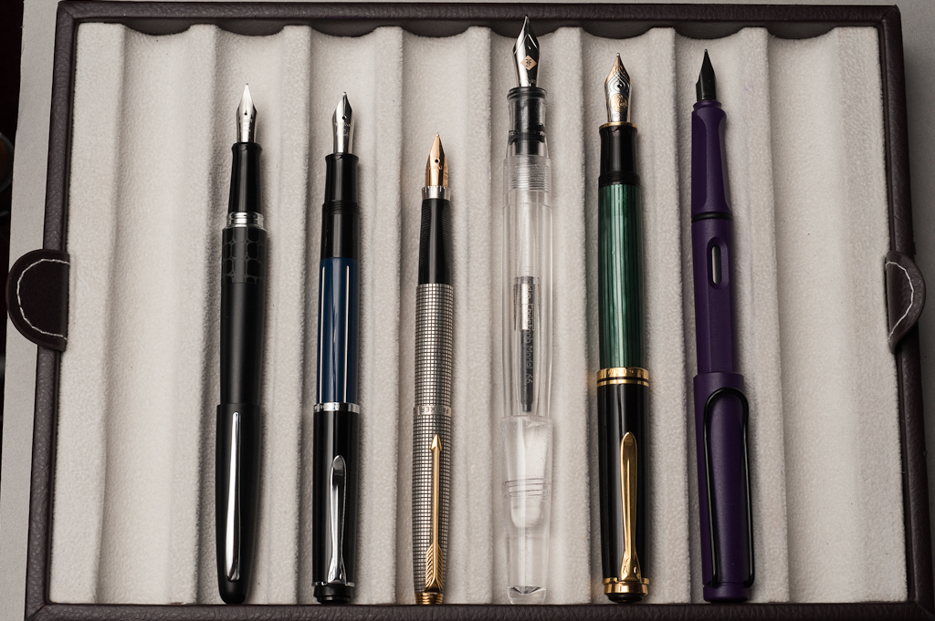
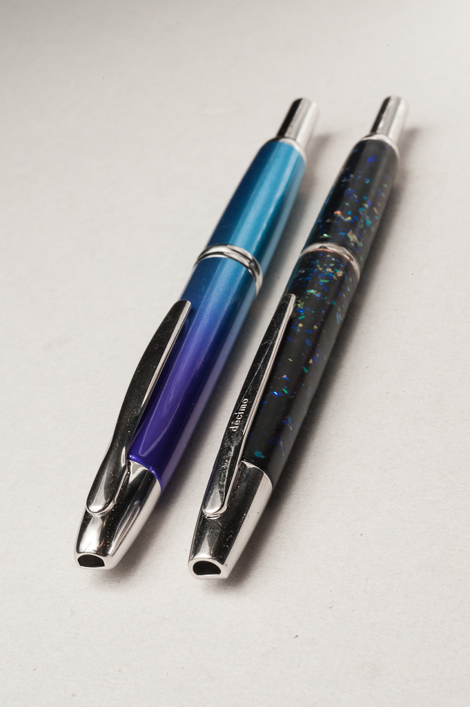
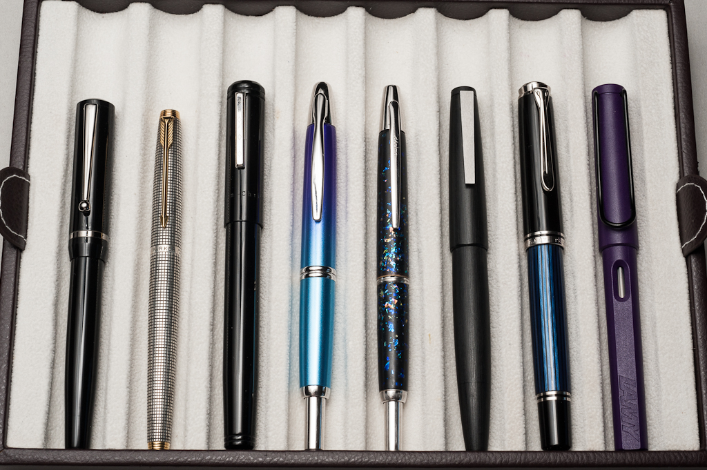
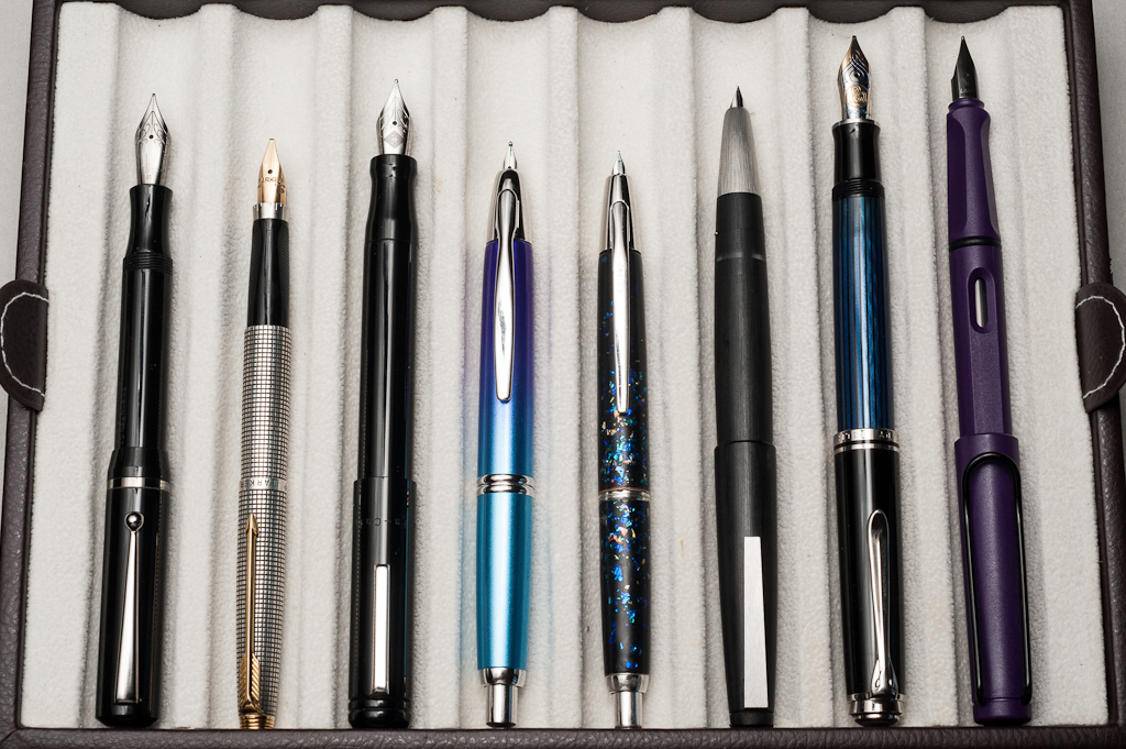
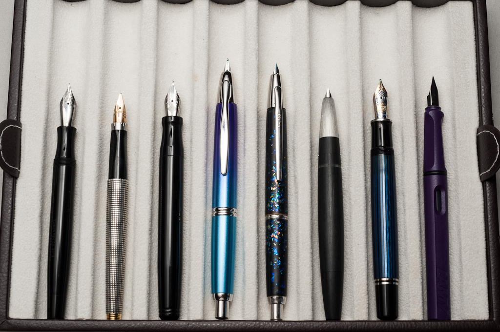
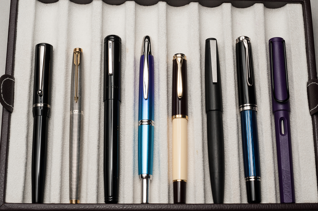
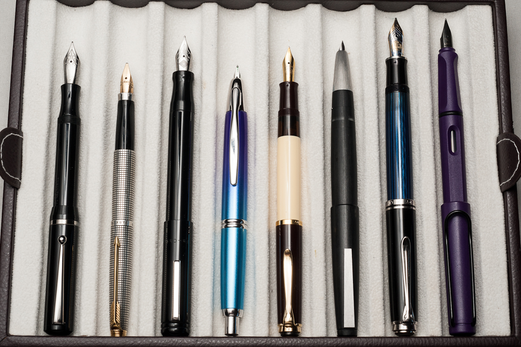
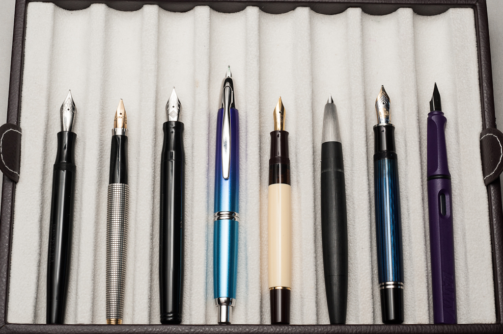
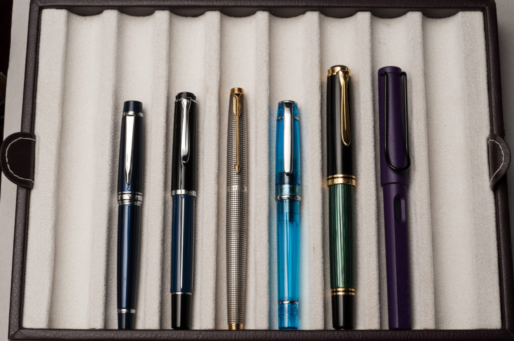
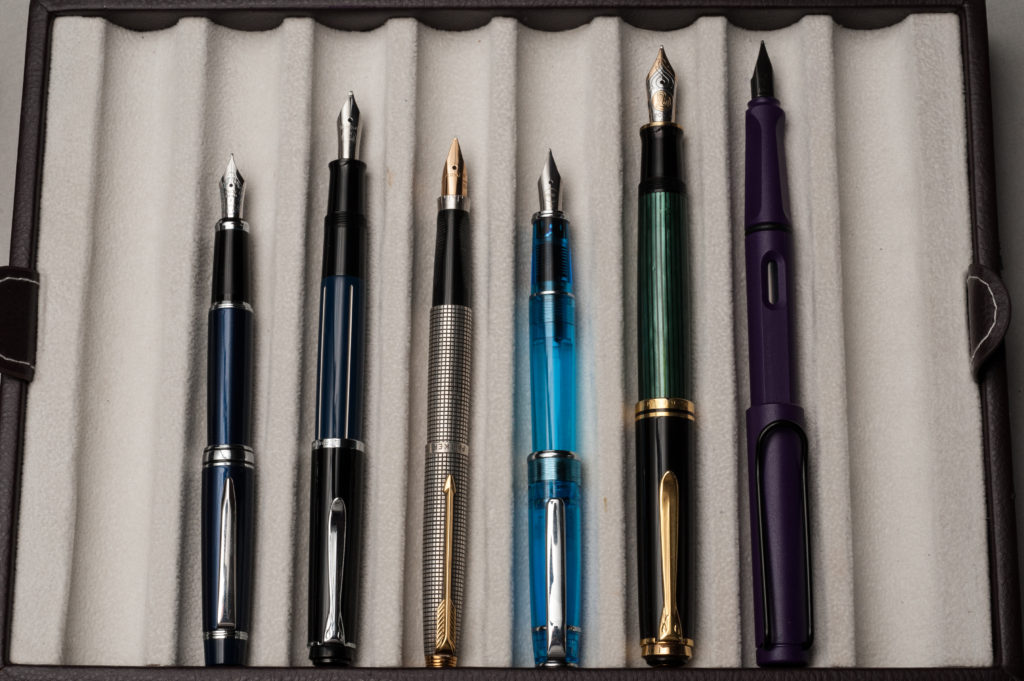
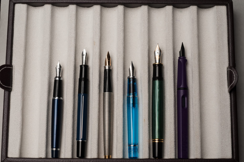
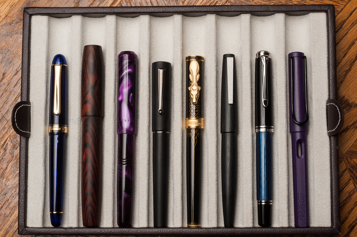
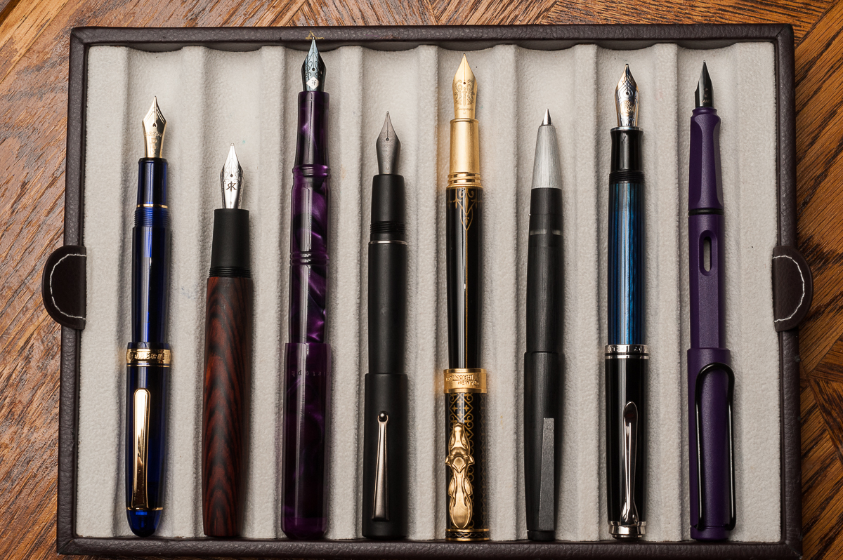
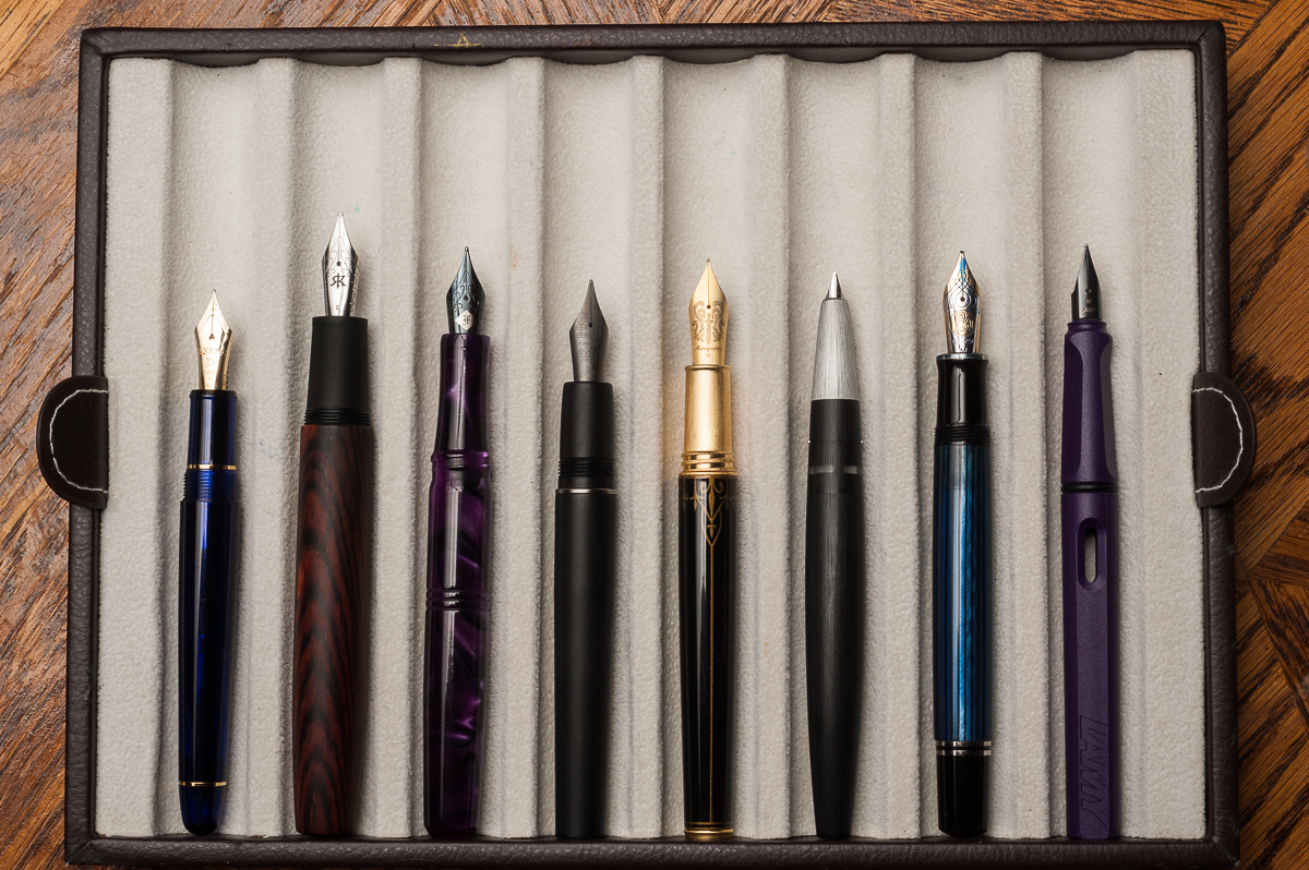
Pen Comparisons
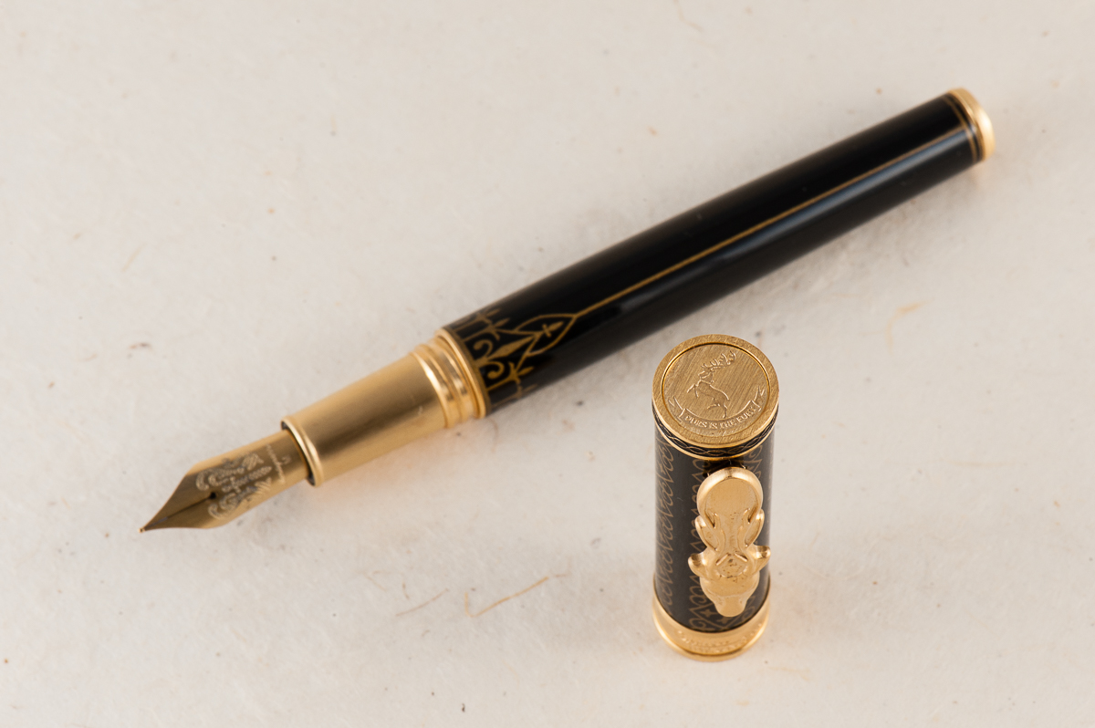
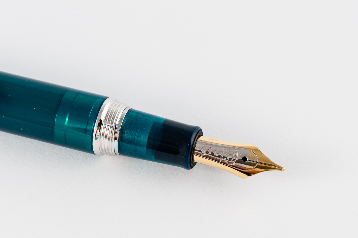
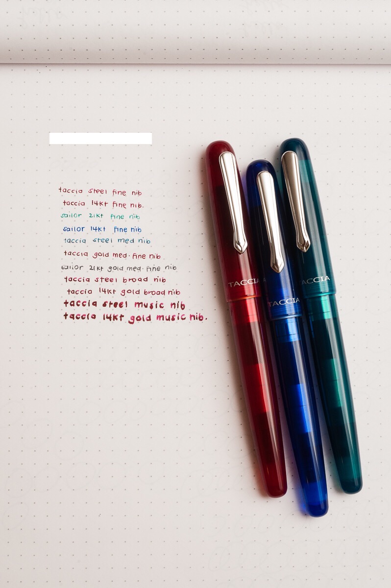
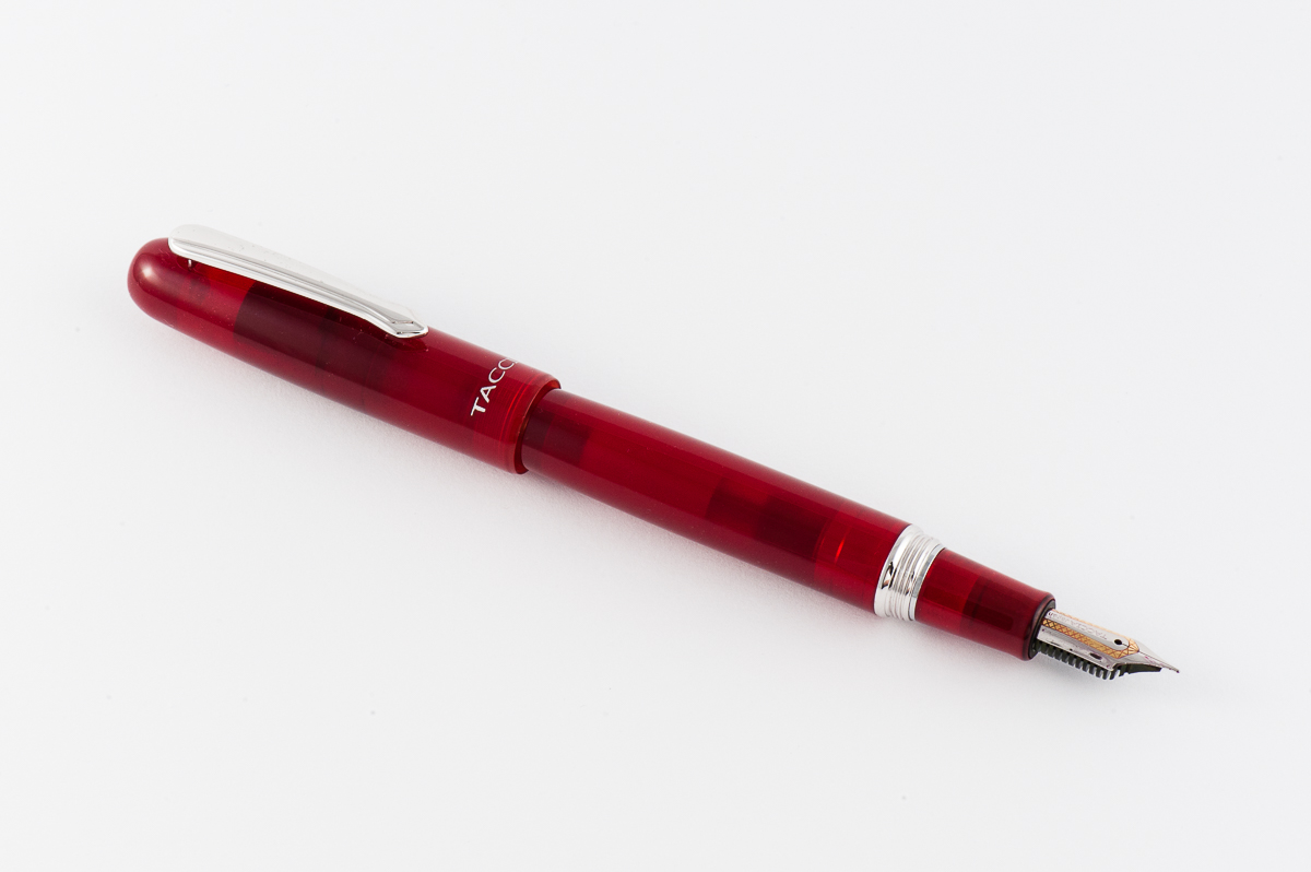
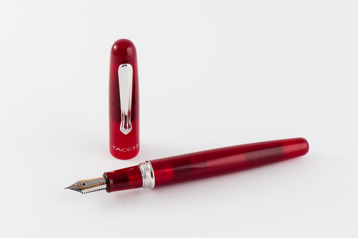
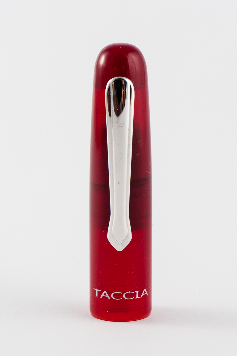
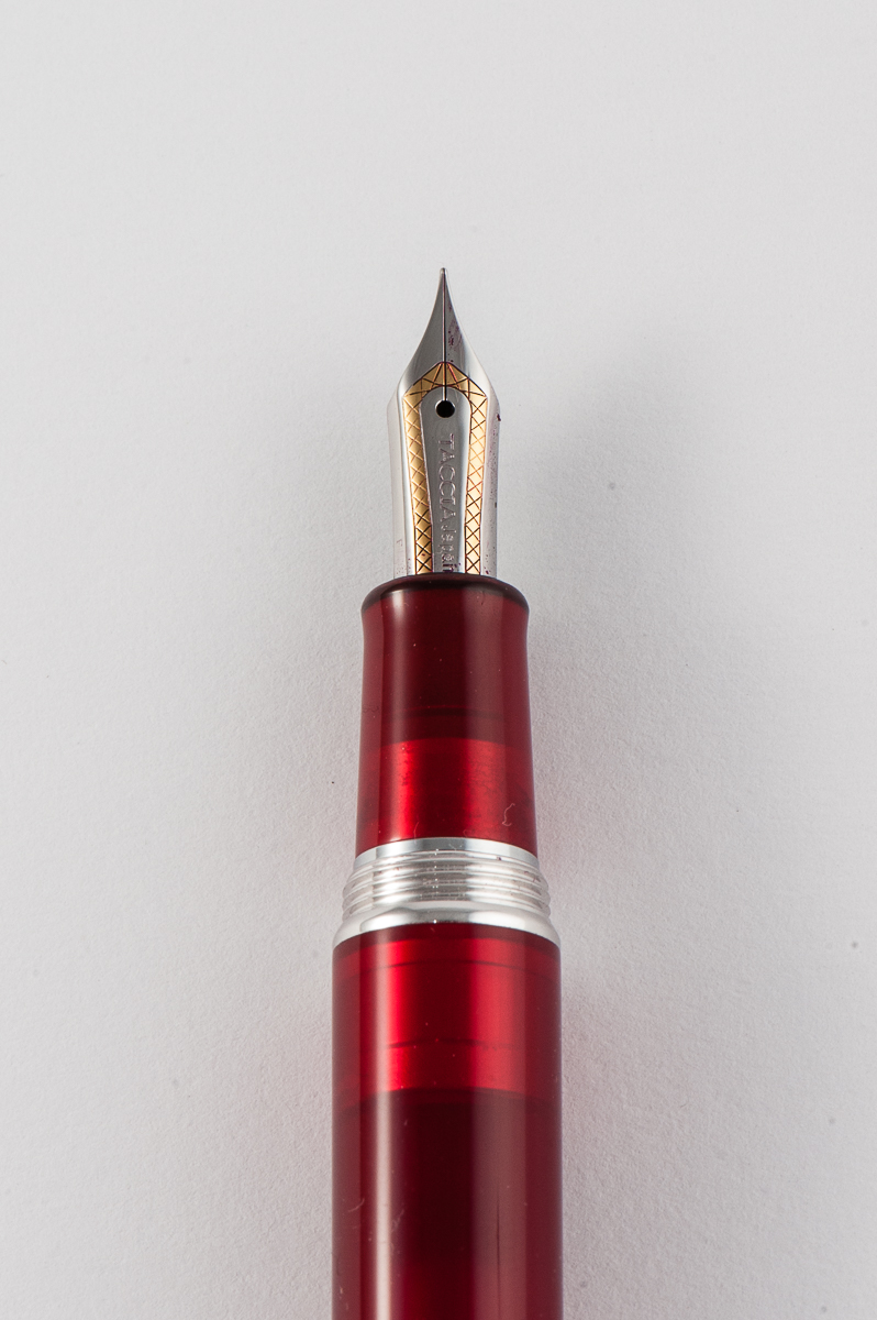
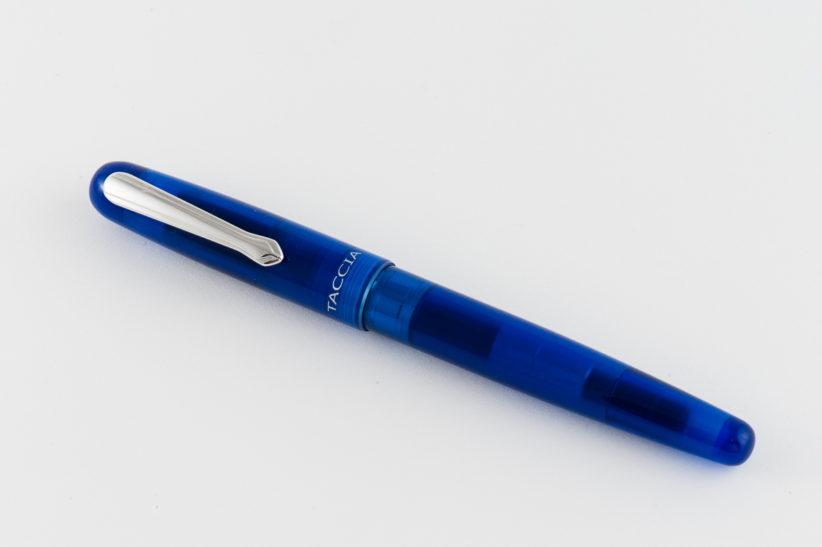
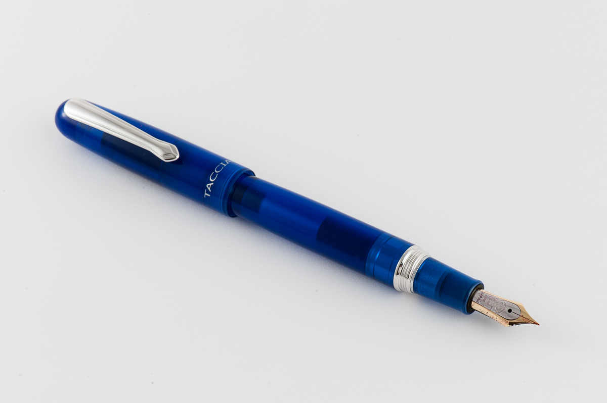
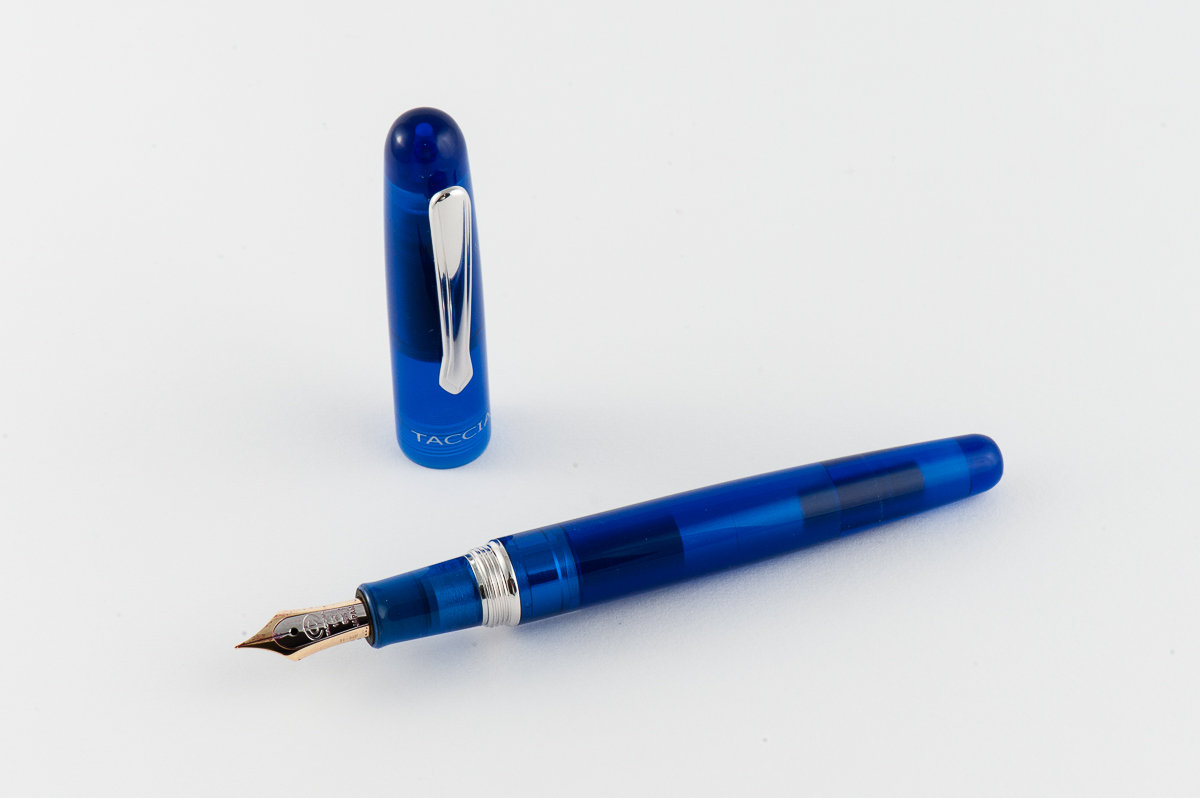
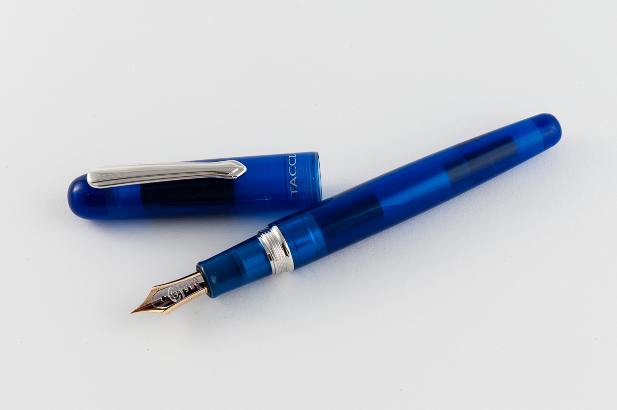
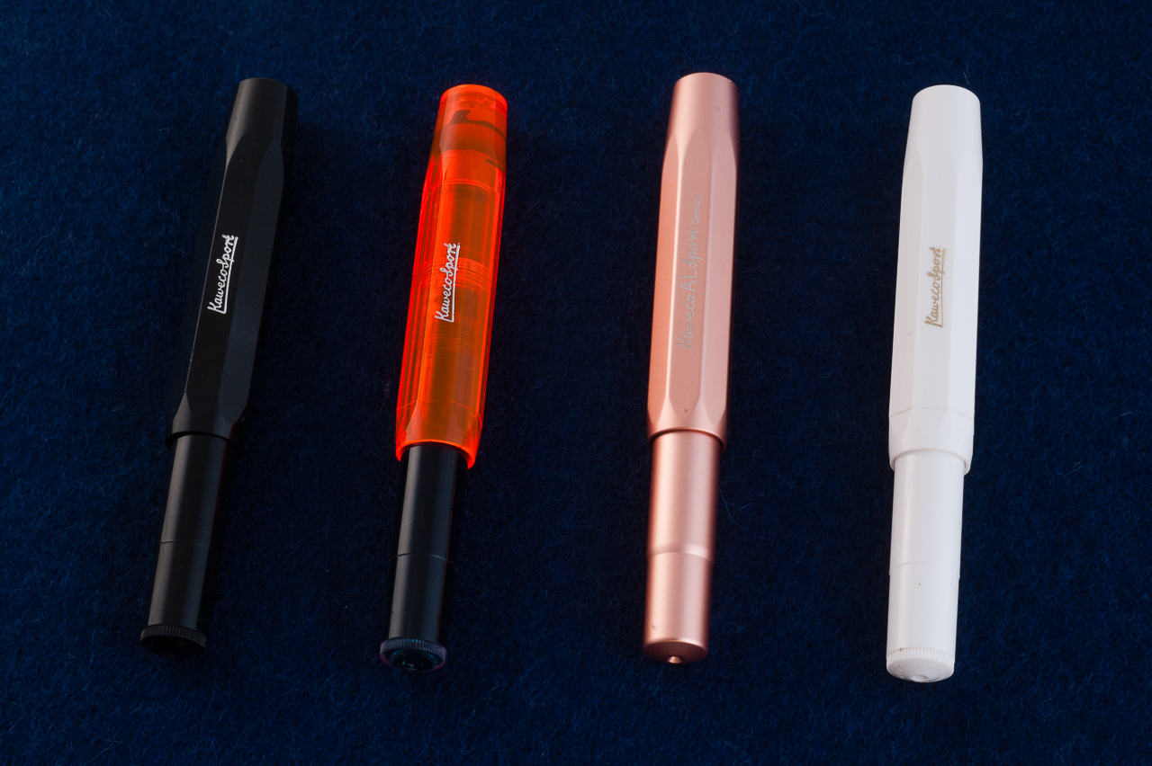
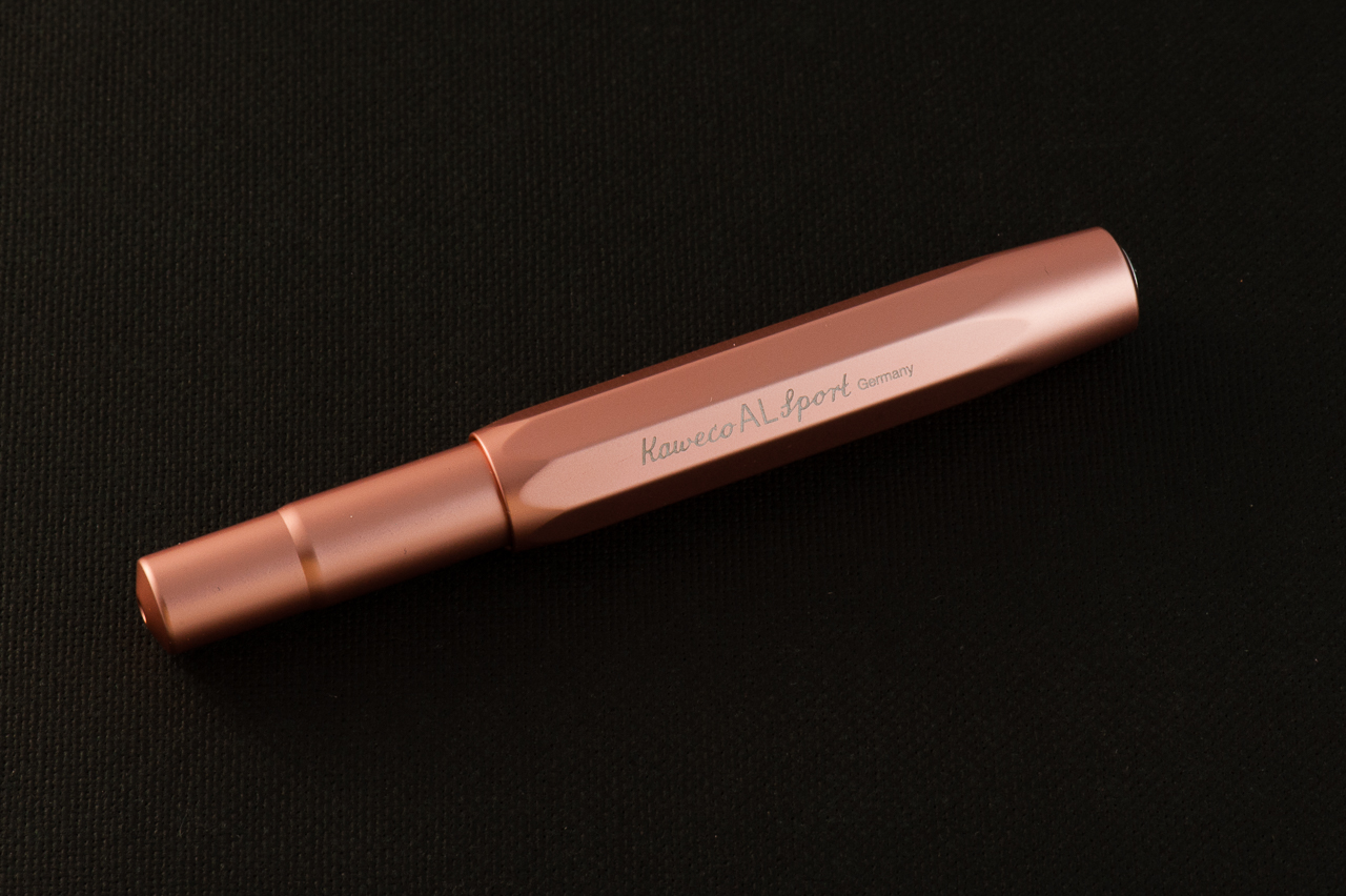
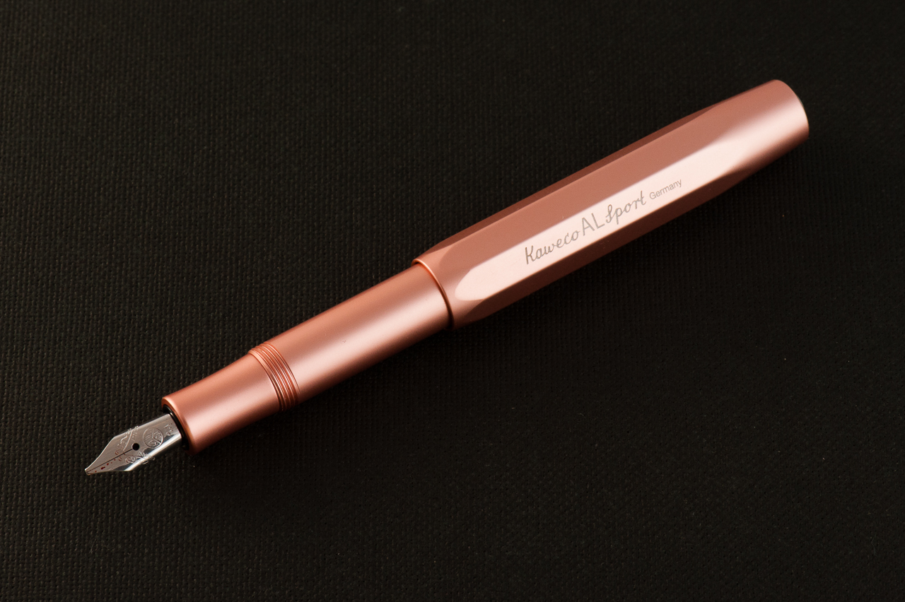
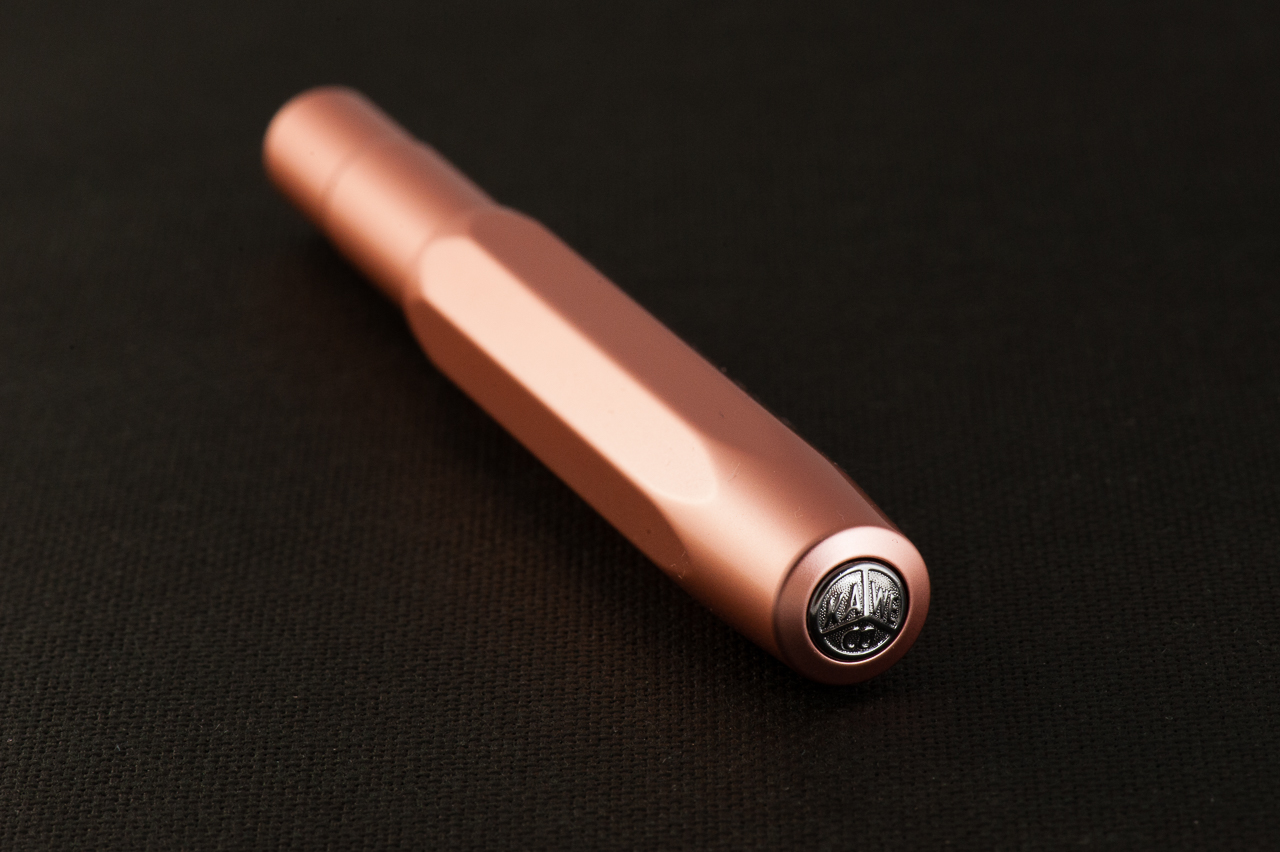
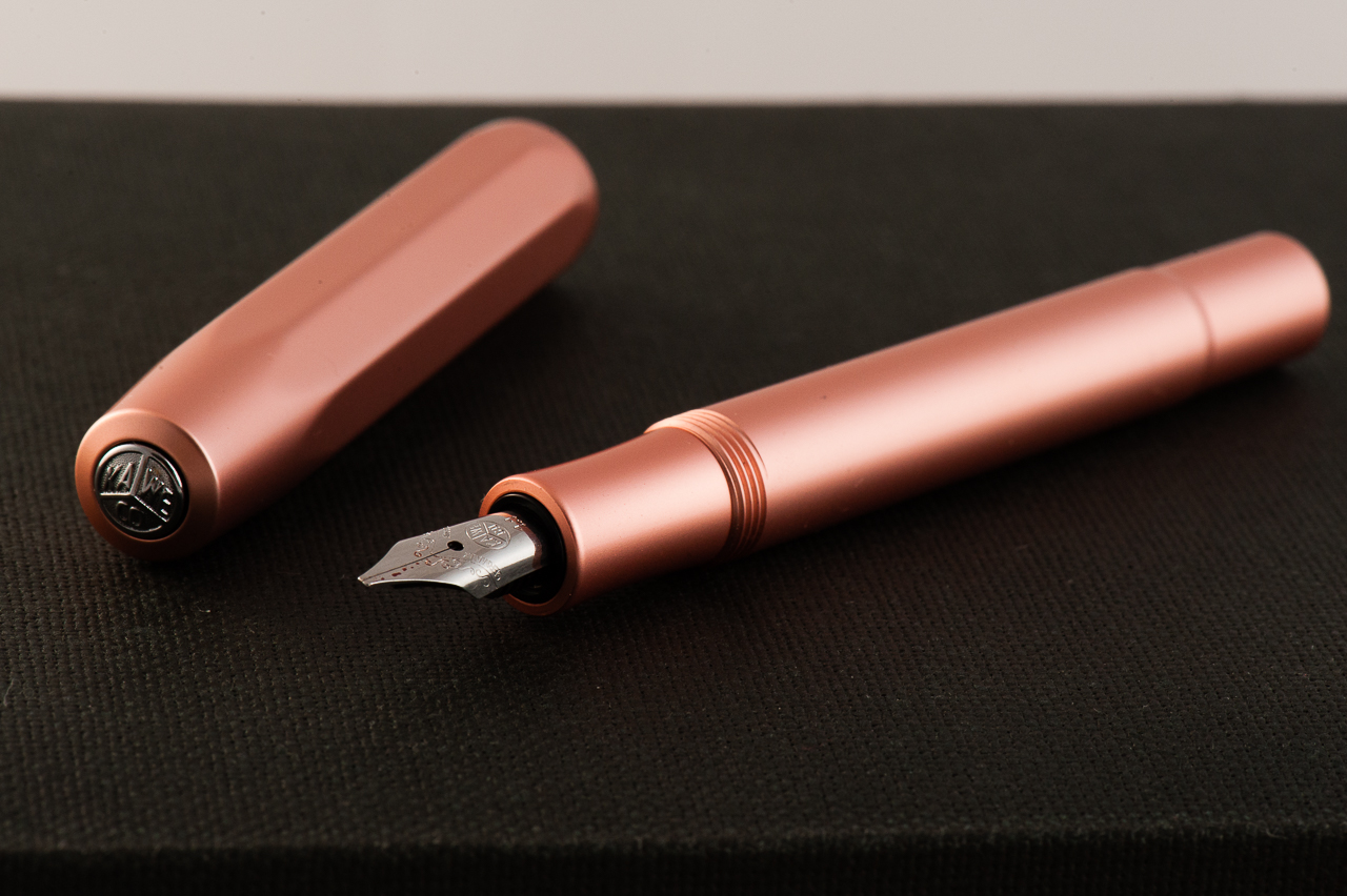
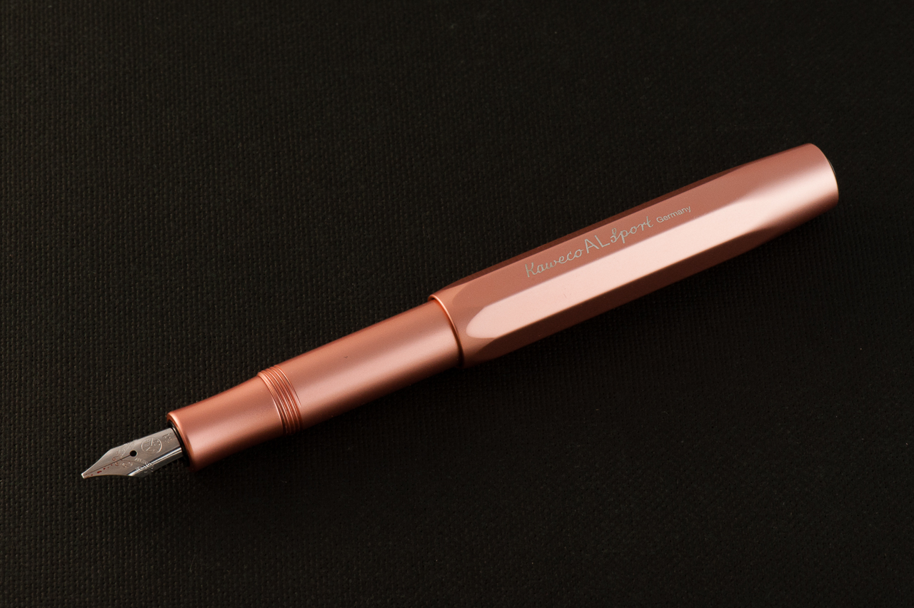
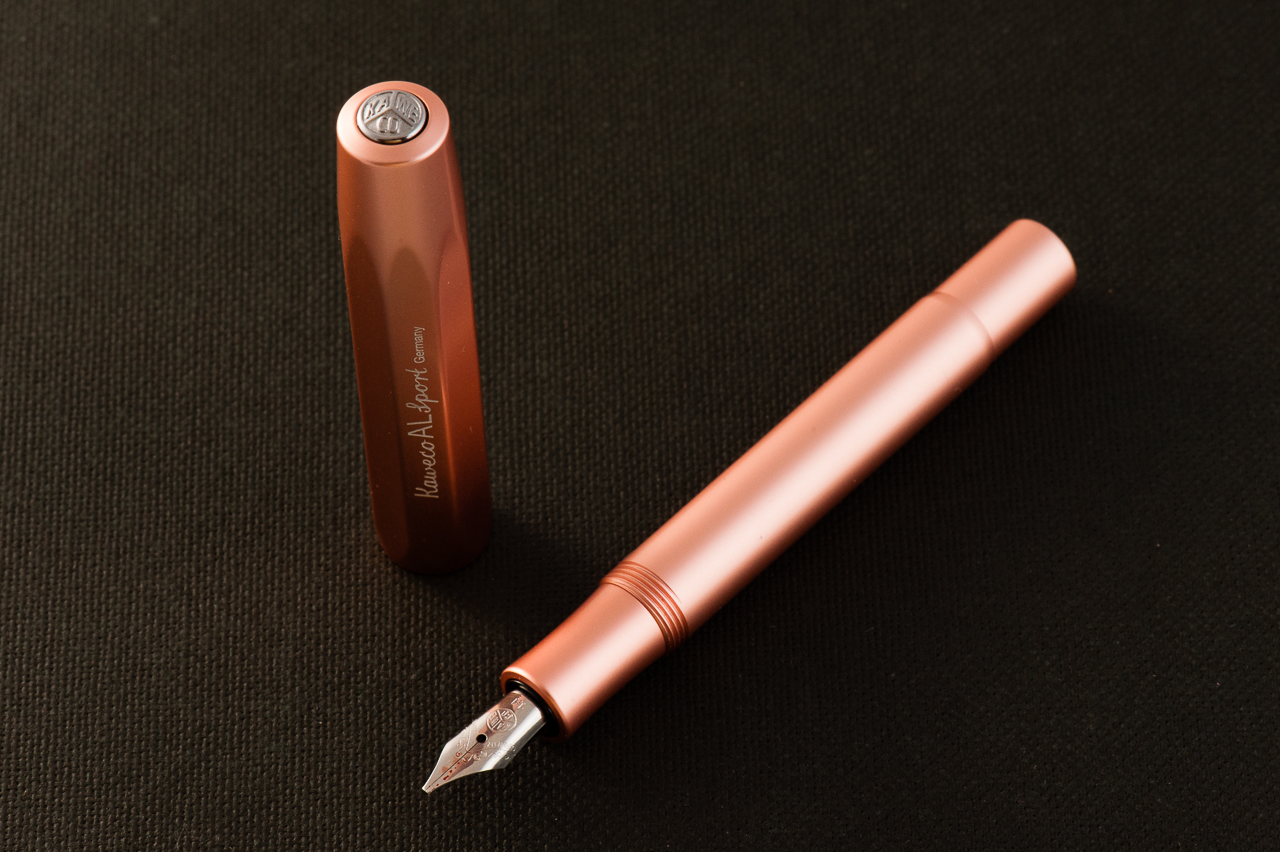
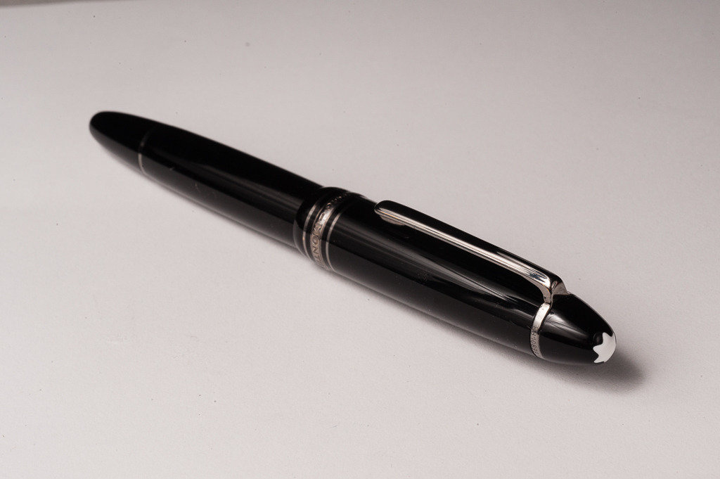
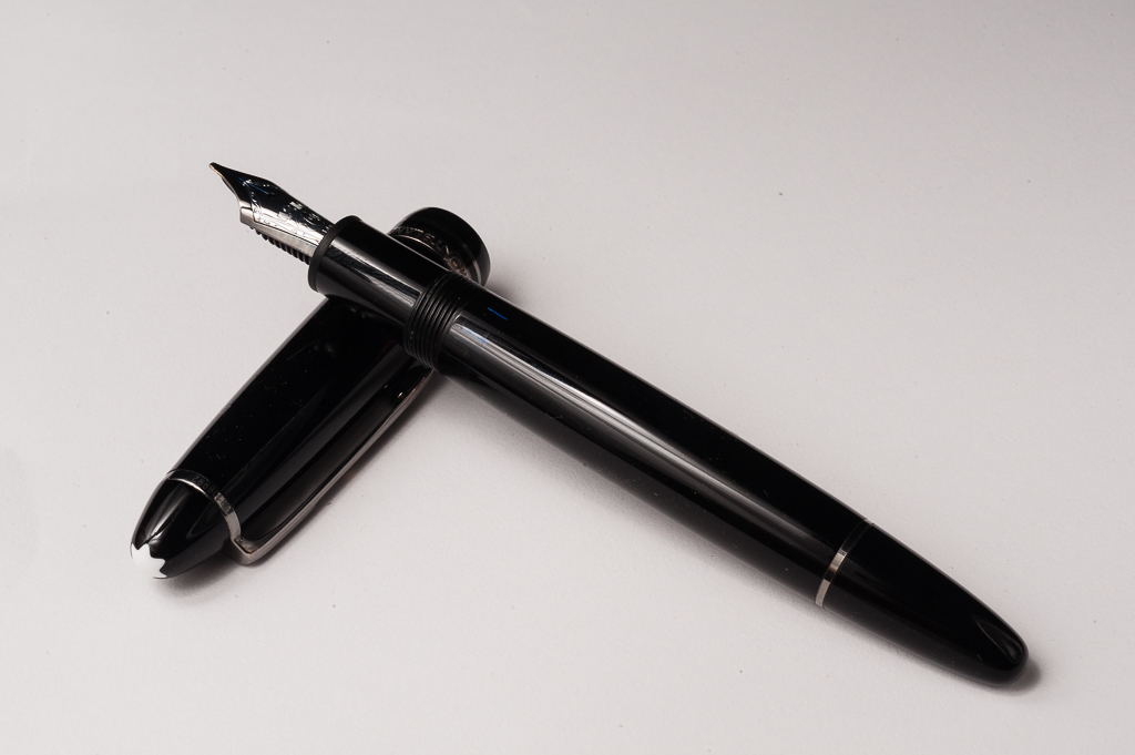
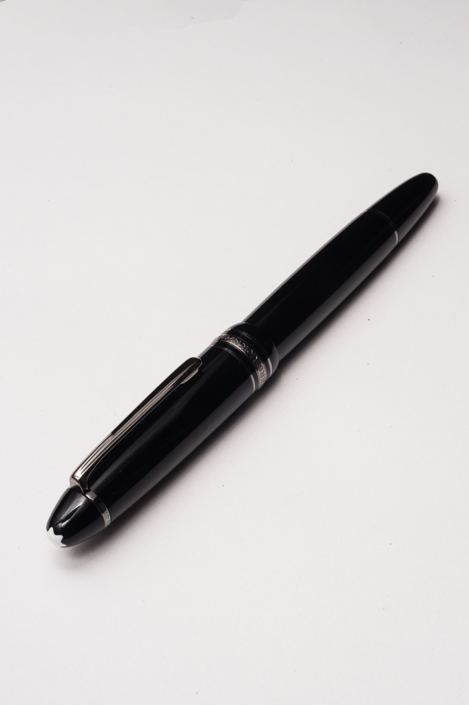
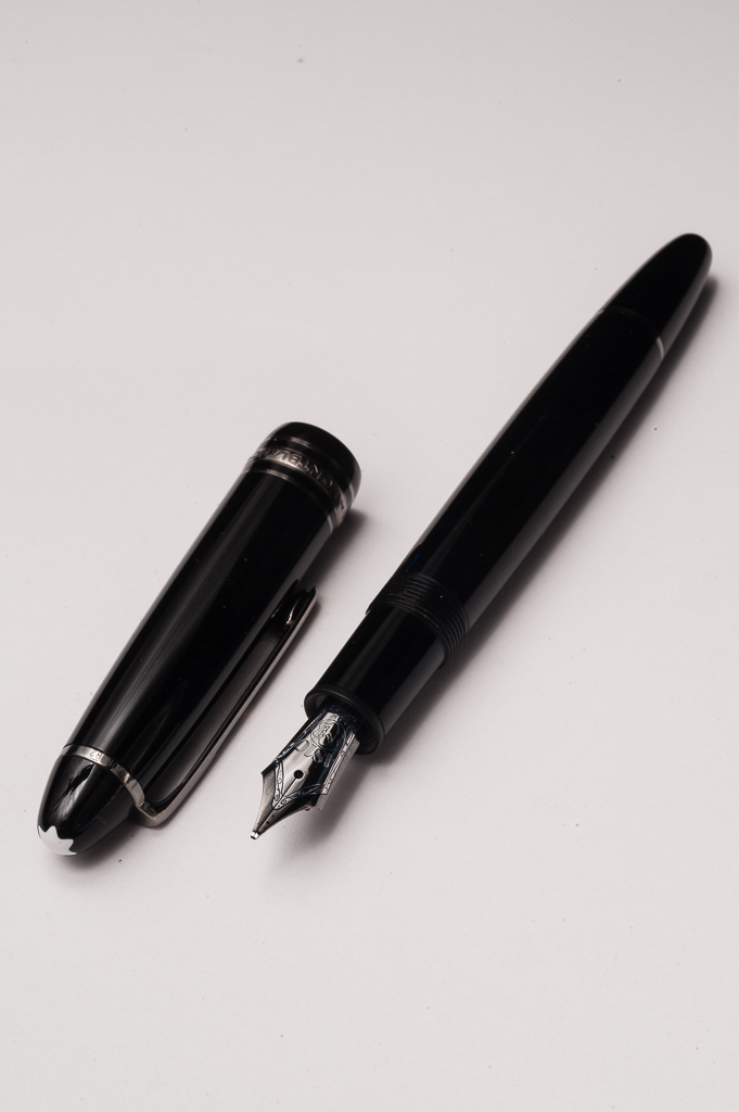
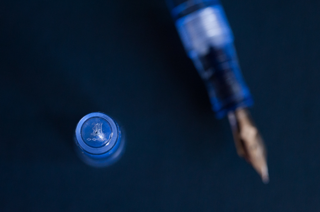
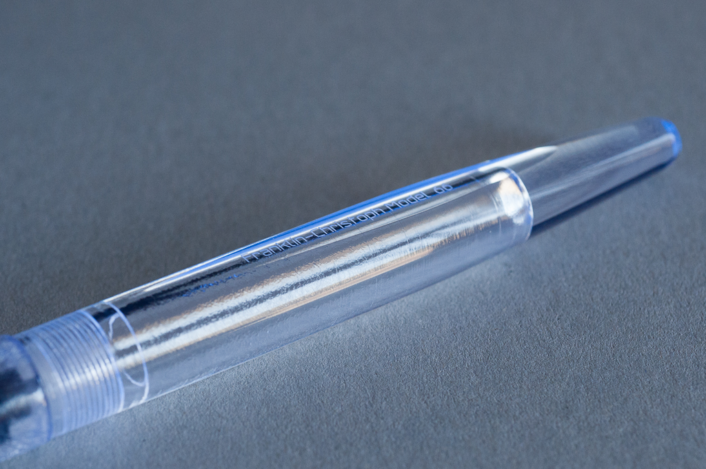
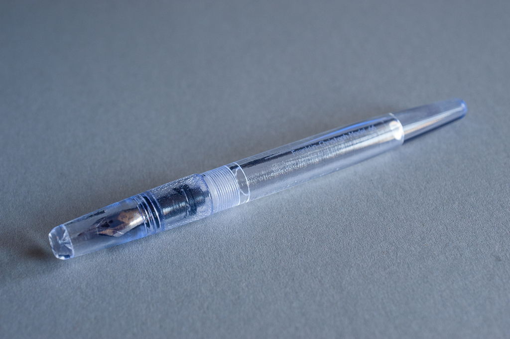
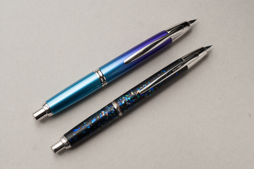
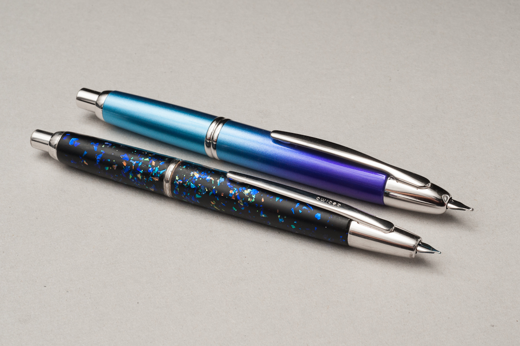
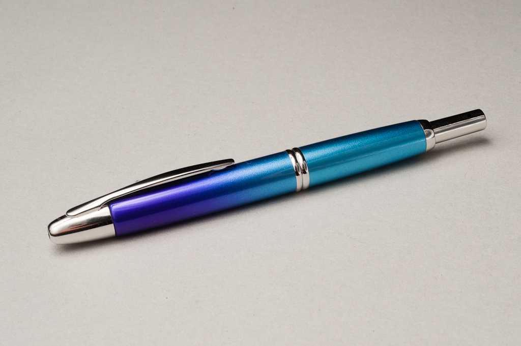
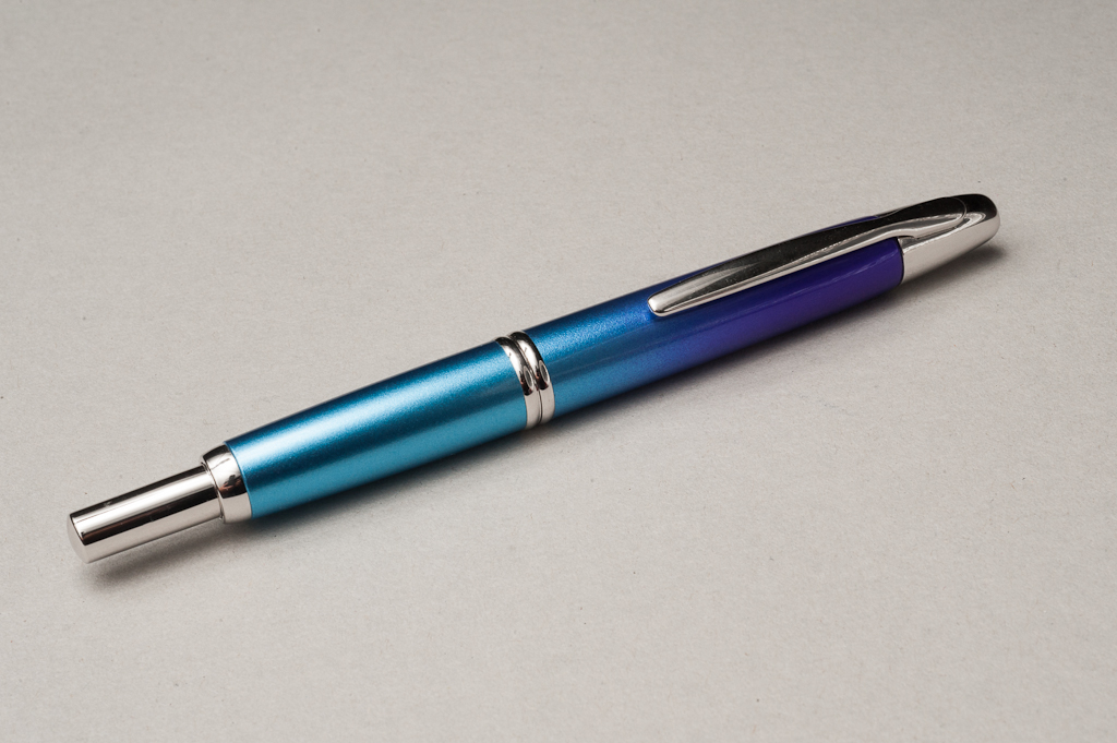
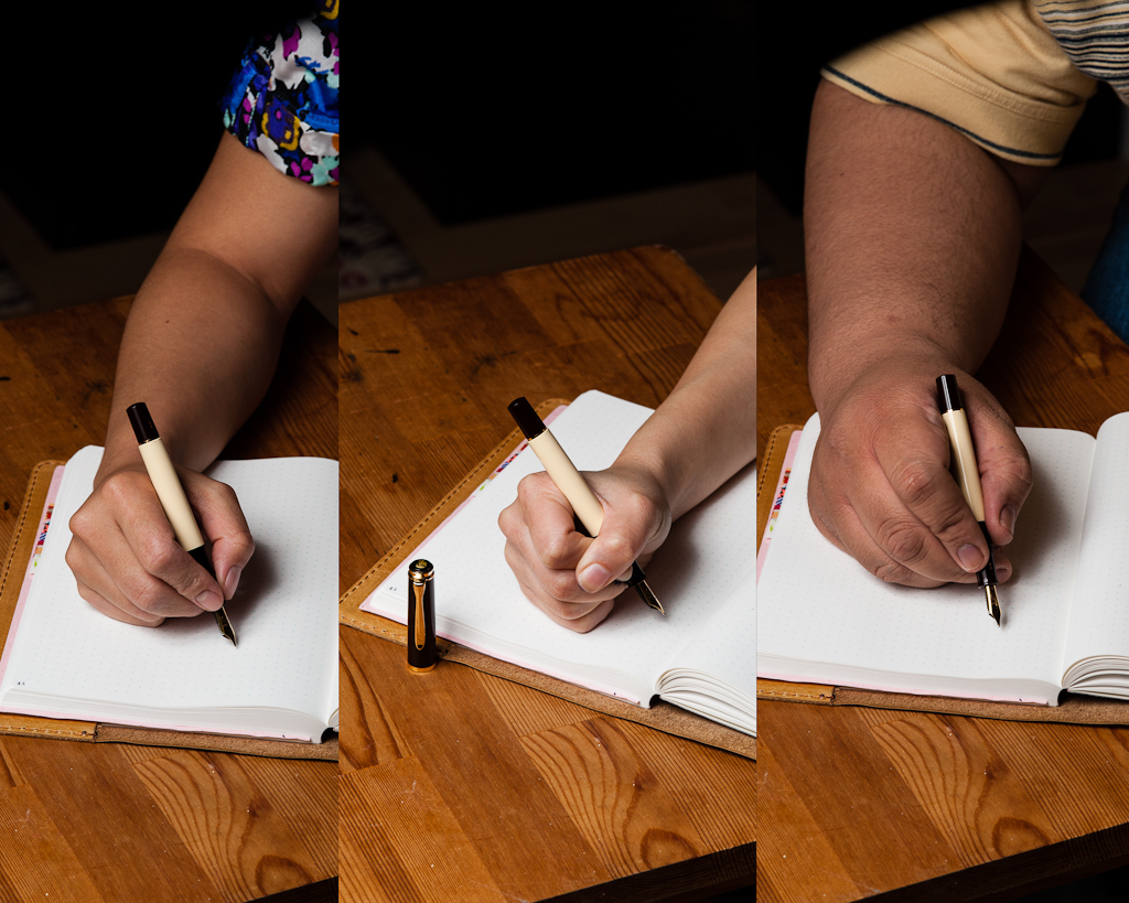
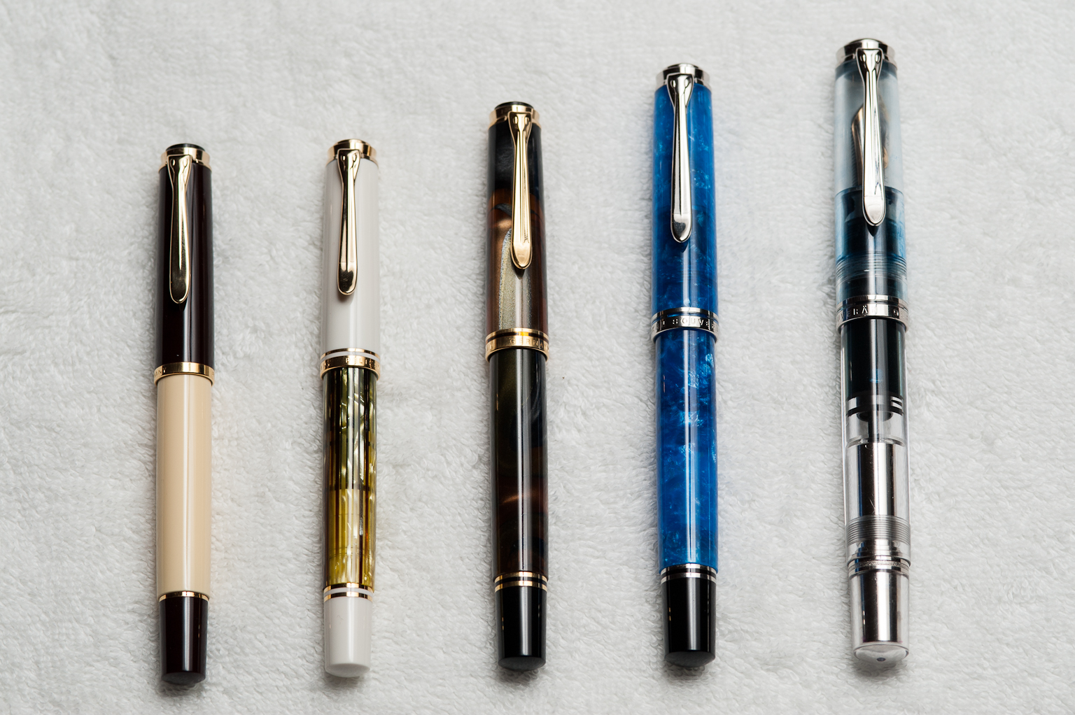
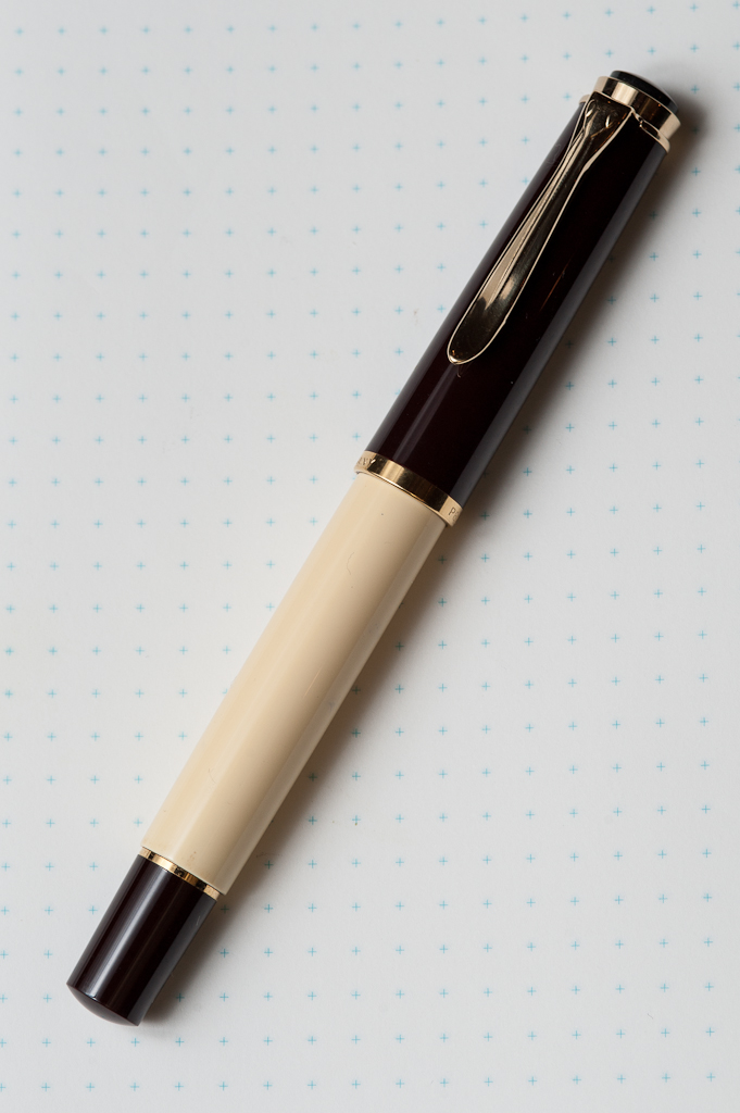
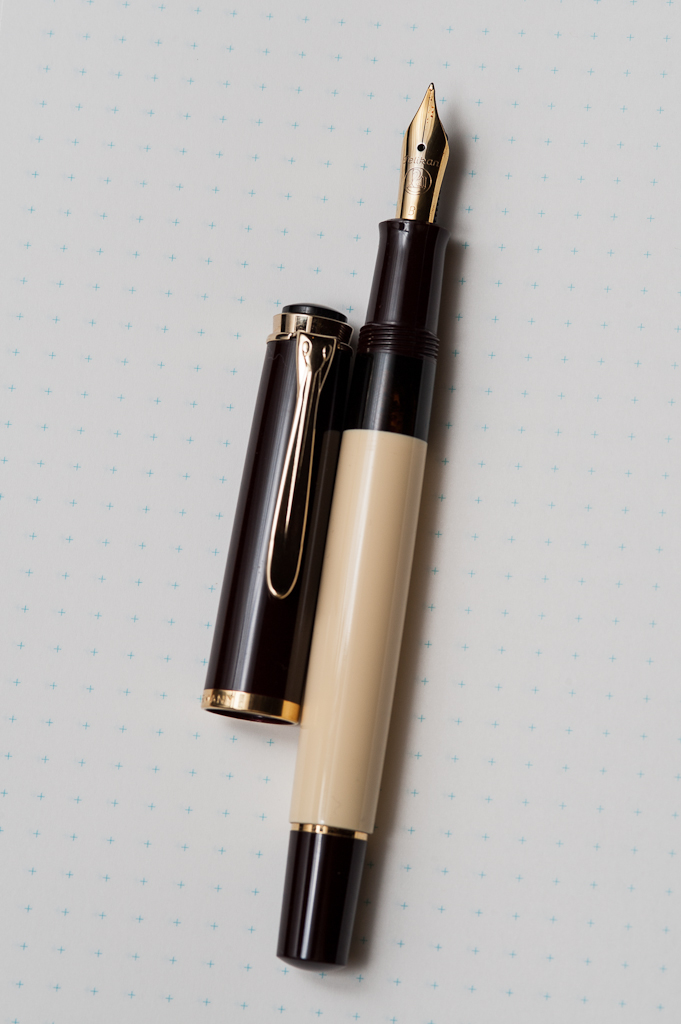
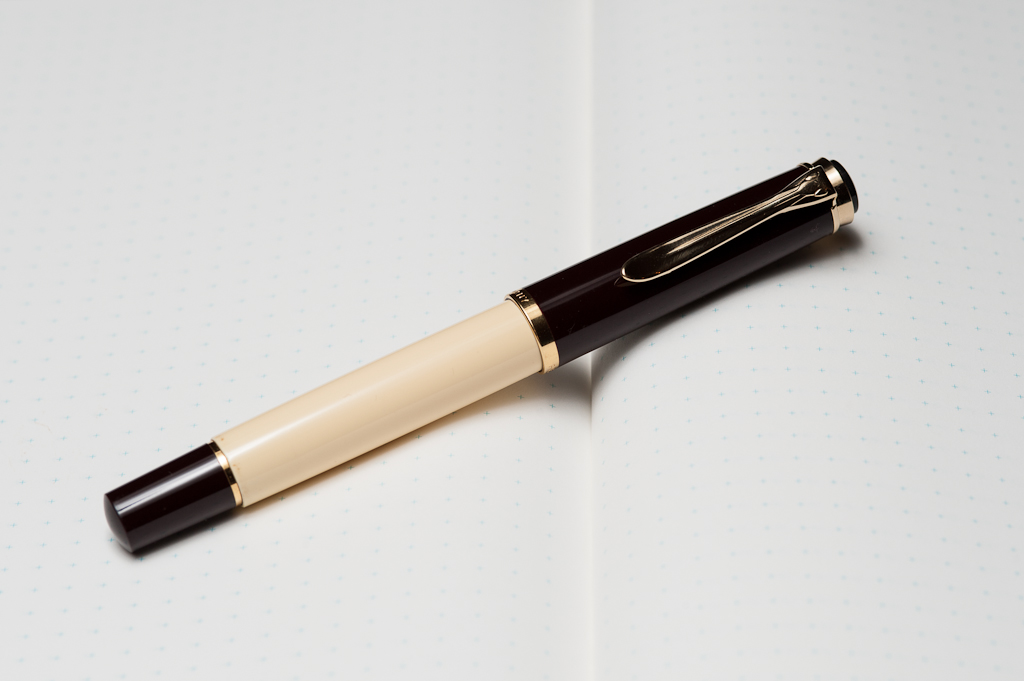
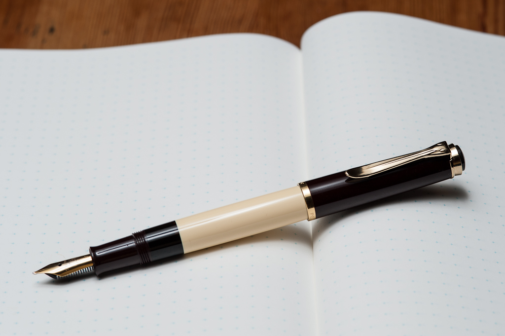
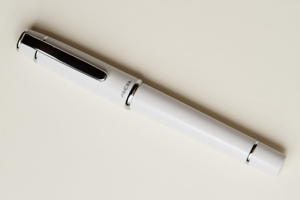
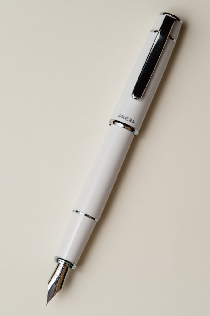
Pen Photos (click to enlarge)