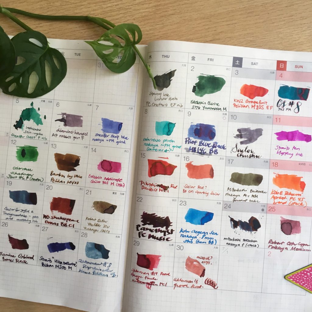
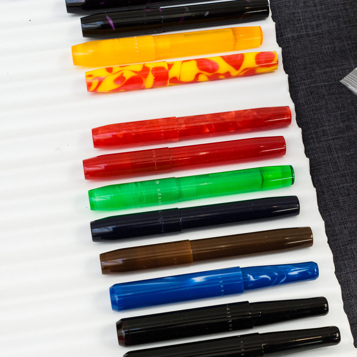
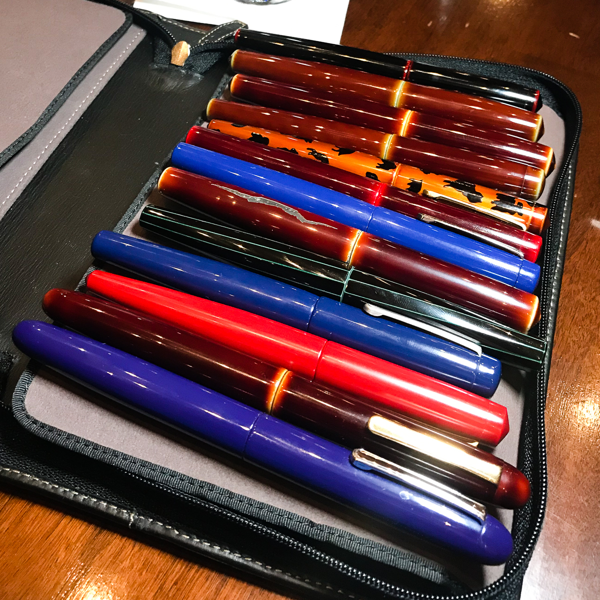
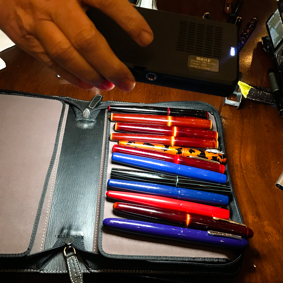
Katherine: I didn’t have a pen and ink pairing for June — I had 30! I kept up with the #30inks30days challenge on Instagram and had quite a lot of fun.I repurposed the (empty) June page from my 2017 Hobonichi to track my progress. I own more ink samples than I’d care to admit, and I had a lot of fun trying new ones and revisiting old favorites. I also own more pens than I can use regularly, and this gave me a chance to get some of them inked up and writing!
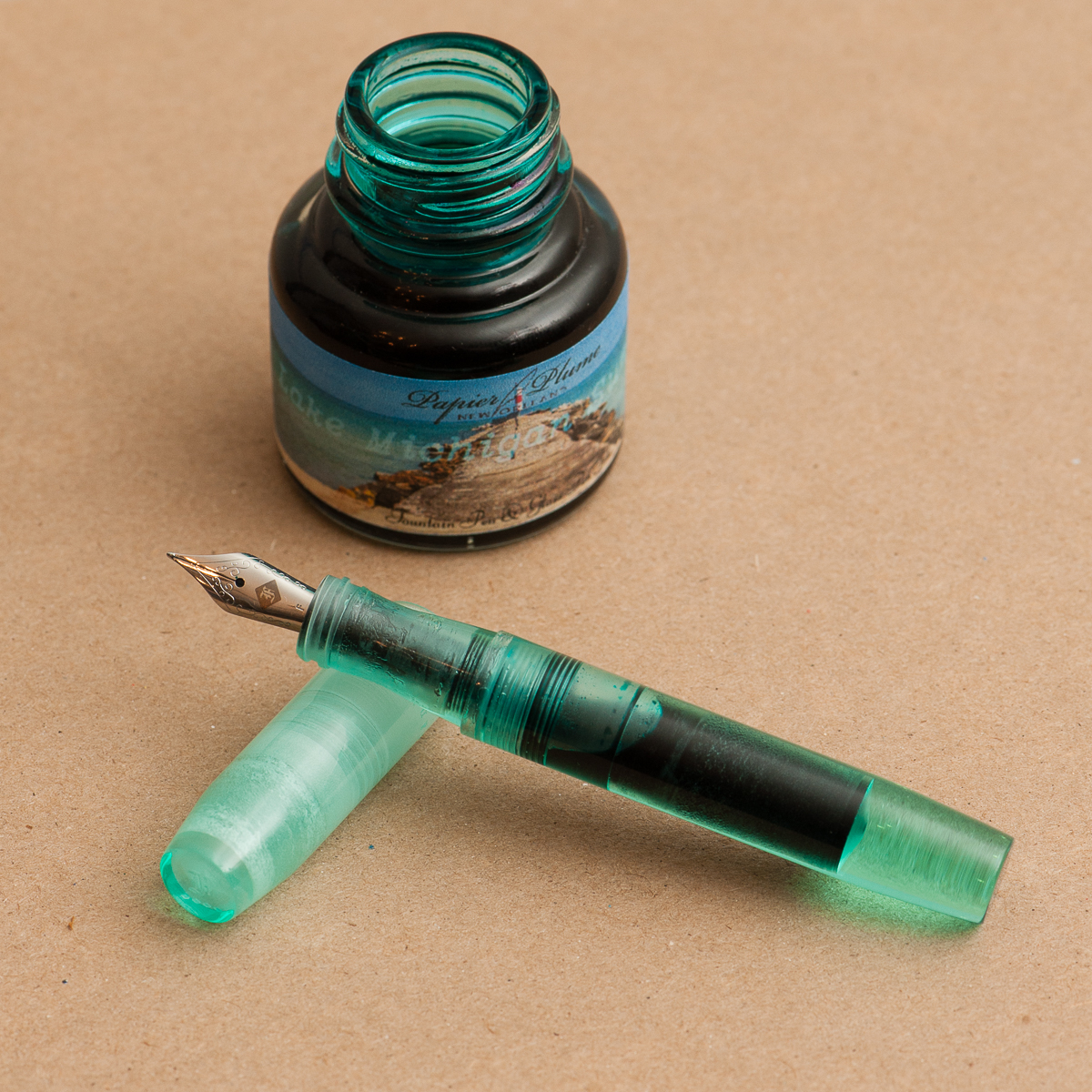
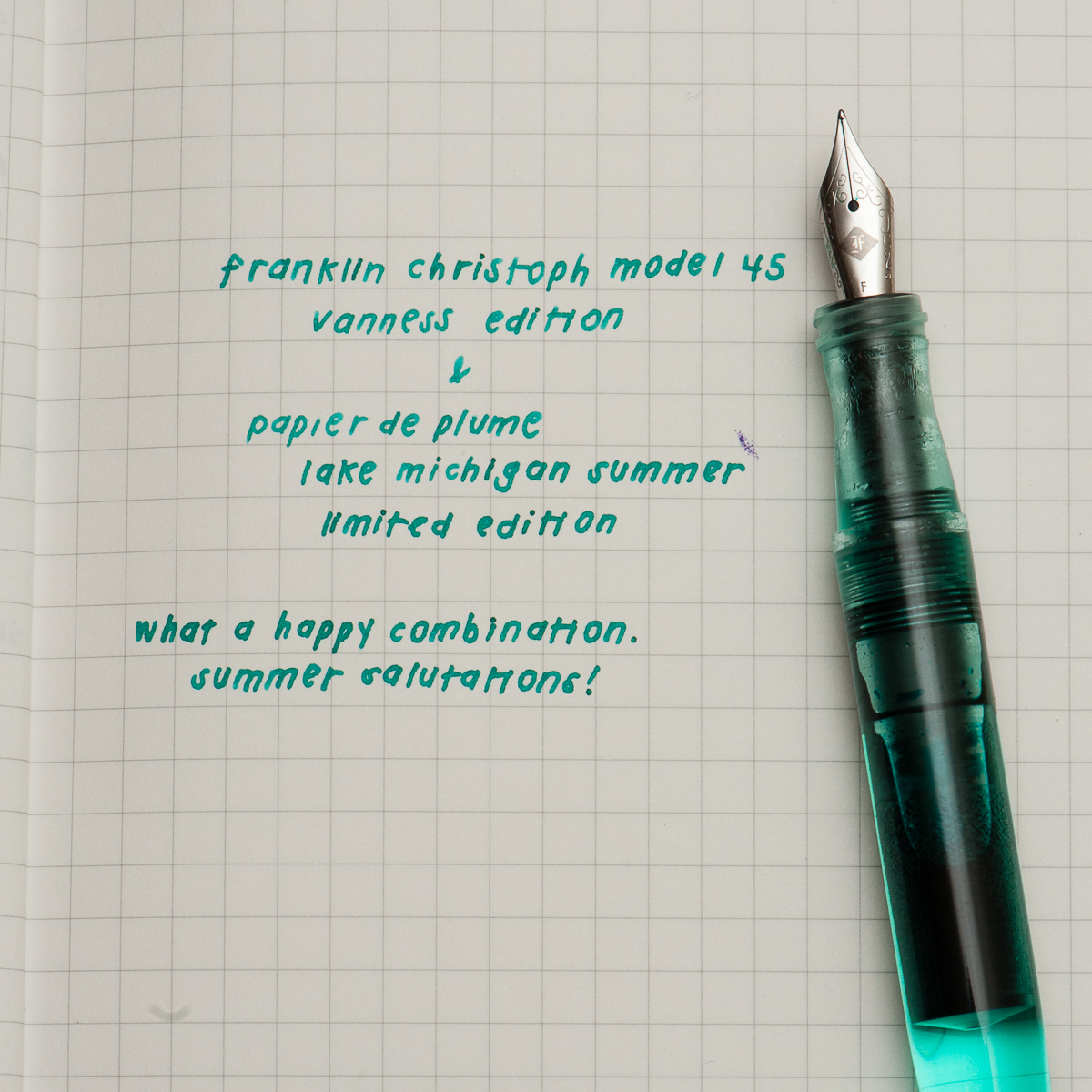
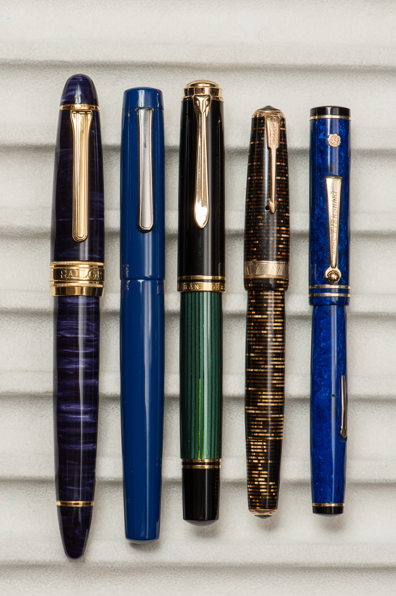
Pam: As luck would have it, ’tis the season to reveal an ink in my stash that I have been hoarding. It has patiently waited for a pen-mate. Thankfully, my minty dreams have come true with the Vanness edition of the Franklin Christoph Model 45 which is the perfect color match to Papier de Plume’s Lake Michigan Summer. The minty color sings of happy summer days as well as the soothing waters of a lake shore in both ink and pen.
I have typically avoided minty inks due to the a possible brightness that detracts from the readability of an ink. I don’t have any problem with this ink. It’s dark and well saturated to make reading a breeze. The comfort of the model 45 rivals that of my Pilot Prera which is practically a daily carry at work. Not only is the ink and pen pairing a dream come true for me; I can’t imagine a better color than the minty Vanness edition Model 45.
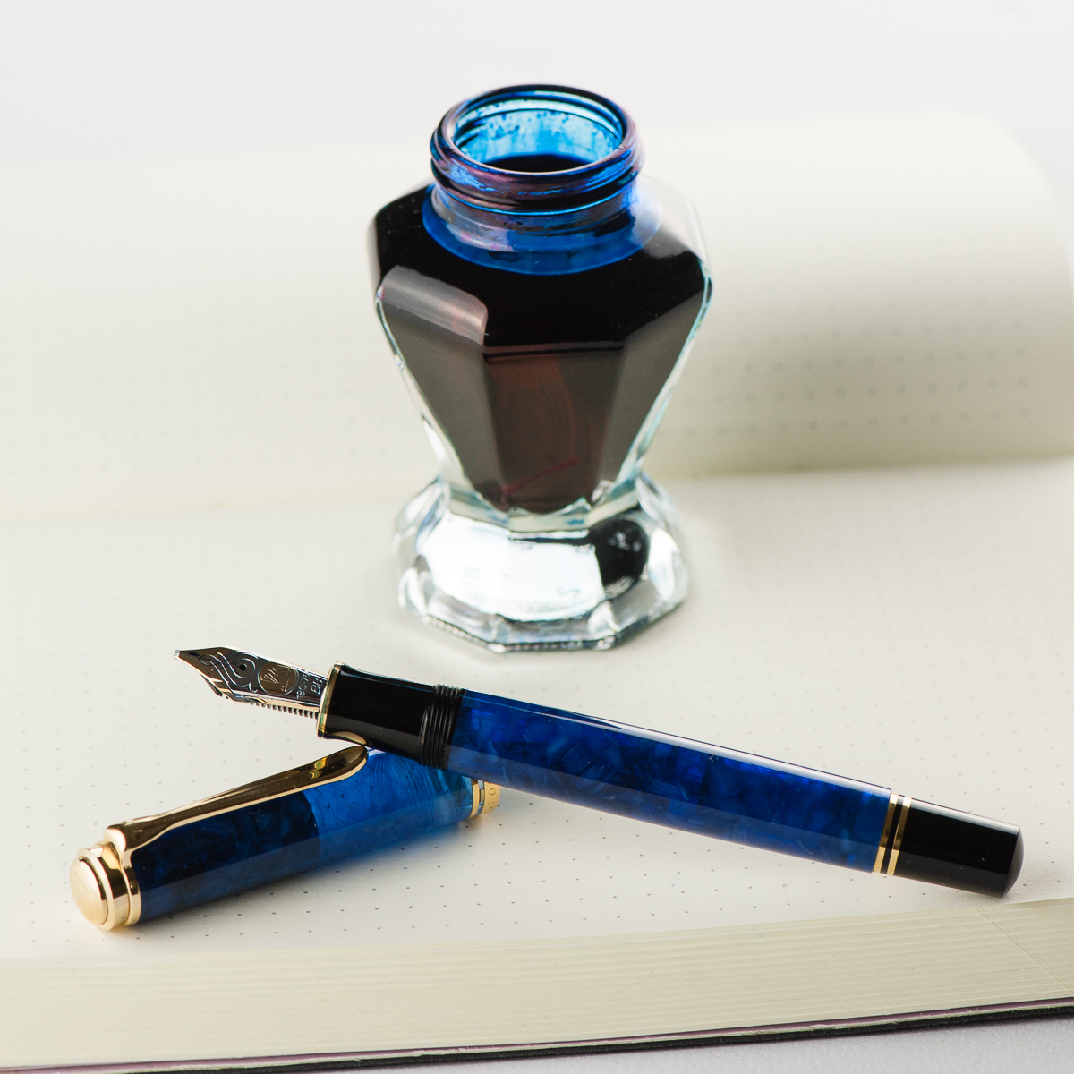
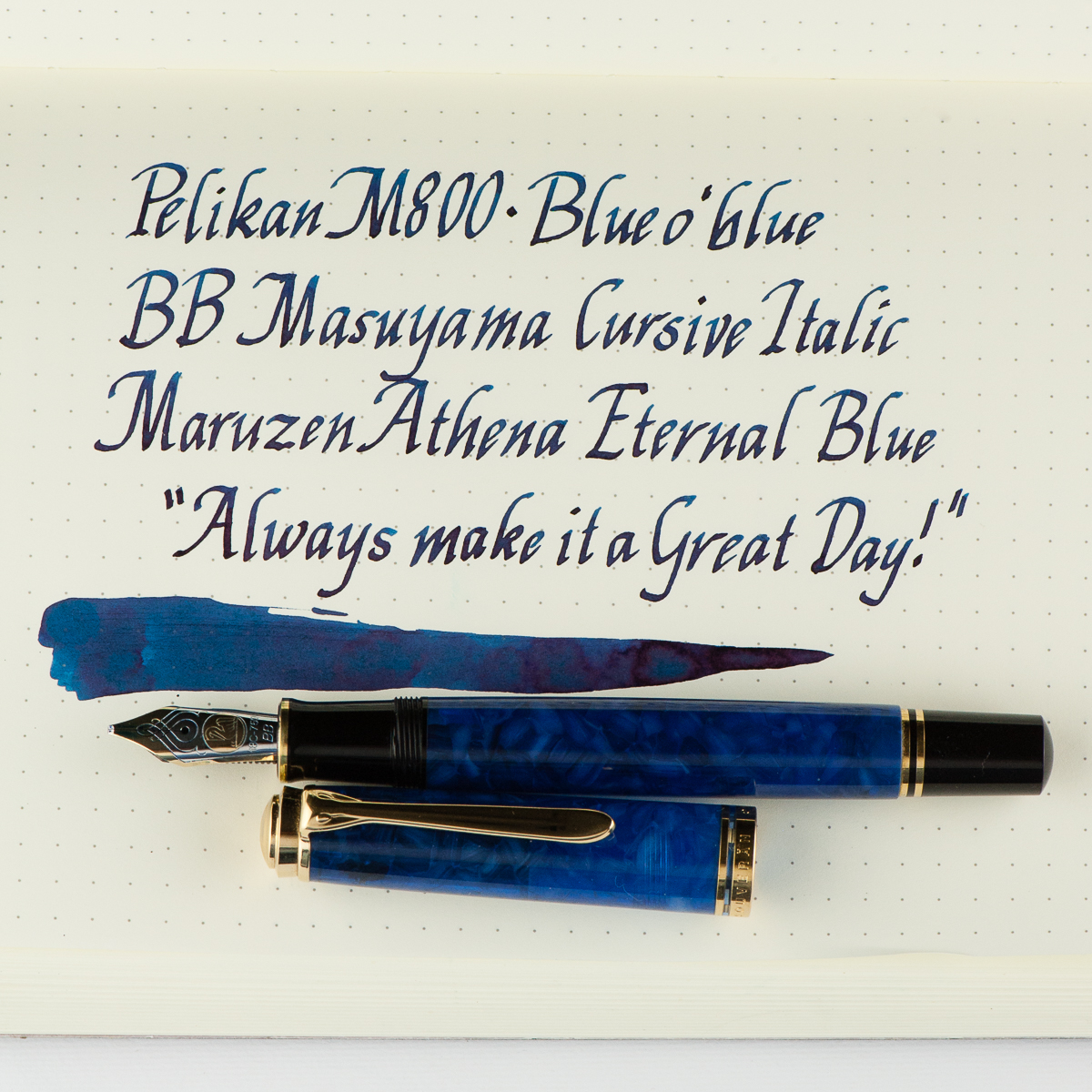
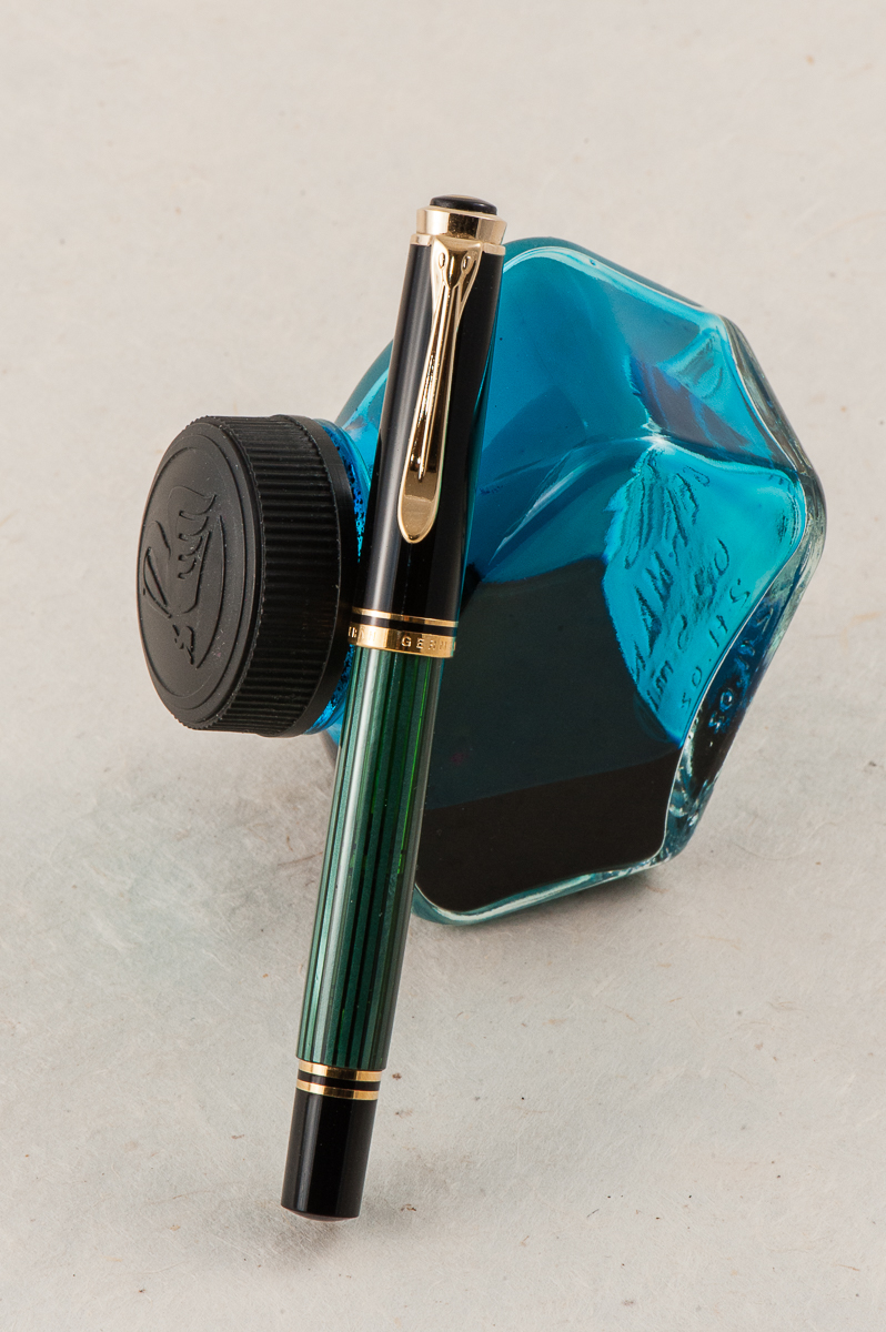
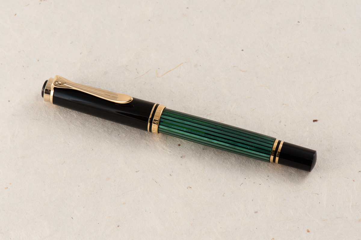
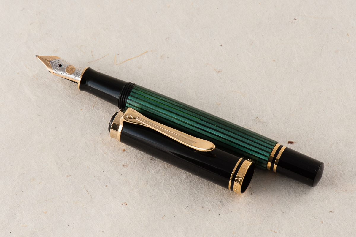
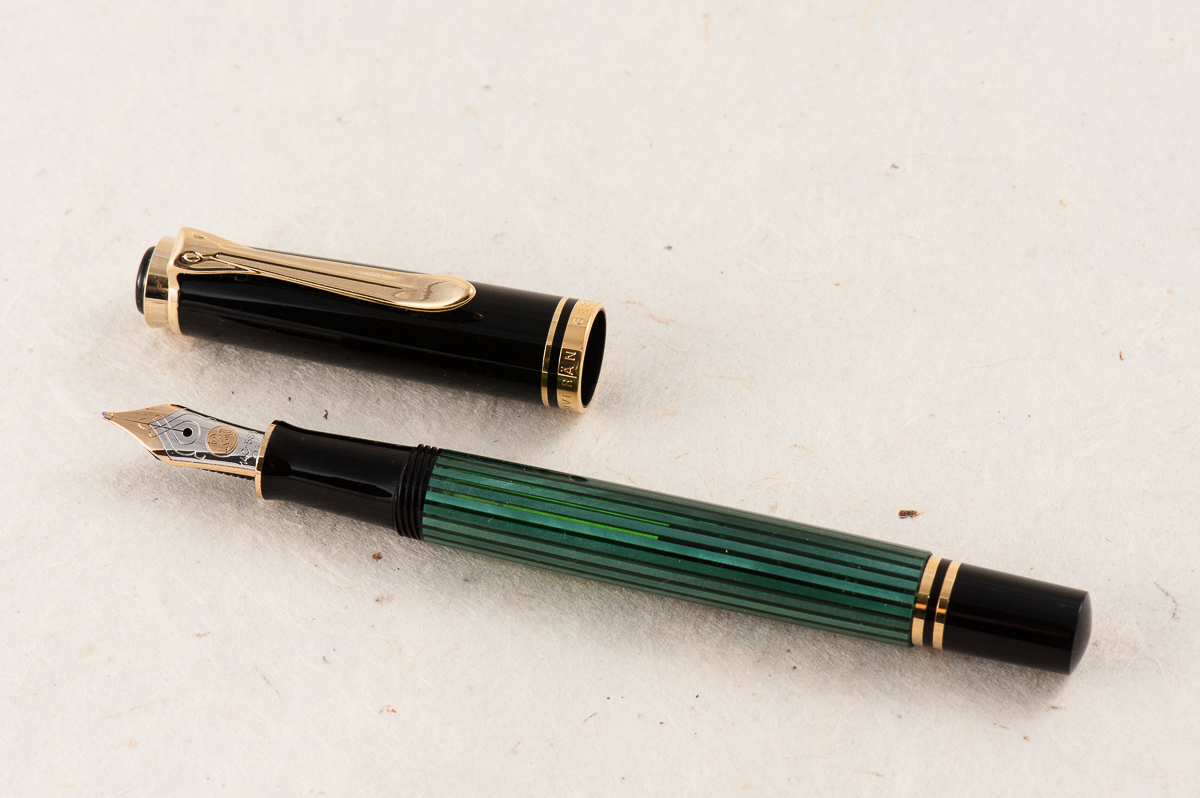
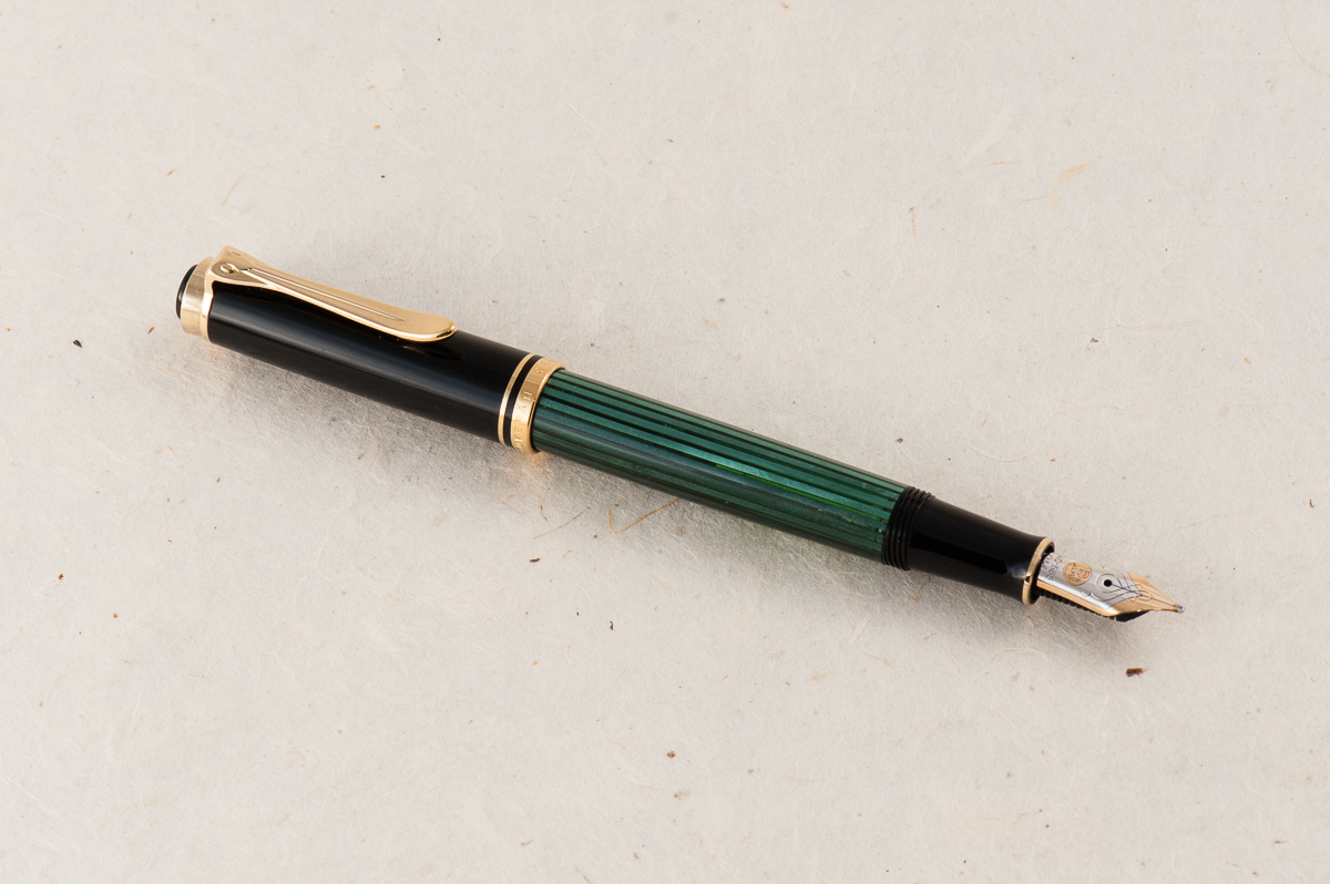
Franz: Hellooo BLUE-tiful! I have had this M800 Blue o’ blue for a while now and figured to ink it up just for practicing and improving my novice italic calligraphy skills. The Blue o’ blue (Blue over blue) was a Special Edition pen by Pelikan in 2010 and I was fortunate to have gotten this pen early in my collecting days. The translucency of this material never ceases to amaze me. #ilovebluepens
I also inked up the M800 Blue o’ blue to match with the Maruzen Athena Eternal Blue ink that I have been growing to like. The Eternal Blue ink has shading that mimics the Blue o’ blue’s material. The double broad italic nib is a fitting nib for this ink because it helps bring out the shading even more.
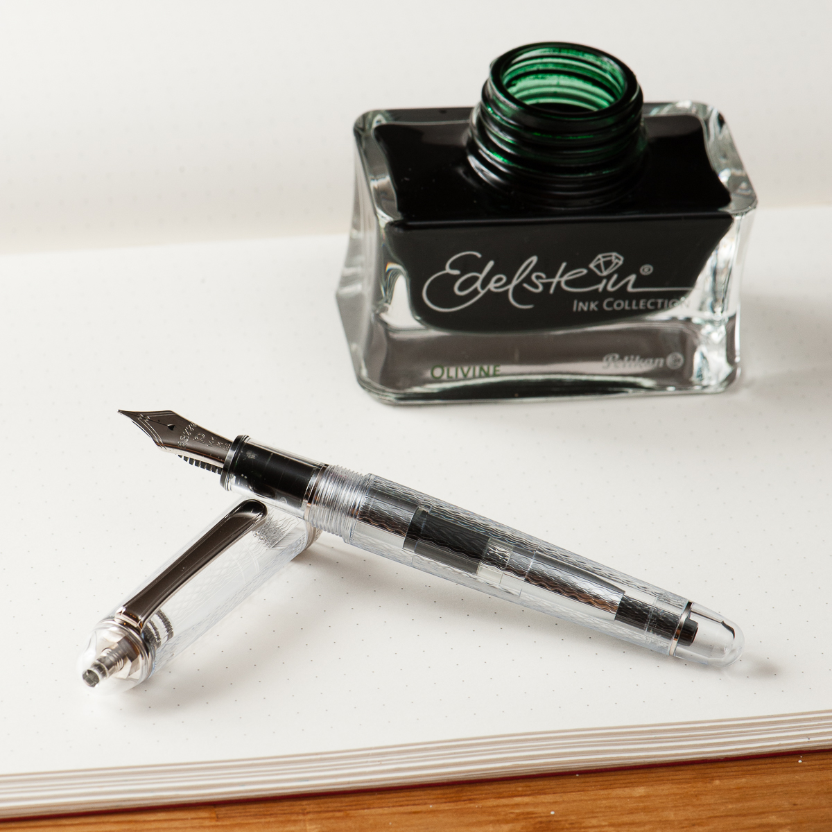
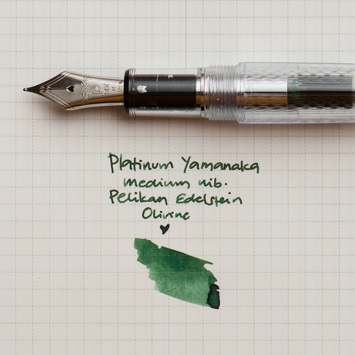
Katherine: I’m another year older and (supposedly) another year wiser this year… so I’ve chosen to celebrate with a Platinum 3776 Yamanaka, paired with Edelstein Olivine. I’ve loved the texture on the Yamanaka for a while, and was finally lucky enough to pick one up last month. It sat uninked for a couple weeks while I wanted to find it a wonderful partner (pretty uncommon for me, I usually ink things up immediately!). Franz brought over a bottle of Olivine and it seemed like a perfect match. The deep green reminds me of plants, and the textured transparent body of a terrarium — a perfect pairing for the middle of spring.
Here’s to another year of friendship, adventure and pens. (And maybe a few more plants)
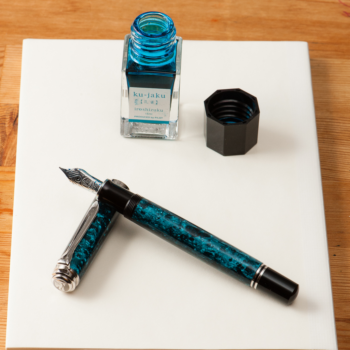
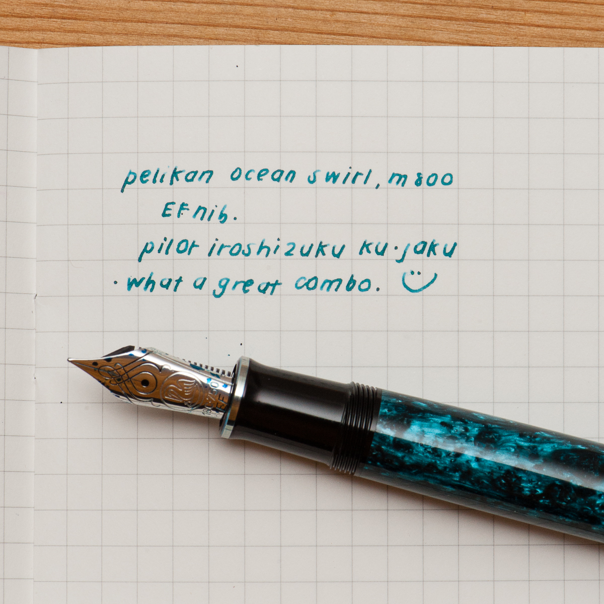
Pam: I had struggled to find the perfect ink color for Pelikan’s Ocean Swirl. The teals were either too blue or too green. I originally attempted Organic Studio’s Walden but found the flow of the Ink to be too wet for an already broad EF.
My last attempt with Pilot Iroshizuku Ku-Jaku was a serendipitous hit. The Pelikan nib is wet enough that the ink color shines though and the line width is within the expected range of an EF. Also, like all well behaved inks, it is much faster drying with little concern for smearing in my Midori’s travelers notebook.
I am glad to return to my first inky loves in the last couple of months. Can’t wait to try more of the “oldies but goodies.” Are there any new ink brands that are comparable to the staples like Pilot and Sailor?
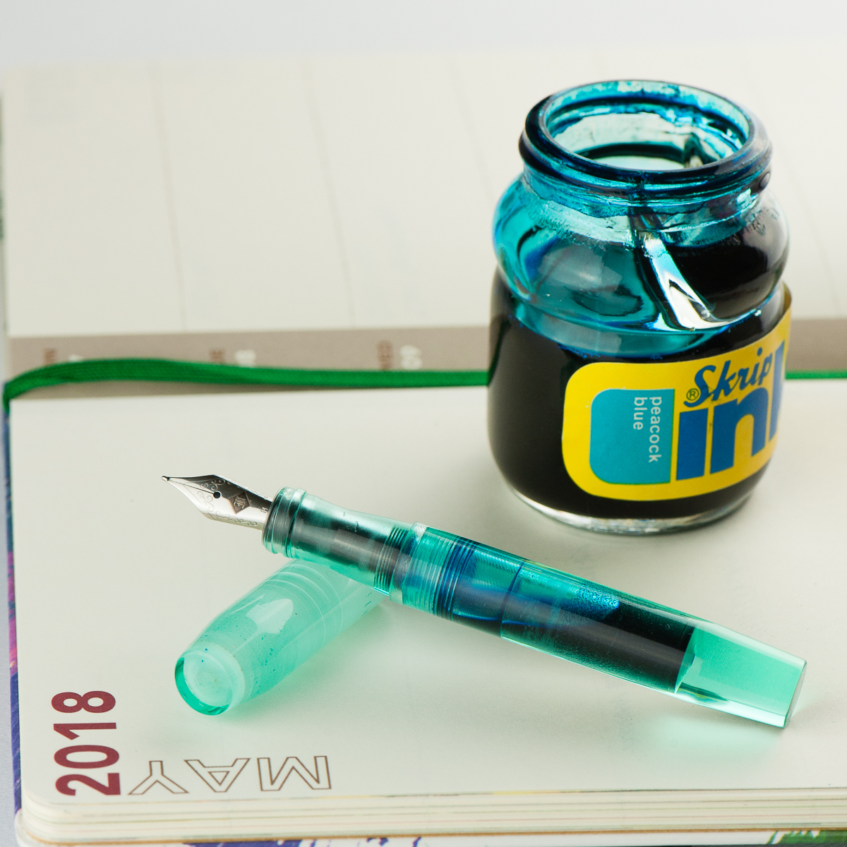
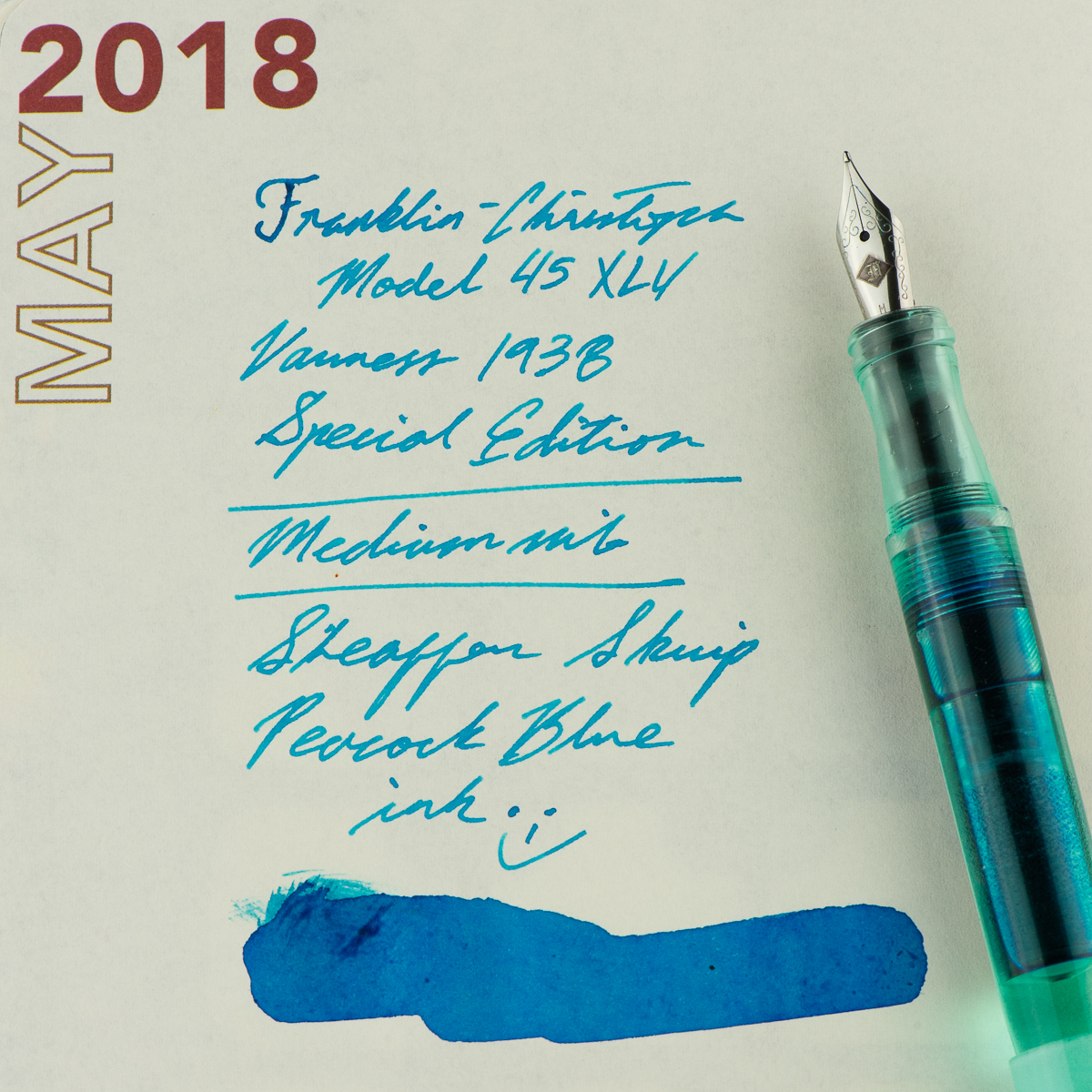
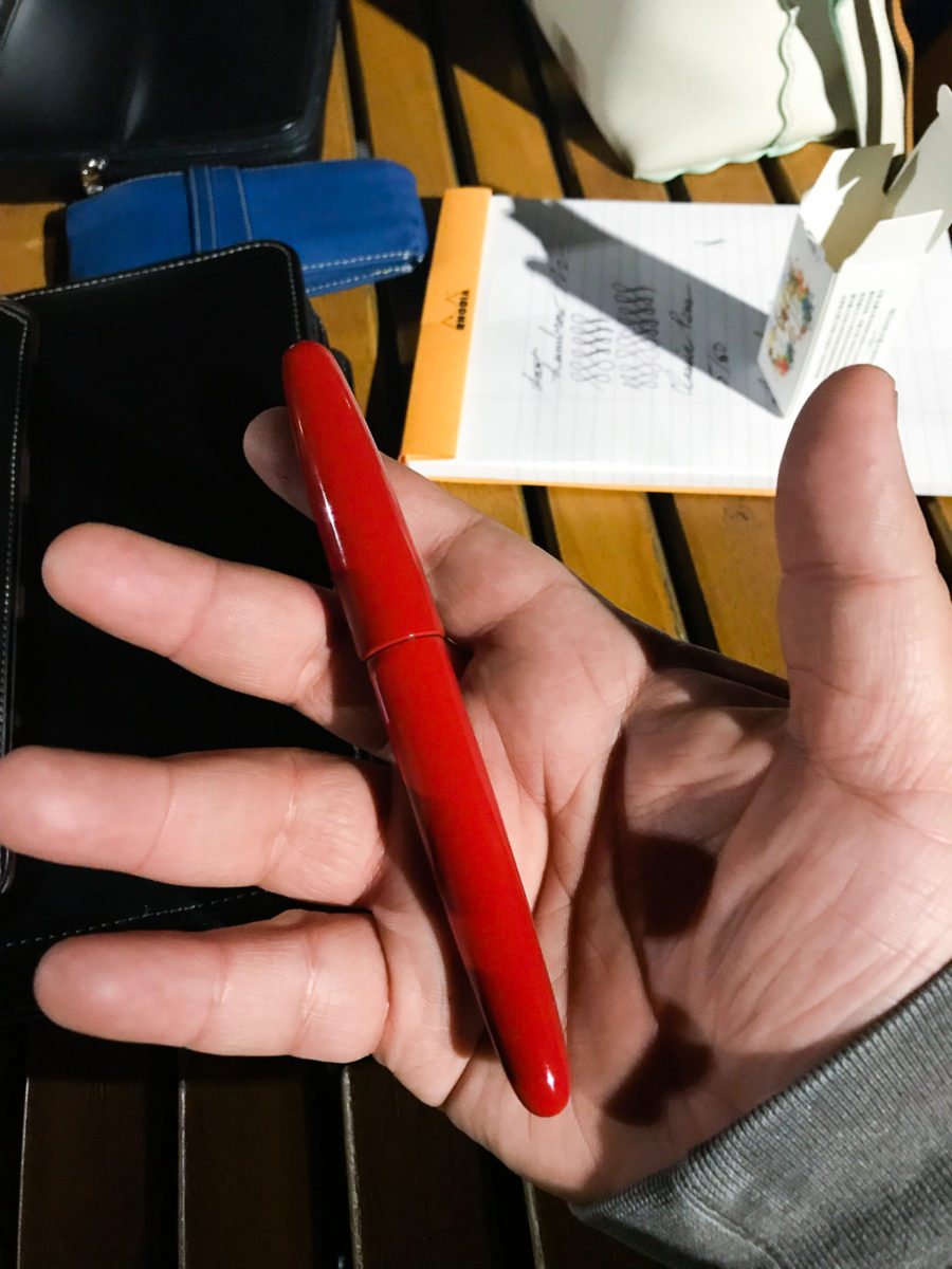
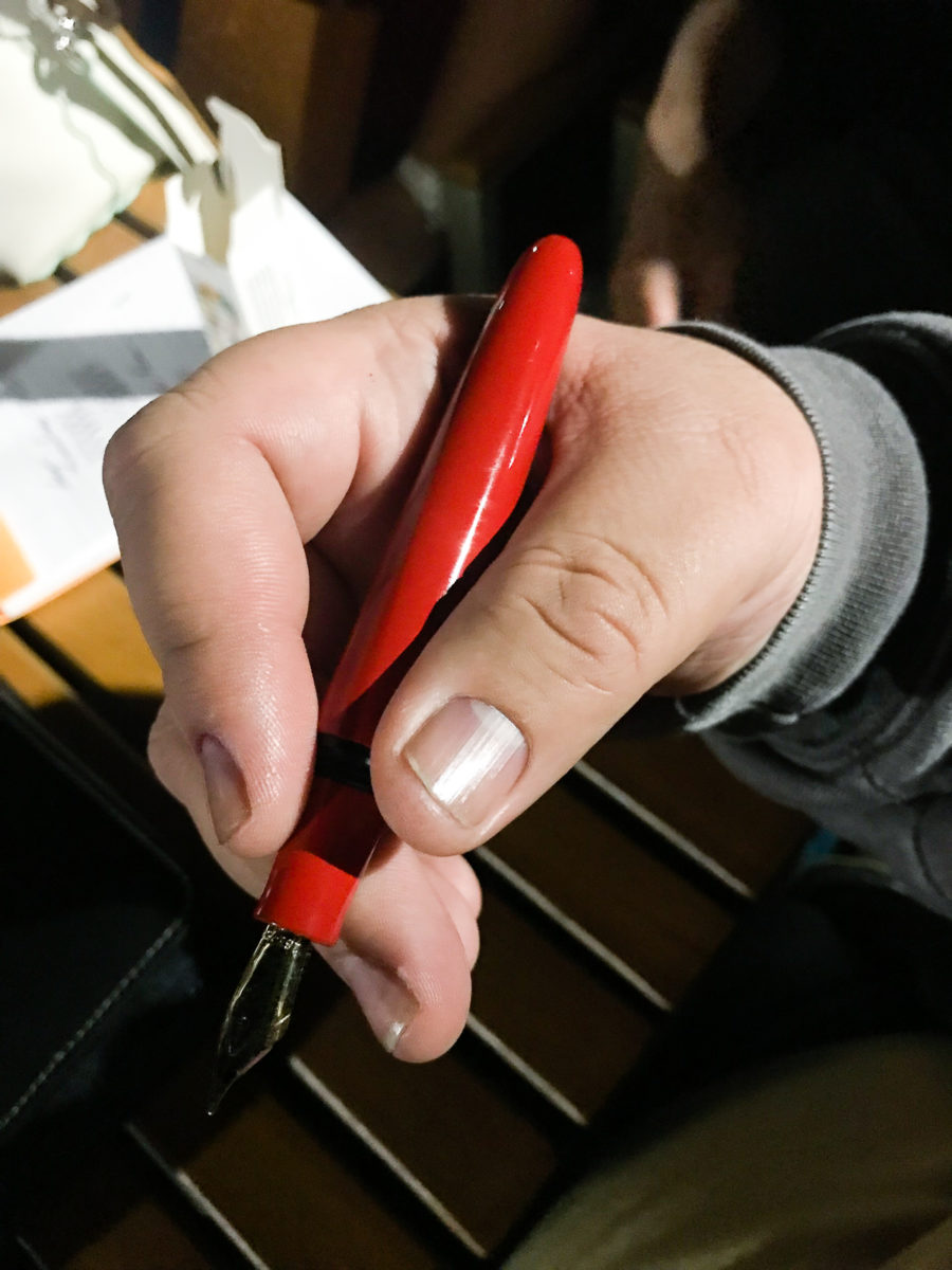
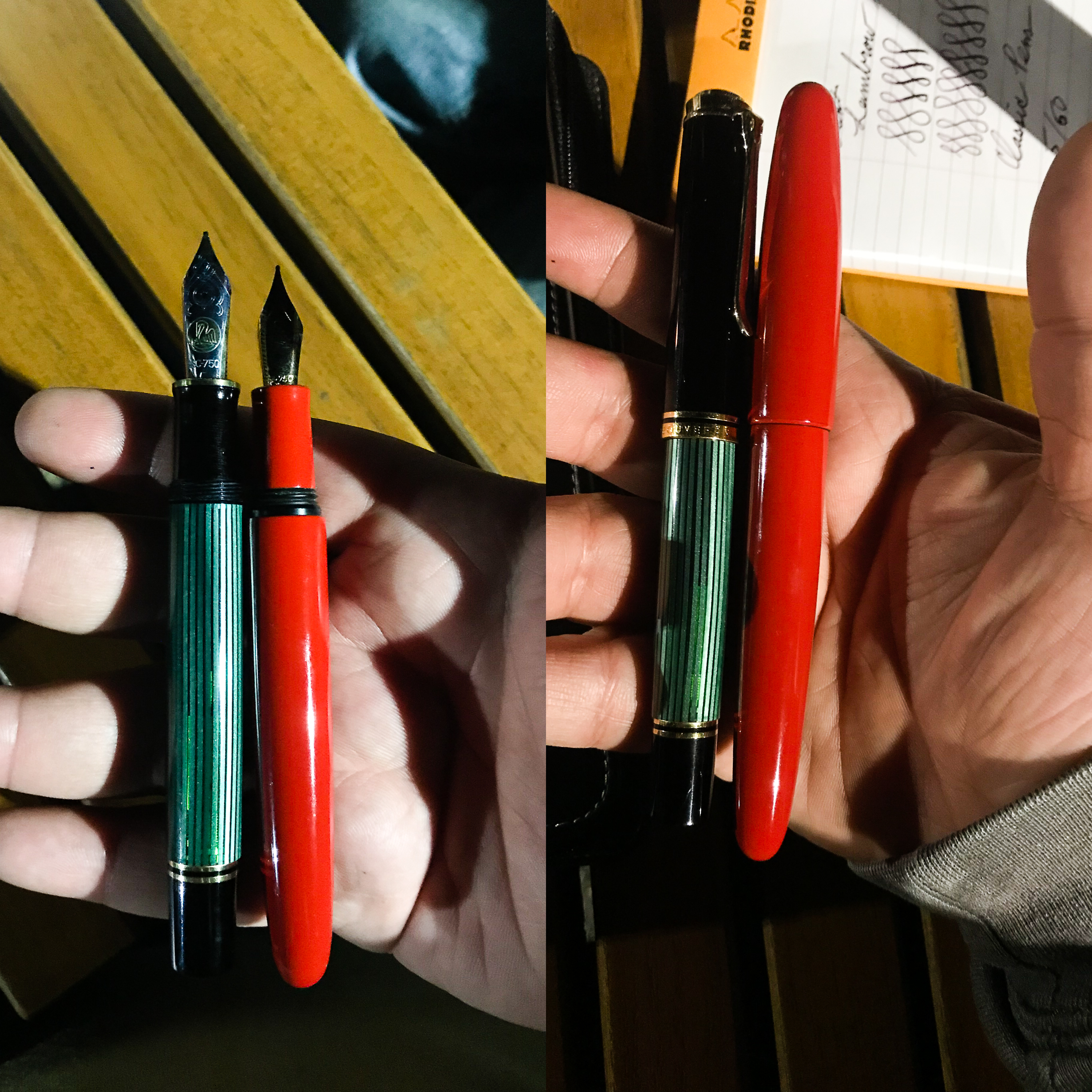
Franz: This month, I finally inked up my Franklin-Christoph Model 45 XLV Vanness Exclusive pen. The mint color of this pen really just appeals to me even if I know that it’s a small pen for my hand. But for the past couple of weeks, I’ve used the pen in conjunction with my Starbucks Philippines Weekly Planner and so far it’s a nice complement to it. I’m “trying” to be a bit more organized in scheduling tasks and events and by using this combo, it’s been enjoyable for me.
Since this is a Vanness Exclusive pen, I figured to ink with one of Lisa Vanness’ favorite colors, turquoise. The Sheaffer Skrip Peacock Blue is a nice vintage ink to complement this pen. I know for a fact that there are inks out there that would match the color of the pen however, this is a more personal ink to me for various personal reasons. Let’s just say that this ink is a homage to a couple people. One of those people used to say, “An italic gives you traction…”. And come on, who doesn’t like turquoise ink? Hmm? Hmm? ;-P
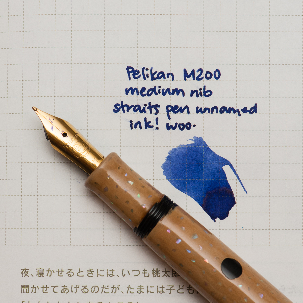
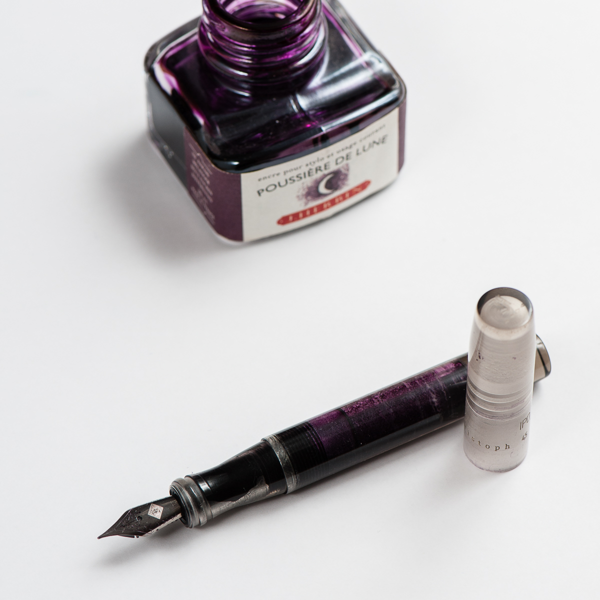
Katherine: It’s late in the month and I’m looking back thinking “What have I written with the most this month?” and the winner, hands down, is this funky combination of a Pelikan with a custom urushi finish by Bokumondoh and a Straits Pen custom ink. Honestly, the Pelikan (originally a M200) holds so much ink that I’m getting a little sick of this purple-ish blue. It’s a lovely color… but after staring at it week after week, I’m ready for something new (good thing May is just around the corner!).
Before we hop into my birthday month, here are some quick thoughts on April’s pen and ink —
First, the pen. I sent this M200 to Bokumondoh despite her warnings that this particular finish ends up pretty thick. I love the beige and black polka dots, and the sparkle of the raden. It came back about a month later, and the finish is, as promised, quite thick — but the serendipitous thing is that now I can use my M200 as a slip cap. Game changer! I can still thread the cap if I need to, but the barrel is now thick enough that I use it as a slip cap 90% of the time.
Second, the ink. This is a custom ink that the folks over at Straits Pen cooked up — it’s a wonderful shade of purple-blue that flows well and dries reasonably quickly. I hope to see it in production soon. Perhaps at the SF Pen Show?
Katherine’s Writing Sample
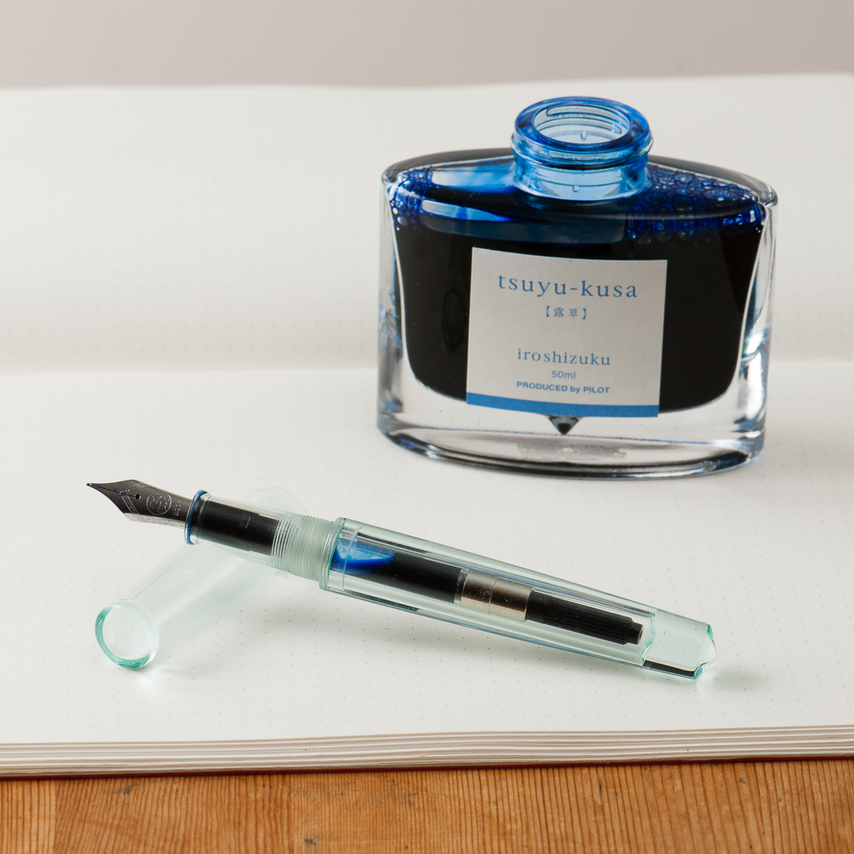
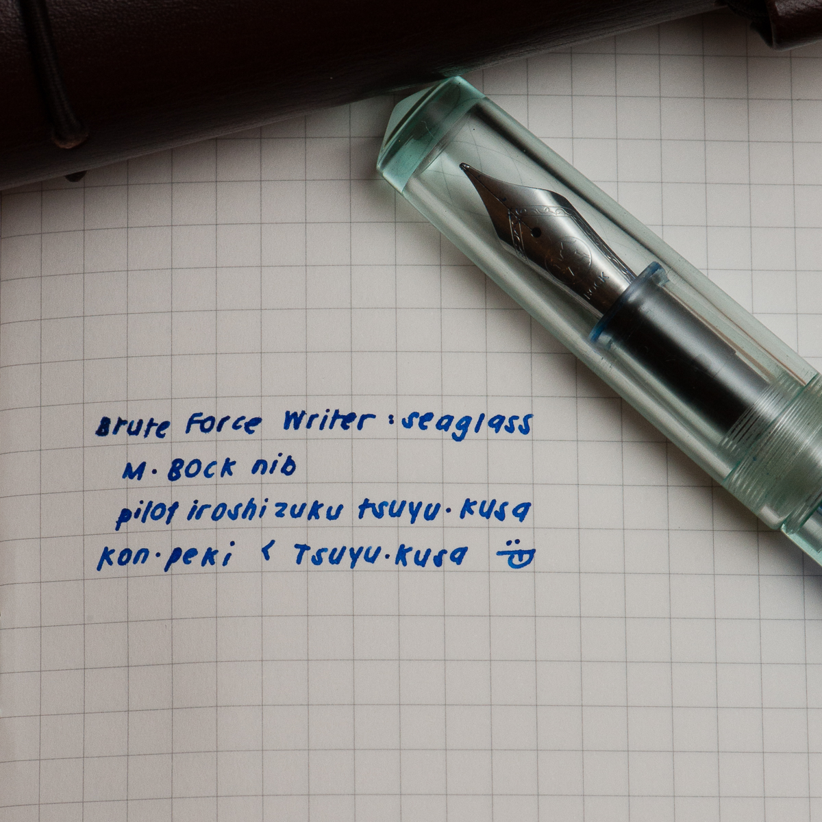
Pam: Thank you Anderson Pens for your ink match up giveaway. I was a lucky winner of the Pilot Iroshizuku Tsuya-Kusa, a new blue (for me.) I will admit that I have been lax in my admiration of the Pilot Iroshizuku inks as of late, however I plan on rectifying that. Starting with pairing this beautiful cornflower blue ink with the Brute Force Design Writer in Sea Glass. The beautiful and deep blue of Tsuya-kusa is deeper and more nuanced than a turquoise or sky blue. (That’s right, I said it. I like it better than Iroshizuku Kon-Peki.) It’s also a warmer blue with more red tones based on my amateur comparison.
Creator in Chief behind Brute Force Design, Troy, is a wonderful artist in pairing metals and woods in his signature pen designs. I chose a lighter version of the Writer model due to the beautiful transparency and seafoam green tint of the material. The nib of choice for Brute Force is a Bock nib. The one I have here is really wet and very well displays the color and depth of Tsuya-kusu to the fullest extent.
Bring on the spring/summer, world! My inked pens, allergy meds and I are ready for you.
Pam’s Writing Sample
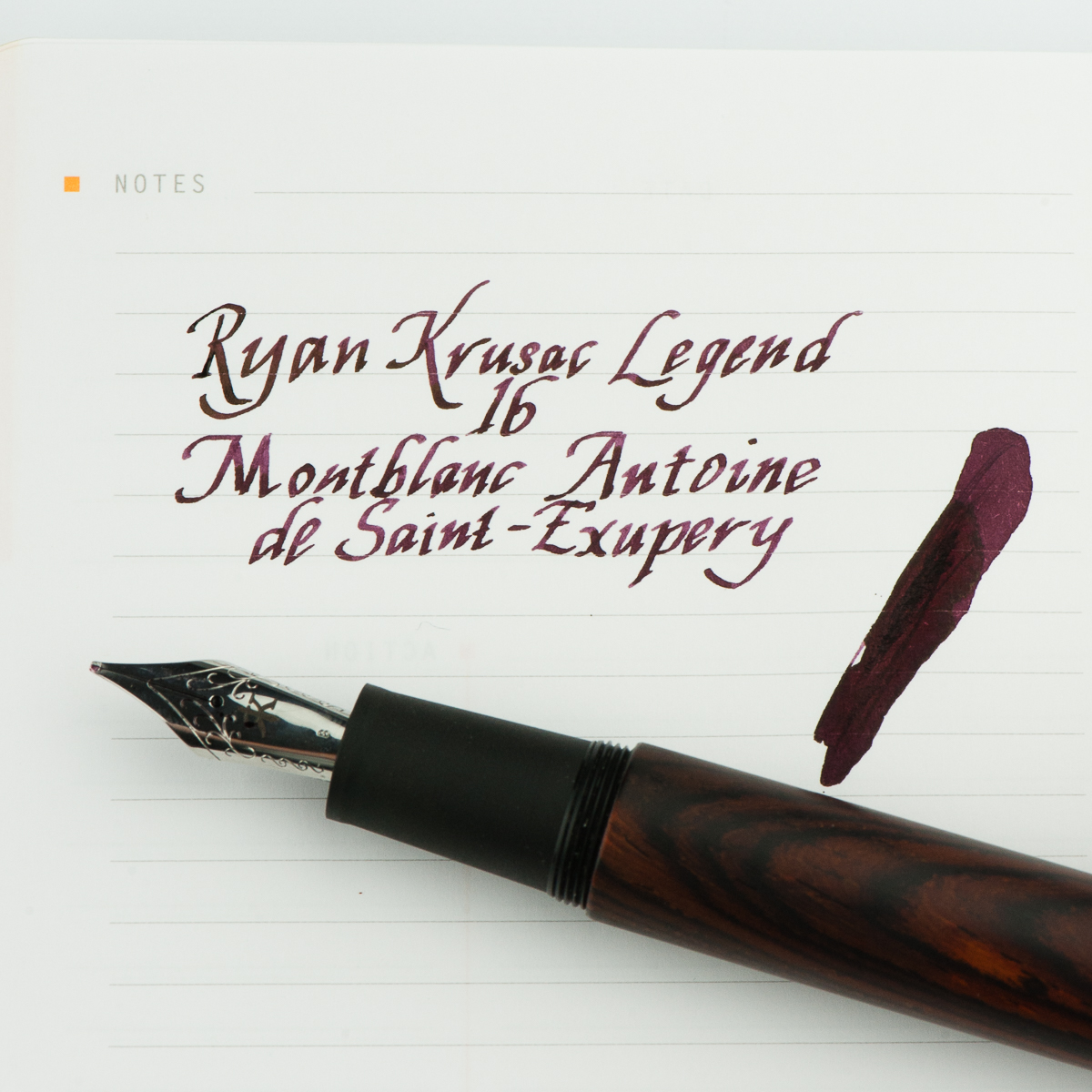
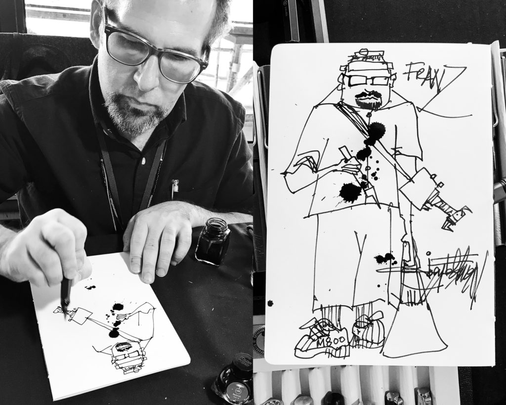
Franz: For the month of April, I thought of inking up my Ryan Krusac Legend L-16 with the limited edition Montlbanc Antoine de Saint-Exupéry ink. I haven’t used the L-16 ever since our review of the pen and I also inked it for two main reasons. First reason is to mark the pen’s first year anniversary with me since I got it at the Atlanta Pen Show in April 2017. Second, the broad cursive italic is very nice to practice my italic calligraphy writing. I’ve been using this pen to write some quotes and post them on instagram. If you’re interested, you may check out #FTDquotes tag on Instagram. =)
As for the MB Saint-Exupéry ink, this was my first time inking a pen with it and the burgundy color is quite rich and has purplish tones. I don’t have many burgundy inks and I find this ink to possess some beautiful shading, and the broad nib brings out the saturation very well. There is no sheen that I can see in the writing which is fine and the flow is very wet. Even if the ink does not match the cocobolo finish of the pen, the ink color complements it well.
What pens and inks have you written with lately this month?
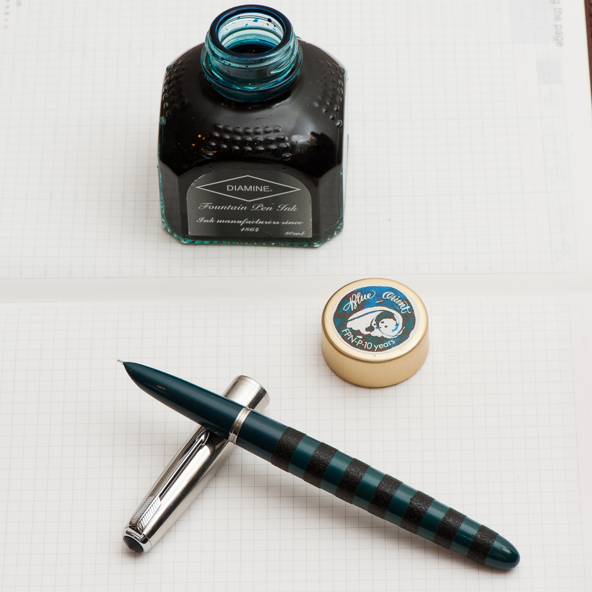
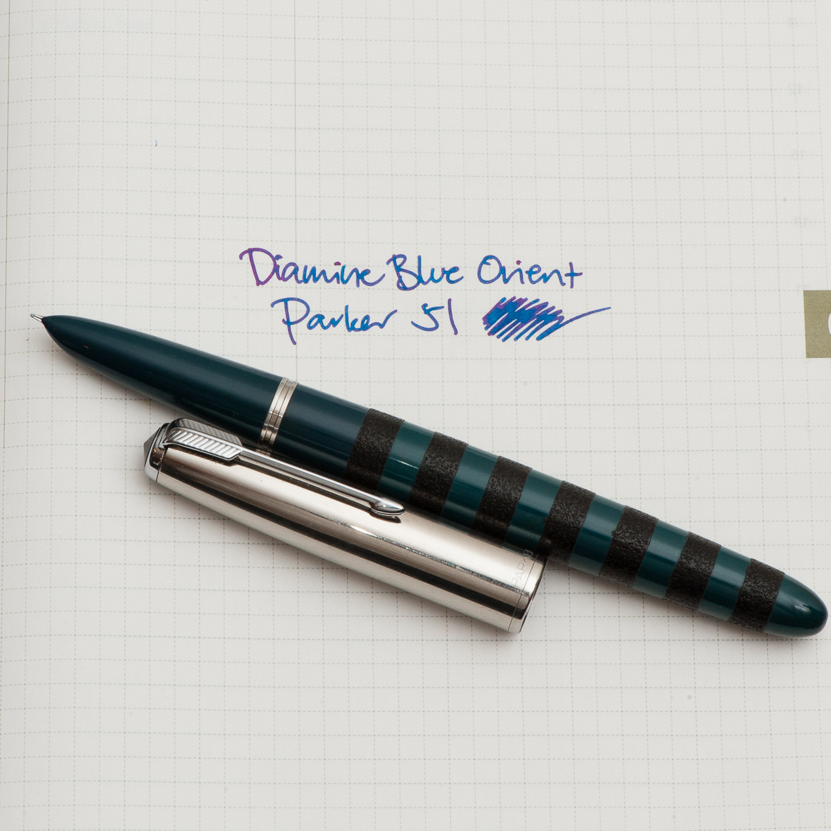
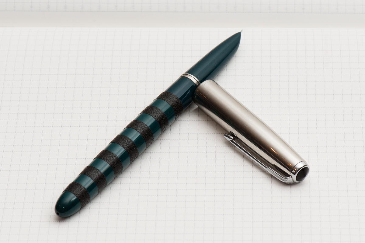
Katherine: It’s been a busy month, and I haven’t spent as much time playing with pens as I would have hoped. I’ve found that for the last couple weeks, my constant companion has been a Parker 51 Special filled with Diamine Blue Orient. The Parker 51 (review to come!) sports black ishime stripes, courtesy of Bokumondoh. I love the feel of the ishime and the visual variance that it gives an otherwise kind of boring looking pen (sorry!). Diamine Blue Orient is a limited edition ink created for FPN Philippine’s 10 year anniversary — I assume it’s honoring the beautiful oceans surrounding the islands.
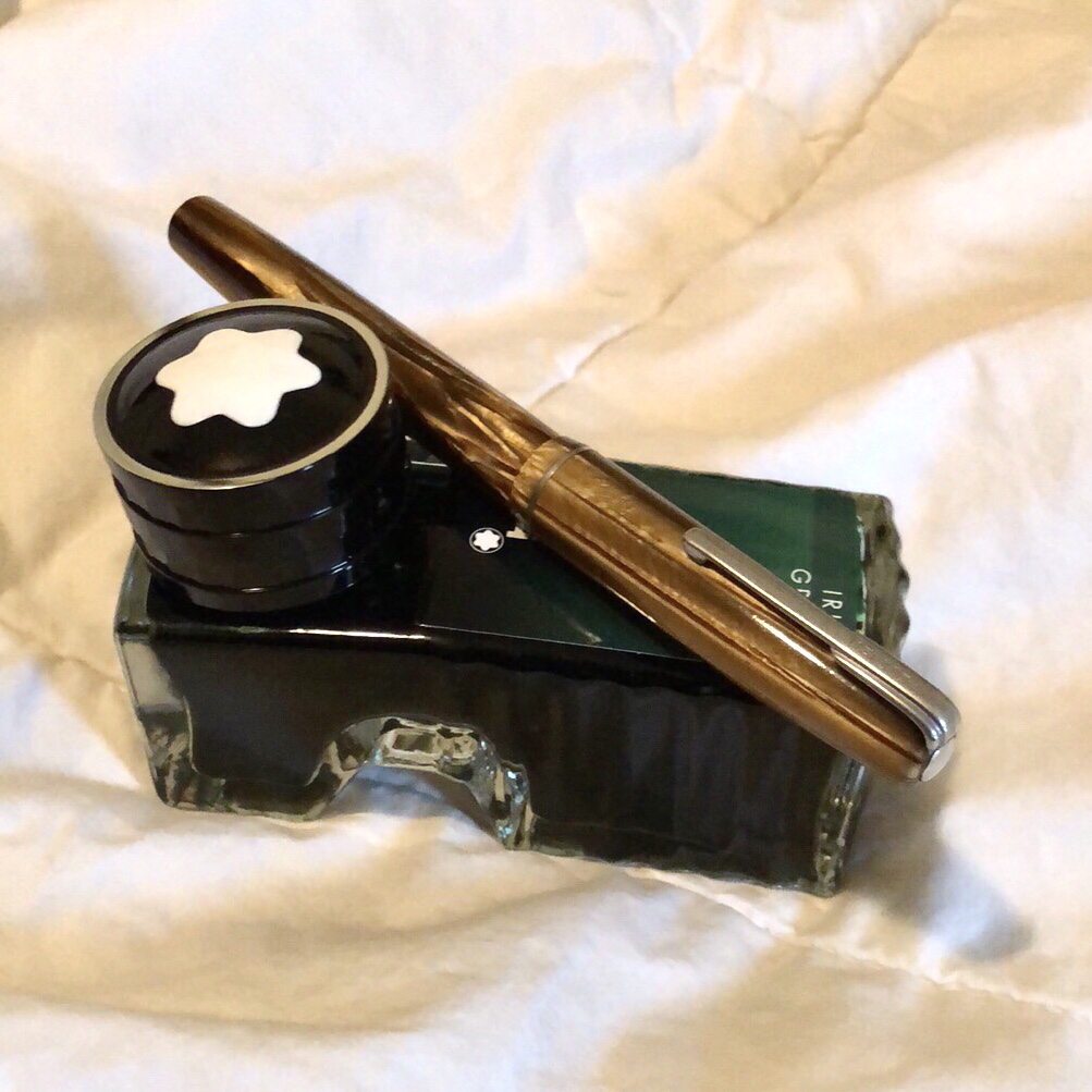
Pam: I have been on a bit of a vintage bender recently. Nik Pang introduced me to this understated brown Waterman that is a lever filler last month. I have also been finding out in my ink-splorations what brands of ink I prefer as I keep getting through all the samples. I inked up the Waterman with my favorite green, Montblanc Irish Green. The nib is akin to a Japanese F and writes beautifully. I chose a drier ink to highlight how fine the nib is.
On a side note, has any noticed inconsistent flows in heavily saturated inks? Or is that just me?
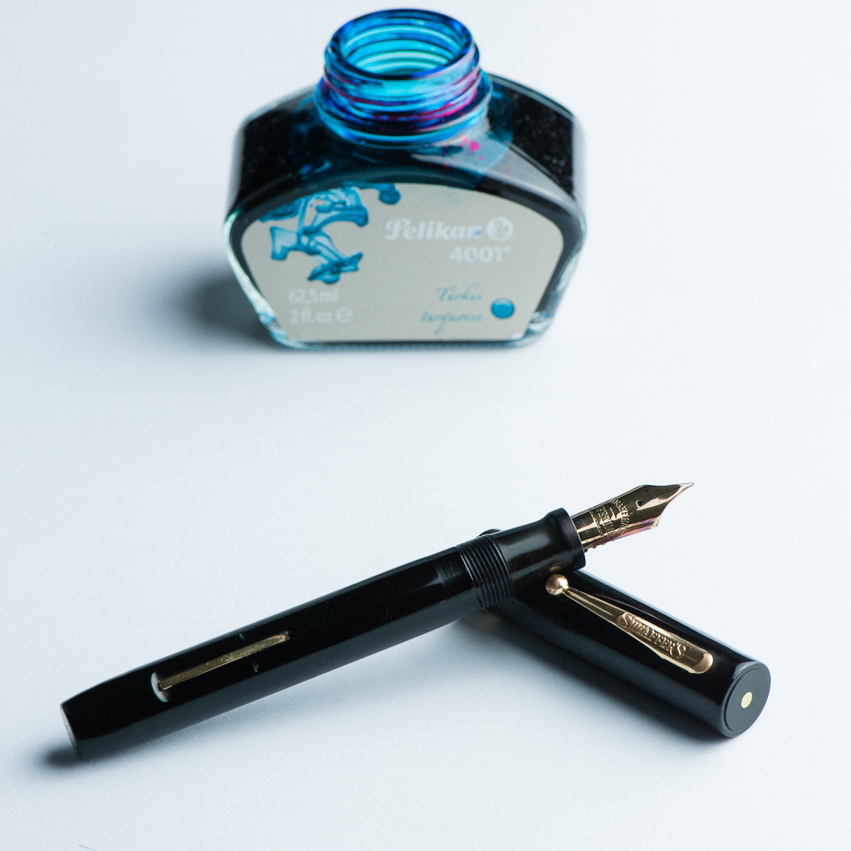
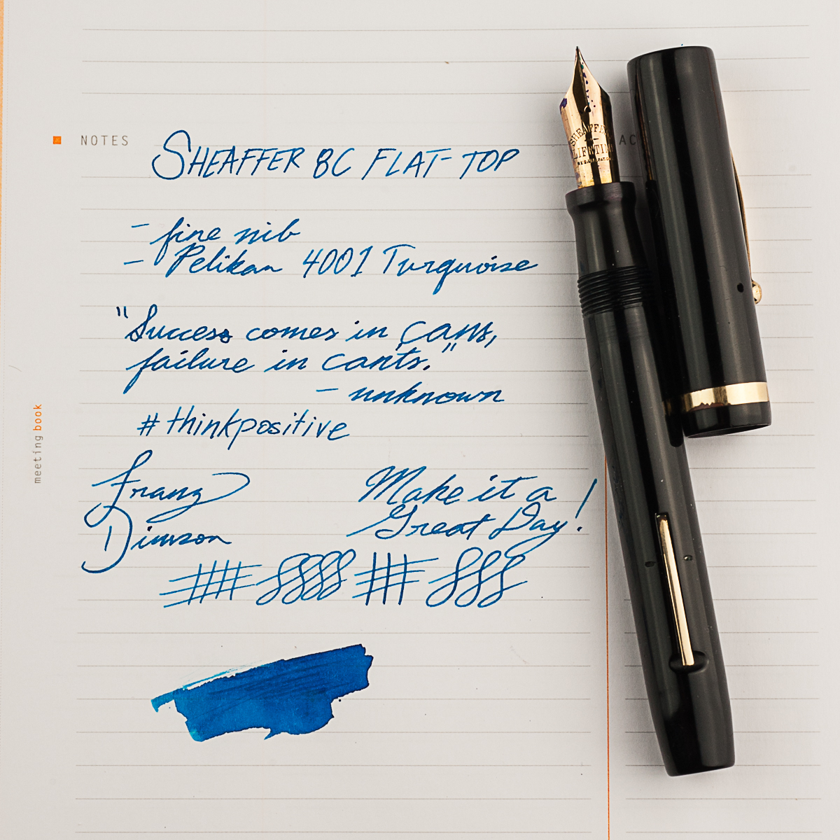
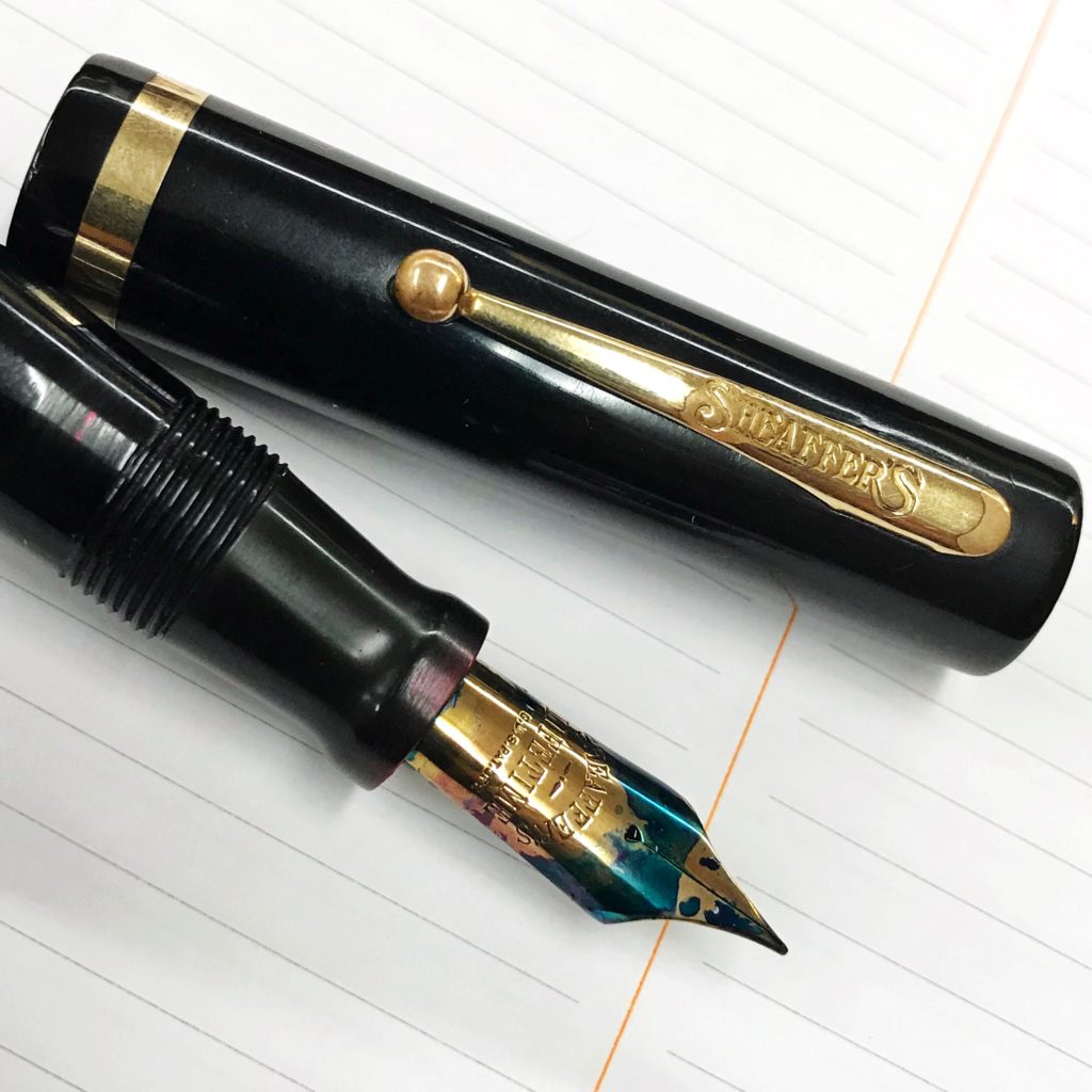
Franz: My pen for the month of March may be a vintage pen but it was a new acquisition from the LA pen show in February. My friend Jon S. knew about my apprehension about Sheaffer pens because most of the ones I come across are short and thin pens. So he showed me the Sheaffer 8C flat top pen which was from the 1920’s. And man, I loved it! He restored the pen himself and it’s in great condition as well. I’ve been using this pen at work almost everyday ever since I got it. The 8C fills my hand very well even when unposted so the bear paw is happy. =)
And of course I had to pair it with my favorite ink, the Pelikan 4001 Turquoise. Even if the nib is a fine width, it shows the ink color very very well. In some parts of the writing, some sheen comes through as well. There’s just something about turquoise inks that floats my boat.
Seems like the three of us have been writing with vintage pens lately. What pens have you been writing with?
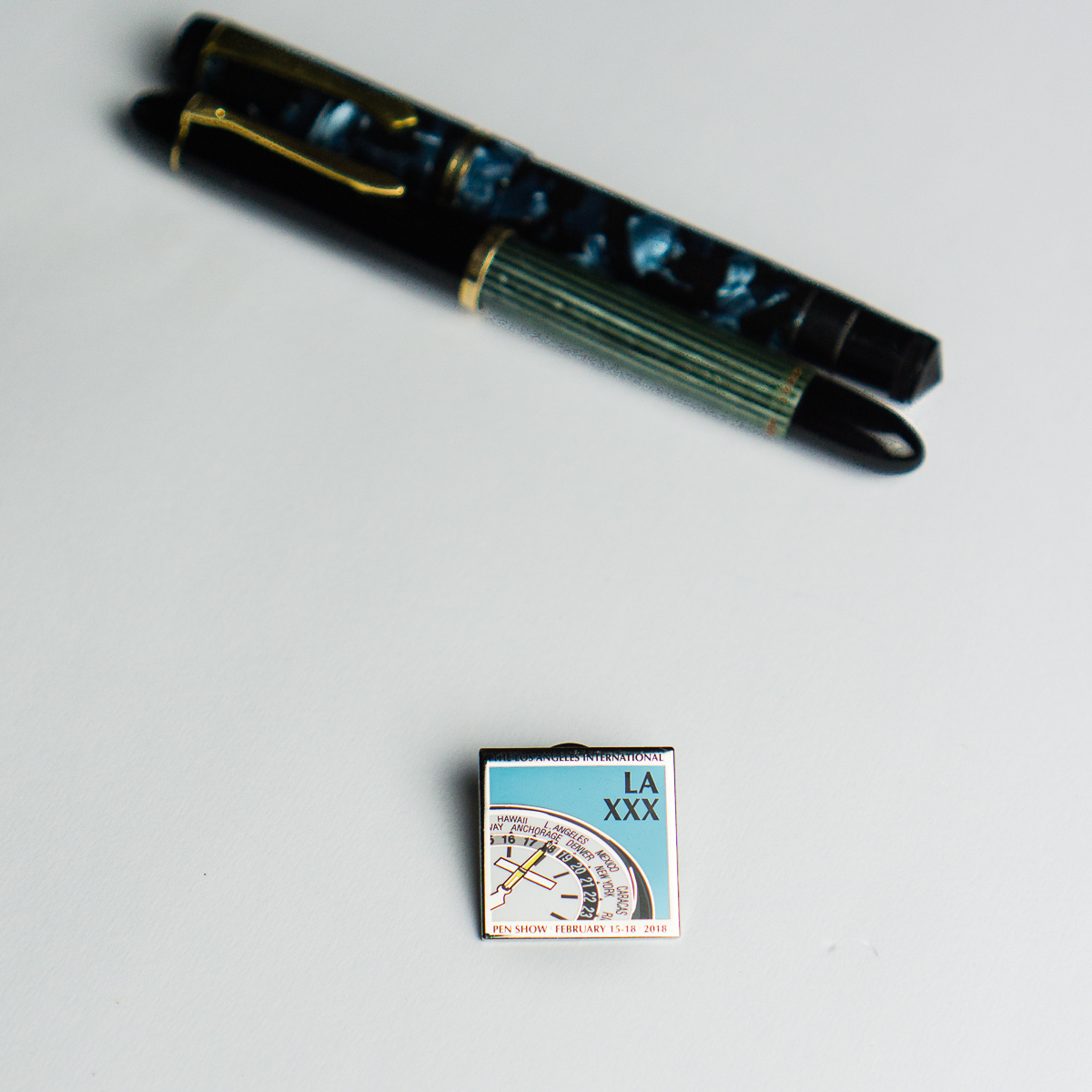
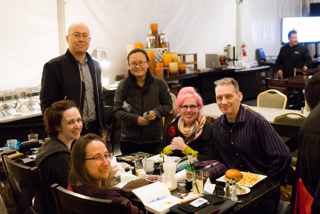
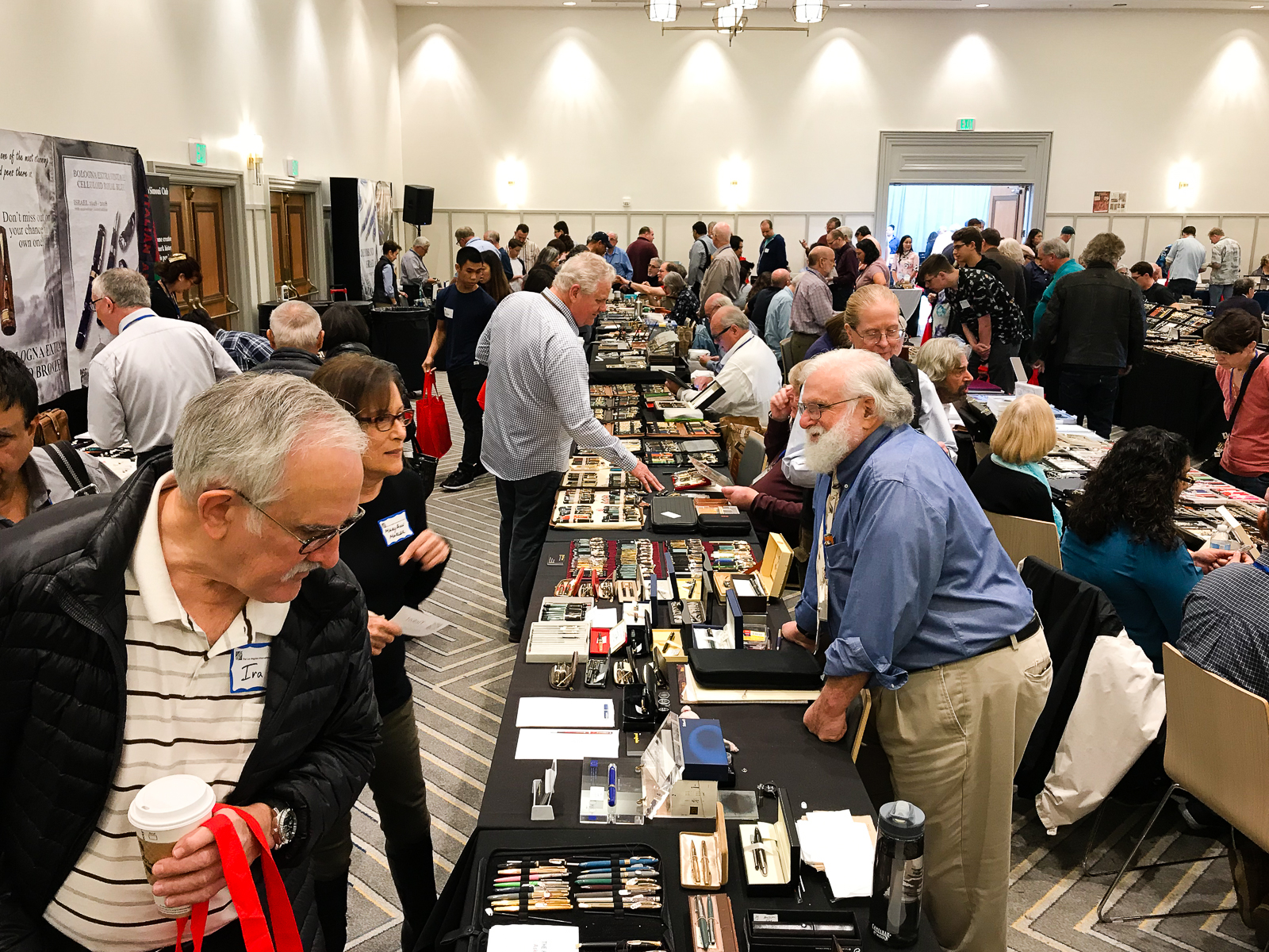
Hello Friends! I was fortunate enough to be able to attend the 2018 Los Angeles International Pen Show that was held on February 15 thru 18. I actually try to make it to the LA pen show every year as kind of like a vacation for myself. Things I look forward to at a pen show: hanging out with pen-minded people, perusing thousands upon thousands of different pens, possibly buying a pen (or two) that I can’t go home without, seeing and visiting with old friends, creating new friends, and just having a fun time!
Thursday, February 15, 2018
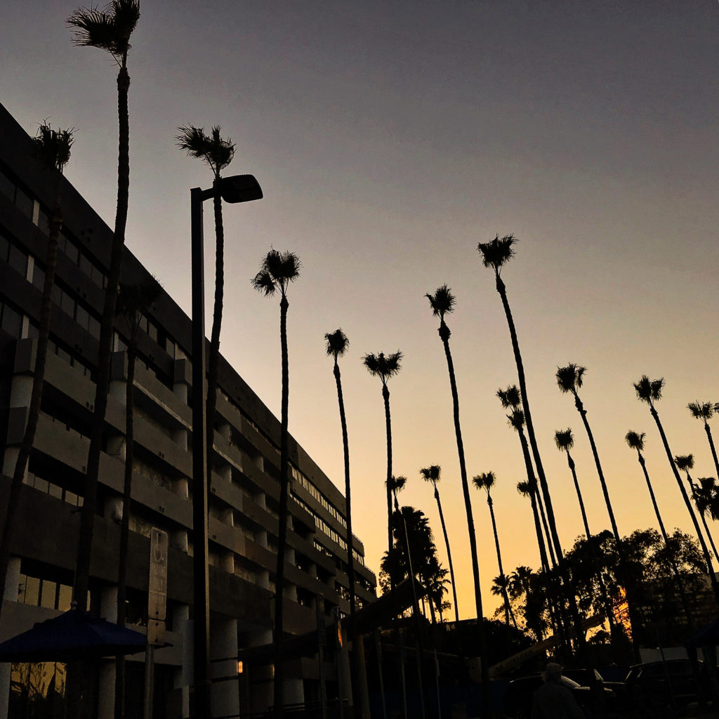
Sunset sky at the Manhattan Beach Marriott Hotel. I have arrived!
Each year, the LA pen show is held at the Manhattan Beach Marriott Hotel in Manhattan Beach, California. This year, they’re in a transition period and changing their name to Westdrift but is still under the Marriott brand. The hotel was still undergoing construction during the pen show. There’s more to be said about that part but I’d rather just focus on the show which was all fun for me!
I arrived on Thursday afternoon just in time as the first day was wrapping up. I immediately checked in and went downstairs to the ballroom.
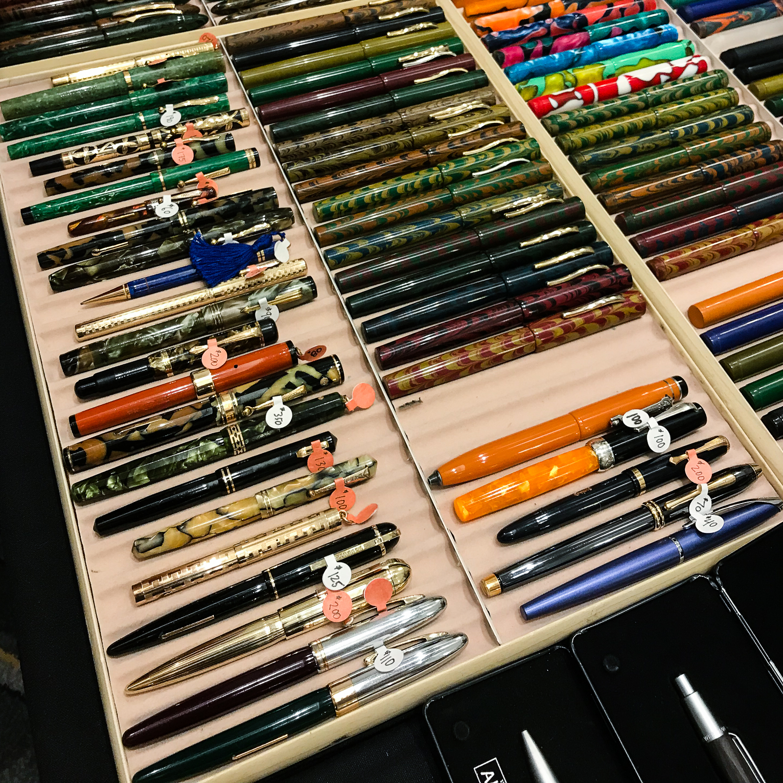
Pens were found!Ebonite pens at the Peyton Street Pens table
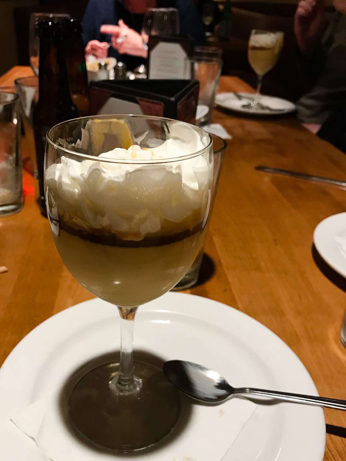
Walking around, I found a “few” pens that want to be bought! But since it was the first day and the first hour I was at the show, I decided to just take it easy and mull it over until the next day. Basically, if the pen isn’t sold yet then it’s mine. So I didn’t buy anything for myself for Thursday. We left the hotel for dinner with Pen Posse peeps as well as pen dealers from Italy, and Japan. We had great food from Sammy’s Woodfired Pizza and Grill. We shared tapas, and pizzas but what we really went there for was the dessert. Salted Caramel Pudding. ‘Nuff said. =)
Salted Caramel Pudding
Back at the hotel, we all congregated to the hotel’s outdoor bar aptly called, “The Tent”. This is the time where pen people sit, relax, talk, and show off their pens.
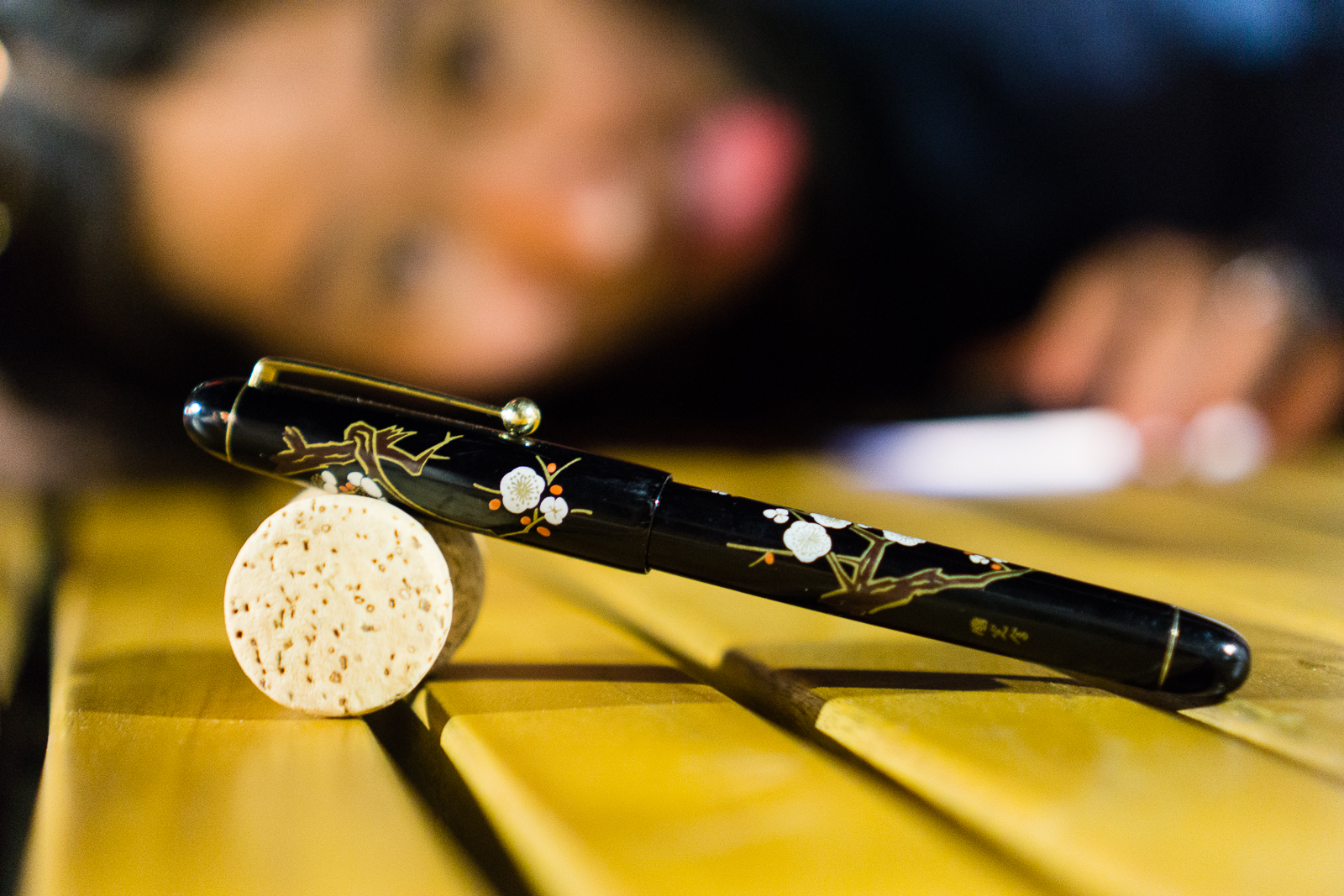
At the bar: A Pilot Hira Maki-e pen in Ume pattern in the foreground while being photobombed by Kimberly.At the bar: An Aurora Optima 365 Azzurra pen. Playing with pens is sweet especially when you have dessert on hand.
One of the pen bloggers (code name: Pink Hair) arrived at The Tent and generously let everyone try out the new Wancher Dream Pen. I must say that it is a substantial pen that filled my paws well. I then did a quick comparison in size with a Pelikan M1000. Thank you Agent Pink Hair!
At the bar: Wancher Dream Pen cappedAt the bar: Wancher Dream Pen unpostedSide-by-side: Pelikan M1000 and Wancher Dream Pen
Friday, August 16, 2018
Good morning Los Angeles! It’s a beautiful day for a pen show! I woke up early-ish and got ready for the day. I went down around 8:30am and found that the show was already ongoing. Paid for my Trader Pass and I was on my way. Walked around and visited to say hello to friends (vendors and attendees).
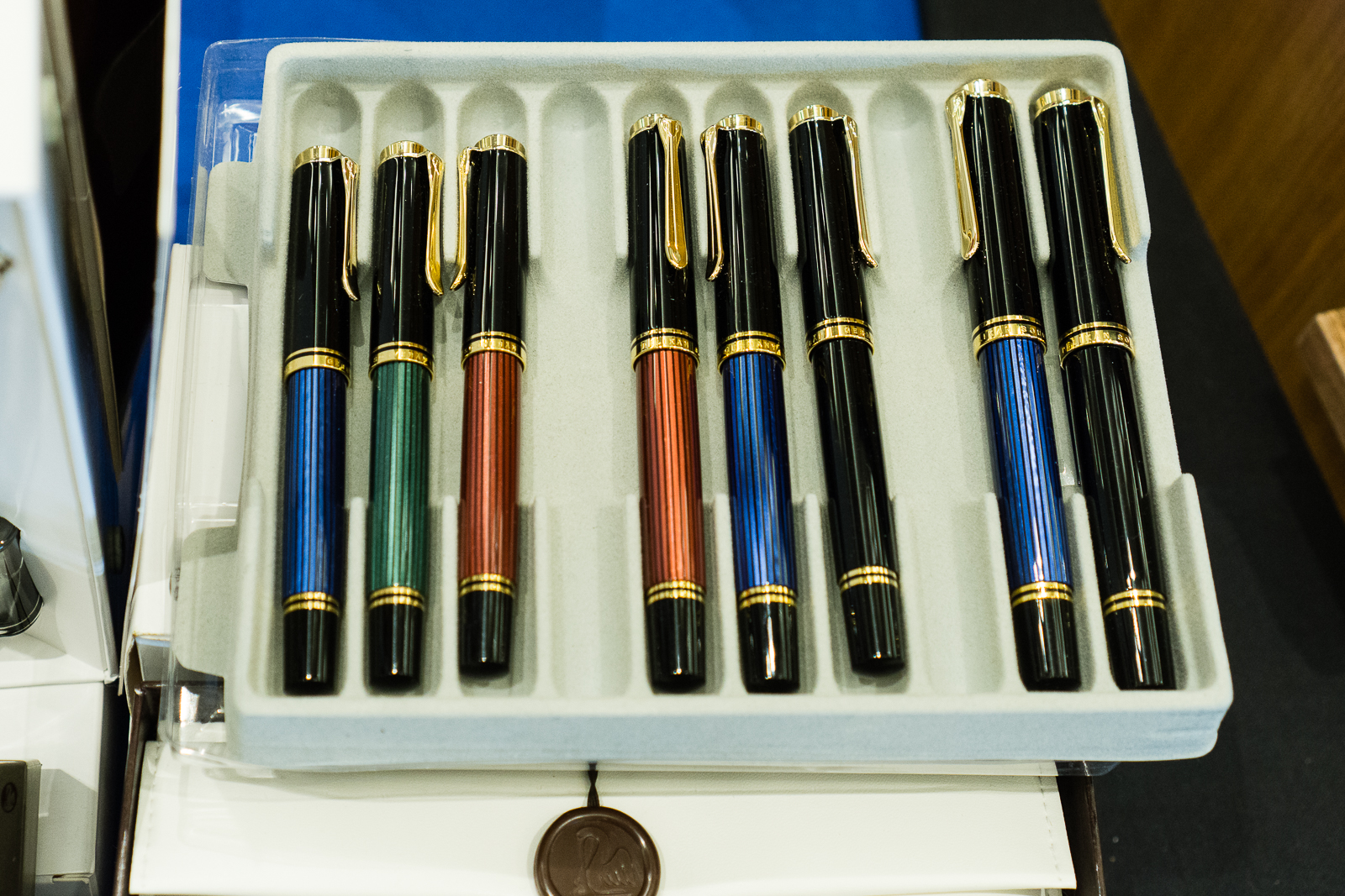
I found the Straits Pen table with some Pelikan pens as well their table’s security detail.
Pelikan M400, M600, and M800Pelikan M101 Originals of their Time 1935 in Lapis BluePen Posse Yuan armed with an ebonite rod for those people with sticky fingers!
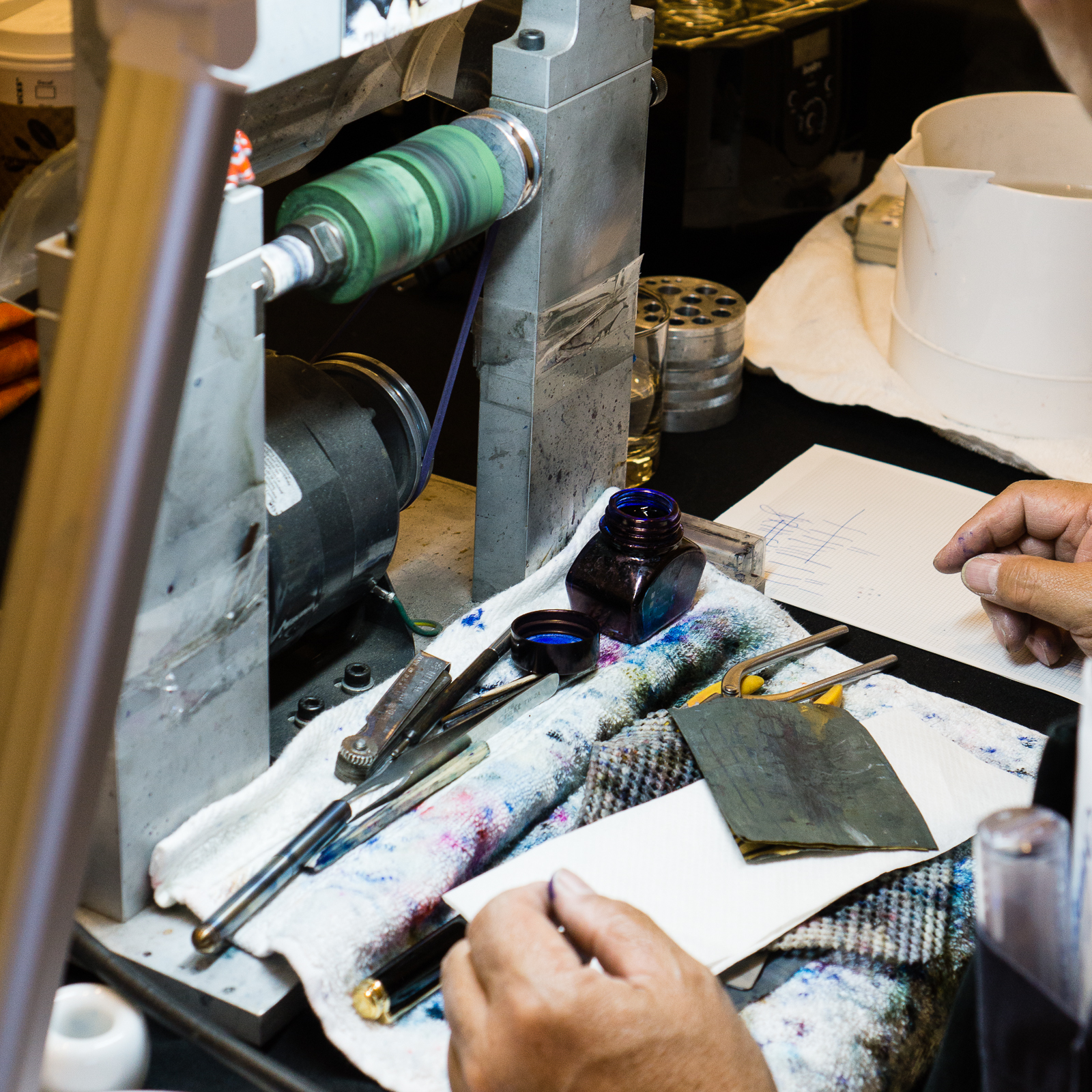
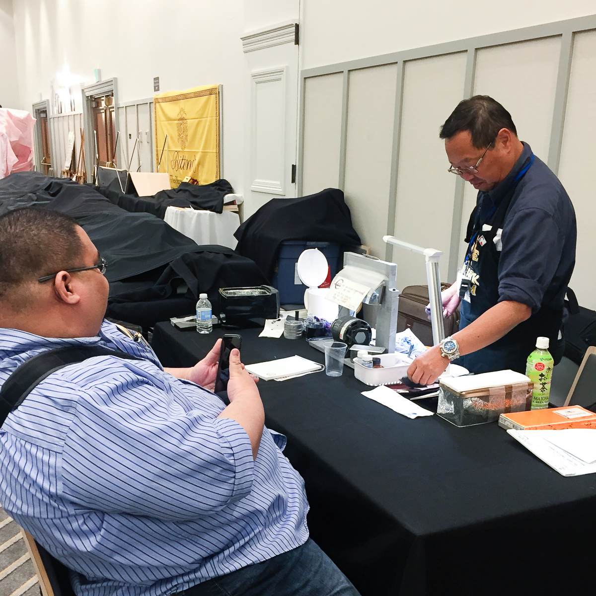
Walked around more and saw the Professional Nib Expert, Mike Masuyama at his table working early. I signed up to get some nibwork done as well. Because of how late I signed up (9:00am), I wasn’t sure if I’ll make the cut for the end of the day. That’s how in demand this gentleman is.
Mike Masuyama’s first customer was ready and raring to get her nibs ground!Mike Masuyama’s work station wherein he pretty much sits behind the whole pen show. This is THE place where he wields his magic and skills to make you happy to write with your pens.Masuyamasan grinding a nib to a cursive italic
Since Friday morning wasn’t too busy yet, I got the chance to do a Live Instagram video and got to show some of the pen show’s light action on Friday morning. I then uploaded to YouTube for others to watch. I was reading and answering live comments (that you don’t see anymore) so pardon my incoherency at times. Enjoy!
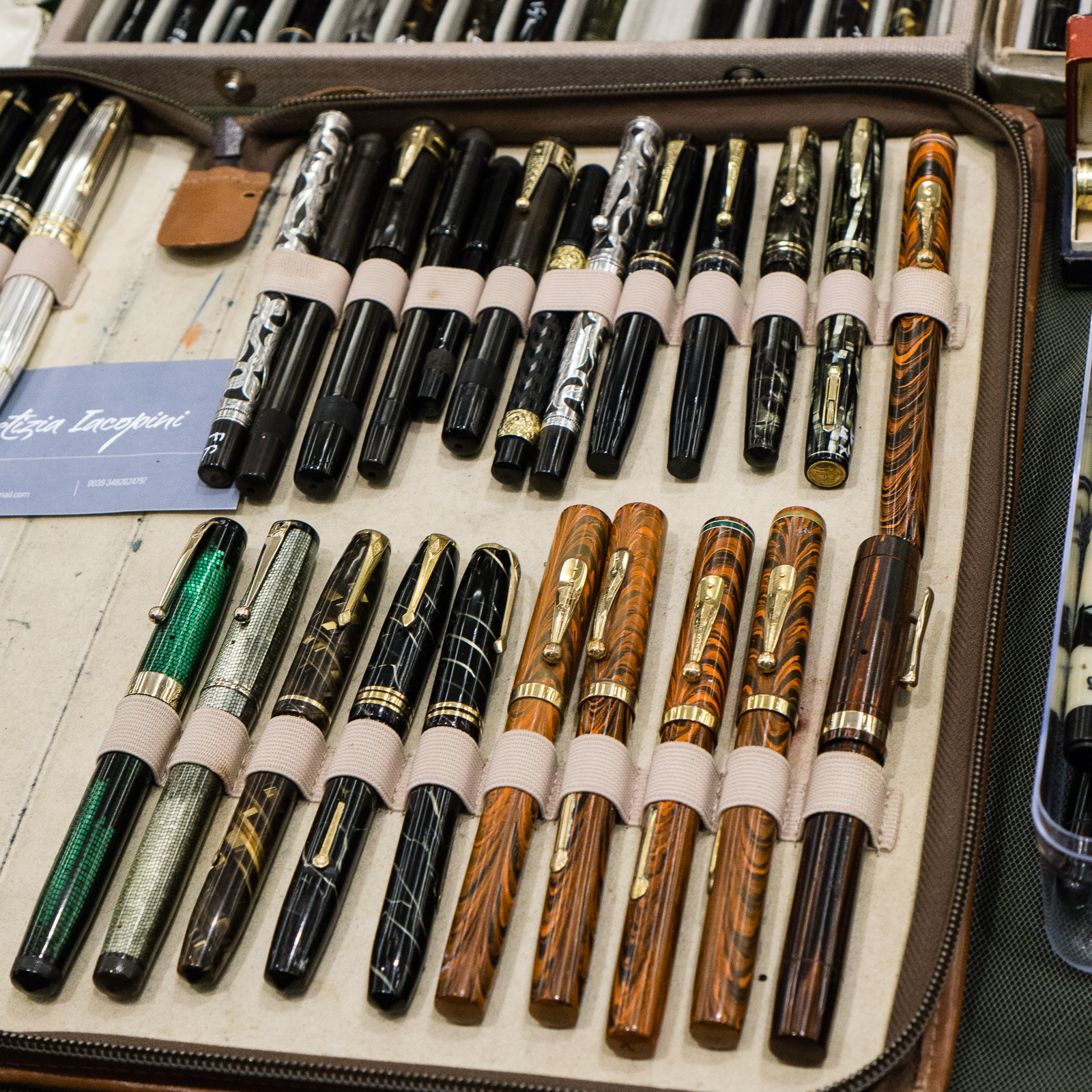
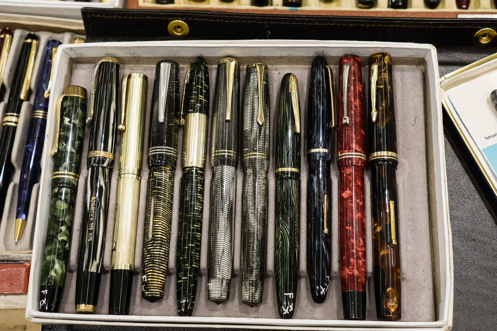
One of the pen dealers who I just met this year at the show was Letizia Iacopini from Italy. I have always heard of her name in the community and how she is an expert of Italian and other pens. She is also an author of several fountain pen books. Her most recent book was, “Parker in Italia: 1900-1960”. Her table at the show had exquisite pens from the vintage and modern era. Majority of her pens were Italian.
Vintage Omas pens
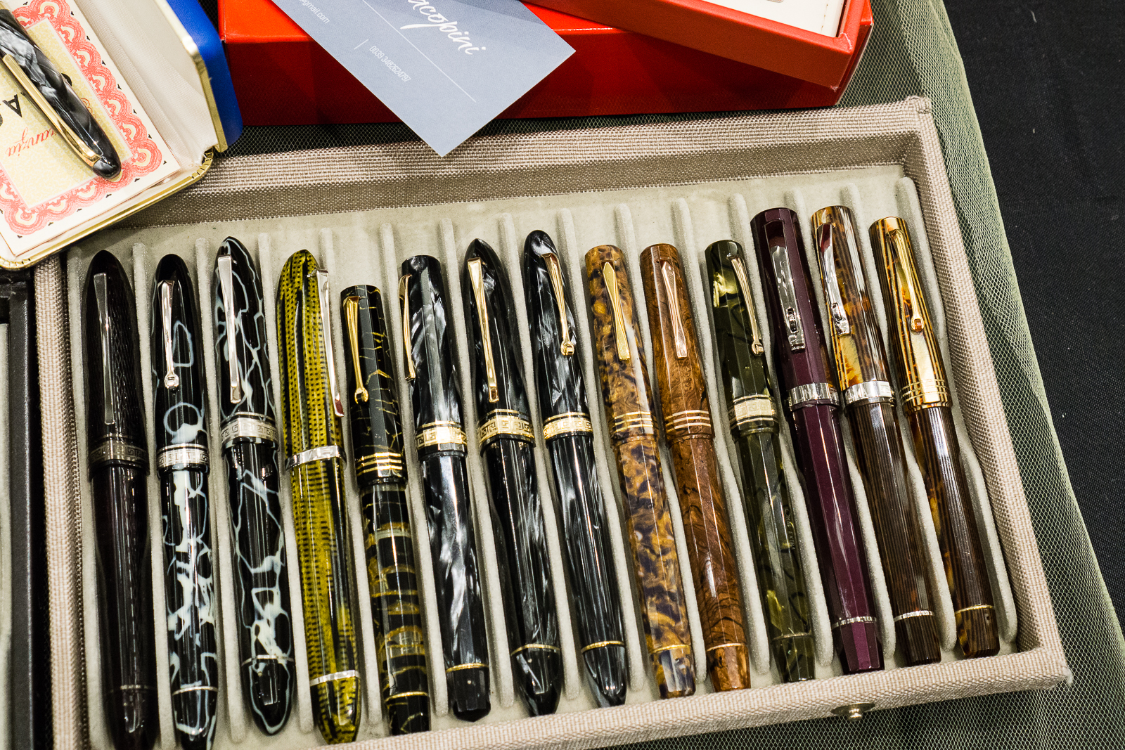
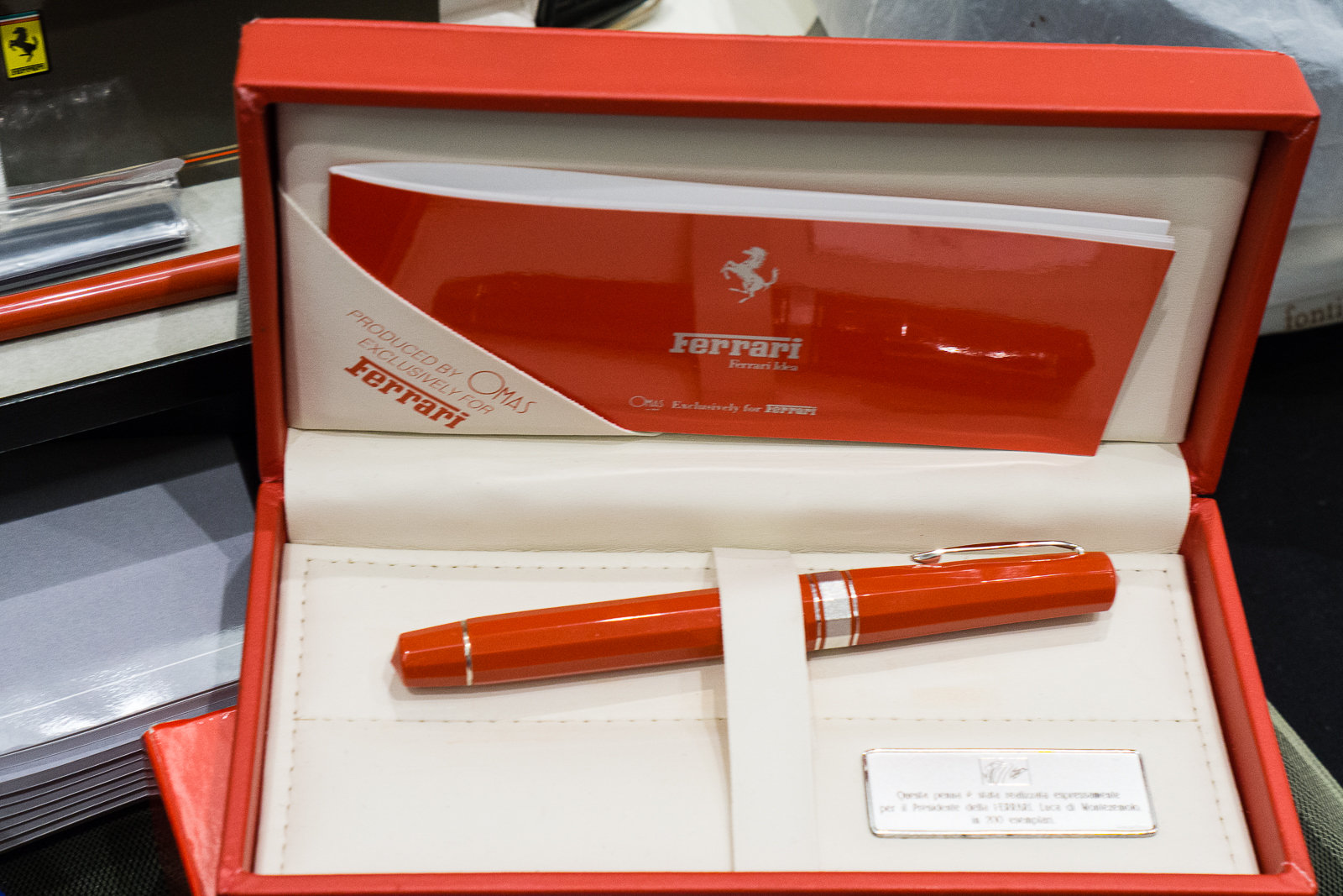
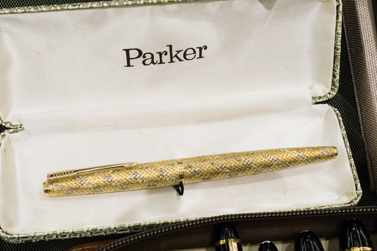
Modern Omas pensOwn a Ferrari? Why not get a Ferrari Omas pen as well?One of my favorites in Letizia’s table. A Parker 45 with Italian solid 18k gold basket weave overlay. I mean, WOW.
Then I turn around and walk 3 steps towards the table of Dayne Nix. He always brings in great vintage pens from different regions. As a side note, I met Dayne at the 2012 SF Pen Show and it was from him that I bought my first flex pen, a Parker Televisor and I still have it. Anyway, Dayne’s table display is fascinating especially his array of Conway Stewart Dinkie pens as well as his demonstration of how a rare Zerollo Dunhill Two Pen worked.
Conway Stewart Dinkie, part 1Conway Stewart Dinkie, part 2Conway Stewart Dinkie, part 3I placed a Pelikan 400 to contrast against the size of these Conway Stewart Dinkie pens
Perhaps one of the most curious pens I’ve seen from Dayne is this Zerollo/Dunhill Two Pen from the 1930s with a matchstick filler. Thank you for showing us this awesome pen Dayne! #onlyatpenshows
Brian and I were fascinated with the Zerollo/Dunhill Two Pen. I took a few action shots and these four showed the pen’s action very well.
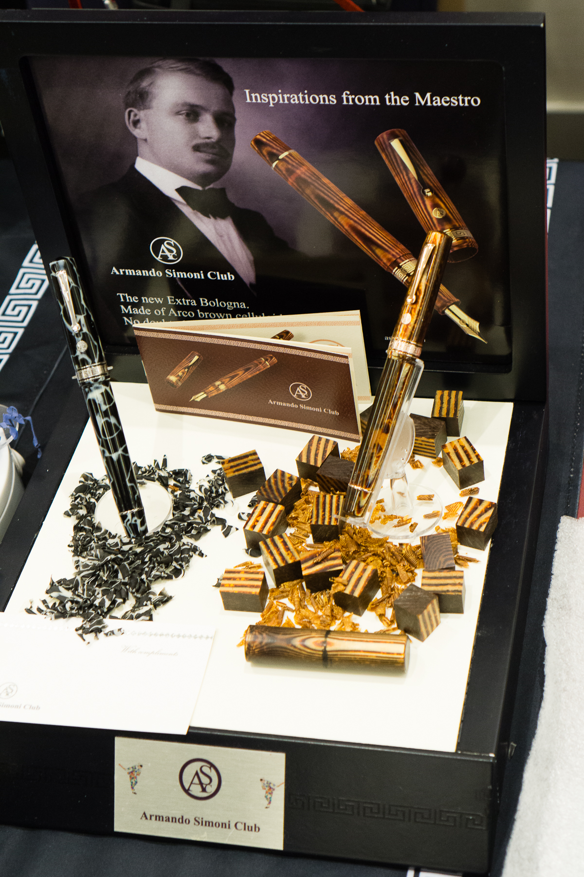
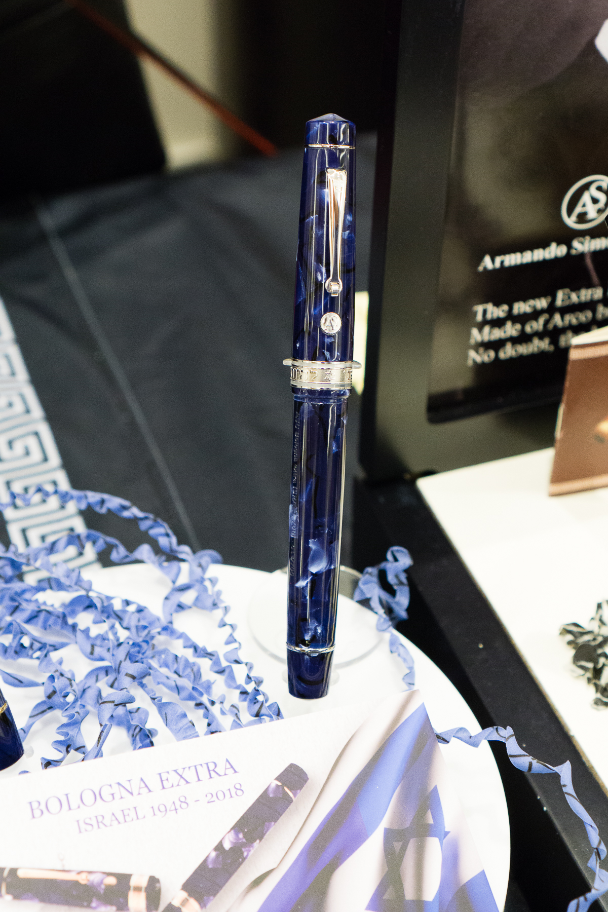
At the Armando Simoni Club (ASC) table, a couple large pens caught my eye.
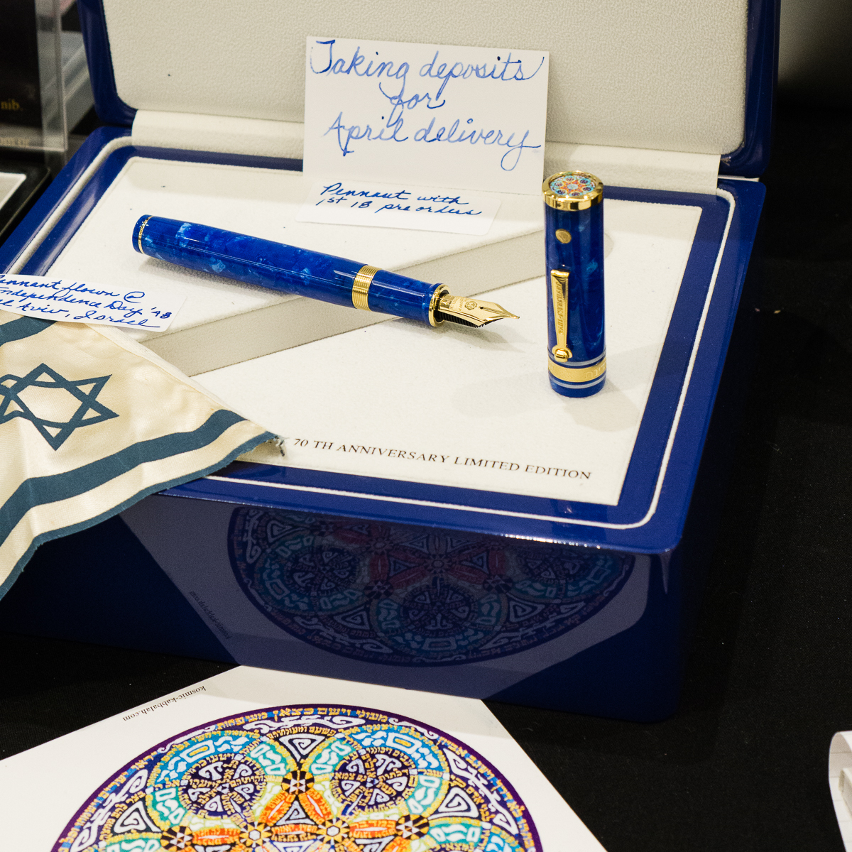
ASC Bologna Wild Dark Side, and Arco BrownASC Bologna Extra Israel
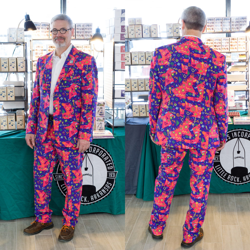
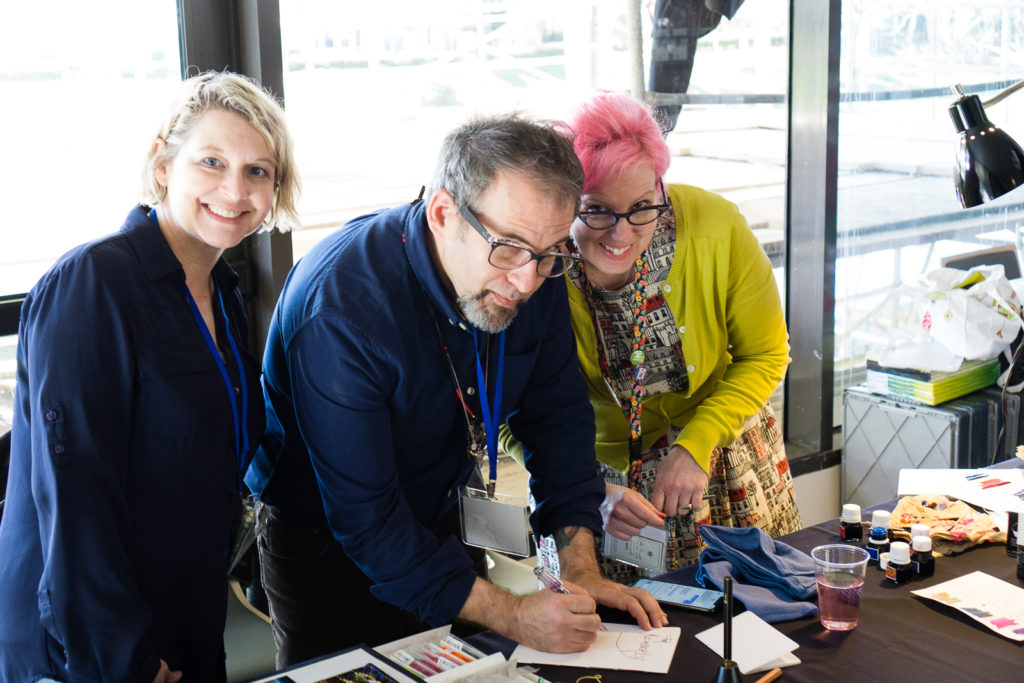
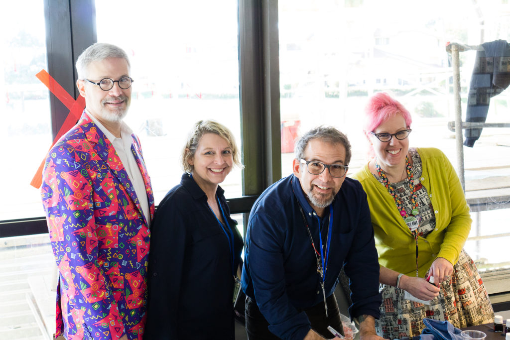
I then walked out of the ballroom to check out the Vanness Pens team in the hallway and look at who I found! Mike Vanness and his awesome suit! He always wears colorful clothing.
Mike Vanness
In the corner were Lisa Vanness, Joey Feldman, and Ana Reinert. Joey was creating artwork for people who bought journals at the show.
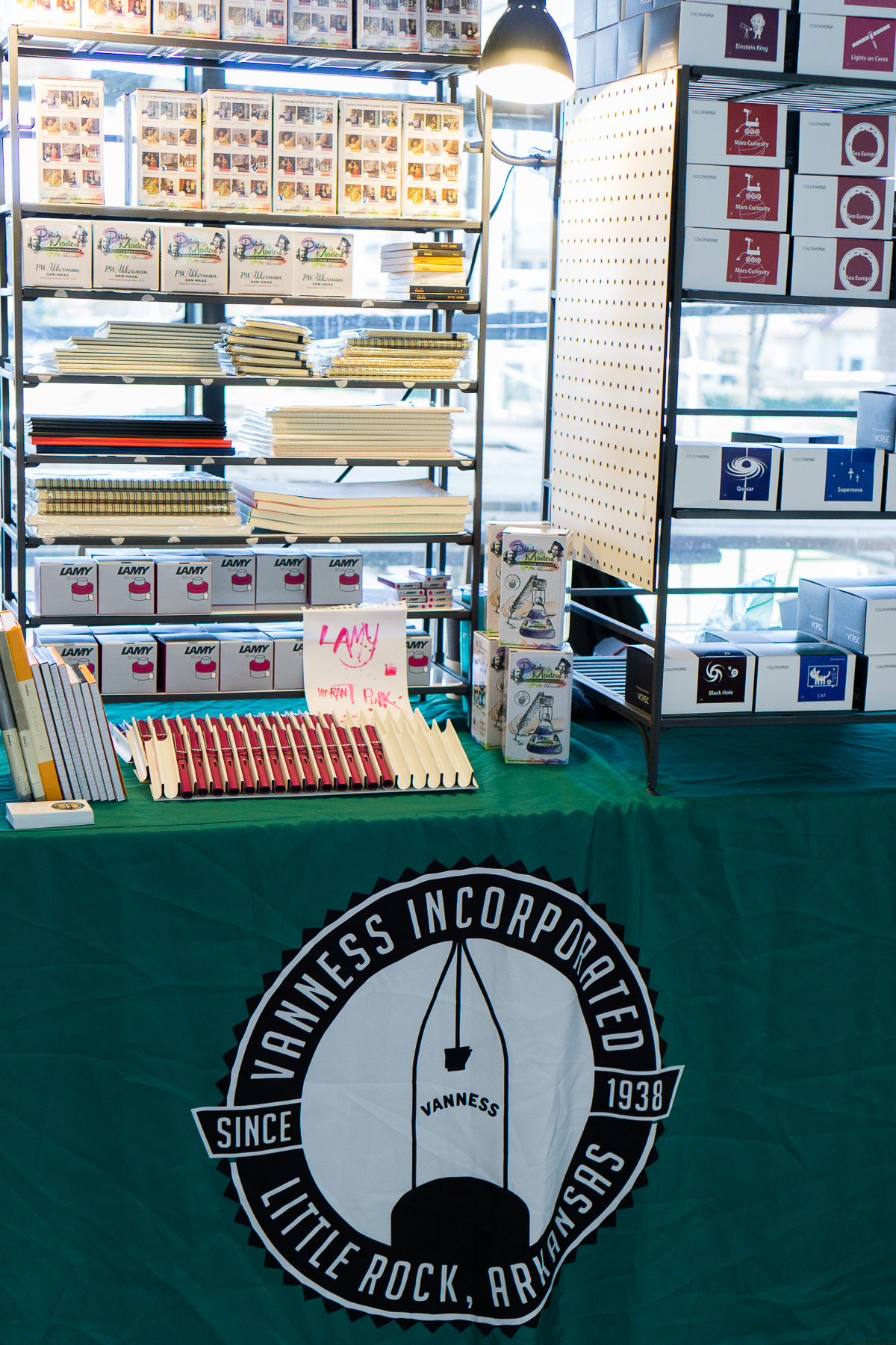
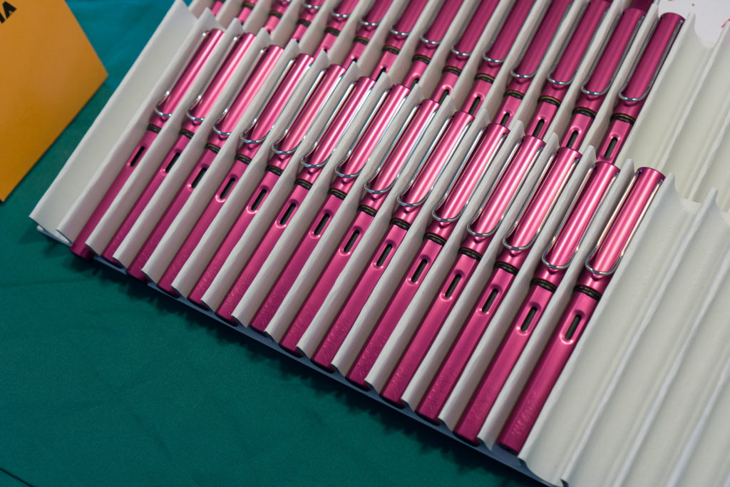
Lisa, Joey, and AnaMike joined in for the Vanness team photo sans Brad who was still traveling.Vanness always brings in tons of paper, pens, and lots of ink! Akkerman, Lamy, Colorverse, etc.Vibrant Pink Special Edition Lamy Al-Stars
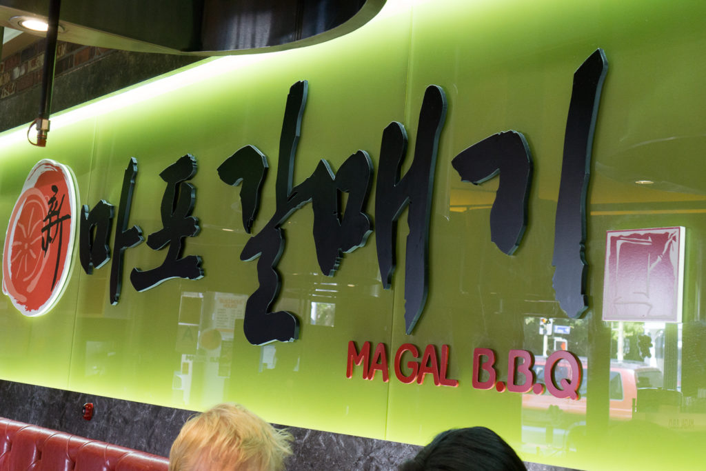
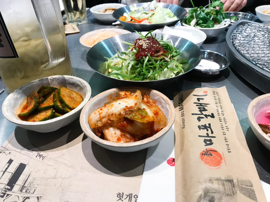
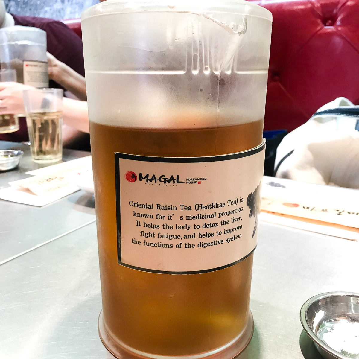
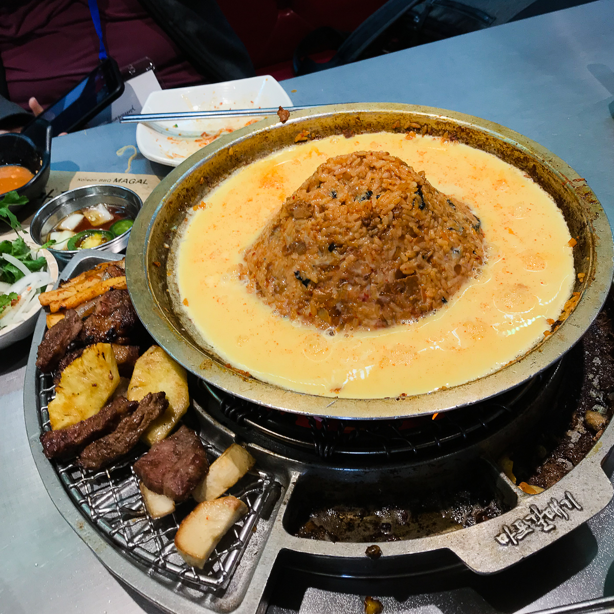
FOOD TRIP: It was almost 11:00am and a few of the pen posse peeps congregated to go out for lunch. A quick-ish drive to Korea town for Magal B.B.Q.! It’s become a tradition for us mainly because of the magic tea they serve.
Kimchi, etc.Magic TeaVolcano Fried Rice
After lunch, we went back to the hotel for more pen show! It was actually energizing to step out of the show for a relaxed lunch. I need to do that more often.
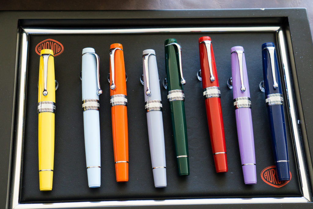
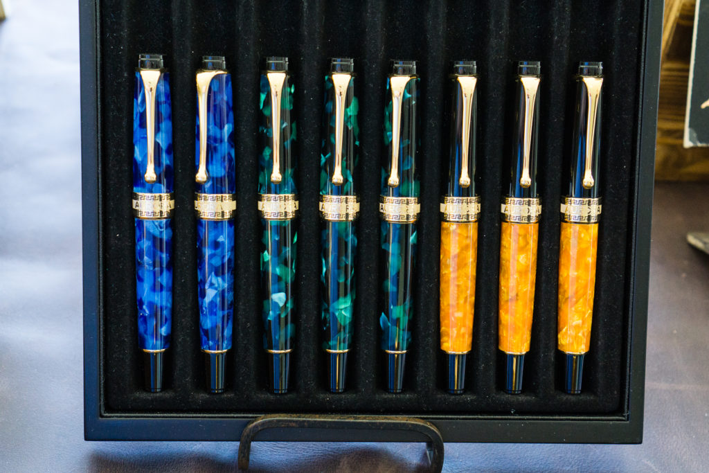
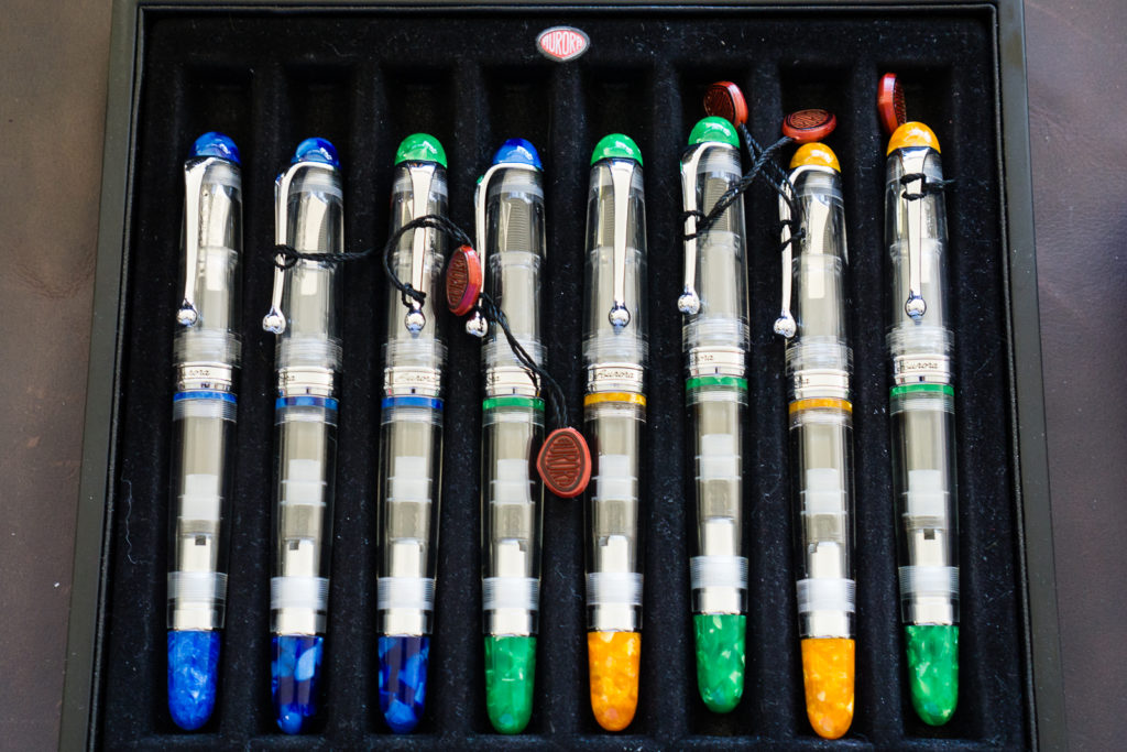
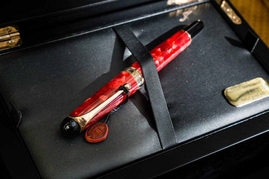
I stumbled upon the Kenro table with all the Aurora pens on display.
The new lineup for Aurora Optima Flex limited edition pens. This time they have rhodium trim instead of the gold ones on the 88 lineup last year.Aurora Optima pens. Blue Auroloide, Green Auroloide. And dio mio! Look at that Sole Mio!Someone’s been playing with the caps of those Aurora 88 DemonstratorsThe Aurora 88 Marte is showing off its beauty as it basks in the Sun.
Here’s a Pelikan basking in the sun as well.
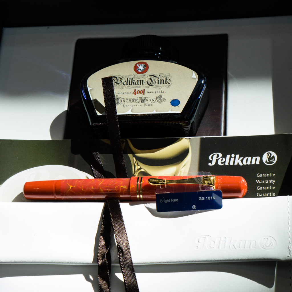
That Bright Red M101N is enjoying the sunshine by the Dromgoole’s table
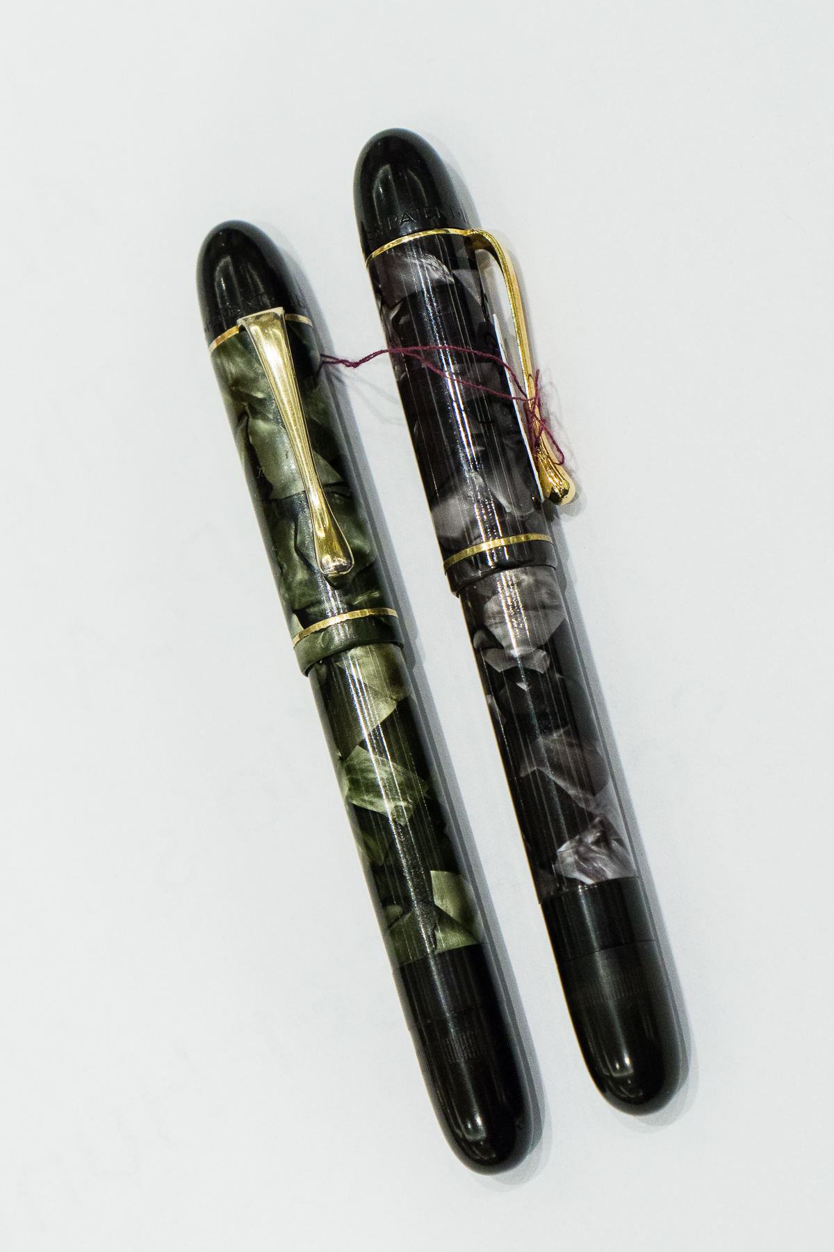
Vintage Corner: My friend Janet showed me a Pelikan IBIS in Grey Marbled that Rick Propas was selling and also showed me her Green Marbled one. The Pelikan IBIS was a pen produced from the mid-1930s thru the early 1940s. You don’t see the IBIS often and this was actually my first time to see the marble colored ones. #onlyatpenshows
Pelikan IBIS: Green Marbled, and Grey Marbled
I then went back to the Vanness Pens table to buy some of their special edition LA Pen Show journals by Curnow Bookbinding with artwork by Joey Feldman. Joey was still there and he drew my Pen Show Persona on the back of the A5 journal I bought. This guy is phenomenal and do you notice what he named my sneakers as? Pelikan M800 FTW! Thanks Joey!
Afterwards, I went up to my room to unload my purchases and rest for a while.
As I went back down, I checked on the progress at Mike Masuyama’s table. As it happens, the “last” person Mike was gonna help was a vendor and did not have the pen with him at the moment and I was the lucky person next on the list. Ricky got to take a picture of me as Masuyamasan was tuning my M800 nib. Thanks Ricky!
Masuyamasan’s last customer on Friday
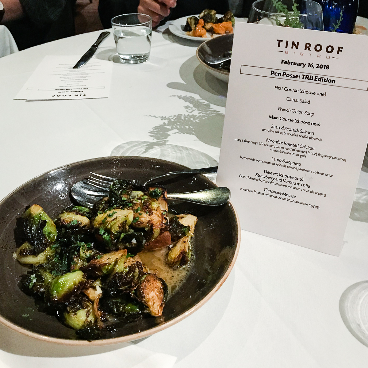
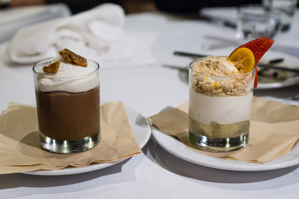
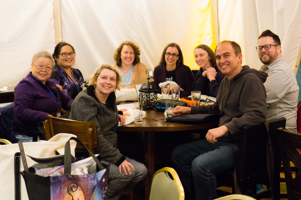
Post Show Dinner: Every year, the SF Bay Pen Posse as well as friends from the SoCal contingent hold a dinner at the Tin Roof Bistro and Joi E. graciously organizes this with the restaurant. As seen on the menu, we call it, “Pen Posse: TRB Edition”. Thank you very much once again Joi!
For this meal, it’s all about the Brussel Sprouts! If you’ve had them at Tin Roof Bistro, you know this to be true.
Back at the hotel, it’s Pen Shows After Dark time!
At the bar: Cary’s Wahl-Eversharp Decoband in Gatsby Pensbury Etched finishAt the bar: Cary’s limited edition Pelikan M1000 SunriseAt the bar: Cary’s limited edition Pelikan M1000 SunriseAt the bar: Yuan brought delicious Port wine
Saturday, February 17, 2018
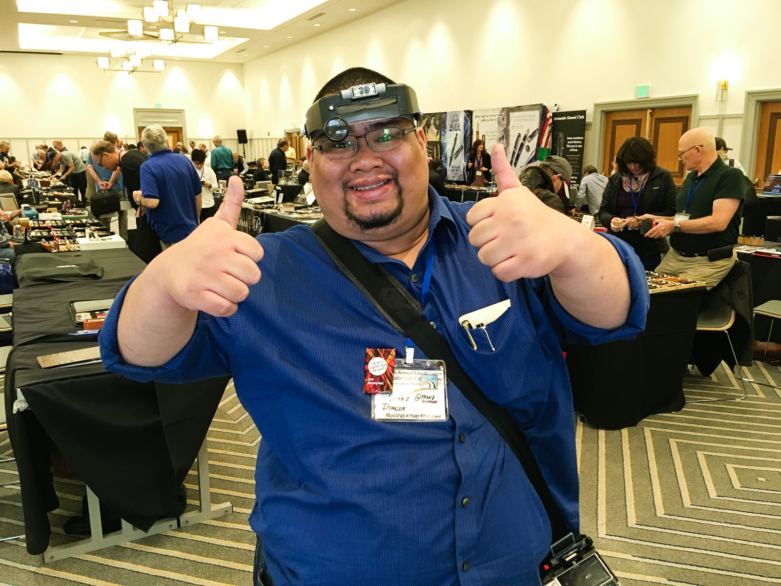
Pen Show Persona: Thanks to Sharon for taking this pic and thanks to Mike P. for the head gear!
Woke up early once again to get ready for the show. I think I got to the ballroom at 7:50am (so early) and it was once again busy with activity. A quick side note, a week prior at a Pen Posse meetup, I joked that I wanted to walk around the show wearing a magnifier head gear to look like a legit pen guy. Friday morning, my friend Mike got me one of these and I committed to what I said. Interestingly enough, what started out as a funny gesture became a very useful tool while I was perusing pens. Sometimes you just can’t see the small print on nibs and barrels. So if you’re going to a pen show, I recommend having a lighted magnifier like a loupe, or this head gear. #pro-tip
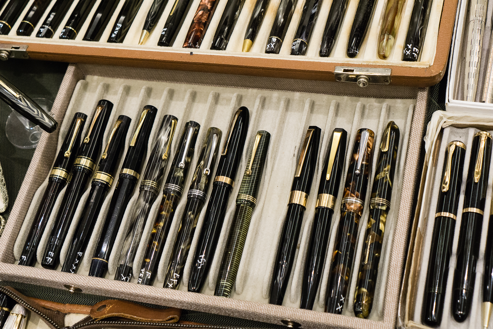
After signing up again at Mike Masuyama’s table, I did my walk around and found myself at Paul Erano’s table. Paul is the Grand Poobah of the secret-not-so-secret Black Pen Society.
Paul Erano: Parker 65, Cross Verve, vintage Parker Duofold pens, and a modern Parker Duofold International in between them.Paul Erano: An array of more pens.
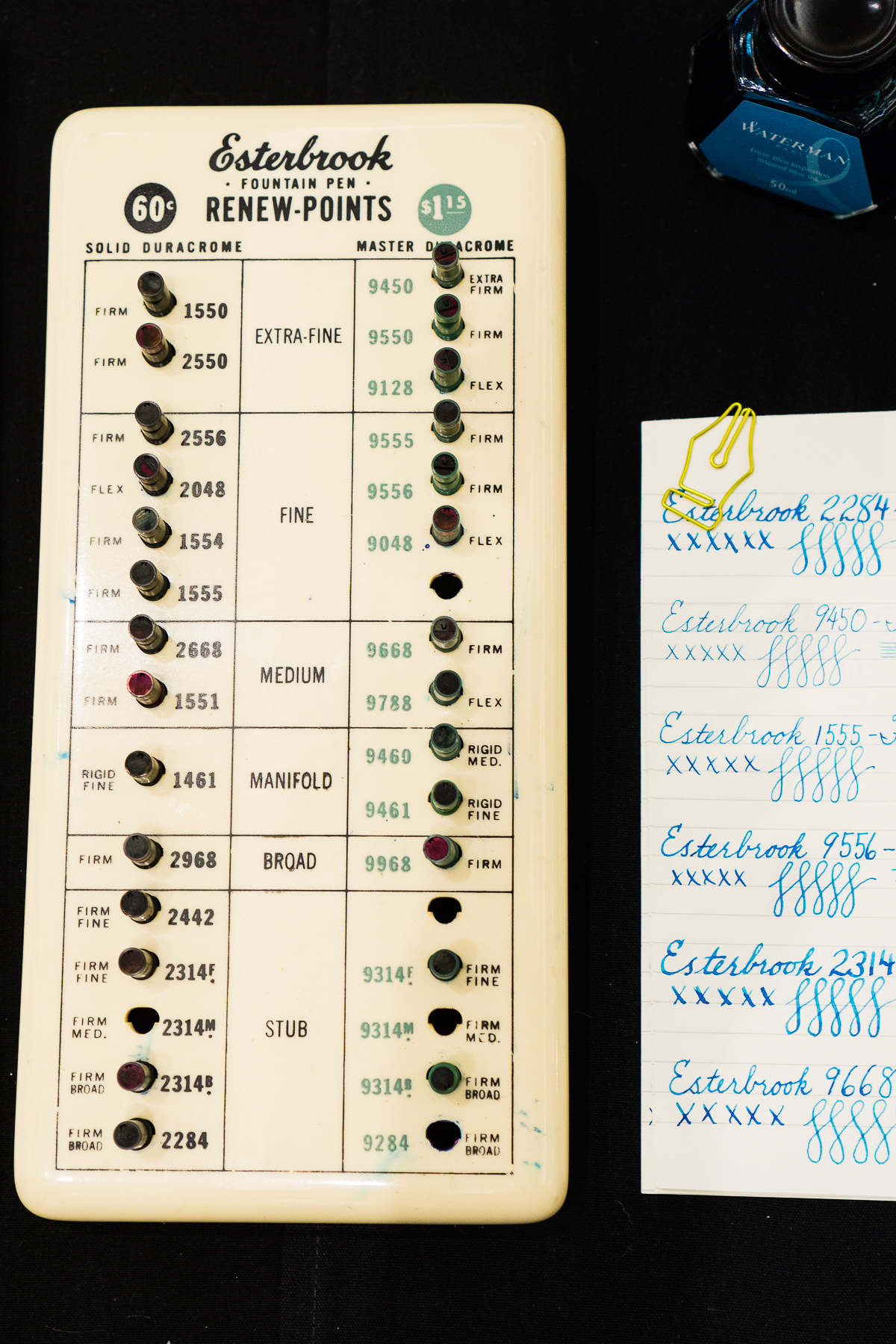
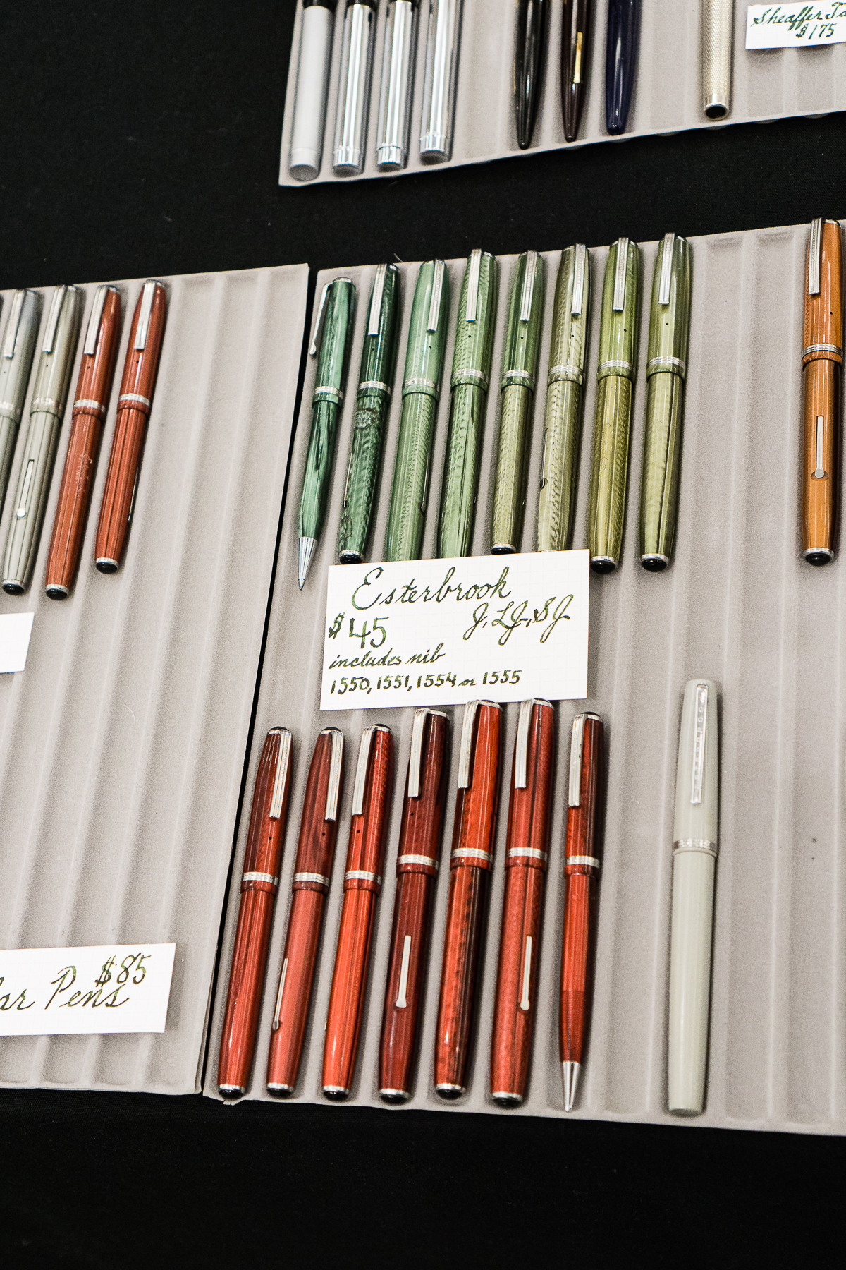
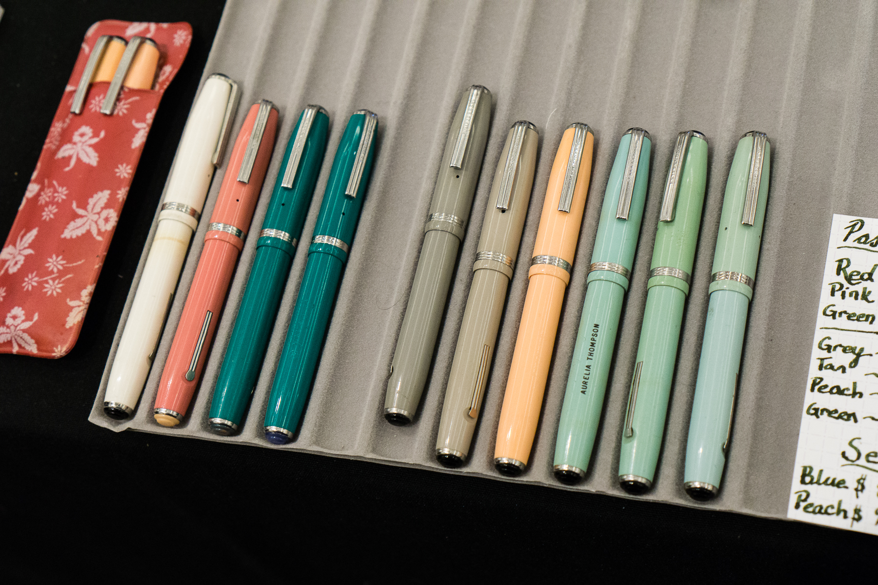
This year, I was fortunate to meet Jesi Coles at the show. She is one of the hosts of the B.Y.O.B. Pen Club Podcast and she also sells pens at shows or on her website. She is known for being a proprietor of vintage Esterbrook pens.
Jesi brought a nib tester display so people can try out the different nib types and sizes that Esterbrook had. This was pretty cool!Esterbrook J, LJ, and SJEsterbrook Pastel pens
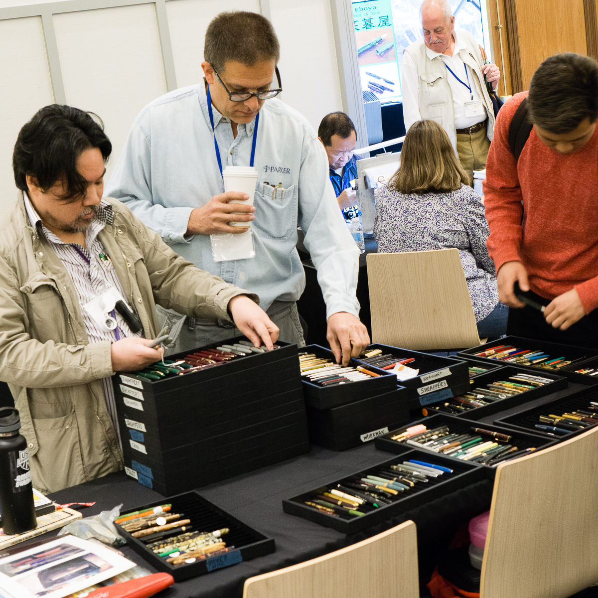
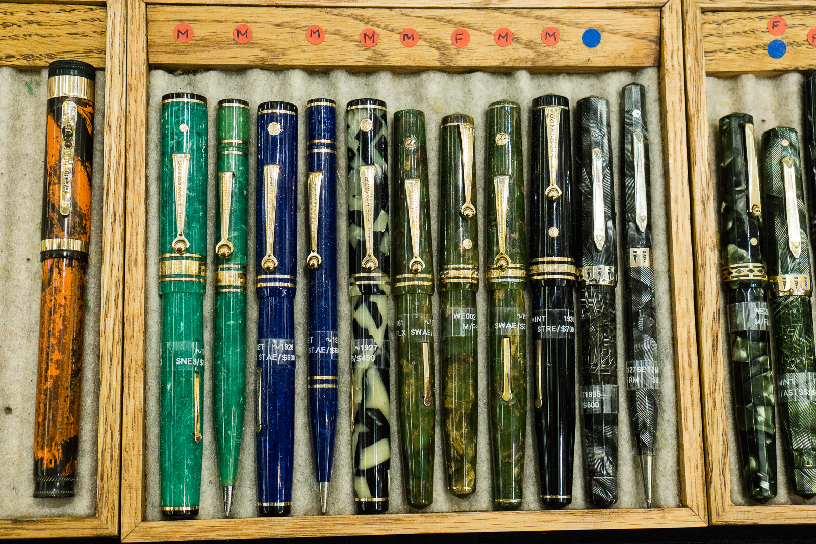
Suddenly, I saw 2 to 3 people doing a beeline from one side of the ballroom to the other. Apparently, a seller just brought out their trays of pens and a few pen buyers saw it from afar. #onlyatpenshows
Vintage Pen Trays
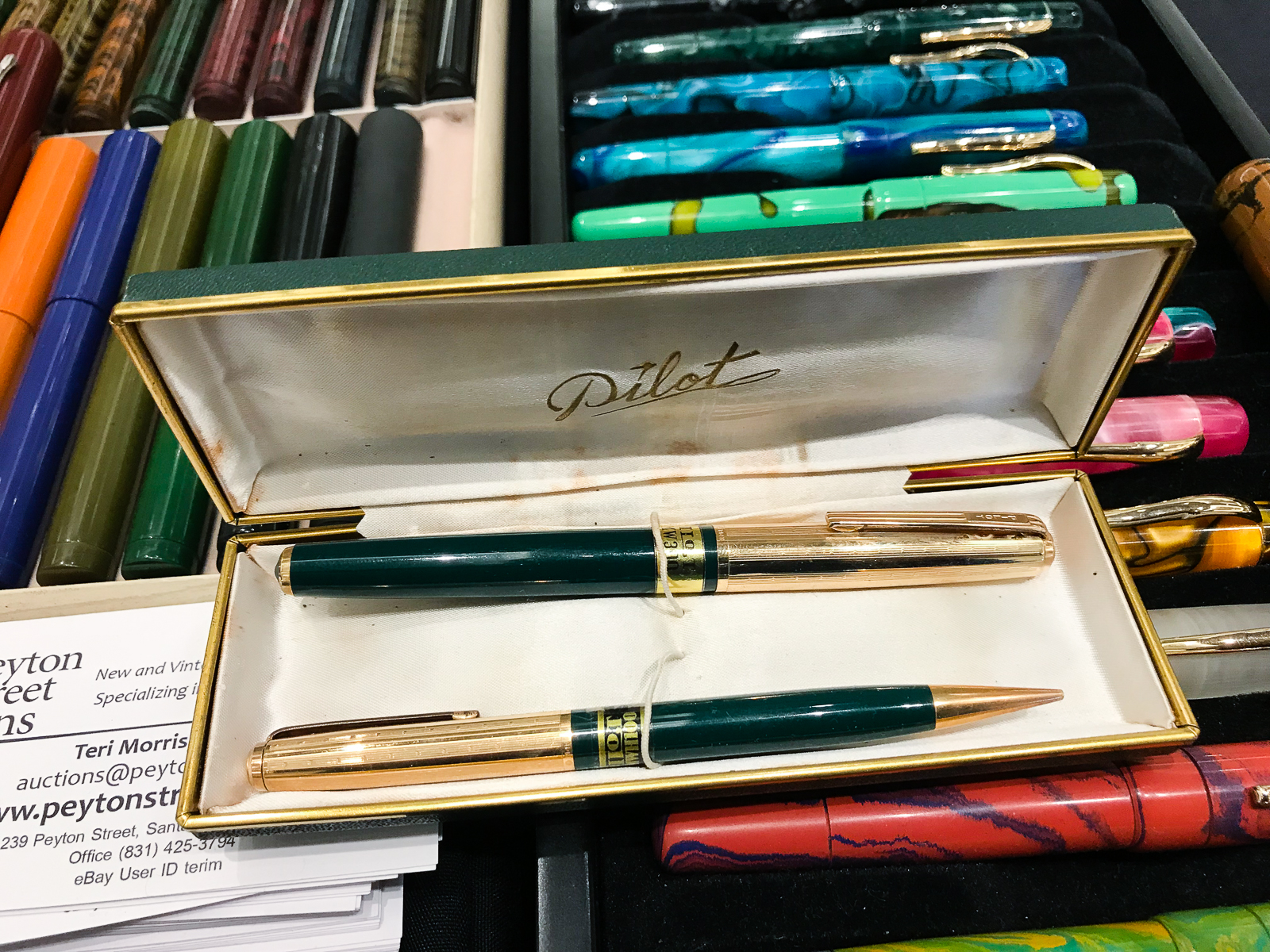
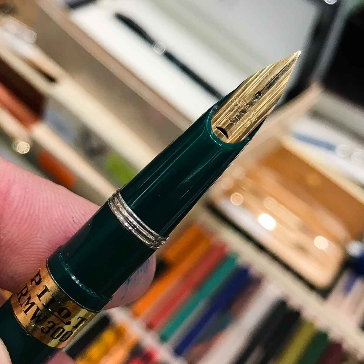
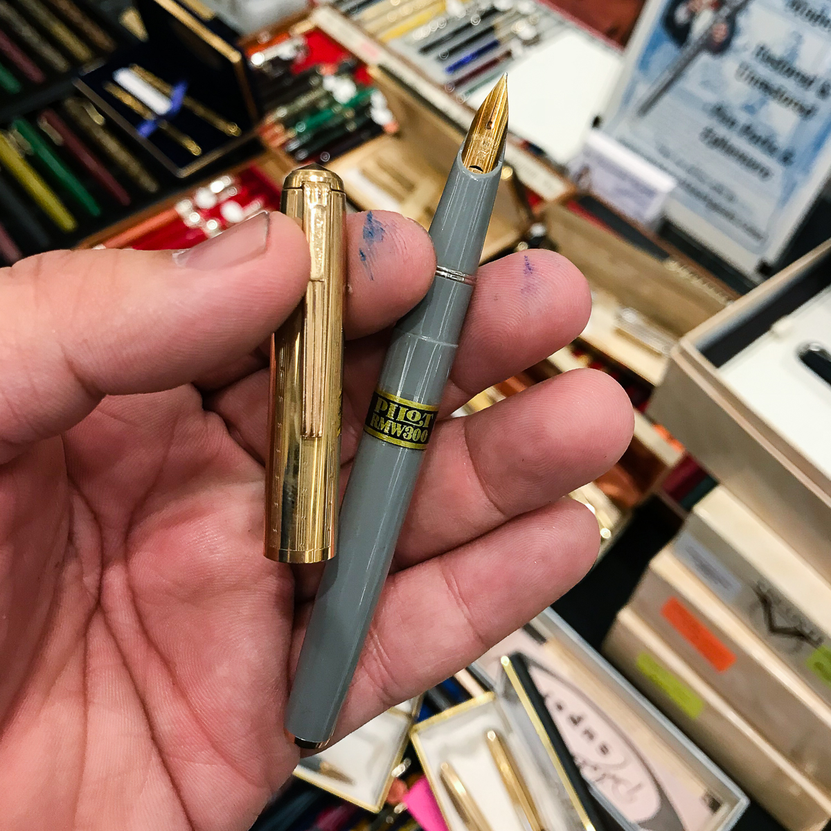
Visited the Peyton Street Pens table and found some vintage Pilot Pens from the 1950s. Sent my friend photos and a message if interested, and boom! Pen show muling… done. OPM points!
Green Pilot RMW300 setNib close up of the Pilot RMW300The Pilot RMW300 also had gray and black color choices
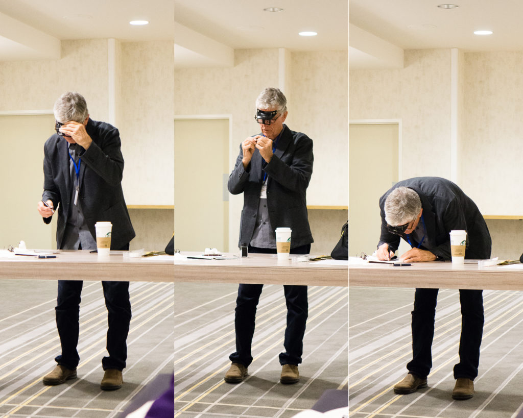
Afterwards, I went up to the hotel’s mezzanine level to attend two seminars. This was my first time to sit in a seminar in LA. The first seminar was about writing books on pens by Mr. Andreas Lambrou. He described his process when he was starting to write his Fountain Pens of Japan book as well as the Fountain Pens of the World. I was so into his topic that I forgot to take a photo. The second seminar was about fantastic nibs by Mr. John Mottishaw. He was demonstrating how to tweak nibs to make it write a little better. He asked people to bring up pens that didn’t write quite right and showed them simple tricks to make it better.
John Mottishaw tweaking nibs
After the seminars, we stepped out for brunch at the Shake Shack across the street from the hotel. First time to have their food and it was good!
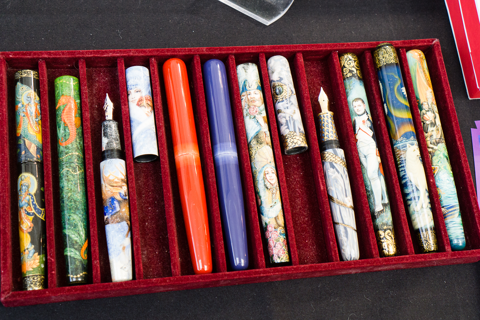
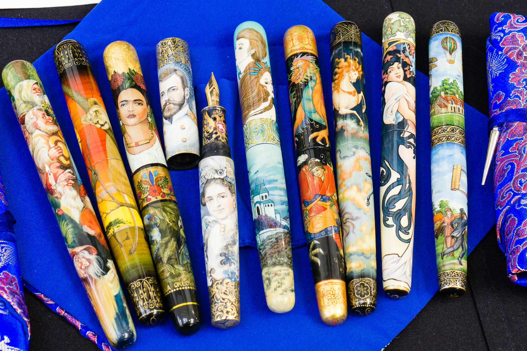
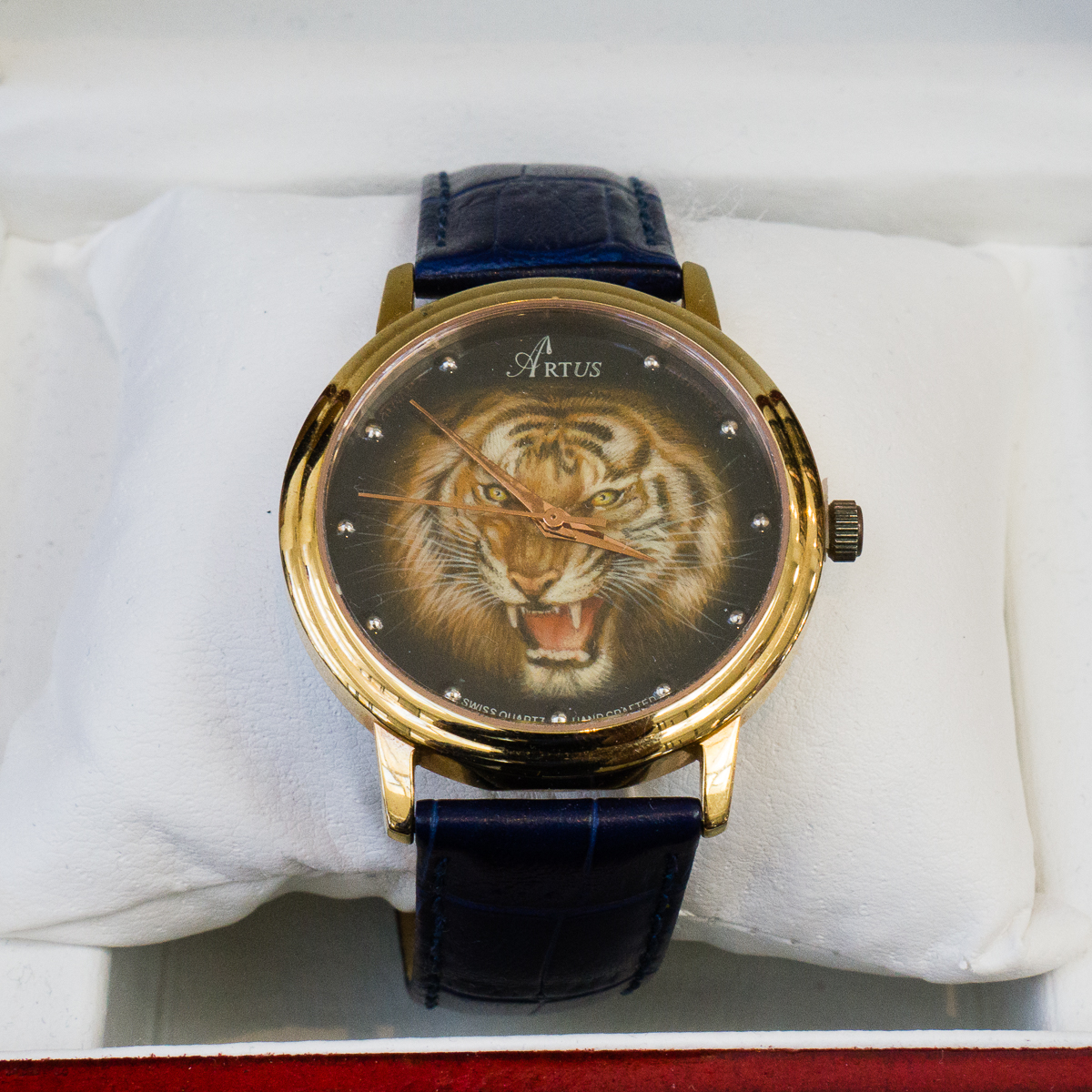
After brunch, it’s back to the show and I got to stop at the Artus Pens table and chat with Maxim. Artus Pen always has beautiful art pens painted by Russian artists. Their lacquer work is phenomenal and the artwork is just stunning.
Artus PensArtus PensBeautiful tiger lacquer on a watch. First time to see this at Artus Pen
One of the usually busy tables at a pen show is the Franklin-Christoph team. I barely got to see them yesterday because of people being at their table so I took advantage of a slower moment on Saturday. I got to peruse their show prototype pens and saw a “few” that I liked.
F-C Model 31 prototypes with the fantastic Jonathon Brooks materialF-C Model 45 and a couple Pocket 40 protoypes
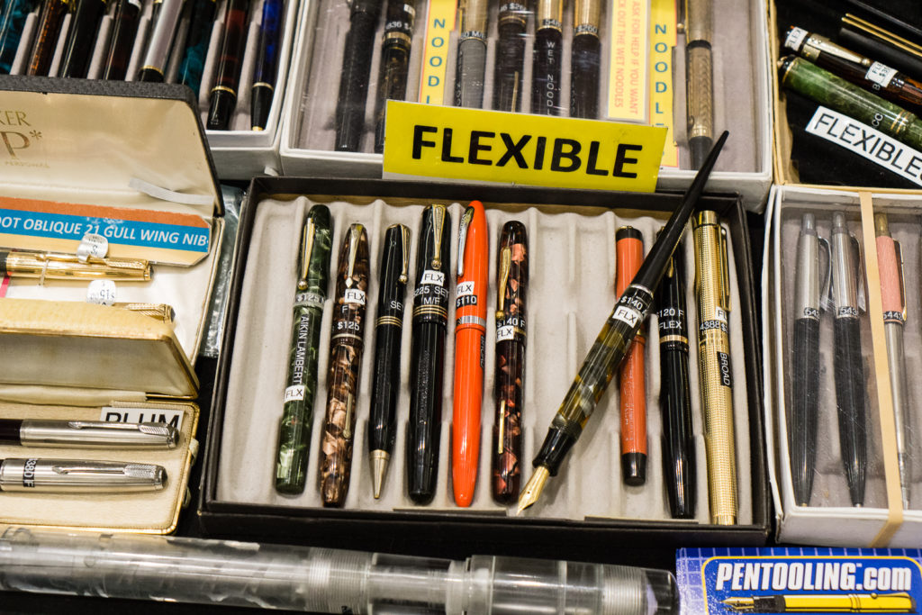
Pens from Dale Beebe’s table. Pentooling.com
flexible nib pensdesk sets
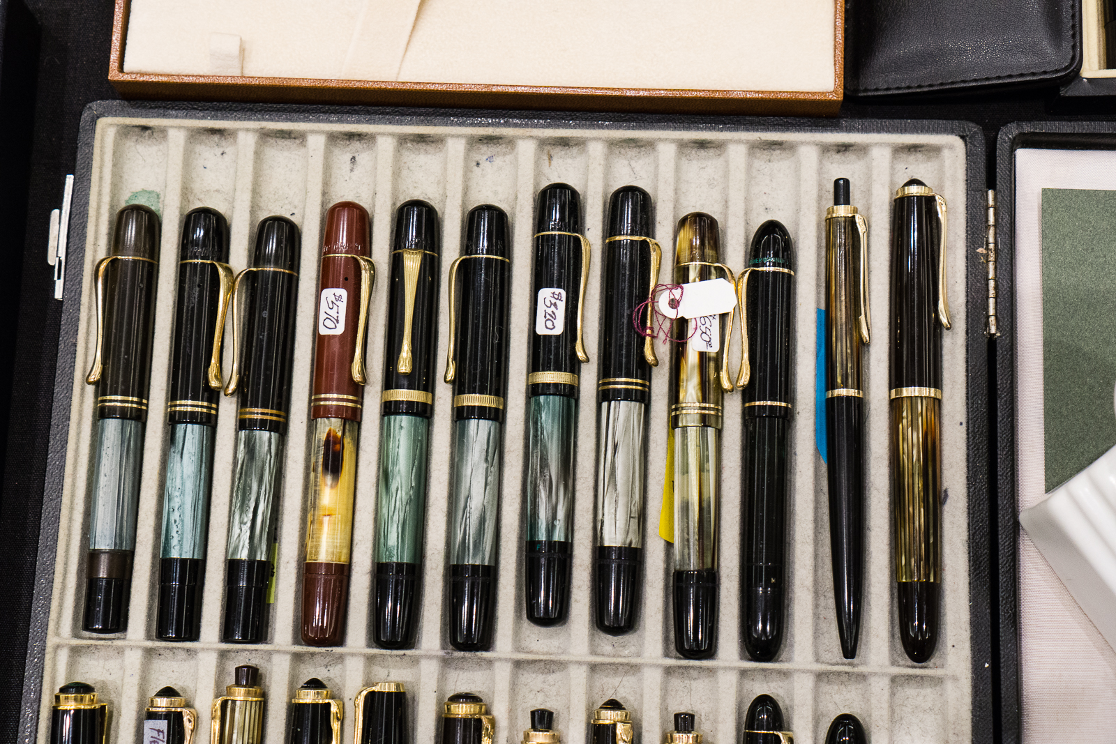
More Pelikan pens…
Vintage Pelikan 100, 100N, etc.
I saw Eric Sands of Atelier Lusso who was also at last year’s SF Pen Show. He is a pen maker and he does great work as well. The clips on most of his pens were fashioned by Eric himself.
Atelier Lusso PensAtelier Lusso Pens
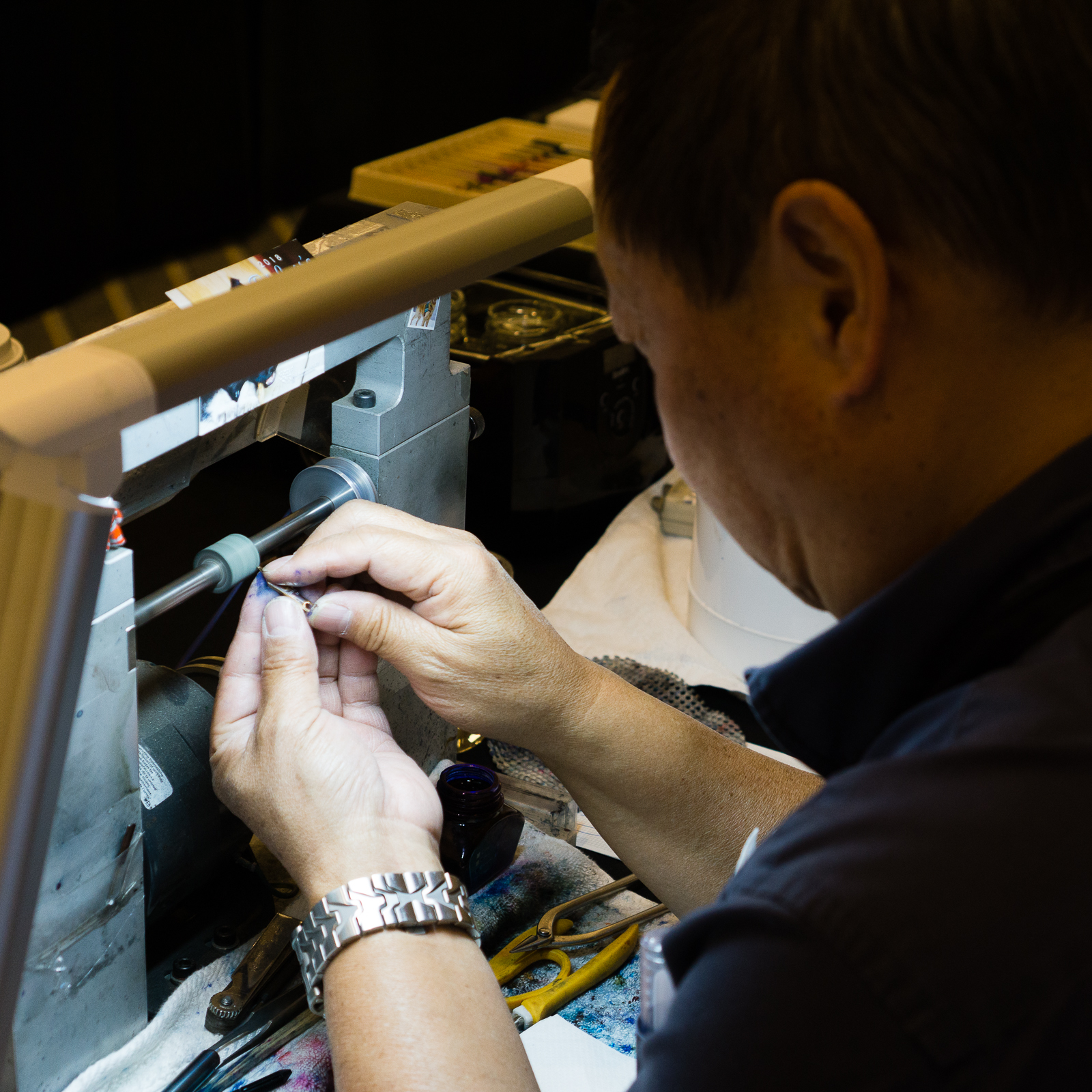
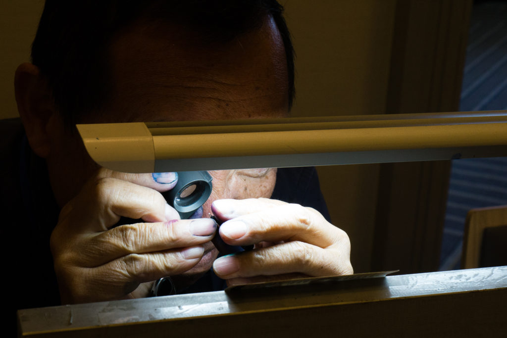
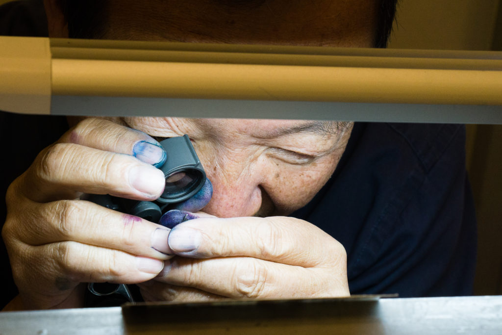
Back at Mike Masuyama’s table, Mike called me over and I had him do an italic grind on one nib as well as tune a vintage Pilot pen. A friend of mine was listed before my turn but had to leave the show so he entrusted me with 2 of his pens for Mike to work on. I spent a little over an hour sitting and chatting with Mike and other pen friends who walk by. This is one of the best ways to spend a Saturday afternoon at the pen show.
Mike checking out the nib with his loupeStill taking a closer “loupe” at the nibMike applying his skills and grinding the magic on to my M800 nib
Sometimes, a vintage pen is stubborn and takes a little more time. Mike seems to be casting a spell on it or something. =P
After sitting with Mike, I walked around once again and just enjoyed the rest of the afternoon. We went to dinner just outside the hotel and came back to “The Tent” for more hanging out.
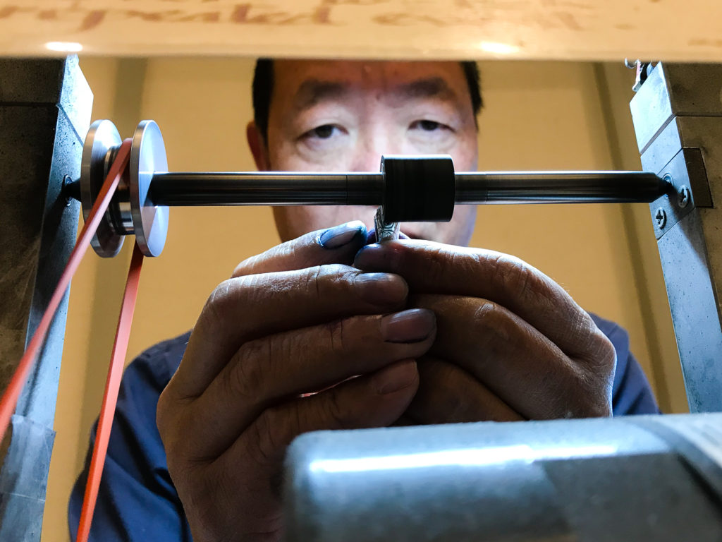
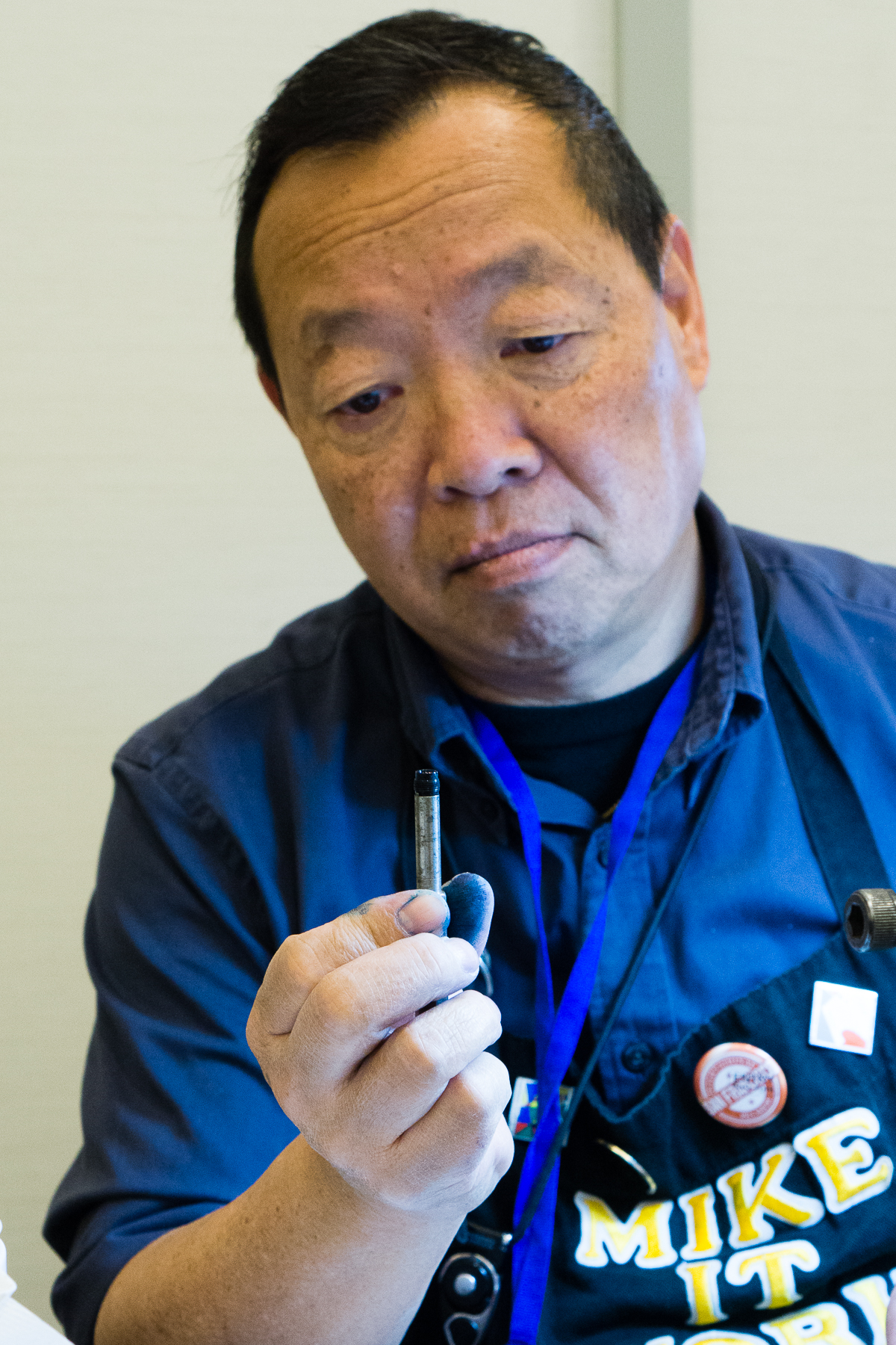
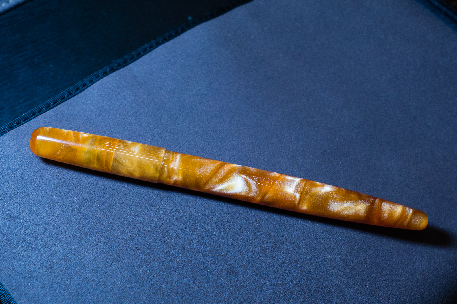
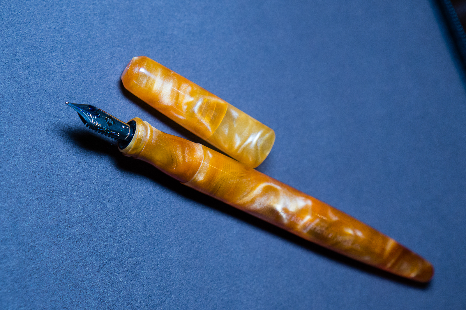
A friend of mine showed me her newly purchased Franklin-Christoph Model 65.
We were admiring different pens with my LED light panel then something happened. A certain brand of urushi lacquered pens kept on appearing under the light and we decided to take a family photo.
A Nakaya family photo from different pen ownersBTS Photo: A photo LED light panel makes a difference when you’re in a dark areaKikyo (Blue) Urushi on 2 Neo-Standards and a Long. We were discussing how the kikyo finish was different among the 3 pens. Pretty interesting!
Called it a night and went to bed. Sunday is the busiest day and I am helping out at a table so I had to get some rest.
Sunday, February 18, 2018
Last day of the pen show! Woke up around 6:30 to catch the sunrise. I swear, pen shows are the only time I sleep late, and wake up earlier than when I have to go to work. Pen Show Time Zone! =)
The show opens to the general public by 10:00am so the Trader Pass holders had 2 hours of last minute shopping before the crowd gets in. I took advantage to take a few photos before I had to work at a table so here are some photos as I walked around.
Nakaya nib testersNeo Standard in Shinobu BlueUrushi goodnessThese ladies took care of all the customers over the weekend. They answered questions about the pens as well as nib grinds. Thank you!Last but not the least, CFP’s security detail, Pony Boy. #adventuresofponyboy
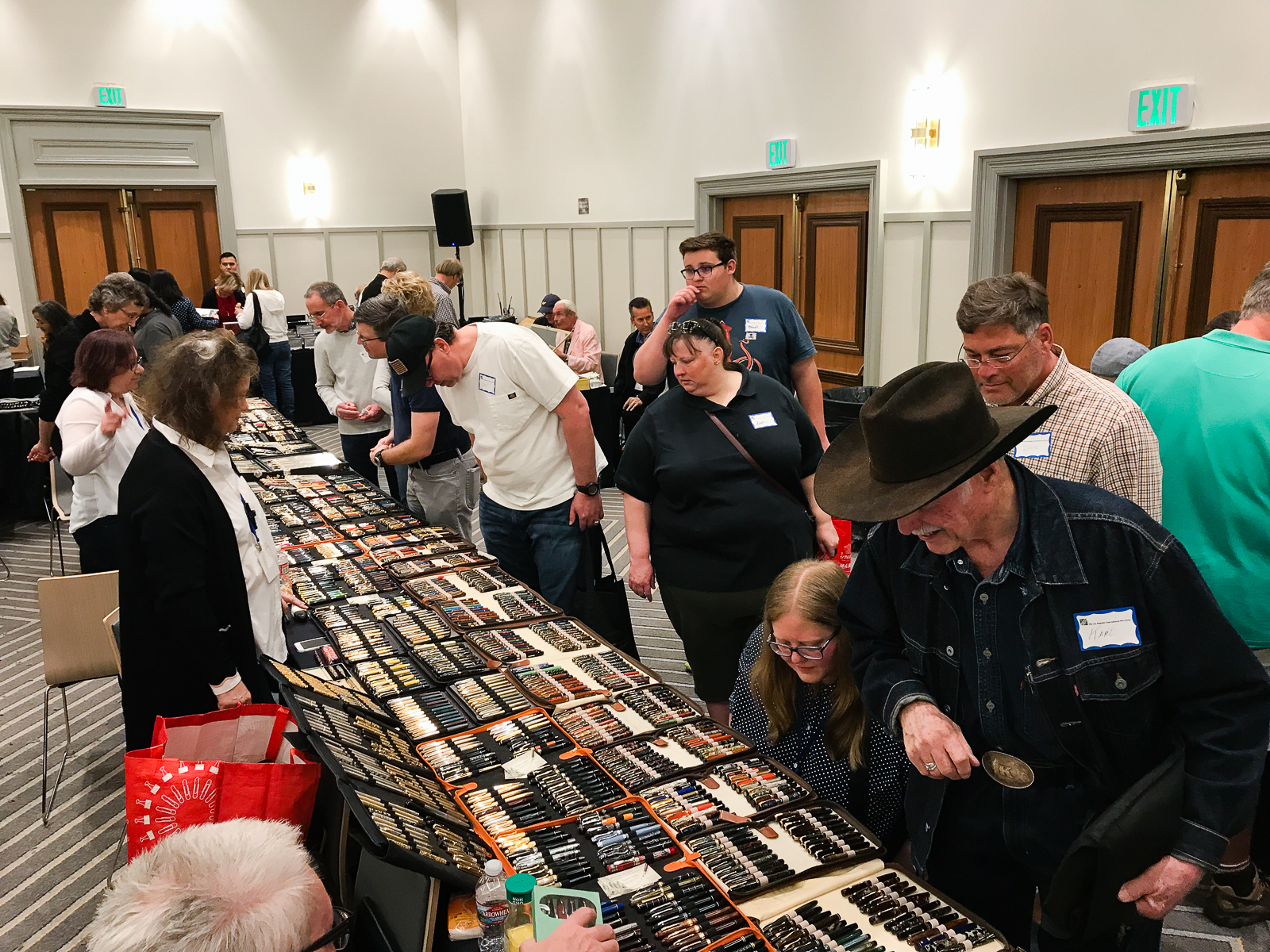
The PENguin Rick Propas‘ table had a lot of pens for sale and these were a few pens that caught my fancy. He is also a “fountain” of knowledge about pens and is always willing to share it.
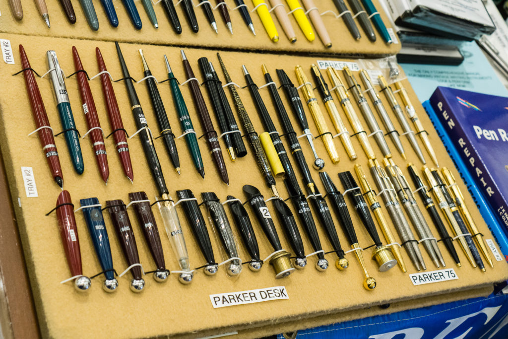
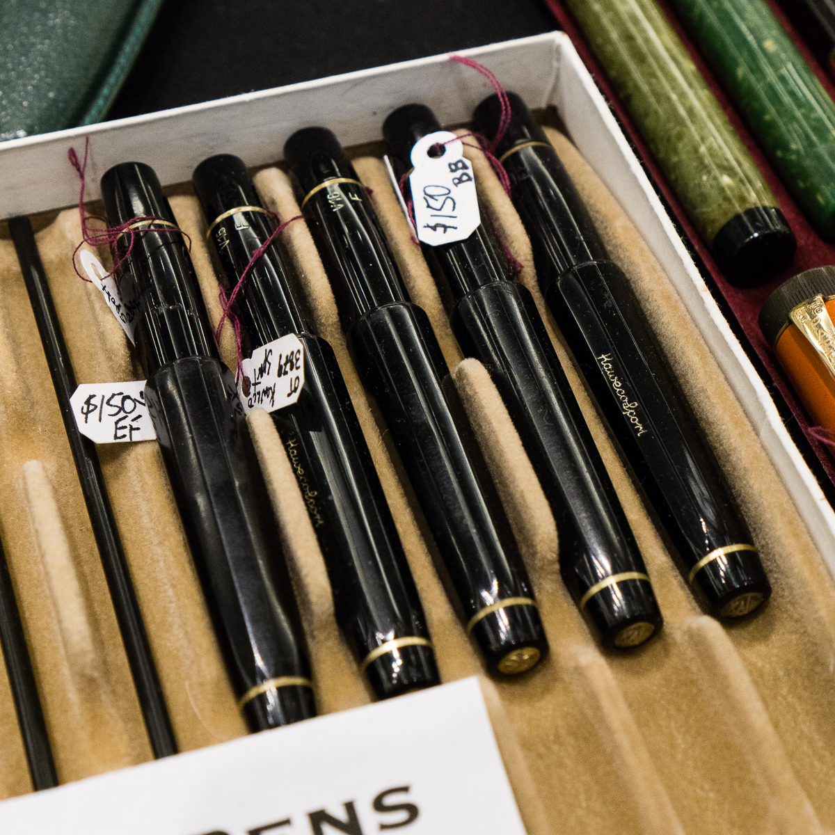
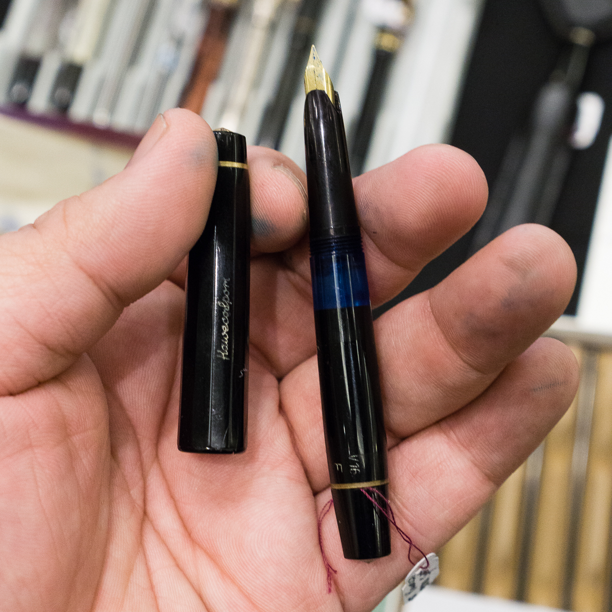
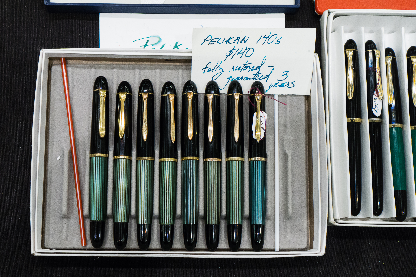
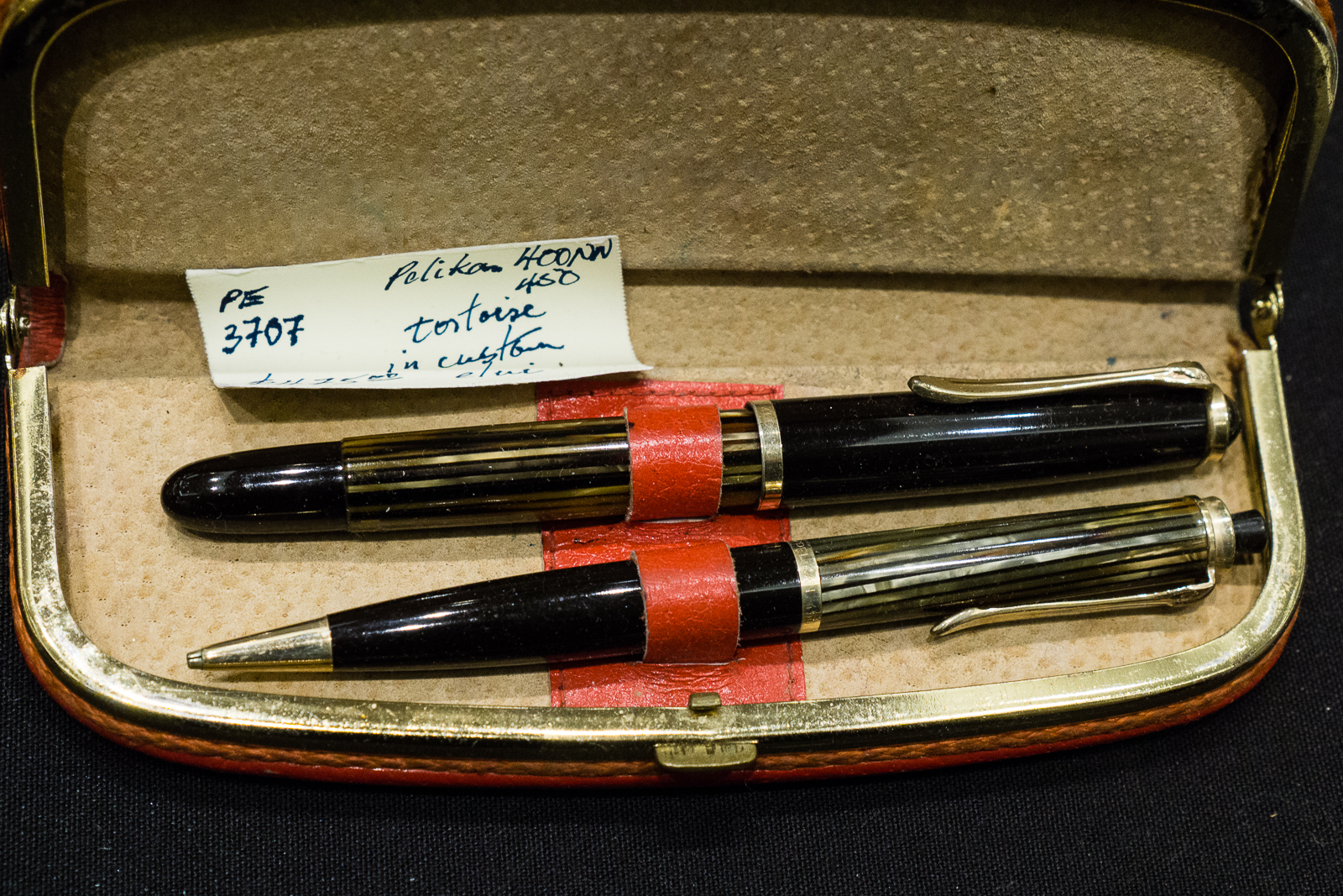
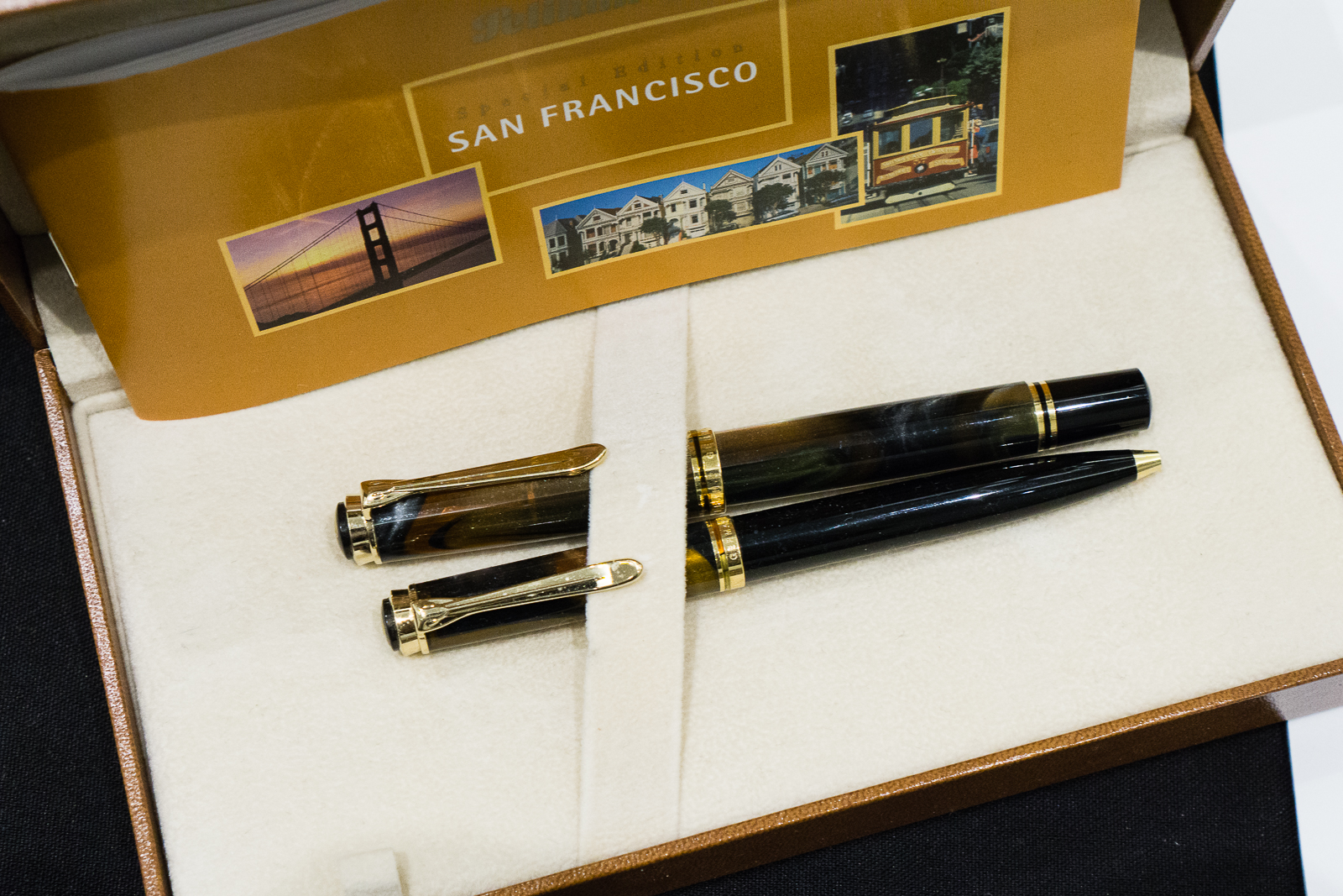
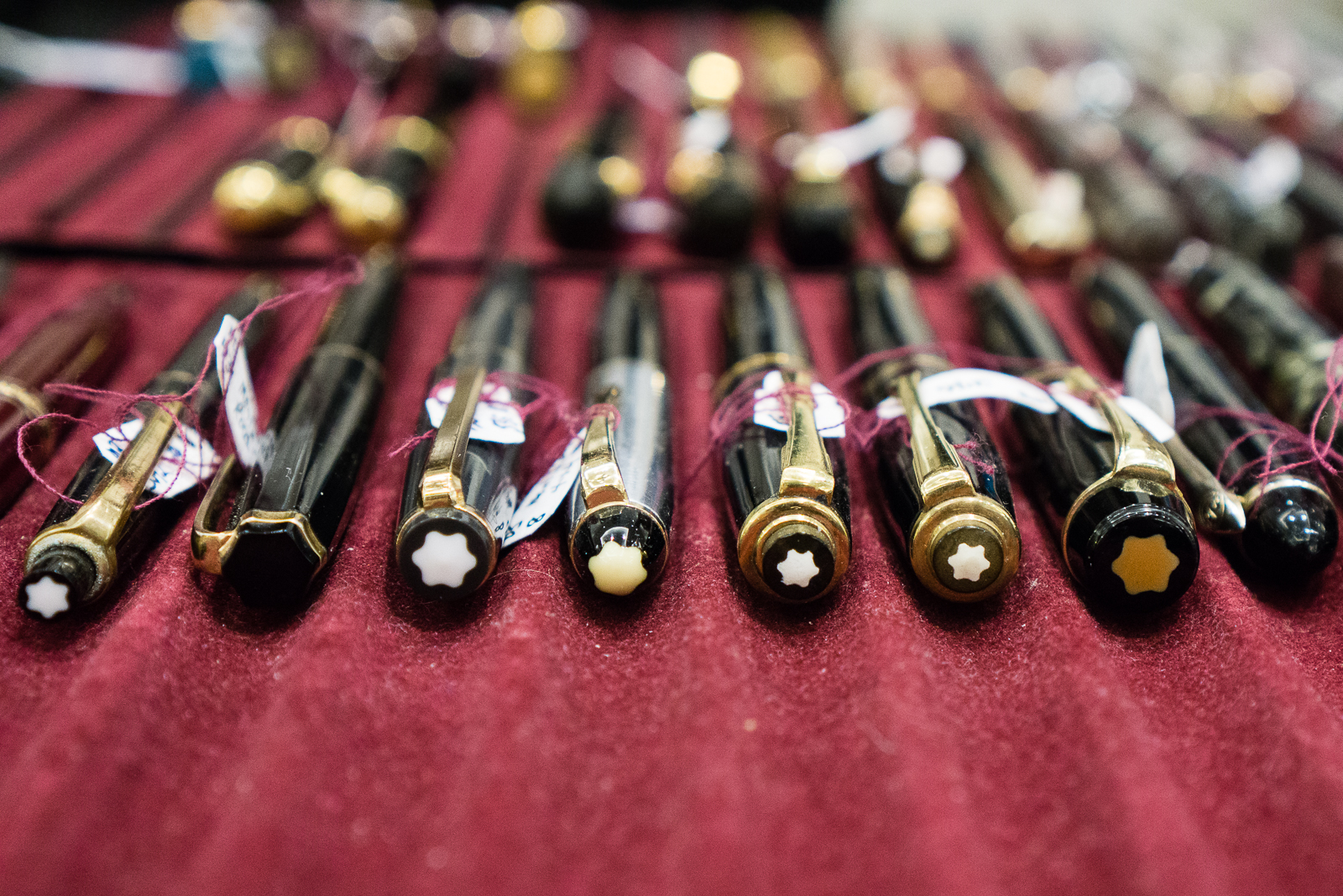
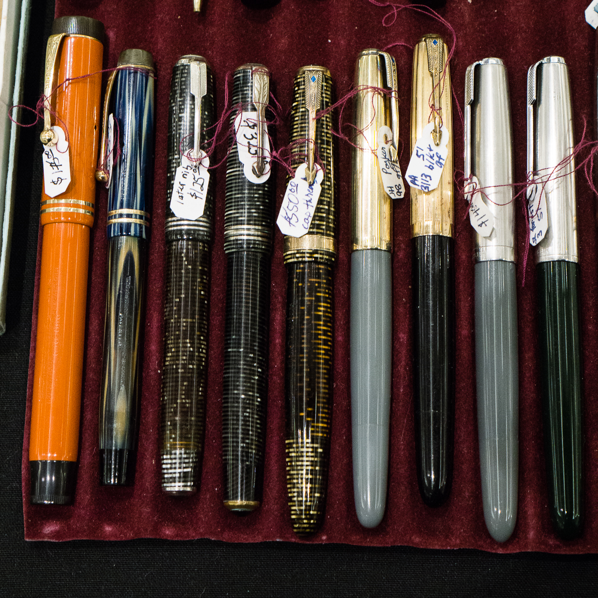
Vintage Kaweco Sport pensUncapped vintage Kaweco Sport has a nice shaped nib and a blue ink windowThese were Kaweco 187 and 189 vintage pensVintage Pelikan 140 for $140. These are perfect starter pens for people who want to go vintage and experience a Pelkan pen with vintage gold nibs. The box on the right were the 120 pens that usually sport a steel nib.A Pelikan 400NN Tortoiseshell set in its original leather caseOne of the more sought-after Pelikan pens is this M620 San Francisco from the City Series.A different perspective to show the different cap finials of vintage Montblanc pens. #whitestarpenRick also had a lot of vintage Parker pens for sale. I wish I had funds to just buy all of these.A nice gold-filled Eversharp Ventura set.This is one of the premium pen trays =)Pen shows have knives too!
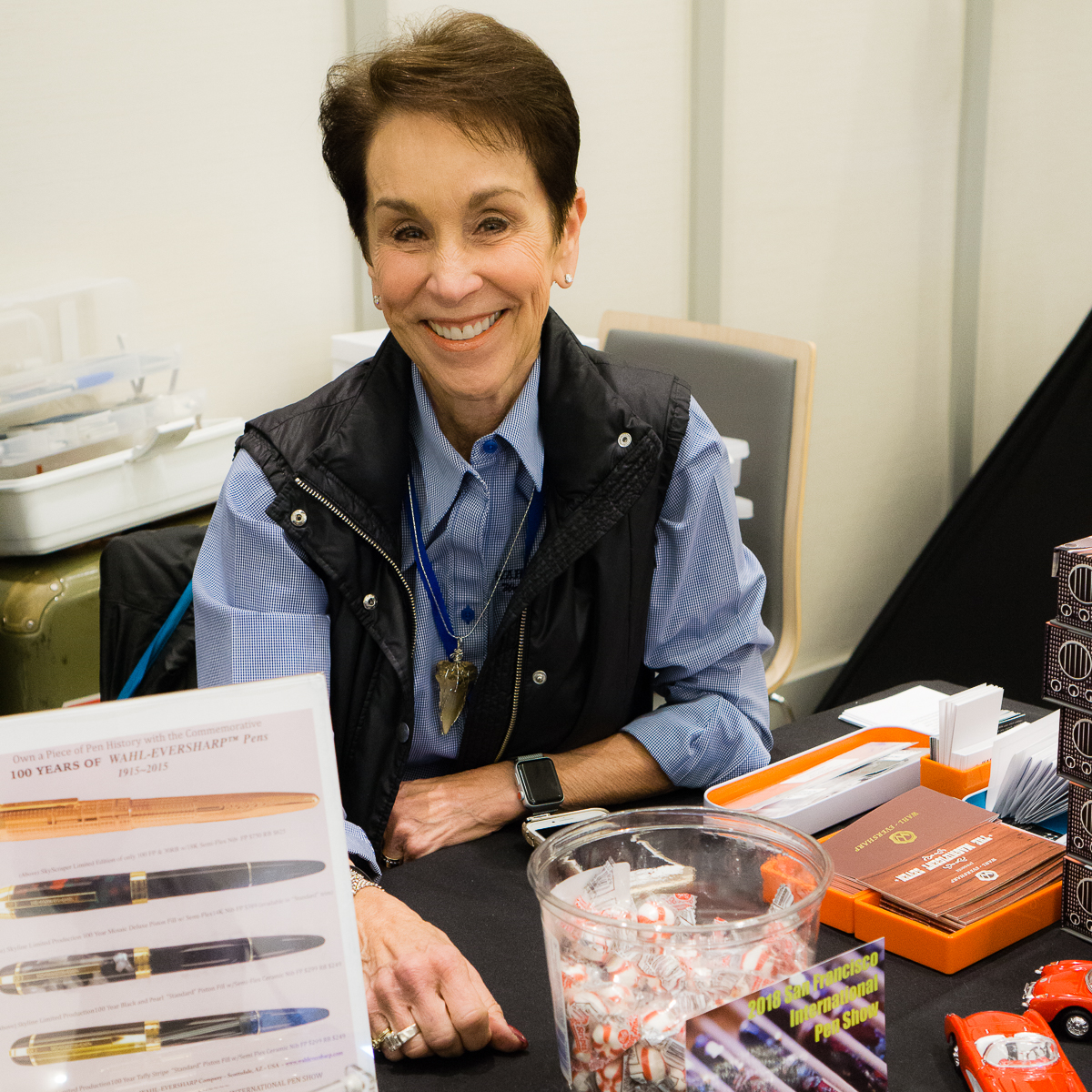
The Wahl-Eversharp table was manned by Syd and Judi Saperstein
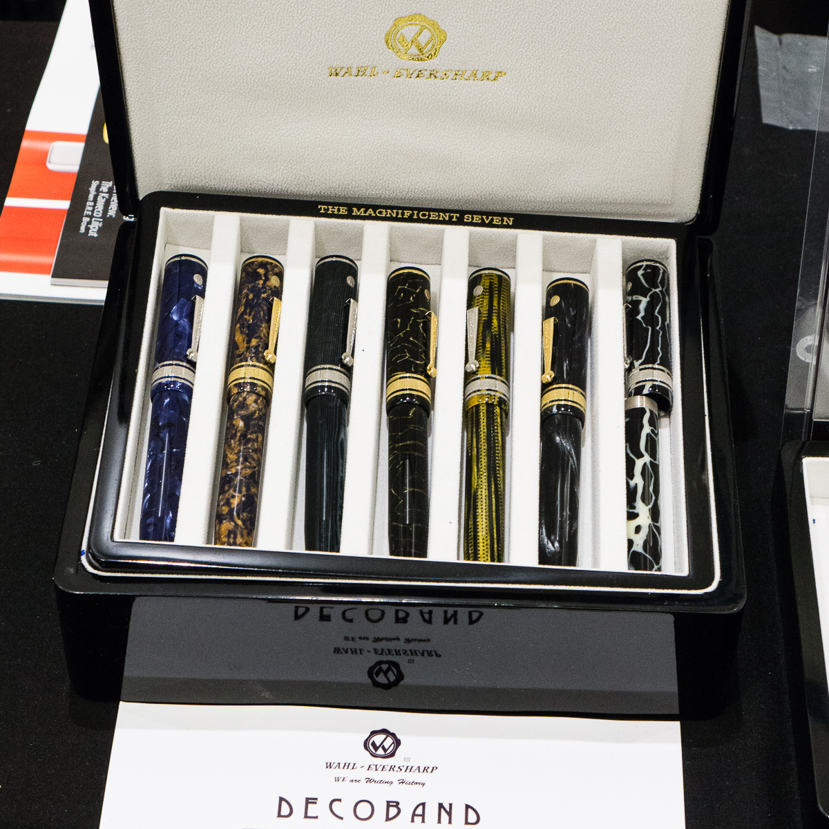
Judi was ready with her sweet smile and to give away sweet candies!Wahl-Eversharp Decoband Israel. That blue material is fantastic!The Magnificent Seven Decoband set
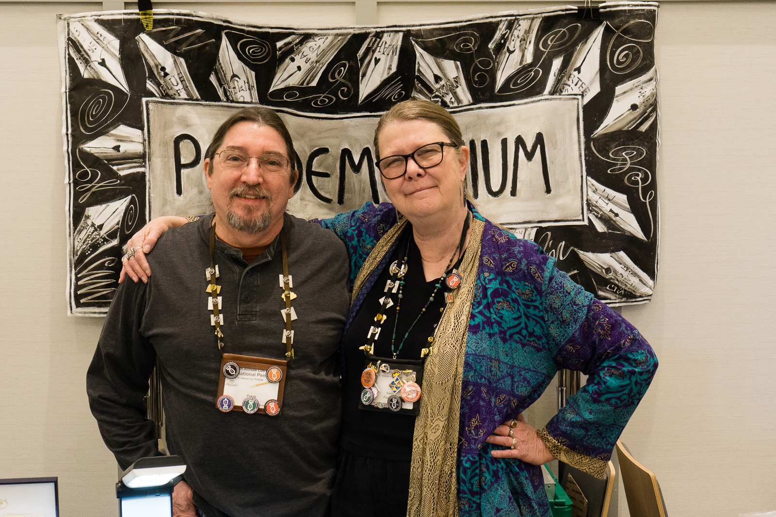
Pendemonium’s Sam and Frank were ready for the Sunday crowd
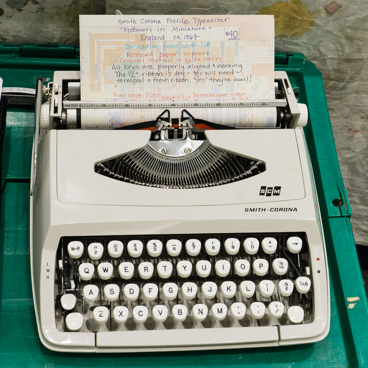
Frank and Sam Fiorella. Two of my most favorite people.I seem to always catch Sam while taking photosTypewriters can also be found at a pen show
Bill Weakley’s table had beautiful discontinued Pelikan pens for sale.
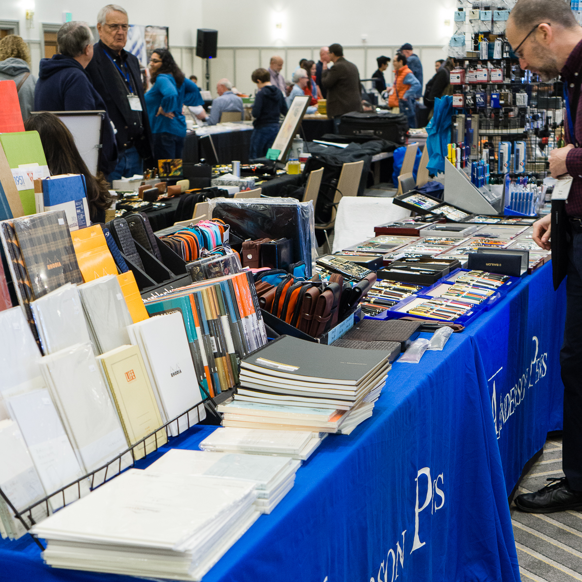
The Andersons always brings paper, pen cases, pens, and inks to the shows.
Anderson Pens
Vintage Wahl-Eversharp pens found at table of The Write Shoppe
Wahl-Eversharp pens
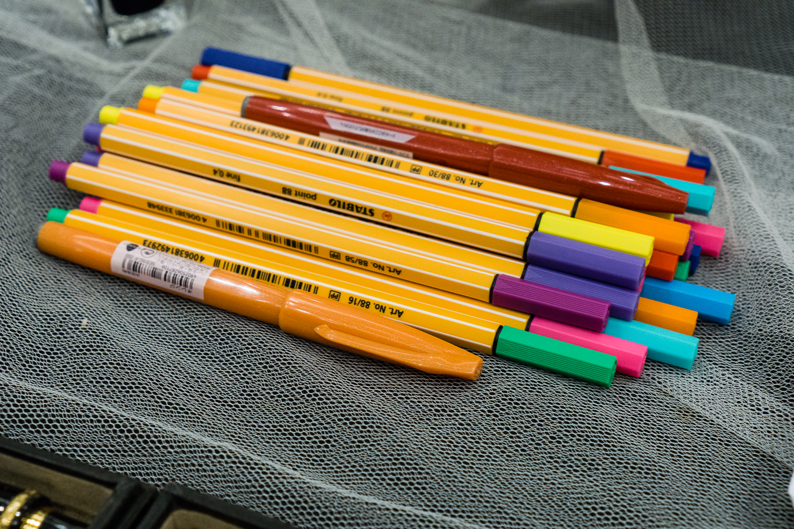
Not just fountain pens… Stabilo markers found at Carla M.’s table for kids attending the show.
Coloful Stabilo markers
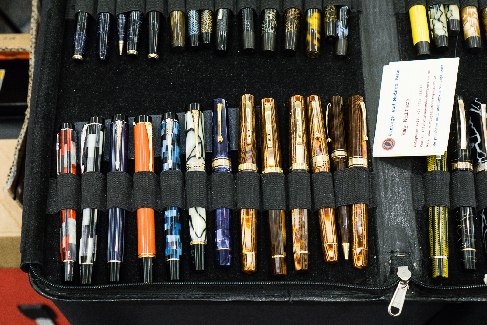
Ray Walters from the United Kingdom was at the show as well.
Parker Duofold pens, Omas pens
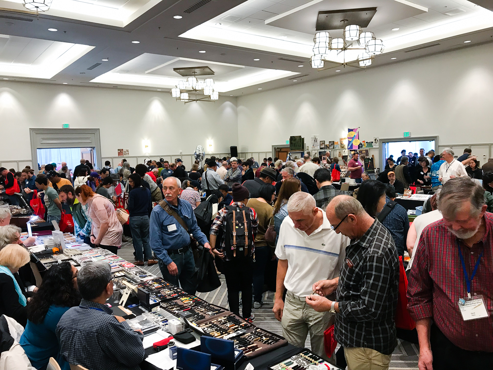
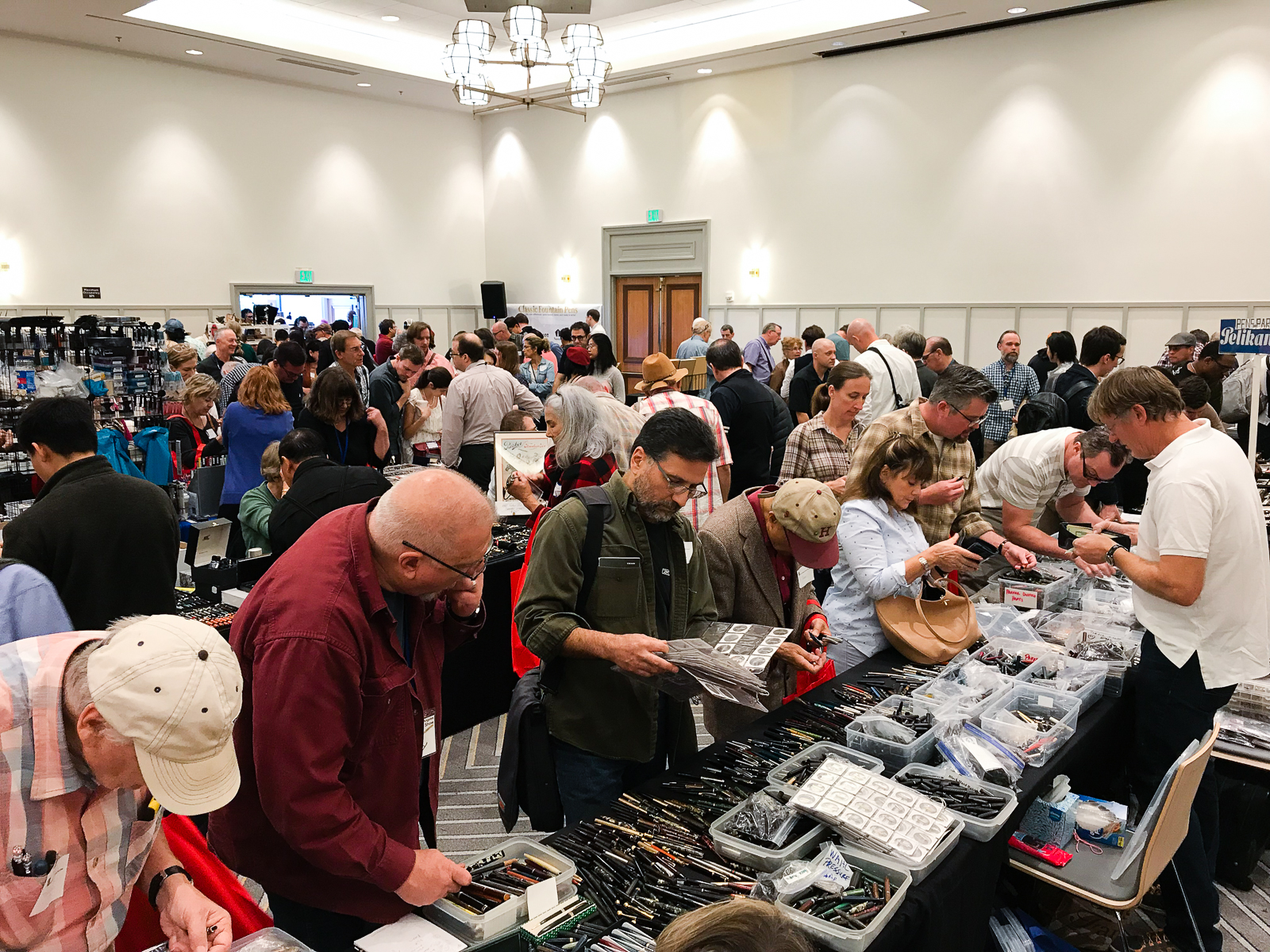
Alright, 10:00am arrives and the crowd is let in. I didn’t get to take photos of the line this year but it was pretty long as usual. Having one public day at a pen show honestly causes the big rush. Sometimes people wish that public was allowed to get in on Saturday as well. Will that change? Maybe. Not sure. I hope so. Anyway, here are my shots of the ballroom while I was helping out at a table around 10:30 so the full force of people haven’t really cleared the line yet.
Around 1:00pm, the crowd let up a bit and I got a chance to walk around and do a live Instagram video once again. Enjoy!
And with that, 5:00pm arrived and the 2018 LA Pen Show was over. Helped a couple vendors pack up, and went to dinner to end a tiring but fun weekend.
Final Thoughts
Pen shows are definitely a fun event to attend. Being in the pen community forges friendships and pen shows are way for you to see your friends. It can never be said enough, if you are near a pen show or can afford to attend one, do it. You find out how a certain pen feels in your hand, you learn about different pens, you find pens you didn’t know existed, but more importantly, you meet people who are as enthusiastic as you are with stationery and pens. To these people, these aren’t just sticks that hold ink. =P
As I’ve said before, pen shows for me have evolved into a social event and honestly is what I treasure more than what pens I bought. To all my friends, it was great to see you as always and to all the new people I’ve met, Instagram people I’ve finally met in real life, hope to see you all more often as well. Until next year!
Thank you for your time in reading my report!
“Pen shows are about the people and the stories between each other. The pens start the story and the people get closer.”
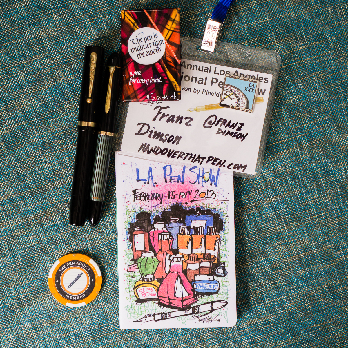
Part of my pen show haul: Sheaffer Flat-top, Pelikan 300, and LA Pen Show journal from Vanness Pens. I also got my Pen Addict “MemberChip” given by Brad Dowdy. Gotta represent Susie Wirth too!
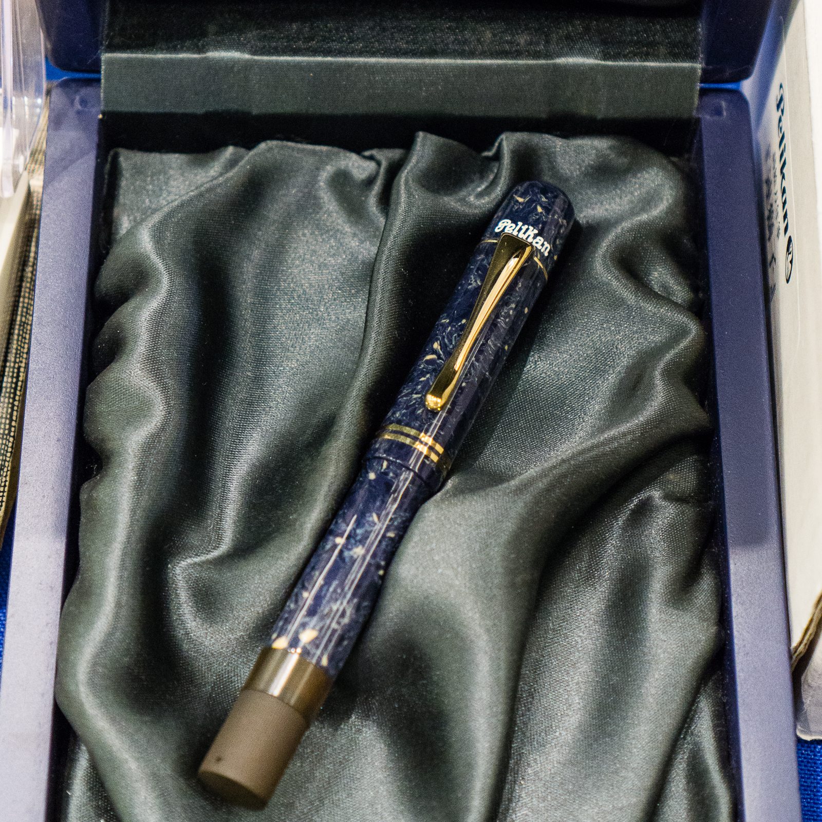
Katherine: The grey frosty cap reminds me of dirty snow, and the dusty purple ink of cold winter nights… just kidding. I just really like this pairing, and the pen is new to me, so I’m really excited and using it a lot. I first saw this pen over a year and a half ago (on May 12th, 2016 — I don’t remember many dates, but I remember important ones!), in the pen case of a friend (who shall remain nameless), and I fell in love. I tried other pens in the meantime, a black FC 45 IPO (which we reviewed) and a Wonderpens Model 20 in the same “bronze” material… but it wasn’t quite the same. To me the combination of this smokey material and compact form factor (with a sprinkle of nostalgia) is magical. Don’t judge. Anyway, friend decided to buy some fancy urushi pen or something, and offered me this pen… and now it’s MINE.
“Patience is bitter, but its fruit is sweet.” – Jean-Jacques Rousseau (Wow, I’m dramatic tonight. Time to go to bed… Waiting wasn’t really that bitter. Just lots of scoping FC tables at shows and on IG.)
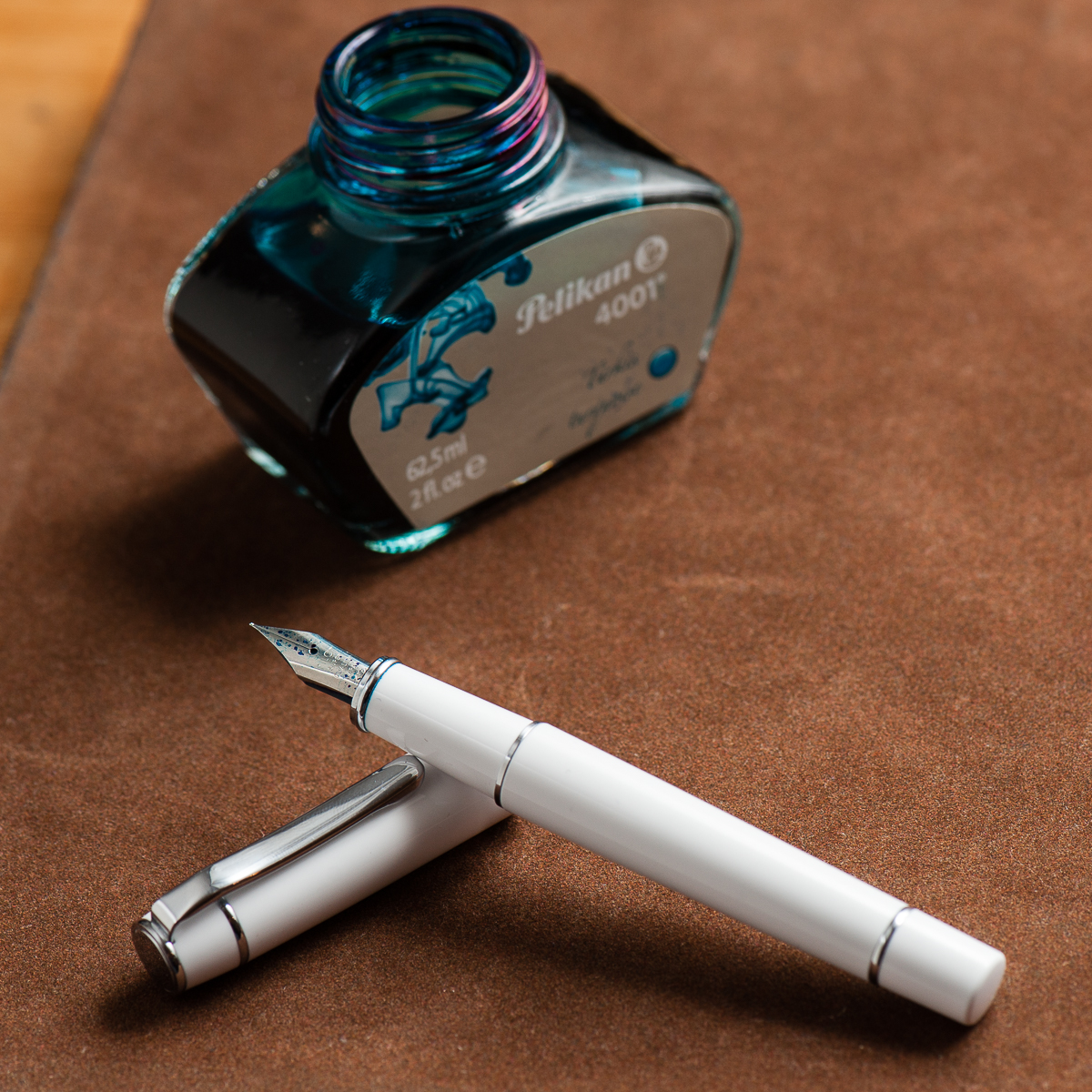
Pam: This has been one of the worst winters at work within recent memory for me. Between medication shortages and the flu vaccine being practically ineffective (twice I have gotten the flu… twice!), it has been an incredibly busy season at the hospital. Thus, my homage to this season is the Pilot Prera (in white) paired with Pelikan Turquoise. The Pilot Prera is a workhorse pen for me given that the F nib works wonderfully on office paper. Pelikan Turquoise a wonderfully vibrant ink that pops off the page of my rather dull reports at work. As people say, it’s the little things in life. Stay warm, healthy and safe this season everyone. (Please be patient with your local pharmacies and pharmacists as we troubleshoot the ridiculously long list of medication shortages.)
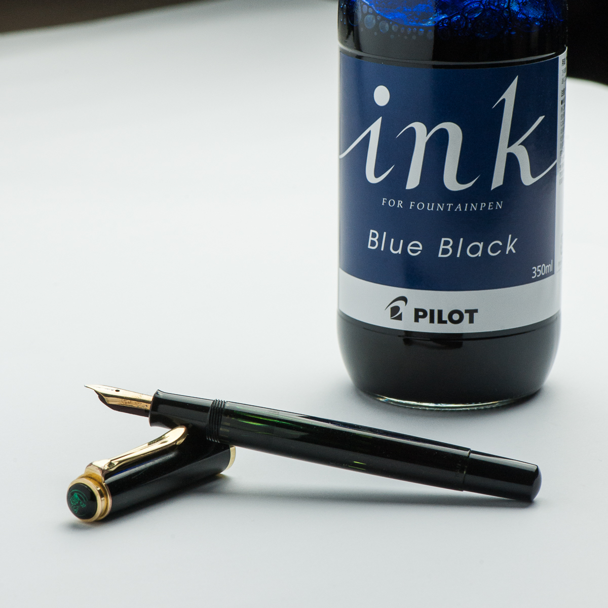
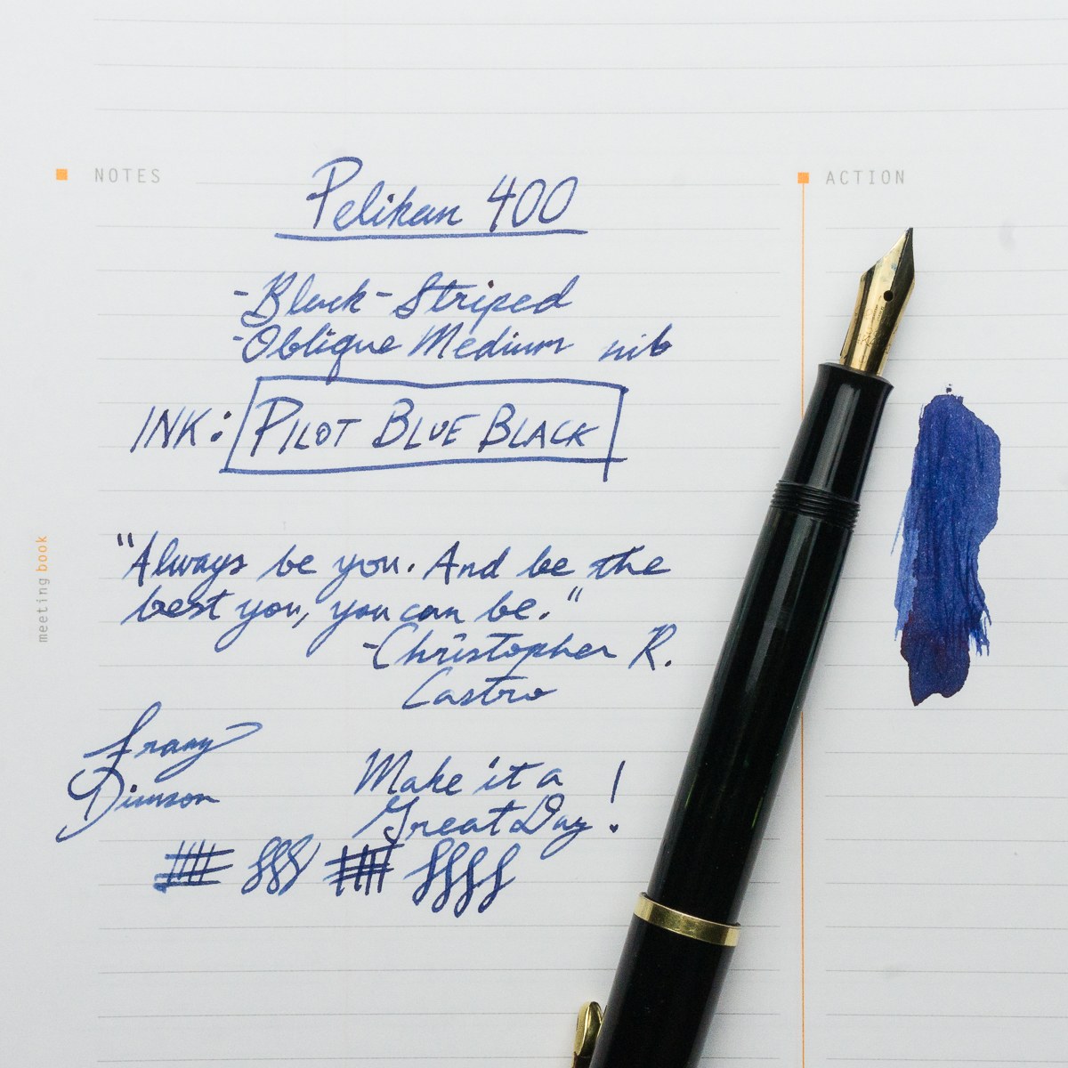
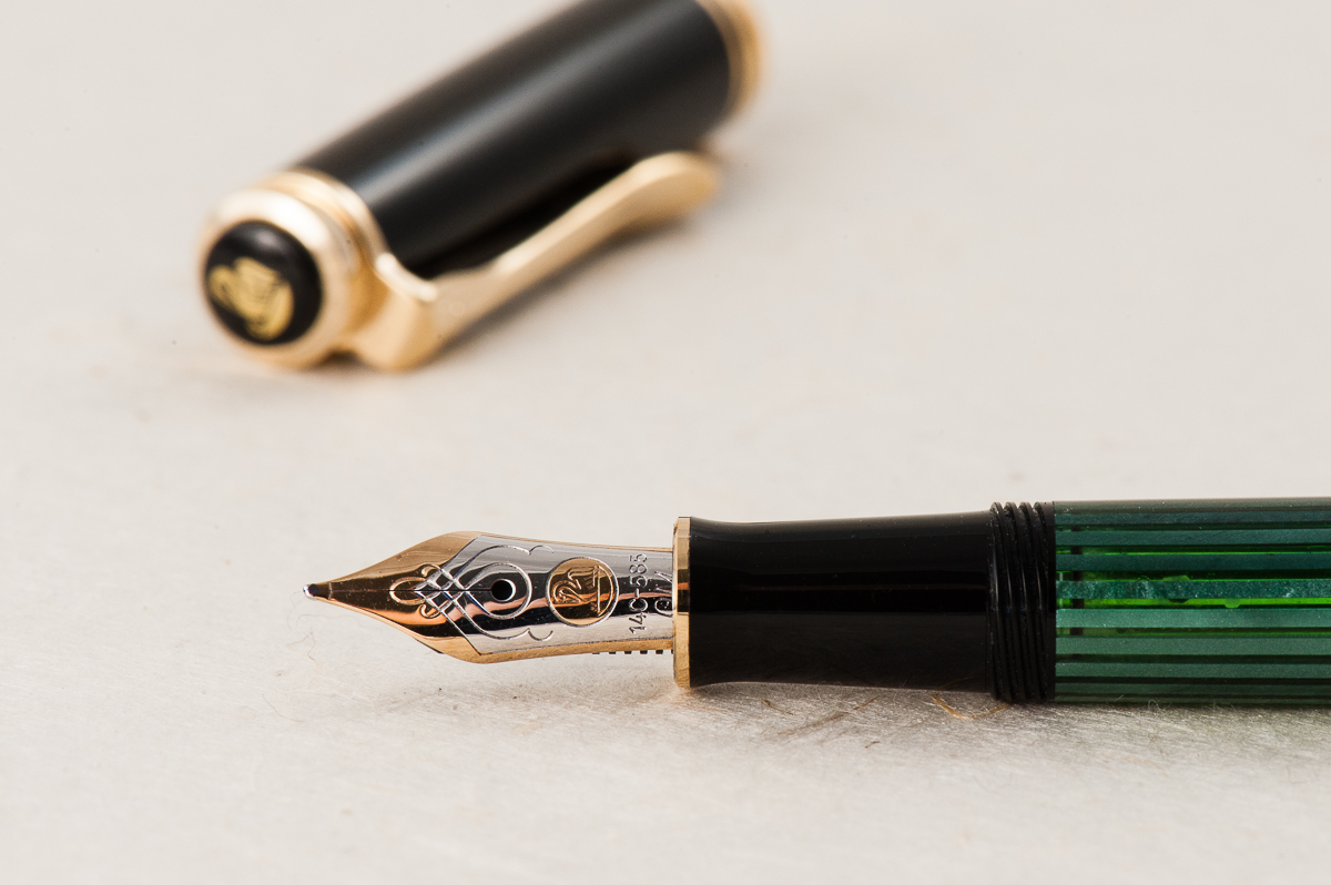
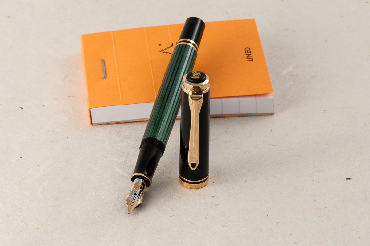
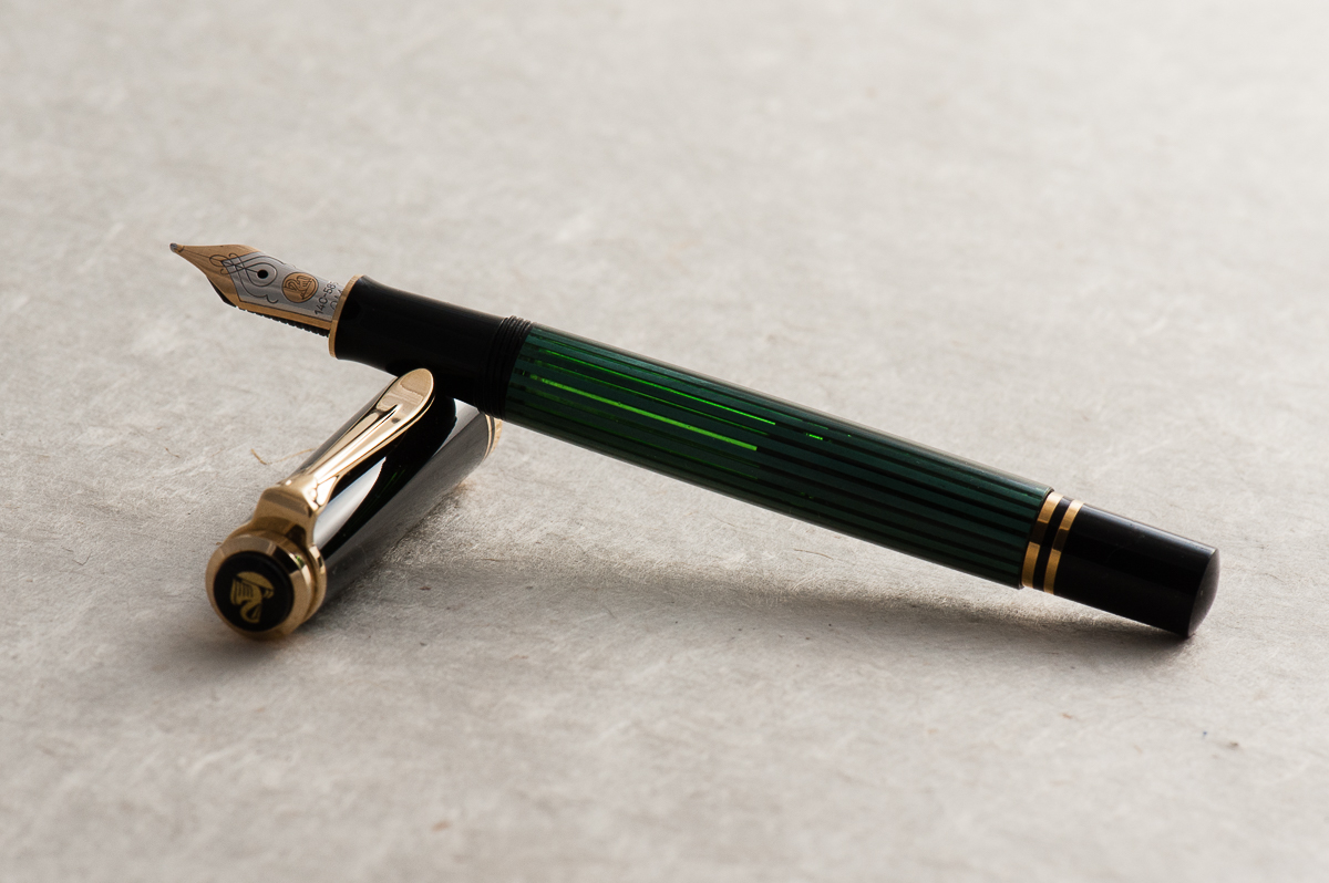
Franz: The first month of the new year is represented by a vintage Pelikan! Actually, this is my oldest Pelikan pen and it’s a Pelikan 400 in black-striped finish. This was actually one of the last pens I received in 2017 so it’s more of a recent acquisition. Upon my review, this 400 was manufactured around the year 1953 due to the lack of engraving on the cap band and the nib imprint without the Pelikan logo. The black stripes are between green translucent strips that let you see your ink level very subtly and I find it very captivating. It took me almost a year to find this pen at a reasonable price and be in decent condition. And having an oblique medium nib allows me to use it at work and for my journaling as well.
When I received the pen in December 2017, it took me three days to decide what to ink it up with… three days! I’m sure you fountain pen folk will understand. Anyway, I decided to ink it up with Pilot Blue Black which is very familiar to me and usable at work. Since Pilot Blue Black is water resistant, if not waterproof, it’s what I use at my workplace for documents to alternate with Noodler’s Liberty’s Elysium.
It’s almost the end of January and I find myself placing this Pelikan 400 in my pocket on a daily basis and have just reinked it a couple days ago. Even if it’s smaller than what I prefer in pens, I just post the cap and write away. I do alternate it during the day with my Pelikan M805 with a medium cursive italic nib though, but that’s for another pairing post. =)
Franz’ writing sample on Rhodia Meeting Book
What favorite pen and ink combo have you been writing with for the month of January?
Katherine: We’d agreed on a prompt of top five acquisitions, I think. But I’m rebelling. 2017 was the year of the Nakaya for me — I went from zero to six, so let’s talk about that.
To start, some insight into my head — I place a lot of value in things that aren’t mass produced and are made by masters of a craft (see also my love for fine dining). Second, I’m willing to pay much more for things I can’t make/do myself (see my love for absurd molecular gastronomy, much less for anything I could conceivably cook at home). Third, I’m pretty busy with work, but I’m obsessive and I tend to be willing to try to do a lot of things (see the hours I’ve spent in the kitchen making my own sous vide egg foams).
Given those things, and my love of pens, I think Nakaya are a natural fit for me. I won’t lie, I’ve dabbled with my own finishes and urushi lacquer, and it’s still something I want to learn more about. Until then, Nakaya is a delightful mix of beautiful forms*, masterful craftsmanship and daily indulgence, all bundled together in a utilitarian writing instrument.
And, because the adventure doesn’t have to end — Nakaya I still want: another Mini Decapod (vaguely considering letting one go? let me know!), a pen in ishime suzu (black and silver) and a Decapod Twist in midori-tamenuri (a mini deca in midori-tamenuri would be amazing… but my odds are so low).
* I have a soft spot for pens with gently conical ends, and a (excuse my language) massive hard on for faceted pens.
Pam: 2017 was a year of acquiring and within that process refining what my writing preferences are. It has been the most adventurous and sentimental year yet for me with 2 pen shows and great pen friends. The five pens I chose is a reflection of my experiences in 2017 as well as the direction that my pen use and “collection” is headed in 2018.
No surprise to the Sailor ProGear Blue Lagoon. It’s by far my favorite Sailor (don’t tell the Progear Slims) for it’s color combination and performance. It has solidified my love for the Sailor Progear and Progear Slims. With all the special limited editions that Sailor keeps coming out with, like the Purple Cosmos, all I can say is that Sailor is going to be keeping my wallet pretty slim. The Pelikan m800 Ocean Swirl was a very pleasant surprise by my pen-spirators (Katherine, Franz and Roz) that included my non-fountain-pen-bestie getting me a very extravagant gift for my 31st birthday. I am a very lucky girl. After having an m800 of my own I am wondering why I was so hesitant to try the m800 size before this year. It’s a great size for pretty much any hand size and so well balanced!
I am actually surprised by the remaining 3 pens on my list given that I never thought of myself as a vintage girl. However, vintage pens have an affinity for small hands as the form factor of the pens are naturally slim and compact. It’s a great match. I am enamored by “short long” pens which are pocket pens that cap into a “normal” size pen. There aren’t that many short long pens with Japanese fine nibs on the modern market; only the Pilot Elite comes to mind. This “gap” is actually well fulfilled by the vintage pens. All three of the Japanese firms (Sailor, Pilot and Platinum) made short-longs/pocket pens back in the day, going as far as to mimic each other’s designs. The black stripe Myu by Pilot and this unique Platinum black and silver pen really opened my eyes to treasures of the vintage world. What I love about the vintage pen world is that everyone has a “niche” in terms of what they get excited about and what they collect. With the influence of a fellow pen friend, Andrew, I may have slipped down this rabbit hole and I can’t wait to see where it will lead in 2018.
Lastly but certainly the greatest of surprises for me is the Parker 51. I don’t typically talk about Parkers and why haven’t I? The nib on this Parker is FANTASTIC, the smooth body and width of the pen is super comfortable for my handwriting, and it’s vintage?! This pen broke me of the idea that vintage pens were “stuffy.” How do you revive a “stuffy” pen? Put a bright ink in it. Inspired by Franz’s post of “black pens want pink ink” on Instagram and following that advice, I found great joy and a wonderful writing experience with this pen.
All I can say is that 2017 was eye-opening. I think 2018 is going to be a year of continual refinement and potentially slowing down the rate of acquiring. Some people have a word of the year and if I had to choose one for my pen use/collection, it would be “intentional” and being more cognizant of my own pen habits and use case (at least until the next Sailor Progear limited edition or vintage pocket pen comes my way).
Franz: Wow! 2017 is almost over and HELLO 2018!
I’ve enjoyed this hobby very much especially because of all the great people I meet along the way. Lots of highlights and events that passed this year. Here’s just a few I’d like to share.
In February, I went to the LA Pen Show and it was all about fun, and food! I mean, pens are great and all but you’ve gotta enjoy some great food too. That restaurant in Korea town with the awesome iced tea was a highlight. Tin Roof Bistro dinner was a success too. Got to spend some time with my sister as well.
In April, went to the Atlanta Pen Show for the very first time. I got to meet up with a family friend who has been into fountain pens long before myself and showed him around for his first pen show. Got to see the live Pen Addict podcast. Late night food at the Waffle House… yum.
In August, got to attend the SF Pen Show and once again assist with their classes and seminars. That show is just phenomenal. Got to host the Pay-It-Forward table with my Mom and a few other Pen Posse friends.
In September, Pelikan Hubs was held, and it was great listening to Mr. Rick Propas provide a history if my favorite pen brand.
All year round, Pen Posse meetups happen with the Food sub-committee meetups as well. The pen posse is a great group of people and happy to be part of it!
Also, I’m very thankful that this Hand Over That Pen blog continues to be. My friendship with Katherine and Pam is just… extraordinary.
Here’s my top 5 pens for 2017 in accordance to being inked up and mostly used during the year.
Classic Pens LB5, Tairiku (continent) in Amethyst Mauve, Broad nib. This pen was part of my top 5 last year as well. It just shows that I love writing with this pen. The 21-karat Sailor King of Pen nib is very nice especially on Tomoe River paper. The length of the pen is perfect for my hand. It still has Pelikan Edelstein Amethyst ink in it.
Nakaya Neo Standard, Kikyo, Medium nib. This is a new pen for me in 2017 that I got from the secondary market. Just like the LB5, the length of the pen is perfect for me. The dark blue is understated and it’s a pen I’ve been using a lot at work. The ruthenium clip and nib made it an even more subtle and beautiful pen for me. Thanks to J. of Classic Fountain Pens! The medium nib is perfect for either the cheap copier paper or Tomoe River paper that I use a lot. The Neo Standard is paired with Pilot Blue Black ink as it matches the dark blue finish.
Pelikan M1000, Green Striated, Fine cursive italic nib. I’ve had this pen since 2016 but I only had the nib turned into a cursive italic by Mr. Dan Smith at the 2017 LA Pen Show. Since then, the M1000 has not been un-inked and I’ve used it almost every day. The nib is springy and wet just like it should. I am a self-confessed Pelikan Addict and this flagship pen is perfect! It has been paired with my top favorite ink, Pelikan 4001 Turquoise.
Parker Vacumatic Maxima, Golden Brown, Medium nib. I have such a love for the Parker Vacumatic pens and I always have at least one Vacumatic inked up. The stacked coin design is so beautiful with these Vacumatic pens. I was looking for a Vacumatic Maxima during the 2017 SF Pen Show but couldn’t find one with a great price, and nib preference. But at a Pen Posse right after the show, I was presented this pen for a great price and it has a medium flexy nib. It also sports a Star clip which was a transitional clip in 1939 before Parker chose the Blue Diamond clip. The Maxima is one of the “bigger” pens in its time and I find it comfortable to write with even unposted. Posted, the length makes it perfect, but I avoid doing so because the cap lip might crack. I love using this at work and every time I use it, it places a smile on my face. It has been inked up with Akkerman 05 Shocking Blue ever since.
Wahl-Eversharp Personal Point Gold Seal, Lazulitic Blue, Medium nib. Ok, Parker pens seems to always get my attention but Wahl-Eversharp pens do so occasionally as well. I’ve been on the lookout for larger sized W-E pens but haven’t really seen much that is within the budget. I saw this W-E pen in person in early 2016 and did not act on it and thought that it was sold. Fast forward to July 2017, I found this pen again and I immediately sold a pen to buy it. That’s how much I wanted it. No regrets at all and has been in use since bought! The blue material of this Personal Point is just stunning especially for a blue pen lover like yours truly. Just like the Vacumatic Maxima, it has a flexy medium nib which writes oh so smoothly. Currently inked with Pilot Blue Black.
Happy New Year to you all and may 2018 bring you more blessings and happiness!
We are once again joined by our guest reviewer, Roz and she contributed her thoughts on this Pelikan pen. She is also our first left-handed reviewer and we are glad to have her persepctive. Thanks very much Roz!
Hand Over That Pen, please!
Roz: Classy and petite! The green, black and gold made me feel fancy just looking at it. I don’t usually seek out gold accents, but this pen makes me question that inclination. Definitely the smallest pen I was ever going to write seriously with, so I’m really looking forward to it!
Katherine: I love the styling of classic Pelikans, and this one is no different. Plus, its adorable! ❤
Pam: Great things come in small packages so when you make a Pelikan petite, it’s adorable. My wallet is very lucky that the white tortie did not come in this size. I don’t normally enjoy the “classic” styling of the Pelikan, but in a small package, it harkens back to the vintage Peter Pan pens.
Franz: Hey! Did someone leave a Pelikan M1000 in the drier, or did it shrink from ink starvation? Harharhar!
Yep, it’s that familiar and elegant green stripe of a Pelikan in their smallest pen ever. They introduced this pocket pen version in 1998 and the green-striped finish is a standard finish as well as a black barrel one. Pelikan also produced a few special edition finishes in the year 2000’s. The M300 is unmistakably a Pelikan Souverän pen.
In the Hand: Pelikan M300 (posted) — from left to right: Franz, Katherine, Pam, and RozIn the Hand: Pelikan M300 (unposted) — from left to right: Franz, Katherine, Pam, and Roz
The Business End
Roz: Springy! Honestly, I had a lot of trouble writing with this nib. I wasn’t expecting the amount of bounce back, so my natural writing pace had a lot of adjusting to do. I also learned (thank you Pam!) that this is an oblique medium nib, maybe my inexperience with this type of nib added to my inconsistent writing.
Katherine: I liked this nib more than I expected. The only other oblique Pelikan nib I’ve written with much was a vintage OB, and that was an unusable angle for me. This one was comfortable, forgiving and surprisingly wet (I’m not sure why I expect small pens to be drier? Not like this one can’t hold a lot of ink…)
Pam: I find the oblique nib to be too inconsistent for my writing style. I always feel that I am apply more pressure to the “longer tine,” if that makes sense. That being said, like all Pelikan nibs, I find the nib to be smooth and enjoyable to write with. This nib somehow reminds me of an ice skater gliding over the ice on one leg.
Franz: The M300’s 14-carat nib is quite springy and I love it! An oblique nib’s characteristic always seem weird to me at first but I eventually get used to it. It’s just being conscious of turning the pen at the right angle. But yes, this nib’s flow is quite generous and I enjoyed it.
Write It Up
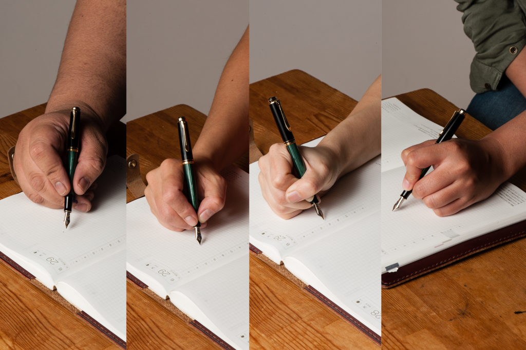
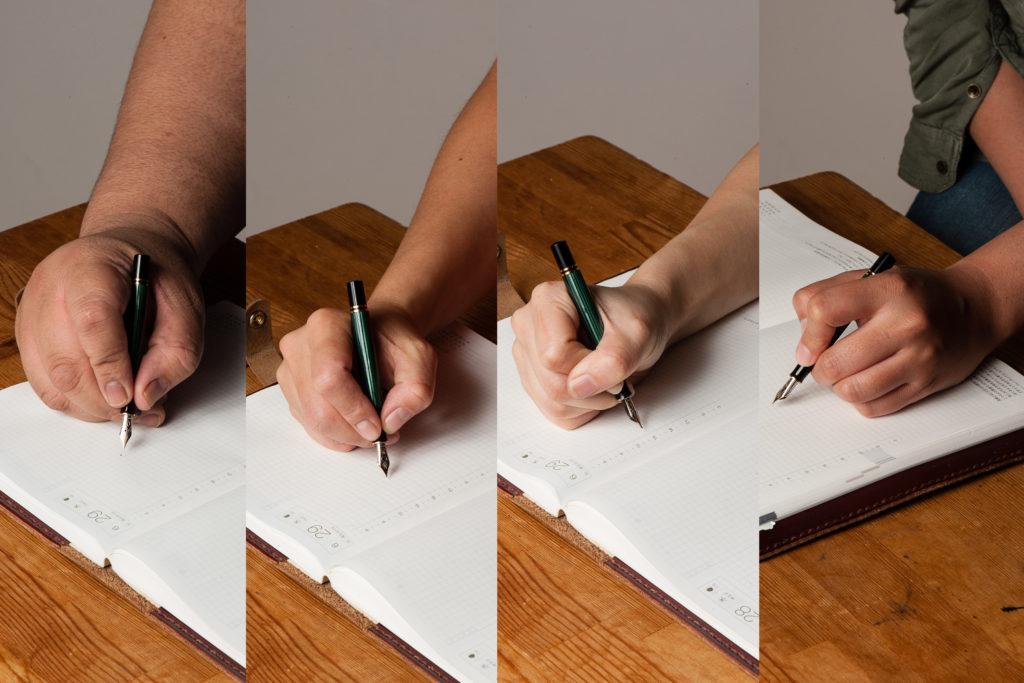
Roz: The diameter of the pen being so small, especially because I tend to grip low on the section, made it difficult for me to find a comfy grip position and my hand got tired pretty quickly as a result.
Katherine: This pen is usable for me for quick notes… But not the pinnacle of comfort for longer writing sessions. Overall though, not bad. Much more usable than I expected, but definitely more of an on-the-go pen than a sit-at-my-desk-and-write-about-my-deep-dark-feelings.
Pam: When I said that this pen reminds me of the Peter Pan pens, it’s likely due to how I see this pen being used. For quick notes in a pocketbook. I find the diameter of the pen to be too slim for a prolonged period of time. I am always fearful of snapping this petite pen with my iron grip.
Franz: At 4.3 inches closed, it’s a small pen. I went into the 20-minute writing session already expecting that my hand wouldn’t be comfortable. And I’m glad I managed my expectations because I did feel fatigued after ten minutes. The section and barrel’s thinness contributed to that fatigue. I only used the pen with the cap posted because unposted, the M300 was almost disappearing in my hand.
EDC-ness
Roz: At first I was super worried I would lose this pen because of its size. However, the clip on the M300 is really strong and it did great in my carrier. I admit though that for my day to day writing, I did not use the M300 much due to the size of the pen being difficult for me to hold for long periods of time.
Katherine: Great pen for EDC! The clip is strong, the size is perfect and the nib makes notes enjoyable. My only gripe is that the typical Pelikan wetness, paired with a medium nib doesn’t make for the fastest drying notes. That’s easily solved by getting a different nib though. 10/10, would EDC again.
Pam: In a checkbook, pocket book or a dainty pocket, it’s perfect! Perhaps it’s the size, but I feel that it’s more fragile than the normal size pens so I wouldn’t throw it into a jeans pockets if you plan on sitting down or putting your keys in the same pocket.
Franz: The M300’s Every Day Carry-ness is what won me over though. Definitely fits in my shirt pocket, and it’s ready to write with only one turn of the cap. It may be too short for my hand unposted but is perfectly usable for a fast signature, jotting down a phone number, or whatever quick note one needs. If I know I’ll use it for more than five words, I’ll post the cap and it does so securely. Unlike Pam’s thoughts, I didn’t find the M300 more fragile than any other pen. Granted, I wouldn’t dare to sit on this pen (or any other pen) but it’s quite durable for everyday usage.
And just like any other Pelikan Souverän, it’s a piston-filled pen and the piston operates very smoothly. As shown in the photo below, you can see through the barrel’s stripes and see the ink level clearly. The smaller barrel definitely means a smaller ink capacity though. And it holds about 50% less ink than an M1000. At 0.7mm, the ink capacity is just like a converter for other pens.
Final Grip-ping Impressions
Roz: The M300 is a beautiful pen. I would like to give it another try down the road, maybe when my experience with oblique, springy nibs develops a bit more. ^_^;
Katherine: A great pocket pen! Classy looking, fantastic nib and the perfect size. My only gripe is the price, for $200+, I would likely get a vintage 400 instead (fairly easily found at around $150) and I’d still have a reasonably small pocket pen, but one that can play dual duty as a normal writer as well.
Pam: Despite my love for pocket sized pens, I would have to say that this pen is an acquired taste given the size. It’s not as practical as the M200 or M400 in size. For those with average and larger size hands, it may be a challenge to use for an extended writing session. For those who love Peter Pan pens or pocket pens, I would highly recommend trying out this pen before committing your wallet to it.
Franz: Clearly, the Pelikan M300 is for people with smaller hands or for people who wants to have an elegant looking pocket pen. Also, it’s a great pen for a Pelikan pen addict (like myself). Have you guessed who owns this pen yet? =) For my large hands, the M300 is a novelty. I love it but I don’t see myself using this pen comfortably on a daily basis. My hand is definitely happier writing with a M800 or M1000.
The M300’s Souverän styling gives it a serious and classic look but it’s tininess makes it a “cute” pen.
Pen Comparisons
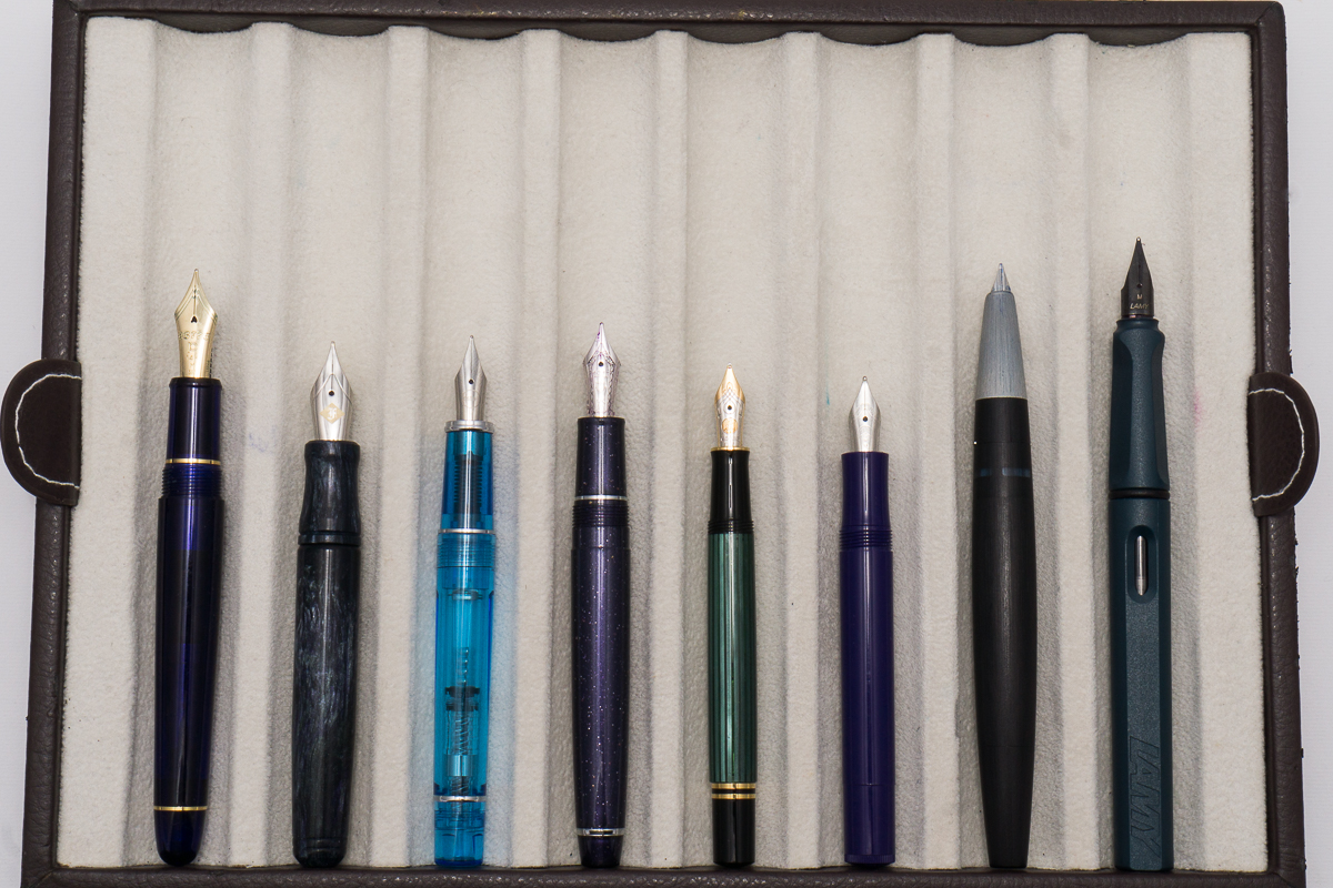
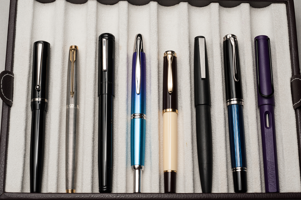
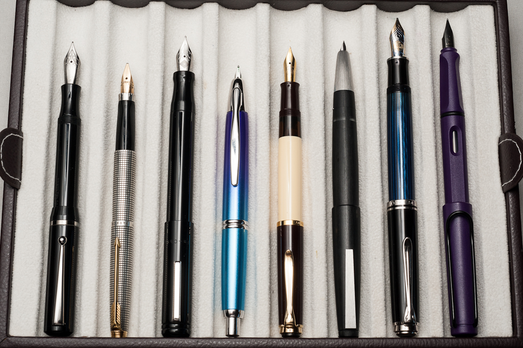
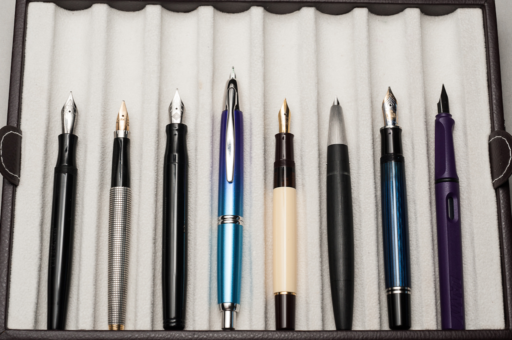
Closed pens from left to right: Platinum 3776, Franklin-Christoph Pocket 20, Pilot Prera, Sailor Professional Gear Slim, *Pelikan M300*, Kaweco Sport, Lamy 2000. Lamy SafariPosted pens from left to right: Platinum 3776, Franklin-Christoph Pocket 20, Pilot Prera, Sailor Professional Gear Slim, *Pelikan M300*, Kaweco Sport, Lamy 2000. Lamy SafariUnposted pens from left to right: Platinum 3776, Franklin-Christoph Pocket 20, Pilot Prera, Sailor Professional Gear Slim, *Pelikan M300*, Kaweco Sport, Lamy 2000. Lamy Safari
Pelikan Pen Comparison
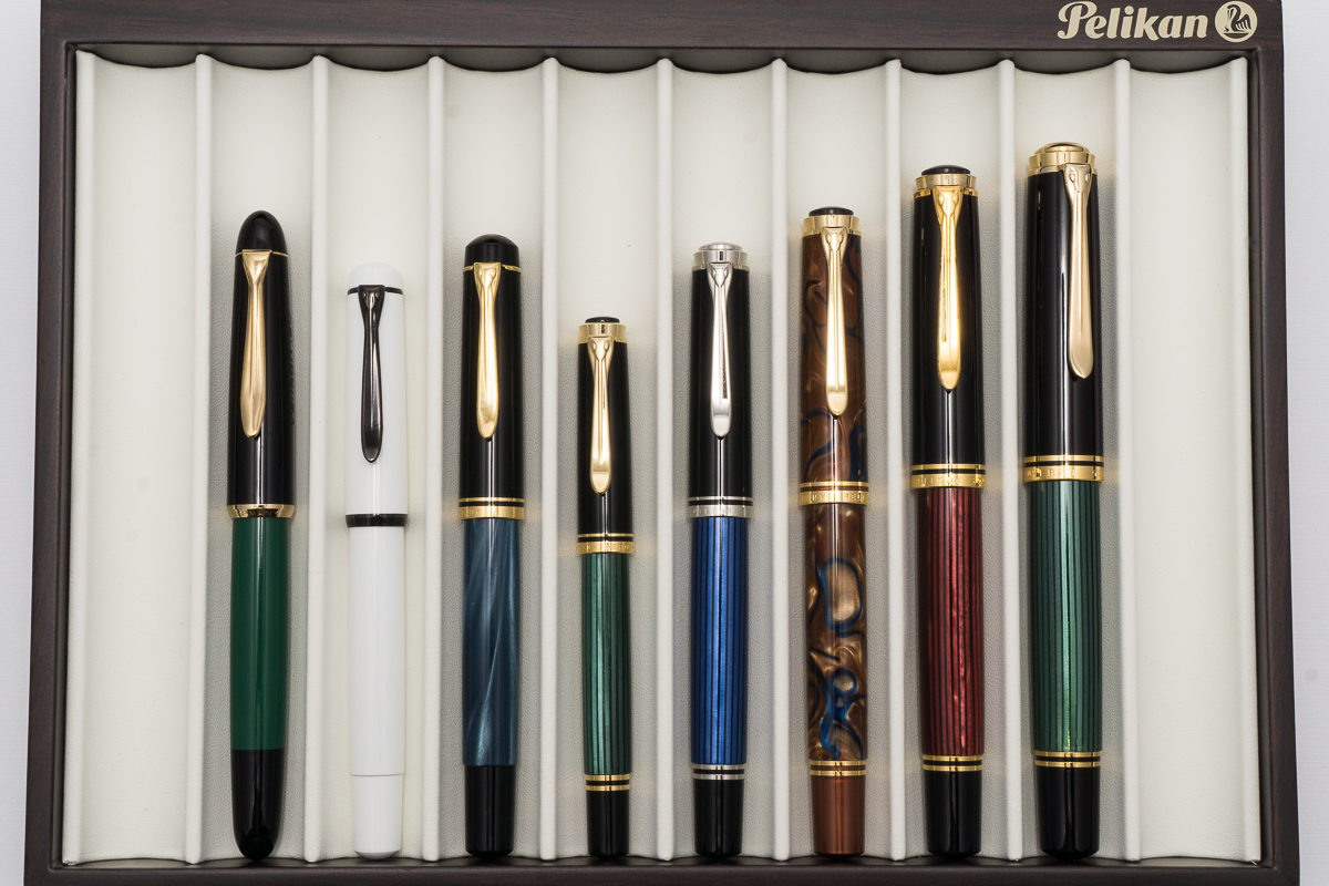
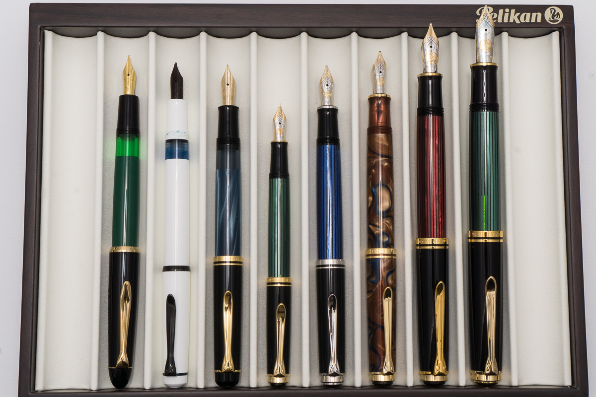
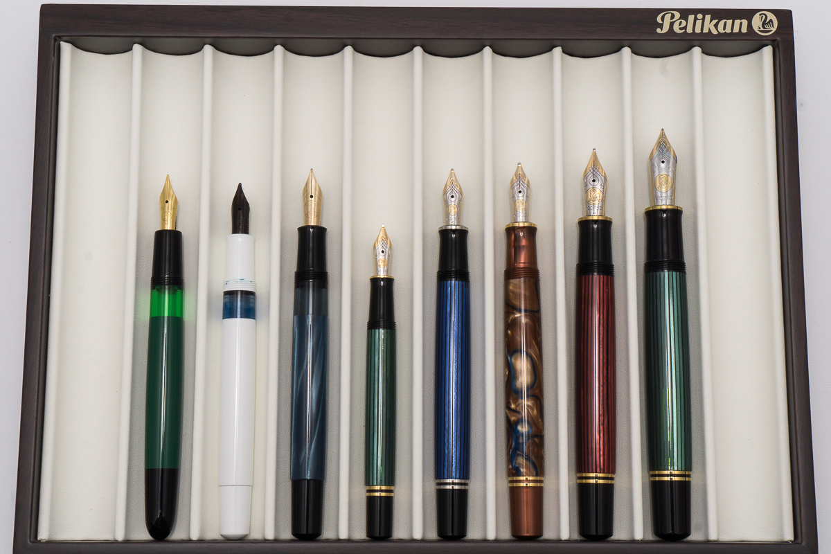
Closed pens from left to right: 120, M100, M200, M300, M405, M620, M800 and M1000Posted pens from left to right: 120, M100, M200, M300, M405, M620, M800 and M1000Unposted pens from left to right: 120, M100, M200, M300, M405, M620, M800 and M1000
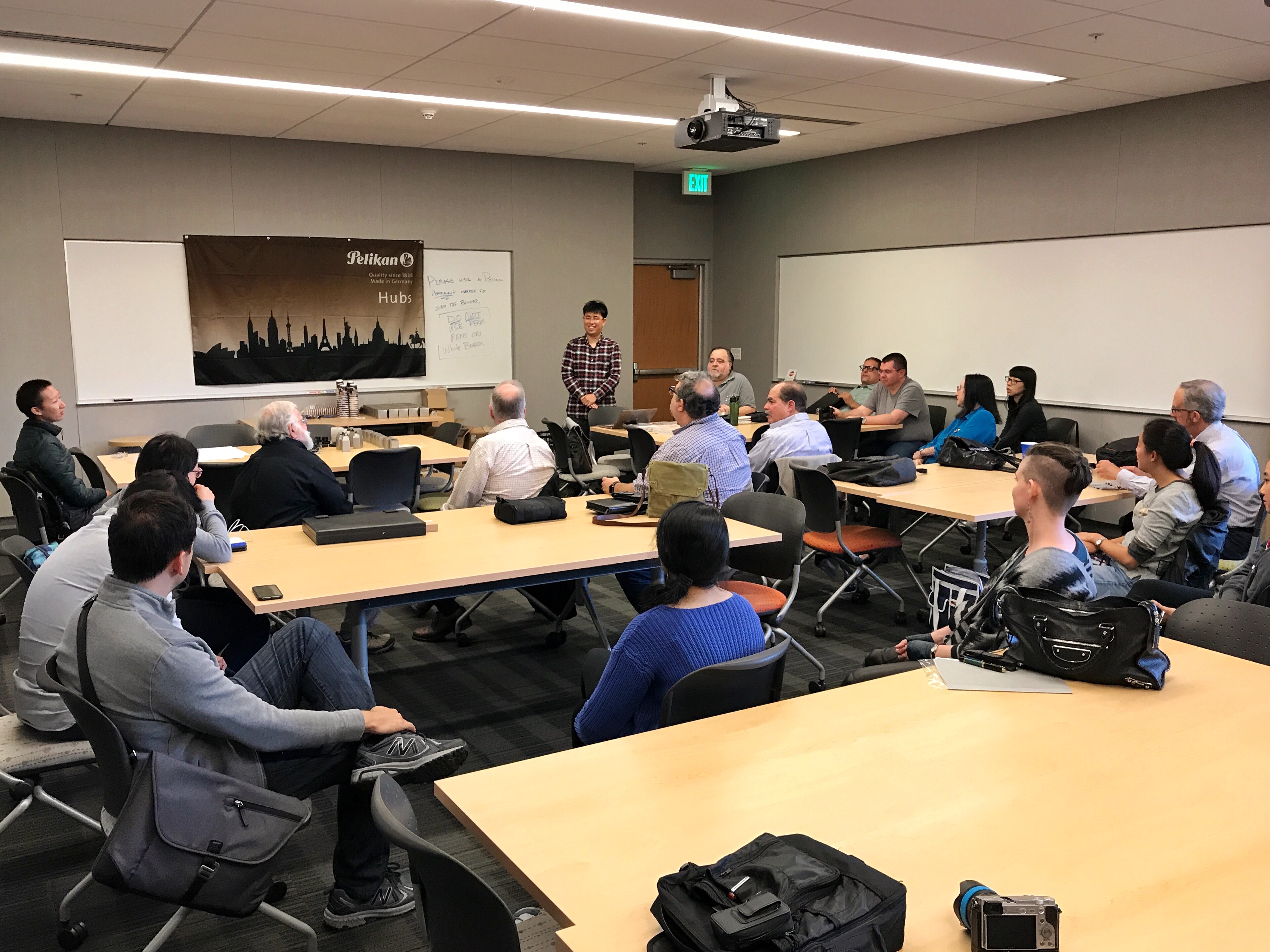
On Friday September 22, 2017, the Pelikan Hub for Palo Alto was held at the Lathrop Library in Stanford University. The Hub was organized by co-Hubmasters Lawrence C. and Glenn T. and it was definitely well organized. Thank you very much for a terrific event gentlemen!
Hubmaster Lawrence speaking at the beginning. The person to his left was Hubmaster Glenn.
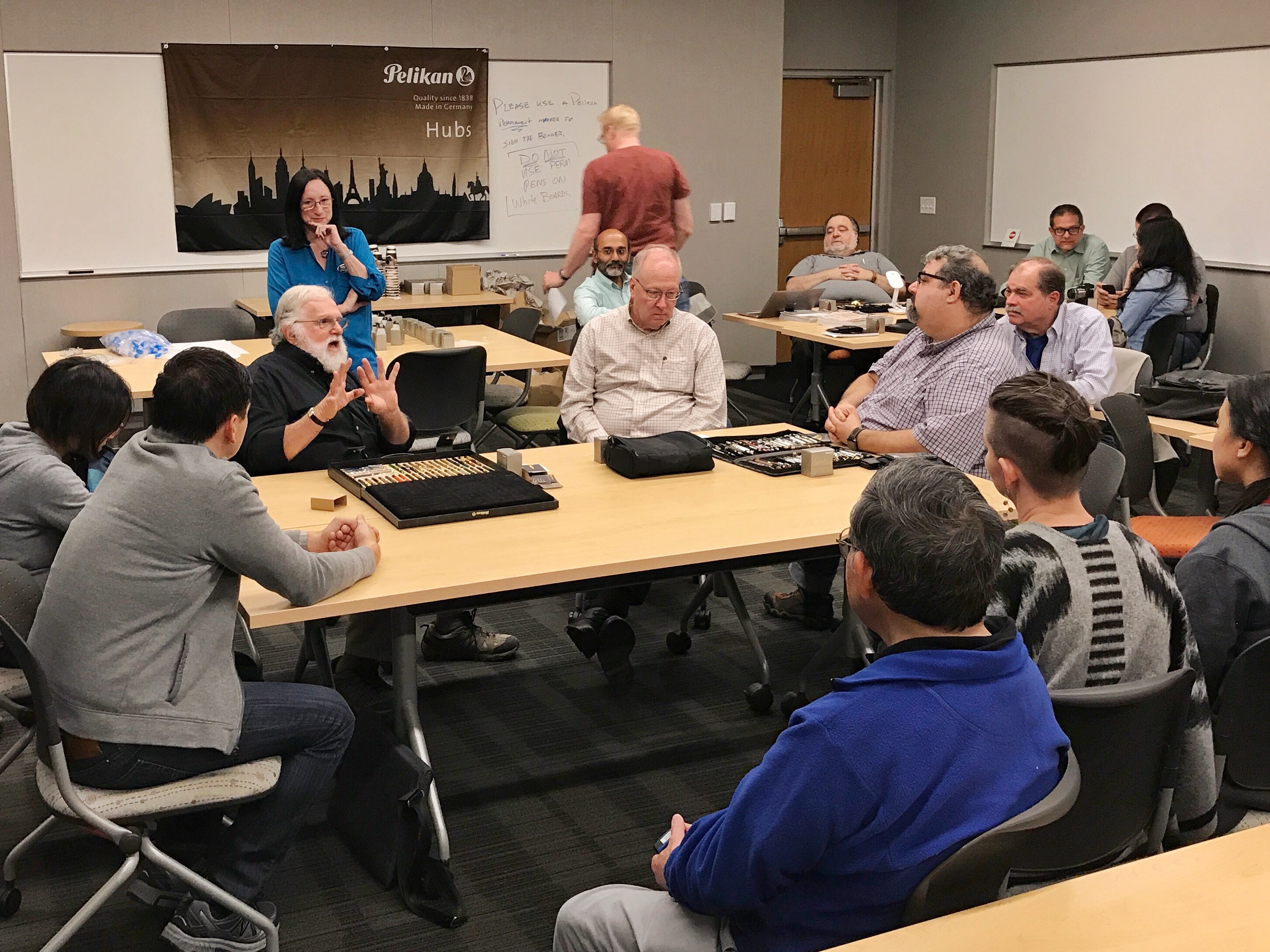
Our group had a mixture of members of the San Francisco Bay Pen Posse, and also members of the Stanford Pen Club. It was a nice gathering and I was happy to meet new people interested in the hobby. As we introduced ourselves around the room, I found that there were people into pens for about a month and up to about 40 years so it was an eclectic group and a lot of people shared their experiences and knowledge.
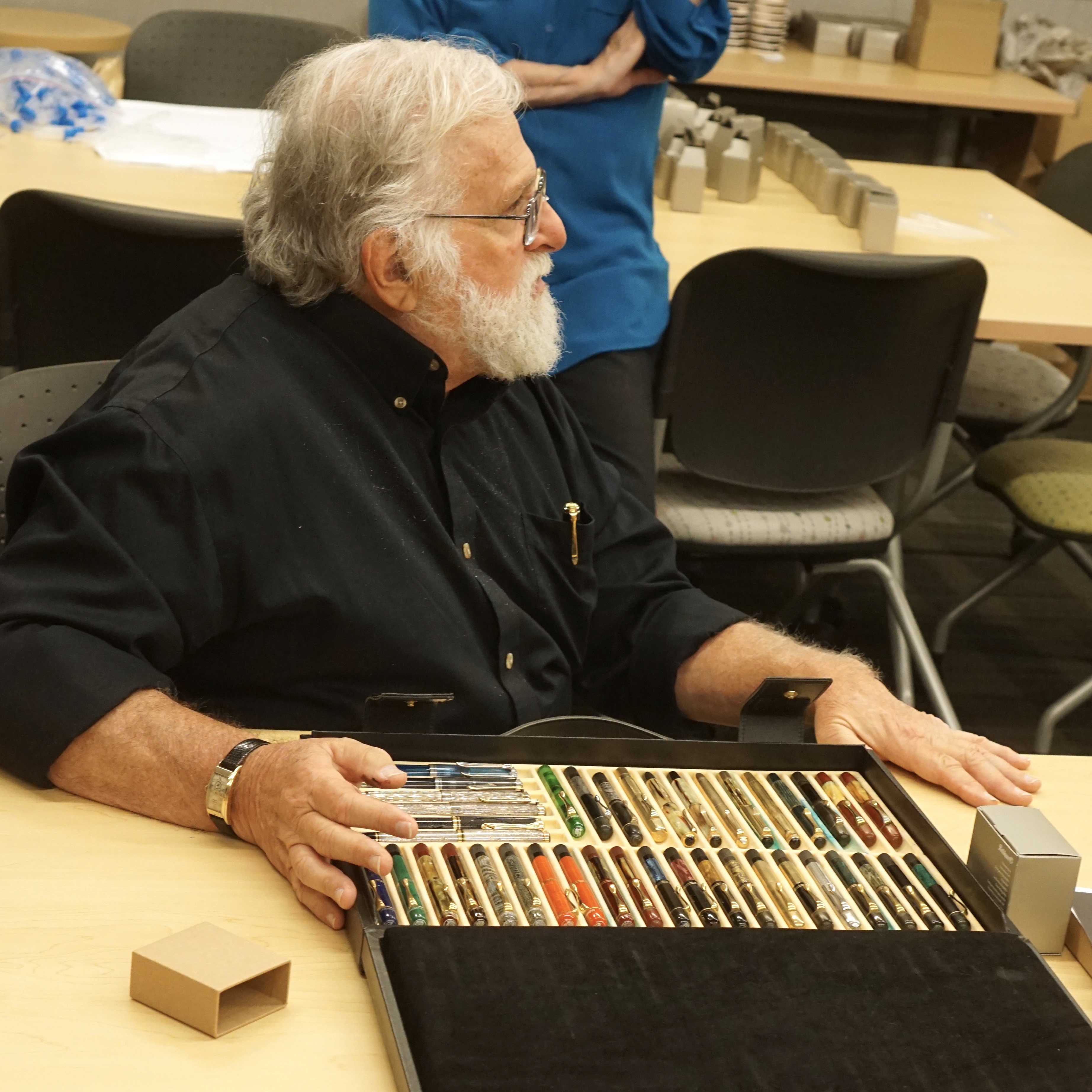
Speaking of knowledge, we were very lucky to have Pelikan pen expert, Rick Propas aka The PENguin, a part of our hub. He had talked about the history of the Pelikan pen company, the first model Pelikan 100, and the evolution of the Pelikan pen models. He showed a few rare, or one-off pens that are in his collection.
Rick Propas attends a few pen shows in the United States. He sells pens at pen shows, and also via his website: www.thePENguinpen.com
Rick Propas starting his talk about Pelikan historyRick Propas and his Pelikan collection brought to the hub
I broadcasted an Instagram Live video and also uploaded to my YouTube account. Rick imparted a lot of information and I am very thankful he had taken the time to do so.
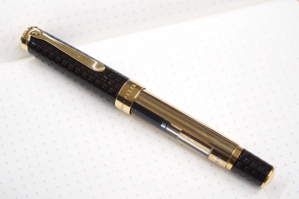
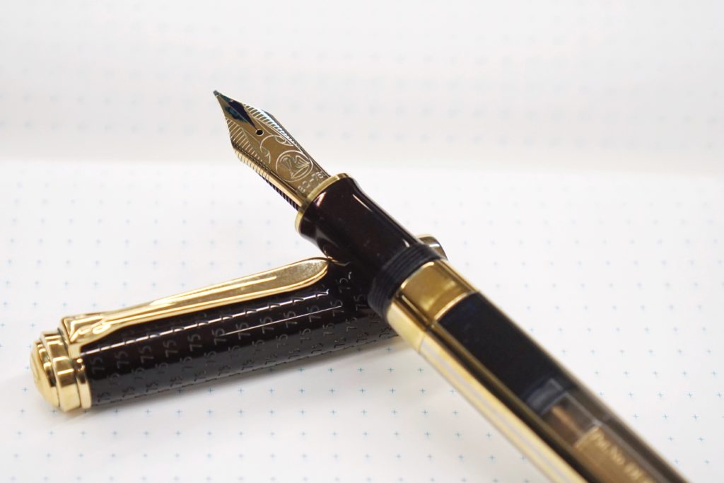
Rick showed his grail pen, the Pelikan 75th Anniversary. I got a chance to photograph this fabulous pen that evening.
Show and Tell: Pelikan 75th Anniversary. Those yellow stripes are very different and distinct.Show and Tell: The nib of the Pelikan 75th Anniversary is very unique. The “75” engraving was fantastic as well.
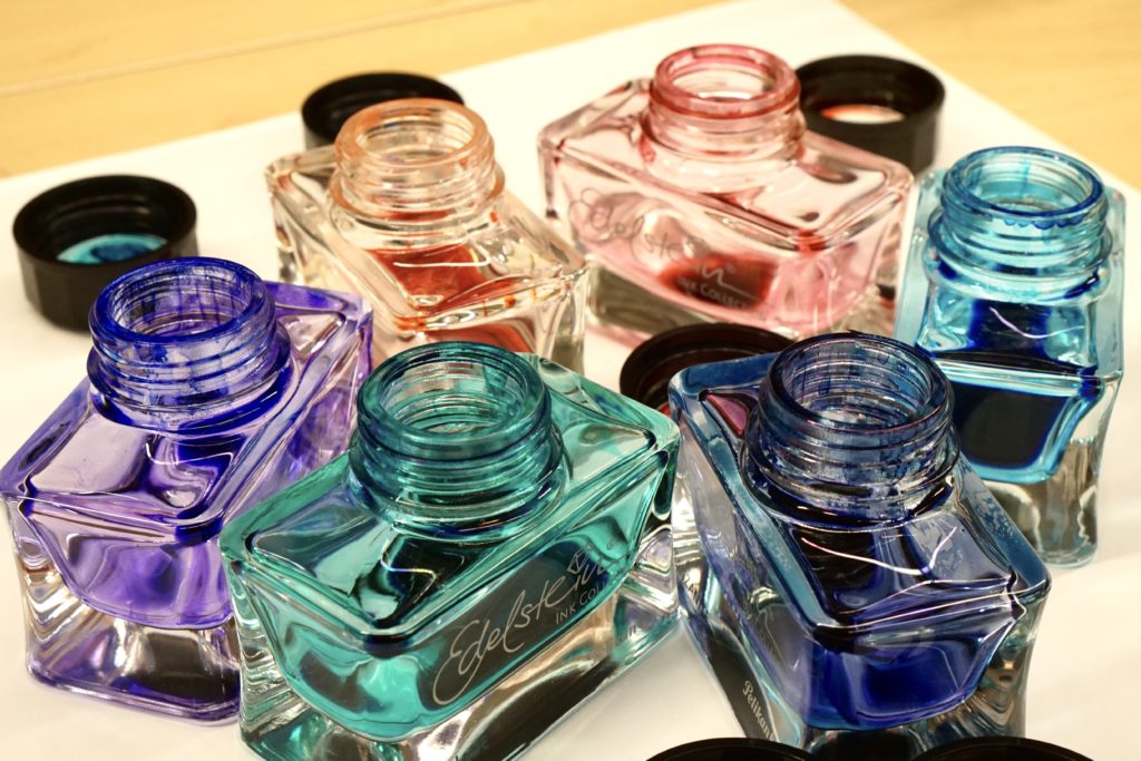
Lawrence and Glenn were given Edelstein ink bottles by Pelikan and they made it available for participants to take ink sample vials of. Here’s some of the bottles emptied out.
A big thank you to Pelikan for once again hosting the Pelikan Hubs around the world and providing an avenue for people to meet and learn about fountain pens and Pelikan pens! Also, we appreciate the generous gift of the Pelikan Edelstein Smoky Quartz ink bottle for each registered participant. I love this ink!
I have been attending the Pelikan Hubs since it started in 2014 and hope that this annual event continues to occur successfully. See you next year!
A flock of Pelikan pens that came out for the Pelikan Hub
Katherine: Woohoo! I love the size of the Pelikan M200/400s — and this one is no exception! I love the shades of brown paired with the gold. However, I actually think it looks richer in photos than it does in person. When I started looking at more expensive pens, the Cafe Creme was high on my list. However, I saw it in person at Aesthetic Bay in Singapore and found that it didn’t live up to my hopes and dreams, so I never purchased one. That being said, it’s all relative — I just happen to prefer the uneven striations of vintage 400s.
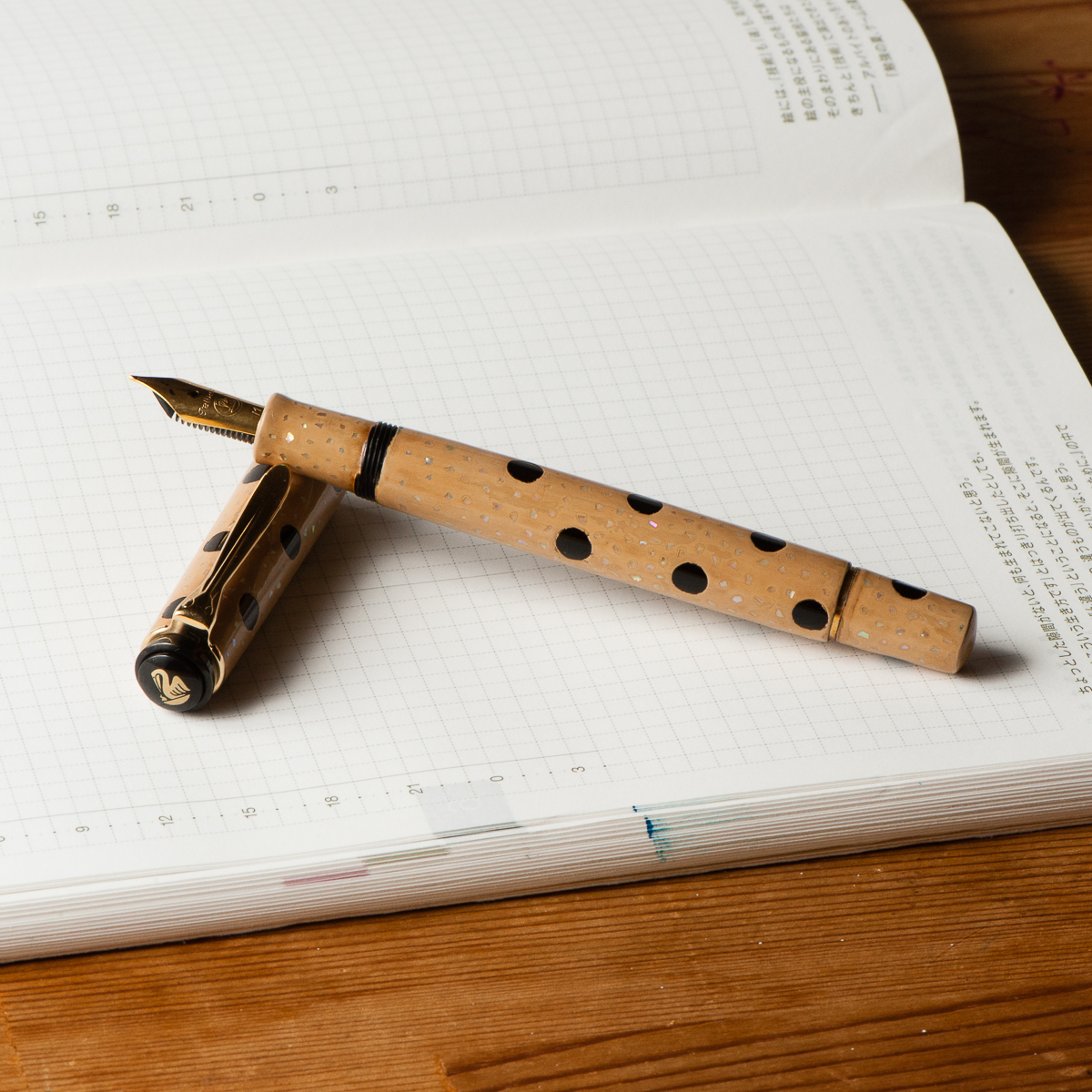
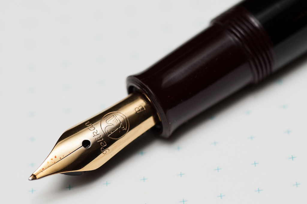
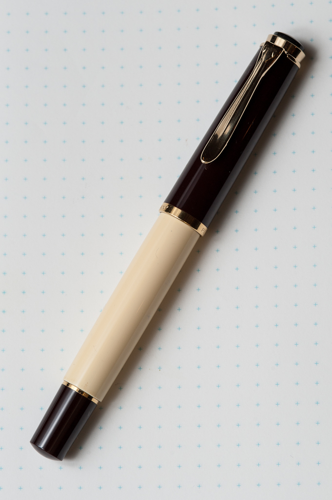
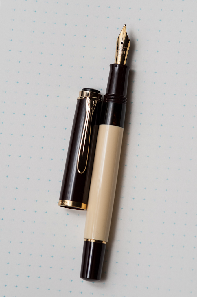
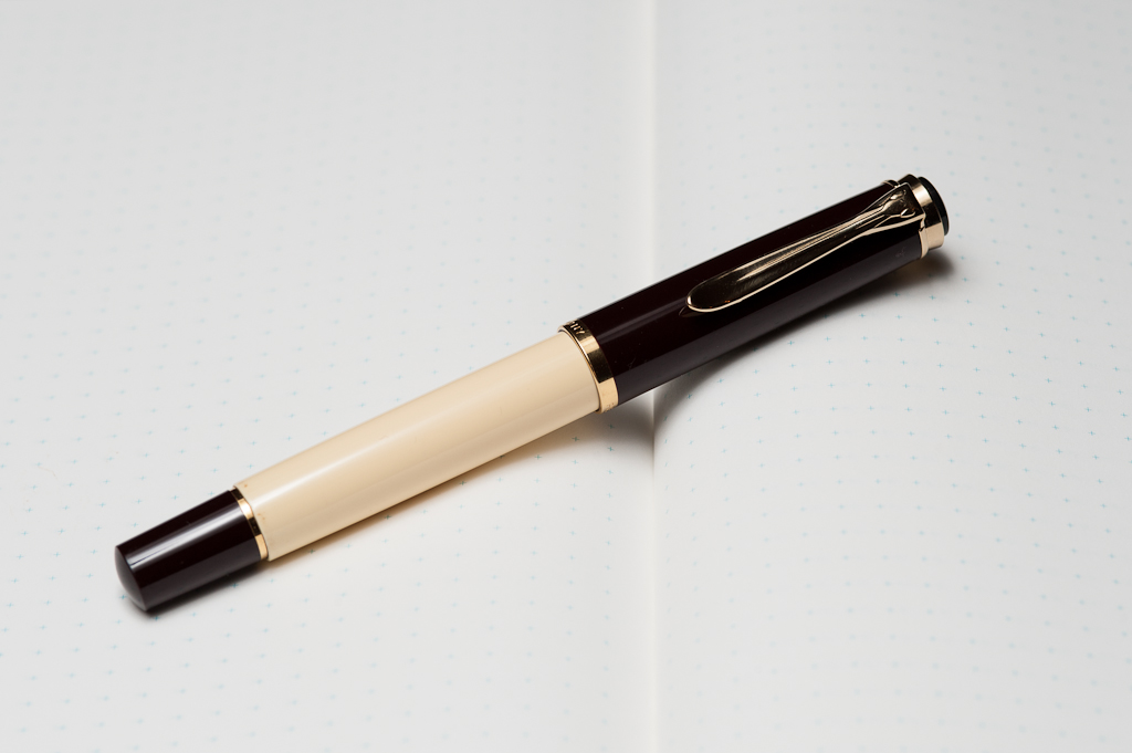
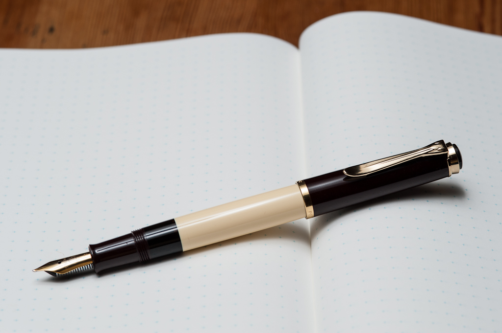
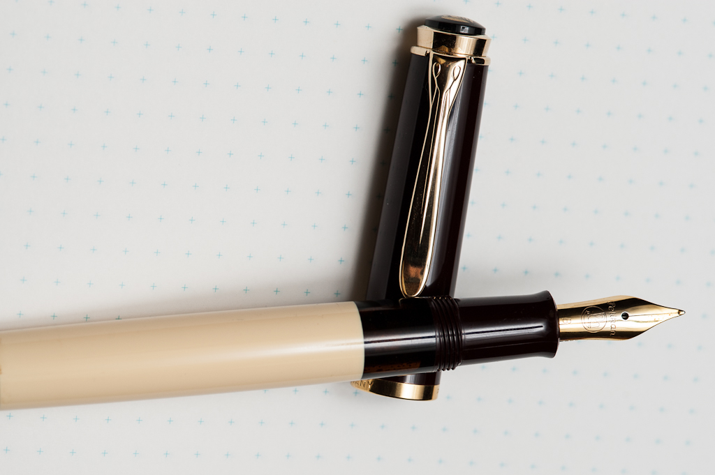
Pam: The Pelikan M200 in review is actually Franz’s pen with a custom architect grind from Dan Smith. I really enjoy the warm tones of the pen as it is a standout from my usual black and grey pens. The cream and brown is simple but rich in color. The brown has a good red undertone that compliments the yellow gold well. My favorite part of the pen is the ink window! A trademark of Pelikan is their twist on the classic fountain pen with great materials and color designs. A great example of that for me is the Pelikan M400 White Tortoise. The Café Crème is no exception.
Franz: Aww yeah, a Pelikan pen finally for review! People who know me are aware of my fascination/obsession with this pen brand. Anyway, moving on with the review, the Pelikan M200 model is considered an entry-level model into the world of Pelikan pens. It is very lightweight and a compact size. Pelikan pens are noted for its reliable piston-filling mechanism and this M200 definitely one of them. There’s just something about filling a pen from a bottle with a piston. Yes, fountain pens with a converter is filled with the same action but it has a different overall feel. But maybe it’s just me.
The Café Crème is a beautiful finish and for a guy addicted to coffee, it seemed like a perfect pen to get. Being an M200, it is fitted with gold-plated clip, cap ring, and steel nib. As what Pam has said, the gold trim fits the finish very nicely.
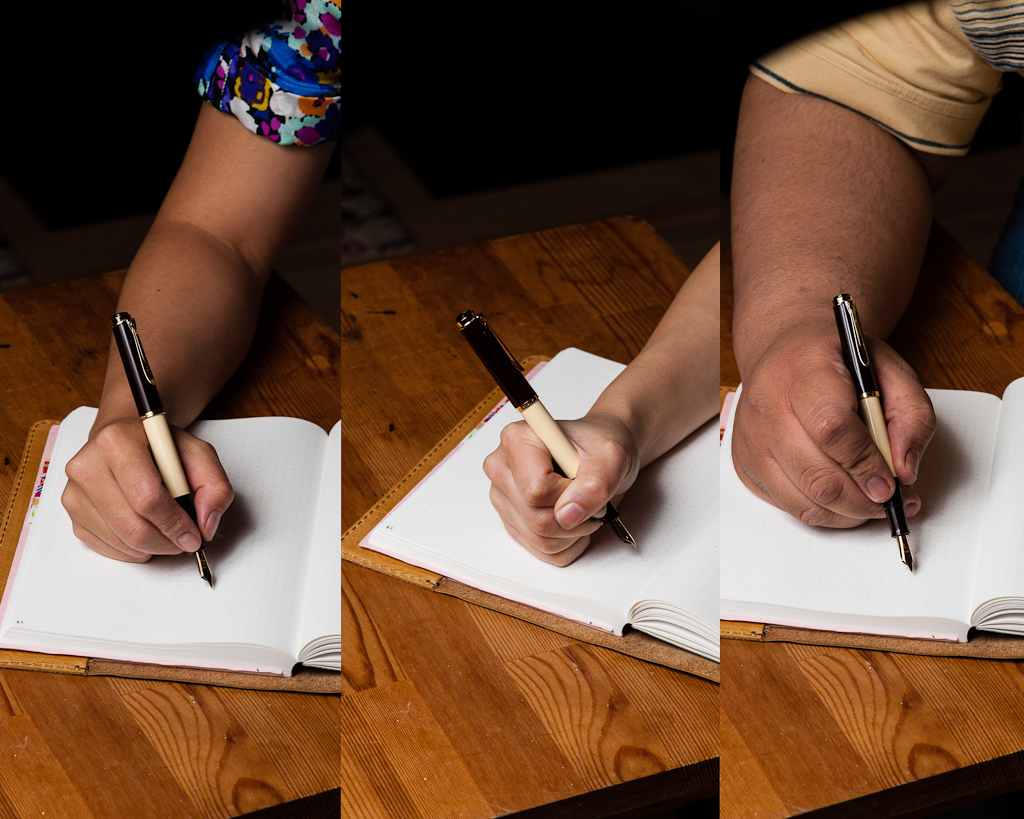
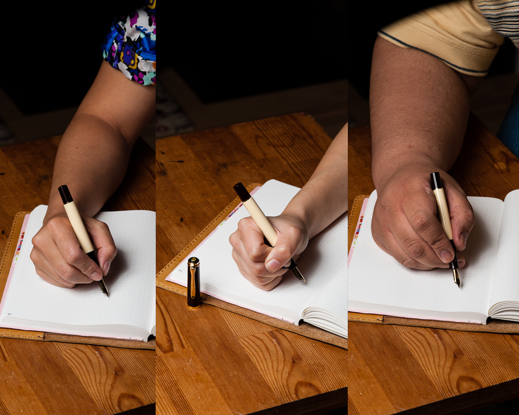
In the Hand: Pelikan M200 (posted) — from left to right: Katherine, Pam, and FranzIn the Hand: Pelikan M200 (unposted) — from left to right: Katherine, Pam, and Franz
The Business End
Katherine: M200 nibs in general? Fantastic steel nibs — smooth, wet while still having a hint of springiness, avoiding the designation of “nail” in my book. But this grind? Not my cup of tea. I can write with it, but I don’t enjoy it. I tend to write in cursive and it makes my letters look weirdly… tall. But, to be fair, I’m not a big fan of broad stubs or CIs either — so ymmv. 🙂 If I were to purchase a M200 I’d steer clear of a Broad (too broad) and consider a CI grind to add some flair.
Pam: The architect grind is wonderful for me. It pretty much becomes a “stub” for me since I typically hold the pen at a 90 degree angle. I love using the architect grind in my journal entries when I want my writing to be short and chubby looking, or as other would say “blocky.” Nib is not too wet so shading comes through with certain inks and it’s smooth on Tomoe River paper and Midori paper. Cheap printer paper absorbs way too much of the ink which leads to feathering and non-crisp letters. Feedback is minimal and as usual, Dan Smith did a wonderful job. From my experience with Pelikans, the modern nibs tend to be quite wide and wet. I had an EF that wrote more like a M. I haven’t met a Pelikan nib that was scratchy or too dry. Granted, I am not Franz. He is our Pelikan expert amongst this triad.
Franz: Pelikan expert? Me? For real? Nope, not at all! I am merely a fan of their pens. A Pelikan pen addict if you will.
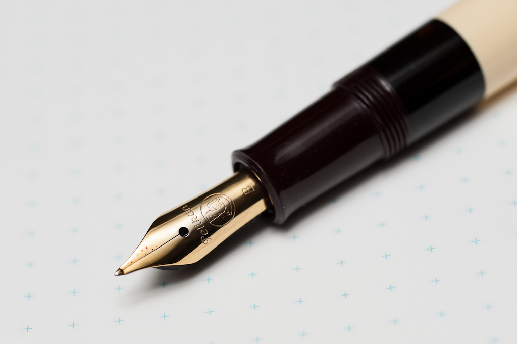
As I’ve mentioned above, the M200 is sold with stainless steel nibs and generally, they are smooth and juicy. There is also a little bit of bounce to it but not something that one would use for flex writing. For this specific pen, I asked Dan Smith to do something fun with the broad nib and he recommended to do an architect grind. I agreed since I’ve never had an architect/hebrew grind on any of my nibs before.
This grind is actually very cool as it sort of is a reverse italic. Instead of the usual thin cross-strokes, and thick down-strokes of an italic, it was the other way around. I primarily write in cursive, and sometimes print/block letters at work. I find the architect nib more suitable to write in print letters which made it look better. I didn’t really like how my cursive writing looked with it. I think it’s a matter of taste. I still recommend everyone to try an architect nib because you never know if you’ll love it or just like it.
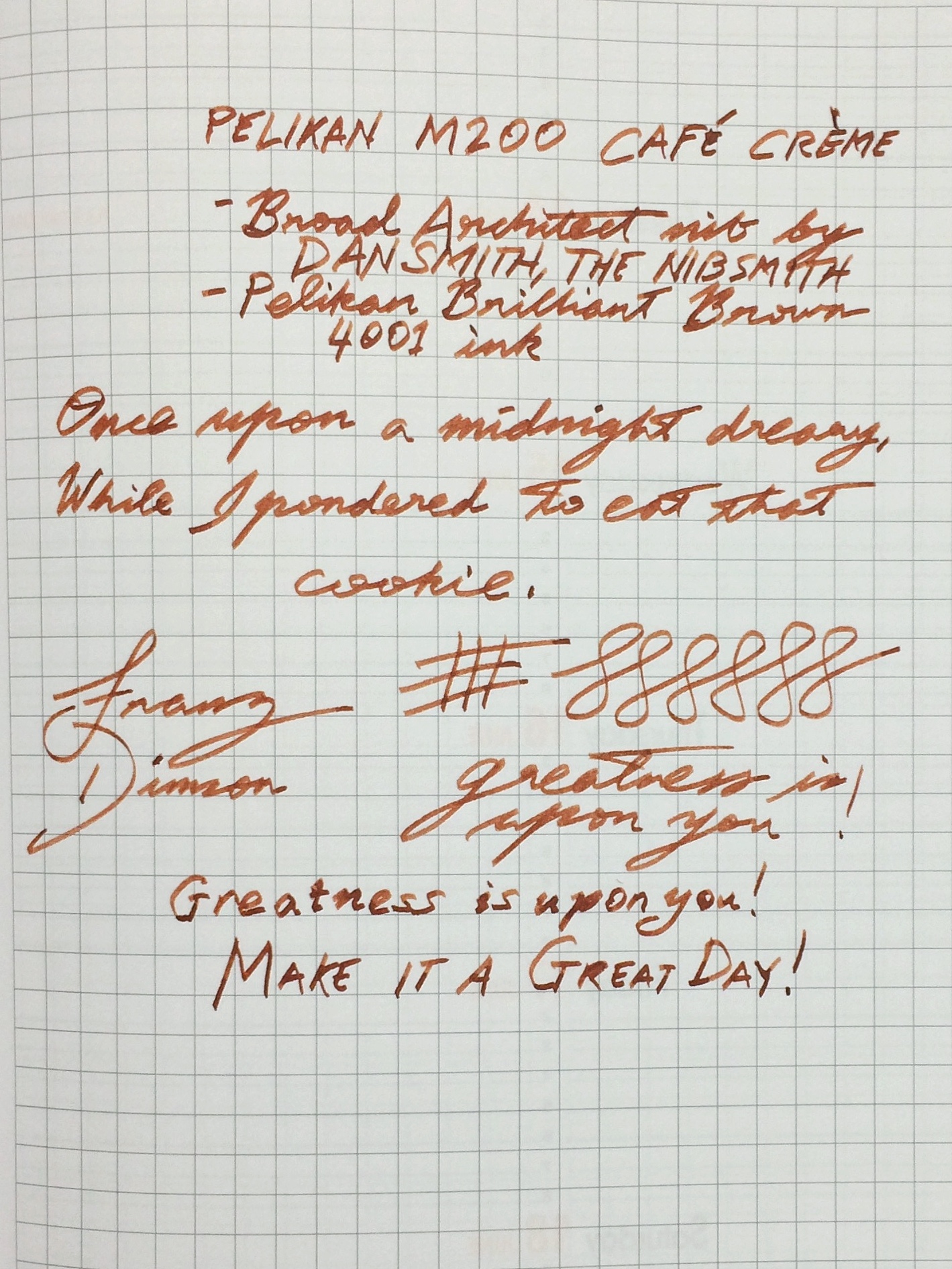
Franz’s writing sample of the Pelikan M200 broad architect nib on a Rhodia Weekly Planner
Write It Up
Katherine: The pen itself is very comfortable for me, and I prefer it uncapped. I love this size of pen and find it very comfortable for long writing and drawing sessions. I love this size so much that I own three Pelikans in this size, two vintage 400s and one 400NN. However, as previously mentioned, the grind on this pen drives me up the wall — so this isn’t my top pick for journaling. A stock nib or, perhaps, a CI on something less broad would be very compelling though!
Pam: The M200 is light and effortless to write with. As a “pocket size” pen of the Pelikan line, it’s a great size for me. It’s about the length of the Franklin-Christoph Model 45 and Franklin-Christoph Model Pocket 20. I can see this pen being too narrow for someone with average or larger size hands.I had no issues journaling with this pen and the “chubby” writing always gives me a bit of amusement.
Franz: I wrote with this pen posted for fifteen minutes of journaling and I found it to be okay. As usual, I grip the pen above the section threads by the ink window and I got a bit more girth to hold and the length was pretty okay. Even with the cap, I found this pen to be a bit too light for me though. I did write with the pen unposted for the last five minutes and that was not comfy for me at all.
EDC-ness
Katherine: I enjoyed using this pen as an EDC — it has a clip, uncaps easily and is a good size for either my notebook’s loops or just sandwiching in my notebook as I run around.
Pam: The pen is very light and with a screw on cap, it’s a great EDC pen in a “controlled setting.” Maybe it’s the fact that I recently lost a fountain pen at work, but I can see myself losing this pen within my white coat or not realizing that I don’t have it in my pocket because it’s so light. Pelikans aren’t super robust pens and dropping a Pelikan can damage the binde/body. I would recommend keeping your birdies clipped in a jacket or shirt pocket rather than pant pockets (no keys!) or tucked safely into a pen case.
Franz: The Pelikan M200’s size is actually a great pen for everyday use. At work, I found it to be a good pen to bring with me and in my shirt pocket. The pen uncaps with one full twist and is quite convenient for quick notes, or signatures. A quick comment about this nib, having a broad architect nib on it was borderline too thick for the copy paper used at the office. But if it were a medium nib with a round, architect, or cursive italic grind, it would’ve been just right.
Final Grip-ping Impressions
Katherine: Even if this particular pen isn’t the one for me, I love the M200 line. The size is perfect, they hold a ton of ink and the nibs are solid. However, if you’re willing to do a little hunting, for the money, I much prefer vintage 400/NN Pelikans. They’re cheaper (easily $100-$150) and often have more interesting nibs (I have both a semi flex fine and a semi flex OB). But, for those less patient with eBay and forum trawling, the M200s are solid pens that look great!
Pam: The greatest compliment I can give a pen is to purchase one. In this particularly case, as the Café Crème hits so many sweet spots for me with the architect grind, beautiful brown and cream material (did I mention the ink window?) , and well sized for my pixie hands, I currently have this pen on “layaway” from Franz. In exchange for permanently borrowing the Café Crème, I will “chip in” to Franz’s next pen fund…
Franz: The Pelikan M200 is principally a great pen to have and to write with. Pelikan has issued the M200 in their Classic line with different standard, or special edition finishes since it was introduced in 1985. So if the Café Crème is not your cup of coffee (tea), there are a number of choices available. As I said in the beginning of this review, the M200 is an entry-level pen for the brand and I recommend this to anyone interested in getting a Pelikan pen.
In my opinion, it’s a great size for users with small to medium sized hands. For people with larger sized, or bear paws similar to me, I’d say to try it out first. It may turn out to be a good fit or you might want to go to a larger size like the M600, M800, or even the M1000. Because I am a self-proclaimed Pelikan pen addict, I hope that my review of this pen comes off fair and as unbiased as possible.
Pen Comparisons
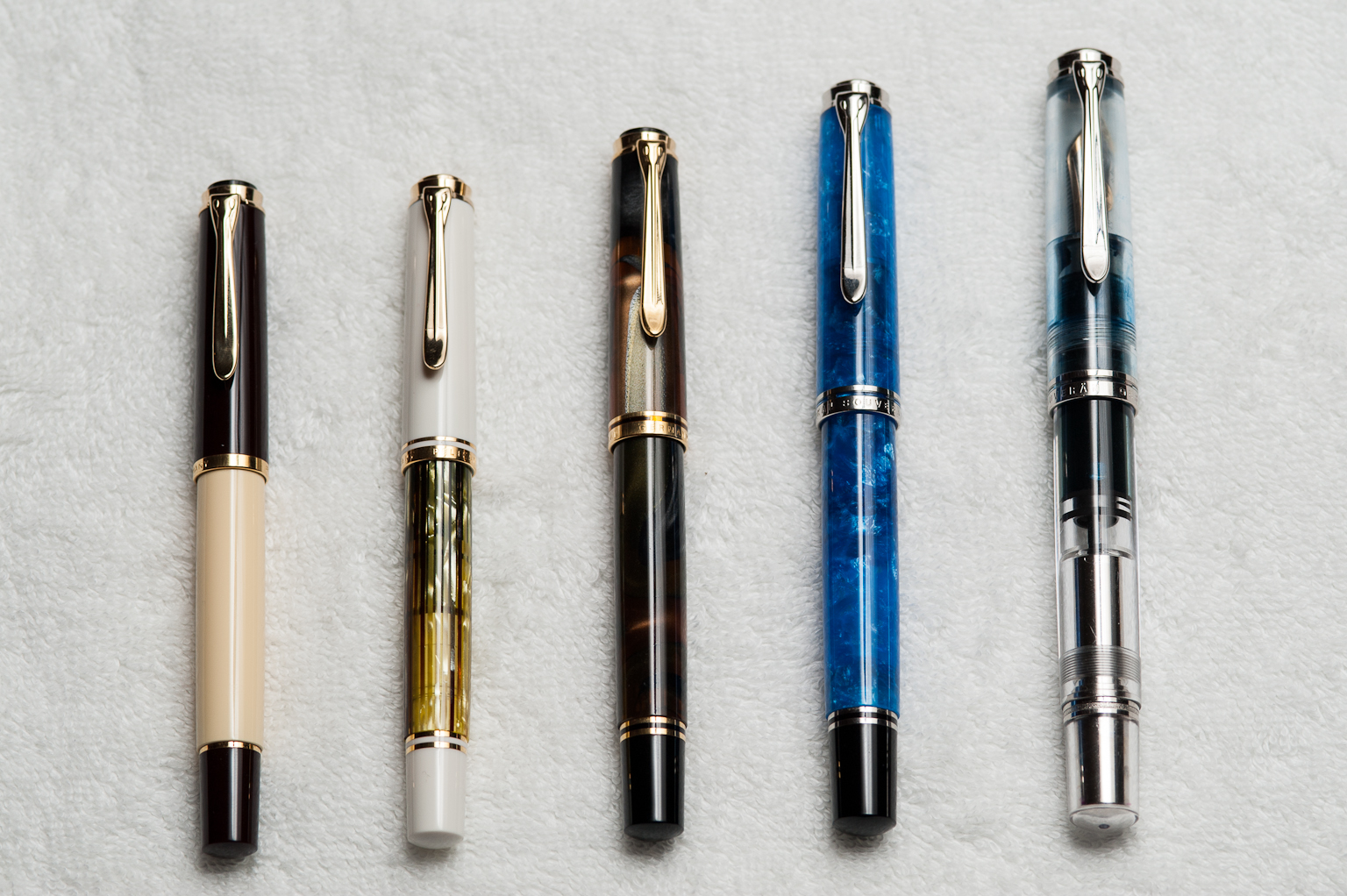
Closed pens from left to right: Edison Beaumont, Parker 75, Franklin-Christoph Model 20, Pilot Vanishing Point, *Pelikan M200*, Lamy 2000, Pelikan M805, and Lamy SafariPosted pens from left to right: Edison Beaumont, Parker 75, Franklin-Christoph Model 20, Pilot Vanishing Point, *Pelikan M200*, Lamy 2000, Pelikan M805, and Lamy SafariUnposted pens from left to right: Edison Beaumont, Parker 75, Franklin-Christoph Model 20, Pilot Vanishing Point, *Pelikan M200*, Lamy 2000, Pelikan M805, and Lamy SafariPelikan pens from left to right: M200 Café Crème, M400 Tortoiseshell-White, M620 San Francisco, M805 Vibrant Blue, and M1005 Demonstrator