Colorverse Season 4: Able & Miss Baker + Hayabusa Ink Review

Before anything else, a big shout out of appreciation to Pen Chalet, for sending us inks to review! Pen Chalet was generous and sent us the inks at no charge, but we promise the review below is unbiased and our own uninfluenced* opinions.

* Except maybe by the food coma that followed our dinner gathering

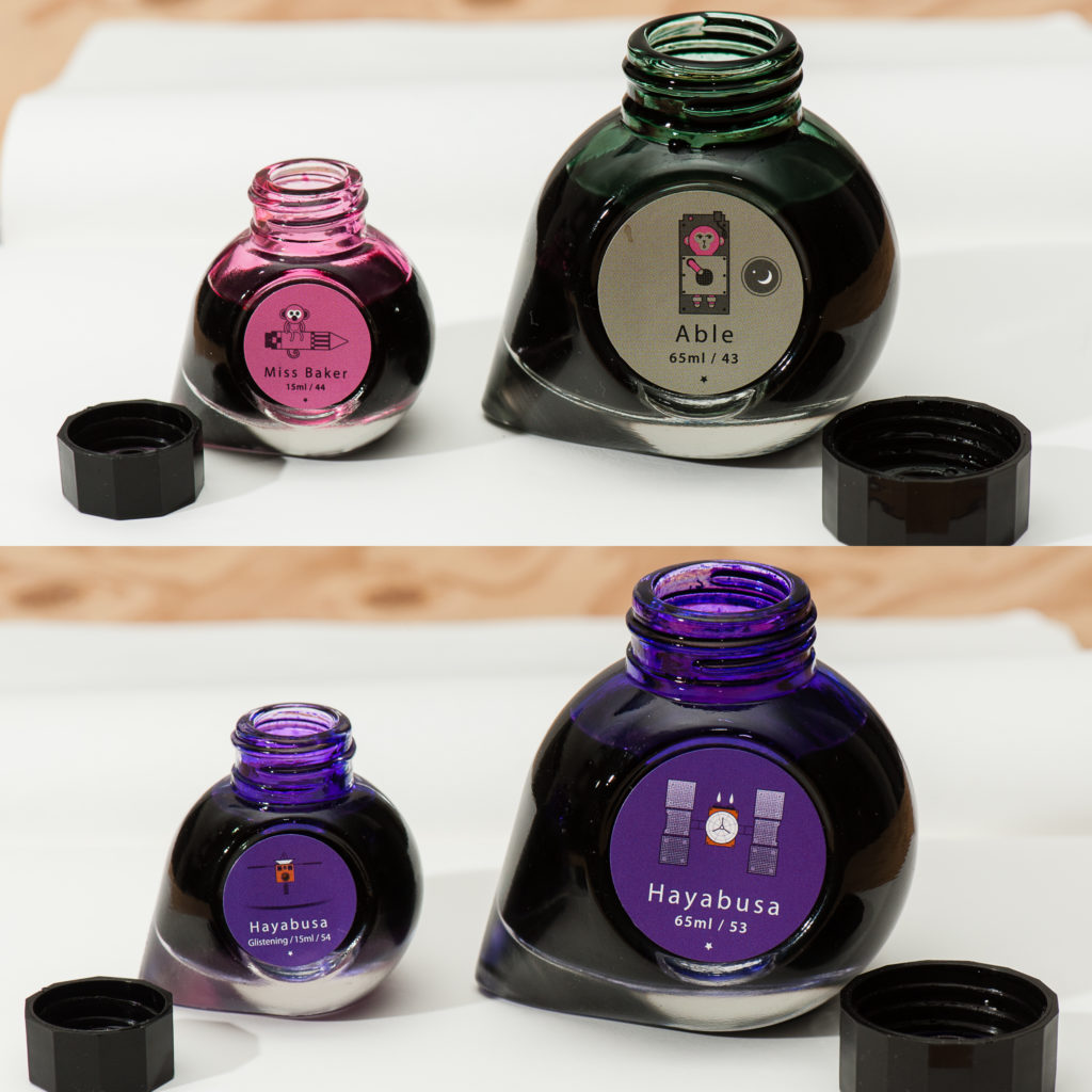
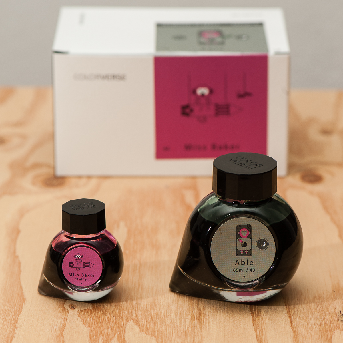
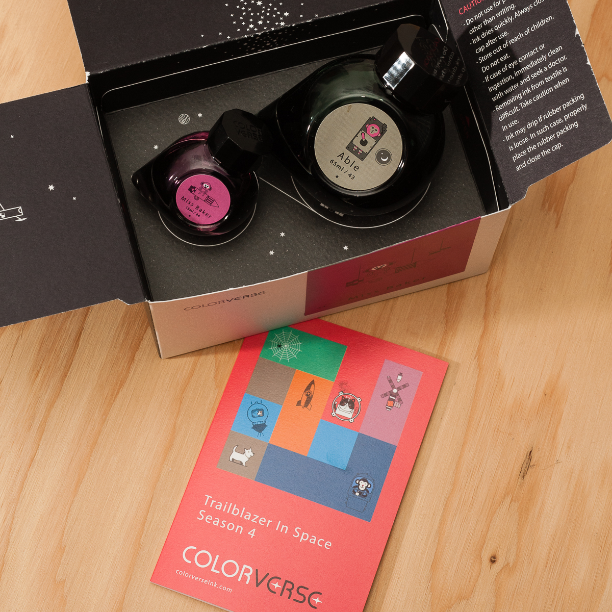
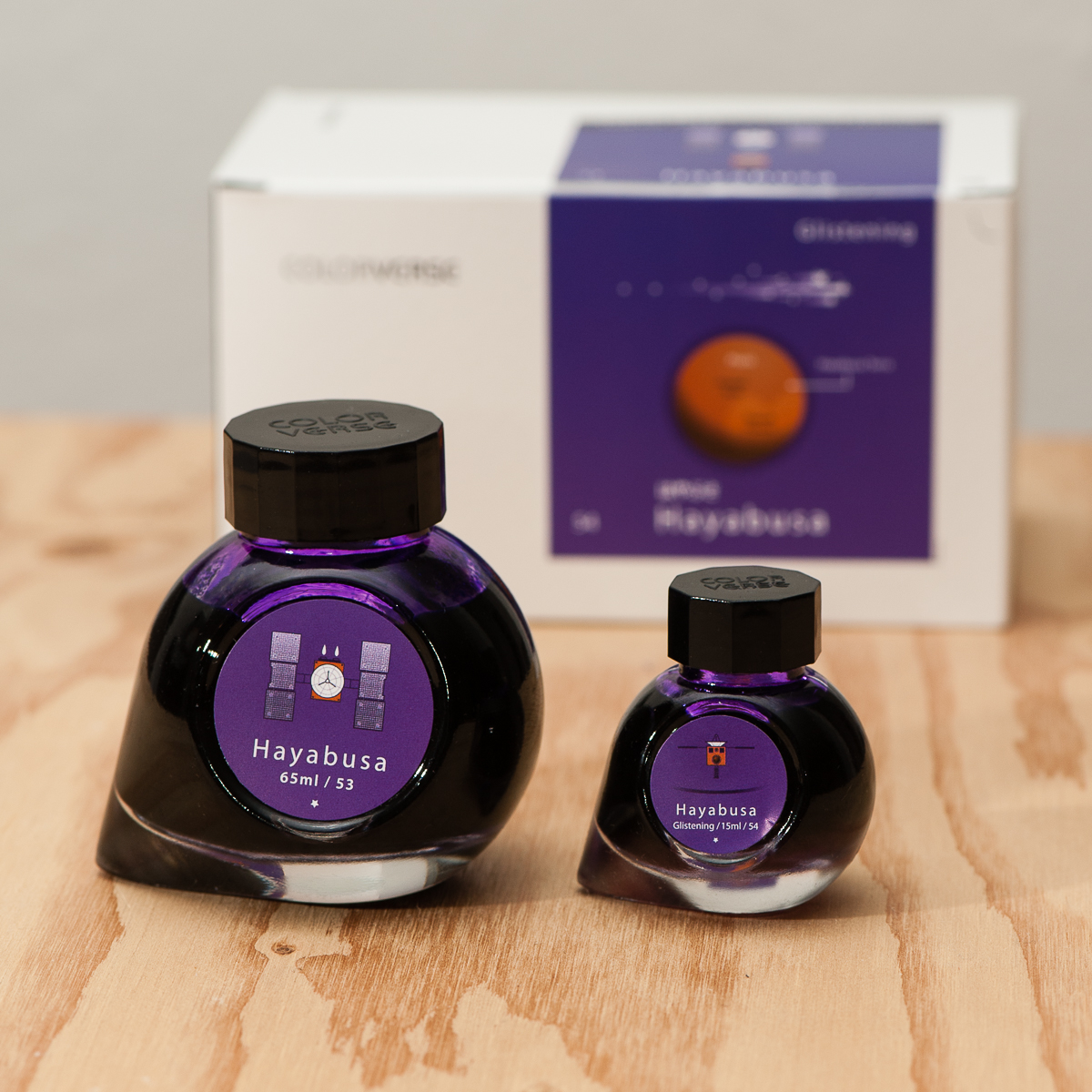
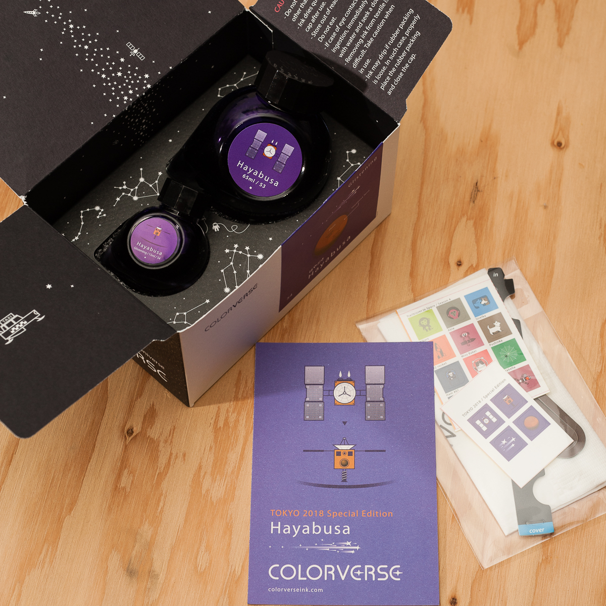
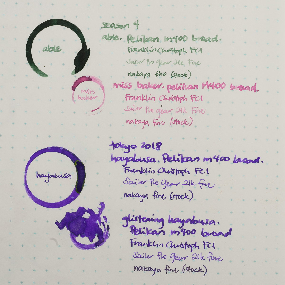
For those unfamiliar with the Colorverse brand, each set contains two bottles, a big one (65ml)and a small (15ml) one. For this review we’re taking a look at two sets: Able + Miss Baker, and Hayabusa + Hayabusa Glistening. Able + Miss Baker is part of Colorverse’s Season 4 offering, Trailblazer in Space. Hayabusa is a Tokyo 2018 Special Edition.

Packaging

Inky Dispositions

Franz: Here goes our first ink review! =) For a period of time now, I’ve been intrigued with the ink bottles of Colorverse. Their bottle shape is very unique as well as their decision to ship two different size bottles and different ink colors. I also really love their outer space themes.

In this review, I only got to test the Able and the Hayabusa (non Glistening). Oh by the way, I kept referring to it as Habuyasa. Good thing I spelled it right in my sample below. Anyway, back to the ink review please.

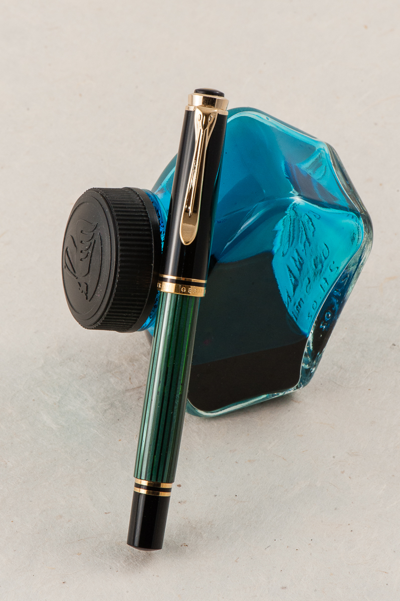
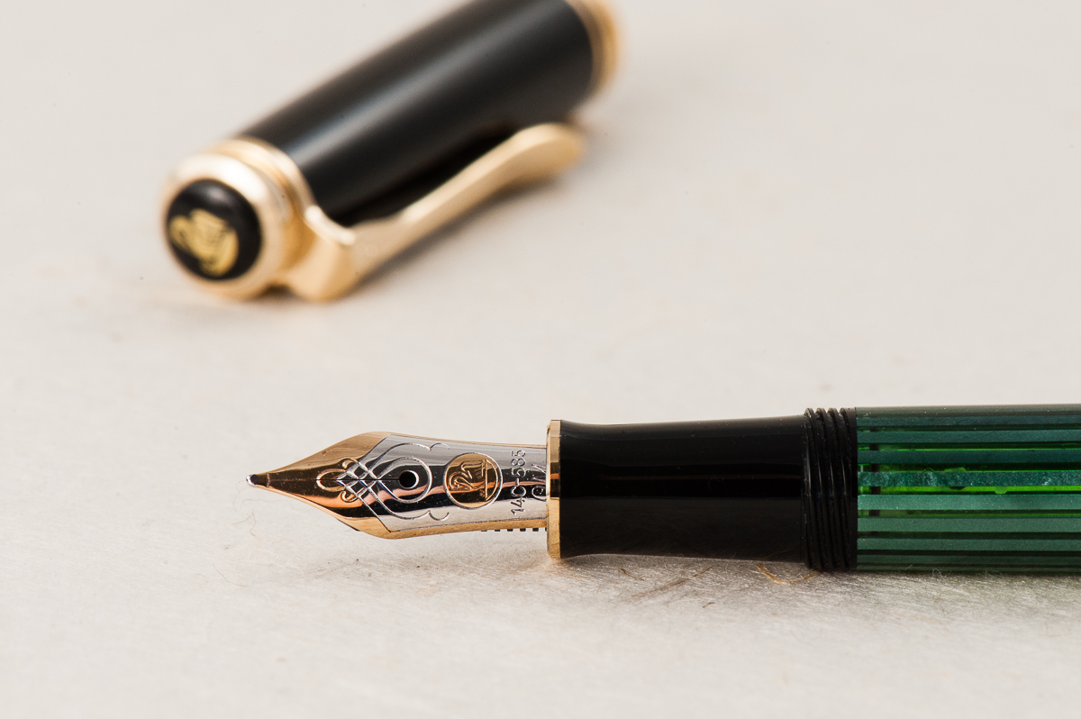
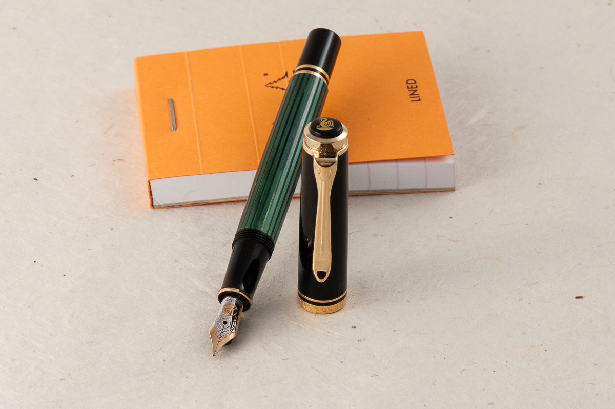
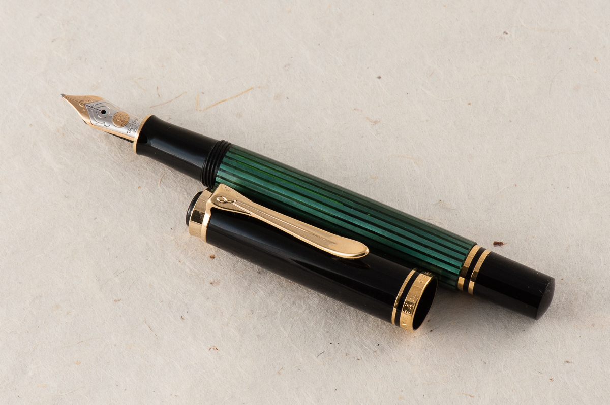
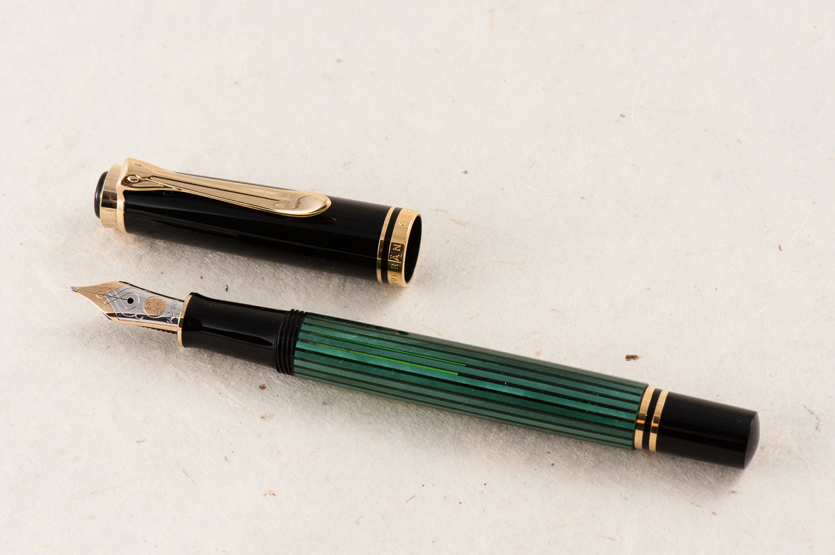
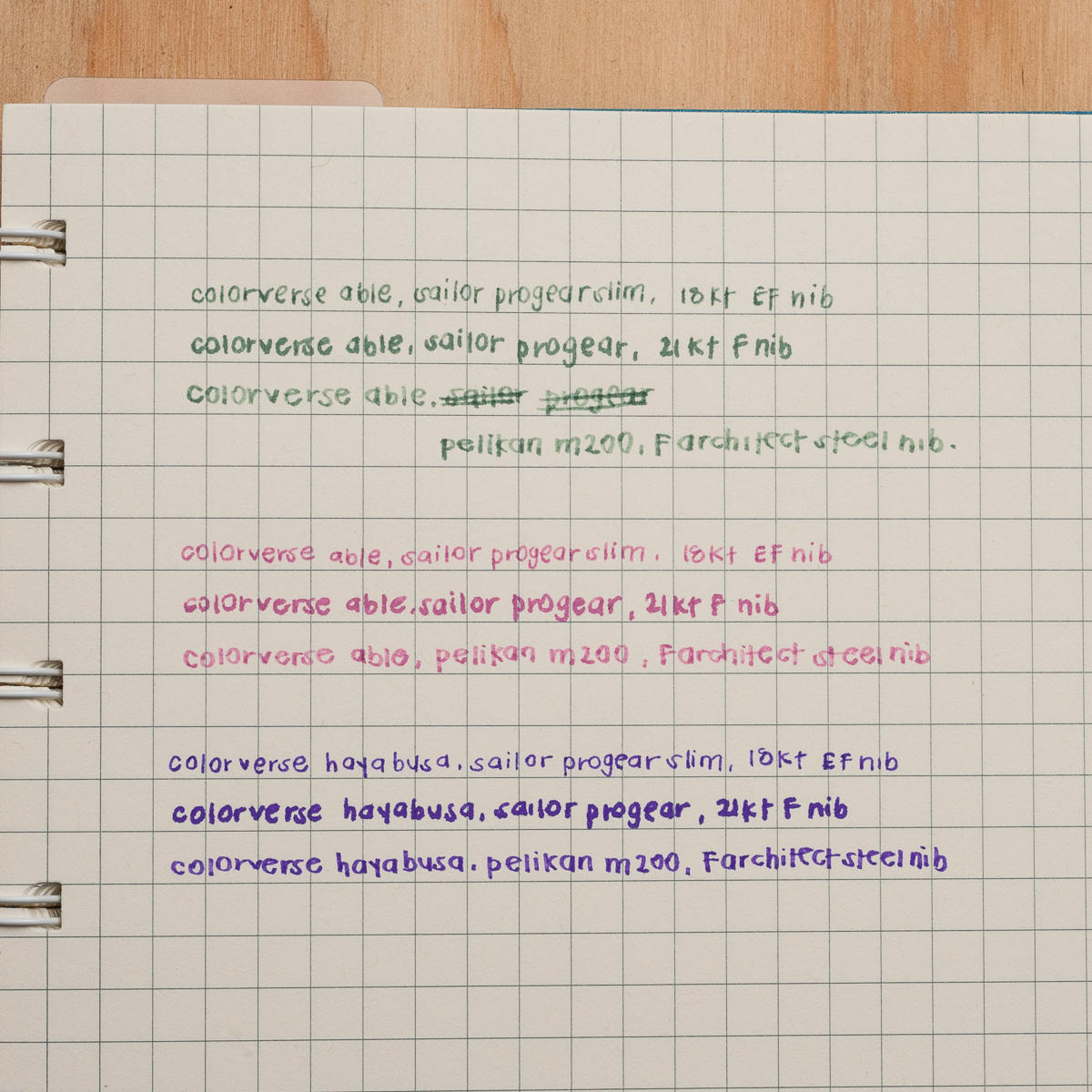
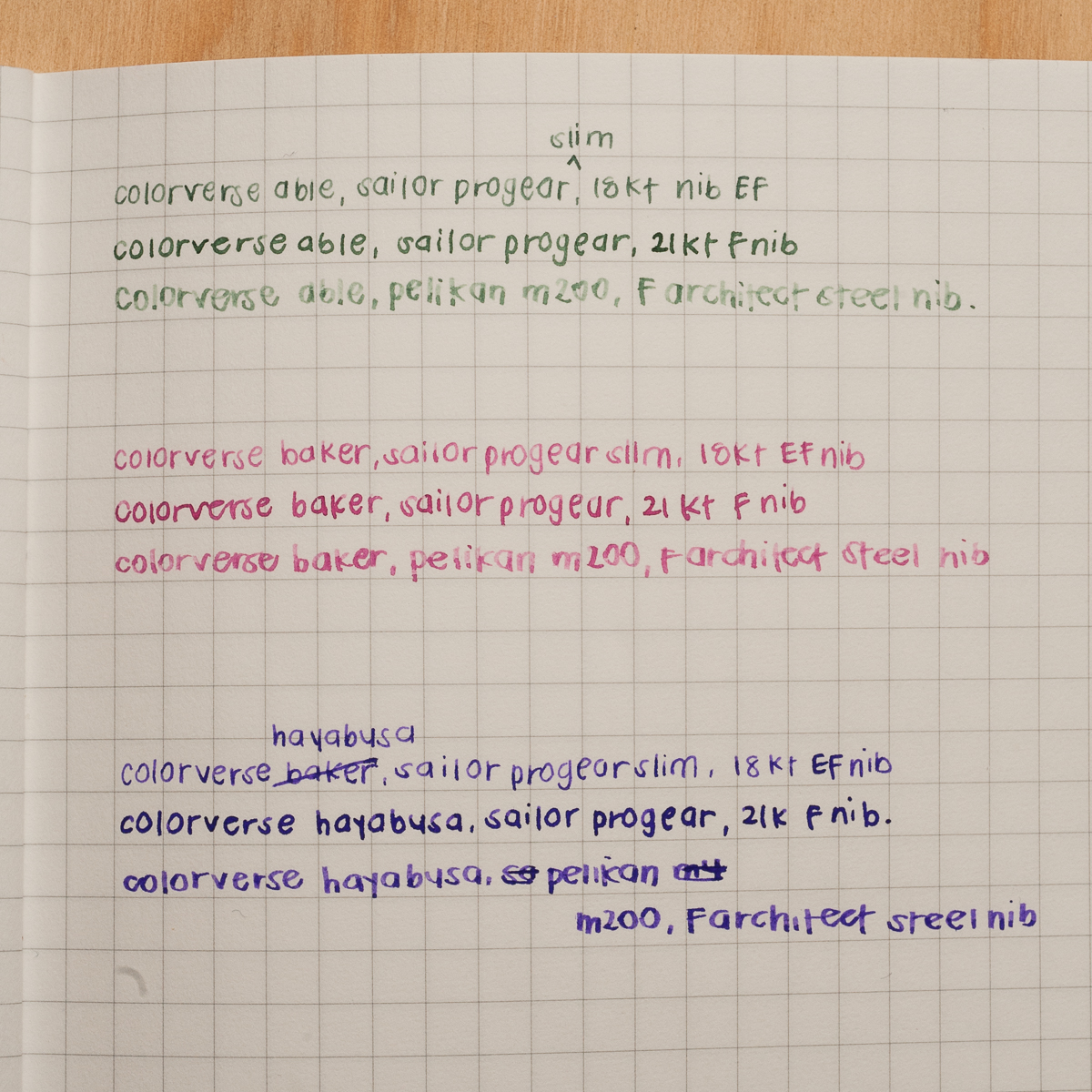
Able: Color- mossy green; Saturation- low; Shading- high; Wetness- dry; Dry time- fast; Overall thoughts- The green color is very nice to look at however it is too light. The italic writing is from a wet, medium size Pelikan M800 nib but it doesn’t look like it below.

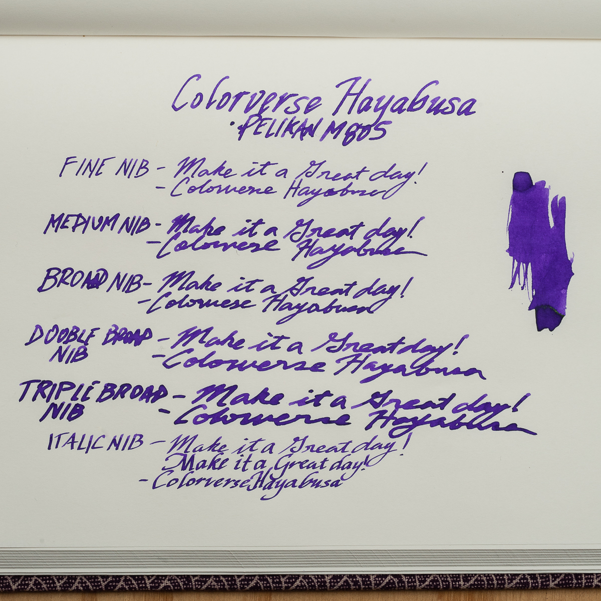
Hayabusa: Color- violet (more of in between violet and purple); Saturation- high; Shading- low; Wetness- medium to high; Dry time- medium; Overall thoughts- I’m loving this color! I don’t have too many purple inks but this definitely hits it for me. The difference in Hayabusa’s lubrication is noticeably different against the Able.

Ms. Baker: As I stated earlier, I was not able to test this ink but I was able to compare ink swatches and the two ladies’ writing samples. I would describe the color a light hot pink. I only own 3 pink inks (Monteverde Kindness Pink, Pilot Iroshizuku Tsutsuji, and Kosumosu) but they don’t match Ms. Baker at all.

I’m happy to have been able to try out inks from the Colorverse brand. I will look into getting more samples of their growing ink line up.

Colorverse Able on 52gsm Tomoe River paper in a Musubi diary notebook
Colorverse Hayabusa on 52gsm Tomoe River paper in a Musubi diary notebook

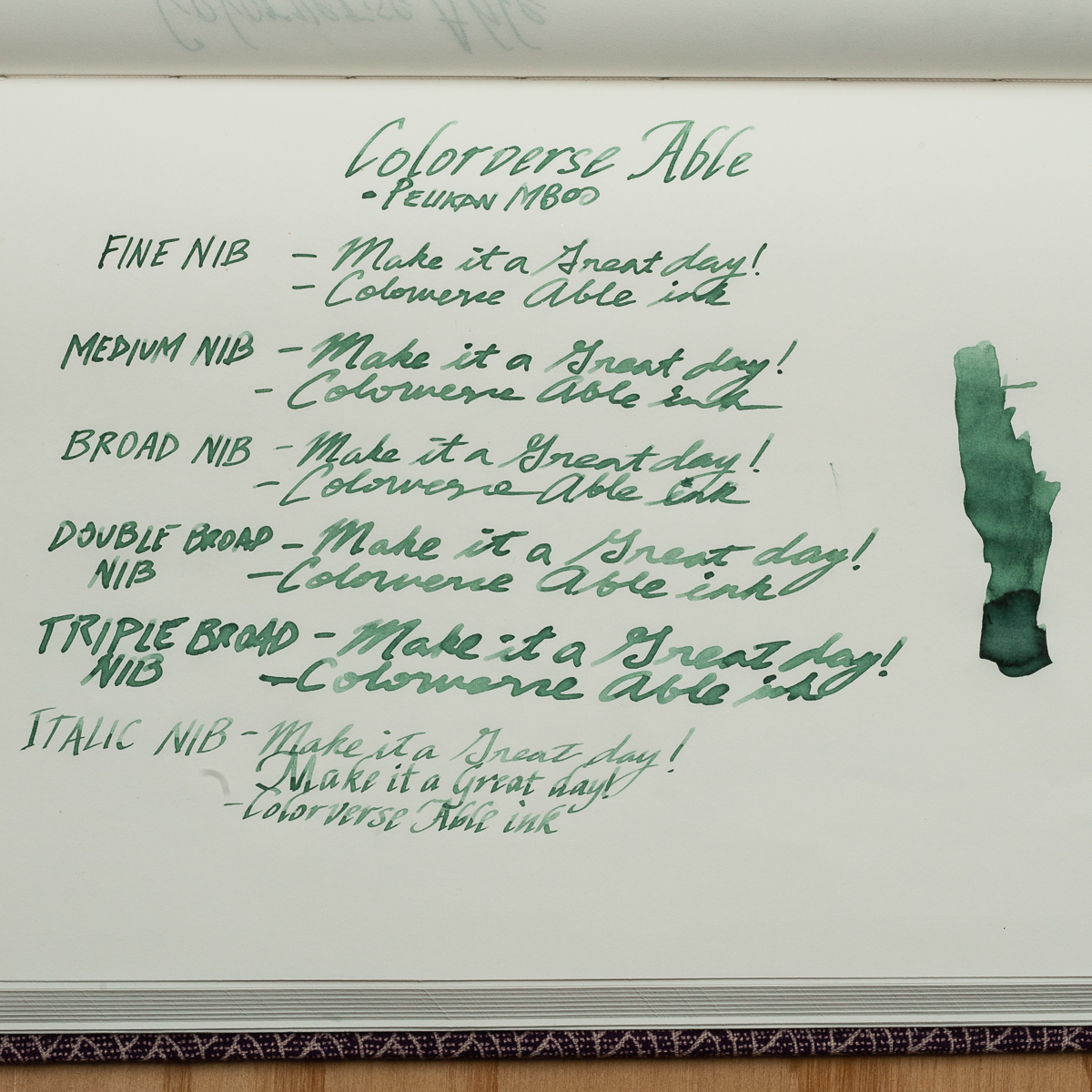
Katherine: First off, I think the Colorverse bottles and packaging are adorable. There are even little stickers! But, that Able label is misleading. It looks solidly grey, but as you can see in our swatches, is solidly green. Perhaps a muddy green, but definitely green.

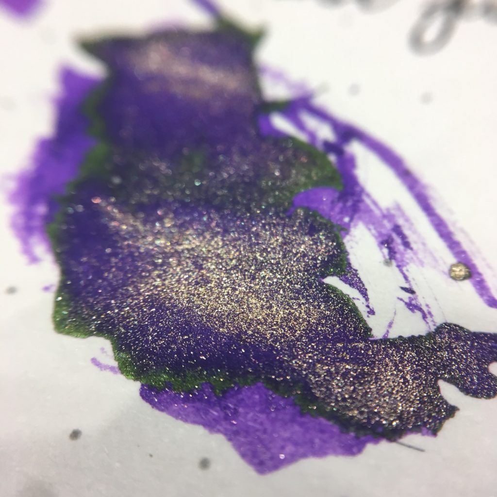
Packaging aside, the inks are well behaved — flow well and wash out easily (I did splatter Able and Miss Baker on some clothing and my face before dinner over the weekend. It washed off easily and no one looked at me funny as I ate my fancy multicourse meal). My one gripe is that Able is really, really light in most nibs — even wetter ones like Pelikan nibs. The highlight of trying the three for me is that Hayabusa Glistening both sheens and shimmers — a purple ink with green sheen and gold shimmer, so much fun!

Overall, I really like Hayabusa (I’m a sucker for purple ink) and Miss Baker. I like the overall color of Able, but found it too light except when in a narrow wet nib (the FCI in my writing samples).

Paper: 52gsm Tomoe River in a Seven Seas Crossfield journal notebook

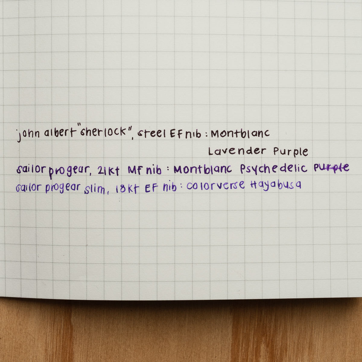
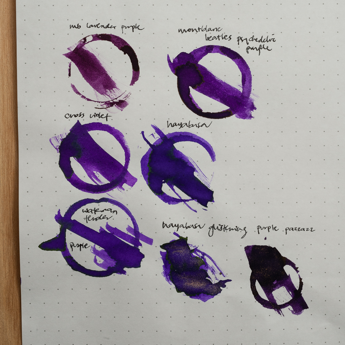
Pam:  My favorite color of the three is Colorverse Hayabusa. It’s a fantastic purple color.  It reminds me of the Montblanc Psychedelic Purple.  There are subtle differences between the two; Hayabusa is a cooler purple (more blue undertones) where as Psychedelic Purple is a warmer purple (with more red undertones.) Both have a subtle gold sheen, although, the sheen on Hayabusa can appear more green in certain lights.  I find Hayabusa to be a great purple ink that has great readability that behaves very well in pens.  Hayabusa was easily the most saturated of the inks and performed extremely well in F and EF nibs.  My architect nib is particularly dry so this saturated ink has more shading without losing it’s vibrancy.

Miss Baker was a pleasant surprise for me.  As someone who passed on Sailor Peche and sakura-inspired pink hues for ink, Miss Baker was surprisingly pleasant to behold.  I particularly liked it with the Sailor 21k F nib, which is the wettest of my three nibs.  My bias towards saturation is obvious, but I can’t deny that Miss Baker is capable of some great shading.  Unfortunately, I don’t see myself using Miss Baker often due to the softness of the color.  I am not sure if I would find a page of Miss Baker to be highly readable, or if it’s a color that would capture my attention in the margins in a sea of black print.

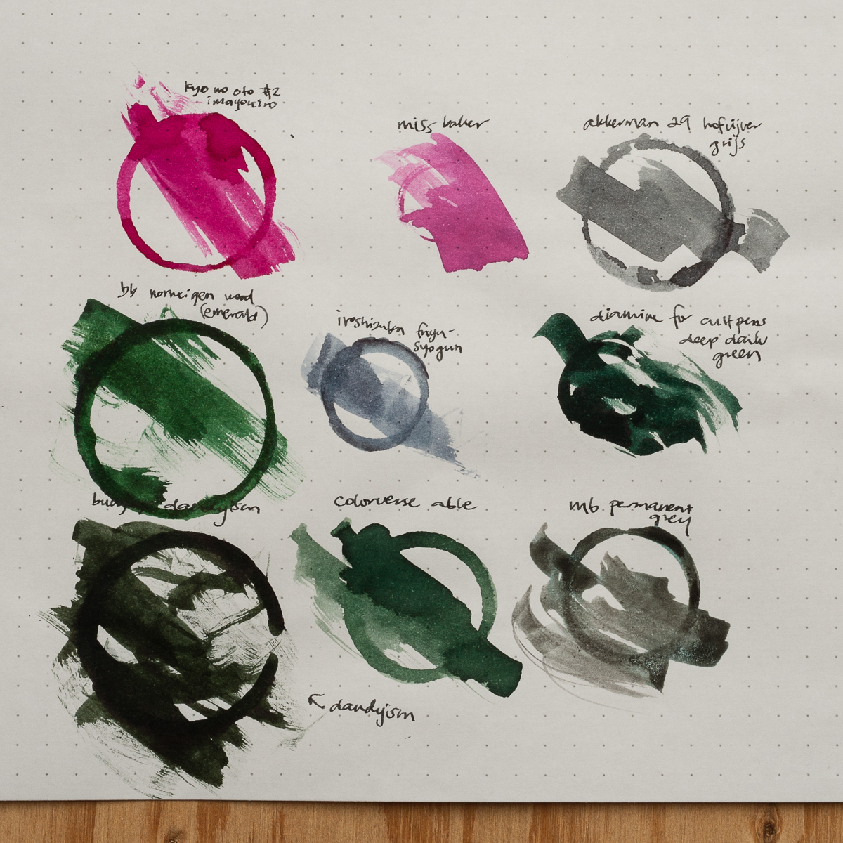
I will admit that I was expecting Able to be a gray ink, so my disappointment on this particular color may overshadow any positive qualities that this ink may have.  Able is NOT gray.  It’s a dull green-gray (more green).  It lacks vibrancy of a green like Montblanc Irish Green or even Bungubox Norwegian Wood or the interest of a green-variant like Ku-jaku or Bungbox Dandyism.  Able is just a blah-green.  If there is any gray in the ink, it just took away the vibrancy and readability of the ink.  It’s the least saturated ink of the three and is a pale ghost of it’s already zombied-green self in my EF and dry architect nibs.  If anything, I feel mislead by the packaging and disappointed by the color.

Overall, I found all the Colorverse inks to be wet in flow and really easy to clean out.  I will definitely be adding some Colorverse inks to my collection in the near future. Thank you again Pen Chalet!  My order will be in your queue soon!

Paper: Filofax notebook.
Paper: (insert here, wait for Pam)
Paper: (insert here). A comparison of different purples side by side. Lavender Purple is much redder.

Ink Circles and Comparisons

Paper: Rhodia 80g Dot Pad. Able is definitely not grey, but is a pretty unique light muddy green. Able is a bright pink, but not similar to anything we had on hand. Katherine suspects it might be close to J Herbin’s Bouquet D’ Antan.

Paper: Rhodia 80g Dot Pad. Hayabusa’s closest match is Waterman Tender Purple, they even have the same greenish sheen.

And for the shimmer fiends, here’s a close up of Hayabusa Glistening. Unfortunately I couldn’t get the sheen and shimmer to show in any writing samples.

We received these inks free of charge for the purposes of this review. We were not compensated monetarily for our review. Everything you’ve read here is our own opinions.

1 Comment

Review: Pelikan Souverän M300 (Green-Striped, Oblique Medium nib)


We are once again joined by our guest reviewer, Roz and she contributed her thoughts on this Pelikan pen. She is also our first left-handed reviewer and we are glad to have her persepctive. Thanks very much Roz!


Hand Over That Pen, please!

Roz:  Classy and petite! The green, black and gold made me feel fancy just looking at it. I don’t usually seek out gold accents, but this pen makes me question that inclination. Definitely the smallest pen I was ever going to write seriously with, so I’m really looking forward to it!

Katherine: I love the styling of classic Pelikans, and this one is no different. Plus, its adorable! ❤

Pam:  Great things come in small packages so when you make a Pelikan petite, it’s adorable.  My wallet is very lucky that the white tortie did not come in this size.  I don’t normally enjoy the “classic” styling of the Pelikan, but in a small package, it harkens back to the vintage Peter Pan pens.

Franz: Hey! Did someone leave a Pelikan M1000 in the drier, or did it shrink from ink starvation? Harharhar!

Yep, it’s that familiar and elegant green stripe of a Pelikan in their smallest pen ever. They introduced this pocket pen version in 1998 and the green-striped finish is a standard finish as well as a black barrel one. Pelikan also produced a few special edition finishes in the year 2000’s. The M300 is unmistakably a Pelikan Souverän pen.

In the Hand: Pelikan M300 (posted) — from left to right: Franz, Katherine, Pam, and Roz
In the Hand: Pelikan M300 (unposted) — from left to right: Franz, Katherine, Pam, and Roz


The Business End

Roz: Springy! Honestly, I had a lot of trouble writing with this nib. I wasn’t expecting the amount of bounce back, so my natural writing pace had a lot of adjusting to do. I also learned (thank you Pam!) that this is an oblique medium nib, maybe my inexperience with this type of nib added to my inconsistent writing.

Katherine: I liked this nib more than I expected. The only other oblique Pelikan nib I’ve written with much was a vintage OB, and that was an unusable angle for me. This one was comfortable, forgiving and surprisingly wet (I’m not sure why I expect small pens to be drier? Not like this one can’t hold a lot of ink…)

Pam:  I find the oblique nib to be too inconsistent for my writing style.  I always feel that I am apply more pressure to the “longer tine,” if that makes sense.  That being said, like all Pelikan nibs, I find the nib to be smooth and enjoyable to write with.  This nib somehow reminds me of an ice skater gliding over the ice on one leg.

Franz: The M300’s 14-carat nib is quite springy and I love it! An oblique nib’s characteristic always seem weird to me at first but I eventually get used to it. It’s just being conscious of turning the pen at the right angle. But yes, this nib’s flow is quite generous and I enjoyed it.


Write It Up

Roz: The diameter of the pen being so small, especially because I tend to grip low on the section, made it difficult for me to find a comfy grip position and my hand got tired pretty quickly as a result.

Katherine: This pen is usable for me for quick notes… But not the pinnacle of comfort for longer writing sessions. Overall though, not bad. Much more usable than I expected, but definitely more of an on-the-go pen than a sit-at-my-desk-and-write-about-my-deep-dark-feelings.

Pam:  When I said that this pen reminds me of the Peter Pan pens, it’s likely due to how I see this pen being used.  For quick notes in a pocketbook.  I find the diameter of the pen to be too slim for a prolonged period of time.  I am always fearful of snapping this petite pen with my iron grip.

Franz: At 4.3 inches closed, it’s a small pen. I went into the 20-minute writing session already expecting that my hand wouldn’t be comfortable. And I’m glad I managed my expectations because I did feel fatigued after ten minutes. The section and barrel’s thinness contributed to that fatigue. I only used the pen with the cap posted because unposted, the M300 was almost disappearing in my hand.


EDC-ness

Roz: At first I was super worried I would lose this pen because of its size. However, the clip on the M300 is really strong and it did great in my carrier. I admit though that for my day to day writing, I did not use the M300 much due to the size of the pen being difficult for me to hold for long periods of time.

Katherine: Great pen for EDC! The clip is strong, the size is perfect and the nib makes notes enjoyable. My only gripe is that the typical Pelikan wetness, paired with a medium nib doesn’t make for the fastest drying notes. That’s easily solved by getting a different nib though. 10/10, would EDC again.

Pam:  In a checkbook, pocket book or a dainty pocket, it’s perfect!  Perhaps it’s the size, but I feel that it’s more fragile than the normal size pens so I wouldn’t throw it into a jeans pockets if you plan on sitting down or putting your keys in the same pocket.

Franz: The M300’s Every Day Carry-ness is what won me over though. Definitely fits in my shirt pocket, and it’s ready to write with only one turn of the cap. It may be too short for my hand unposted but is perfectly usable for a fast signature, jotting down a phone number, or whatever quick note one needs. If I know I’ll use it for more than five words, I’ll post the cap and it does so securely. Unlike Pam’s thoughts, I didn’t find the M300 more fragile than any other pen. Granted, I wouldn’t dare to sit on this pen (or any other pen) but it’s quite durable for everyday usage.

And just like any other Pelikan Souverän, it’s a piston-filled pen and the piston operates very smoothly. As shown in the photo below, you can see through the barrel’s stripes and see the ink level clearly. The smaller barrel definitely means a smaller ink capacity though. And it holds about 50% less ink than an M1000. At 0.7mm, the ink capacity is just like a converter for other pens.


Final Grip-ping Impressions

Roz: The M300 is a beautiful pen. I would like to give it another try down the road, maybe when my experience with oblique, springy nibs develops a bit more. ^_^;

Katherine: A great pocket pen! Classy looking, fantastic nib and the perfect size. My only gripe is the price, for $200+, I would likely get a vintage 400 instead (fairly easily found at around $150) and I’d still have a reasonably small pocket pen, but one that can play dual duty as a normal writer as well.

Pam:  Despite my love for pocket sized pens, I would have to say that this pen is an acquired taste given the size.  It’s not as practical as the M200 or M400 in size.  For those with average and larger size hands, it may be a challenge to use for an extended writing session.  For those who love Peter Pan pens or pocket pens, I would highly recommend trying out this pen before committing your wallet to it.

Franz: Clearly, the Pelikan M300 is for people with smaller hands or for people who wants to have an elegant looking pocket pen. Also, it’s a great pen for a Pelikan pen addict (like myself). Have you guessed who owns this pen yet? =) For my large hands, the M300 is a novelty. I love it but I don’t see myself using this pen comfortably on a daily basis. My hand is definitely happier writing with a M800 or M1000.

The M300’s Souverän styling gives it a serious and classic look but it’s tininess makes it a “cute” pen.


Pen Comparisons

Closed pens from left to right: Platinum 3776, Franklin-Christoph Pocket 20, Pilot Prera, Sailor Professional Gear Slim, *Pelikan M300*, Kaweco Sport, Lamy 2000. Lamy Safari
Posted pens from left to right: Platinum 3776, Franklin-Christoph Pocket 20, Pilot Prera, Sailor Professional Gear Slim, *Pelikan M300*, Kaweco Sport, Lamy 2000. Lamy Safari
Unposted pens from left to right: Platinum 3776, Franklin-Christoph Pocket 20, Pilot Prera, Sailor Professional Gear Slim, *Pelikan M300*, Kaweco Sport, Lamy 2000. Lamy Safari


Pelikan Pen Comparison

Closed pens from left to right: 120, M100, M200, M300, M405, M620, M800 and M1000
Posted pens from left to right: 120, M100, M200, M300, M405, M620, M800 and M1000
Unposted pens from left to right: 120, M100, M200, M300, M405, M620, M800 and M1000


Pen Photos (click to enlarge)

No Comments