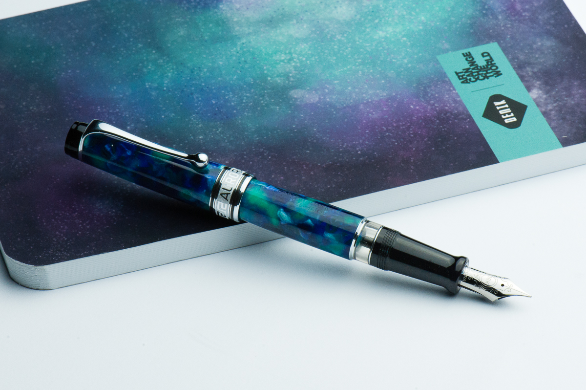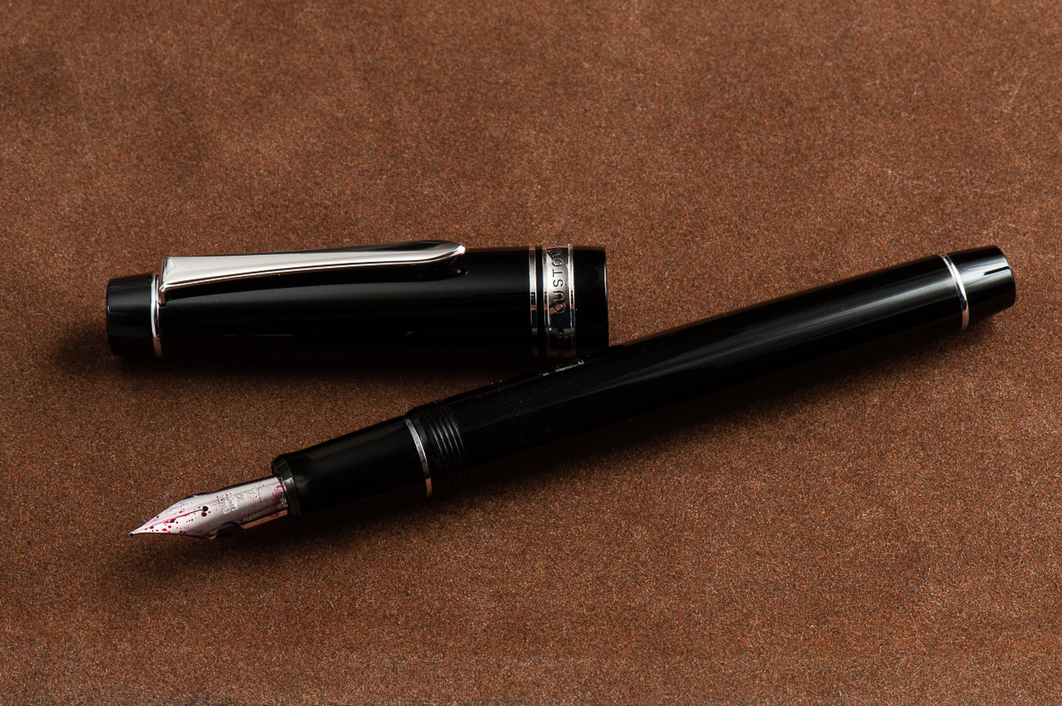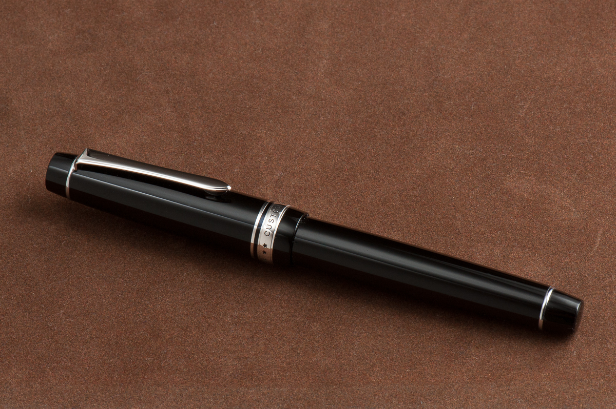
Review: Kasama Una


Hand Over That Pen, please!

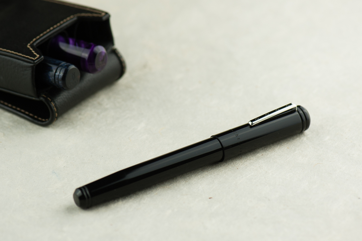
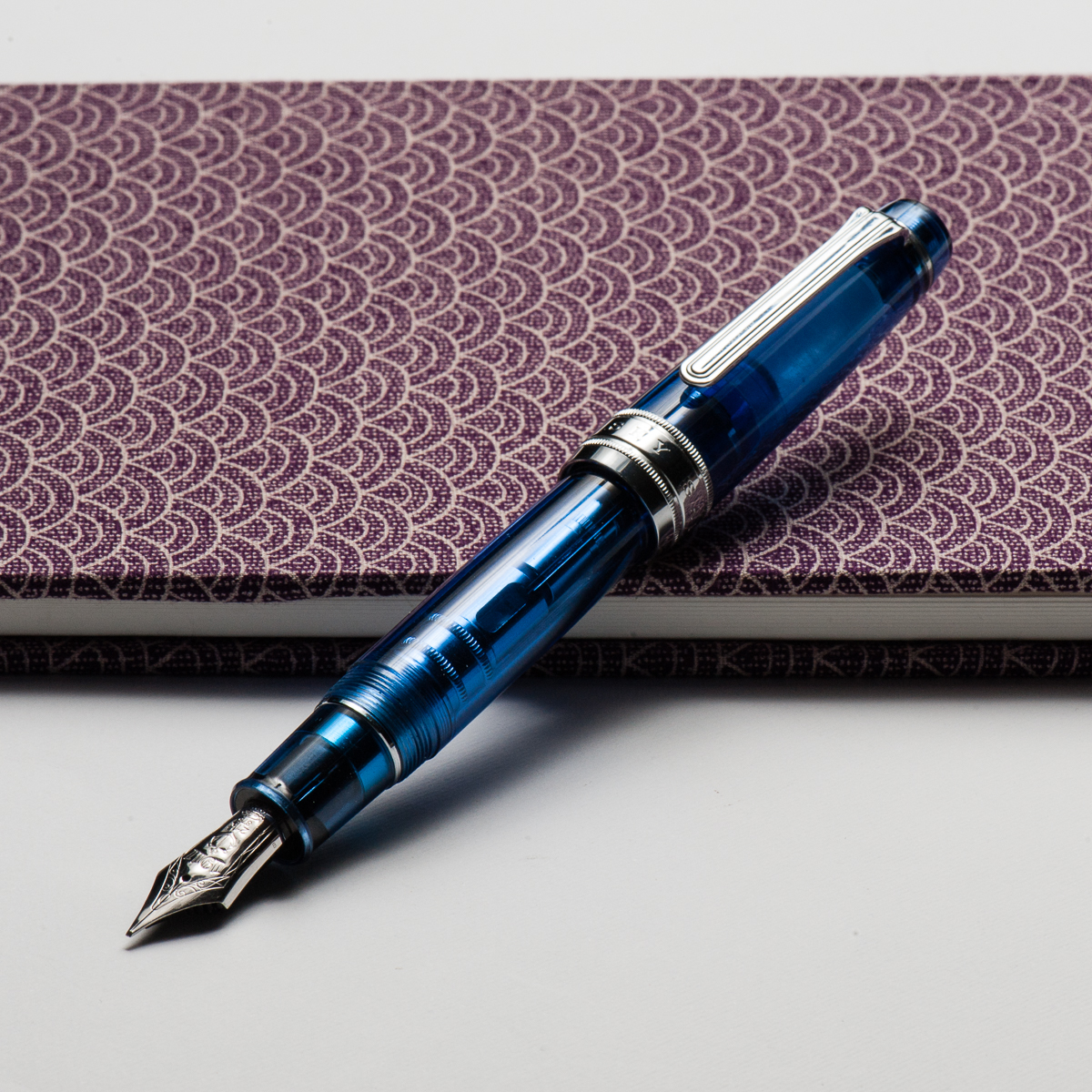
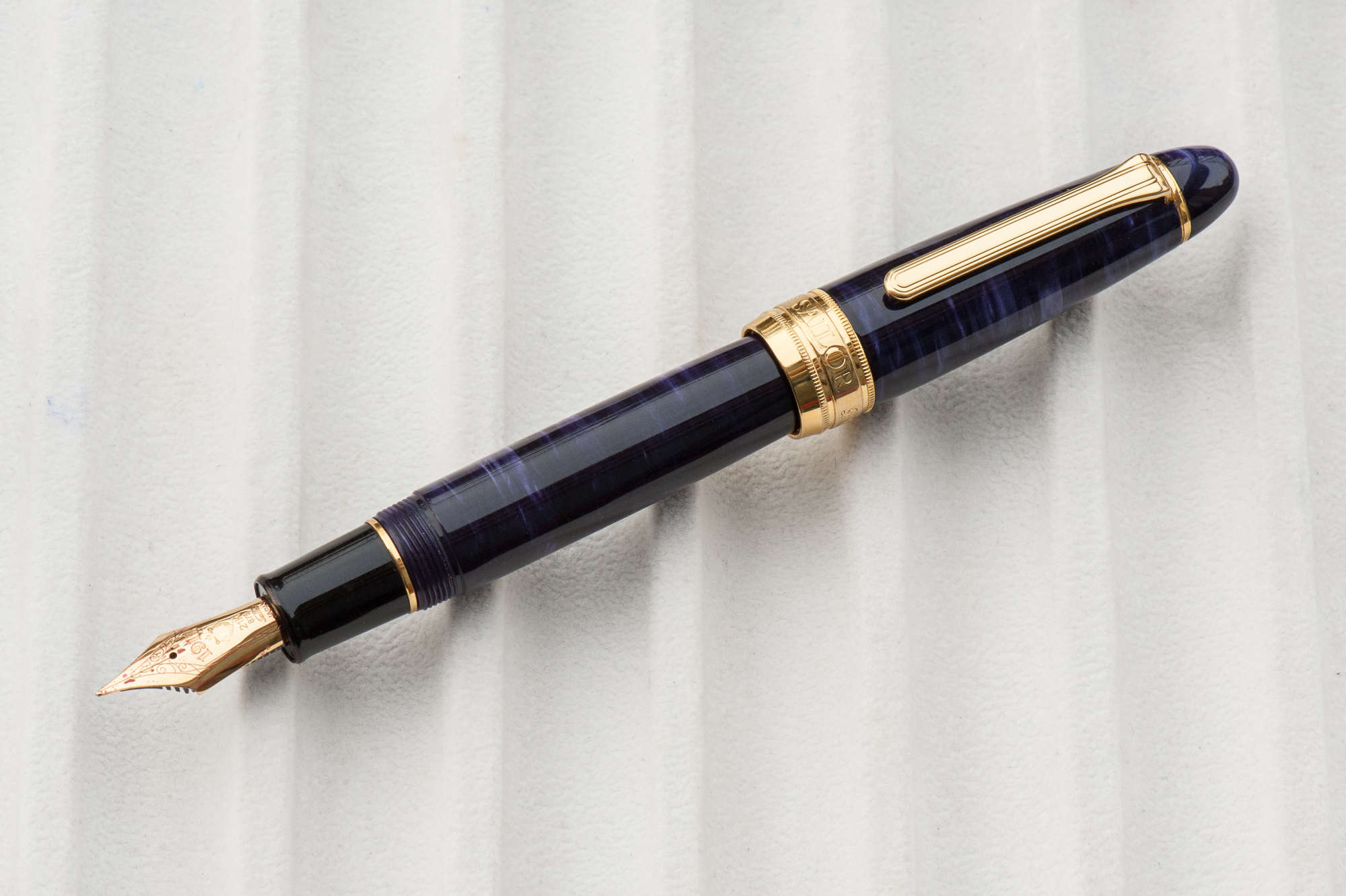
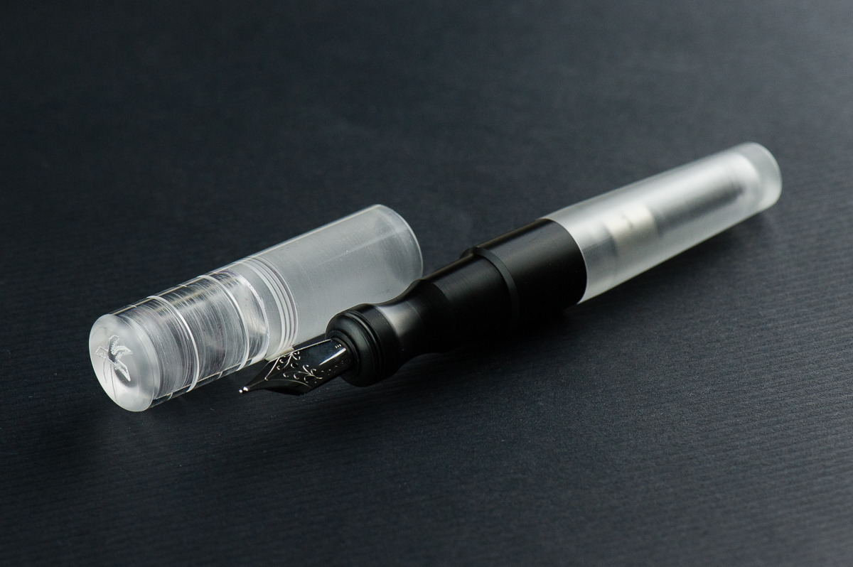
Katherine: I love short and chubby pens — so the Kasama Una is right down my alley. I also love demonstrators, despite not owning too many, so that’s another check mark. When Kasama first started selling the Unas, I was a little disappointed that they had delrin sections, instead of being entirely translucent, but now that I’ve spent some time with it, it’s grown on me a lot!

Pam:  I am so glad that Franz and Katherine are my gateways to the awesome pen and stationary community in the Phillipines.  The Kasama Una is a very modern pen with the translucent and black material.  The acrylic feels good to the hand, and the section is Delrin which feels fantastic.  It feels warmer than the acrylic in my opinion.  The shape of the pen seems disproportional to me at first glance, however, after picking it up, it makes a lot of sense.  The cap adds to the oversized nature of the pen, however, the pen body itself is proportional in your hand.

Franz: One of the things I love about this pen hobby is being able to check out cool things either in terms of design or materials. And this Kasama Una fountain pen definitely piques my interest in both of those aspects. Honestly, what drew my attention to this pen is its section. It’s oddly shaped, weirdly ergonomic, and that delrin material is prrretty cool! Actually, it seems that the Kasama folks created the pen around the features of the section (see their post on Instagram).

As Pam mentioned, Kasama is a new pen company from the Philippines and they create these Una pens in the Philippines as well. Kasama is a Filipino/Tagalog word that can mean a multitude of things depending on its usage and context. Some of which are: companion, fellow, friend, being included, or being in one’s company, etc. Una in tagalog means first which is befitting since this is Kasama’s first fountain pen.
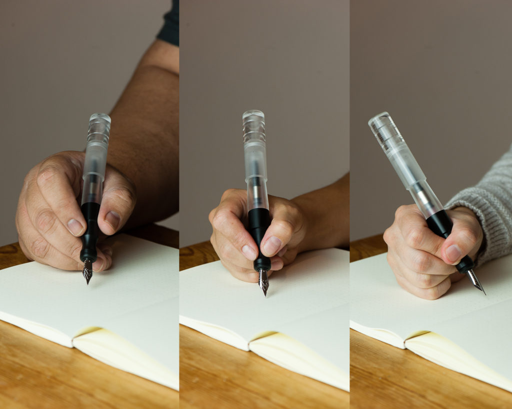
 

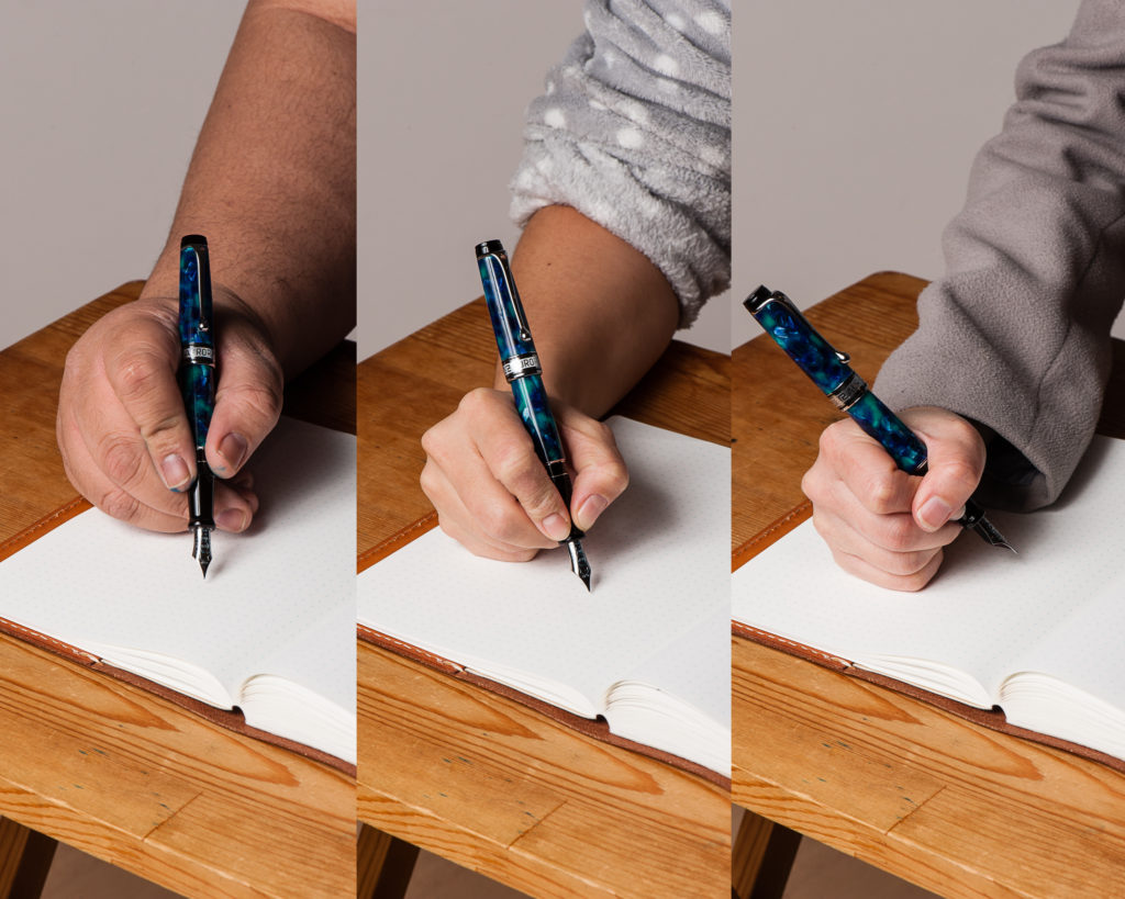
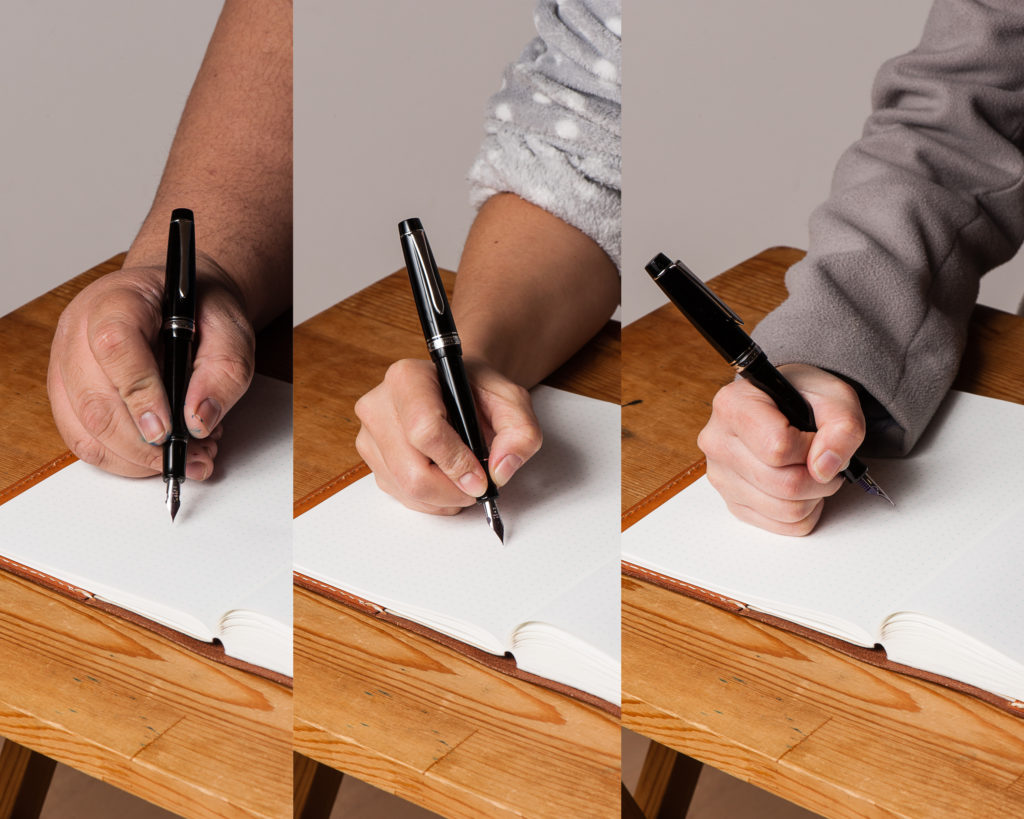
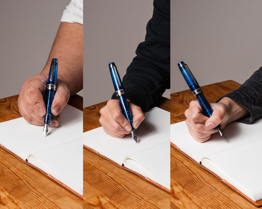
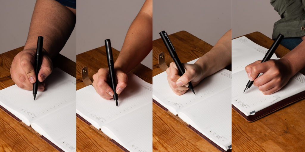
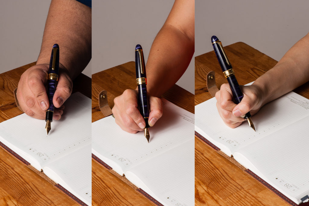
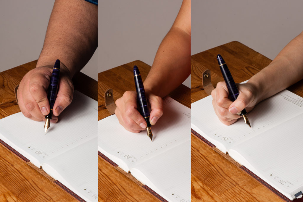
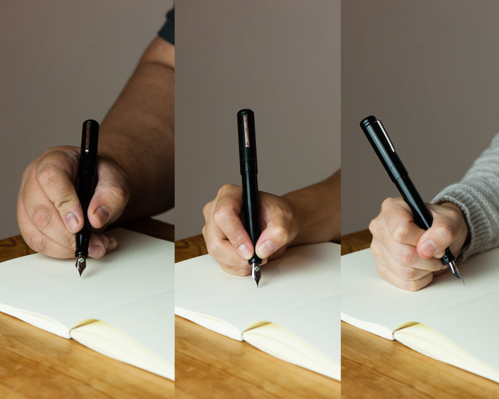
In the Hand: Kasama Una (posted) — from left to right: Franz, Katherine, and Pam
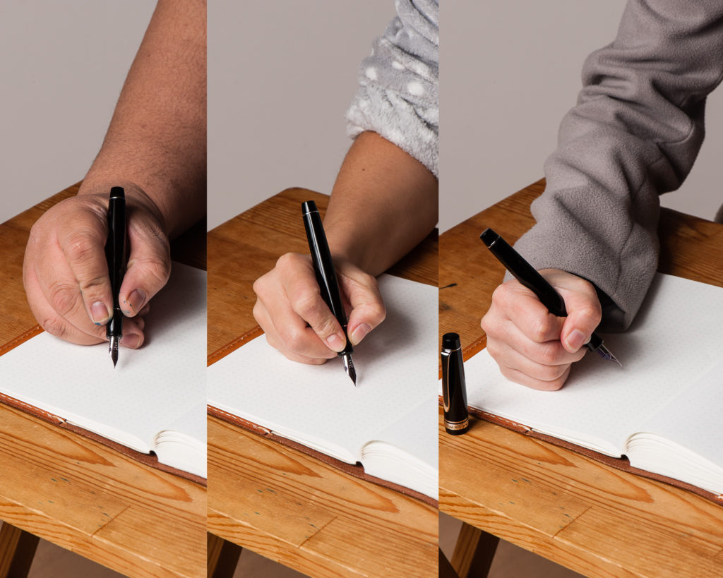
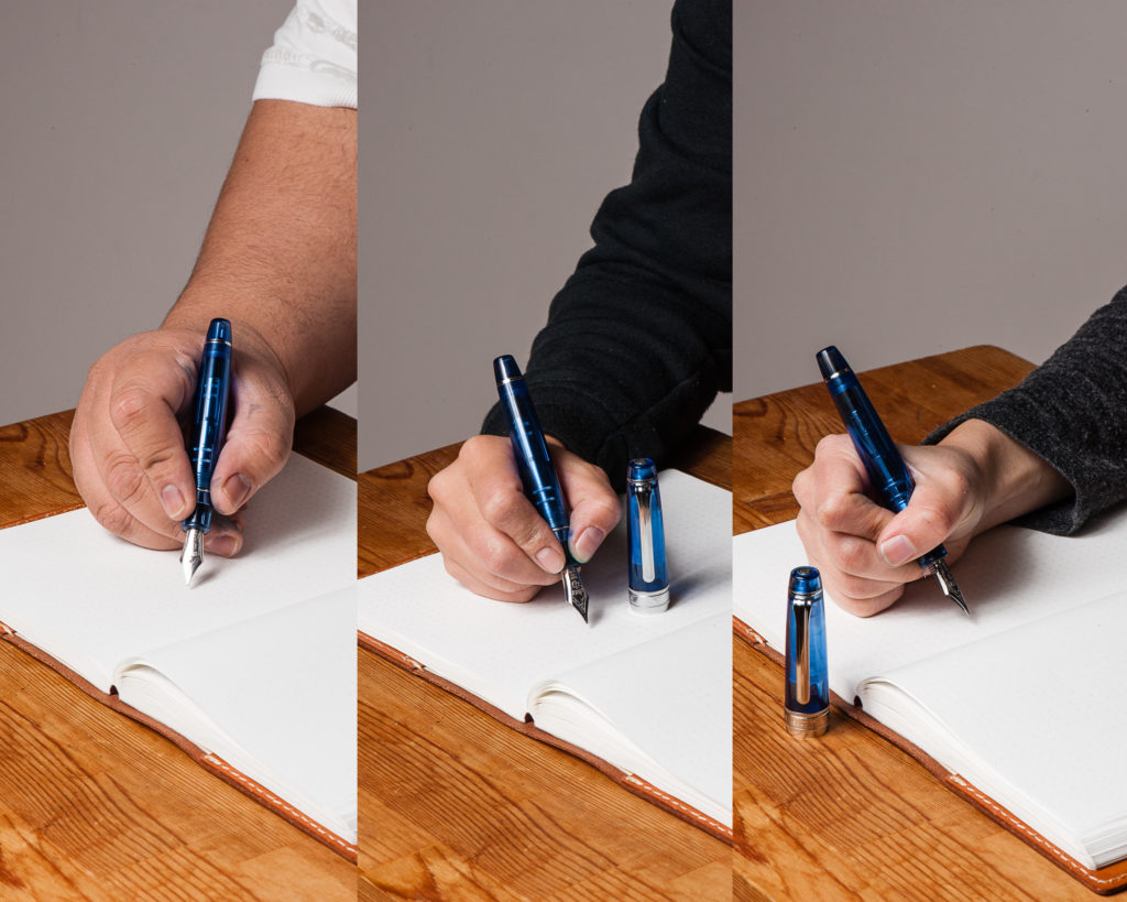
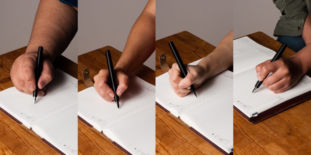
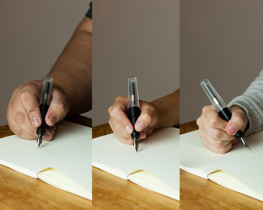
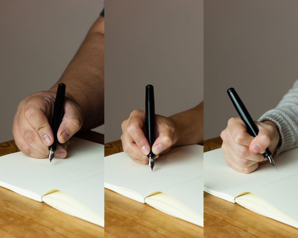
In the Hand: Kasama Una (unposted) — from left to right: Franz, Katherine, and Pam


Detail Shots

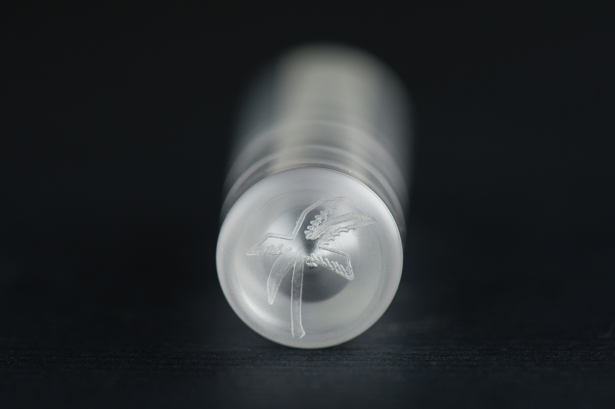
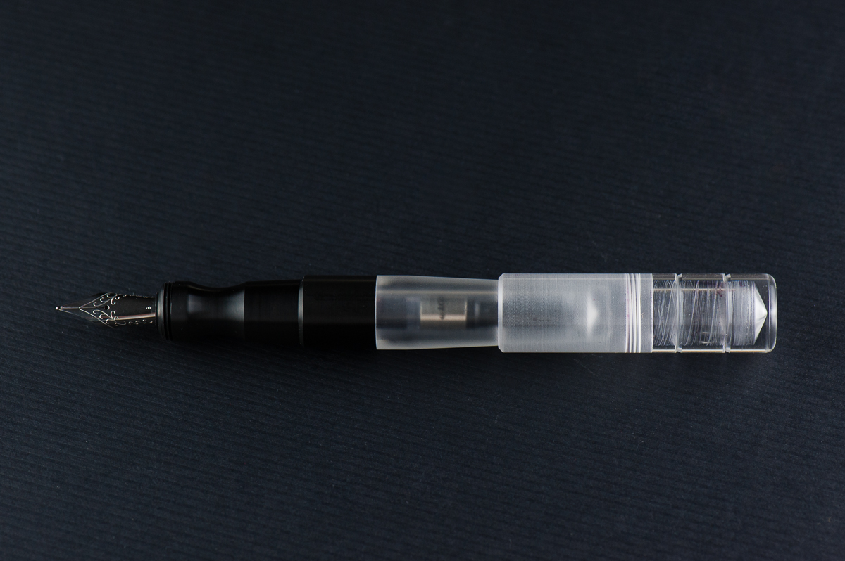
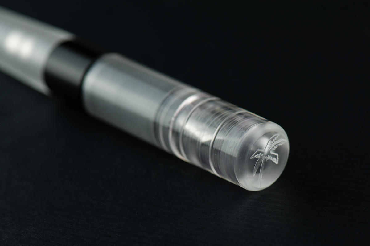
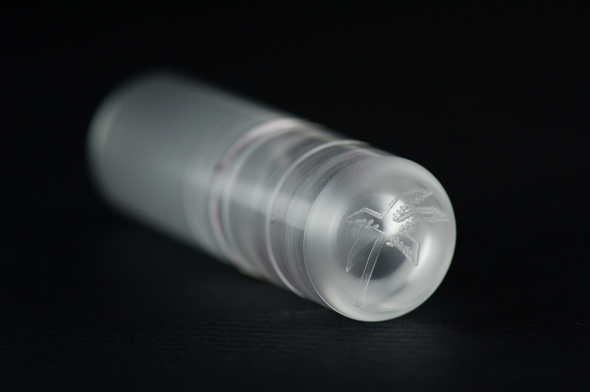
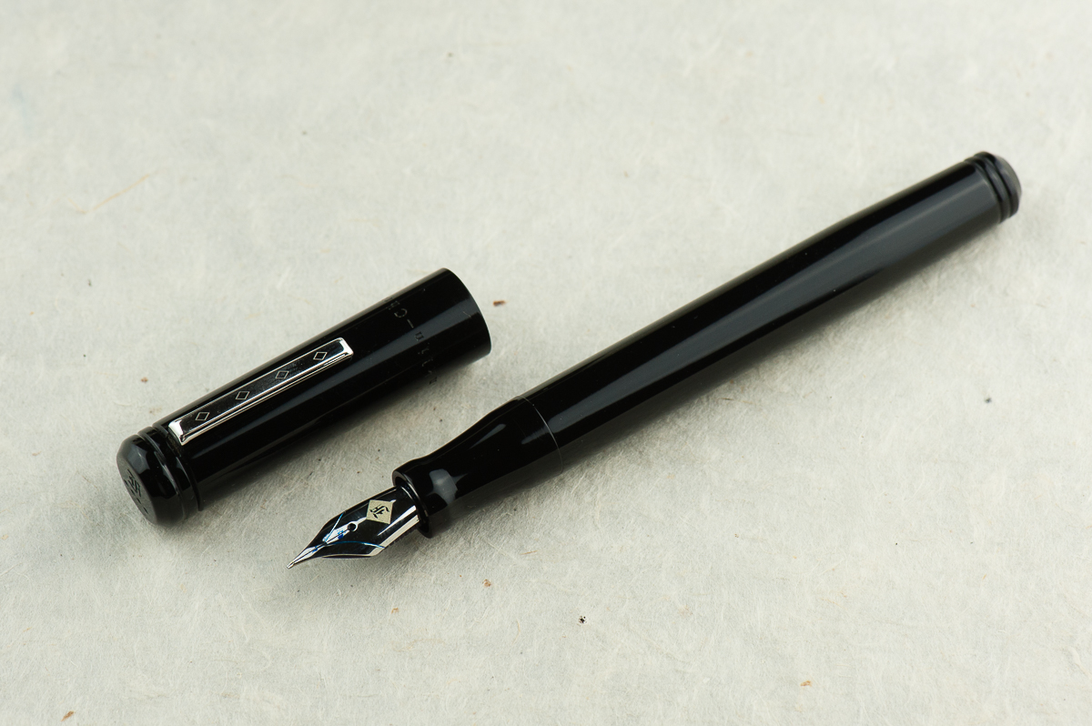
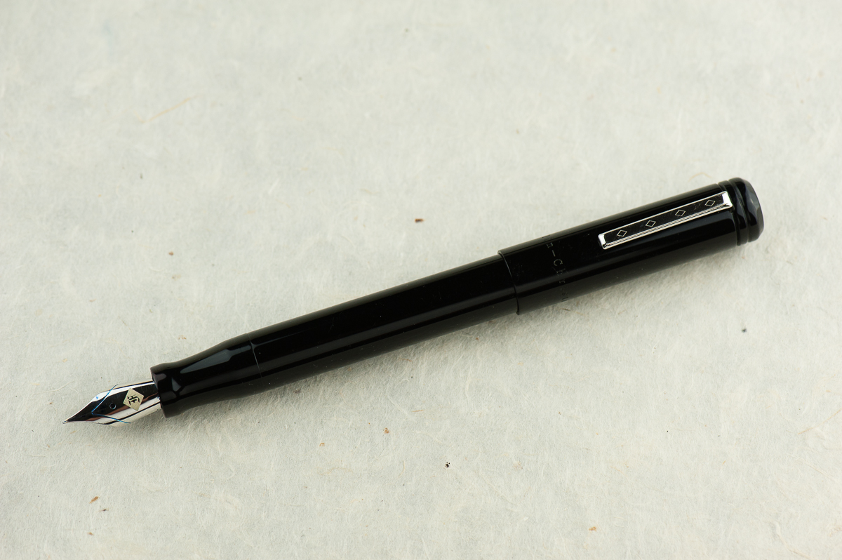
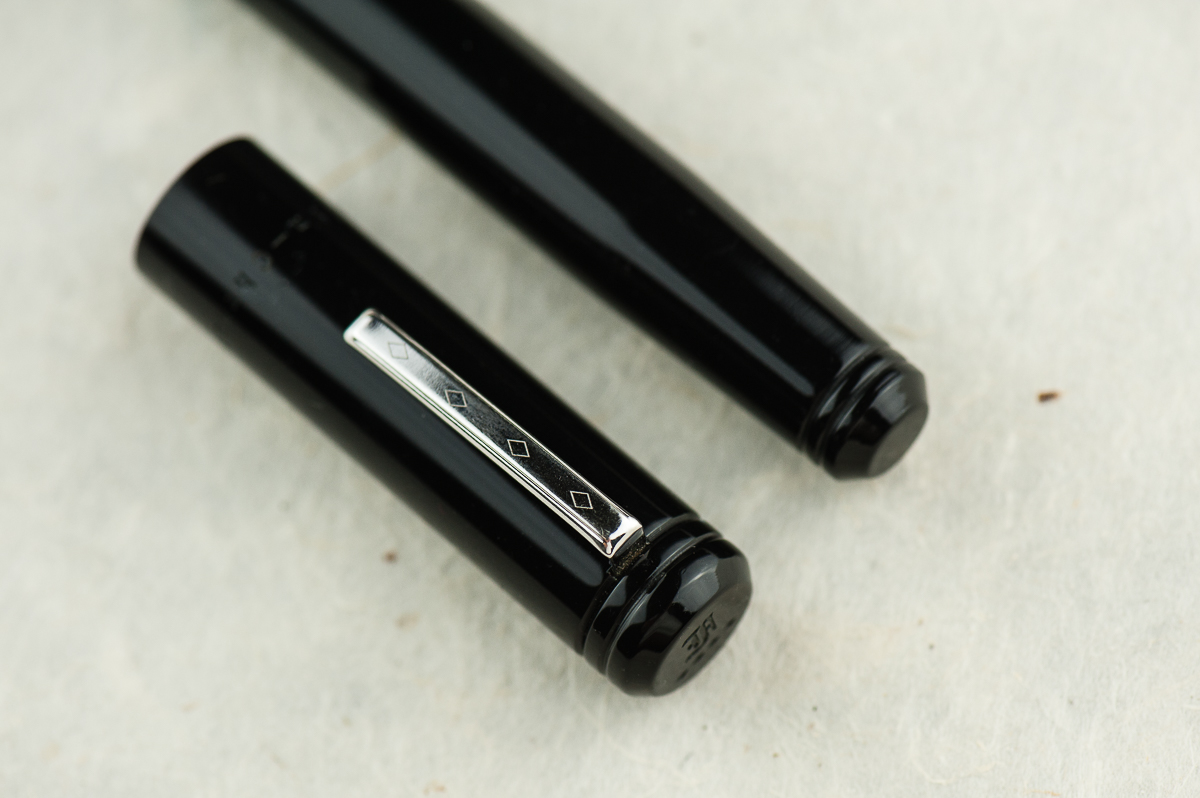
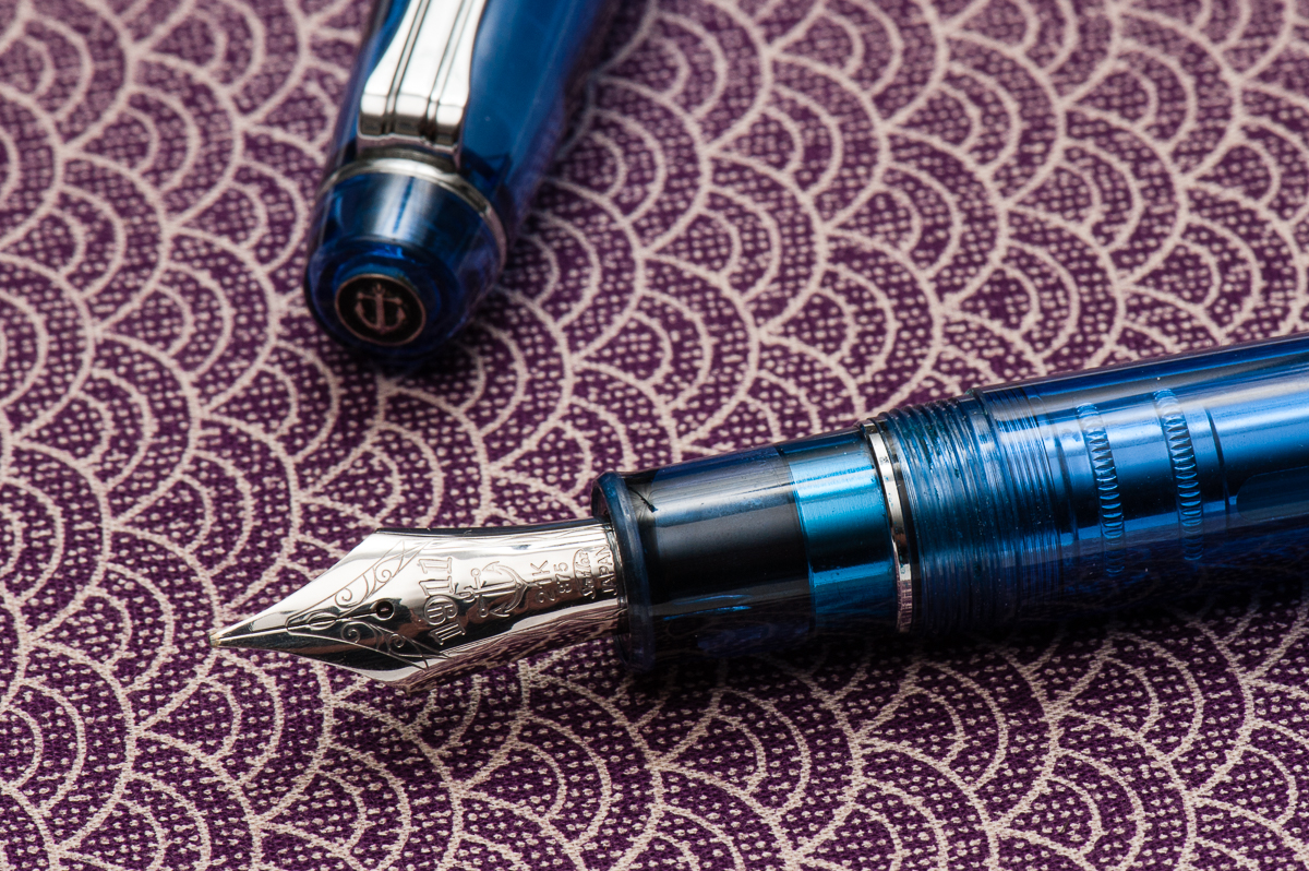
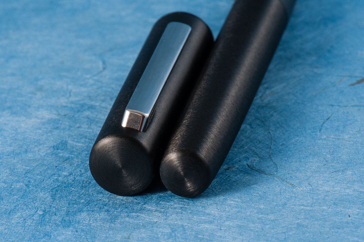
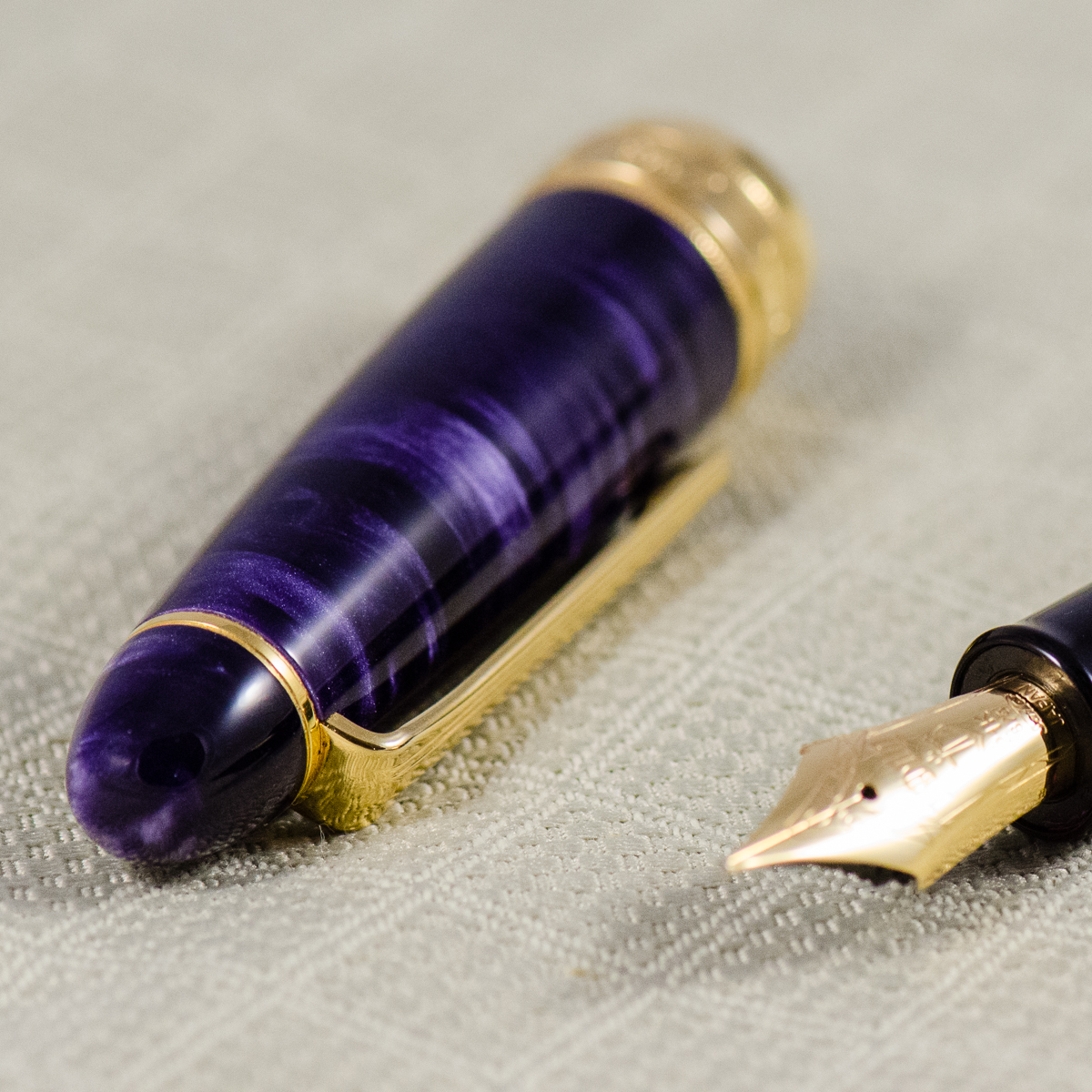
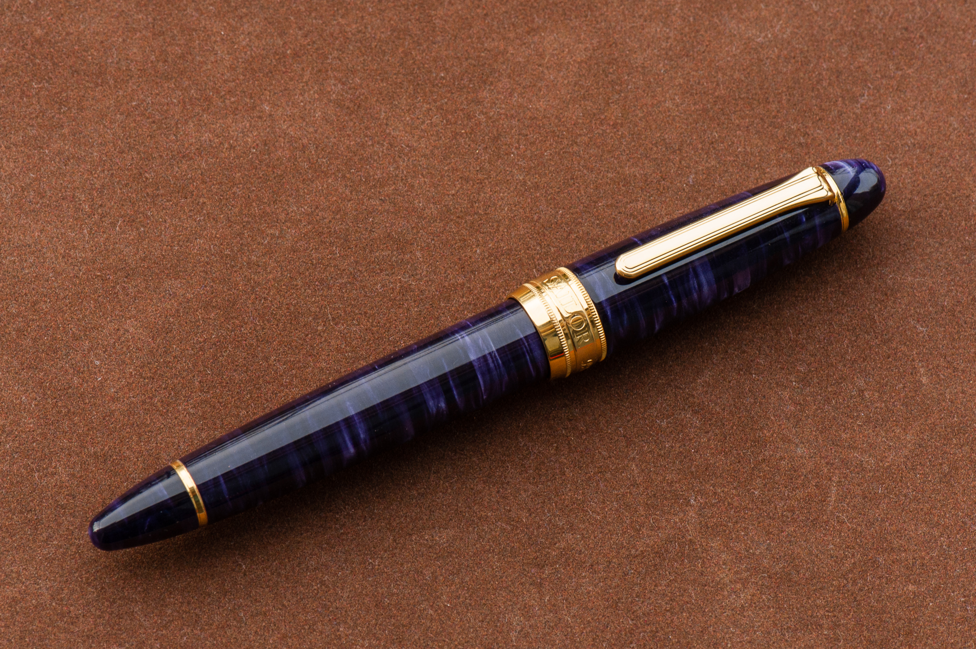
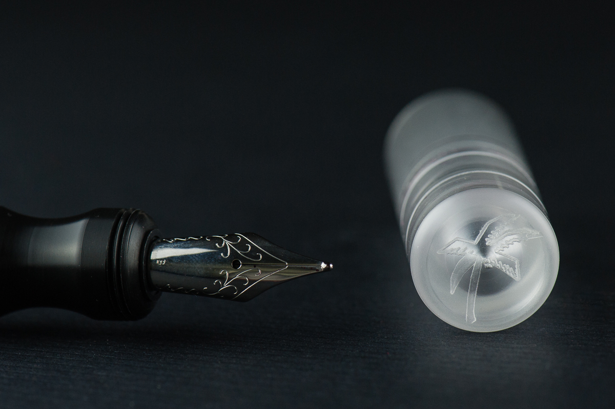
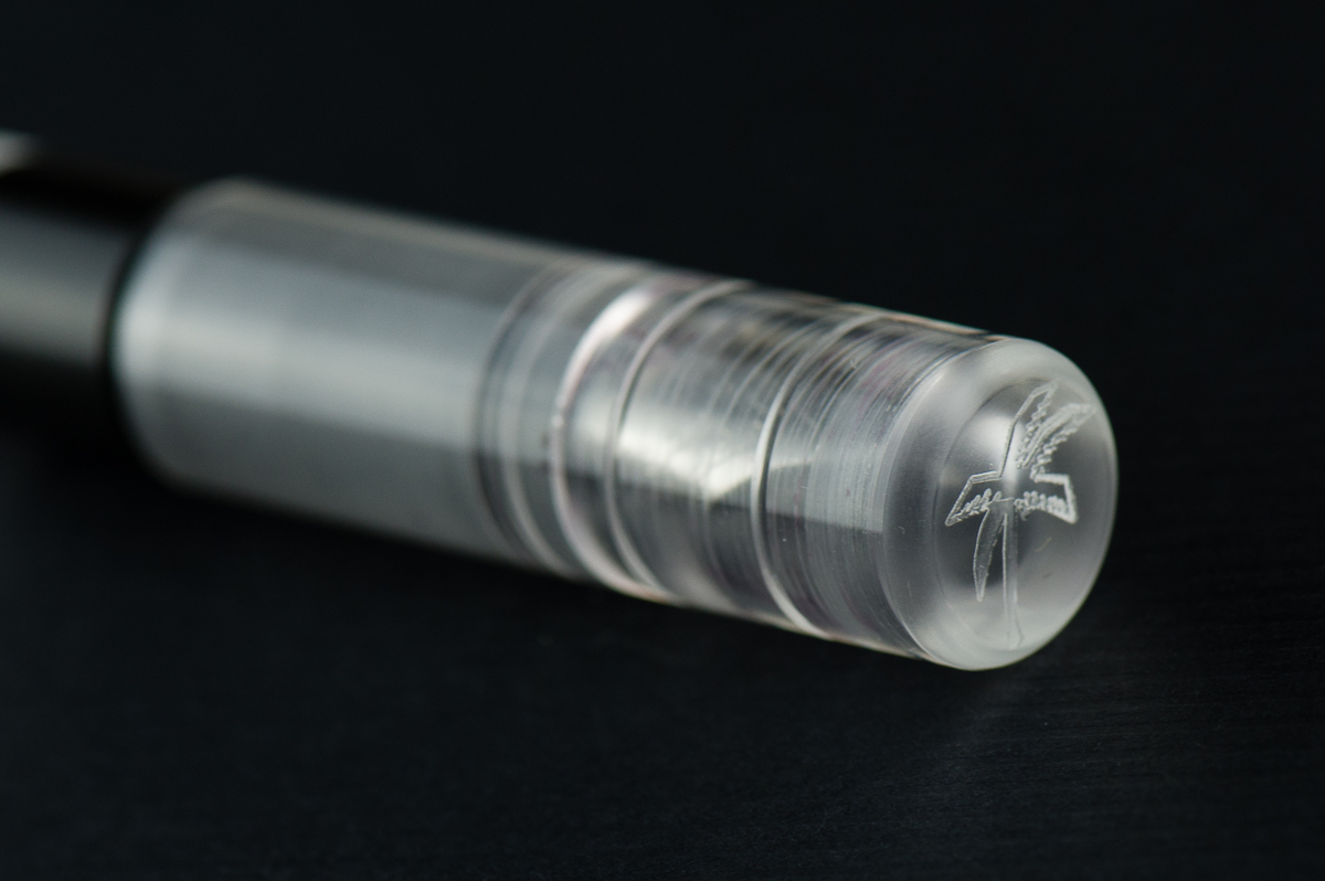
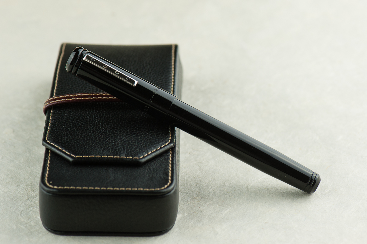
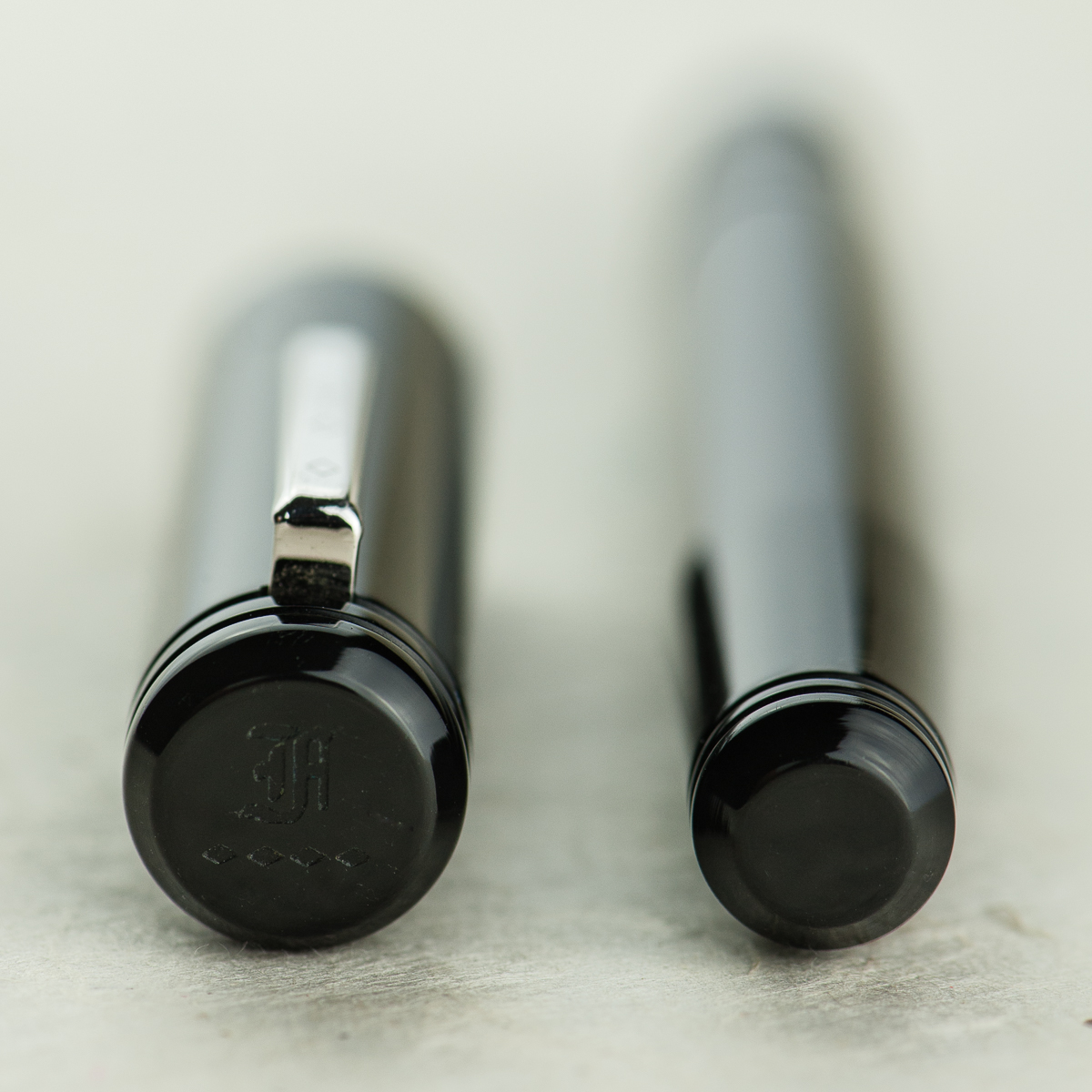
Kasama logo on the Una’s finial
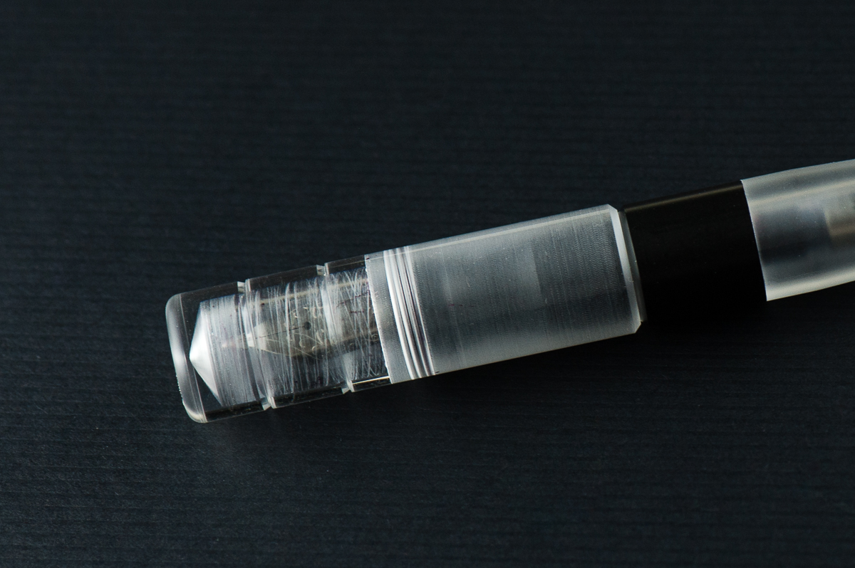
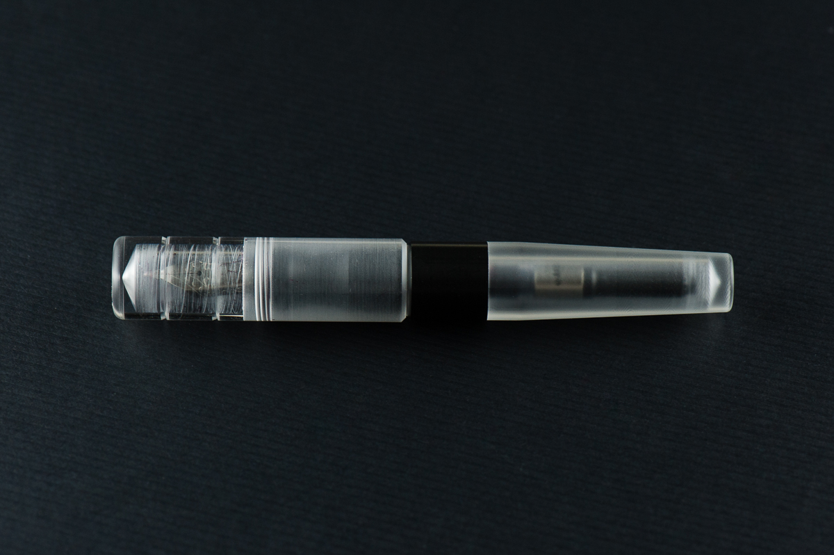
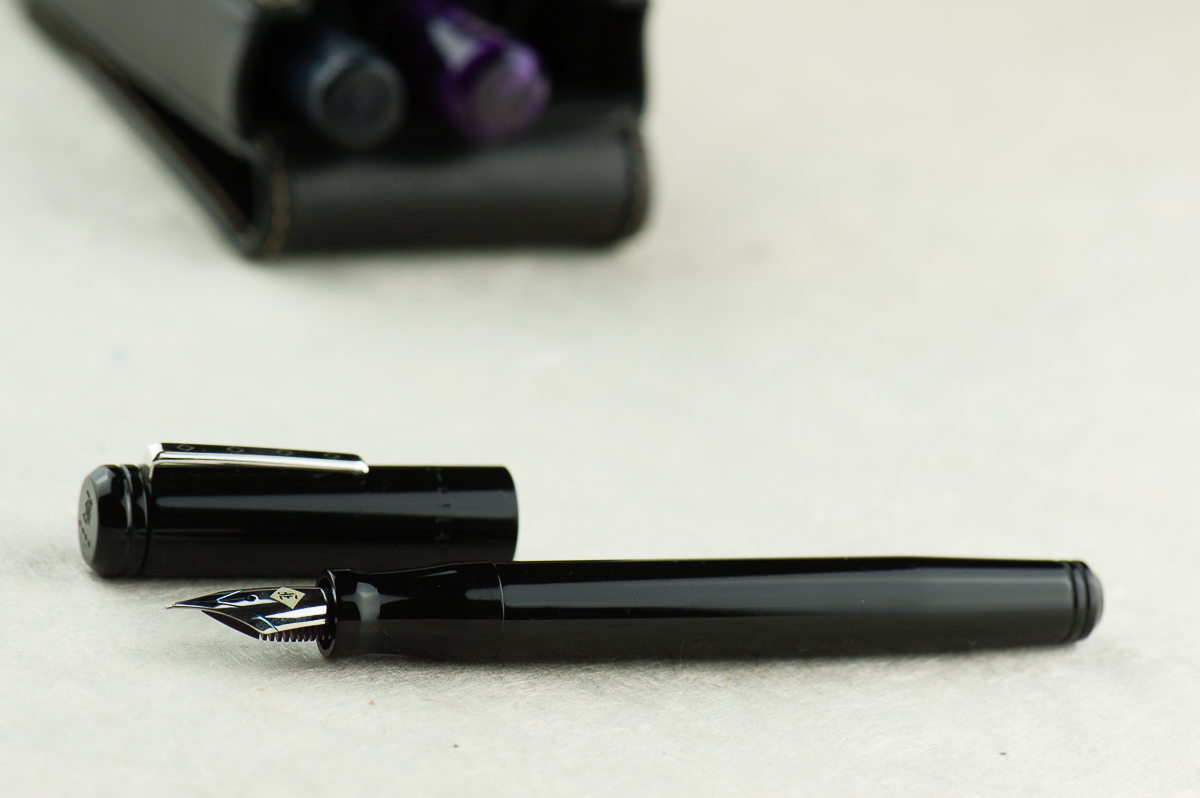
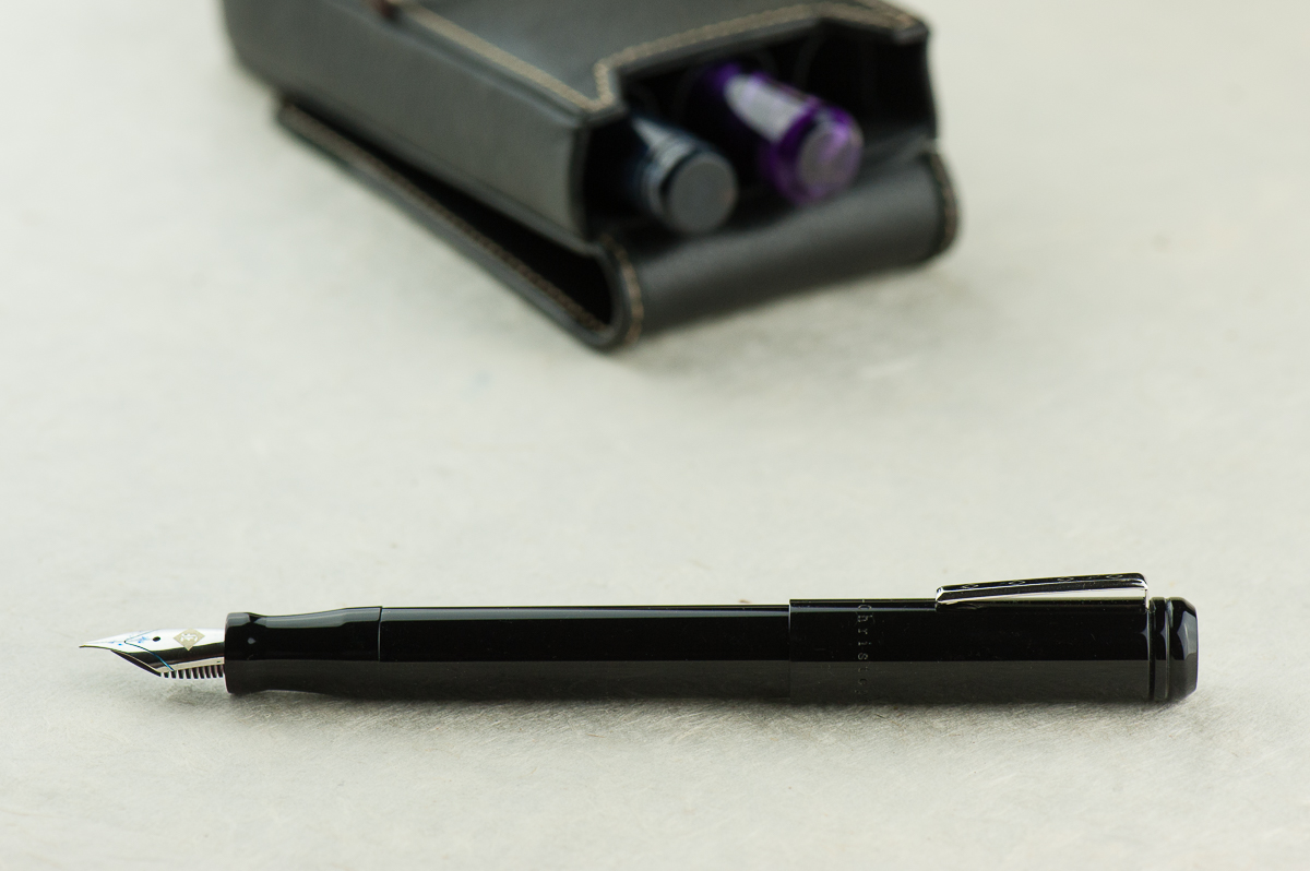
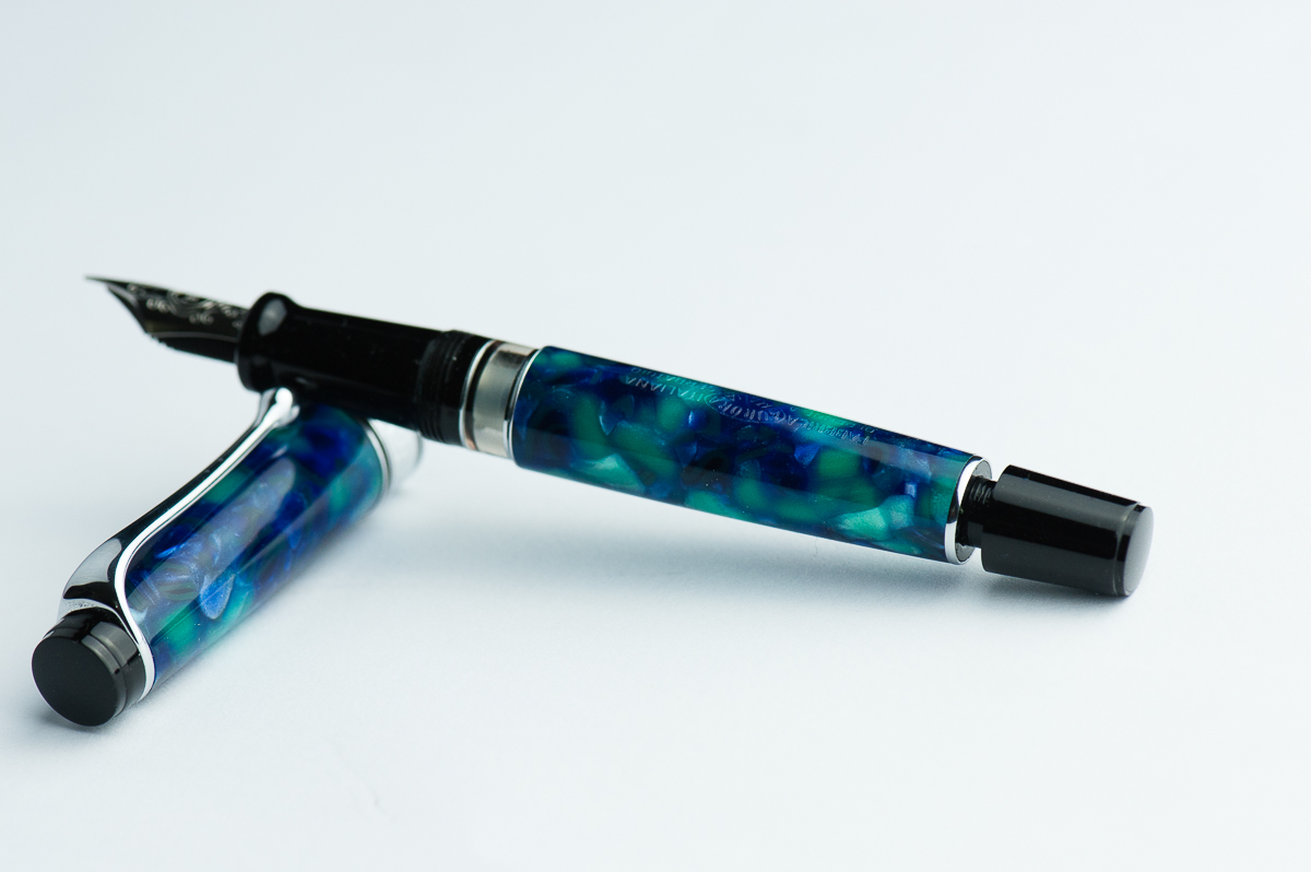
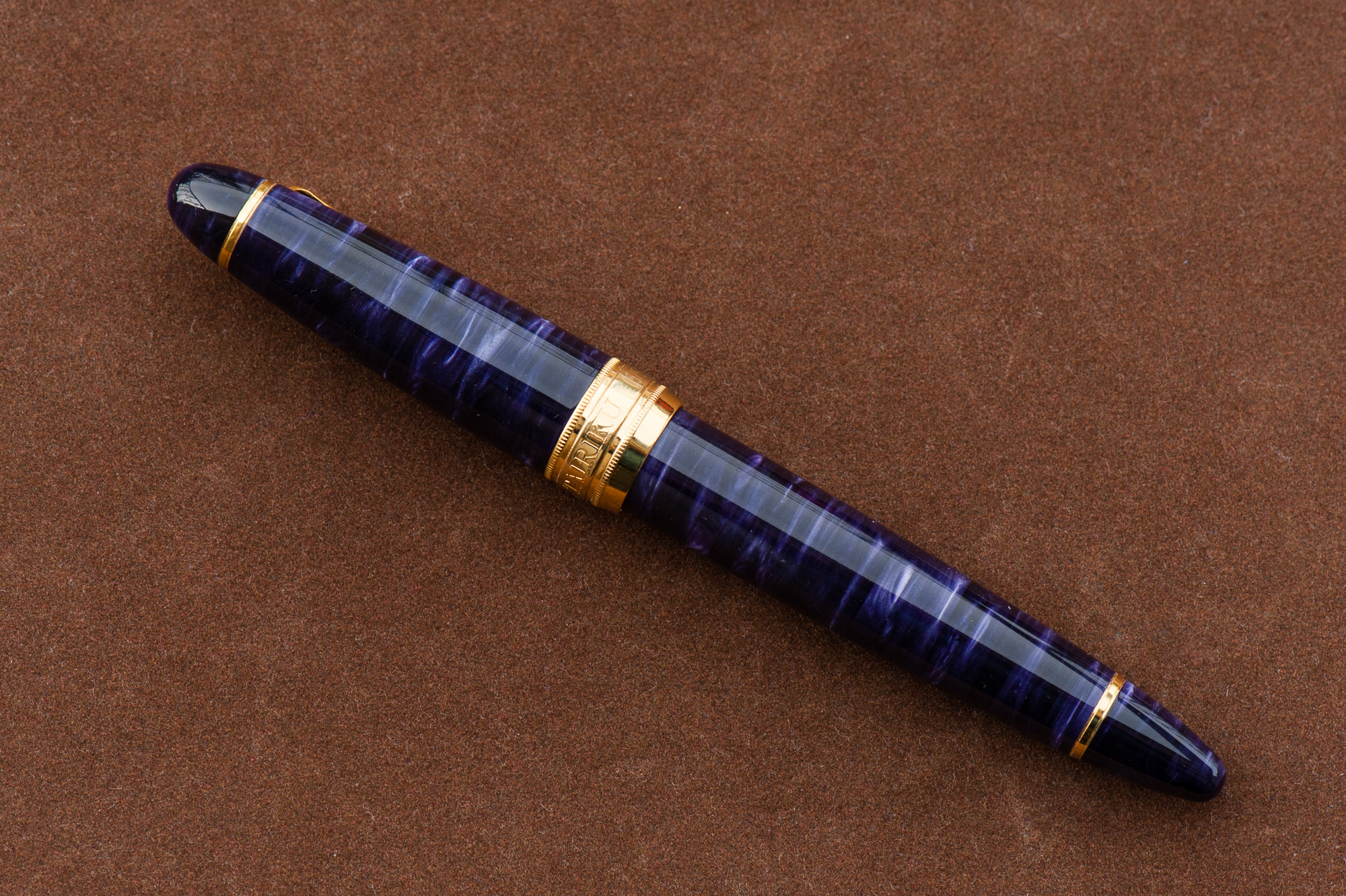
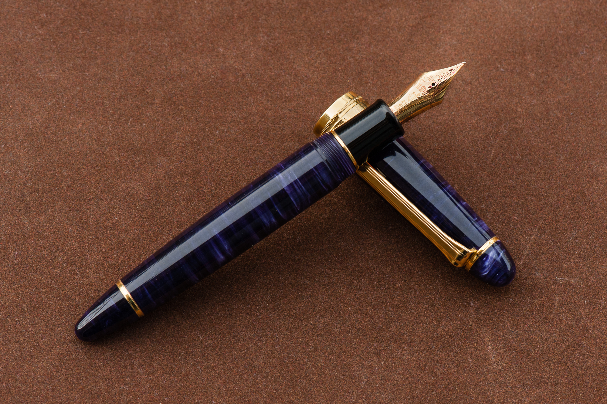
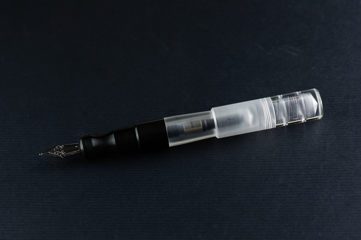
The semi-translucent cap reveals its interior shape, cap threads, and the nib
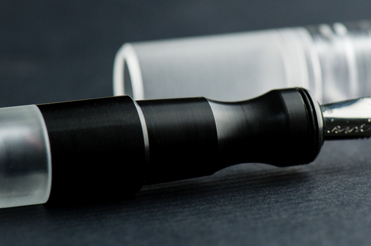
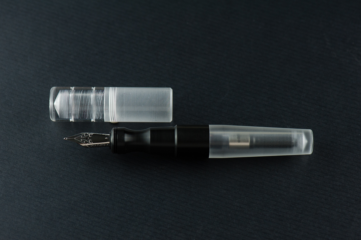
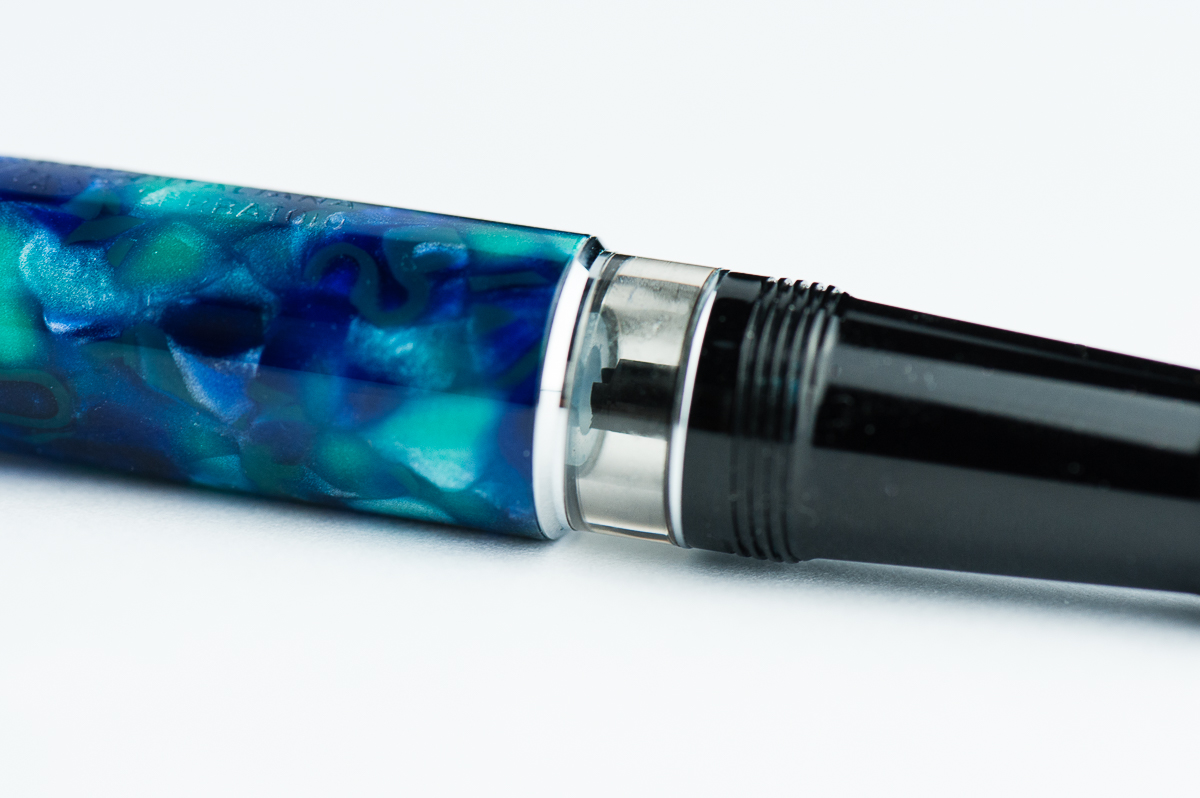
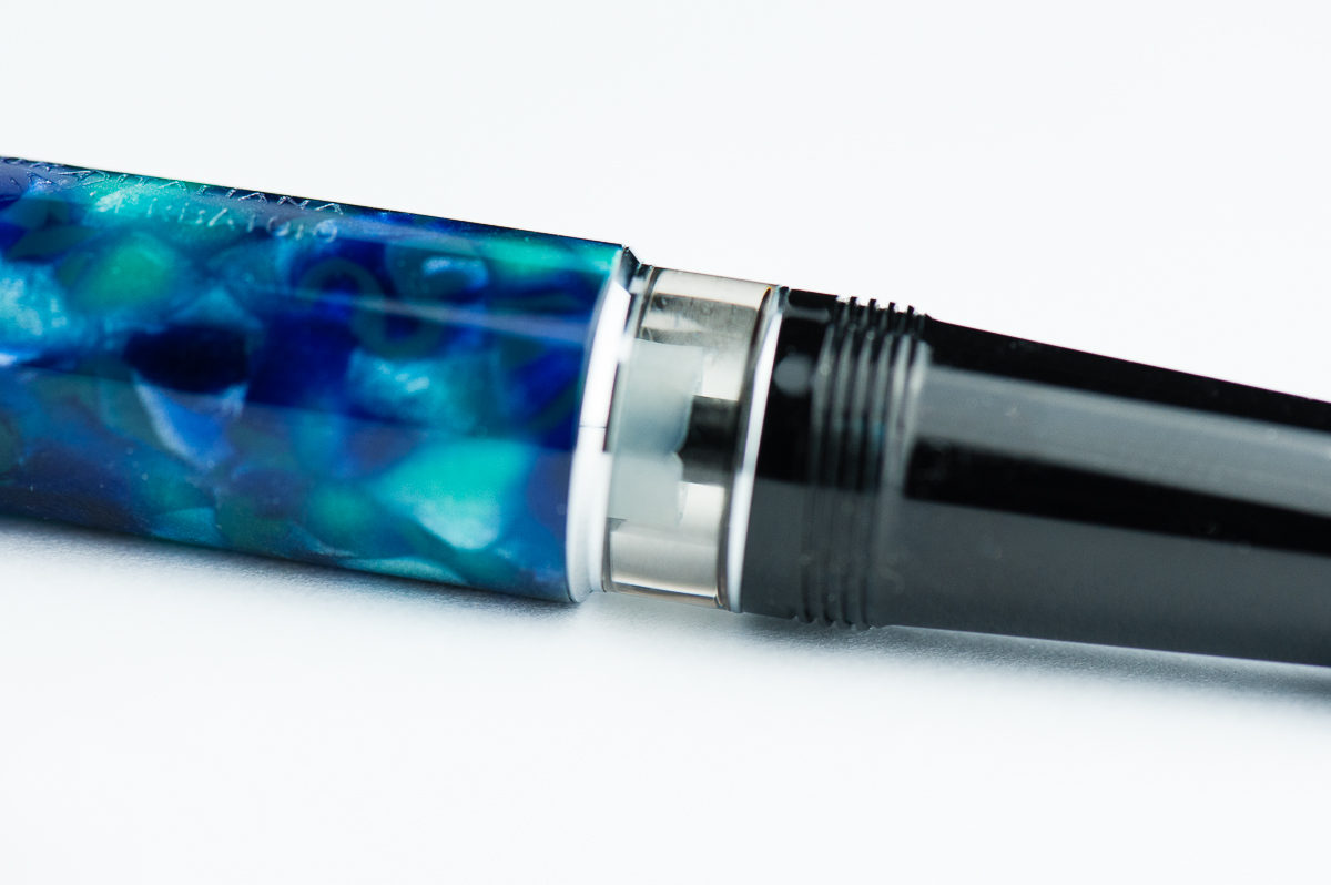
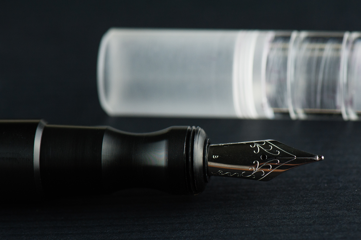
The Delrin section shows very fine lines however they are smooth to hold.


The Business End

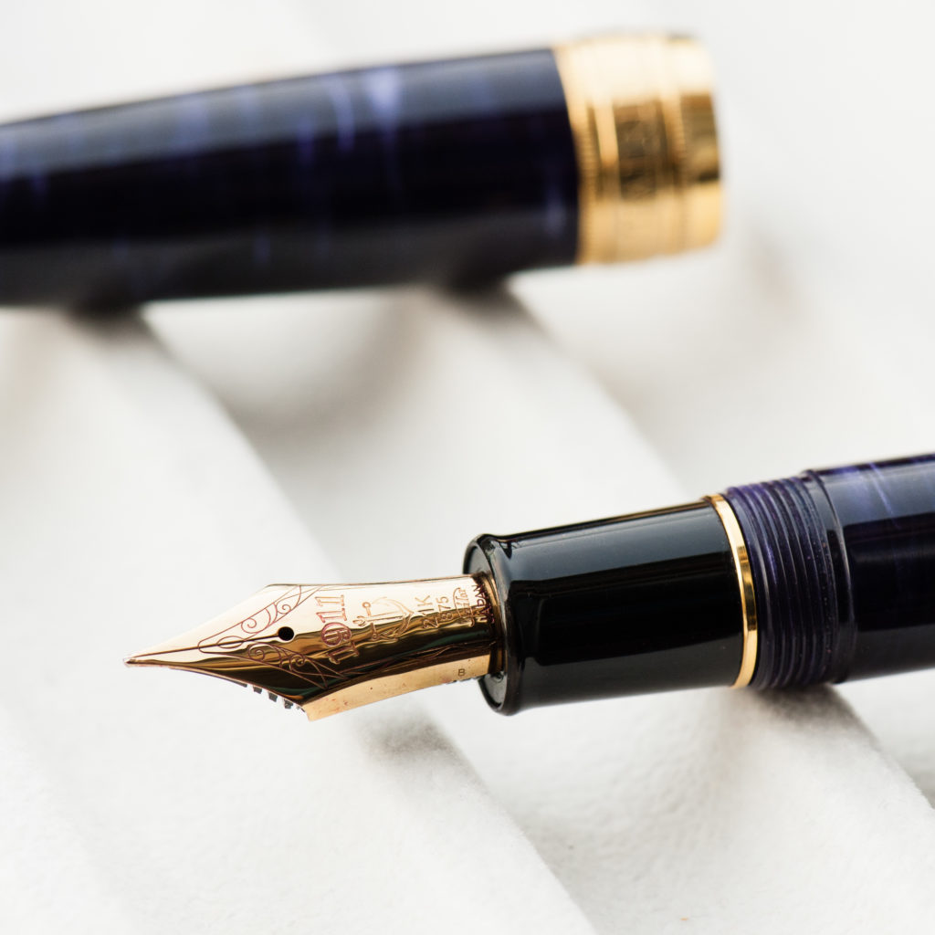
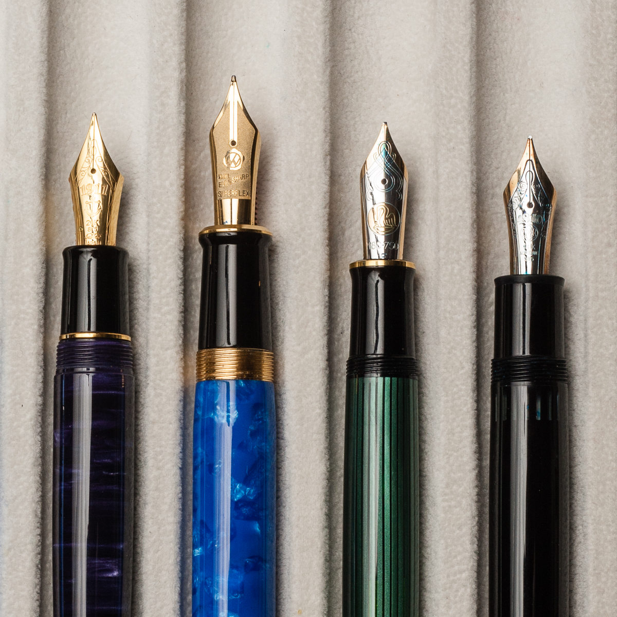
Katherine: It’s a Jowo broad that’s super smooth (I’m not sure if they did any tuning work, but I know they do grinds on some nibs). Not my favorite width, but Jowo threads are standard, so I’m excited to swap it out after this review is done.

Pam:  The nib is a stock Jowo broad nib that is glass smooth.  It performed well and provided a well saturated line.  Not much variation from the standard quality of the Jowo nibs in terms of stiffness or performance.  This nib is just smoother than usual so I am not sure if it was tuned or not.

Franz: Perfectly tuned broad and juicy nib. And I love me some broad nibs! =) And yep, being a Jowo nib you can swap it with other similarly sized ones.
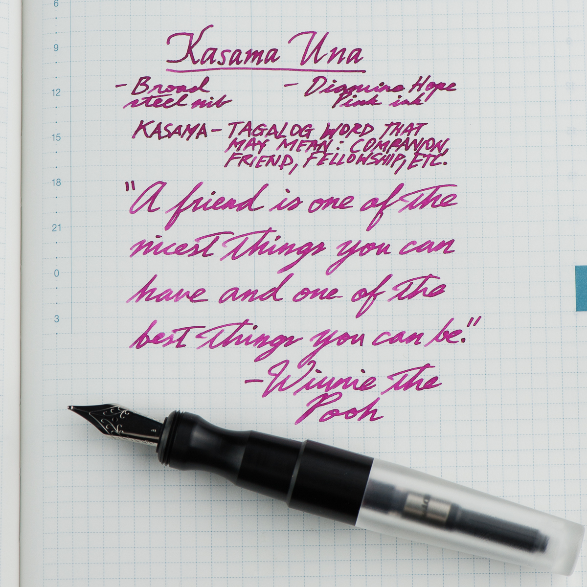
 

Franz’ writing sample on a Hobonichi Cousin journal


Write It Up

Katherine: I suspect the Kasama Una’s shape will be pretty polarizing. It has a very deep waist where you hold the pen, so this either works for you or it doesn’t. Personally, it works great for me and is very comfortable, but I’m not surprised it doesn’t work for Pam. It does force me to hold my pen at a reasonable distance from the nib though, versus my natural tendency to hold pens further forward.

Pam:  I had a really hard time wrapping my hands around this pen, literally.  The Kasama Una has a cap that encapsulates the section as well.  It leads to the step being higher up on a pen than most pens.  The step is very smooth so it doesn’t bite into the flesh between thumb and pointer finger, but it is noticeable and can be annoying.  The section has a pretty deep groove that is super comfortable for the tripod grip but gets wonky for me in my tiger fist grip. Adding to the comfort of the tripod grip is the extra width to the pen.

Franz: Writing with the Una is quite enjoyable since it is on the larger side of the pen scale. What won me over is how comfortable the pen’s section is even if my grip lands on the pinched area. Either when the cap was posted or not, I wrote effortlessly for a long period of time.

A thing to note, the cap posts deeply however sometimes if it’s not secure it becomes lopsided or may even come off while writing. This could be user error in my part because I also didn’t want to use force since it wasn’t my pen.
EDC-ness

Katherine: Totally EDC-able, though I don’t remember offhand how many rotations it takes to get the cap off — I think two? Ish? Either way, it’s an easy to carry pen that has a rugged aesthetic that suggests durability. One of the later editions of this pen was made from ultem, a super durable plastic — I have one on the way, drop test here we come!

Pam:  This pen won’t be lost in your pocket, clip or no clip.  There wasn’t a drop test but the acrylic body does appear to be of high quality.  Scratches may be more evident on the material and finish.  It only takes about 2 turns to uncap the pen so it’s a great pen for pick notes if you can spare two hands. My only gripe is that the body section can also unscrew as you attempt to unscrew the cap depending on the force applied.  It’s because the threads for the body and the cap are cut in the same direction. It doesn’t happen often and surely something that can be improved upon in later iterations of this pen.

Franz: First (Una ;-P) to answer the number of turns, it took one and 3 quarter turns to cap or uncap the Una. Not bad for a daily use pen! This pen stayed in my shirt pocket fairly secured even without a clip. And because it is a larger pen, I didn’t have to fish it out to use it. Of course with the cheap copier paper and the broad nib, I definitely didn’t use it very often at work. But if fitted with a finer nib, this pen will be great to use.

A feature I’d like to highlight is the Delrin section’s fine machined lines. It’s smooth to the touch but you can feel a hint of texture. =)

The Una is a cartridge/converter filler and they include a standard international converter with it. I imagine that you can eyedropper this one as well but since it was Katherine’s pen, I didn’t attempt to do so.
 

Final Grip-ping Impressions

Katherine: I’m excited to see more makers in the pen scene, and especially excited to see that Kasama went for a more unique design, not another standard-ish girth stick or rounded stick CNC pen. The pen itself is well made (though there was a sharp point on the end of the barrel, I sanded it down, but that would have been easy to do in shop) and solidly made. My only real gripe with this pen is that the section<>barrel and section<>cap threads turn in the same direction — so if you don’t tighten the section<>barrel well, unscrewing the cap can unscrew the barrel instead. This hasn’t been an issue for me, but it’s a small design change that could go a long way.

Pam:  This is a solid pen and well worth a try, especially for those who prefer a wider pen.  It has the potential to be made with a variety of acrylics and delrin and very comfortable for longer writing session.  Other than the section, which is a deal breaker for the pixie fist grip that I have, I would recommend this pen.  Good thing Katherine has one I can play with occasionally!

Franz: To sum up, I really love the Una fountain pen. I’d largely attribute that to the design: interestingly shaped Delrin section, machined lines on the cap, translucent cap that shows the nib underneath, and a couple more things.

Katherine and Pam pointed out probably the biggest issue with this pen though. The Una’s thread design can be a little frustrating if you’re in a rush to write but then you find that you unscrewed the barrel instead. Annoying? Sure. But I’d be getting one anyway. Because… penvy (pen envy). Darn you Katherine for making me spend money!

My chosen quote from the writing sample above fits my gratitude of being friends with Katherine and Pam in this fun little project we call HOTP. They are my “kasama” in this blog. Thanks ladies! And thank you all for your readership. =)

“A friend is one of the nicest things you can have and one of the best things you can be.”  — Winnie The Pooh


Pen Comparisons
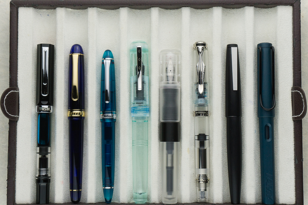
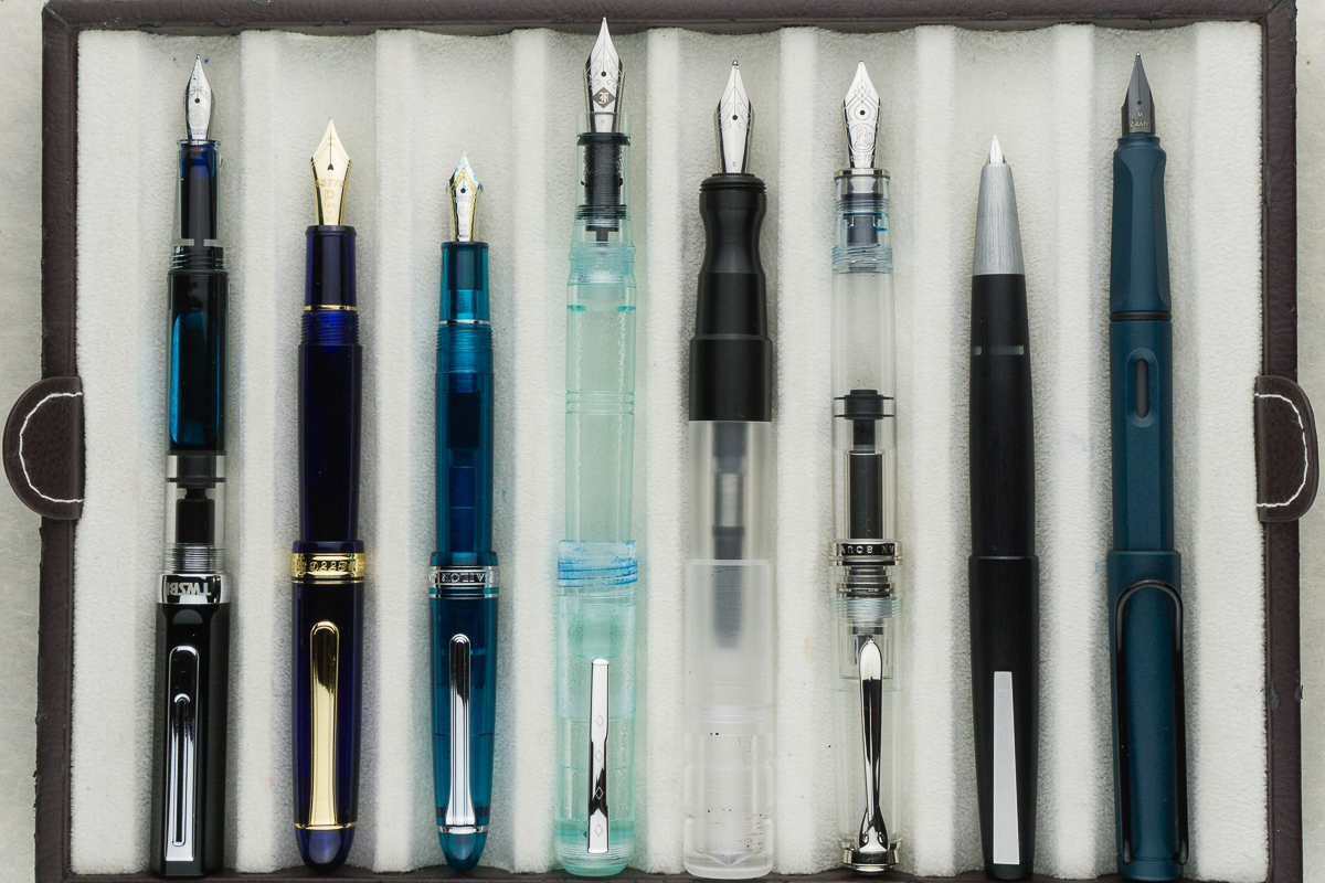
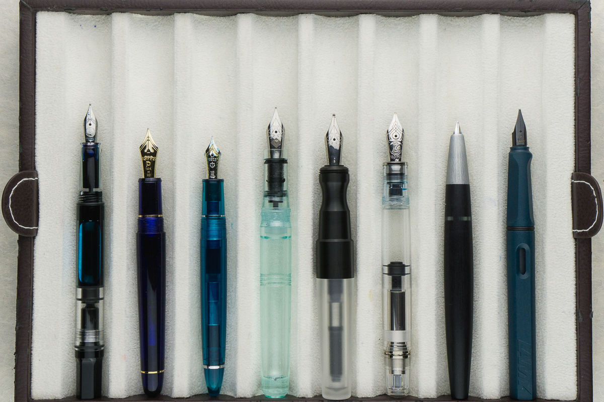
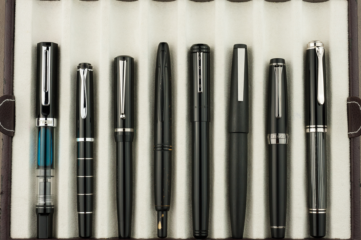
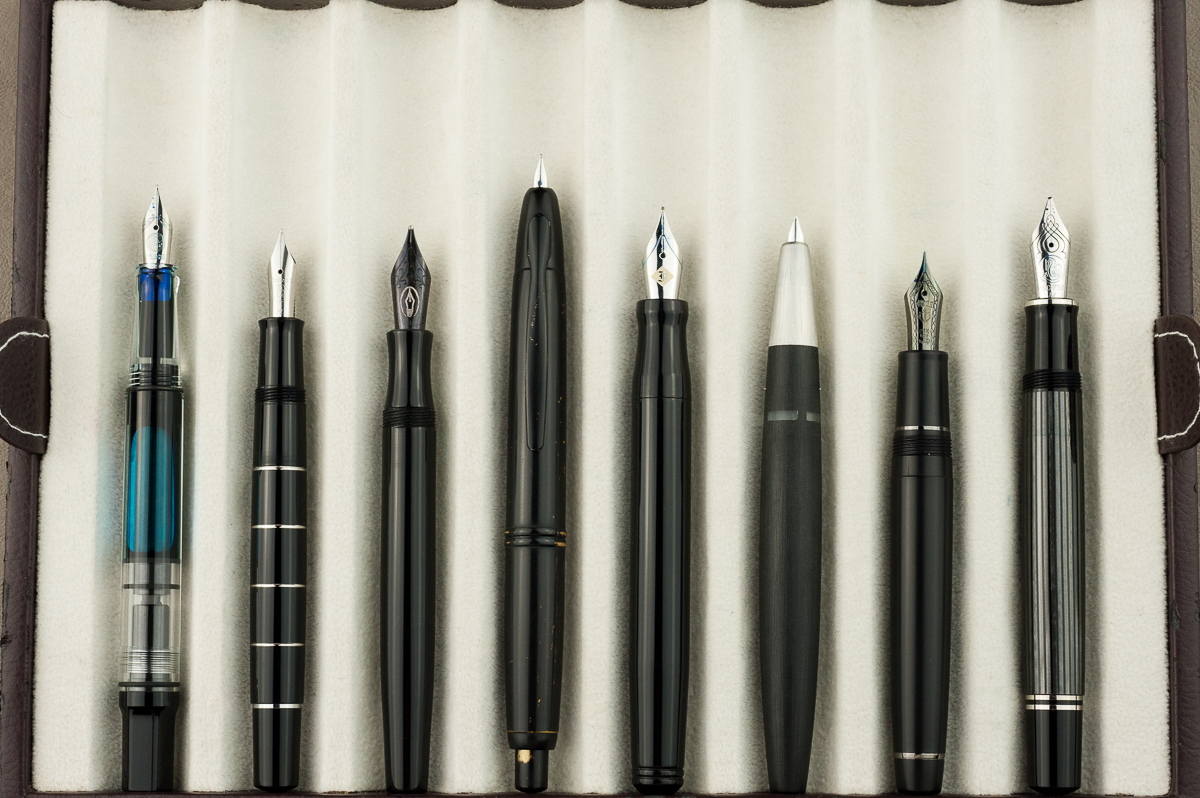
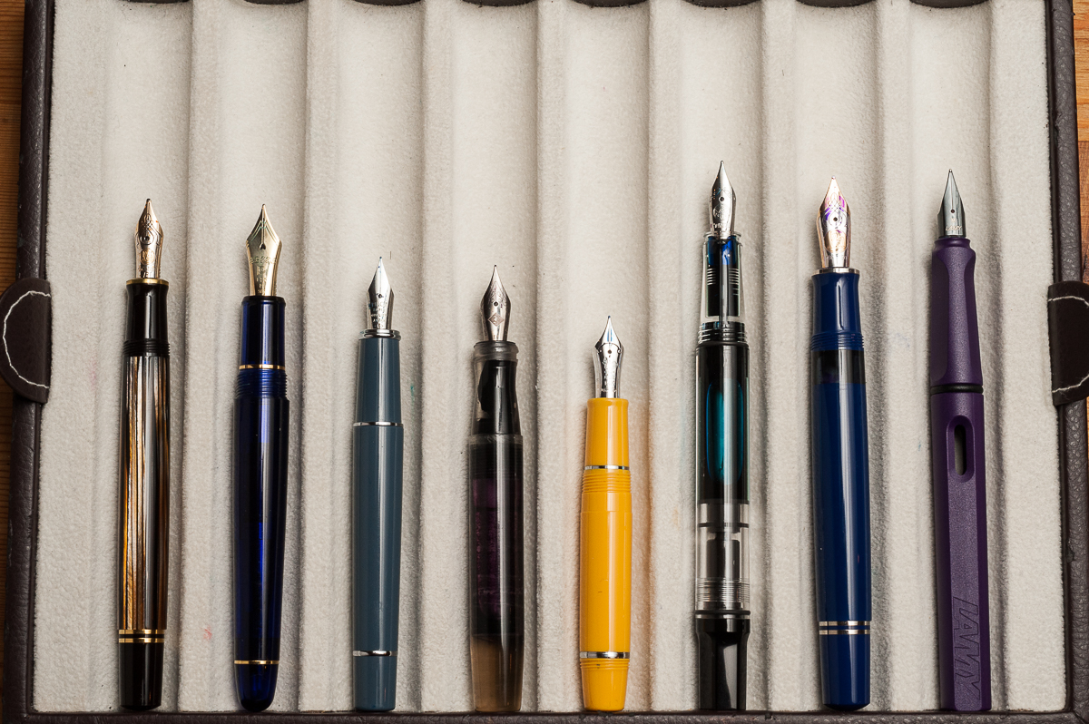
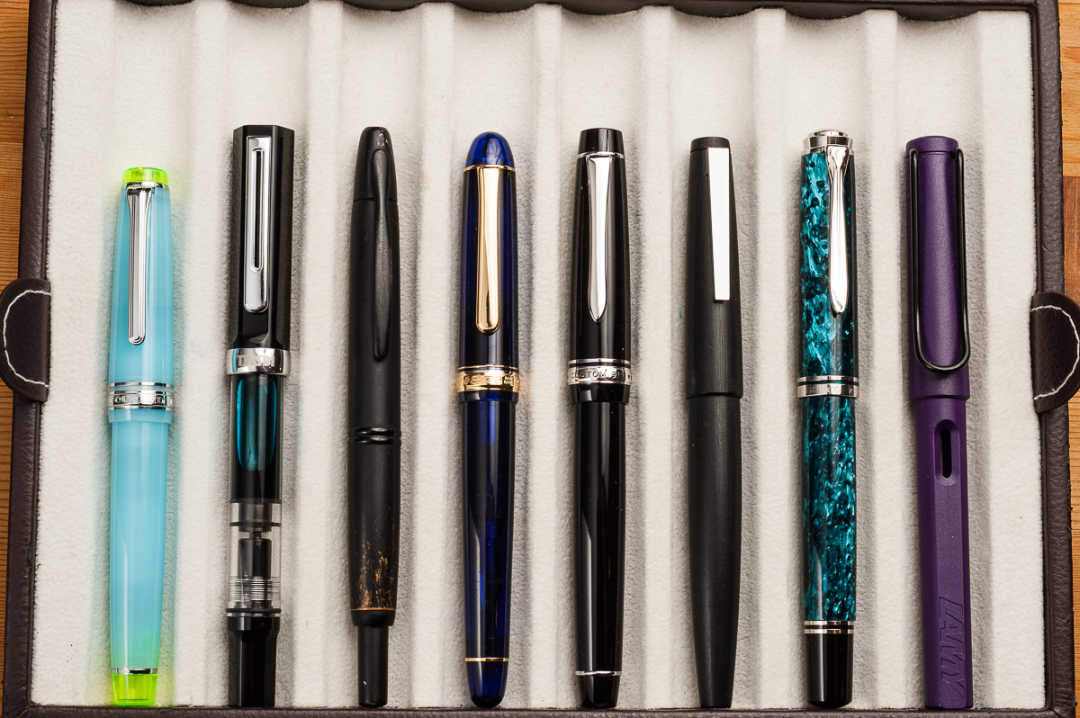
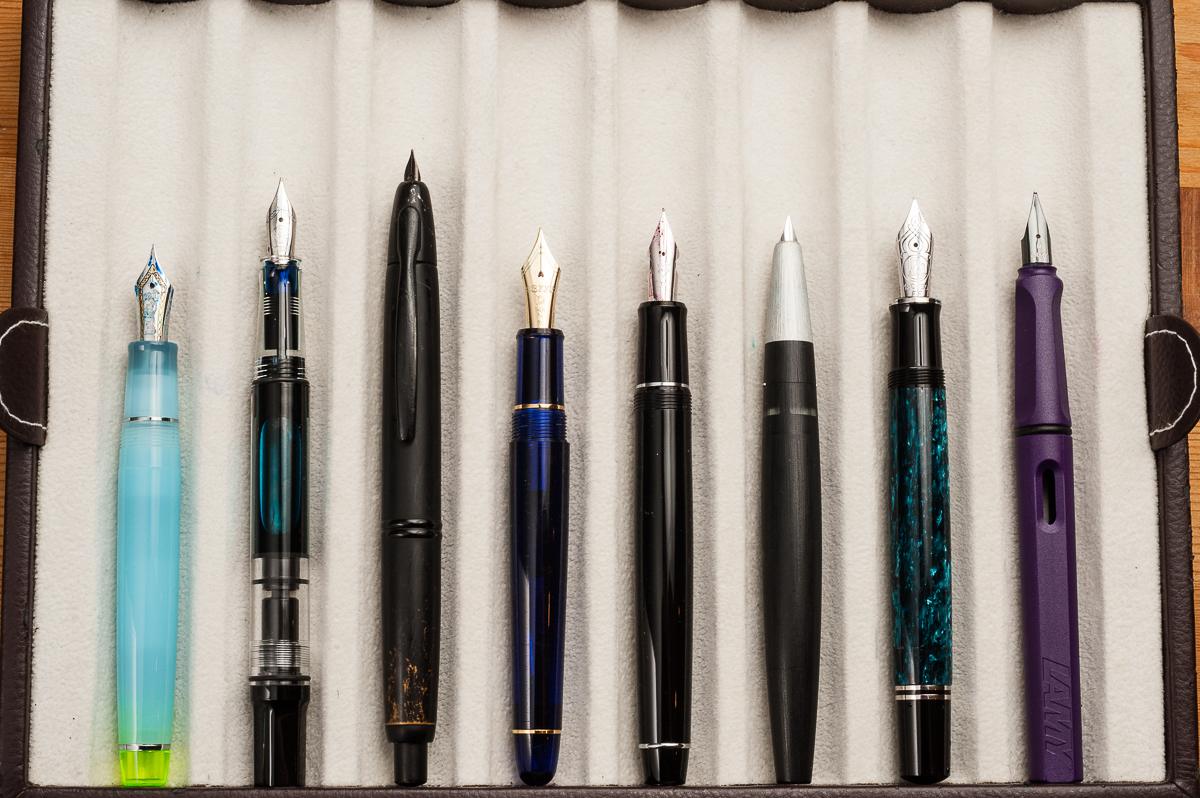
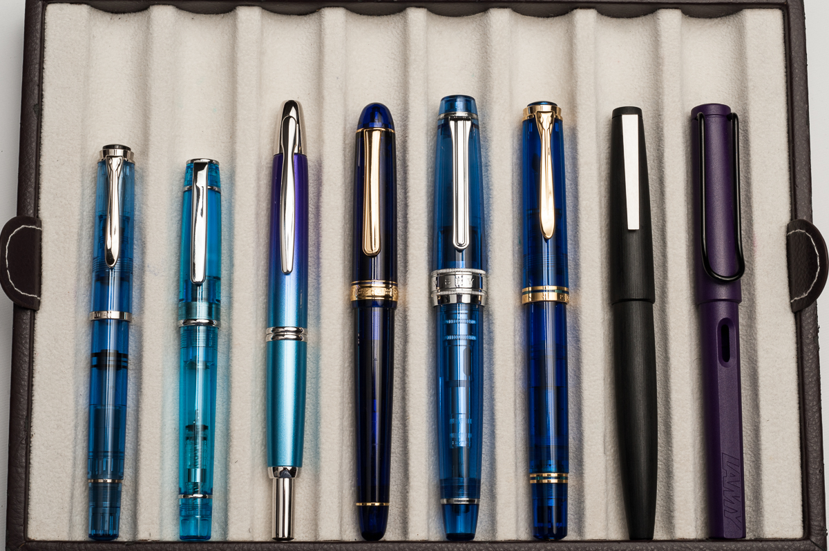
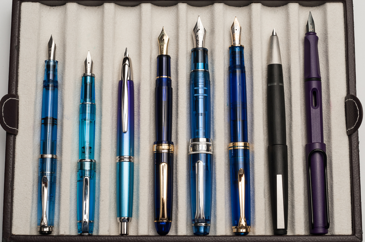
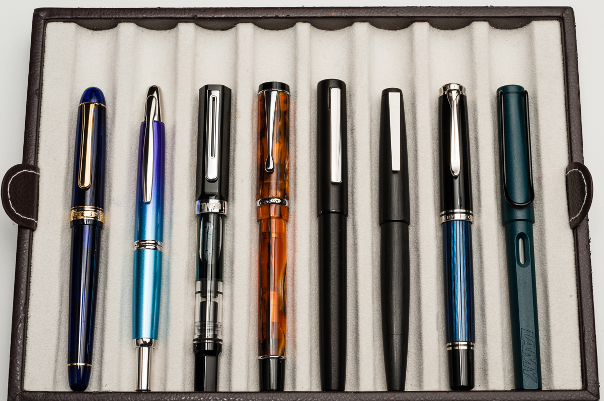
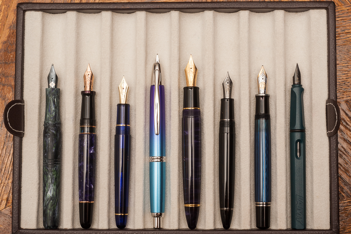
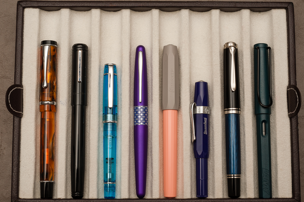
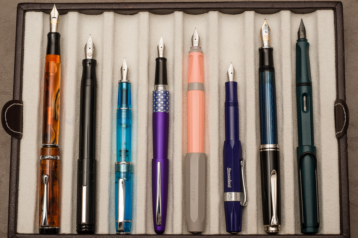
Closed pens from left to right: TWSBI Eco, Platinum 3776, Sailor 1911S, Franklin-Christoph Model 31, *Kasama Una*, Pelikan M805, Lamy 2000, and Lamy Safari
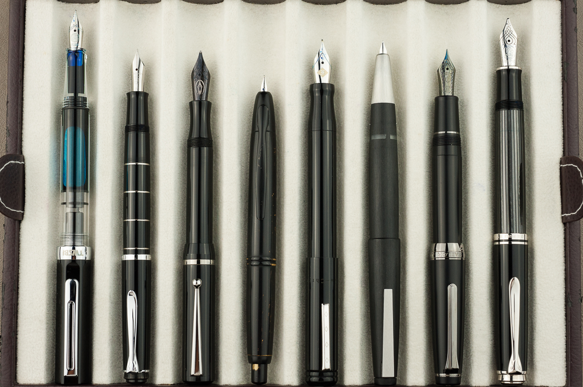
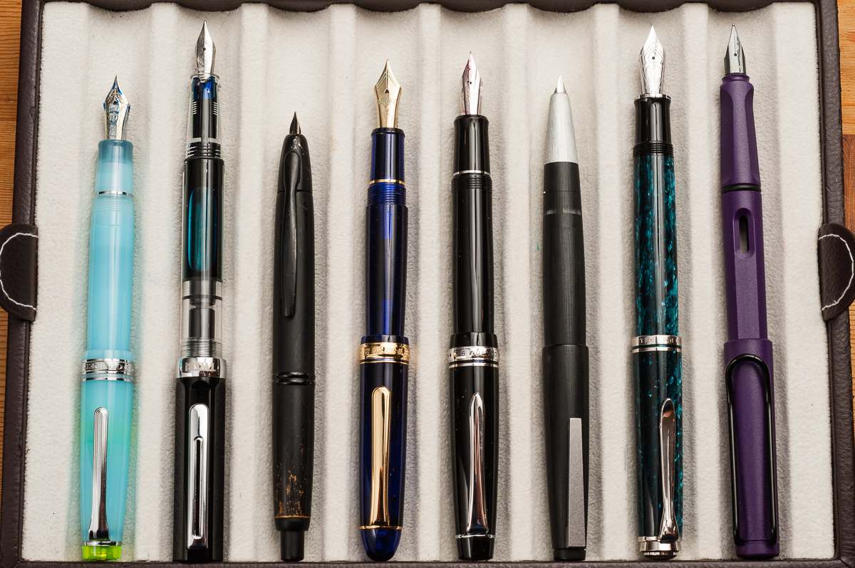
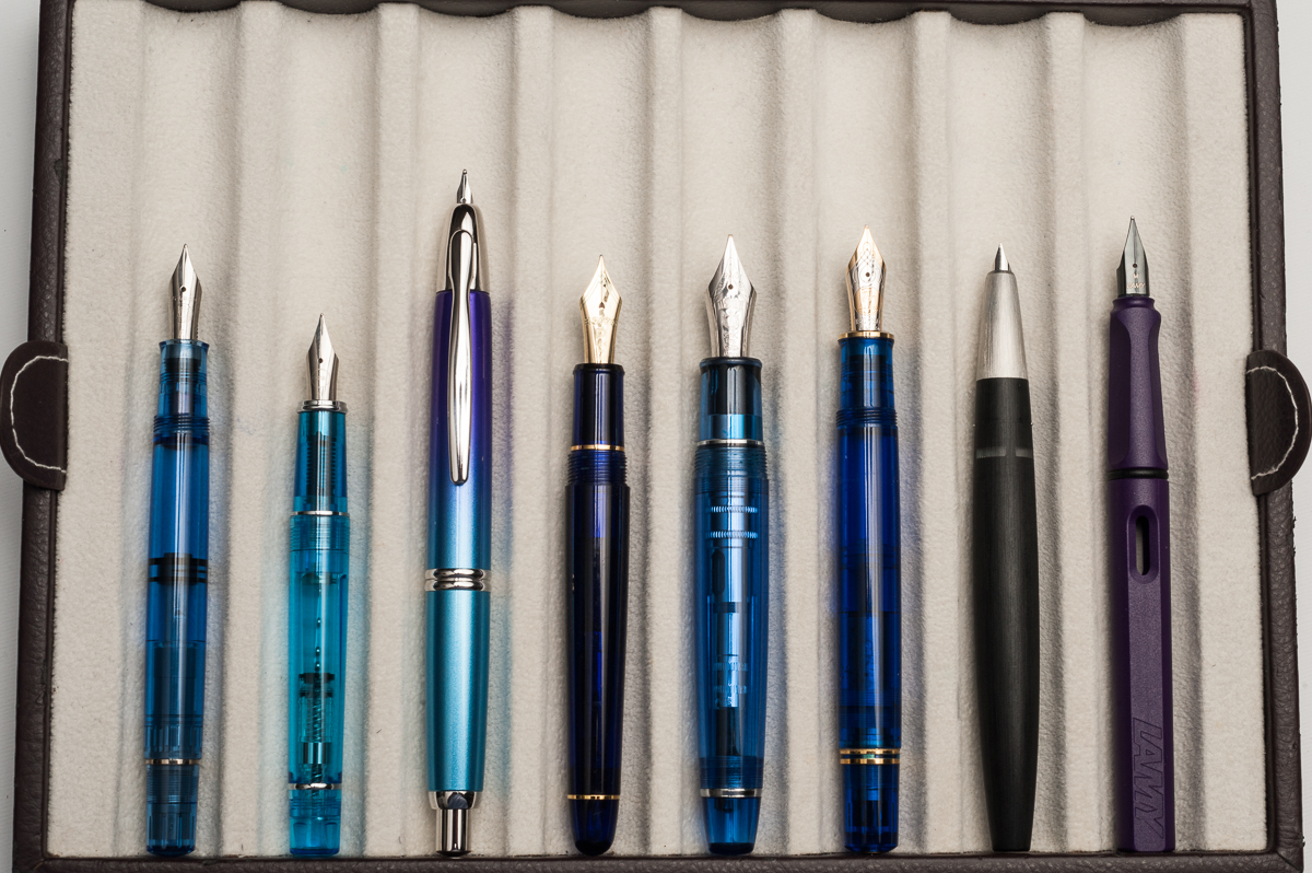
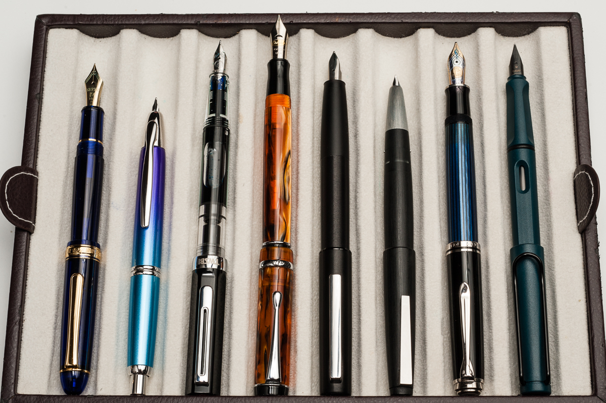
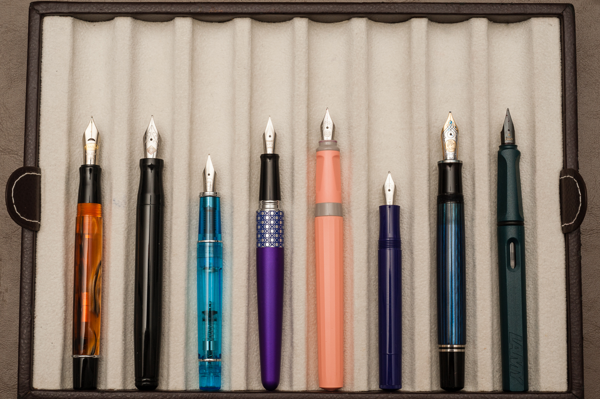
Posted pens from left to right: TWSBI Eco, Platinum 3776, Sailor 1911S, Franklin-Christoph Model 31, *Kasama Una*, Pelikan M805, Lamy 2000, and Lamy Safari
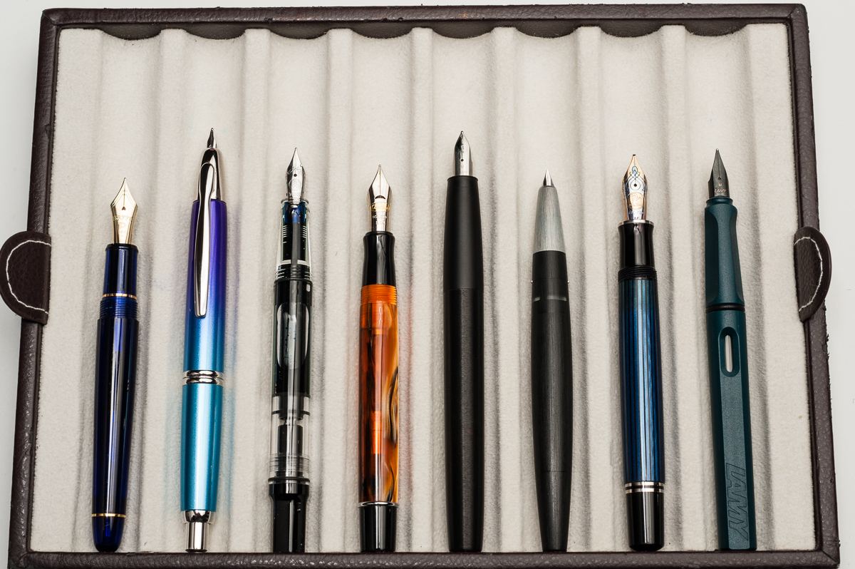
Unposted pens from left to right: TWSBI Eco, Platinum 3776, Sailor 1911S, Franklin-Christoph Model 31, *Kasama Una*, Pelikan M805, Lamy 2000, and Lamy Safari

Pen Photos (click to enlarge)
4 Comments

Review: Franklin-Christoph Model 20 Marietta


Hand Over That Pen, please!

Katherine: I love the shape of this pen — it’s so clean and well proportioned. My one gripe, as with the Pocket 20, is I don’t love the lines on the cap and at the end of the barrel. I’ve owned two Model 20s, but over time I’ve sold both. I love the frosted finishes, but the barrel is too large for me to want to eyedropper the pen (because I’ll never be able to write it dry) and they don’t look quite as nice with converters.

Pam:  Franklin-Christoph never disappoints.  I am happy to review their classic Model 20.  I was initially turned off by the shape of the pen when it saw it in the Ice and Antique Glass finish.  In the black finish, it’s actually quite subtle and doesn’t bother me at all.  One of my favorite features of this pen is the snap cap.  It’s so practical for my specific use case.

Franz: The Model 20 looks so simple and sleek! The beveled flat ends, and the very slight taper of the barrel give the pen a lovely silhouette. Actually, the barrel’s slight taper is there for both function and form. I’ll expand more on that later on. For now, I’m just saying that the Model 20 Marietta looks oh so good! =)


In the Hand: Franklin-Christoph Model 20 (posted) — from left to right: Franz, Katherine, and Pam
In the Hand: Franklin-Christoph Model 20 (unposted) — from left to right: Franz, Katherine, and Pam


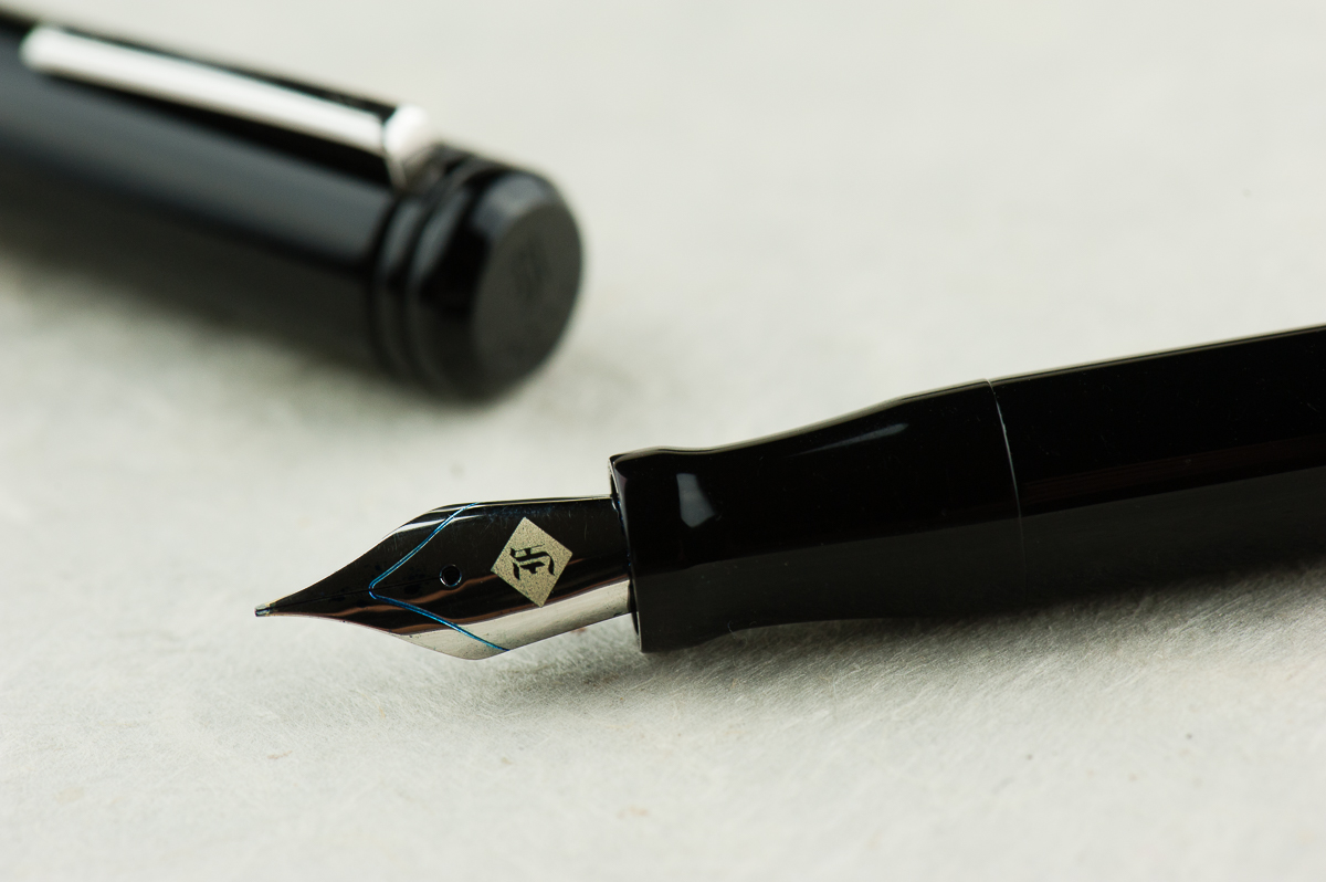
Details: Franklin-Christoph’s logo engraved on the cap’s finial, and the flat end of the barrel.
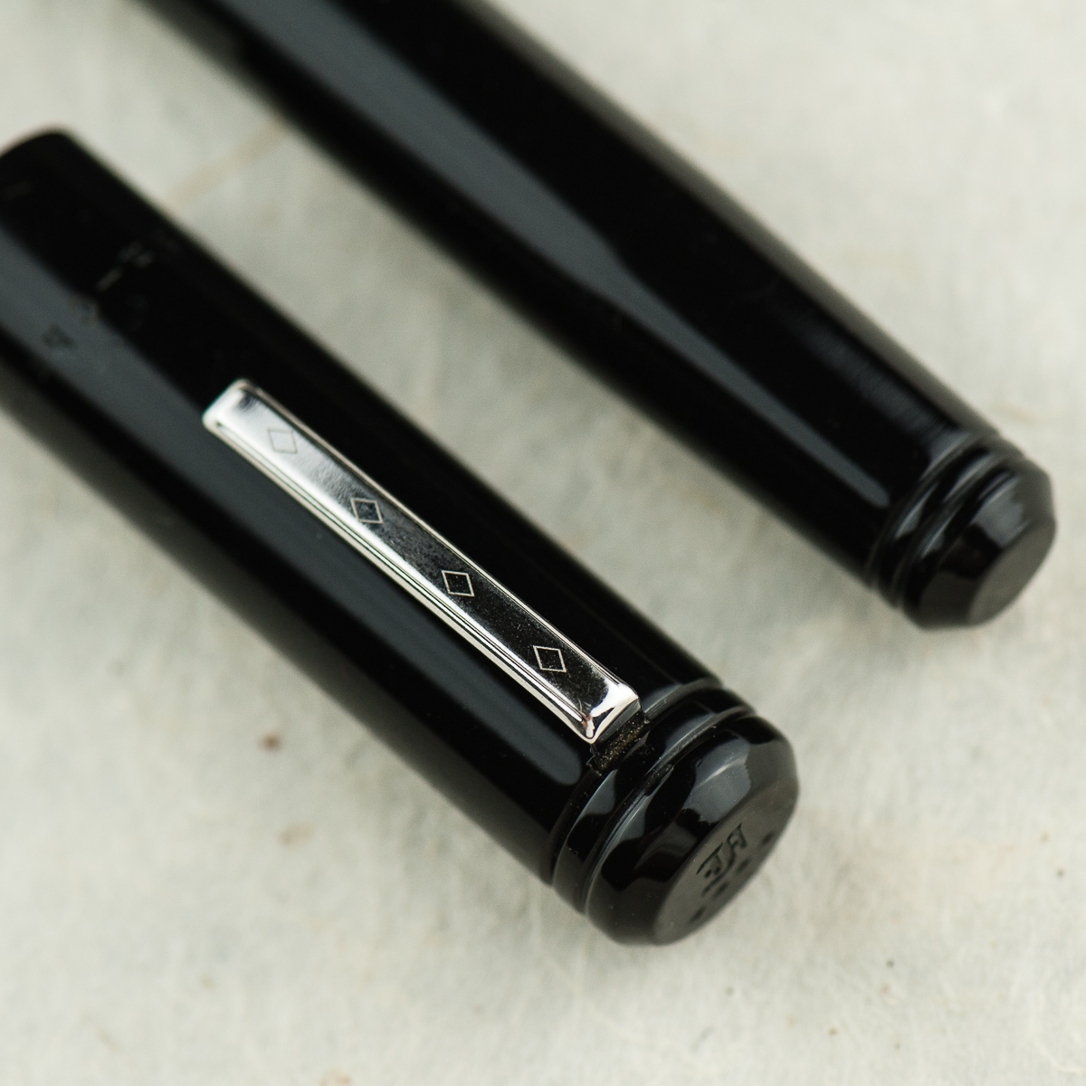
Details: Beveled ends of the cap and barrel, Franklin-Christoph’s Diamond design on the clip, and the rings designed on each end.


The Business End

Katherine: Yay Masuyama cursive italics! I prefer the Fine, but the Medium is similarly smooth while still be nice and crisp.

Pam: The nib is a Masuyama M cursive italic that was tuned by Jim Rouse at time of purchase.  The cursive italic has a small amount of bite, but nothing bothersome.  It’s also the nature of a cursive italic grind to be less smooth than a typical stub grind.  Like always, it’s a joy to write with and the bit of a bite is pleasant feedback.

Franz: As far as I know, when Franklin-Christoph introduced the Model 20 in early 2015, it was the first recessed nib fountain pen they had. And that design alone attracted me to the Marietta at the 2015 LA Pen Show. It wasn’t sold back then but I knew I had to have one!

The Model 20 is fitted with a #6 size Jowo nib like most of their larger pens. This nib in particular was pre-ground to a cursive italic by Mr. Mike Masuyama and then as with all F-C pens sold, it was finally adjusted by Mr. Jim Rouse to my liking. It provides a crisp line and also quite forgiving.


Write It Up

Katherine: This pen is definitely comfortable — it’s light and the section is a good size! I’ve definitely written page upon page with this pen, it’s unobtrusive and, paired with a nice grind, lots of fun.

Pam: Due to the lack of threads, my typical writing grip is REALLY comfortable.  Yay for no threads or steps!  The section is a good fit for me in the tripod grip.  The little flare is quite helpful in keeping my fingers in check. However, due to the lack of a step and the seamless transition from section to body makes it so the section can accommodate larger fingers and grips.  #bearpawsallpaws

I highly recommend using the pen unposted for those of the smaller hand persuasion.  It’s a bit top heavy when posted.  Without the cap the pen is nice and light.

Franz: Just like Pam, I definitely enjoyed the lack of threads on the barrel so that the pen can be held at any spot you’re comfortable with. As for myself, I was comfortable gripping either on the pinched section or the barrel itself. Also, both writing modes (posted and unposted) were very comfortable for my large paw. As a preference though, I prefer the cap posted for it gives more weight and a better balance for me. With the cap unposted, the pen seemed to be a little too light.


EDC-ness

Katherine: I’m not generally good at tightening my caps or well… remembering to close things all the way. Except the fridge. And the Model 20 is no different, but the slip cap is even more dangerous. As a desk pen, or one sandwiched in a notebook, it’s generally fine — but if I relied on the clip, I had several close calls with the body sliiiiiding away toward the floor. Yikes. It’s super convenient, but because it’s a slip, not snap cap, I have a pretty hard time telling when I’ve closed it “enough”.

Pam:  As mentioned previously, this pen is one of the best EDCs for me.  The snap cap makes this pen really easy to deploy and use for quick notes and comfortable enough for longer writing sessions.  It’s a great all rounder pen for me.  The clip was secure and the capping was easy.  The only thing missing from the capping action is a satisfying snap like the Pilot Prera.  (Insert total bias disclaimer here.) It’s hard for me to determine when the cap is securely capped but it is a snug fit and I haven’t had issues with the pen falling out into my pocket.

Franz: Another top reason why I was attracted to the Model 20 is its slip cap feature which makes it a perfect candidate for an every day carry pen. The two ladies’ comments about the pen not having a positive snap is very valid and was one of my issues when I first got the Marietta. However, after watching Scott Franklin’s introduction video of the Model 20, I learned a lot about how the pen was engineered. So with just a liiiiitle push, the cap secures very well. And this works in both closing the pen, and posting the cap. The lip end of the section and the tapered end of the barrel was designed to attach firmly deep inside the cap. To detach the cap, it’s easier to just use one hand. If you’d like to watch the video, link is here Model 20 Marietta Introduction.

The Model 20 can be inked either via a cartridge/converter filler, or eye-droppered. I prefer using the supplied converter and it is a standard international one.

One thing to note, the clip on this Model 20 is the older version and it doesn’t clip to clothing easily. I’d need to lift the clip with my fingers and slip it in my dress shirt. Franklin-Christoph changed the clip to a better functioning one so that issue is solved.


Final Grip-ping Impressions

Katherine: This is a pen I thought I loved, but with use found that while I certainly enjoy it, it wasn’t true love. Even then, it’s more one of those “it’s not you, it’s me” things — it’s a very solid pen that’s fairly unique in the industry, but it’s got a couple quirks that just don’t work for me (the generally super convenient slip cap and the lines on the cap and barrel). But every time I see one for sale second hand… I’m tempted, maybe the third time’s the charm?

Pam:  I know that I have mentioned that the Sailor Progear Slim is an “upgrade” to the Pilot Prera starter pen.  I think the pocket Model 20 and Model 20 is the Western “upgrade” to the Pilot Prera.  They both are snap caps and Franklin-Christoph boasts one of the largest variety of steel and golden #6 nibs on the market for their pens.  If you want a great EDC pen with a variety of different nibs that can be swapped out, the Model 20 is close to perfect.

Franz: What else is there to say except to say that the Model 20 is one of my favorite pens to ink up! In the pen comparison photos below, it is very similar to a Pelikan M805 and that’s about the perfect pen size for my larger hands. The Model 20’s features check pretty much all the boxes for me. Simple aesthetic, larger size (length and girth), slip cap for quick deploy, lightweight, and a fantastic nib performance!

Like a lot of their pens, Franklin-Christoph offers the Model 20 in a few different colors on their site, and they also offer more color prototypes at pen shows. I definitely recommend this model for your daily use or even just part of your rotation. See if it’s a comfortable pen for your paws. =)


Pen Comparisons

Closed pens from left to right: TWSBI Eco, Pelikan M215, Edison Beaumont, Pilot Vanishing Point, *Franklin-Christoph Model 20*, Lamy 2000, Sailor Professional Gear, and Pelikan M805
Posted pens from left to right: TWSBI Eco, Pelikan M215, Edison Beaumont, Pilot Vanishing Point, *Franklin-Christoph Model 20*, Lamy 2000, Sailor Professional Gear, and Pelikan M805
Unposted pens from left to right: TWSBI Eco, Pelikan M215, Edison Beaumont, Pilot Vanishing Point, *Franklin-Christoph Model 20*, Lamy 2000, Sailor Professional Gear, and Pelikan M805


Pen Photos (click to enlarge)
2 Comments

Review: Aurora Optima (365 Azzurra, Fine Nib)


Hand Over That Pen, please!

Katherine: I love the Optima’s aesthetic. I love the flat ends, a taper, but overall it’s short and kind of stubby. And I love stubby pens. Additionally, Aurora makes it in a range of gorgeous materials — including the limited edition pictured here. I’m partial to the gold and green, but have yet to find one at a price I’m comfortable with.

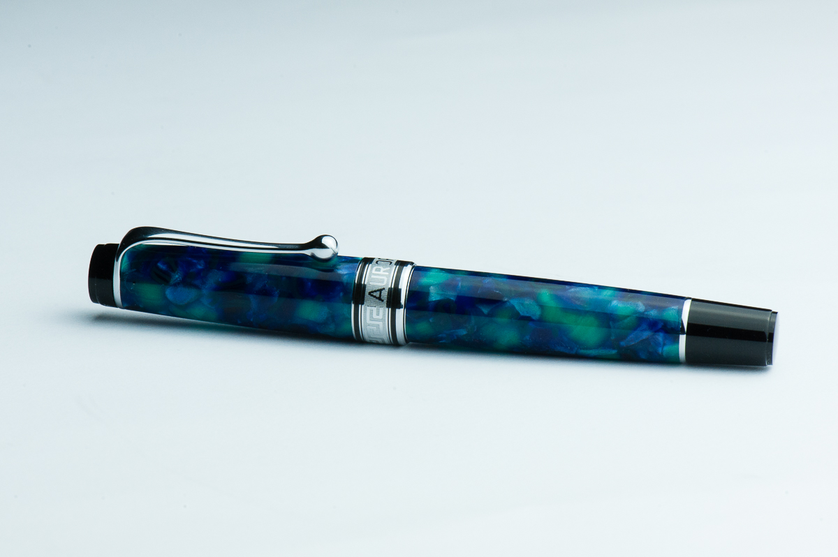
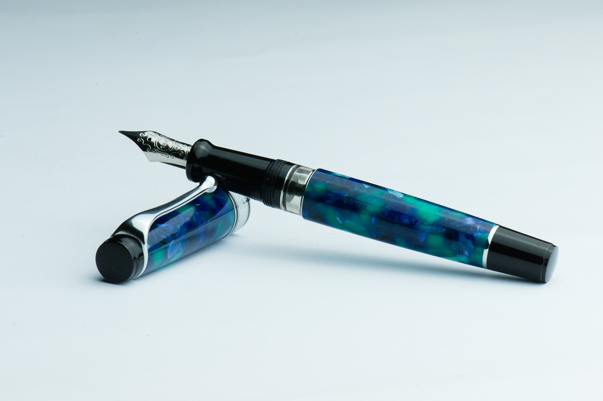
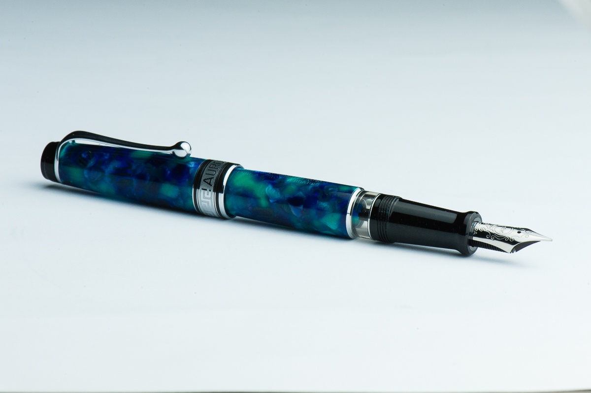
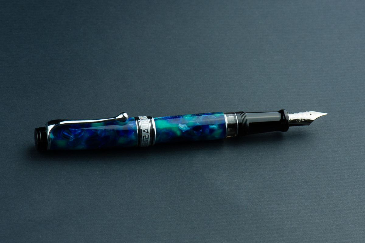
Pam: I really love the Optima’s shape and size.  Why you ask?  Because, to me, the Aurora Optima 365 is a gaudier Sailor Progear with the use of a wider, more ostentatious cap band.  I have hesitated in purchasing an Optima mostly due to the stock material used for the pen body and cap.  This limited edition material for the Optima made me eat my words.  It’s sooo pretty. The blues, teal and flecks of silver-white is pretty unique and fantastic.

Franz: Wow! That Azzurra is fantastic! Pam’s observation is correct that the Optima is similarly styled as the Sailor Pro Gear. However in the hand, the Optima is definitely larger and the section is longer. That Greek key cap band is quite nice to look at as well. I’ve observed that a lot of Italian pens use this design which is pretty cool especially on the vintage ones.

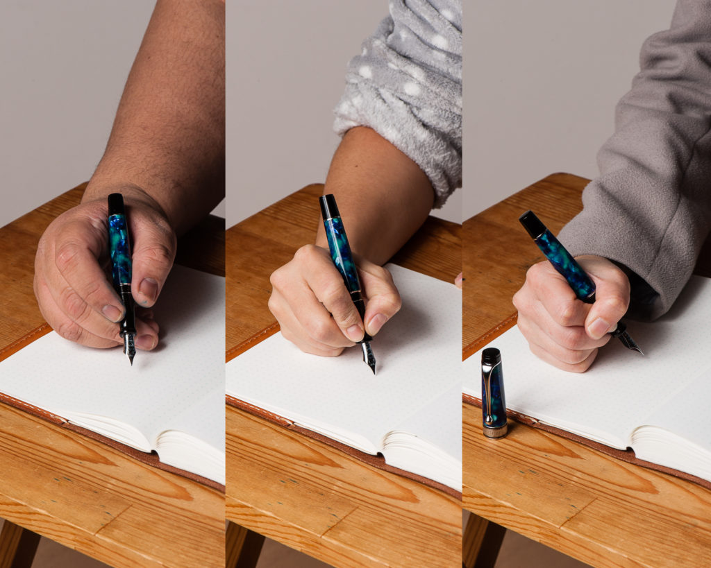
In the Hand: Aurora Optima (posted) – from left to right: Franz, Katherine, and Pam
In the Hand: Aurora Optima (unposted) – from left to right: Franz, Katherine, and Pam


A Bit of History

The Aurora pen company was established in 1919 in Turin, Italy. Pretty cool to know that they are nearing their 100th year anniversary!

Just like what we learned about the 88 model in our review, the Aurora Optima model has been a part of their model lineup since the 1930’s. The vintage model had the same flat ends kind of style and the greek key cap band as well. The vintage Optima however had the same celluloid material for the whole pen unlike the modern one which has black cap finials, section, and piston knob. Also, the vintage Optima had a vacuum-filler instead of the piston-filler in the modern one.

The Optima that we know nowadays was redesigned in 1992. The Optima is offered in different colors, materials, and limited edition options. As long as you like the shape and style of the pen, there’s gonna be an Optima pen just for you. The Azzurra 365 is a limited edition of 365 units and Franz snagged one when it came out in 2017 from Dan Smith, the Nibsmith. As of March 2018, Dan still has a couple of these in his inventory.

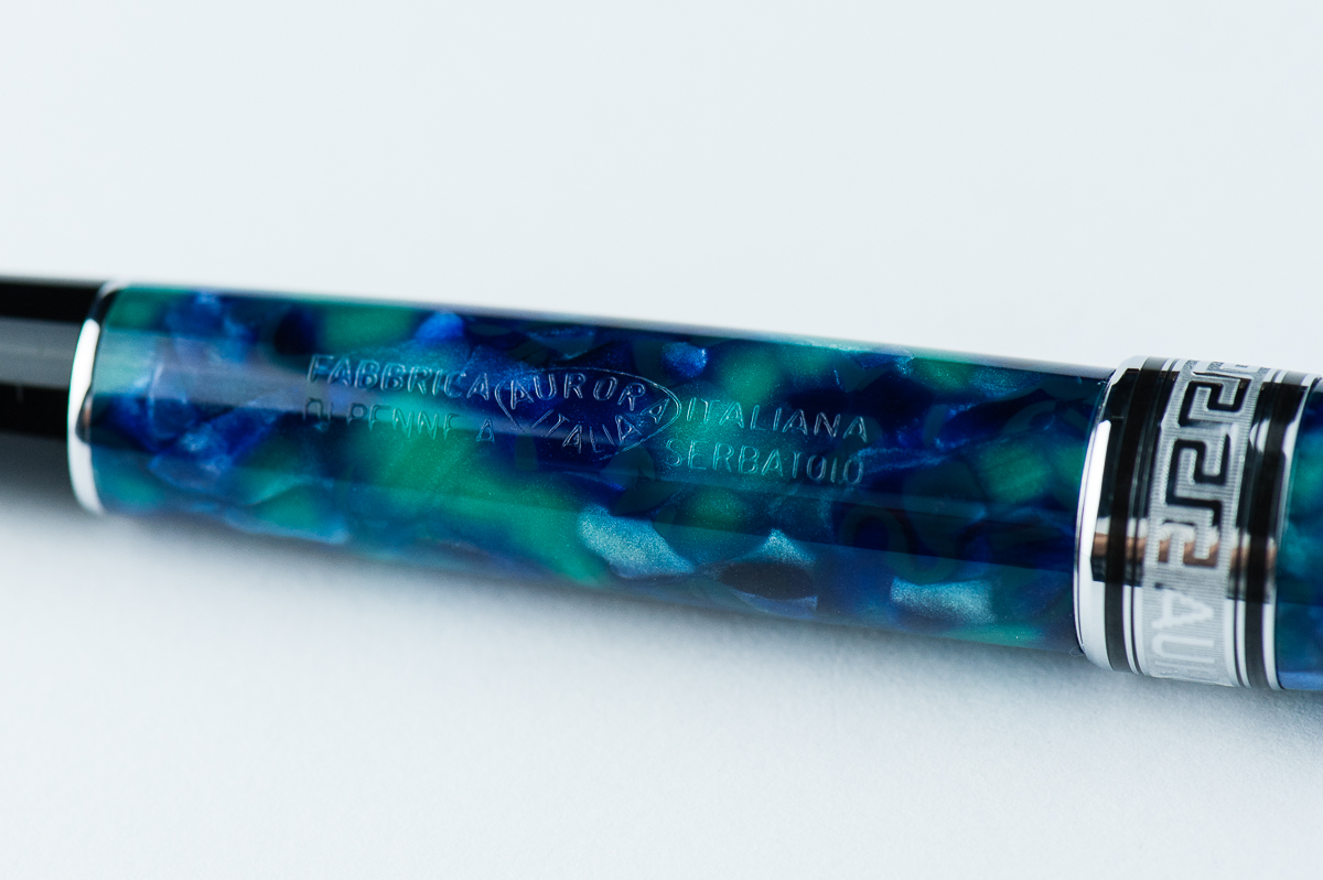
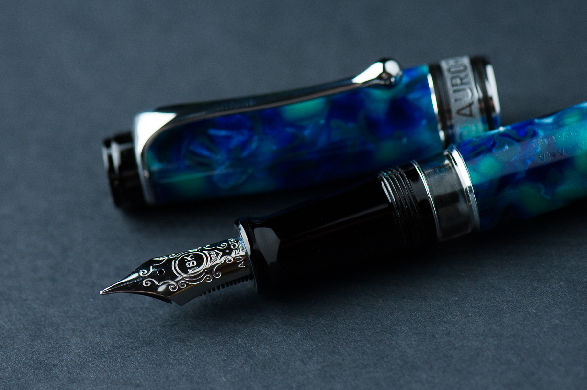
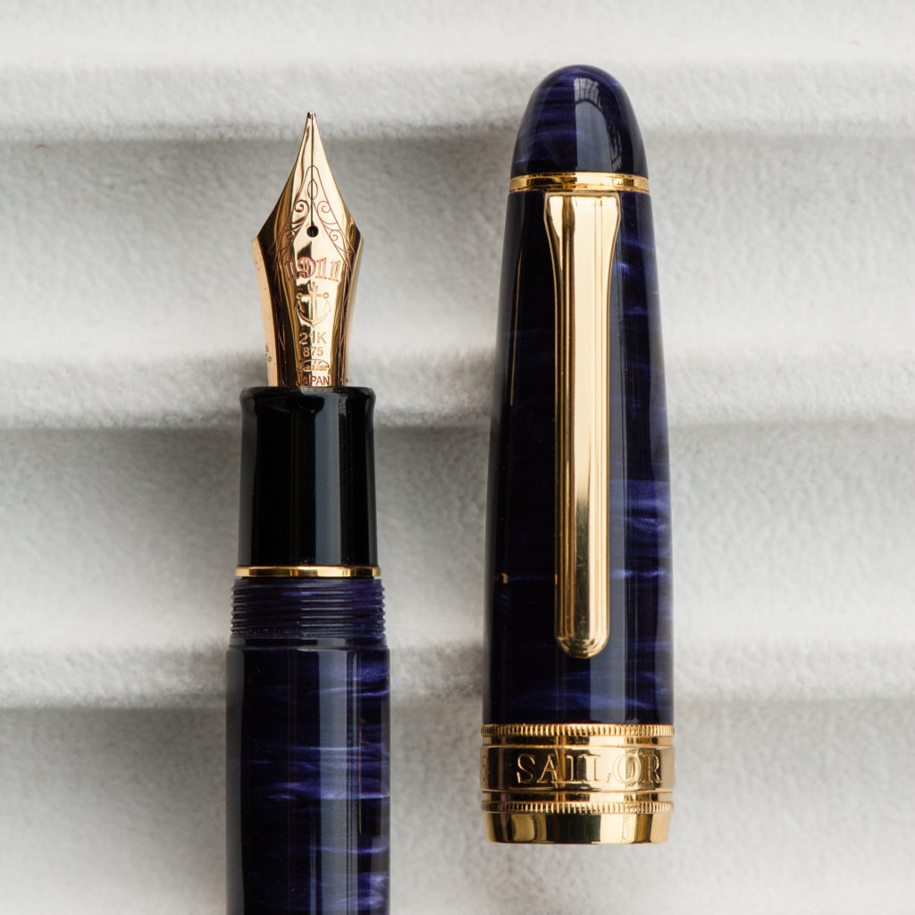
Beautiful Azzurra celluloid engraved with Aurora’s full company name: Fabbrica Italiana di Penne a Serbatoio – Aurora


The Business End

Katherine: I’ve been surprised by the Optima nibs I’ve tried — they’re somewhere between a Japanese and a Western nib. Plus they have a wonderful smidge of feedback, reminiscent to me of Sailor nibs. Now that I’ve typed this all out… the Optima nibs feel like a middle ground between a Sailor nib and a typical Western nib in terms of both line width and feedback vs smoothness.

Pam:  I have been able to try both an Aurora Optima’s EF and F nib.  I have found Aurora’s nibs to be very consistent in line width and feel. The EF is more similar to a Japanese EF.  The F nib is more consistent with a Western EF. The nib is quite wet but then again, the ink itself is also quite wet. I really enjoyed the super smooth writing experience.  Sheeny inks would really shine with this nib.

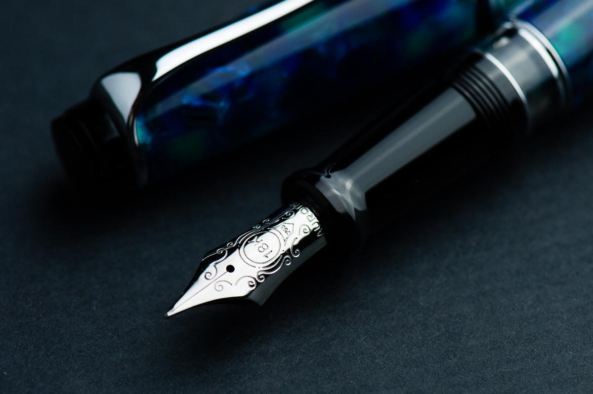
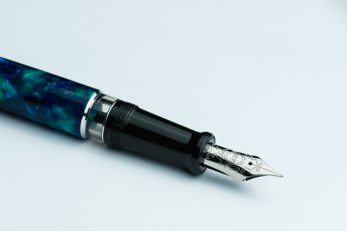
Franz: I really love the nib design of the Aurora Optima and the shape is a traditional fountain pen nib. Surprisingly, I didn’t ask for a medium/broad nib from Dan but a fine instead. I’m glad I did because the fine nib is definitely lovely to write with. As Katherine said, there is a pleasant feedback while writing that I like especially on smooth paper like my Rhodia meeting notebook. The 18-karat nib isn’t really flexy nor is it marketed as a flexible nib but with just a little pressure, it does give my signature a little flair.

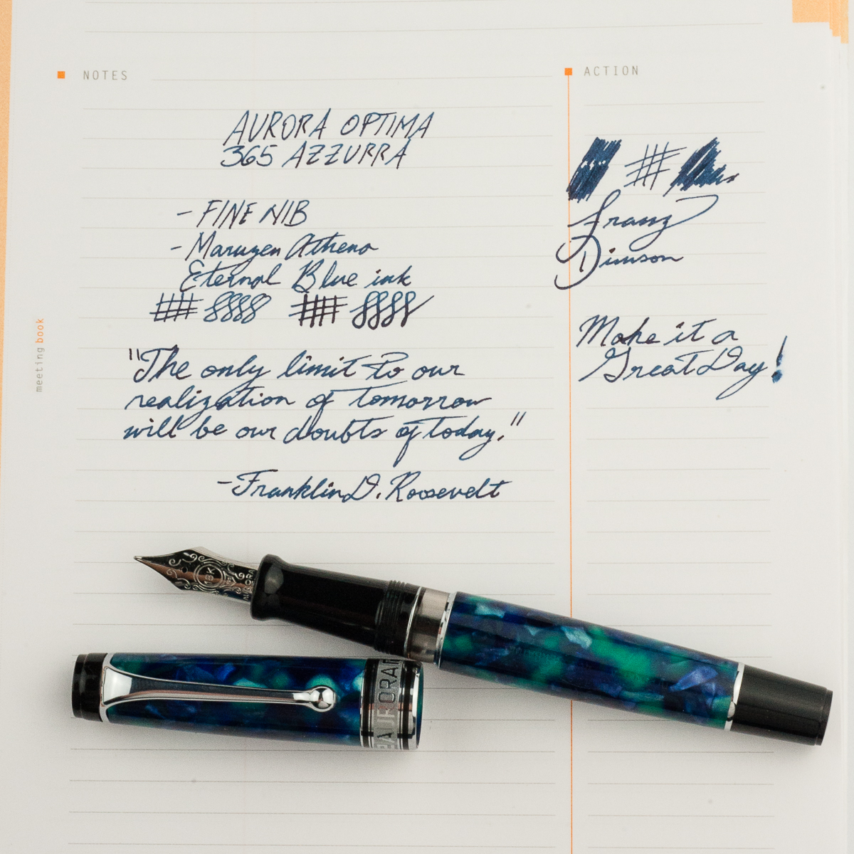
Franz’ writing sample on a Rhodia Meeting Notebook


Write It Up

Katherine: I haven’t measured, but this pen feels like a heavier Pro Gear. Maybe a little bigger? But if it is, not by much. I found it comfortable (and quite enjoyable) to write with for long periods of time.

Pam:  It’s a comfortable size pen for a variety of hand sizes.  For smaller hands, it would be worth it to post the pen.  For smaller sized hands, unposted is slightly better balanced and comfortable.  My thumb wraps around the step and threads of the pen, but I hardly notice them.  The step and threads aren’t sharp and the step is minimal making for a wonderful “no imprints” writing experience in my iron fist grip.

Franz: Let me just say that writing in my journal with the Optima was such a joy. The Optima is quite light compared to my usual Pelikan M800 and I have not experienced any fatigue at all. Both modes posted and unposted were very comfortable for me. The cap posts deeply onto the barrel and doesn’t affect the balance at all. I’ve already mentioned this but what I really love about the Optima is the lengthy section since I do grip pens farther back than others as seen in the hand comparison photos above.


EDC-ness

Katherine: A solid pen that works quite well as an EDC. And the cap takes 1.3 turns to uncap, which is pretty darn fast. I holds up quite comfortably to a life of being used to jot down quick meetings.

Pam:  The pen is a great size capped.  It should fit into a decent number of pockets.  The clip is strong and tight.  It should have no problem slipping in and out of shirt pockets. It took a bit more finagling for my white coat pockets with the thicker material. I kept it in my Sinclair case for a majority of my time with it.

Franz: I’ve been using the Optima at my workplace for a couple weeks now and it’s such a nice everyday carry pen. The ball clip fastens to my shirt pocket very securely and uncapping is fairly quick with less than one and a half turn. The fine nib was nice to use on the copier paper in the office too.

Something pretty cool with Aurora’s piston filled pens like the 88 and the Optima is their hidden ink reservoir. If you are running out of ink, just fully extend the piston down and a little bit more ink will be available to use hopefully until you get back home to refill your pen.

The black stem behind the feed is where ink is fed through. The piston has a hole that will fit around the black stem.
Piston midway onto Stem: When the piston goes over the black stem, a couple drops of ink underneath will be displaced and fed up to the stem.
When the piston knob is extended, it is a reminder for you to refill the pen.


Final Grip-ping Impressions

Katherine: All in all, I really like the Optima. I like the shape, the nibs are fantastic and they are made in beautiful materials. But, I find the MSRP quite high for the pen so I’ve been quite conflicted about purchasing one. As Pam mentioned earlier in the review, also remind me a lot the Pro Gears, though I don’t think the aesthetic is better or worse — just very different.

Pam:  I really enjoyed my time with the pen.  I enjoyed the nib more. This particular material is exceptional.  I know the price of the Aurora Optima reflect the celluloid material used for the pen but that alone isn’t enough for me.  That being said, if you can enjoy a beautiful modern celluloid pen with a fantastic nib, I would highly recommend the Aurora Optima.

Franz: I don’t have a lot of Italian pens in my collection but so far, Aurora has been winning my heart over. The Aurora Optima has been a pen model I’ve liked a lot and the 365 Azzurra pushed me to get one. For large-sized hands, I can definitely recommend the Optima and as mentioned earlier, there are lots of finishes that one can choose from. I think with the experience of the two ladies above, the Optima is also a good pen for small and medium sized hands as well. Plus, it’s a piston-filler which holds a lot of ink perfect for daily use.

A little food for thought to end this review, Optima is derived from the word optimus which stands for “Best”. Hmmm… is it the best pen ever? For me, the Optima has jumped into my Top 5 since I got it late last year. Not necessarily my Number One pen (Pelikan still FTW) but it’s up there. Now of course, best pens are very subjective! =)

Pen Comparisons

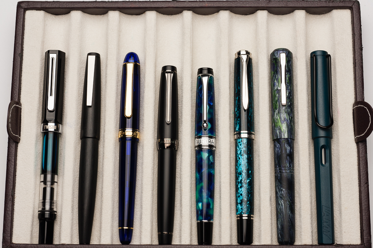
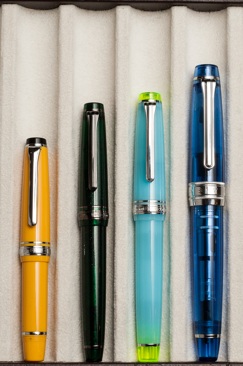
Closed pens from left to right: TWSBI Eco, Lamy 2000, Platinum 3776, Sailor Pro Gear Classic, *Aurora Optima*, Pelikan M805, Franklin-Christoph Model 31, and Lamy Safari
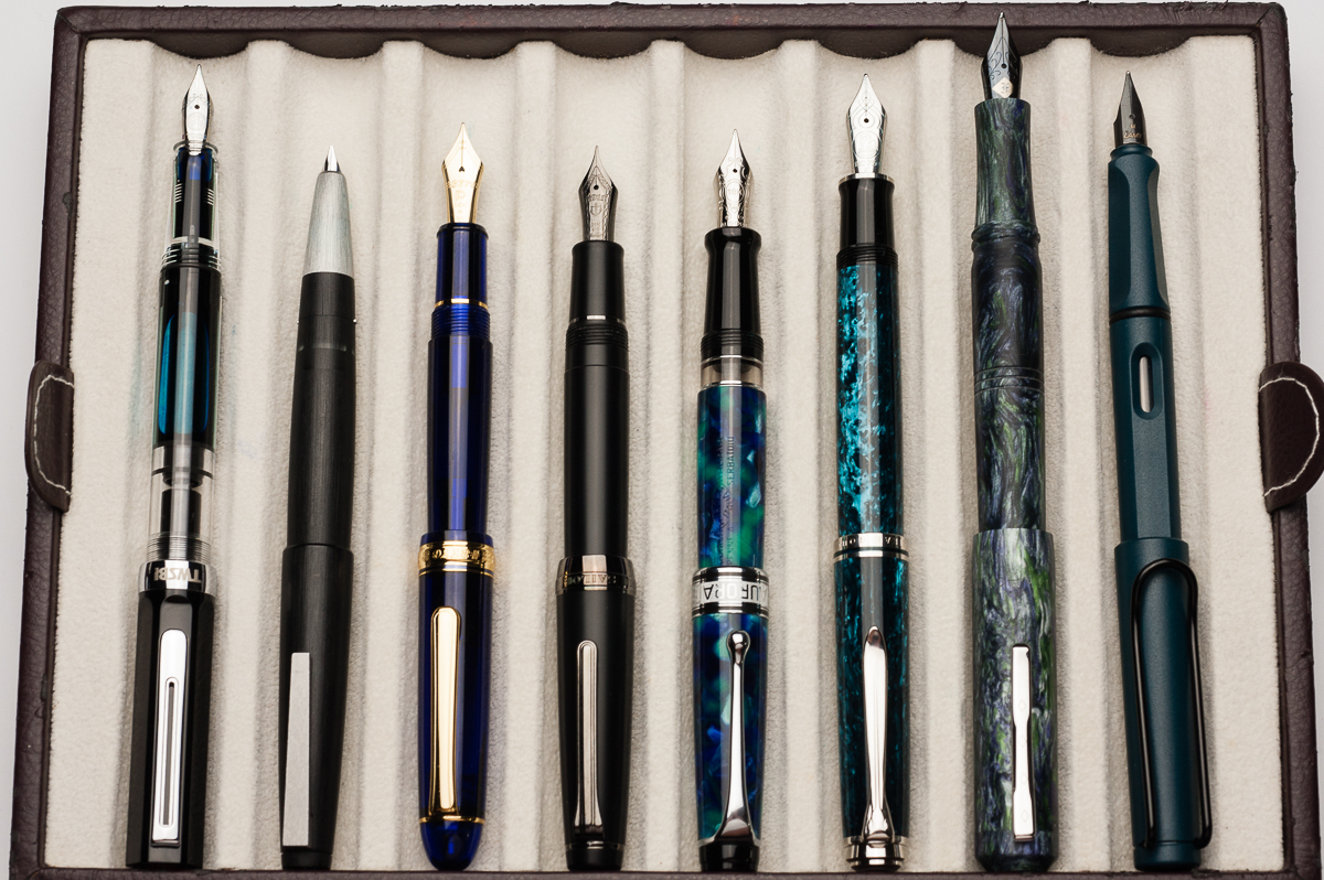
Posted pens from left to right: TWSBI Eco, Lamy 2000, Platinum 3776, Sailor Pro Gear Classic, *Aurora Optima*, Pelikan M805, Franklin-Christoph Model 31, and Lamy Safari
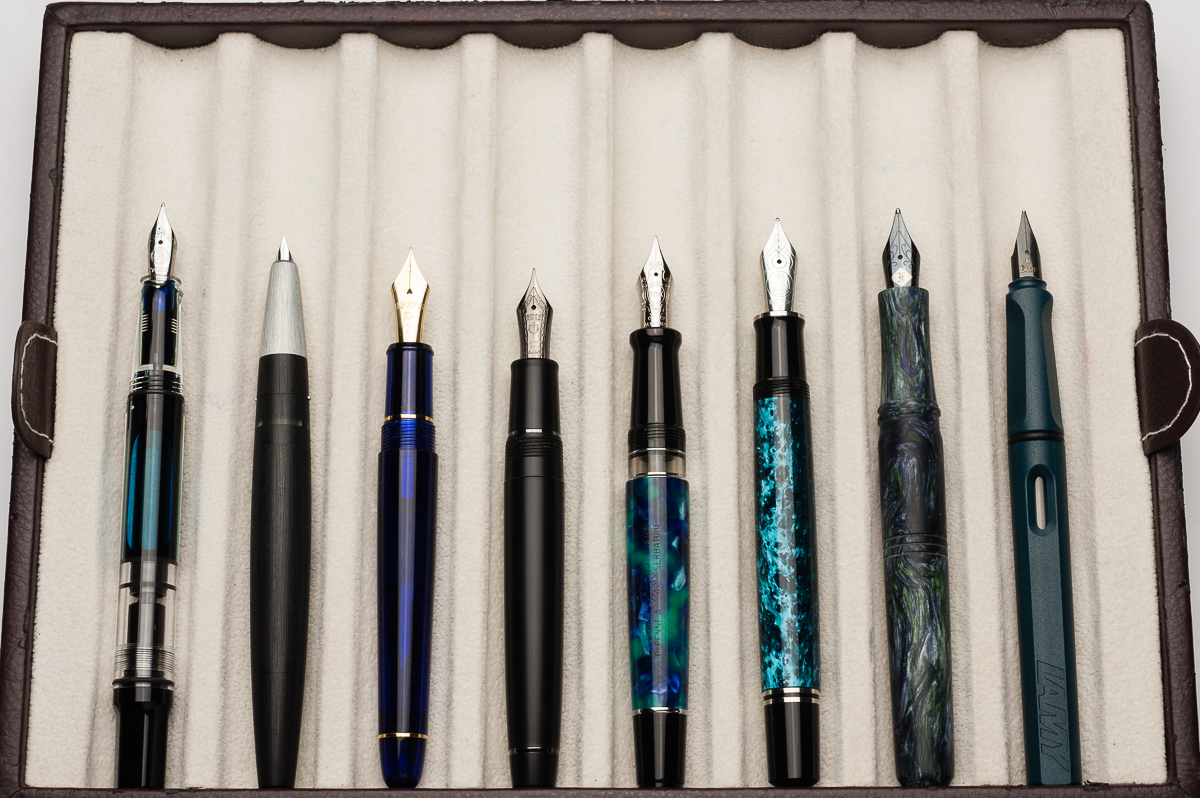
Unposted pens from left to right: TWSBI Eco, Lamy 2000, Platinum 3776, Sailor Pro Gear Classic, *Aurora Optima*, Pelikan M805, Franklin-Christoph Model 31, and Lamy Safari

Pen Photos (click to enlarge)
5 Comments

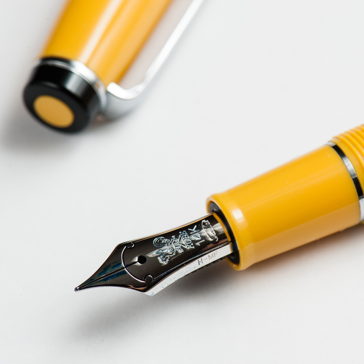
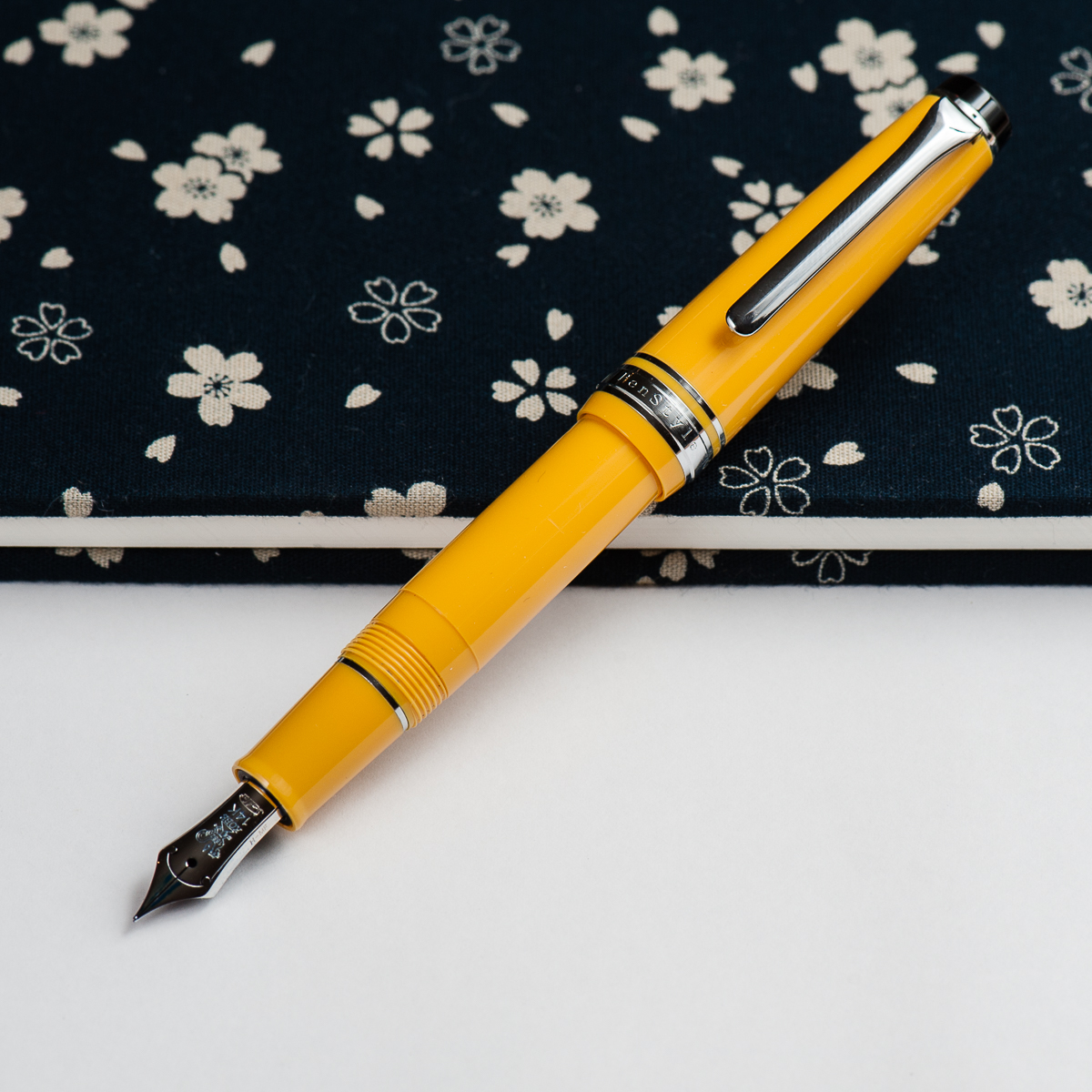
Review: Sailor Professional Gear Slim/Sapporo Mini (Medium-Fine Nib)


Hand Over That Pen, please!

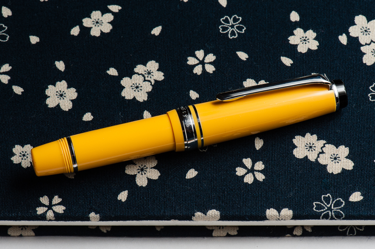
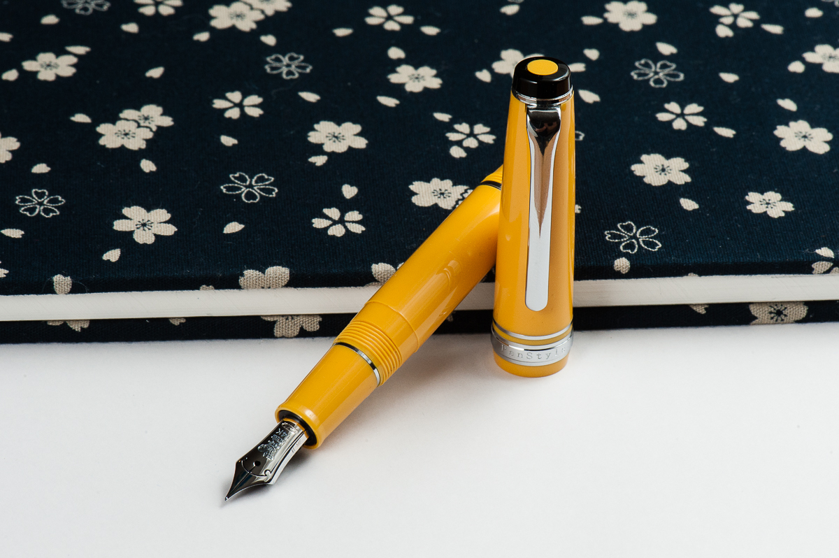
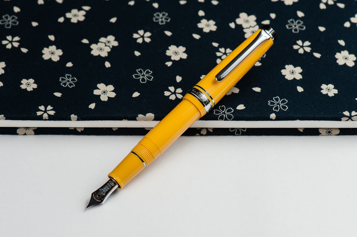
Katherine: This pen is adorable. But it does bug me a little that the end of the barrel isn’t black (I’m picky, I know). But oh, it is so cute. (Contrary to what Pam says, they’re still available on Rakuten)

Pam:  CHIBI BUMBLEBEE SAILOR for the win!!! It’s a petite Progear that is small enough that the pen gets posted by screwing on the end of the pen.  Sailor pocket pen are three words that send my heart swooning; great things come in small packages. Unfortunately, these are not being made anymore.  They are available on the secondary market.

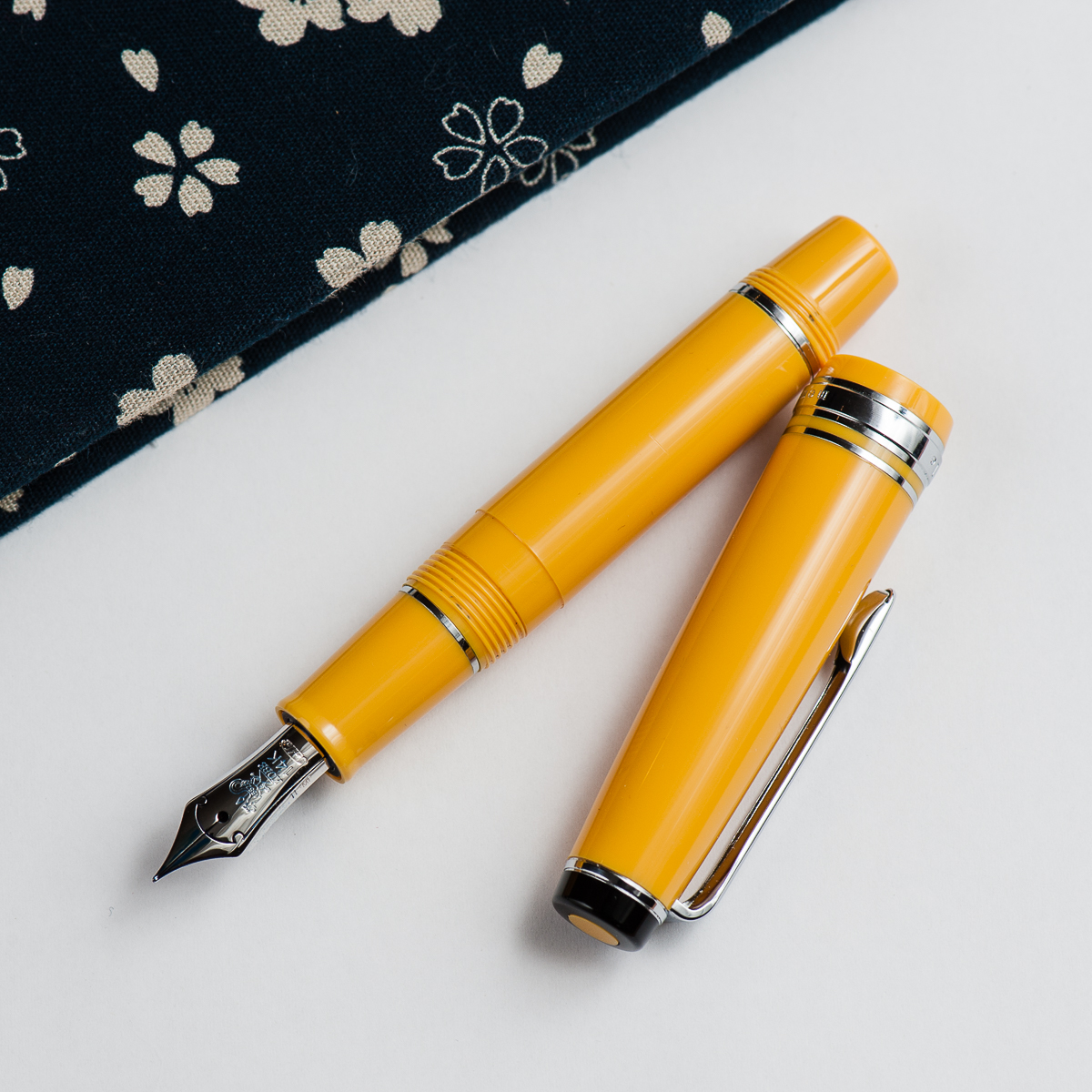
Franz: The Sailor Pro Gear Mini is so tiny and charming especially in this yellow finish! Pam calls it bumblebee and I can see that too but in my mind, I refer to it as a banana pen. I don’t know… it’s just something about that black cap finial that makes me think of one of my favorite fruits.

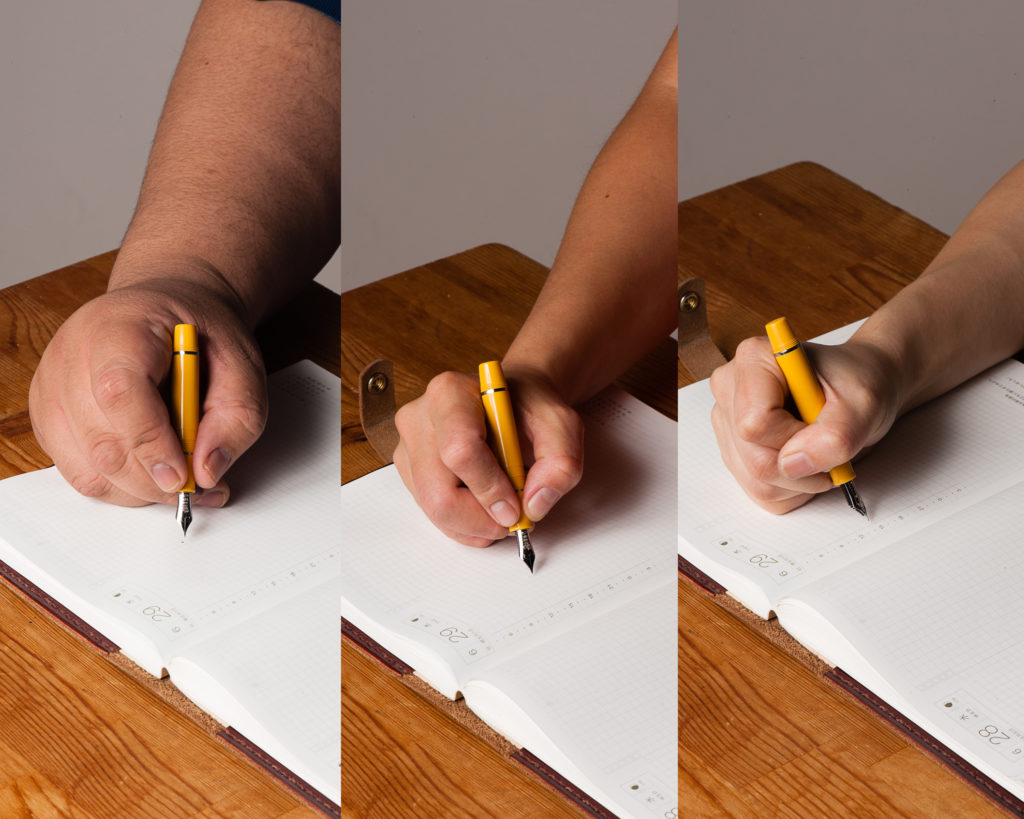
In the Hand: Sailor Pro Gear Mini (posted) – from left to right: Franz, Katherine, and Pam
In the Hand: Sailor Pro Gear Mini (unposted) – from left to right: Franz, Katherine, and Pam


The Business End

Katherine: It’s the the same Sailor MF 14k as a Pro Gear Slim (it’s really just a Pro Gear Slim with a shorter barrel, after all) — and unsurprisingly, I really enjoyed it. It’s broad enough that I can see the color of the ink, but fine enough that I can stick to my usual tiny hand writing.

Pam:  It’s a Sailor MF (medium-fine) nib.  It’s in the great sweet spot of a slightly wetter/broader line that isn’t too wet.  I would recommend putting in an ink that you want to show off.  Perhaps an ink with some sheen.  I don’t find as much feedback with this Sailor nib, which makes sense given that the MF nib is a bit broader.

Franz: The Mini’s medium-fine nib is very nice to write with. Just like most Sailor nibs I’ve tried, it was very smooth. The M-F line width is actually a good one for me as I find Sailor’s fine nibs just “a little” too thin of a line for me.  The design on this nib is different from any other Sailor pen because this was a pen commissioned and sold by the Nagasawa Kobe stores in Japan.


Write It Up

Katherine: I found this pen usable, but slightly short when unposted. It’s one of the few pens that I prefer posted to unposted. Like the Kaweco Sport, when unposted, this pen makes my hand a bit tired after a while because it’s just barely long enough to fit in my hand and I have to be careful about how I position my hand. Posted though, it’s fantastic — like a slightly longer Pro Gear Slim!

Pam: The size of the pen posted is similar to the Sailor Progear Slim.  The width of the pen is exactly that of the Sailor Progear Slim actually.  They section and body are swappable amongst the Sailor Progear Slim and Mini. Other than the length, if you find the width of the Sailor Progear Slim comfortable, this pen won’t be a problem for you.

Franz: I wrote in my journal with the Mini only in the posted mode because it was quite difficult to write with the cap unposted. I found that the posted length made it a little more comfortable for me. The girth of the section was quite thin for me so I end up gripping the pen on the threads. They weren’t too sharp and I barely noticed them.


EDC-ness

Katherine: It’s great for quick notes and pocket use. It’s tiny, brightly colored (and hard to lose…) and seems plenty durable, not that I threw it against a wall or anything.

Pam:  I kept this pen with my Hobonichi A6 notebook cover and it kept up with my adventures in my bag.  It’s really portable.  It’s not the best for quick notes given that you have to screw the cap onto the body to post, However, if you have particularly petite hands and don’t need to post it, a which quick twist of 1.5 rotations, will get you writing pretty quick.

Franz: Ahh… every day carry. It is definitely a pen that fits in your pockets. The M-F nib is actually very appropriate for use on cheap copier papers as the line is thin and the ink spread is minimal. But I don’t think I can recommend this pen for large handed writers because after 2 or 3 words, it’s hard to write with the pen unposted. This is due to the pen falling into the crook of my hand and is uncomfortable. I’d need to post the cap and screw it onto the barrel which takes quite a bit of time if you are constantly needing to cap and uncap for quick usage. It takes almost 2 turns to uncap the pen and then another turn or two for posting the cap. Small hands? No problem as you can see from the two ladies’ experience.


Final Grip-ping Impressions

Katherine: This pen is really cute — but between this and the Pro Gear Slim, I’d prefer the latter. It’s just a little more flexible and accommodating for my hand. But if short pens are your thing — this is definitely a great fit.

Pam:  It’s a chibi Sailor for chibi hands.  It’s a solid Sailor pen, albeit small.  If you are into challenging yourself on how small of a pen you can comfortably write with (like Franz), this is a great pen to borrow from smaller hand friends.  If you are looking for a great pocket pen and don’t mind the extra work posting, you will be rewarded with this Sailor.

Franz: I really like the Pro Gear Mini a lot, and want one for myself. But to be honest, this is more because of me just hoarding wanting the pen in my collection. As a journal, or letter writing pen, I’d use this pen again.

The Mini is a pen more suited for people with a small, or medium hand size. This is coming from a guy who uses his King of Pen Pro Gear a lot in the workplace and for daily use. As well as a guy who constantly annoys pen friends by singing, “I like big pens and I cannot lie…!”.

But one, including myself, cannot deny that the Sailor Pro Gear Mini is an adorable pen to behold. #ChibiPen


Pen Comparisons

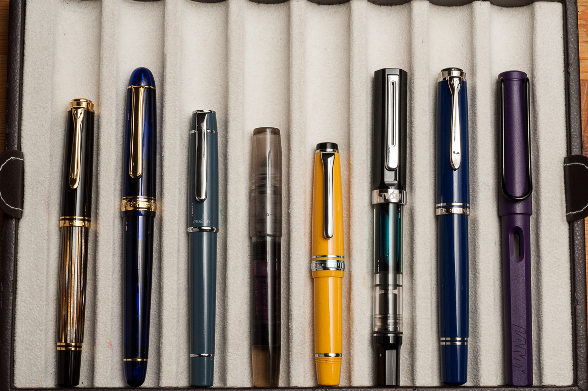
Closed pens from left to right: Pelikan M400, Platinum 3776, Pilot Prera, Franklin-Christoph Model 45, *Sailor Professional Gear Sapporo/Mini*, TWSBI Eco, Pelikan M805, Lamy Safari
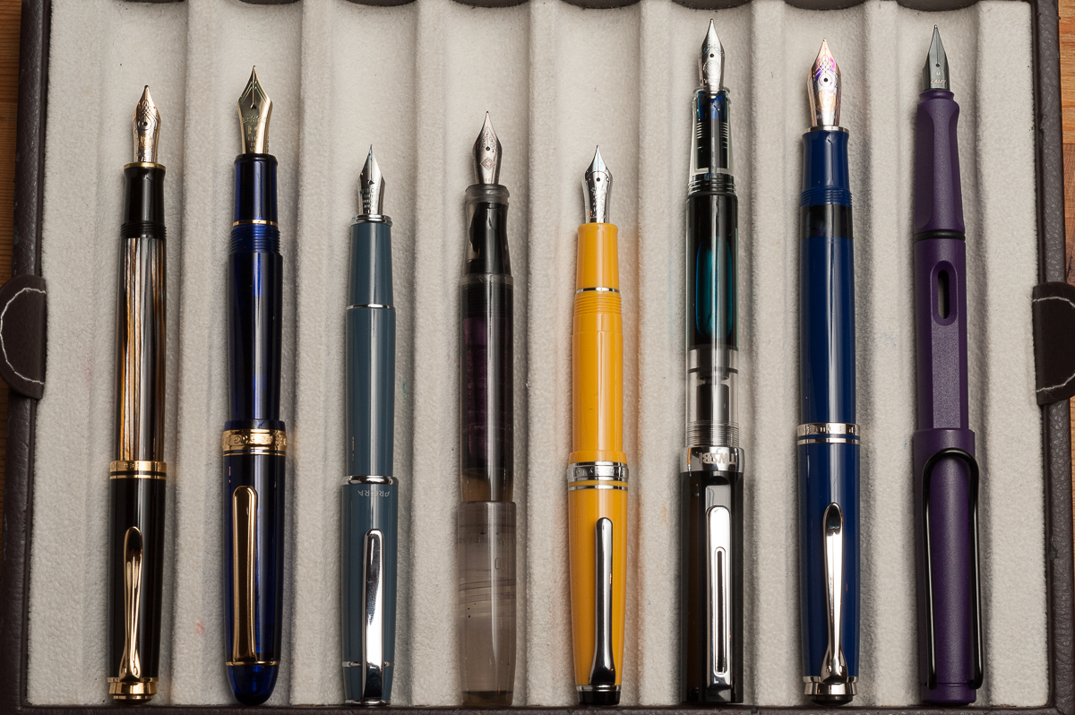
Posted pens from left to right: Pelikan M400, Platinum 3776, Pilot Prera, Franklin-Christoph Model 45, *Sailor Professional Gear Sapporo/Mini*, TWSBI Eco, Pelikan M805, Lamy Safari
Unposted pens from left to right: Pelikan M400, Platinum 3776, Pilot Prera, Franklin-Christoph Model 45, *Sailor Professional Gear Sapporo/Mini*, TWSBI Eco, Pelikan M805, Lamy Safari


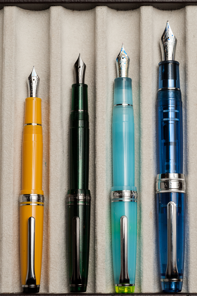
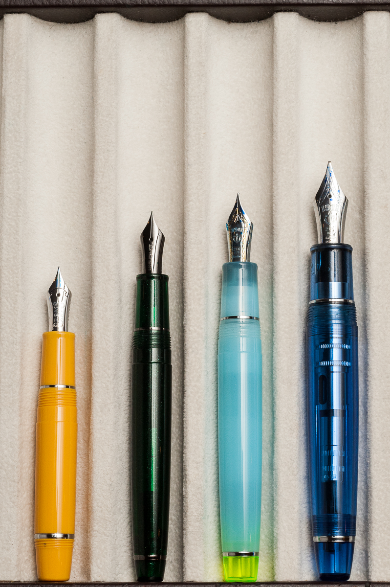
Sailor Professional Gear Comparisons (Left to right: Pro Gear Sapporo/Mini, Pro Gear Slim, Pro Gear Classic, and Pro Gear King of Pen)


Pen Photos (click to enlarge)
2 Comments

Review: Pilot Custom 912 (FA Nib)


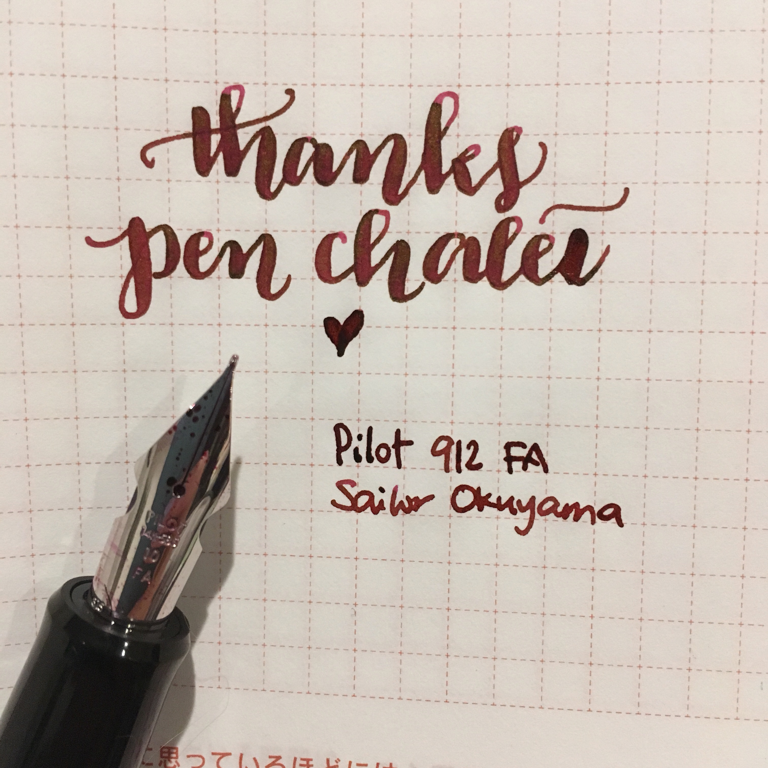
We would like to thank Pen Chalet and Ron M. for sending us this Pilot Custom 912 as a review loaner pen. Pen Chalet has been a great company that sells pens and stationery items at competitive prices. They also frequently run promos for specially priced items as well as provide discount coupons. Check them out if you haven’t yet.

That being said, the opinions below are our own and we were not compensated (monetarily, or otherwise) for this review.


Hand Over That Pen, please!

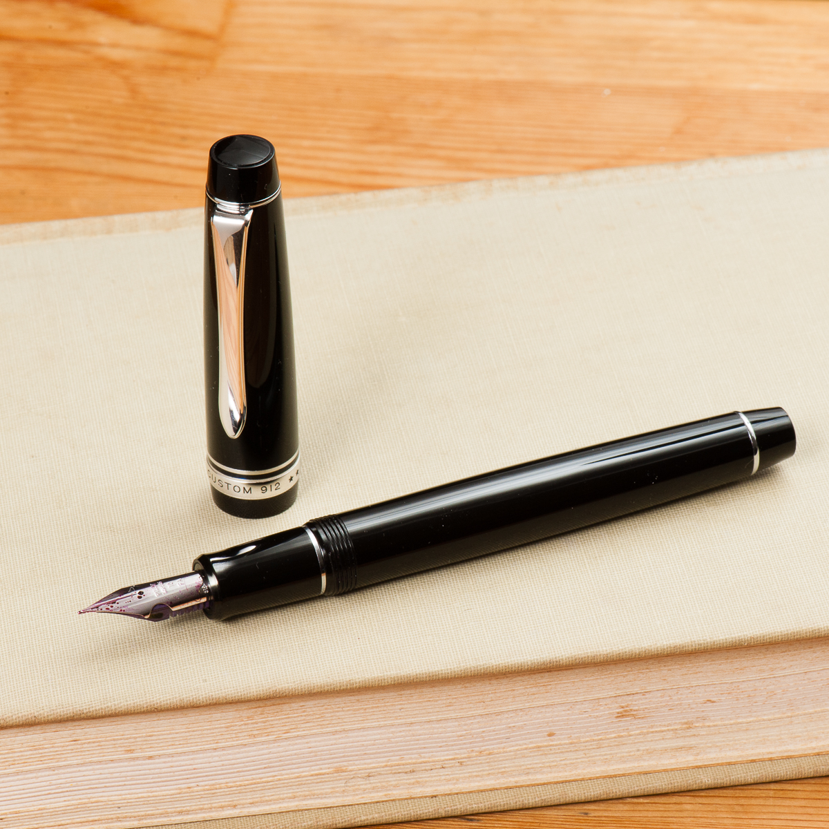
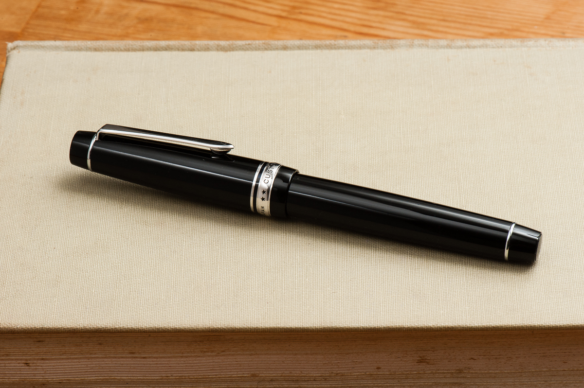
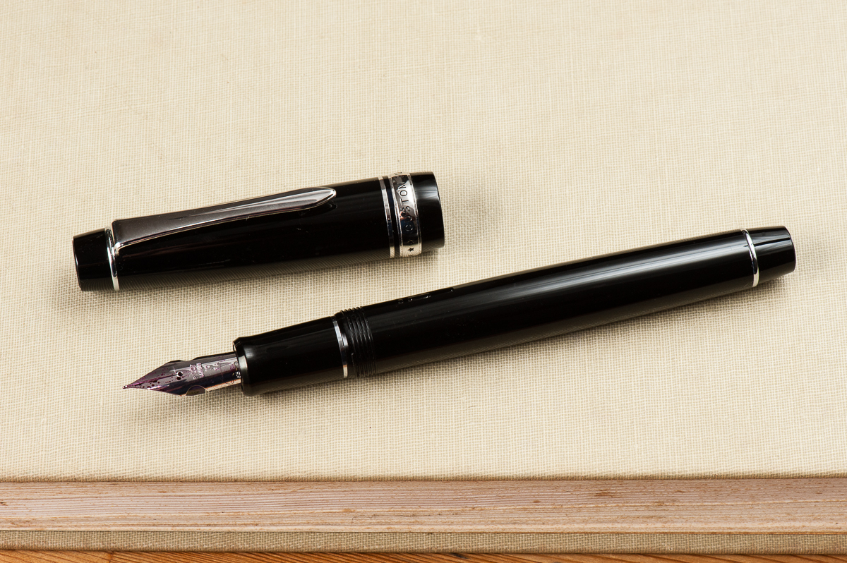
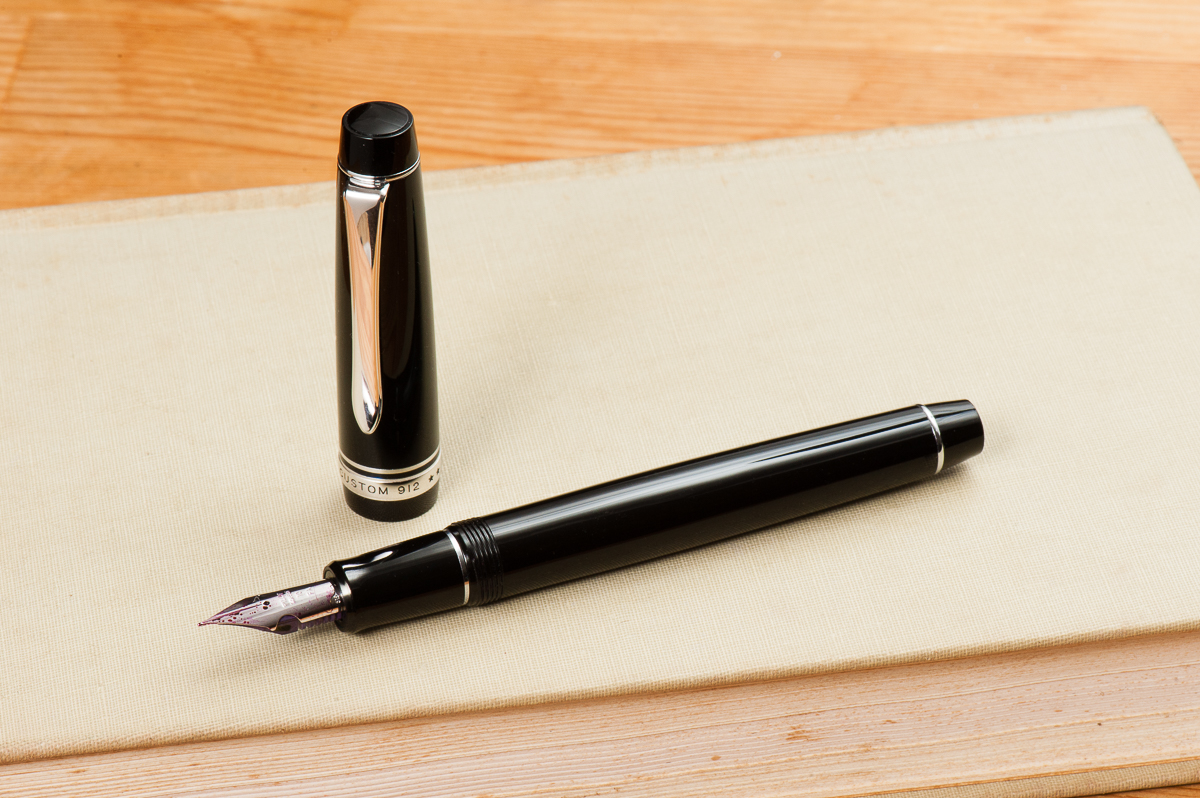
Katherine: I like the way this pen looks. Flat ends, with some taper, and silver rhodium hardware. It’s nothing flashy, but I much prefer this look to cigar shaped pens.

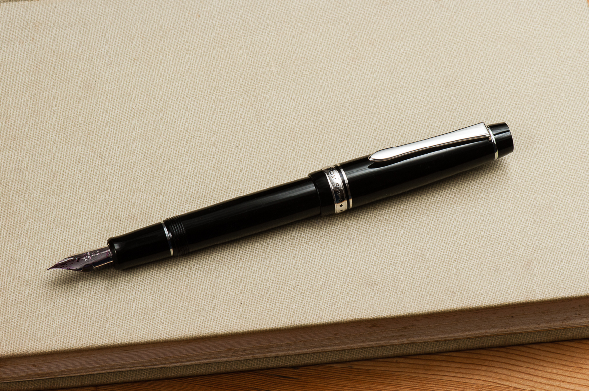
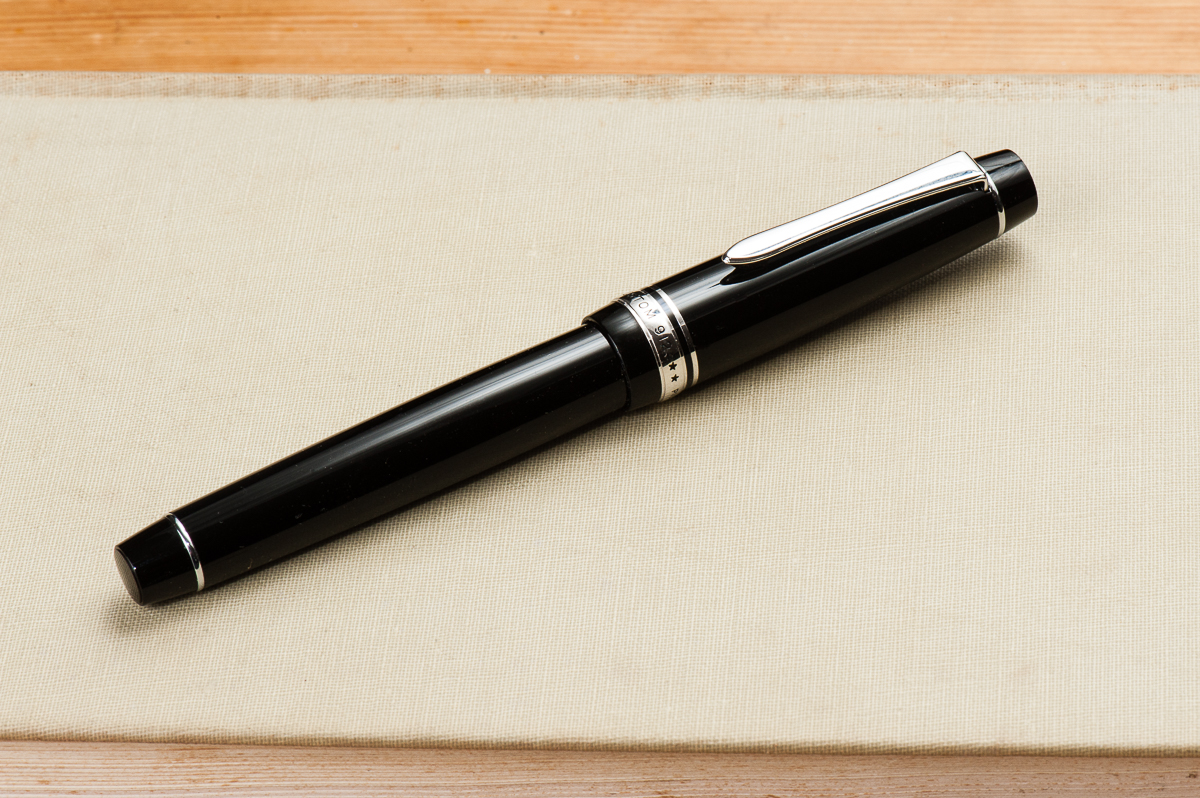
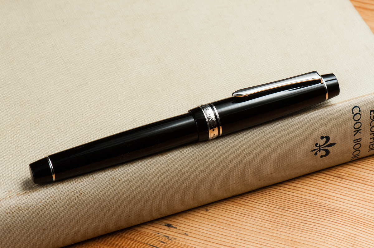
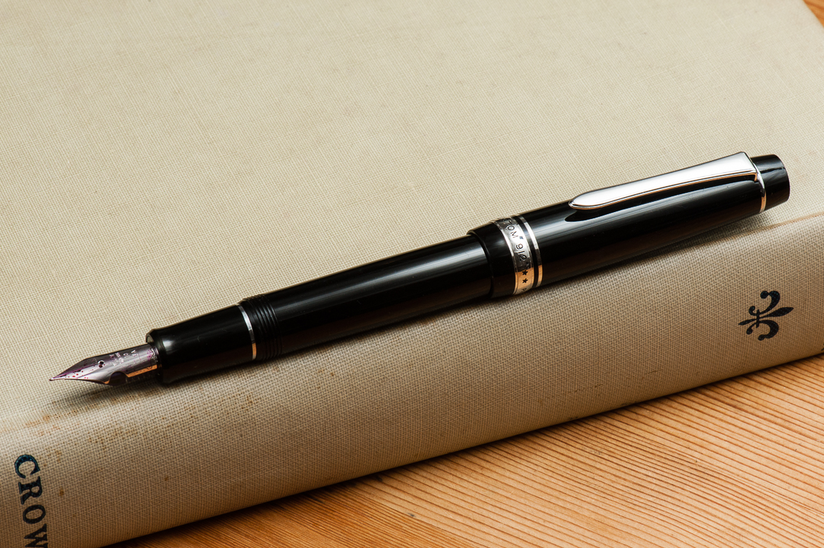
Pam:  This pen hits several check boxes for me in terms of aesthetics.  Flat top, check.  Rhodium trim, check. Non-garish clip, check.  It’s perfectly understated and professional.  Oh, what fun this pen hides!

Franz: A lot of Pilot pens have a simple look and this is one of them. The shape of the 912 reminds me of a Parker 75, a Lamy 2000, and maybe even a Sailor Pro Gear. A flat top pen with slight taper. And do you notice how the clip’s shape looks like a sword? The pen is mightier than the sword, right? =)

Here’s a quick informational tip. A lot of Pilot pens are assigned numbers as their model names. I’ve come to know that the first 2 numbers of the model name indicates the company year when the pen model was released. In the case of the Pilot Custom 912, it was released within the 91st year of the Namiki/Pilot company which was founded in 1918. So, 1918+91 years means the 912 was introduced in the year 2009. The last digit was/is the manufacturer suggested retail price for the pen in 10,000 Japanese Yen. So 2 x 10,000 = ¥20,000.

In the Hand: Pilot Custom 912 (posted) – from left to right: Franz, Katherine, and Pam
In the Hand: Pilot Custom 912 (unposted) – from left to right: Franz, Katherine, and Pam


The Business End

Katherine: Ooooh the FA nib! This is the second #10 (the smaller size) FA nib I’ve used, and just like the other, it was a delight. I love the flex and softness of FA nibs — they don’t have quite the snap back that some vintage gold nibs have, but they’re plenty for my untrained hand and ultra reliable (see the EDC portion). The one caveat is that the stock feed with the 912/742 tends to have a hard time keeping up if you flex a lot. To solve this, I widened the feed channel on my FA nib (the 912 was a loaner, so I didn’t, but I made the modification to my 742) and rarely have rail roading problems. With the improved flow the 742 is a fantastic, fun writer.

Pam:  The FA nib is really really fun.  It’s one of the best softer/flexier modern nibs.  It’s a great alternative to those who don’t want to tempt fate with vintage gold nibs or on a more modest budget.  (If you are a newb like I am with vintage pens and find the idea daunting.) The nib can take quite a bit of pressure and allows for some generous line variation. Yes, the nib survived my writing pressure.

Franz: Pilot nibs in general are so good out of the box whether it be the steel nib of a Pilot Metropolitan, or the 14k gold nib of a Pilot Stargazer. The Pilot Custom 912 just follows suit and is a very smooth writing nib. The FA nib has that soft bounce and it was a pleasure writing with it. I don’t do much “flex” writing and the nib and feed kept up with my writing doodling. So it’s a great one for me!

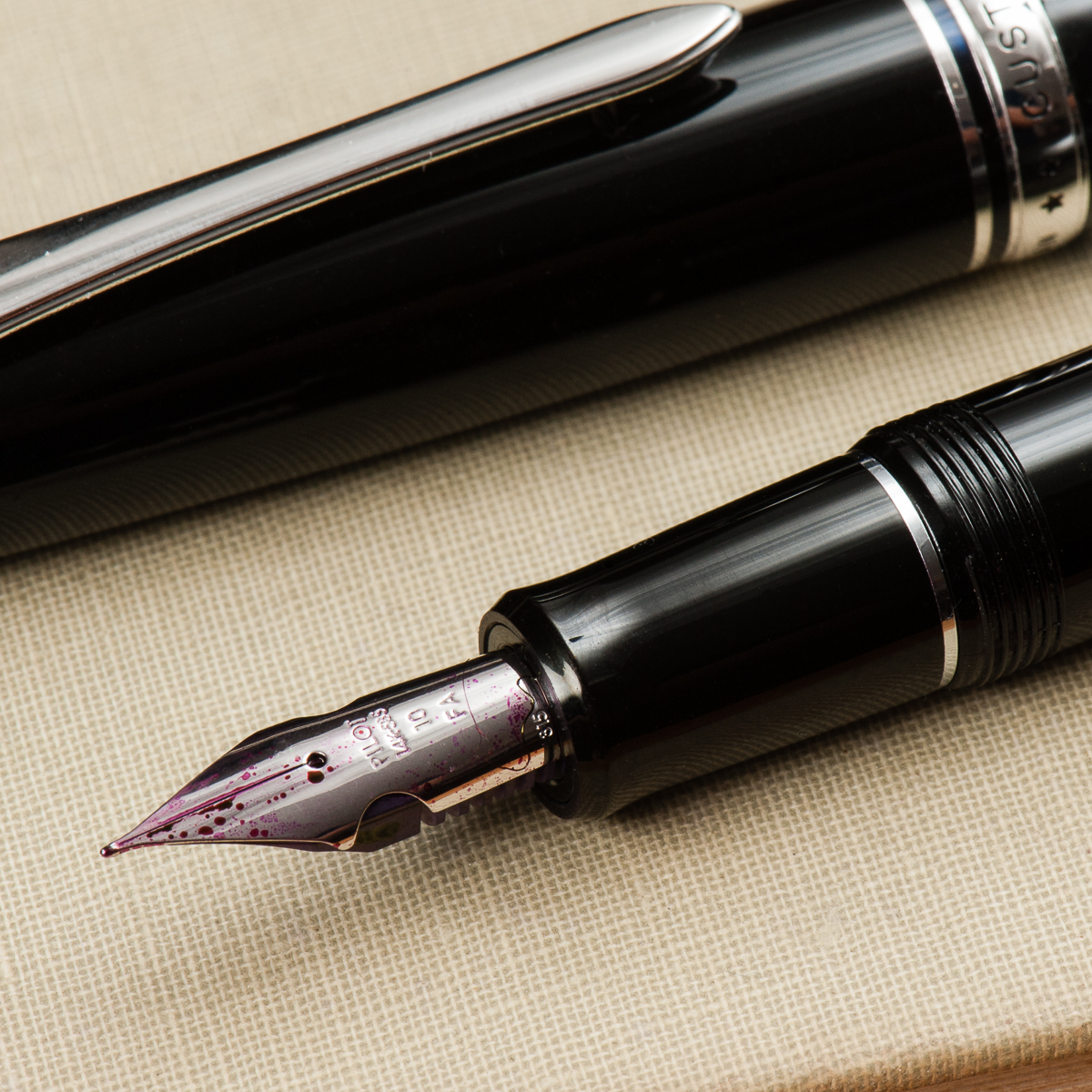
Did you know that some of Pilot’s nibs are date stamped? You can barely see it in the photo below but this nib is stamped “315” which means the nib was manufactured in March of 2015. #justoneofthosethings =)


Write It Up

Katherine: This pen is plenty comfortable for me. It’s well balanced, not too thick and not too thin. The nib is also stiff enough that it’s easy to write with for pages on pages (versus some really soft nibs where super light pressure is a must) but soft enough that it’s easy to add some flair to my writing when I want to (or for whole pages at a time, if I must admit).

Pam:  I am reminded of how reliable and wonderful Pilot pens each time I pick one up.  It’s a pretty light pen, well balanced and had a good width.  I can’t use my usual grip with this pen given how this nib performs, but even in the tripod grip, it’s a good comfortable section.

Franz: Comfy posted or unposted. Nuff said. Thanks. =) Yep, writing with the Custom 912 was such fun. Unposted, the length was sufficient and I was writing along fine. The cap posted deeply onto the barrel and didn’t change the balance very much but I appreciated the longer length.


EDC-ness

Katherine: What really makes the Pilot FA nibbed pens stand out to me over vintage flex is how incredibly reliable they are. I carried this 912 in my backpack for a few days, and I never had a leak or found ink in the cap — it’s a durable pen that has all the conveniences of modern pens, but with a fun flexy nib.

Pam: This is a great pen for lettering in planners to add a pop or a flourish to your dailies or to do lists.  The clip worked well in my Hobonichi A6 notebook. One of the perks of modern pens is that I know that it will perform well and consistently.  It survives the transit in my daily bag without any issues.  I didn’t really use this pen at work, but it’s a great companion for “planner time.”

Franz: I got to use the Custom 912 at work for about 3 days and found it to be a great pen for daily use. The clip secured the 912 on my shirt pocket nicely. Pilot supplies the 912 with a Con-70 ink converter and it holds a decent amount of ink.


Final Grip-ping Impressions

Katherine: If I didn’t already have a 742, I’d be asking Pen Chalet how much they want for the pen so I’d never have to send it back. I really like it (and prefer the way it looks to the 742). But… alas, a girl cannot have every pen that catches her eye. Overall, the 912 is a comfortable, non flashy daily driver AND a fun pen for doodling and dabbling in calligraphy.

Now back to telling myself I don’t need a second FA nib. I don’t need a second FA nib.I don’t need a second FA nib.I don’t need a second FA nib. Ugh.

Pam:  If you are looking for a modern “flex” nib or want to start practicing your hand letter/calligraphy from a consistent and reliable writer, I would highly recommend the 912.  If you are a newb like me and just want to have the fun of a softer nib without delving too deep into your wallet or the vintage world, this is a great pen to start with.  Granted, that being said, there is almost no alternative to a flexy vintage gold nib.  One of the great things about fountain pens is that there is a pen to suit anyone. This pen hits a particular spot for me as the best of both worlds, soft nib with a reliable performance and good body.  It’s a “happy writing” spot.

Franz: To state the obvious, I really liked the Pilot Custom 912. It has been on my list for a while now but I haven’t been able to acquire one. Reviewing this loaner from Pen Chalet could be the helpful nudge I’ve been needing.

Even if the term “solid” may be overused in reviews, I have to say it. The Pilot Custom 912 is a SOLID pen to use and recommend. It isn’t an inexpensive pen, but there is value in it. The nib is a great writer, the build seems durable, the threads are smooth, and the pen’s silhouette is beautiful. However, there is one caveat/drawback with the 912. As of this writing, the pen has only been offered in a black finish. For me, I love black pens and don’t mind the lack of options (would love to have a blue though). But knowing the awesome people in the pen community, a lot of pen folks want color options for the pens. So if the aesthetics of the 912 appeal to you, go get one and try it out!


Once again Ron, we appreciate your lending this Pilot Custom 912 for review!


Pen Comparisons

Closed pens from left to right: Sailor Pro Gear Classic, TWSBI Eco, Pilot Vanishing Point, Platinum 3776, *Pilot Custom 912*, Lamy 2000. Pelikan M805, Lamy Safari
Posted pens from left to right: Sailor Pro Gear Classic, TWSBI Eco, Pilot Vanishing Point, Platinum 3776, *Pilot Custom 912*, Lamy 2000. Pelikan M805, Lamy Safari
Unposted pens from left to right: Sailor Pro Gear Classic, TWSBI Eco, Pilot Vanishing Point, Platinum 3776, *Pilot Custom 912*, Lamy 2000. Pelikan M805, Lamy Safari


Pen Photos (click to enlarge)
2 Comments

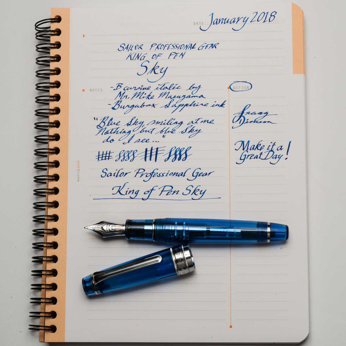
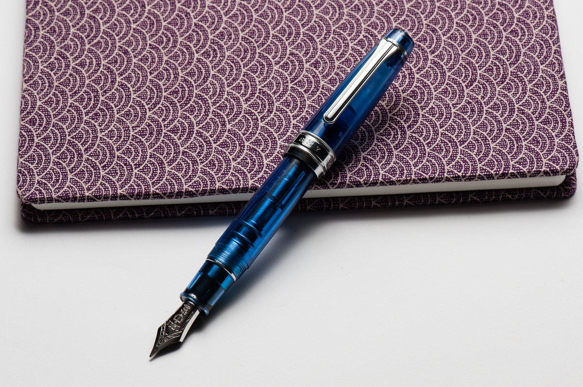
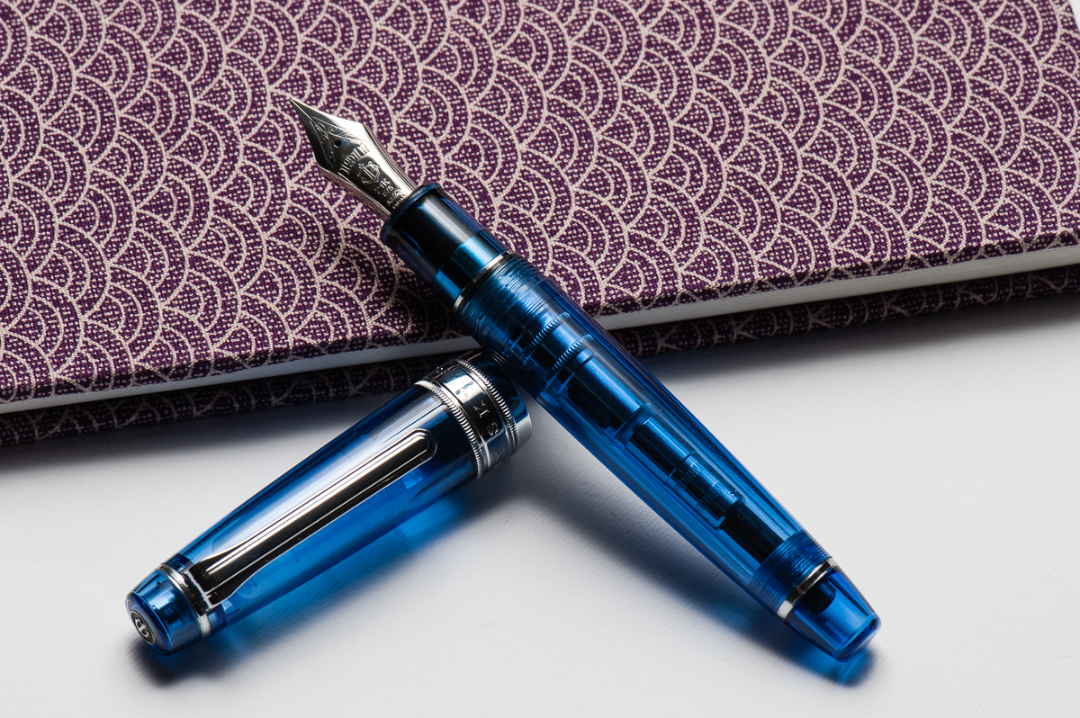
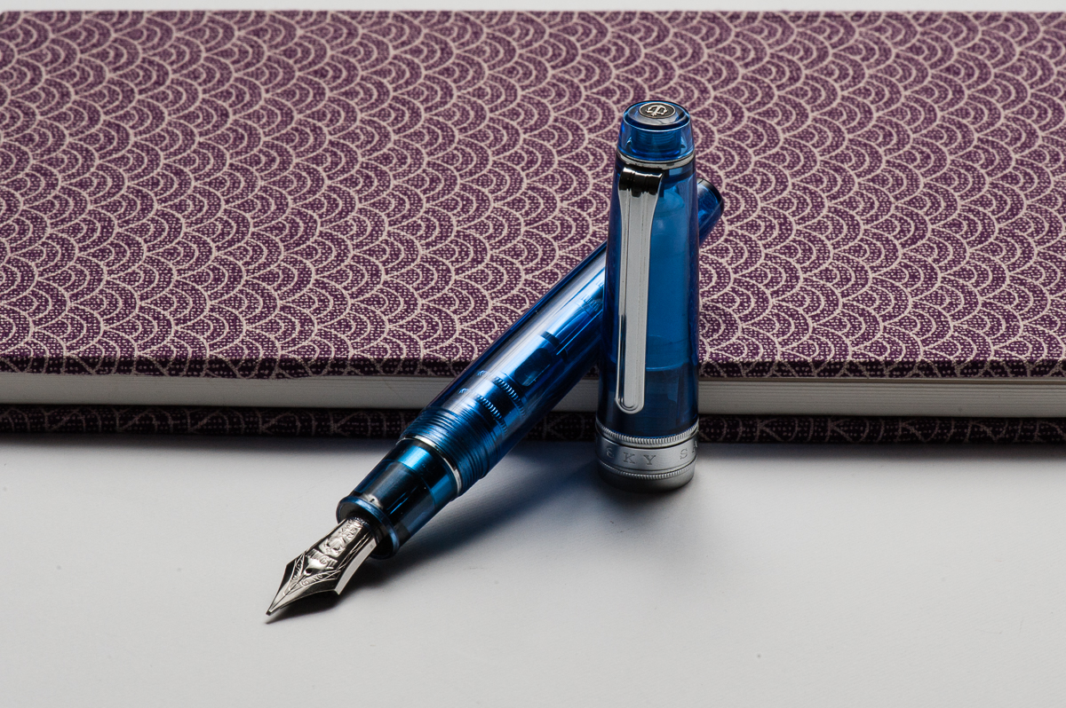
Review: Sailor Professional Gear King of Pen (Sky, Broad Cursive Italic Nib)


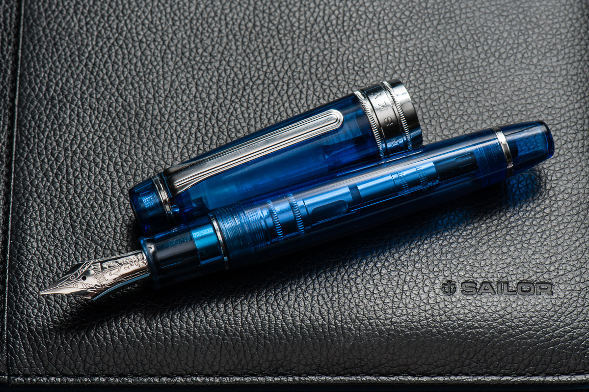
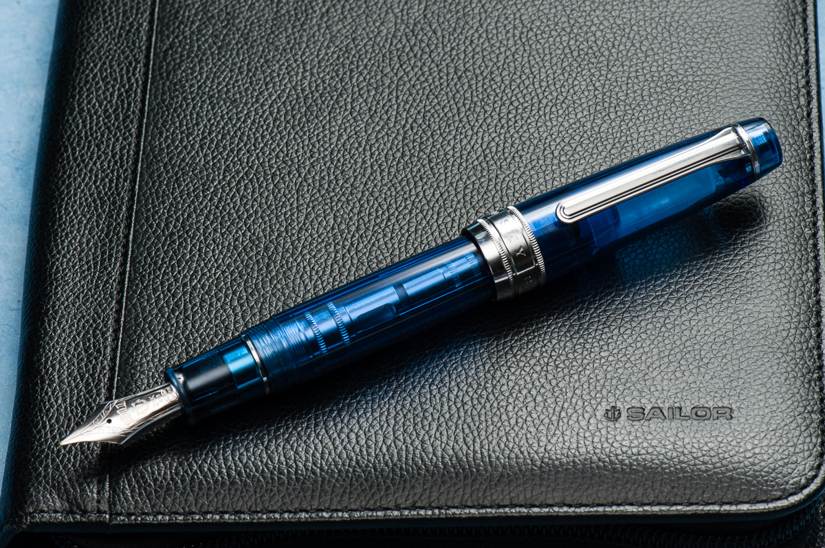
Happy 2018 folks! Thank you for your continued readership and we are looking forward to provide you with more reviews, and other interesting content. And for our first pen review of the year, here’s a blue pen from Sailor.

Also, just in case you’re wondering, the notebook the pen is resting on is a Musubi handmade diary just arrived from Singapore. We may review this notebook after some use. We are not affiliated in any way. They were quite popular at the San Francisco Pen Show in 2017 and they’re friendly people as well.


Hand Over That Pen, please!

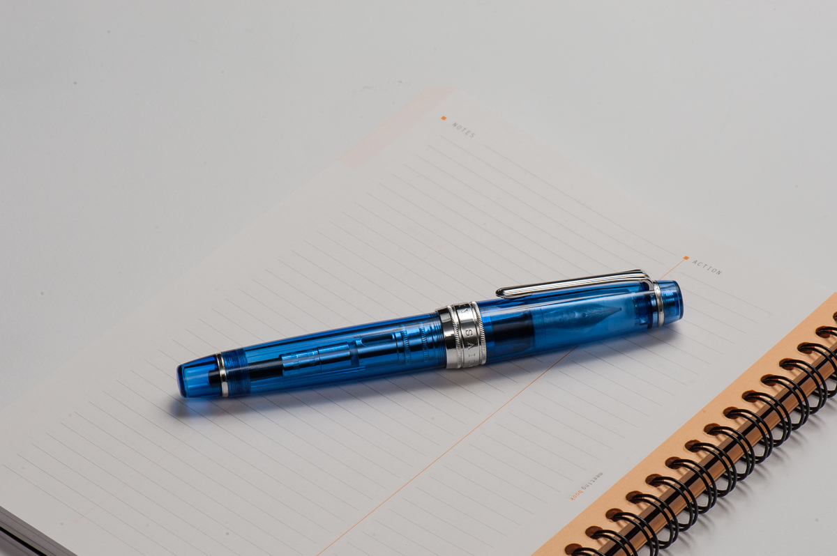
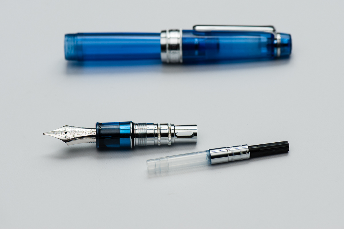
Katherine: Ahhhhhh. I want a sky. They look so cool. Even the converter showing looks cool!

Pam: I am totally biased given that I own a Sailor Sky in the Progear Slim size.  The blue material is the same, however, there are more metal parts to the King of Pen which adds to the weight and hand feel. (More on that later.)

Franz: “Blue Sky smilin’ at me, nothing but blue Sky… do I see…”. Ever had a pen make you just wanna sing? Well, this King of Pen (KoP) Sky did it for me and I got Sinatra’s voice in my head.

It shouldn’t come as a shock to a lot of people that I just adore the blue finish of the pen and the shape of the Pro Gear is a great aesthetic as well. I’d say that in my hand, the Pro Gear KoP size is in between a Pelikan M800 and Pelikan M1000. A pen of substance if you will.

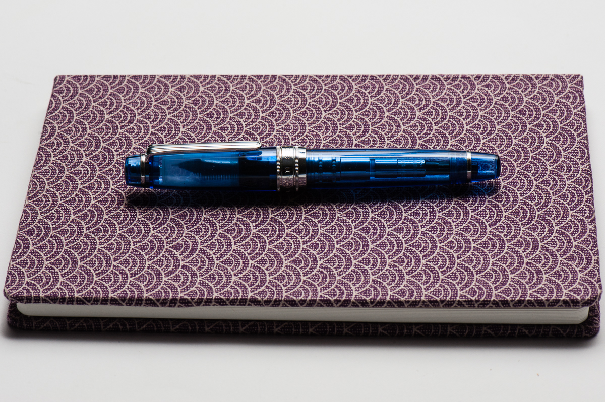
In the Hand: Sailor Pro Gear King of Pen (posted) – from left to right: Franz, Katherine, and Pam
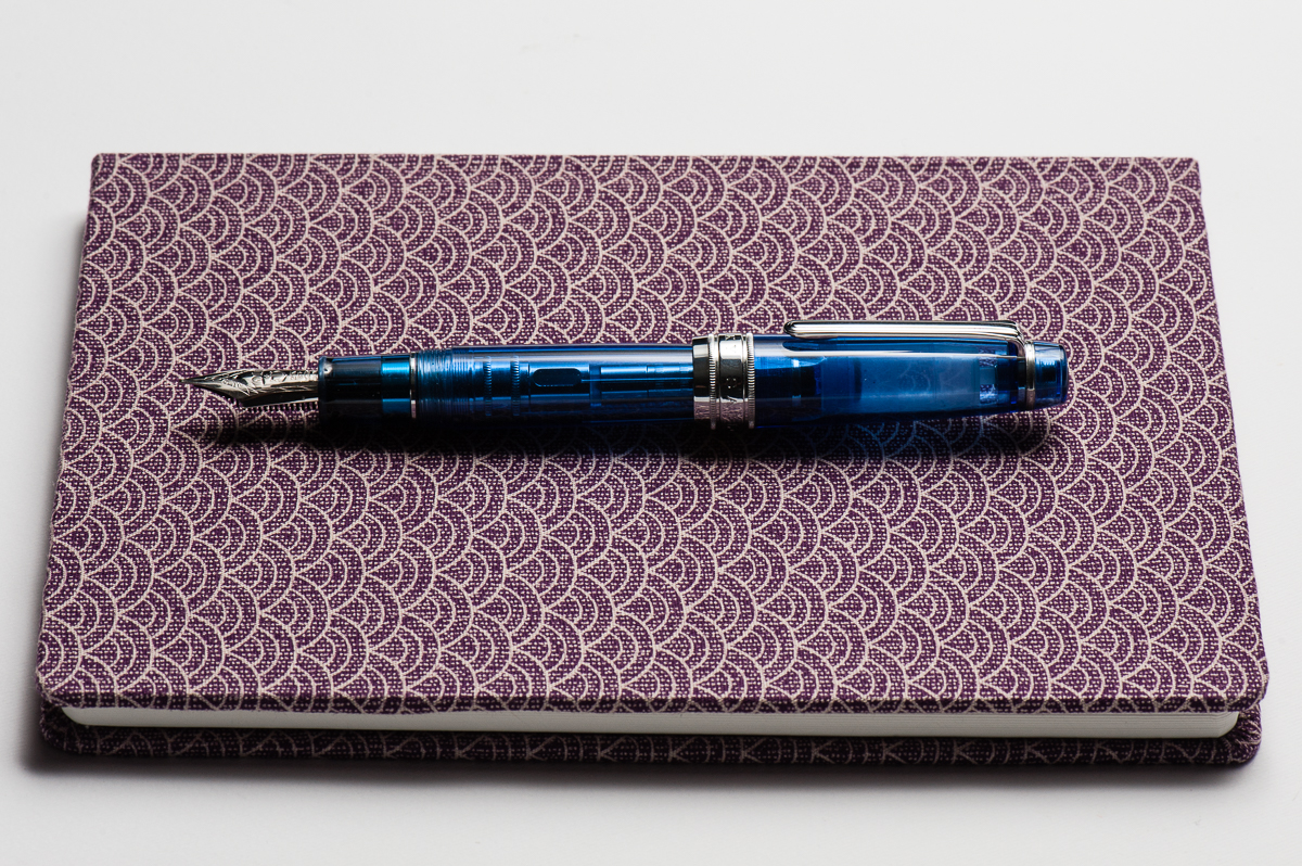
In the Hand: Sailor Pro Gear King of Pen (unposted) – from left to right: Franz, Katherine, and Pam


The Business End

Katherine: Being one of Franz’s, this pen sports a wonderful BCI. The nib is quite large, but a joy to write with. Smooth, juicy without being sloppy and capable of crispy line variation.

Pam: Sailor has one of the most beautiful and consistent nibs on the market.  The KOP nib is no exception.  The cursive italic was expertly ground and the slight springiness of the nib allows for a great ink flow.

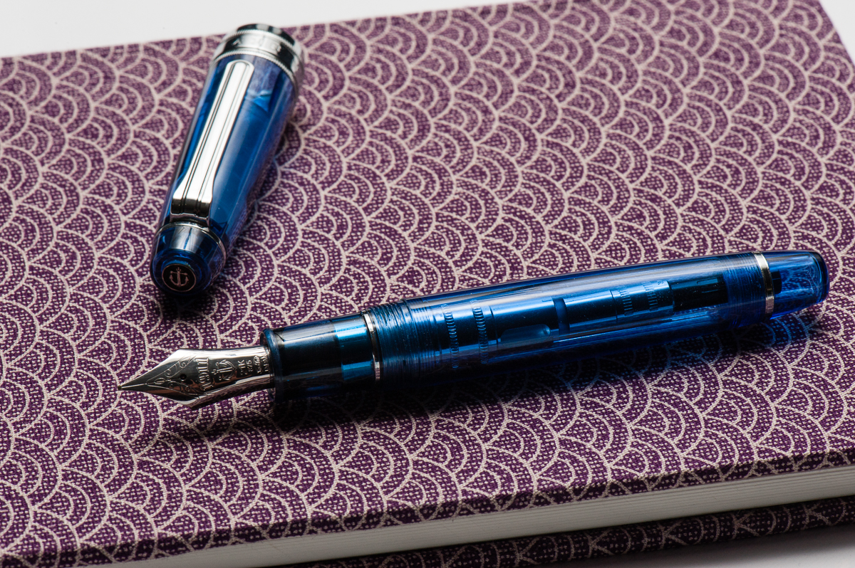
Franz: Mirroring what Pam said, Sailor nibs are well tuned with a hint of feedback out of the box . I’ve purchased a couple Sailor pens in 2017 and it wrote oh so perfectly for me without any adjustment. I got this pen second hand via a well-known auction site for a great price but when I got it, I found that the tines were a bit misaligned and almost too far apart. I inked it up and found that the flow was too much. So what do you do in this situation? You wait for the next pen show and ask Mr. Mike Masuyama to take care of it! Which is what I did and I also asked Masuyamasan to transform the Broad nib into a crisp cursive italic. Been loving the nib ever since.

Franz’ writing sample on a Rhodia 6.5 x 8.25 Meeting Book


Write It Up

Katherine: The KOP Pro Gear is a little bigger than I’d prefer, but still very comfortable and usable. I had no fatigue using it for extended periods, but do prefer the standard sized Pro Gear overall (better for my wallet, I suppose).

Pam: This size reminds me of the Pelikan M800 where it appears to be intimidating to those with pixie hands but is surprisingly comfortable. I find that the girth of the pen to be comfortable to hold for long periods of time.  The weight of the pen doesn’t seem to bother me at all as it’s a well balanced pen when unposted.  It does get long and more unwieldy for me when posted.

Franz: As I mentioned in the beginning, the Pro Gear KoP’s size is between the Pelikan M800 and M1000. These are two pens that I’m very happy to write with so this pen definitely fills my hand well. I wrote with the Sky in both posted and unposted modes at 10 minutes each and found that I’m comfortable either way. I lean more towards writing with cap unposted because it’s just a little bit more balanced that way. The cap band does place a bit more weight when posted but it wasn’t top heavy at all.

EDC-ness

Katherine: Works just fine as an EDC. The clip is strong and it takes 2 cap turns to uncap, which isn’t crazy, but feels extra secure.

Pam:  This would be a pretty good EDC pen.  The only down side is that this beauty maybe a bit too eye catching.

Franz: I use the KoP Sky at my workplace quite regularly and found it very useful as a daily carry pen. The broad cursive italic was just perfect for the copier paper we use as well as on my Rhodia meeting book. The clip like every other Sailor is very secure on my dress shirt pocket and the 2 turns to uncap isn’t too bad at all. It does fill either via cartridge/converter so I found myself refilling the converter after 3-4 days of use.


Final Grip-ping Impressions

Katherine: As mentioned earlier, I prefer the non-KOP Pro Gear more. But, I do love the way the KOP Pro Gear looks — it’s like a chubbier cuter (but larger) version of the Pro Gear! And a solidly awesome pen to boot. Alas, I can’t justify the price point (I can barely justify the price point on most Pro Gears these days…)

Pam: The Sailor KOP is a fantastic pen for those who enjoy the Sailor Progear but want something with a bit more heft and solid feel in hand.  It could easily become a daily carry pen or “the” pen that is constantly inked.  If there was a KOP in the right color (combination), it would easily make it to my grail pen list. As much as I love the Sailor Progear Slim and Sailor Progear, the KOP is an easy yes for me.  Too bad my wallet says no alot more than I do.

Franz: Four words. Bear paws are happy! The Pro Gear King of Pen is definitely for medium to large sized hands (but Pam who has the smallest hand among the 3 loves it) and I truly prefer this against the Classic size of the Pro Gear pens. In the photos below, the Pro Gear size comparisons dramatically show the big step up in size between the Classic and the King of Pen. Another key difference of a King of Pen is its nib. It is springier than a Classic or Slim size Pro Gear and provides flair to my writing that I appreciate very much.

Because of the price point of the King of Pen, it does dig into your wallet a bit..er..a lot. But it’s all a question of value. I would like to repeat that I won this second hand pen via an auction for a great price and I’m very happy about it. Would I purchase a brand new KoP Sky if this one didn’t come along? **cough** I would **cough**. I’ve wanted one ever since I saw Pam’s Pro Gear Slim Sky.


Pen Comparisons

Closed pens from left to right: Pelikan M205, Pilot Prera, Pilot Vanishing Point, Platinum 3776, *Sailor Professional Gear King of Pen*, Pelikan M800, Lamy 2000. Lamy Safari
Posted pens from left to right: Pelikan M205, Pilot Prera, Pilot Vanishing Point, Platinum 3776, *Sailor Professional Gear King of Pen*, Pelikan M800, Lamy 2000. Lamy Safari
Unposted pens from left to right: Pelikan M205, Pilot Prera, Pilot Vanishing Point, Platinum 3776, *Sailor Professional Gear King of Pen*, Pelikan M800, Lamy 2000. Lamy Safari


Sailor Professional Gear Comparisons (Left to right: Pro Gear Slim, Pro Gear Classic, and Pro Gear King of Pen)


Pen Photos (click to enlarge)
No Comments

Review: Lamy Aion (Black, Medium Nib)


Our lefty guest reviewer is joining us again! Roz helped us provide thoughts on this new Lamy Aion fountain pen.  Thanks very much Roz!

Hand Over That Pen, please!

Katherine: The Aion just ain’t my thing. It looks okay — but the different textures on the section and the rest of the pen bug me. Also, it looks really long? (But we already know that Lamy style and I generally aren’t bffs)

Pam:  Why hello there Mr. Minimalist design.  It’s unsurprisingly a Lamy pen, with shape and feel that is similar to the Lamy 2000 and the Lamy Studio.  In my mind’s eye, if the Lamy 2000 was the James Bond of the Lamy line with it’s sleek and beautiful shape, the Aion is the buffer, larger and less graceful cousin.  It reminds me of the fine line Sharpie markers with the squared off profile in the cap.  Aesthetically, I have mixed feelings about this pen.  In hand however, its a different story.  It feels as it looks:  heavy, sturdy, and very comfortable (with a seamless body and section), all pluses in my book.

Roz: I pretty much fell in love with the Aion the moment I got to hold it. Brushed metal, black & silver, and clean lines – yes please. The weight surprised me as well. It was definitely heavier than most pens I would gravitate to, but what was surprising to me was that it was a comfortable weight to hold, even while writing.

Franz: Lamy introduced the Aion a few months ago in the summer of 2017 but U.S. retailers did not get these pens until late November or early December. My co-worker who went to Germany in August for a vacation surprised me with this Aion fountain pen. I was surprised at how nice the brushed aluminum felt in my hands mainly because I’ve found that metallic pens especially their sections get a little slippery for me. The Aion was smooth but the texture allowed me to grip it without issues. It does look like a fatter Lamy 2000 or a VERY beefed up Lamy CP1. I’m loving it so far.

In the Hand: Lamy Aion (posted) – from left to right: Franz, Katherine, Pam, and Roz
In the Hand: Lamy Aion (unposted) – from left to right: Franz, Katherine, Pam, and Roz


The Business End

Katherine: Like most Lamy nibs, I find the Aion’s nib wayyyy too smooth. On Tomoe River, it’s almost nails-on-chalkboard-y for me. On less smooth paper, like copy paper, it’s more usable — and perfectly fine.

Pam:  The nib was perfectly smooth and glided over paper superbly.  The wetter nib tended to feather on copy paper, so I kept it on Tomoe River paper most of the time.  It left a well saturated  consistent line with no skipping.

Roz: The nib was easy to write with. Admittedly I prefer a finer nib so there were times when I felt I was almost painting with the pen, but the nib was smooth and the ink was consistent.

Franz: As detailed by the ladies above, the writing performance is smooth and wet. It writes like what a medium nib from Lamy does. One thing to note though, the Aion’s steel nib is stiffer than a Safari’s steel nib. Uhh… I do not recommend putting too much pressure on their steel nibs but the Safari does give a teeny bit of variation.

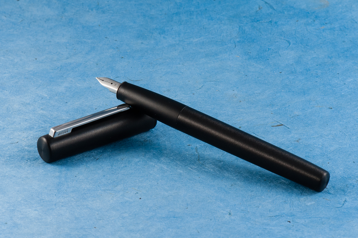
The shape of the nib is different compared to a Safari’s as well. The Aion nib looks curvy which complements the section. Since I’ve done so myself, the Safari nibs are interchangeable with the Aion.

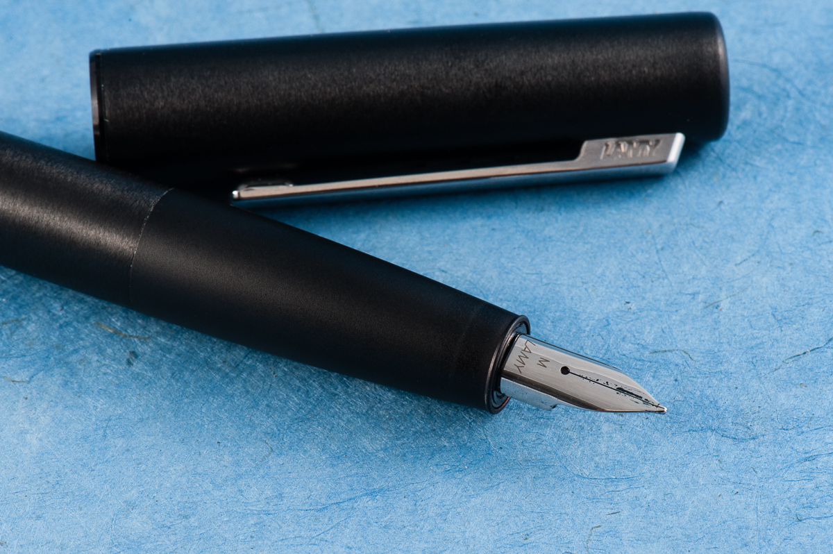
The Aion nib.


Write It Up

Katherine: I do most of my writing on Tomoe River… so this wasn’t my favorite pen to write with for a long duration. But, ignoring the nib, it’s a comfortable pen for me. The section is within my range and it’s a well balanced pen. I expected my fingers to sliiiide down the section slowly, but they didn’t!

Pam:  I am excited that this pen can be another home for the Lamy Safari nibs given that I have a harder time with the Lamy Safari’s section.  The section with the matte finish/brush metal is a joy for my particular grip and sweaty hands. There is no step! It makes up for my reservations about the aesthetics of the pen. It’s heftier than most pens, but that’s to be expected with an all metal pen (and a bonus for me).  I wouldn’t recommend posting this pen for those with smaller hands as it makes the pen more top heavy and can tire out the hands.

Overall, I savor writing with this pen given how comfortable it is.  The width and the non-slip grip section is spot on, even for those with petite, fisty, grips.

Roz: Writing is awesome with the Aion. I prefer to write with it unposted, the balance seems to suit me better. It was amazingly easy to write with this pen, the slope of the section is so well done it didn’t leave any impressions.

Franz: Using the Aion to journal with is awesome. I wrote with the cap either posted or unpsoted and it was comfy both ways. The unposted length is quite perfect for me but if I wanted a little more weight, the posted length wasn’t too long. One thing to note, although the cap posted on the barrel for more than an inch there were a couple instances when it slid off the pen. It does post securely at first but in my 10 minutes of writing, the cap loosened and slipped off twice. Perhaps I was writing voraciously? I don’t know… haha!

It was still a nice writing experience for 20 minutes and I liked that the section did not have a mark of where my grip should be like that triangular-ish section on a Safari.

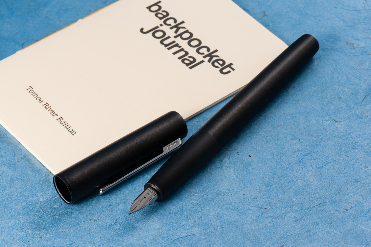
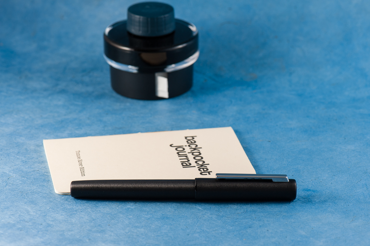
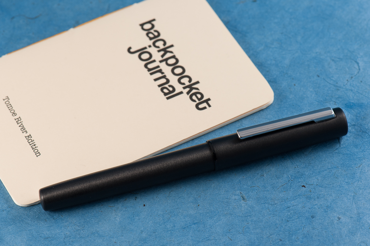
The Aion beside a Curnow Backpocket Journal. A Lamy ink bottle in the background.

EDC-ness

Katherine: The snap cap is super convenient. And makes a nice clicky sound. Click click. Definitely an EDC-able pen, but wouldn’t be my go to for the reasons listed previously.

Pam:  I would have no problems taking this pen around at work given it’s sturdiness and snap cap.  It harkens back to the days (and present time) of how I prefer snap caps and fast access to jot things down at work.  It’s weight also is a good reminder that it’s in your pocket or the fact that it’s not, if you are forgetful like me.

Roz: The Aion fit well in my carrier, but was a bit too heavy for me to wield throughout the day. What I did enjoy doing was sitting and writing with it for a solid chunk of time.

Franz: Before we decided to review the Aion, I’ve used it at work for about two weeks. The quick deploy of the snap cap, the spring loaded clip for the shirt pocket, and the black finish made for a distraction-free every day carry pen. I’m only wishing it had a fine nib because there were times when the line width was too thick for the cheap copier paper we use at work. I also used the Aion with my Curnow Backpocket Journal. Now that juicy medium nib was perfect for the Tomoe River paper in that journal.

The Aion is filled via either the Lamy cartridges or the supplied Z26 converter. During my two weeks of use, I refilled it three times. I did miss my Lamy 2000’s piston filler capacity but it’s far from being a deal breaker.


Final Grip-ping Impressions

Katherine: Lamy pens and I don’t really seem to get along and the Aion is no different. But, all of my gripes are very subjective — if you like the smoothness of Lamy nibs and the aesthetic agrees with you, there’s no (surprise) reason you won’t love this pen. It feels well made and finished.

Pam:  I haven’t been this excited over a “less than $100” pen in a long time.  If you are looking for an upgrade to your Lamy Safari and enjoy the more industrial, minimalist design, this is the pen for you.  If you enjoy writing with a sturdy, metal pen at a very reasonable price, this is the pen for you.  If you don’t want to spring for the Lamy 2000 (yet) and wonder what else Lamy has to offer after the Safari or Studio, this pen is worth a shot.  Honestly, in this price range, there aren’t that many pens I could recommend over the Lamy Aion with the features mentioned throughout this post.  My only reservation is on the bulky cap, but in terms of writing experience, I have no complaints.

Roz: I *really* enjoyed this pen, everything about it. I think I’m going to put this at the top of my pens-to-get-soon list 🙂

Franz: The Lamy Aion is a knockout pen. Period. =)

It’s a very unassuming pen that brings great value. I love using this pen and will be inked up in rotation quite a few times. I kinda wish they had more color choices though. If they come out with other colors other than black, and silver, I’d probably get another one.

Within the four of us, we have different hand sizes and we found it a comfortable pen to write with. So the Lamy Aion is definitely a pen you should try to write with!


The cap and barrel finials are circular and simple.

Pen Comparisons

Closed pens from left to right: Platinum 3776, Pilot Vanishing Point, TWSBI Eco, Conklin Duragraph, *Lamy Aion*, Lamy 2000. Pelikan M805, and Lamy Safari
Posted pens from left to right: Platinum 3776, Pilot Vanishing Point, TWSBI Eco, Conklin Duragraph, *Lamy Aion*, Lamy 2000. Pelikan M805, and Lamy Safari
Unposted pens from left to right: Platinum 3776, Pilot Vanishing Point, TWSBI Eco, Conklin Duragraph, *Lamy Aion*, Lamy 2000. Pelikan M805, and Lamy Safari

Pen Photos (click to enlarge)
1 Comment

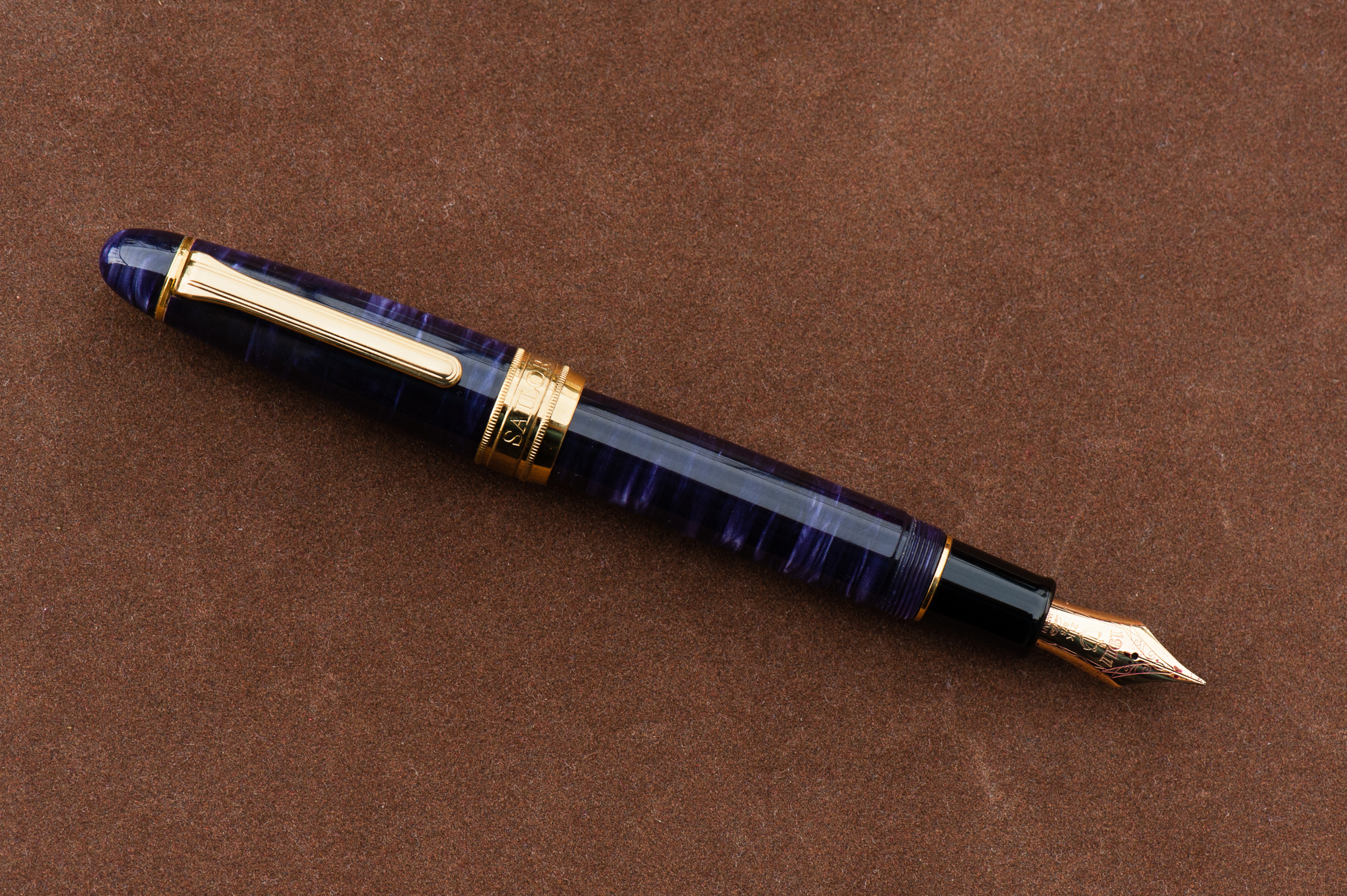
Review: Classic Pens LB5 (Tairiku in Amethyst Mauve, Broad Nib)

HOTP Editorial: Please note that the Classic Pens LB5 were limited edition releases from 2012 and since then has been unavailable for sale from their authorized retailers. The LB5 pen can occasionally be found for sale in the secondary market, or at a pen show. Granted that because this is a limited edition pen, this may only happen a few times and far in between.

This review, and our pen blog is primarily focused on providing a point-of-view (or is it a grip-of-view?) from different hand sizes as well as compare the LB5’s size against other more common pens. Thank you for reading our thoughts and reviews!


Hand Over That Pen, please!

Katherine: This is a very sizable pen made out of a very unique and interesting material. The something or another fancy acrylic has a lot of depth, in a way that is totally unique from celluloid or other acrylics. I really like how this pen looks — I just wish it were smaller.

Pam: Holy nightstick Batman! That’s how big this pen is (at least to me). It’s one of the most notable features of the pen. The second thing that I noticed of this massive beauty is the material.  The material has a lot of surface area to show off it’s depth and iridescence.  Pictures can’t do this pen justice. One of my favorite materials of the LB 5 is the purple.   The overall aesthetic of the pen is very much a classic shape with the traditional gold trim.  However, maybe it’s the size or the material, but I wouldn’t consider the aesthetic of the pen to be “vintage” looking.

Franz: CHATOYANCE! Pardon my French. An over-sized pen with a beautiful acrylic material? Please tell me more!

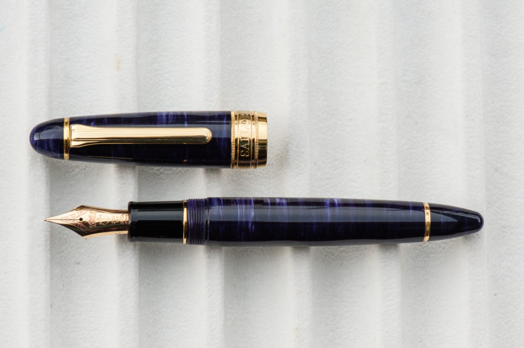
The Classic Pens LB5 is an impressive pen to behold. Their unique material lures you in and the Sailor King of Pen nib performance keeps you coming back for more. As the blog photographer for HOTP, I tried my very best to show the beauty of the LB5’s material but nothing beats seeing it in person.

In the Hand: Classic Pens LB5 (posted) – from left to right: Franz, Katherine, and Pam
In the Hand: Classic Pens LB5 (unposted) – from left to right: Franz, Katherine, and Pam

Background Info: Classic Pens was established in 1987 and has been known for collaborating with other pen brands, and artists to introduce stunning limited edition art pens. The pen in review is part of the LB Collection wherein LB is an acronym for Lambrou and Brown. Andreas Lambrou and Keith Brown are the two founders of Classic Pens. The LB5 series was introduced in 2012 and 2013 to commemorate the company’s 25th year anniversary and was aptly named, Classic Pens LB5 25th Anniversary Shizen (Nature) Pens.

The unique acrylic was made by two companies. First, Sintetica from Italy cast the sheets of pearlized acrylic and then Carville from the United Kingdom used an exclusive diffusion bonding technique to bond multiple sheets together and made the material more stable. The acrylic was then sent to Sailor Pen Japan to each be turned into a King Profit (King of Pen) pen. A difference to be noted is that the LB5 was made 5mm longer than the King Profit pen. And the pen was fitted with a 21-karat King Profit nib. The nib sizes offered were either a medium, or broad. There were a few Nagahara Cross Point nibs available at a premium price.

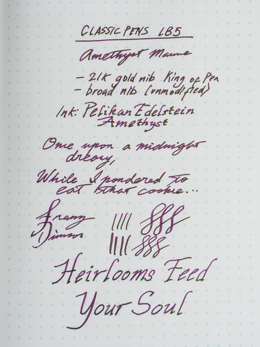
The LB5 was manufactured in six different colors: Tensui (raindrops) in Space Blue, Kaen (violent flames) in Flame Red, Midorigi (new green trees) in Forest Green, Tairiku (continent) in Marble White, Kouseki (metal ore) in Diamond Brown, and Tairiku (continent) in Amethyst Mauve which is the pen we are reviewing. This limited edition was issued only with 50 pens in each color. with a listed price of $1,600 in 2013. Important to note that in recent years, Classic Pens changed their name into Lambrou Pens.

close up of the cap’s acrylic


The Business End

Katherine: I’ve tried LB5s with both an unmodified Medium and a Broad Cursive Italic, both were lovely. The first time I tried it, I was surprised by how soft and bouncy the nib was. I loved writing with it, though it is a monster of a nib. I tend to hold my pens pretty far forward, and the size of this nib means I hold it at the very lip sometimes. Not a problem, but an observation.

Pam: This nib is a Sailor nib, so it’s perfect. Actually, it’s not the typical size of the Sailor nibs that we know and adore so well. Like the pen, it’s bigger!  With the extra size and material of the nib, comes with more bounce. Perhaps, it’s my natural bias to love all things Sailor but I really enjoyed the “oversized” nib with the “oversized” pen.  (Oversized is in quotes because I know it’s the perfect size for bear paws.) Oddly enough, I felt that this nib was proportional to the pen and performed extremely well. It was a smoother nib than I expected and I didn’t feel the pencil-like feedback that Sailor nibs are known for.

Franz: The LB5 is made by Sailor so naturally, the nib used was their King of Pen line. As Pam mentioned, the size of the KoP nib was balanced against the larger size of the LB5.

Most Sailor nibs write perfectly out-of-the-box and this was no exception. The unmodified broad nib wrote smoothly and had a bit of bounce to it. The 21-karat KoP nibs are not meant to be used for flex writing but its springiness provided a little flair to my writing. As shown in the second photo below, the LB5 section is comparable to other over-sized pens and was comfortable for my grip.

Sailor King of Pen Broad Nib
Over-sized nibs from left to right: Classic Pens LB5, Wahl-Eversharp Decoband, Pelikan M1000, and Montblanc 149
Franz’ writing sample on a Nanami Crossfield Journal

Write It Up

Katherine: This pen is a littttle too large for me. It’s usable, but if I grip it tightly, my hand ends up pretty tired. If I grip it loosely though, it’s great! A fun nib in a pen that’s beautiful. Unfortunately, though, I tend to be a not-loose gripper by default, so I don’t think this pen will ever be a favorite for journaling.

Pam: The pen is easier to write with the tripod grip. My “iron fist” grip had the larger pen feel unbalanced.  The tripod grip being a “secondary grip” for me did tire out my hand, however the width of the pen was still very comfortable in either grip.  The threads were not sharp so I wasn’t so worried about my “iron fist” grip getting too uncomfortable.  If only my hands were larger, this pen would be much more comfortable.  This pen would be great for the “normal” or medium hand size.  (Just not pixie hands.)

Franz: The bear paw… I mean, my hand wrote with the LB5 effortlessly in both posted or unposted modes. As mentioned earlier, the LB5 is 5mm longer than the “standard” Sailor King of Pen. This is because Classic Pens requested Sailor to lengthen the barrel to make the pen more comfortable to write with when unposted. I truly appreciate the extra length of the barrel and was sufficient for my larger hands. I do post the cap sometimes when i feel that I’d like the pen to be a little heavier and it was still a pleasant journaling session.


EDC-ness

Katherine: This pen is too large for me to EDC comfortably. I tend to stick my pens in notebooks sandwiches, or occasionally in my jacket pockets… and this is just too big. It’s like having a hot dog in your pocket. But, if you have larger pockets than I do, it seems up to the task. Solidly made, and takes about 2.25 twists to uncap, so solid but not too tedious.

Pam:  This pen is a bit too large for my pockets, whitecoat or jeans.  I would also not recommend being rough with this pen given that the material is so beautiful and may be scratched by keys.  This beast will need a home in a case.

Franz: Is the LB5 a good pen for Every Day Carry use? Well, it could be. As detailed by the two ladies above, it is a larger pen to bring along. When I used this pen at work, I had to make sure that the dress shirt I was wearing had a deep breast pocket and even then, it still stuck out semi-securely. I am able to conceal and secure the LB5 when I constantly wear a suit jacket at work though. Now for carrying cases, it barely fit in my Nock Co. Sinclair case that I use on the daily. It does fit nicely inside my Franklin-Christoph Penvelope Six case and is quite secure in my bag. The broad nib is a little too wet for the cheap paper used at work but I believe a medium nib would be perfect.

Just like most Sailor pens, it is a cartridge/converter filled pen so when I used this pen on the daily, I found that I needed to refill every three days or so. An advantage of the c/c filler is it makes the pen light weight instead of having a filling mechanism installed which potentially makes a pen heavier.


Final Grip-ping Impressions

Katherine: I can see why this pen is a grail for many, but the size just means it doesn’t work for me. I wish pen makers wouldn’t only make their flagships massive… It’s gorgeous, has a fantastic nib and has a really unique material. But, I prefer smaller pens. :/ Womp.

Pam:  I love the nib of this pen.  Unfortunately, this pen wouldn’t be balanced to have a small pen with a large nib.  I would highly recommend this pen to those who have the fortune of having a “normal” hand size and can find one of these pens looking for a new home.  The way I see, if both criteria are met, the stars have aligned and you are meant to have this pen. ;p (Wallet protests aside.)

Franz: As we have noted in the beginning of this review, the Classic Pens LB5 has long been sold out. If you are interested in the pen’s unique diffusion bonded acrylic, Andy Lambrou currently has another edition of limited edition pens in these acrylics. The Lambrou Pens LB6 Virtues is slowly being issued in seven different colors. This edition however is more limited since they are releasing only 10 pens in each color.

My final thoughts on the LB5? I am channeling the thoughts of the people who had reviewed the LB5 before (Dan Smith, SBRE Brown, Matt Armstrong, etc.) when I say that, I love this pen! The Classic Pens LB5 has been a part of my Top 5 pens ever since I brought it home from the pen show. Why? Is it because: it’s a limited edition? the material? the pen size? the aesthetic? the value? the connection I have with the pen maker? I can’t specifically answer why but I feel that it’s the whole package that the LB5 delivers.


Pen Comparisons

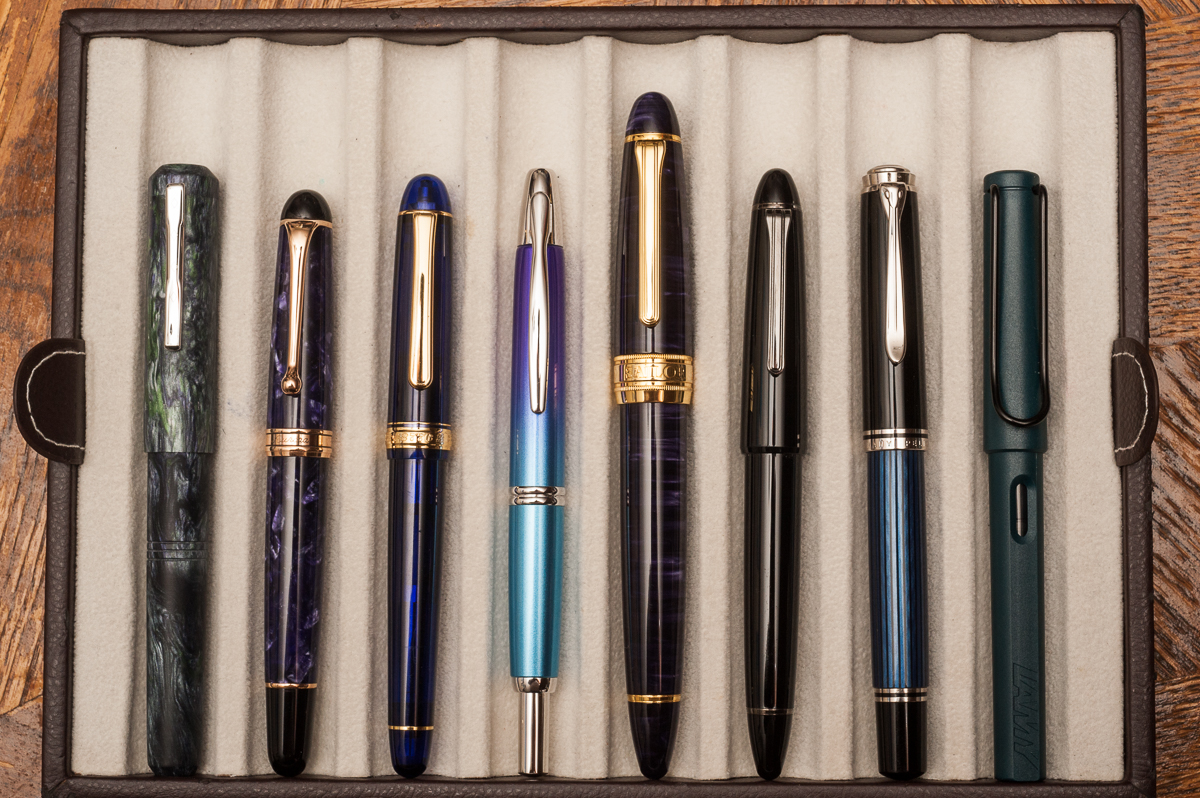
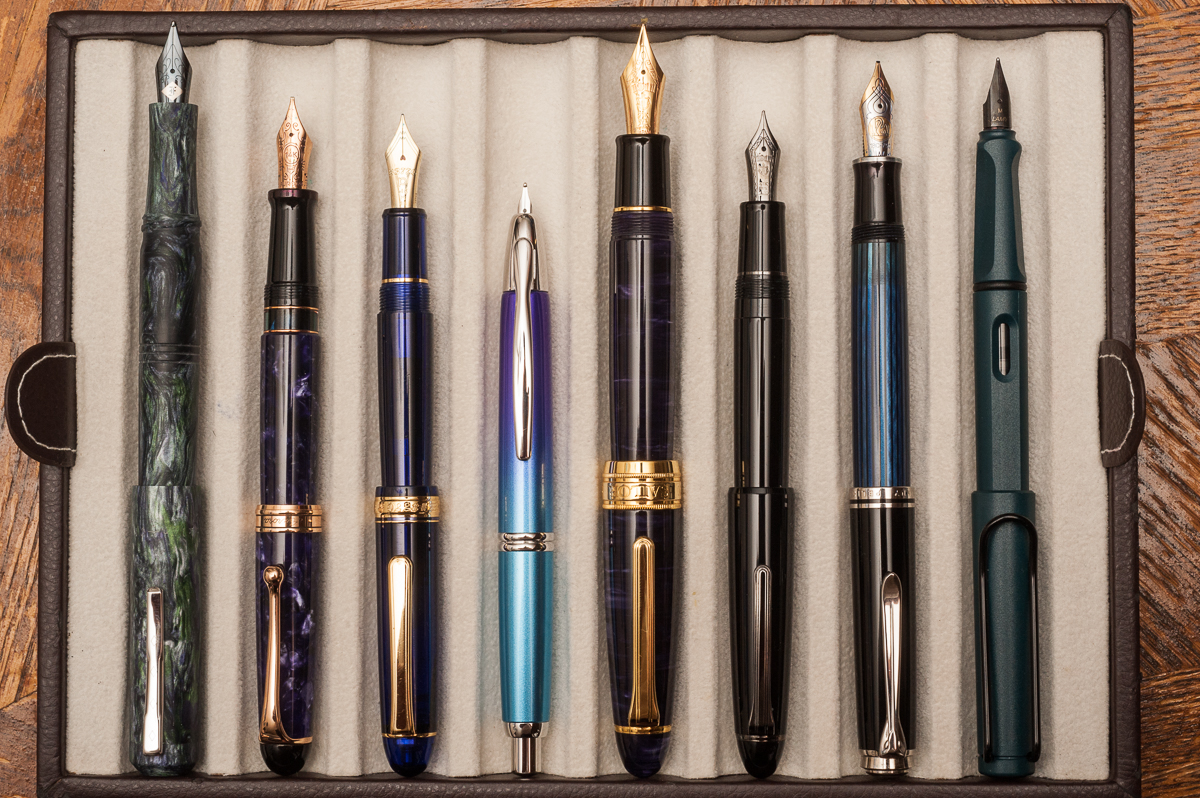
Closed pens from left to right: Franklin-Christoph Model 31, Aurora 88, Pilot Vanishing Point, *Classic Pens LB5*, Sailor 1911 Large, Pelikan M805, and Lamy Safari
Posted pens from left to right: Franklin-Christoph Model 31, Aurora 88, Pilot Vanishing Point, *Classic Pens LB5*, Sailor 1911 Large, Pelikan M805, and Lamy Safari
Unposted pens from left to right: Franklin-Christoph Model 31, Aurora 88, Pilot Vanishing Point, *Classic Pens LB5*, Sailor 1911 Large, Pelikan M805, and Lamy Safari


Pen Photos (click to enlarge)
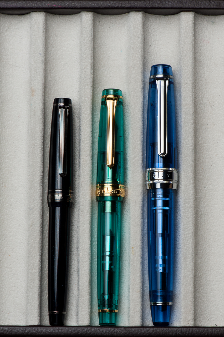
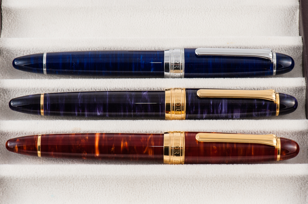
Closed pens from top to bottom: Tensui (raindrops) in Space Blue, Tairiku (continent) in Amethyst Mauve, Kouseki (metal ore) in Diamond Brown
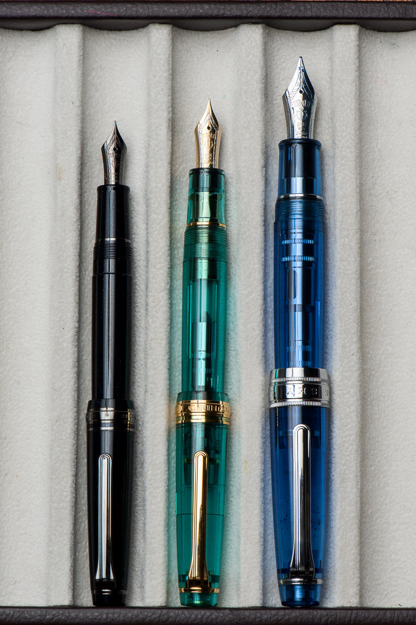
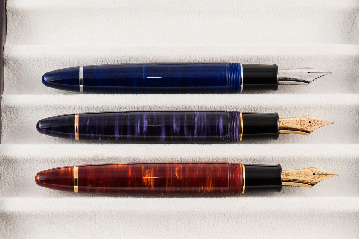
Unposted pens from top to bottom: Tensui (raindrops) in Space Blue, Tairiku (continent) in Amethyst Mauve, Kouseki (metal ore) in Diamond Brown
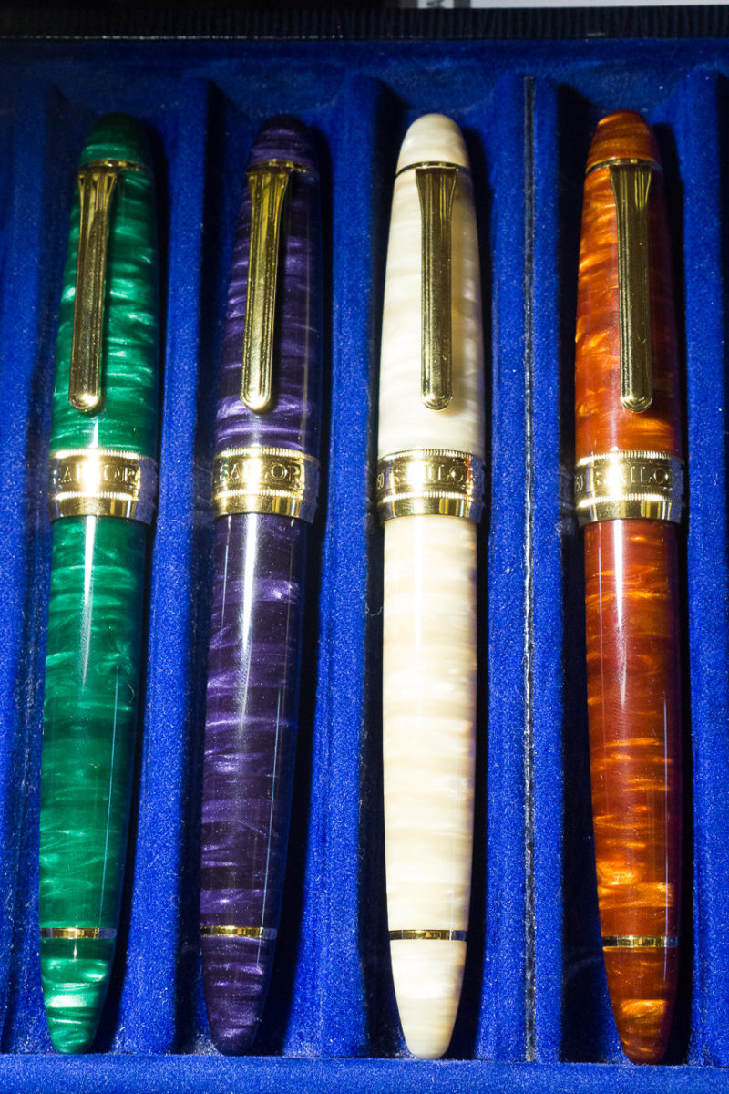
Closed pens from left to right: Closed pens from top to bottom: Midorigi (new green trees) in Forest Green, Tairiku (continent) in Amethyst Mauve, Tairiku (continent) in Marble White, Kouseki (metal ore) in Diamond Brown
1 Comment

Review: Kaweco Perkeo (Fine Nib)

Welcome to another one of our pen reviews! This time, we are joined by our second guest reviewer and she is also our first left-handed guest, Roz Hung.

Roz is a techie by profession and enjoys writing and sketching as well. She’s always admired fountain pens but was afraid to use them until Pam took her under her wing less than a year ago. Pam let her write with a few pens to see what she might like and own. Roz primarily uses her fountain pens for journaling, and scheduling on her planner. Currently, she’s also using her pens to sketch and doodle for Inktober and tries to keep up with the daily prompts for October. When Roz isn’t busy writing or drawing, she spends her time baking in the kitchen. Thank you for joining the fun and helping us out Roz!


Hand Over That Pen, please!

Roz: My first impression of the Kaweco Perkeo was how attractive and friendly its colors were. While the colors are solid and the pen has no sheen or gloss to it, I think the facets really give it a subtle eye catching quality.

Katherine: The Perkeo is a little weird to me. My initial reaction was “ooooh facets!” then “hm… the facets on the body and cap are different…” I like the colors overall, but have clear favorites.

Pam:  The Perkeo has a design that will appeal to both children and adults.  The cap of the Perkeo heralds back to the beloved Kaweco Sports that we all know and love.  The colors are eye catching and pretty sophisticated, in my opinion.  The faceted body is an ode to Kaweco’s overall aesthetics.  I am really impressed by this starter pen.

Franz: These Kaweco Perkeo pens fascinate me. It is a substantial pen compared to the Kaweco Sport and the colors may be subdued but at the same time they are enthralling. The fine facets of the barrel makes it an elegant looking pen and makes the Perkeo stand out.

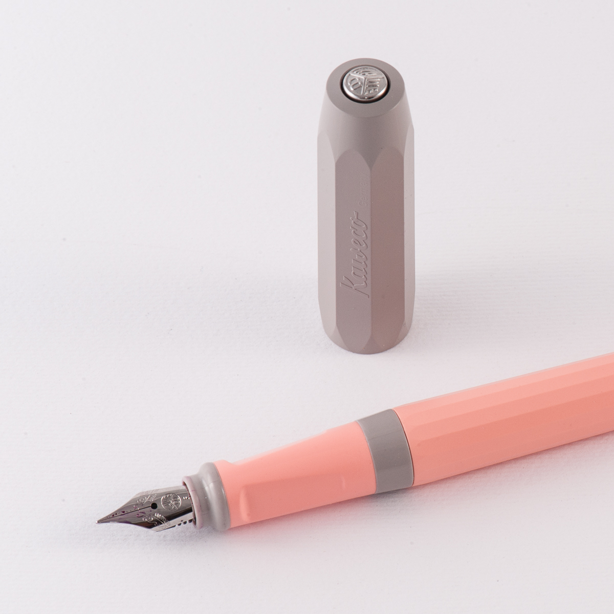
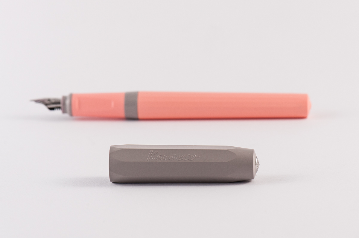
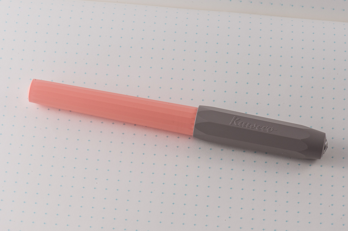
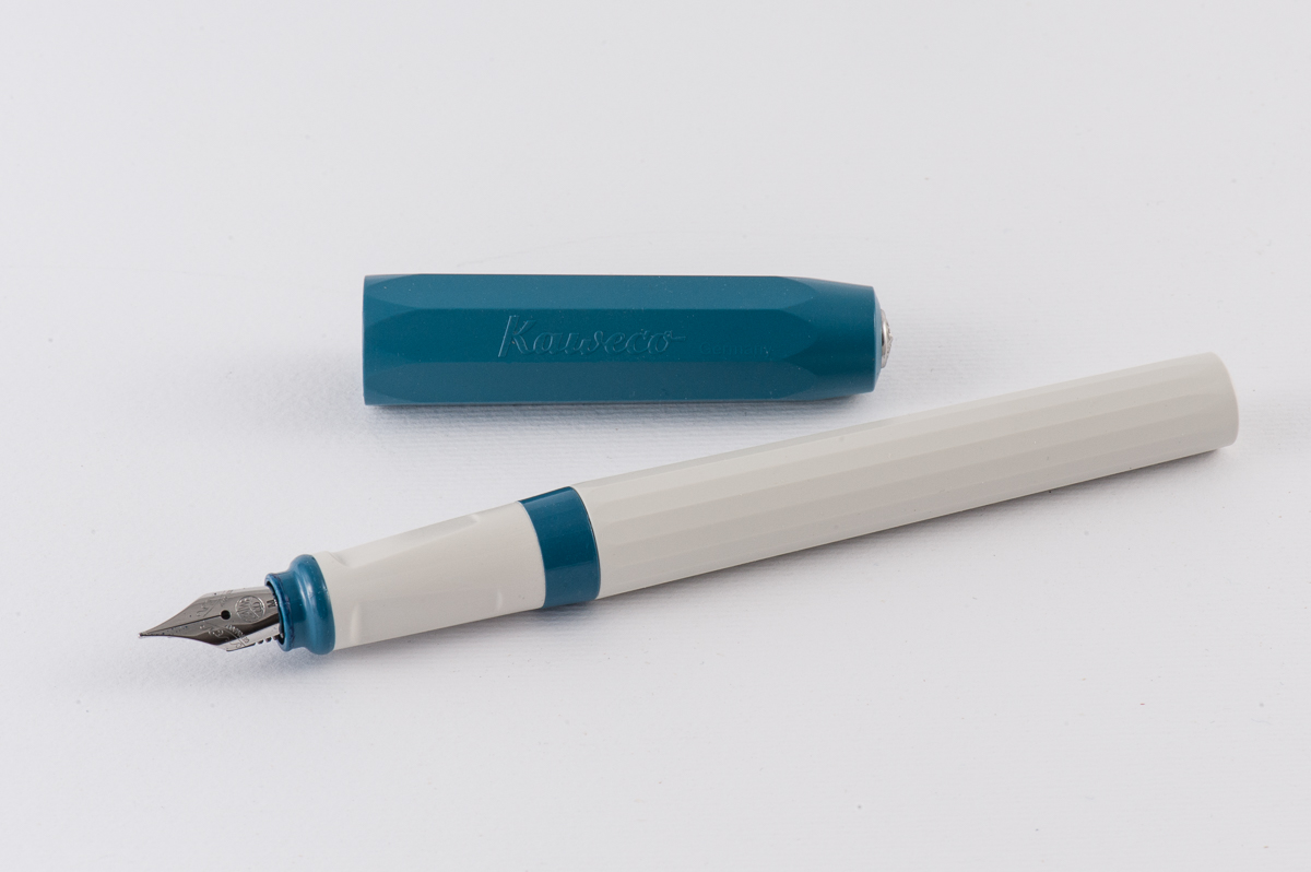
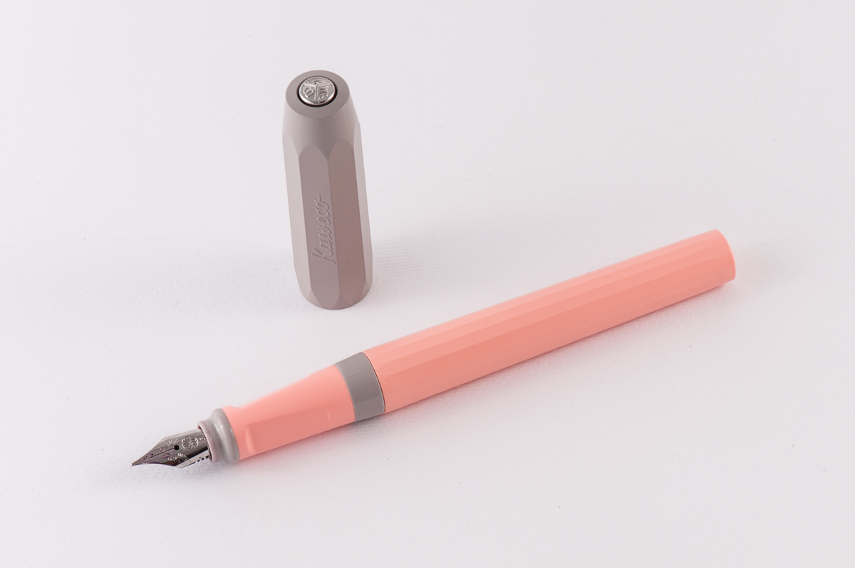
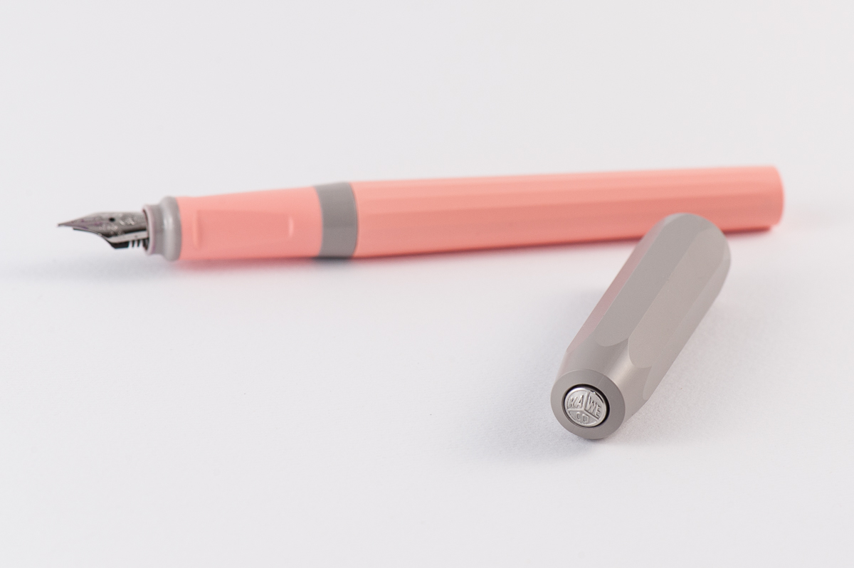
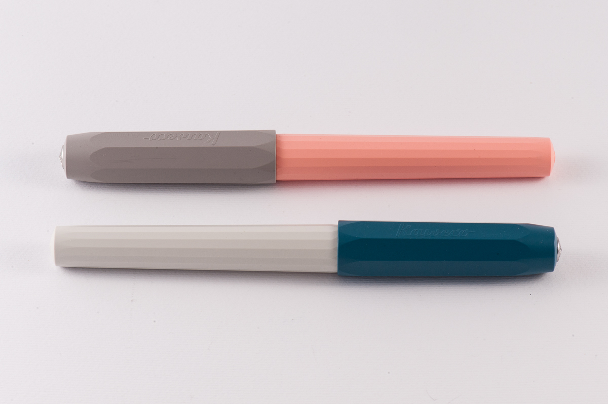
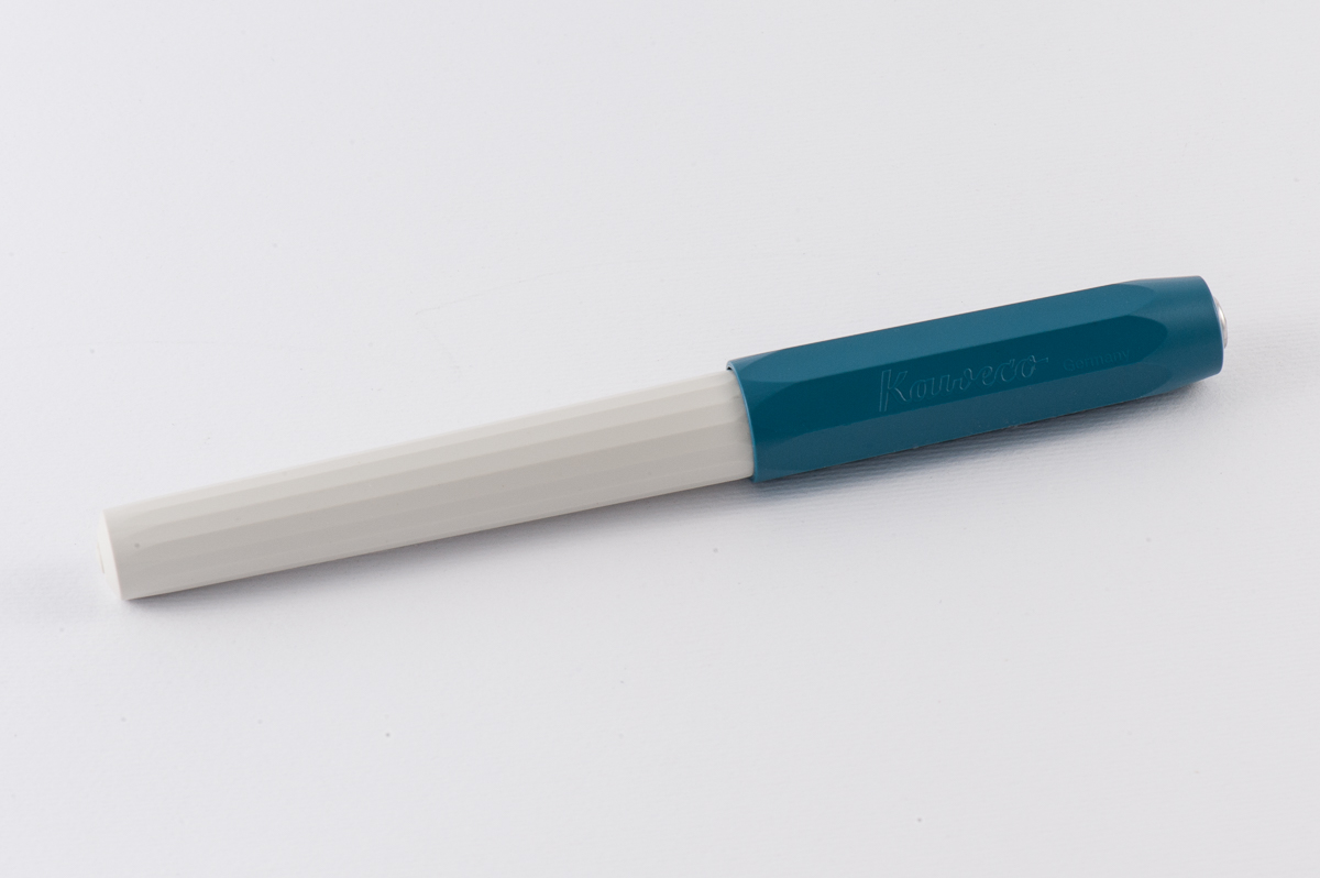
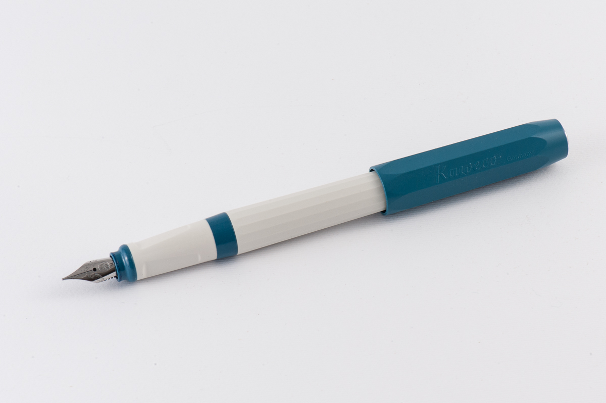
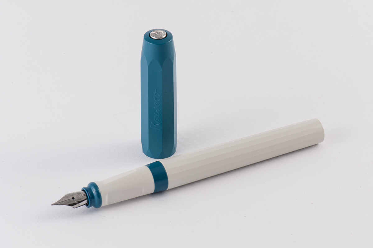
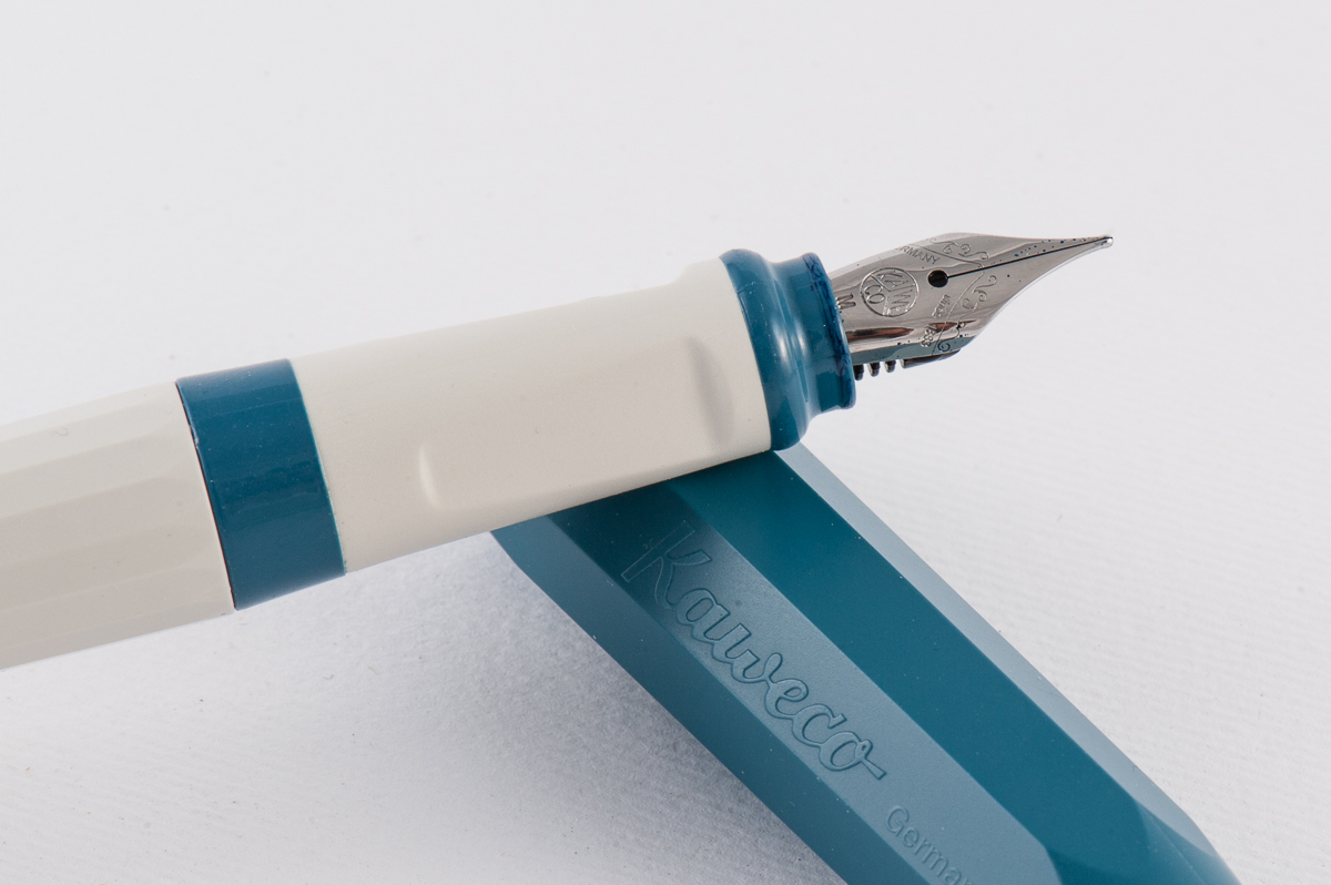
The Perkeo currently has four finishes: Indian Summer (black and yellow green), Bad Taste (pink and black), Cotton Candy (light pink and gray), and Old Chambray (white and light blue). As we expressed above, the Perkeo’s finishes are captivating and I’d like to add that Kaweco’s naming of these colors are equally intriguing. The Indian Summer and Bad Taste are both supplied with a black steel nib, and black finial. And both the Cotton Candy, and Old Chambray sports a chrome steel nib, and chrome finial.

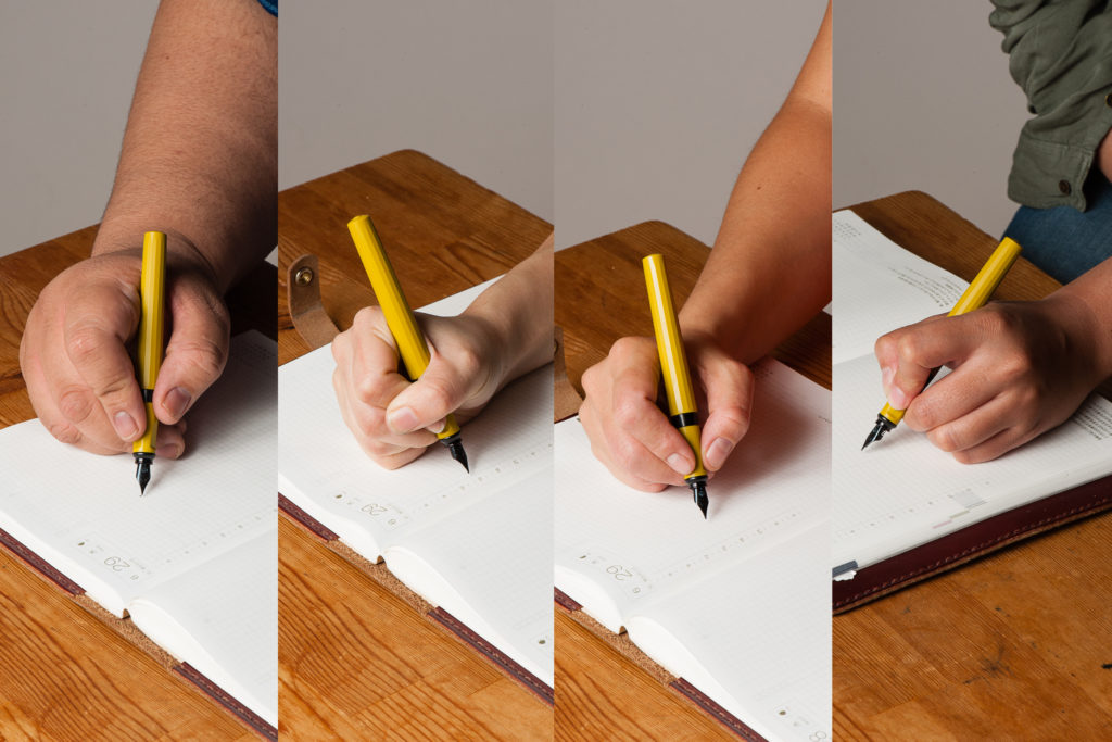
In the Hand: Kaweco Perkeo (posted) — from left to right: Franz, Pam, Katherine, and Roz
In the Hand: Kaweco Perkeo (unposted) — from left to right: Franz, Pam, Katherine, and Roz


Note: The Perkeo pen we used for the In the Hand photos above was the Indian Summer finish. During our review process, we focused on using Katherine’s Cotton Candy Perkeo shown below.

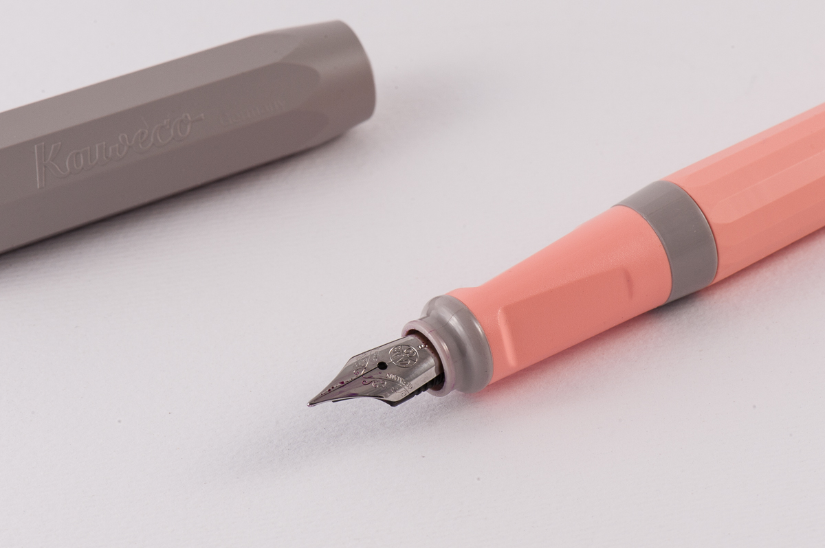
The Cotton Candy’s grey cap


The Business End

Roz:  I admit at the top of my lungs that I know nothing about nibs! However, I liked the line width of the Kaweco’s nib and I only needed to make minor adjustments to my horizontal tilt for a smooth writing experience.

Katherine: The variability on these nibs is surprising — my boyfriend and I each own one, and mine writes like a dry EF, and his writes like a wet Fine, even when inked with the same ink. Both are smooth and decent writers, but the variability in flow and tipping was surprising!

Pam:  For the times I “crave” for a “chubby” line width, I gravitate towards a Kaweco EF nib.  What I love about the Kaweco EF nib is that it creates a very round line that can sometimes compliment my writing style.

The ones that Katherine had were F nibs.  Unsurprisingly, they wrote well out of the box with no issues for me.   However, between the two pens that Katherine had for us to try out, I did notice a difference in the line width despite both pens being marked as F.  One was drier than expected and the other flowed quite well.  Aesthetically, the nib seems to be disproportionally too petite for a “regular” sized pen.  Or maybe that’s just me.

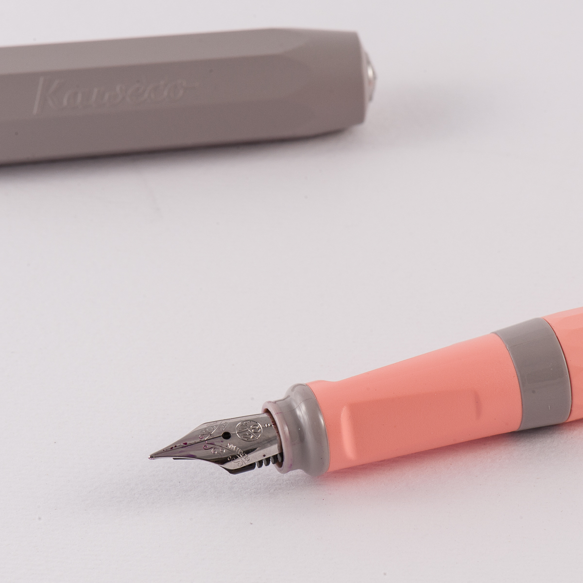
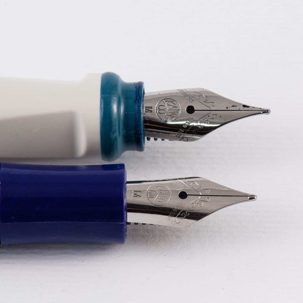
Franz: The nib on this Perkeo wrote with a very thin line width but it wrote immediately and quite smooth with minimal feedback for a fine nib. Visually, the nib is very slightly recessed and I initially thought that the nib was the same that Kaweco uses for the Sport model but I believe I was wrong. Side-by-side, the Perkeo nib is a size bigger than the nib on the Sport. The Perkeo is inked via a cartridge or a standard international converter and that makes it convenient since I have a few in my drawer.

Perkeo: fine nib
Nib Comparison: Kaweco Perkeo (above), and Kaweco Sport (below)


Write It Up

Roz:  I wrote as much as I could with this pen. The length of the Kaweco fit my hand nicely, and since it was so light I could write with it posted and unposted. My only (mild) struggle was with the triangular section. At the beginning, it would take me a bit to work my way to a comfortable grip on the section – after a few times of writing with this pen, I got to a point where only minor mid-writing adjustments needed to be made.

Katherine: I really expected to hate the Perkeo because it has a triangular grip, and the only other triangular grips I’ve used (and stronnnngly disliked) are the Lamy Safari and Jinhao x450, but surprisingly, I quite enjoy the Perkeo. Maybe it’s the shape of the triangular grip, or the angle or some other sorcery, but it’s a light comfortable pen for me. This is the “entry level” Kaweco folks should look at. I’m not sure why you’d buy a Sport anymore unless you want to carry it in your pockets. Or have a really small pen case?

Pam:  The Perkeo is pretty light, just like the acrylic Kaweco Sport, which is both an advantage and disadvantage in my book.  I find that in pens that are too light, I tend to bear down harder on the paper.  Yet for portability and journaling purposes, the weightlessness of this pen made it really easy to start and continue using with little fatigue (if I don’t bear down).  Interestingly enough, the disadvantage of weightlessness that I pinpointed on the Sport, was offset by the length and size of the Perkeo.  It was a joy to write with.

The triangular grip didn’t bother me very much since the corners were well rounded.  I find the triangular grip on the Perkeo to be more comfortable than the Lamy Safari with my grip.

Franz: Surprisingly, this is a pen that I can comfortably write with unposted for a long period of time. Posting the cap makes it a little long but the added weight definitely makes it better though. The Perkeo’s section is approximately the same width as the barrel and this let me grip the pen wherever I found comfortable. My fingers naturally landed right on the transition of the triangular grip as it ends toward the top of the section. I enjoyed approximately 20 minutes of writing on my journal and my hand did not cramp at all.

Kaweco Perkeo on top of a Nanami Crossfield Tomoe River page

EDC-ness

Roz: I kept the Kaweco in a Nock Lookout case and it did great! I actually did use it throughout my day, the lightweight feel of the pen made it easy to grab and made quick notes.

Katherine: I enjoyed this for the few days I carried it. It’s light, durable (yes, I dropped it. maybe intentionally) and the facets make sandwiching it in a notebook pretty secure — no worries about a rounded pen sliding out or shooting out of either end of my notebook (generally not a problem except with the fattest roundest and clipless-est pens though, tbh). And the lack of a fancy finish means it can go in a pocket with keys and come out looking the same!

Pam:  Other than a clip, this would a great EDC.  It doesn’t take much to uncap, it’s a postable pen (no lost caps!), and light! Again, some see the weight as a disadvantage, however, the construction of this pen should be able to stand up to a trip to the washing machine.  Ink stains not withstanding.

Franz: Using the Perkeo at work for 2 days was quite nice. It’s a no frills kinda pen that just wrote which is what an Every Day Carry pen should be. I placed the pen in my dress shirt pocket and for most of the time, it stayed upright. The length definitely made it easy to grab and not fish out of the pocket like a clipless Kaweco Sport or something similarly sized. The facets on the cap made sure the pen did not roll on my desk. And even if the pen was open and cap unposted, the pen did not roll away as long as I place it on the desk gently.

The snap-cap allows for quick usage when needed and provides a positive snap when you want to close it. The fine Kaweco nib was suitable for the not-so-stellar copier paper found in our office. And as Katherine described above, it passed the durability field test. Two thumbs up!


Final Grip-ping Impressions

Roz: I think the Kaweco is a really fun pen and I enjoyed trying it out. It was an easy writer (after some adjustments) and it fit my hand size quite nicely.

Katherine: I like it! It’s not life changing, but if the aesthetic suits you, it’s a light and totally reasonable pen. Mine is somewhat sentimental, so it’s sticking around, otherwise though, it isn’t a pen I likely would have purchased on my own… but it’s really hard to say no to your non-pen-enthusiast boyfriend wanting to get matching pens as you stand in a cute stationery store after having driven ten hours to see a total solar eclipse. So it’s my eclipse pen. (Except he got the yellow and black, which is eclipse-y themed. I have the pink and grey, which is more… rubber eraser themed)

Pam:  Honestly, the pen is a GREAT example of a starter pen for those who want to try out a Western sized nib.  For the price, the design and the nib performance, the Perkeo is a contender to be a great starter pen.  Will it surpass the Lamy Safari or the TWSBI Eco?  Maybe not, but depending on what you are looking for, why not try the Perkeo?

Franz: The Perkeo joins the ranks as one of the recommended starter pens. The only thing to consider is the fact that a converter is not supplied with the pen and is an additional expense. But hey, the Lamy Safari and/or Al-Star does not come with a converter either. I love that the Perkeo takes a standard international one!

Well, what else can I really say differently about the Perkeo that the three ladies above haven’t yet? Ditto? Hehehe… =) The bear paw likes it a lot! But seriously, if the colors appeal to you and you’d like to try an inexpensive pen with some facets, go get one of these. I for sure did and not just because it’s blue. =)

My Perkeo in Old Chambray finish. #ilovebluepens

Pen Comparisons

Closed pens from left to right: Conklin Duragraph, Franklin-Christoph Model 20, Pilot Prera, Pilot Metropolitan, *Kaweco Perkeo*, Kaweco Sport, Pelikan M805, and Lamy Safari
Posted pens from left to right: Conklin Duragraph, Franklin-Christoph Model 20, Pilot Prera, Pilot Metropolitan, *Kaweco Perkeo*, Kaweco Sport, Pelikan M805, and Lamy Safari
Unposted pens from left to right: Conklin Duragraph, Franklin-Christoph Model 20, Pilot Prera, Pilot Metropolitan, *Kaweco Perkeo*, Kaweco Sport, Pelikan M805, and Lamy Safari

Pen Photos (click to enlarge)
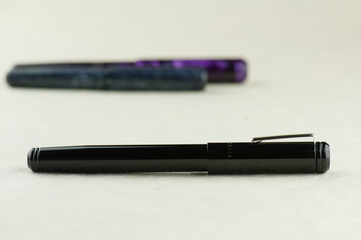
3 Comments