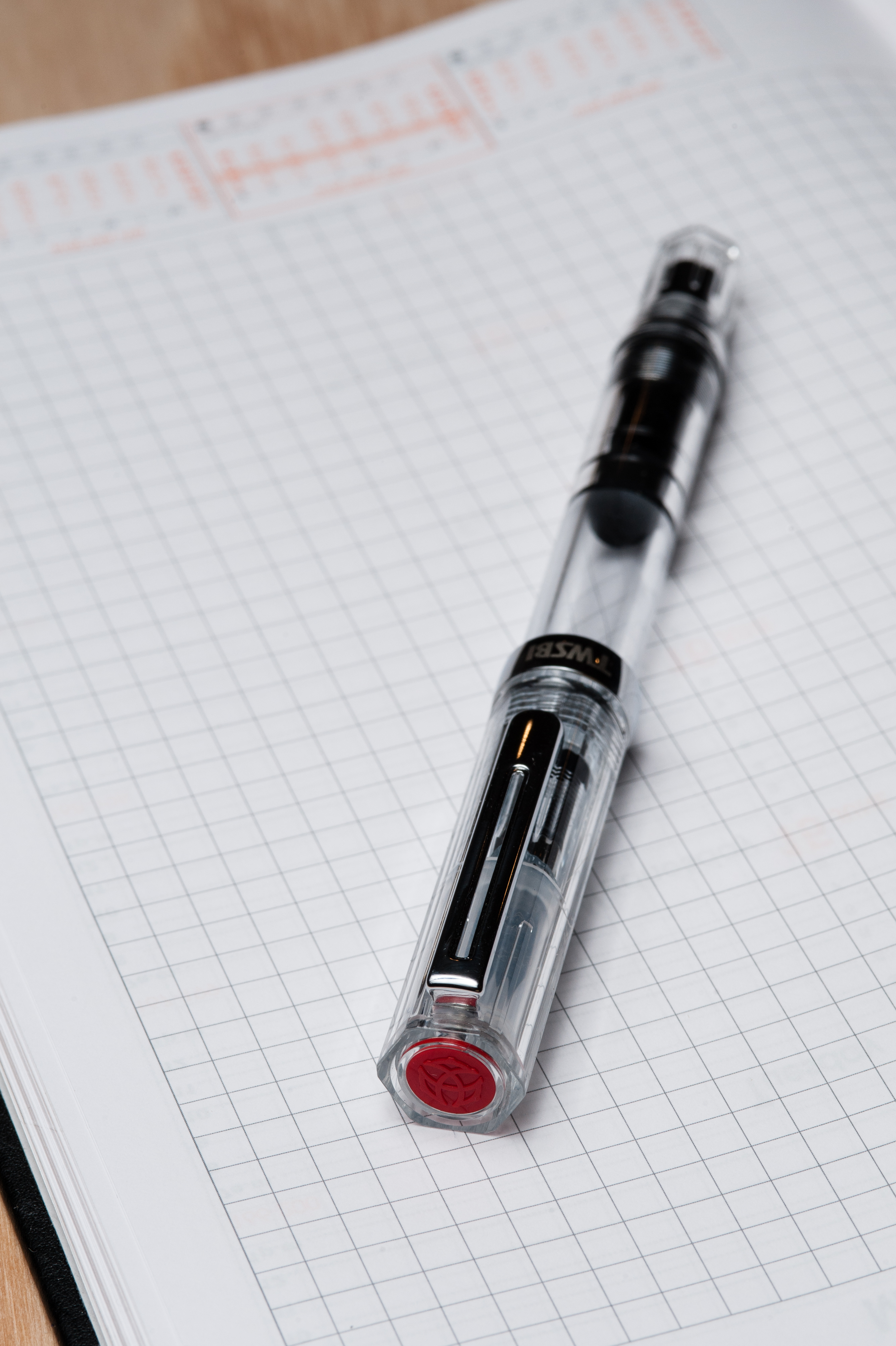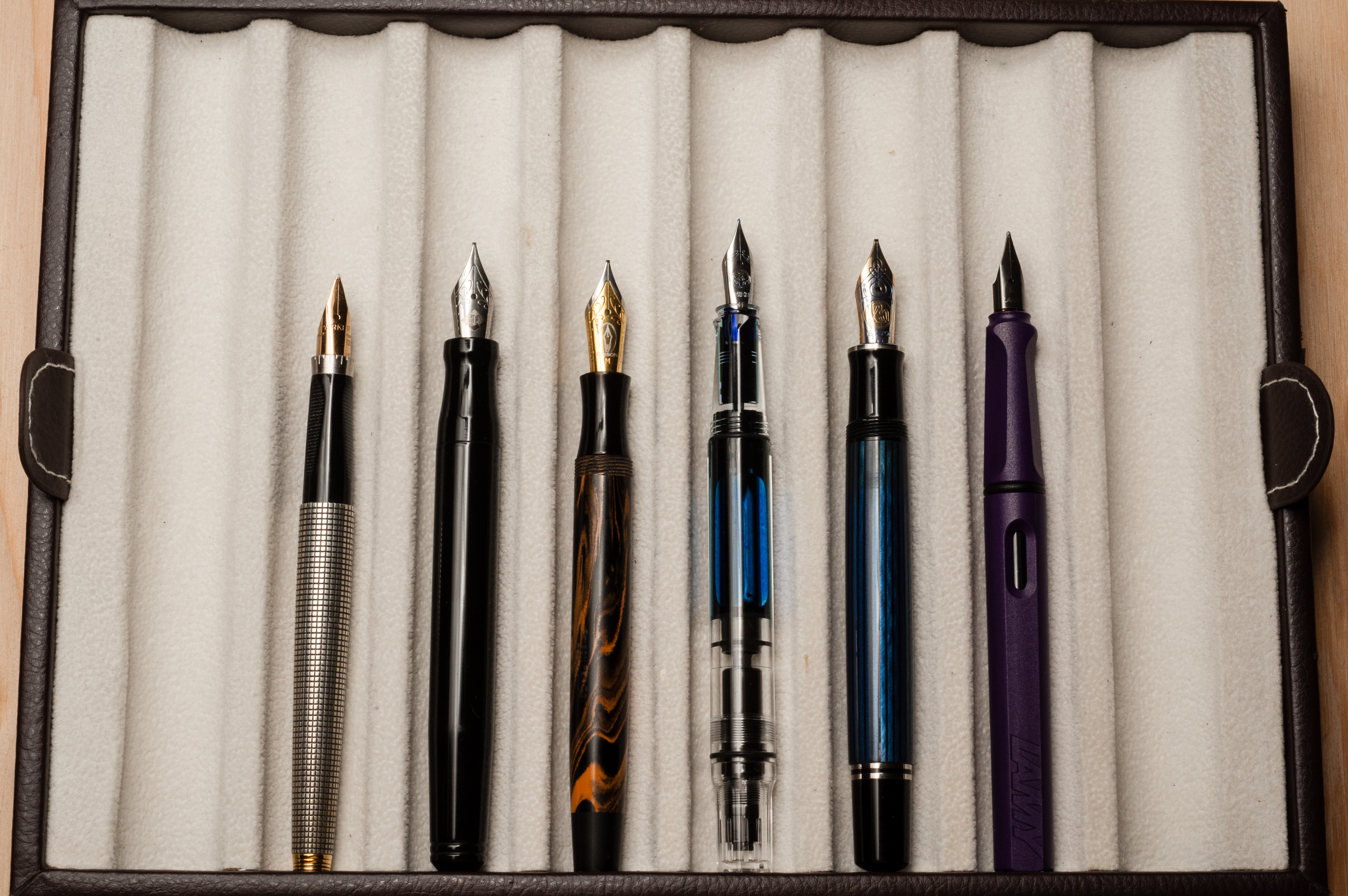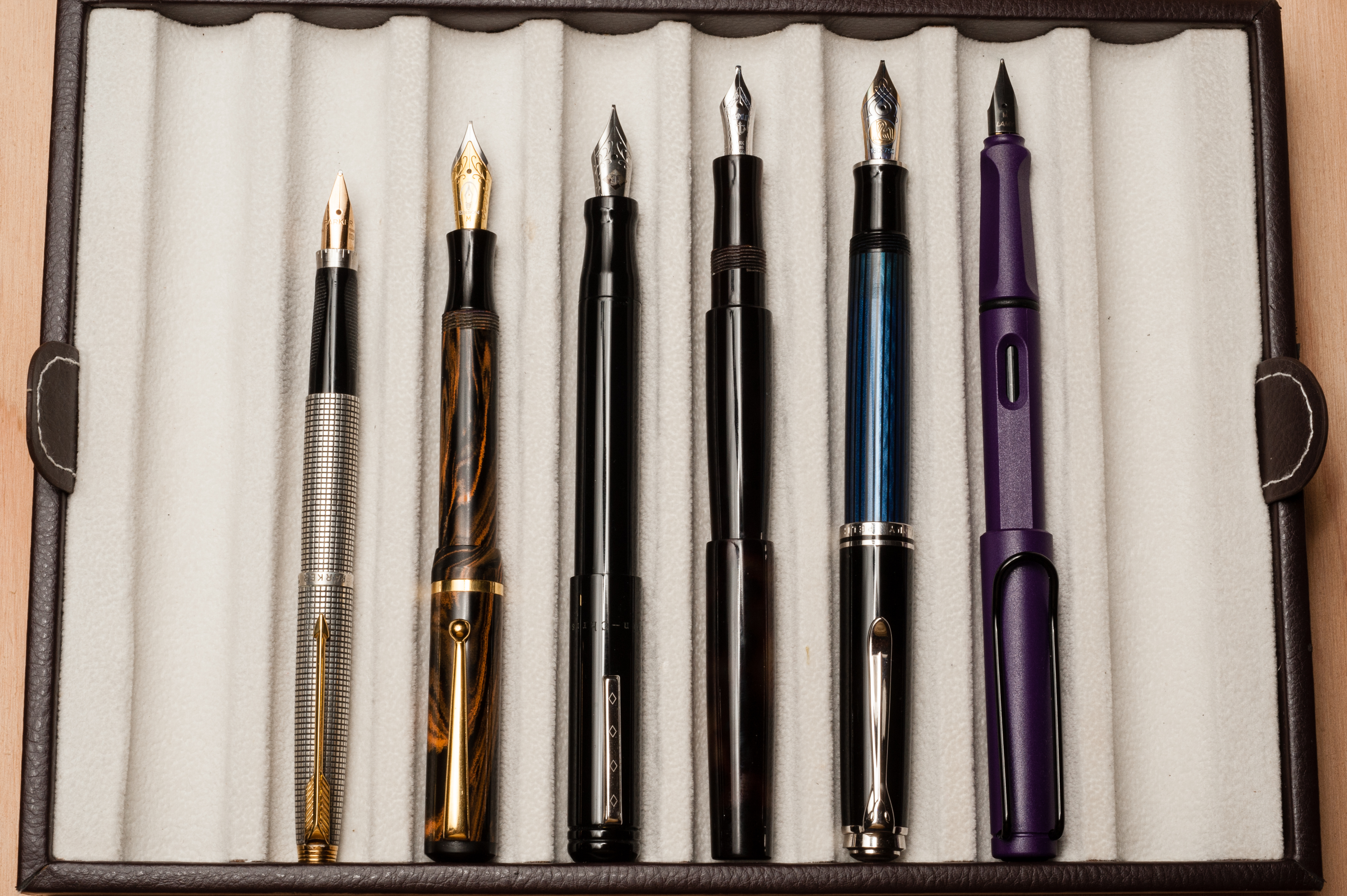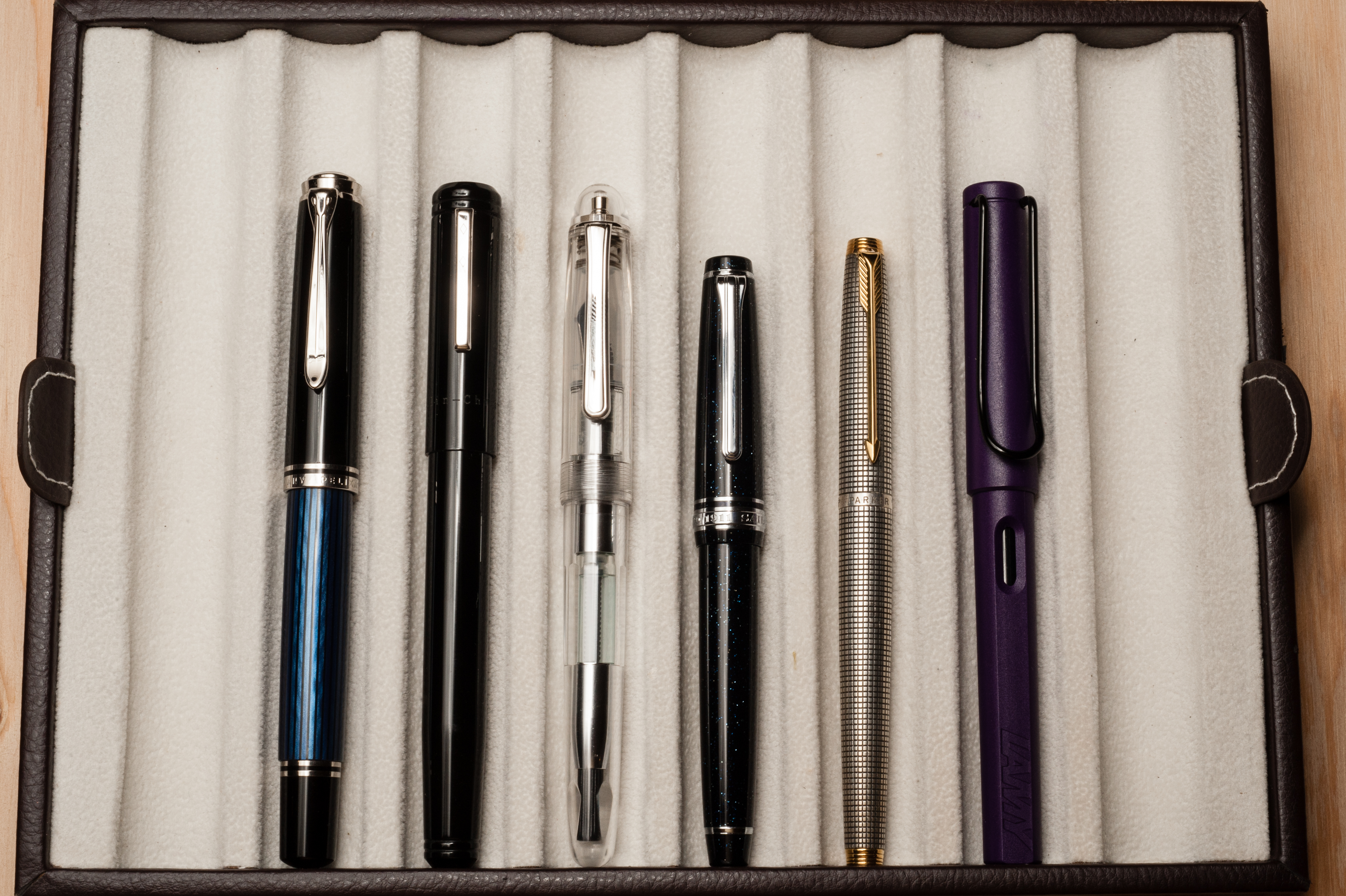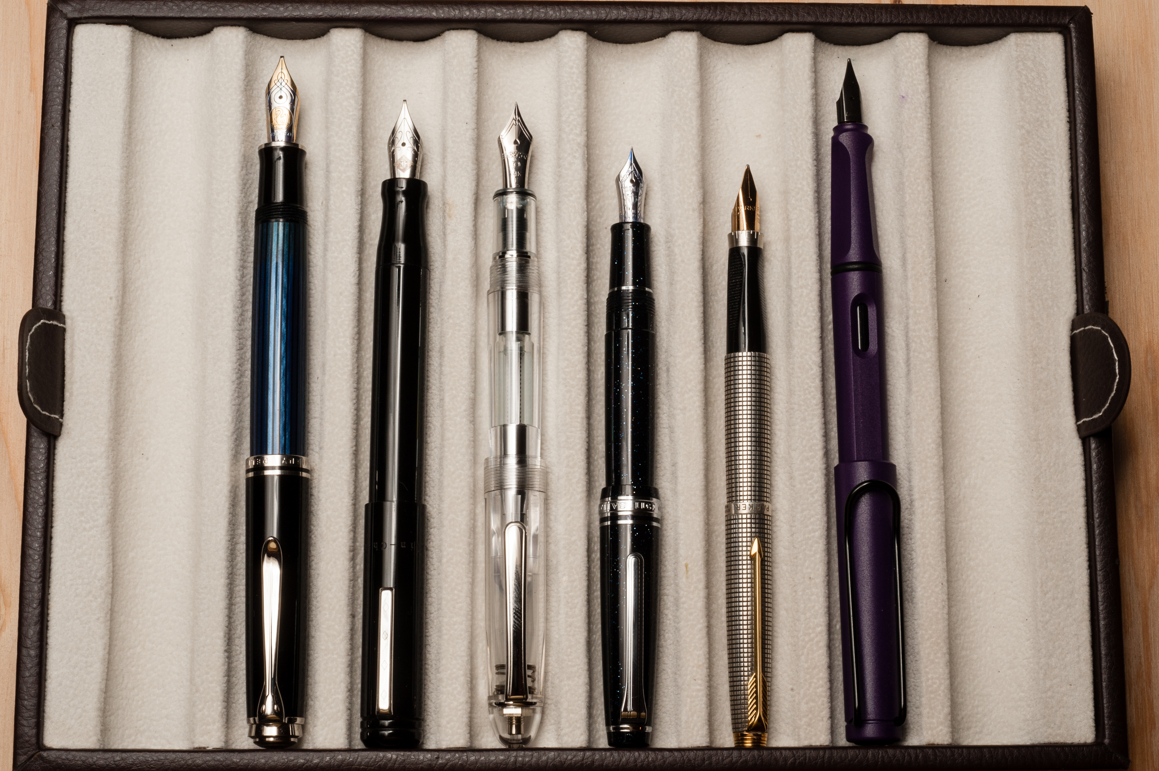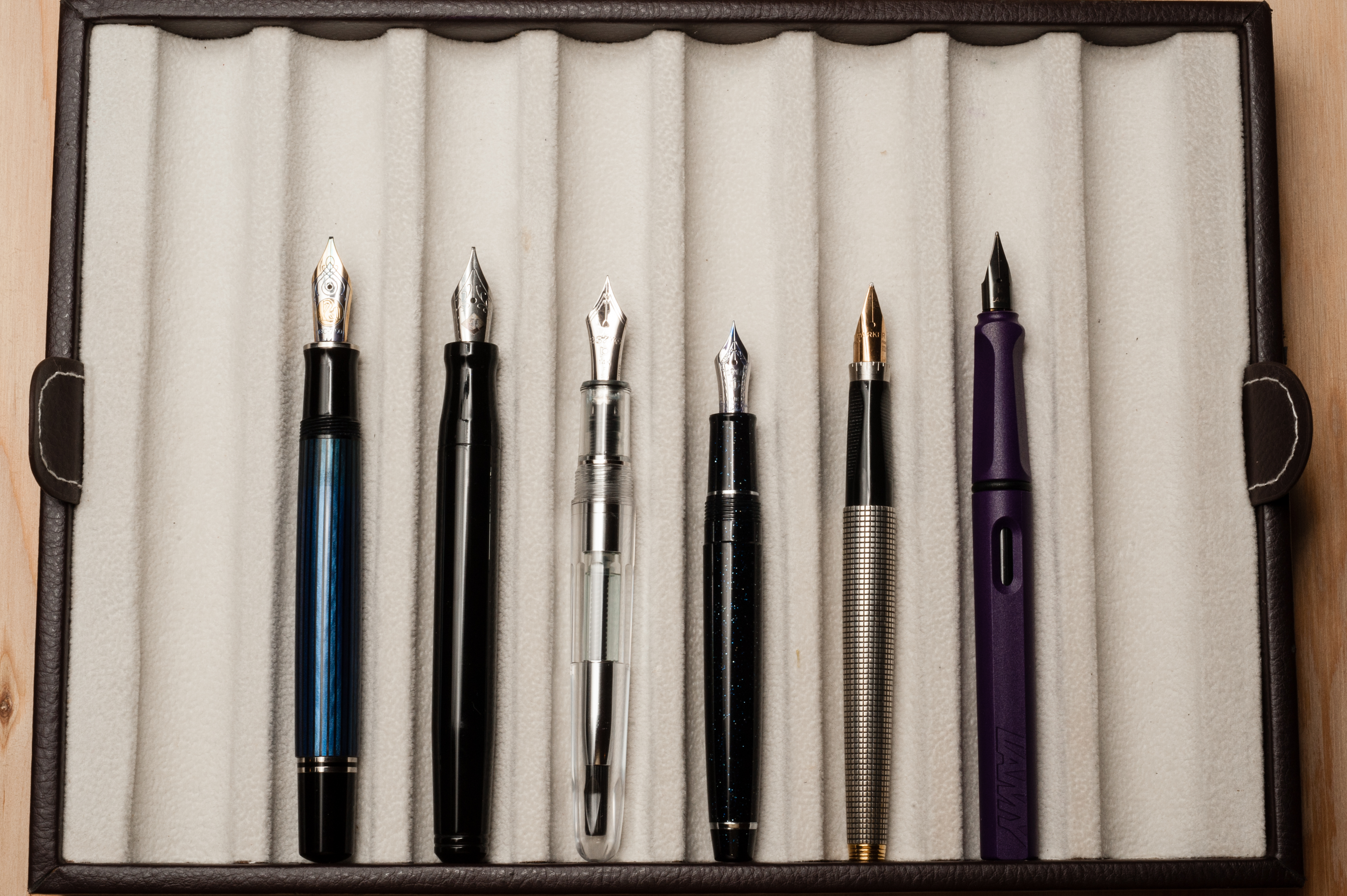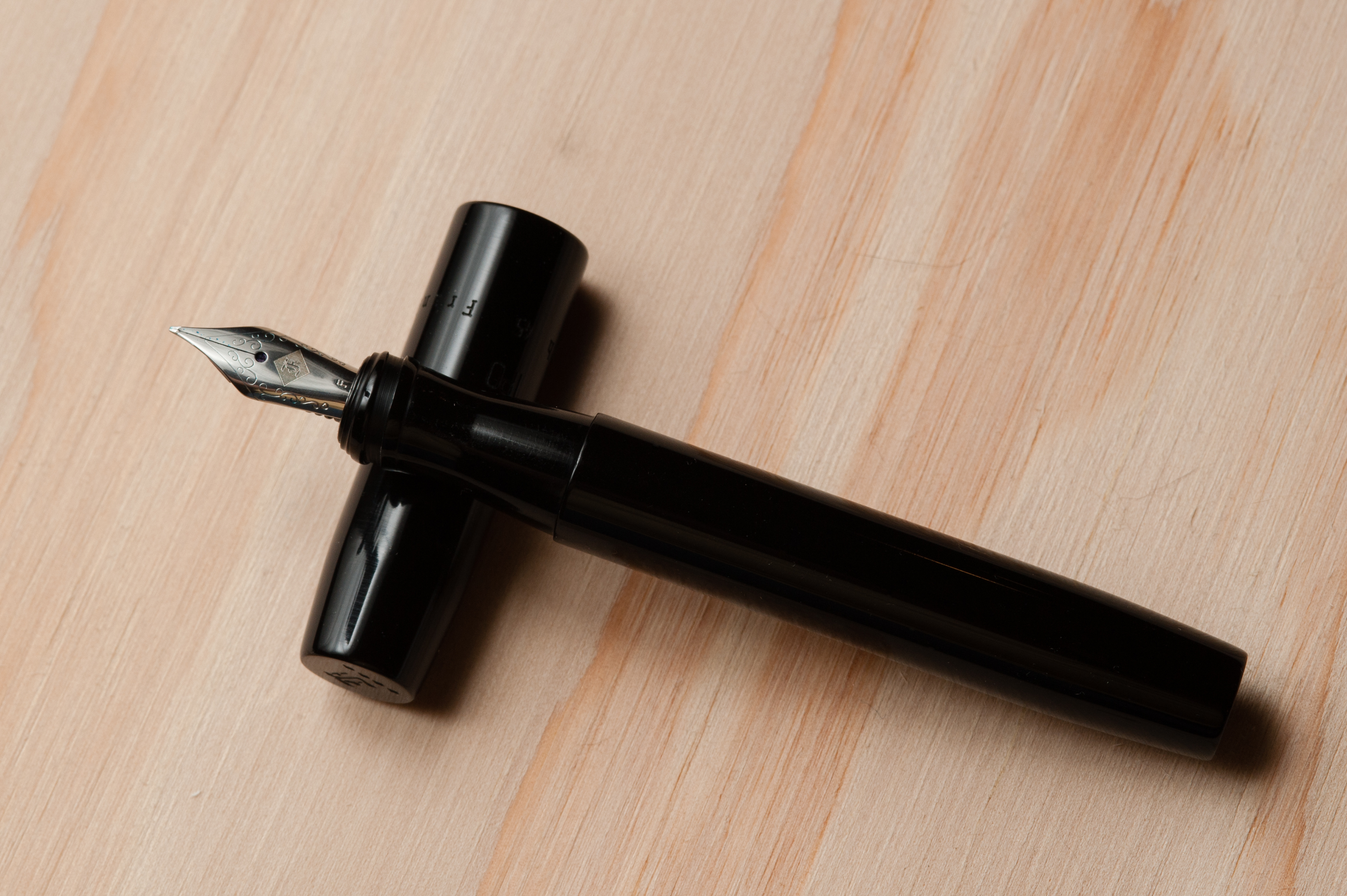
Hand Over That Pen, please!
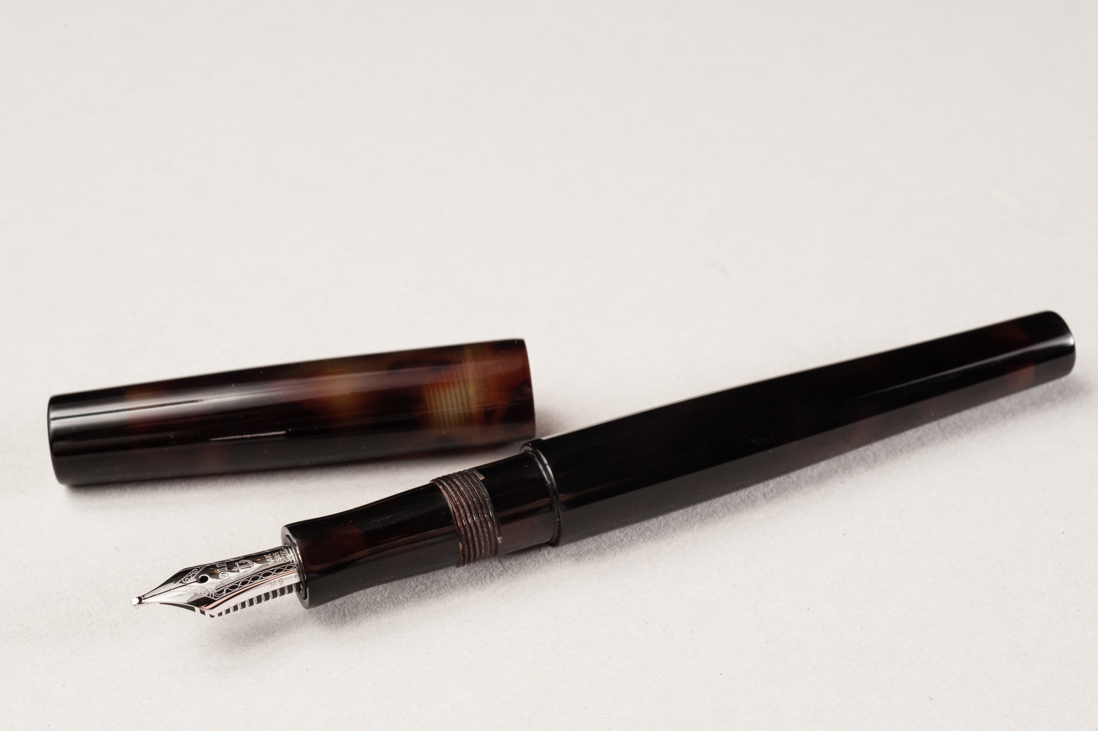
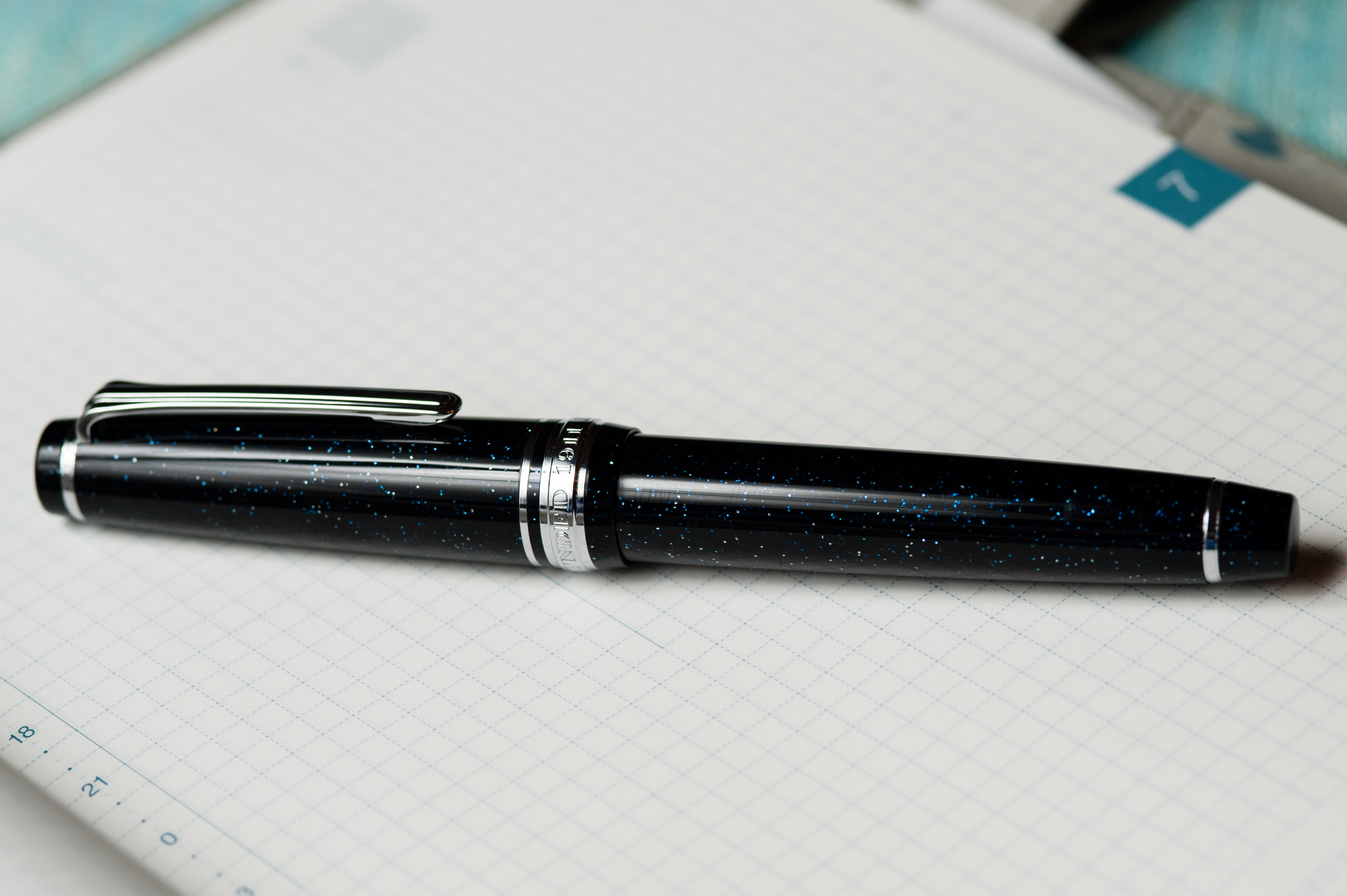
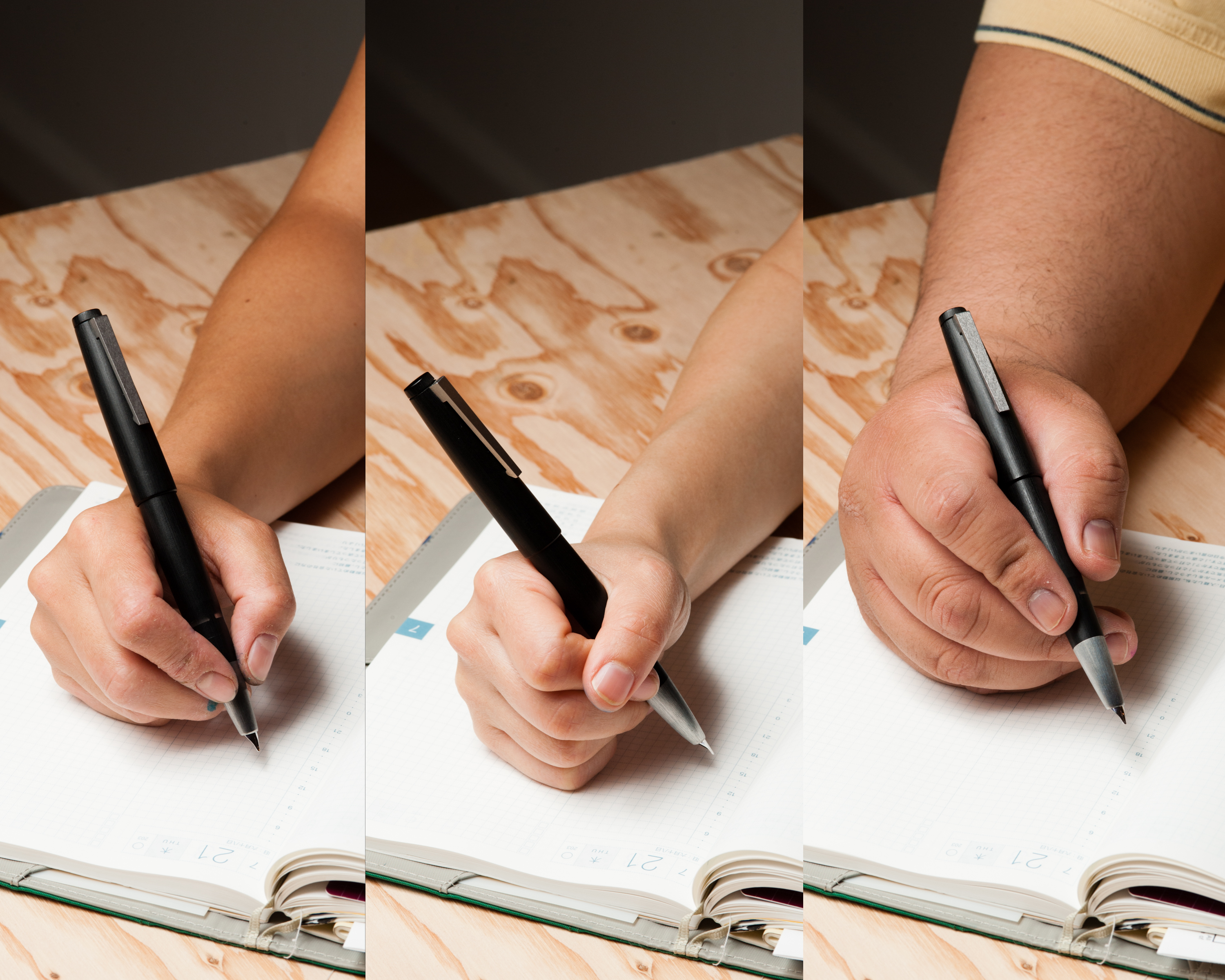
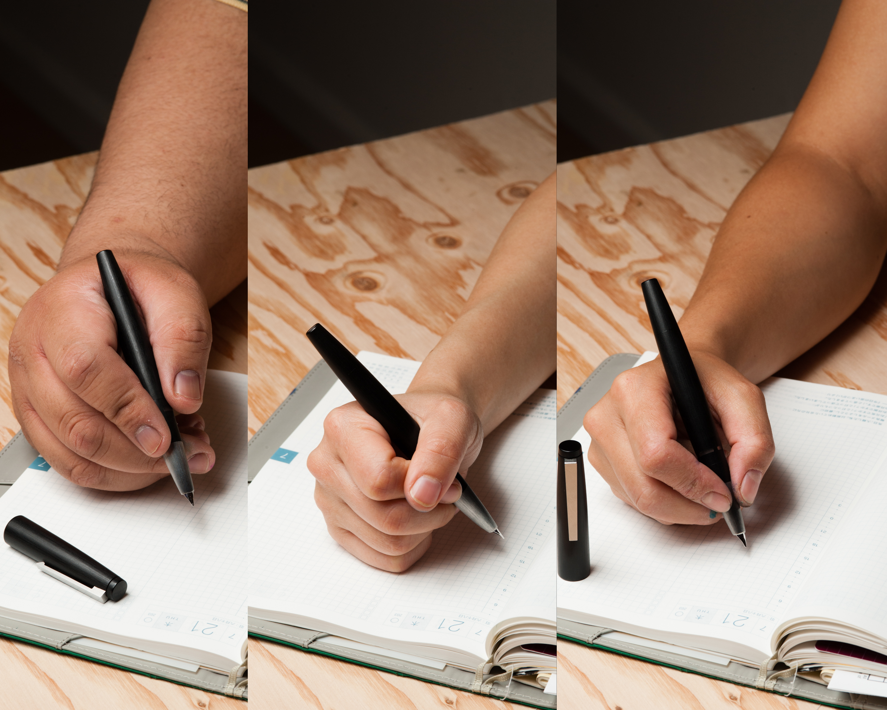
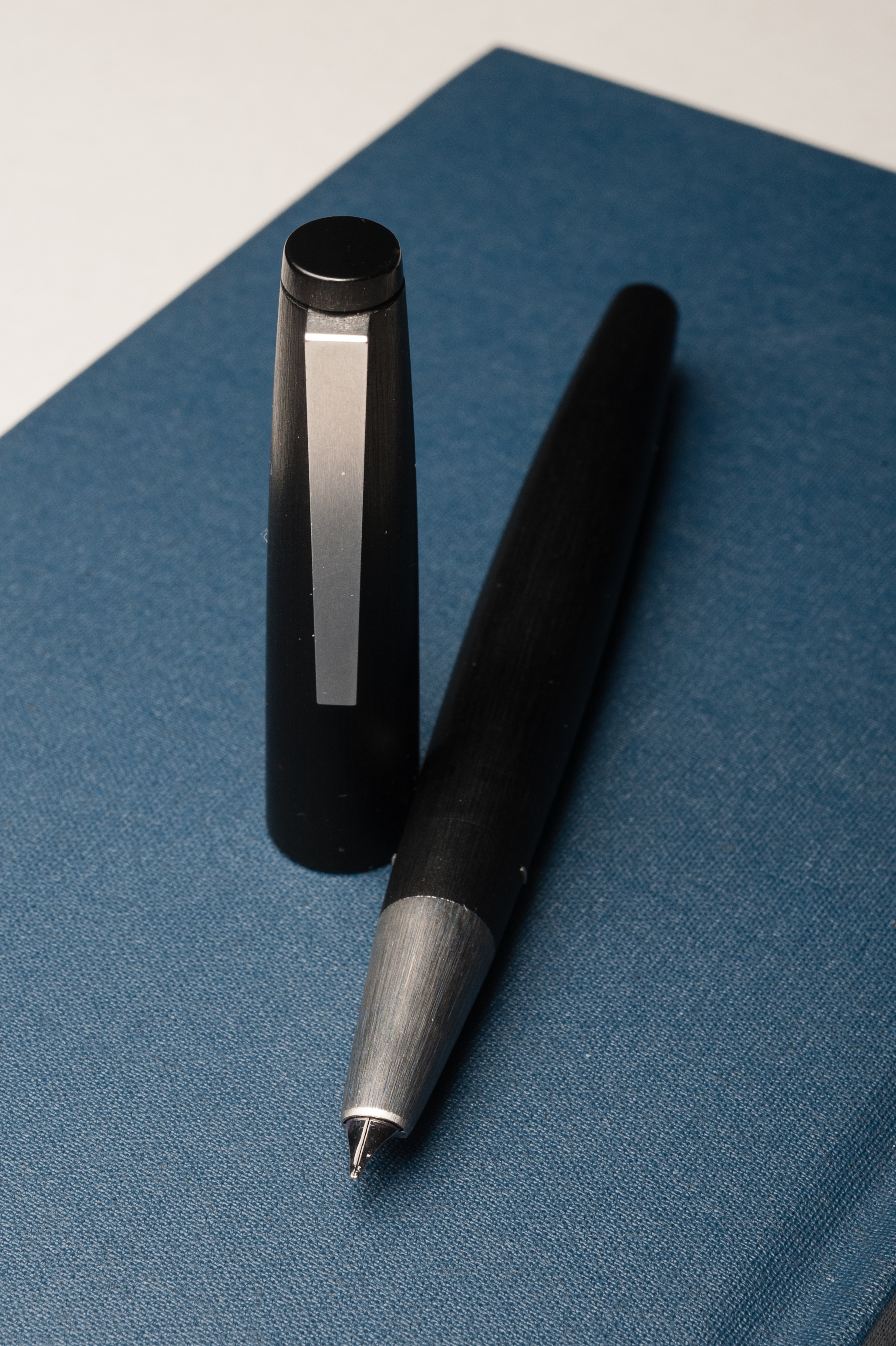
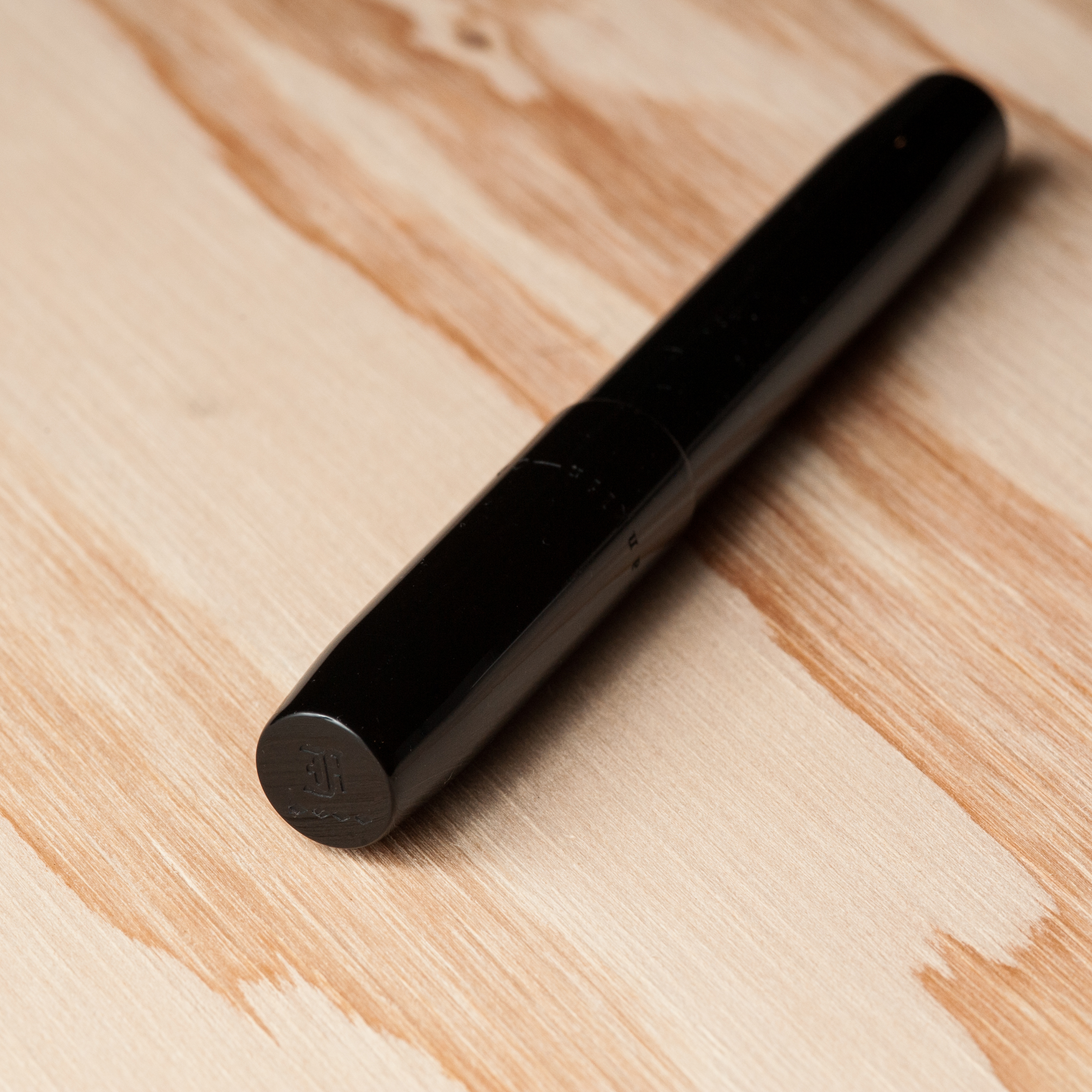
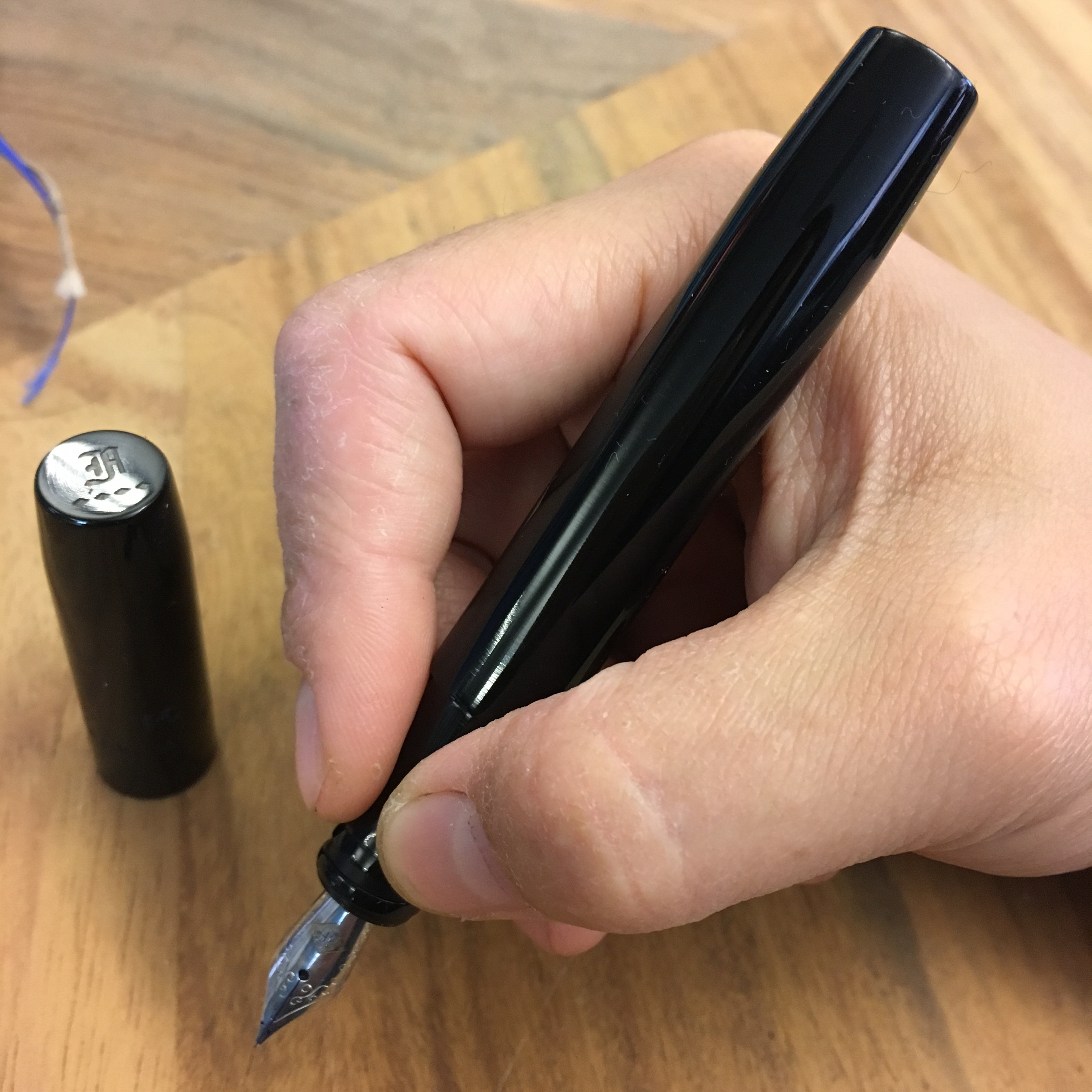
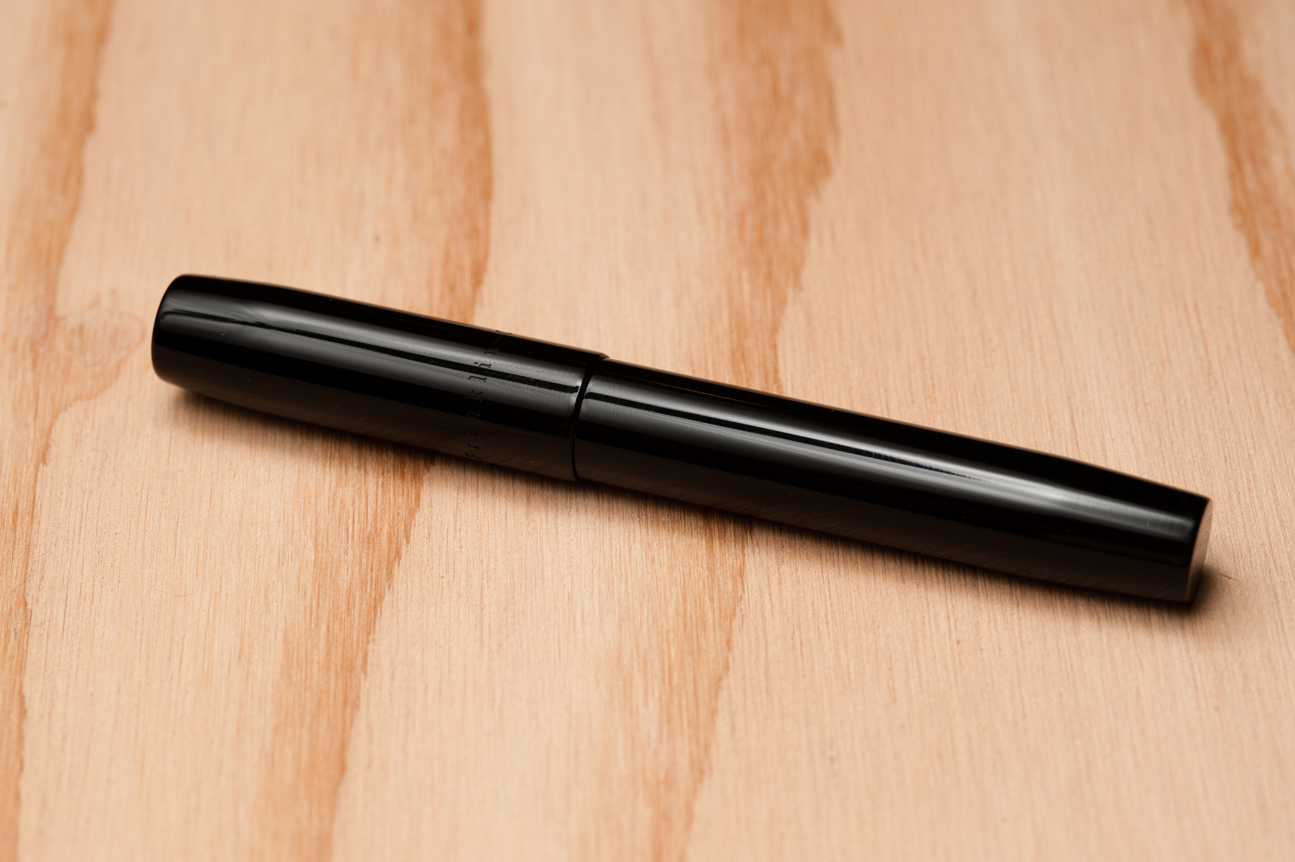
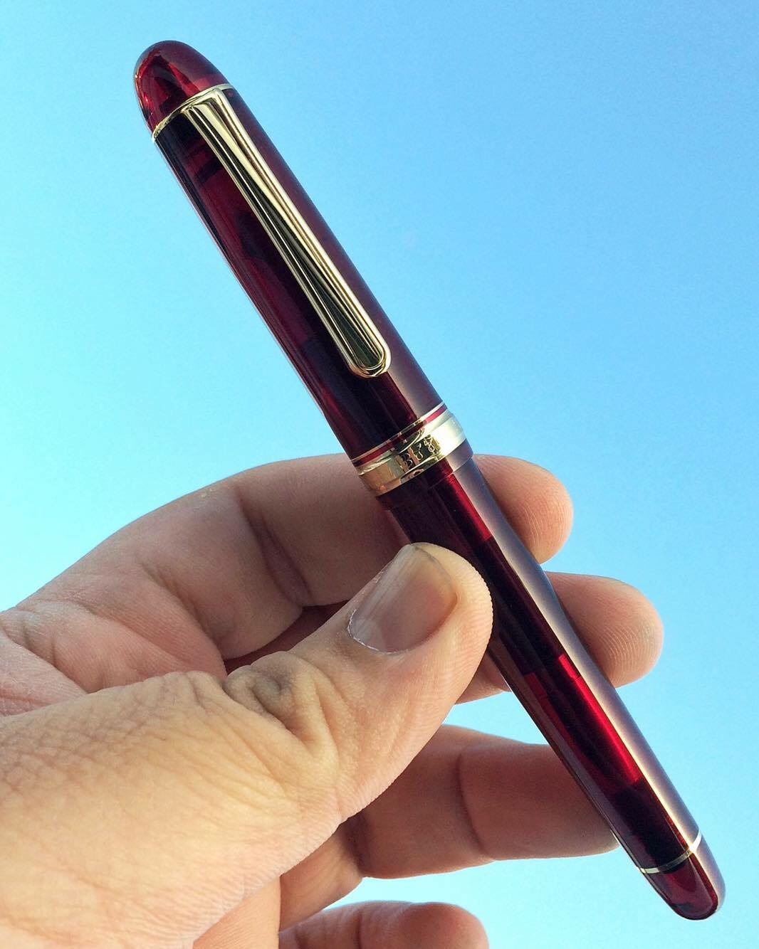
Katherine: It’s a cute and small pen with a beautiful finish. I’m surprised at how heavy it is, given its size.
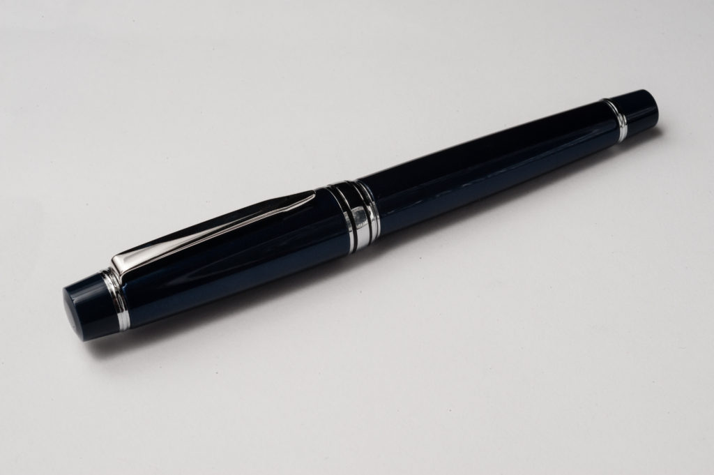
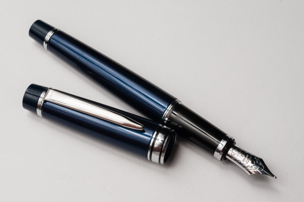
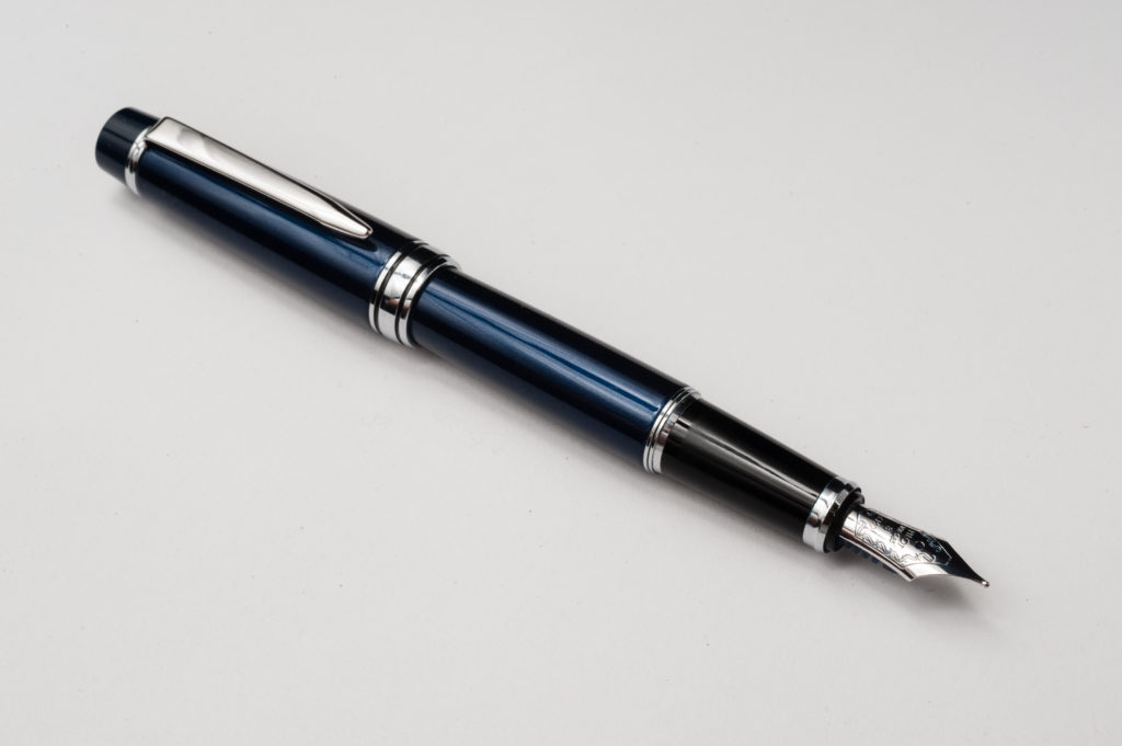
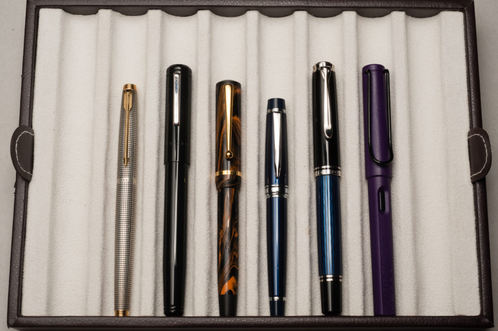
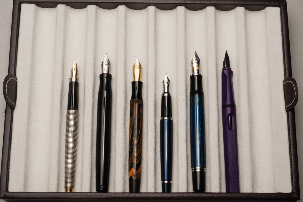
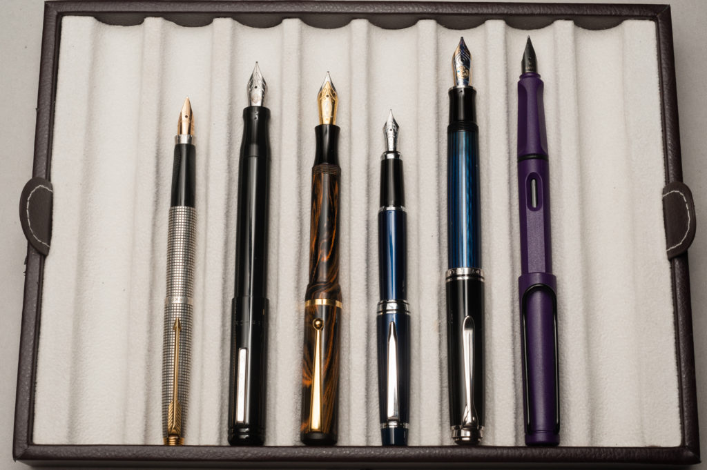
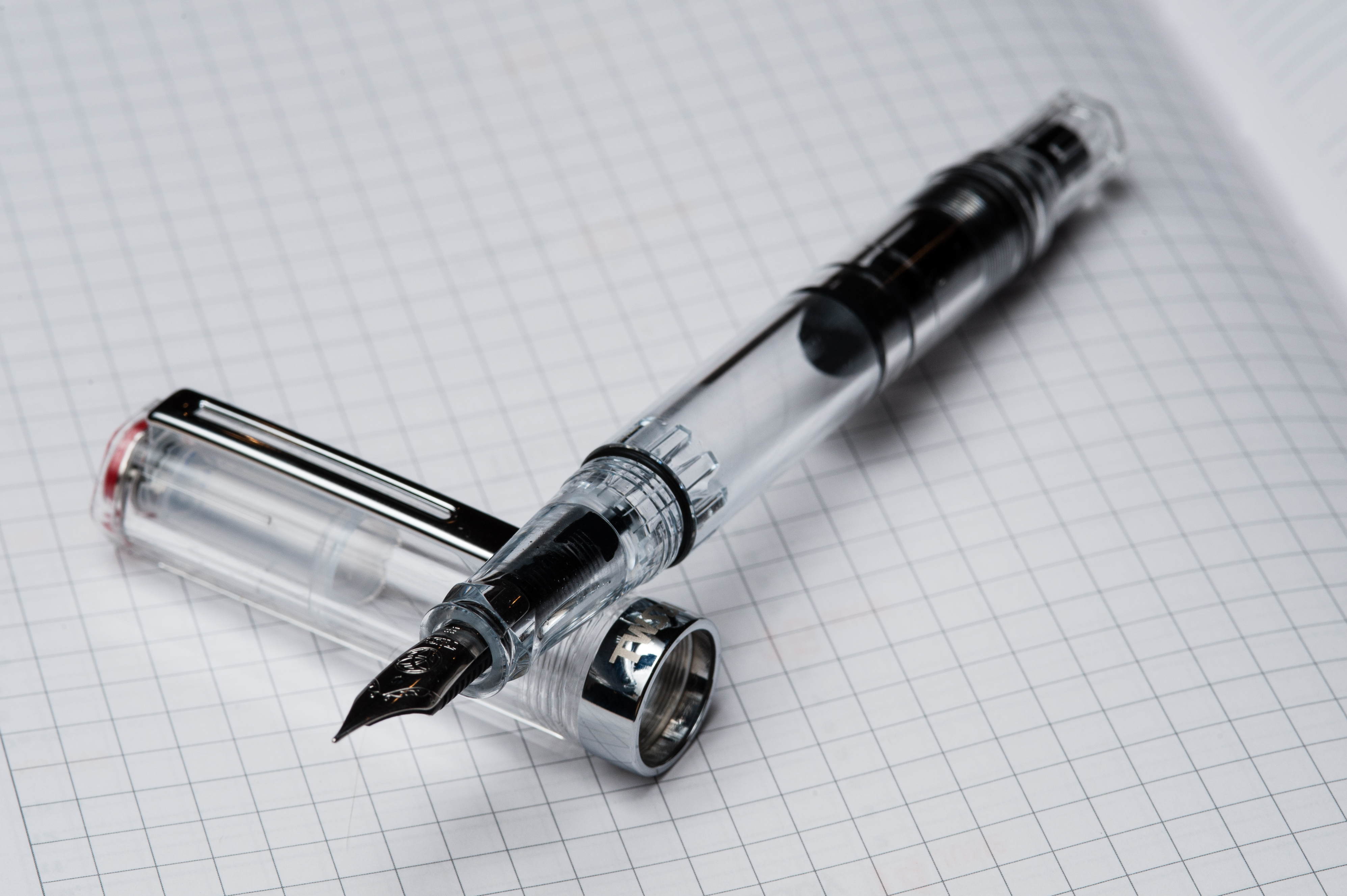
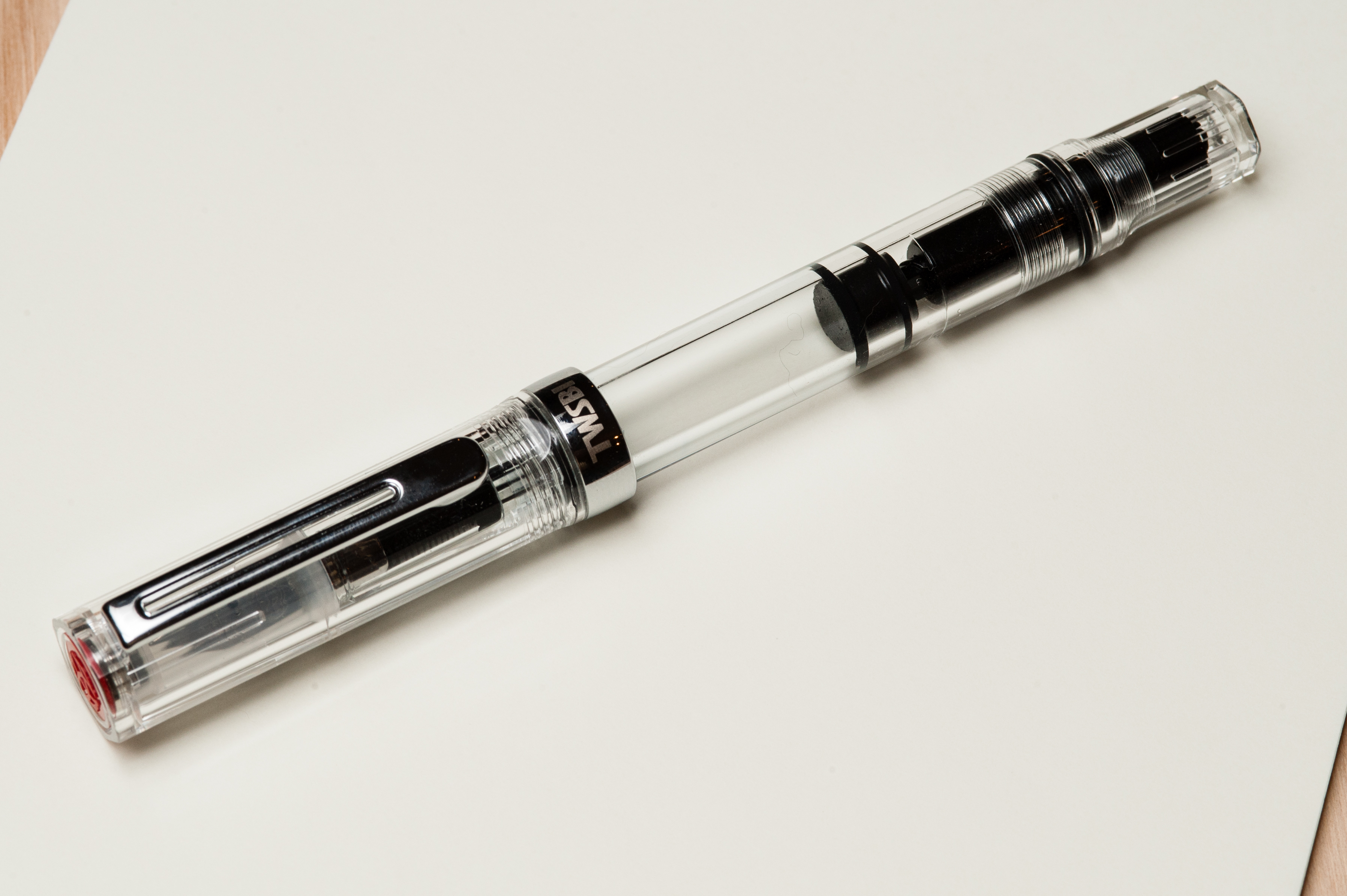
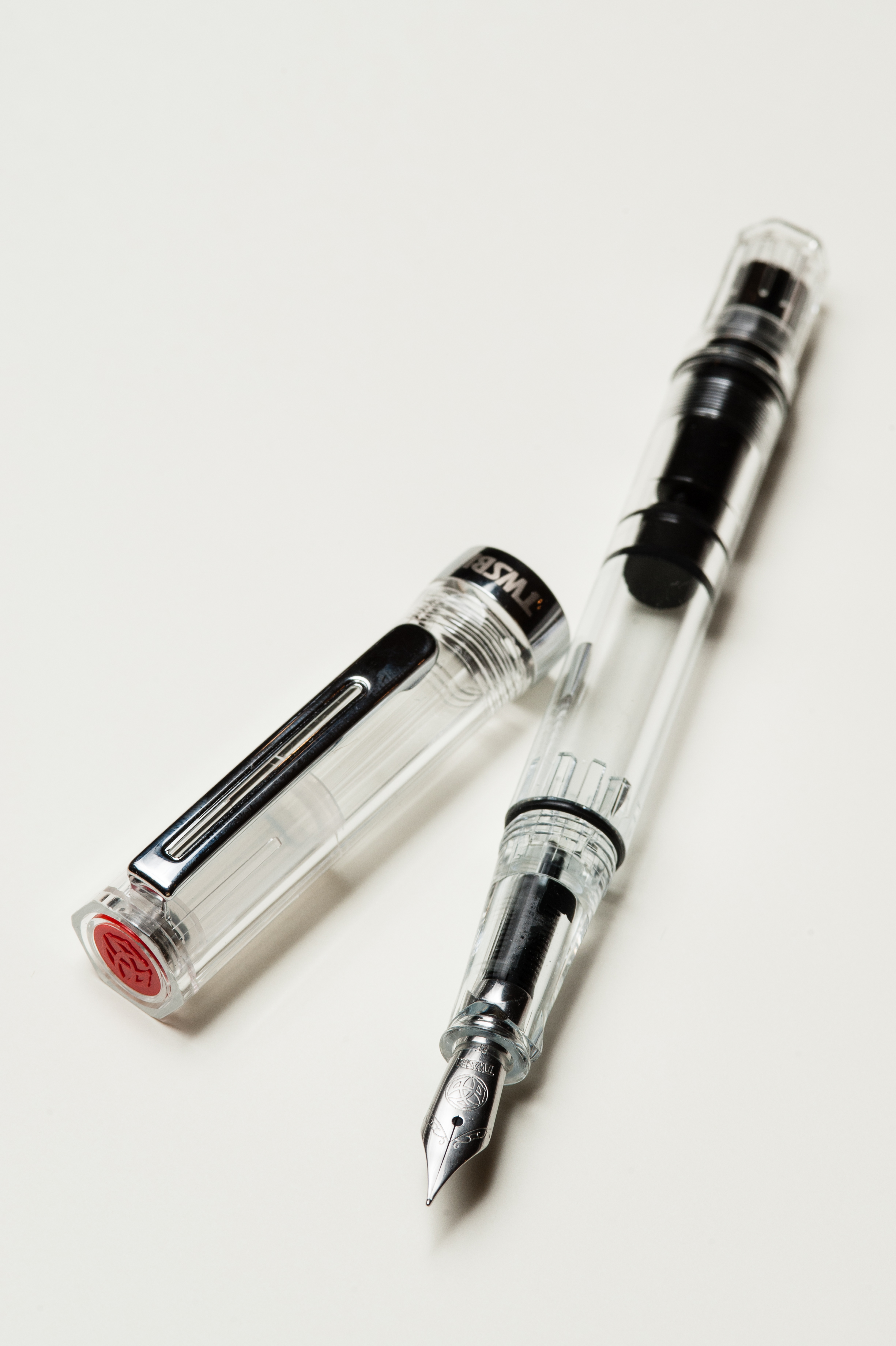
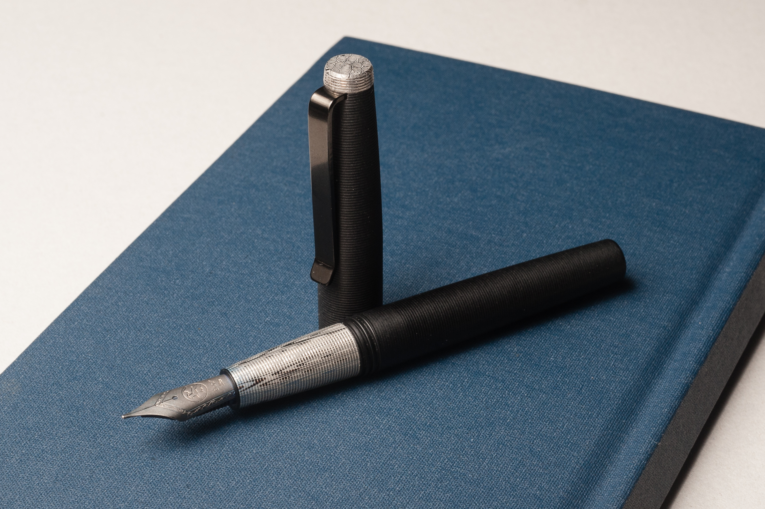
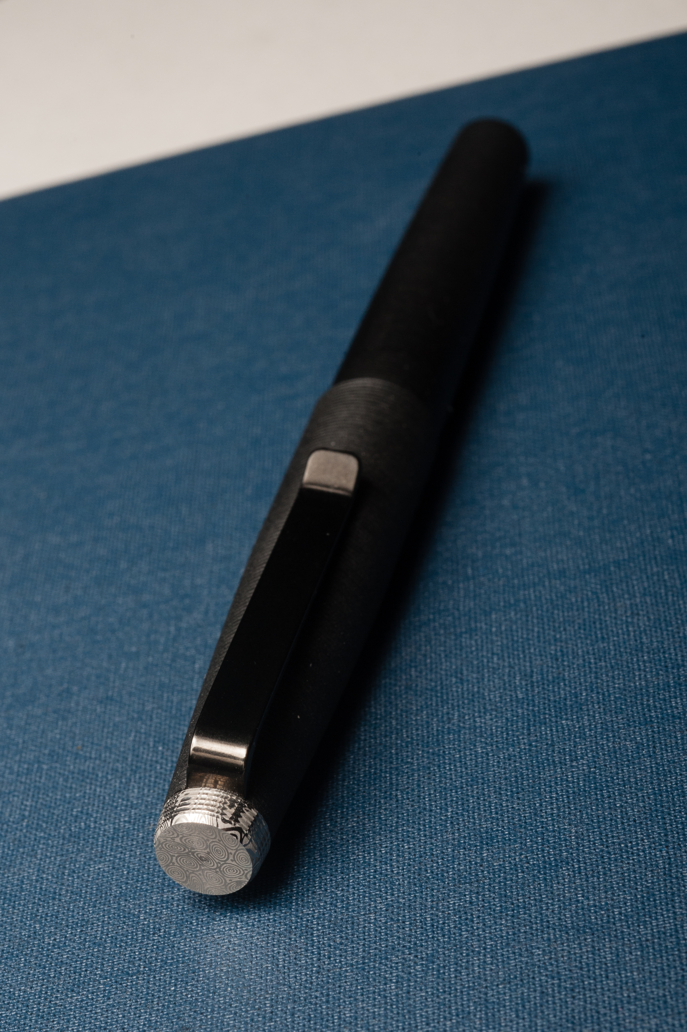
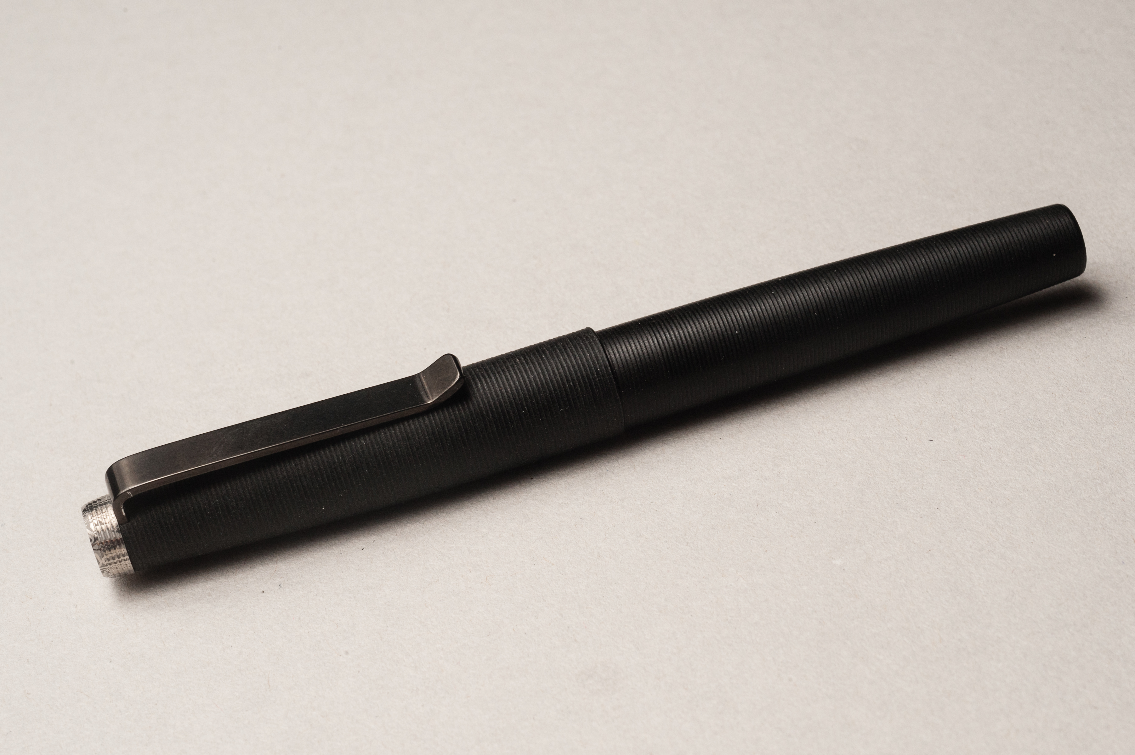
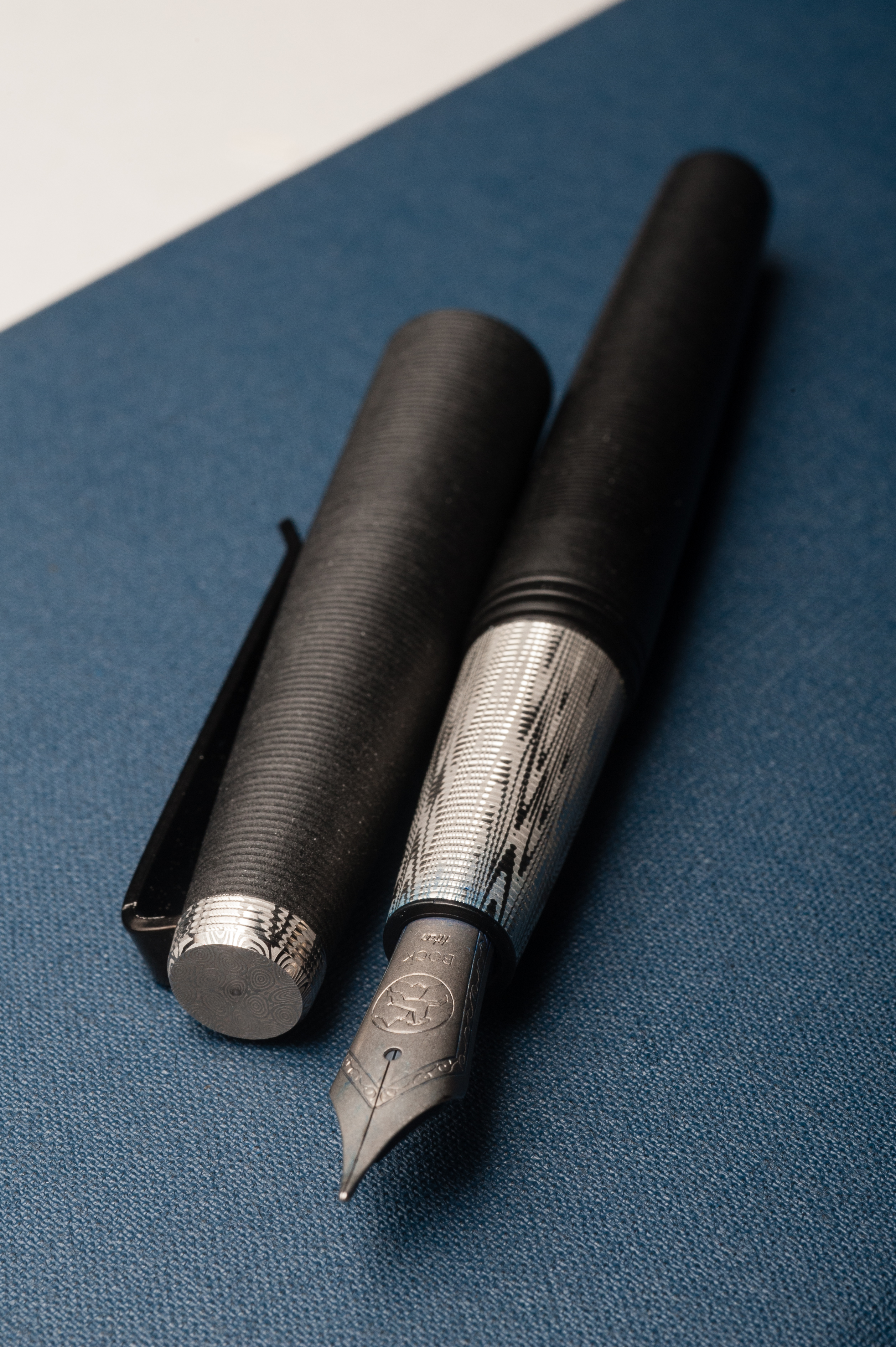
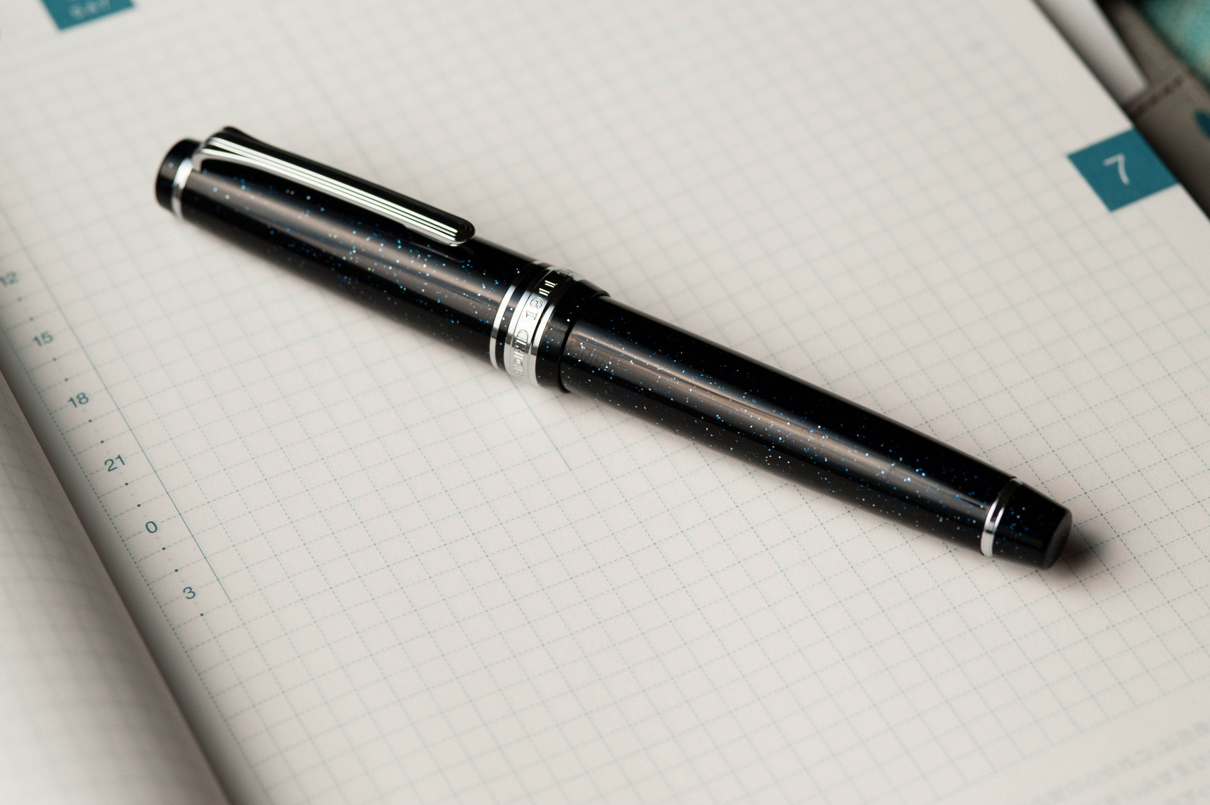
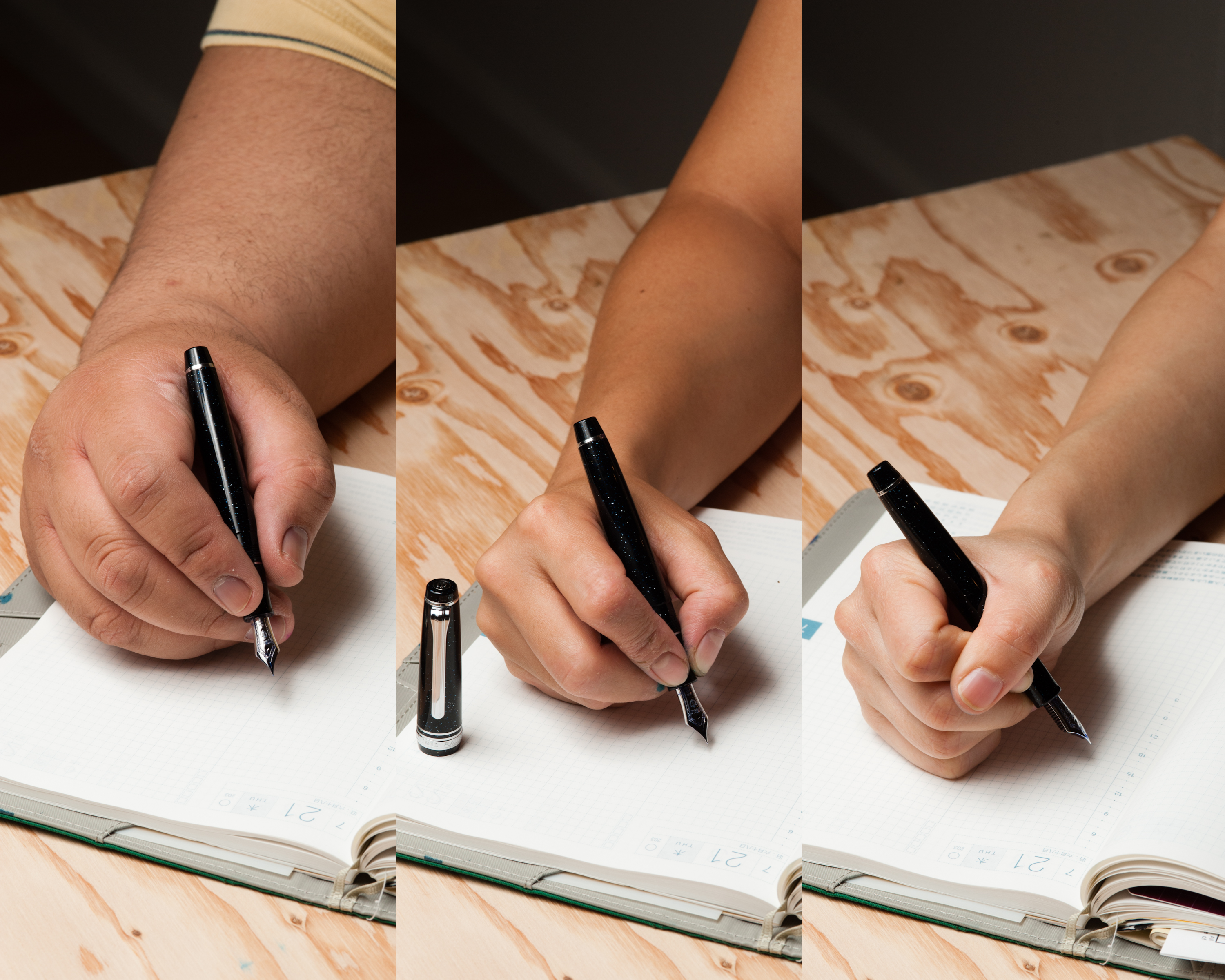
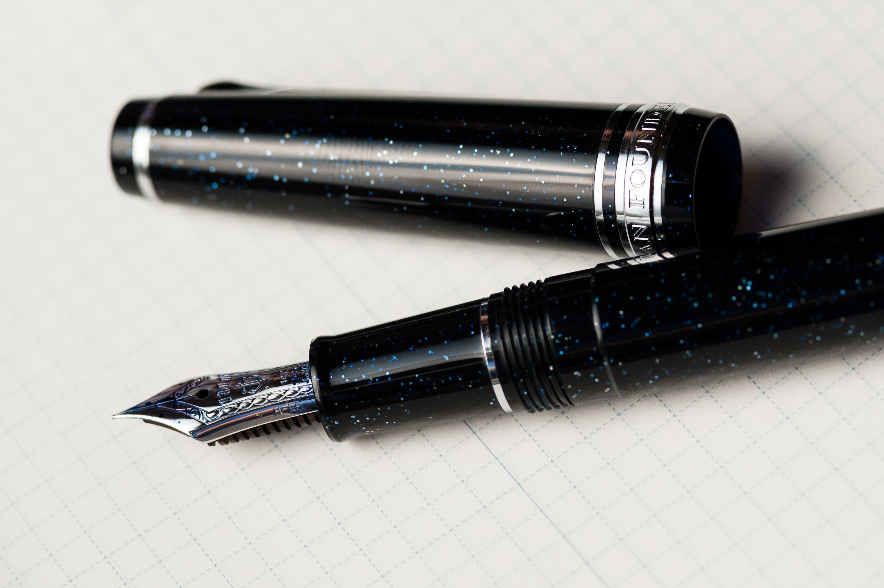
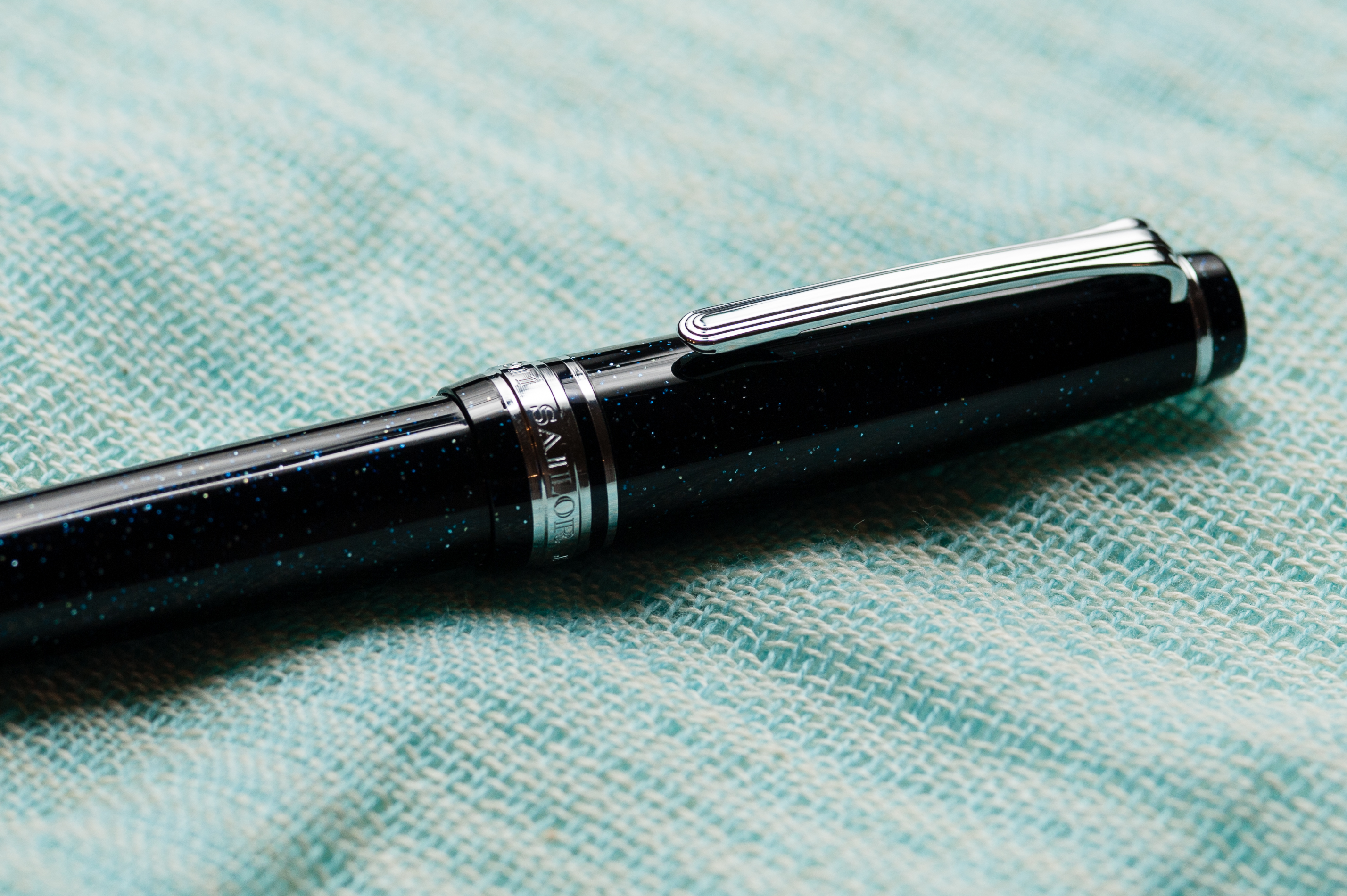
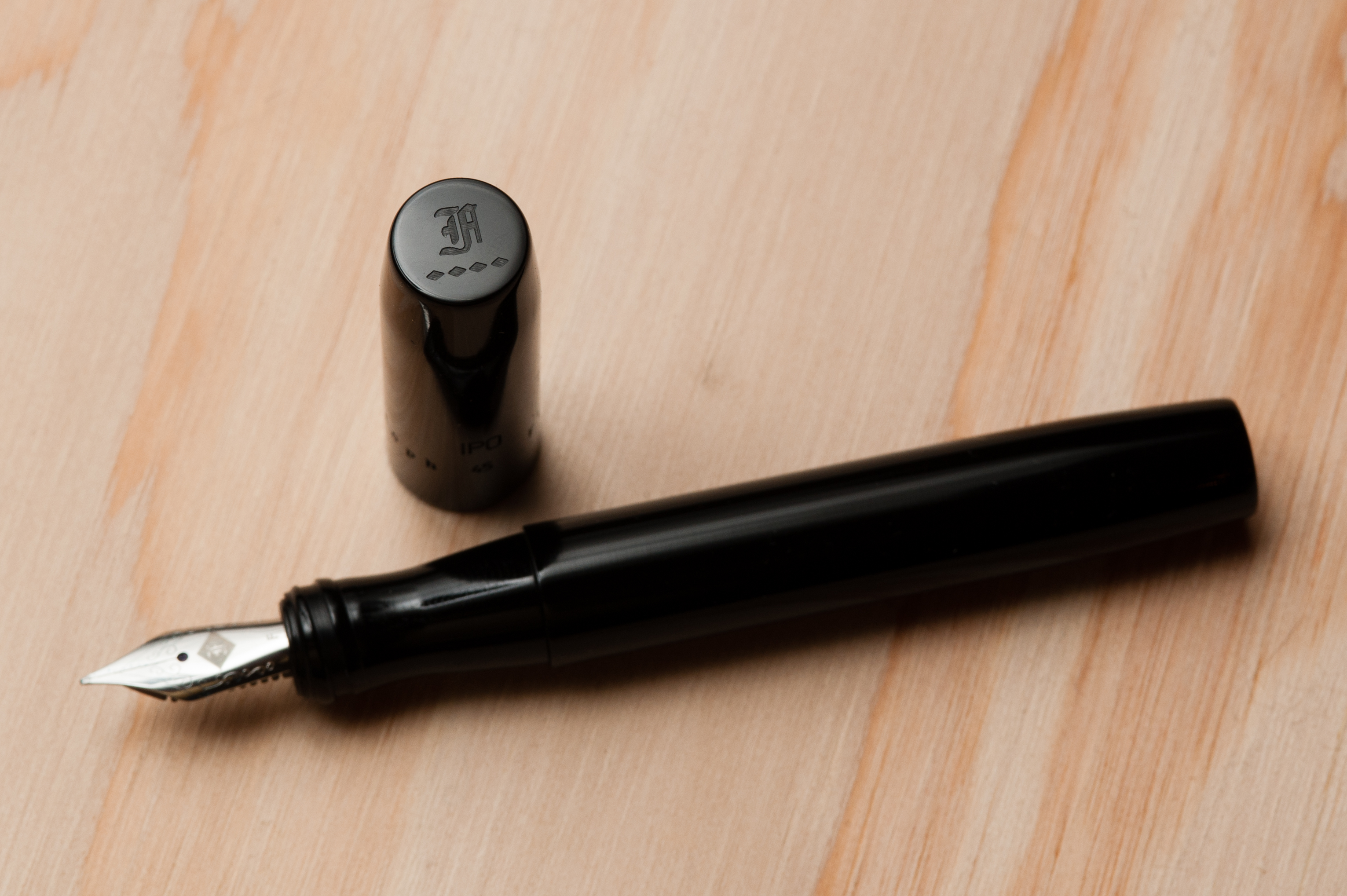
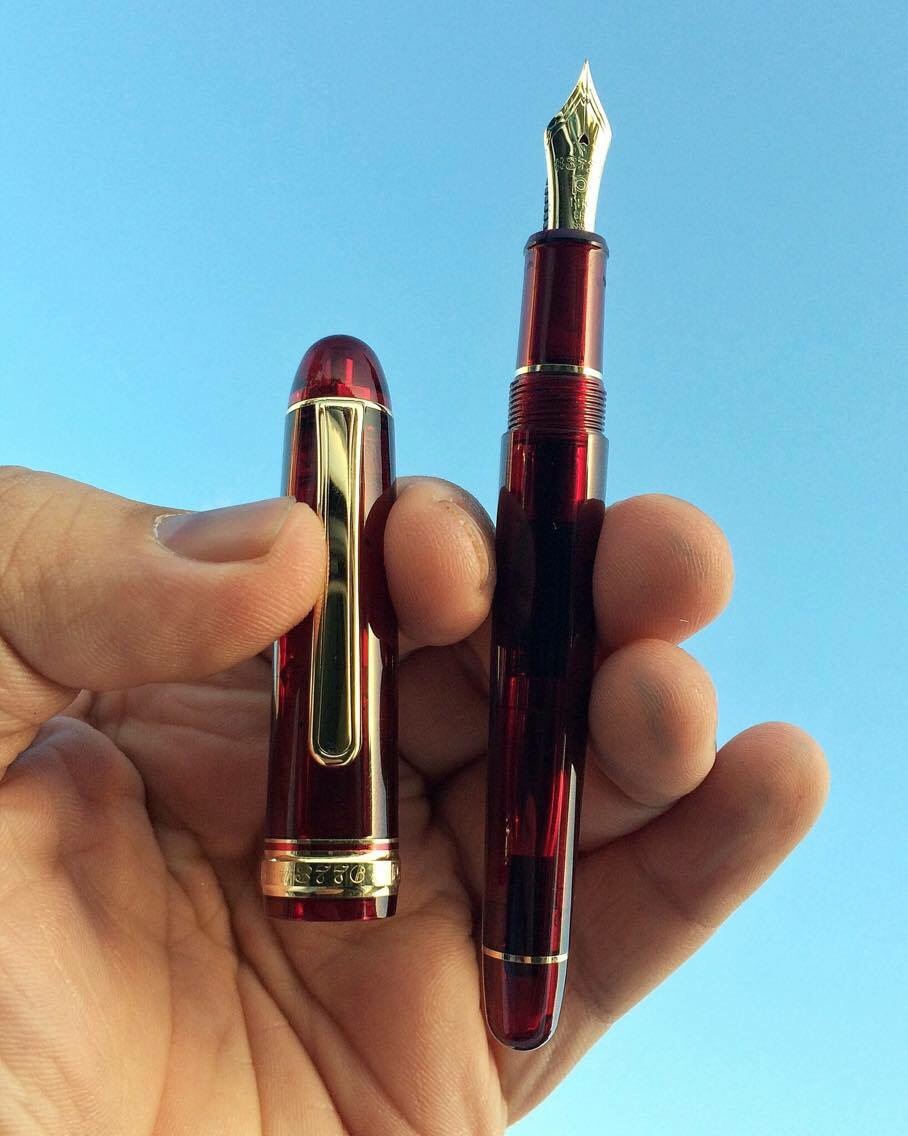
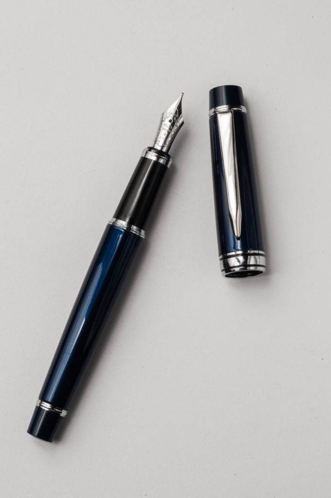
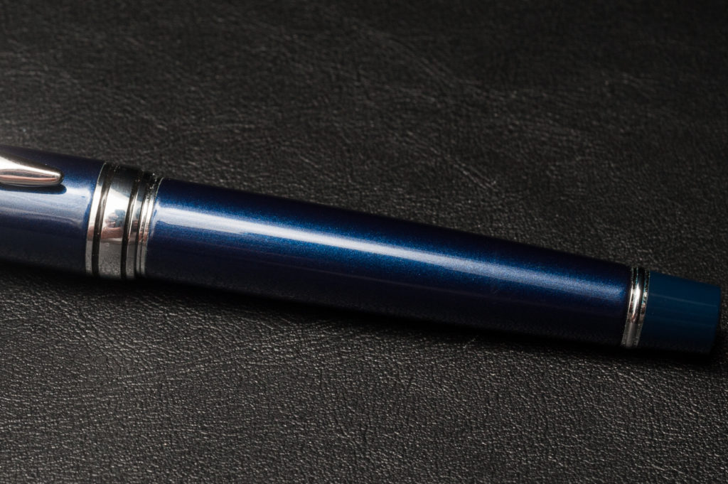
Pam: Cute, small and elegant. The blue finish on the metal barrel pen has alot of depth in the light. It’s a really good weight for such a small pen. The width of the pen is very reminiscent of the Pilot Prera, another favorite of mine. The finish, weight and extra wide silver band with simple black writing lends a “grown-up” feel to the pen. It is easily a pen that can be used in an office setting. It’s particularly handy for use due to the slip cap for fast and easy deployment. Posting the cap is easy and secure.
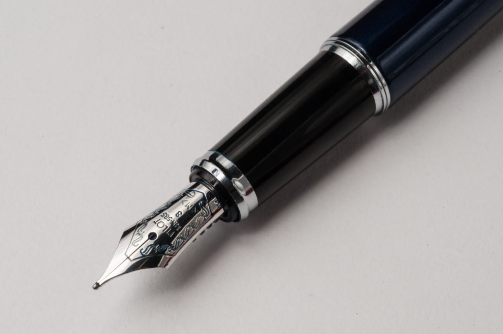
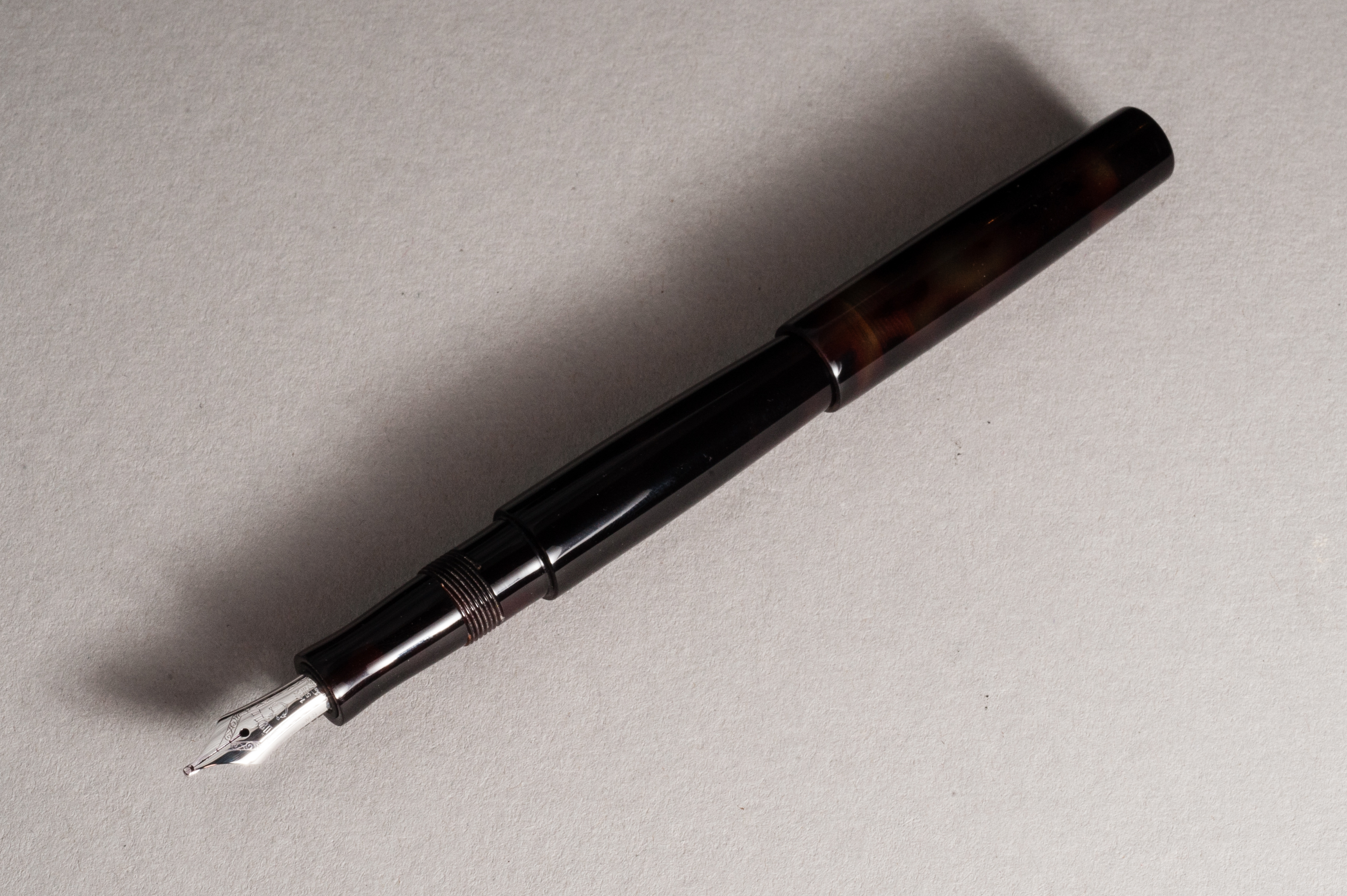
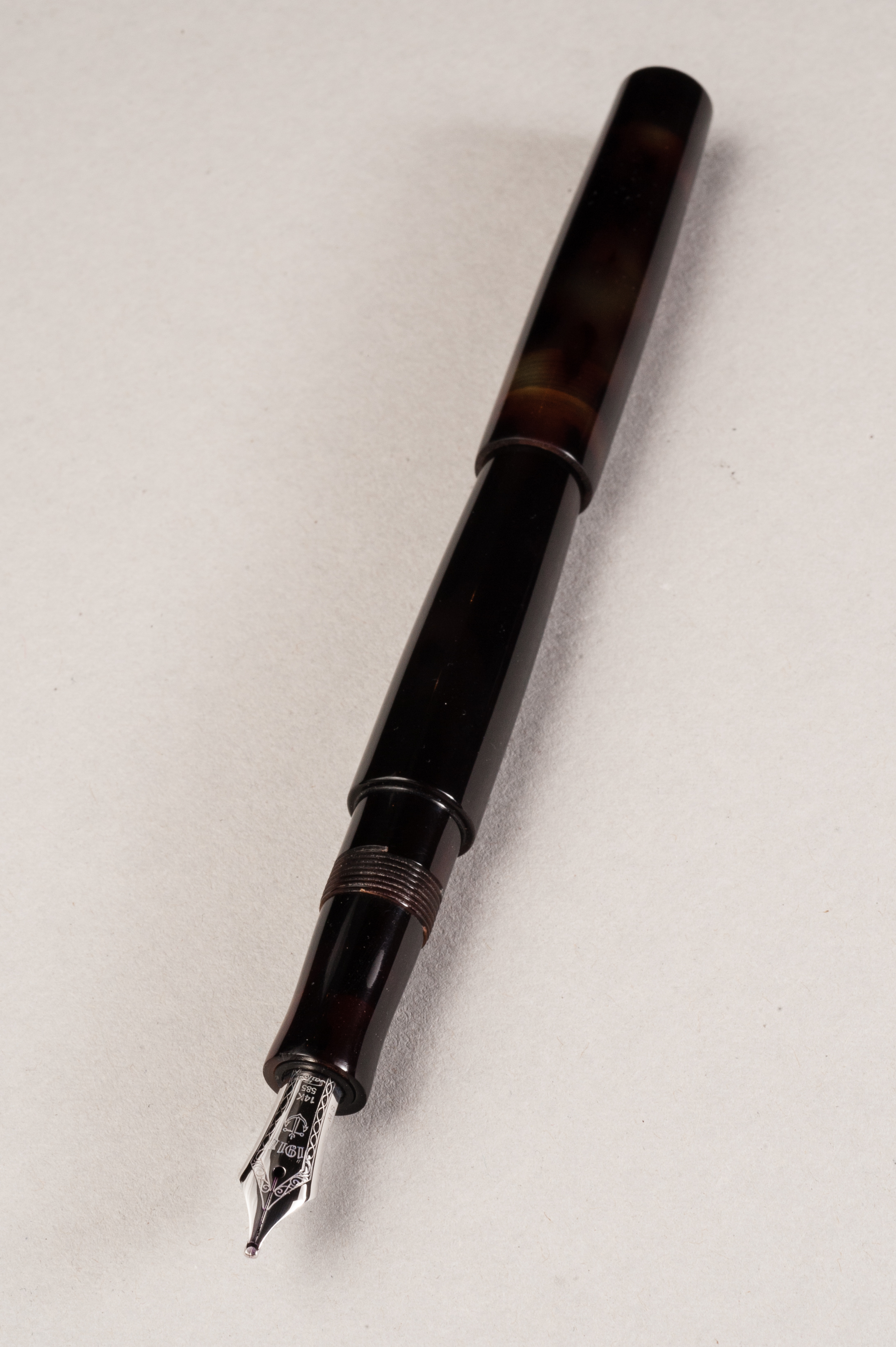
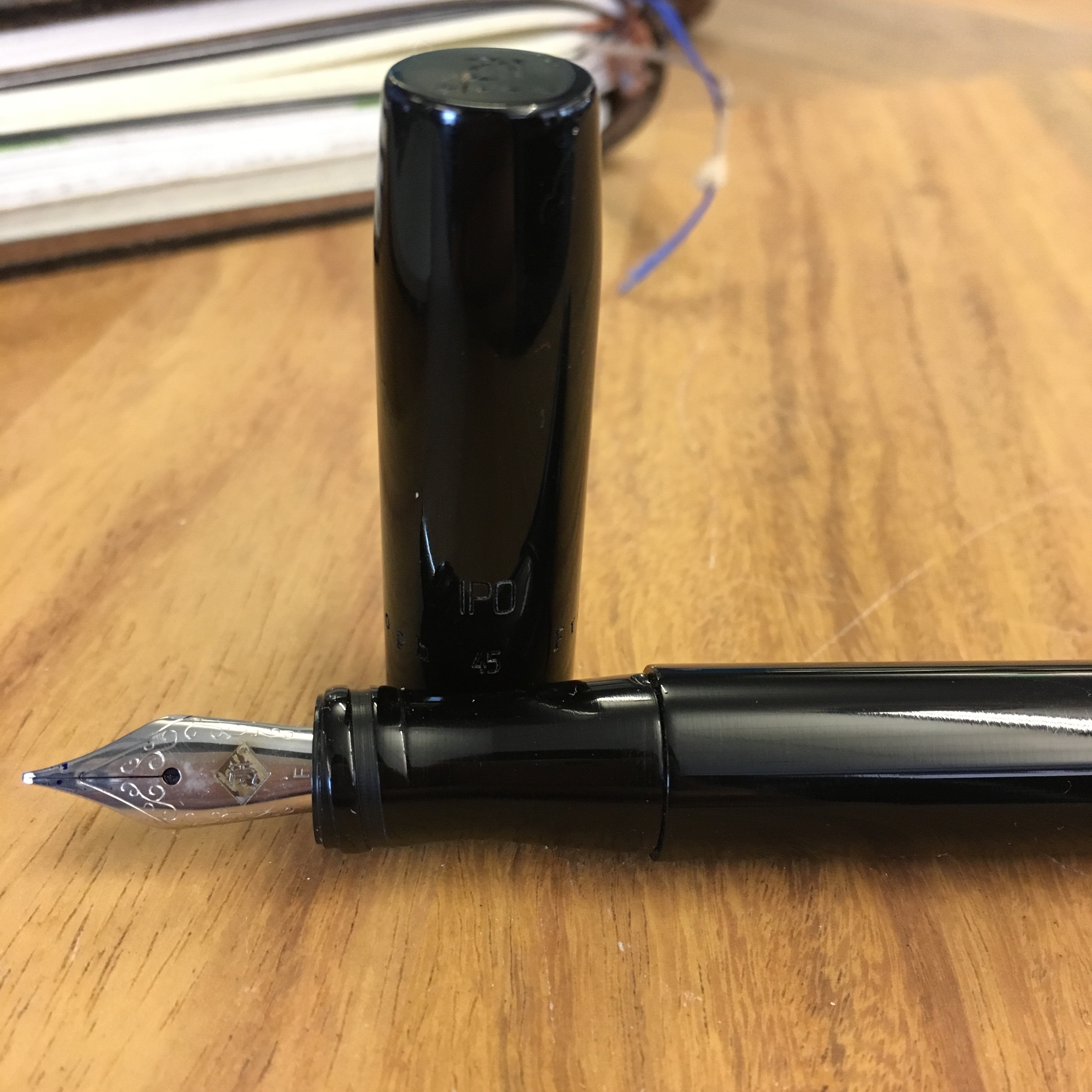
Franz: The Pilot Stargazer was a pen that I wanted to get when Mr. Dan Smith reviewed it a couple years back. The sapphire blue finish truly won me over especially each time I hold it in my hands. It may be a small pen but it looks quite appealing and refined.
The Business End
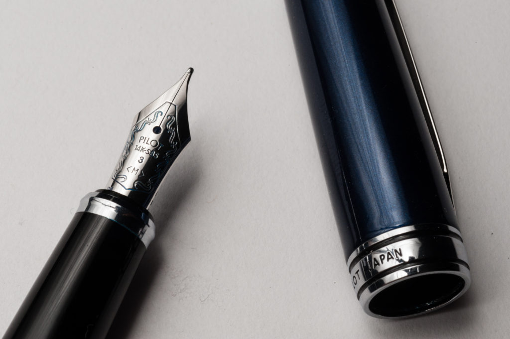
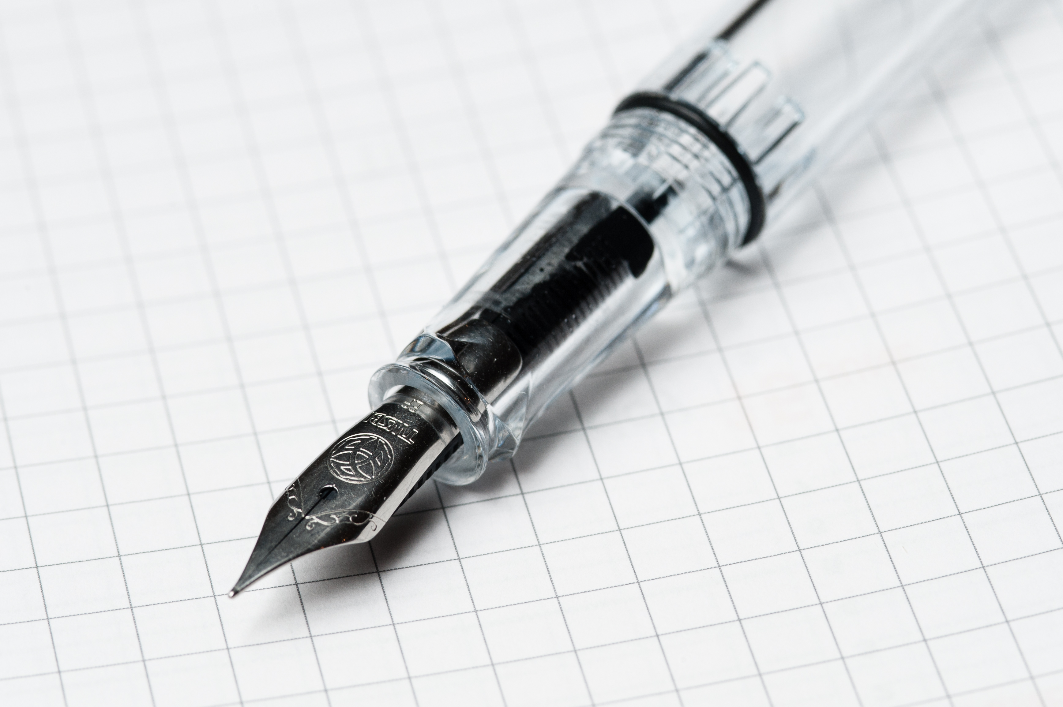
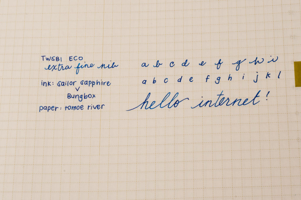
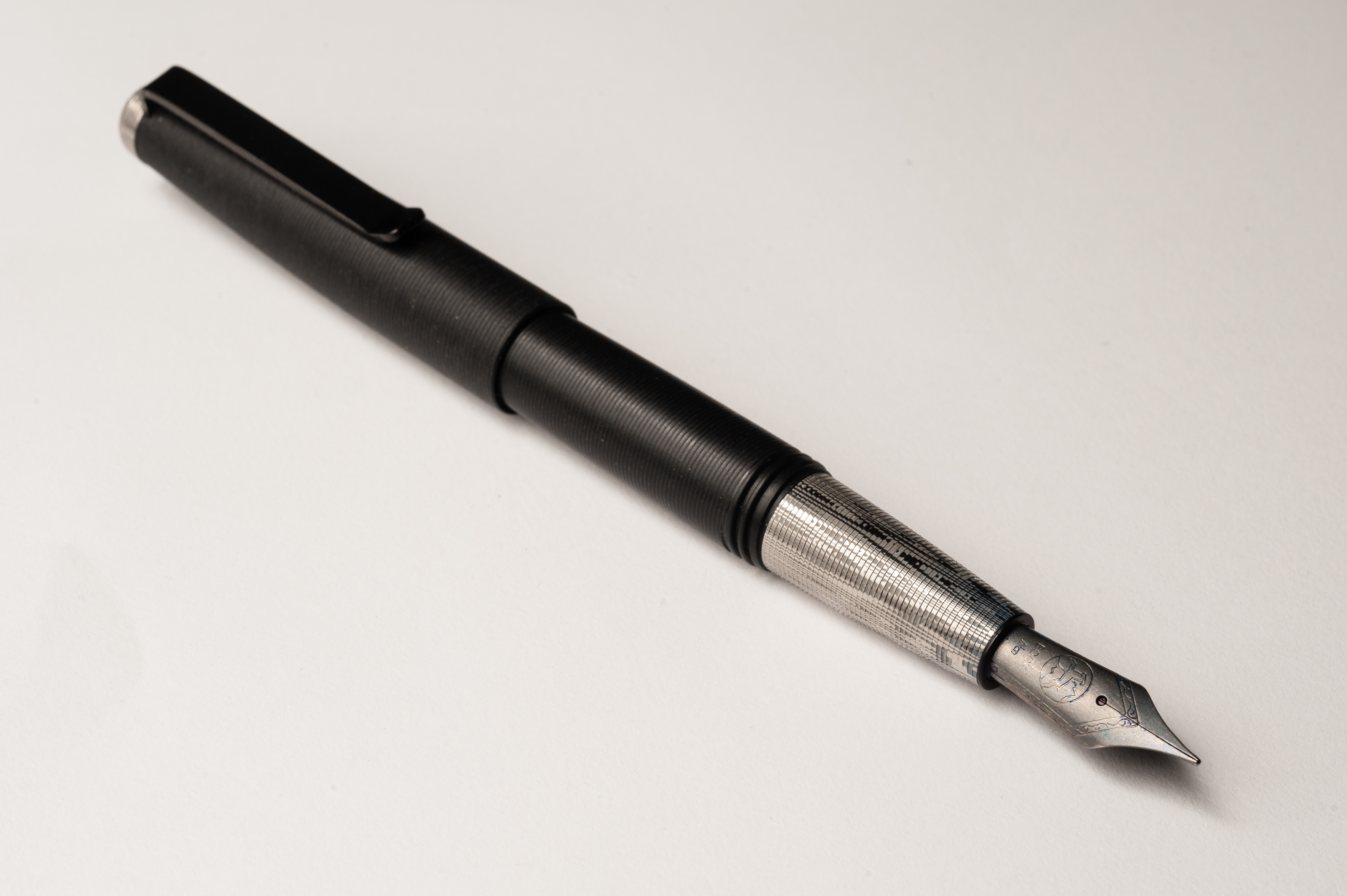
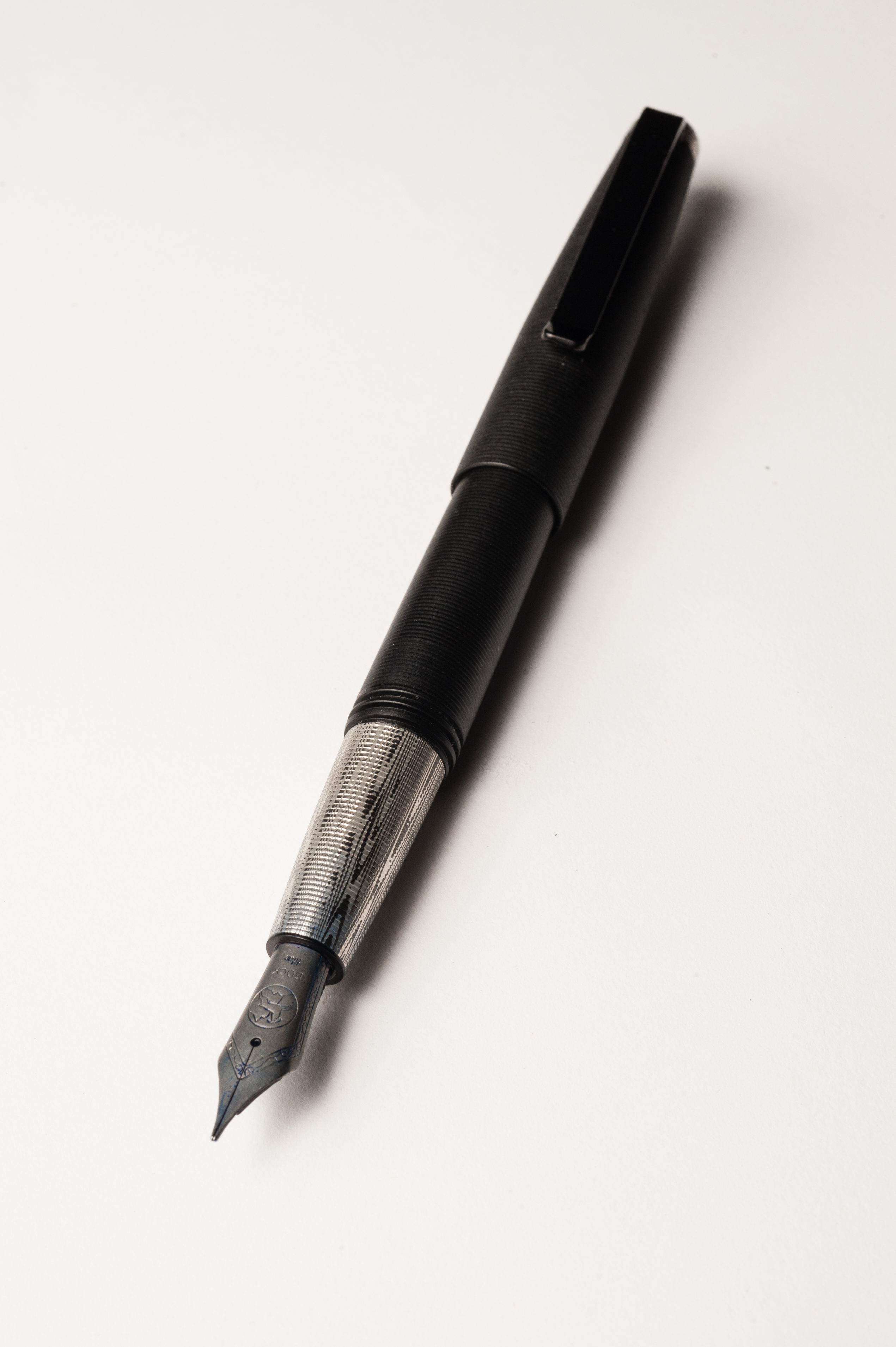
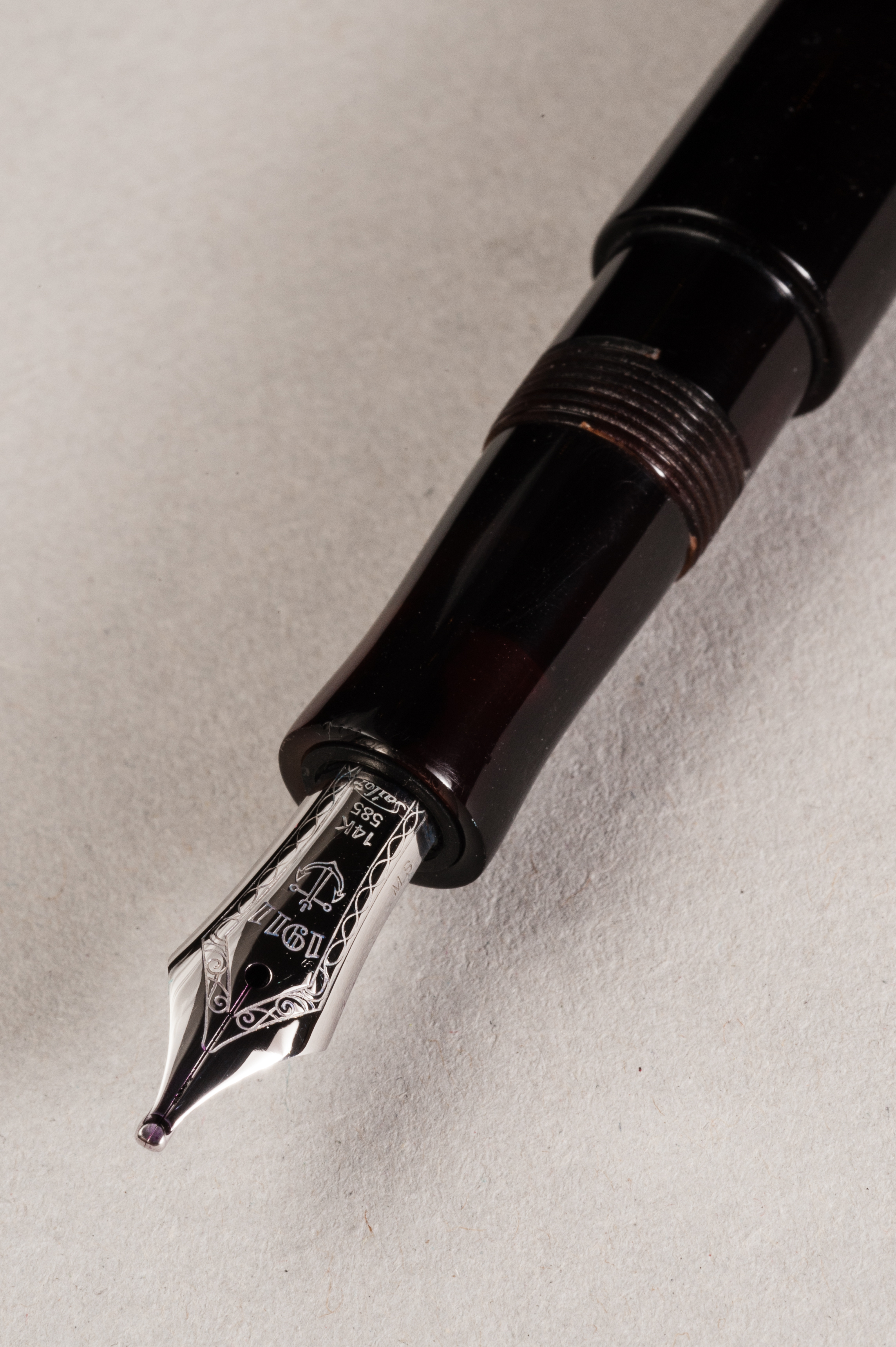
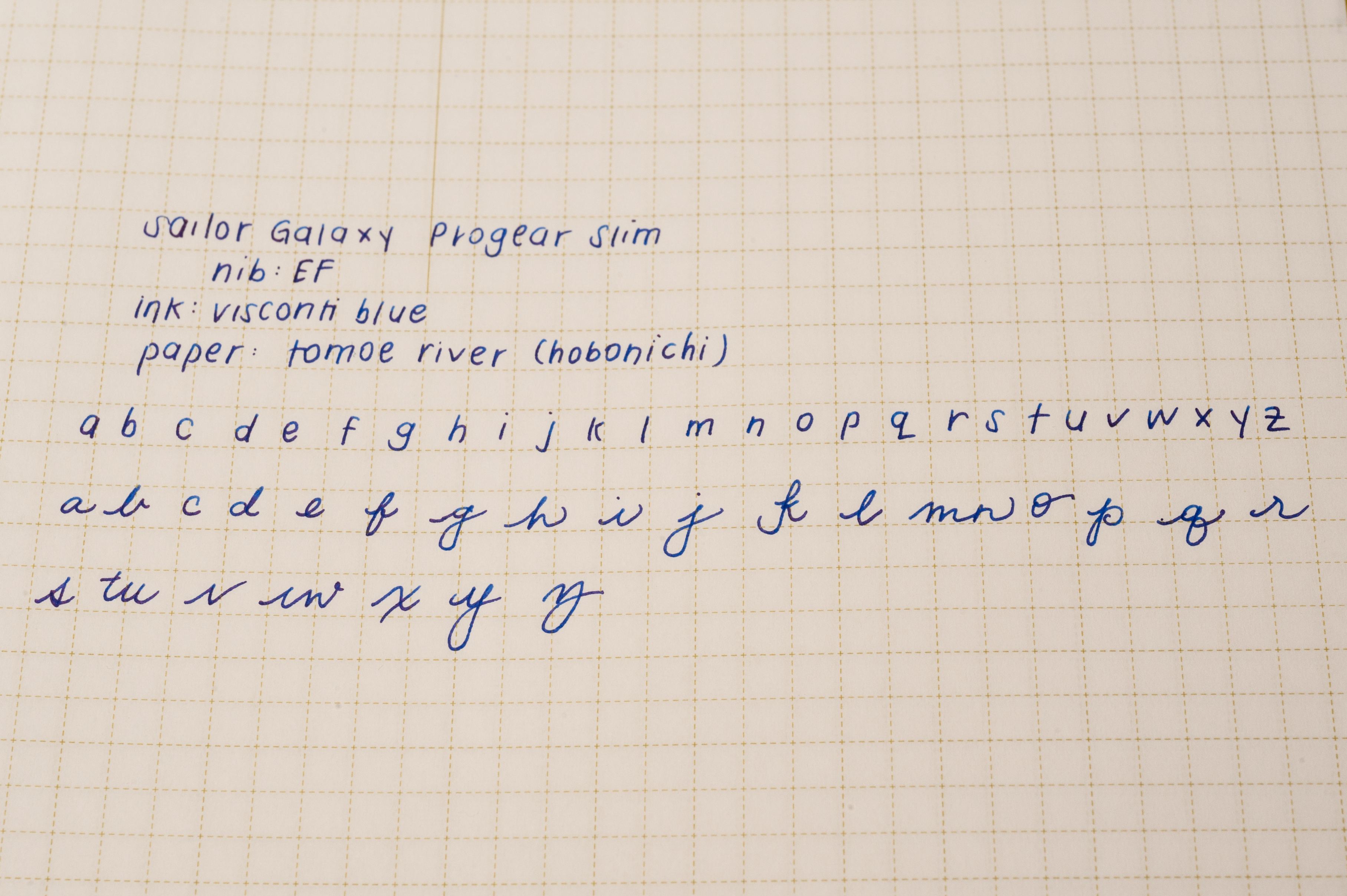
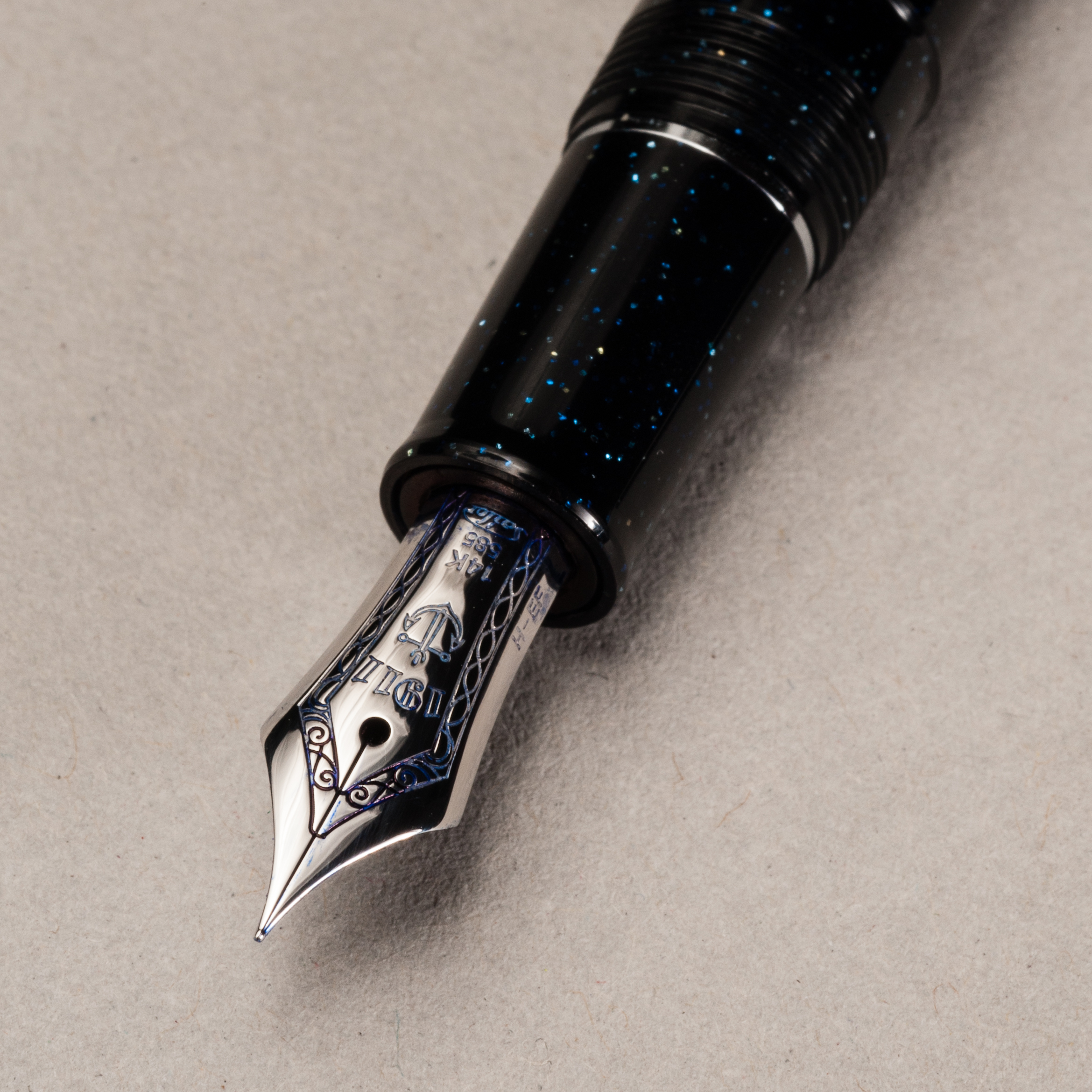
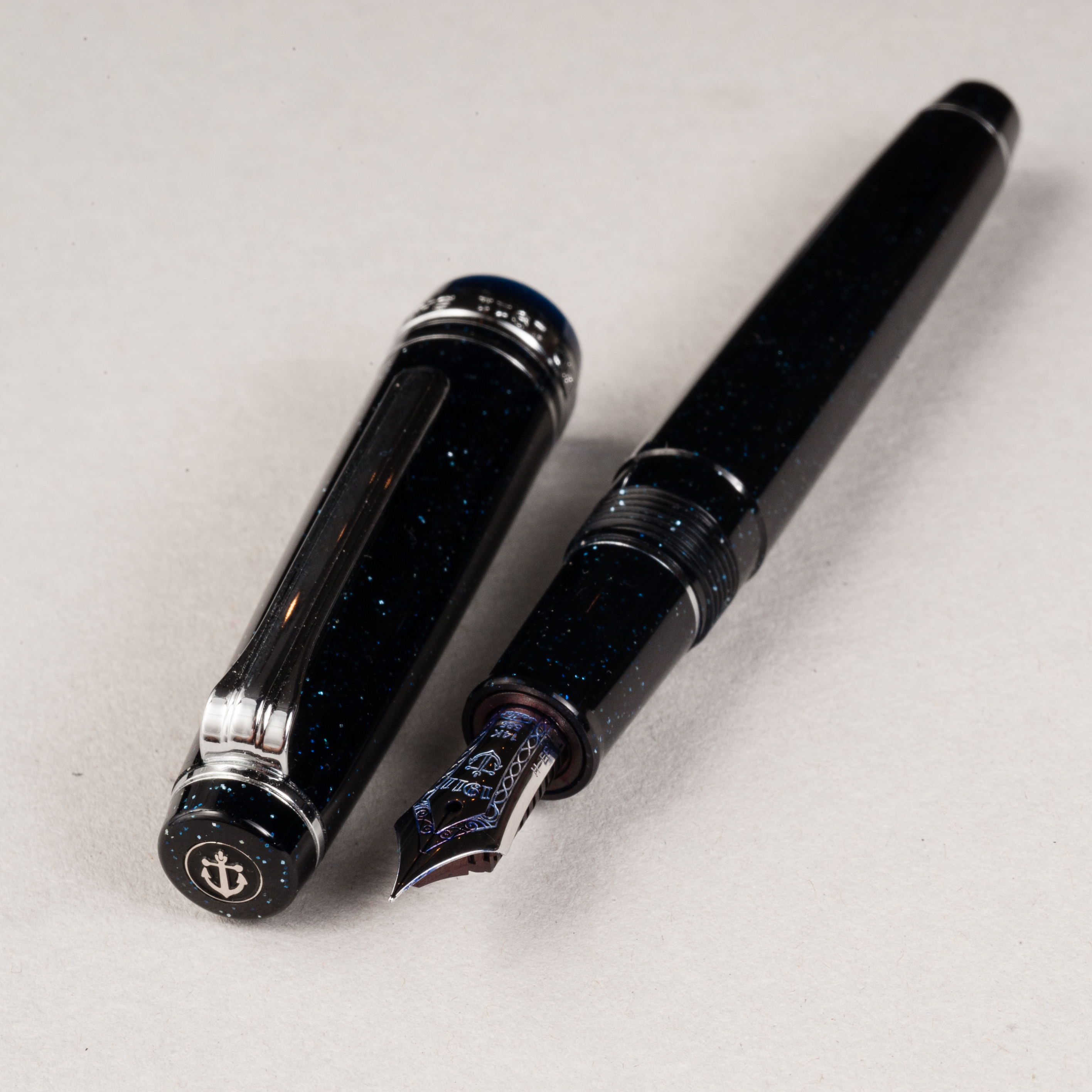
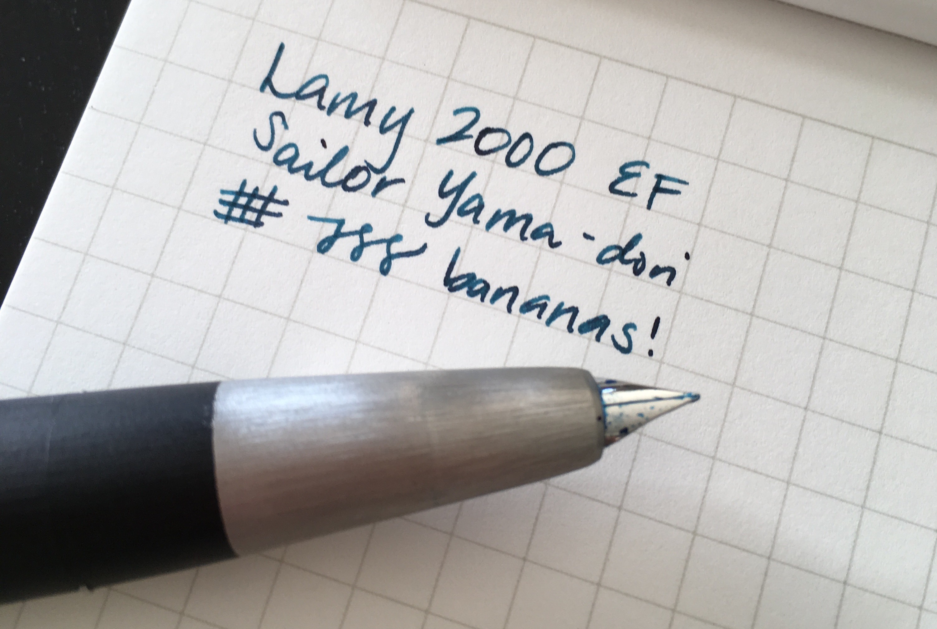
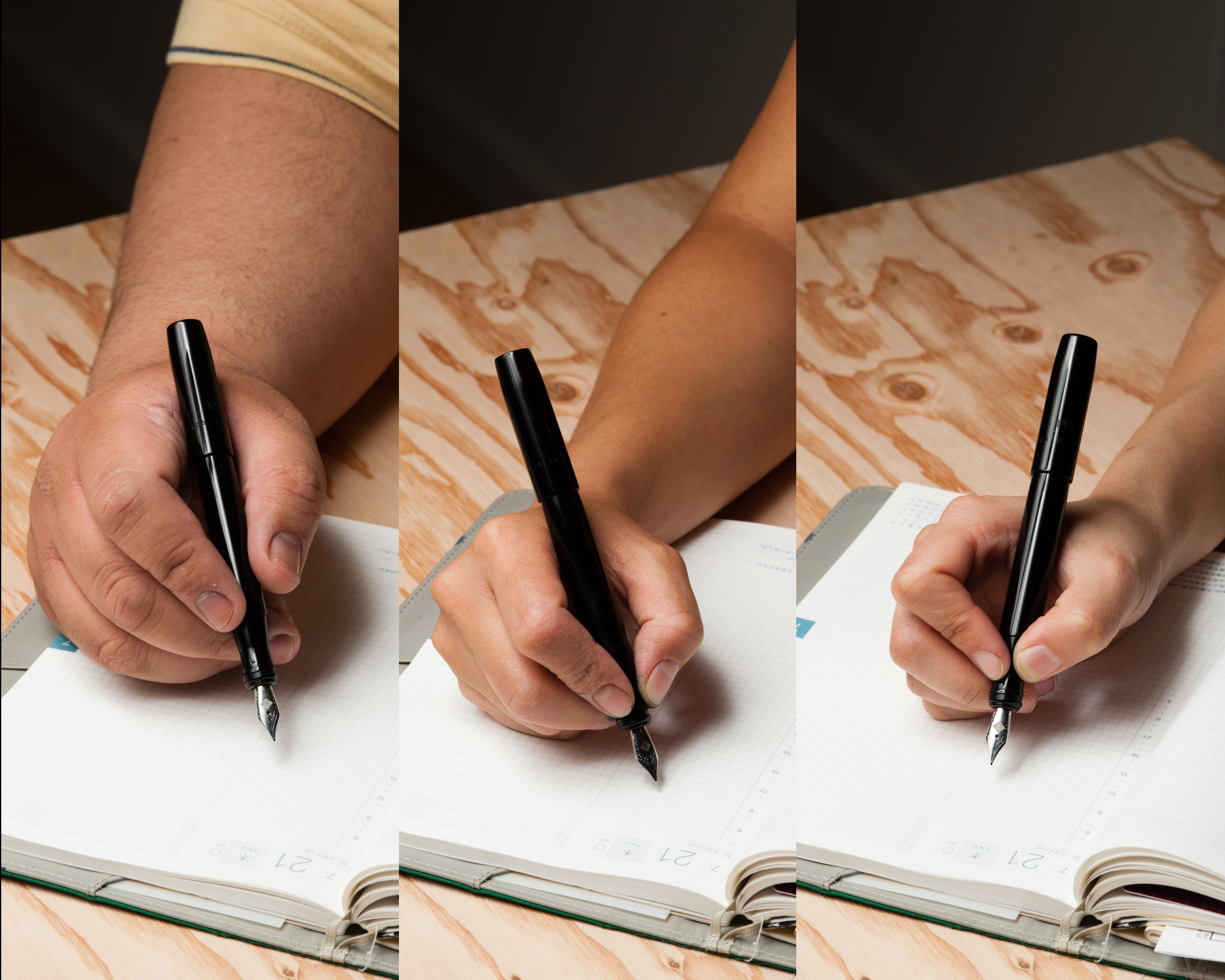
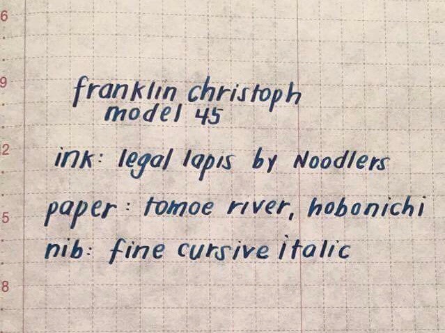
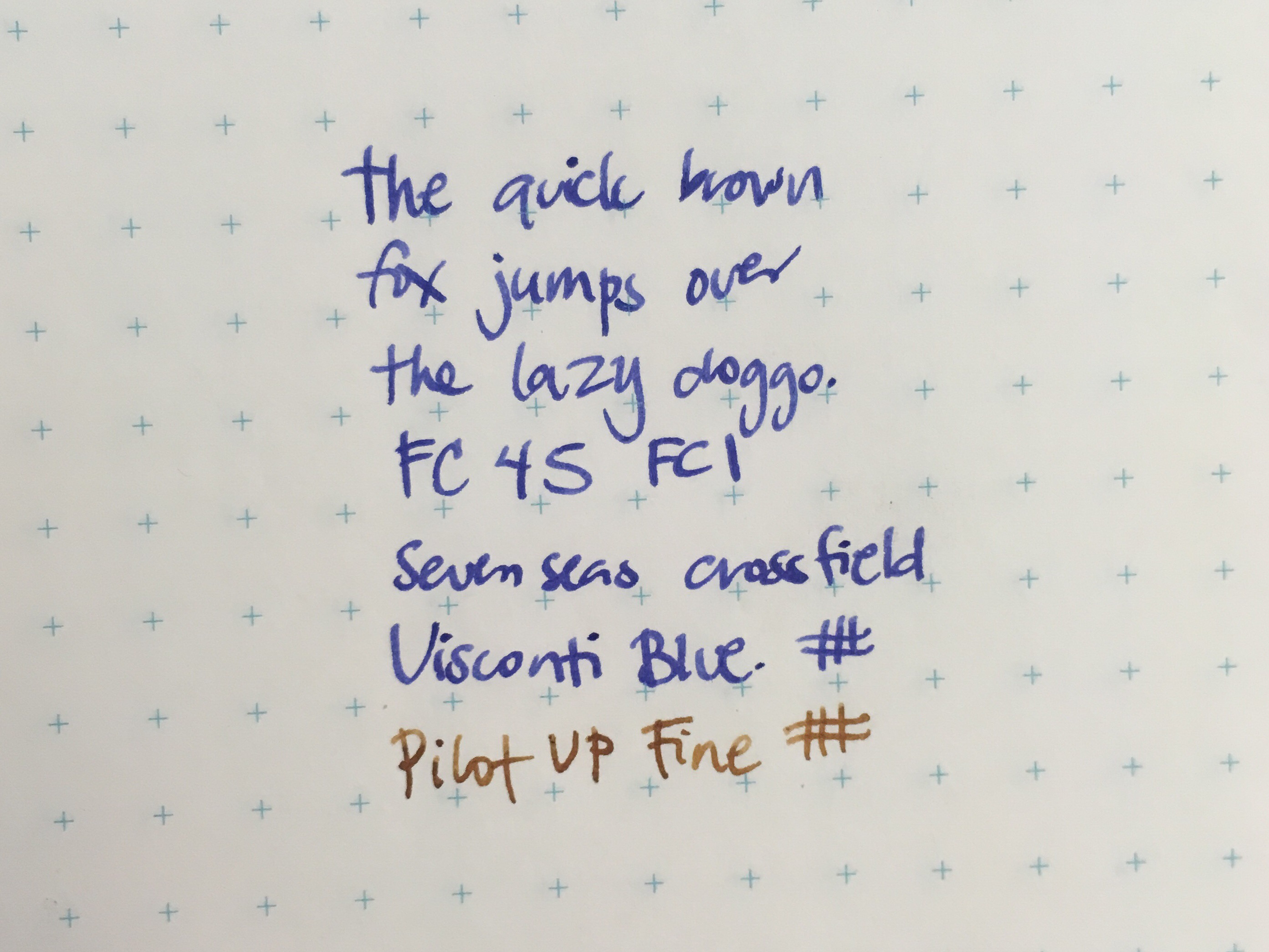
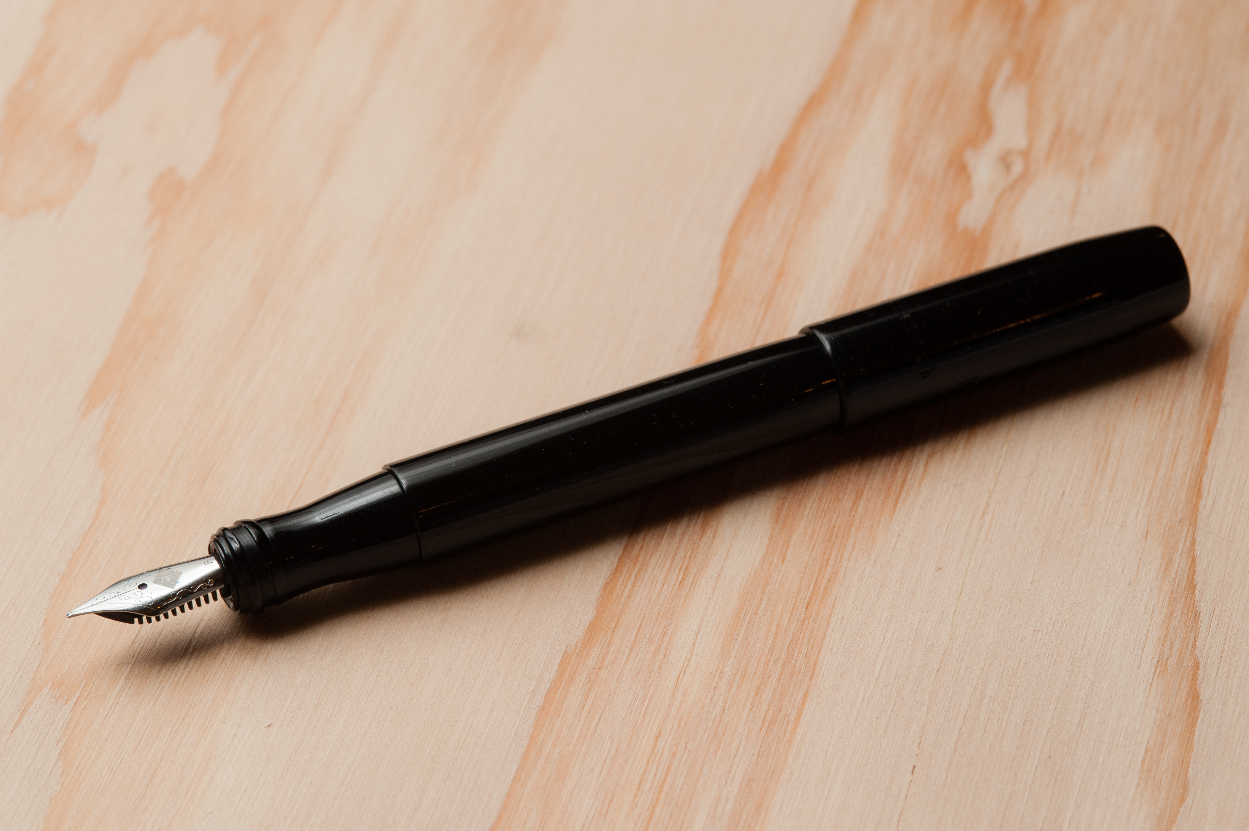
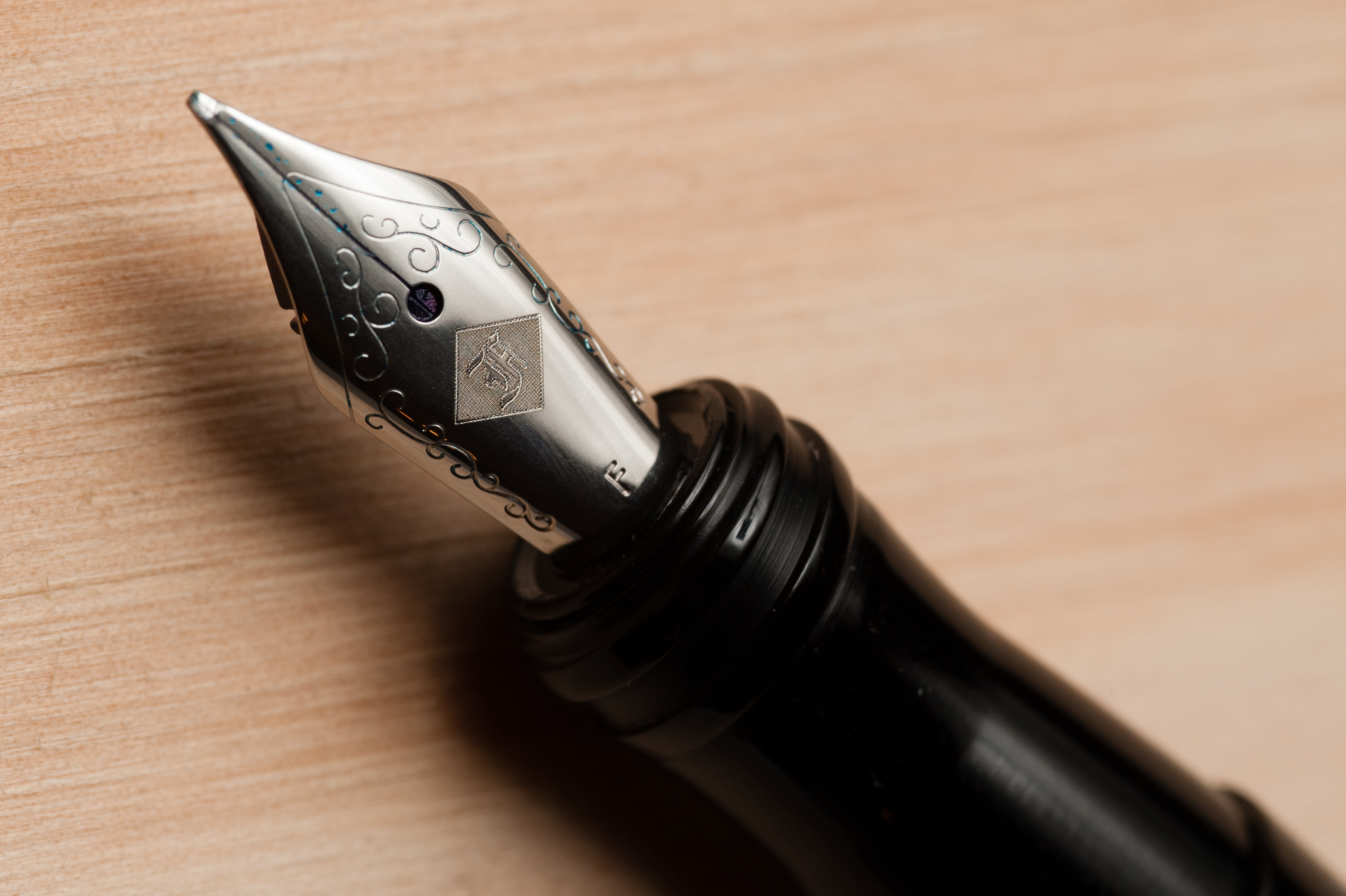
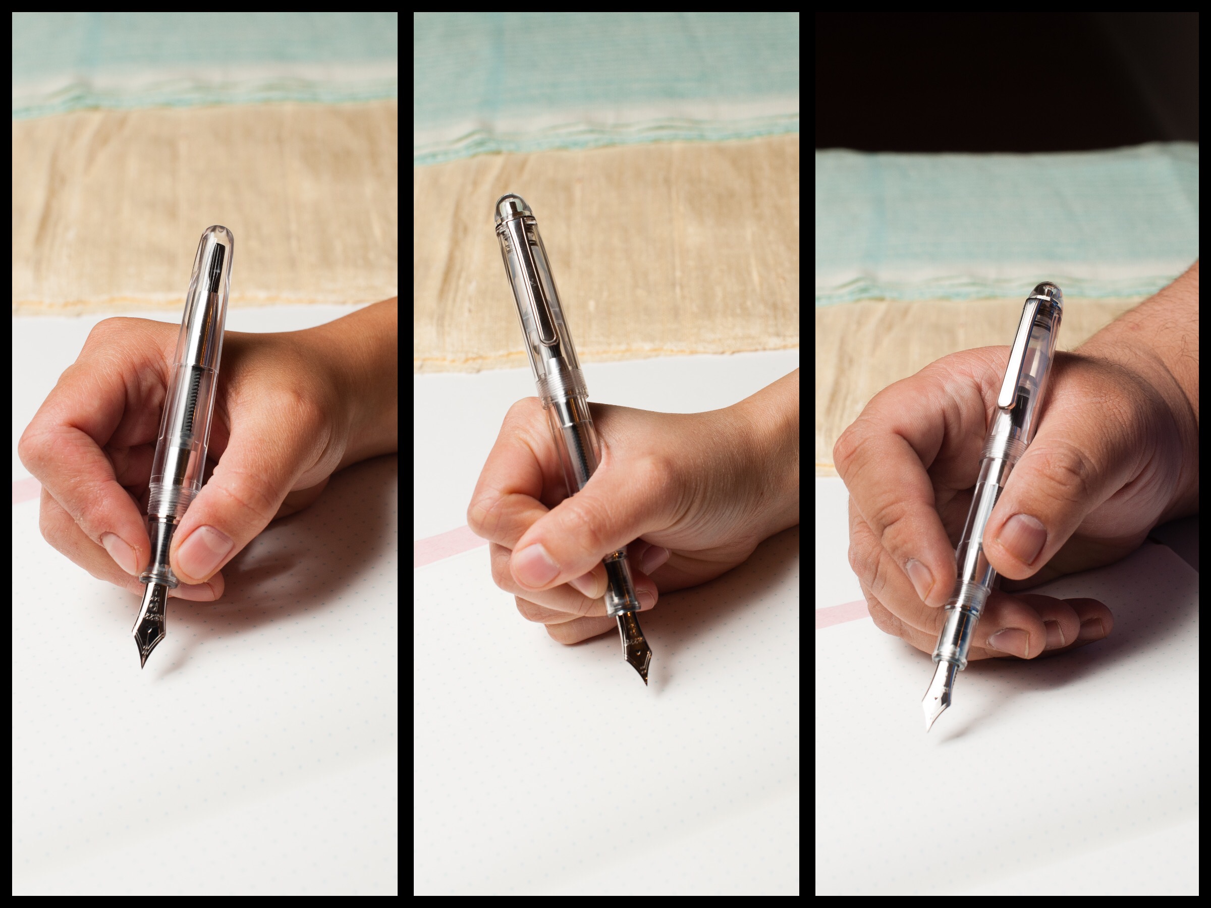
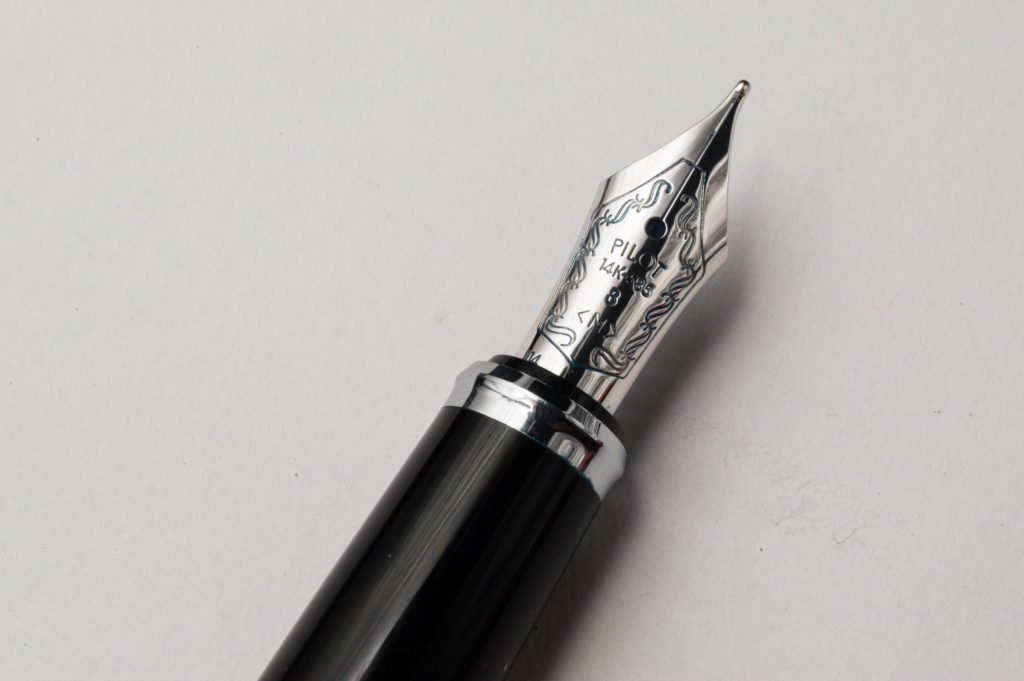
Katherine: The pen I’m reviewing has a medium nib — and I’m very surprised by how wide and wet the nib is. It’s very smooth, but I’m generally not a fan of pens this wide. The overall experience of writing with the pen reminds me a lot of bigger, German nibbed pens. (I don’t have a Metro on hand, but I’m pretty sure this is much wider than the Metro’s Medium nib)
Pam: Needless to say, the medium nib is WAY too broad for me. It’s practically a broad because the gold nib is really soft for me. The nib is a wet writer but very very smooth. Whew. But it sure is pretty and shiny. I wonder how the EF nib is…
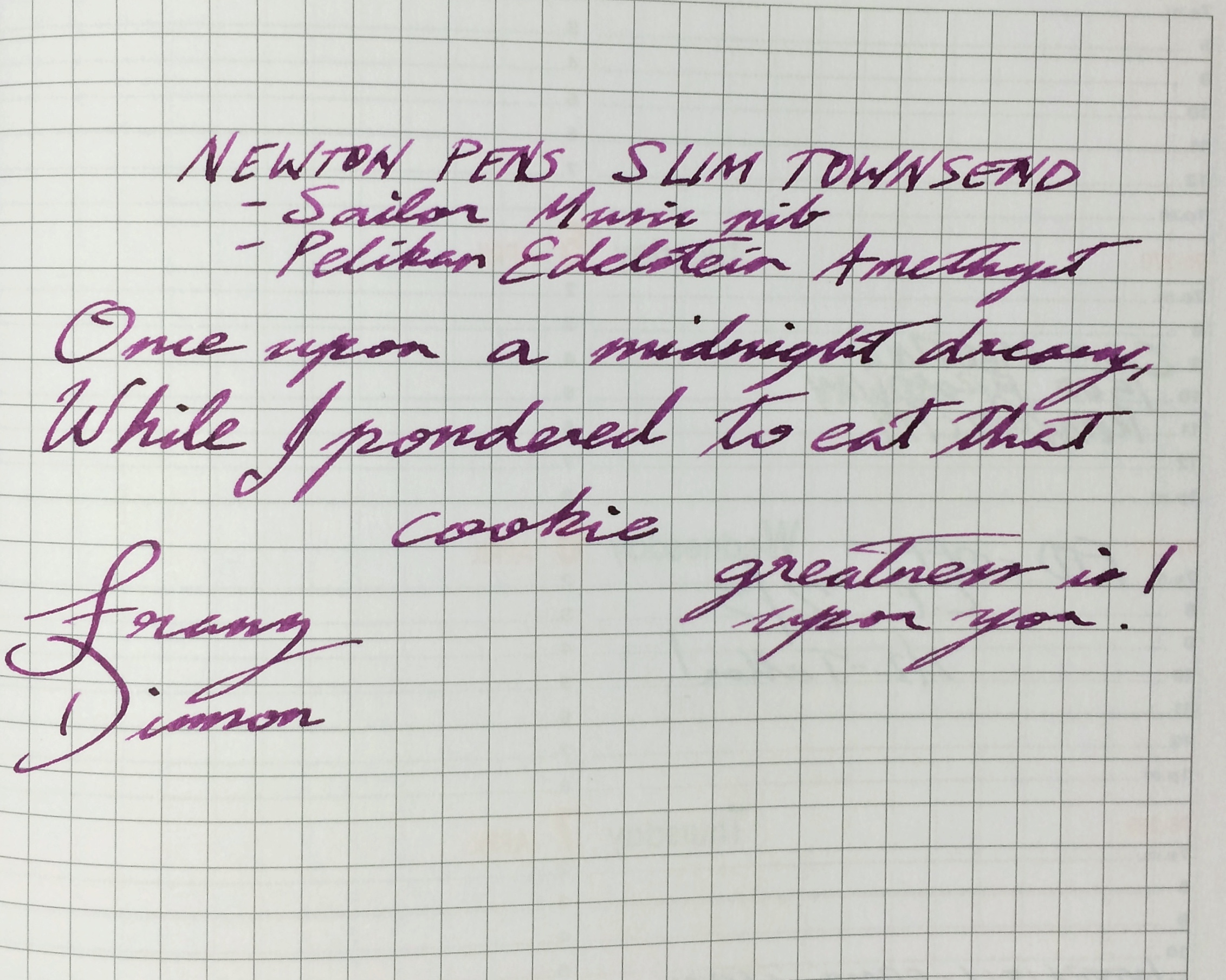
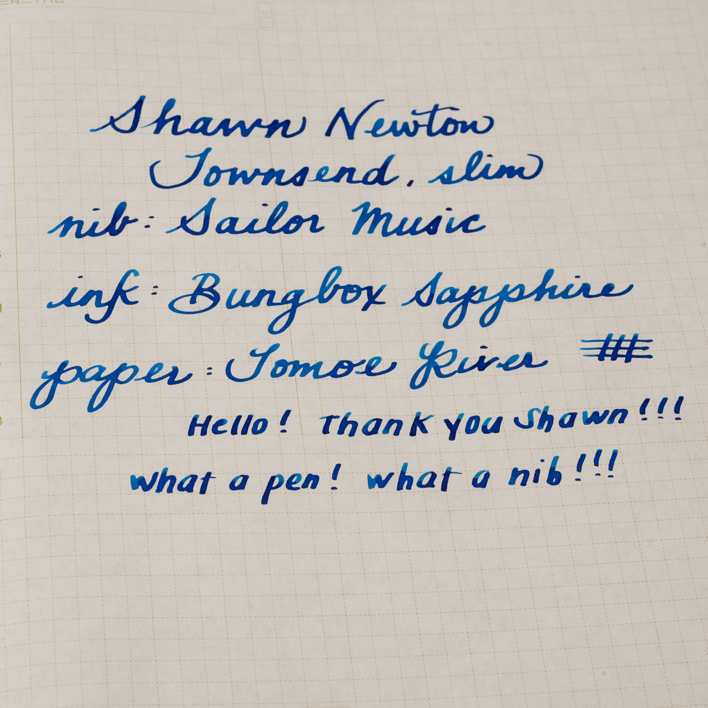
Franz: Ha! I chose that medium nib because there wasn’t a broad nib option. I do have to disclose that the line width is probably thicker now because I wrote with this pen on a daily basis for almost a year. Over time, the nib spread a little bit more than when I bought it.
Write It Up
(20-minute writing experience)
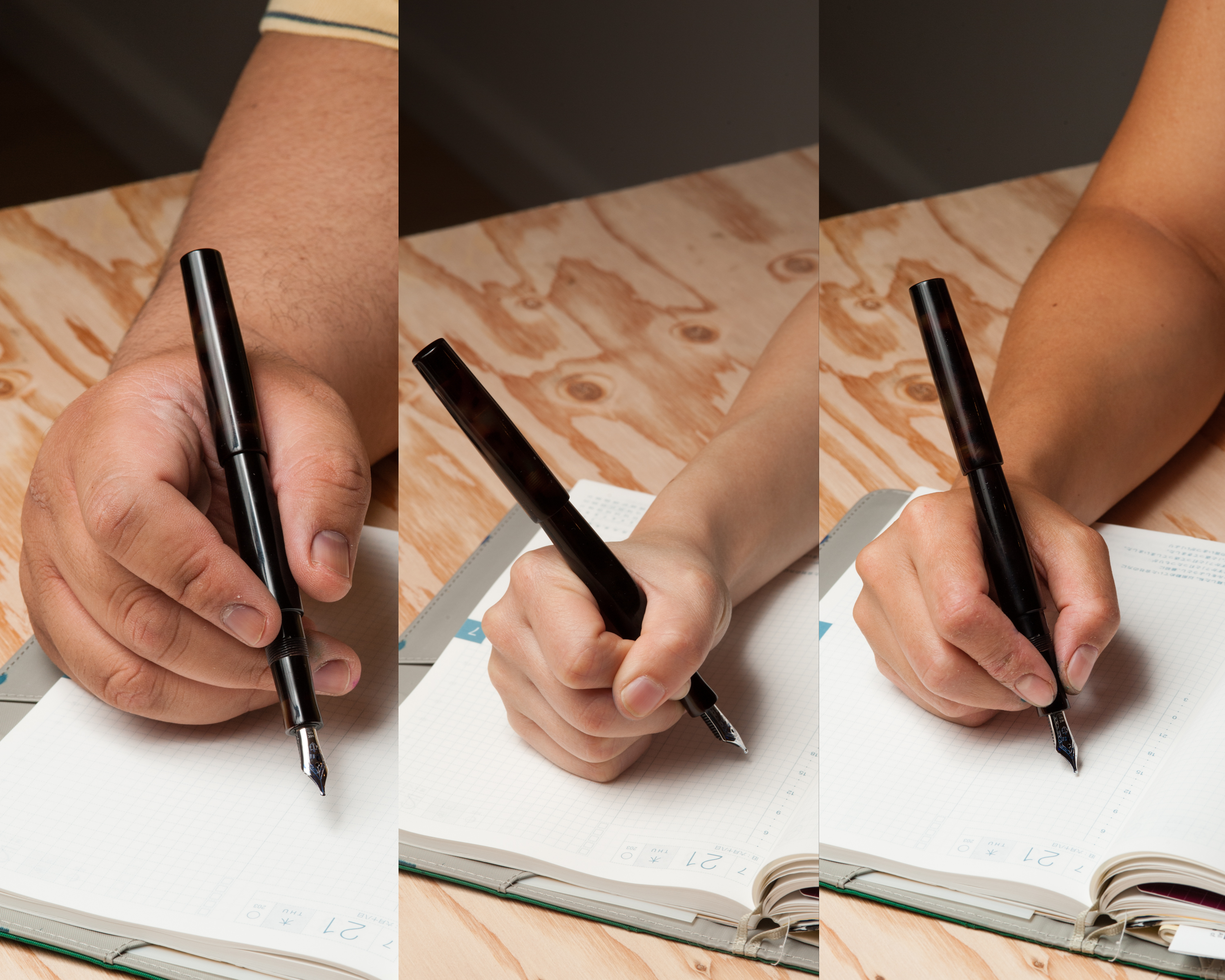
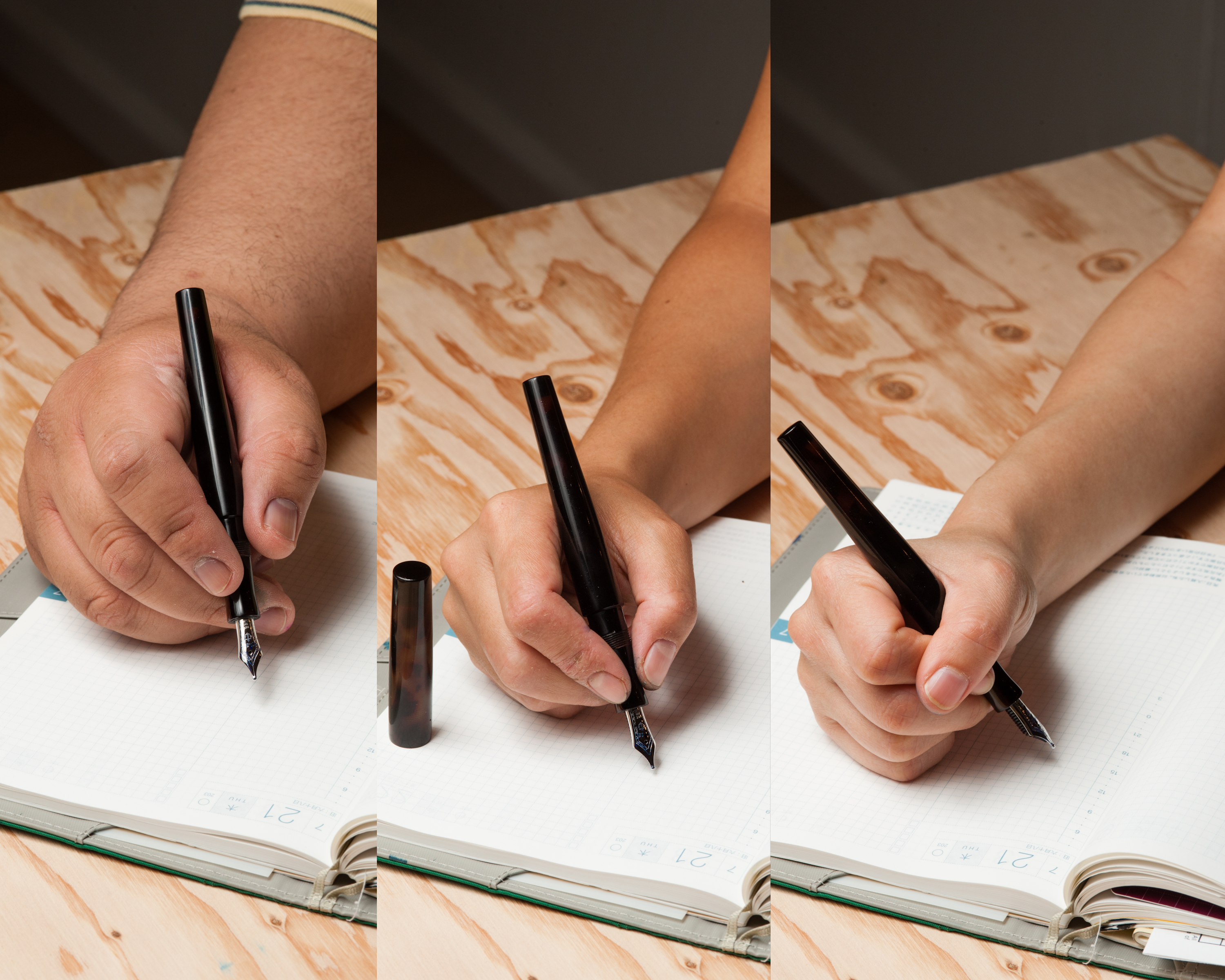
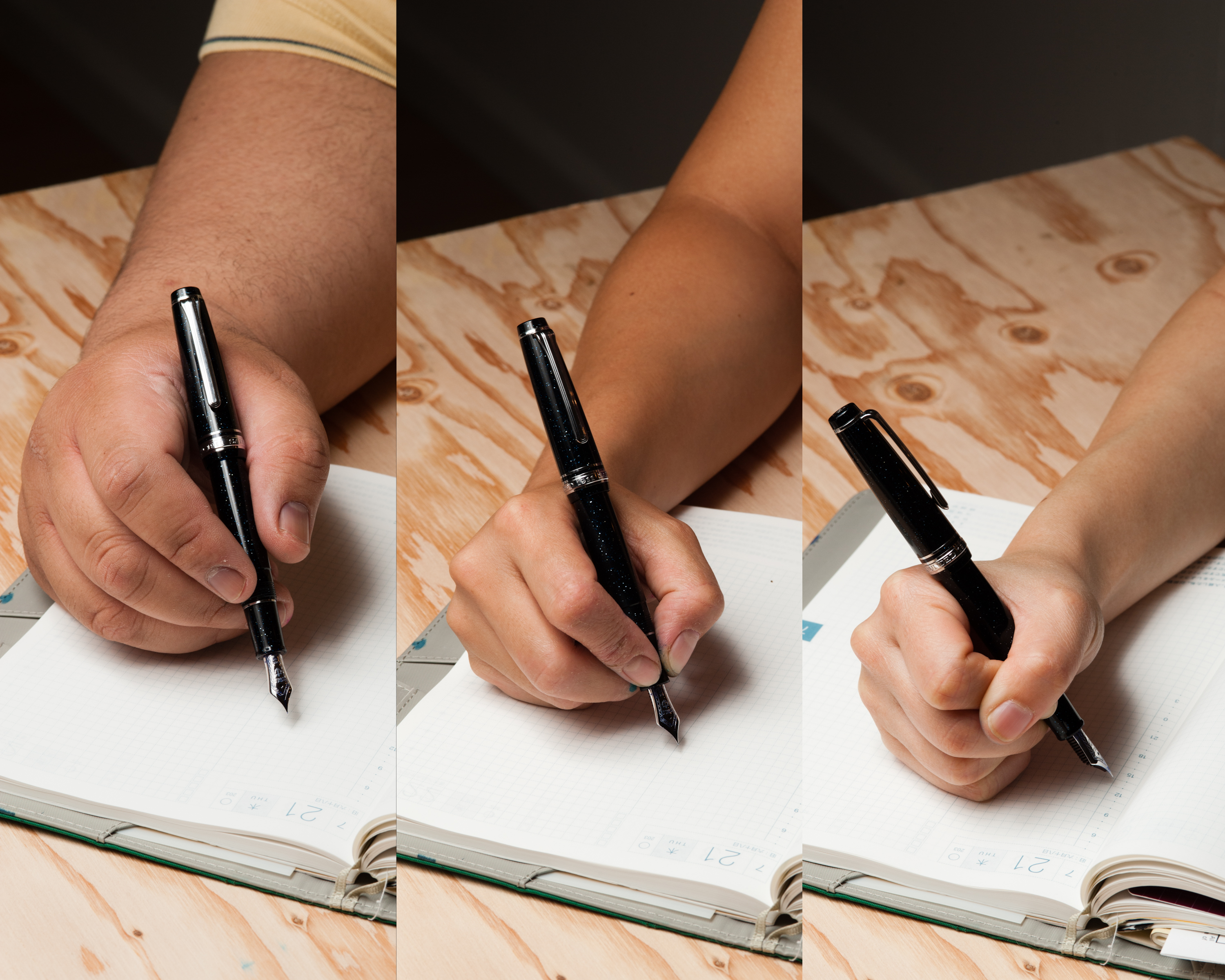
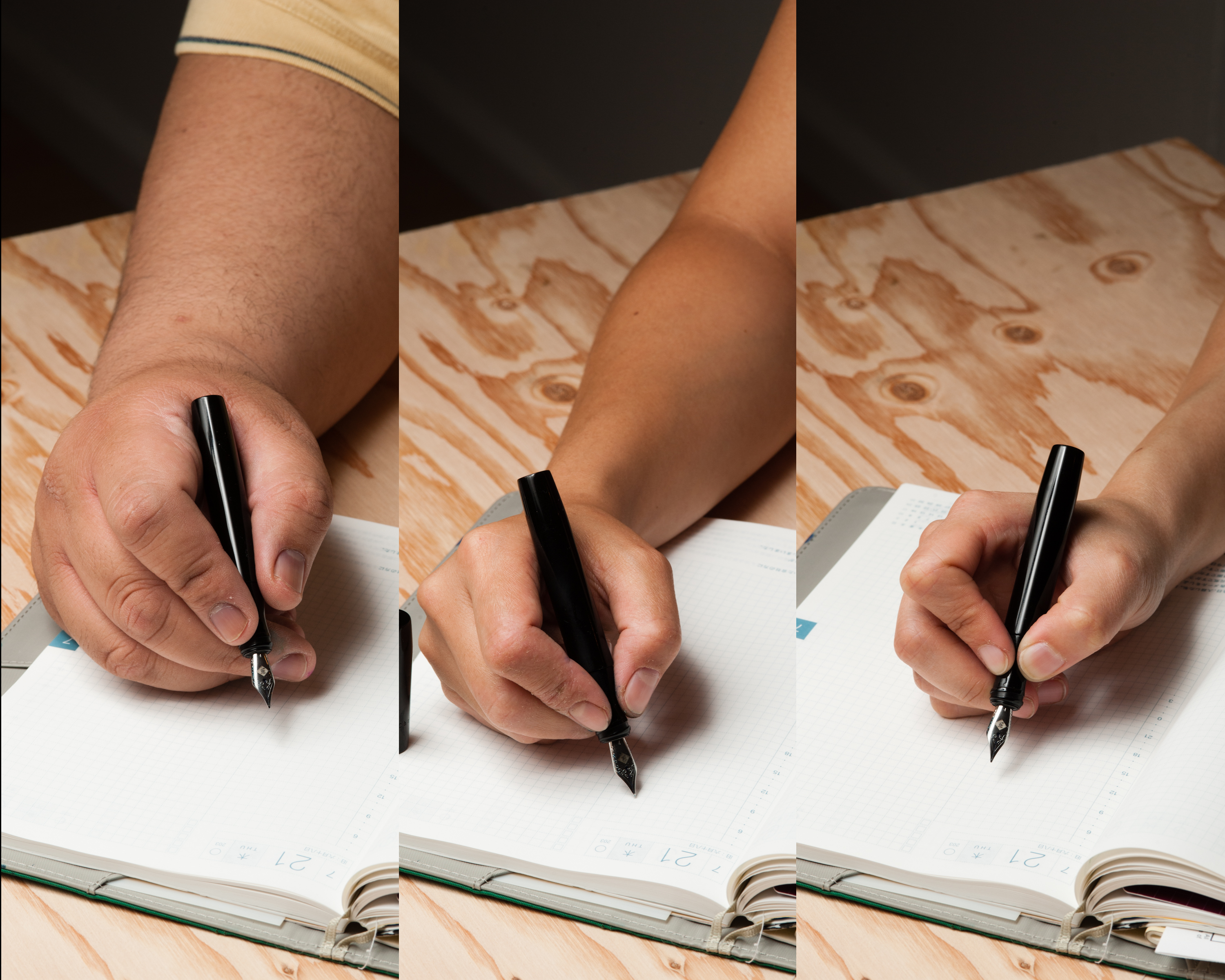
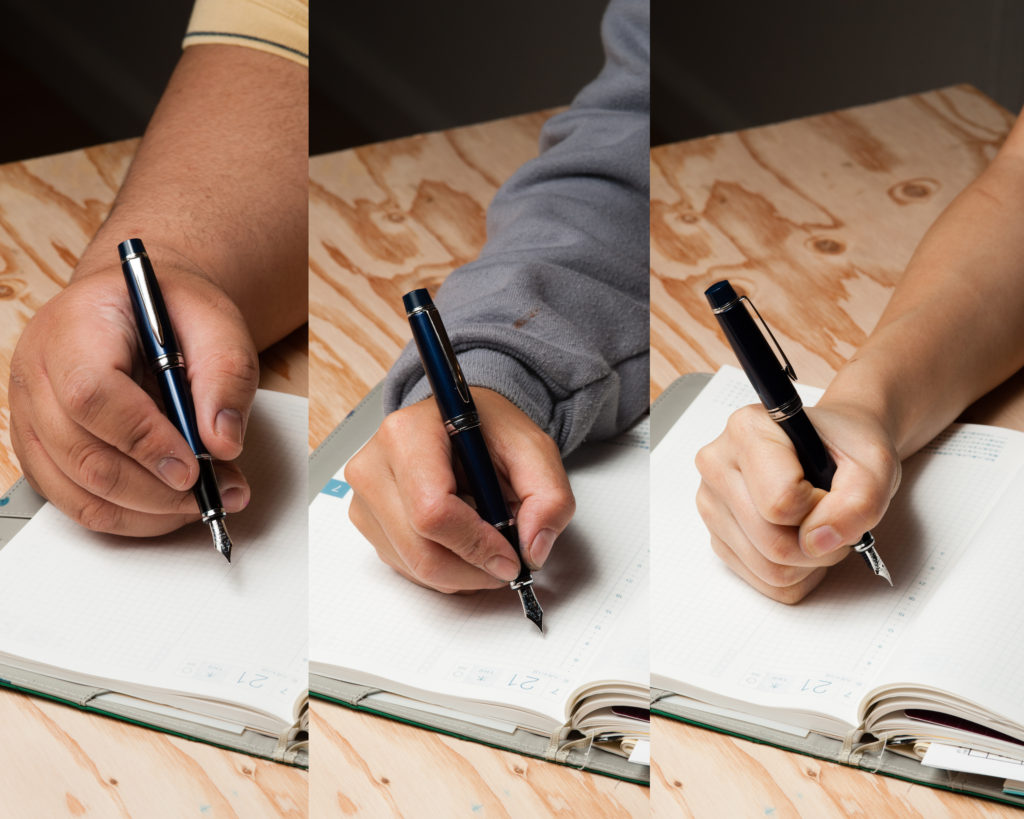
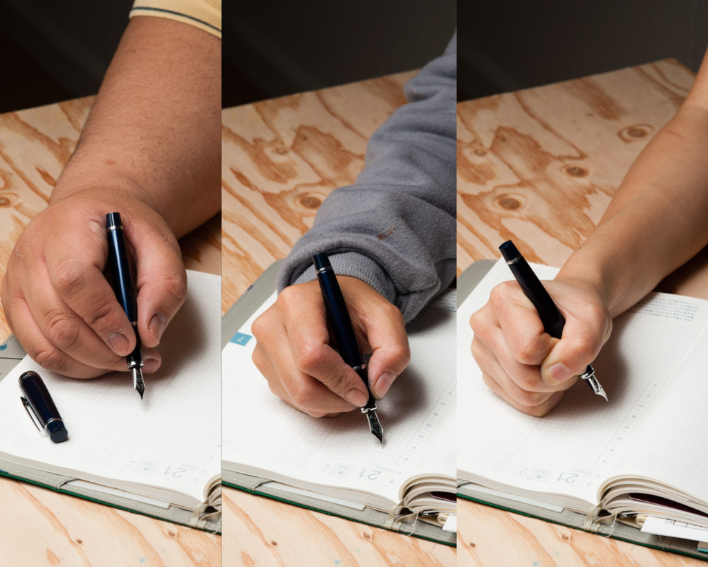
Katherine: Twenty minutes later — this pen is great if I feel like printing, but my cursive is far too small for this pen. For printing though, it’s a solid feeling pen (I could imagine it hurting if I threw it at someone) but I prefer slightly lighter pens when I’m holding a pen at this size. Not bad, but not my favorite.
Pam: I would have to write LARGE with this pen so that my handwriting doesn’t become a blobby mess. The nib and the pen would have been perfect for a long writing session, however, the aesthetics of my handwriting was bothering me. I can’t keep keep writing that large! The cartridge/converter has a decent ink capacity, but, I have to write so large. And the nib is so wet… I can’t imagine using this pen at work on the crappy office paper.
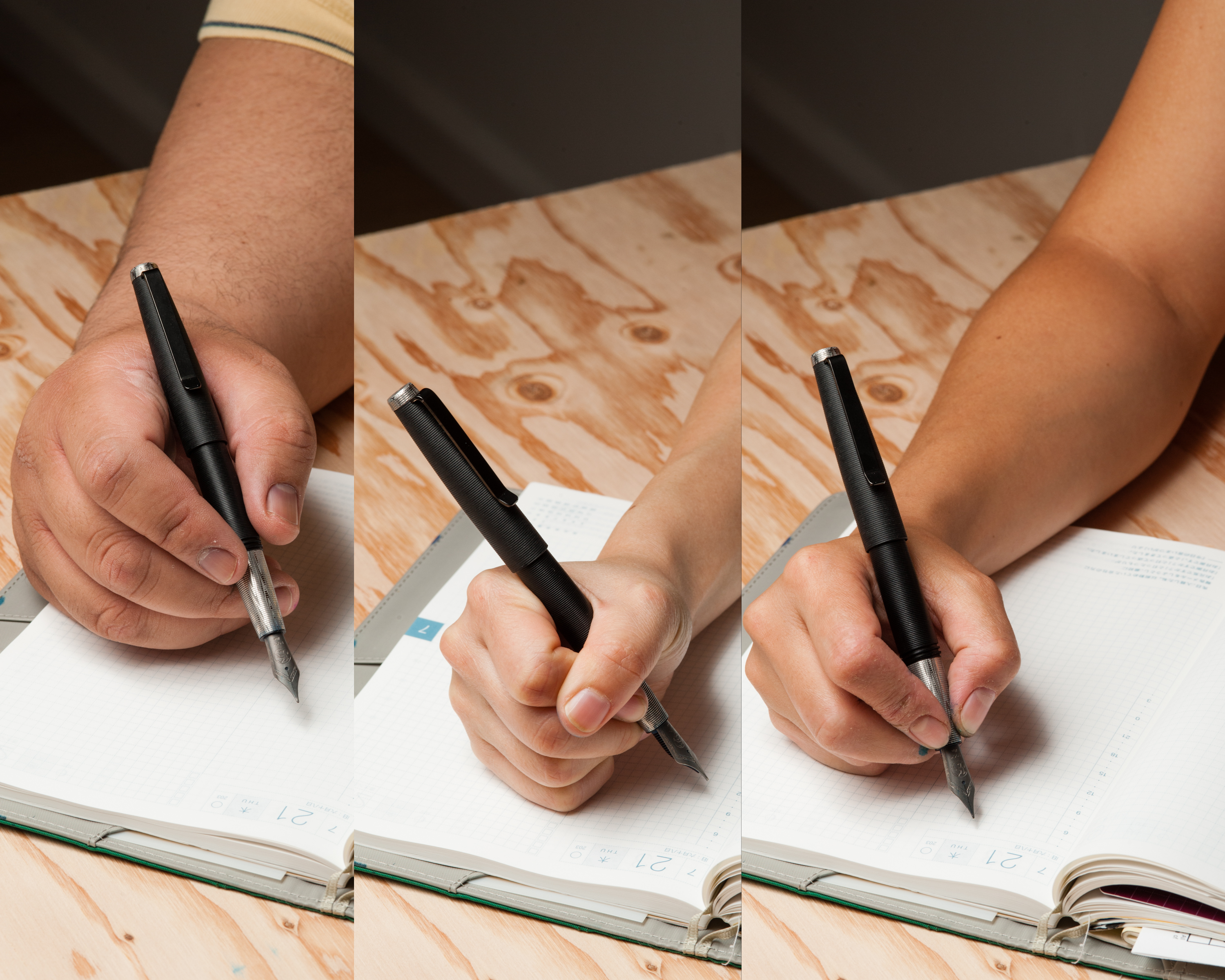
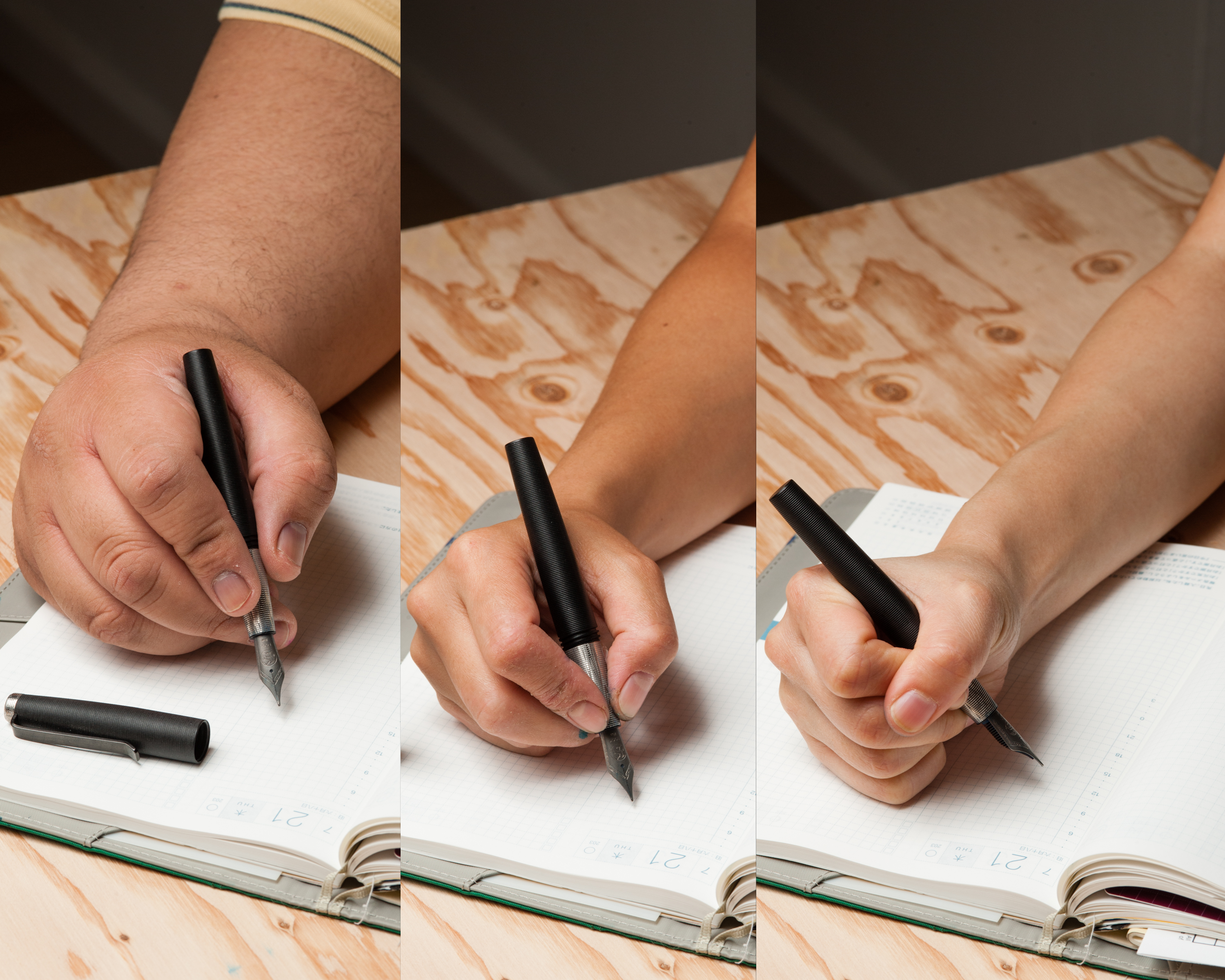
Franz: I used the Stargazer with its cap posted during the full twenty minutes. And even though the weight, and size was quite comfortable, I felt my hand cramp up a little bit. I think that was the first time I wrote with this pen for an extended period of time.
EDC-ness:
Katherine: As previously mentioned, I find this pen a little heavy… which turns into it feeling “slippery” as an EDC. A little too small for how heavy it is. But, when it comes down to use, the slip cap is very convenient. But, the wetness made it hard for me to use as an EDC (my little letter-shaped puddles) didn’t dry in time to close my notebook! The long and the short of it is this wouldn’t be my preferred EDC pen. But it wouldn’t be terrible.
Pam: With the slip cap, elegant design and an extra fine nib, it would be a great addition to any jacket, lab coat or writing arsenal. It’s quick to deploy and you would definitely notice the pen in your pocket. Given my recent lost of my beloved Vanishing Point, I can really appreciate that aspect.
Franz: When I bought this pen, I intended to use it for work daily. With the pull cap design, and nice nib, it worked well for me. Unlike Pam, writing on copy paper wasn’t too bad. There was definitely showthrough and some spots that bled into the back, but it was acceptable.
When I went on vacation for 9 days, I always had the Stargazer clipped onto either my shirt pocket, or jeans pocket. I think this is a good Every Day Carry pen at work or when you’re just out and about.
Final Grip-ping Impressions
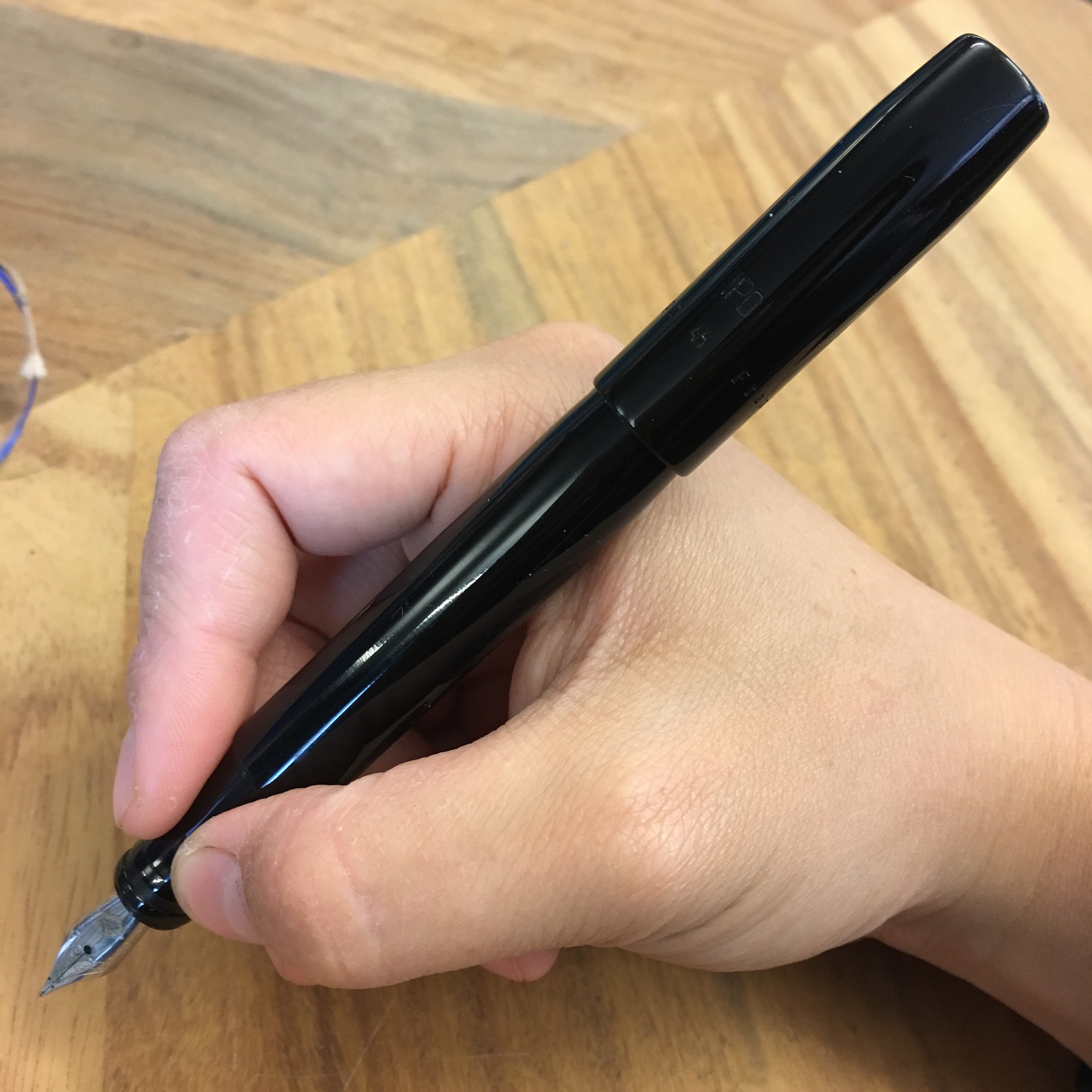
Katherine: As mentioned, it’s a surprisingly heavy and solid feeling pen for how small it is. That being said, I find it a little too heavy for the size — I prefer the feel of the Prera, which is a much lighter pen. This is a pen I wouldn’t purchase for myself or for a friend, unless they were specifically looking for a pocket-friendly pen. It’s a refined looking pen, but it’s a little too heavy and a little too wet.
Pam: This is a pen that I felt was a suitable gift for my friend’s 30th birthday to introduce her to fountain pens. It’s a beautiful, elegant and worth pen for anyone looking for an “upgrade” to the Prera, or as a first gold nib pen if you enjoy the added weight due to the brass body.
Franz: As Pam said, the Pilot Stargazer is a beautiful pen to give as a gift, even if it’s just for yourself. I love the look of this pen and the feel in my hands.
There are two things that may be a negative about this pen. The girth is just a little too thin for me which is probably what caused my hand to cramp. Next, the price of this pen is in the higher range and on par with a few larger pens like the Pilot Vanishing Point, the Pilot Custom 74, and the Lamy 2000. With that said, I do not regret getting this pen.
If you like small pens and a slip cap design, check this pen out.
A philosopher once asked, “Are we human because we gaze at the stars, or do we gaze at them because we are human?” Pointless, really…”Do the stars gaze back?” Now, that’s a question.
– Neil Gaiman, Stardust