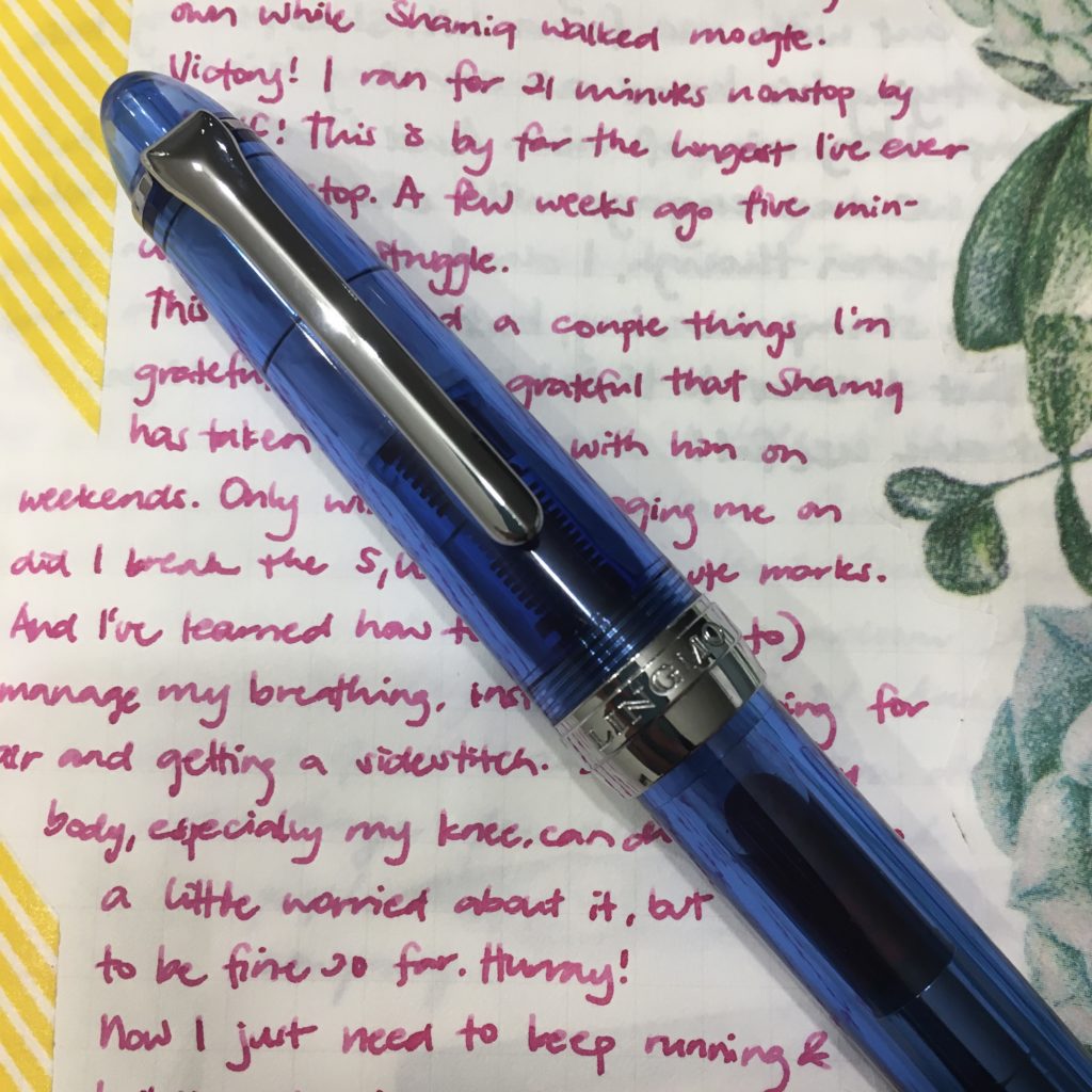
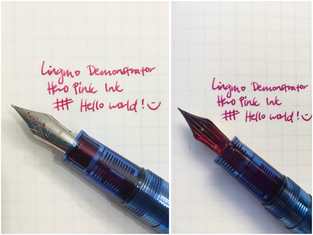
Katherine: As many of you know, I’ve been “upgrading” my collection at a pretty rapid clip over the last year. The SF Show quickly approaches and about a year ago, my most expensive pen was a Danitrio… but other than that, I’d never spent more than $120 on a pen. That’s changed quite a bit, so this month I thought I’d revisit the cheaper side of the hobby — I inked up a Lingmo blue demonstrator with some Hero Pink ink (the entire set of ten colors was $30!). It’s a slim pen, but I love the pairing of a bright ink on the clear feed of the Lingmo! A bright and sunny combo for the summer!
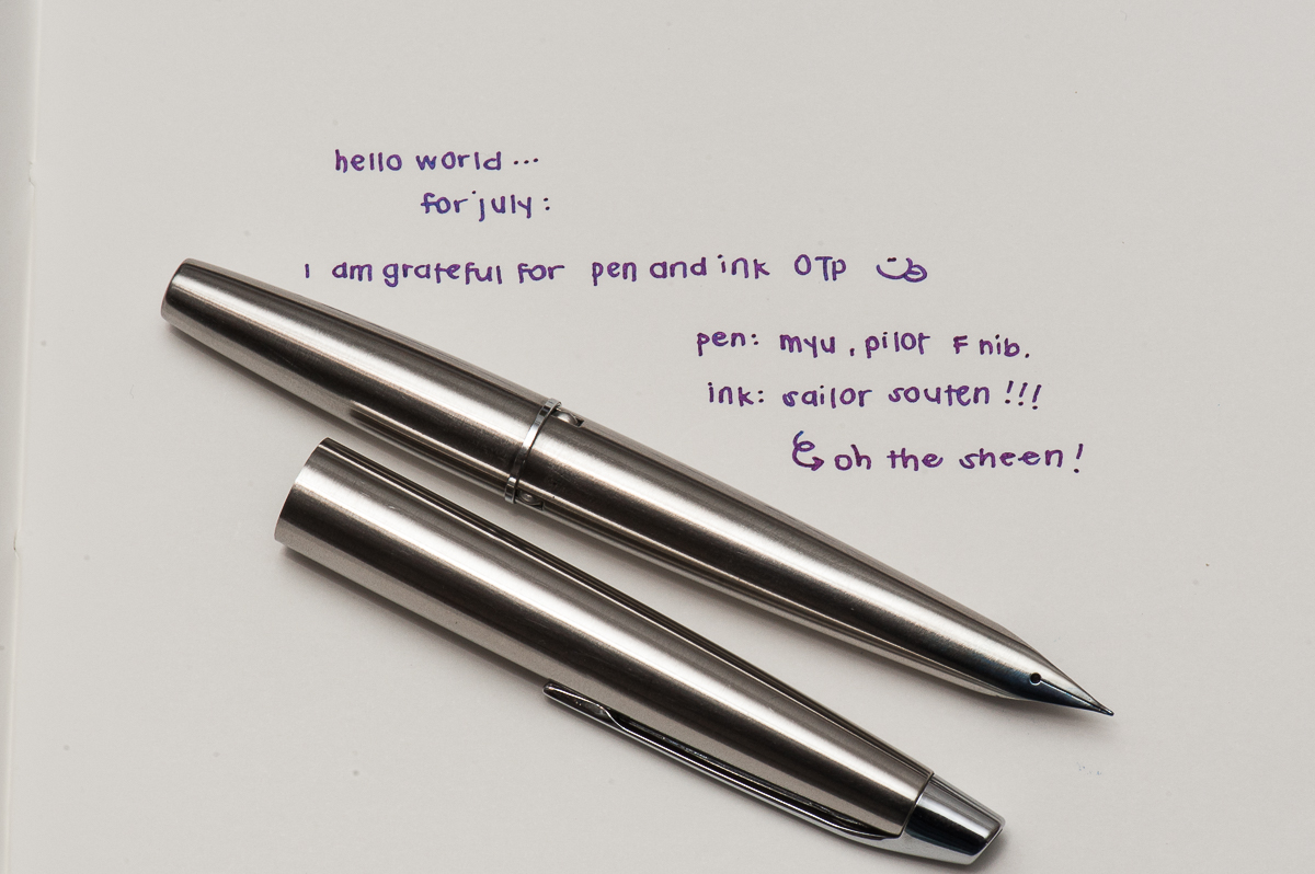
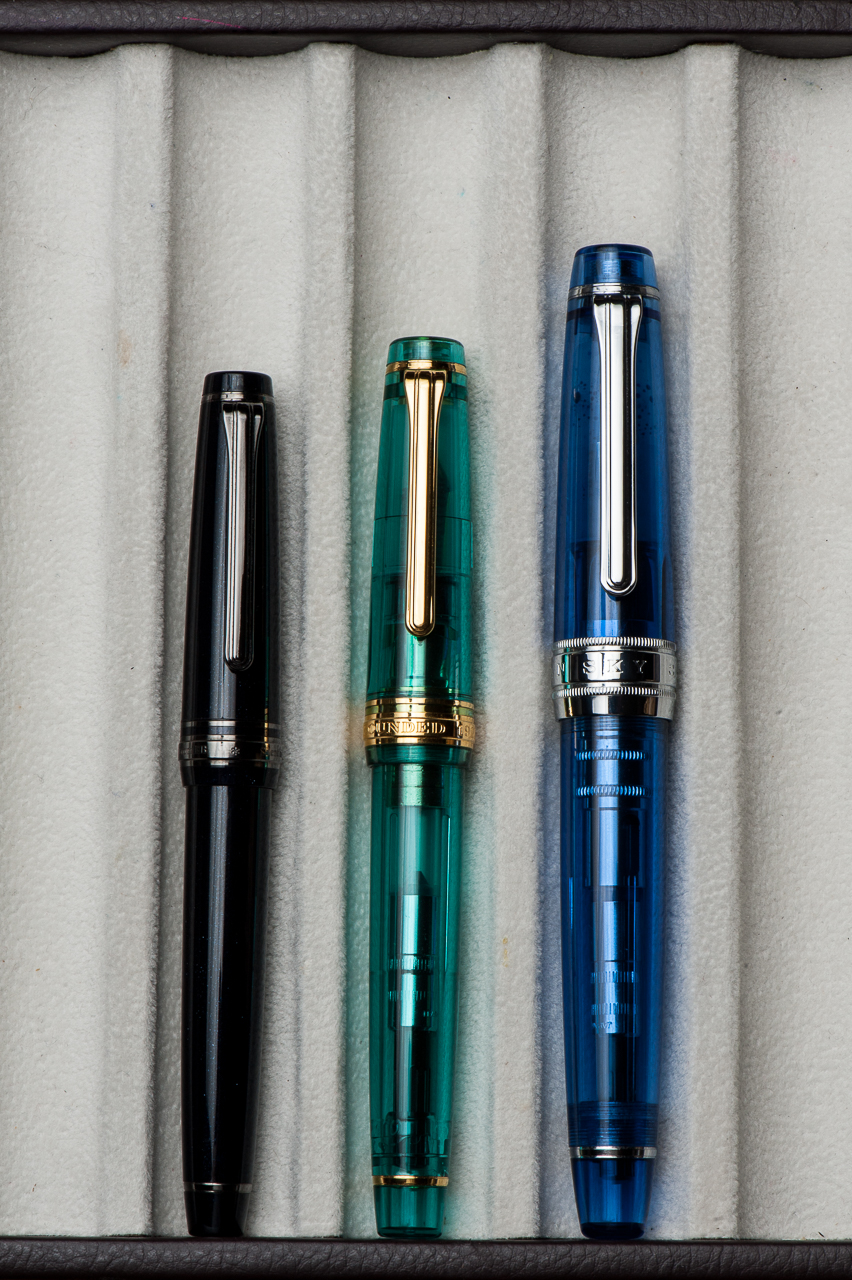
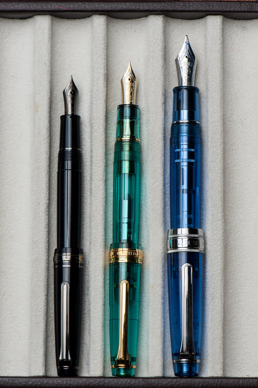
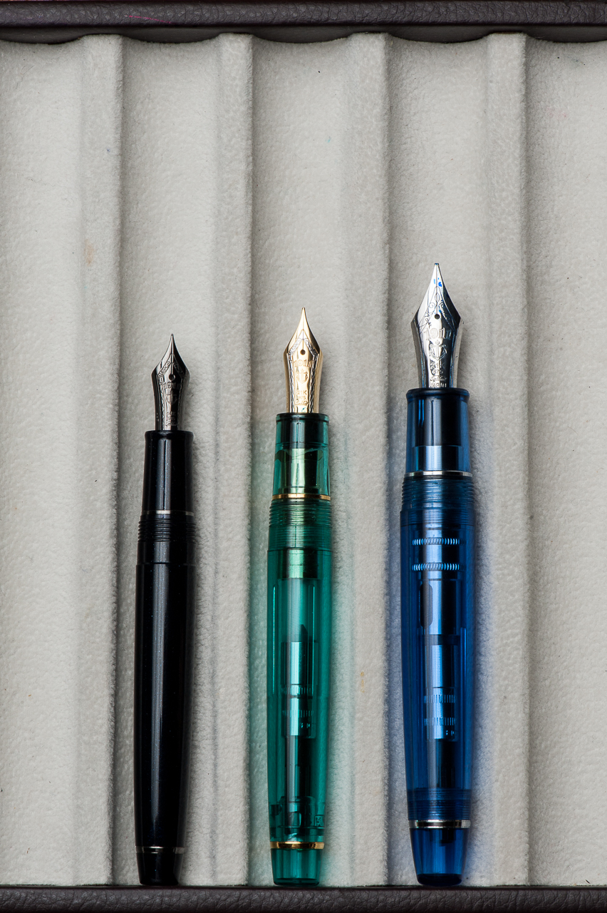
Pam: July is the peak of the summer months here in California. My inky homage to the cloudless (and hot) days and swimming pools during this time of year is Sailor Souten! I was lucky enough to get my hands on a Pilot MYU with a Fine nib. (Thank you Andrew!) The feed has a chip on it that creates a wetter ink flow. (It writes more of a Medium Fine to me.) With the extra flow of the pen, and the unique design, I had a hard time finding an ink and pen combination that I loved…until I tried Sailor Souten. Sailor Souten is reminiscent (if not identical) to Sailor Sky High. The bright color and sheen really comes through with the extra wetness with this Pilot MYU. The bright color of the ink is a great compliment to the minimalistic design and color of the MYU. It’s like the unexpected bright pocket square to a gray suit. Or maybe this is a pen-ink version of the mullet: The pen looks like it means business, but the ink is a party.
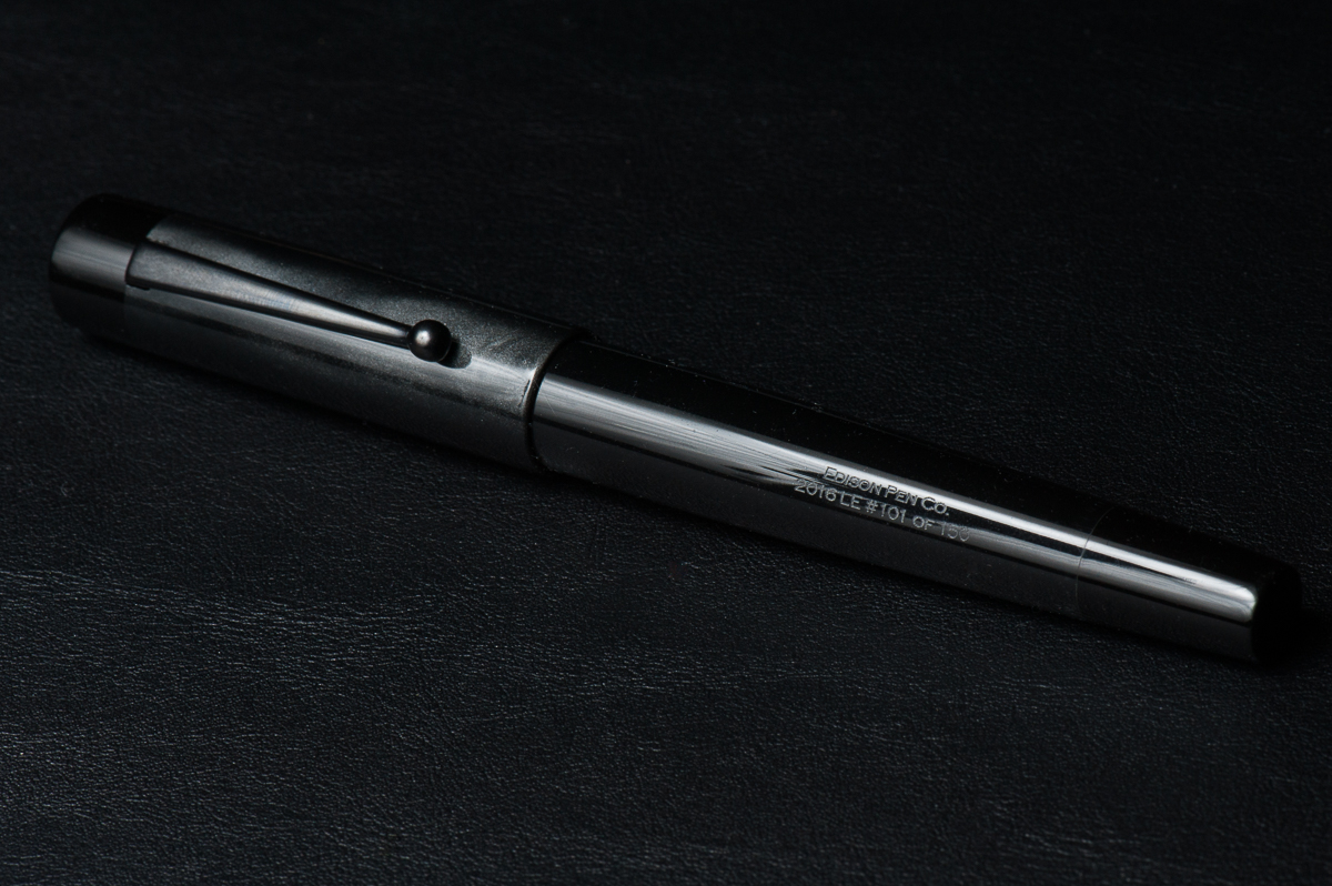
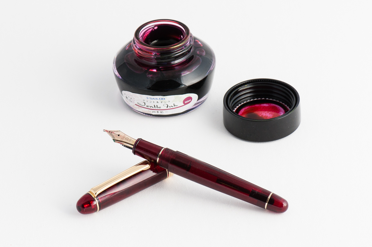
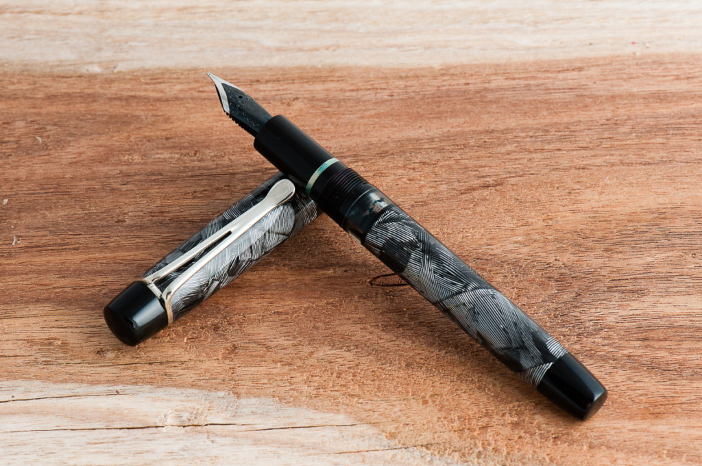
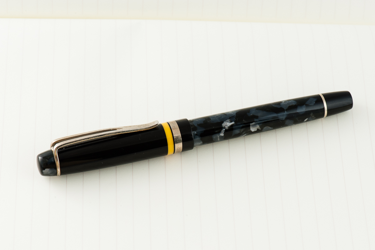
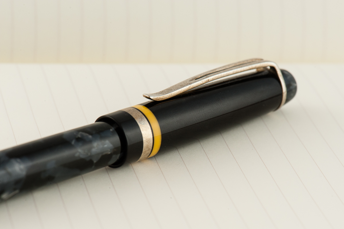
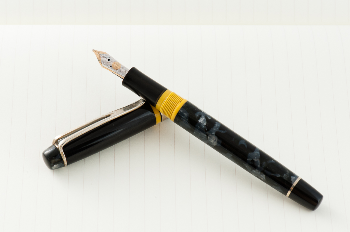
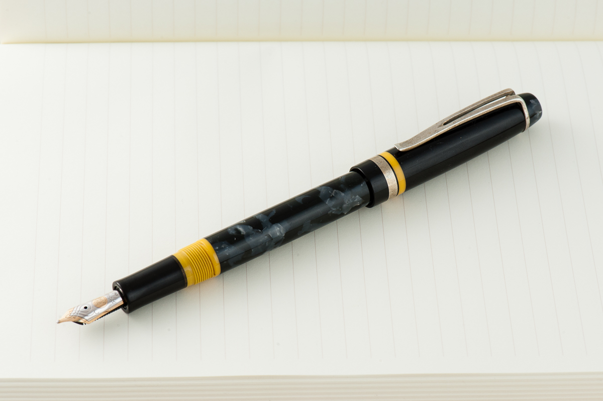
Franz: Aww man! July has been a busy month for me and I’m “grateful” that I have my pen friends and my pens to keep me going. #hotpGratefulInJuly! It took me a while to decide which pen and ink pairing I’d be highlighting for July for I have a “few” pens inked up. I’ve decided to feature my 2016 Limited Edition Stealth Glenmont from the Edison Pen Co. I acquired number 101 of 150 last October of 2016 and I was lucky because this pen was sold out less than 12 hours when it was announced by Brian Gray. Being that this is a black pen, the ink options are unlimited and I initially inked it up last year with a blue-black ink.
This month, I was reminded of what my friend Gerald (@mycoffeepot) once said. “Stealth pens crave pink ink”, April 2013. (And by the way, he does pen reviews on YouTube) So, I got myself a bottle of Pilot Iroshizuku Tsutsuji and satisfied my stealth pen’s craving. With the broad cursive italic nib customized by Dan “The Nibsmith” Smith, the juicy ink flow brings out Tsutsuji’s gorgeous color. And that sheen! =) I’ve been happily journaling with this pen and it’s almost time to refill the converter.
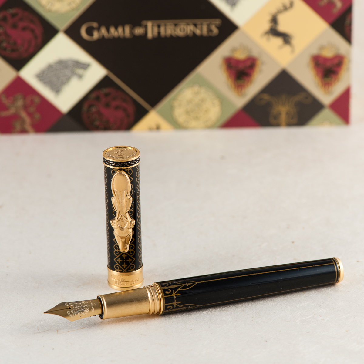
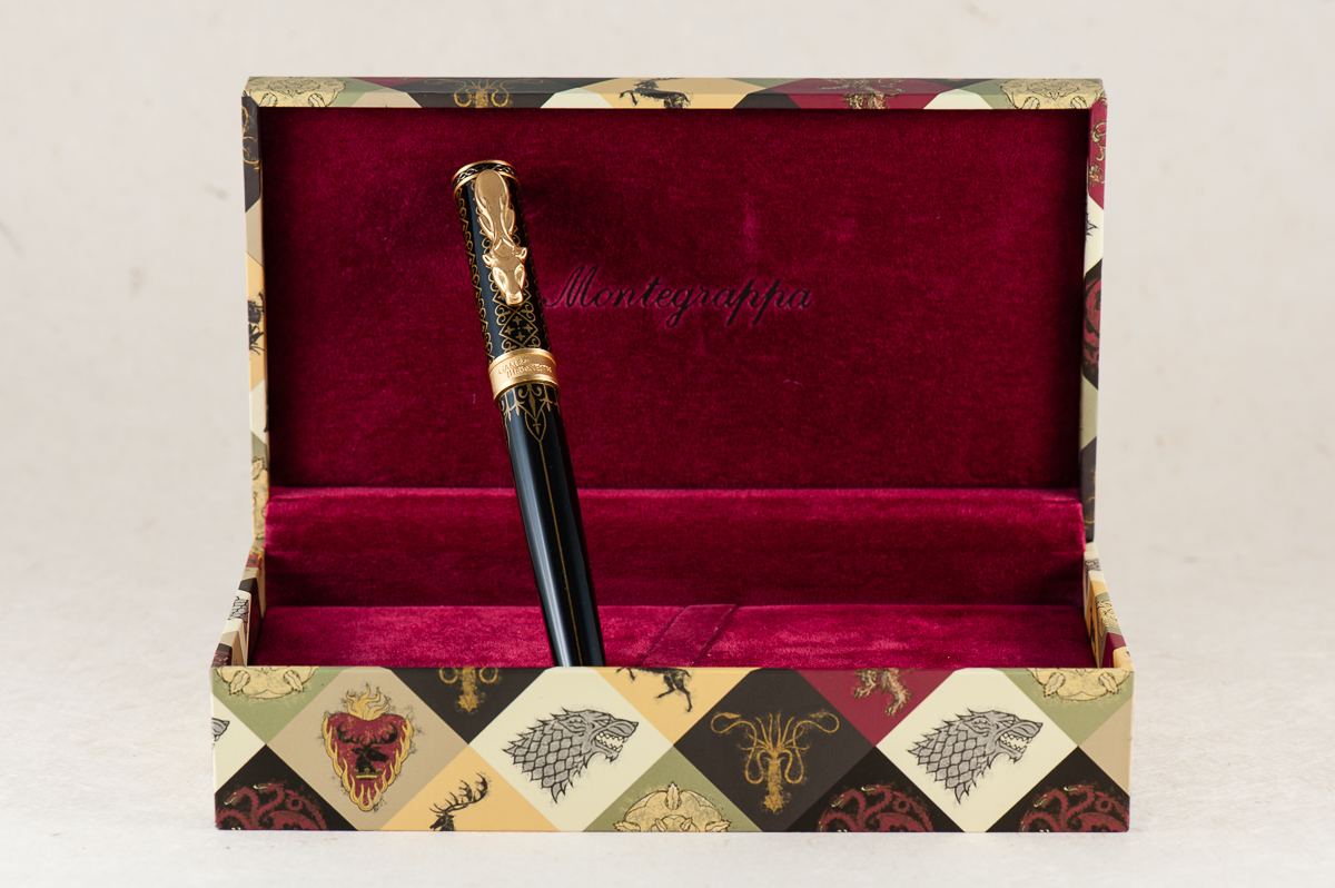
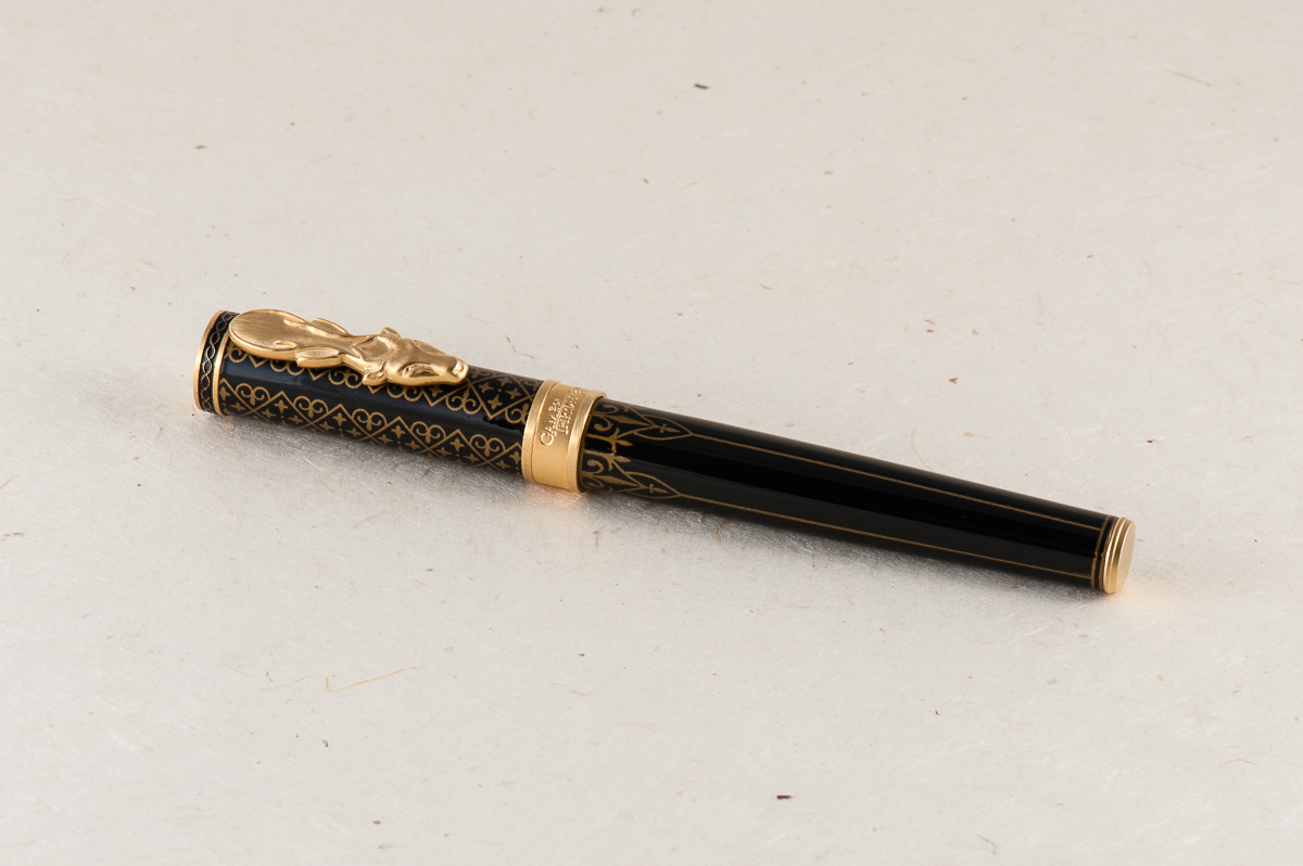
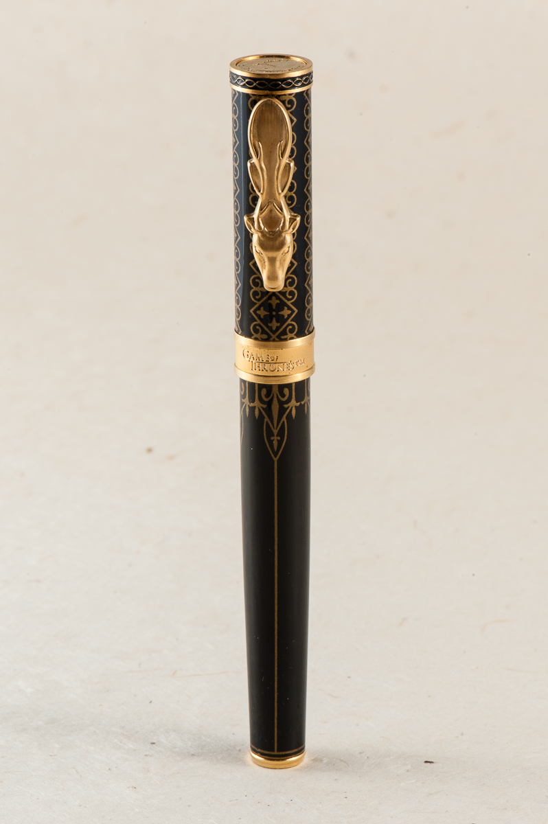
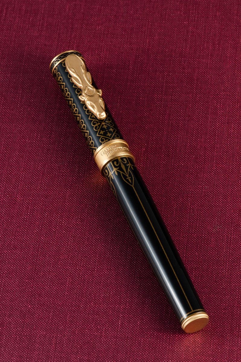
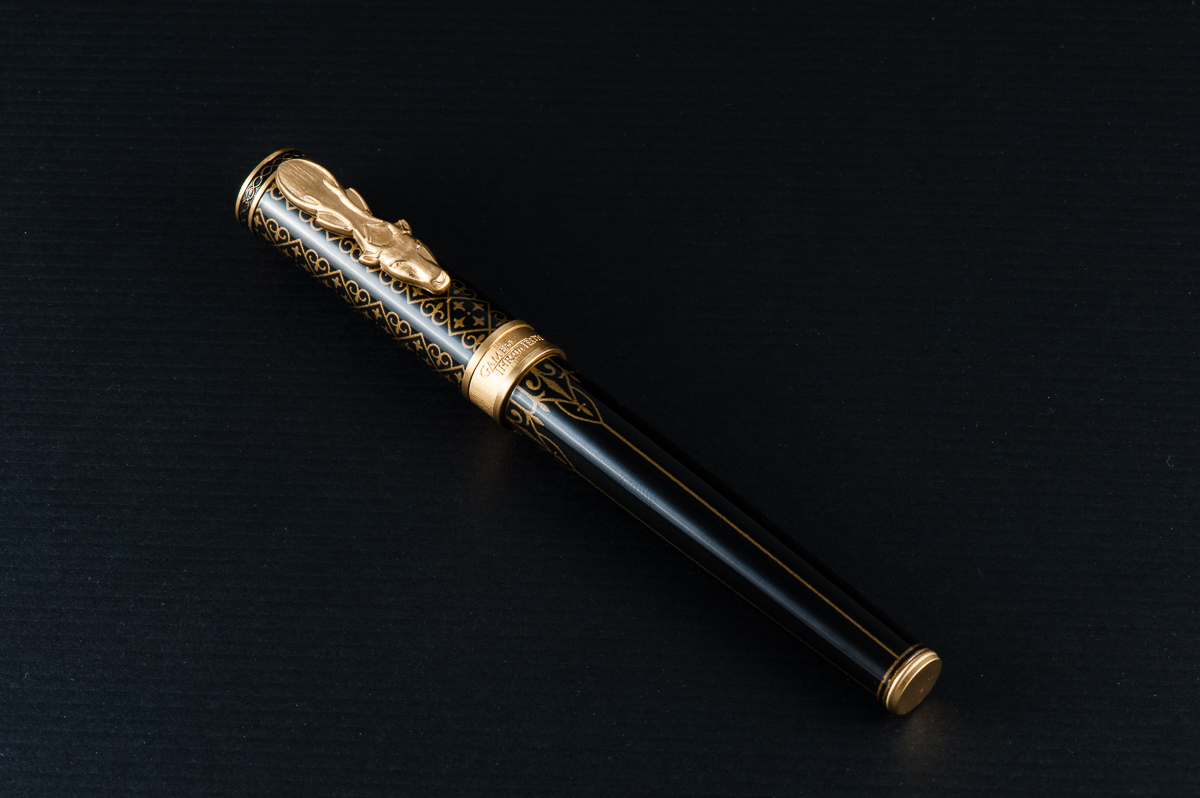
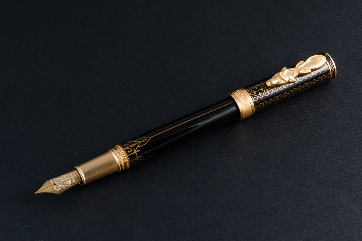
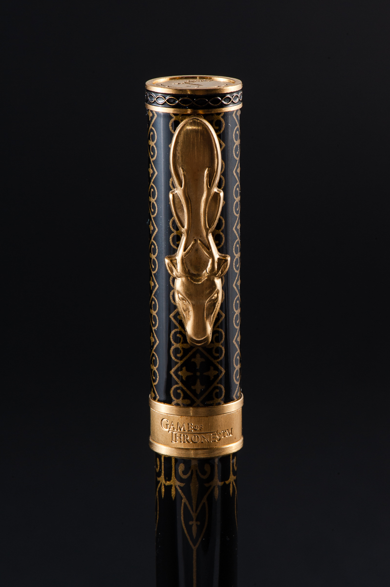
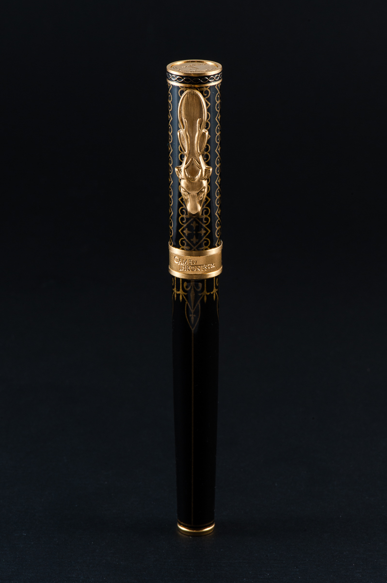
We would like to thank Mr. Detlef Bittner of Bittner Pens for letting us review this Montegrappa Game of Thrones Baratheon fountain pen. His family pen store is located in the beautiful town of Carmel, California, and is well known in the pen shows in the United States.
And as always, the opinions here are our own and we were not compensated (monetarily, or otherwise) for this review.
Hand Over That Pen, please!
Katherine: It’s a cool looking pen — though I was a littttle disappointed that there wasn’t more texture to the barrel, which makes it feel more mass produced and gimmicky to me. But really, I’m not sure what I expected, I think my standards may just be unreasonable here. Out of all the GoT pens, I like this one the most, which is a litttle disappointing, since the Baratheons aren’t a terribly interesting house to me.
Pam: Fan disclaimer: I am only on book 2 of the series so I have been holding out on watching the series in its entirety. Therefore, I have to say, this is a really good representation of the houses from the awesome fantasy series. My biggest gripe about the set of 4 is that I believe that they could have made a set of 5 to include the Tyrells because who doesn’t love an experienced, witty woman throwing some shade? (Think of an edgier Dowager Violet Crawley from Downton Abbey for those not familiar with the glorious shad-ability of Olenna Tyrell.)
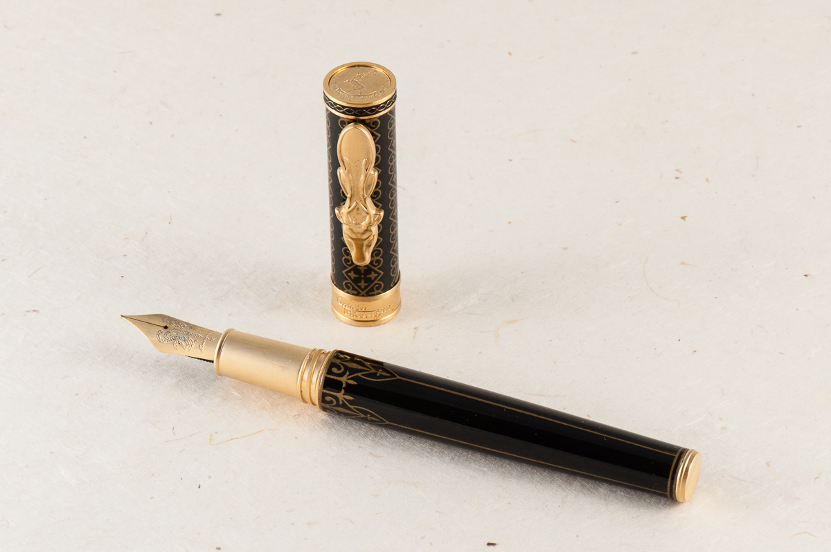
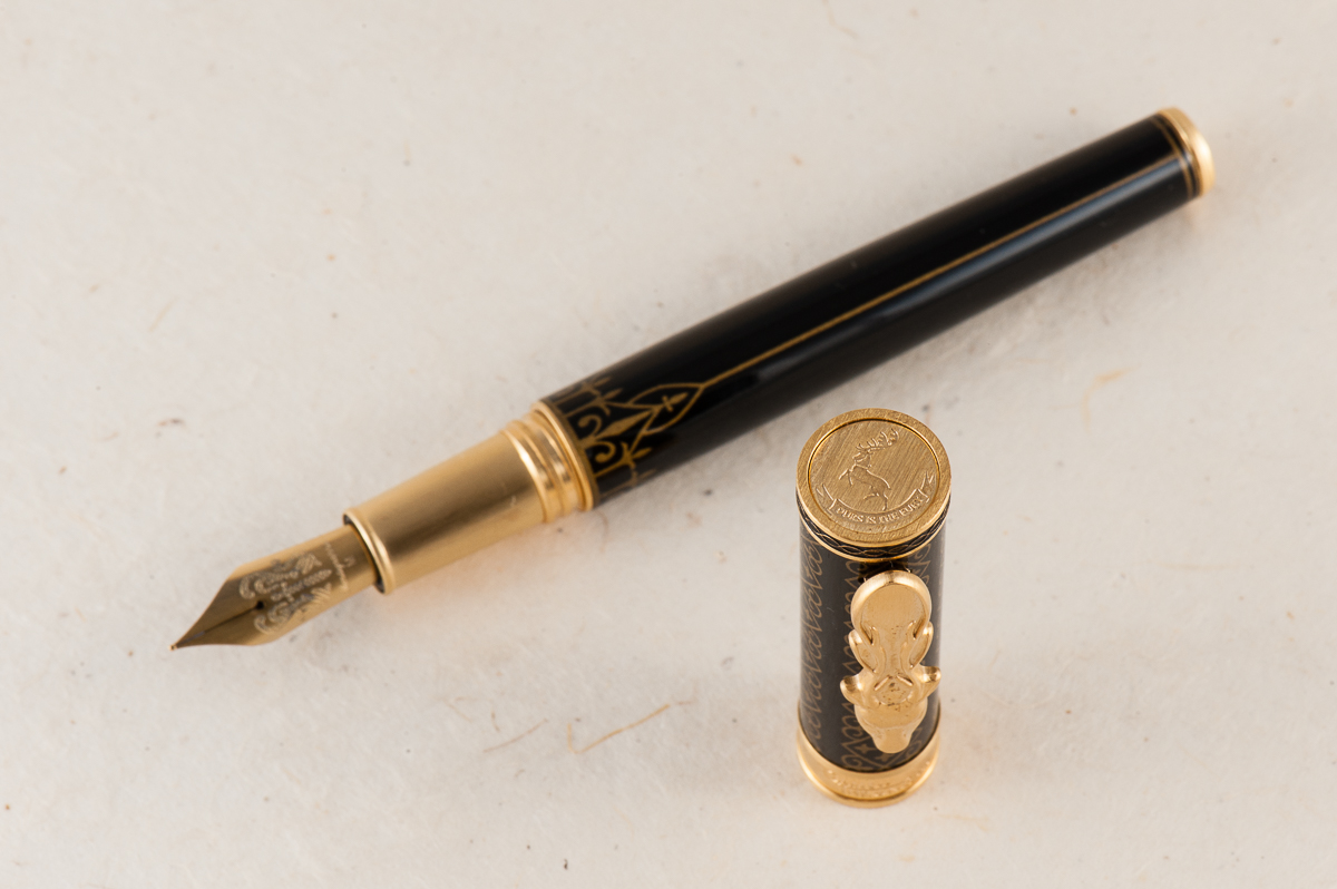
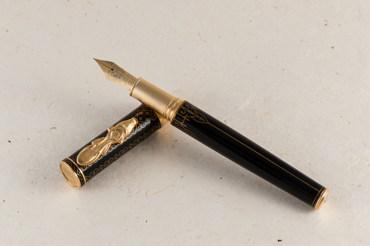
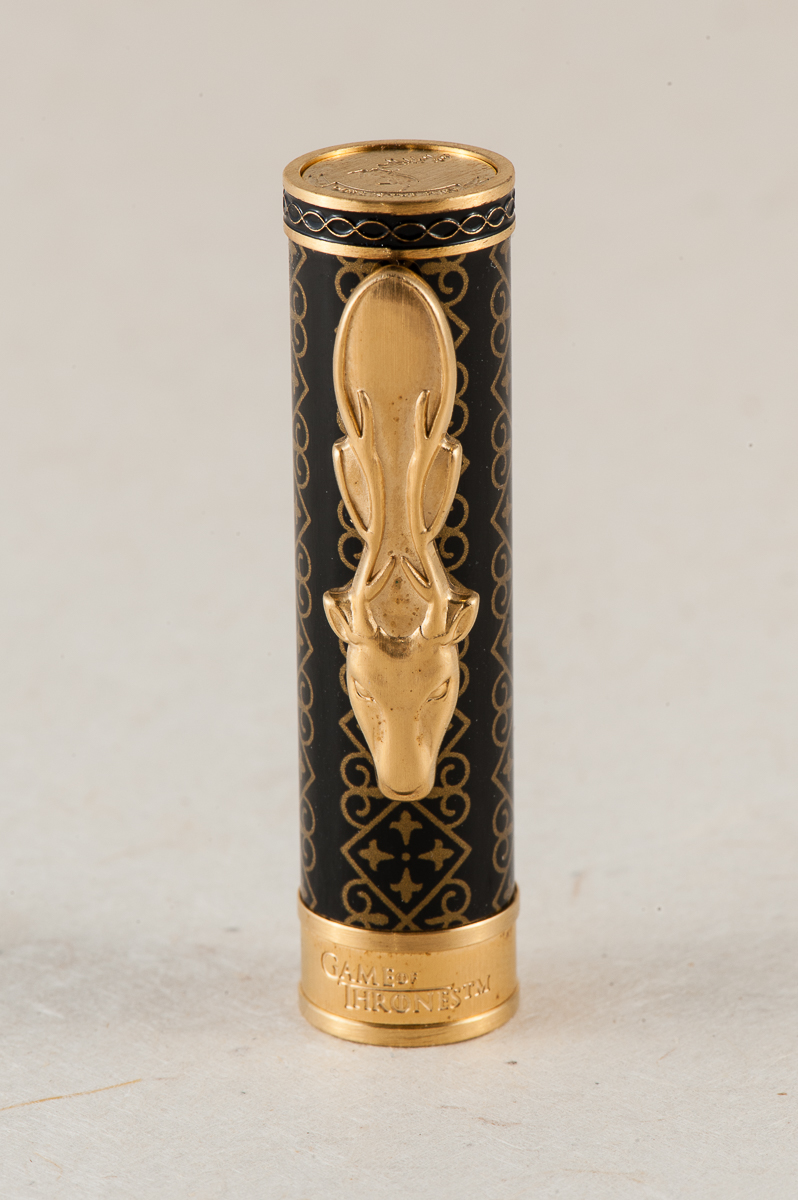
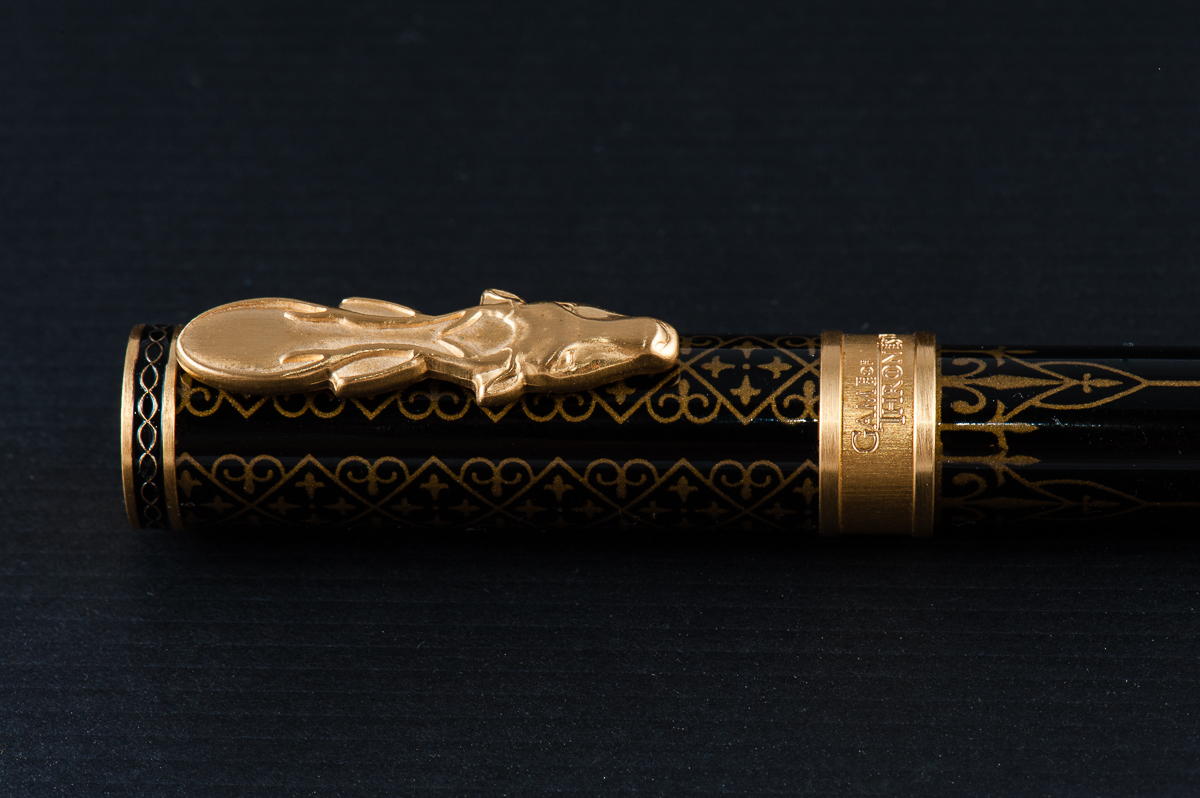
House Baratheon is one of my least favorite, but I think of all the pens, the Baratheon pen is the best made and unique of the bunch. The clip is perfect representing the Baratheon stag. I find the other clips, Lannister’s Lion, Stark’s Wolf, and Targaryen’s Dragon, to be too triangular and similar in shape and less pleasing to the eye. The stag is the most unique and well done of all the clips in my opinion. There was so much potential for the dragon on the Targaryen’s pen for it to be more serpentine in shape or maybe even wings! The rest of the decor are similar among all the pens, with the exception of the colors to represent each house.
Thank you again Bittner Pens for allowing us to borrow this beauty!
Franz: So… let me just say it. I have not watched a single episode, segment, nor even a second of Game of Thrones. *cringe*. Nothing against the show but I just haven’t given it a chance yet. So my approach with this pen review is just all about the design, performance, and of course the Hand-le-ability of the Montegrappa GoT Baratheon. I think I will let the person who has the most knowledge of the pen’s theme handle the rest of what the pen represents. Right Pam? ;-P
Just by handling the pen, I loved its overall looks and the heavier weight is more what I prefer. The brushed cap finial, cap band, and section ties up the design of the pen as well. And that clip design. Wow. Love the clip!
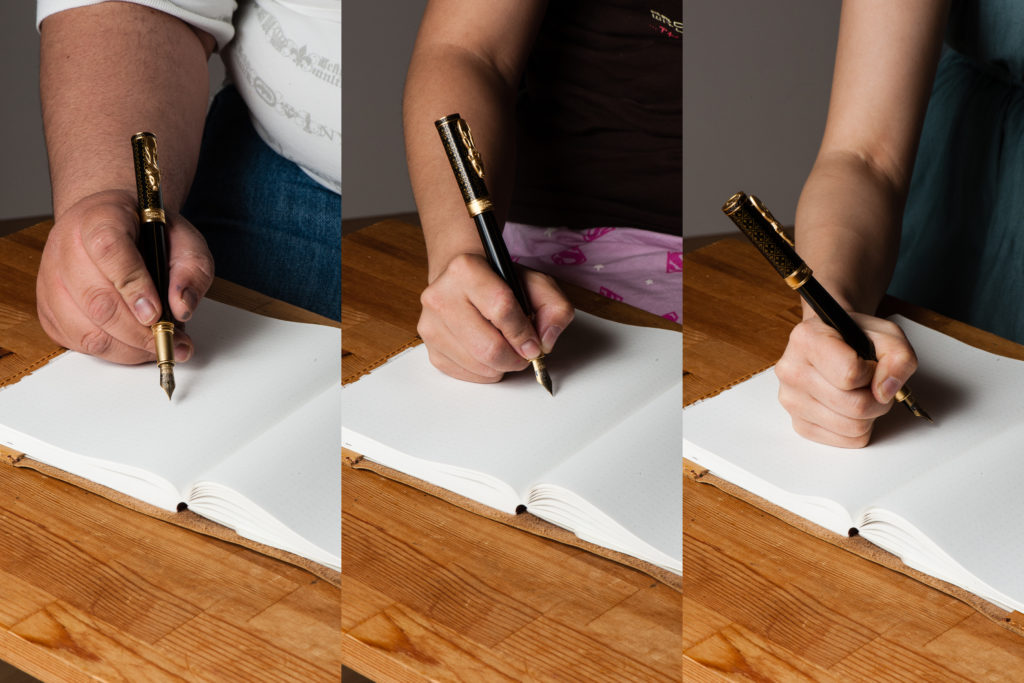
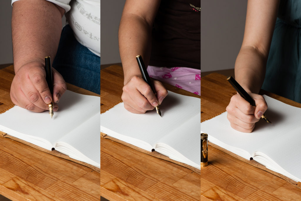
In the Hand: Montegrappa GoT Baratheon (posted) — from left to right: Franz, Katherine, and PamIn the Hand: Montegrappa GoT Baratheon (unposted) — from left to right: Franz, Katherine, and Pam
The Business End
Katherine: I enjoyed this nib — it was smooth, wet (and least when dipped, but I’m pretty sure I wrote enough to get over the initial super wetness of a dip) and prettily matching. However, I wouldn’t buy this pen for the nib, it was solid, but not unique. No surprise there.
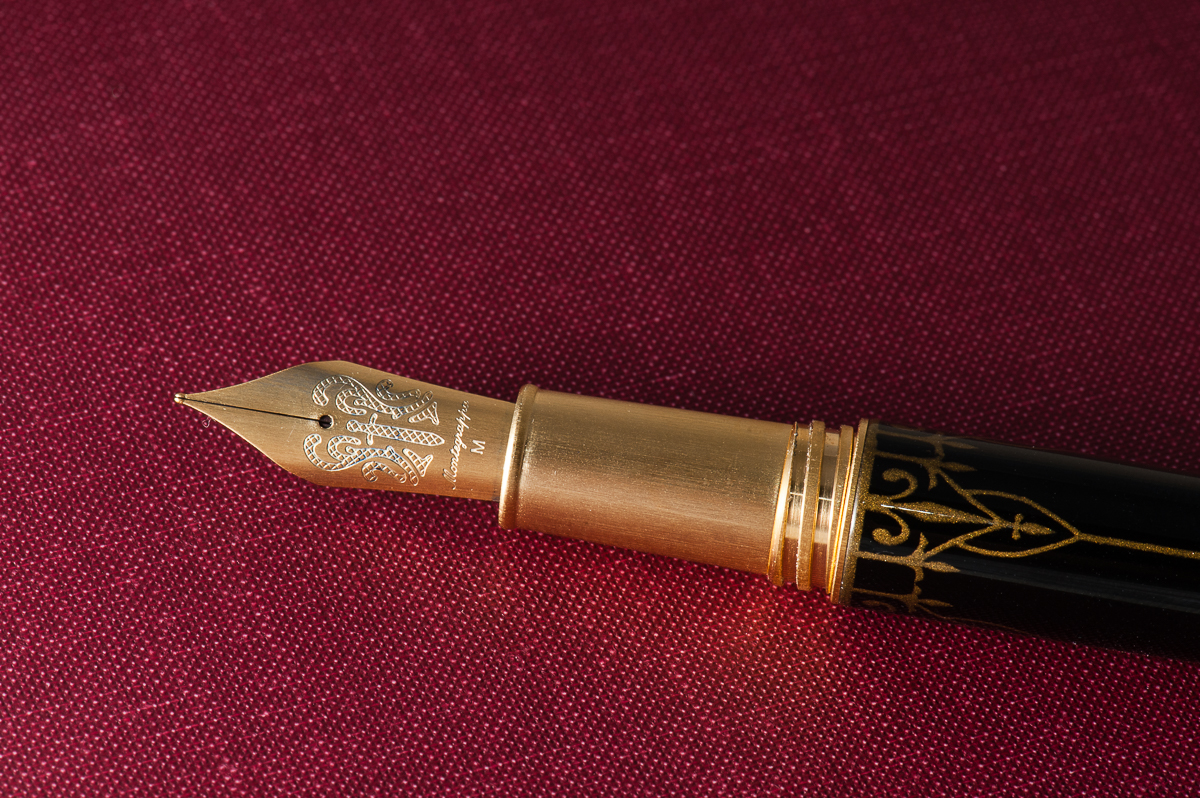
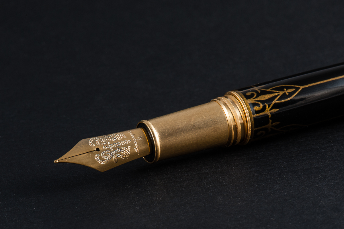
Pam: Montegrappa did not skimp on the nib and did a wonderful job making it fit in with the Game of Thrones theme. I am pretty sure that all the nibs are the same design, with a sword in the center, but a different color to match the clip colorjng. Montegrappa did a great job with that detail.
I found the nib to write wonderfully. I can’t particularly comment on flow or saturation since we dipped the pens. The nib was smooth with little feedback and was very pleasant to write with.
Franz: Oh yeah, the Baratheon’s steel nib also has brushed background for the engraved sword. Such a pretty thing to look at. As for its writing performance, it wrote smoothly and didn’t skip at all. It was a well tuned nib out of the box.
Write It Up
Katherine: Overall this pen was well balanced and comfortable for me… BUT, I did notice the threads. They weren’t terrible, but I did notice they were there and was a little annoyed. Nothing major, but worth mentioning because I typically don’t notice sharp threads because I hold my pens pretty far forward. Despite my grip, I still noticed the threads on this pen.
Pam: I didn’t end up writing with this pen for the 20 minute time span because it just plain hurt to do so. The step is pretty sharp on this pen and pretty unforgiving with my iron fist grip. I ended up with indentations of the step along the skin between my pointer finger and thumb. Yes, I understand that I could just loosen my grip and that would ease some misery, but the step is sharp enough that I wouldn’t recommend this pen for those with “fisty grips,” particularly if it’s around the step.
Franz: The length and girth of the Baratheon was comforable for me either when it was posted or unposted. The only issue I had was that the brushed steel section made my fingers slip closer to the nib as I wrote with it. So writing with the cap posted afforded me to grip the pen higher above the threads and my fingers did not slip anymore.
EDC-ness
Katherine: I didn’t carry this — but it seems very solidly made. The clip is solid and I’d be comfortable clipping the pen to a shirt pocket — but not springy enough for me to clip it to jeans.
Pam: Since the pen was borrowed, it stayed in the case until we were ready to write with it. The clip seems solid and able to clip onto fabrics well. The weight of the pen is considerable for this pen and I can see where it might drag down a shirt pocket. I don’t know if the clip will prevent it from slipping out. Also, given the pristine finish of the pen, I wouldn’t recommend it being thrown in a jeans pocket with your keys either. This pen would be great in a pen case on the go. Like a sword, this pen deserves a proper sheath. 😛
Franz: Since it is a pen on loan, we did not fill it up with ink and we didn’t get to use the pen at a work setting. However, as Katherine said, the clip works very nicely and clips on to my shirt pocket. The Baratheon has a cartridge/converter filling system so a full fill will last me a good 2-3 days if I would use it at work. Now something I love about the pen for its EDC-ness? The acme threads allow the cap to be unscrewed with just one turn. Love that quick deploy!
Final Grip-ping Impressions
Katherine: Ehhhh. I’m not big on franchise merchandise, and this pen was no exception. BUT, if you’re a GoT fan and you enjoy themed stuff, this pen could be perfect for you. It’s a well made, solid writer and seems like it can withstand the rigors of daily life (and hopefully your life is less stressful than any of the characters…).
Pam: I genuinely enjoyed this pen, not only due to the theme and the details involved in making these four into reality. The set of pens is a great collectors item for both fountain pen and Game of Thrones enthusiasts alike. Notably, these pens would be more of a “collectors” item for me than practical due to the price. At around $300 per pen, it’s a bit of an investment for one pen, let alone all four. That being said, the details and construction of the pen are fantastic and deserve to be rewarded. If you are in the perfect cross section of GoT and fountain pen fandoms (and your favorite house is represented with these four options), this is a great pen for you! You will get a quality writing instrument and wave your house banner high at the same time!
Franz: I truly appreciate the design of the Montegrappa GoT Baratheon pen sans the Game of Thrones knowledge. The Baratheon actually inspired me to take more pen photos than usual so please enjoy them below. The pen is comfortable for my use in terms of its dimensions, and nib performance. I just wish that metal sections did not make my fingers slip.
With an MSRP of $350, this might be a justifiable buy when you are a great fan of the show. For me, the price is just a little too high even if I do love the design and build of the pen. A pen’s value (or any other item), is both all relative, and subjective.
Once again, big thanks to Detlef Bittner of Bittner Pens for lending us this Montegrappa GoT Baratheon pen!
Pen Comparisons
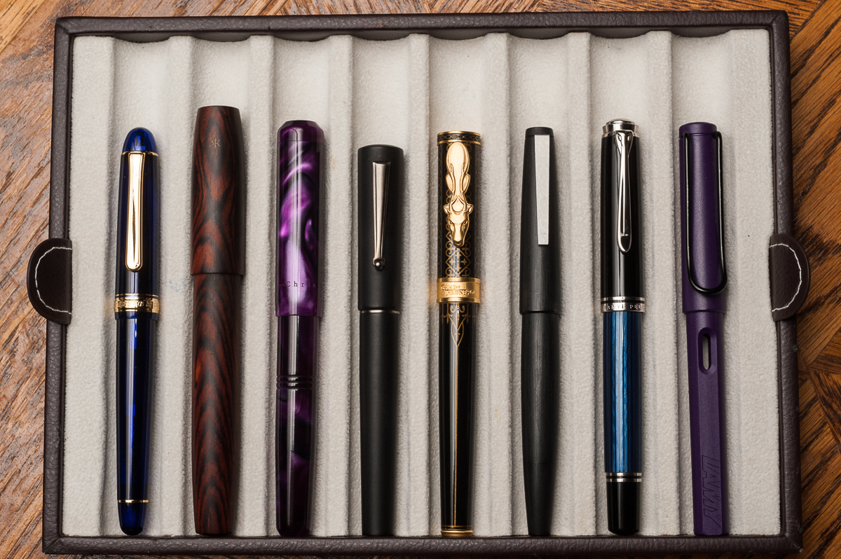
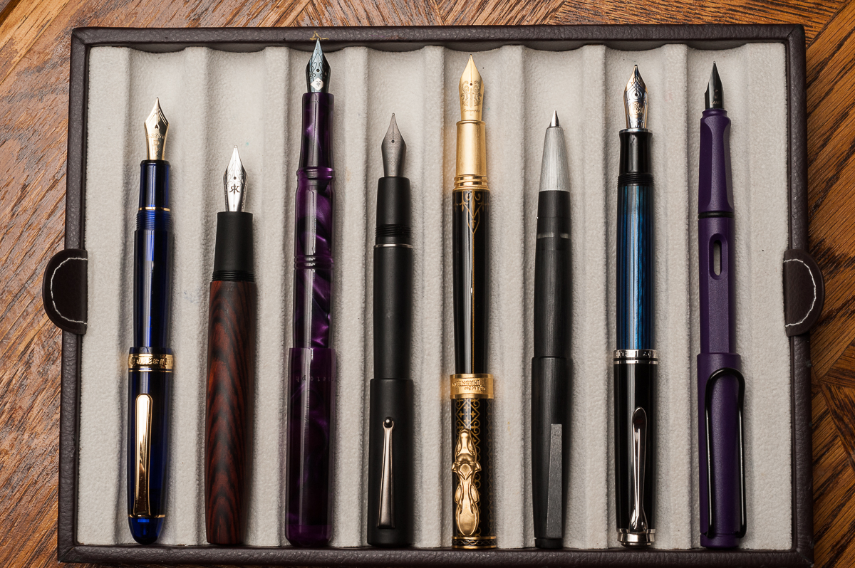
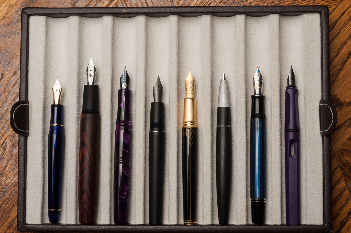
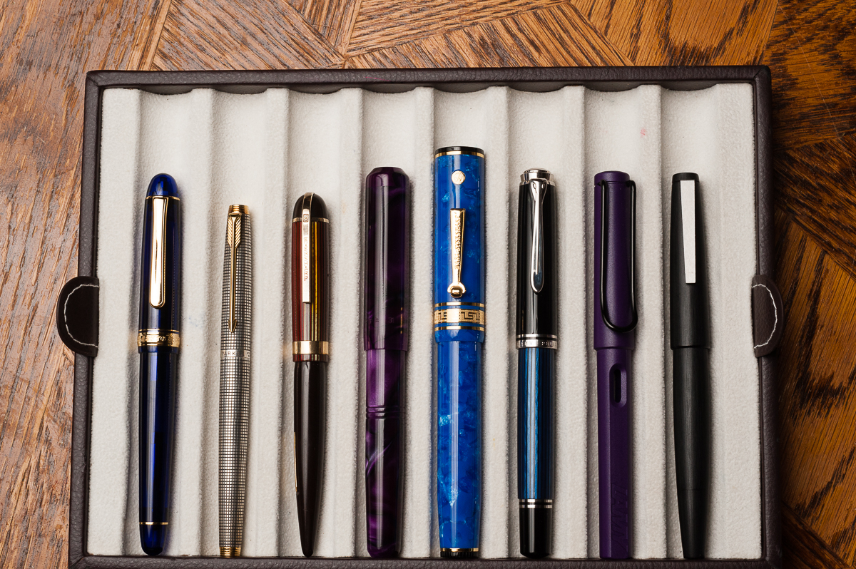
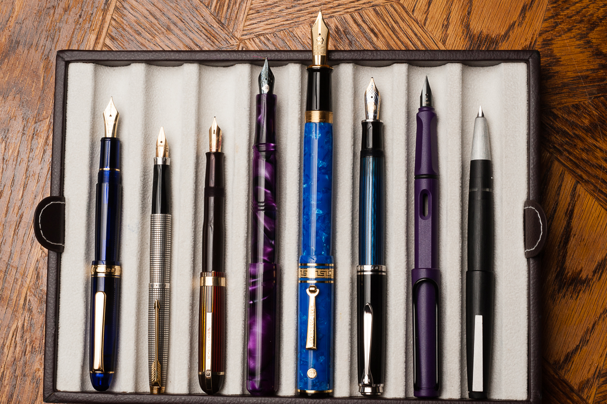
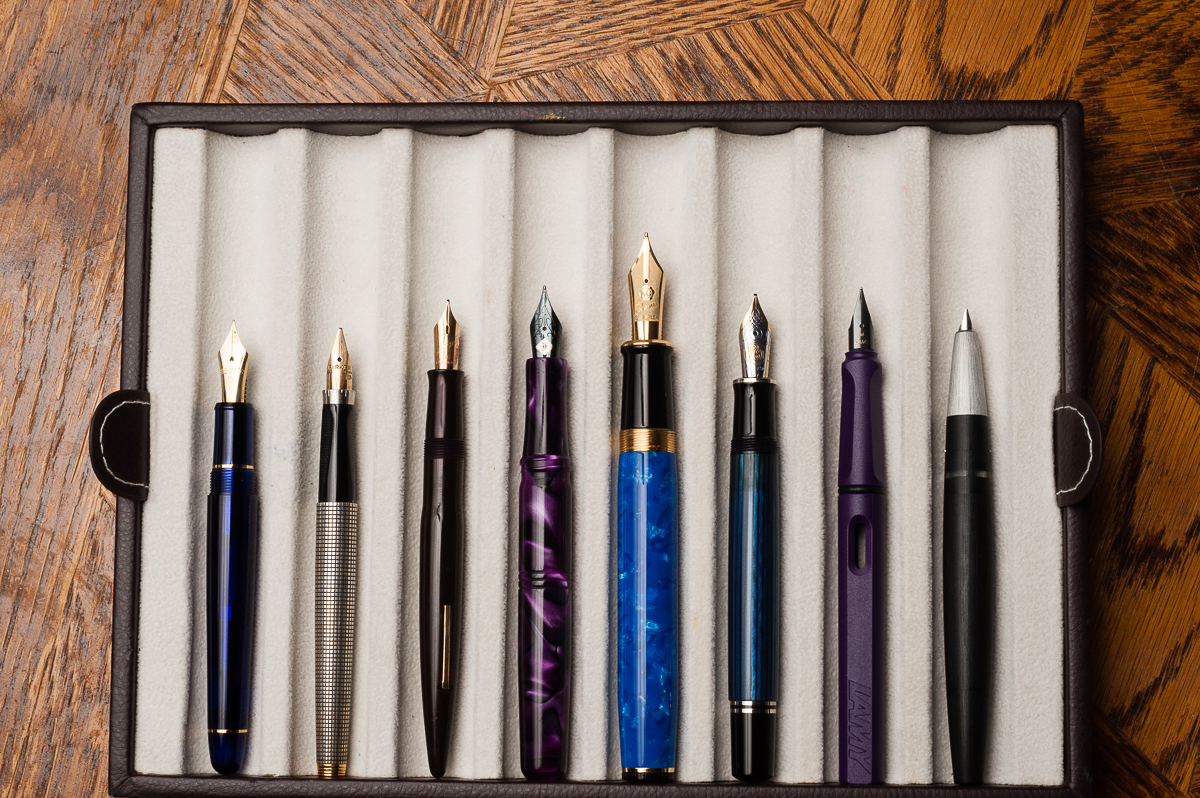
Closed pens from left to right: Platinum 3776, Ryan Krusac Legend L-16, Franklin-Christoph Model 31, Delta Unica, *Montegrappa GoT Baratheon*, Lamy 2000, Pelikan M805, and Lamy SafariPosted pens from left to right: Platinum 3776, Ryan Krusac Legend L-16 (did not post), Franklin-Christoph Model 31, Delta Unica, *Montegrappa GoT Baratheon*, Lamy 2000, Pelikan M805, and Lamy SafariUnposted pens from left to right: Platinum 3776, Ryan Krusac Legend L-16, Franklin-Christoph Model 31, Delta Unica, *Montegrappa GoT Baratheon*, Lamy 2000, Pelikan M805, and Lamy Safari
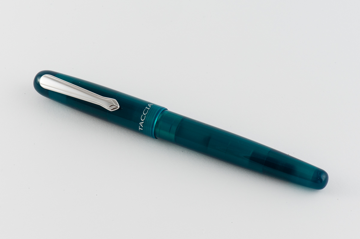
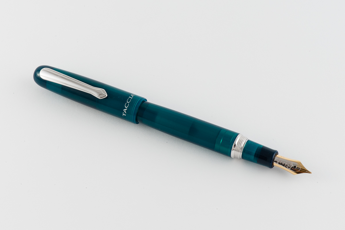
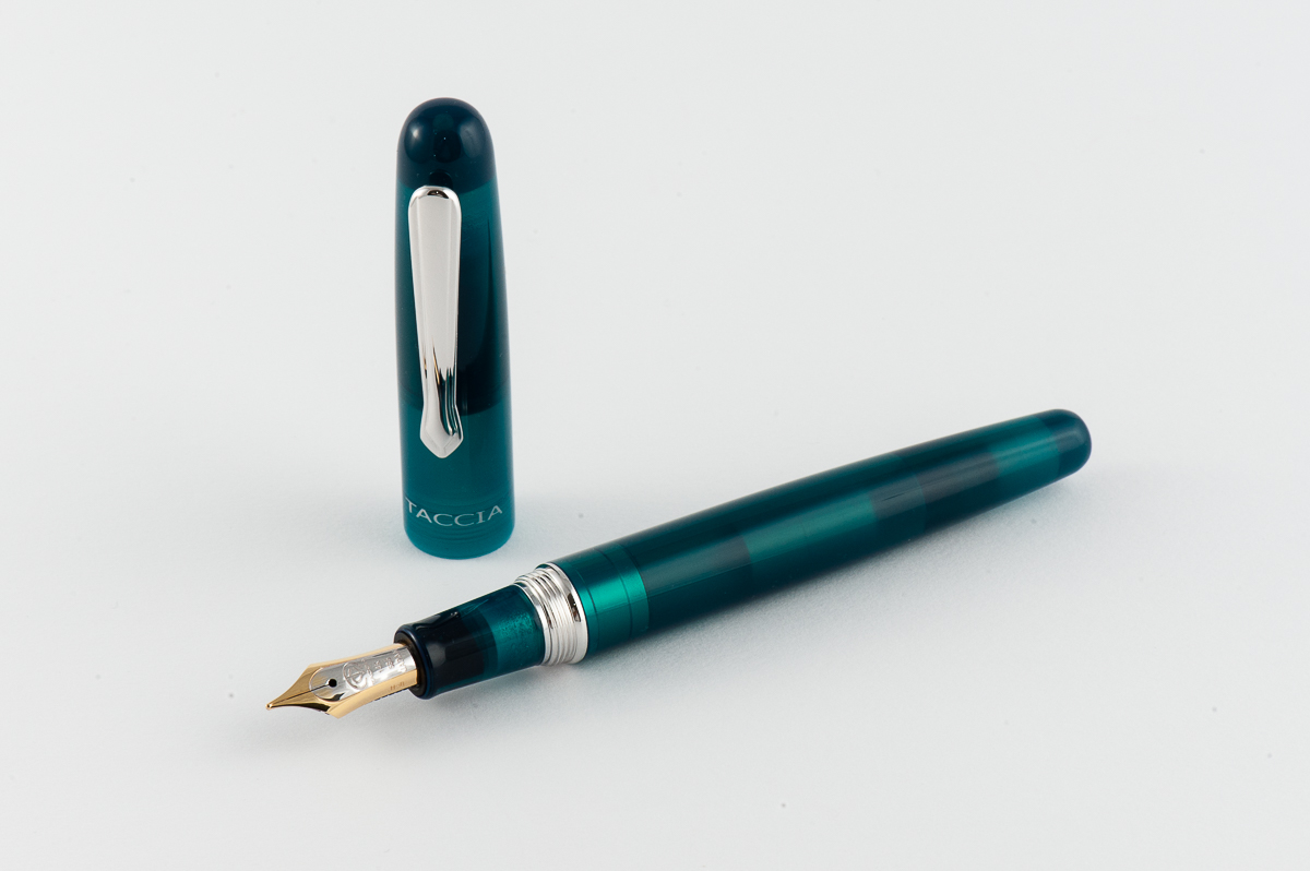
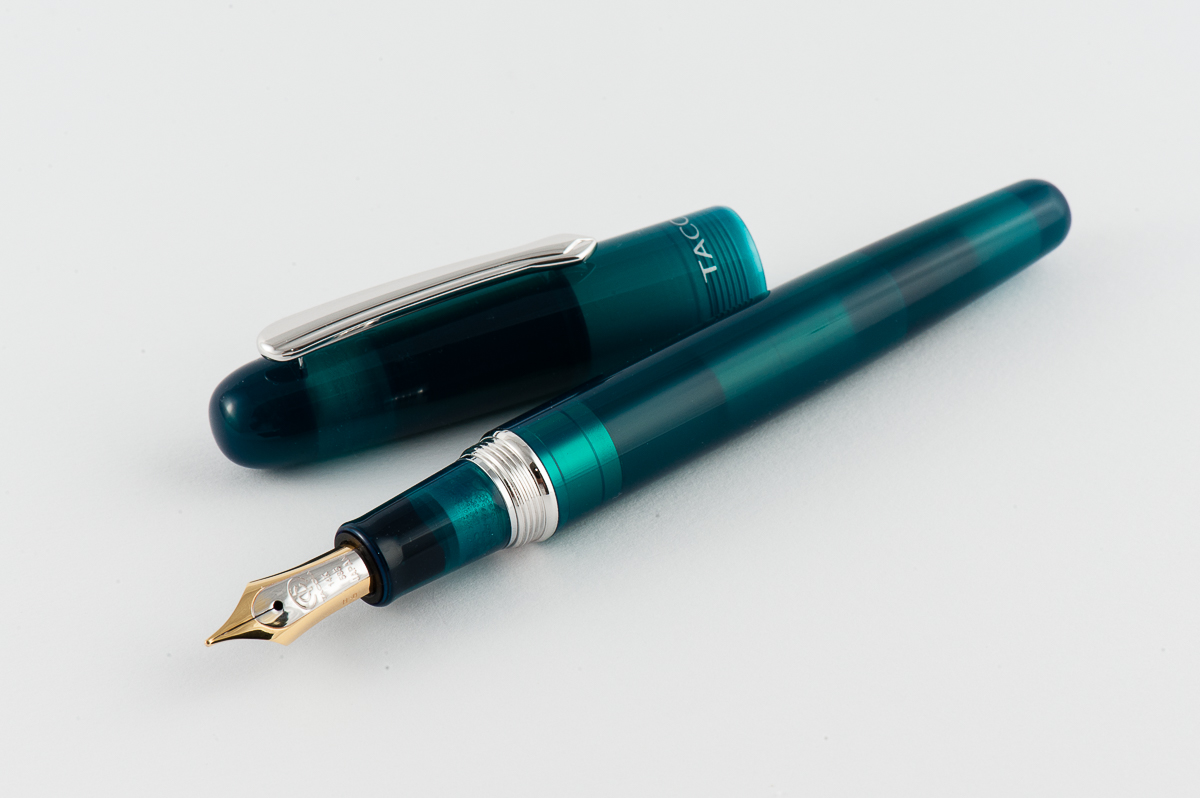
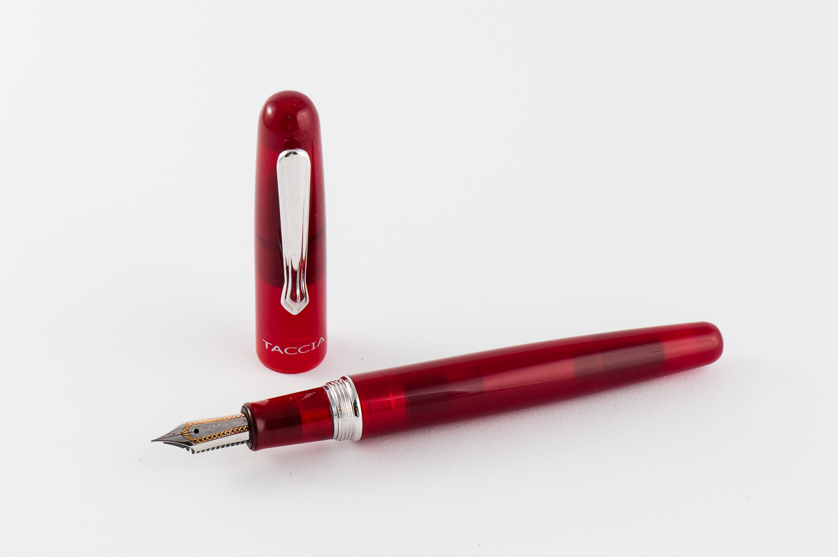
The Taccia pen company was very generous in letting us review their Spectrum pen line. Multiple units were provided so we were able to try out their steel and gold nibs. We very much appreciate this opportunity! And special thanks goes to Ron L. for connecting us with Ms. Shu-Jen.
As always, the opinions here are our own and we were not compensated (monetarily, or otherwise) for this review.
Hand Over That Pen, please!
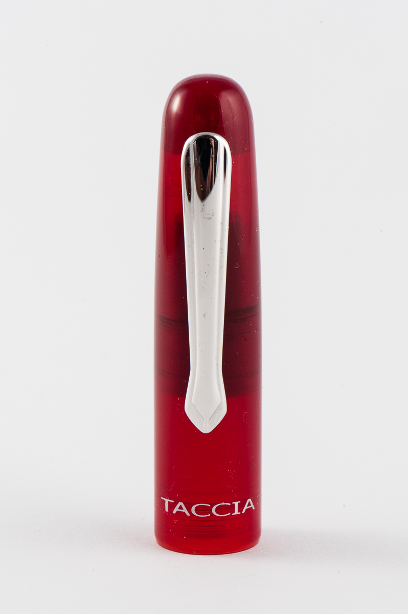
Katherine: I’m not a big fan of the aesthetics of this pen. I think the colors are pretty, but the semi-opaqueness (you can see the converter, but it’s not really clear enough to be a demonstrator) just isn’t my thing. I think it looks messy. But, that’s the super, super subjective part of this review. On we go!
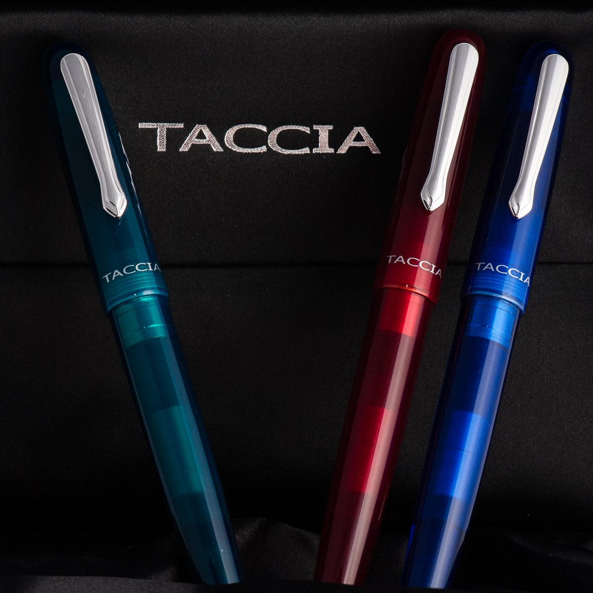
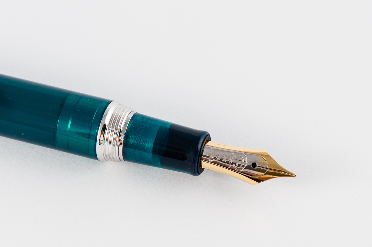
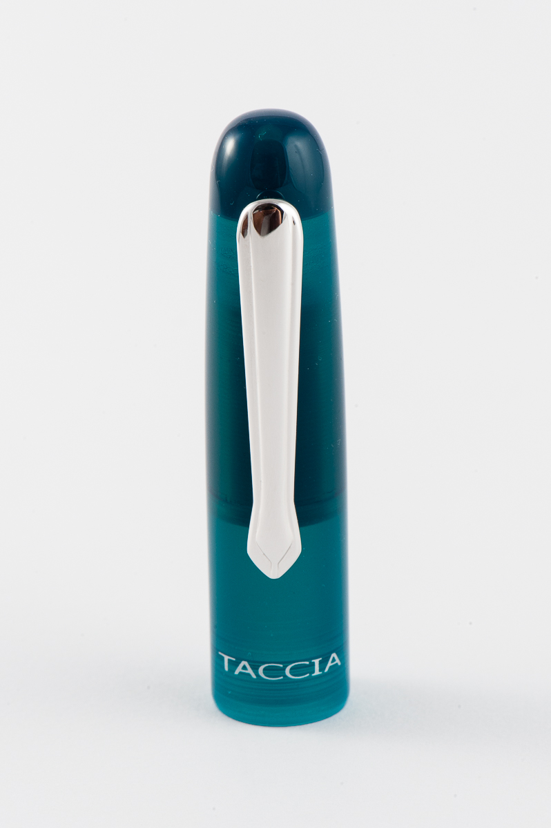
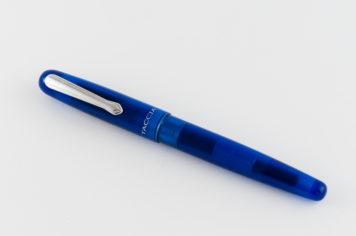
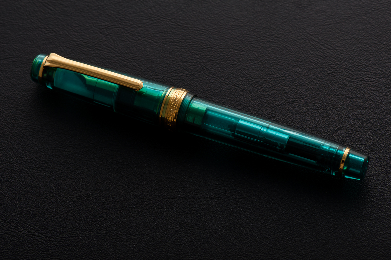
Pam: The Spectrum is a very modern feeling pen with both the shape and material. The material with the odd balance of translucence and opacity gives the pen a “space age” feel for me. I do really enjoy the different colors. Each of them are rich and very pleasant. My favorite is the teal, it reminds me of one of my favorite inks, Yama-dori.
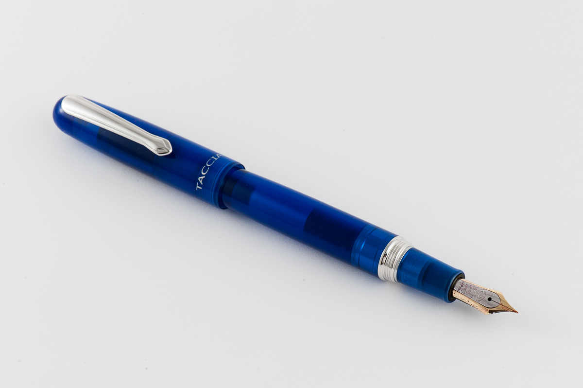
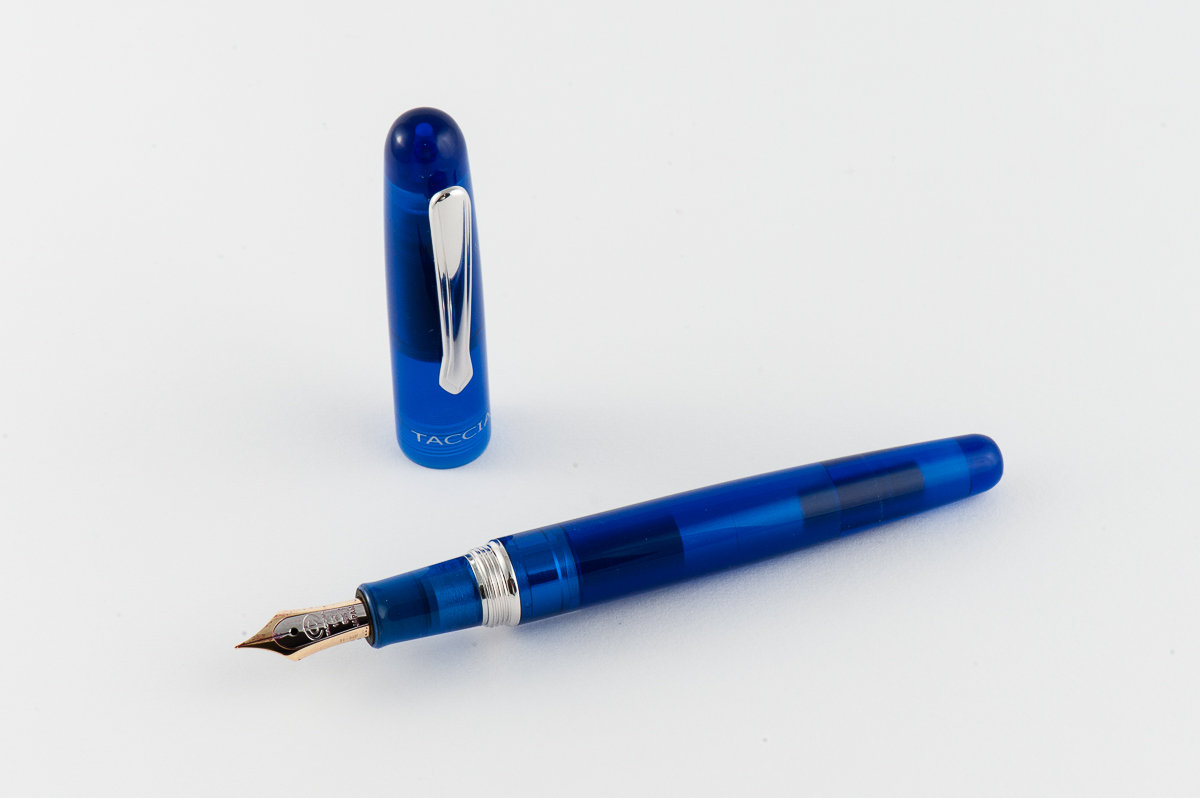
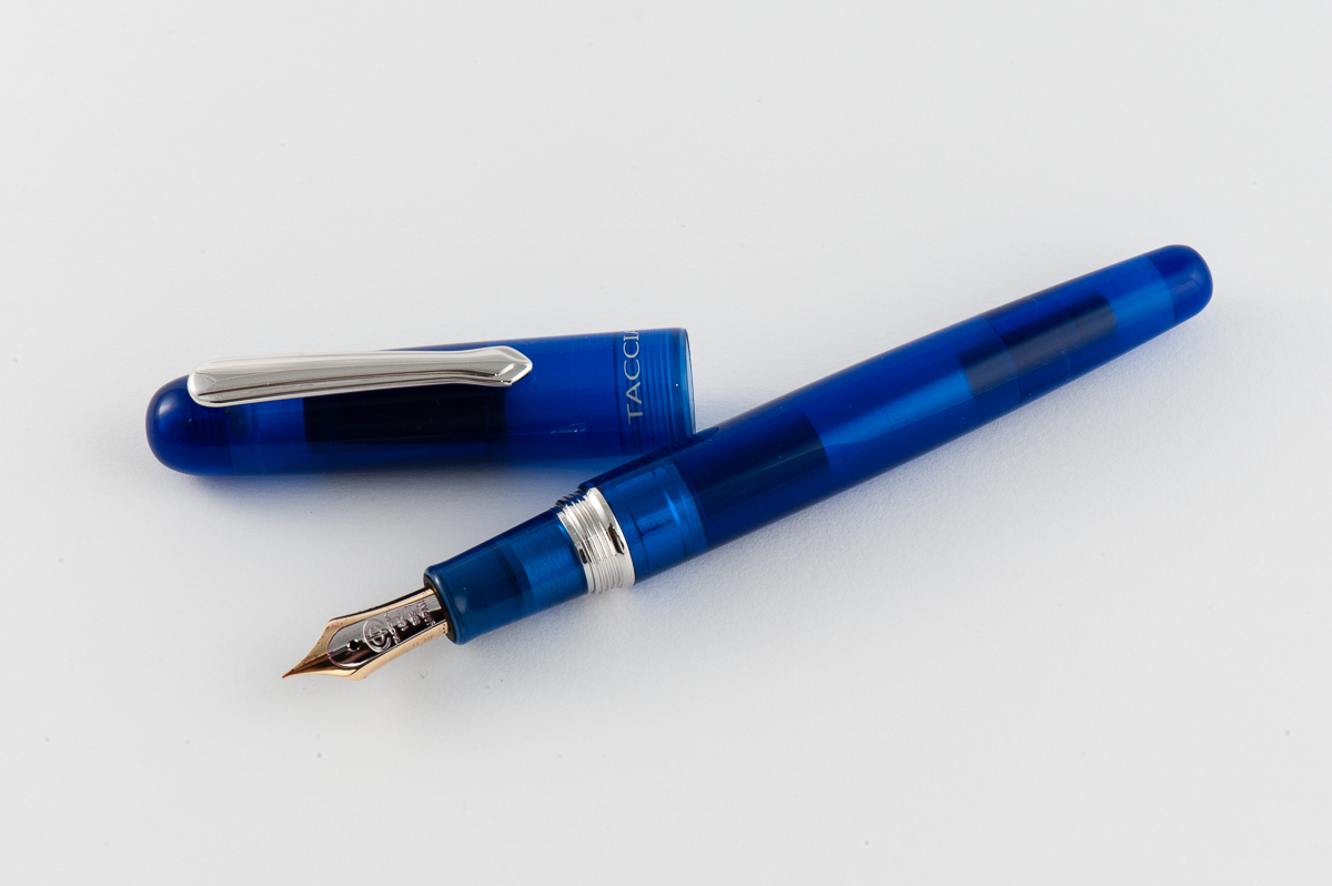
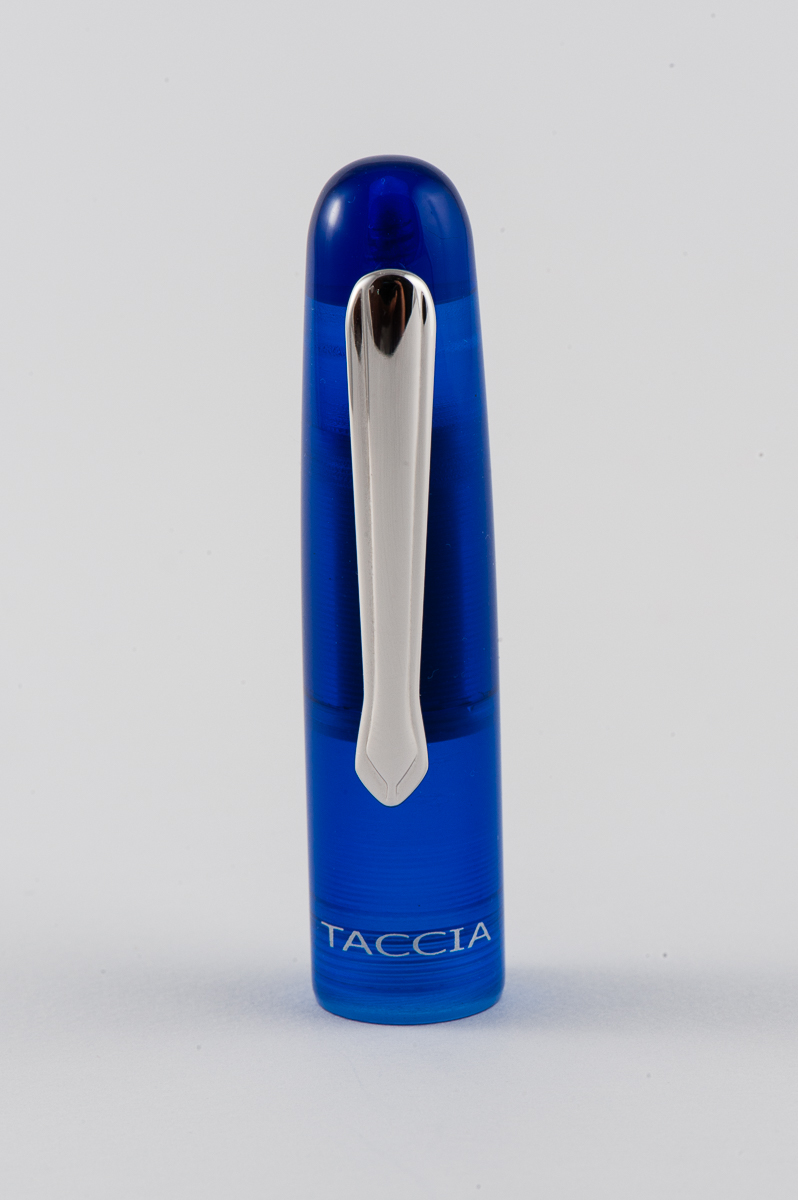
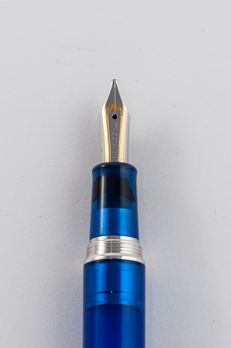
Franz: Taccia has been a pen brand that I’ve seen around especially at pen shows I’ve attended but I haven’t had the chance to try their pens out until now. The colors of the Spectrum are quite pleasing to the eye and its translucency is striking for me. The shape of the pen kind of resembles a Parker 51 or a vintage Conway Stewart. And I second Pam’s opinion of the green pen matching Sailor Yama-Dori ink
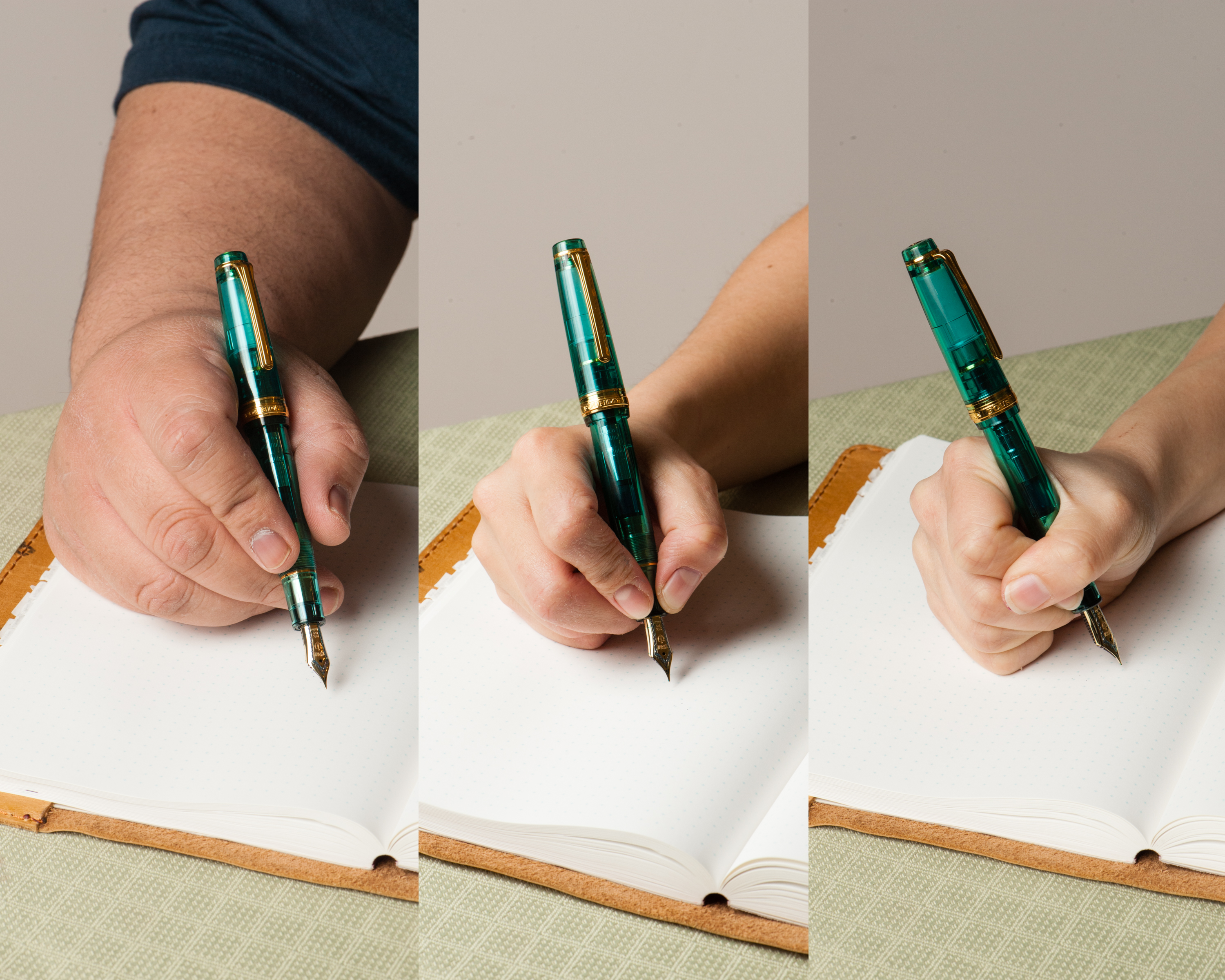
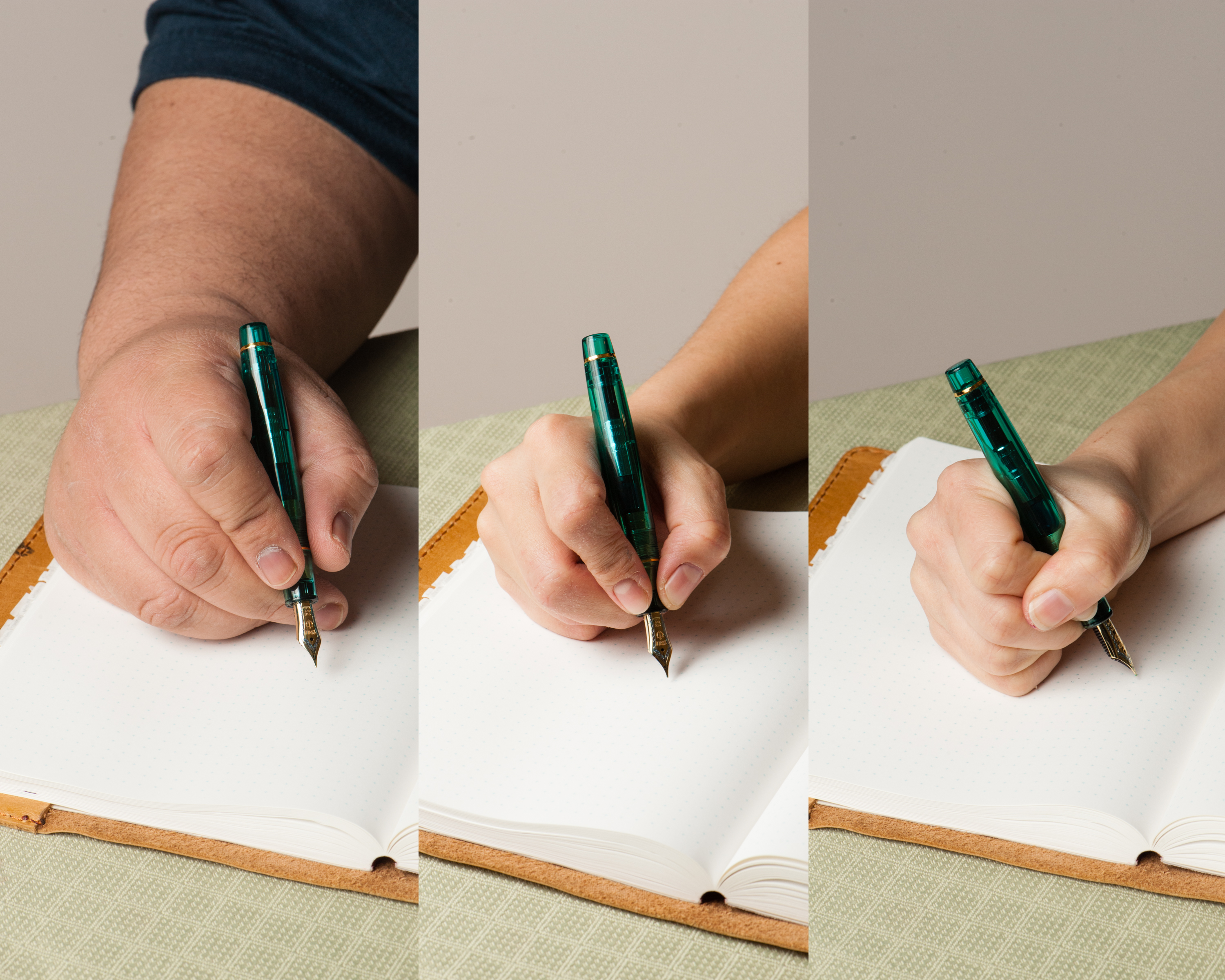
In the Hand: Taccia Spectrum (posted) — from left to right: Franz, Katherine, and PamIn the Hand: Taccia Spectrum (unposted) — from left to right: Franz, Katherine, and Pam
The Business End
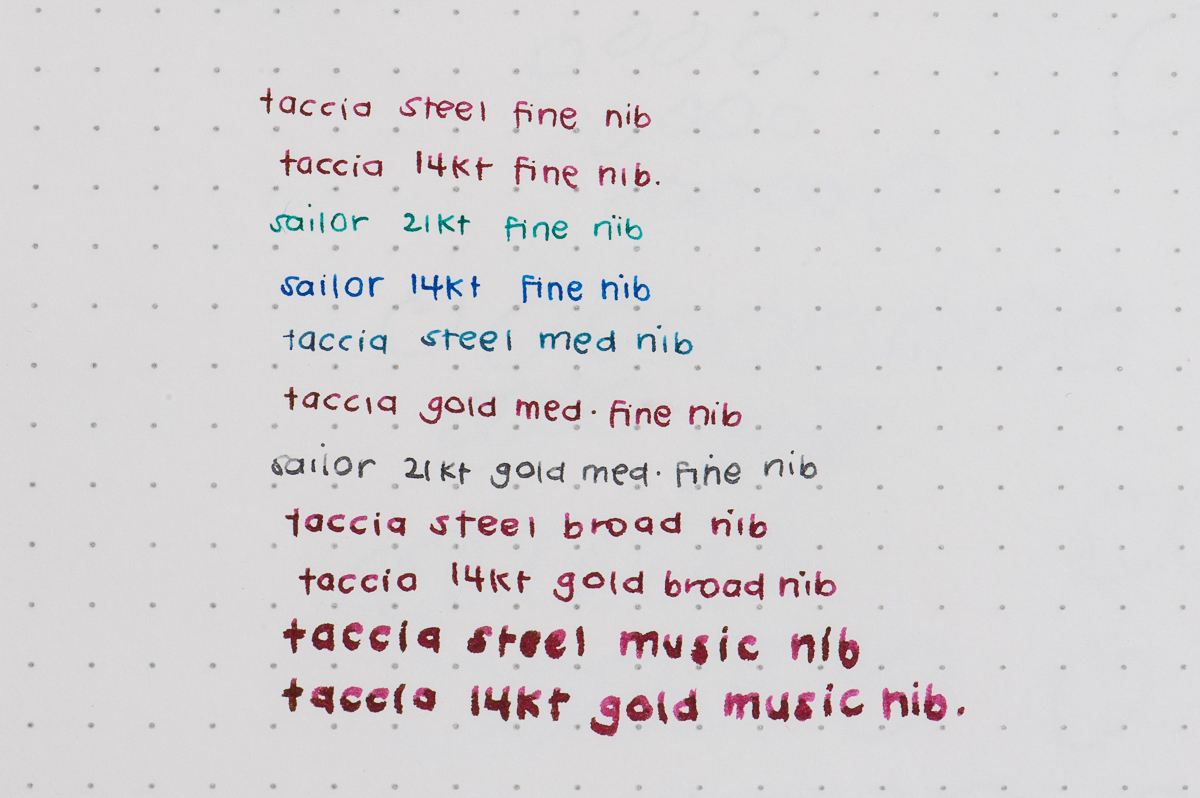
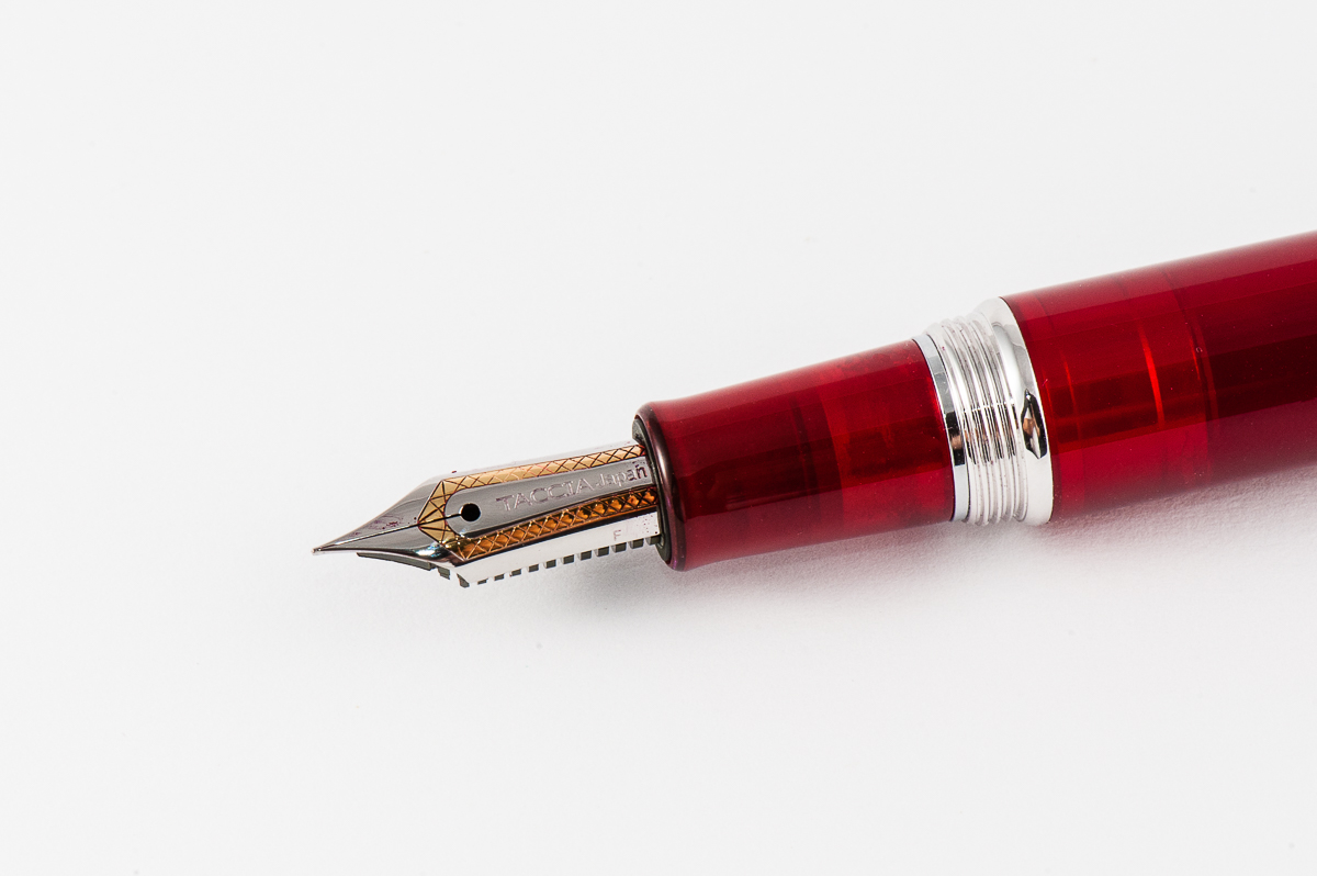
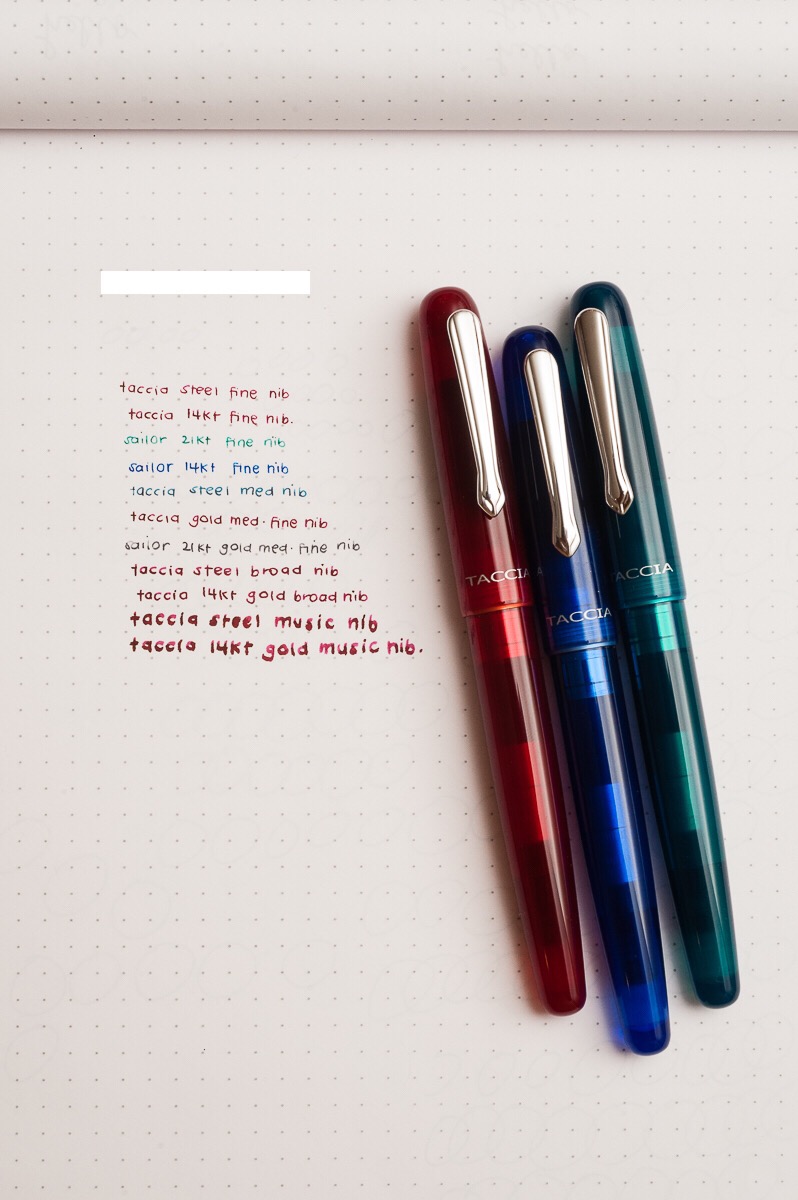
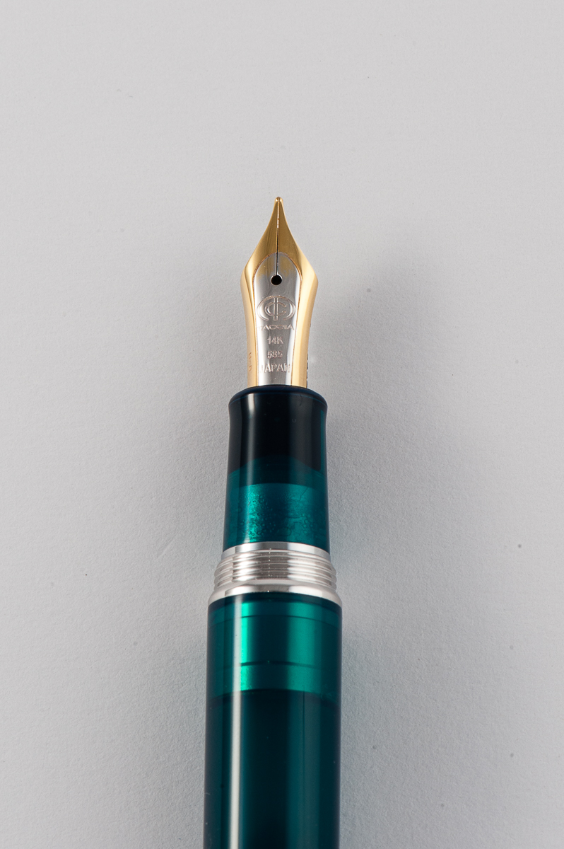
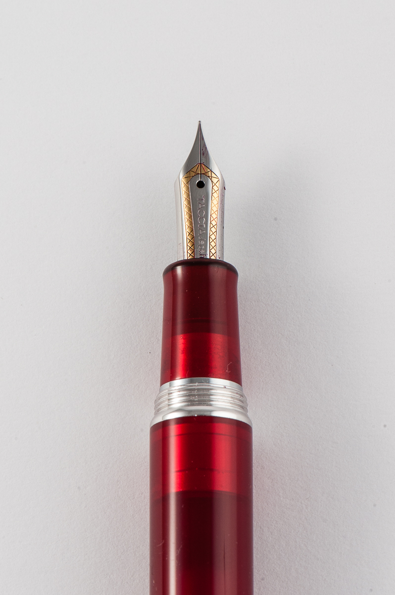
Katherine: The Taccia nibs are apparently made by Sailor. Interestingly, they look like Sailor nibs, but seem to be tuned differently (and it’s not necessarily a bad thing). The steel nibs are wetter than the comparable Sailor nib widths (though we were comparing against gold Sailor nibs) and have less of the signature Sailor feedback. It feels like a nib smack in the middle of Sailor feedback and fineness, and a western nib that’s a little smoother and wetter. Nice, but not the same as a Sailor nib, which is what I initially expected after being told they’re made by the same person. The gold nibs (Thank you for sending us the range, Taccia!) were even more western feeling, smoother and broader than the equivalent Taccia steel nib and Sailor gold nibs. What a difference tuning makes!
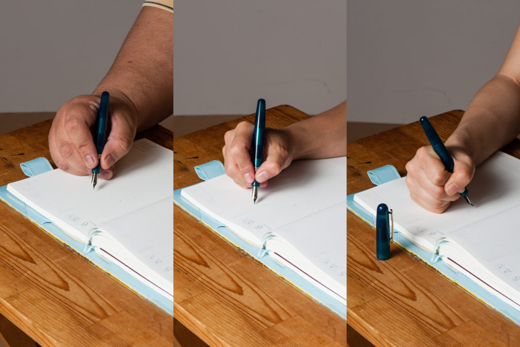
Pam: The non-Sailor Sailor nibs did not perform how I expected. I was expecting it to perform like the Sailor nibs that I love and adore. Instead, I felt that the steel nibs from Taccia was a big improvement of the Sailor steel nibs. I find the Sailor steel nibs to be really dry. The Taccia gold nibs provide slightly more feedback for me and also provide a wider line width. I prefer the Taccia steel nibs and the Sailor gold nibs for my writing style/purposes. Comparisons of the nibs and how they perform on Rhodia paper in the picture below.
Franz: Taccia sent us 8 pens to try out and compare their steel and gold nibs. This ranged from fine to their music nib size. They sent us their “Spectrum” of nibs! And yes, these nibs are made by Sailor for Taccia. We really appreciate being able to write with the different nibs. Aesthetically, I like the engraving on the steel nib as it gives a nice border to the Taccia brand.
I had the same experience as the ladies above in that the steel nibs seem to be much smoother and less feedback-y and I liked that. As for their line widths, they seem to be the same to me but the 14k gold nibs do offer a little more bounce so the line width can be thicker. Also, the music nibs are so fun to play with and I got to write on a letter with it!
Nib comparisons written by Pam on Rhodia (she has the most consistent writing among us)steel fine nib14k gold broad nib
Write It Up
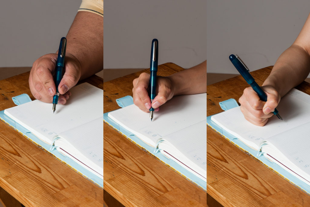
Katherine: I journaled quite a bit with this pen. Overall, I found it comfortable, but a tad bit heavy, perhaps because of the metal section. I did notice that after extended writing sessions, my hand got tired feeling — but took quite a bit to reach this point, so I don’t think it’s an issue.
Pam: I really enjoy writing with the pen. I prefer to write with it unposted due to length. It’s a bit front weighted and it can tire the hand. I found the width of the pen to be quite comfortable. Overall, it does well and I have no real complaints about the pen during a lengthy writing session.
Franz: Let me tell you right now, I did not journal with the Spectrum unposted as it is too small lengthwise and the section is quite thin. And the lip where the cap meets the pen dug into my finger. So posted it is! And posted, I found this pen quite comfy as I grip it on the barrel above the threads. The cap gave the pen balance for me and I did not feel any hand cramps after almost twenty minutes of writing.
EDC-ness
Katherine: The Taccia feels very well made and sturdy. It carried for a couple days at work and it was a champ — the clip is solid, no spitting into the cap & it’s solid enough that I’m not worried about the occasional fall. (Dear Taccia people who lent me this pen — I promise I didn’t drop it!)
Pam: I kept the pen in my Nock Sinclair for several days and it did wonderfully! It gave me no trouble whatsoever.
Franz: As I used the Spectrum at work with its medium steel nib, I found it wrote nicely on copier paper. For quick notes, I can write with the pen unposted so it was a nice experience. And my co-workers loved the color of the Forest Green too!
My one nit is that it takes two and 3/4 turns before it uncaps. Kinda too long for my constant need to use at work. It’s a good pen to just stay on my desk during the day and write when I get to sit down.
Final Grip-ping Impressions
Katherine: At about $150 for the steel nibs, the Spectrum feels expensive. That’s just a little cheaper than it’s gold nibbed Sailor cousins, or the Platinum 3776 at US MSRP (but 2x the 3776 at Japanese prices). The price is my biggest gripe about the pen. Other than that, I don’t love the aesthetic, but know many people who do, but the pen is a comfortable writer with interesting nibs. If you see one on sale and like the way they look, I wouldn’t hesitate to pick one up!
Pam: I really enjoyed playing with this pen. I don’t know if I love the pen for the price. For the $150 for the steel nib, I would consider getting a Sailor Pro Gear Slim and those come with a gold nib. That being said, I really like the performance of the Taccia steel nib and the aesthetics of the pen. If you are up for a modern aesthetic with a great steel nib and a splash of amazing color, this pen is for you.
Franz: The Spectrum is a fun, solidly built pen with stunning colors which for me brings value against the offered price. And then their steel nibs are fantastic writers out of the box.
The Taccia Spectrum is an awesome pen even if it is a bit small for my bear paw, I probably would get one for myself. I just need to decide between the Forest Green (which is a crowd favorite), or the Ocean Blue (because… blue!).
Thanks again to Taccia for lending (entrusting) us these pens and to our pen posse friend, Ron L. for being our liaison to Taccia.
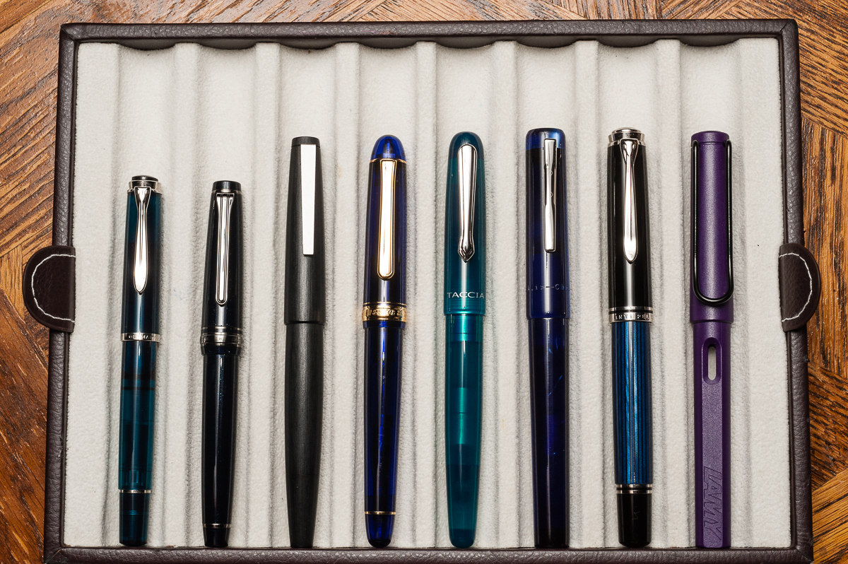
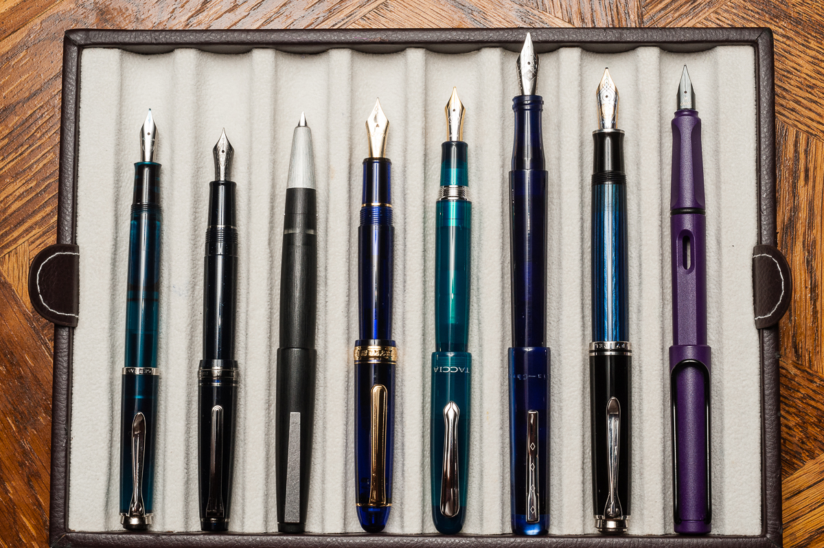
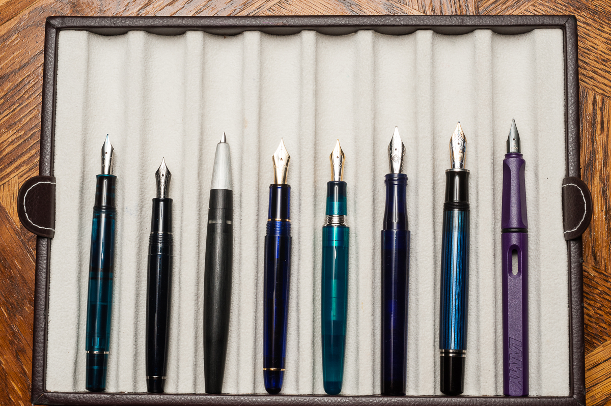
Pen Comparisons
Closed pens from left to right: Pelikan M205, Sailor Pro Gear Slim, Lamy 2000, Platinum 3776, *Taccia Spectrum*, Franklin-Christoph Model 03, Pelikan M805, and Lamy SafariPosted pens from left to right: Pelikan M205, Sailor Pro Gear Slim, Lamy 2000, Platinum 3776, *Taccia Spectrum*, Franklin-Christoph Model 03, Pelikan M805, and Lamy SafariUnposted pens from left to right: Pelikan M205, Sailor Pro Gear Slim, Lamy 2000, Platinum 3776, *Taccia Spectrum*, Franklin-Christoph Model 03, Pelikan M805, and Lamy Safari
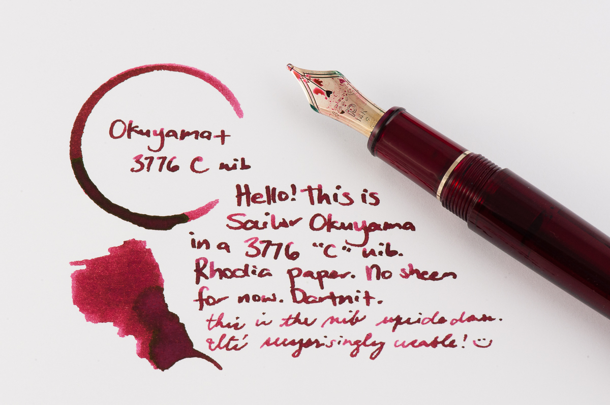
Katherine: This month my pairing is a Platinum 3776 in the red “Bourgogne” color, with Sailor Okuyama. I picked up the 3776 (I previously rated it one of my top pens) because of the C nib. C stands for “coarse” and is Platinum’s BB nib. It’s quite broad, but, out of the box, not a gusher — which I like. Additionally it writes smoothly when upside down, so I can use it at work too! Overall I’m really enjoying the sheen of Okuyama, laid down by a nib that gets the sheen going, but isn’t gratuitous.
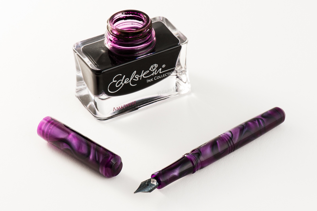
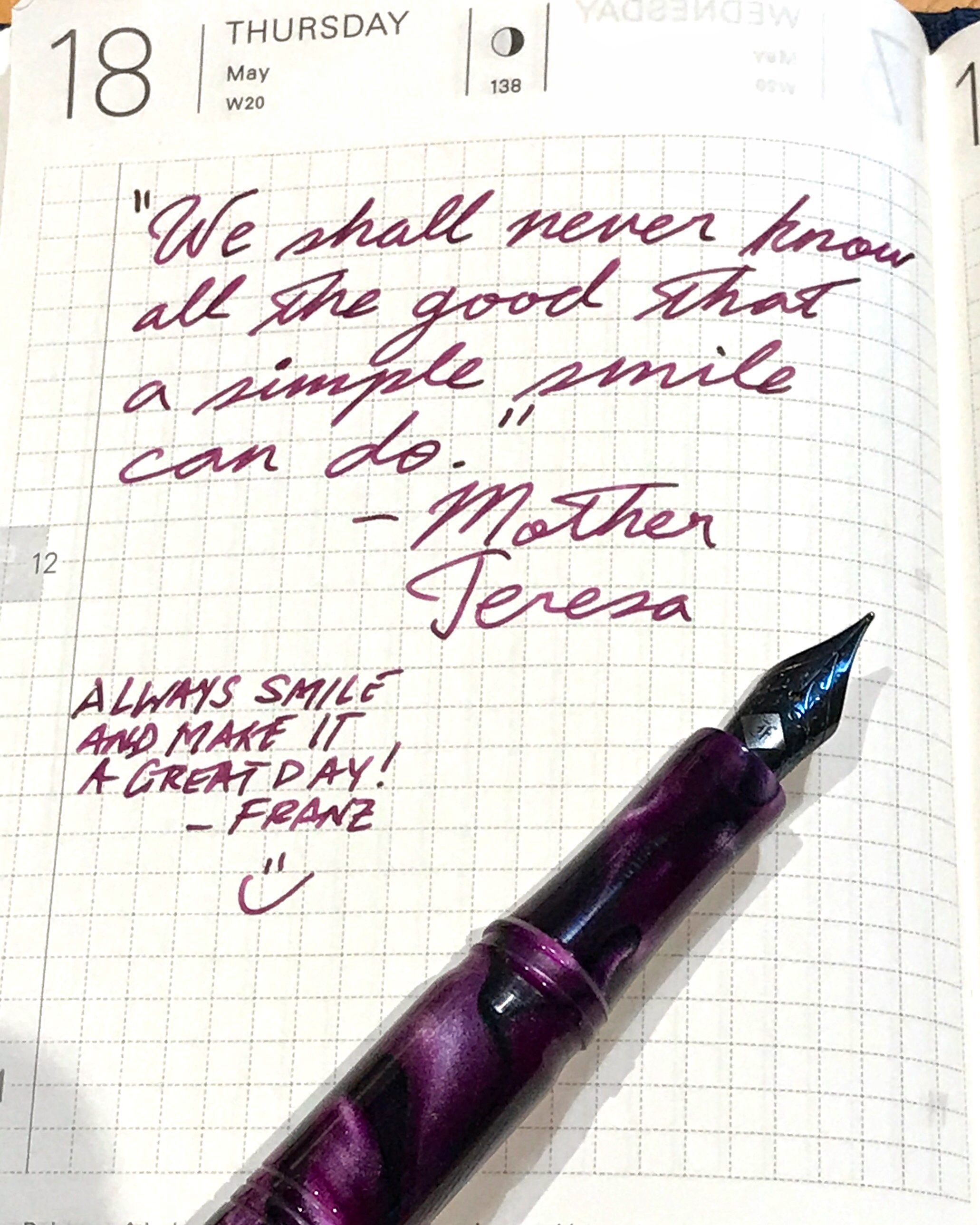
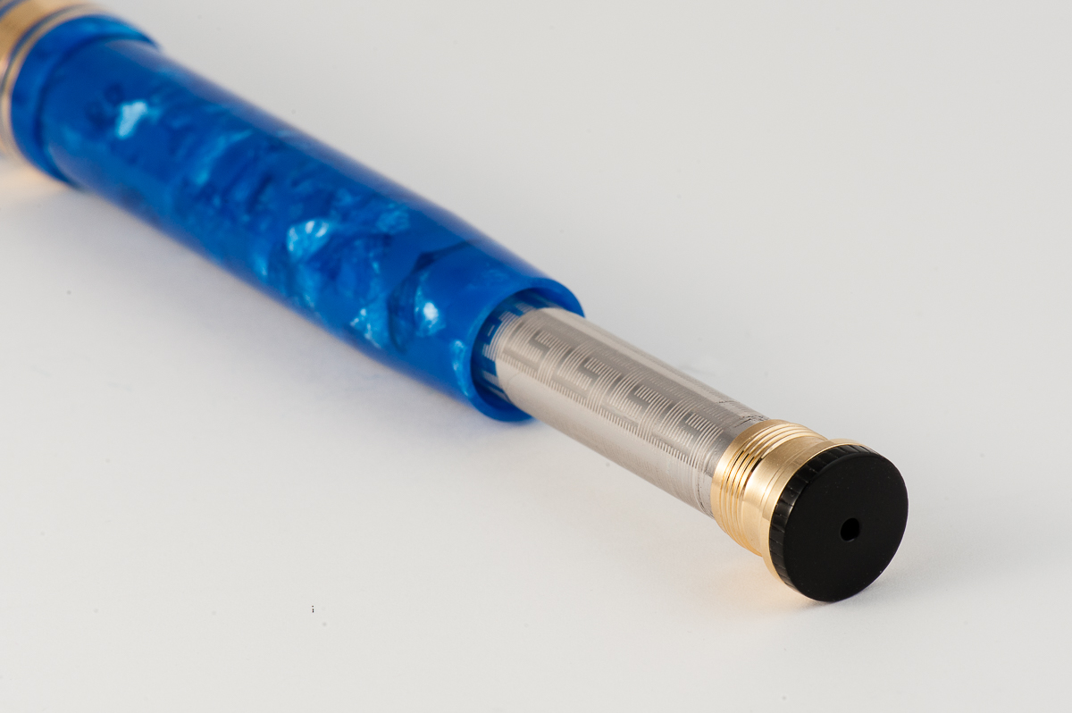
Franz: A co-worker of mine once said that Purple is the color of royalty, and madness. I totally agree! So for the month of June, my royal pen and ink pairing is the Franklin-Christoph Model 31 Omnis in Purpurae finish, and the Pelikan Edelstein Amethyst special edition ink. The deep purple and black swirls of the “Purpurae” madly matches the dark purple of the Amethyst ink. The acrylic has chatoyance that just can’t be captured on camera that well especially on the lighter swirls of the pen.
A quick aside, I got the Model 31 at the 2017 LA Pen Show and it was (at that time) the initial color prototype. Scott Franklin of Franklin-Christoph commented that this was the first purple 31 out there. I initially called the color “Purple Soul” but Franklin-Christoph recently introduced it as a regular part of their Model 31 line up as “Purpurae”. The Amethyst ink was Pelikan’s 2015 special edition Ink of the Year and has become my top favorite purple ink due to it being a darker color, and its sheen when ink pools in the writing.
Will this pen and ink pairing become an OTP (One True Pairing) for me? We shall see!
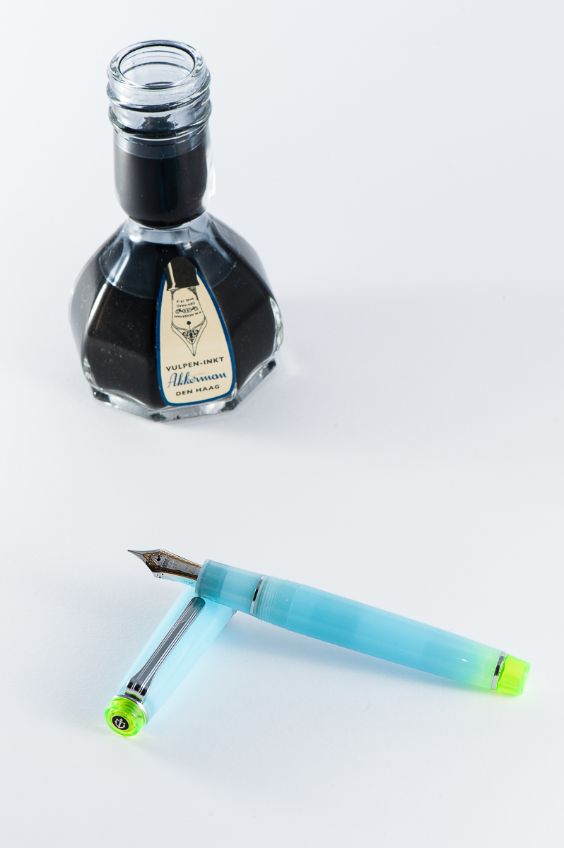
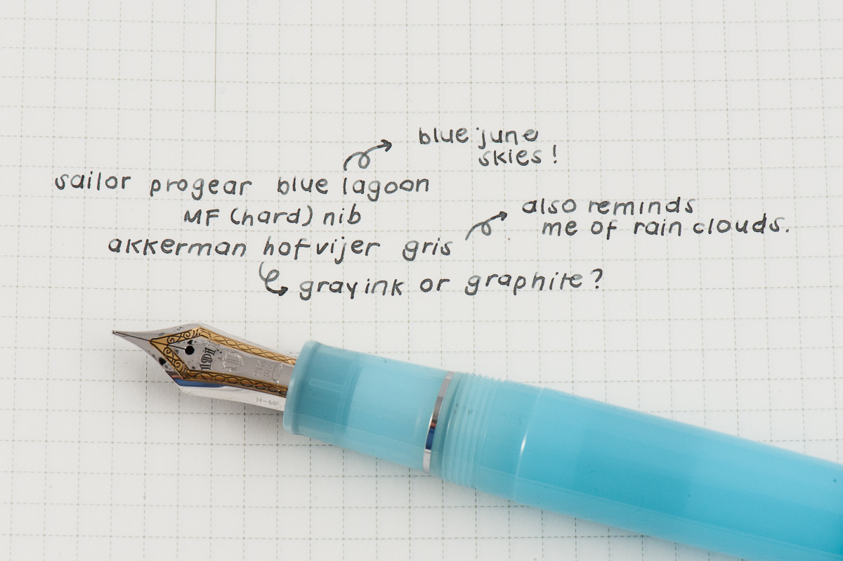
Pam: Summer is in full swing but I still miss the rainy season so this pen is a reflection of having the best of both worlds. My choice for the June pairing is Sailor Pro Gear Blue Lagoon with Akkerman Hofvijver Gris (#29) ink. This is probably one of my favorite OTP/pen and ink pairings since I started collecting pen.
The Sailor progear has a really unique and whimsical color pairing with the neon green and soft blue. The gentle blue with such a vibrant hue reminds me of the “Unicorn Barf” colorway with the blue and bright pink. I have been trying to get the term “Unicorn Snot” for this blue and green combination to stick…but alas. The Sailor nib is perfectly wet enough to show off the wonderful gray ink, as usual.
Akkerman #29 is my first ink from Akkerman and I couldn’t be happier with this ink. It’s practically my “gateway” gray, getting me more interested and more inclined to try out more gray inks. I had thought that gray inks would be only dilute and dull blacks. I am so glad to be have been mistaken! Originally obtained via ink sample from Vanness Pens, I quickly tried to obtain a full bottle of this wonderful gray. The gray reminds me alot of pencil graphite and I really enjoy the shading available in this ink. Not to mention, the bottle of Akkerman ink is always a treat in itself!
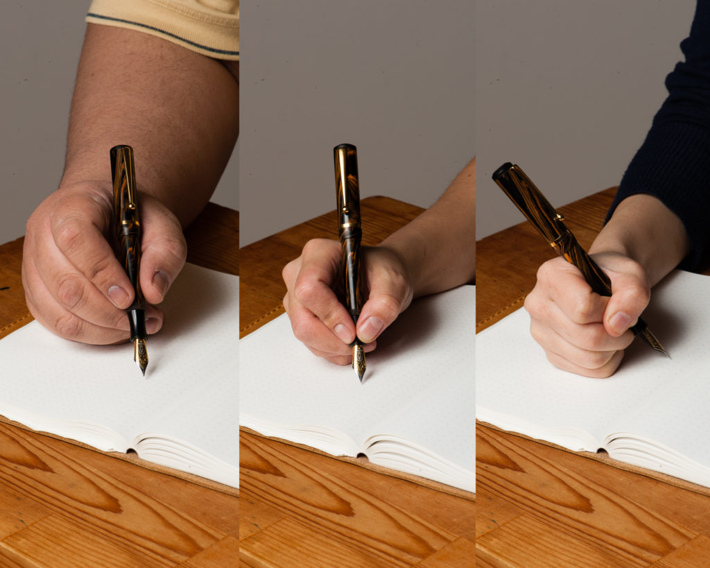
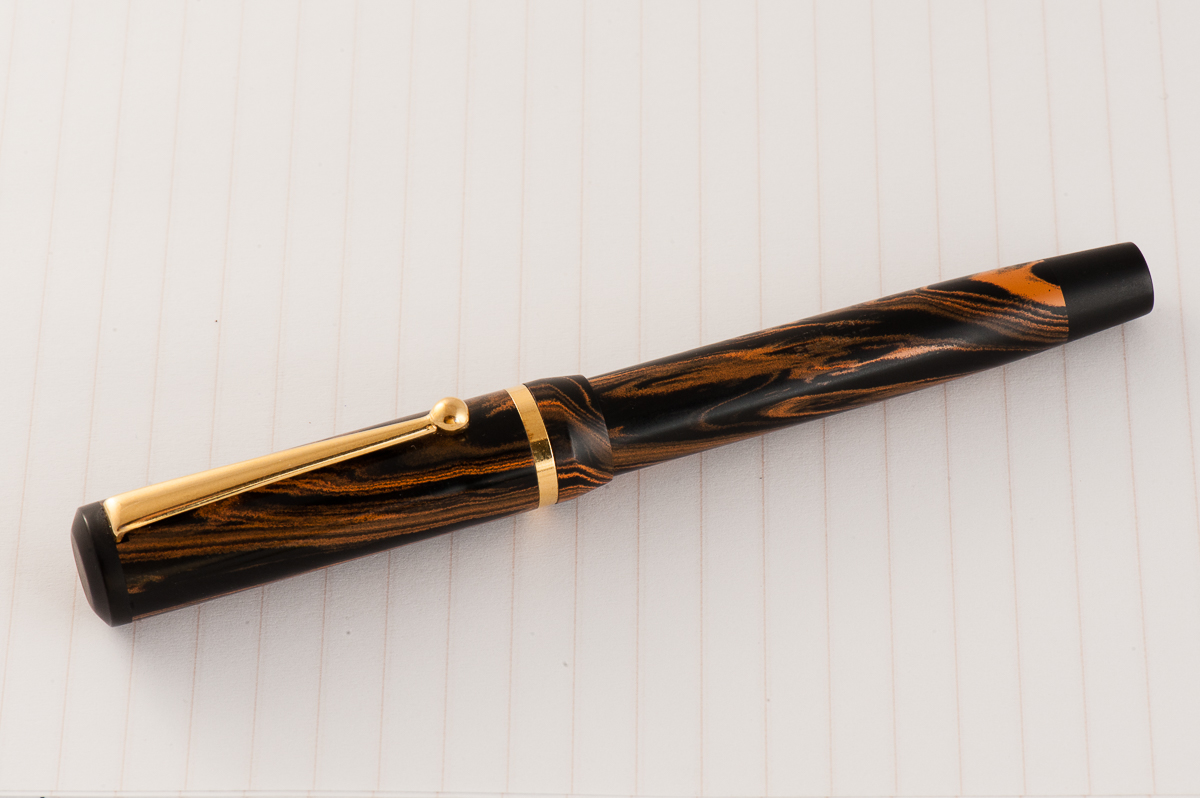
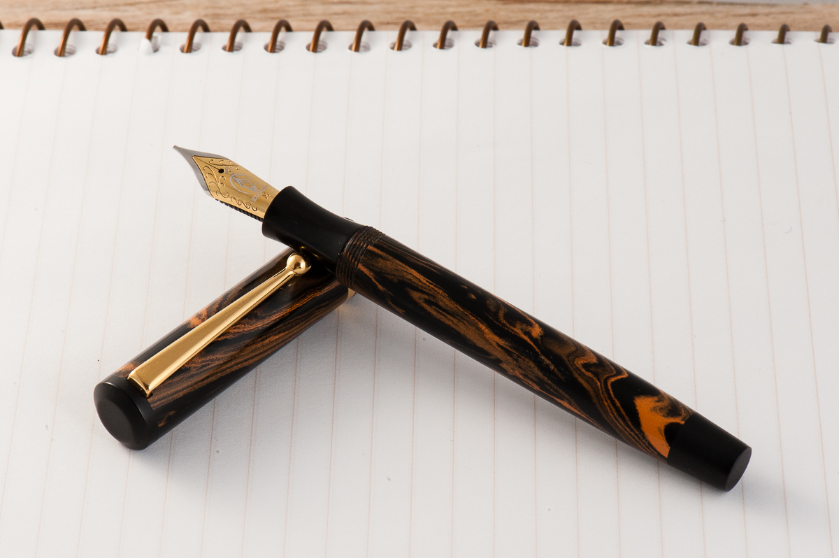
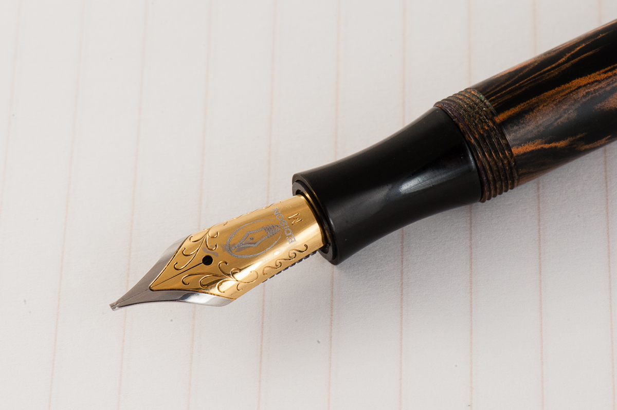
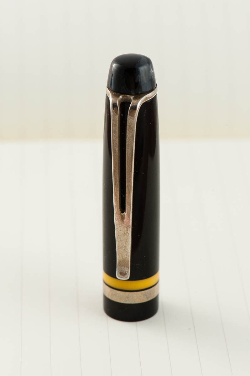
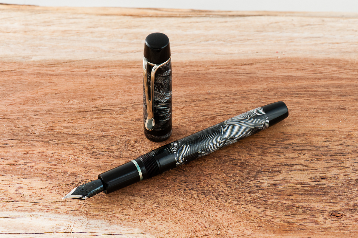
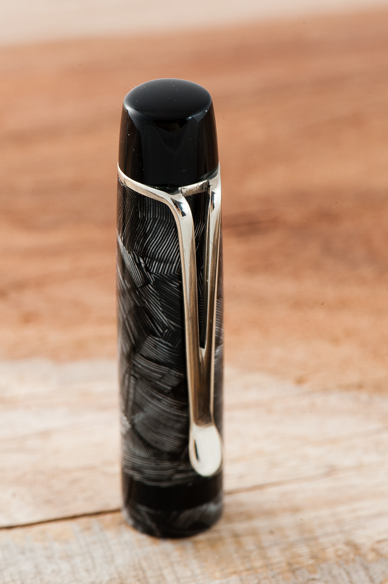
Katherine: The Edison Beaumont comes in a variety of materials, but at it’s heart, it’s a slim pen with a very distinct flat-top cap. Overall, it strikes me as an updated version of very vintage styling (I guess flat-tops just do that for me), which I don’t mind, but I don’t love.
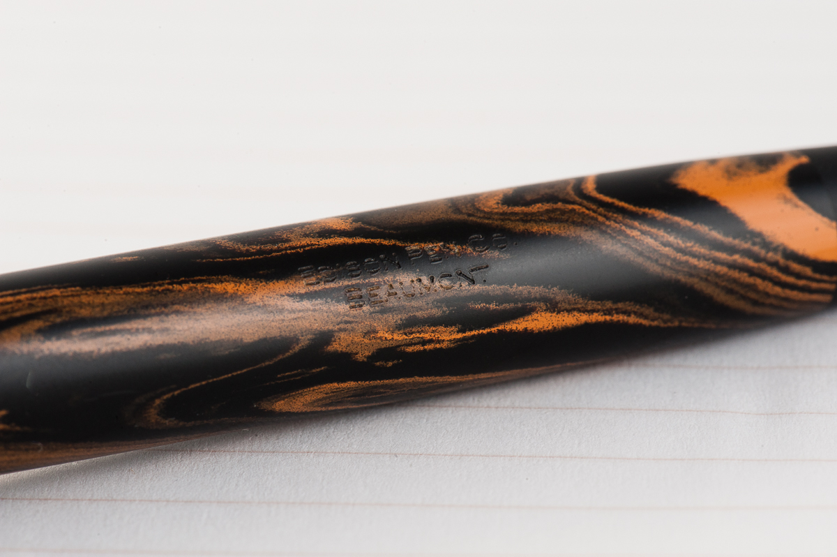
Pam: The Beaumont is relatively slim in width but a good length (may be too lengthy) for the pen. The material reminded me of ebonite ripples which is an acquired taste that I am currently lacking. Generally speaking, the pen’s proportions didn’t appeal to me. I find the cap to be too chunky for such a slim pen. That being said, it’s a well made pen and would work well for those in a business setting or going for a more classic and formal look. The ripple material brings some interest, but not overly loud. Not to mention, there are options for different materials.
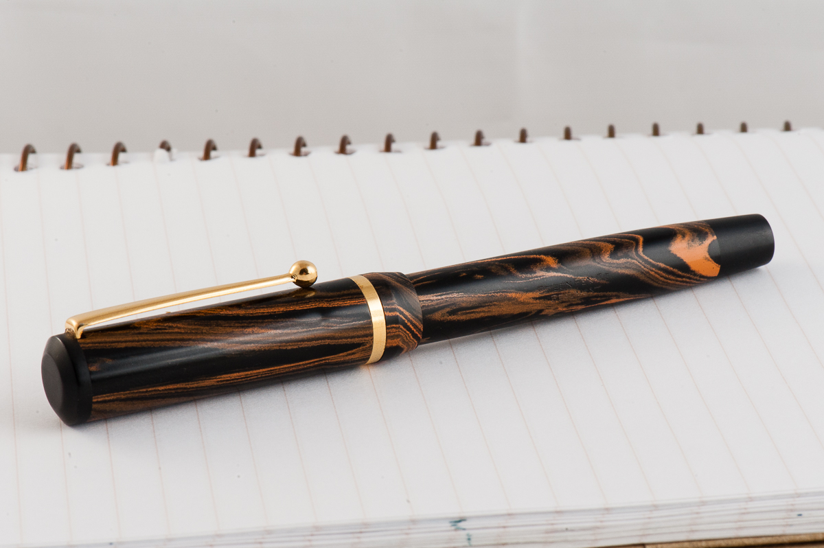
Franz: This is an Edison Beaumont in Briar Swirl ebonite which I purchased very early at the start of my pen collecting. The Beaumont definitely has a vintage shape to it and reminds me of something like a vintage Parker Duofold Streamline pen. I really love how the black cap-top and barrel finial frames the creamy amber swirls of the ebonite.
In November 2012, it was the first ever celebration of Fountain Pen Day. This awesome day is celebrated annually on the first Friday of November. So for Fountain Pen Day, Edison Pen Co. was offering free nib grinds along with a purchase. I got this Beaumont from their “Current Inventory” and asked to get my first ever cursive italic grind. Working with Brian, and Andrea Gray was seamless and I got my pen within a couple days.
In the Hand: Edison Beaumont (posted) — from left to right: Franz, Katherine, and PamIn the Hand: Edison Beaumont (unposted) — from left to right: Franz, Katherine, and Pam
The Business End
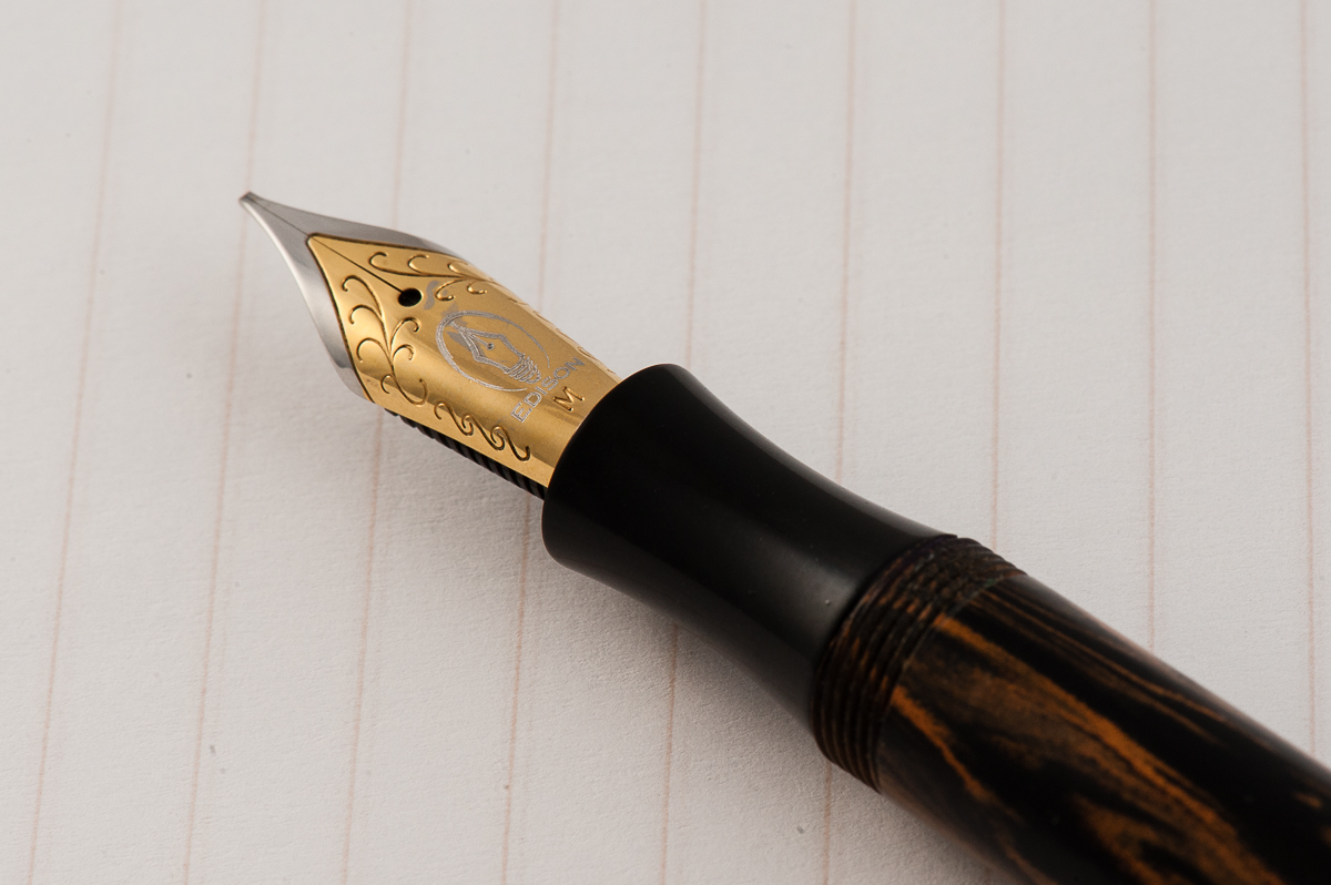
Katherine: The Beaumont I’ve been using has a MCI, ground by Brian Gray of Edison Pen Co. It’s a very comfortable nib with dramatic line variation, as one would expect of an MCI. It’s decently smooth, without being buttery or too wet, which I like. Overall, I really like the nib!
Pam: The nib is my favorite part of the pen! I had no issues with the nib, it flowed well and provides just the right amount of feedbacky-ness. The cursive italic is well done and provides a great writing experience. Bravo!
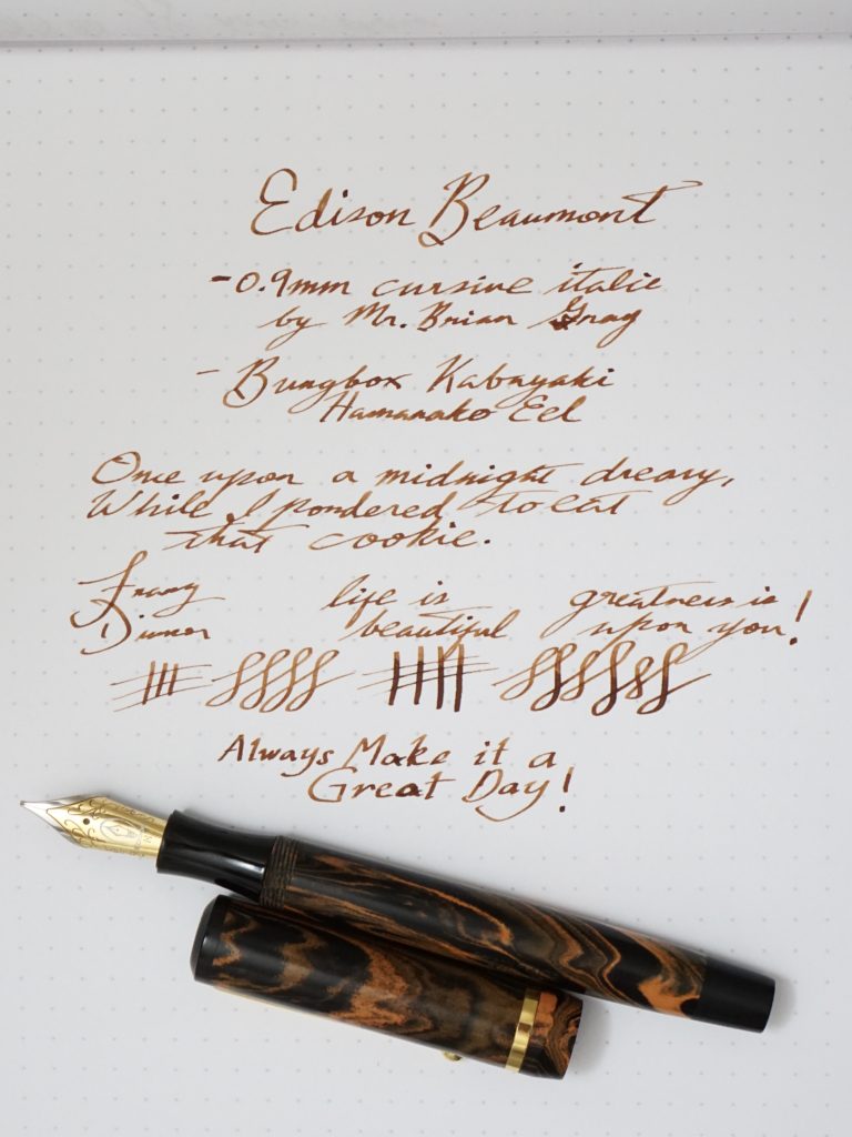
Franz: The 0.9mm cursive italic is such a dream to write with. This was the first custom ground nib I had and it’s got perfect flow for my light pressure, with crisp line variation. And that light bulb nib logo of Edison on the Jowo nib is just so cool too!
Write It Up
Katherine: This pen is a taaaad bit on the slim side, but ultimately still comfortable for me to write with for long periods of time, but I’m surprised that Franz can! The pen is light and comfortable, and the nib is complaint-free.
Pam: The pen is very comfortable and light to use. I didn’t have an issue with the slimness of the pen in both hand grips- tripod or “iron grip”. In my weird “iron grip,” I did find the pen to be slightly top heavy or unbalanced when posted. Hence why I felt that the initial design of this pen is just too lengthy for me, particularly since most of my usual grip is closer towards the nib end.
Franz: The Edison Beaumont is one of the smaller pen models in their offering. As shown on the “In The Hand” photos above, the Beaumont is a bit small in my hands especially when unposted. I do prefer writing with the cap posted and my grip is above the barrel threads for a thicker grip. The concave grip section is quite small for me and causes my hand to cramp up.
For about 15 minutes, I wrote with the cap posted and it was a comfortable journaling session with a nice balance.
Franz’ writing sample on Rhodia Dot pad
EDC-ness (Every Day Carry)
Katherine: There’s something about the way the cap and the cap threads are designed that’s a little… strange. I found that if I cap the pen and twist, sometimes it doesn’t catch — it gets caught on a lip or something, and I have to wiggle to get the threads started. This is kind of annoying for me, since usually, if I want to cap a pen… I want to cap it. Other than that, it’s a small, light pen that seems durable and clips securely to pockets. I ran some errands with it clipped in my poncho pocket, and it held on securely! (Edit: Since writing this, Franz has informed me that the weird threading was a design flaw with the initial Beaumont, but it has since been fixed! Hurray!)
Pam: It’s a great pen for EDC and the clip did just fine in my white coat pocket. The cap took a little more than 1 full rotation so it wasn’t too bothersome for me to carry around and use for quick jots.
Franz: I’ve used the Beaumont at work for a good amount of time and because of the cursive italic grind, it became a pen specifically for signatures. The 0.9mm line was a nice width for the copier paper used in my office. The length of the pen was perfect for my dress shirt pocket and it clips easily onto my shirt.
This Beaumont is filled via cartridge/converter and using this daily at work makes me need to re-ink it after 2-3 days. Not a very big deal but it is something I have to keep on checking daily. That’s due to being spoiled by my piston-filled pens. The pen can be eye-dropper filled as well but I’ve never done that (yet).
Final Grip-ping Impressions
Katherine: All in all, the Beaumont is a nice pen. It’s comfortable, solidly made and writes well. However, it’s on the slimmer/smaller side and it feels a touch overpriced. I think I’m conflating flat-tops in my head, but I’d flip and the Conklin Duragraph in terms of price points… and all would be what I expect.
Pam: The pen is great for those who enjoy a modern take to the vintage aesthetic and can appreciate the workmanship that is guaranteed by the Edison pen company. Again, I see this pen doing great in a business or formal setting, or for those who have more vintage fountain pens than modern ones. This one would be a great addition to your collection.
It wouldn’t be my first pen to recommend to someone due to the price point but it’s not a fair comparison in terms of price point with giants like Lamy or Pilot to the personal service and workmanship of Brian Gray. Amongst the “custom” pen makers, this is a pretty good price point. Alternatively, I would also consider a Franklin-Christoph if you are looking for an American company with great service and a bit more modern/unique design aesthetic.
Franz: As I was starting my pen collecting, the Edison Beaumont was my most-expensive pen. This pen we reviewed in the Briar Swirl ebonite finish was part of their Signature Line and as of June 2017, they are currently priced at $250. There are Production Line Edison Beaumont pens that can be purchased currently for $149 and I think that is such a great value. If you want to have a more unique pen with all different materials Brian has, paying the $100 premium is worth it as well.
Even though the Beaumont is smaller than what I prefer, I still enjoy writing with it especially with the custom ground 0.9mm CI nib. If size is the only category to consider, my large hands prefer the Edison Glenmont, and the Pelikan M805 which are included in the pen comparisons section below.
I recommend this Edison Beaumont for more smaller, or medium size hands and as I said above, the Edison Pen Co.’s Production Line Beaumont provides bang for your buck.
Pen Comparisons
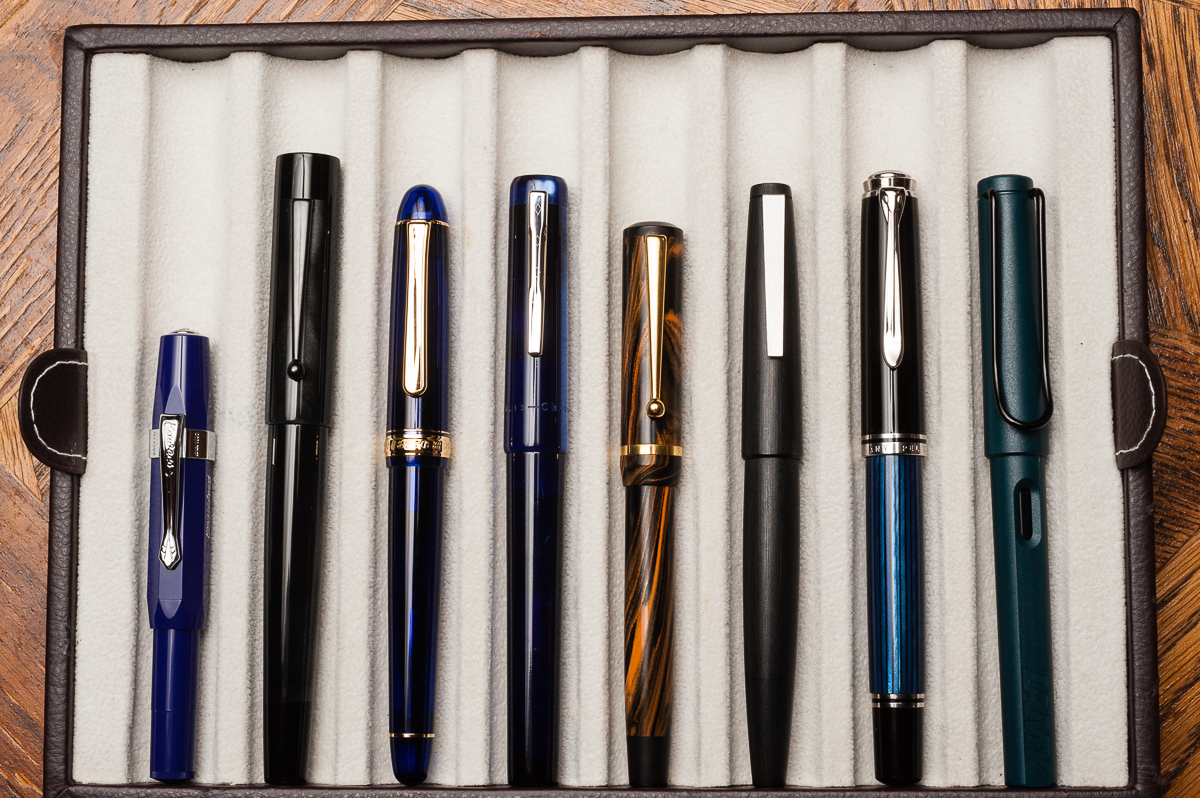
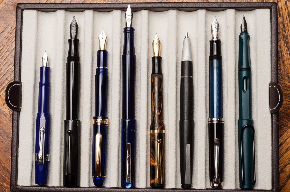
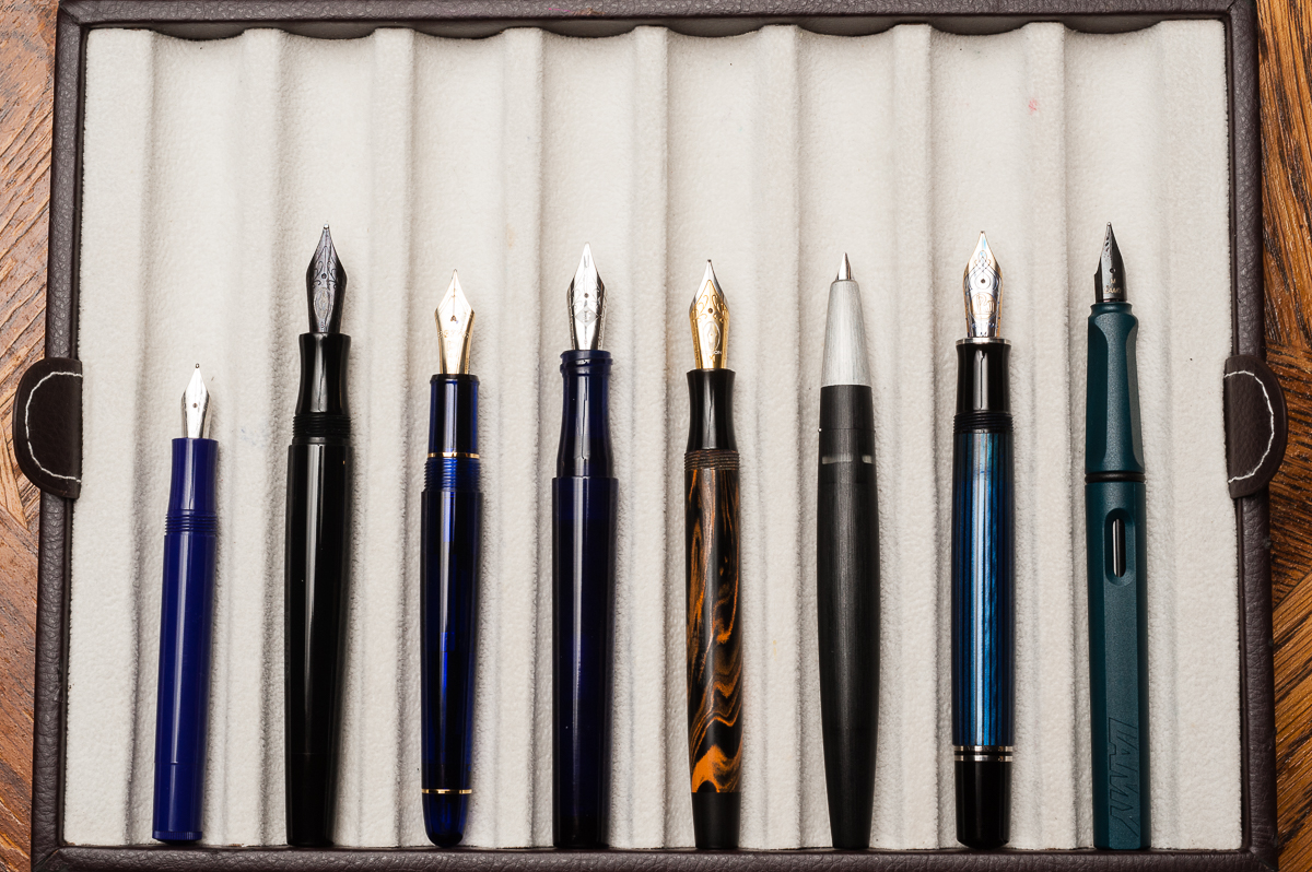
Closed pens from left to right: Kaweco Sport, Edison Glenmont, Platinum 3776, Franklin-Christoph Model 03, *Edison Beaumont*, Lamy 2000, Pelikan M805, and Lamy SafariPosted pens from left to right: Kaweco Sport, Edison Glenmont, Platinum 3776, Franklin-Christoph Model 03, *Edison Beaumont*, Lamy 2000, Pelikan M805, and Lamy SafariUnposted pens from left to right: Kaweco Sport, Edison Glenmont, Platinum 3776, Franklin-Christoph Model 03, *Edison Beaumont*, Lamy 2000, Pelikan M805, and Lamy Safari
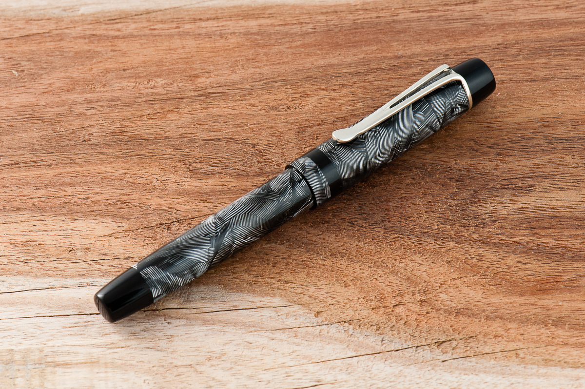
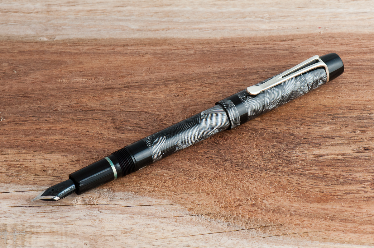
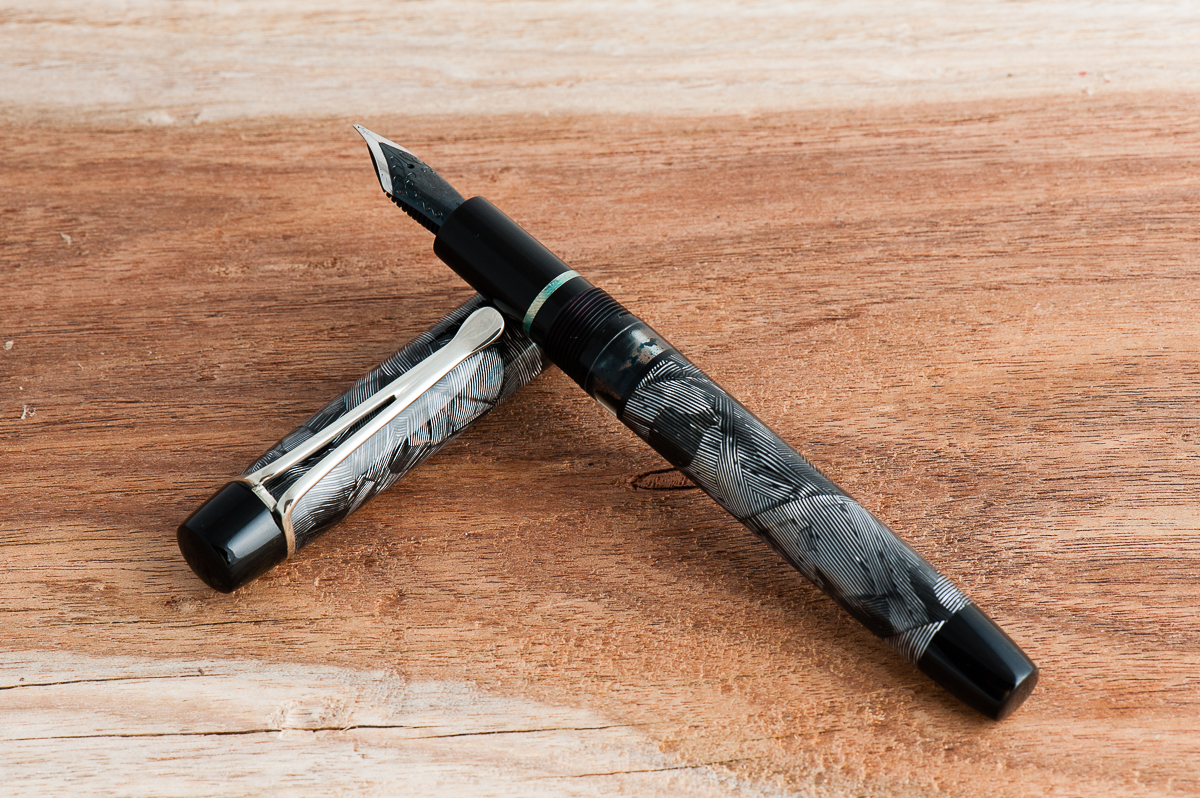
This is a review of working with custom pen maker John Albert, of Romulus Pens. Since he doesn’t have pre-defined ‘models’, we thought it would make more sense to review more general aspects of his pens instead of diving deep on a specific pen. (Also check out his Instagram here)
Hand Over That Pen, please!
Katherine: To me, this is where John shines. He went to art school and it shows. His pens are classically inspired, but, if you choose, he’ll work with you to incorporate personal and modern touches (sometimes with gentle steering to save you from clashing asks or bad design choices). But, he’s also willing to experiment and try new things. My second pen from him, a purple “nonagon” was at least partially caused by my grousing about being unable to find a Nakaya Decapod Mini and my love for facets — and what a beautiful experiment that has turned out to be! Experiment or not, he takes an immense amount of pride in his work and everything is always immaculately finished — metal bands are tight and smooth, everything is buffed and threads are never tight.
Pam: John has the eye of an artist and the patience of a saint. I haven’t had any experience in designing a pen with all the options available. Particularly since John will work with alot of different materials including hard woods, acrylic (and many more) and with the number of design elements in a pen from the cap, barrel, finials, and clip the possibilities are endless. I started telling John what I wanted in a pen with only one material in mind as the working inspiration. With my initially obscenely long emails of wants, wishes and “I don’t know what to do with this aspect of the pen” and alot of John’s patience and help as a vacillated between all the different possibilities, the “Sherlock” (my name for the pen, not his) was born.
John is great to work with and really does have some great input to fine tune your design to a particular feel or look.
The Business End
John typically uses Jowo nib units, but can work with other nibs if supplied by the customer. He doesn’t do any grinds or adjustments.
Katherine: While I like Jowo nibs, I don’t love the idea of having a bunch of Jowo-holders. As a result, the first pen I commissioned from John (the grey and yellow one) fits Pelikan m400/600 nibs. I chose to go with an eyedropper, not a piston filler, and it’s written fantastically with little leaking! More recently, John has been building pens around all sorts of nib units, including ones that are entirely friction fit. I don’t own one of these pens (so far) but am excited to do so once I find an appropriate nib.
A Pelikan M600 nib on Katherine’s first Romulus Pen
Pam: I was fine with a Jowo nib for my first pen, particularly with the awesome black/rhodium finish. John was able to get me 2 nib units for my pen, one with a 0.4 cursive italic and one in EF, to suit whatever writing mood I might be in. I really enjoy both nibs and they write as expected. John is branching out to other nib units and I look forward to having all kinds of custom pens that hold some pretty amazing nibs. One day John! One day!
A two tone black oxide #6 steel nib for Pam’s first pen from Romulus Pens
Final Grip-ping Impressions
A Pen Maker’s Goal: A customer to own enough pens to have Wolverine claws with… ;-P
Katherine: I love all three of the Romulus pens I have — a grey celluloid with yellow accents, the first/prototype “nonagon”, in clear acrylic, and the second “nonagon” in a grape stripe resin. All three are immaculately finished, well balanced and well designed. I look forward to working with John on many more custom pens, I already have quite a few ideas queued up…
Pam: John has great workmanship and the “Sherlock” is flawless. The pen is so well polished that the barrel and the finials are seamless to the touch. I joke with John that we can either have a custom pen subscription for me where I just send him money in regular increments until enough money accumulates for me to get another pen by him, or establish a punch card system with the number of ideas I have and get excited about. I don’t keep the ideas to myself mind you, John gets the blitzes of communication when inspiration strikes and he takes it all in stride with great feedback. Did I mention he’s a saint? He also makes all my pen dreams come true.
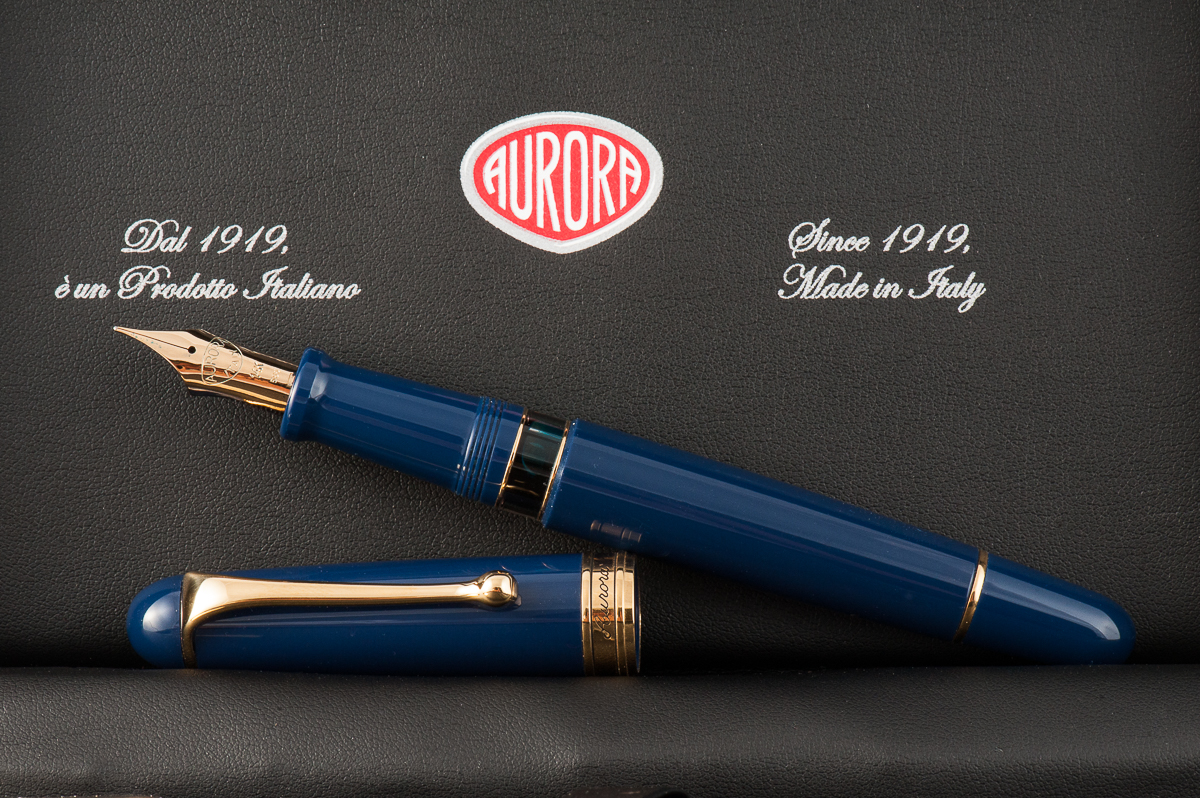
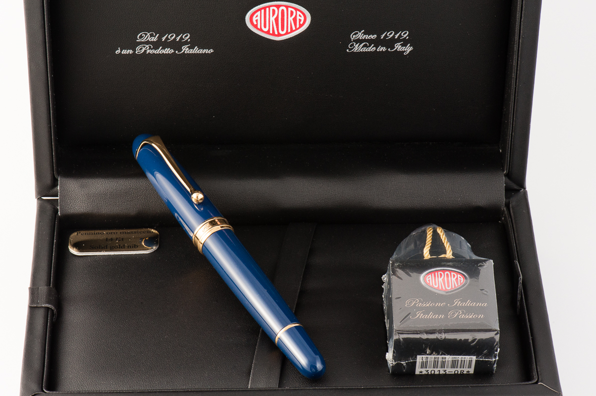
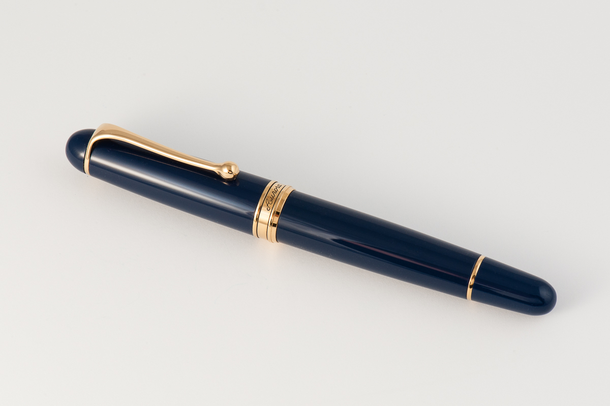
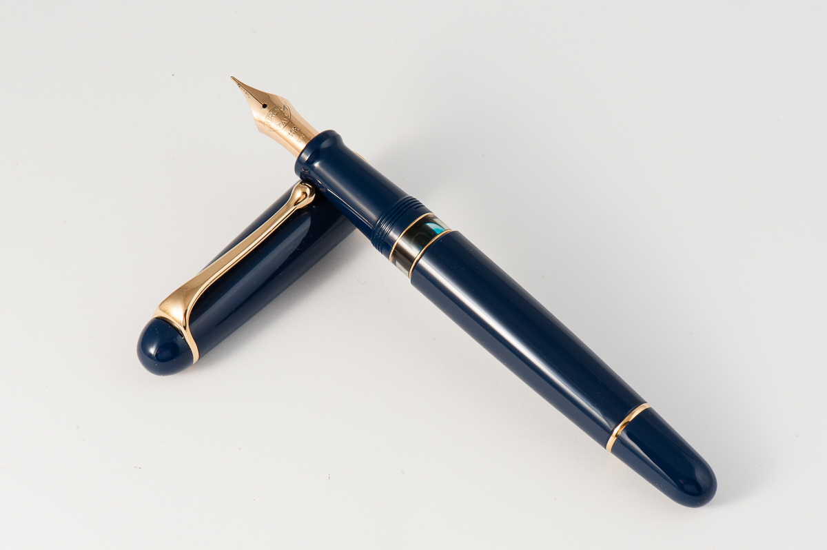
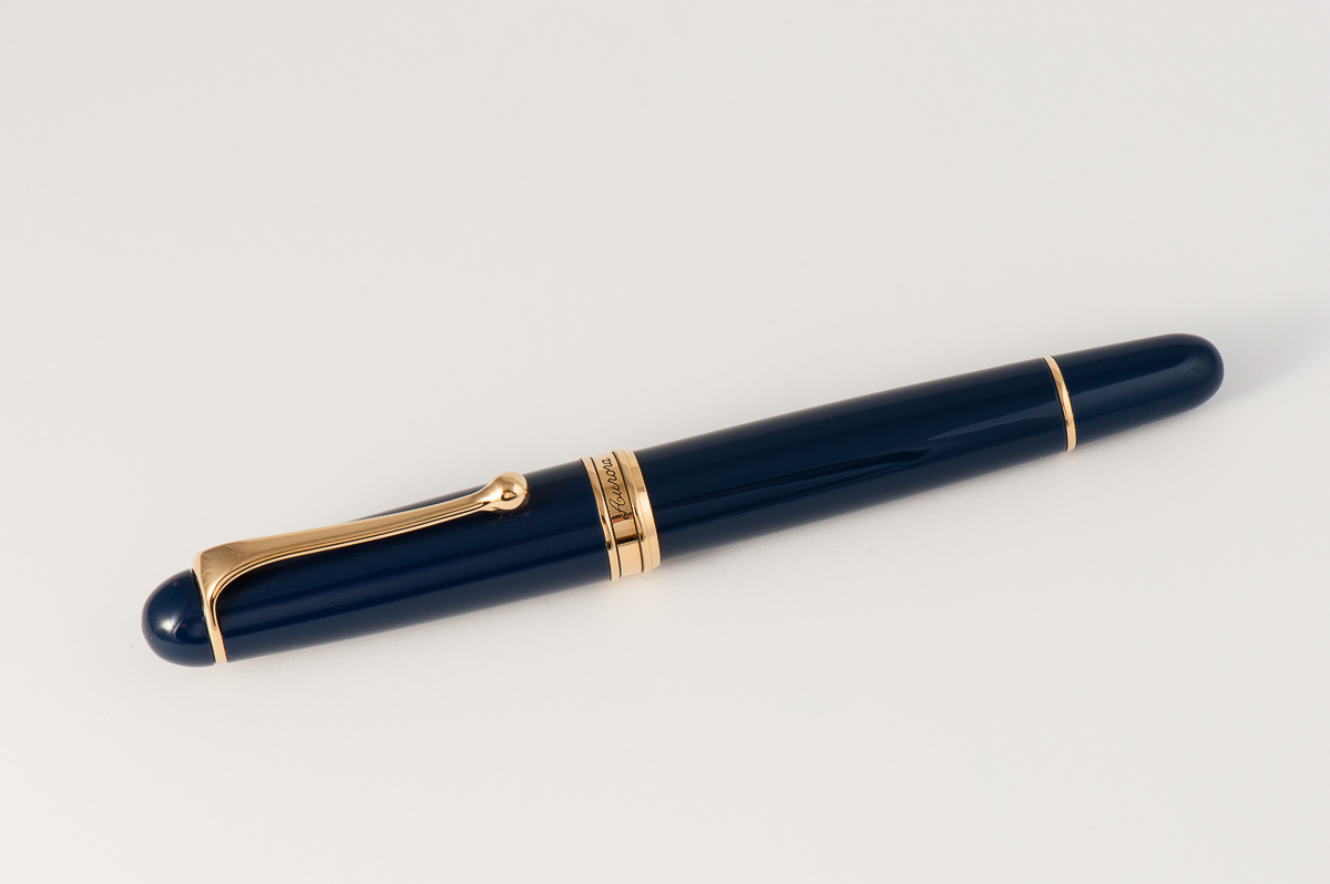
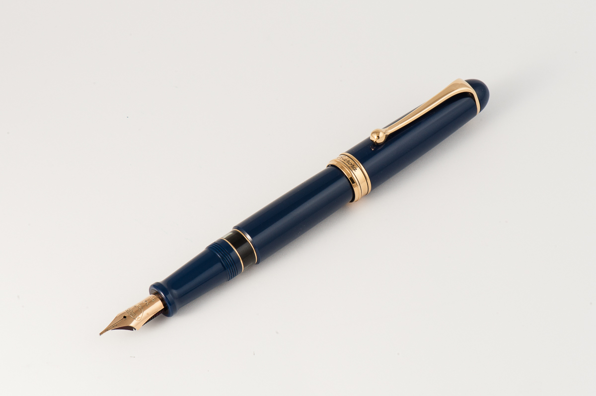
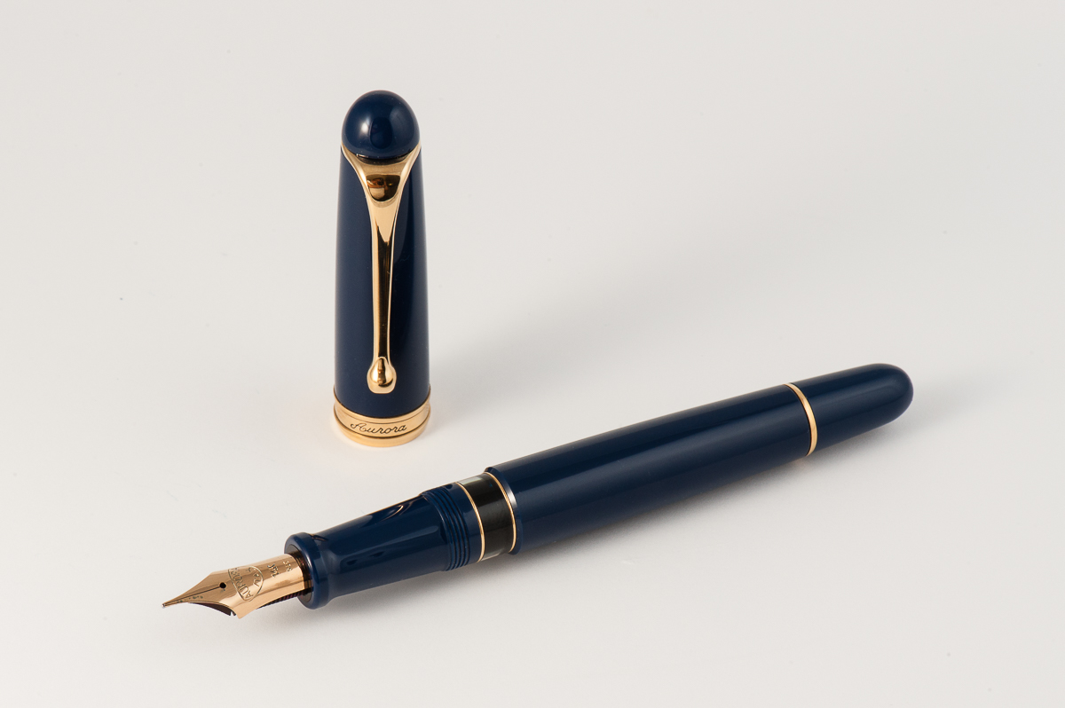
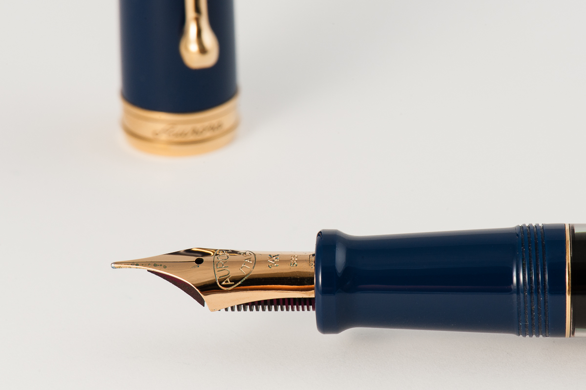
Katherine: I prefer the aesthetic of the square-ended Optima. I thought this was a pretty boring (or perhaps classic?) looking pen, but in a quite unique shade of grey-purple-ish blue.
Pamela: The Aurora Flex 88 has a beautiful blue gray material that is somewhat complimented by the yellow gold hardware. I am curious if a rhodium trim would be a better compliment since the material has a pretty cool tone to it. Shapewise, the pen is a simple cigar shape that does little to convey how special this pen is given all the hype to the “modern flex” pen. The clip is a unique fluid design that doesn’t appeal to me, but does have a clean aesthetic to it. My favorite part of the pen is the ink window. Always a plus for me.
Franz: The Aurora 88 is a visually pleasing pen with a design that makes it timeless. Now this may mean boring for some people …cough… Katherine… cough… ;-P, but the rounded ends look elegant to me. The elongated and tapered barrel makes it a comfortable pen in my hand either posted or unposted.
Going back to the pen being timeless, the Aurora 88 design has been in existence since 1947. Albeit, the original 88 design was a bit thinner, had a slip cap, and a hooded nib. Unfortunately, I do not have any photos of a vintage Aurora 88 but an image search for “vintage Aurora 88” will display adequate photos of it. In the 1980’s however, the Aurora 88’s design was altered into what it is right now which is a thicker pen, twist cap, a full size nib, and incorporated with their hidden reservoir system.
Note: This pen history information was taken from Andreas Lambrou’s “Fountain Pens of the World” book.
In the Hand: Aurora 88 (posted) — from left to right: Franz, Katherine, and PamIn the Hand: Aurora 88 (unposted) — from left to right: Franz, Katherine, and Pam
The Business End
Katherine: I was excited to try Aurora’s much talked about flex nib… but ultimately, I was disappointed. It’s a perfectly usable, and even enjoyable and interesting to use… but, to me, it didn’t live up to the hype. My Pilot 742 FA is significantly softer and offers me much more line variation, while being a fraction of the price. But, if you like the look of the pen, and like soft nibs, this is great — just not what I’d call “flex”.
Pamela: The is a unique shape which provides it the structure needed for this modern flex. Since this pen was on loan from a friend at the SF Pen Posse, I didn’t feel comfortable pushing the limits of this pen. That said, the “flex” is more of a middle ground; it is not as soft as a vintage flex, but softer than the Platinum soft fine nib.
Franz: I really like the shape of Aurora’s nibs especially this fine flex one. The tines are quite longer and cool looking. As for the flex nib and echoing my colleagues above, I feel that it really isn’t a match towards vintage flex nibs. There definitely is line variation but not what you would expect when it is called a flexible nib. I did experience some railroading but as long as I took it slow, it didn’t reoccur anymore.
Overall, Aurora’s nibs are great and I’ve had pleasant experiences with them from writing with other people’s pens. I personally own a factory italic nib that writes quite juicy and sharp. Without any pressure on this fine flex nib, it wrote very smoothly with a fine line.
Write It Up
Katherine: The Aurora 88 is comfortable and enjoyable to write with for long periods. It’s quite light, which I find comfortable and usable for long durations.
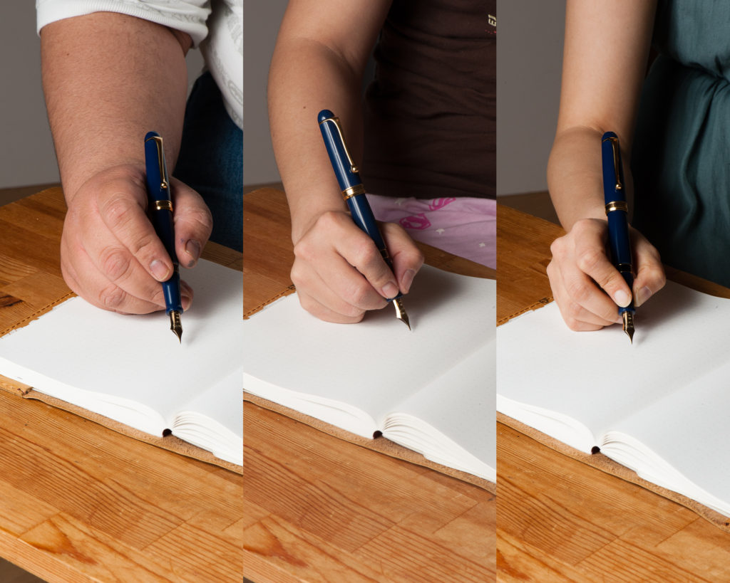
Pamela: The 88 is has a very light material, almost too light for me. However, the girth of the pen is very comfortable to use as it cruises over the pages. For this particular nib, I held the pen in a tripod grip. (Yes, even in the tripod, I still grip the pen too tight…). The length of the pen is pretty comfortable both posted and unposted. The material is light enough that posting the pen doesn’t add too much weight or unbalance the pen.
Franz: I enjoyed my journal time with the Aurora 88. I wrote comfortably with the cap posted for about ten minutes, and then unposted for another ten. I do prefer the cap posted on the pen for the extra length but I did not experience any fatigue even when the pen was unposted. Now that’s a rare thing and it’s one of the biggest selling points of the 88 for me.
Katherine’s comparison of modern flex nibs (on Tomoe River)
Franz’ writing sample on Rhodia Dot Pad
EDC-ness (Every Day Carry)
Katherine: This was a loan from a friend in the San Francisco Pen Posse — so no EDC-ing for me. But, it has all the makings of being a great EDC pen: A solid and strong clip for pockets (though probably not thick denim), and it uncaps quickly, but not too quickly (one and a quarter turns).
Pamela: Since this pen is on loan, I didn’t trial this pen on the road at work. Instead, the pen is a good size for a daily carry with a strong clip for suit pockets. I wouldn’t recommend throwing this pen into a pair of jeans as the material will probably get pretty scratched up. With the relatively unsubstantial weight, it may also be forgotten in a deep pocket somewhere.
Franz: I used the Aurora 88 at my workplace for a good two days and it was a splendid pen for my work setting. The quick deploy of one and a quarter turns made it convenient for me, as well as the fine width of the nib. As I signed my name, I applied a little bit of pressure and the slight flex gave my signature a bit of flair that I enjoyed very much.
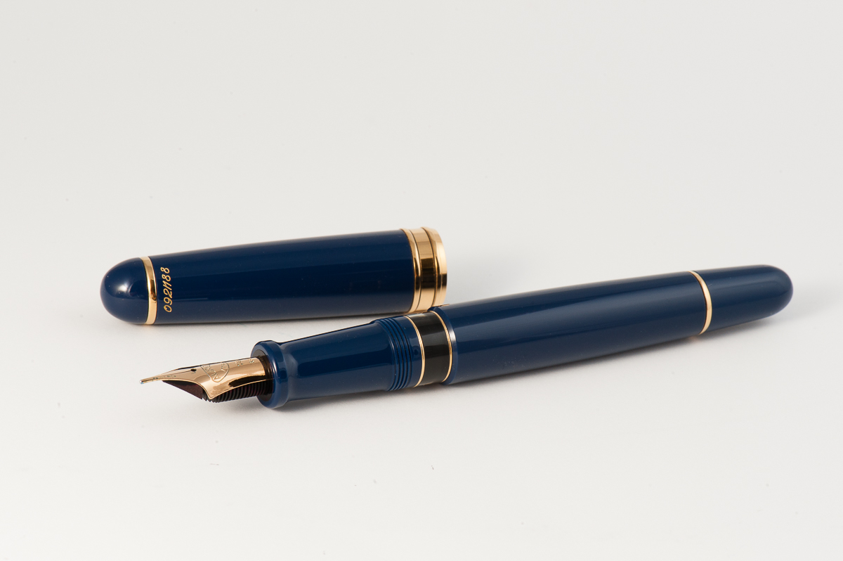
The Aurora 88 has a piston-filler system that carries a good amount of ink and is perfect for an everyday use pen. You can see the ink level quite clearly via the ink window. When you’re running out of ink, fully extend the piston towards the section to activate the hidden reservoir to be able to write a little bit longer. That is a pretty neat feature.
The Aurora 88’s ink window is quite clear.
Final Grip-ping Impressions
Katherine: I have no complaints about this pen, other than the marketing and expectations set by the “flex” label. I’d call this “soft”. That aside, it’s a smooth, comfortable nib that is capable of some line variation (more than a Platinum 3776 SF, but less than a Pilot 742), in a solid and classic body. But, as with many pens in the $500+ category… whether or not it’s worth that price tag is a pretty subjective mater. To me, it’s not, but there aren’t many options for nibs like this, and if you don’t like black Pilots, this is the most line variation I’ve seen from a modern pen.
Pamela: I am torn in my final recommendation for this pen. On one hand, the pen and nib is a modern feat in trying to emulate the infamous vintage flex. On the other hand, there are still vintage flex nibs and pens out there for a substantially smaller price tag. I applaud Aurora for adding more flex and softness to the modern nib options and for those individuals who have the funds and the willingness to support such an endeavor, I would highly recommend this pen to them. For those who lack the funds but still want to try a flex pen, I would recommend taking the time to research vintage pens and flex nibs, and finding a good deal via the Pen Addict slack, reddit or your local pen show.
Franz: It’s interesting how the two ladies above and myself have about the same sentiments on the Aurora 88. The pen itself is very nice to write with and my larger hand was not even a bit uncomfortable/fatigued. If you like the shape of this pen like I do, you may currently acquire one below the $500 price point with the round nibs (Extra Fine, Fine, Medium, and Broad). Now if you want the Fine Flex nib option, you’ll be paying a premium since the flex nib is only available in their limited edition releases. I mean, that’s quite a chunk of money knowing that you can obtain a decent vintage flexible nib for a lot less money. But then of course, the limited edition colors are quite nice as well. The blue finish of this Aurora 88 is very enticing to a blue pen lover like me.
As for my final thoughts on the Aurora 88, I like it. A LOT. This is definitely on my list of pens to one day own and add to my growing Italian pen collection.
Thank you Michael for lending us your Aurora 88 Flex pen. You’ve been very generous my friend. See you at the Pen Posse meetups soon!
Pen Comparisons
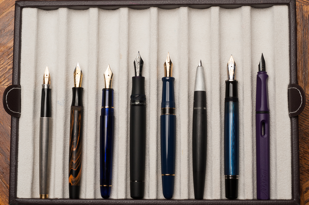
Closed pens from left to right: Parker 75, Edison Beaumont, Platinum 3776, Visconti Homosapiens, *Aurora 88*, Lamy 2000, Pelikan M805, and Lamy SafariPosted pens from left to right: Parker 75, Edison Beaumont, Platinum 3776, Visconti Homosapiens, *Aurora 88*, Lamy 2000, Pelikan M805, and Lamy SafariUnposted pens from left to right: Parker 75, Edison Beaumont, Platinum 3776, Visconti Homosapiens, *Aurora 88*, Lamy 2000, Pelikan M805, and Lamy Safari
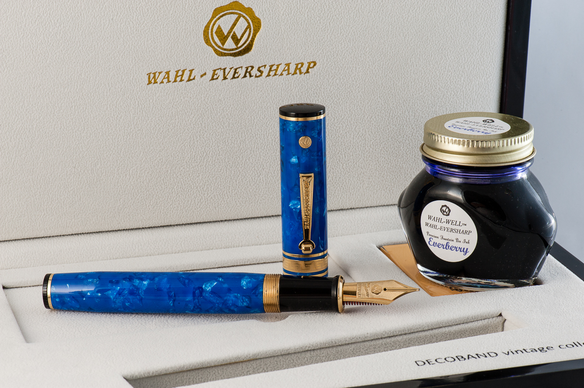
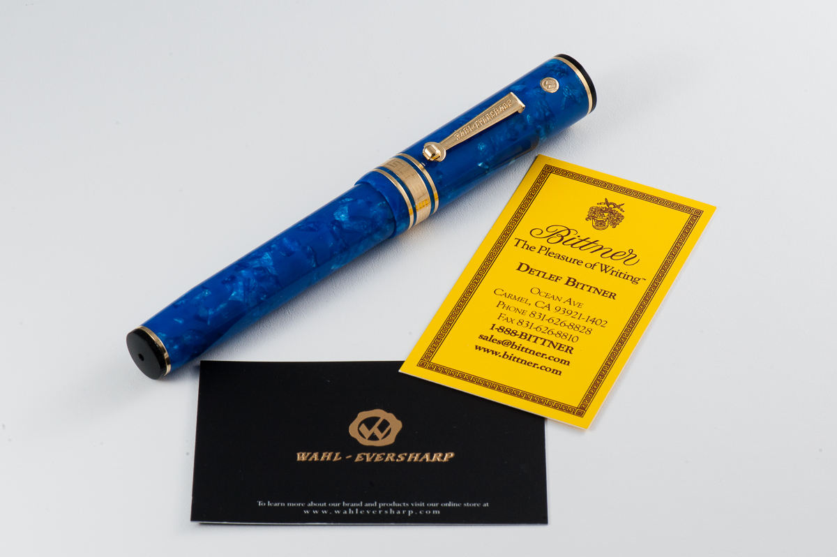
We want to thank Mr. Detlef Bittner of Bittner Pens for lending us this Wahl-Eversharp fountain pen for review. Detlef’s pen store is located in Carmel, California and he also travels to a lot of pen shows. When we return this pen, the HOTP crew may just decide to take a road trip and visit the pen store.
The opinions here are our own and we were not compensated (monetarily or otherwise) for this review.
We have also asked Claire (@writteninrice) to be our guest once again and review this pen with us. Thanks Claire!
Hand Over That Pen, please!
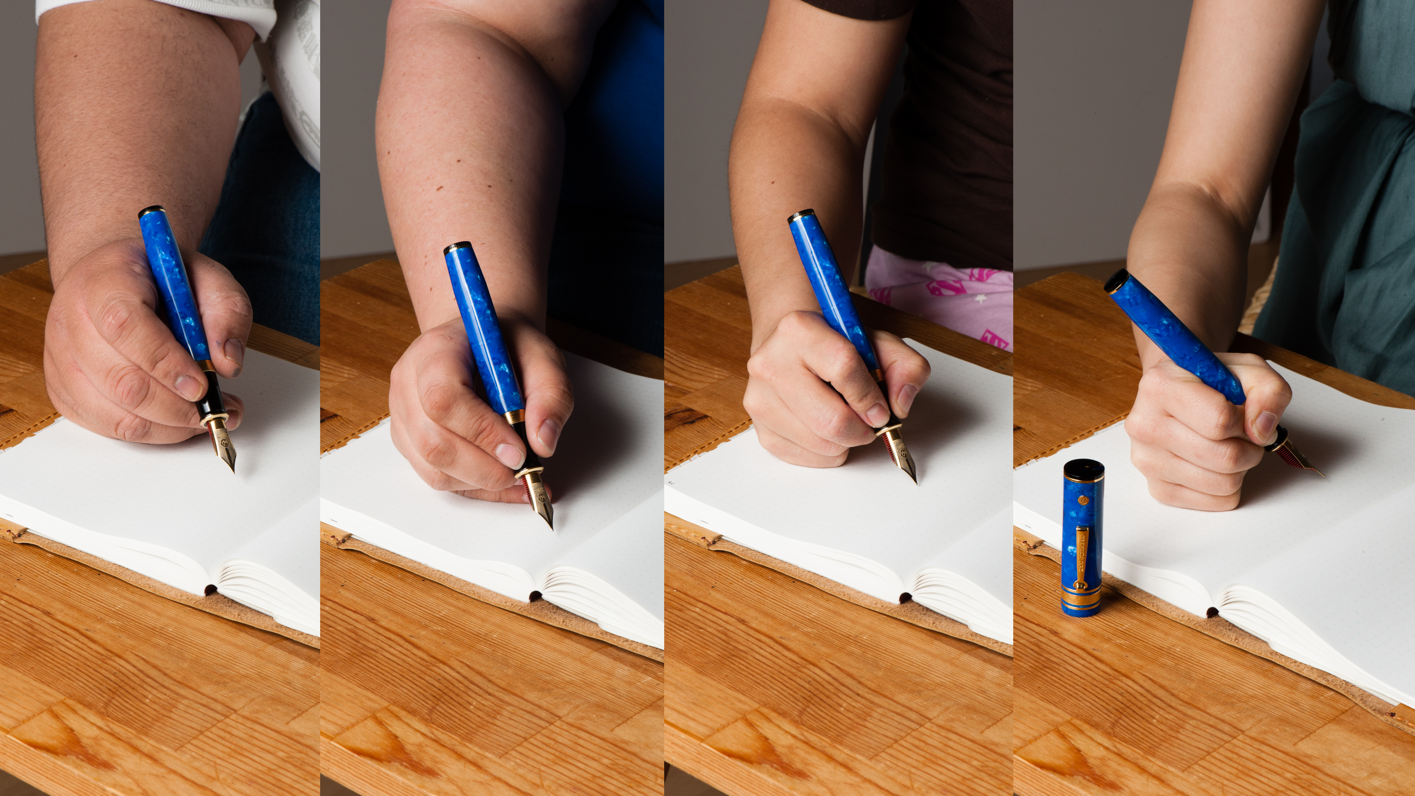
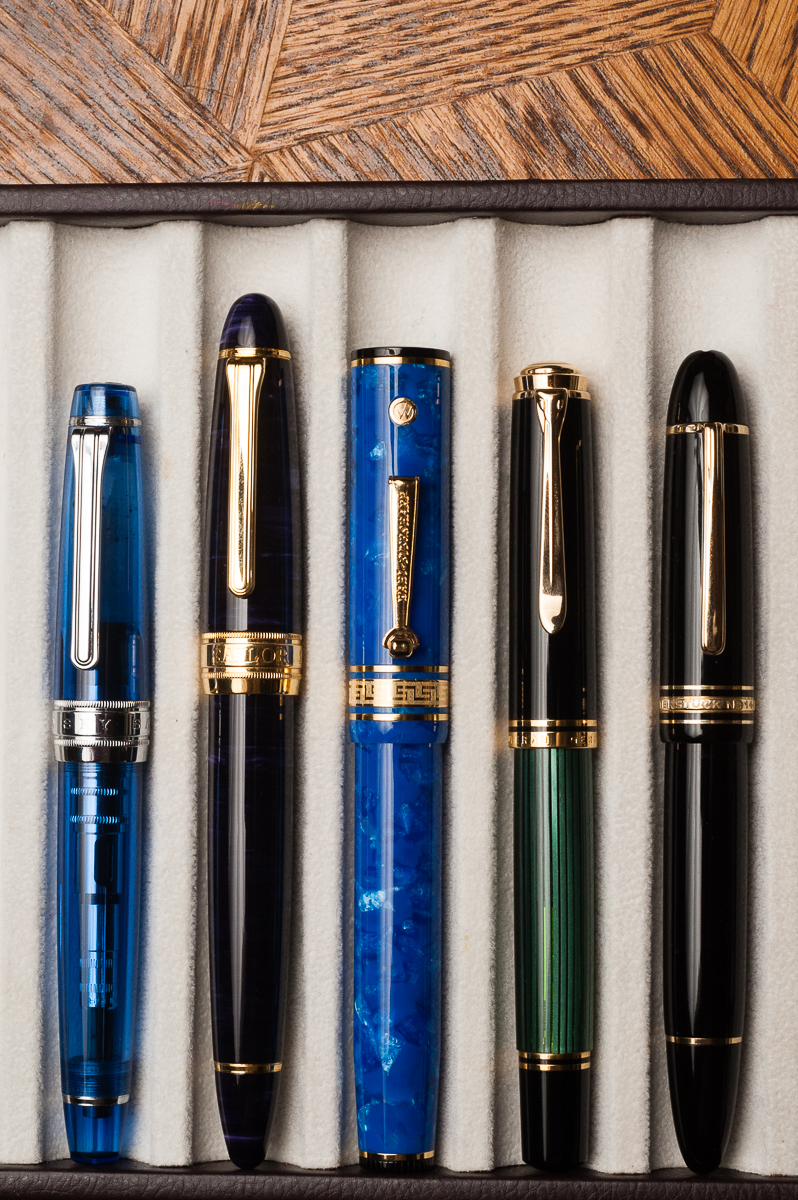
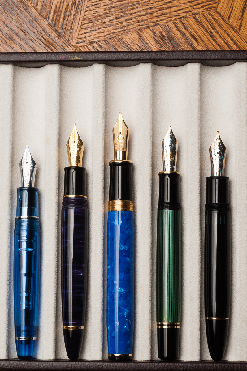
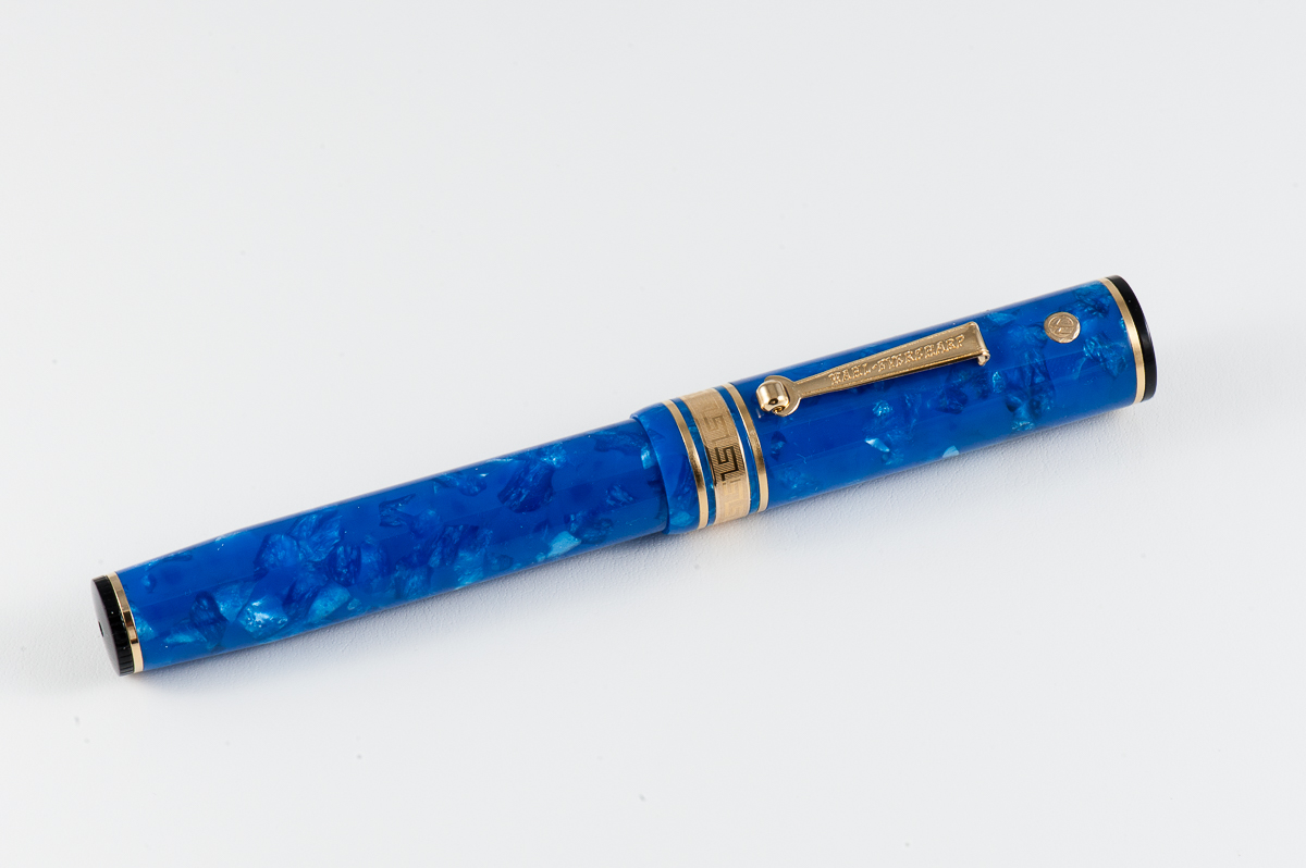
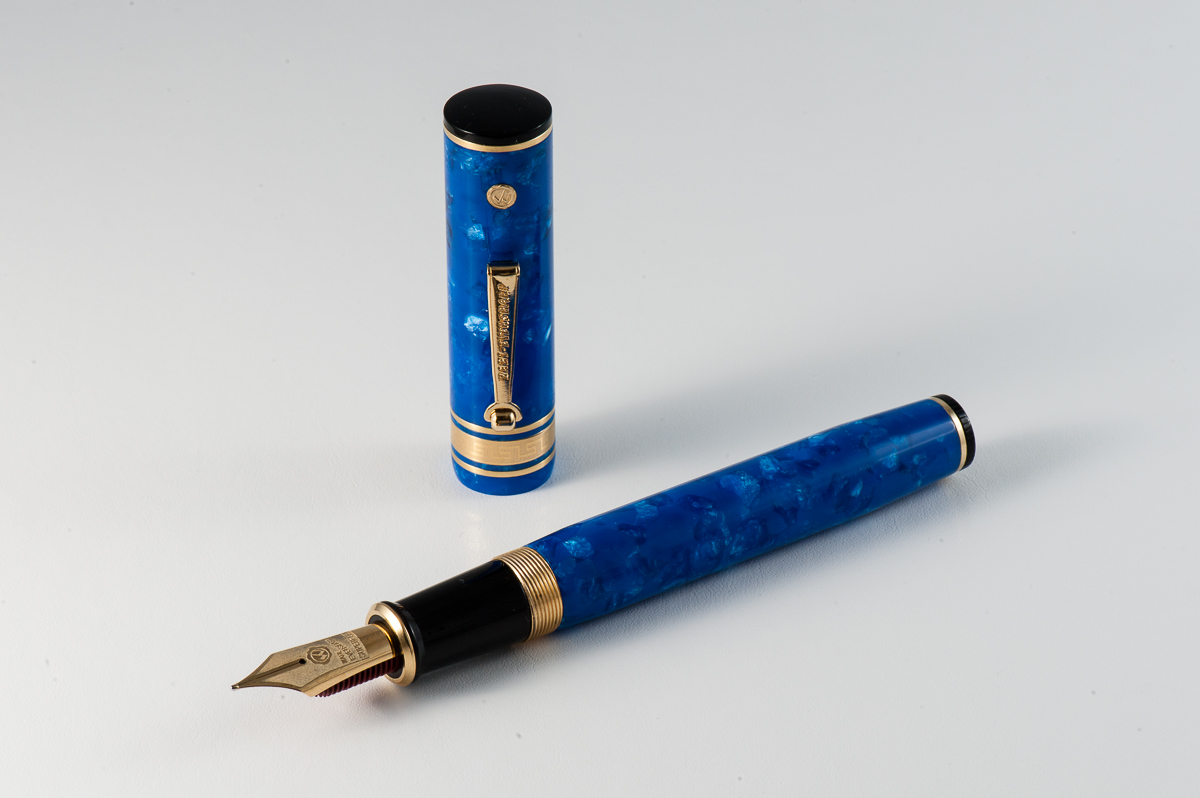
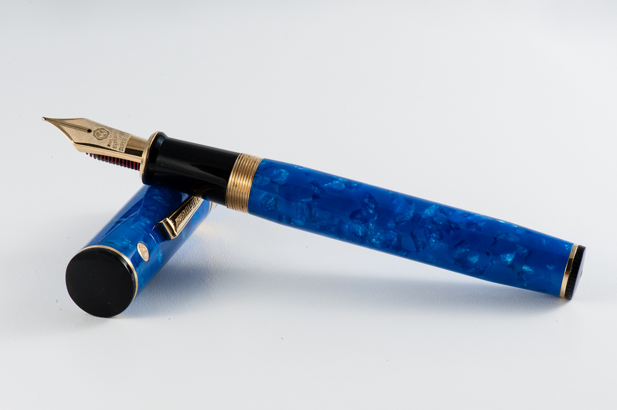
Katherine: This is a pretty cool looking pen, and the huge nib looks very cool. I really liked details on this pen — the complex blue material, the red ebonite feed and the classy use of gold and black trim. But, even at first glance, this is a huge pen! It stands out and is hard to miss.
Claire: This is a pen with gravitas that hearkens back to pens of a bygone era. The Wahl Eversharp Decoband is a large pen that’s an attention grabber. The nib on this pen is just lovely and I love the red ebonite feed. In fact, I couldn’t help but post a nib shot of this pen on Instagram the second I got it in my hands. I am not typically a fan of pens with gold hardware but for this pen, it works.
Pam: The Decoband is an acquired taste for me. It is undeniable that the blue material is beautiful and deep, that the red ebonite feed is awesome, and that nib is gorgeous. I am just not a fan of the shape and the overall aesthetic. Despite my reservations about the pen, it’s a beautiful pen that is very reminiscent of the fountain pen’s golden days.
Franz: Is this pen big enough or what? The Decoband is massively impressive and is probably the biggest pen that I’ve held in terms of length, girth, and weight. This is a revival of Wahl-Eversharp’s Gold Seal design in 1929. The proportion of the pen is very similar to the vintage one except for its larger scale. The Decoband fits quite perfectly in my bear paw…err… large hand and is quite comfortable for me to use.
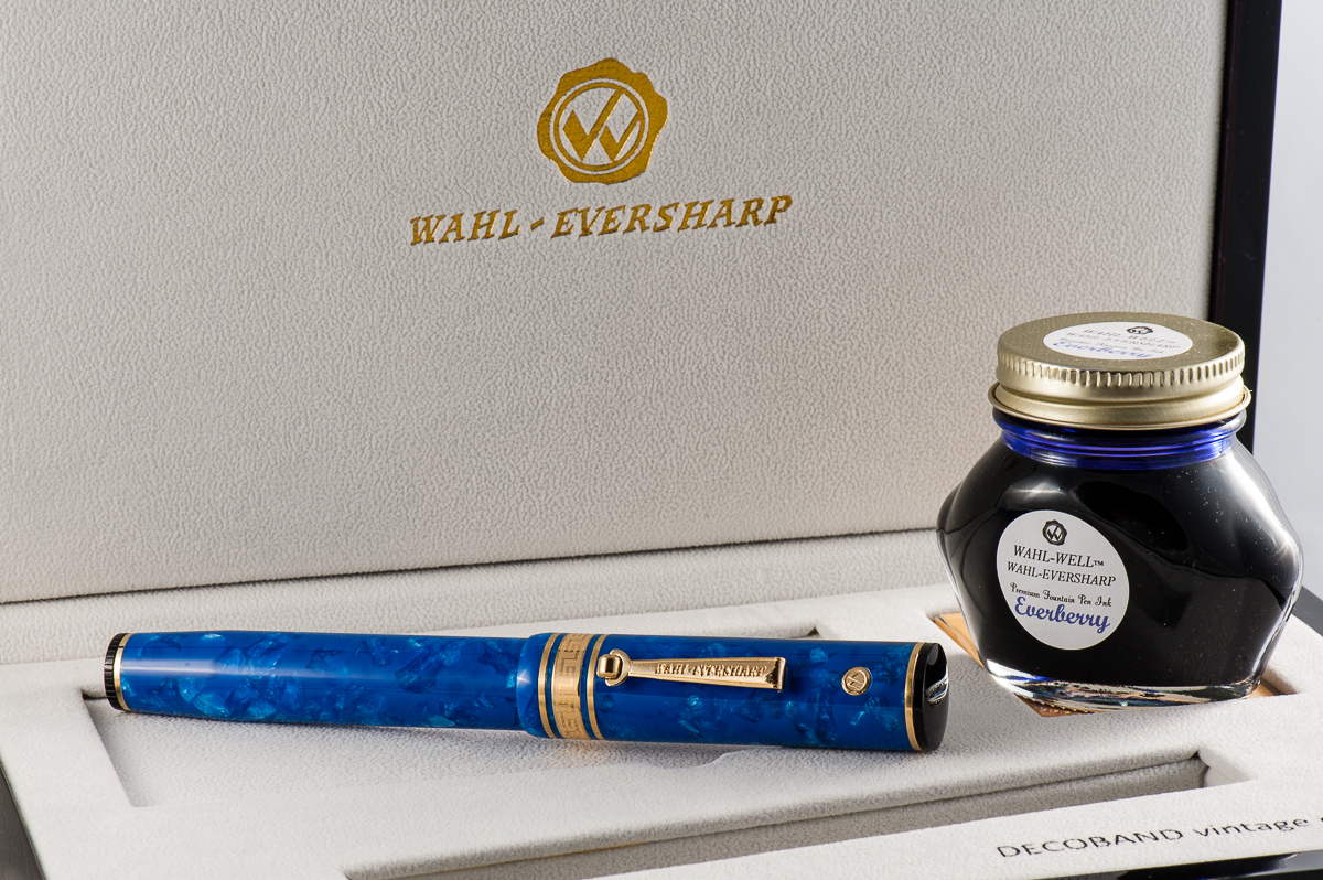
The Amalfi Blue Pearl acrylic is such a stunning material and as Katherine pointed out, the black finials on the cap and the bottom of the barrel makes it a classic looking pen. The packaging is also impressive as the box big and shiny. They also supply the pen with Wahl-Eversharp’s ink bottle which is a nice touch.
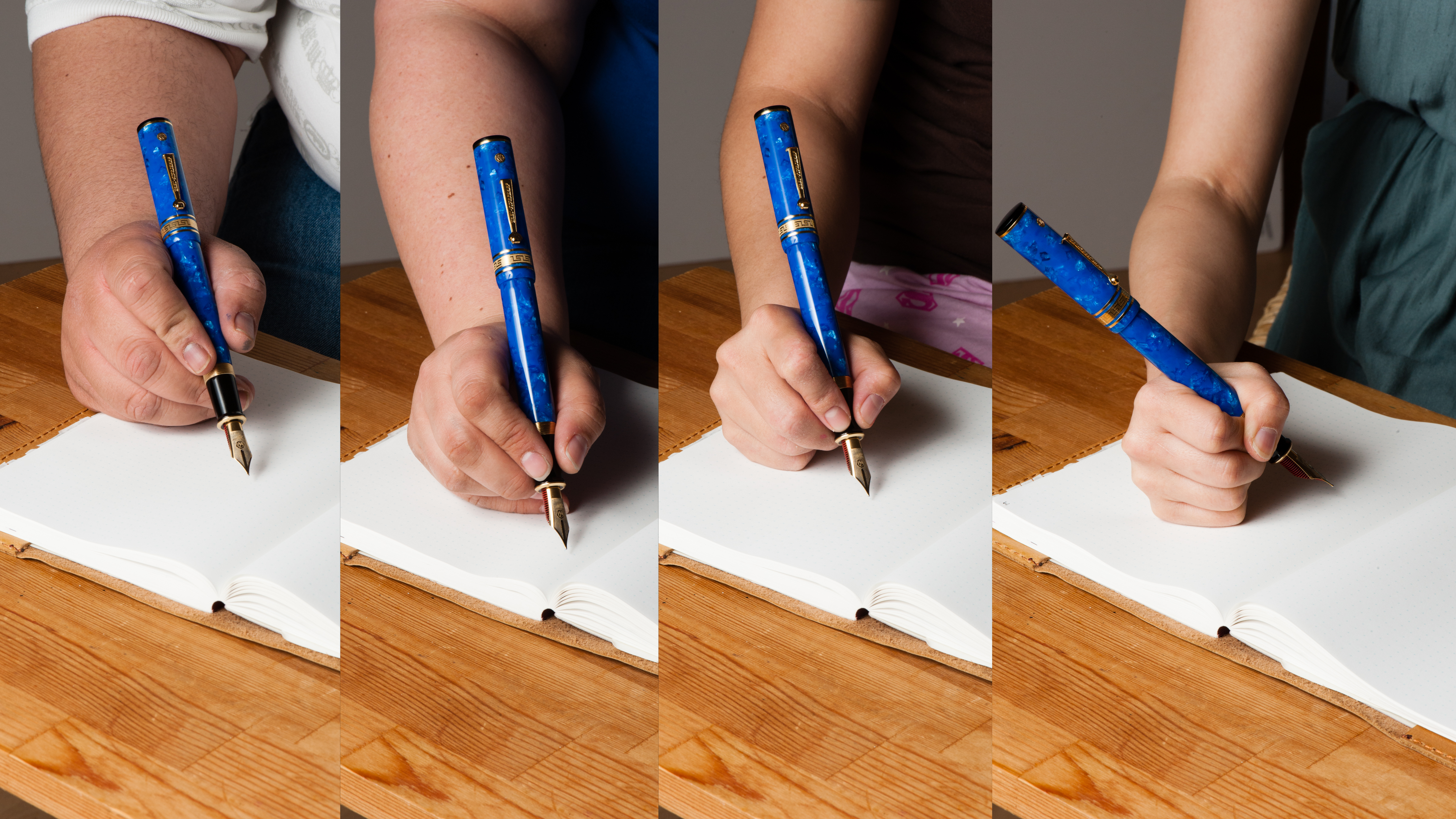
In the Hand: W-E Decoband (posted) — from left to right: Franz, Claire, Katherine, and Pam In the Hand: W-E Decoband (unposted) — from left to right: Franz, Claire, Katherine, and Pam
The Business End
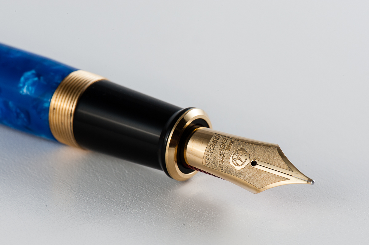
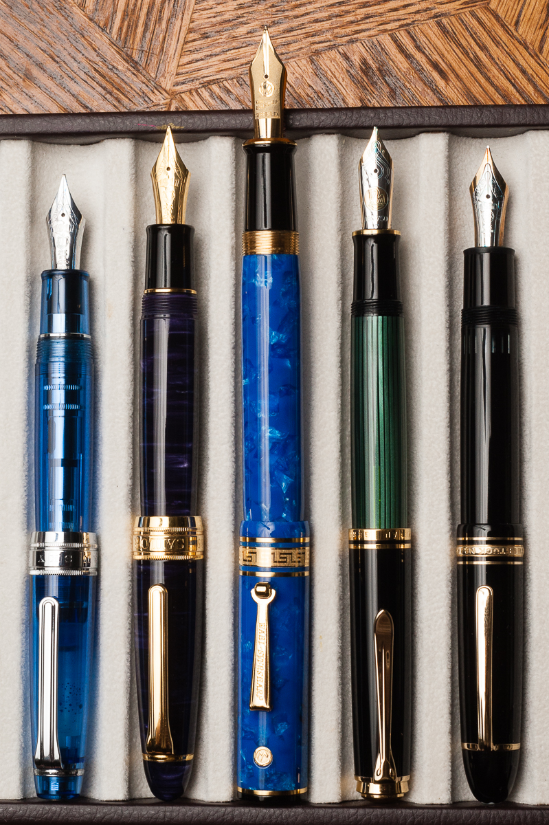
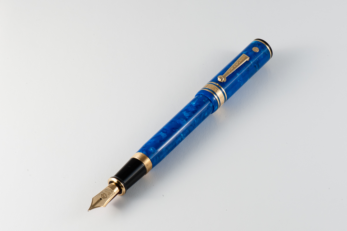
Katherine: The nib is huge and it writes quite nicely. It’s very smooth without being glassy, and has a nice softness to it. However, I didn’t think it was comparable to many of the “full” flex vintage nibs I’ve tried. The Decoband nib is smooth and wet, but line variation is not its strong suit. Perhaps a finer point would produce more line variation, but out of the box, this is more of a wet and medium writer.
Claire: As I mentioned earlier, the super flex nib on this pen is eye catching. I love the frosted detail noting the brand and specifics. In hand, the nib is a little on the squishy side. After primarily writing with hard nibs this was a bit disconcerting. Though, it didn’t take too long to get used to the experience and really start to enjoy the way this pen puts ink to paper. The super flex nib boasts arguably the best modern flex on the market. While it doesn’t have the snap back that I experienced with vintage flex nibs, it does provide an amazing amount of flex.
Pam: My favorite part of the pen is the nib and the red ebonite feed. It’s an absolute beauty. The nib is one of the smoothest and softest nibs I have tried. The line variation is not as great as a vintage flex, but arguably this nib is the best “modern flex” nib out there. I did find the nib to be quite wet, so I don’t see this my ideal for daily writing (don’t forget my writing pressure), but it would definitely give those who want your autograph a special flourish!
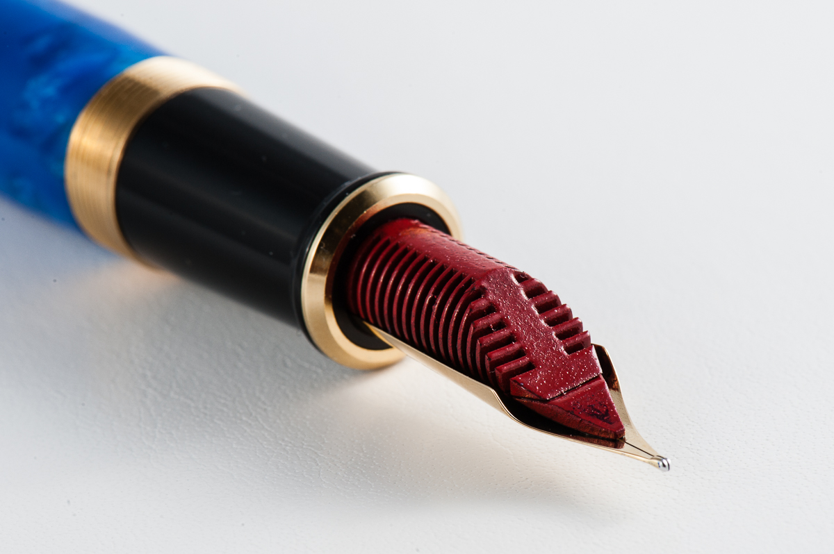
Franz: The Decoband is available in two nib options. First is the semi-flex extra fine nib, and second is the Superflex nib which is what was loaned to us. I typically do not write with flexible nibs and the only “flex” pen I own is a vintage Parker Televisor. The Superflex nib’s variation was remarkable to me. It definitely has a wet flow that even without pressure, the line is a medium width and when pressure is applied, it lays down a nice wide line. The Decoband’s feed is made of ebonite coated with red urushi lacquer and assists the generous ink flow of the nib.
In addition, I was able to try out the semi-flex extra fine nib from a friend at the 2017 LA Pen Show and I think that the semi-flex is more of an everyday writing nib for me. So you have two great nib choices for the Decoband.
Superflex nib Ebonite feed with red urushi lacquer
Write It Up
Katherine: At first I thought this pen would be okay — but a couple minutes into writing with it I noticed my hand was more tired than normal, and starting to get a bit of cramping. Additionally, if I tried to use it posted… well, I wouldn’t. I’d probably poke myself in the eye. All in all, a pen I’d rather look at than use, which is unfortunate, but such are small hands.
Claire: This is a hefty pen that is more apt for larger hands than mine. I found that my hand started cramping up after just a few minutes of writing. Overall, the pen felt well balanced and of an appropriate heft for its size. Unfortunately, this pen is just too wide for me to use comfortably for long writing sessions.
Pam: This pen was meant for bear paws as I found the pen to only be comfortable for a couple of minutes before my hand would notably tire. I don’t recommend using the pen posted for those with small hands as the pen is quite large and heavy. The pen is heftier than most on the market, likely due to the material used. The width is not a problem for me, but the pen is quite top heavy, given the length of the pen, particularly posted.
Franz: As I’ve said above, the pen fits my hand nicely and I was happy to write with it in my journal. In case you didn’t know, the pen’s internal mechanism is made of solid brass parts and the weight of the pen uncapped is about 40 grams. Compared to the Pelikan M805 that I use every day is about 20 grams uncapped. It is a heavy pen that after journaling for about ten minutes, my hand felt very fatigued. While this pen impresses me a lot, I would only use it to write quick notes, a short letter, or a nice signature. I wrote with this pen unposted because it is too long for me when the cap is posted.
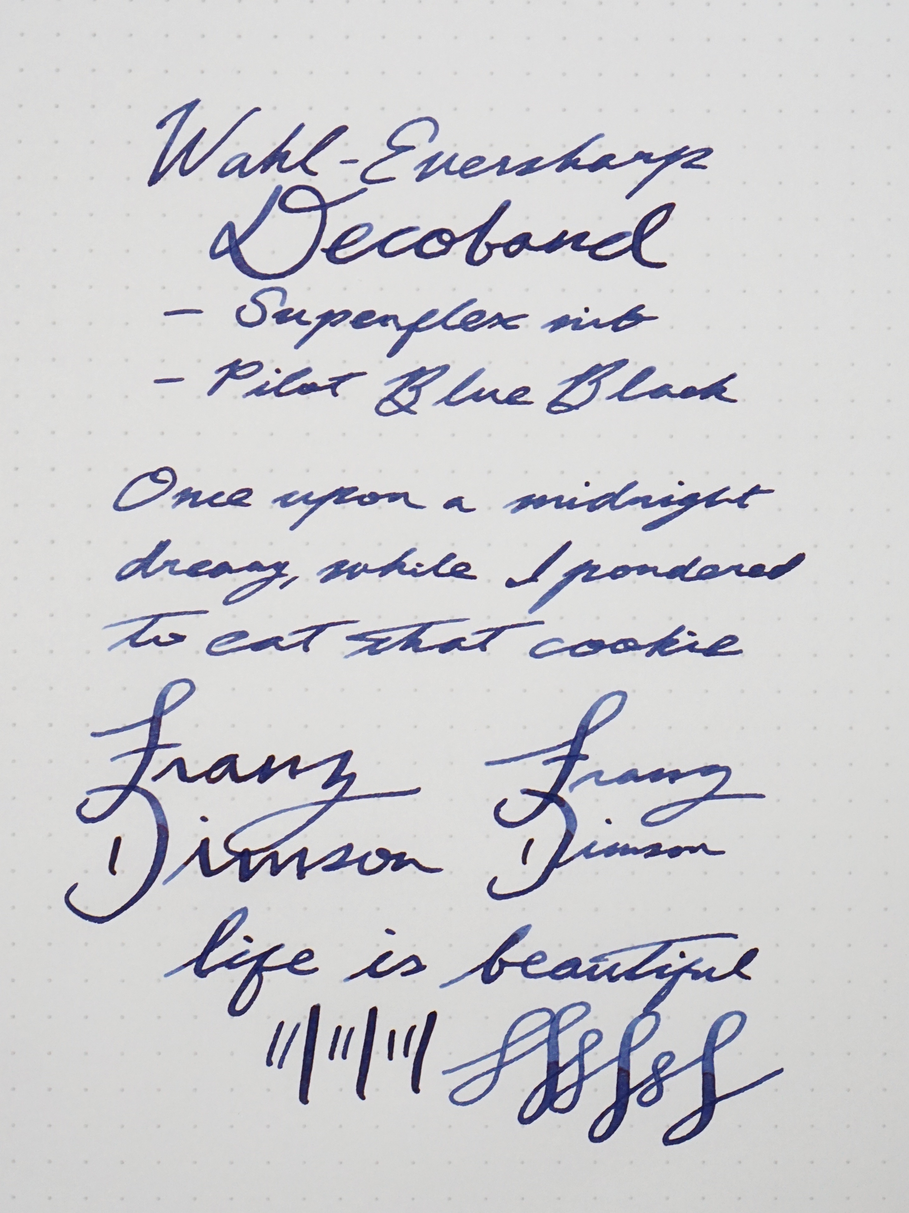
Franz’ writing sample on Rhodia Dot grid pad
EDC-ness
Katherine: I sat down with this pen and wrote a few pages with it, but didn’t EDC it since it’s on loan from Bittner Pens (thank you again!) and didn’t want to risk any damage. However, based on the handful of pages I wrote with it, I wouldn’t consider it a candidate for EDC for a couple reasons: 1. it’s just too big, 2. nib is a little too wet, I’d have to wait for all my notes to dry before being able to close my notebook!
Claire: This is not a pen that springs to mind in association with the letters EDC. This would be a great pen for an office job that required occasional notes. I did not get a chance to carry this pen around to test it out for longer than playing with it for an evening at Katherine’s place.
Pam: Thank you Bittner Pens for your generous loan of the Decoband. That said, it lived in the original box unless we were testing it out. I would recommend this as a great EDC for a fancy desk to hold and carry. This pen is a bit large for the usual jacket or shirt pocket and given the weight, may not stay in the pocket for long if you were to bend over. Not to mention, this pen is best suited (in my opinion) for your autograph; what better pen to do that with than this beauty?
Franz: Because this Decoband is on loan, we only dipped the nib in ink and did not fill it. I was not able to use this pen in my office but I imagine that it would be a pen I’d keep on my desk and write with it only when seated. The Decoband is too big to fit securely in my shirt pocket although it would be okay for a jacket pocket.
The pen has a pneumatic filling system which is why there are solid brass parts inside. To fill the pen, unscrew and pull out the black knob, extend the metal sleeve, submerge the nib in the ink bottle, cover the hole on the knob, push the knob/metal sleeve down to the barrel, and uncover the hole. This action compresses the sac inside and when you let go of the hole, the pressure will draw ink in the pen. According to Wahl-Eversharp, the Decoband holds an ink capacity of 2.1ml. Now that’s appropriate for the amount of ink that it lays down from its superflex nib.
The pneumatic filling system
Final Grip-ping Impressions
Katherine: I’m pretty biased with this pen. It’s clearly not meant for people with smaller hands, which makes me a big meh on it. But, if I had a large handed friend I really liked and needed to get a pen for, this would be a contender. It’s a beautiful, classic looking pen with a nib full of character. However, at a price point of $800+, there’s no way I can justify a pen that’s so large my hand cramps for myself.
Claire: I love the blue material on this pen. Even though this pen is far too big for my hand it seems to be well balanced and well made pen. This pen has a the aesthetic of a vintage pen but also is quite large, which to me is an interesting combination. The superflex nib is the only modern pen that I’ve written with that is maybe a flexible as vintage flexible nibs straight out of the box. Overall, I think this is a lovely pen for a person with larger hands than myself.
Pam: The nib/feed of this pen is great for everyone. The pen itself however is much better suited for bear paw individuals (Hint, hint Franz!) and for those who really enjoy the vintage aesthetic. It’s a steep price so it’s not great for most wallets. However, I can say for this pen in particular, you pay for what you get. It’s a large, statement-esque, hefty pen, that has all the trappings of the fountain pen’s glory days. It’s obvious that Wahl Eversharp did not skimp on the Decoband. That said, it’s not an “every day carry” pen, it’s a “special occasion” pen. But for us fountain pen lovers, every day with a fountain pen is a special occasion!
Franz: I really like the Decoband because of its large dimensions and the awesome nib it is issued with. As a friend from the Pen Posse said, this is a “whale” of a pen for large handed people but as I say in most of our reviews, try it out for yourself when you can.
The Amalfi Blue Pearl acrylic version of the Decoband is a special edition color and will be limited in production. This is similar to the now sold out Lapis Blue. So if you want the Amalfi Blue, better contact Detlef of Bittner Pens, or Syd of Wahl-Eversharp right away. Hmmm….
Thank you Detlef for giving us the opportunity to review this awesome pen.
Pen Comparisons
Closed pens from left to right: Platinum 3776, Parker 75, vintage Eversharp Skyline, Franklin-Christoph Model 31, *Wahl-Eversharp Decoband*, Pelikan M805, Lamy Safari, and Lamy 2000 Posted pens from left to right: Platinum 3776, Parker 75, vintage Eversharp Skyline, Franklin-Christoph Model 31, *Wahl-Eversharp Decoband*, Pelikan M805, Lamy Safari, and Lamy 2000 Unposted pens from left to right: Platinum 3776, Parker 75, vintage Eversharp Skyline, Franklin-Christoph Model 31, *Wahl-Eversharp Decoband*, Pelikan M805, Lamy Safari, and Lamy 2000
Oversize Pen Comparisons
Closed pens from left to right: Sailor King of Pen Pro Gear, Classic Pens LB5, *Wahl-Eversharp Decoband*, Pelikan M1000, and Montblanc 149 Posted pens from left to right: Sailor King of Pen Pro Gear, Classic Pens LB5, *Wahl-Eversharp Decoband*, Pelikan M1000, and Montblanc 149 Unposted pens from left to right: Sailor King of Pen Pro Gear, Classic Pens LB5, *Wahl-Eversharp Decoband*, Pelikan M1000, and Montblanc 149
Katherine: My pairing for the month is, once again just based on usage — a Ban-ei Kamakura-bori vintage urushi pen + Diamine Eclipse. I bought this pen while I was in Japan last month, but it only arrived a couple weeks ago since Eurobox had to complete the restoration. I paired it with Diamine Eclipse because the pen holds a whopping 3ml of ink — and I really like Eclipse and haven’t used in a while. I predict I’ll be using it for weeks to come. I really like Eclipse since it’s a dark, dark purple ink that’s very work friendly, but has some hidden character. The pen, on the other hand is full of fantastic detail… but doesn’t really match the Eclipse. Oh well. 😛
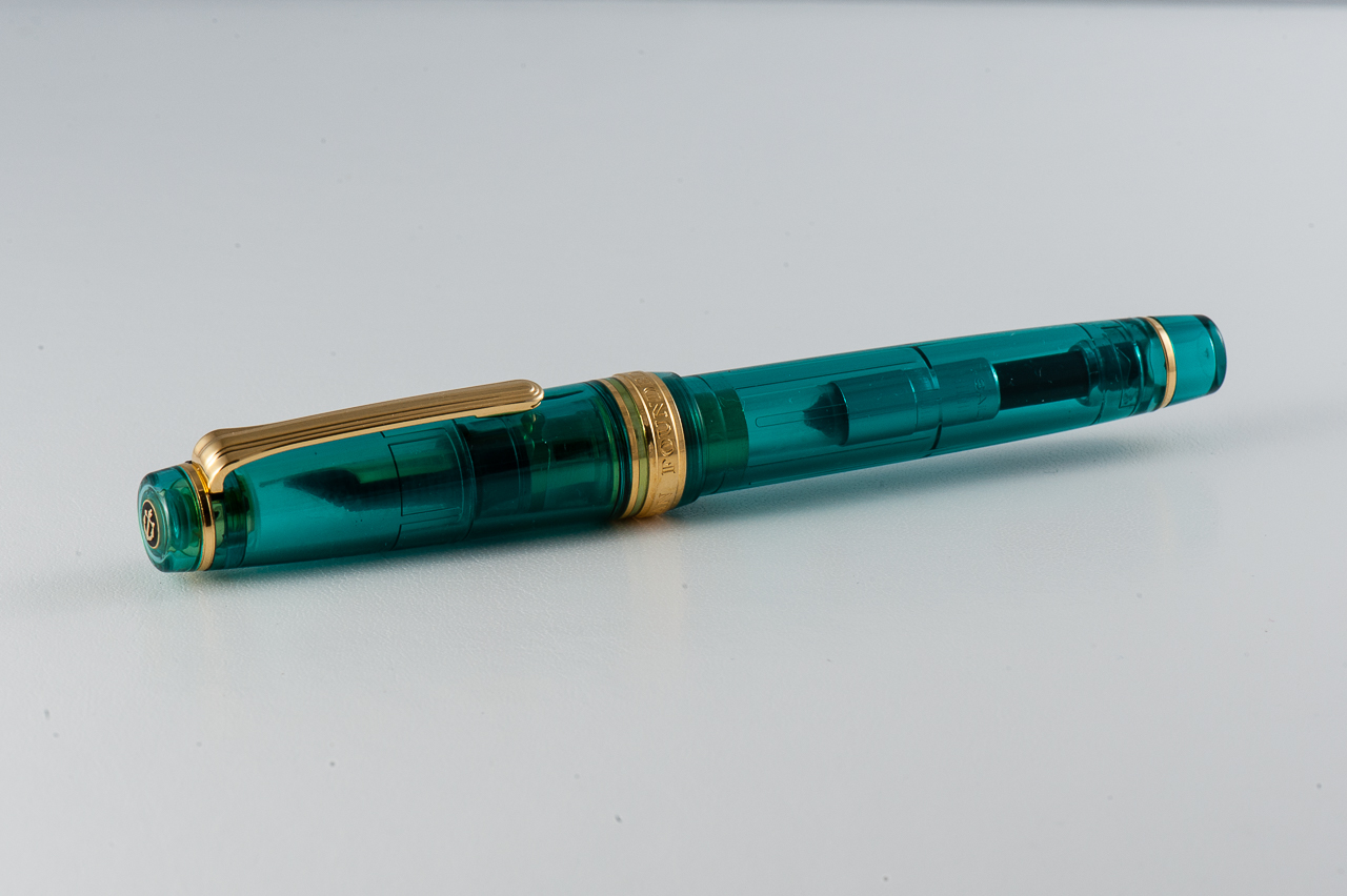
Pam: The skies are clearing up and the hotter spring nights are great for seeing the stars. So my ink and pen pairing for May is the Sailor Pro Gear Slim in the Galaxy finish with Private Reserve Electric DC Blue.
The dark blue ink has an incredible red sheen that reminds me of the night sky and the depths of space. The sheen shows up even with the EF nib on the Pro Gear Slim, granted, the nib has a great balance of fine line and wetness. In my not so discerning opinion, the sheen rivals that of the famous Robert Oster inks like Fire and Ice.
Some people have reservations about Private Reserve or Noodlers inks potentially causing damage to a pen. I can only attest for the Electric DC Blue, but I have not had any issue with this ink in my beloved Galaxy.
Franz: My pairing for May is a personal (read as emotional) one and please be advised that this will have a different feel from my usual write-up. I inked up my Teal Parker 45 with Sheaffer Skrip Peacock Blue ink. I believe the pen matches this turquoise ink quite nicely. It’s also a great vintage ink for a nice vintage-y pen.
I chose to ink the Parker 45 as a homage to the Queen of ink, Susan Wirth. She recently passed away unexpectedly this month. I acquired this pen from Susie’s table at the 2016 LA Pen Show and it has an italic nib. If I’m not mistaken, the Parker 45 is one of her favorite pens as well. She’s also a great advocate of writing with Italic nibs.
Susie was the first person who taught me about writing with an italic nib. I can still hear her distinct voice in my head as she says, “An italic gives you traction in your writing. Without it, it’s like a car that goes all over the road.”. I met Susie at the 2012 SF Pen Show and I immediately learned a lot from her. At the time, I did not know that she went to every US pen show and that she had been attending shows since mid-1980’s. But as I continued to attend the LA and SF Pen Shows annually, I’ve learned how much of a big part of the community she is. At the 2016 LA pen show, I brought my mom along and when she met Susie, she got the Susan Wirth Experience. This resulted with my Mom buying her first flexible nib fountain pen. So just like me, my Mom learned a lot from Susie at her first pen show.
Susie is already missed in the pen community but I know that she will live on in our hearts and in our writing. Thank you for everything Susie!
Update 05/15/2017 : We are adding the information that the Turquoise Sailor Pro Gear pictured above was a 2016 limited edition pen release via the Japanese shop, Wancher. Pam purchased this online via the global marketplace, Rakuten. And the Kingfisher finish that Claire is holding below is another Japanese limited edition Sailor Pro Gear. These limited edition finishes are currently unavailable via US retailers. We apologize for not establishing this bit of information. Our main focus for our pen reviews is to show how different pen sizes feel on different hand sizes and we hope that we continue reflecting this point.
Hand Over That Pen, please!
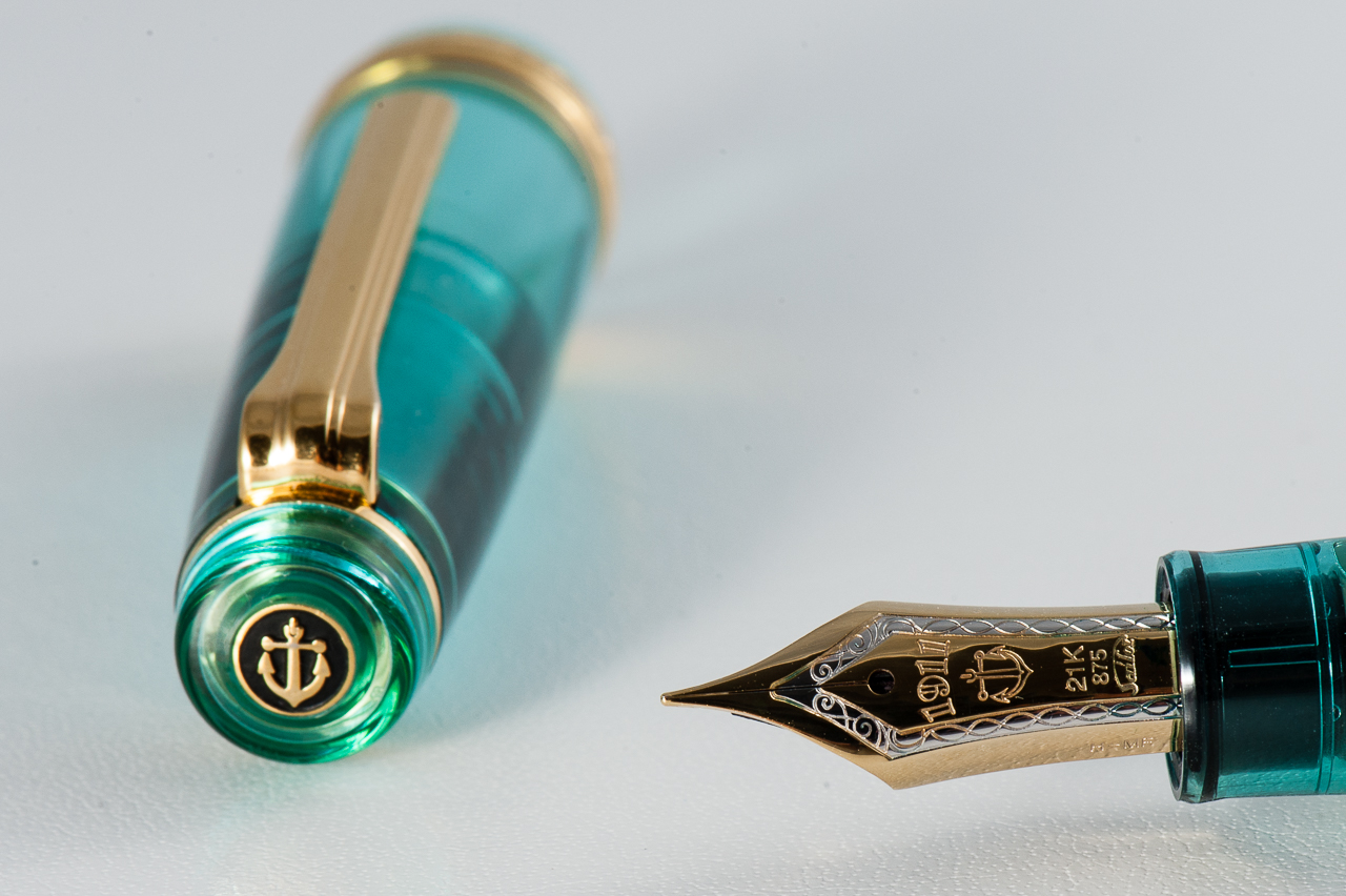
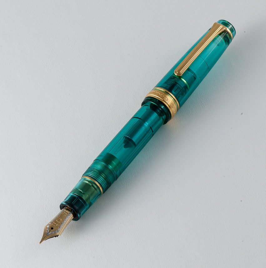
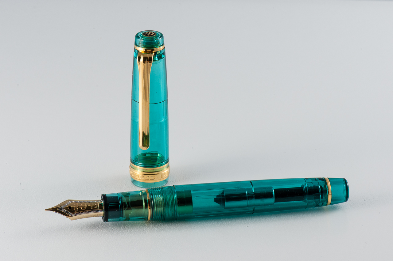
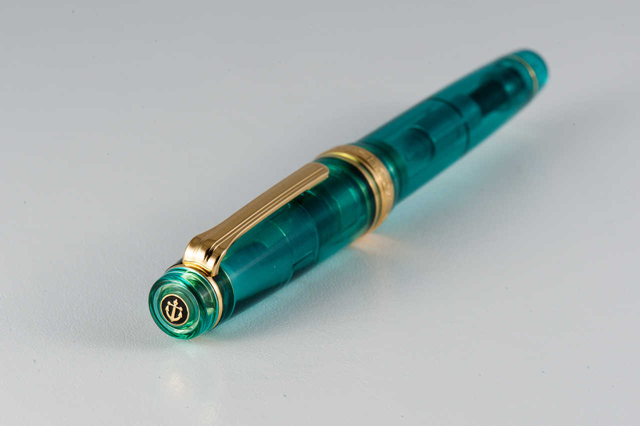
Katherine: I love the look of the Pro Gears — the clean lines and squared-off cap just look really classic, but aren’t boring. The one pictured above is Pam’s, and I think the translucent material is gorgeous, and the gold trim, while louder, really makes the green look more rich. I own a Pro Gear in the Keio Atman “Kingfisher” limited edition colors… That’s another upside, no matter what kinds of colors you liked, there’s a Pro Gear out there for you! (It might just not be cheap…)
Pam: In a previous review, I made terrible analogies comparing my love for the Sailor Pro Gear’s smaller sister, the Progear Slim to the ardent love that Darcy had for Elizabeth Bennett of Pride and Prejudice fame. Just like last time, my love for a Sailor is of literary proportions. I was originally attracted to the Progear Slims as they are only slightly smaller than the Progear, but at a significantly lower price. That being said, you don’t always get to choose what limited edition you love and must have so my collection expanded to the Progears as well. Let’s just say I felt remiss for missing out on such a wonderful pen for so long. The relationship status I I have with my wallet on the other hand is “complicated.”
Claire: Hang with me here, I can wax poetic about the Sailor Pro Gear all day long. This is by far my favorite pen available on the market. I currently own three Pro Gears and one Realo. I love the way this pen looks, the flat finials pull the pen together in the best possible way. The size and weight is perfect for my hand. If I had to choose one pen to write with for the rest of my life, a Pro Gear would be that pen. I love how many colors are available, especially if you’re willing to do the leg work on Japanese exclusives.
Franz: A turquoise-y disposition! (Yep… that will now be a term and a hashtag, thank you very much!) For the past six months I have come to appreciate Sailor pens more and that’s due to both Katherine and Pam. Largely, Pam is to blame though for she has set out to collect some special/limited edition Pro Gear Slim and Classic pens available. And what’s not to like? It’s a pen that Sailor designed almost 15 years ago so the aesthetic works.
The Professional Gear has been on my “list” of pens to own for the longest time. Just like the three ladies above, the flat ends definitely appeal to my taste. The gold trim blends well with the color of the pen and gives it a warm feel.
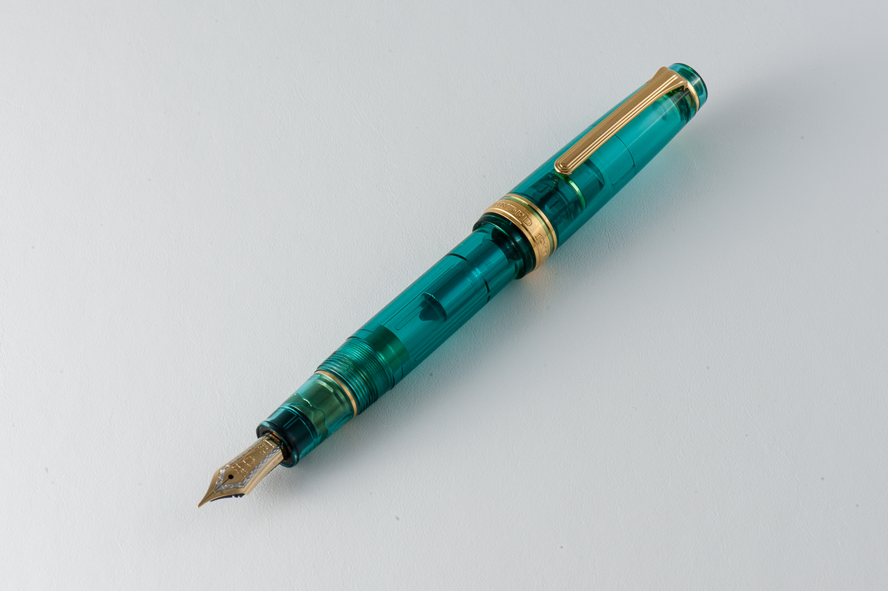
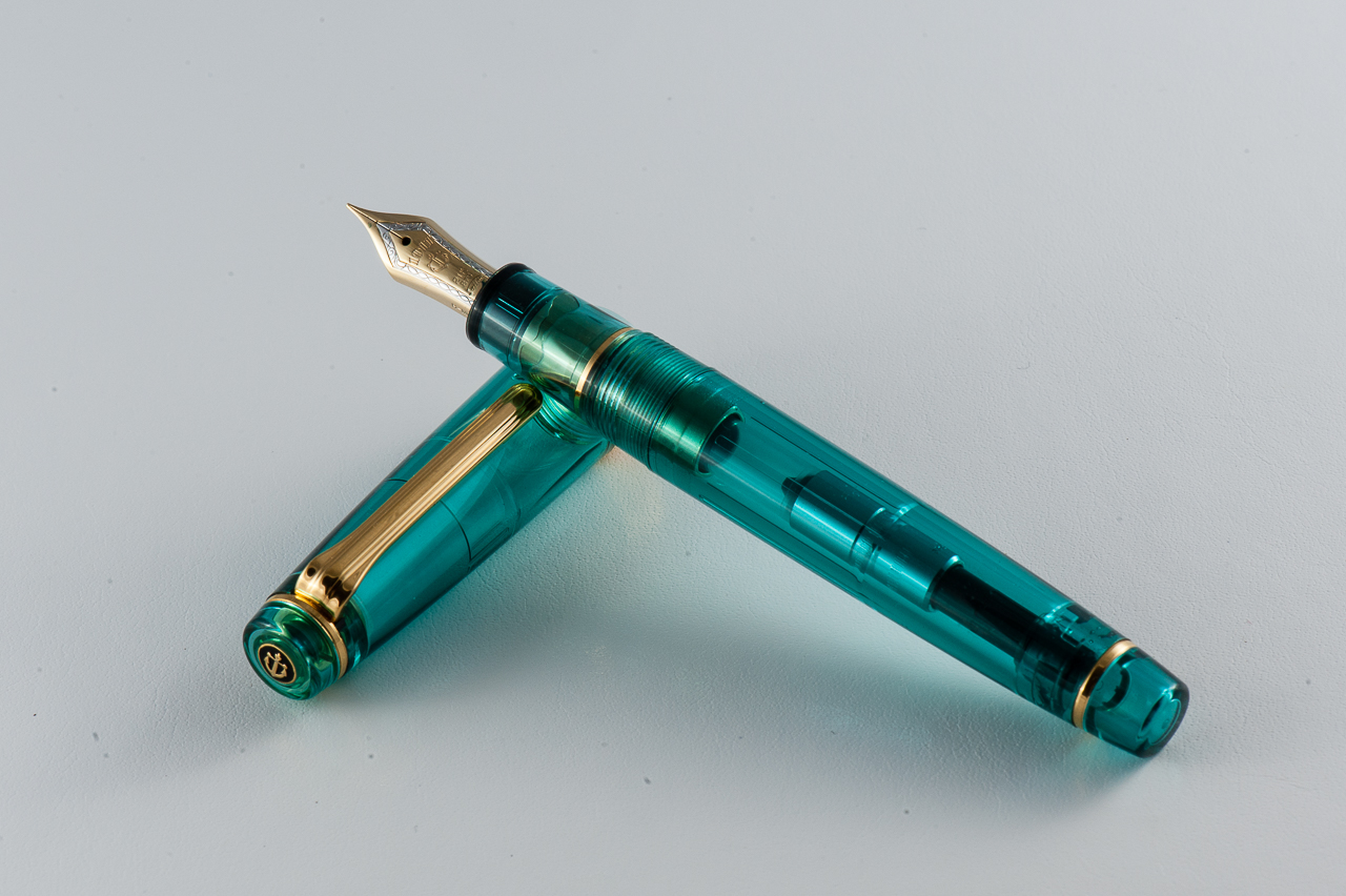
In the Hand: Sailor Pro Gear (posted) — from left to right: Franz, Katherine, and PamIn the Hand: Sailor Pro Gear (unposted) — from left to right: Franz, Katherine, and PamIn the Hand: Sailor Pro Gear (Kingfisher version) — Claire
The Business End
Katherine: The MF is fun to write with — fine enough for daily use but just wide enough to see the character of one’s ink. My Pro Gear (which I’ve written with more) has a H-F nib, which is extremely fine, but also wet. It’s a magical combination of wet and fine, which leaves me with saturated but very fine lines. Additionally, despite being labeled a “hard” fine, it has some bounce to it. I wouldn’t recommend it, but I can get line variation out of mine. And, at the risk of sounding overly enthusiastic, I also love the feedback on this nib. It’s a nice pencil-y feeling that isn’t too smooth, it’s got character!
Pam: I have had some variability in my experience with the Sailor 21k MF nibs. I have seen some that are more on the fine and harder end of the spectrum while some are broader and slightly wetter. Given that the MF nib is broader than the F or EF, the nib is wonderfully smooth and really shows off the ink qualities like shading or sheen really well. Surprisingly, I didn’t consider grinding the MF down, probably because I paired this turquoise demonstrator Progear with Robert Oster’s Fire and Ice; be still my heart, the sheen!
Claire: The 21k hard fine Sailor nib is my favorite. I love how hard the nib is; though it isn’t too hard. It’s hard to quantify what makes this a Goldilocks nib in my opinion. I love the pencil like feedback that these 21k nibs give so consistently. All three of my fine nibs have given me the same lovely out of the box performance. The only qualm I have with this pen is the converter isn’t the best. Sailor converters don’t hold very much ink and are notorious for having issues. Typically when I get a new Sailor converter I open it up and put silicone grease on the threads and piston. That so far has saved me from running into any of the issues I’ve heard others to have.
Franz: In my experience, Sailor nibs are well tuned out of the box. And this H-MF is no exception at all. I enjoyed writing with this nib for hours. (I have held it hostage from Pam for a while now) And like Katherine, I found the feedback to be pleasant like writing with a pencil.
Sailor Pro Gear 21-karat H-MF (Hard, Medium-Fine) nib
Write It Up
Katherine: This pen surprised me with how small it is for the not “slim” version. And it’s a wonderful size for my small hands. Both this and the Pro Gear Slim are comfortable for me to use for extended periods of time, but I do prefer this to its smaller sibling (Which is unfortunate for my wallet. And there are slightly fewer limited/store editions available in the Pro Gear). This pen isn’t too narrow, it’s well balanced and the nibs are a delight to write with — I regularly toy with the idea of collecting on in each nib size, but haven’t quite convinced myself not to stick to my pen limit.
Pam: As all pen addicts know, the smallest differences can make all the differences turning a good pen to a great pen. Fortunately, going between the Progear Slim and the Progear isn’t such a large difference that it’s an issue. In my hand, the Progear is a bit longer, equally well balanced and slightly girthier than the Slim. The extra girth is great for longer writing sessions in my opinion. Even in more petite hands, the Progear is comfortable and well balanced, capped or uncapped. Honestly, if the Slim is comfortable for you, the Progear would be equally comfortable. If the Slim is slightly uncomfortable for you, the Progear will be just right. All I can say is, beware of picking up a Progear, you won’t want to put it down.
Claire: I can write with a Pro Gear all day long without running into any hand fatigue. Many times when I’m taking notes for school I’m switching between Pro Gears so I can have a variation in ink color. The way the section tapers fits my hand perfectly. The section on the Pro Gear is really what makes the pen. The more I write, the more I want to find more to write. I really can’t write enough about how much I enjoy writing with this pen.
Franz: The Pro Gear is slightly bigger in girth and length compared to the Pro Gear Slim. Because it is larger, it’s more comfortable to journal with. And I wrote blissfully for a good ten minutes. I even got to finish a letter for a friend with it. But once I unposted the cap, it became a bit tiresome even after only five minutes of writing. So definitely for my large paws, I gotta have it posted for longer writing sessions.
EDC-ness
Katherine: This is a great EDC pen — not terribly expensive, not too small, not too big, fantastic nib, durable plastic body, what’s not to like? The clip is solid too! Plus, because the converter is mediocre… even if everything goes wrong, you’ll never get lots of ink on your clothes! (Honestly, because the F I have is so fine, I get plenty of writing out of one converter, so capacity isn’t an issue for me EDC-ing this pen, as long as I remember to check my ink level regularly)
Pam: I have at least one Progear or Progear Slim in my rotation at all times. The nibs can’t be beat and the finer nibs (EF in 14k or F in 21k) performs admirably on cheap office paper for work. The clips are secure without being overly tight and the pens do tolerate being in white coat pocket easily and well. Additionally, depending on what colorway you choose, the pen can be subtle, professional and classic looking or bold, loud and modern. For those in the office setting, this pen can be like a tie, the pop of color or a small, subtle way to show off some personality.
Claire: If I had a job where a fountain pen would be useful in day to day work, this would be the pen I would bring with me every single day. The Pro Gear is often the first pen I reach for when taking notes for class. When I graduate and move to a desk job, you can bet this will be one of the pens I carry with me on a day to day basis. At home, this is almost always the first and only pen I reach for for my evening journaling.
Franz: I once again echo the three ladies above and agree that the Pro Gear is a nice pen to use on a daily basis for my workplace. The pen was clipped securely onto my dress shirt and was always ready to write. You do need to rotate the cap twice to deploy the pen but I just accepted this since it gives me happiness to use the pen. With signing my name multiple times at work, I didn’t feel the need to post the cap and the medium-fine nib was perfect for the copy paper used in the office.
Final Grip-ping Impressions
Katherine: I really like this pen. It comes in so many colors and I’ve been very tempted to collect quite a few. But, alas, my pen limit has prevented me from doing that and instead I only own one Pro Gear, but it’s a solid pen and I love writing with it. It’s a very comfortable pen and a very solid one. I would highly recommend it to anyone who’s thinking of purchasing — and it’s fun (and frustrating…) to hunt down crazy colors and limited editions to find the perfect one (or ten).
Pam: My love for Sailor Progear or Progear Slim has been effusive to say the least. However, once you pick up one of these pens, you will understand. The pen is well made, the nib is beautifully crafted, the shape is elegant and the color ways can be unique. (Speaking of nibs, Sailor makes some amazing specialty nibs like the zoom nib.) Like the Lamy 2000, everyone should at least try this pen, and I would surmise that it’s pretty inevitable that you will own one. Additionally, if it’s a limited edition Progear, I am sure one of us would be happy to “insure” the purchase…
Claire: The size of this pen is perfect, it’s just long enough to fit perfectly in my hand. The balance is exactly what I look for in a pen. The tapered section allows the pen to be comfortable to write with without adding additional weight to the pen. I only have one gripe with this pen: the converter. While I haven’t run into any of the glaring issues I’ve heard of with this converter, I really wish it could hold more ink.
Franz: Sailor has done right with the Professional Gear design. Proportions are great and the build quality is awesome. And just in case you still aren’t sure what my thoughts are, this pen is awesome. It is perfect for me posted, and “okay” unposted. I seem to have always hesitated to buy this pen due to its size in my hand. But after spending some time with Pam’s Pro Gear, I may just get one myself when I find a finish that attracts me.
In closing, every serious pen user should pick up and write with a Sailor Professional Gear. You never know, this pen may just appeal to you and change your mind as it did mine.
Pen Comparisons
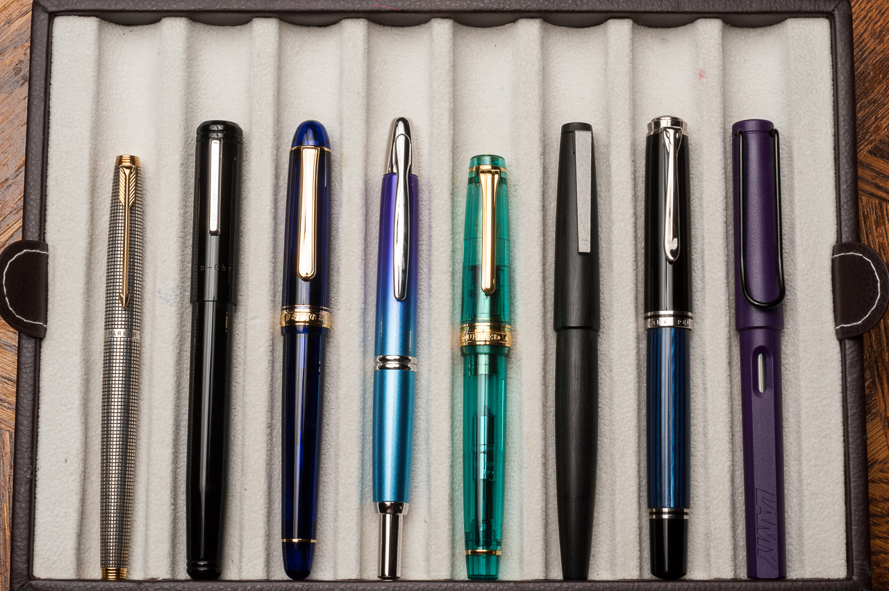
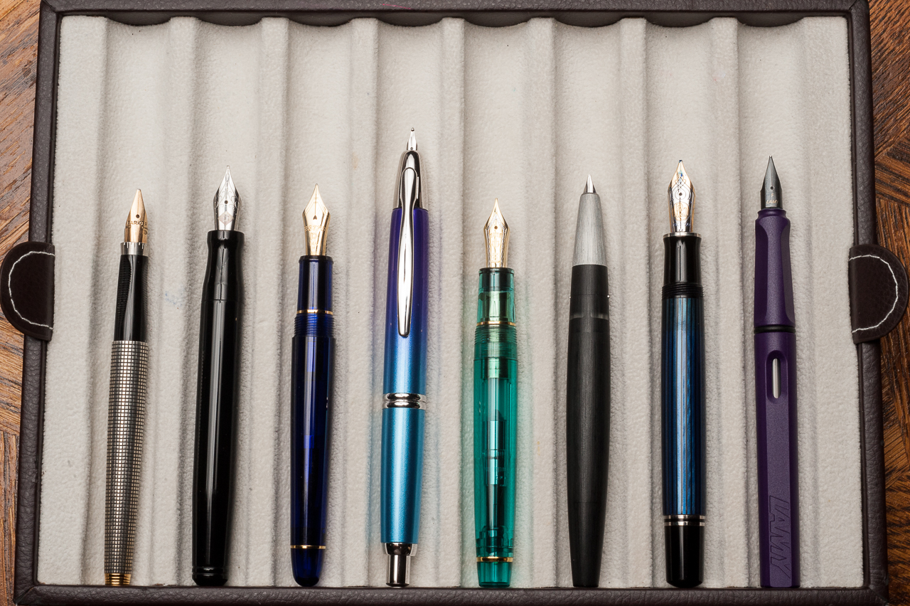
Closed pens from left to right: Parker 75, Franklin-Christoph Model 20, Platinum 3776, Pilot Vanishing Point, *Sailor Professional Gear*, Lamy 2000, Pelikan M805, and Lamy SafariPosted pens from left to right: Parker 75, Franklin-Christoph Model 20, Platinum 3776, Pilot Vanishing Point, *Sailor Professional Gear*, Lamy 2000, Pelikan M805, and Lamy SafariUnposted pens from left to right: Parker 75, Franklin-Christoph Model 20, Platinum 3776, Pilot Vanishing Point, *Sailor Professional Gear*, Lamy 2000, Pelikan M805, and Lamy Safari
Sailor Professional Gear Comparisons (Left to right: Pro Gear Slim, Pro Gear Classic, and Pro Gear King of Pen)
Pen Photos (click to enlarge)
Sailor Pro Gear Classic 21-karat H-MF (Hard, Medium-Fine) nib