Hand Over That Pen, please!
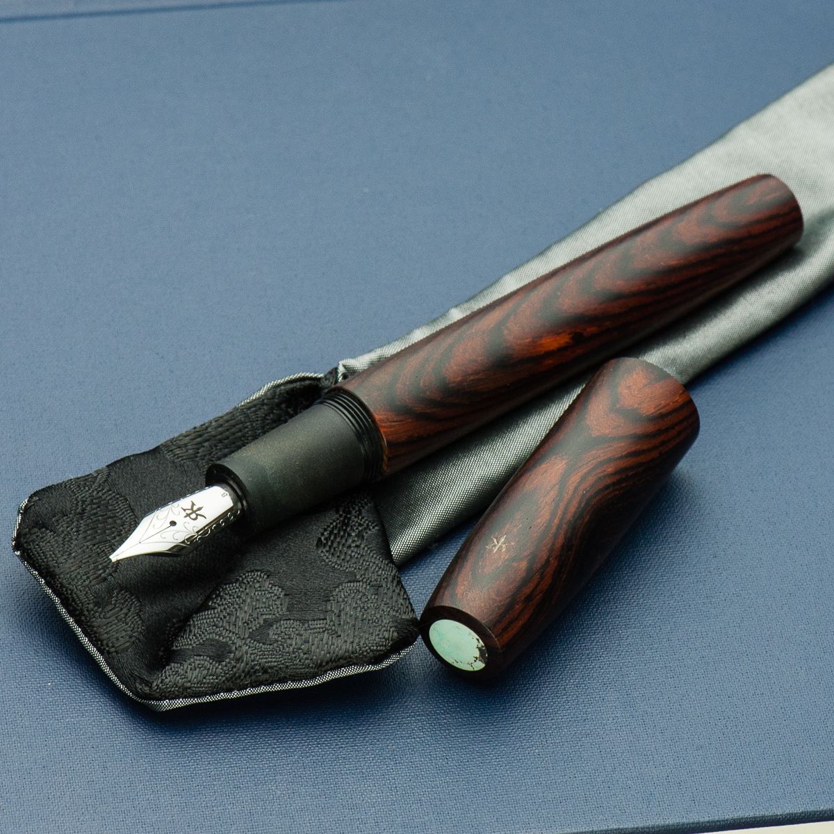
Katherine: I love the materials and finish of this pen. The warm, rich wood paired with a turquoise finial is a beautifully organic pairing! However, I think the pens proportions are a weeee bit off? The barrel looks a little too long to me. But, I do tend to prefer stubbier pens.
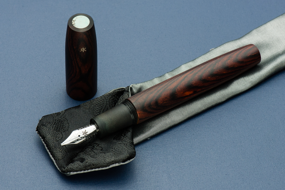
Pam: This is one big pen. Even for someone who loves the Pelikan M800 and the Sailor King of Pen. The craftsmanship on this pen is obvious. From the warm and super smooth finish of the wood, the subtly engraved Ryan Krusac logo, and the turquoise inset, you can see the care that has been put into this pen. It’s a work of art.
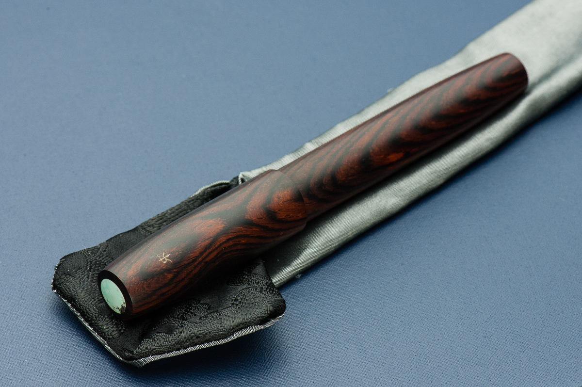
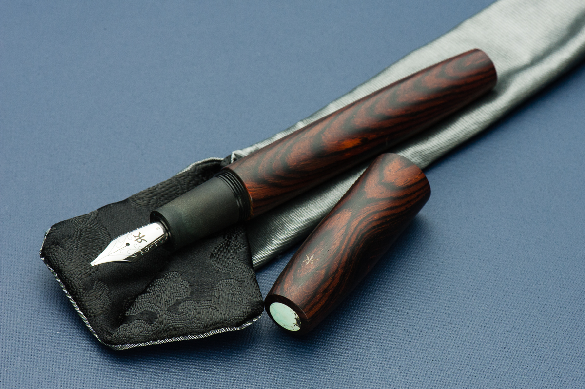
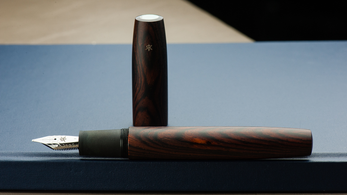
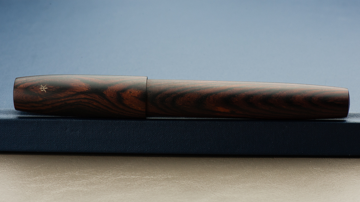
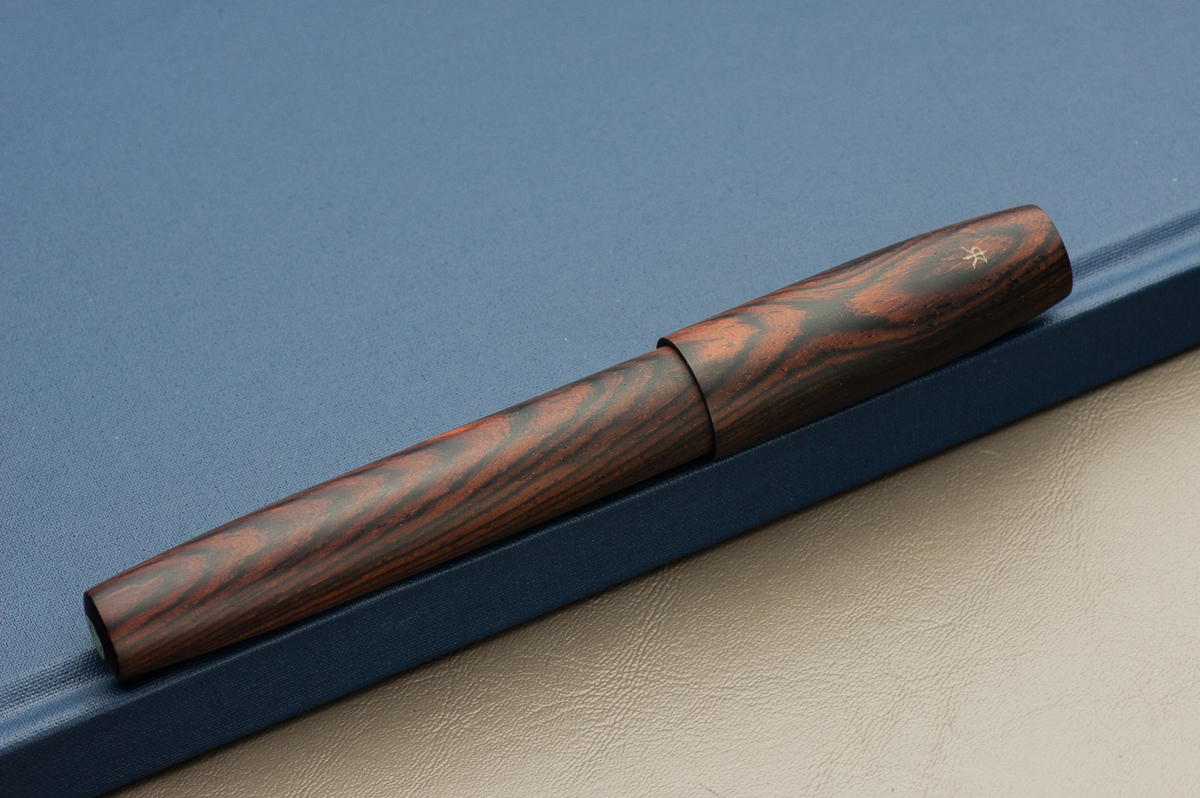
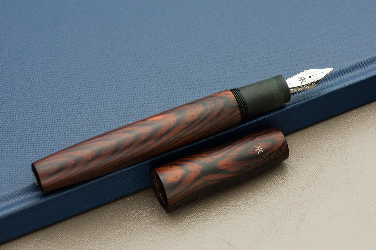
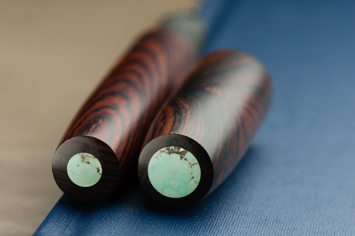
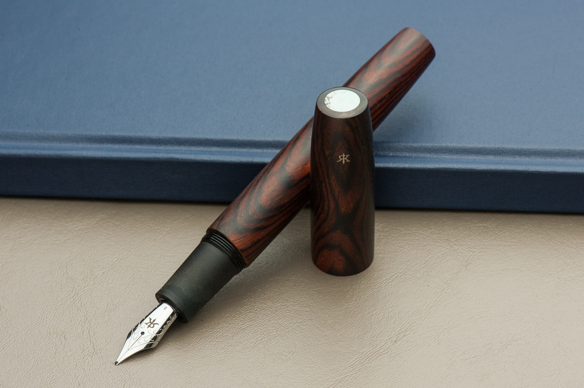
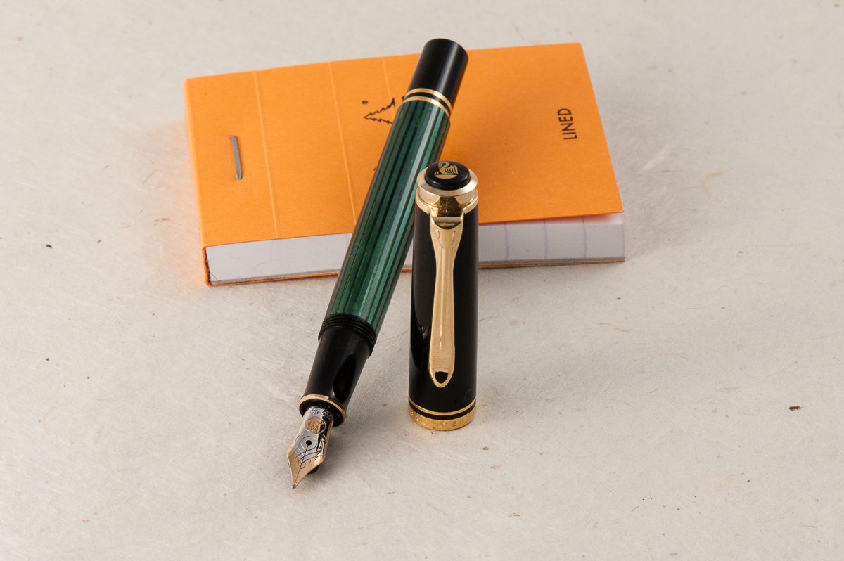
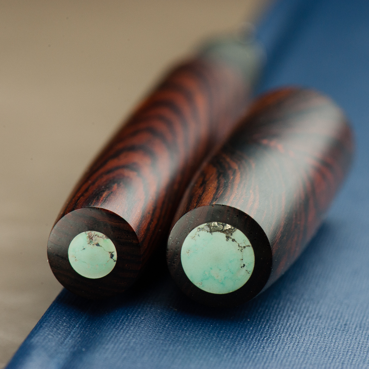
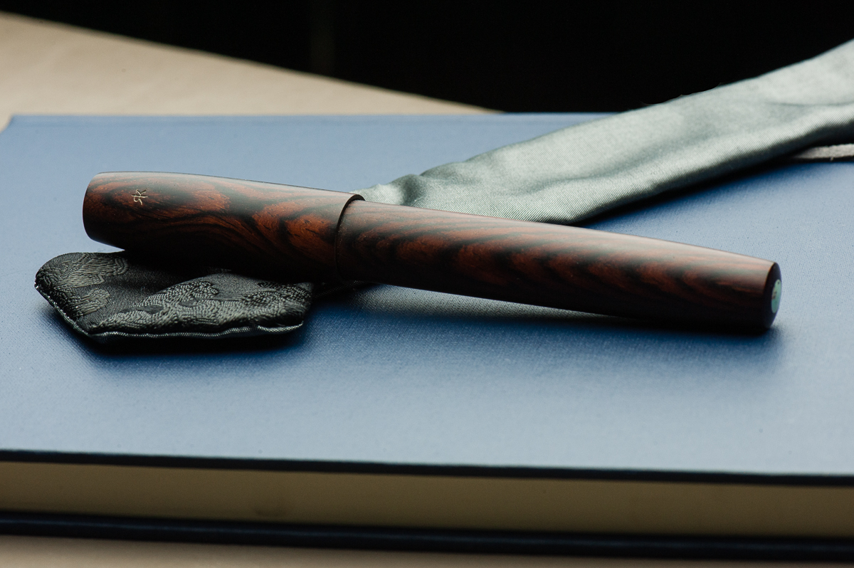
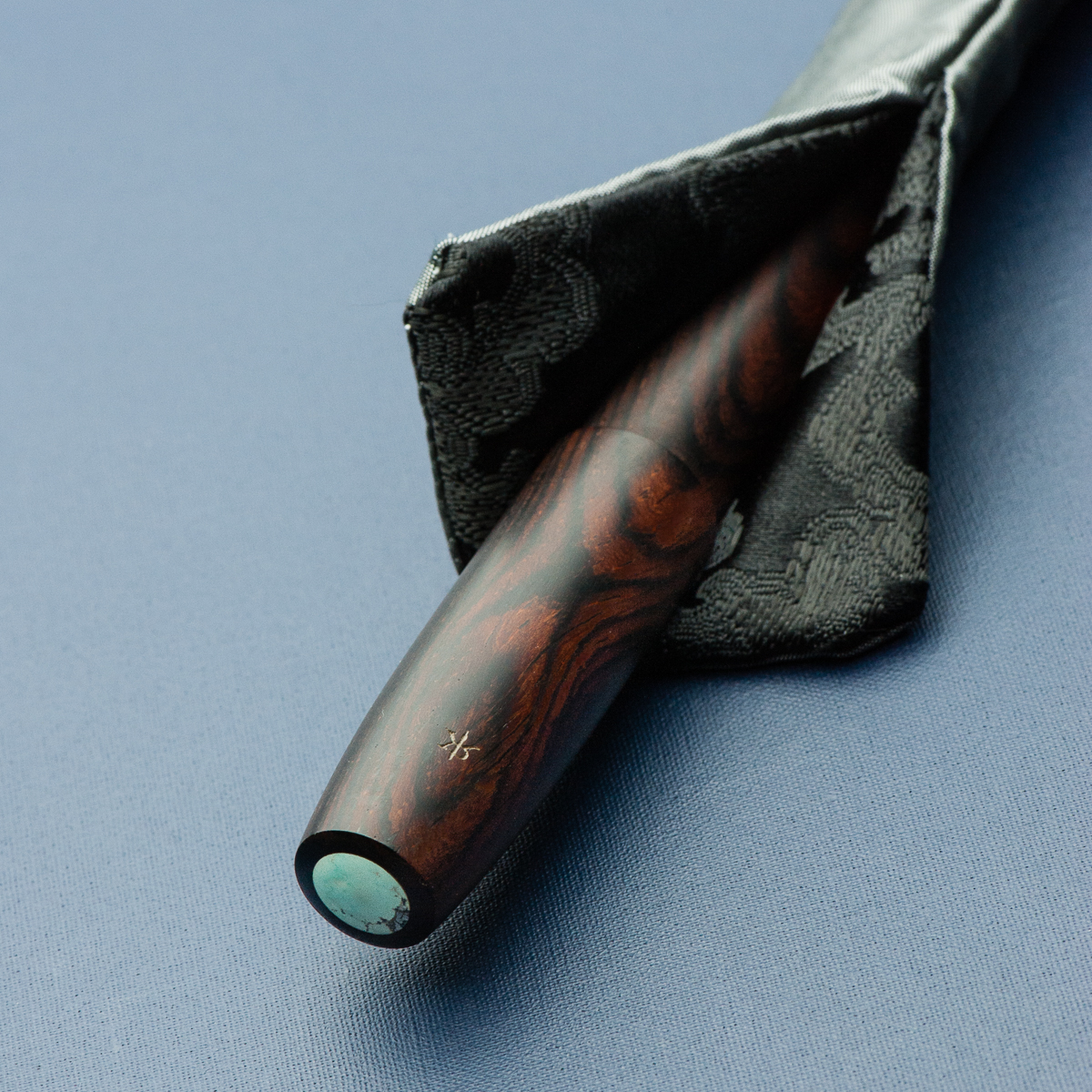
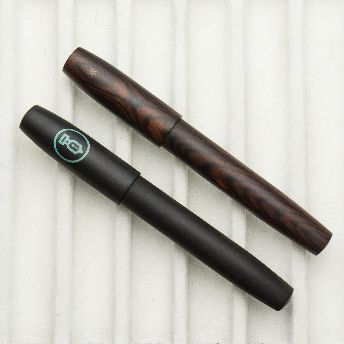
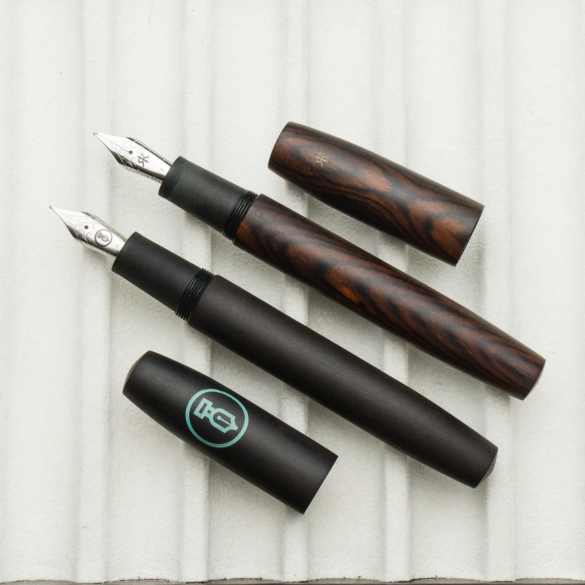
Franz: The Legend L-16 is quite impressive in the hand as it is the largest in Ryan Krusac’s Legend pen line. The L-16 denotes that the barrel’s diameter is 16mm and then another size is the L-14 which is 14mm. Ryan had also announced the L-15 size (15mm) but that is still unavailable at the time of this review. The Legend pen can either be ordered from his website or at any pen show that he attends. I happen to have snagged this Legend in Cocobolo from Ryan at the 2017 Atlanta Pen Show. The dark Cocobolo finish is complemented by the turquoise inlays on the cap and barrel.
Being a wood pen, the Legend gets warmer while writing as well as the ebonite section. I must mention that Ryan pays attention to details with each pen he creates. When you are writing with the Legend, the best looking grain of the wood faces you as you write and also, the cap and barrel aligns perfectly each time. Smart move to make it a single thread!

The Business End
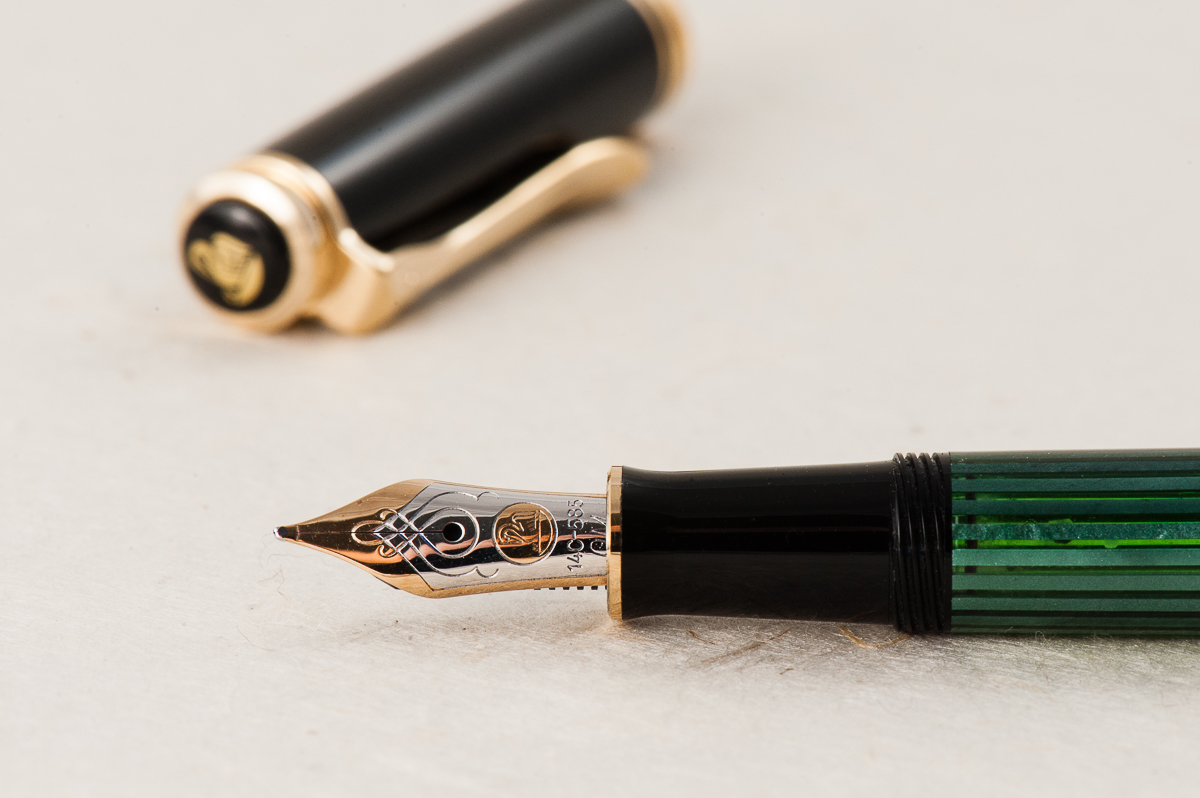
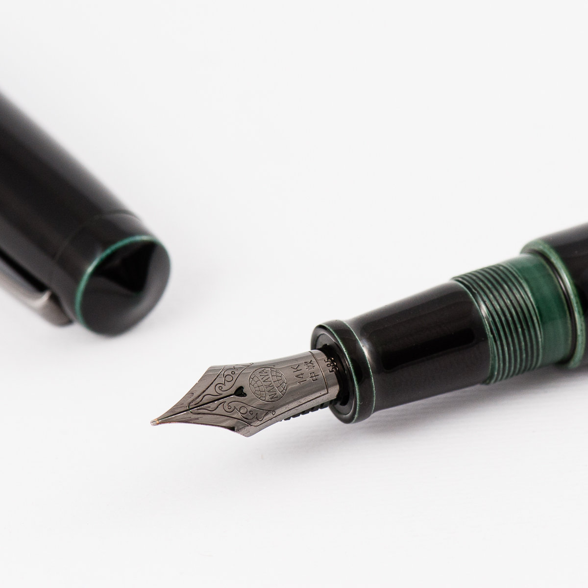
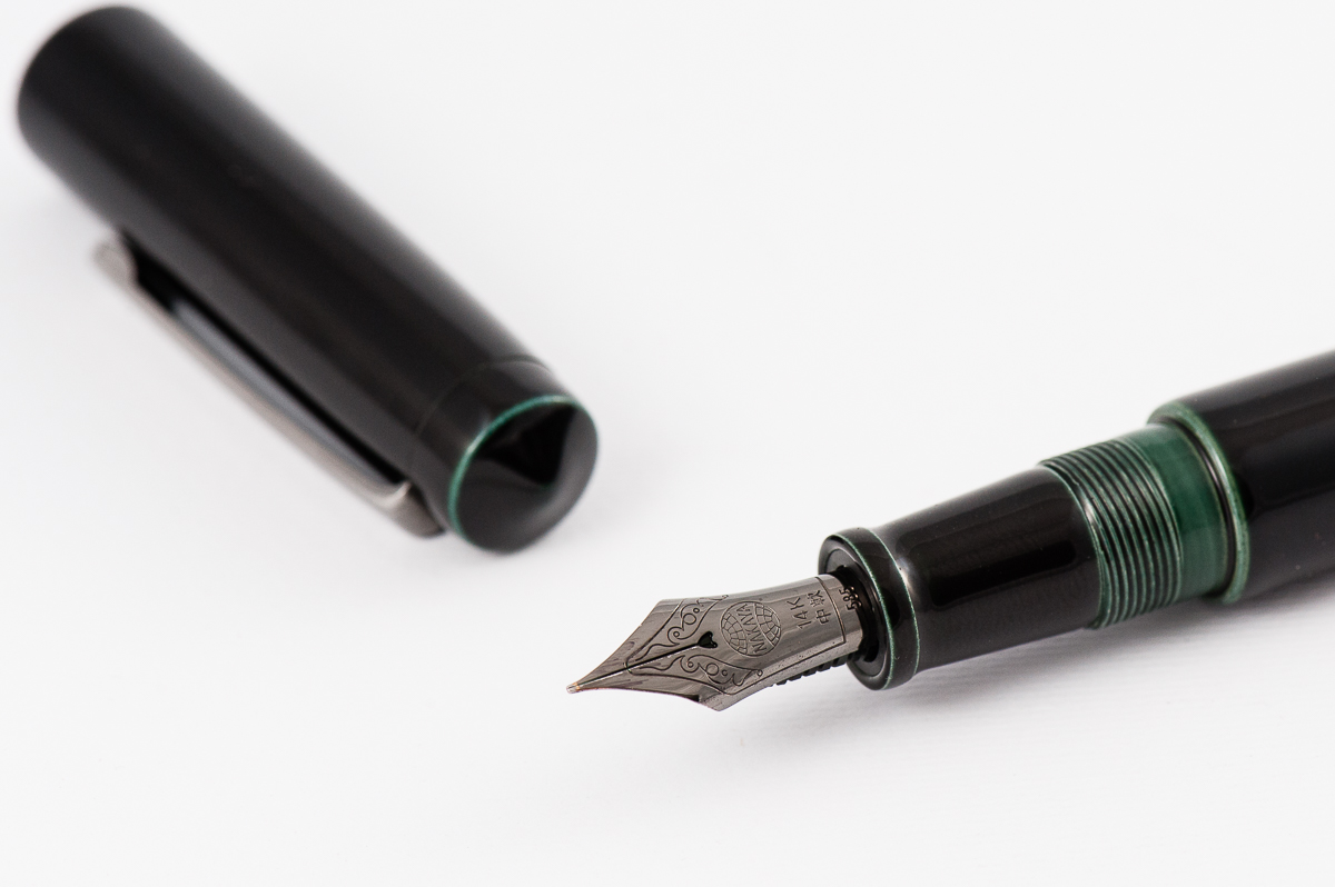
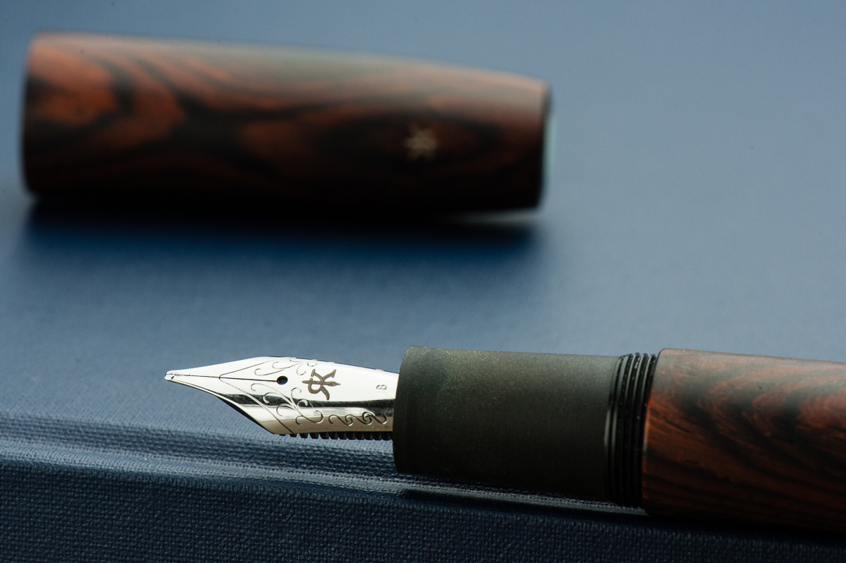
Katherine: The pen fits a Jowo #6 nib. The nib on this one had a nice BCI, unlike many of Franz’s other BCIs, this one had a little bit of tooth. It’s unlike most of the Masuyama grinds I’ve used, but it was a perfectly usable nib with some character. Would borrow (from Franz) again!
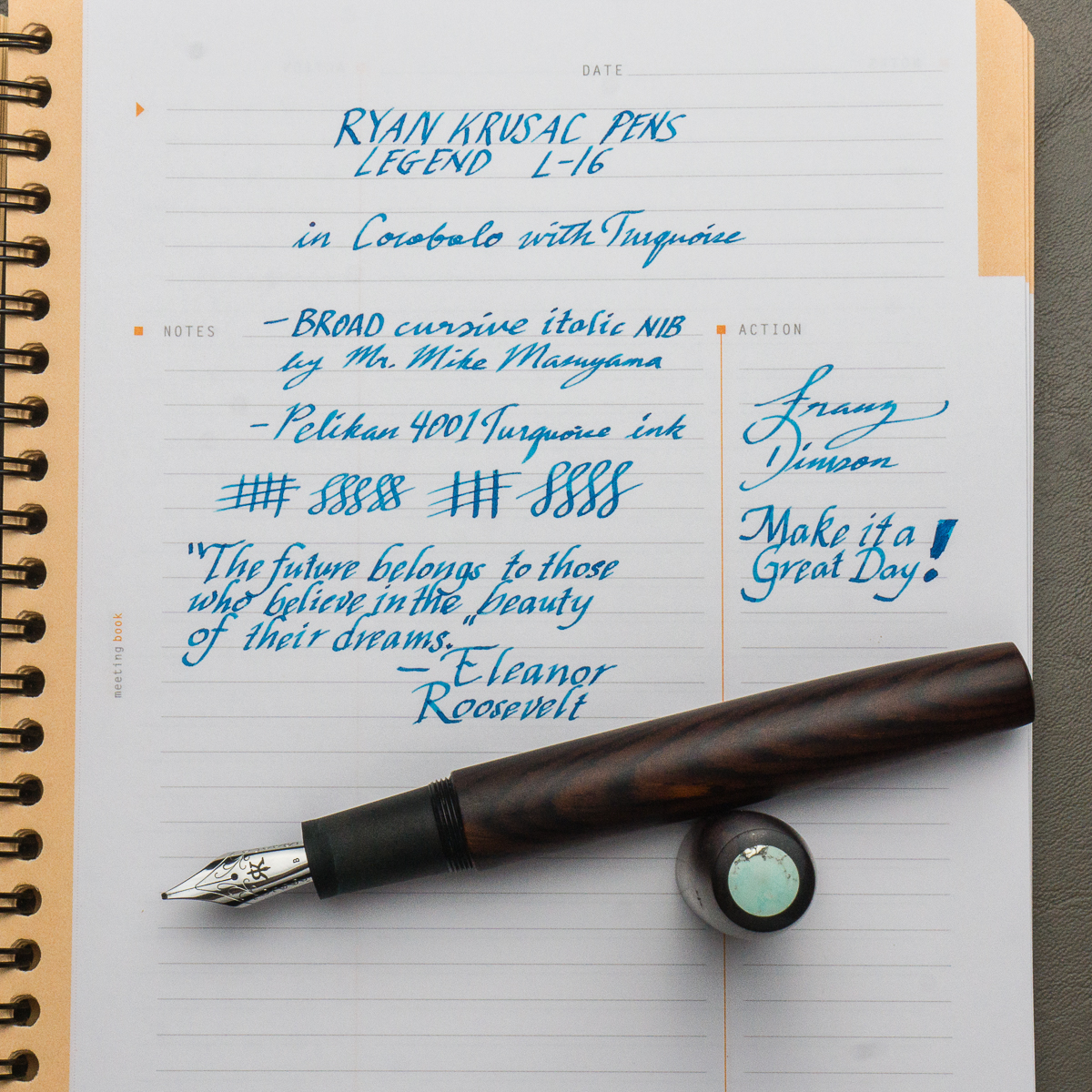
Pam: It’s a great CI. I find the nib to be crisp and wet. It is pretty toothy, but I greatly appreciate the feedback. It makes for a unique writing experience. It did show off the sheen of Pelikan Turquoise fantastically.
Franz: When you buy a pen from Ryan, you have a choice of steel nibs or 18-karat gold nibs. I opted for a broad steel nib with the intention of having it ground by Mr. Mike Masuyama at the same pen show. Needless to say, the juicy broad nib was transformed into a crisp, juicy cursive italic. The broad nib can go through ink quite fast but the included standard international cartridge/converter does its job as it should. Also, I really love Ryan’s logo on the nib as it makes a “generic” Jowo nib match the pen.
Write It Up
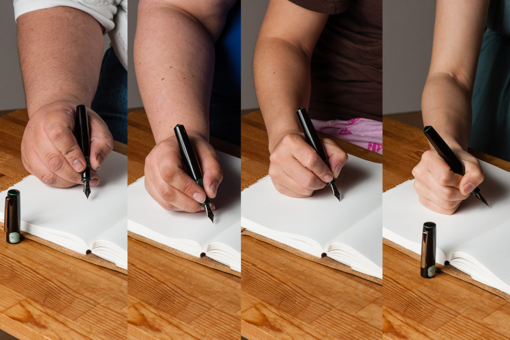
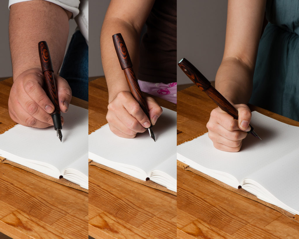
Katherine: This pen is quite long for me… but surprisingly light. As a result, it’s a very comfortable pen for me to write with despite its size.
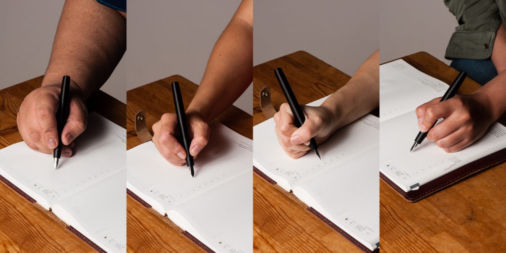
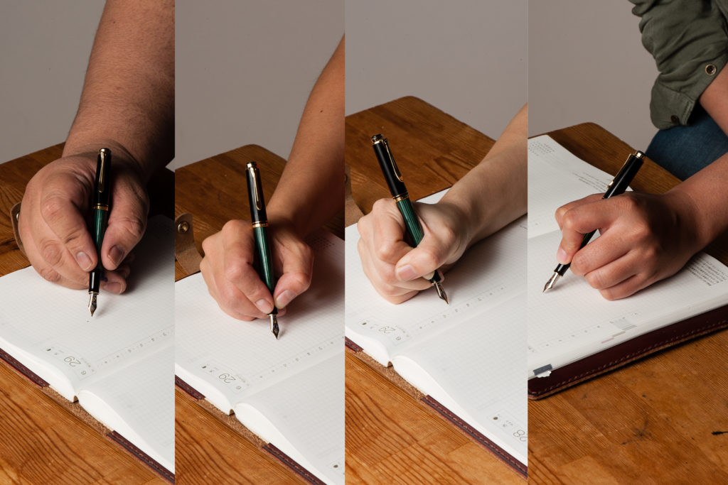
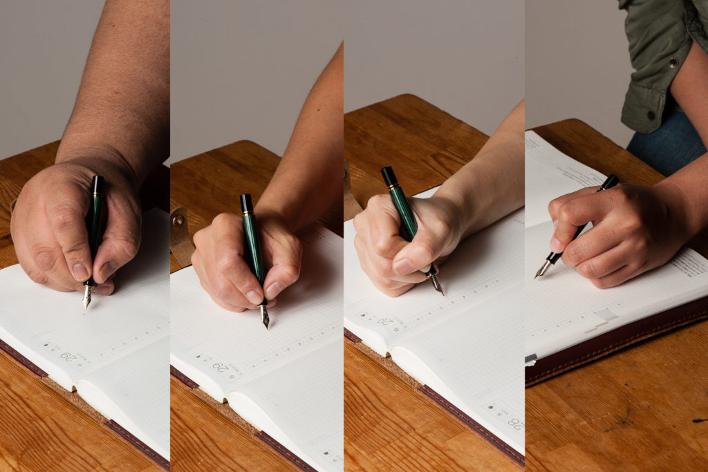
Pam: I am surprised how comfortable I found this pen. The length and width/girth of the pen is similar to the Sailor King of Pen. The Krusac is lighter for me. Due to the width of the pen, it’s quite comfortable to hold in the tripod grip. However, for those with the iron fist grip, the step and the threads are right below where I would place my thumb. No thread imprints for the win.
Franz: The Legend fits my hand very well and my journaling of about 15 minutes was very enjoyable. We may have taken a hand comparison photo of the pen with the cap posted but neither of us wrote in that mode. Reason being? I don’t believe this pen was made to be posted as the cap threads can mar the wood finish. Also, the cap only touches less than half an inch of the barrel which makes for a very long unwieldy pen, and the cap is unsecured and can wiggle off while writing. Unposted, this pen is plenty long even for my bear paw.
EDC-ness
Katherine: The lack of a clip or rollstop makes this one a bit of a danger to EDC… I imagine it doesn’t do well when hitting the ground. (Don’t worry Franz, I didn’t test that!) Additionally, it takes a full three turns to uncap — so I found this pen was a suboptimal EDC. But a lovely home desk-living pen!
Pam: Honestly, it didn’t occur to me to try out the EDC-ness of this pen other than have it live in the Nock Sinclair. My hesitation was that it didn’t have a clip and I can’t imagine dropping this pen out of my coat pocket, especially since it’s not mine to drop. This is a “savor the journaling moment” pen where one would enjoy the finer things and slower moments in life. Keep it at the desk or in a case is my recommendation.
Franz: I do echo the ladies above that the Legend pen being clipless is a risk for ROFY. (Rolling-On-Floor-Yikes!) So I’m a bit more conscious when I am using this pen at work and avoid walking around with it. I do enjoy writing with it while I’m at my desk during a call or something else that doesn’t require me to move around.
And because the pen is single-threaded to maintain the cap and barrel alignment, the trade-off is taking 3 full turns to uncap for use. Not really the best for on-the-go purposes.
Final Grip-ping Impressions
Katherine: If the proportions of this pen were a little bit different, I think this would be love. But, thankfully for my wallet, they’re not, and while it’s a nice pen, it’s not aesthetically balanced to me. Despite that though, it’s very usable even for my small hands — light and comfortable!
Pam: If you appreciate the craftsmanship and the beauty of natural materials like wood, I would highly recommend this pen to you. For many, it’s a worthy grail pen to covet. If this pen is too big for you, the good news is that Ryan Krusac has other sizes available! Be sure to check Ryan Krusac out at your nearest pen show to see what works best for you.
Franz: As I started my review above, the Legend L-16 is an impressive pen — size-wise as well as aesthetics-wise. Anyone who is interested in this pen must try it out and see if it’s for you. Ryan is currently based in Georgia so he will always be at the Atlanta pen show but he travels to several U.S. pen shows including the Los Angeles pen show, and the San Francisco pen show.
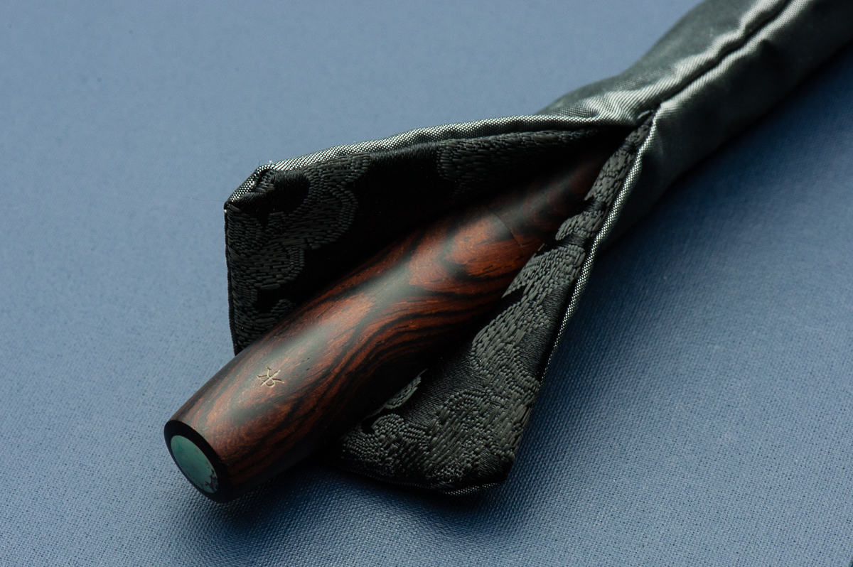
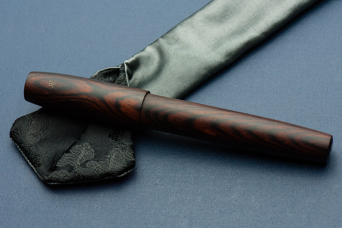
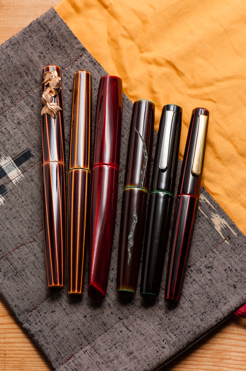
One of the best parts of buying a pen from Ryan is that you get a handmade pen sleeve by his two daughters, Zoe and Sylvia. They even have their own handmade brand, zoia.co. The grey and black pen sleeve pictured above was included when I got the Legend in Atlanta.
What else can I say about the Legend L-16? I like it… a lot! So much that when Cary (Fountain Pen Day), and Ryan collaborated on a pen to raise funds for Shawn Newton, I jumped on the opportunity to get the FPD Legend pen in the L-16 size as well. The limited edition pen is made with Gaboon Ebony wood (pictures below).
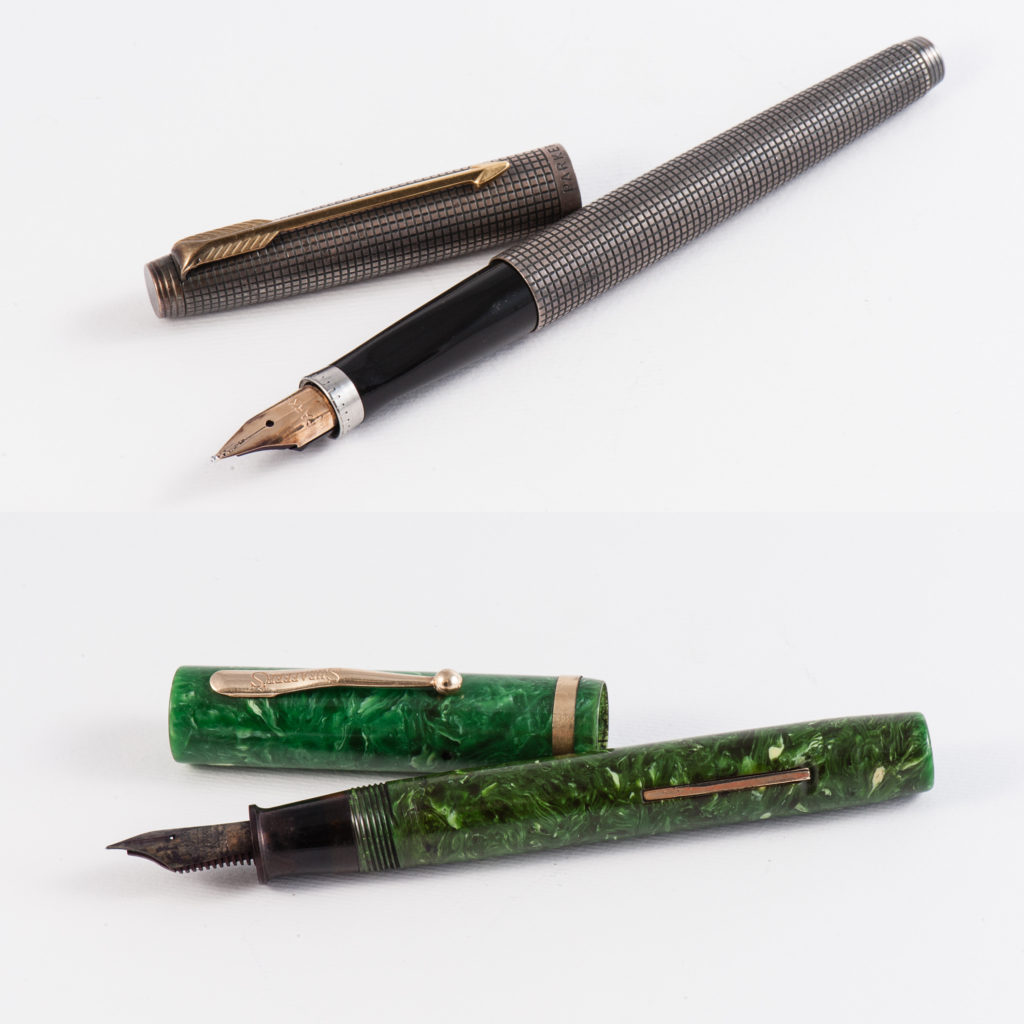
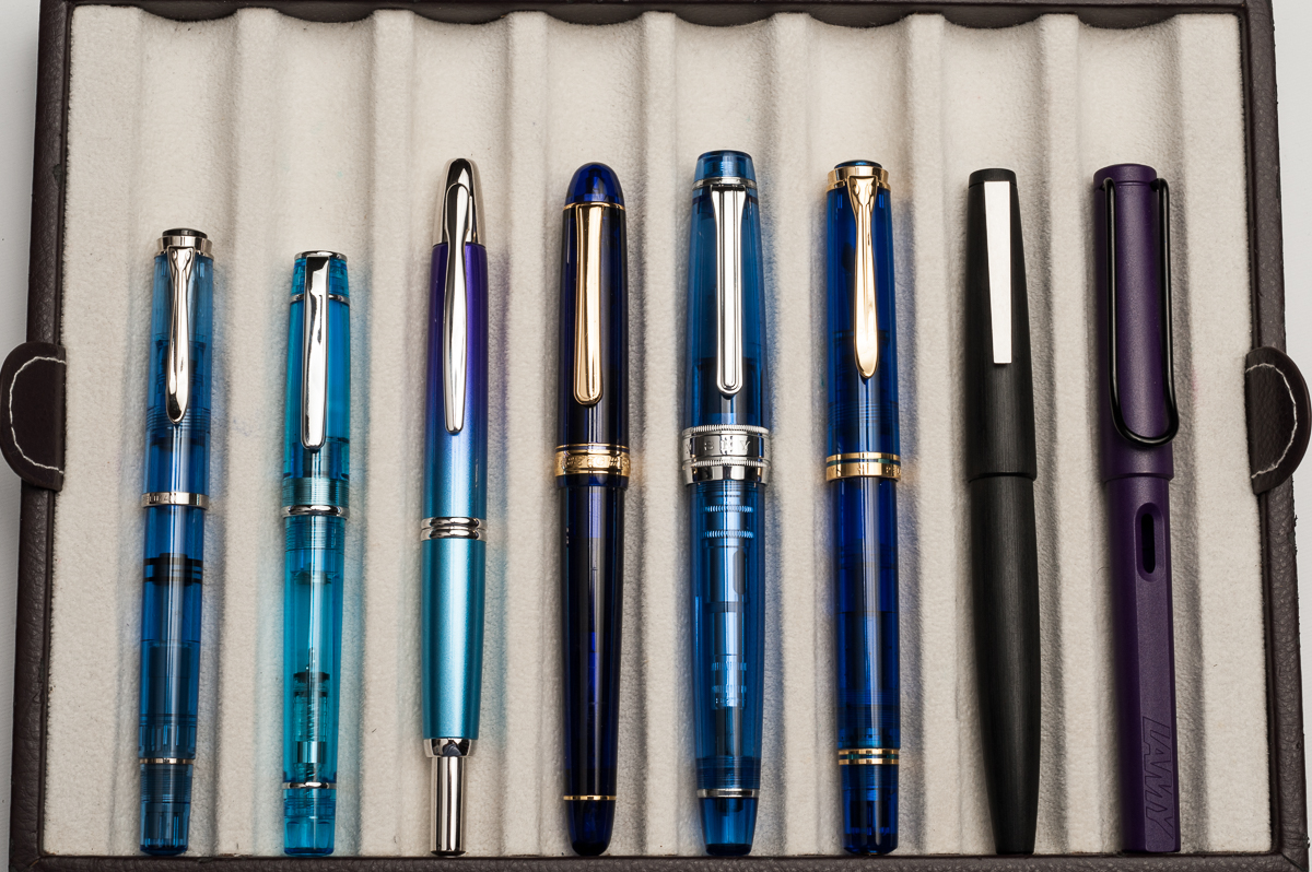
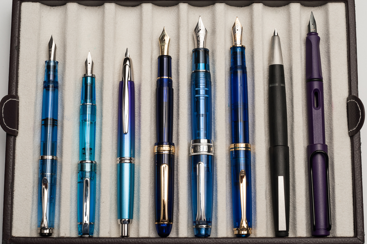
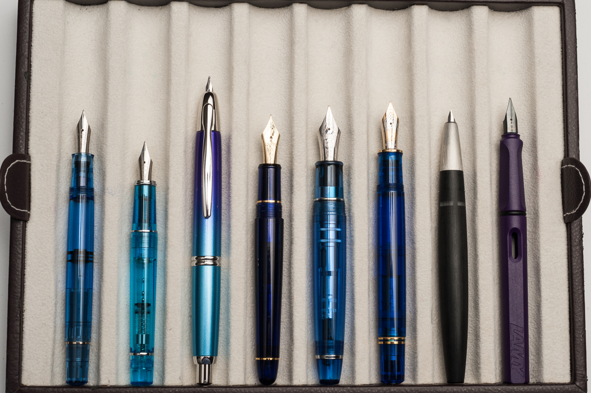
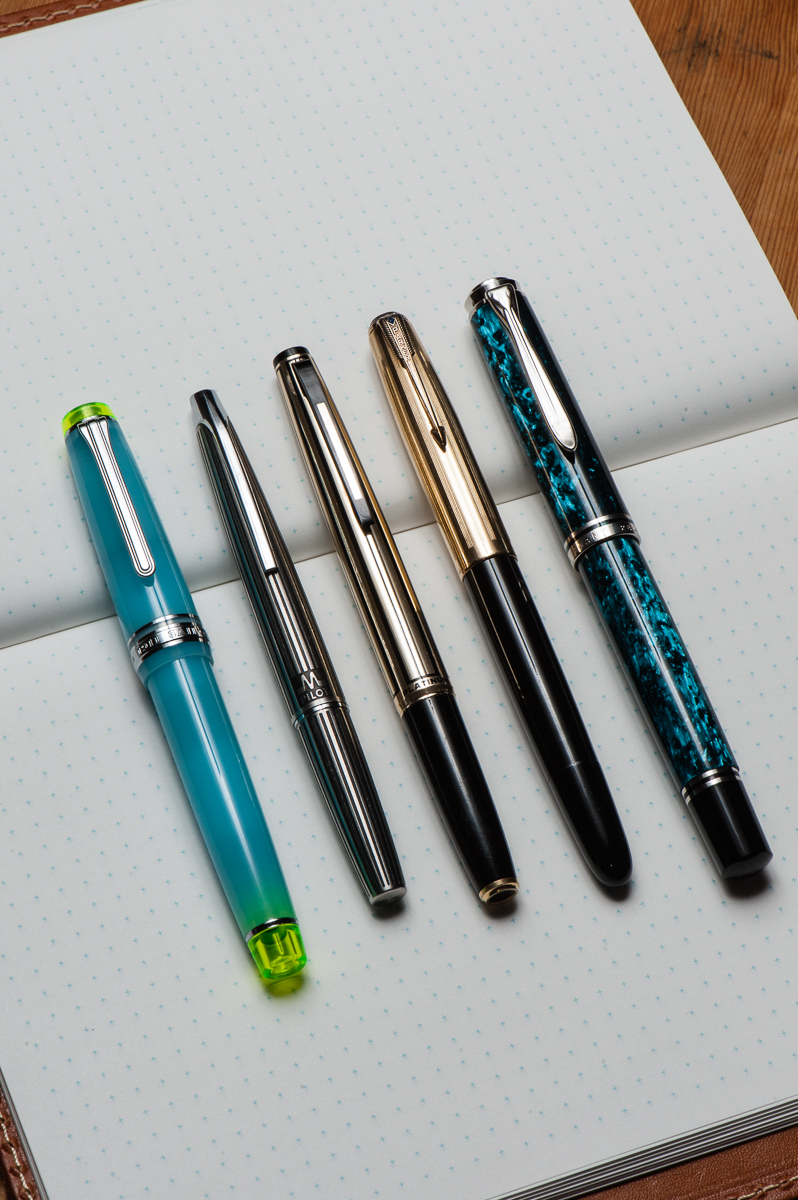
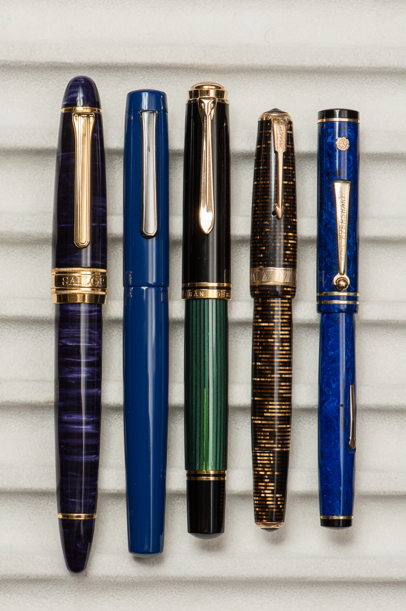
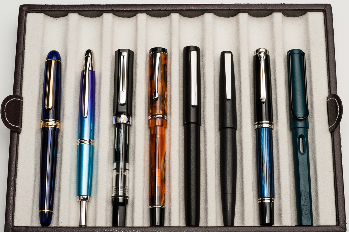
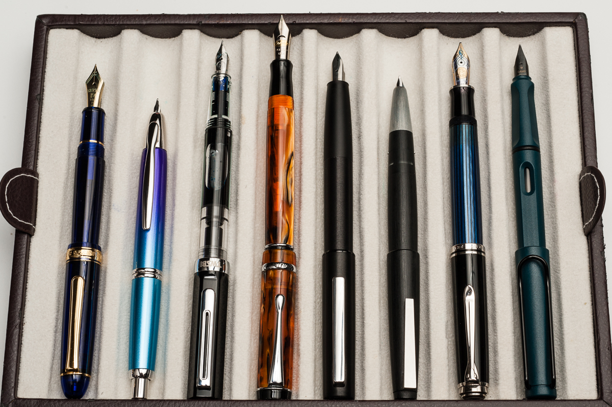
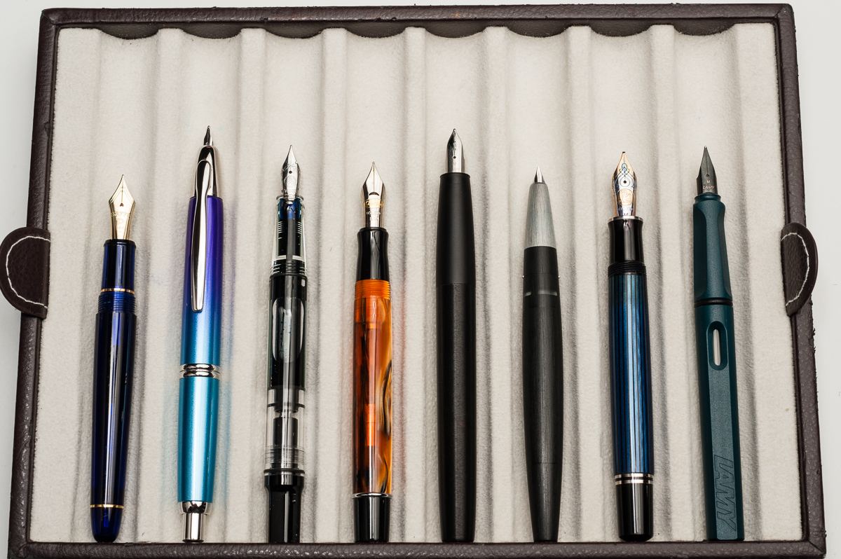
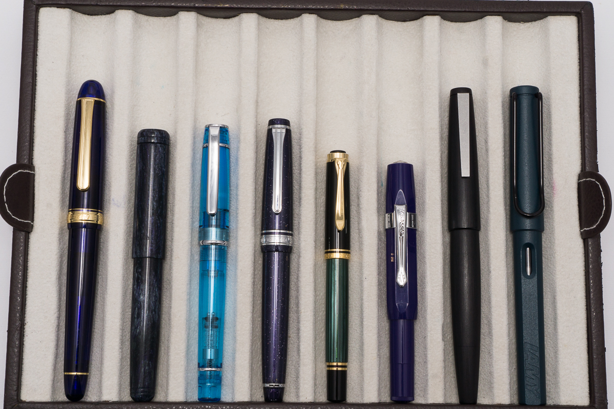
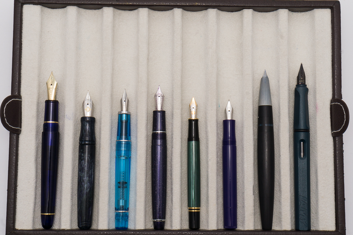
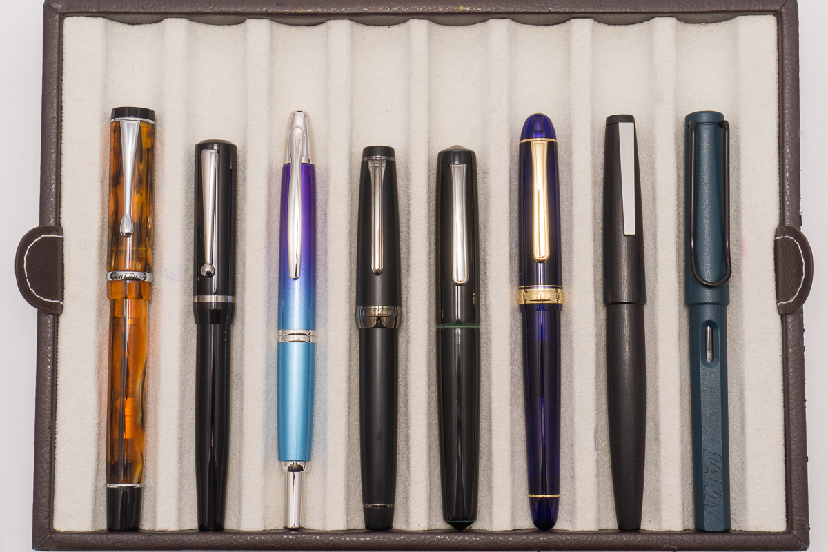
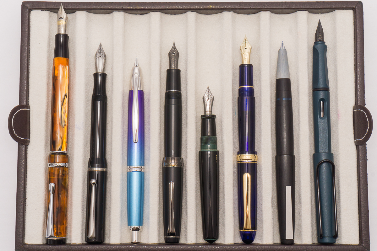
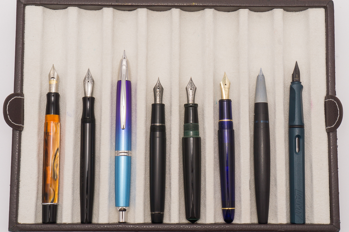
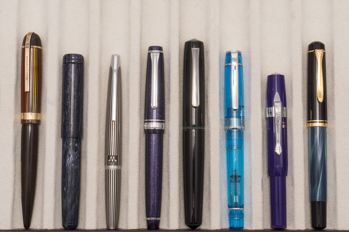
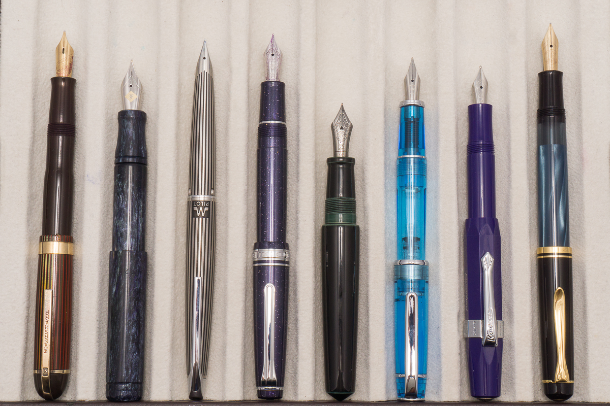
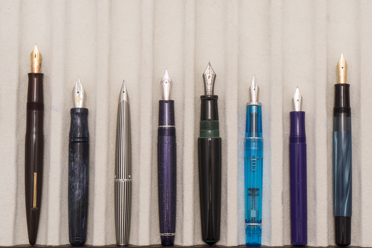
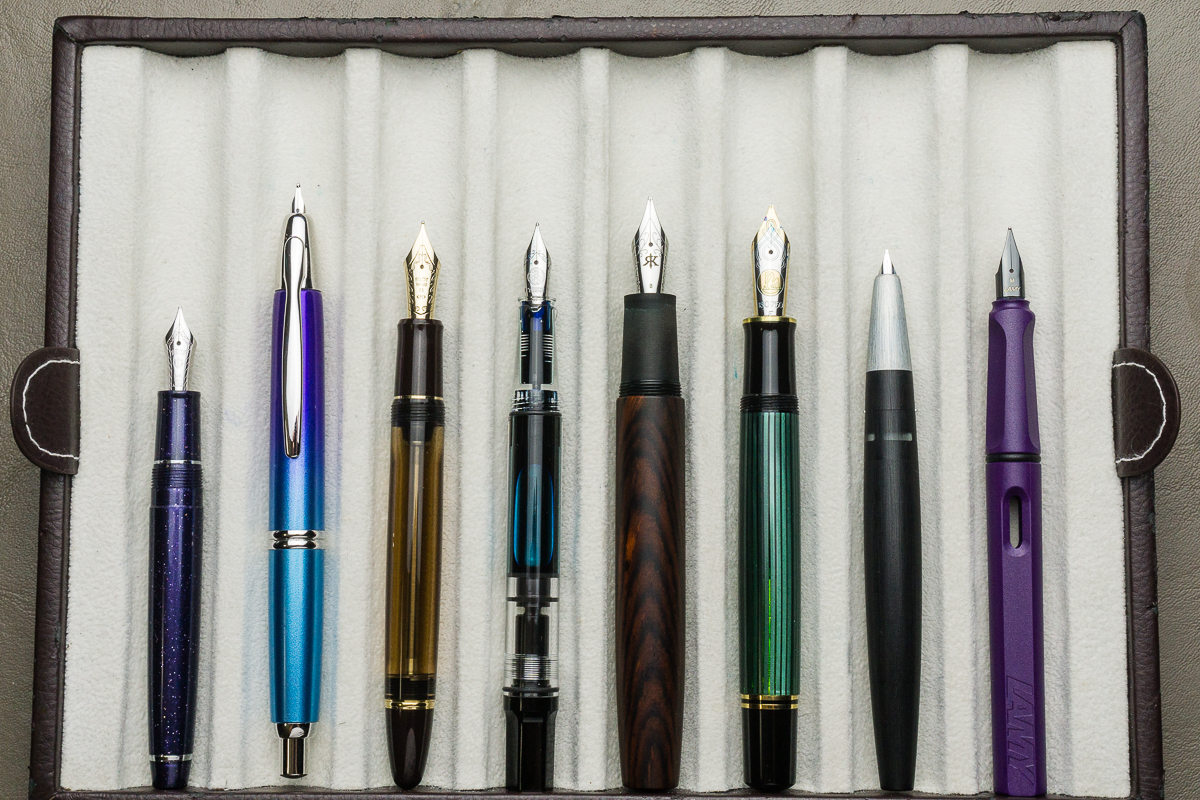
Pen Comparisons
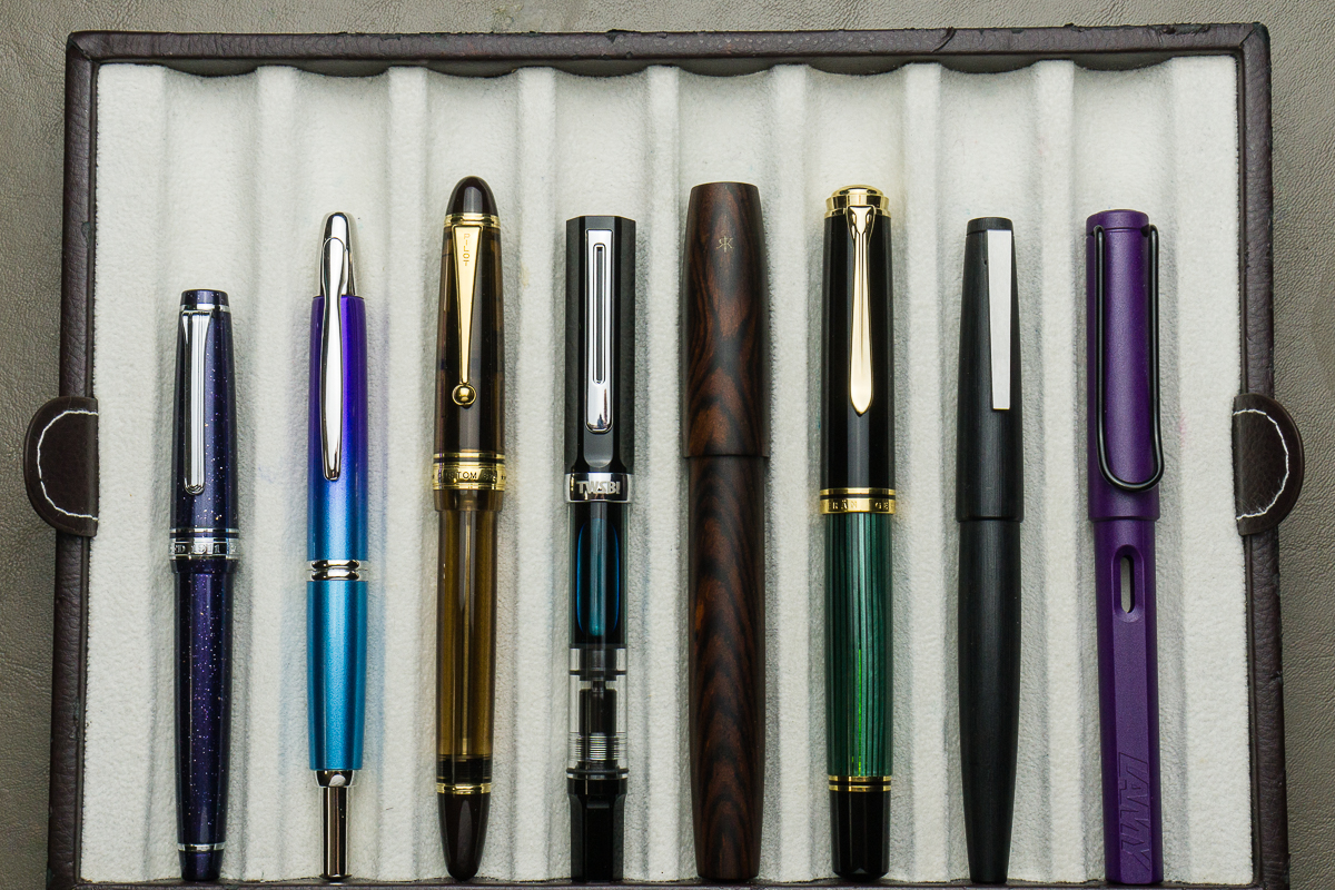
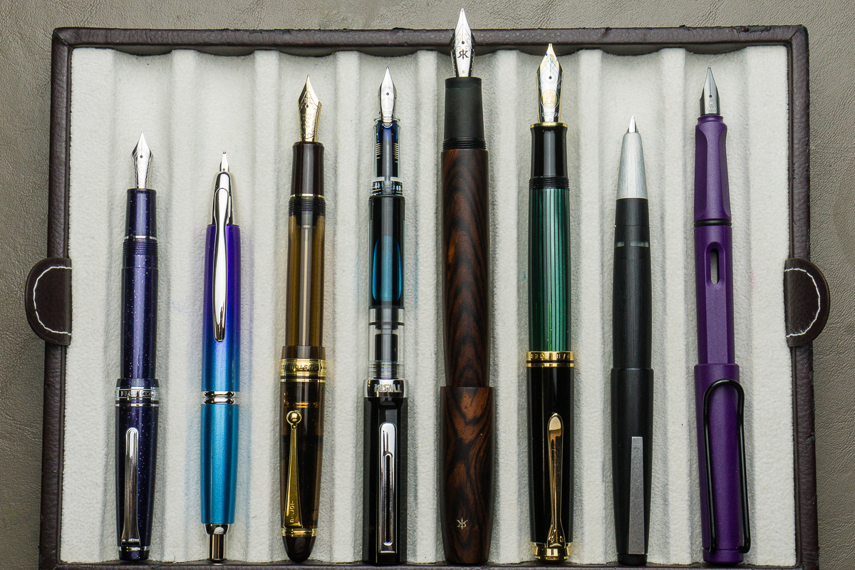
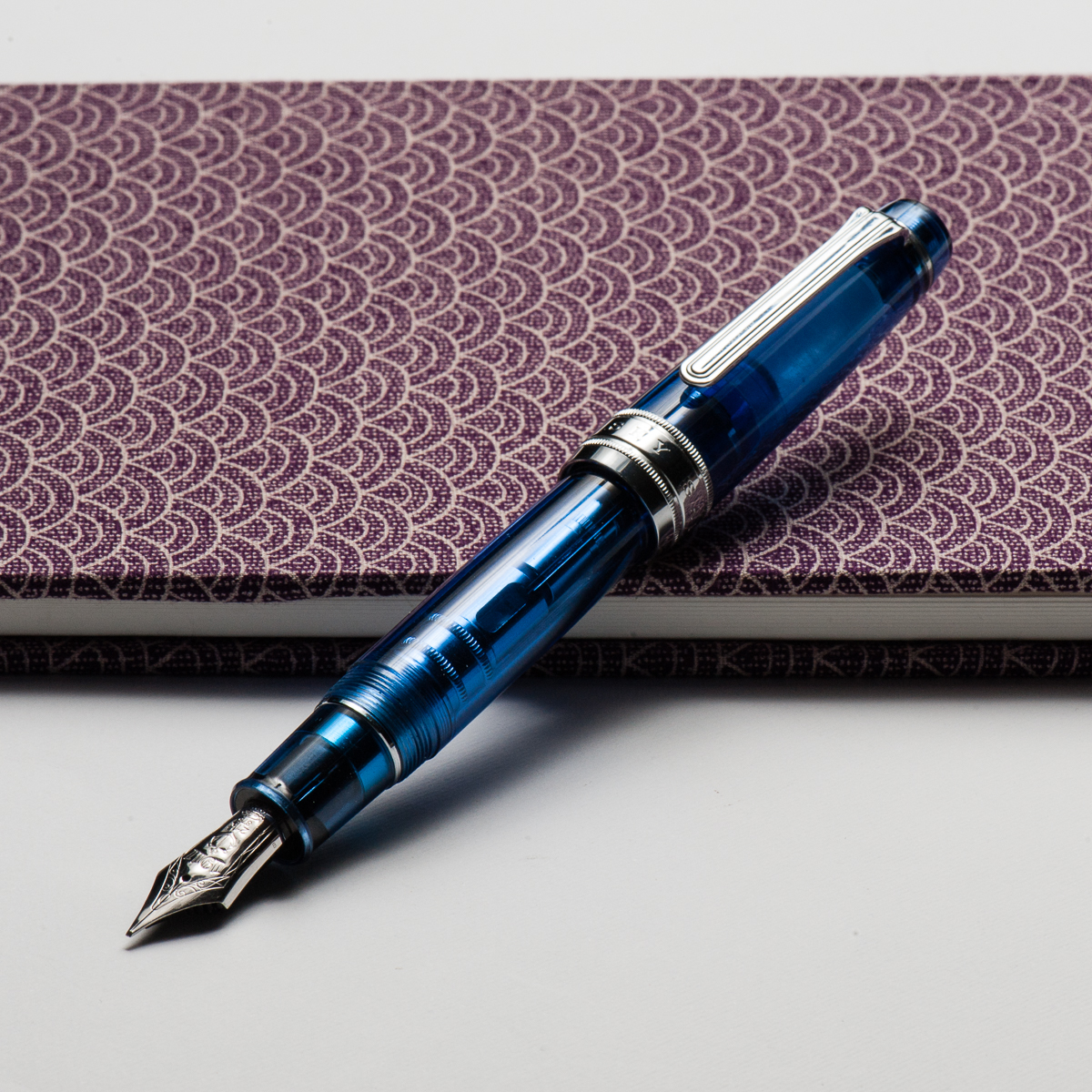
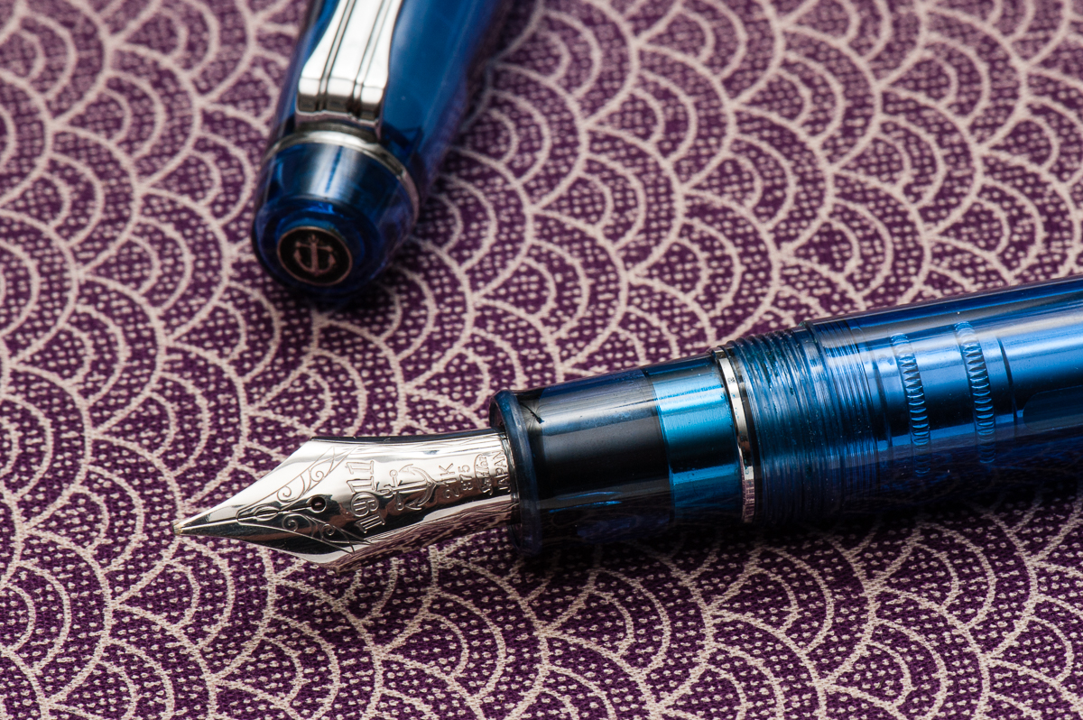
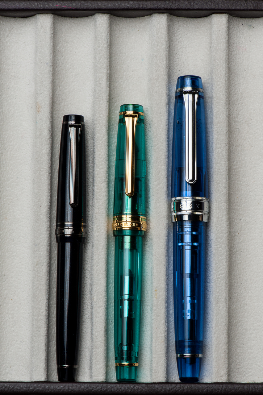
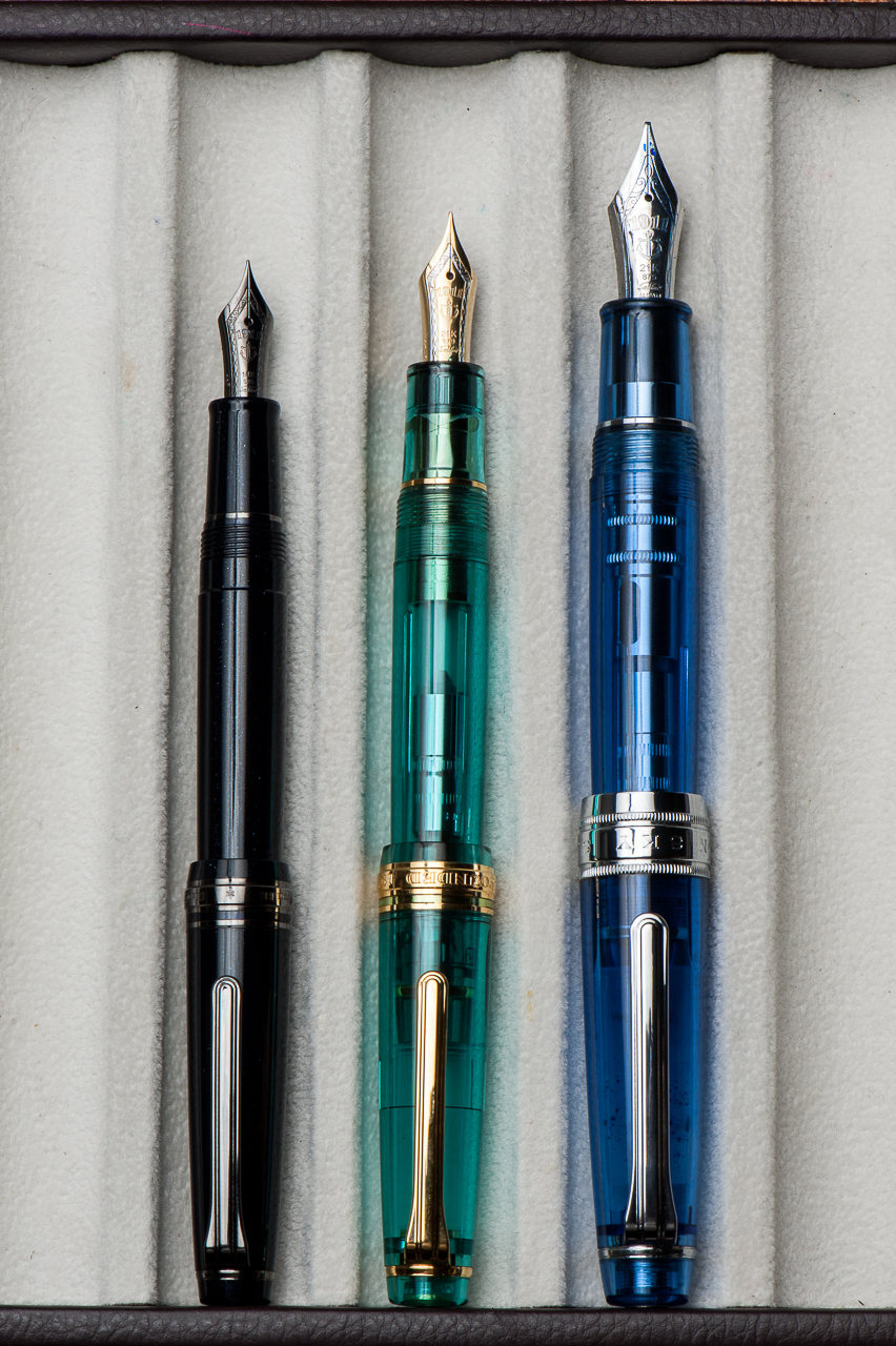
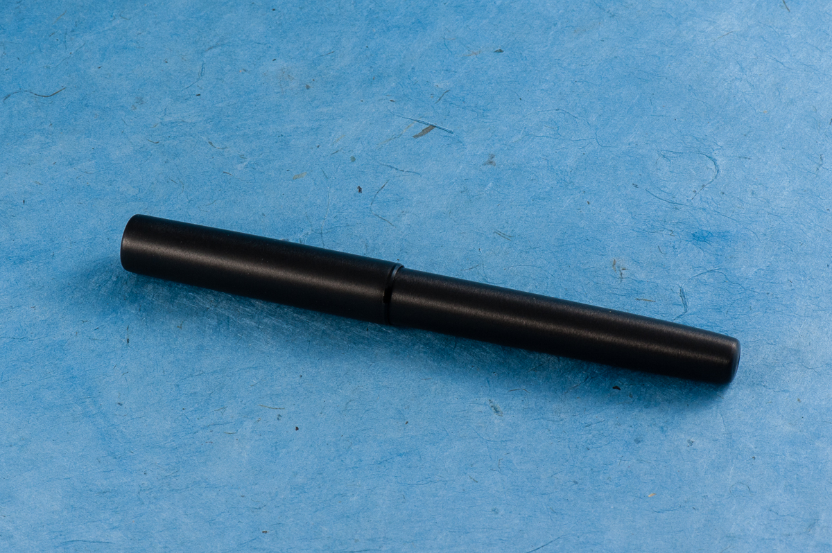
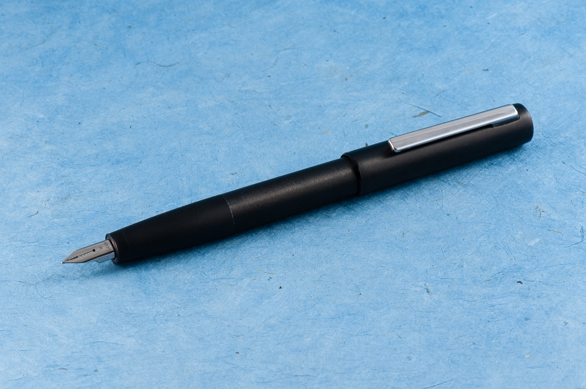
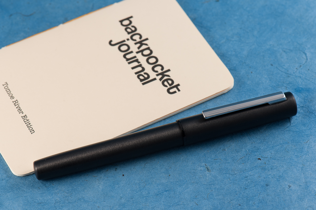
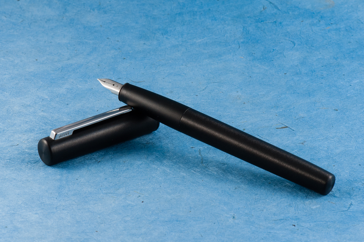
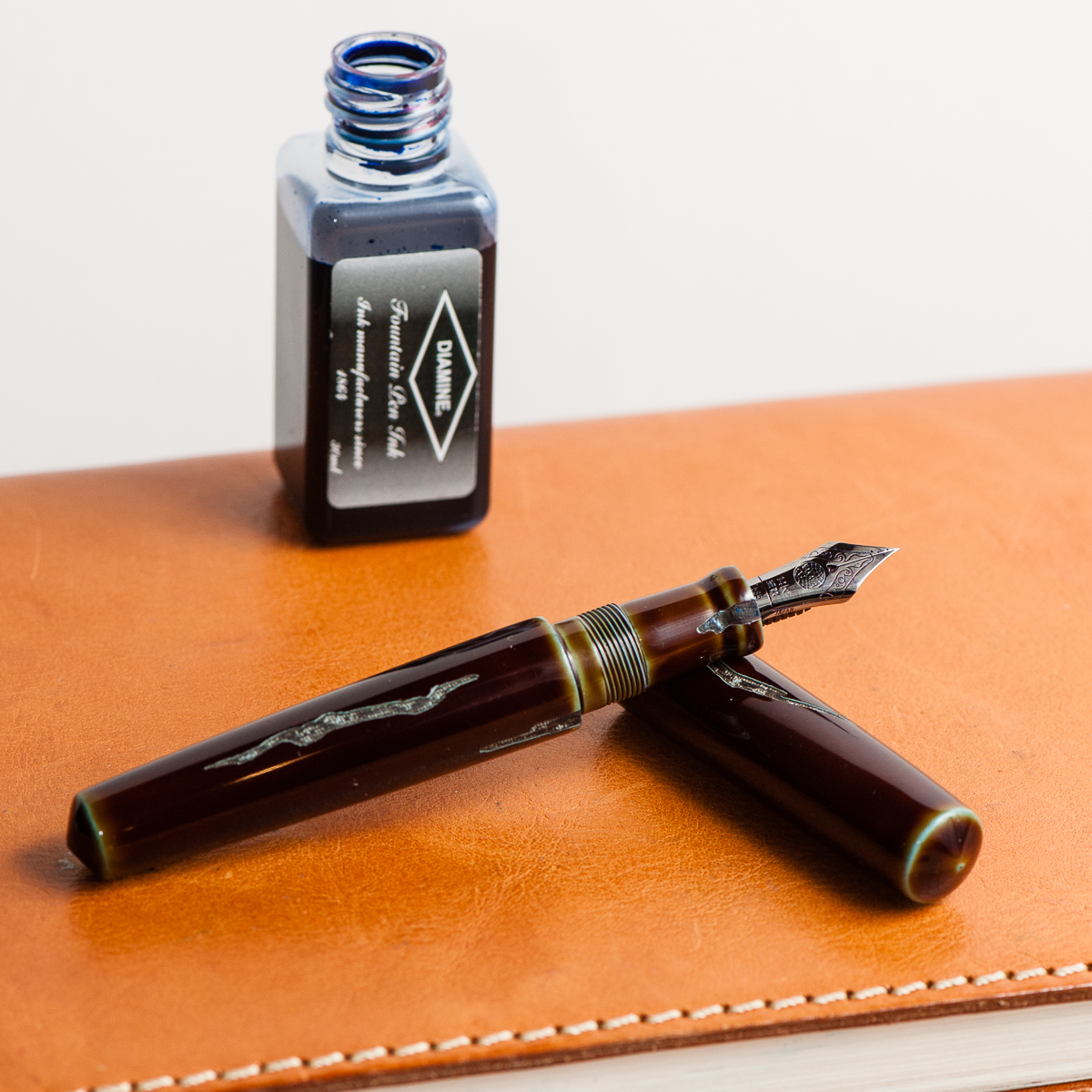
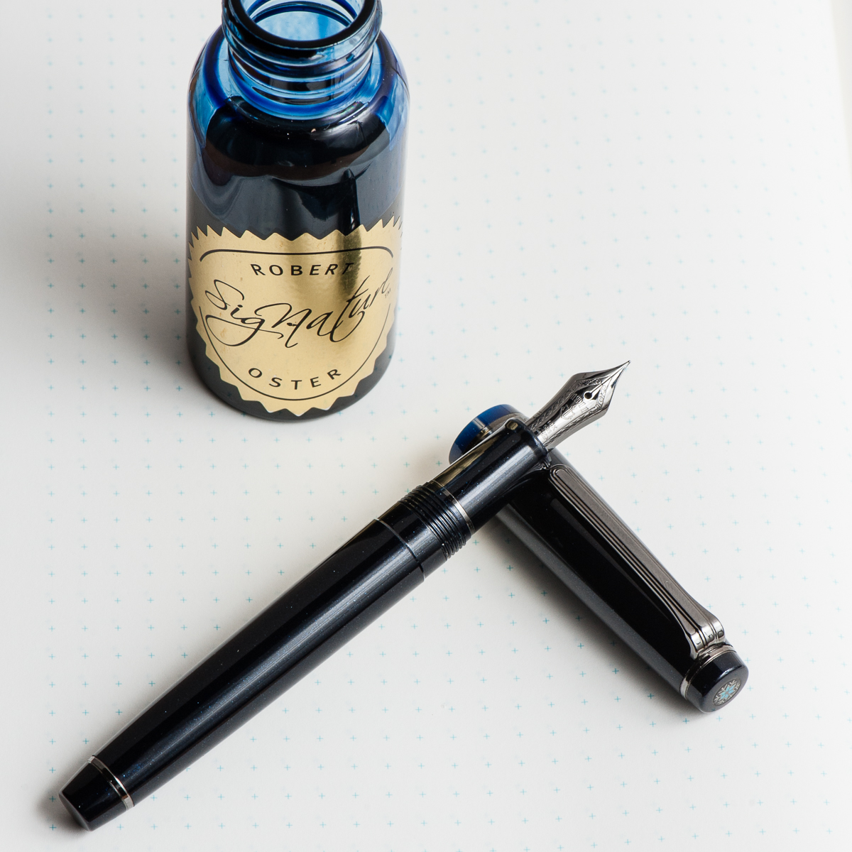
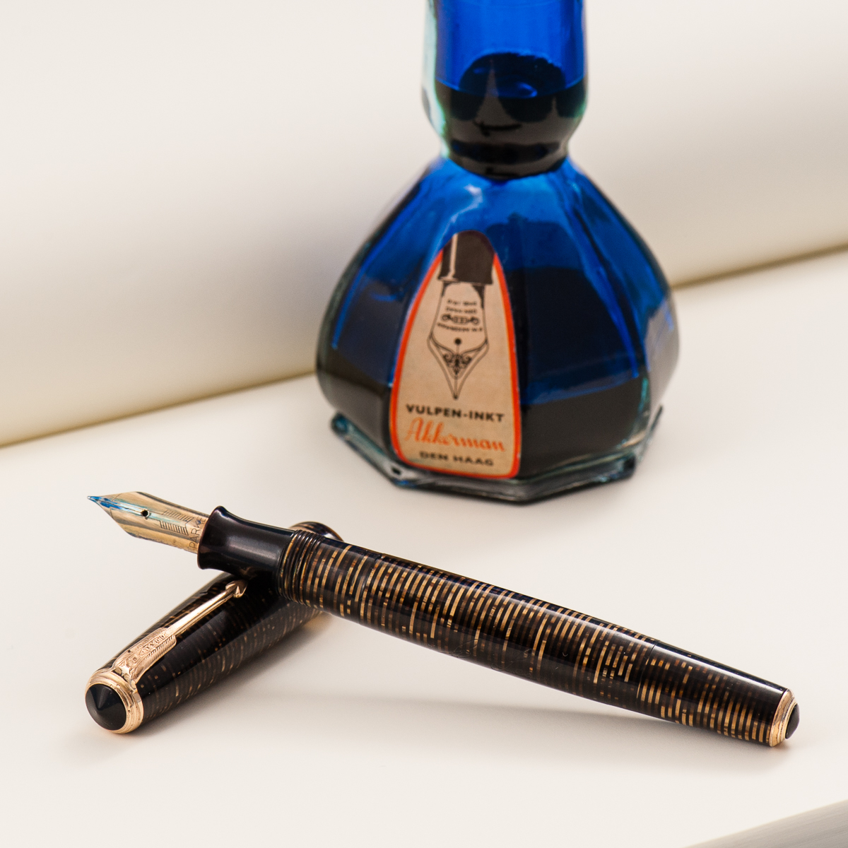
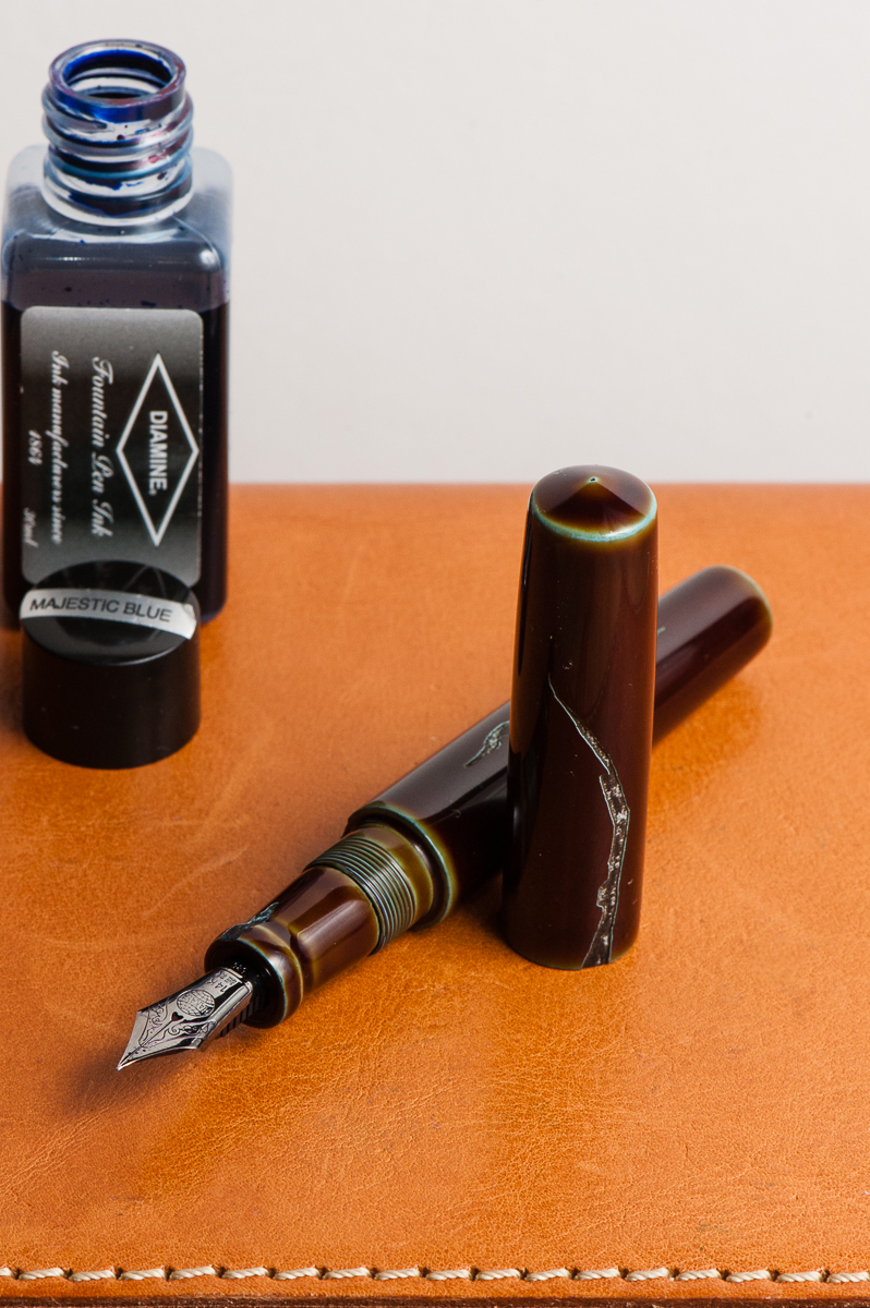
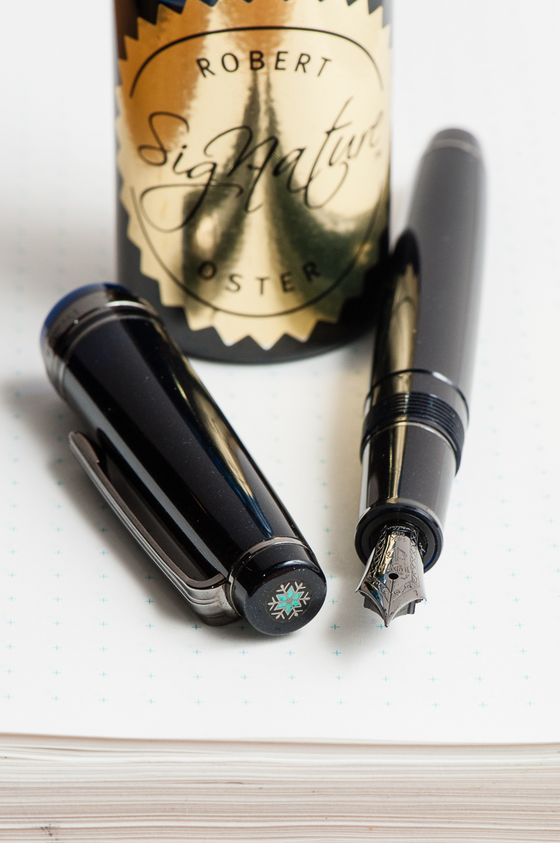
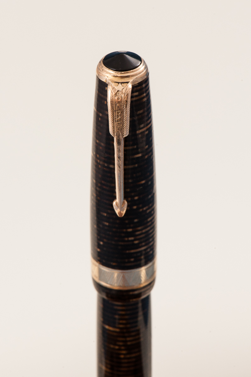
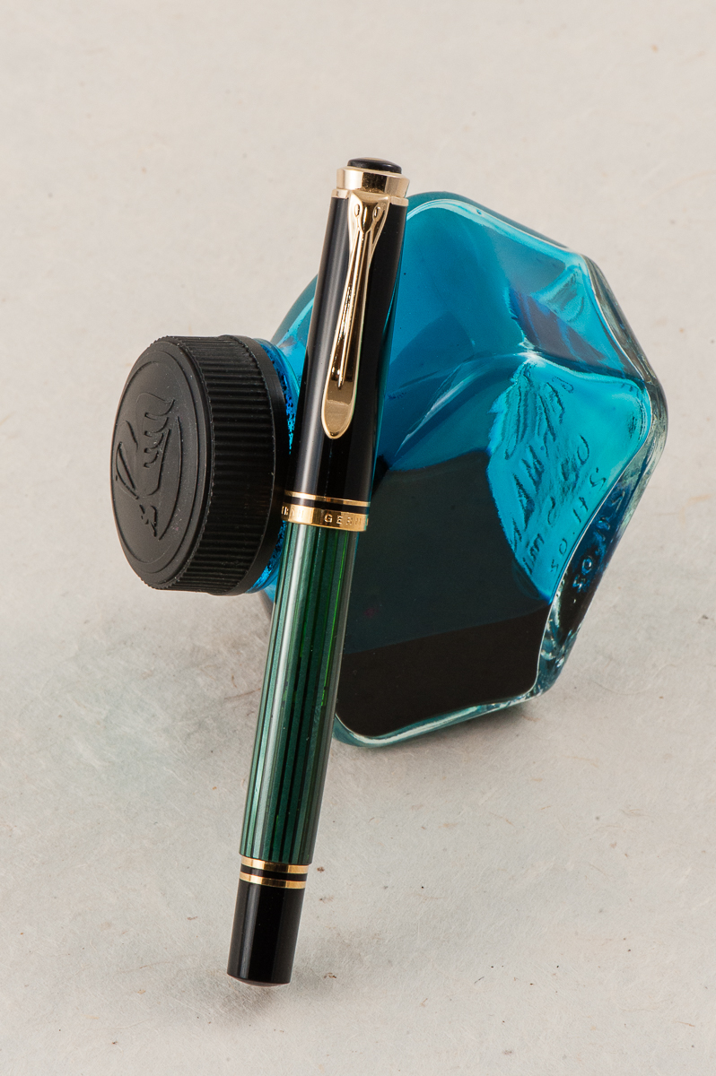
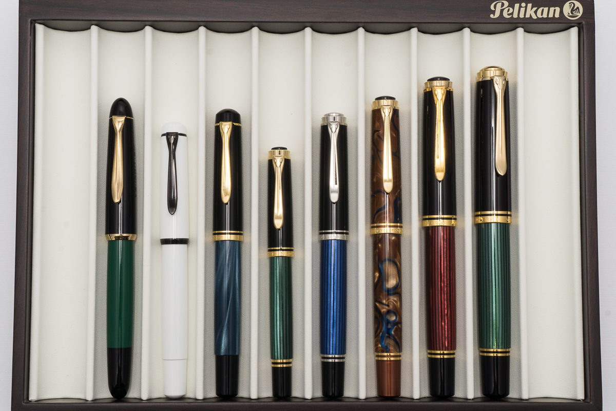
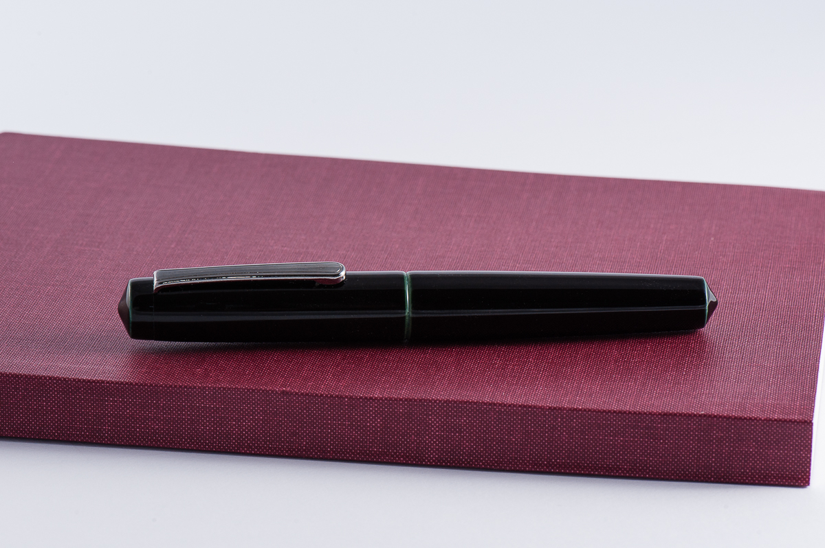
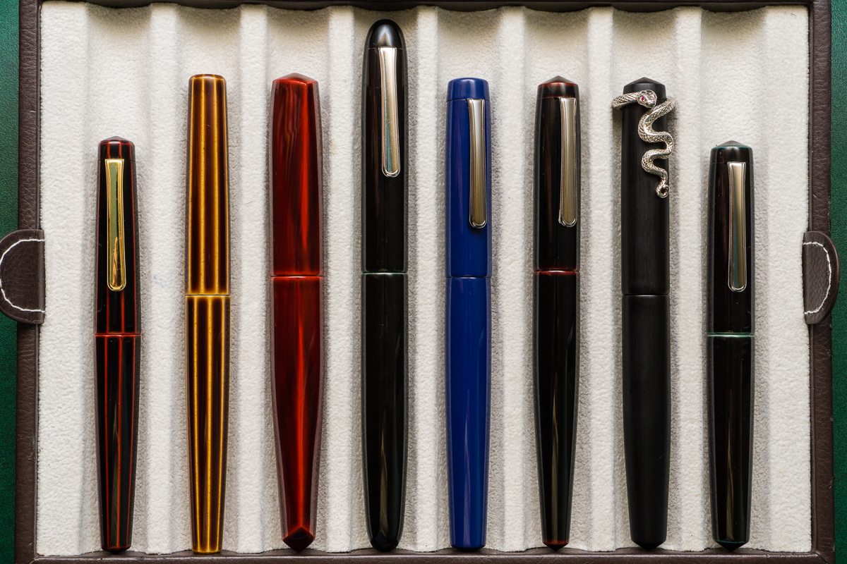
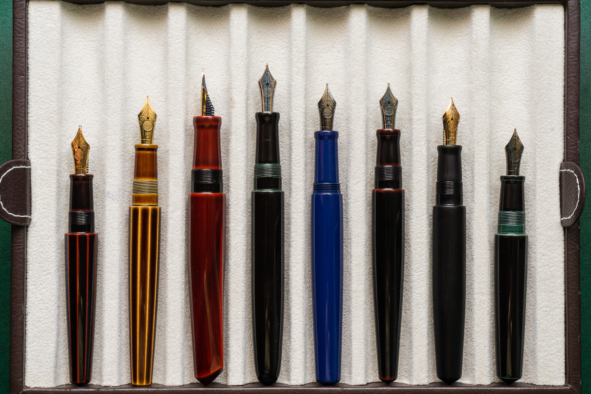
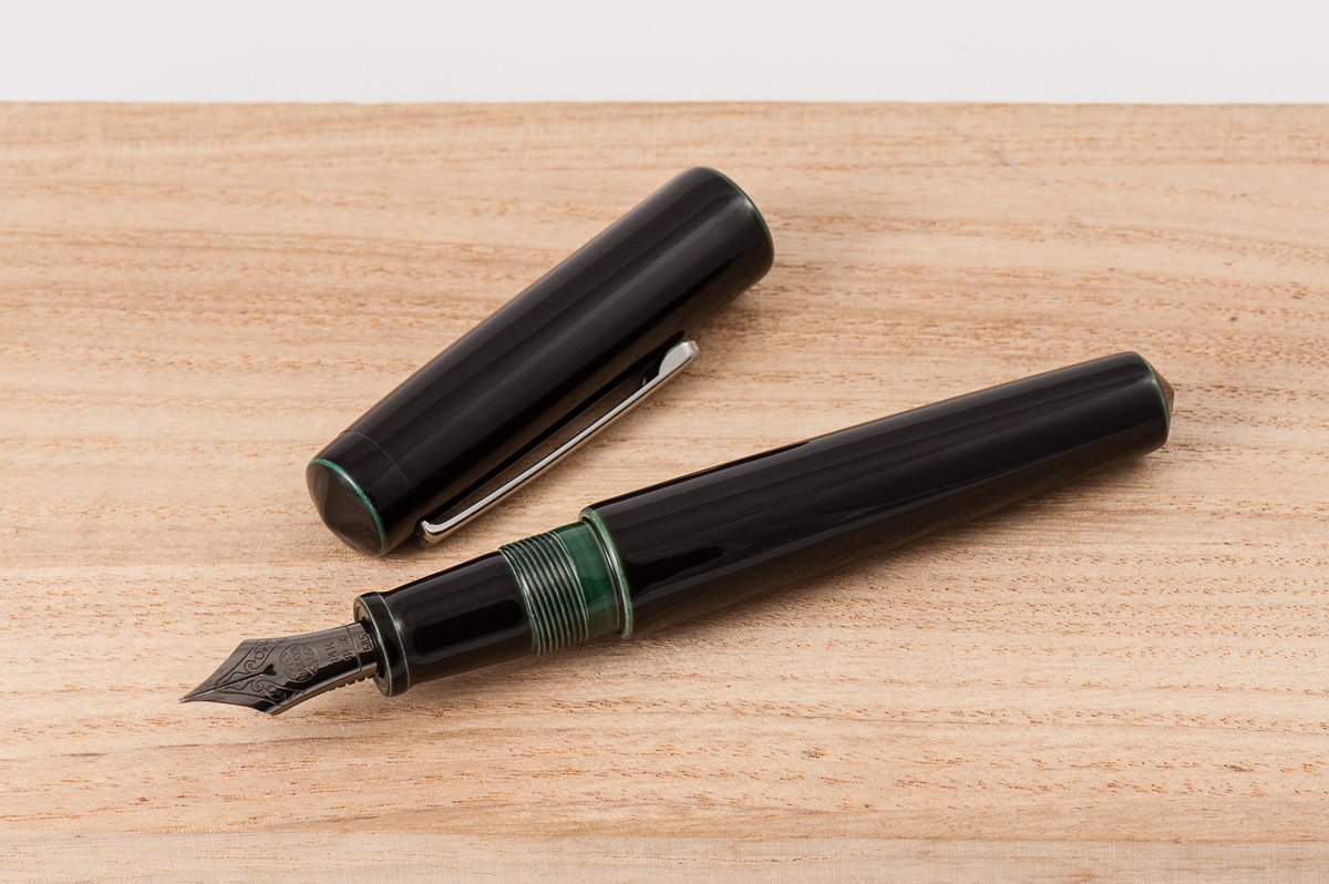
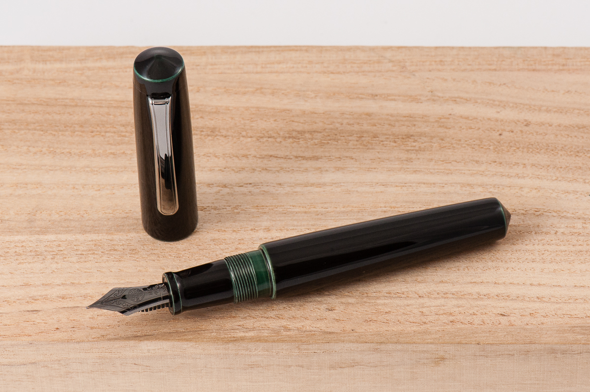
Pen Photos (click to enlarge)