Search results
8 results found.
pens & perspective for all hands, great and small
8 results found.
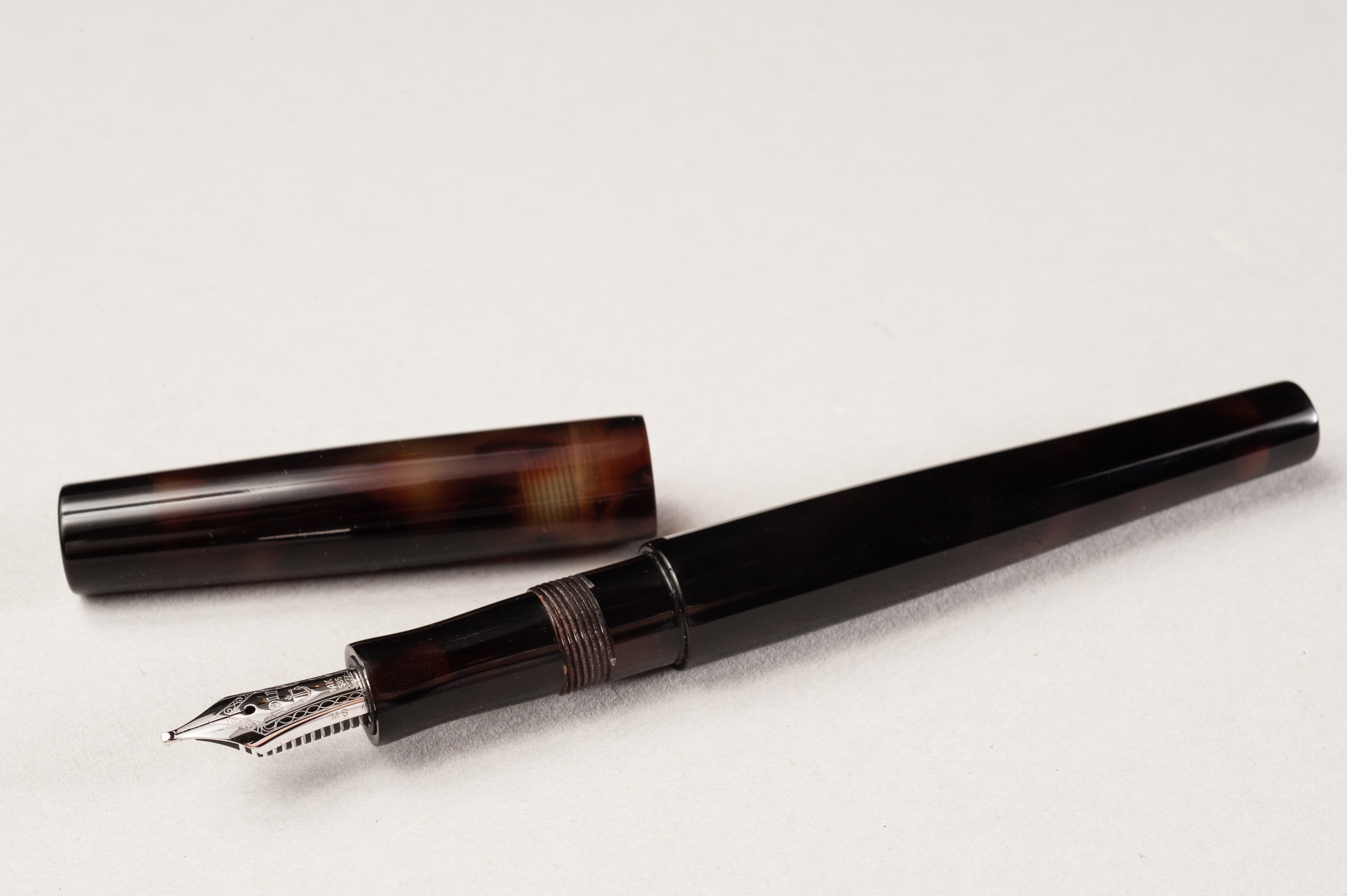
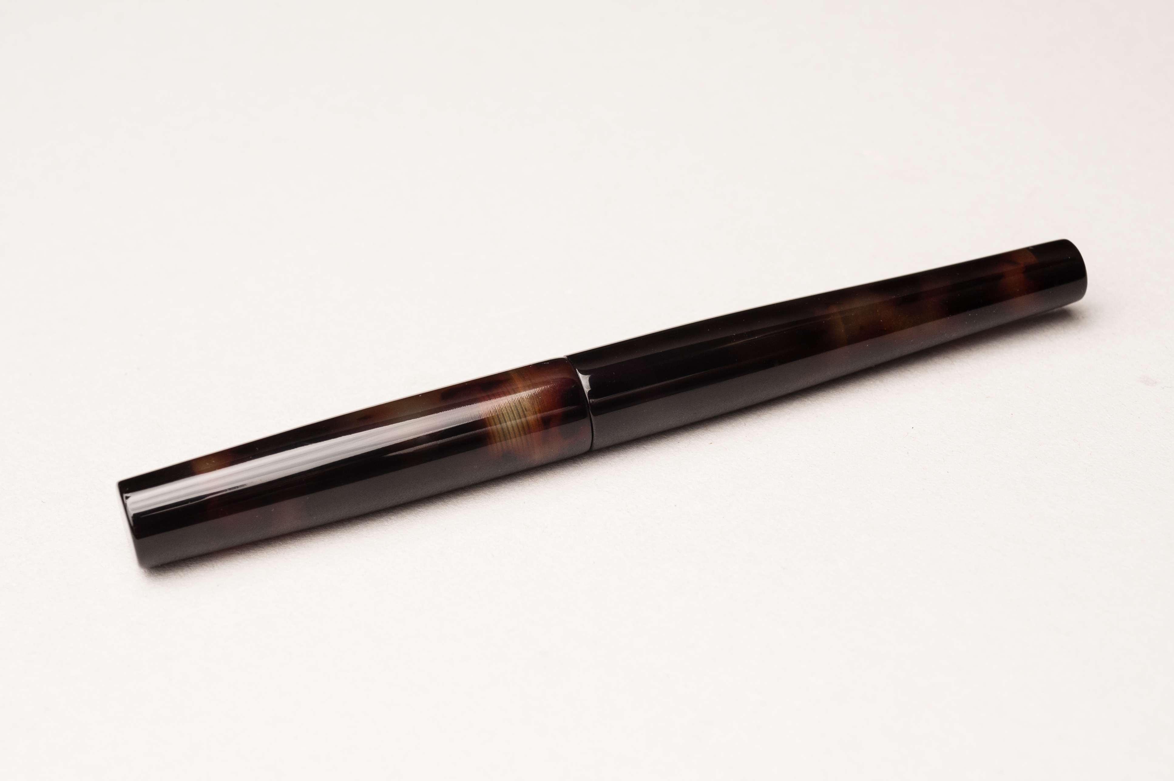
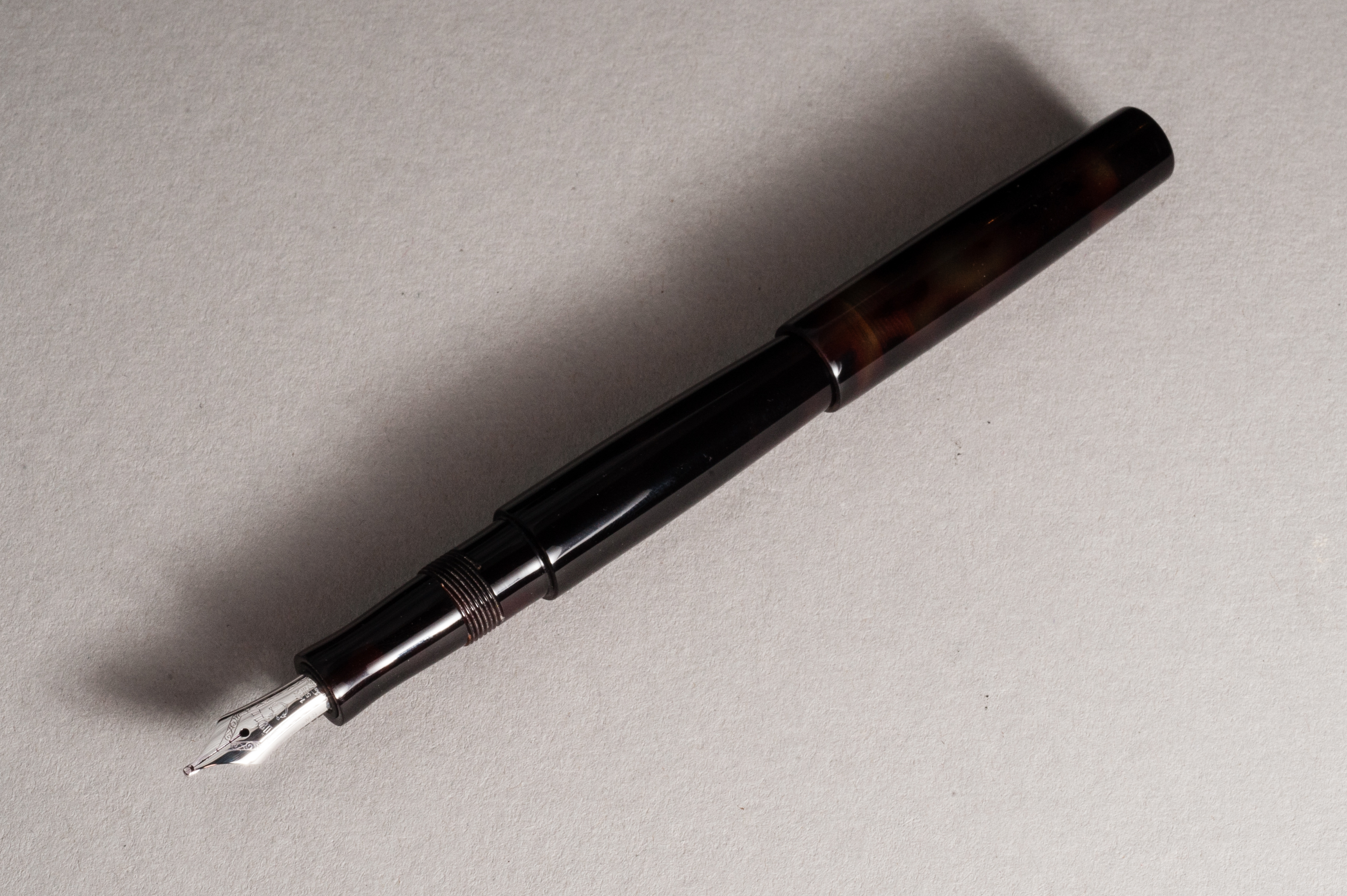
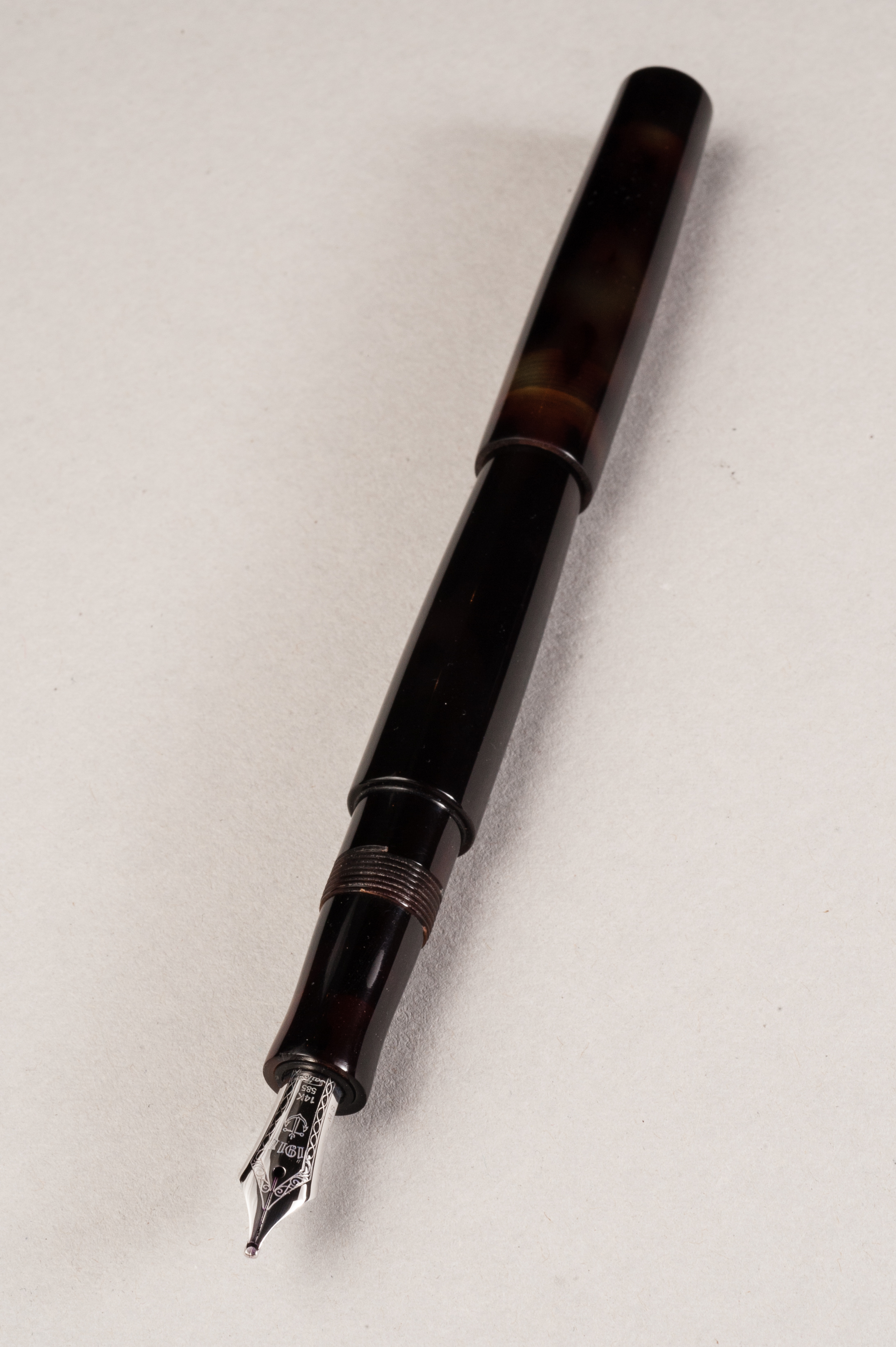
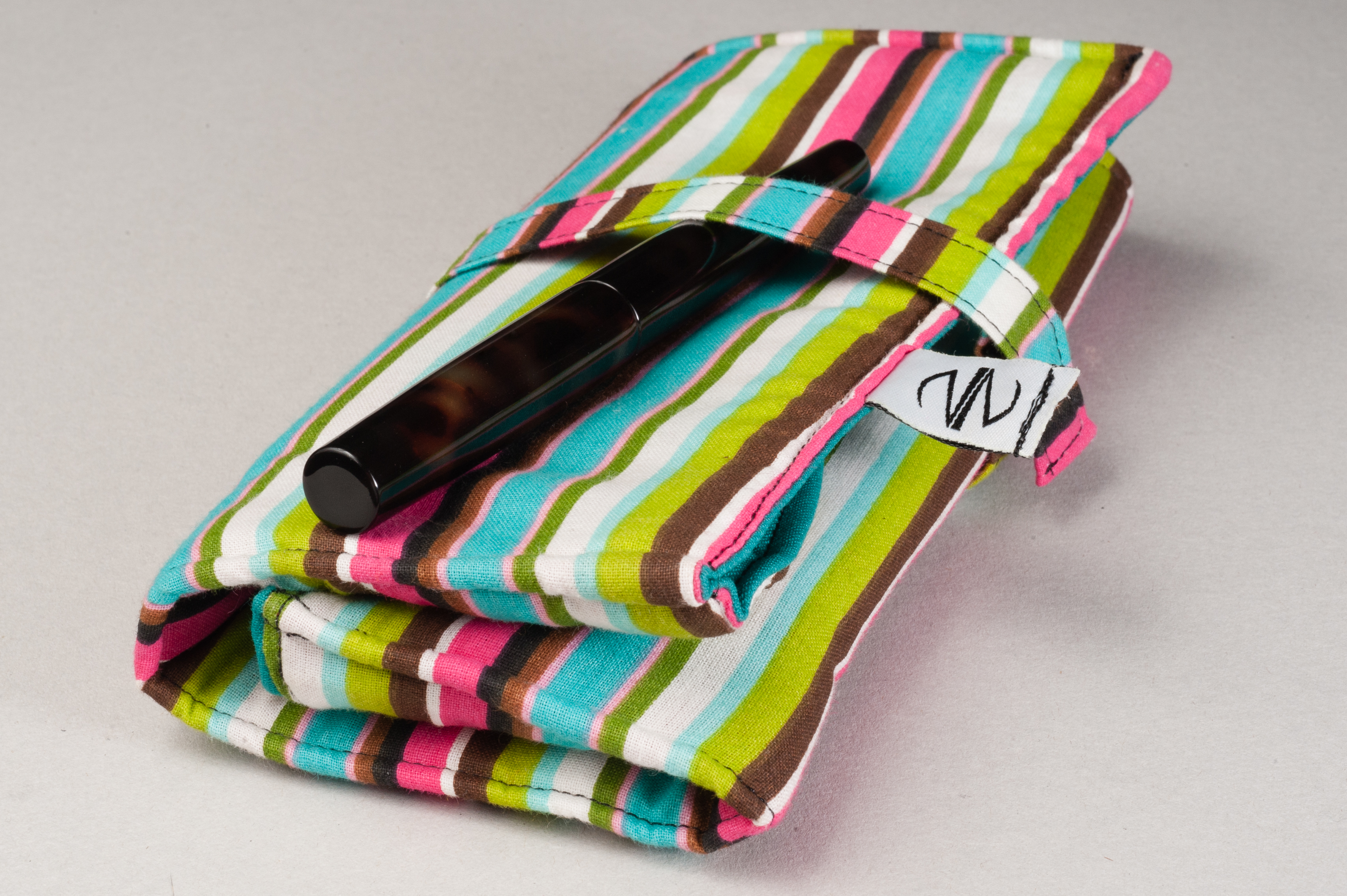
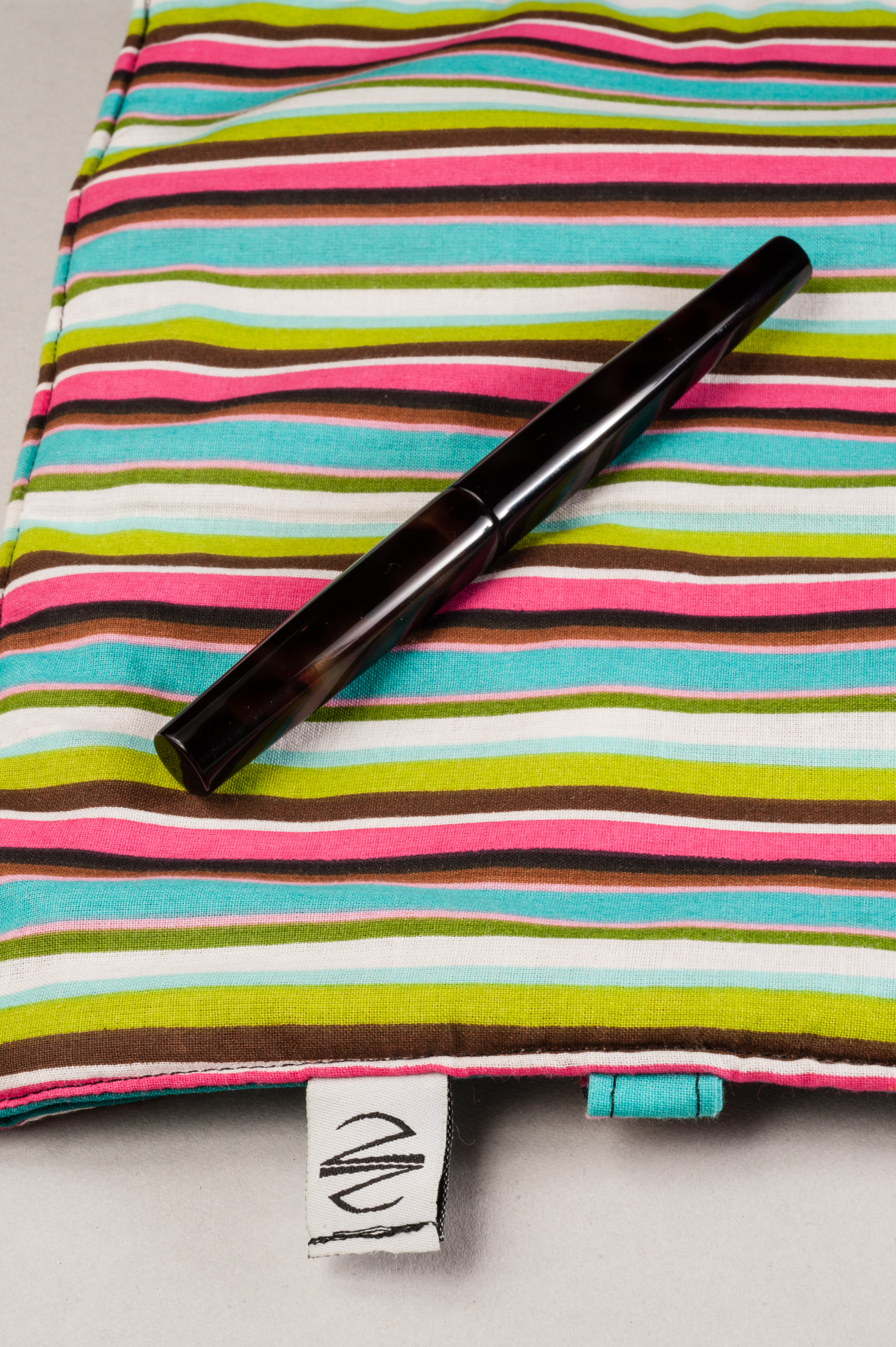
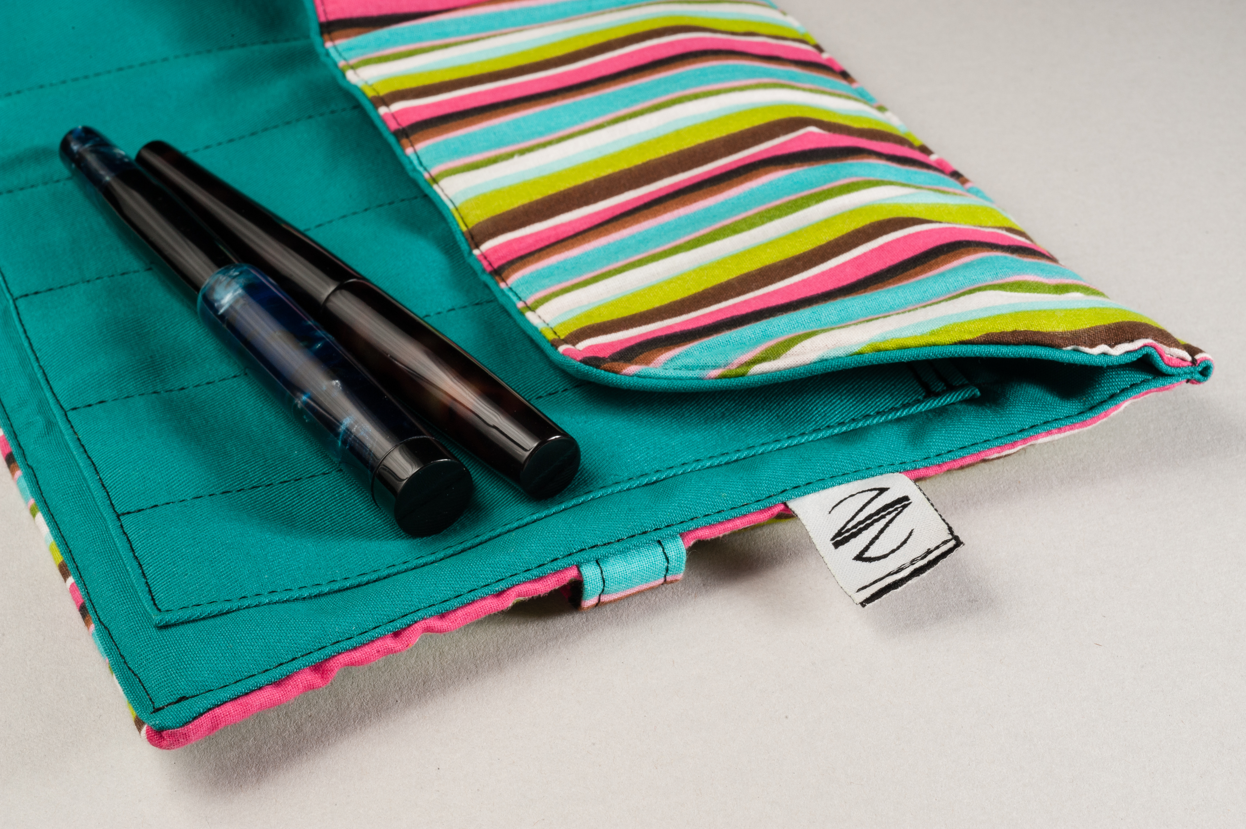
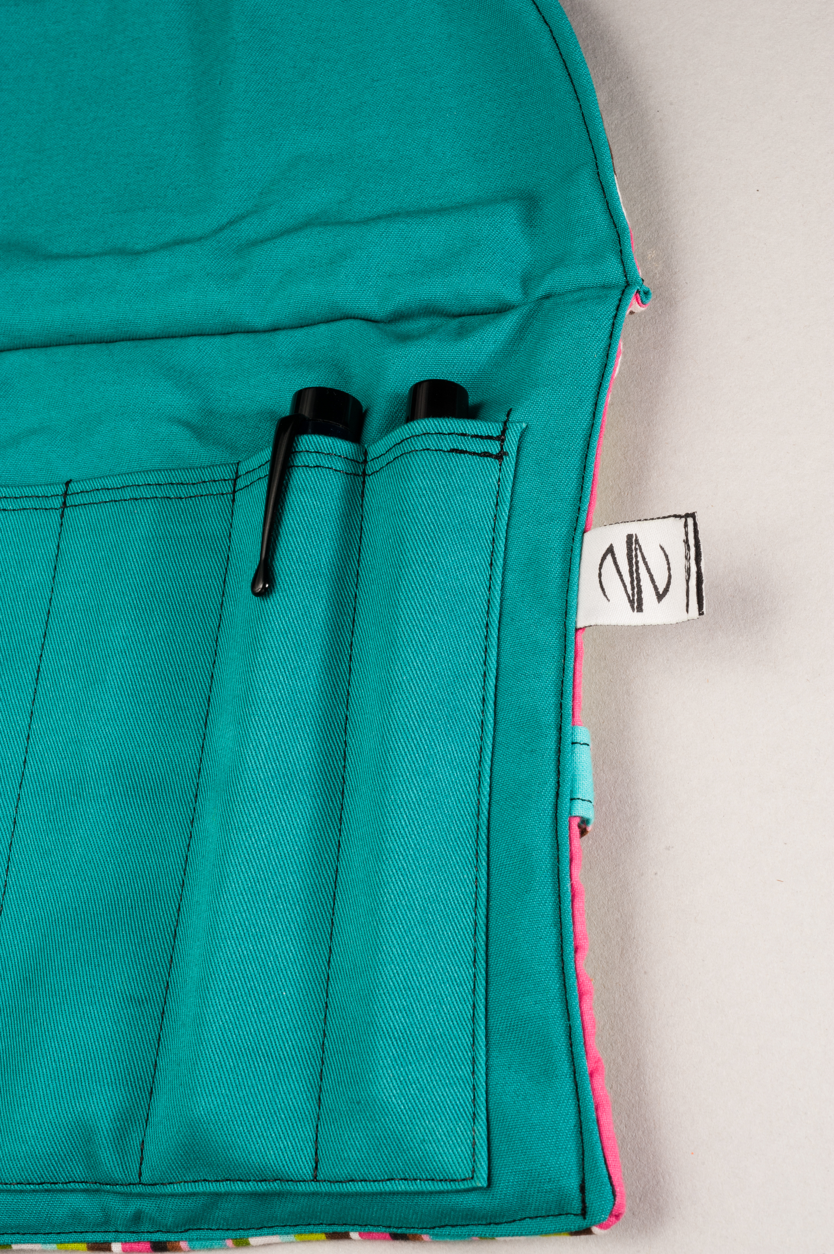
Shawn Newton of http://newtonpens.com was kind enough to send us a pen to test out along with one of Liz’s (his wife) pen wraps. The pen featured is a Slim Short Townsend made out of a dark tortoise celluloid and is fitted with a Sailor music nib.
Thank you so much Shawn!!!
Hand Over That Pen, please!
Katherine: I love the design of the Townsend — it’s sleek, but interesting and it posts. I don’t typically post my pens, but I like the option of doing so if I’m worried about losing a cap (hasn’t happened yet, but you never know…). In addition to a design I enjoy, the pen is very well made — there are no seams and no blemishes or scratches on the pen. The threads on this particular pen are a little tight — but I assume they’ll loosen up over time. (I asked Shawn — and he said that the threads will ease up over time and the threads are cut this way because of the material. I’ve tried a handful of other Newton pens and have never noticed this on any of them.)
Franz: The Newton Townsend has a very nice shape. Closed, the diameter from the top of the cap down the barrel slightly becomes thicker until the middle of the pen. And then it tapers nicely down to the end of the barrel. And with this brown tortoise material, it reminded me of that scene when Harry Potter first held his wand at Ollivanders. The pen wrap included was made by his wife, Elizabeth (Liz) Newton, and it was a very colorful 6 pen roll/wrap. It was well-constructed and accommodates long pens.
Pam: Full admission here: I squeal or make noises that are not meant for public ears when excited. I may have squealed when I saw the tortoise acrylic and got subsequently squeakier when I was able to handle the Townsend with the Sailor music nib.
Shawn Newton was first brought to my attention for his unique custom pens and innovative designs, particularly the Shinobi. I can definitely understand why people gravitate towards the Shinobi, but the Townsend deserves some time in the spotlight! When capped, the Townsend has a long elegant shape, practically seamless and has a subtle taper, particularly in this “small size” that makes it a very interesting pen to hold and to visually admire. When posted, the cap remained on pretty securely and I could be confident that the cap would stay on.
I am a great admirer of the tortoise acrylics, particularly since I am very partial to my tortie glasses from a couple years ago. The material itself is beautiful and sturdy with very subtle variations. I had a hard time seeing some of the variation in the material without sunlight or bright lights but when you do see it, it’s mesmerizing. The tortie material provides nuance and visual interest to the pen itself without being distracting. The material tolerated posting and unposting the cap pretty well with no noticeable blemishes on the body or cap.
The Business End
(Nib design, feel, issues)
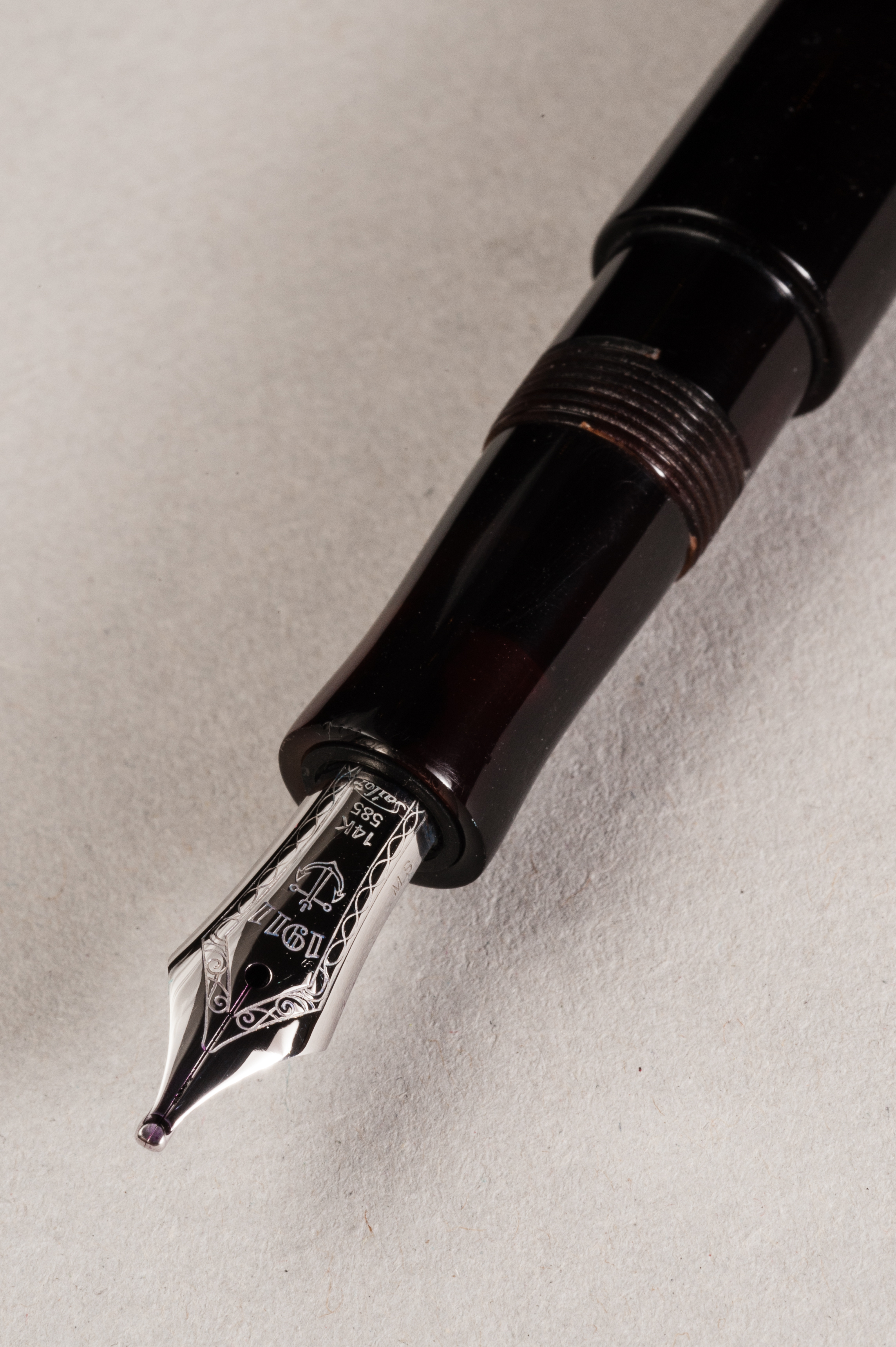
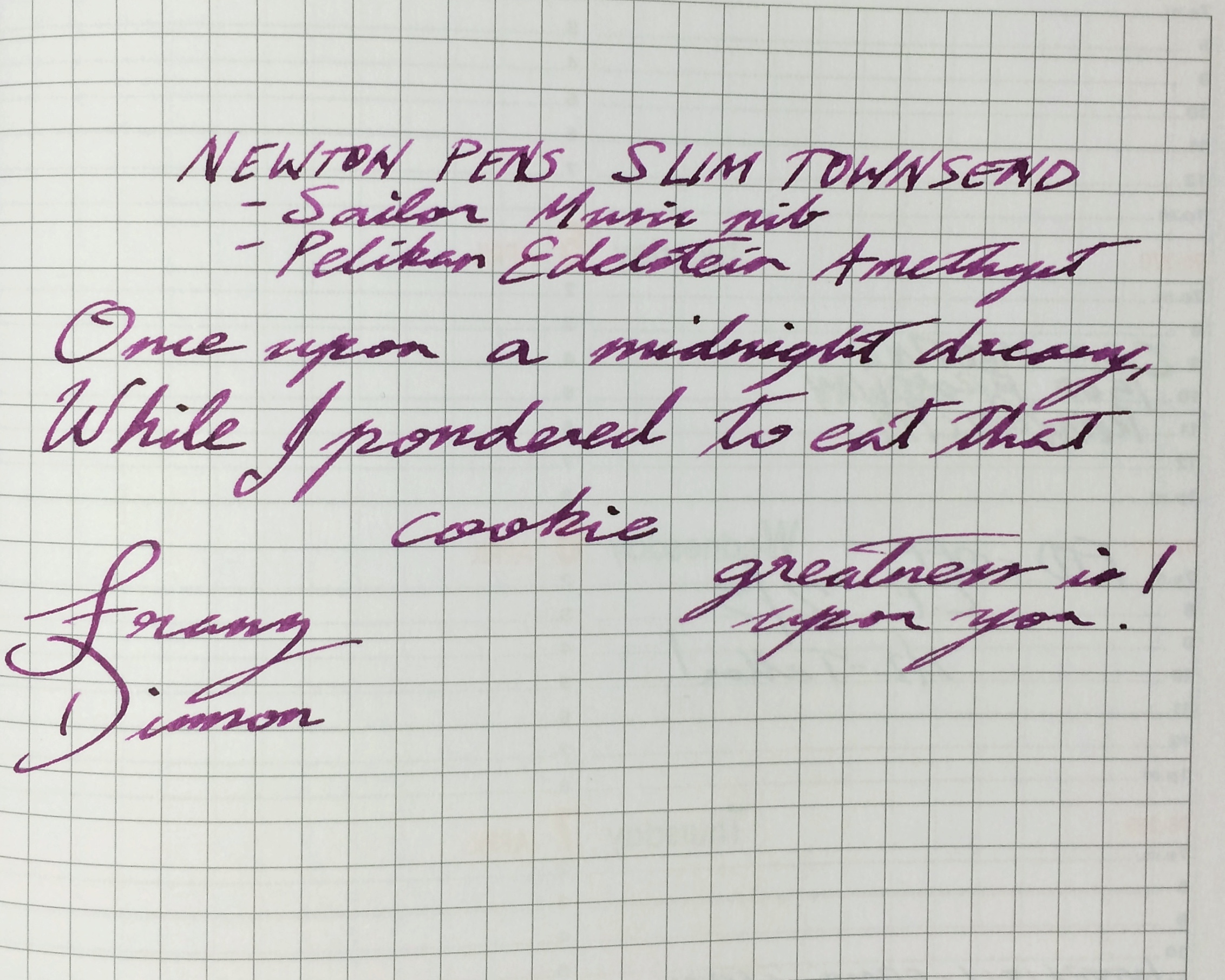
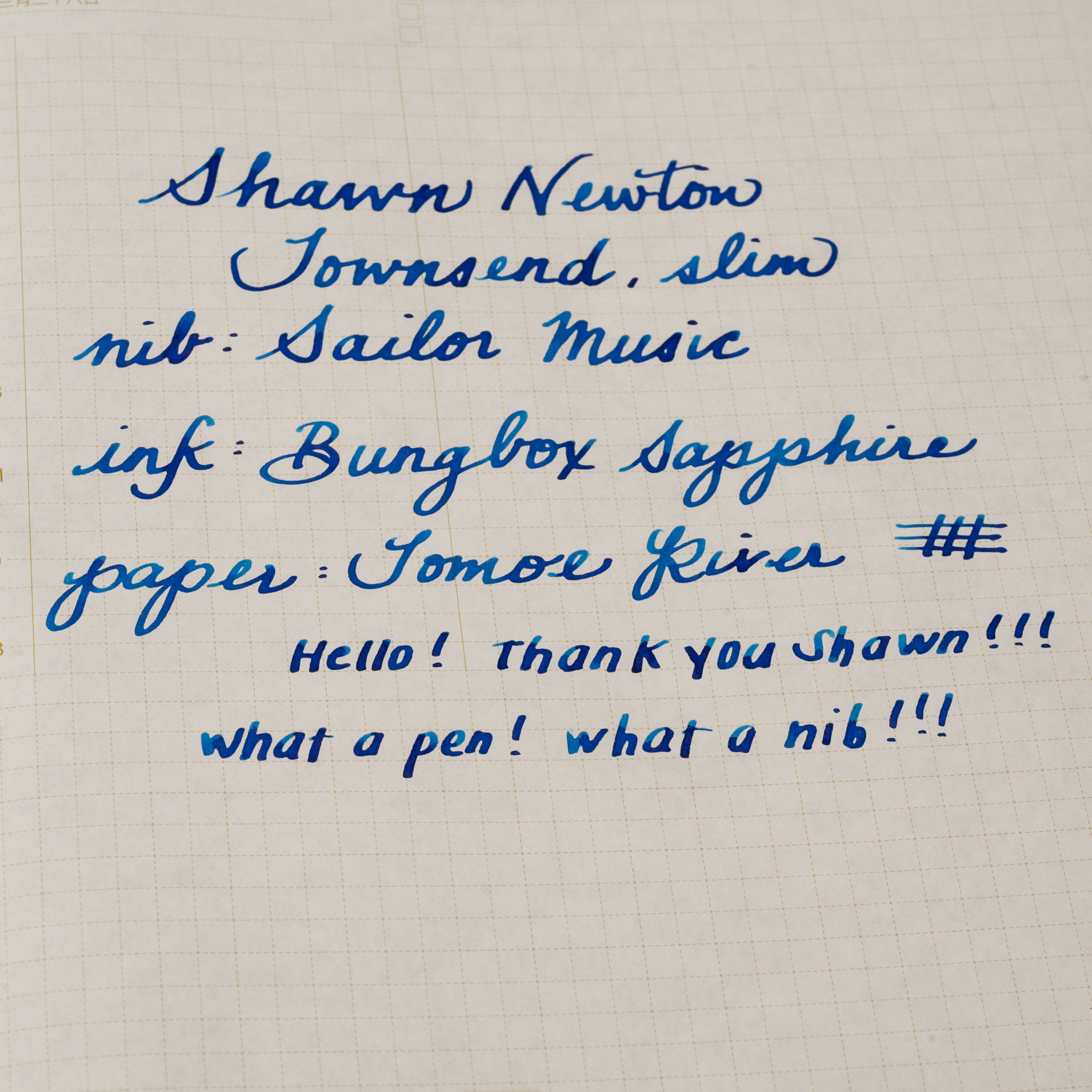
Katherine: The nib on this particular Townsend is a Sailor Music nib, not a Shawn Newton grind. I find “music nibs” intriguing, but this one doesn’t seem as crazy as some do — this one has a single slit and ends up writing like a fat stub. Fun, but a little too wide for my typical writing. I could see keeping a nib like this around for Christmas cards and ink testing though.
Franz: It was my first time to ever try out Sailor’s music nib. Just like Katherine, I felt that it was basically a stub and it’s something I’m used to writing with. I love the juicy, broad line of this nib and was wonderful on Tomoe River paper. Now I know to get the music nib if I want a stub on a Sailor pen. Of course, the juicy flow of the nib was my issue when I used it on copy paper. My writing spread, and bled on the page. But that is hardly the nib’s fault and I pretty much expected it. Shawn pretty much nailed it when he used the Slim, and Short design to accommodate and fit the fairly small size of this Sailor music nib.
Pam: I really enjoyed playing with the Sailor music nib, if only as a break in my usual F and EF nibs. It was a beautiful nib that laid down a good amount of ink that let the color and qualities of Bungbox Sapphire come through. The ink dried in a relatively reasonable time period on Tomoe River paper. This nib is a FUN nib, but not for journaling or work. It’s such a broad line, that I just wanted to write big and just go wild on the page. I had a hard time keeping my writing neat with this nib when I tried to write my usual (tiny tiny) size. It would be great for calligraphy or cursive, if you have the space to let this nib fly.
Write It Up
(20-minute writing experience)
Katherine: The slim size of the pen is very comfortable for me — I have a Townsend on order with Shawn and now I’m really torn between a normal and a slim. It’s an easy to hold, well balanced pen. Writing with it for twenty minutes was comfortable and fun — though the music nib made it hard for me to journal. (I ended up making lists of all the pens I’d like to own one day. Don’t ask. >_>)
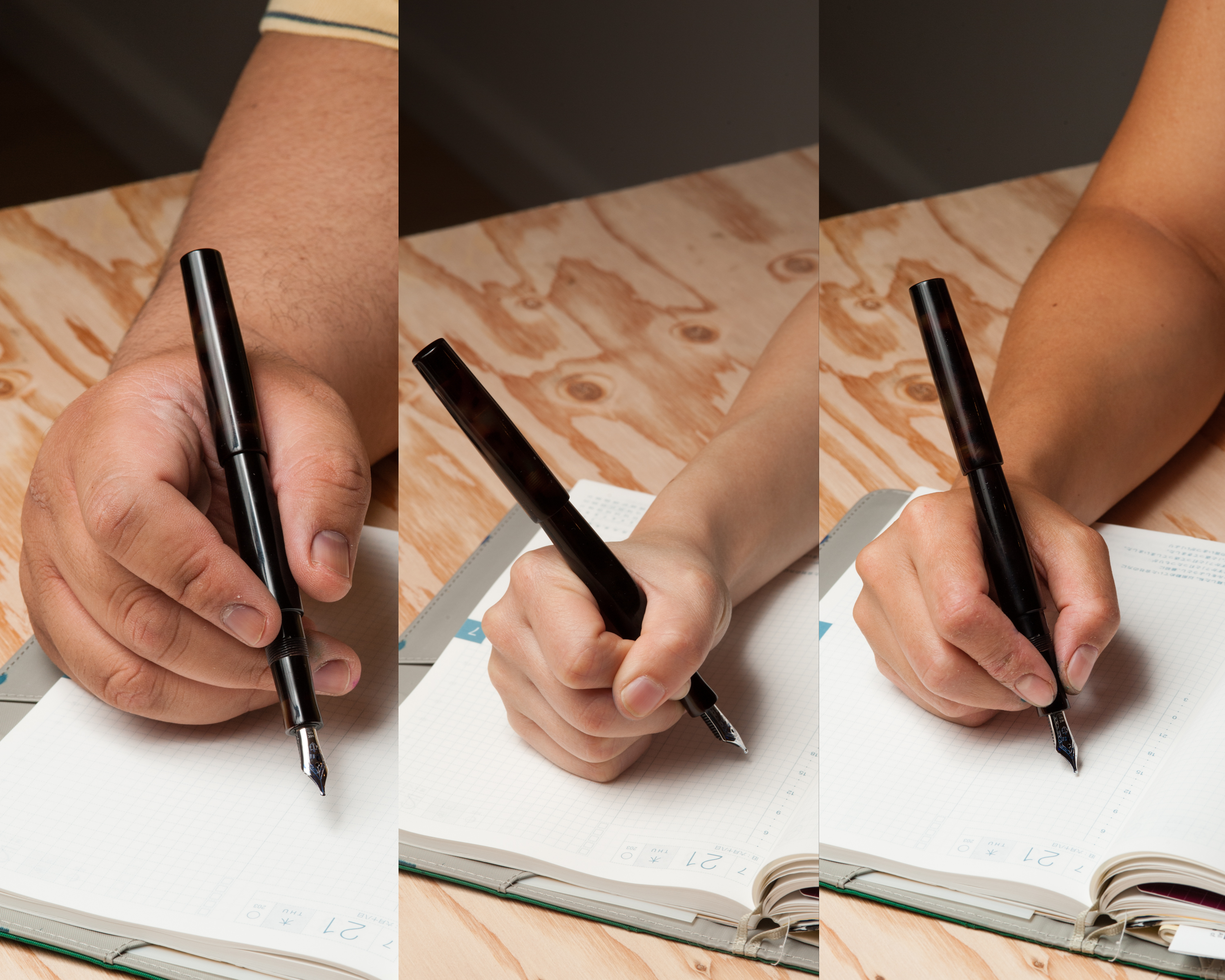
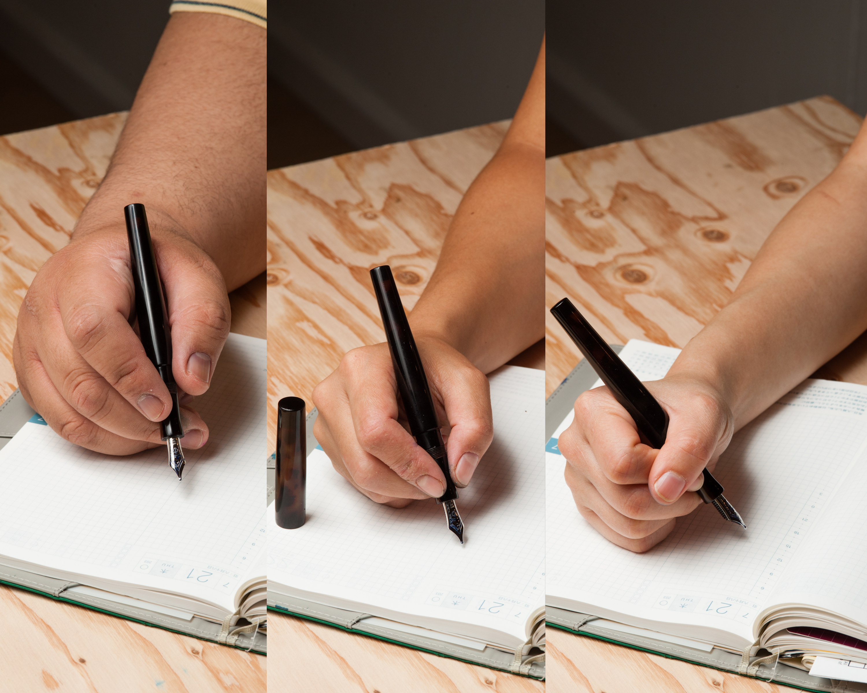
Franz: I wrote with the Townsend for the first ten minutes with the cap posted. My grip was on the pen barrel right before the step down to the section. It was very pleasant to write with and my thoughts flowed on my journal. The next ten minutes, I used it unposted and my fingers gripped the section near the threads. I immediately felt the thinner diameter but I did not find it irksome and I just kept on writing.
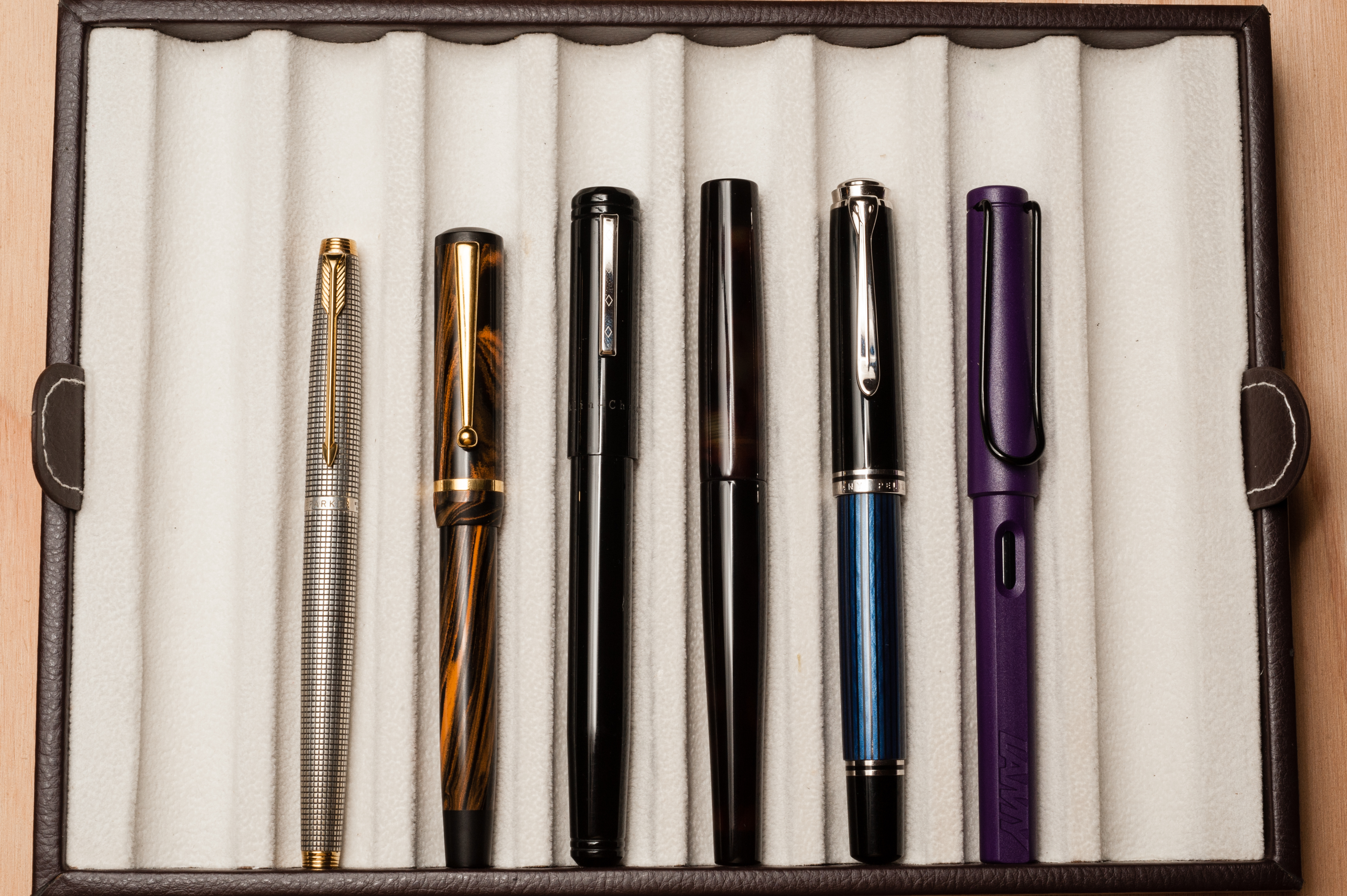
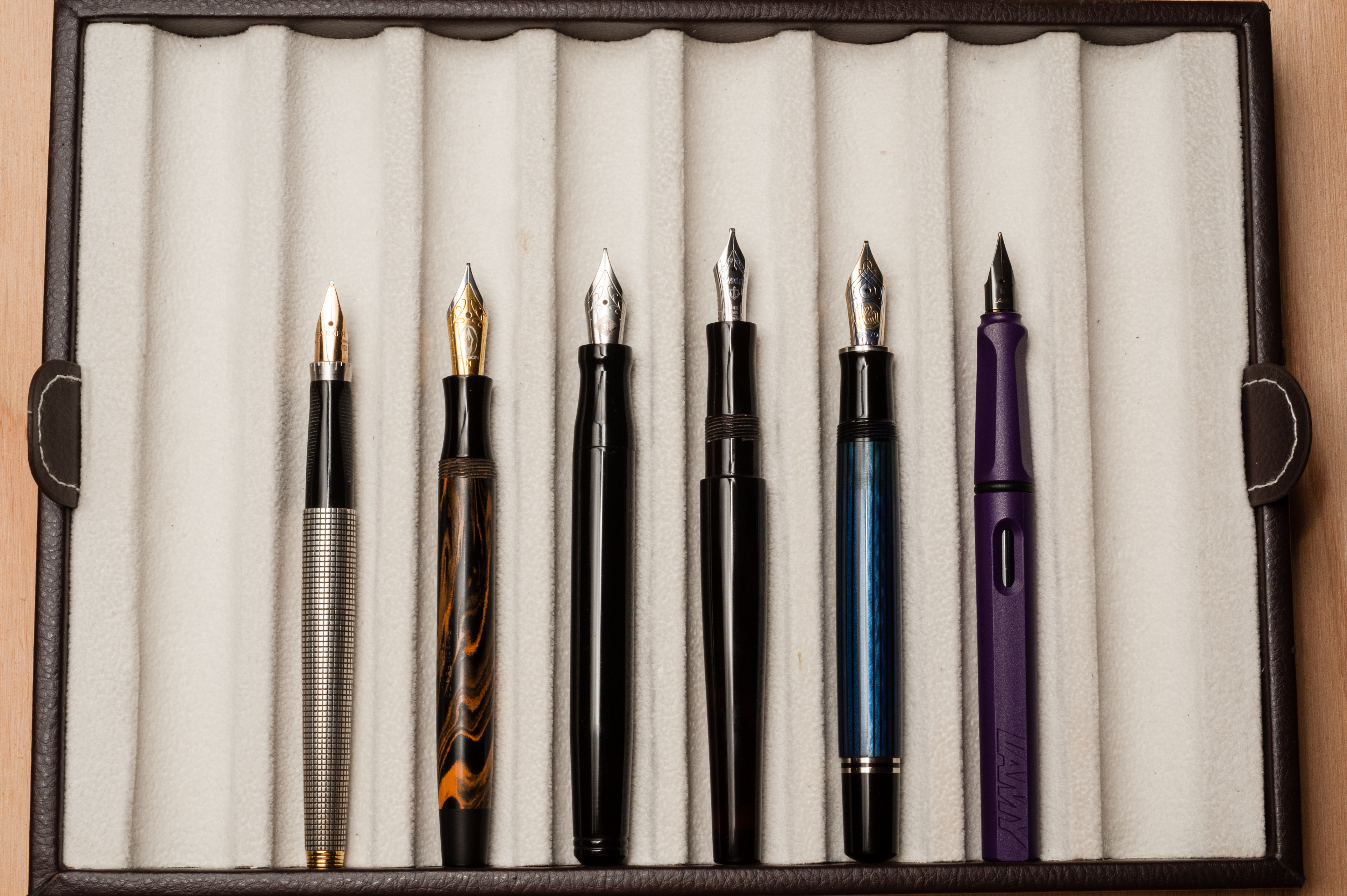
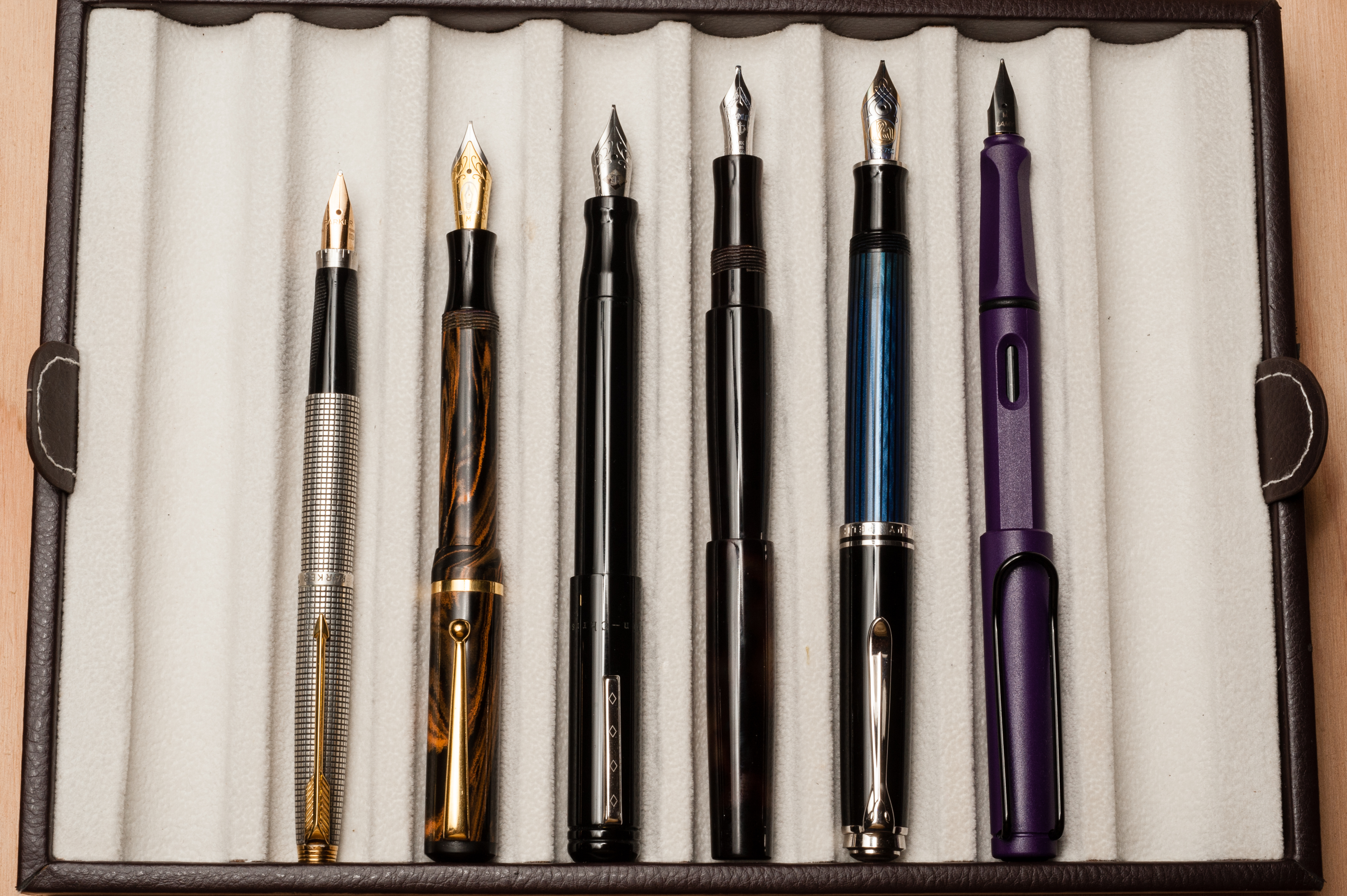
Pam: I held the pen via traditional grip due to the music nib and it was wonderfully comfortable. The width of the section reminded me to the width of the Franklin-Christoph Model 45, possibly slightly slimmer. The length of the pen didn’t require me to post the pen and when “flourishing” with this pen, I preferred the pen unposted.
I also tried to hold the pen in my usual “iron grip.” (Maybe for a future pen purchase…) It could be that I am used to shorter pens like the Pilot Prera or the Pelikan M400, but I felt that this pen was a tad too long for me when posted. It could also be the nib which required some adjusting on my grip so it could be used. The pen was more comfortable unposted for me but remained a comfortable weight with or without the cap. The threads when held in this strangle hold didn’t bother me in the slightest.
It’s a really enjoyable pen to write with for a prolonged period of time, no matter which grip I used. It’s also the first pen that I really enjoy using unposted.
EDC-ness
(Daily use at work/home, at least a day or two)
Katherine: I only used this at work for a day (versus usually I like to do a couple days at minimum, but I wanted to be able to get this pen back to Shawn in a timely fashion!)… But it was a great day. That being said, the pen in in it’s current form wouldn’t be my pick for an EDC pen. It’s a gorgeous pen that I really enjoyed looking at, but the music nib is impractical for me and, more notably, the threads are a little tight, which makes capping and uncapping slower. Additionally, the lack of a roll stop means I worry it’ll end up on the floor. But, I’d love to own a pen in this shape with a more practical nib and a roll stop. I’m sure I’ll journal with it enough to break in the threading and EDC away!
Franz: I was unable to truly use this pen at my work setting. Mainly because of the nib’s very broad line on cr-opy paper, my writing was illegible. Even though it was clip-less, the pen was long enough for me to store it in my shirt pocket and I did not feel the need to post the cap for quick notes.
Pam: The pen itself was easy to carry around and pretty portable in my pen case. With a clip or even a roll stop (and a normal EF nib), I can easily see this pen clipped to my Hobonichi planner for regular use. The pen is light, sturdy and the cap is secure so I wouldn’t have any qualms bringing it with me as I round in the hospital. The threaded cap does require more time to cap and uncap the pen, but that’s typically not a deal breaker, just a consideration. Given how well constructed this pen, it will handle daily use well. (Bonus on breaking in the threads for an even smoother capping/uncapping.) Additionally, this pen will definitely be unique even among the fountain pen carrying posse I have (enabled) at work.
Final Grip-ping Impressions
Katherine: A couple weeks before Shawn asked if we’d like to review a pen I put in an order with him for a Townsend — and I’m so glad I did. It’ll be many, many months before it arrives, and I may flip flop between a slim and normal Townsend a dozen times — but I’m pretty sure I can’t go wrong (I seem to have days where I prefer slightly fatter pens…). The Slim fits my hand wonderfully, and the Short size is well balanced for my hand. Additionally, the fit and finish on this pen is wonderful — it’s a cliche saying, but each of Shawn’s pens is truly a work of art. I’m definitely adding a roll stop to mine though — I cringe at the idea of a pen this meticulously made & finished hitting my floors.
Franz: The Townsend is practically the second Newton Pen model that I’ve spent time using and have written with. The shape of the pen is quite impressive and pleasing to look at. I was able to use this pen both posted and unposted so the length is just right for my large paw. The only thing I would really change is the diameter of the pen. According to Shawn’s website, the slim model has a 10.8mm thick section. The Newton pen that I own is a Small Orville and according to his site has a 12.1mm thick section. I found the small diameter a bit more comfortable than the slim.
The Brown Tortoise material, the Sailor music nib, and the Harry Potter-like wand shape of this Townsend pen are three features that made me quite sad and reluctant as I stood in line in a United States Post Office to mail the pen back to Shawn.
Pam: I may very well follow in Katherine’s footsteps in the next year or so and start on my custom fountain pen collection, especially after handling the Townsend. I really appreciate the ability to post a pen so when the Townsend provides both elegant minimalist design with post-ability, it’s a definite win for me. I have a while to consider which shape, material, and nib I want in a pen, but I will definitely include a Shawn Newton pen into my collection in the future. This pen shows great craftsmanship and care as well as an eye for a well thought out design. For those interested in Shawn’s pens, you should definitely check out his website or his Instagram feed to check on his latest works. (I stalk him on Instagram regularly. Hi Shawn!)
He has great designs and pen sizes to fit ALL hands.
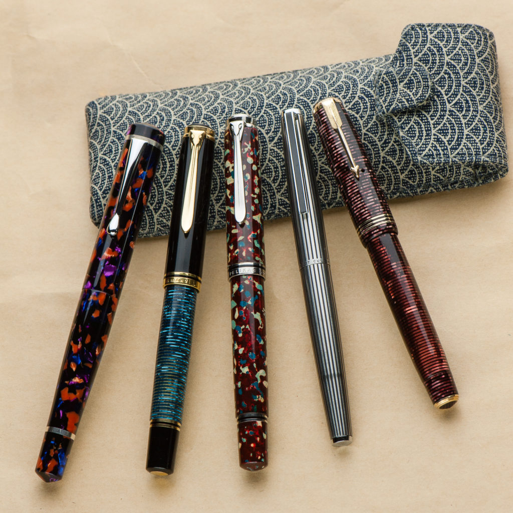
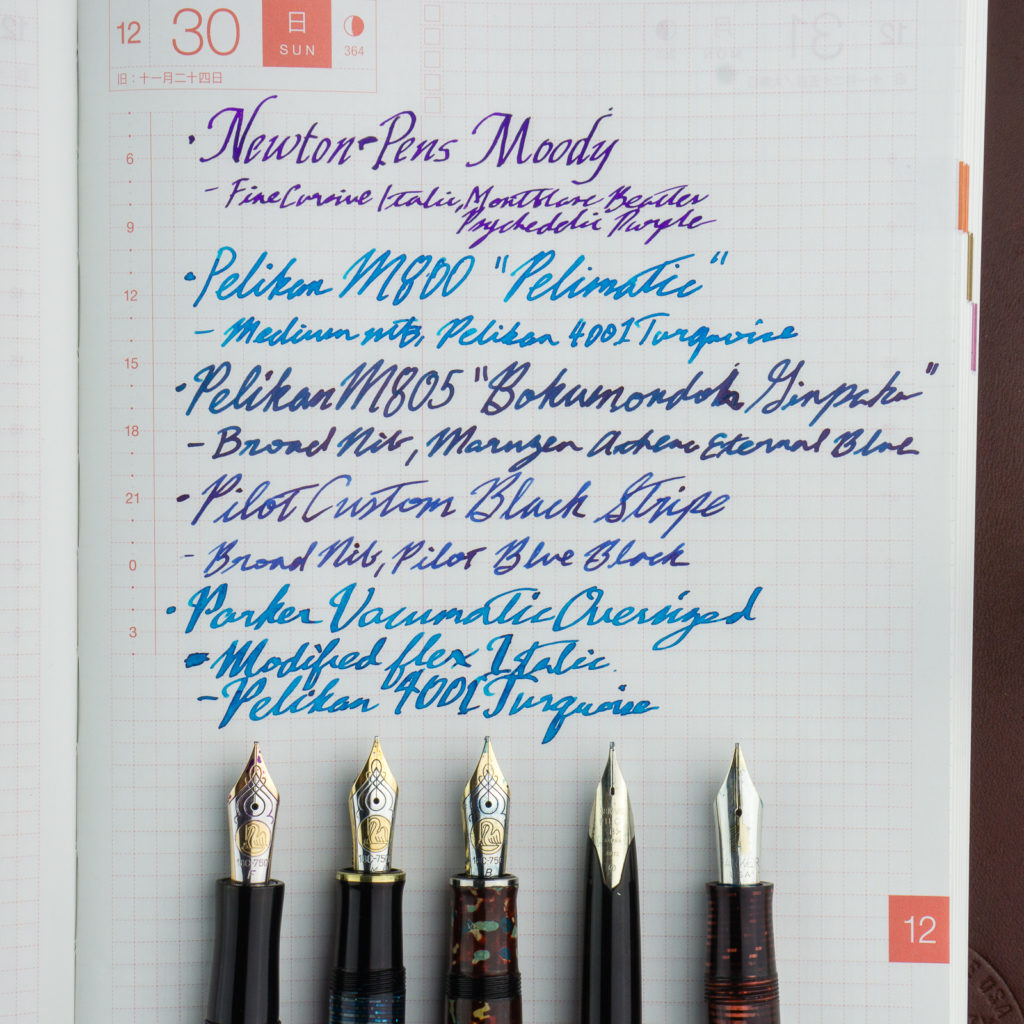
Franz: Another fantastic year has come and gone and 2018 has been an interesting year for me in terms of refining my pen focus. I believe I can categorize this year as both the Custom/One-Off Exploration, and the Vintage Search/Education type. I’ve actually bought less pens this year against any other year however it has been more deliberate and selective. This may be an influence from Katherine. Haha!
And here are my Top 5 Pens for 2018. This isn’t my greatest pens of all time however these are the pens that have been acquired within the year and has been inked up ever since I got it. Also a quick note, one of my invaluable stationery finds for the year is the Musubi pen case (pictured above). This has been a daily carry case for me at work and it secures my pens well.
However, the biggest find for me in 2018 are my Pen Friends! I was lucky enough to be able to once again attend both the San Francisco and Los Angeles pen shows and was able to meet new people either just from the show or via online. The San Francisco Bay Pen Posse pen group has also grown and I’ve met great people whom I see at least once a month. I really love that there is an active pen group that is local to me as it lets me talk to like-minded people in this hobby. So here’s to 2019 for more pen adventures, more learnings, and more fun! Thank you for your readership dear friends!
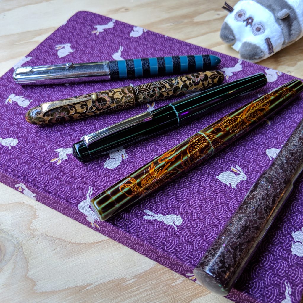
Katherine: It’s been a crazy year for me — both personally and in terms of pens. In 2018 I discovered a couple new brands and makers (a post about this to follow!) and hoarded acquired more pens than was probably responsible. Whoops.
For my top 5 I’ve chosen a mix of both interesting and super-functional pens: Nakaya ao-tamenuri decapod mini, Japanese vintage (kamakura-bori), Nakaya heki-tamenuri dragon thingy, Parker 51 with ishime by Bokumondoh & Stylo Art Saiun-nuri.
All of them are reliable and solid writers, but honestly some are more practical than others. The Saiun-nuri sports a fantastic PO nib that’s great for my small handwriting and all sorts of paper. On the other end of the spectrum, the carved floral pen is a lever filler, a decent writer but not a pen I’d choose to EDC any time soon. (Though some of that is due to how uncommon it is, I’ve never seen another one like it… nor has anyone I know)
They’re also from a variety of sources, which adds to the fun. The Dragon Nakaya was from my July trip to Singapore for the Aesthetic Bay Nakaya fair. The floral kamakura-bori was muled from LA by a friend who sent me a picture of a dealer’s case, which I zoomed in on and fell in love, and Paypaled them the money… all while brushing my teeth. The funniest story is the Ao Decapod Mini’s — it had been a grail pen of mine for a while, and one day I woke up to a message “This is really silly, but I think I’ve had your grail pen in a drawer all this time, do you want it?” (Clearly, the answer was YES OMG HOW MUCH DO YOU WANT FOR IT… then I ran around my parents house squeeing for a while while my brother’s corgi chased me. Yep, that’s my life.)
I’m excited to see what 2019 brings, and how my hoard evolves! And, I think it goes without saying, if you happen to find a decapod mini in your drawer and want to send it to a new home, you know how to reach me! ♥
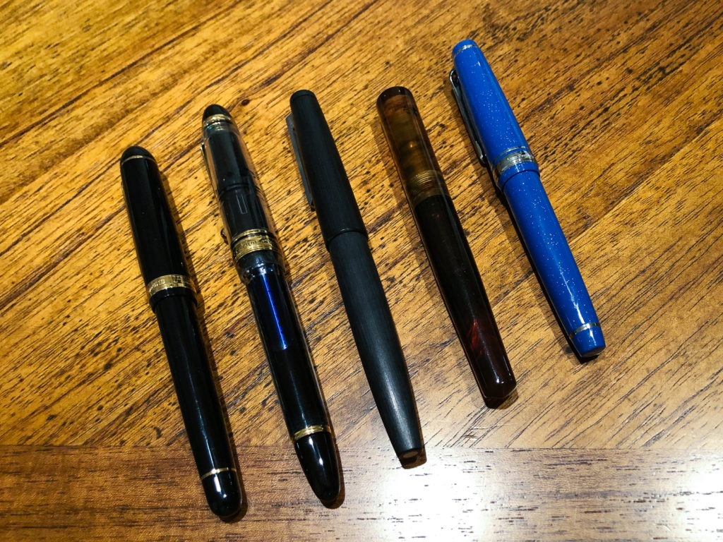
Pam: 2018 was a year of big changes for me, which included in less acquisitions (darn adulting!) and exploring what was already in my collection. At least, that’s what my top 5 pens are reflecting to me as we wrap up 2018.
Pilot Custom 823, F nib. I haven’t explored Pilots more expensive pens despite my love of the Pilot Prera. I have become a bit addicted to using this pen when it comes to a writing experience. It’s such a comfortable and smooth writer. It’s also my first vac! Now, if only I could find it’s one true ink pairing…
Lamy 2000, needlepoint grind by Mottishaw. An oldie but a goodie. You know you love a pen when you part with it only to buy it again. I parted with my original Lamy 2000 with the EF nib to a friend who loved it more than I did, only to miss it. I was fortunate enough to find someone at the SF pen show who was willing to part with the needlepoint Lamy 2000 that I coveted since the 2017 SF pen show. It was fated! Yes, I absolutely inked it with Sailor Yama-dori.
Sailor Blue Cosmos, MF nib is a bit of a surprise to me in terms of how much I enjoyed writing with the pen despite it’s broader, relatively speaking, nib size. It is currently paired with my new blue obsession, Iroshizuku Tsuya-Kusa. I can’t get enough of this warm blue which reminds me of bright summer skies. The MF nib shows off the color beautifully. This is my favorite pen and ink pairing in 2018.
Platinum 3776, UEF nib was a gift by the infamous Thomas Hall who is also known for his tiny “hantwriting.” From one tiny handwriting person to another, I am so grateful for this pen. It has been inked with Pilot Blue Black, my ode to Thomas Hall himself. Platinum is a brand that I was introduced to through Katherine who has a bit of a Nakaya obsession and now, I definitely understand why so many love the Platinum nibs as much as they do. I greatly appreciate how different the nibs of the big 3 Japanese brands feel and how they distinguish themselves. I find that to be particularly true in the super fine and extra fine sized nibs. The difference may appear to be minute, but when nib hits the paper, it’s a whole new world.
Brute Force Pequeno with Montblanc 144 nib became one of my favorite SF pen show memories this year and resulted in one of my favorite pens of 2018. I loved the body of the Pequeno but found the standard nib to be lackluster. I really wanted to write with the Montblanc 144 nib more, but hated the skinny body. Claire came to my rescue by notifying me that the 144 nib would fit a Jowo housing if I could acquire one. The hunt was on at the SF pen show! It resulted in trips down memory lane for both Troy and me as I showed him the new improved Pequeno. I paired with with Sailor Rikyu-cha because the broader, wetter Montblanc nib showed off the green-brown color so well. I am still intrigued and mesmerized with this ink color.
2018 was the year of me getting over the Sailor limited edition FOMO. It was a tough year for resisting temptation! It also is making me reconsider parts of my collection that I don’t use out of fear of losing or damaging the pen, particularly when it comes to the vintage fountain pens. In 2019, we are going to fix that! I am going to start rotating in my vintage collection and continue to fine tune my collection. To more inky and pen adventures in the upcoming year!
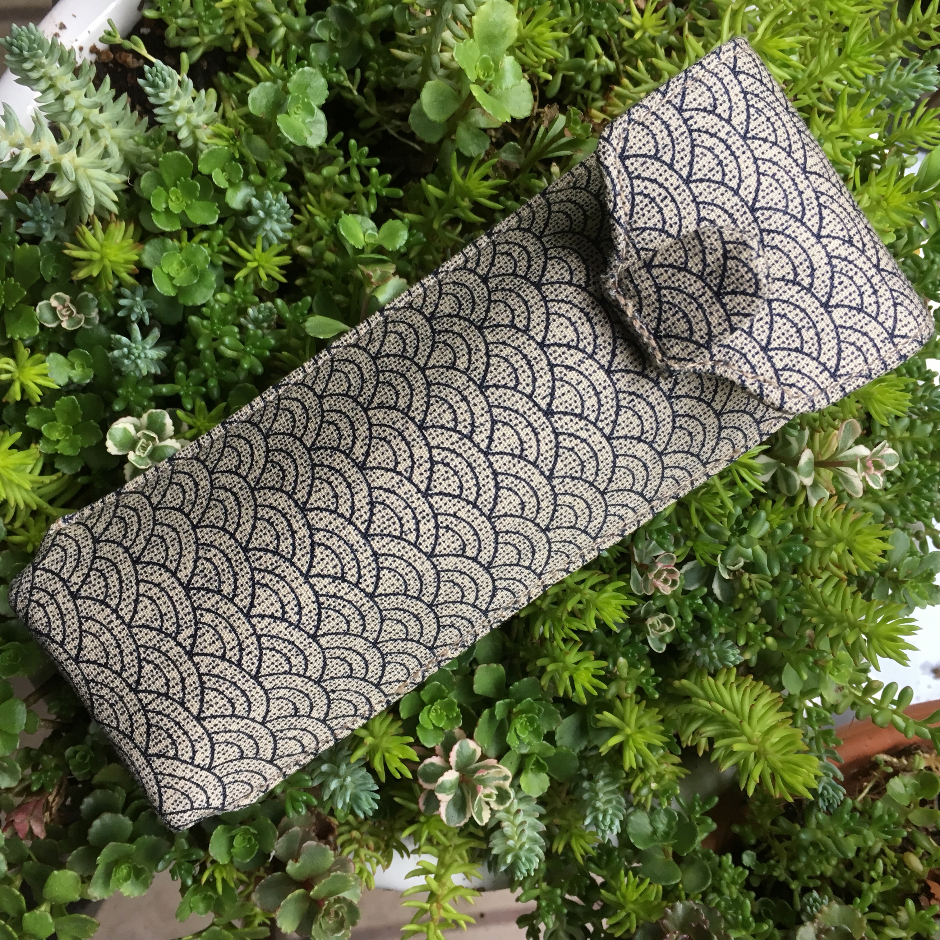
Edit 2 (July 29, 2018): The Musubi divider is here! It’s an easy removable strip in fabric that matches the case and slides in for the length of your pen. No more touching! New pictures to come.
Atelier Musubi is known for their handmade Tomoe River diaries. They recently released these two pen cases in two sizes, a large and a small. I bought a large for myself, and a smaller one for my mom for mother’s day (ssssh — good thing I know she doesn’t read any blogs!).
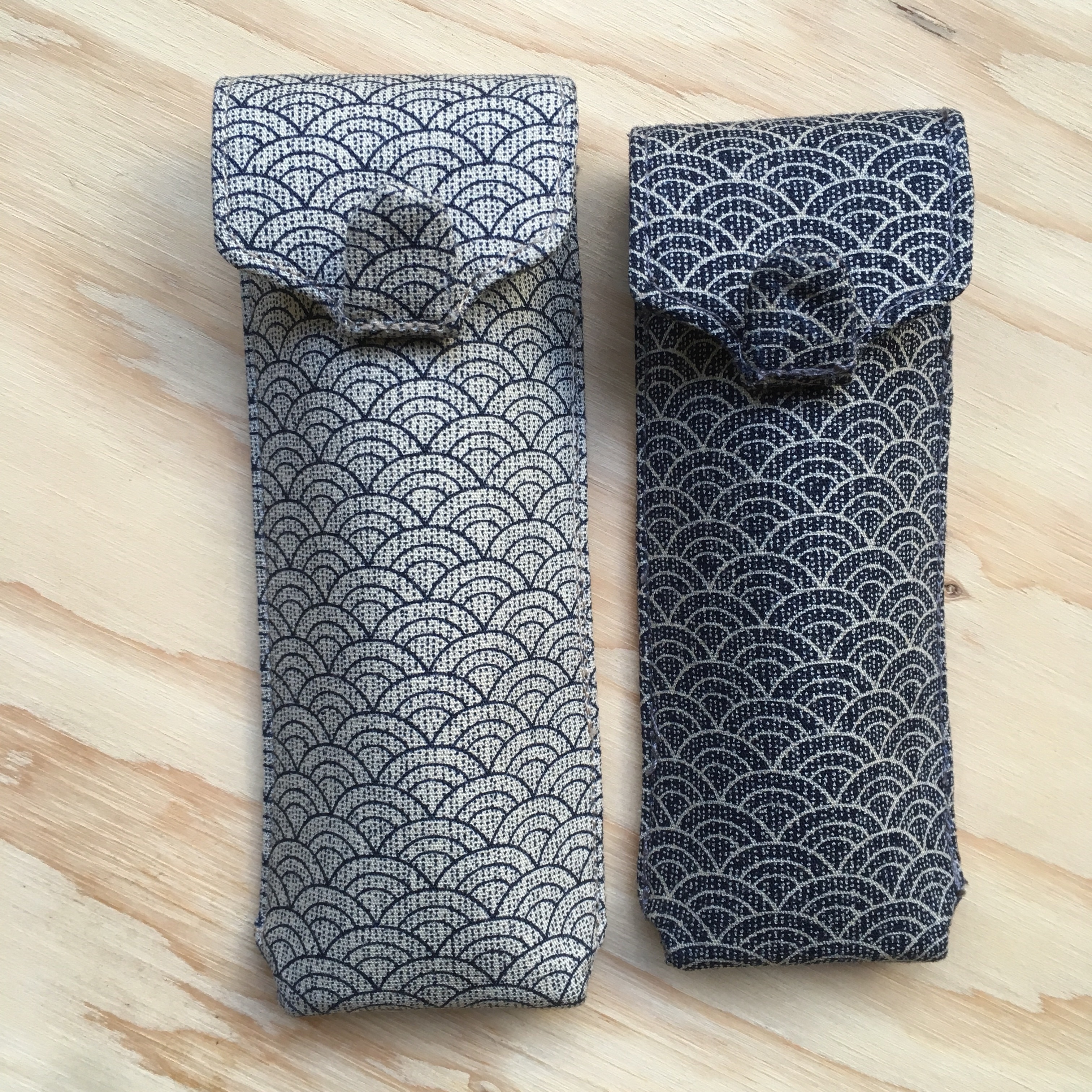
True to the Musubi description, the small one is a great size for short pens. The long, perfect for longer pens. The long comfortably fits Nakaya Decapods, a Newton Shinobi, an old style Paragon and my Montblanc 146. I’ve only had this for a couple days, so I haven’t tried too many pens!
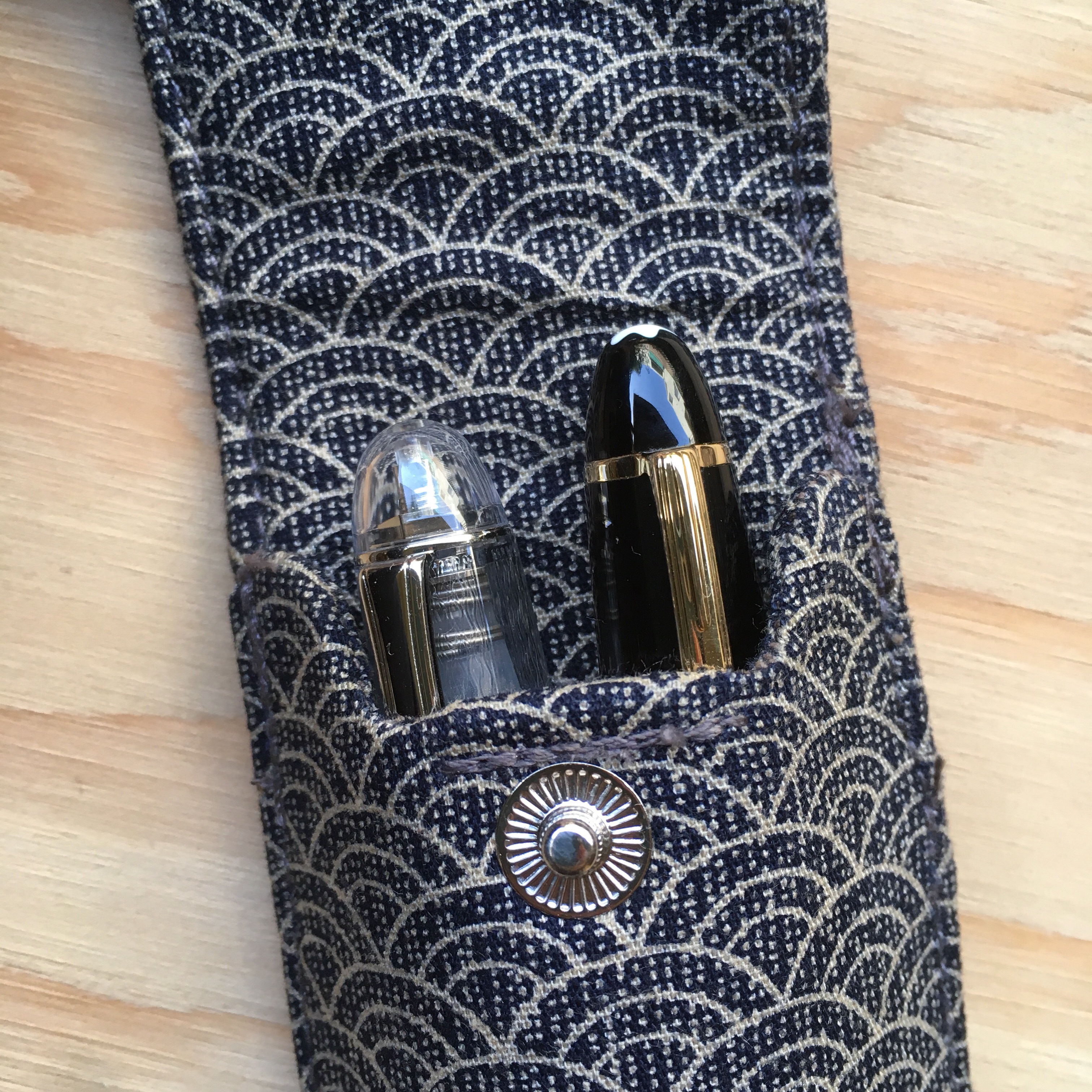
I haven’t tried too many pens in either case yet, but most of my pens fit in the shorter size, but some, like the Montblanc 146, fit but make the flap slightly harder to close. The 3776 fits perfectly in the short case though!
Overall, I really like the case, it’s very well made and seems very sturdy. My one complaint is that the pens do touch each other in the case (no longer an issue, see my edit at the top of the review). The tab at the top keeps the two pens from touching at the top. In the small size, fatter pens (including Piccolos and the caps of the 3776 and MB 146) they do rub as you slide pens in and out. In the larger case, the above pens don’t rub, but do clatter against each other if you shake the case. I stuffed a small piece of cotton at the bottom of the long case with a bump in the middle, and it seems to hold the pens apart at the bottom too. (They might still rub a little, but at least they don’t clatter against each other when I shake the case)
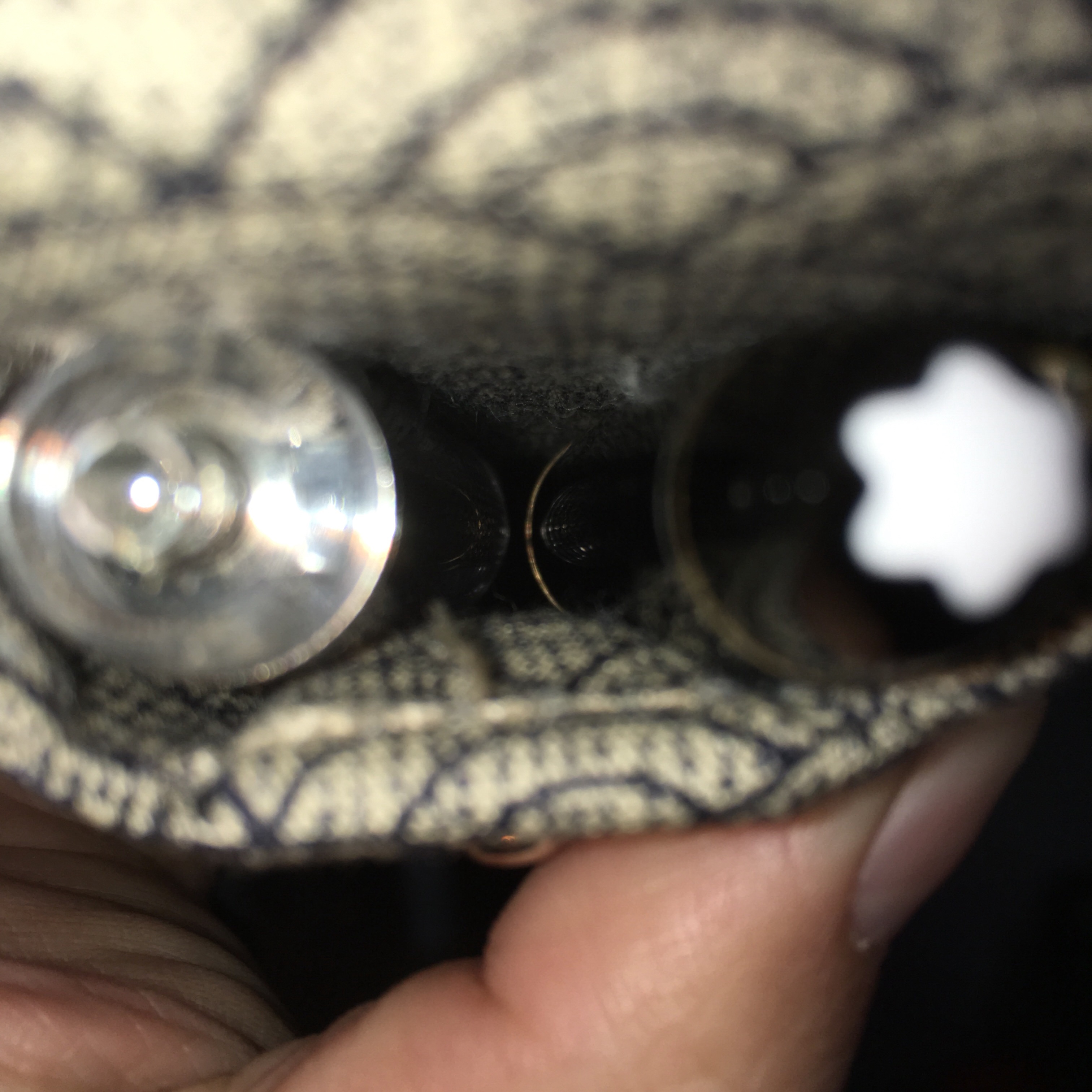
It’s hard to photograph, but that’s a 3776 and Montblanc 146 in a large case… probably touching. (So use the supplied divider if you care!)
TLDR: Great cases, but not for you if you want a healthy space between all your pens at all times.
Edit: Musubi is rethinking their design to add a separator between pens. Keep an eye out on their social media for updates!
Hand Over That Pen, please!
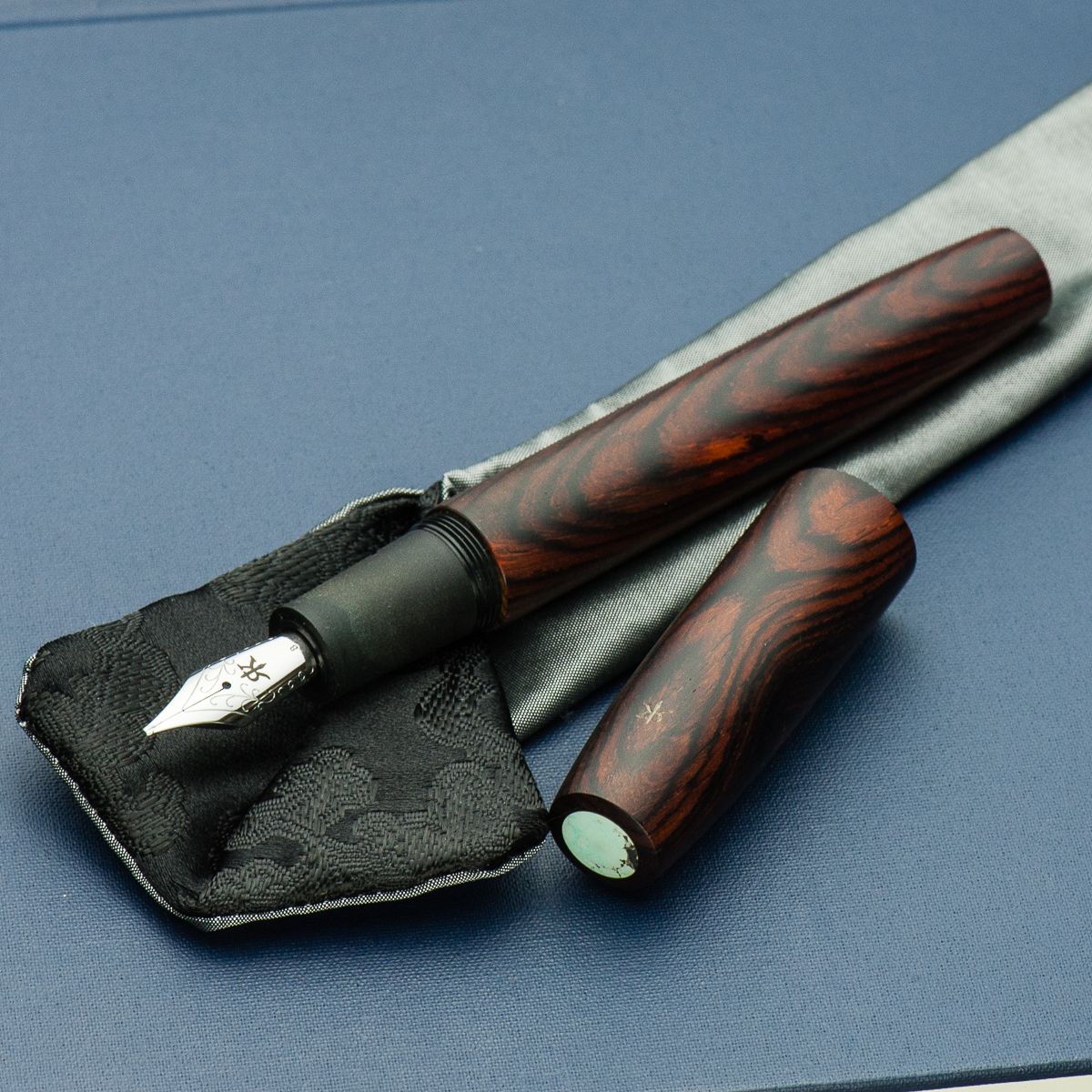
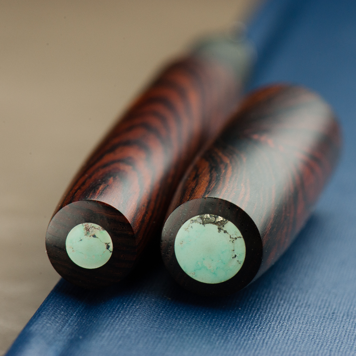
Katherine: I love the materials and finish of this pen. The warm, rich wood paired with a turquoise finial is a beautifully organic pairing! However, I think the pens proportions are a weeee bit off? The barrel looks a little too long to me. But, I do tend to prefer stubbier pens.
Pam: This is one big pen. Even for someone who loves the Pelikan M800 and the Sailor King of Pen. The craftsmanship on this pen is obvious. From the warm and super smooth finish of the wood, the subtly engraved Ryan Krusac logo, and the turquoise inset, you can see the care that has been put into this pen. It’s a work of art.
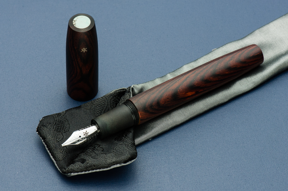
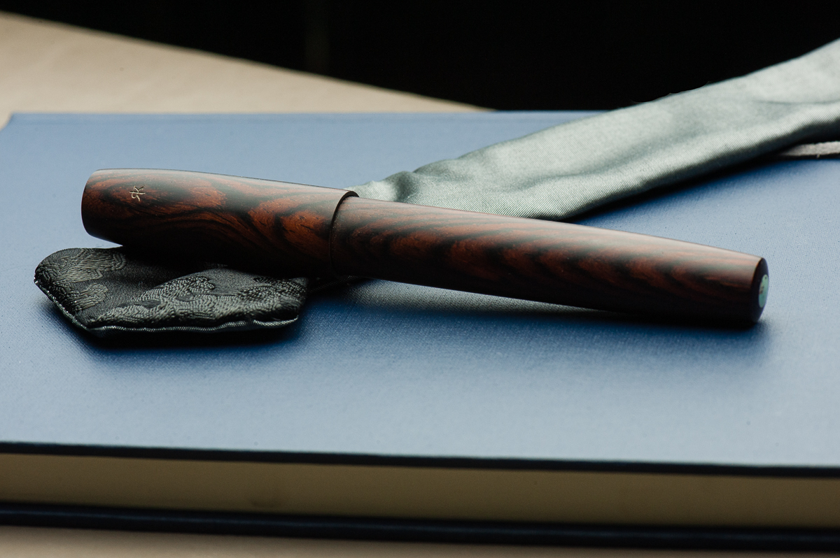
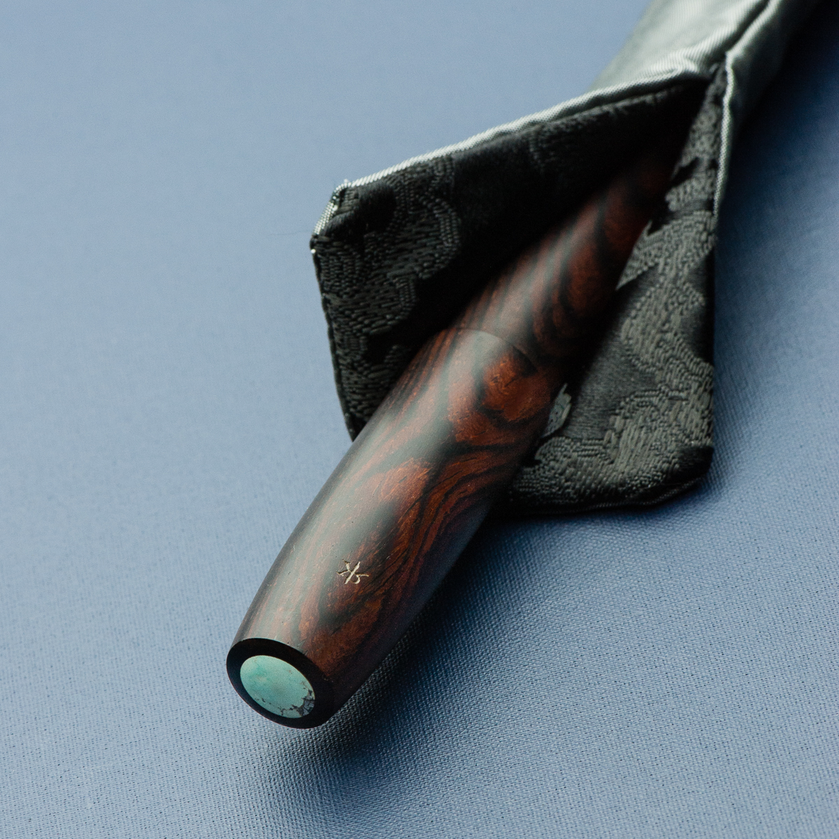
Franz: The Legend L-16 is quite impressive in the hand as it is the largest in Ryan Krusac’s Legend pen line. The L-16 denotes that the barrel’s diameter is 16mm and then another size is the L-14 which is 14mm. Ryan had also announced the L-15 size (15mm) but that is still unavailable at the time of this review. The Legend pen can either be ordered from his website or at any pen show that he attends. I happen to have snagged this Legend in Cocobolo from Ryan at the 2017 Atlanta Pen Show. The dark Cocobolo finish is complemented by the turquoise inlays on the cap and barrel.
Being a wood pen, the Legend gets warmer while writing as well as the ebonite section. I must mention that Ryan pays attention to details with each pen he creates. When you are writing with the Legend, the best looking grain of the wood faces you as you write and also, the cap and barrel aligns perfectly each time. Smart move to make it a single thread!

The Business End
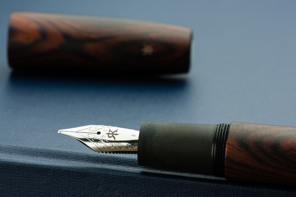
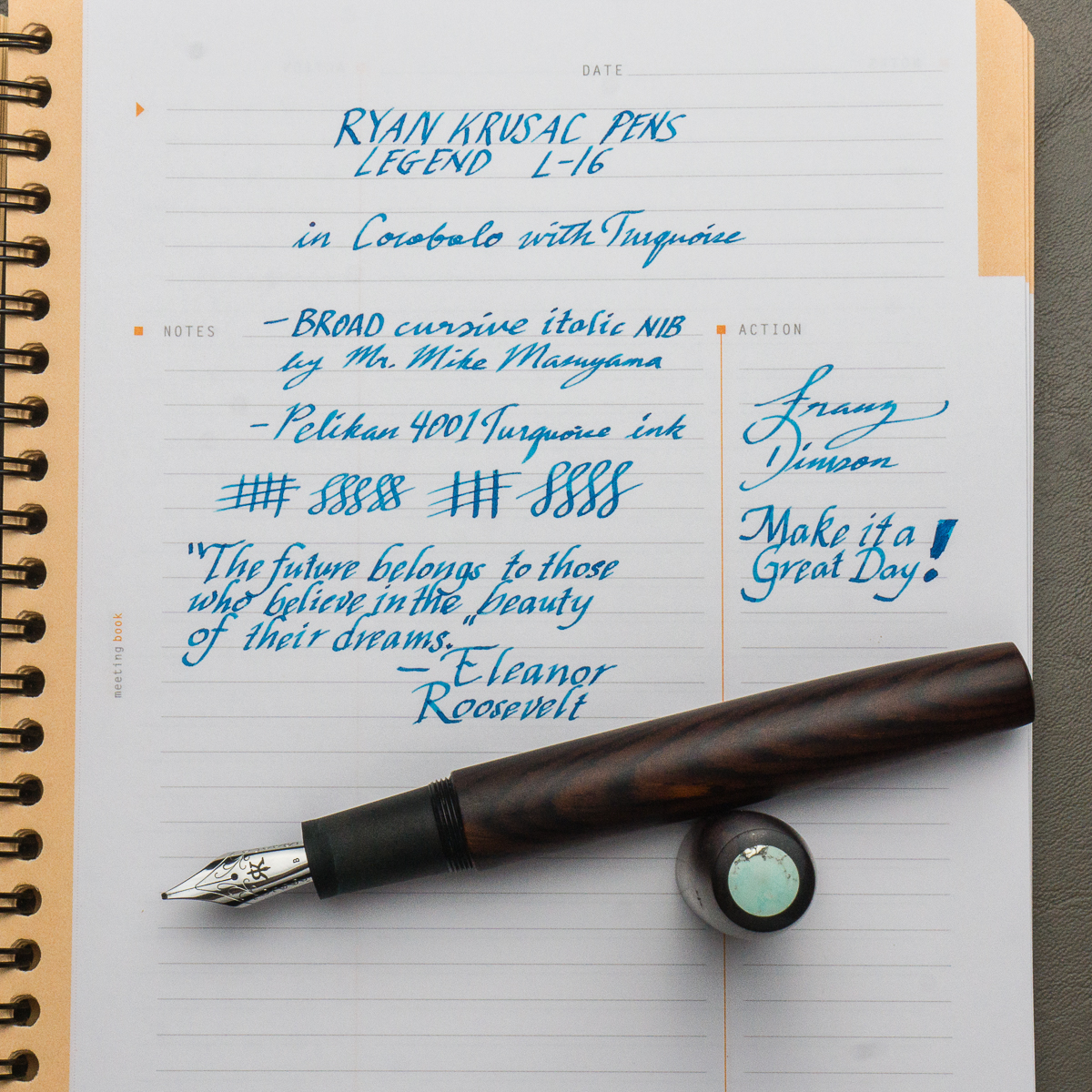
Katherine: The pen fits a Jowo #6 nib. The nib on this one had a nice BCI, unlike many of Franz’s other BCIs, this one had a little bit of tooth. It’s unlike most of the Masuyama grinds I’ve used, but it was a perfectly usable nib with some character. Would borrow (from Franz) again!
Pam: It’s a great CI. I find the nib to be crisp and wet. It is pretty toothy, but I greatly appreciate the feedback. It makes for a unique writing experience. It did show off the sheen of Pelikan Turquoise fantastically.
Franz: When you buy a pen from Ryan, you have a choice of steel nibs or 18-karat gold nibs. I opted for a broad steel nib with the intention of having it ground by Mr. Mike Masuyama at the same pen show. Needless to say, the juicy broad nib was transformed into a crisp, juicy cursive italic. The broad nib can go through ink quite fast but the included standard international cartridge/converter does its job as it should. Also, I really love Ryan’s logo on the nib as it makes a “generic” Jowo nib match the pen.
Write It Up
Katherine: This pen is quite long for me… but surprisingly light. As a result, it’s a very comfortable pen for me to write with despite its size.
Pam: I am surprised how comfortable I found this pen. The length and width/girth of the pen is similar to the Sailor King of Pen. The Krusac is lighter for me. Due to the width of the pen, it’s quite comfortable to hold in the tripod grip. However, for those with the iron fist grip, the step and the threads are right below where I would place my thumb. No thread imprints for the win.
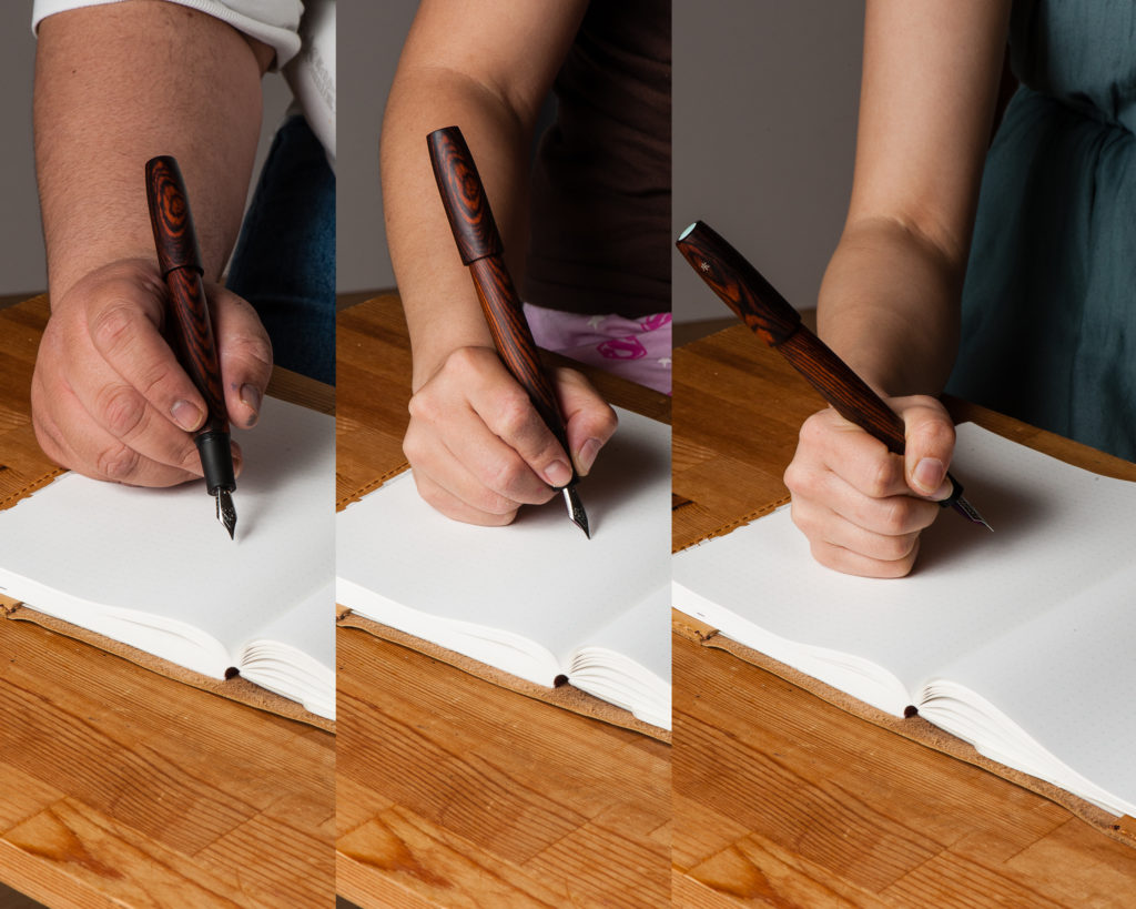
Franz: The Legend fits my hand very well and my journaling of about 15 minutes was very enjoyable. We may have taken a hand comparison photo of the pen with the cap posted but neither of us wrote in that mode. Reason being? I don’t believe this pen was made to be posted as the cap threads can mar the wood finish. Also, the cap only touches less than half an inch of the barrel which makes for a very long unwieldy pen, and the cap is unsecured and can wiggle off while writing. Unposted, this pen is plenty long even for my bear paw.
EDC-ness
Katherine: The lack of a clip or rollstop makes this one a bit of a danger to EDC… I imagine it doesn’t do well when hitting the ground. (Don’t worry Franz, I didn’t test that!) Additionally, it takes a full three turns to uncap — so I found this pen was a suboptimal EDC. But a lovely home desk-living pen!
Pam: Honestly, it didn’t occur to me to try out the EDC-ness of this pen other than have it live in the Nock Sinclair. My hesitation was that it didn’t have a clip and I can’t imagine dropping this pen out of my coat pocket, especially since it’s not mine to drop. This is a “savor the journaling moment” pen where one would enjoy the finer things and slower moments in life. Keep it at the desk or in a case is my recommendation.
Franz: I do echo the ladies above that the Legend pen being clipless is a risk for ROFY. (Rolling-On-Floor-Yikes!) So I’m a bit more conscious when I am using this pen at work and avoid walking around with it. I do enjoy writing with it while I’m at my desk during a call or something else that doesn’t require me to move around.
And because the pen is single-threaded to maintain the cap and barrel alignment, the trade-off is taking 3 full turns to uncap for use. Not really the best for on-the-go purposes.
Final Grip-ping Impressions
Katherine: If the proportions of this pen were a little bit different, I think this would be love. But, thankfully for my wallet, they’re not, and while it’s a nice pen, it’s not aesthetically balanced to me. Despite that though, it’s very usable even for my small hands — light and comfortable!
Pam: If you appreciate the craftsmanship and the beauty of natural materials like wood, I would highly recommend this pen to you. For many, it’s a worthy grail pen to covet. If this pen is too big for you, the good news is that Ryan Krusac has other sizes available! Be sure to check Ryan Krusac out at your nearest pen show to see what works best for you.
Franz: As I started my review above, the Legend L-16 is an impressive pen — size-wise as well as aesthetics-wise. Anyone who is interested in this pen must try it out and see if it’s for you. Ryan is currently based in Georgia so he will always be at the Atlanta pen show but he travels to several U.S. pen shows including the Los Angeles pen show, and the San Francisco pen show.
One of the best parts of buying a pen from Ryan is that you get a handmade pen sleeve by his two daughters, Zoe and Sylvia. They even have their own handmade brand, zoia.co. The grey and black pen sleeve pictured above was included when I got the Legend in Atlanta.
What else can I say about the Legend L-16? I like it… a lot! So much that when Cary (Fountain Pen Day), and Ryan collaborated on a pen to raise funds for Shawn Newton, I jumped on the opportunity to get the FPD Legend pen in the L-16 size as well. The limited edition pen is made with Gaboon Ebony wood (pictures below).
Pen Comparisons
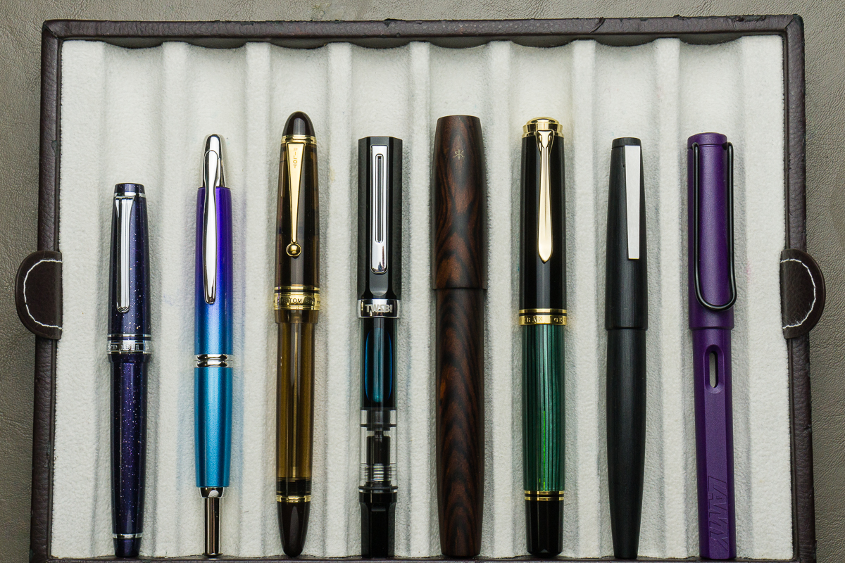
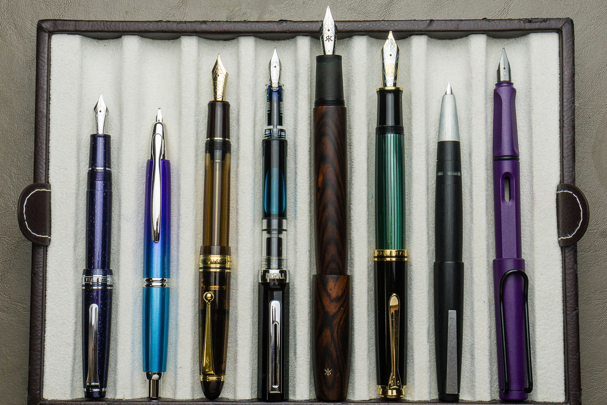
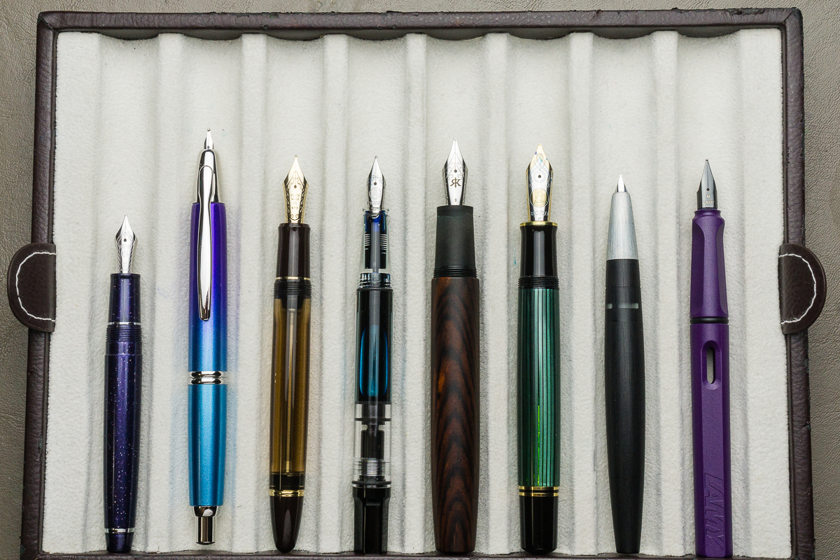
Pen Photos (click to enlarge)
Hello friends! Thank you for hanging in there and I hope that you’re enjoying my detailing of the San Francisco pen show. This is the continuation of my SF Pen Show Report – Part 1.
This carries on to the events on Saturday afternoon and evening. And ends on Sunday’s last day of the show. Enjoy!
Saturday, August 26 – Continuing on the Second Day
Planner Meetup – Special Event
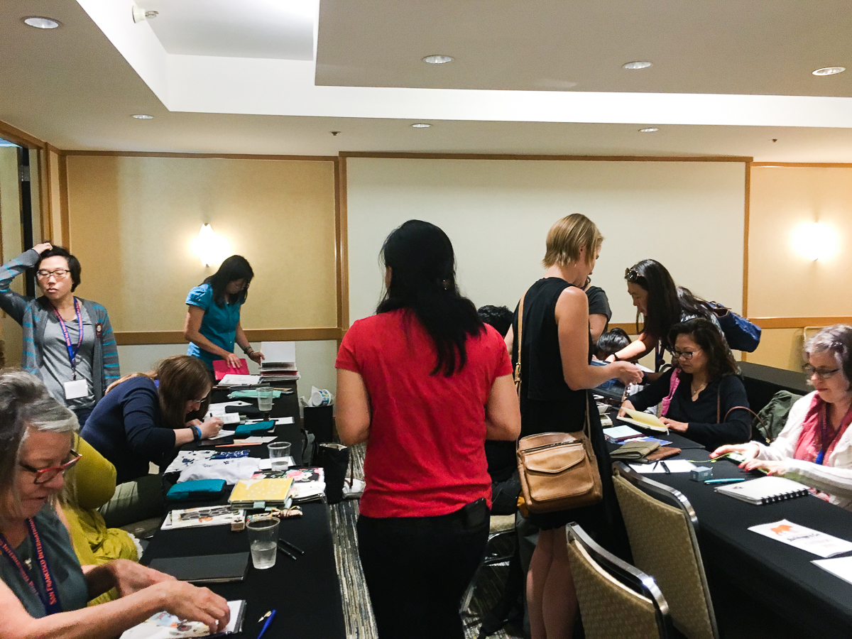
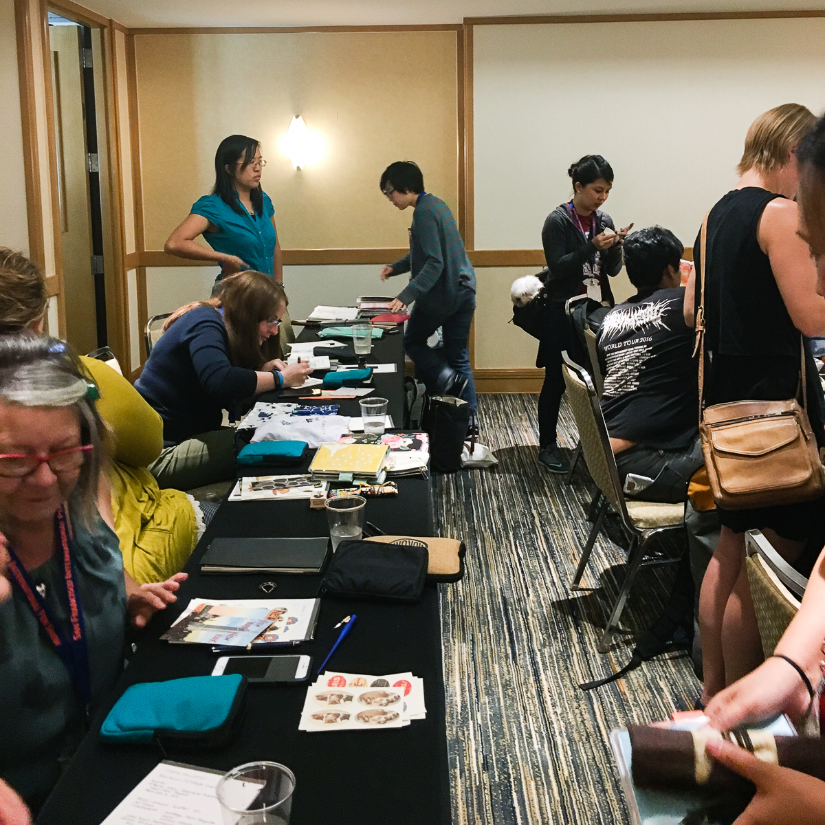
Around 1:00pm, Pam, Katherine, and Christina had once again hosted a planner meetup and had discussions with others on what they do to decorate, organize, and utilize their planners. There were some exchanges of stickers, washi tapes, and notebooks as well. Photos courtesy of Christina.
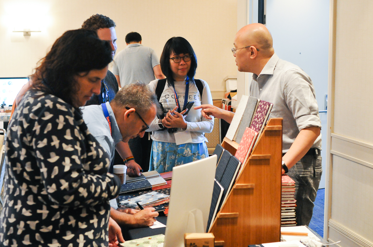
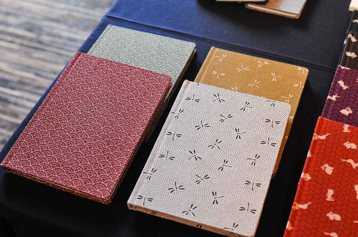
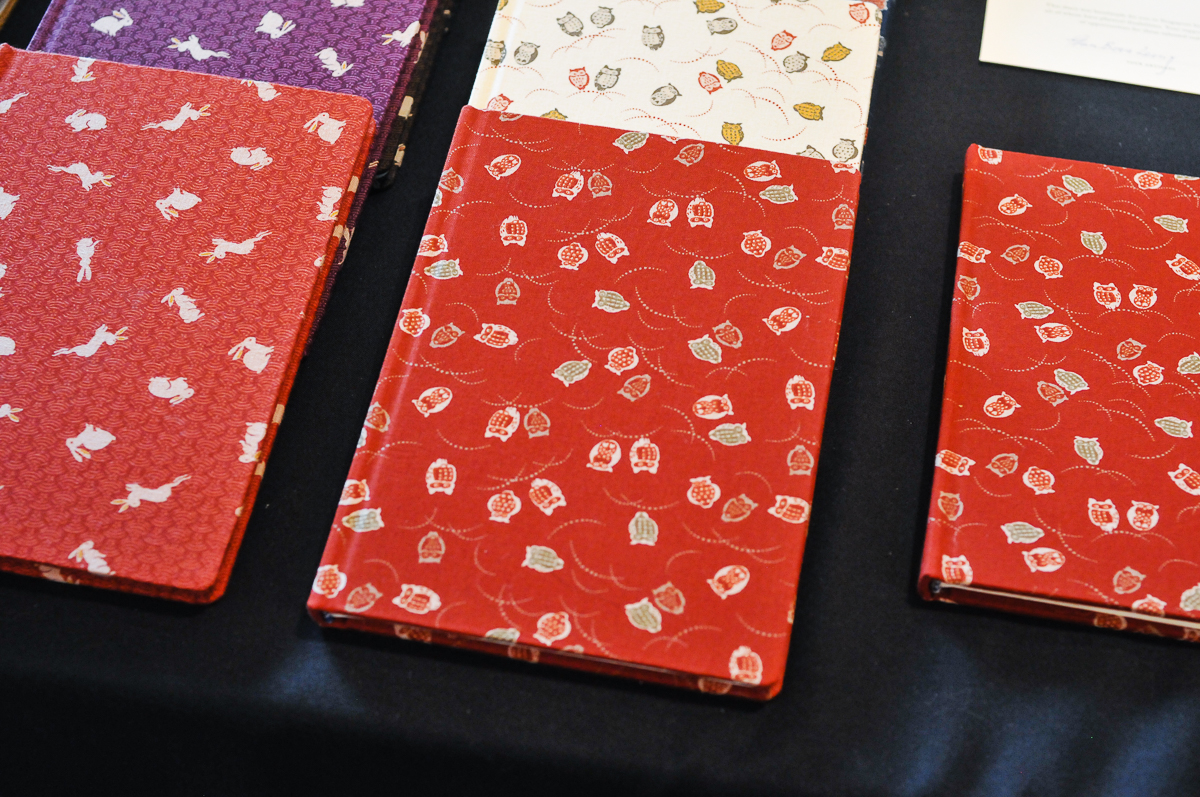
One of the vendors that were considered a big hit at the show was Atelier Musubi who traveled all the way from Singapore. Their beautiful journals are cloth bound, contains Tomoe River paper, and are handmade in Singapore. In addition, these journals are handmade by a person living with a physical disability.
Here’s Atelier Musubi’s table located in the Grand Salon and was visited by some artists that you may possibly know.
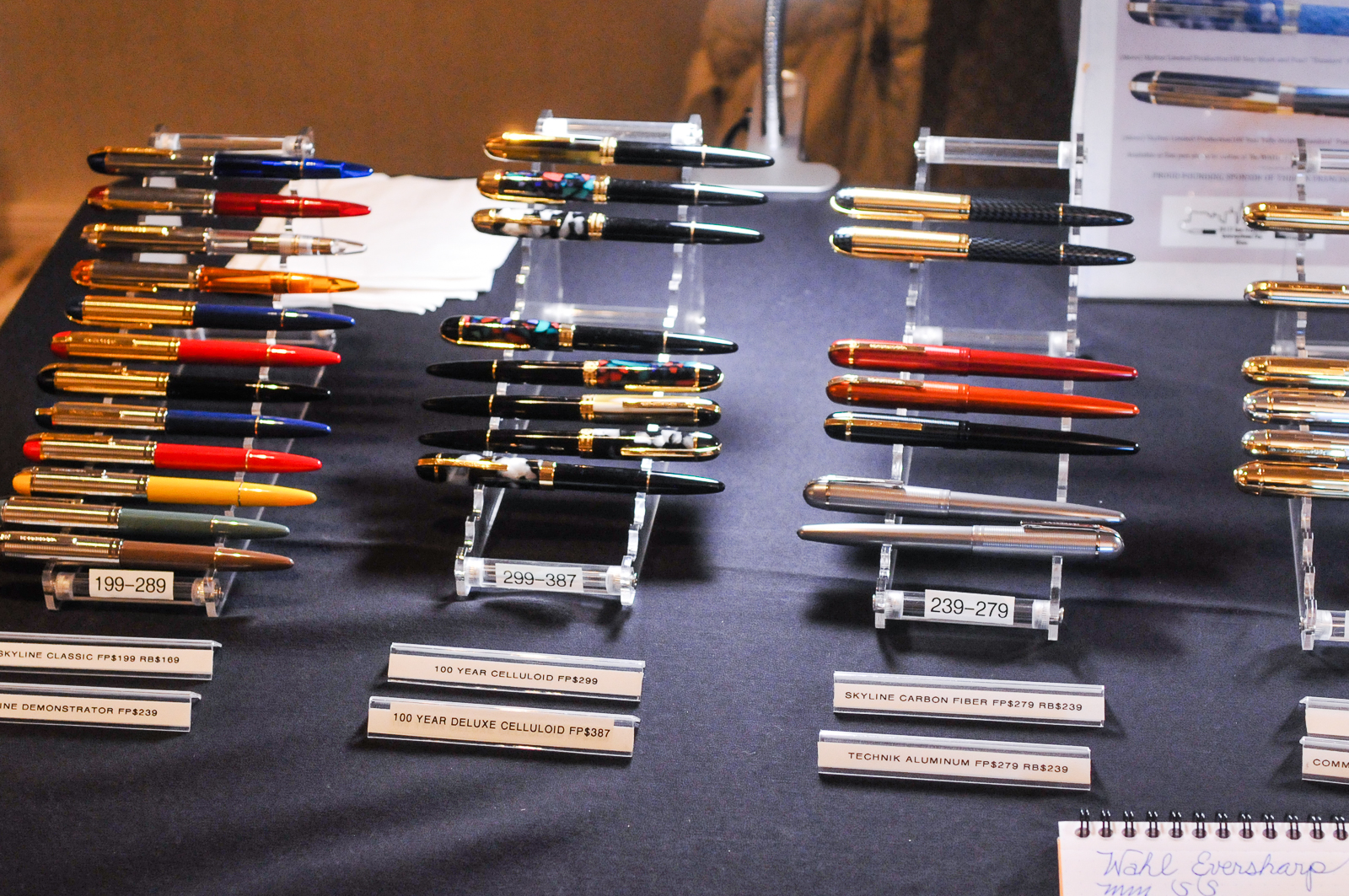
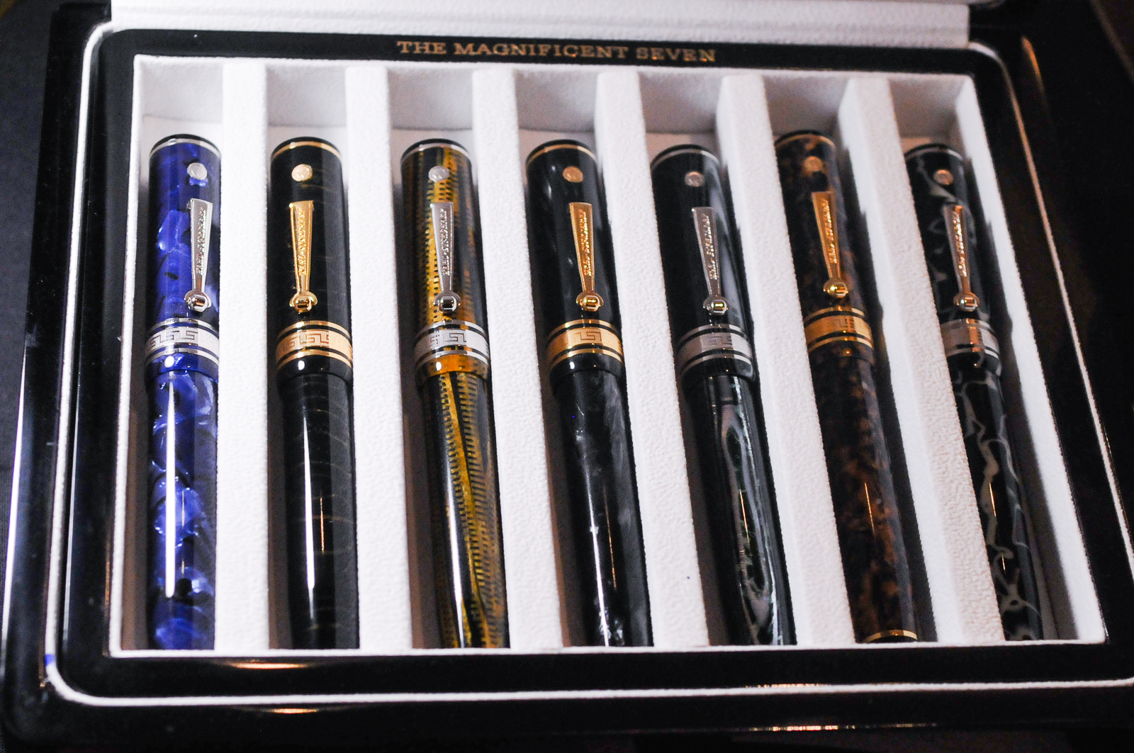
Within the same room, the table of the SF Pen Show principal sponsor, Wahl-Eversharp was there and were selling a lot of their Skyline pen models. Also displayed were the Magnificent Seven Decoband pens.
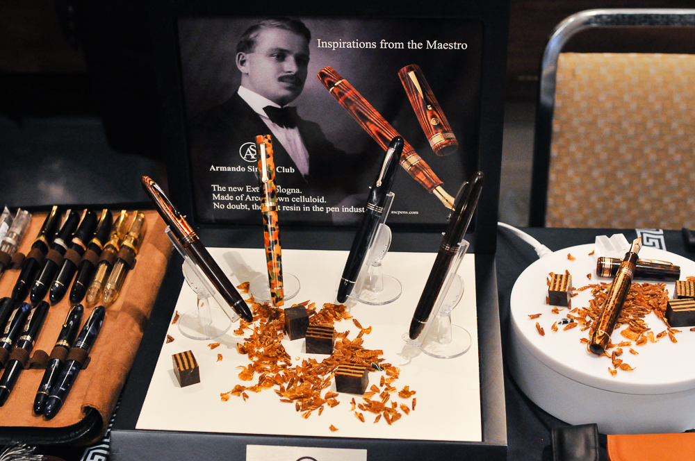
Right beside Wahl-Eversharp was the Armando Simoni Club (ASC) table. Pens and chocolates… mmm…
Pen World Magazine – Readers Choice Awards Ceremony
A first for the SF Pen Show, Pen World magazine presented a few of the Reader’s Choice Awards at the show. Editor-in-Chief Nicky Pessaroff presented the winners their awards below. Congratulations to all!
Pen Addict Meetup – Pen Dash
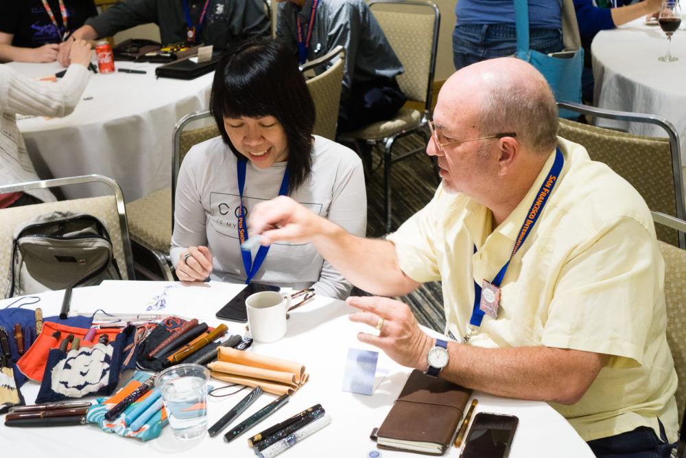
This year at the SF Pen Show, the Pen Addict Brad Dowdy, and Lisa Vanness of Vanness Pens tried a different type of meetup. In most meetups, people sit down, show their pens, get to know each other, and learn from each other. The Pen Dash is somewhat of the same concept except for the fact that every ten minutes the participants will have to stand up and proceed to another table with a different host or as what I referred to them as subject matter experts (SME). Brad made a write up of it on The Pen Addict.
I was able to do an Instagram Live Video and post it to my personal YouTube. Please forgive my blunder in the video and know that the first room DID follow directions to move tables. I just thought they were signaled to move right then. Ah, the hitches of live television. Haha!
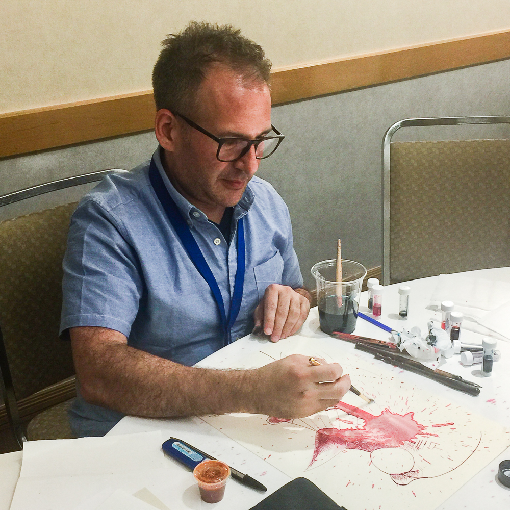
Here are photos I got to take before going live on Instagram.
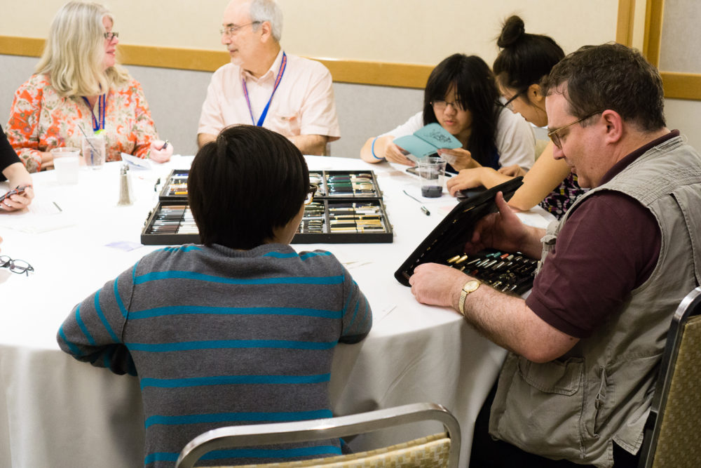
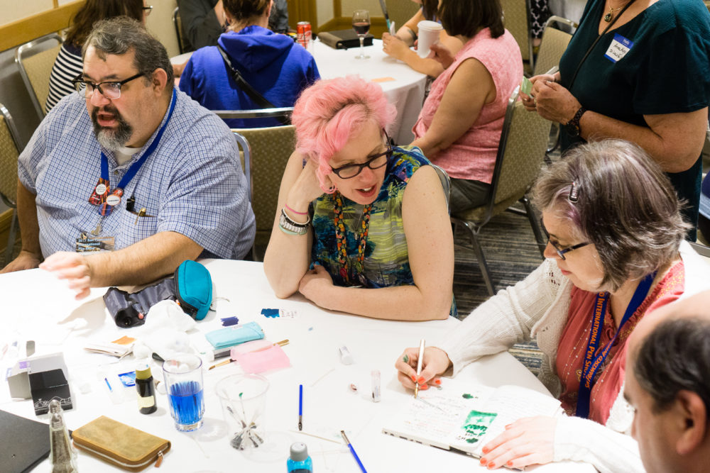
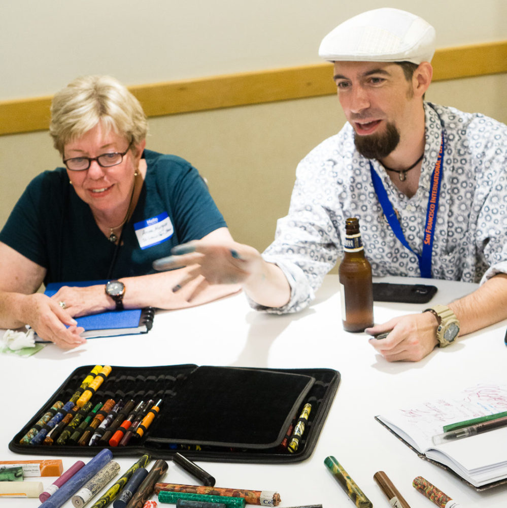
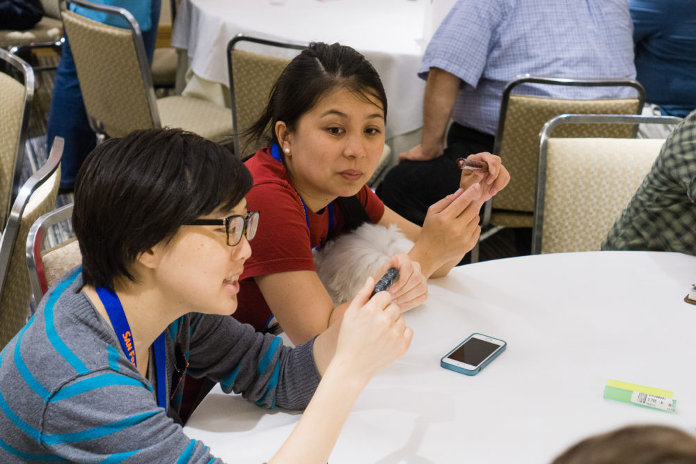
Susan Wirth Memorial
First, a sip of water, deep breath, and go.
As most of the pen community knows, the passing of Susan “Susie” Wirth earlier this year had left a great big hole in the pen show world. Anyone who knew her knows that it’s not a pen show without her. In 2012, she was one of the first five people I personally met in the pen world. This was way before I became part of the SF Bay Pen Posse.
My friend Rebecca Joyce got the chance to film Susie at the 2017 LA Pen Show. If you’re interested, here’s that very informative video.
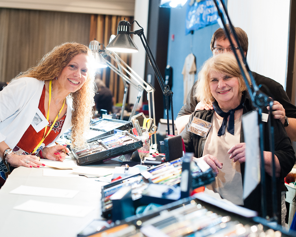

This was my first pen show to not see Susie’s table, to not see her face, to not smile and giggle as I saw her inky fingers, and to not hear her distinct voice. It felt weird to me and I’m sure to other people as well.
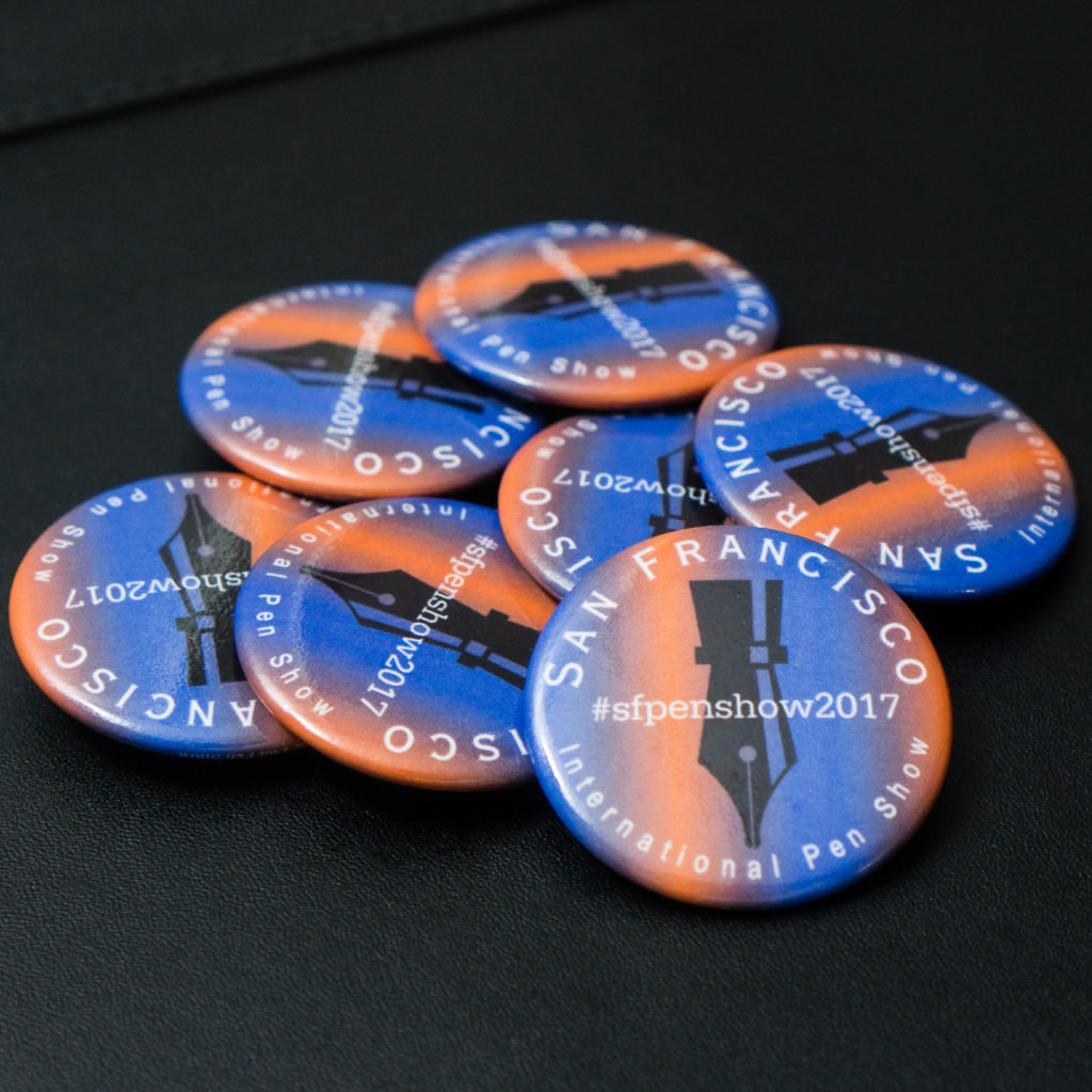
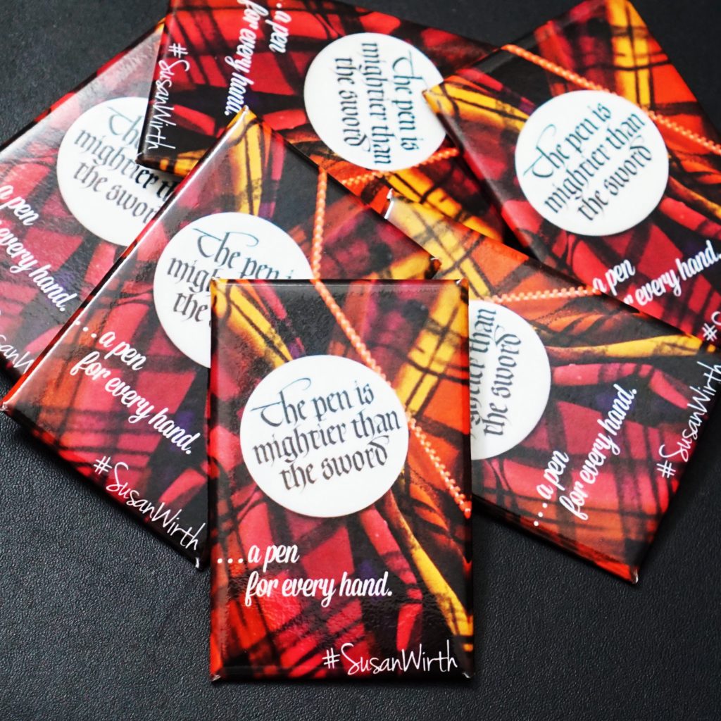
A week before the pen show, I decided to do something to honor Susie. I figured, what’s a small inexpensive thing that people appreciate at pen shows? Buttons! So I edited the picture I took of Susie’s identifiable shawl while she was wearing it and made it into a button. Saturday morning, I gave out these buttons to honor her. I told everyone, “This is her day!”. I’m sure everyone agreed.
I am thankful that the SF Pen Show Organizers allocated some time during Saturday evening to honor Susie.
I am also thankful to see John Martinson at this show. He worked with Susie at every pen show and has become a good friend to me. John brought some of Susie’s pens to show people and he also brought out Susie’s banner. I loved seeing it once again.
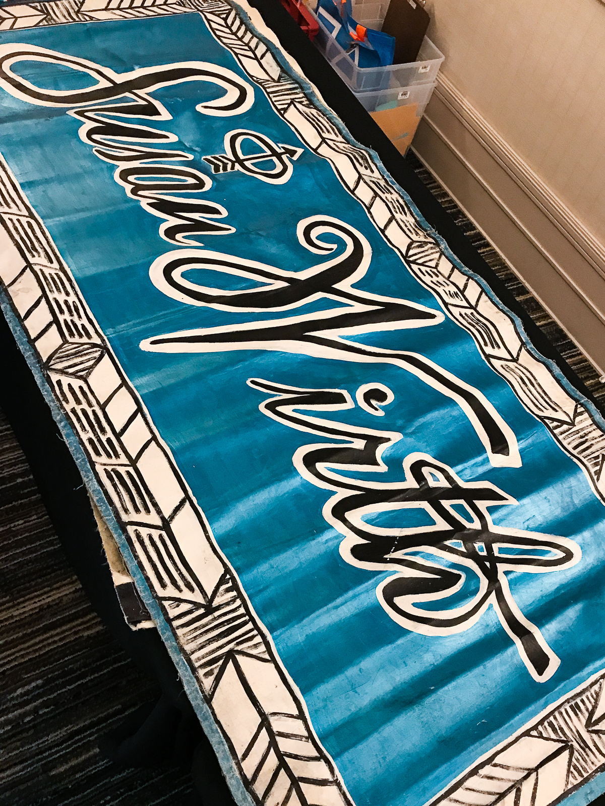
During the memorial, John M. spoke about Susie. He ended by saying that the best way to honor her memory is to share the love of pens, to write more letters, and share what an italic nib can do for one’s writing. Thanks John!
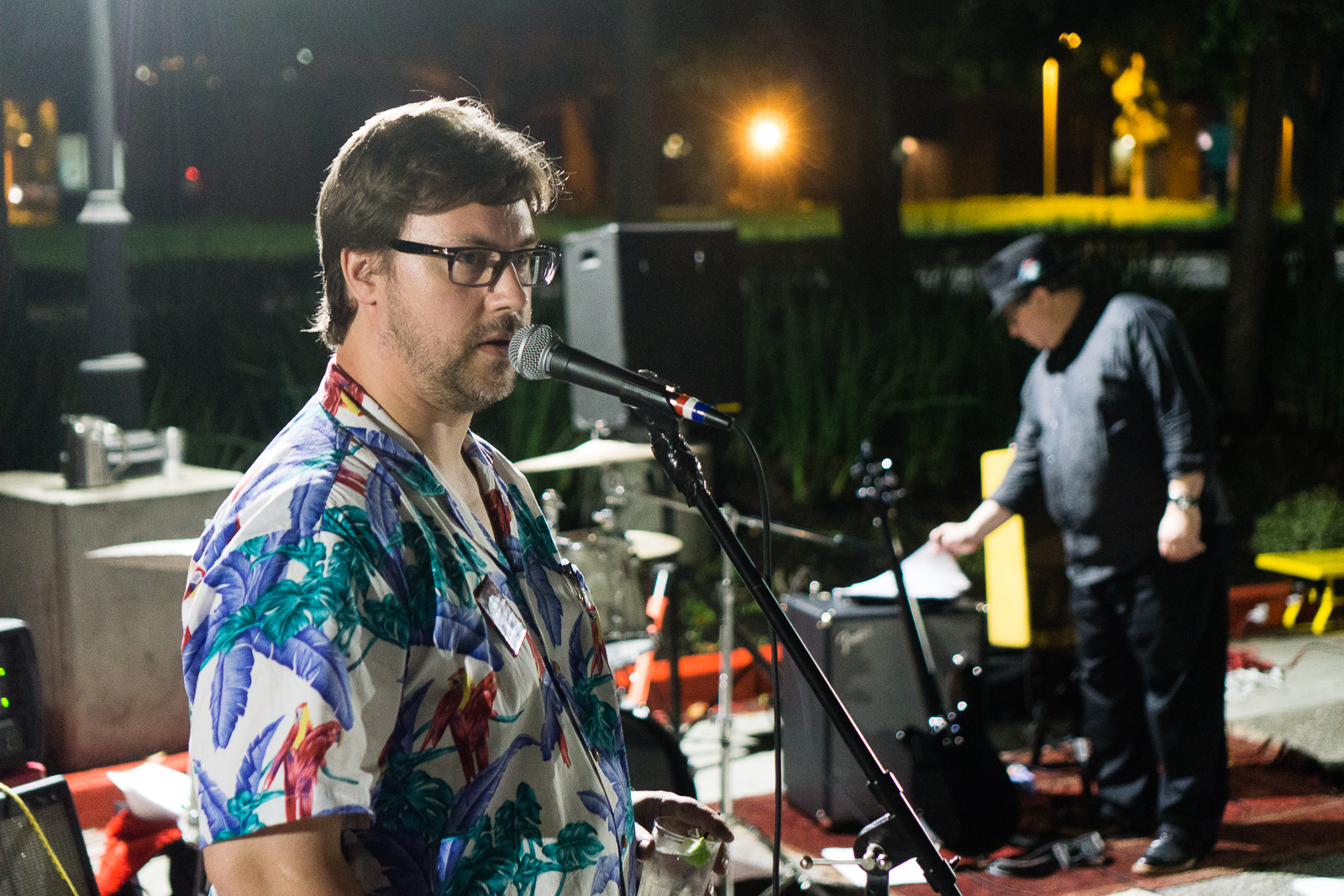
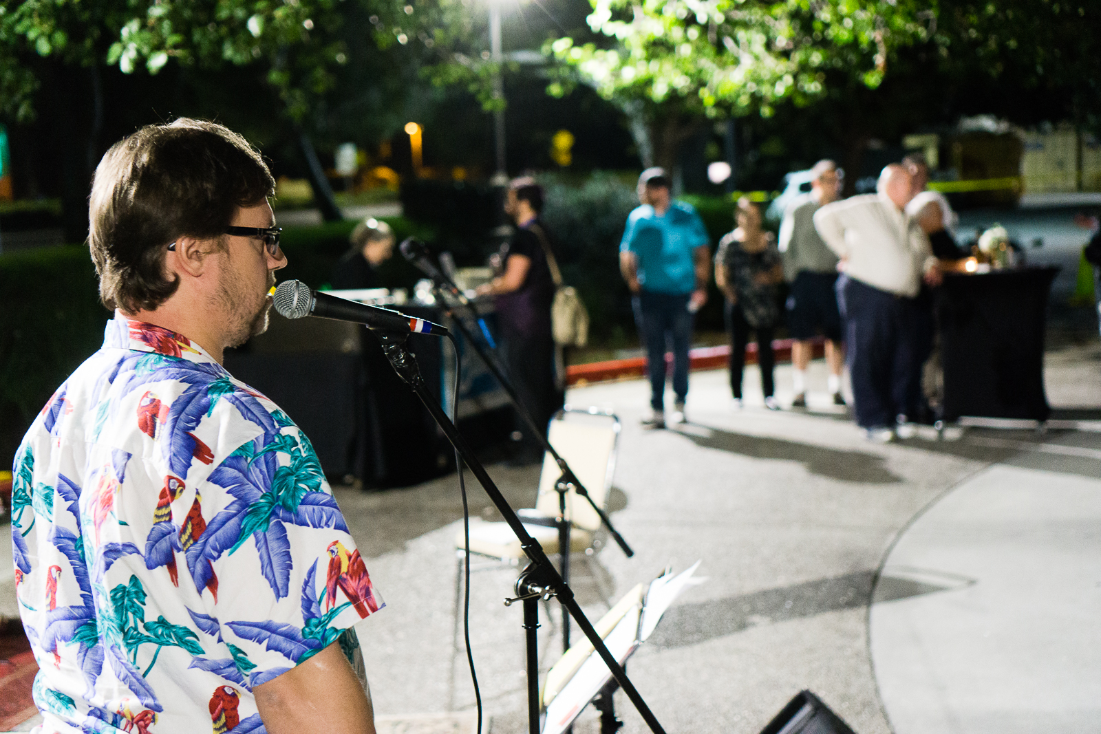
You were definitely missed Susie.
Groove Situation – Pen Show Concert
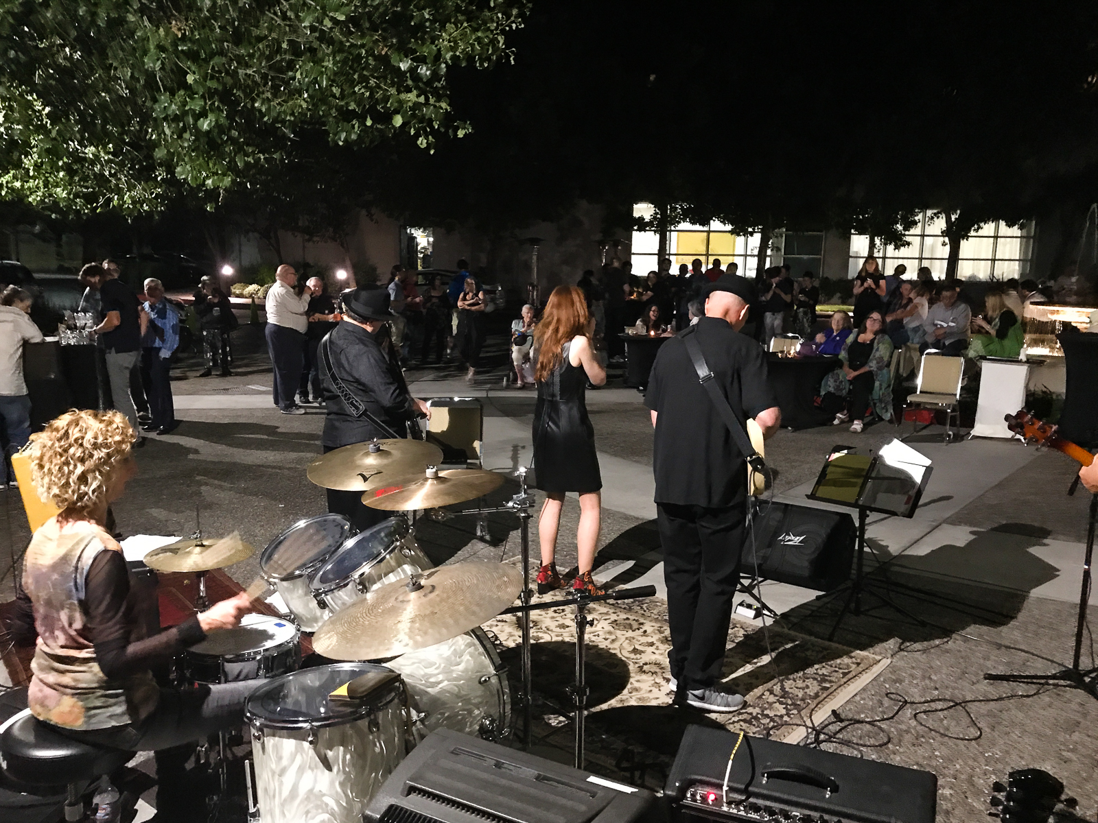
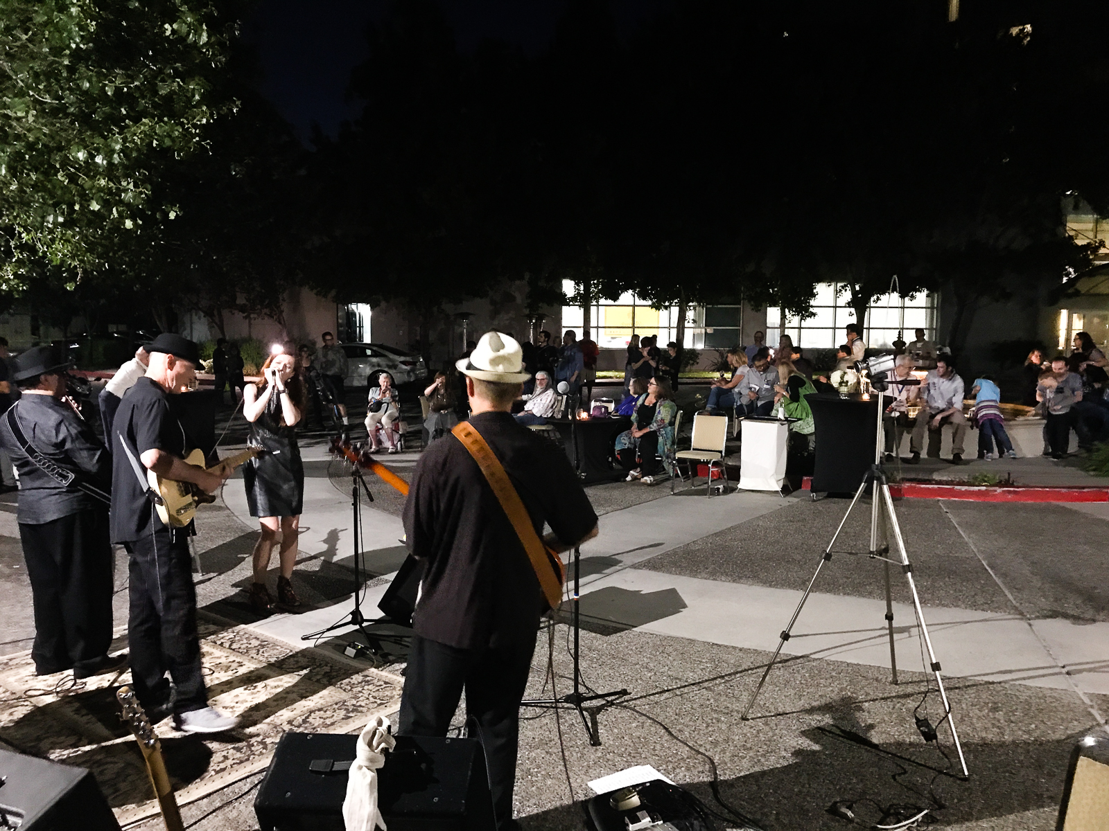
Each year, the show organizers gets a band and play a concert after the show. This year, due to the hotel renovations, the concert was held outside by the fountain. The band was different this year but their music, and song selection was still awesome. The band’s name is Groove Situation and their FaceBook page is here.
What’s pretty cool is that their bassist is Pen Posse’s very own, Jon R.
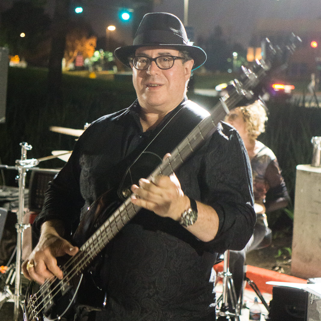
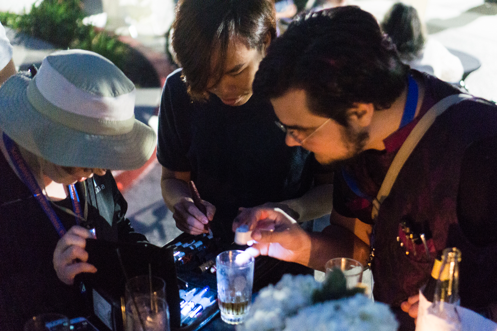
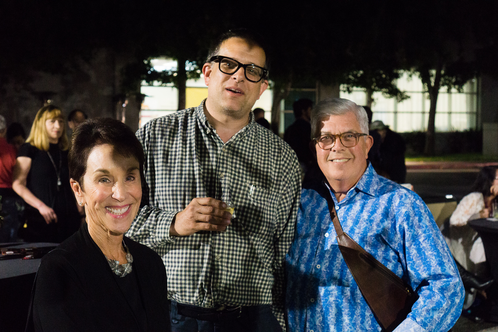
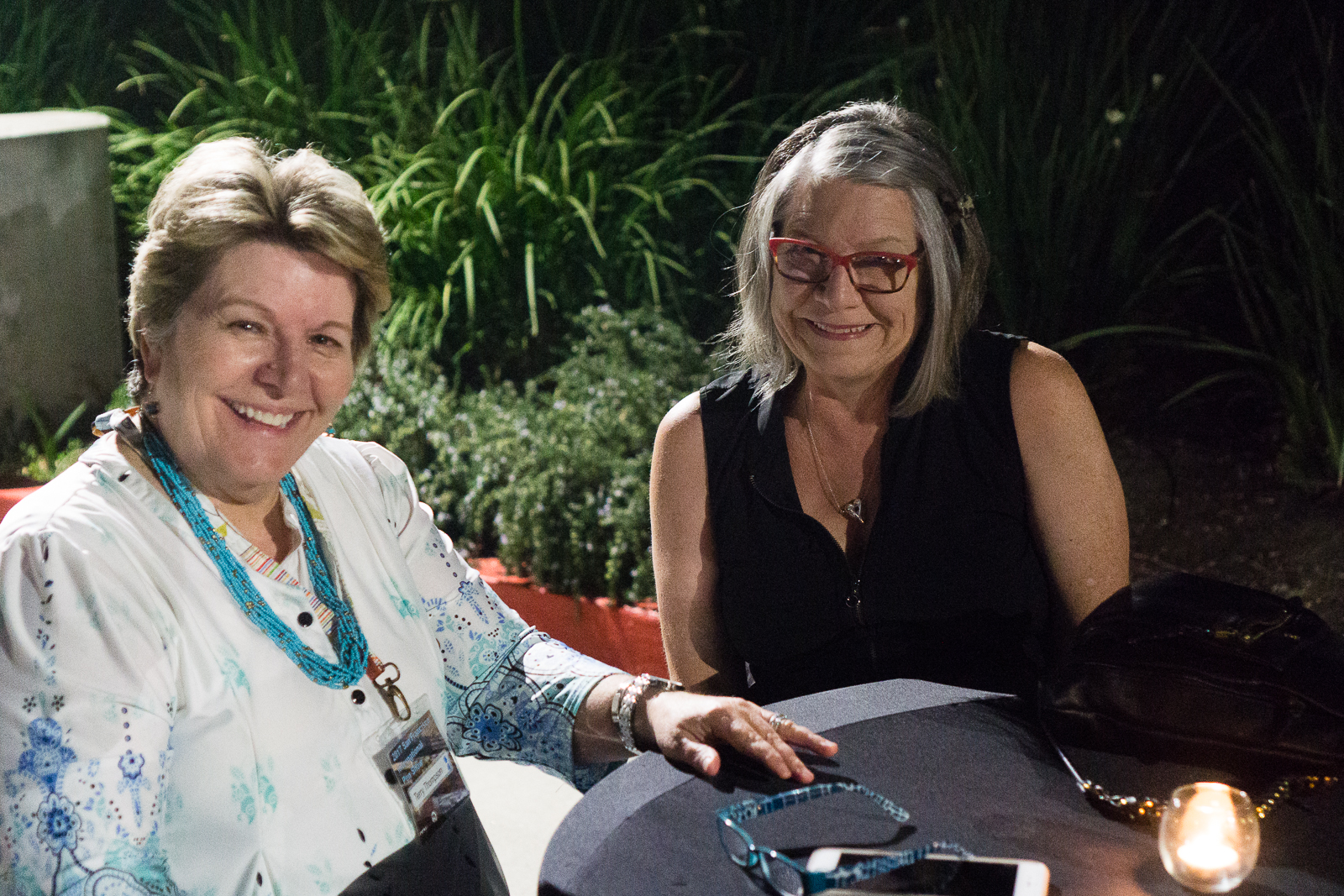
Overall, the turnout for the pen show concert was great and a fun time was had.
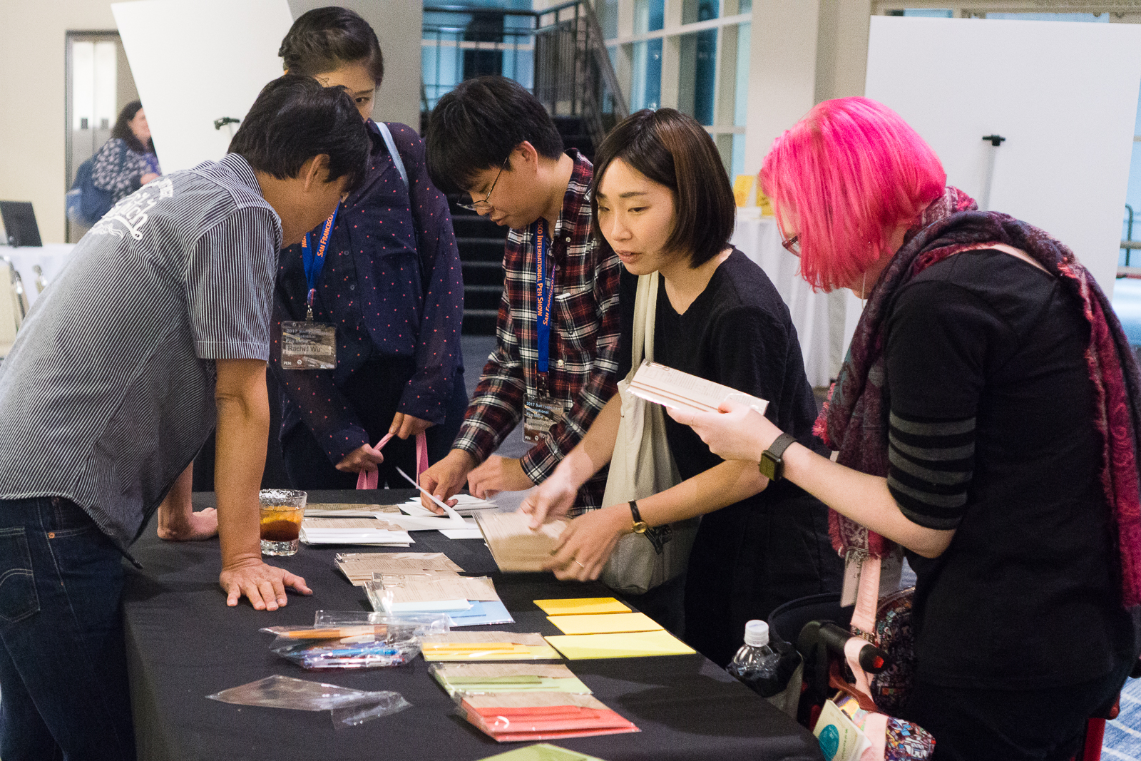
Inside the hotel, my friend Bruce Eimon introduced Taizo Yamamoto and his paper products. They are launching “Paper Tasting” (paper samplers) and they laid it out on an empty show table. Their website is http://yamamotopaper.com/index.html.
Saturday evening went on and we all just hung around and had great conversations. The evenings of pen shows are opportunities to reconnect, interact, and meet new friends. I eventually went home to rest up for another pen show day.
Sunday, August 27 – Third and Final Day of the Show
Wow, the weekend is almost over and this is the day I feel happy and sad. Shall we say, verklempt?
Not gonna lie, the past few days were tiring especially with the amount of sleep (or lack of) I’ve had. But Pen Show Time Zone prevailed and got ready for another fun filled day.
I once again arrived around 7:00am to assist the 8:00am class attendees (Sorry Nik!), as well as assist the registration desk. Duty calls! As a reward, I got my name on Masuyama-san’s list as well.
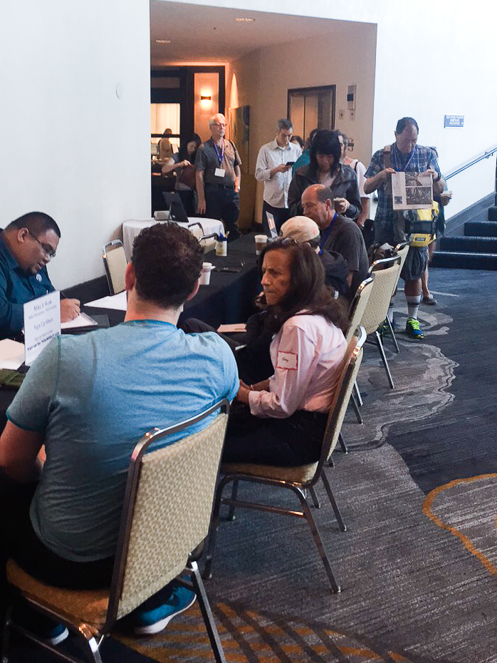
On Sunday, the show had another combination of paid classes, and free seminars.
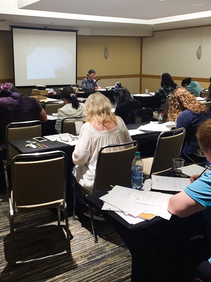
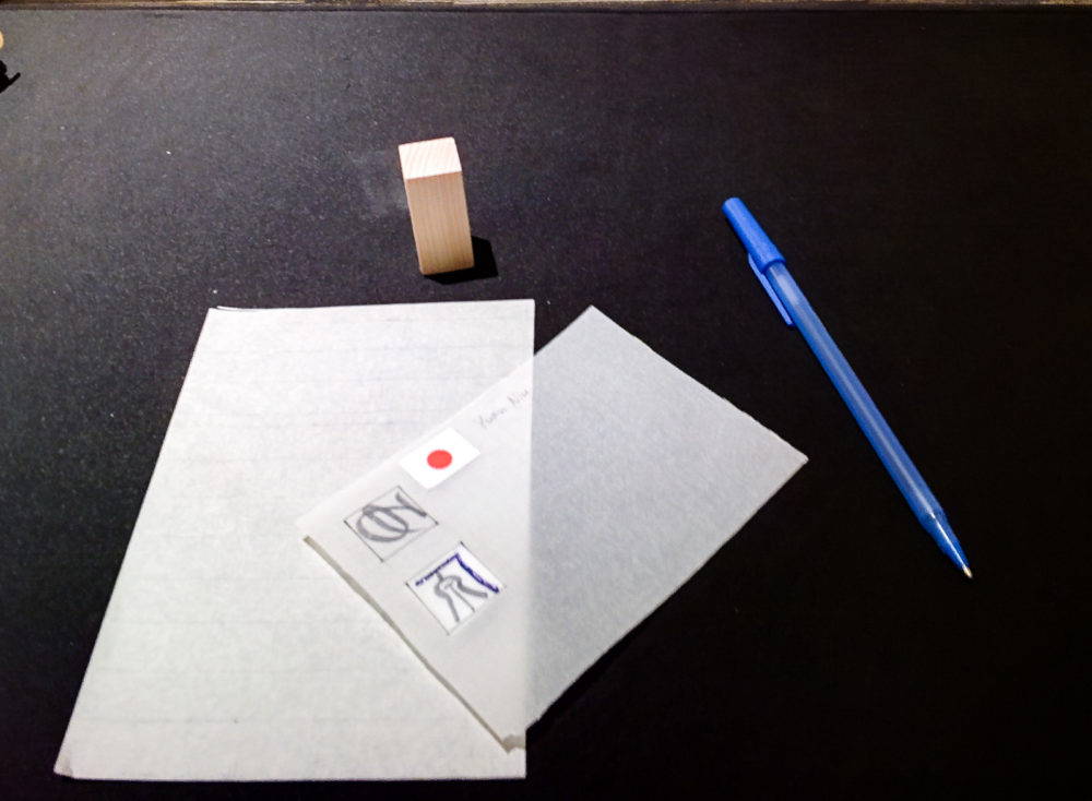
Here’s are some photos I got to take during the day.
John Mottishaw arrived in the morning and Joel Hamilton caught him at the registration desk.
Janet Takahashi
The Nibsmith, Dan Smith was always busy with a customer.
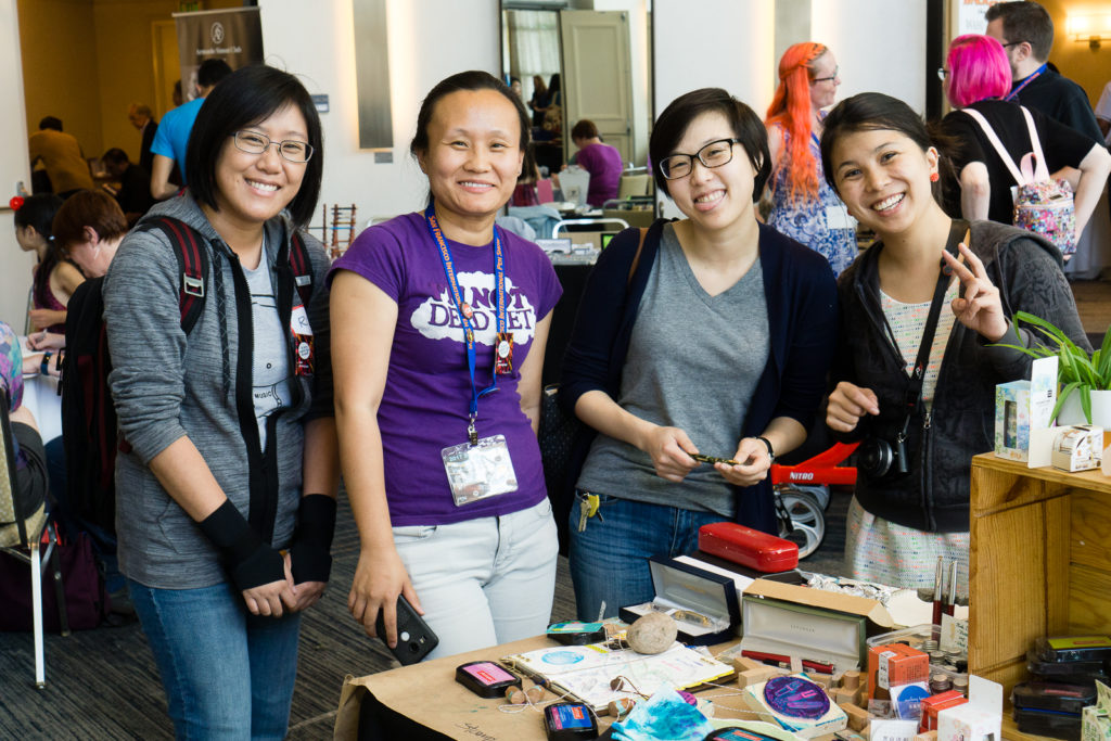
Over at Ryan Krusac’s table, the prototype of the limited/special edition Legend Pen he collaborated with Cary of Fountain Pen Day was on display. It’s beautiful for sure! And the proceeds of this collaboration will be donated to Shawn Newton’s scholarship fund.
Here’s a bit of a penvangelism story. Jon, my co-worker, brought his kids to the pen show and I took the liberty of giving them a tour. Of course the first stop was the Pay-It-Forward table and the kids got their starter kits. One of Jon’s kids wanted a pink ink to match the pink pen and we eventually found J. Herbin Rose Cyclamen from a table of a pen posse member. =) We continued the tour around the ballroom and we eventually sat down and showed them how to fill a pen with ink, how a pen works, etc. It’s inspiring to see teenagers wanting to learn how to use fountain pens.
A bit of background, Jon got into fountain pens when he started to work with a pen addict (me) and he really wanted to come to the show and find a pen he’d like. We found a green pen with a 14k gold nib over at Peyton Street Pens with the help of Nivardo. Needless to say, Jon and the kids were happy.
As the show comes to a close, I got to walk around the ballroom a little bit and take some pictures again.
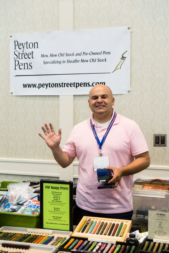
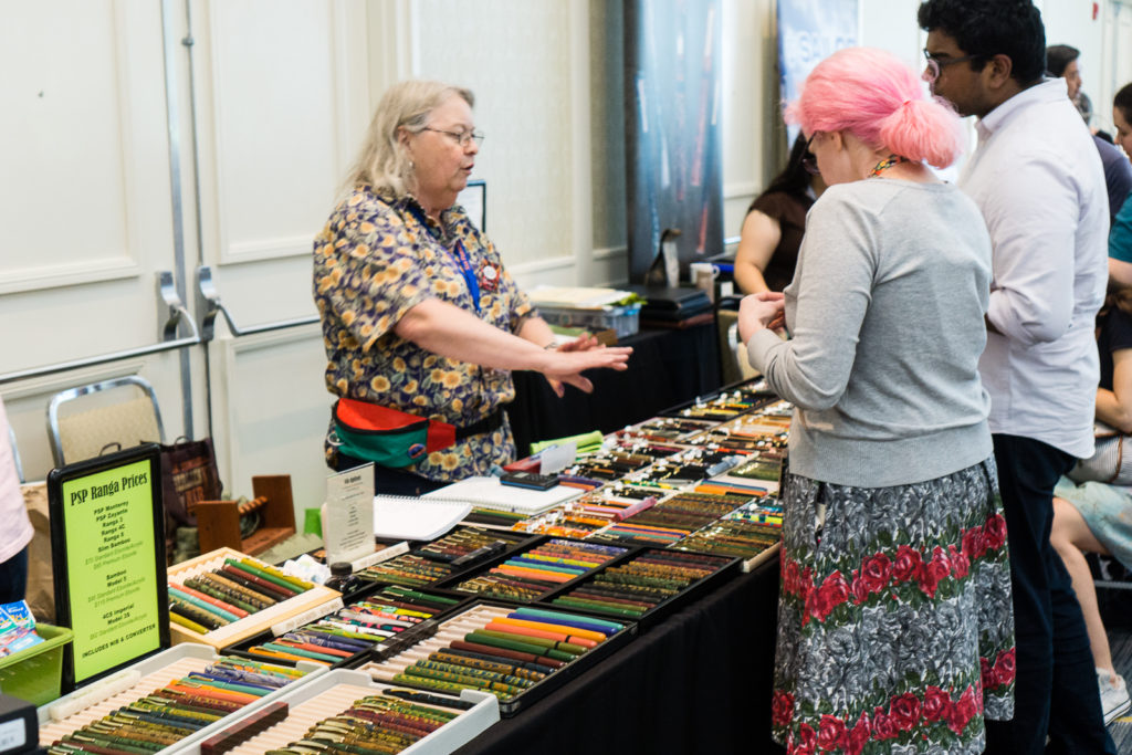
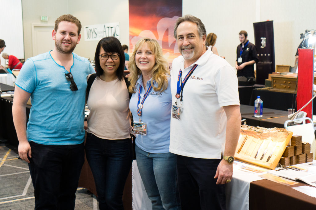
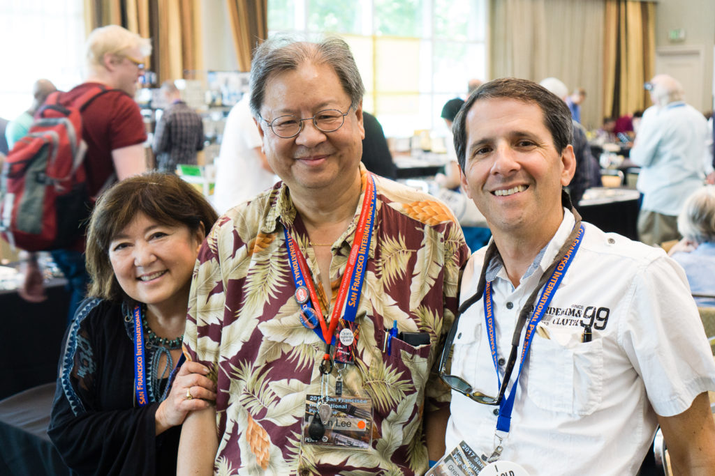
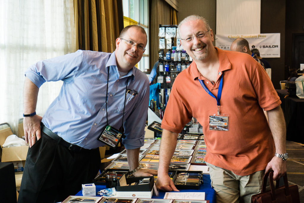
See? Even puppies want to see some pens at the SF pen show! =)
My final purchase at the show was at the Vanness Pens table. Replenished my supply of Akkerman 05 Shocking Blue, and Bungubox Sapphire. Also picked up these special edition Curnow notebooks with Joey Feldman’s artwork in the cover. During the weekend, Joey was doing individual art sketches behind the notebooks when people bought them. He actually did this special piece for me (of me) on Saturday and I just picked it up on Sunday.
Joey has dubbed me, Franzulini: Leader of the Free Pen World. I loved it! If you’re reading this, thanks again Joey! =)

Post Pen Show
As the show closed, I packed up the PIF table, and helped with taking home some Ink Testing Stations. Ink Boss Christina was pleased. =)
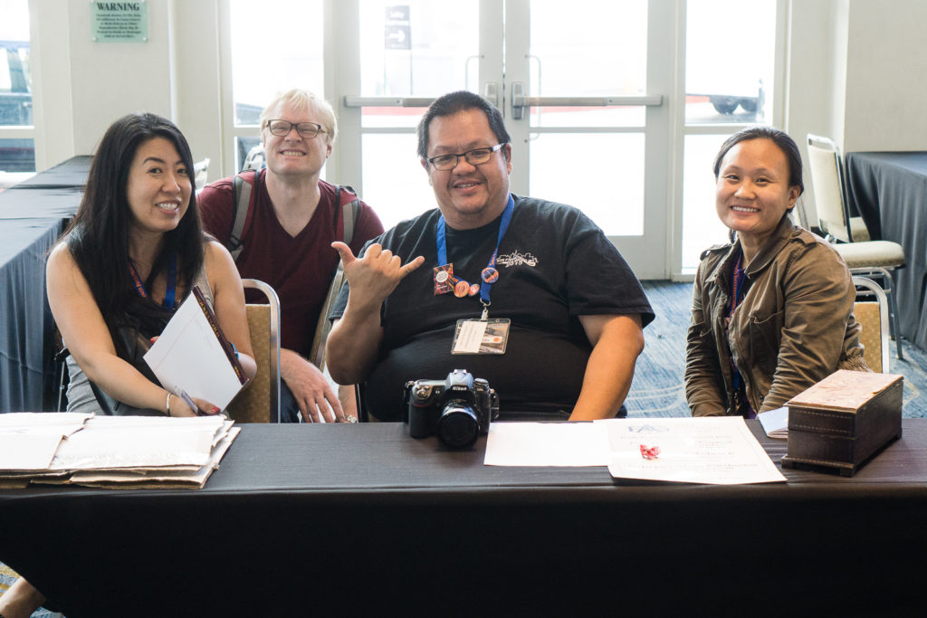
And I got a chance to have a photo with the legendary Cary of Fountain Pen Day. Thanks Ricky! =)

My Mother and I took a pen vendor friend out to dinner which has become a tradition now. Afterwards, we went back to the hotel and found other pen friends coming back from dinner as well. We hung out at the bar for a bit.
Needless to say, I was tired but I was very happy. The photo below was the last one I took before I gave in to the fatigue and finally went home.

Final Thoughts
The San Francisco Pen Show has come and gone and I’m very thankful I was able to attend and be part of it. Pen shows for me have evolved quite a lot and it has now become a true social event that I look forward to attend. Whether it be SF, LA, Atlanta, or others, what makes pen shows is the people I meet, or visit with. I mean, pen people are so kind, generous, and cool. Who wouldn’t want to hang out with those kinds of people? There were a lot more stories that you can’t just place in a report and I treasure a lot of them.
A HUGE Thank you and Great Job to the show organizers: Ricky, Todd, and Syd. The SF Pen Show gets better year-over-year and it starts with them. To the amazing Pen Posse peeps, great job and thanks for the volunteer work! Just a reminder, 2018 SF Pen Show will be on August 24-26. So, plan your days off now! =)
And to you my dear readers, thank you for sticking around for this lengthy report. And again, I hope you enjoyed it.
For those who attended the show, comment what your favorite part of the show was and what you bought. For those who weren’t there, let me know if you have questions as well!
THANK YOU!
“Pen shows are about the people and the stories between each other. The pens start the story and the people get closer.”
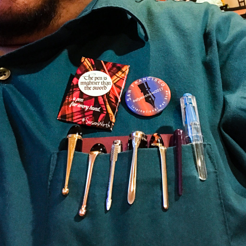
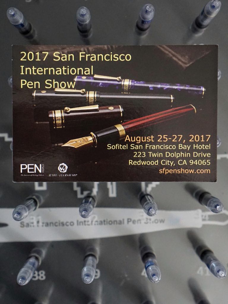
The San Francisco Pen show is just around the corner for the HOTP crew! Here is a sneak peek of some of the things that will be at the pen show and what we are each looking forward to for 2017!
Pam: It’s odd to think that I met Franz at the registration desk of the SF pen show in 2015, 2 years ago! That said, my first full experience of the SF Pen Show was last year. With the knowledge from last year, I can say that I am really looking forward to:
Itinerary aside, I am just really excited to meet pen friends, new and old, near and far. The pen show is a great time and place for me to nerd out with all things pens and stationary with nerds just like me. And at the end of the day/weekend, it’s just what it’s all about. See you all at the FUN pen show by the Bay!
Katherine: I’m mostly on the hunt for unusual pens and have been excited to hear that there will be a couple of European vendors that are new to the show AND Stylo Art will be there! My wallet quakes in fear. I’d love to pick up an Aurora Novum, but we’ll see if I can find one that fits in my budget. -____-
I’m also sharing a table with a couple friends from Pen Posse, where I’ll be selling washi tape and hand carved stamps. Keep an eye out for me in the lobby! 🙂
Franz: Whoa! It’s been a year already since the 2016 SF Pen Show and now I can hardly wait for next week! Year over year, the SF pen show seems to become much bigger and busier. I try my best to help out at the show with assisting at the registration desk. Pen Posse members try to take shifts in manning the desk to make sure that we help people get in the show, or direct them to classes and seminars. Being at the desk lets me see old friends when they arrive and make new friends as well.
This year, the pen show has more vendors attending that weren’t present in 2016. Some vendors off the top of my head: Shawn Newton (Newton Pens), Hugh and Karol (Kanilea Pen Co.), John Mottishaw (Classic Fountain Pens), Motoshi Kuzuno and wife, Shuko (Stylo Art Karuizawa), Claire Rice (WrittenInRice), Miroslav Tischler (Penkala Pens), and A LOT more!
Events that I’m looking forward for the weekend:
The San Francisco Pen Show for me has evolved into primarily a social gathering. I love seeing the different vintage and modern pens offered for sale and I may buy a pen, or two, or three! ;-P But what really floats my boat is seeing old friends, visiting with the pen show vendors, meeting Instagram friends in real life.
Pay-It-Forward
 This year, we will have the Hand Over That Pen table to host the Pay-It-Forward initiative. The Penthusiast Oscar Rodriguez along with a lot of awesome pen people started this fantastic PIF table to provide beginners, and children who are attending the show with pen starter kits. It was a great success at the D.C. Pen Show a few weeks ago. There will also be a “Give a pen. Take a pen.” part wherein people can donate pens they no longer use and just want to donate instead of selling. People can also take a pen that they would want to own. This will be a little bit smaller than what they did at the recently held D.C. Pen Show but we believe it’s important to keep the ball rolling.
To learn more about the PIF table, it’s all documented on Oscar’s site: https://www.thepenthusiast.com/dc-pen-show-pay-it-forward-table. If you would like to donate money, pens, notebooks, etc. please let us know via the comments or direct message Franz on Instagram: @franzdimson
Hope to see you at the #SFPenShow2017! 🙂
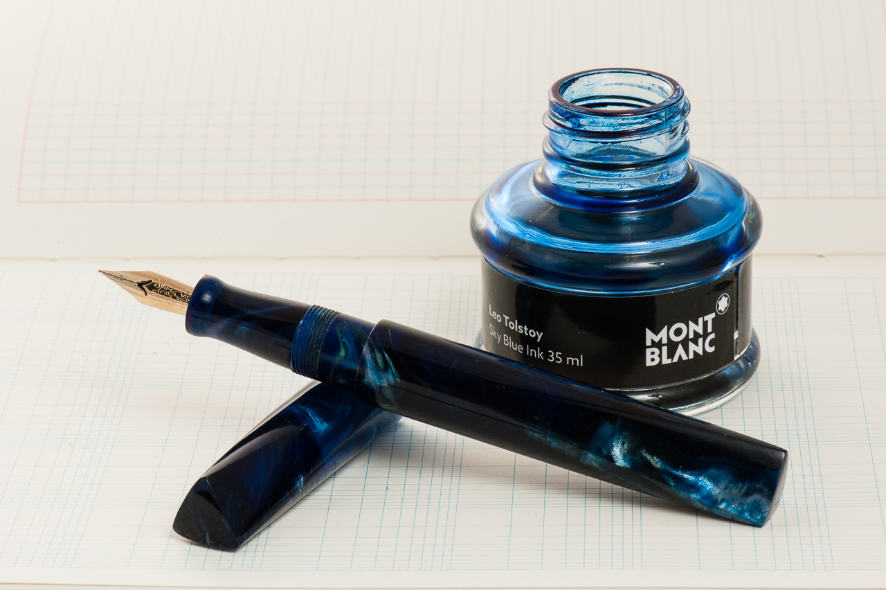
Katherine: It’s still March as I write this — I’m picking a little early since I’ll be out of town for a lot of April. But, even though it’s March, I have no doubt I’ll keep this pen inked through April. 🙂 My pairing for the month is my new Newton Pens Prospector and Montblanc Tolstoy. I chose BSea’s Galaxy Trek resin, which reminds me of the deep ocean. It’s a dark, almost black, blue in many areas with swirls of lighter blue and even white and an occasional brown. I had to pair it with a blue ink, and I chose Tolstoy. There could be lots of reasons for this pairing… blue and blue, reminders of my childhood (swimming off islands in the Philippines and wondering what lurked in the dark waters… and my numerous failed attempts at reading War and peace as a 13 year old), but really it’s just because that’s the blue ink I had on hand when I ripped open the Prospector’s box a few days ago. I only had the presence of mind to record an unboxing video because my boyfriend, Shamiq, suggested it. Then I grabbed the bottle of ink on my desk, filled the pen and proceeded to oooh and aaah over the pen and the shiro nib. And, because I can see into the future, I’m sure I’ll still be ooohing and aaahing over this pen in a couple weeks.
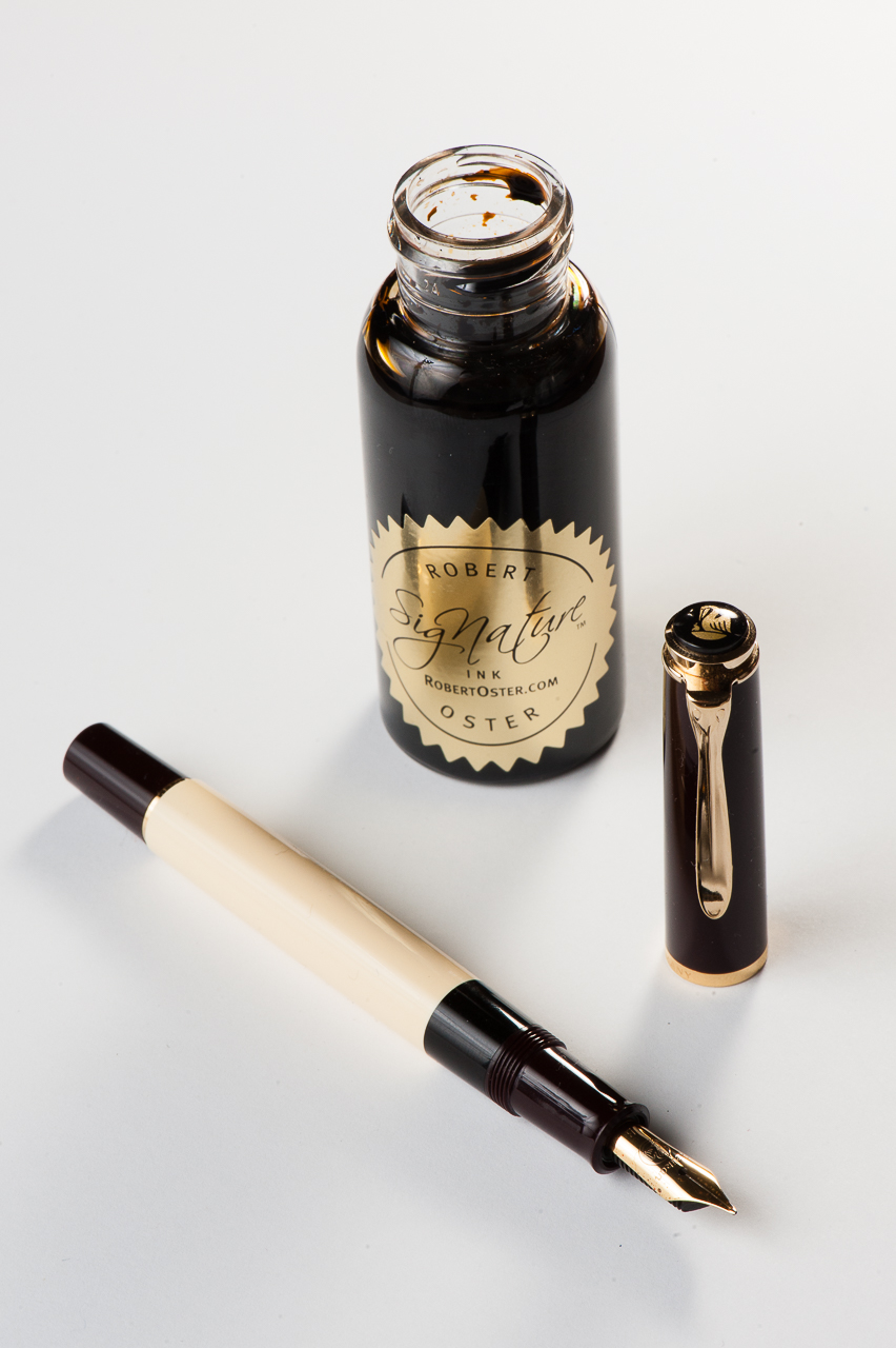
Pam: Spring is in the air! The air is still crisp and a breeze is still about. We still get the occasional rain this season, which just makes me want to curl up with a *mug* of coffee and a good book. In lieu of that possibility, I chose Pelikan M200 Cafè Créme to be paired with Robert Oster Caffè Crema! This particular pen has a wonderful architect nib done by Dan Smith of the Nib Smith fame. It shows off the subtle shades of this pen quite well and keeping a crisp line.
I considered this combination for more of an autumn month, but my love for coffee, Robert Oster inks and Pelikan flocks is year round.
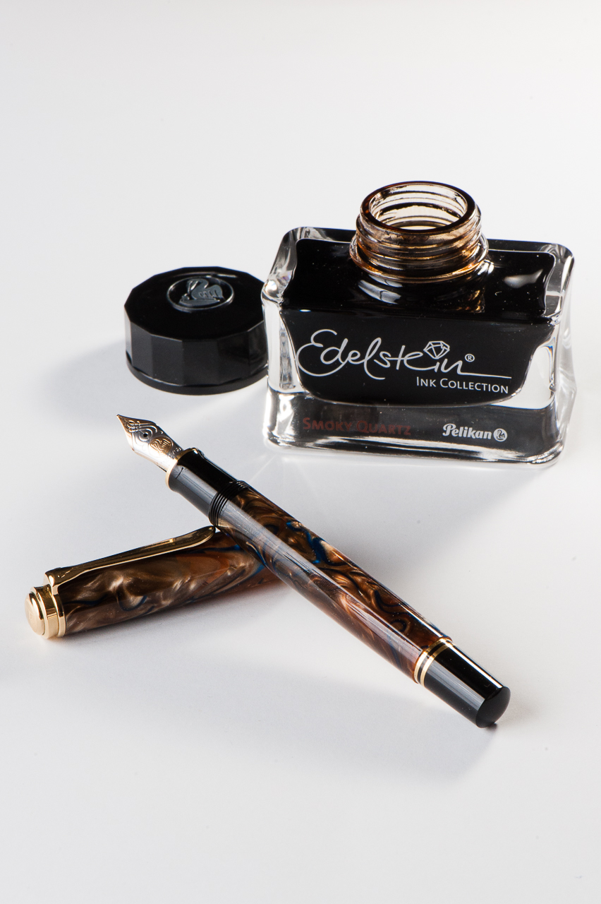
Franz: April’s pairing for me is the Pelikan M800 Grand Place Special Edition release, and the newly released Pelikan Edelstein Smoky Quartz which is their Ink of the Year for 2017.
Now I’ve got quite a few.. ahem.. a lot of inked up pens especially after March’s 6 Pen Challenge so this month’s pairing is a true winner at the moment. The ink is definitely a very nice brown which matches the creamy swirls of the pen. The nib of the M800 is a juicy fine cursive italic nib ground by Dan Smith (The NibSmith), and that generous flow creates spots in my writing wherein the ink pools to an almost black. So far, I’ve got only bought the ne bottle of this ink to test it out but I think a second bottle will be in my inventory sooner than later.
While writing with the M800 Grand Place, I catch myself sometimes just pausing admiring the chatoyant swirls of the pen. It’s almost hypnotic.
Writing Samples (click to enlarge)
Thanks for your time, and keep enjoying your pens. And please tell us what new ink pairings you’ve discovered recently.
Fountain Pens:
Kaweco Sport(AL & Skyline)
Platinum 3776 Century, SF nib
Franklin-Christoph 45, Masuyama FCI
Lamy 2000, Makrolon, EF nib
Sailor Pro Gear Slim Starburst Galaxy, EF nib
Sailor Pro Gear King of Pen, BCI nib
Newton Pens Slim Short Townsend + Sailor Music Nib
Tactile Turn Gist, Polycarbonate, Titanium nib
TWSBI Eco, Clear EF
Pilot Stargazer, M nib
Pilot Prera, M & F nibs
Montblanc 146, .4mm CI
Conklin Duragraph, 1.1mm stub
Conid Minimalistica, Delrin, EF Titanium nib
Nemosine Singularity, .6mm stub
Lamy Safari, M nib
Pilot Metropolitan
Franklin-Christoph Model 66, Gold Medium CI nib
Pelikan M200, B Architect nib
Pilot Vanishing Point vs Decimo
Lamy Aion, M nib
Pelikan Souverän M300, OM nib
Nakaya Piccolo, SM CI nib
Classic Pens LB5, B nib
Nakaya Size Comparison
Franklin-Christoph 31, M nib
Montegrappa Game of Thrones Baratheon
Taccia Spectrum, several nibs
Armando Simoni Club (ASC) Arlecchino 2 (Magic Flex 18K Nib)
Edison Beaumont (0.9mm cursive italic nib)
Romulus Pens (John Albert) Customs
Aurora 88, F flex nib
Wahl-Eversharp Decoband, F flex nib
Sailor Pro Gear
Montblanc 149, MCI nib
Kaweco Perkeo, F nib
Ryan Krusac Studios L-16, BCI nib
Kasama Una
Inks:
none yet, coming soon!
Paper/Notebooks:
2017 Starbucks Philippines Planner
Grids and Guides Notebook
Target Dollar Spot Letter Set (December 2017)
Monthly Pen & Ink Pairings
January 2017
February 2017
March 2017
April 2017
May 2017
June 2017
July 2017
August 2017 – didn’t do one
September 2017
October 2017
November 2017 – didn’t do one
December 2017