Before anything else, a big shout out of appreciation to Pen Chalet, for sending us inks to review! Pen Chalet was generous and sent us the inks at no charge, but we promise the review below is unbiased and our own uninfluenced* opinions.
* Except maybe by the food coma that followed our dinner gathering
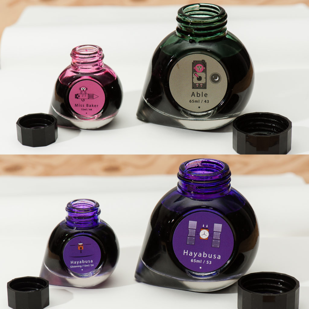
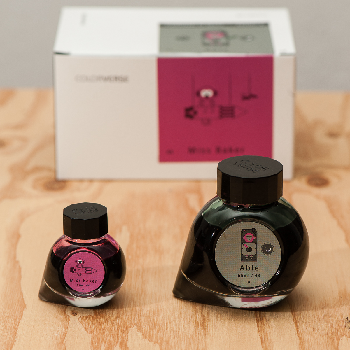
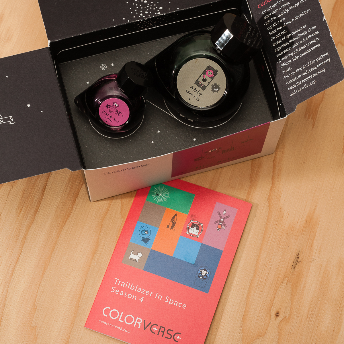
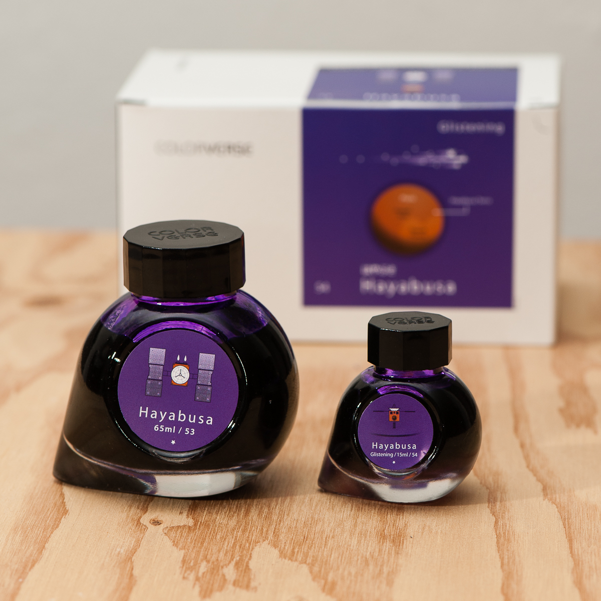
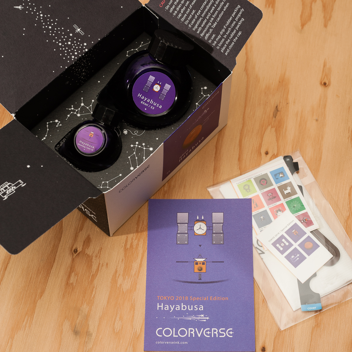
For those unfamiliar with the Colorverse brand, each set contains two bottles, a big one (65ml)and a small (15ml) one. For this review we’re taking a look at two sets: Able + Miss Baker, and Hayabusa + Hayabusa Glistening. Able + Miss Baker is part of Colorverse’s Season 4 offering, Trailblazer in Space. Hayabusa is a Tokyo 2018 Special Edition.
Packaging
Inky Dispositions
Franz: Here goes our first ink review! =) For a period of time now, I’ve been intrigued with the ink bottles of Colorverse. Their bottle shape is very unique as well as their decision to ship two different size bottles and different ink colors. I also really love their outer space themes.
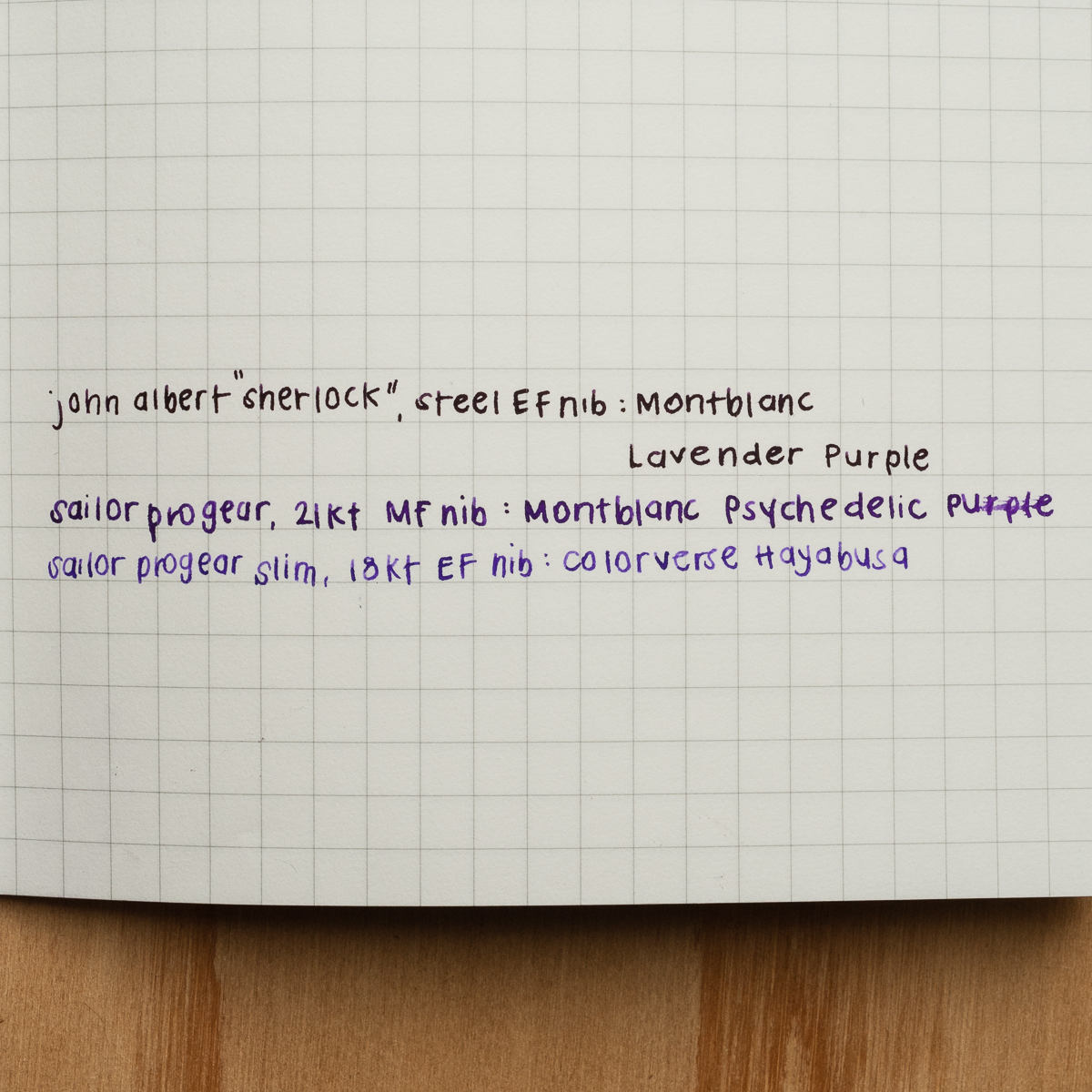
In this review, I only got to test the Able and the Hayabusa (non Glistening). Oh by the way, I kept referring to it as Habuyasa. Good thing I spelled it right in my sample below. Anyway, back to the ink review please.
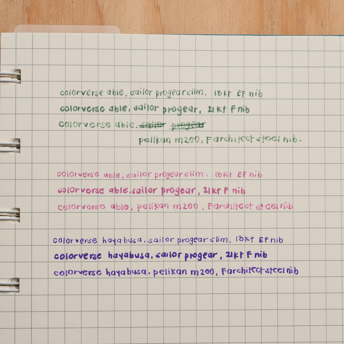
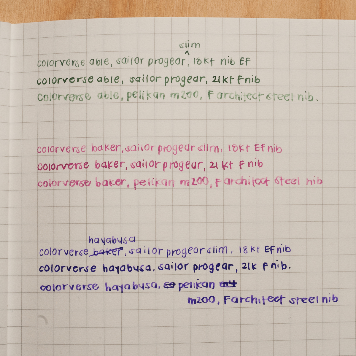
Able: Color- mossy green; Saturation- low; Shading- high; Wetness- dry; Dry time- fast; Overall thoughts- The green color is very nice to look at however it is too light. The italic writing is from a wet, medium size Pelikan M800 nib but it doesn’t look like it below.
Hayabusa: Color- violet (more of in between violet and purple); Saturation- high; Shading- low; Wetness- medium to high; Dry time- medium; Overall thoughts- I’m loving this color! I don’t have too many purple inks but this definitely hits it for me. The difference in Hayabusa’s lubrication is noticeably different against the Able.
Ms. Baker: As I stated earlier, I was not able to test this ink but I was able to compare ink swatches and the two ladies’ writing samples. I would describe the color a light hot pink. I only own 3 pink inks (Monteverde Kindness Pink, Pilot Iroshizuku Tsutsuji, and Kosumosu) but they don’t match Ms. Baker at all.
I’m happy to have been able to try out inks from the Colorverse brand. I will look into getting more samples of their growing ink line up.
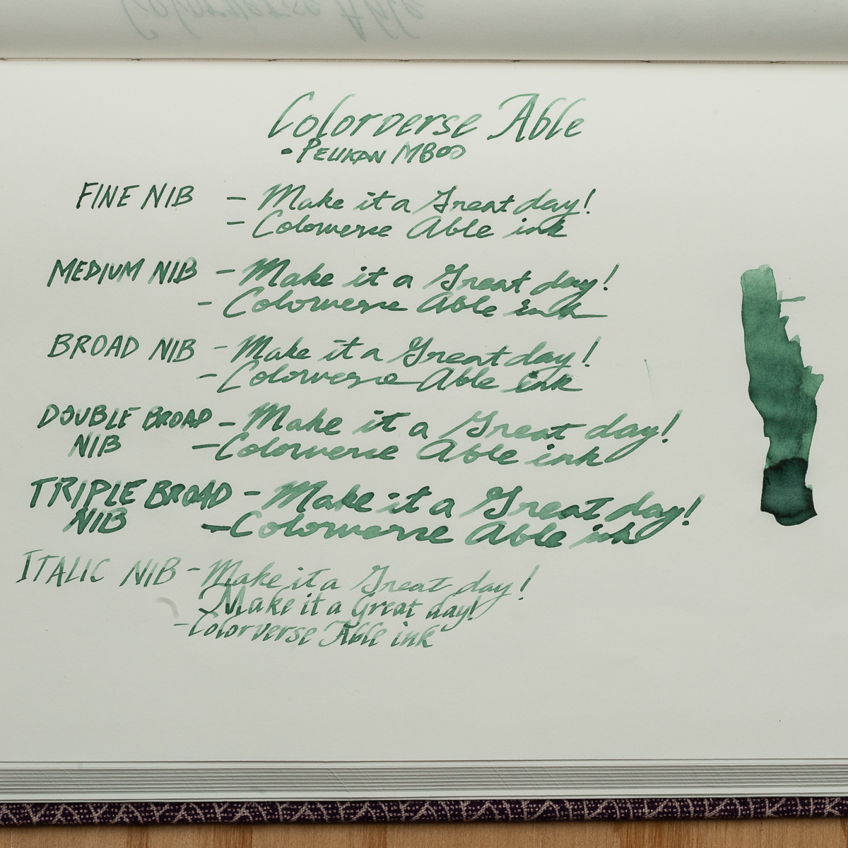
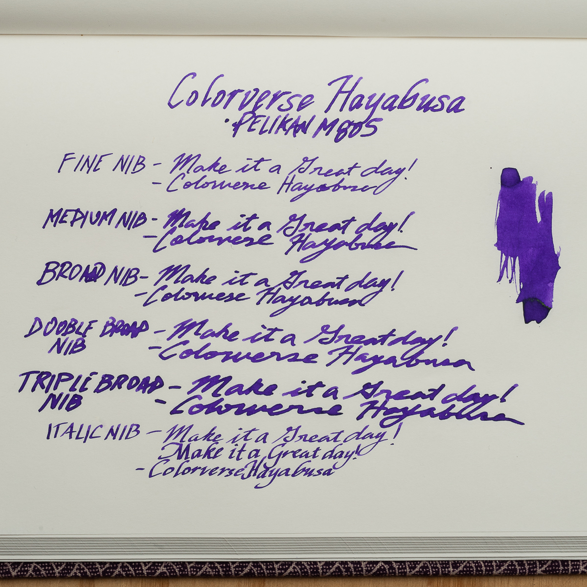
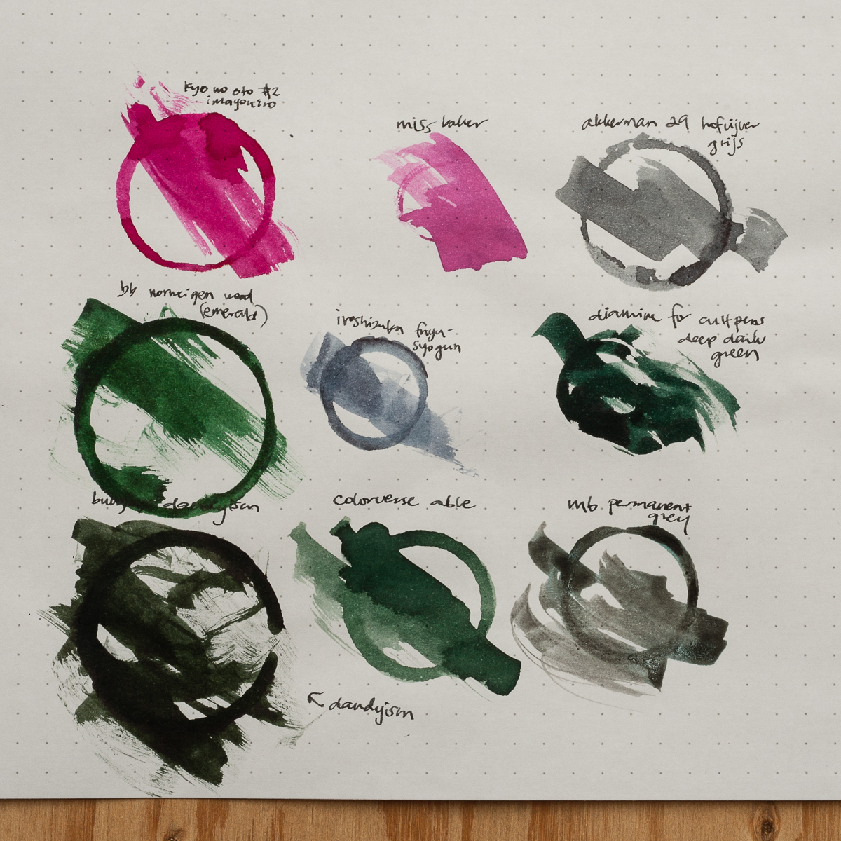
Katherine: First off, I think the Colorverse bottles and packaging are adorable. There are even little stickers! But, that Able label is misleading. It looks solidly grey, but as you can see in our swatches, is solidly green. Perhaps a muddy green, but definitely green.
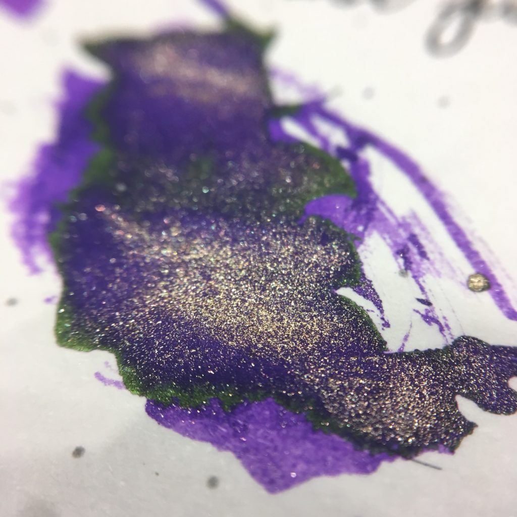
Packaging aside, the inks are well behaved — flow well and wash out easily (I did splatter Able and Miss Baker on some clothing and my face before dinner over the weekend. It washed off easily and no one looked at me funny as I ate my fancy multicourse meal). My one gripe is that Able is really, really light in most nibs — even wetter ones like Pelikan nibs. The highlight of trying the three for me is that Hayabusa Glistening both sheens and shimmers — a purple ink with green sheen and gold shimmer, so much fun!
Overall, I really like Hayabusa (I’m a sucker for purple ink) and Miss Baker. I like the overall color of Able, but found it too light except when in a narrow wet nib (the FCI in my writing samples).
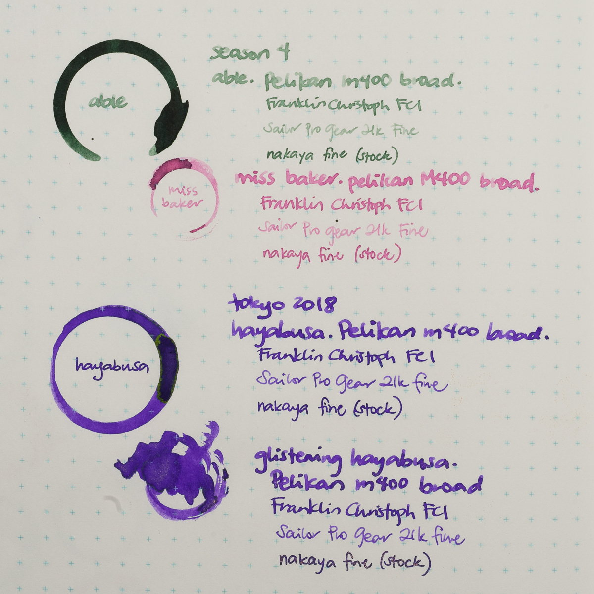
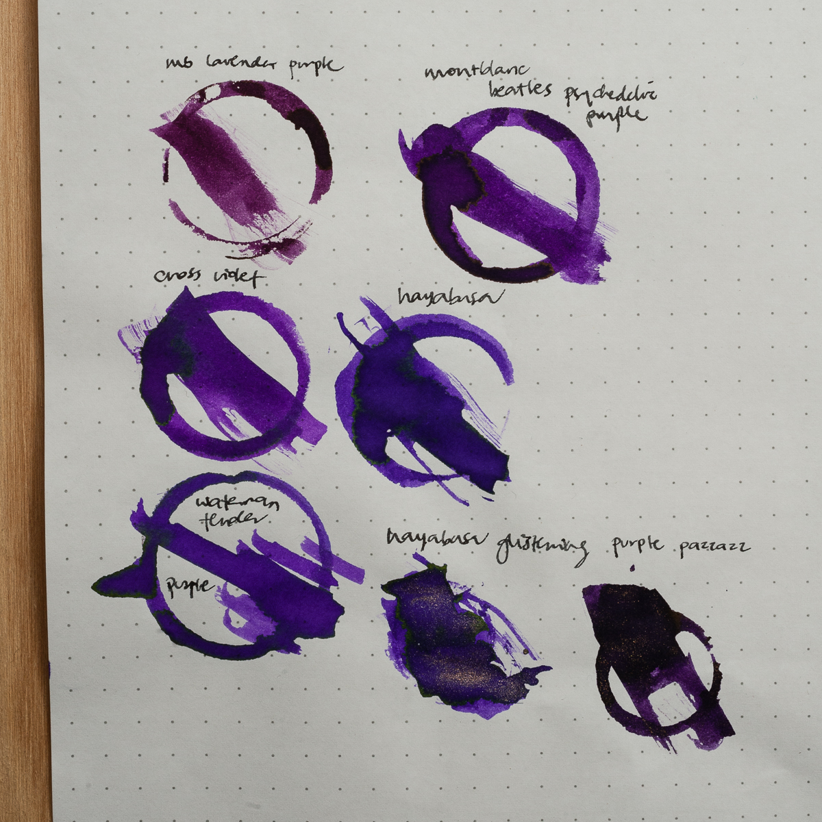
Pam: My favorite color of the three is Colorverse Hayabusa. It’s a fantastic purple color. It reminds me of the Montblanc Psychedelic Purple. There are subtle differences between the two; Hayabusa is a cooler purple (more blue undertones) where as Psychedelic Purple is a warmer purple (with more red undertones.) Both have a subtle gold sheen, although, the sheen on Hayabusa can appear more green in certain lights. I find Hayabusa to be a great purple ink that has great readability that behaves very well in pens. Hayabusa was easily the most saturated of the inks and performed extremely well in F and EF nibs. My architect nib is particularly dry so this saturated ink has more shading without losing it’s vibrancy.
Miss Baker was a pleasant surprise for me. As someone who passed on Sailor Peche and sakura-inspired pink hues for ink, Miss Baker was surprisingly pleasant to behold. I particularly liked it with the Sailor 21k F nib, which is the wettest of my three nibs. My bias towards saturation is obvious, but I can’t deny that Miss Baker is capable of some great shading. Unfortunately, I don’t see myself using Miss Baker often due to the softness of the color. I am not sure if I would find a page of Miss Baker to be highly readable, or if it’s a color that would capture my attention in the margins in a sea of black print.
I will admit that I was expecting Able to be a gray ink, so my disappointment on this particular color may overshadow any positive qualities that this ink may have. Able is NOT gray. It’s a dull green-gray (more green). It lacks vibrancy of a green like Montblanc Irish Green or even Bungubox Norwegian Wood or the interest of a green-variant like Ku-jaku or Bungbox Dandyism. Able is just a blah-green. If there is any gray in the ink, it just took away the vibrancy and readability of the ink. It’s the least saturated ink of the three and is a pale ghost of it’s already zombied-green self in my EF and dry architect nibs. If anything, I feel mislead by the packaging and disappointed by the color.
Overall, I found all the Colorverse inks to be wet in flow and really easy to clean out. I will definitely be adding some Colorverse inks to my collection in the near future. Thank you again Pen Chalet! My order will be in your queue soon!
Ink Circles and Comparisons
We received these inks free of charge for the purposes of this review. We were not compensated monetarily for our review. Everything you’ve read here is our own opinions.
1 Comment
Very helpful review! Thanks.