In this review, we are once again joined by our friend, Roz. She’s volunteered to be our left-handed reviewer and we love having her back. Especially when she brings us cupcakes. Thanks again Roz!
Hand Over That Pen, please!
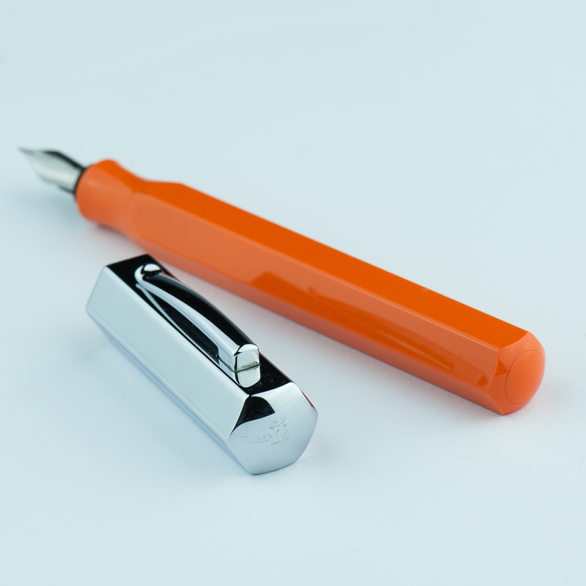
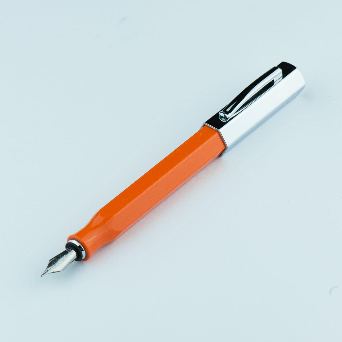
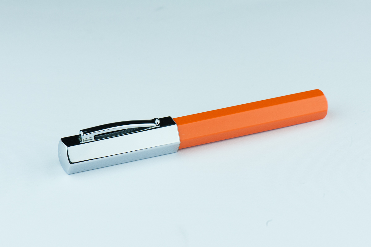
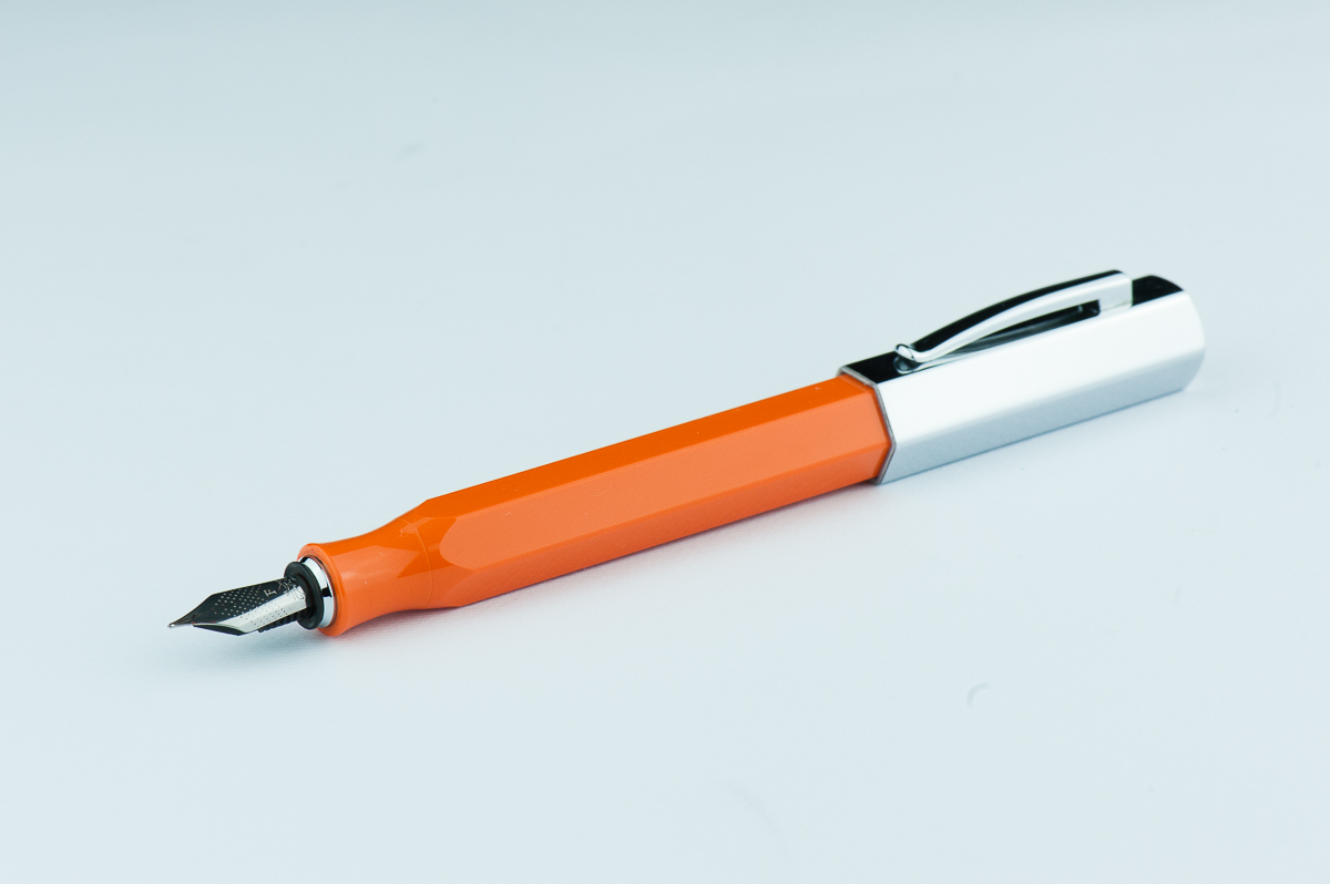
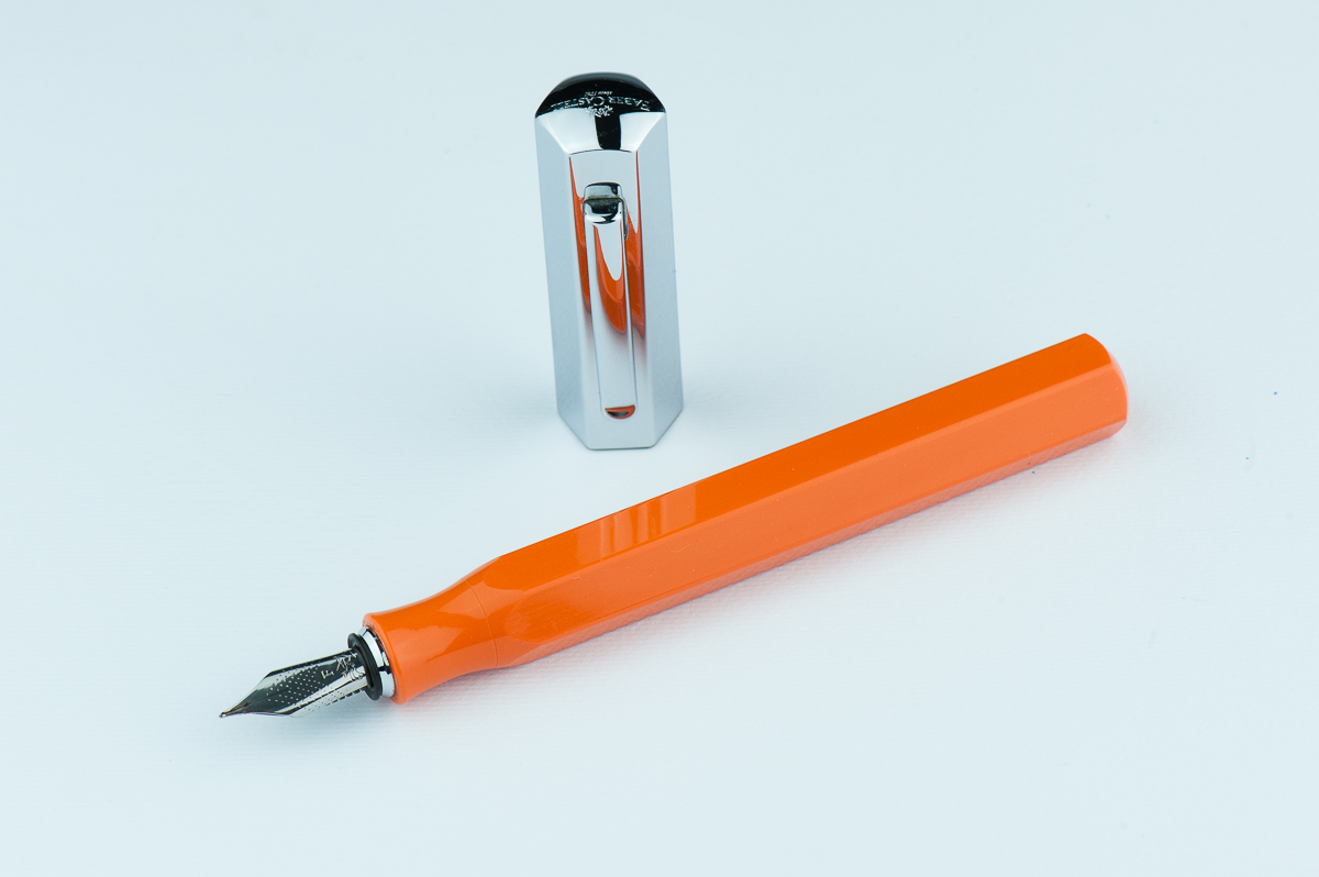
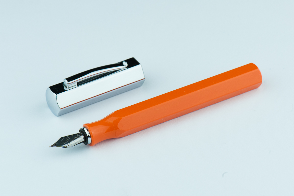
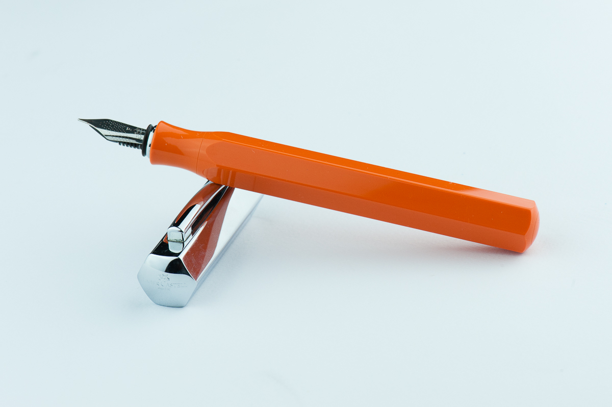
Katherine: I have a thing for faceted pens, and this is no exception. I love the chunky, stubby look of the Ondoro paired with clean faceted lines. I really want a white Ondoro… but they appear to be discontinued, so for now I have an orange one. I like the bright playful orange and the contrast with the chrome cap. The bright orange paired with the chunky look reminds me of those big grip pencils that little kids get.
Pam: The Ondoro’s unique design and eye catching color did make me curious to pick one up. I am glad that Katherine ultimately decided to get one. The shape of the barrel reminds me of an oversized pencil. I mean, a fountain pen is an adulting pencil right? The chrome barrel is a great cherry on top to this design in my opinion.
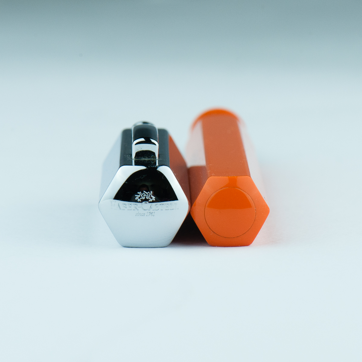
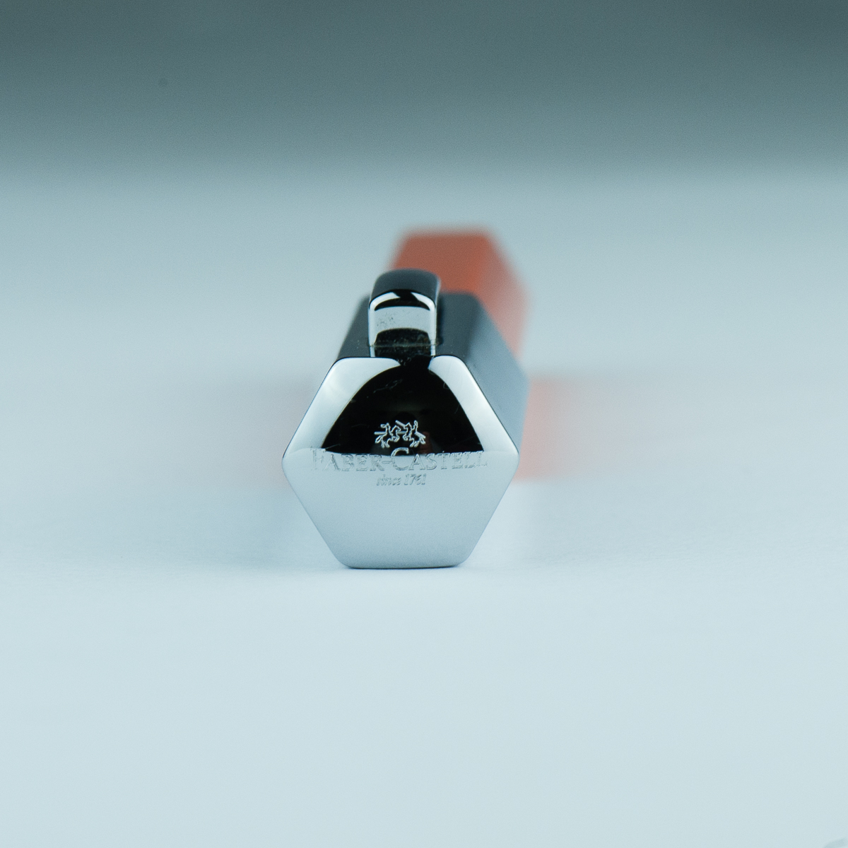
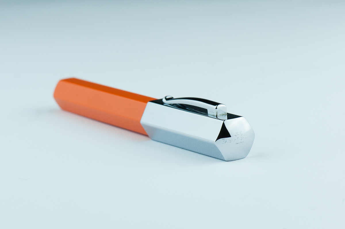
Franz: Stout! That’s one word I’d describe the Ondoro. Its shortness in length is balanced by the girth of the barrel and cap though. The hexagonal facets make this pen interesting and different from others. The shiny cap is cool looking but is a fingerprint magnet for sure.
Roz: Wow, my eyes! The Ondoro is definitely an attention getter. The bright orange with shiny silver cap, I’m awake and excited to experience this pen. I’m still not sure about my opinions on facets – but I feel like a pen of this size benefits from the facets breaking up the amount of solid colors there would be otherwise.
The Business End
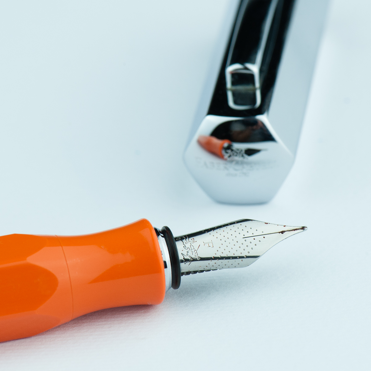
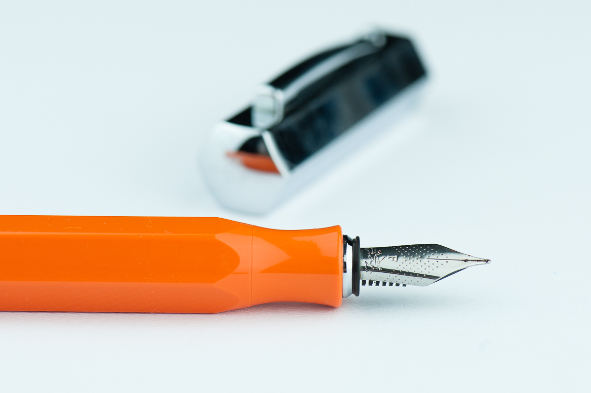
Katherine: This was my first experience with a Faber Castell nib. I like the nib and it’s pleasant to write with, but nothing particularly notable. It’s a western fine with a nice balance in wetness — wet enough to be comfortable for writing, but dry enough to see lots of shading with the right inks. The feedback on the nib is a smidge feedbacky — which I really like. Hurray for nibs that aren’t super smooth and “buttery”.
Pam: I do really enjoy the Faber Castell nib. It’s a pleasant nib to write with and does somewhat remind me of a pencil in terms of feedback. It’s not super smooth, but the feedback isn’t distracting either. The nib performed well and had more feedback on Midori paper than Tomoe River paper in my opinion. The nib is a good balance between dry and wet. It’s dry enough for a decent consistent line, however, you also get to enjoy the ink color you have put into the Ondoro. I would prefer a more saturated ink in this instance given that I shading inks make my handwriting look messier, especially if it’s beyond a couple of sentences.
Franz: Aesthetically, the smaller nib size (#5?) looks good on this pen. I also love the design of dots with chevron shape. As for nib performance, the fine nib has a bit more feedbacl tha I refer. But I am the medium/broad nib kinda guy so not a biggie for me. It did write with a consistent ink flow though.
Roz: The nib was a bit scratchy for me at first, it took me a while to find a good angle – but I did find it! Once I got my angle down, the nib was pretty easy to write with. Additionally, the nib made a sound while writing that I really liked.
Write It Up
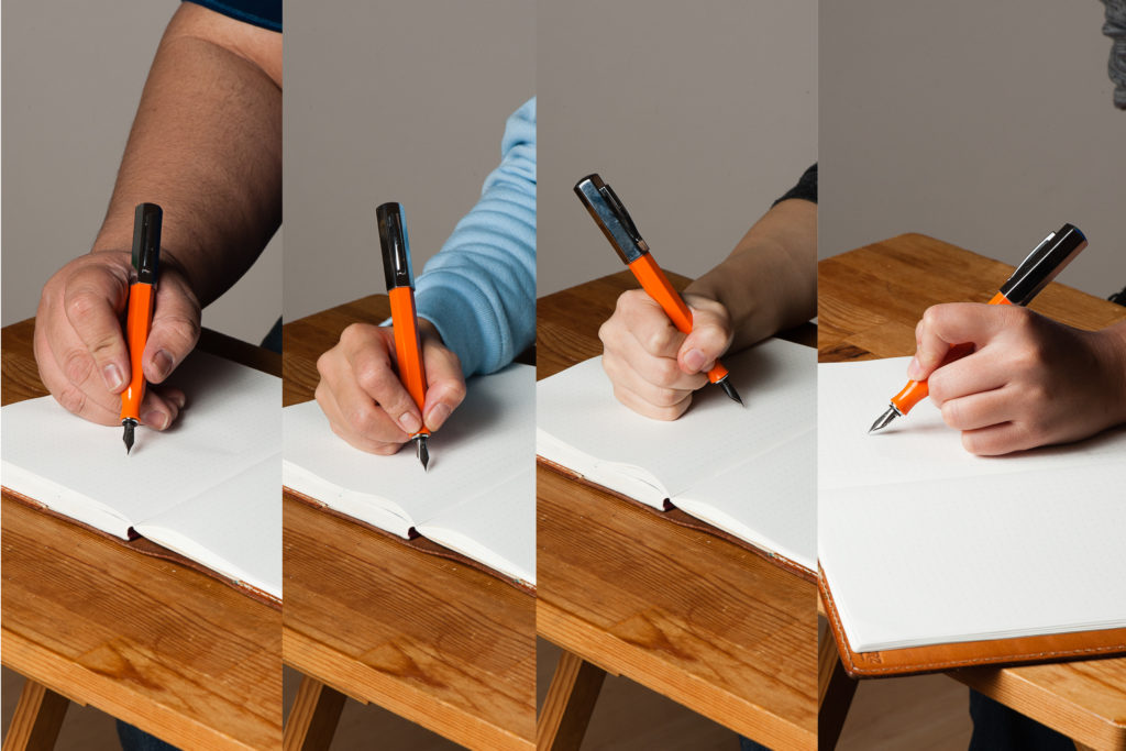
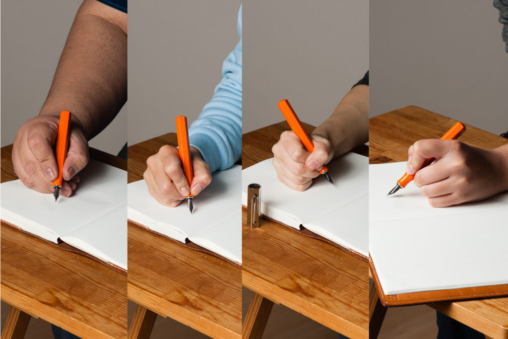
Katherine: I was initially hesitant about this pen (why I never bought a white one) because of the narrowed section. However, it’s surprisingly comfortable, but does force me to hold my pen slightly further back than I usually do (probably more like a normal person). I use the pen unposted and it’s well balanced and pleasant to write with for extended periods.
Pam: The short section was a bit of a concern for my dinky iron grip initially, however, I had no reasons to worry. The smooth transition from body to section meant that the entire pen is one big grip for me! The angles on the pen is soft enough that no corner actually bites into my hand and the section being tapered doesn’t detract from my capacity to grip the pen. I do get sweaty hands so there are times that I have to reposition a bit. Surprisingly, slippage was relatively minimal. That’s more my hand sweat problem and less about that pen.
Franz: Okay… writing with the Ondoro for 20 minutes, I’ve come up with some issues. Probably it’s just specific to me but I didn’t find the Ondoro comfortable to write with either posted or unposted. Posted, the cap definitely makes it unbalanced and top heavy. I seemed to have to exert some force to counterweight the cap to put the nib to paper. Unposted, the length is barely enough for my usual higher grip. With the Ondoro’s pinched/concave section, I needed to grip it higher because of the smaller diameter of the section.
Now here comes the probably just specific to me part and you as a reader shouldn’t worry too much about. Gripping the Ondoro higher above the section wasn’t comfortable for me either because my usual writing angle causes my fingers to land on the edges and not on the flat side of the facets. This bothered me a bit and when I adjust my grip to the flat sides of the facet, either the writing angle felt weird to me, or one of the nib’s tines was not hitting the paper optimally and caused me to feel scratchiness or more feedback. Again, this is possibly just me.
Roz: My grip tends to move around a lot when I write; so having to keep to a narrower range of angles, I really expected my hand to tire quickly. But I didn’t! The girth of the pen kept my hand from cramping up and the grip dipped in such a way that it really helped with my writing fatigue. Writing with the Ondoro unposted was a bit unbalanced for me. While I preferred to write posted, the cap does add a good amount of weight to be wielded.
EDC-ness
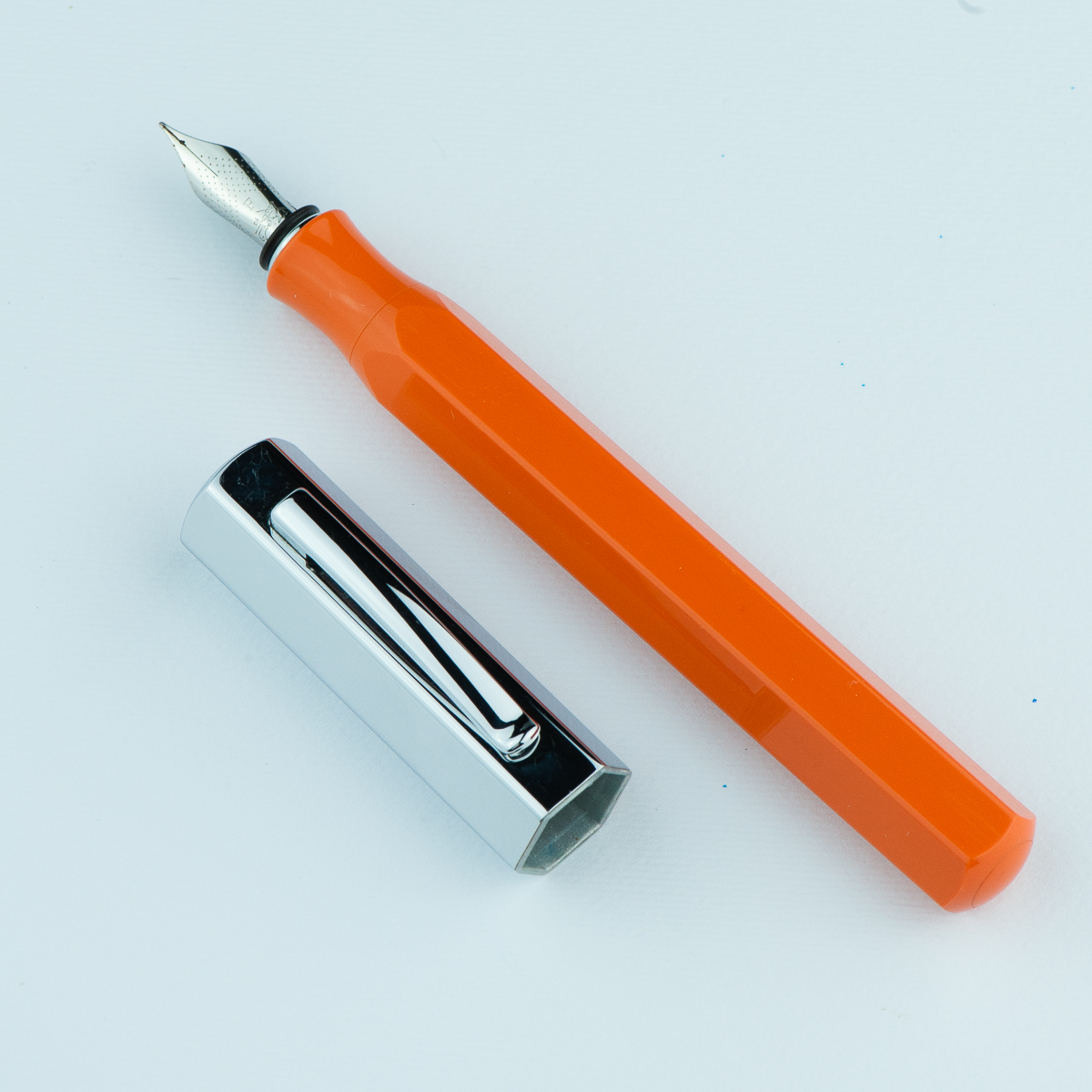
Katherine: It’s a snap cap! Hurray! My only complaint with this pen as an EDC is that the snap isn’t satisfying — it doesn’t have that clean click that makes me think “now my pen is capped”. I’m not sure if all Ondoros are like this, or if it’s because this one came to me used. That being said, I’ve never had it uncap itself, so it seems pretty secure and my gripes about an unsatisfying snap are purely aesthetic. (Does the word “aesthetic” still apply to how satisfying something is to hear and feel?)
Pam: I love a good snap cap! I makes me so happy that it’s so quick and easy to deploy at work. The snap does leave a bit to be desired in terms of “aesthetics”, but on the flip side, it’s a quiet snap cap action so it’s not going to announce to the world that your capping and uncapping your pen. The clip worked pretty well in my white coat pocket, nothing crazy notable in terms of tightness or looseness when it came down to it snagging on the fabric.
Franz: Echoing the ladies here, snap cap FTW. =) It definitely is a good pen for on-the-go, quick notes kind of writing. And the fine nib performed very well with copier paper found in our office.
Roz: I kept the Ondoro snugly in my Nock case during transport. I don’t get to write a ton during my work day, so it was really fun to bust this pen out for random thoughts, meeting notes, and quick breakdowns.
Final Grip-ping Impressions
Katherine: I like this pen! At $150 MSRP, I think it’s a little steep for a steel nib, but it has a unique look and often shows up slightly discounted. It’s a solid pen with a solid nib that makes a great sturdy EDC.
Pam: I honestly really like the Faber Castell Ondoro. It’s a great pen for those who enjoy faceted pens, an industrial aesthetic, and a snap cap. The nib is a great bonus. With the different colors available, it’s a great statement pen for those looking for a good pizazz in their pockets.
Franz: Here’s another plus one for liking the Ondoro’s aesthetics and its faceted disposition. I love the nib’s looks and performance, and that orange is very pleasing. I have stated (with some length) how I feel about writing with the pen for a longer period of time and I’m thankful that I got to try it without buying one. I’ve concluded that because of my larger paw, and kinda picky writing angle, this pen isn’t really for me. And that means I won’t steal… er… borrow the pen for a long time from Katherine. =)
Roz: Overall, the Faber Castell Ondoro was an interesting one for me to try out. Without a doubt the Ondoro is a pen that makes a statement, but in the end I think it was too much pen for me. And I’m still not sure about my opinion on facets!
Pen Comparisons
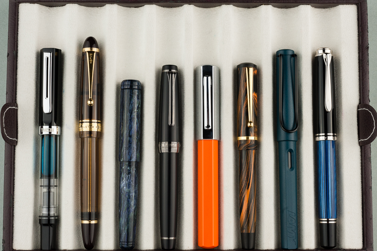
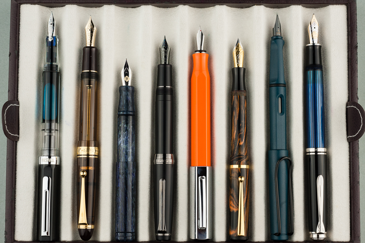
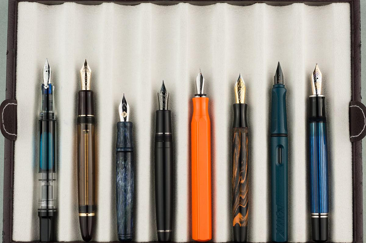
Pen Photos (click to enlarge)

5 Comments
I have a White Ondoro in my own shop if you are looking for one
Brian
The PenThing
…love your comments, all, & espec. pleased, shocked to see a LEFT-handed person in a rev.Great Made my evening. Read Ondoro & Izumo rev’s, both of which I was considering buying–urushi takes lots of thought.
Keep on!
Jon
(Does the word “aesthetic” still apply to how satisfying something is to hear and feel?)–No. I never did. Sloppy use, maybe.
I absoulutely love your way of reviewing pens! I just wish that you would also include pictures of writing samples, so we could see how the pen writes iin different hands aswell! 🙂 Keep up the good work!
The word aesthetic does apply to all senses. For example, the term anaesthetic refers to the state of lack of feeling to pain that is induced by such a drug.
Anyway, really liked your review style. It’s best to have multiple perspectives, because comparison is the only way to infer any valuable information about how a particular pen might suit us, in my opinion.