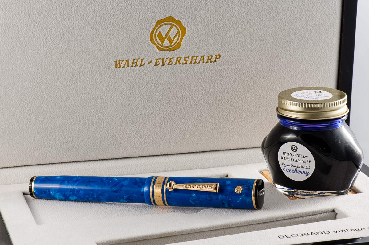
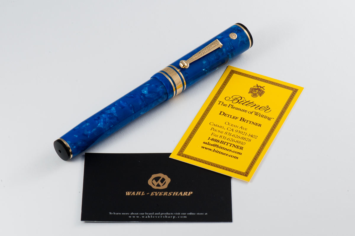
We want to thank Mr. Detlef Bittner of Bittner Pens for lending us this Wahl-Eversharp fountain pen for review. Detlef’s pen store is located in Carmel, California and he also travels to a lot of pen shows. When we return this pen, the HOTP crew may just decide to take a road trip and visit the pen store.
The opinions here are our own and we were not compensated (monetarily or otherwise) for this review.
We have also asked Claire (@writteninrice) to be our guest once again and review this pen with us. Thanks Claire!
Hand Over That Pen, please!
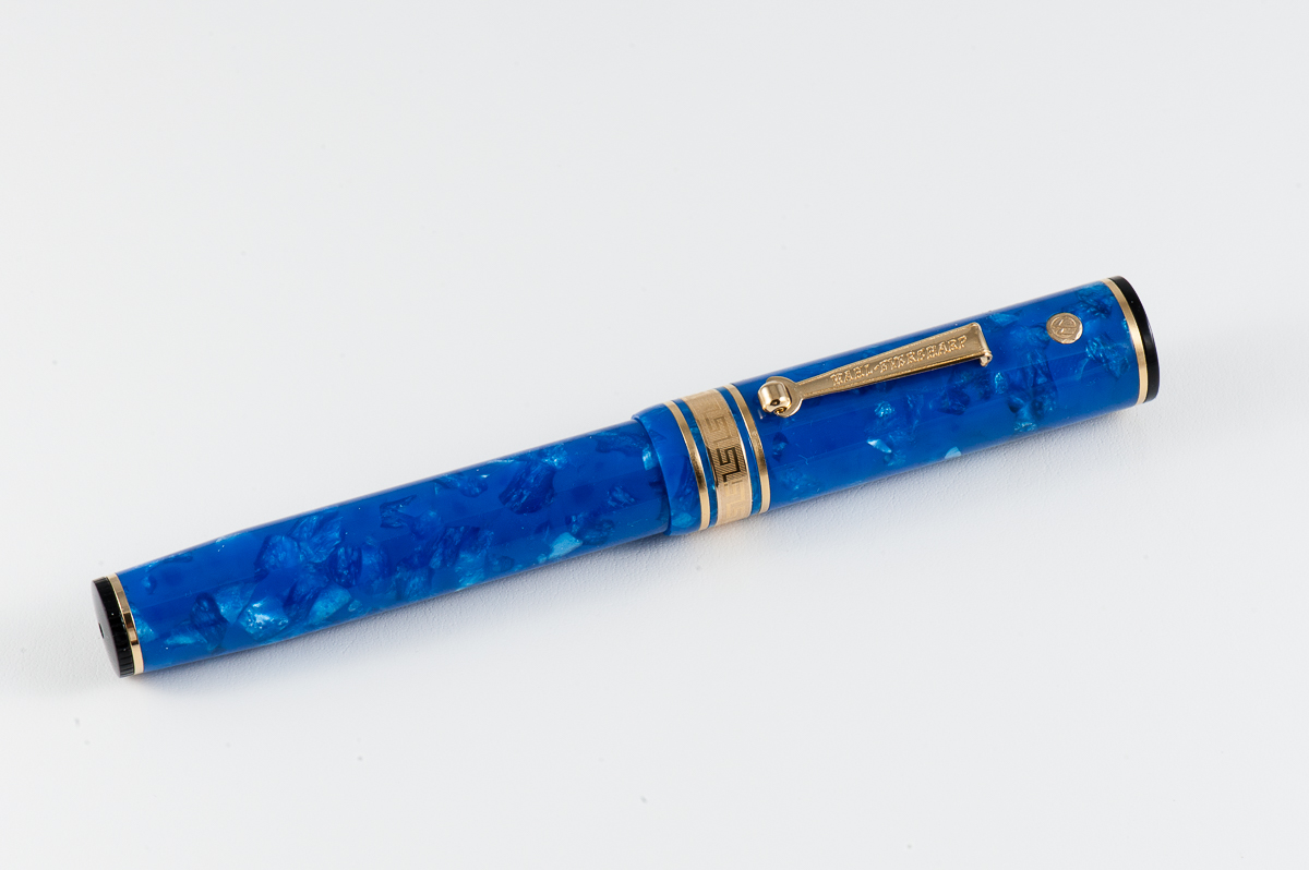
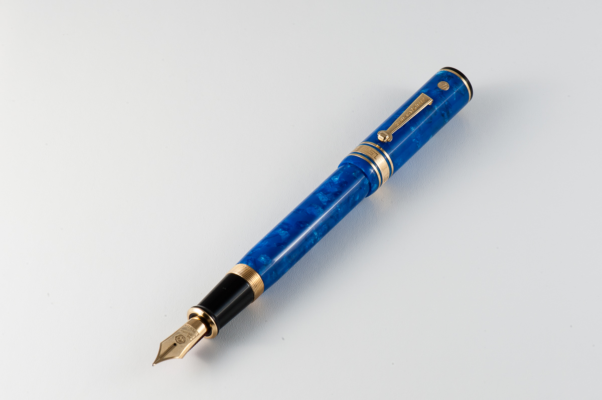
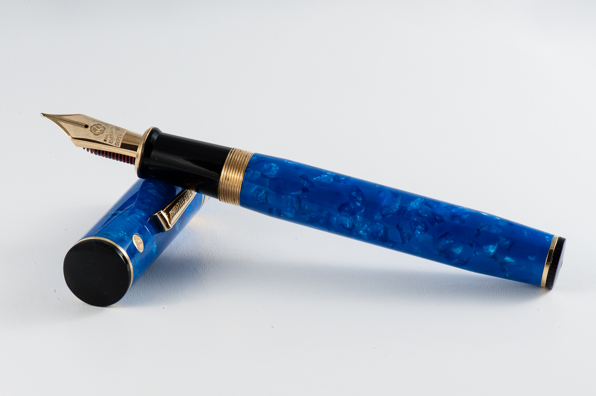
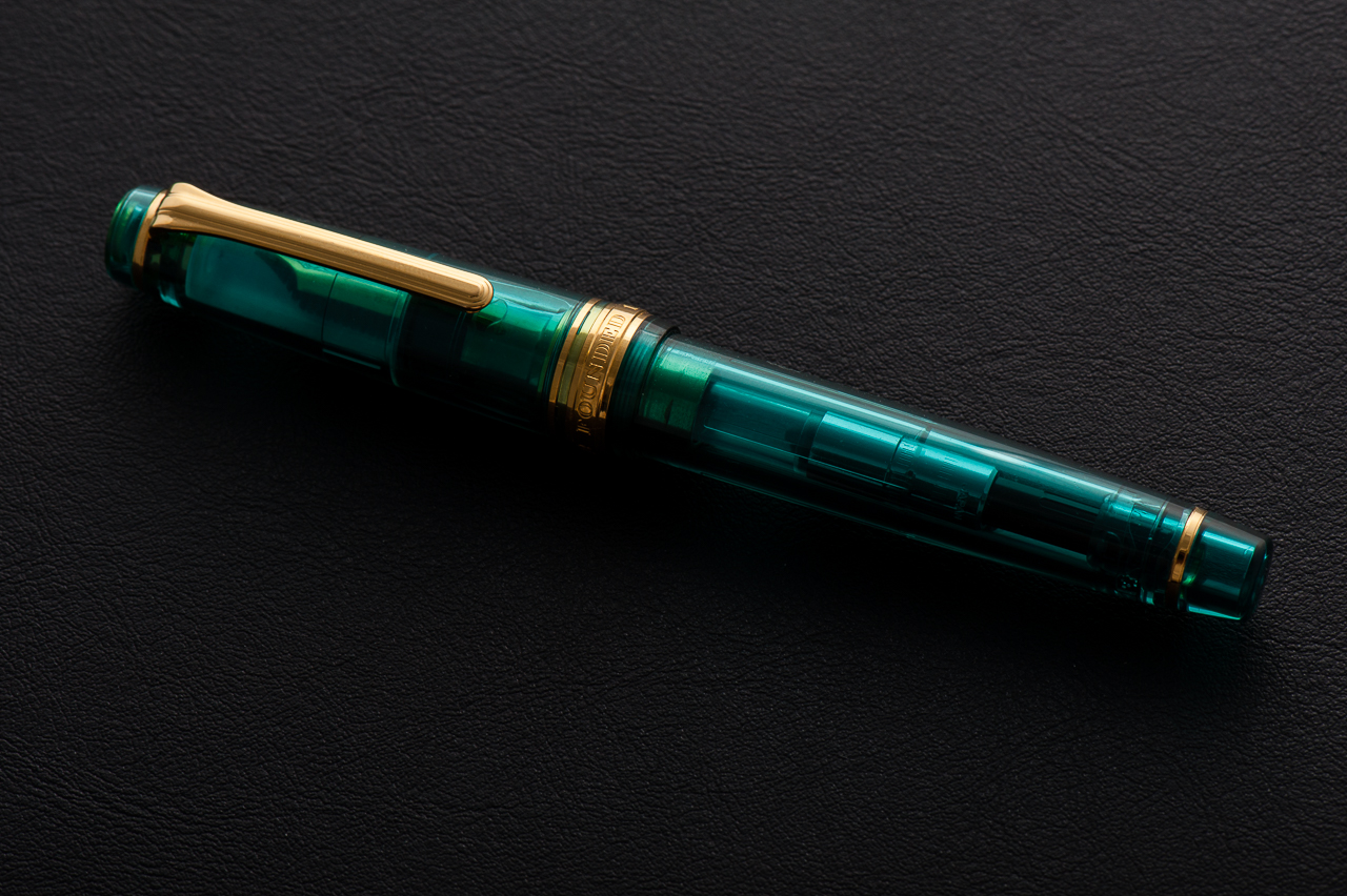
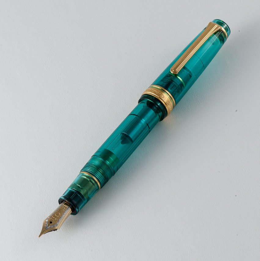
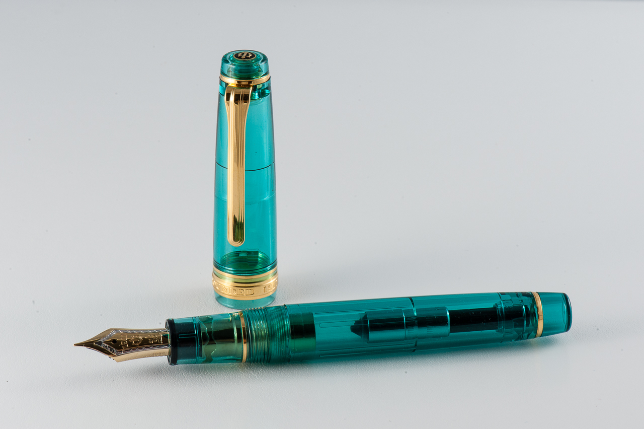
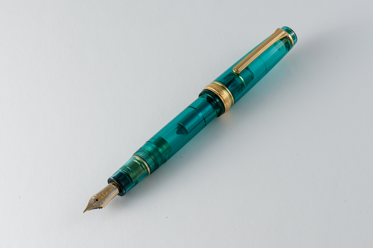
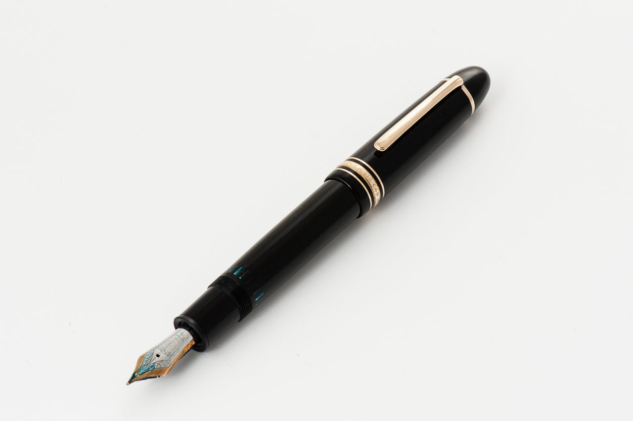
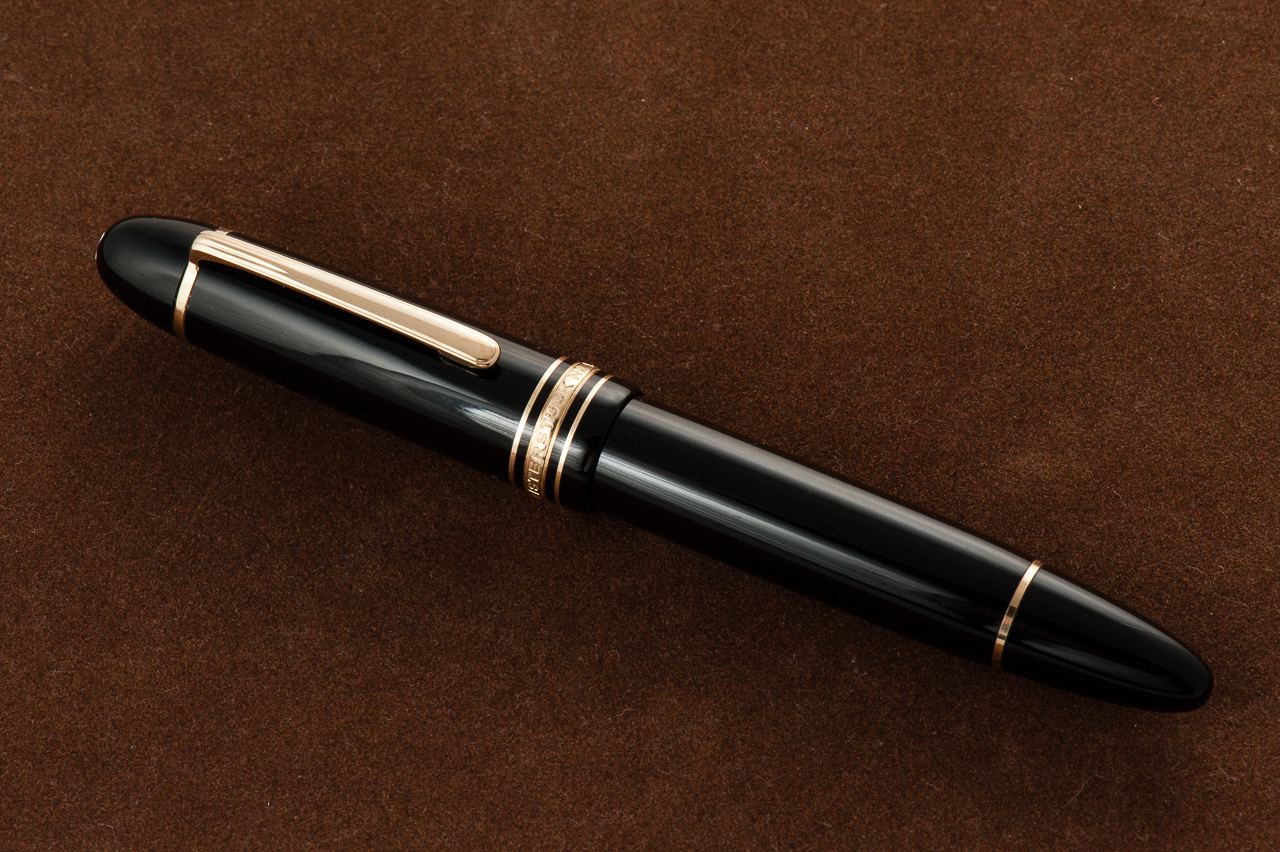
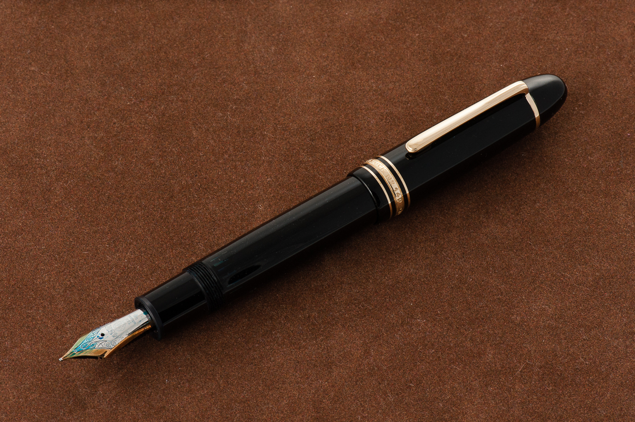
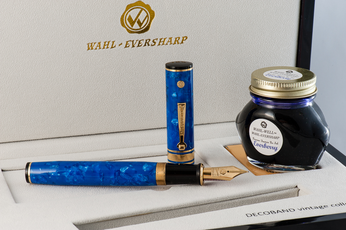
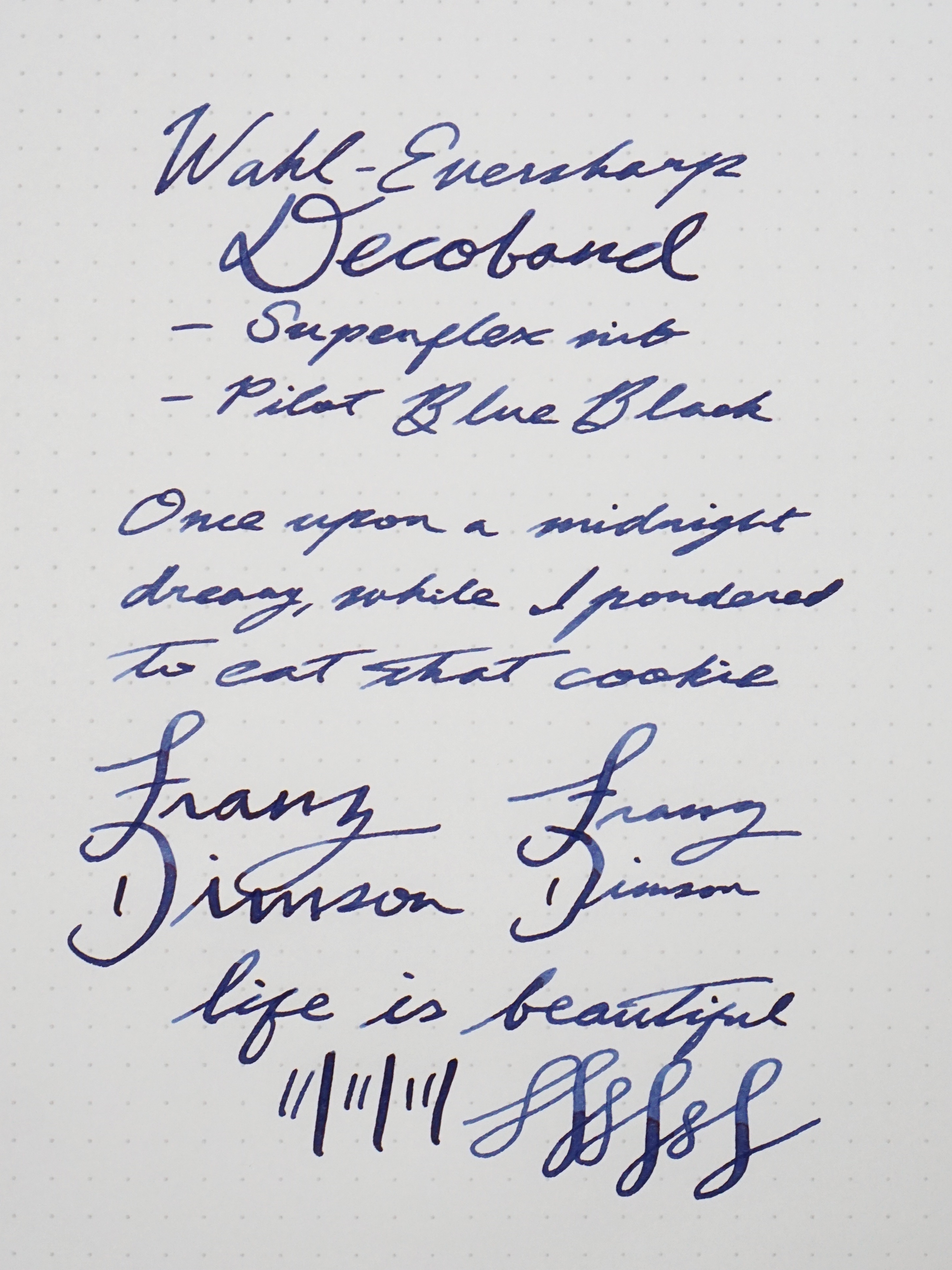
Katherine: This is a pretty cool looking pen, and the huge nib looks very cool. I really liked details on this pen — the complex blue material, the red ebonite feed and the classy use of gold and black trim. But, even at first glance, this is a huge pen! It stands out and is hard to miss.
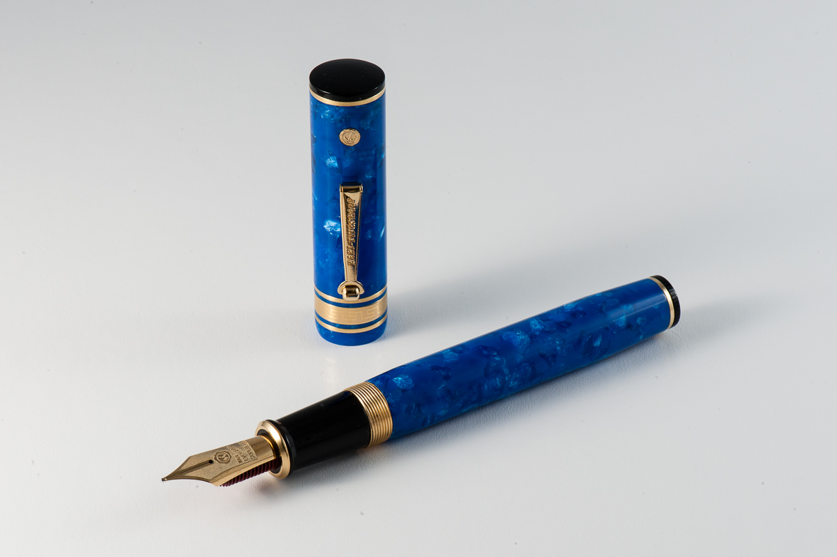
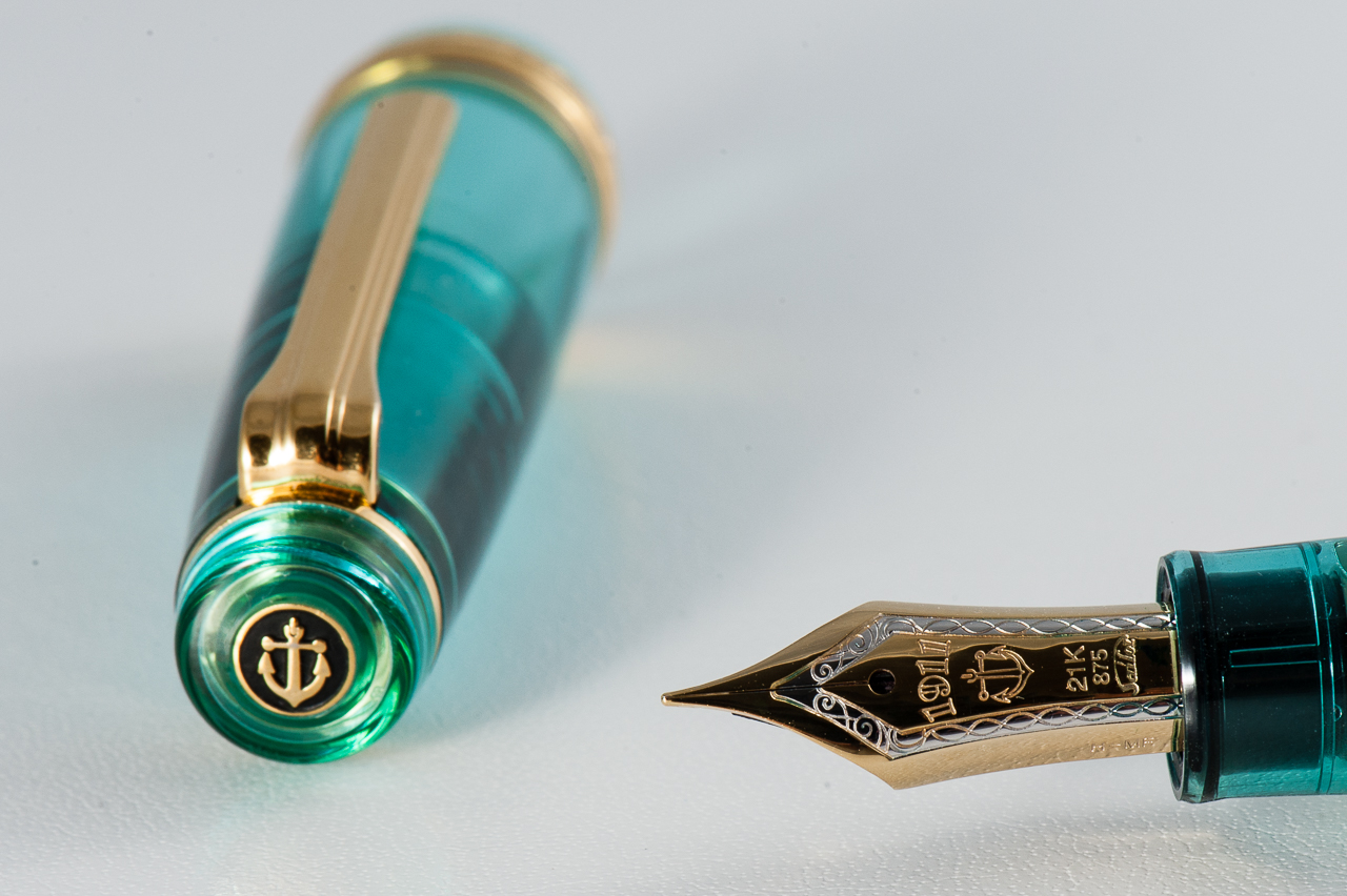
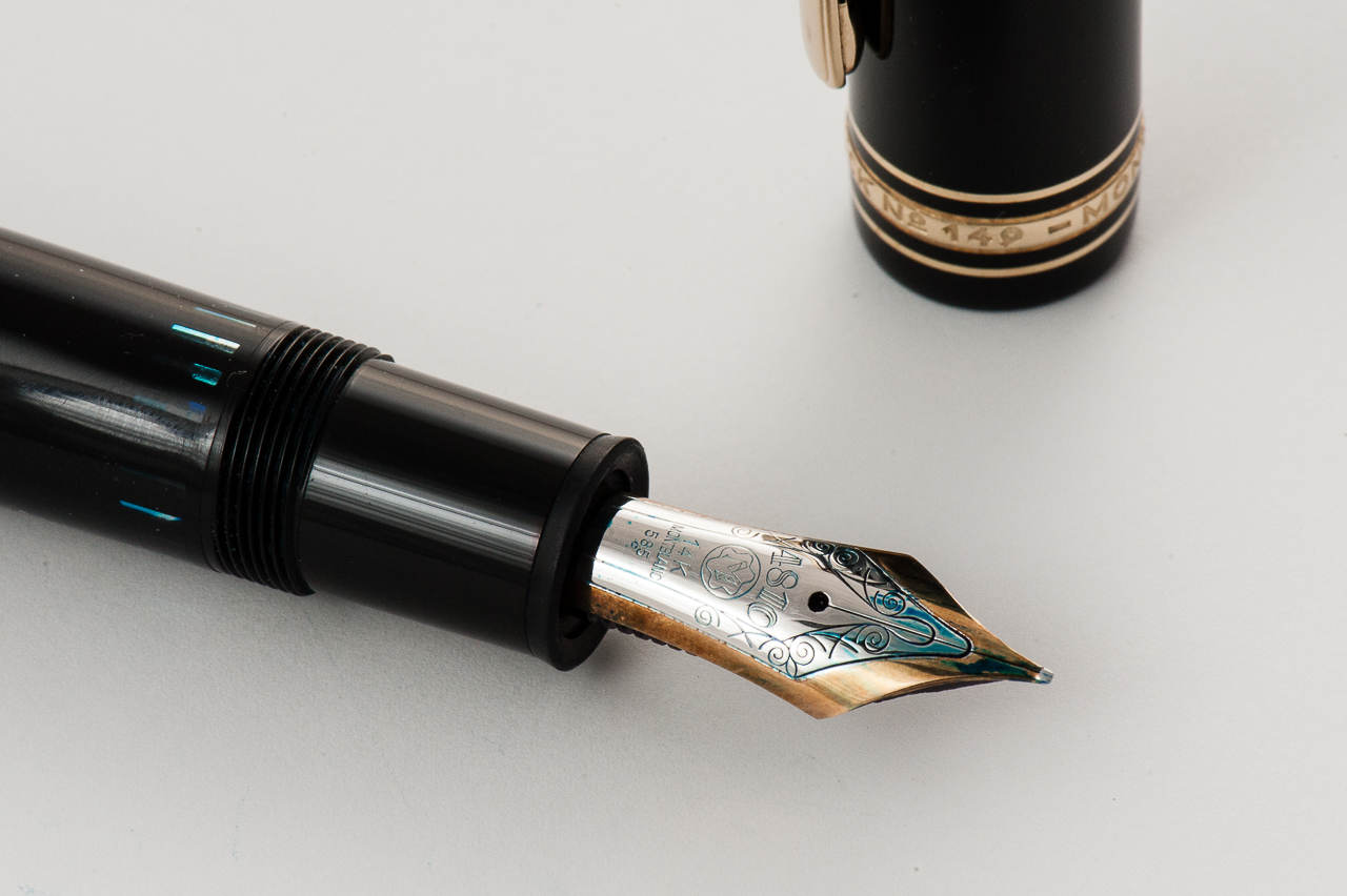
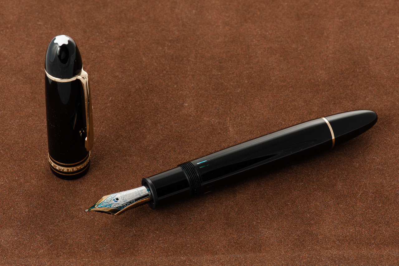
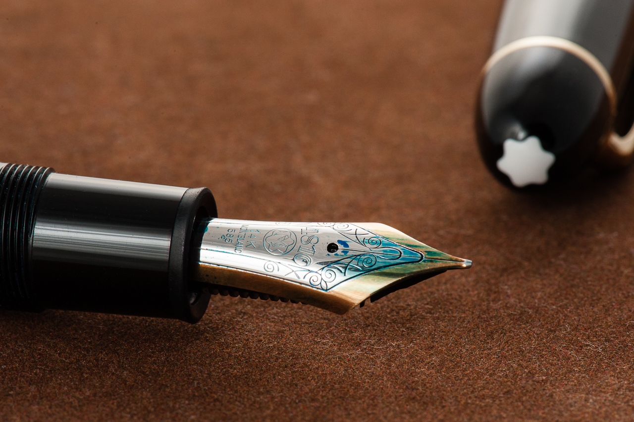
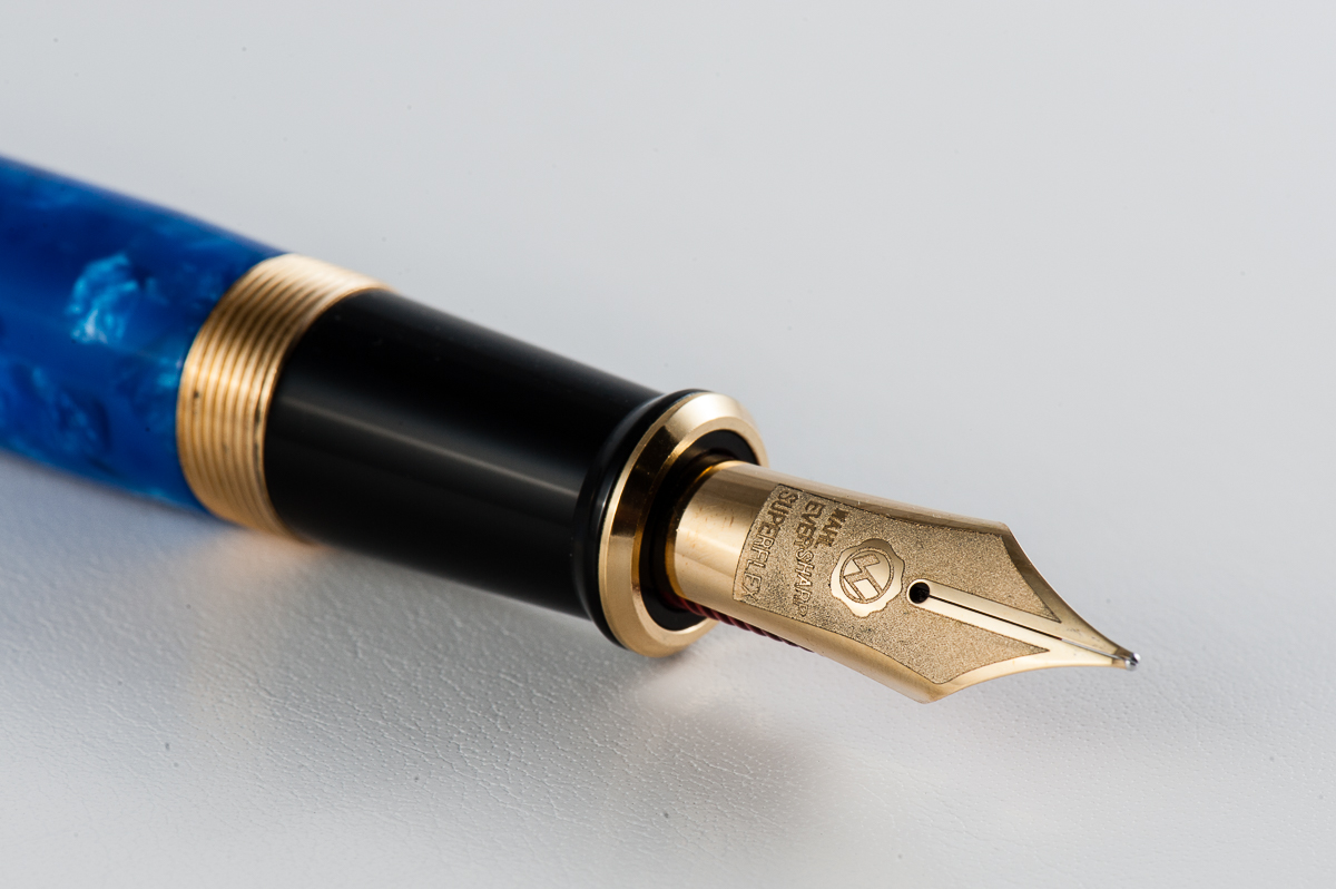
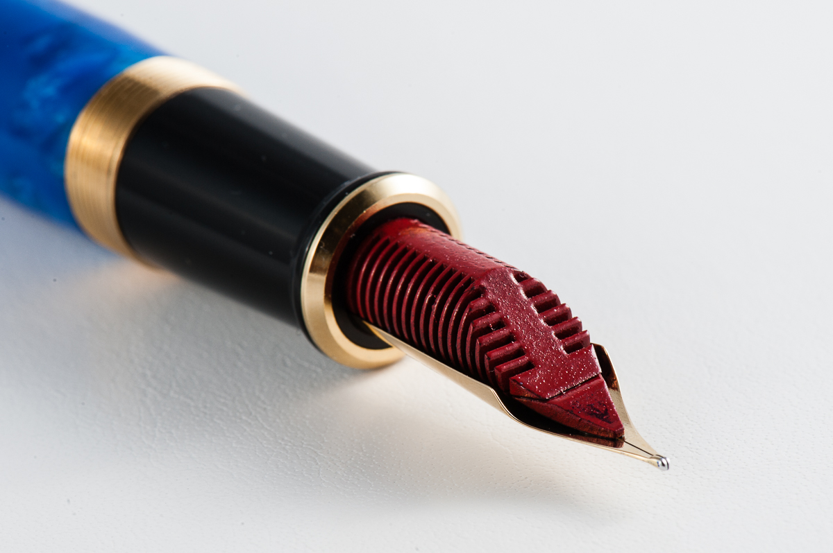
Claire: This is a pen with gravitas that hearkens back to pens of a bygone era. The Wahl Eversharp Decoband is a large pen that’s an attention grabber. The nib on this pen is just lovely and I love the red ebonite feed. In fact, I couldn’t help but post a nib shot of this pen on Instagram the second I got it in my hands. I am not typically a fan of pens with gold hardware but for this pen, it works.
Pam: The Decoband is an acquired taste for me. It is undeniable that the blue material is beautiful and deep, that the red ebonite feed is awesome, and that nib is gorgeous. I am just not a fan of the shape and the overall aesthetic. Despite my reservations about the pen, it’s a beautiful pen that is very reminiscent of the fountain pen’s golden days.
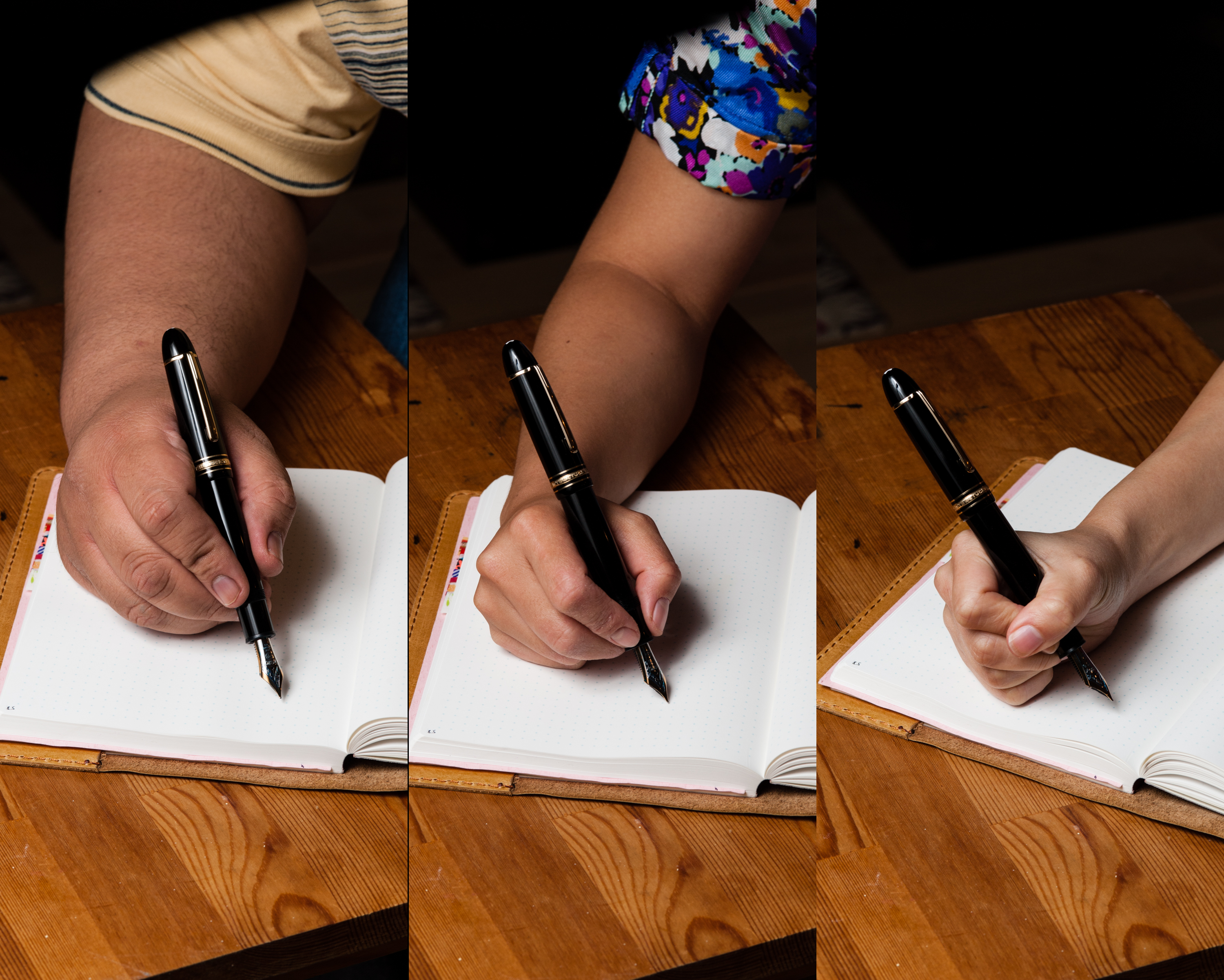
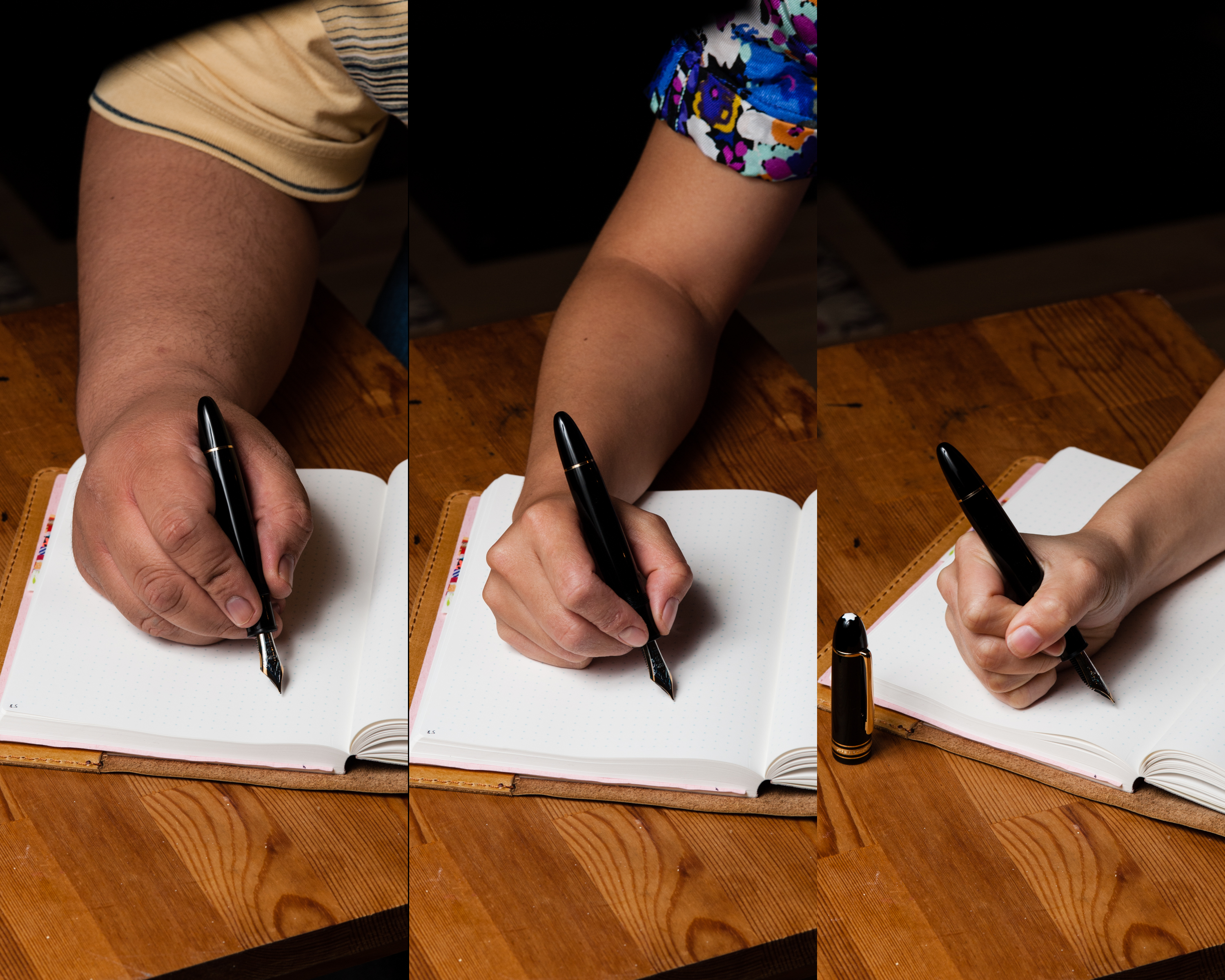
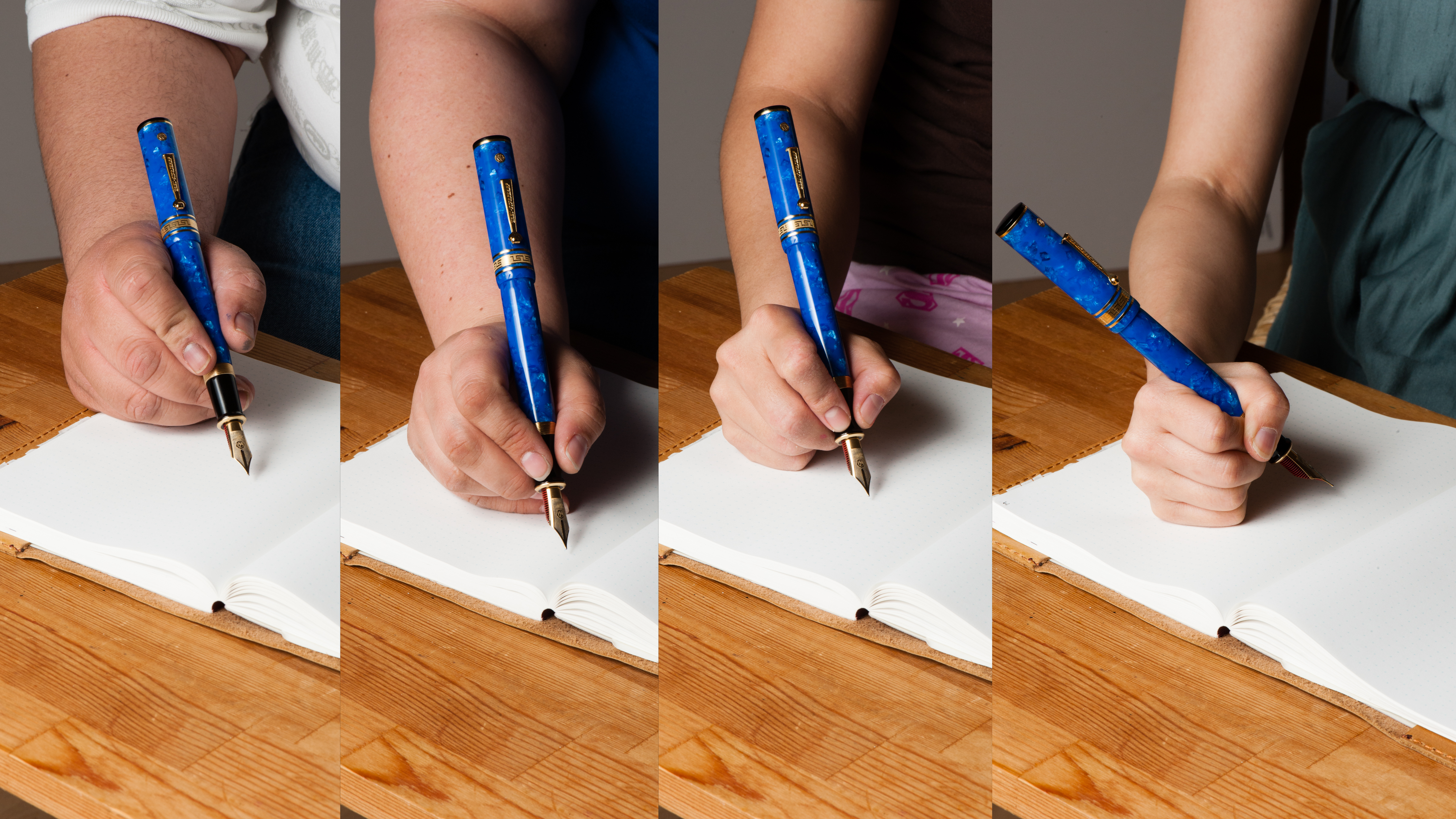
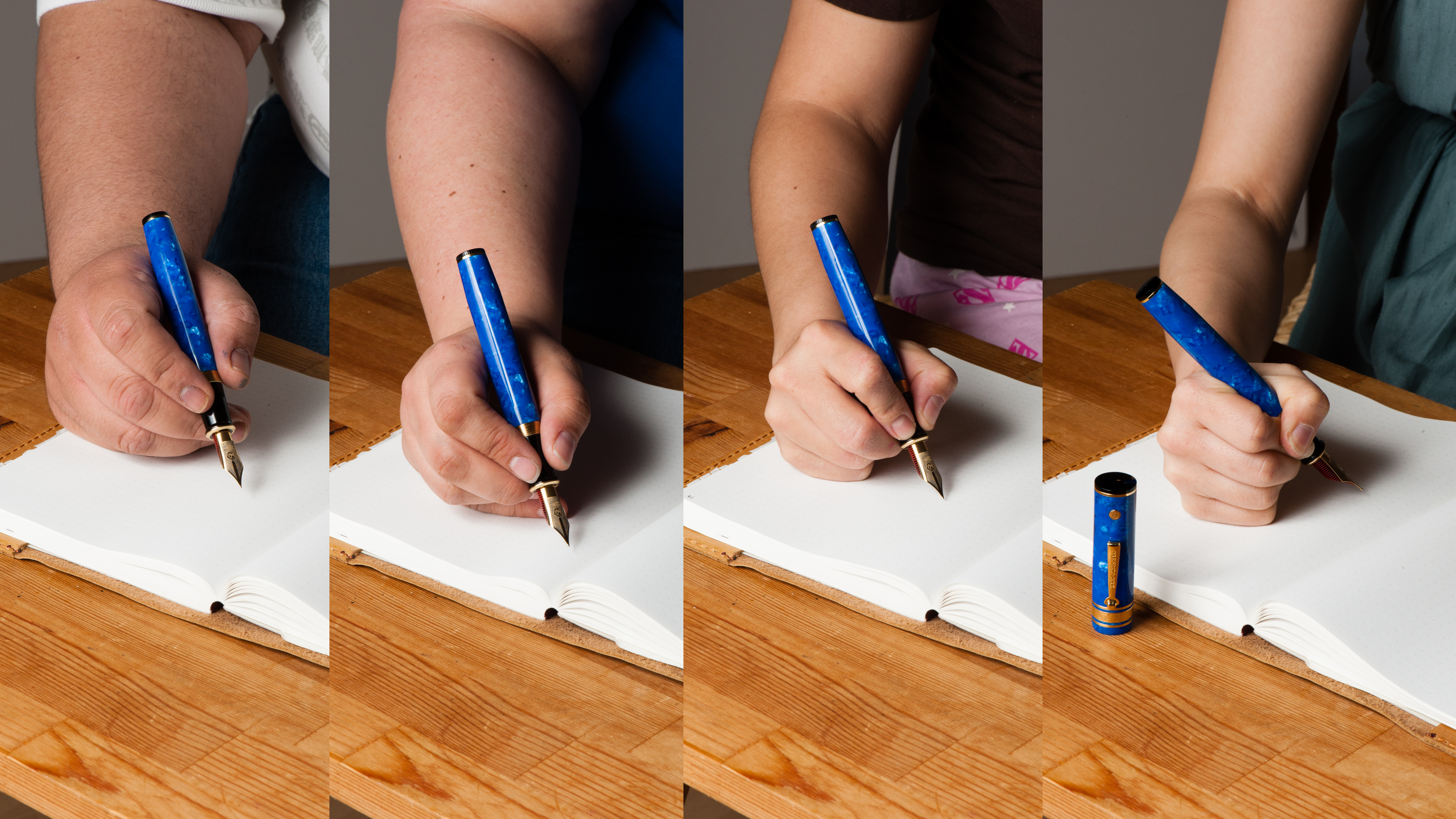
Franz: Is this pen big enough or what? The Decoband is massively impressive and is probably the biggest pen that I’ve held in terms of length, girth, and weight. This is a revival of Wahl-Eversharp’s Gold Seal design in 1929. The proportion of the pen is very similar to the vintage one except for its larger scale. The Decoband fits quite perfectly in my bear paw…err… large hand and is quite comfortable for me to use.
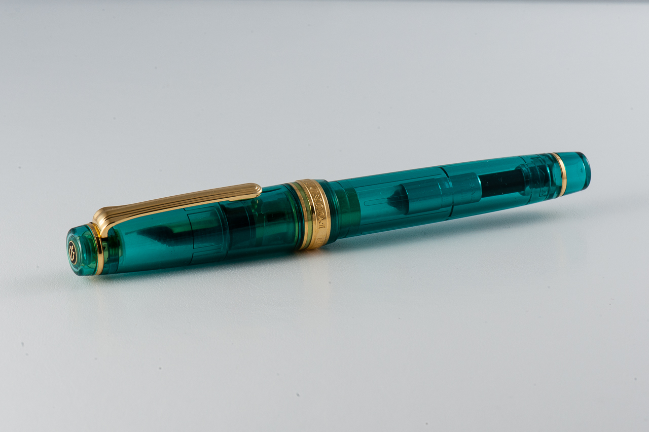
The Amalfi Blue Pearl acrylic is such a stunning material and as Katherine pointed out, the black finials on the cap and the bottom of the barrel makes it a classic looking pen. The packaging is also impressive as the box big and shiny. They also supply the pen with Wahl-Eversharp’s ink bottle which is a nice touch.
The Business End
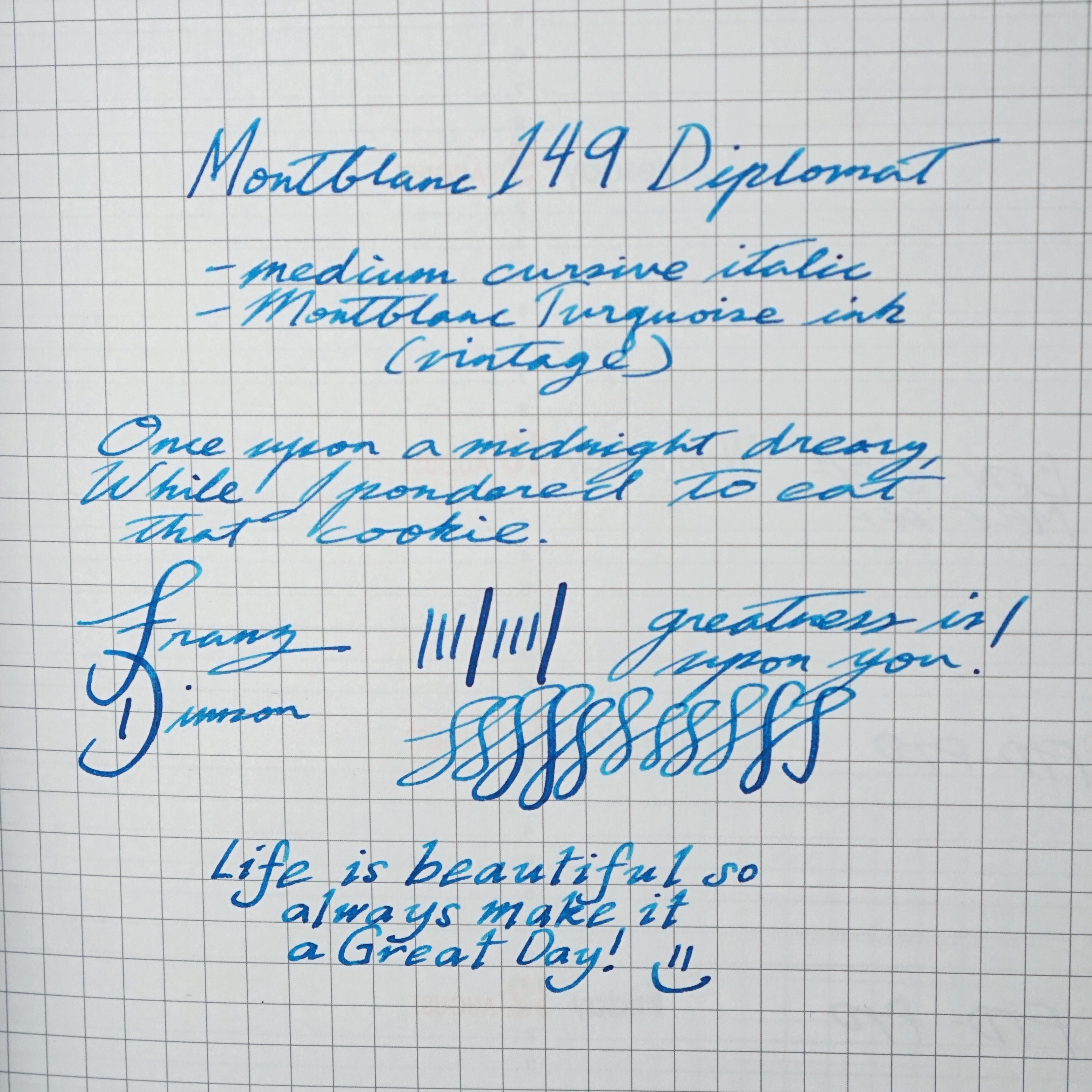
Katherine: The nib is huge and it writes quite nicely. It’s very smooth without being glassy, and has a nice softness to it. However, I didn’t think it was comparable to many of the “full” flex vintage nibs I’ve tried. The Decoband nib is smooth and wet, but line variation is not its strong suit. Perhaps a finer point would produce more line variation, but out of the box, this is more of a wet and medium writer.
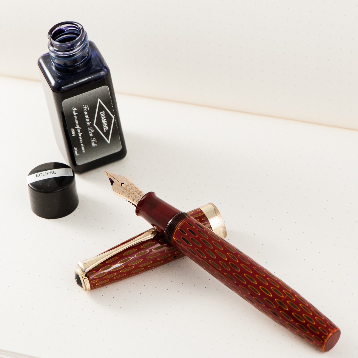
Claire: As I mentioned earlier, the super flex nib on this pen is eye catching. I love the frosted detail noting the brand and specifics. In hand, the nib is a little on the squishy side. After primarily writing with hard nibs this was a bit disconcerting. Though, it didn’t take too long to get used to the experience and really start to enjoy the way this pen puts ink to paper. The super flex nib boasts arguably the best modern flex on the market. While it doesn’t have the snap back that I experienced with vintage flex nibs, it does provide an amazing amount of flex.
Pam: My favorite part of the pen is the nib and the red ebonite feed. It’s an absolute beauty. The nib is one of the smoothest and softest nibs I have tried. The line variation is not as great as a vintage flex, but arguably this nib is the best “modern flex” nib out there. I did find the nib to be quite wet, so I don’t see this my ideal for daily writing (don’t forget my writing pressure), but it would definitely give those who want your autograph a special flourish!
Franz: The Decoband is available in two nib options. First is the semi-flex extra fine nib, and second is the Superflex nib which is what was loaned to us. I typically do not write with flexible nibs and the only “flex” pen I own is a vintage Parker Televisor. The Superflex nib’s variation was remarkable to me. It definitely has a wet flow that even without pressure, the line is a medium width and when pressure is applied, it lays down a nice wide line. The Decoband’s feed is made of ebonite coated with red urushi lacquer and assists the generous ink flow of the nib.
In addition, I was able to try out the semi-flex extra fine nib from a friend at the 2017 LA Pen Show and I think that the semi-flex is more of an everyday writing nib for me. So you have two great nib choices for the Decoband.
Write It Up
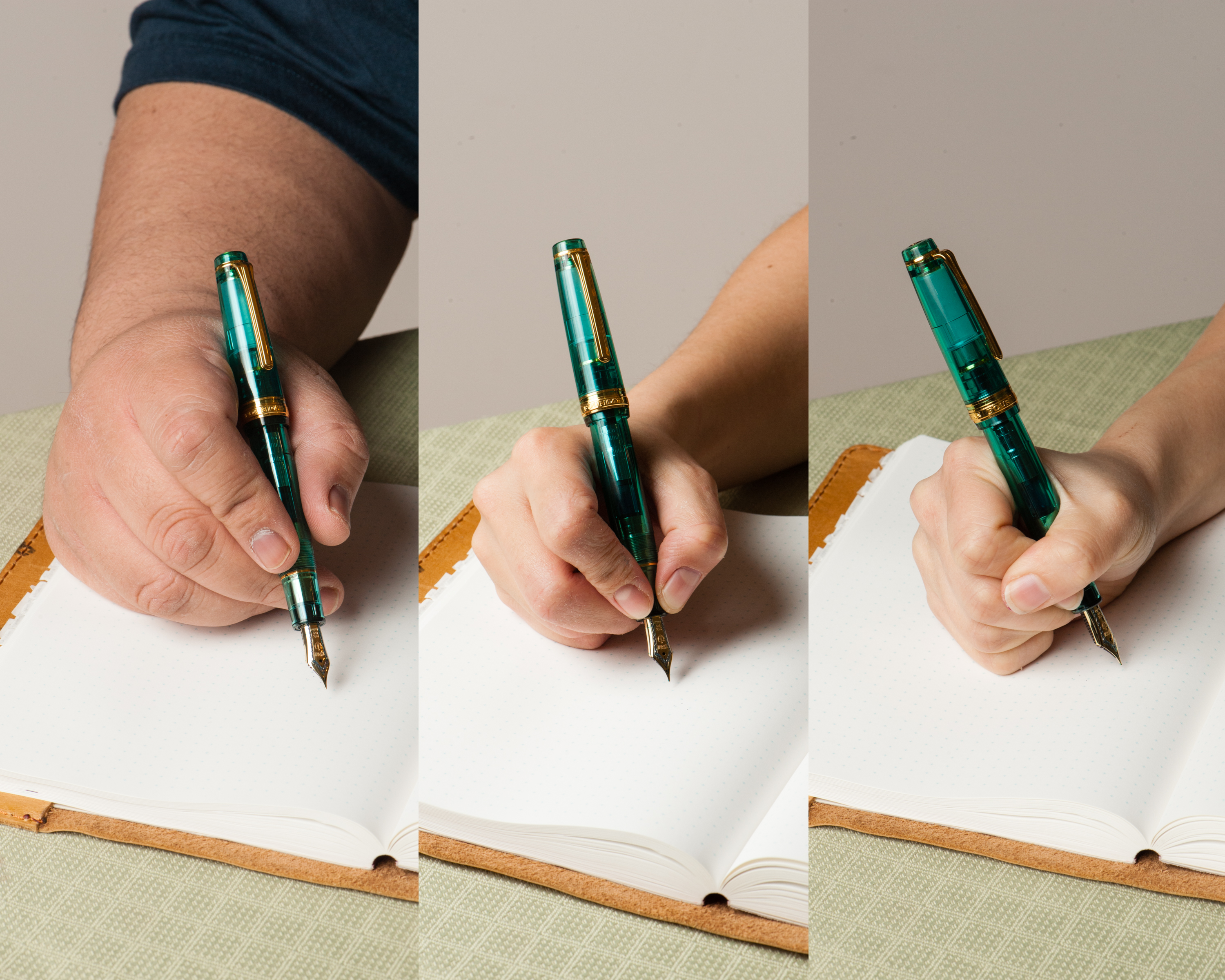
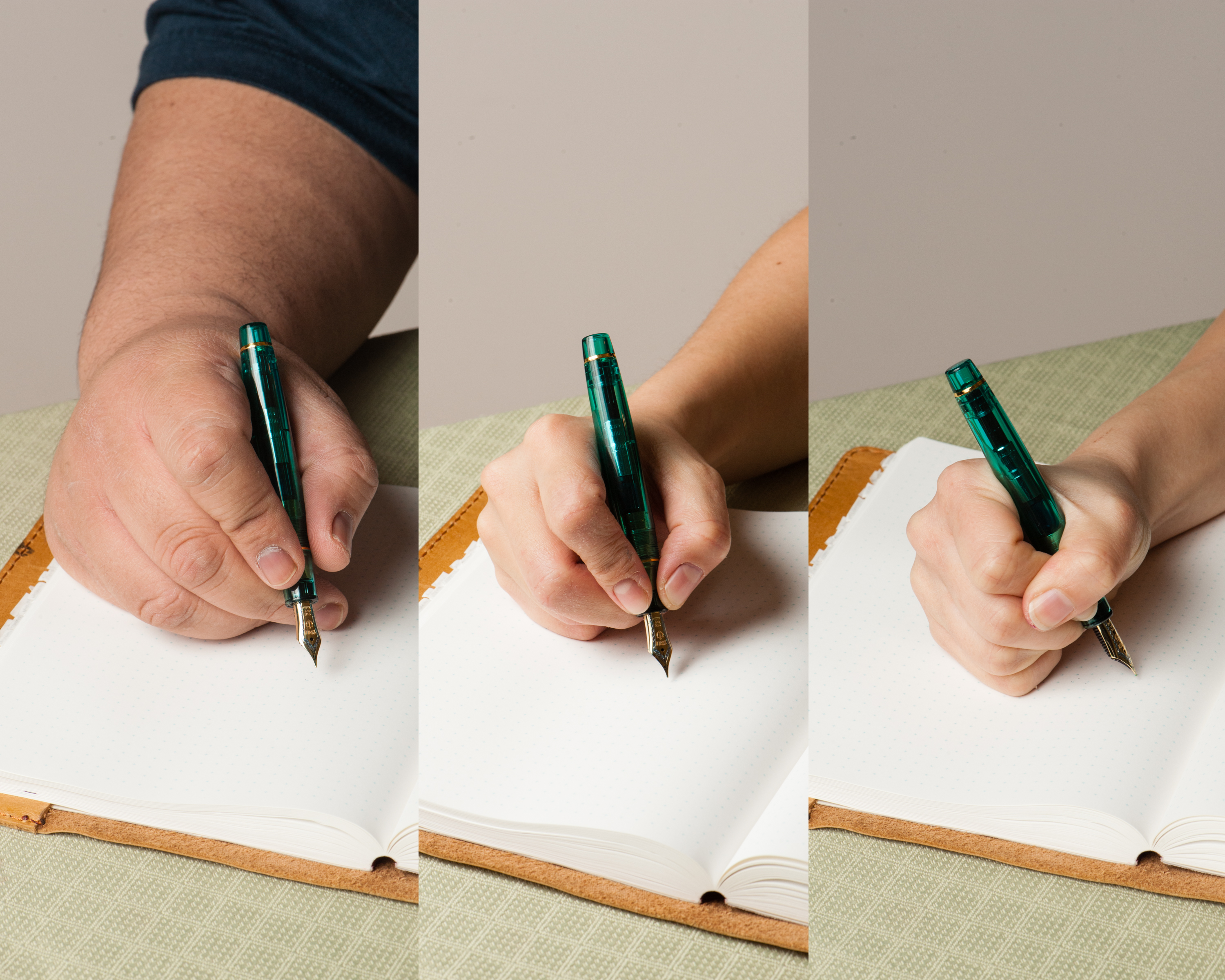
Katherine: At first I thought this pen would be okay — but a couple minutes into writing with it I noticed my hand was more tired than normal, and starting to get a bit of cramping. Additionally, if I tried to use it posted… well, I wouldn’t. I’d probably poke myself in the eye. All in all, a pen I’d rather look at than use, which is unfortunate, but such are small hands.
Claire: This is a hefty pen that is more apt for larger hands than mine. I found that my hand started cramping up after just a few minutes of writing. Overall, the pen felt well balanced and of an appropriate heft for its size. Unfortunately, this pen is just too wide for me to use comfortably for long writing sessions.
Pam: This pen was meant for bear paws as I found the pen to only be comfortable for a couple of minutes before my hand would notably tire. I don’t recommend using the pen posted for those with small hands as the pen is quite large and heavy. The pen is heftier than most on the market, likely due to the material used. The width is not a problem for me, but the pen is quite top heavy, given the length of the pen, particularly posted.
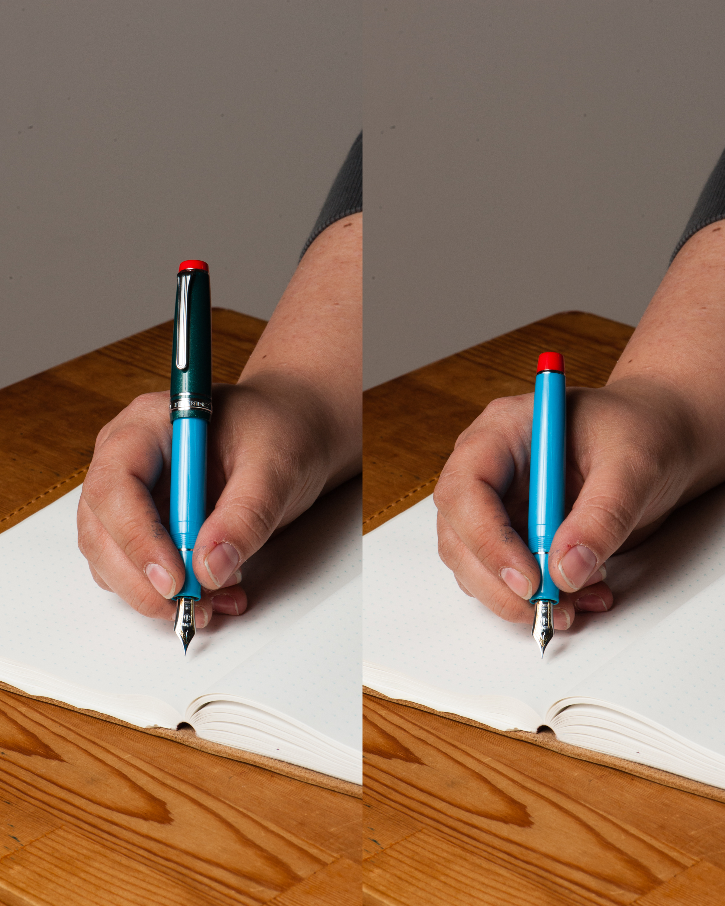
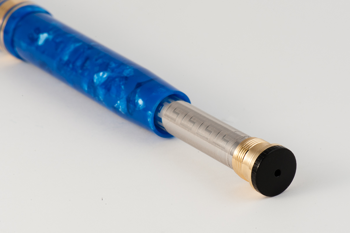
Franz: As I’ve said above, the pen fits my hand nicely and I was happy to write with it in my journal. In case you didn’t know, the pen’s internal mechanism is made of solid brass parts and the weight of the pen uncapped is about 40 grams. Compared to the Pelikan M805 that I use every day is about 20 grams uncapped. It is a heavy pen that after journaling for about ten minutes, my hand felt very fatigued. While this pen impresses me a lot, I would only use it to write quick notes, a short letter, or a nice signature. I wrote with this pen unposted because it is too long for me when the cap is posted.
EDC-ness
Katherine: I sat down with this pen and wrote a few pages with it, but didn’t EDC it since it’s on loan from Bittner Pens (thank you again!) and didn’t want to risk any damage. However, based on the handful of pages I wrote with it, I wouldn’t consider it a candidate for EDC for a couple reasons: 1. it’s just too big, 2. nib is a little too wet, I’d have to wait for all my notes to dry before being able to close my notebook!
Claire: This is not a pen that springs to mind in association with the letters EDC. This would be a great pen for an office job that required occasional notes. I did not get a chance to carry this pen around to test it out for longer than playing with it for an evening at Katherine’s place.
Pam: Thank you Bittner Pens for your generous loan of the Decoband. That said, it lived in the original box unless we were testing it out. I would recommend this as a great EDC for a fancy desk to hold and carry. This pen is a bit large for the usual jacket or shirt pocket and given the weight, may not stay in the pocket for long if you were to bend over. Not to mention, this pen is best suited (in my opinion) for your autograph; what better pen to do that with than this beauty?
Franz: Because this Decoband is on loan, we only dipped the nib in ink and did not fill it. I was not able to use this pen in my office but I imagine that it would be a pen I’d keep on my desk and write with it only when seated. The Decoband is too big to fit securely in my shirt pocket although it would be okay for a jacket pocket.
The pen has a pneumatic filling system which is why there are solid brass parts inside. To fill the pen, unscrew and pull out the black knob, extend the metal sleeve, submerge the nib in the ink bottle, cover the hole on the knob, push the knob/metal sleeve down to the barrel, and uncover the hole. This action compresses the sac inside and when you let go of the hole, the pressure will draw ink in the pen. According to Wahl-Eversharp, the Decoband holds an ink capacity of 2.1ml. Now that’s appropriate for the amount of ink that it lays down from its superflex nib.
Final Grip-ping Impressions
Katherine: I’m pretty biased with this pen. It’s clearly not meant for people with smaller hands, which makes me a big meh on it. But, if I had a large handed friend I really liked and needed to get a pen for, this would be a contender. It’s a beautiful, classic looking pen with a nib full of character. However, at a price point of $800+, there’s no way I can justify a pen that’s so large my hand cramps for myself.
Claire: I love the blue material on this pen. Even though this pen is far too big for my hand it seems to be well balanced and well made pen. This pen has a the aesthetic of a vintage pen but also is quite large, which to me is an interesting combination. The superflex nib is the only modern pen that I’ve written with that is maybe a flexible as vintage flexible nibs straight out of the box. Overall, I think this is a lovely pen for a person with larger hands than myself.
Pam: The nib/feed of this pen is great for everyone. The pen itself however is much better suited for bear paw individuals (Hint, hint Franz!) and for those who really enjoy the vintage aesthetic. It’s a steep price so it’s not great for most wallets. However, I can say for this pen in particular, you pay for what you get. It’s a large, statement-esque, hefty pen, that has all the trappings of the fountain pen’s glory days. It’s obvious that Wahl Eversharp did not skimp on the Decoband. That said, it’s not an “every day carry” pen, it’s a “special occasion” pen. But for us fountain pen lovers, every day with a fountain pen is a special occasion!
Franz: I really like the Decoband because of its large dimensions and the awesome nib it is issued with. As a friend from the Pen Posse said, this is a “whale” of a pen for large handed people but as I say in most of our reviews, try it out for yourself when you can.
The Amalfi Blue Pearl acrylic version of the Decoband is a special edition color and will be limited in production. This is similar to the now sold out Lapis Blue. So if you want the Amalfi Blue, better contact Detlef of Bittner Pens, or Syd of Wahl-Eversharp right away. Hmmm….
Thank you Detlef for giving us the opportunity to review this awesome pen.
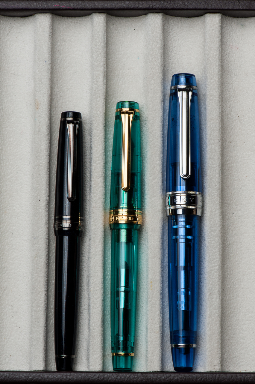
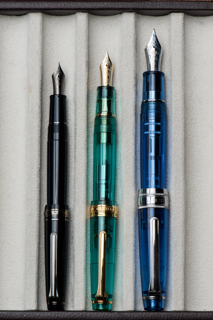
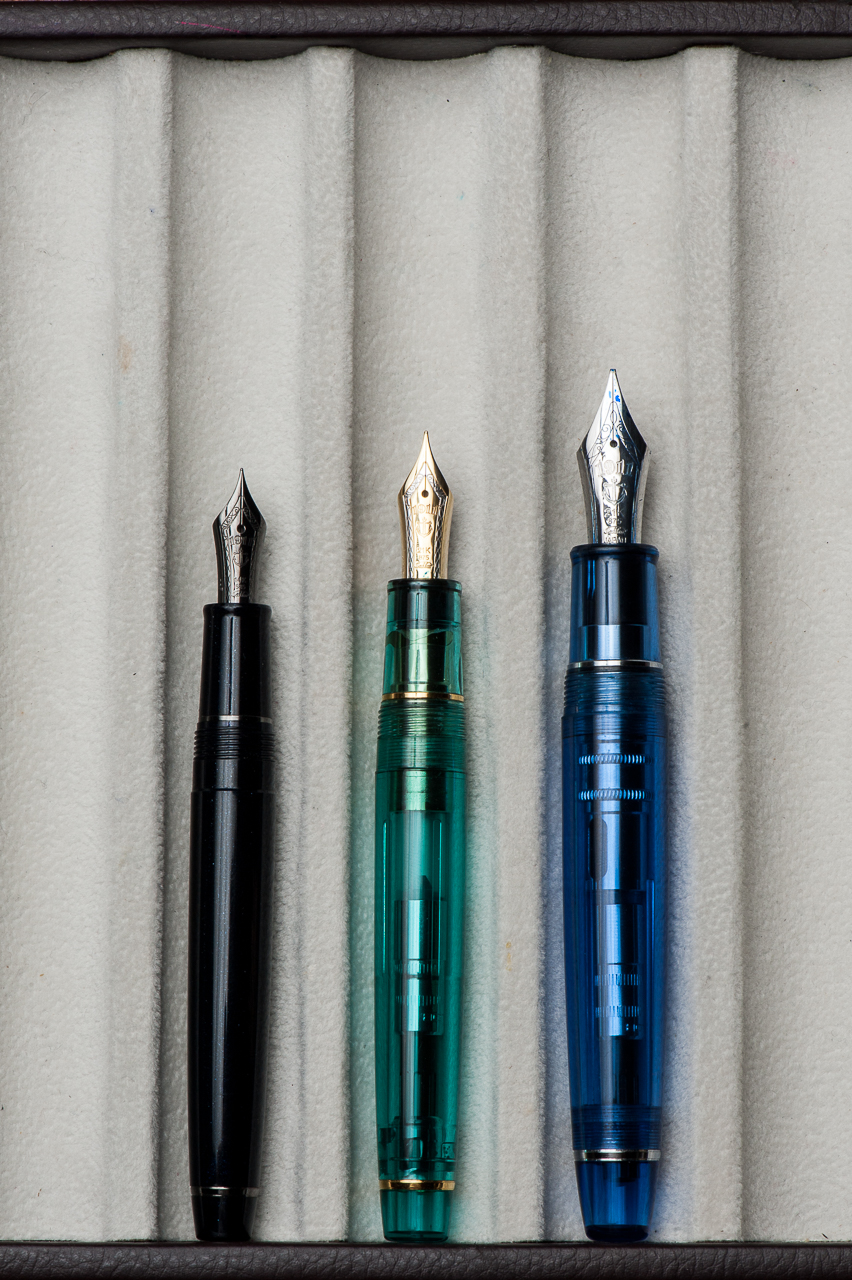
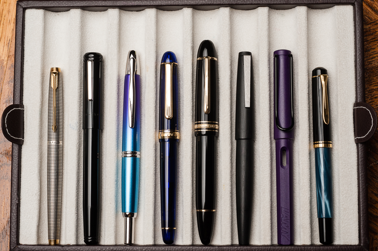
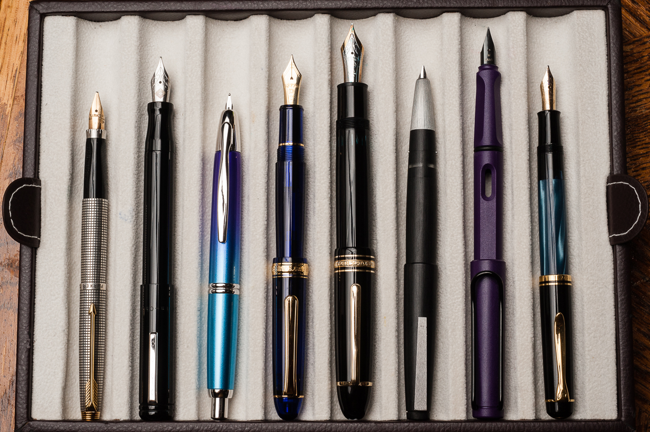
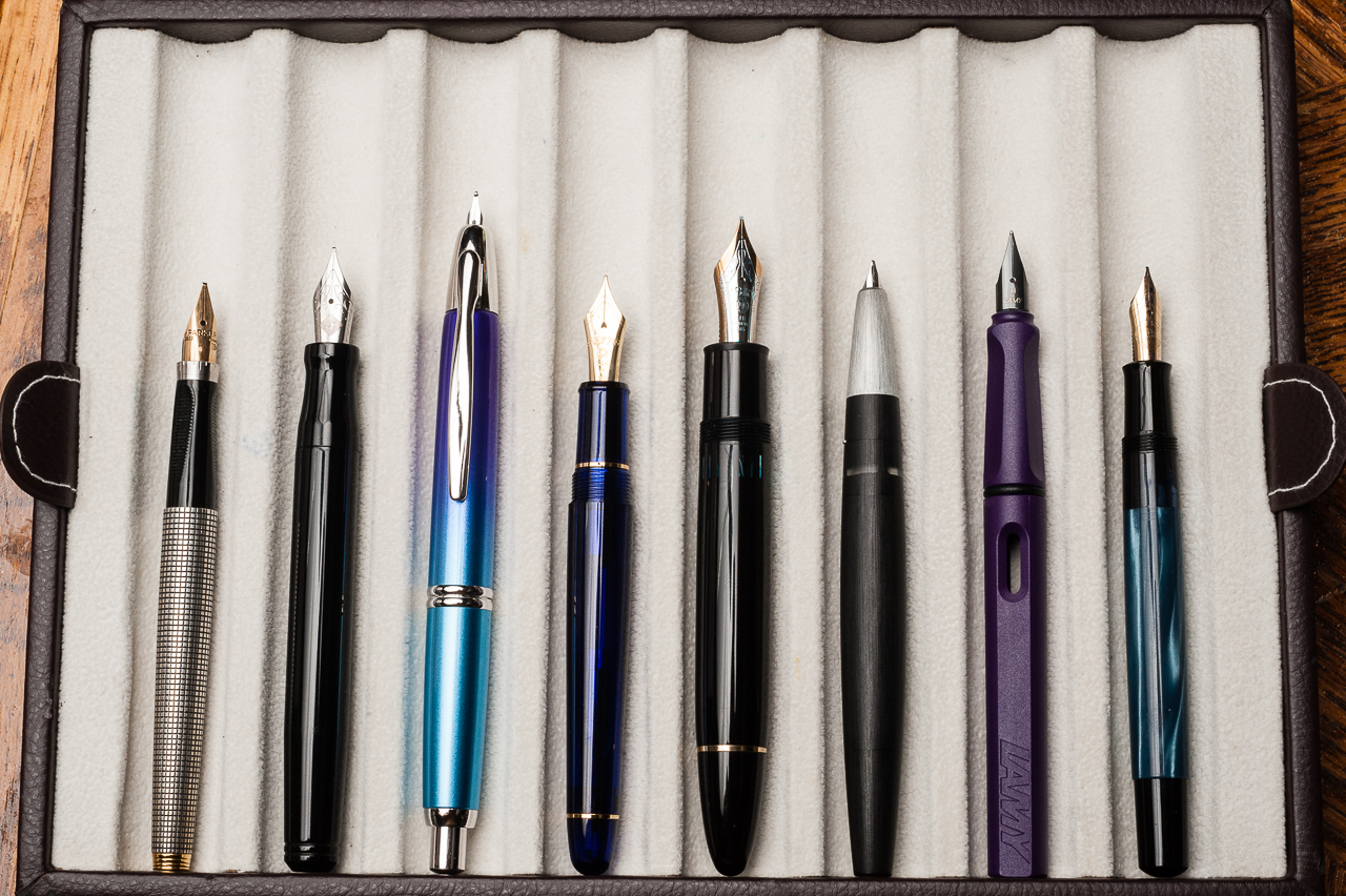
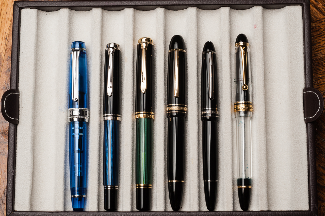
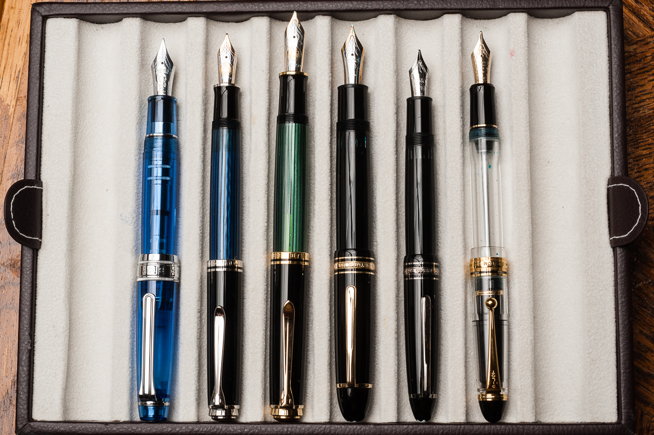
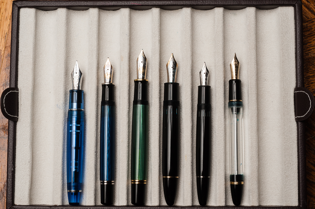
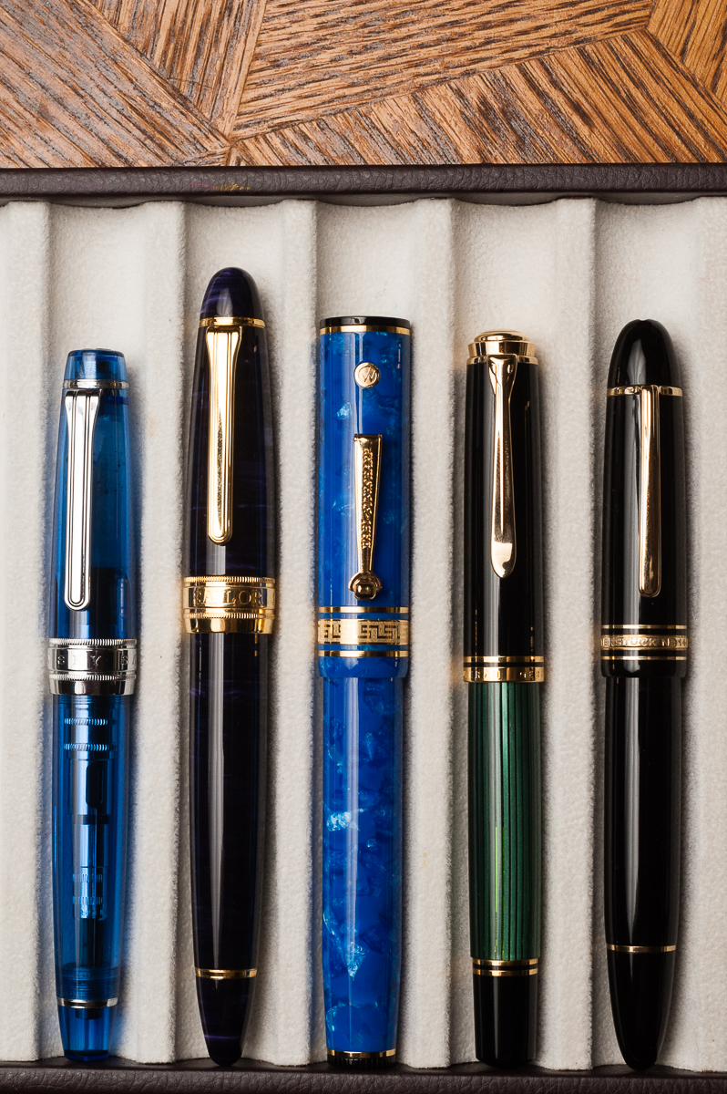
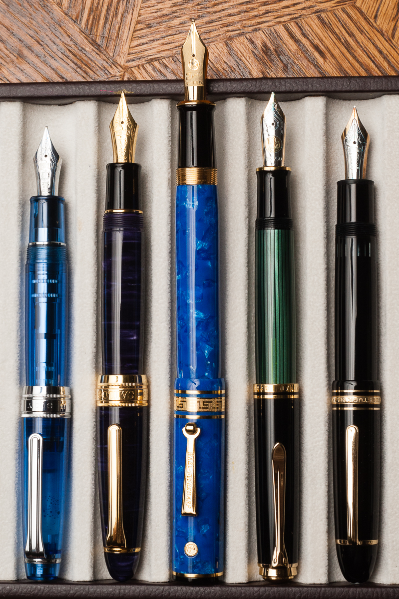
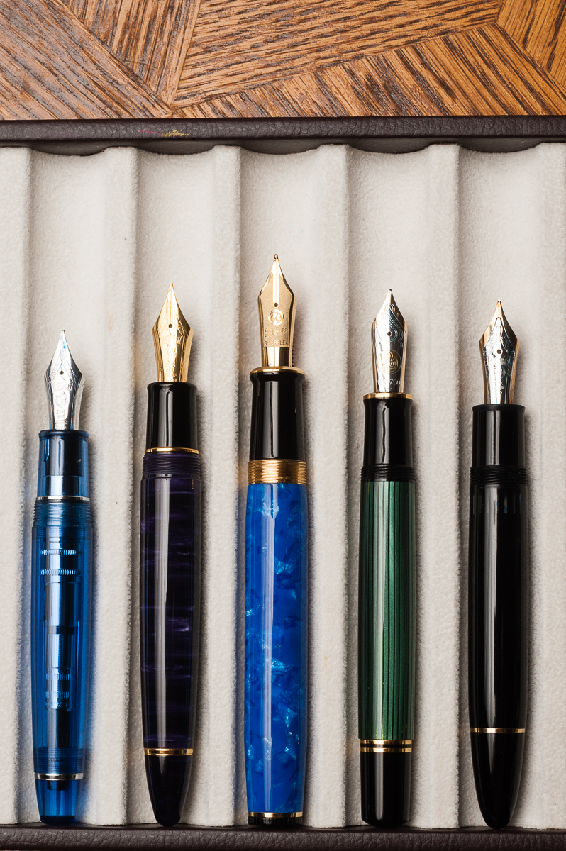
Pen Comparisons
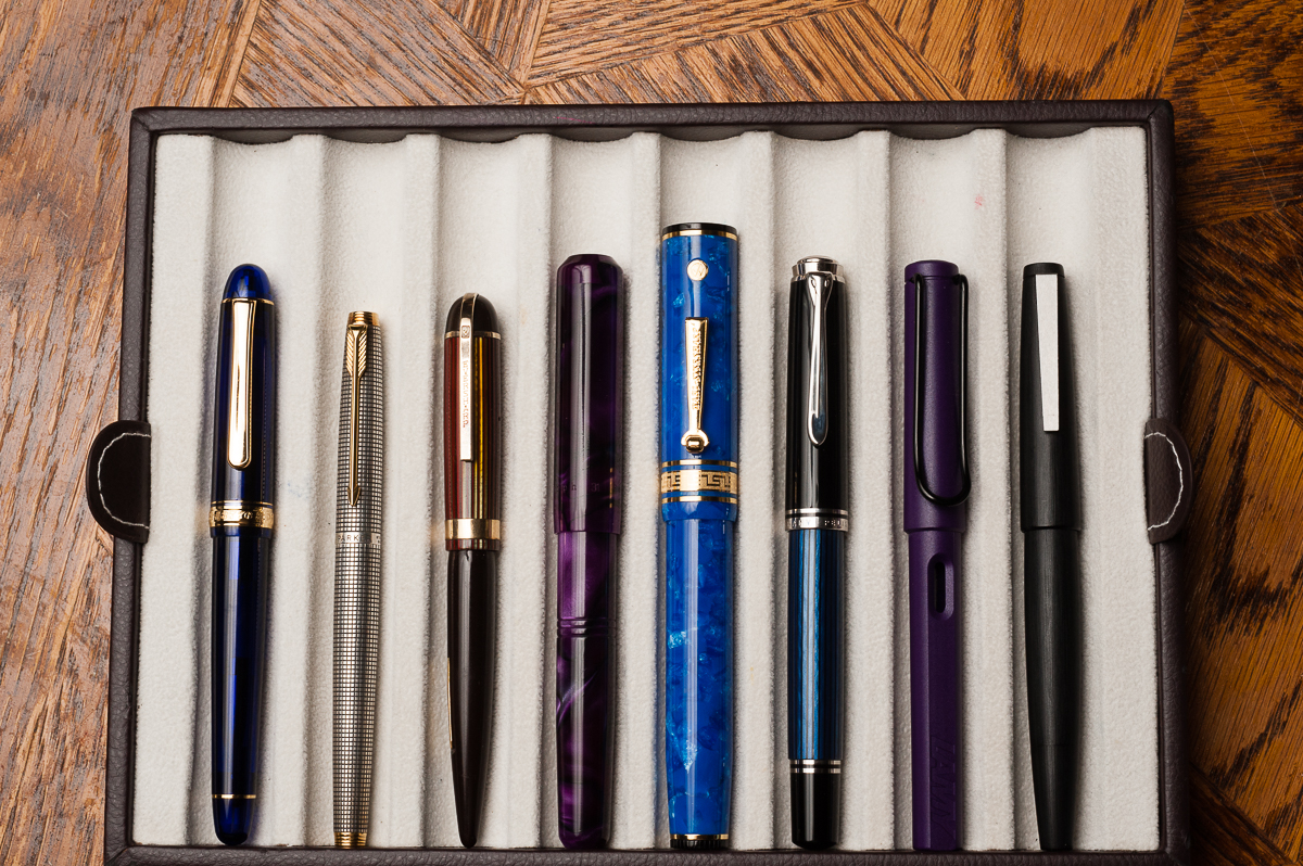
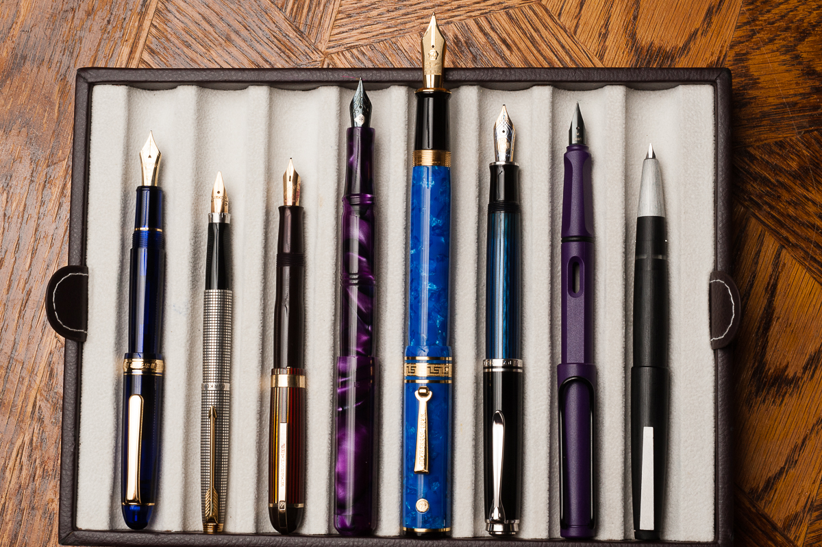
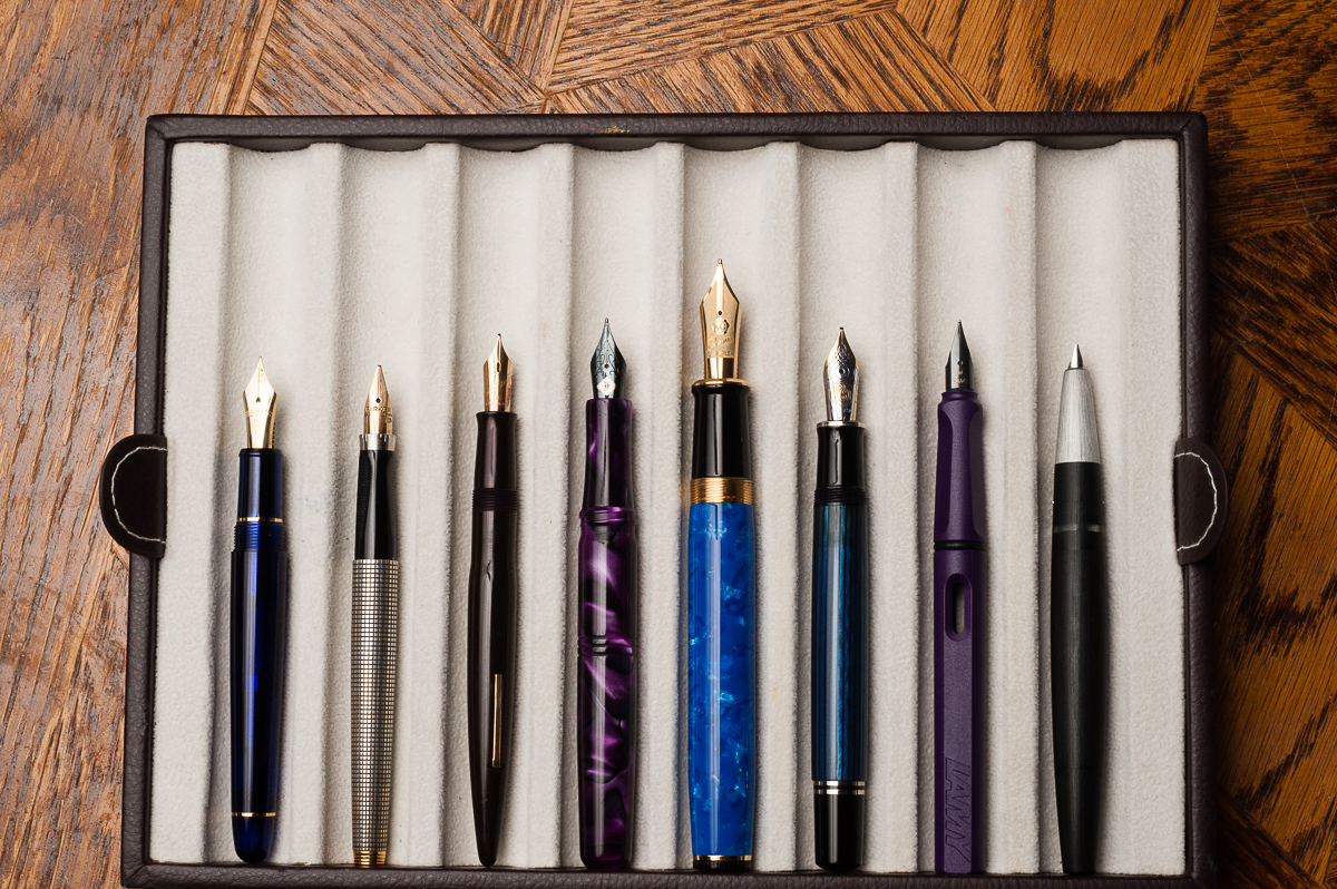
Oversize Pen Comparisons
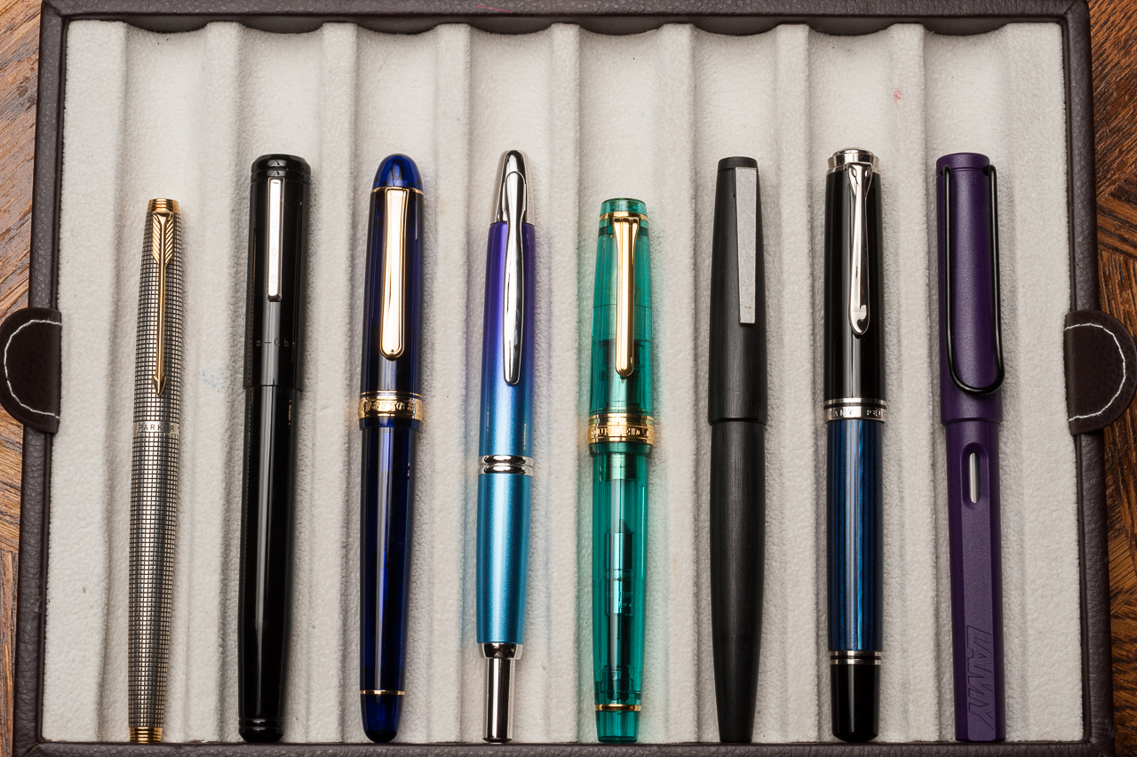
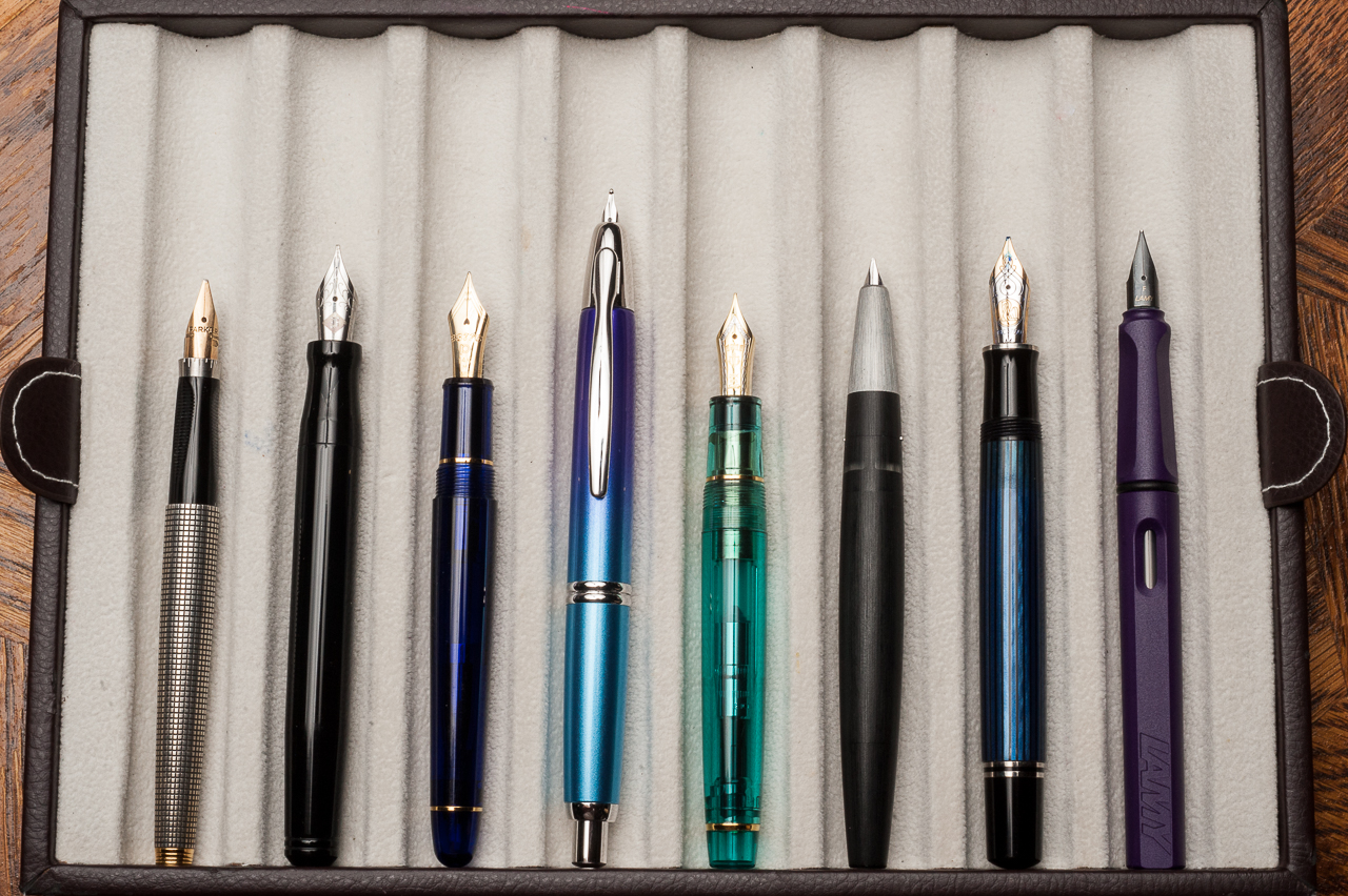
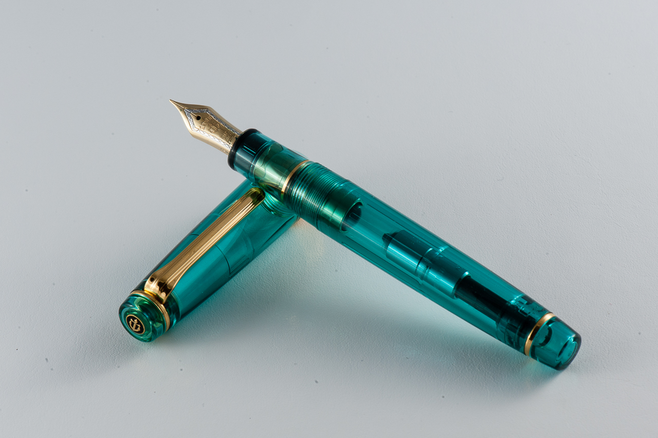
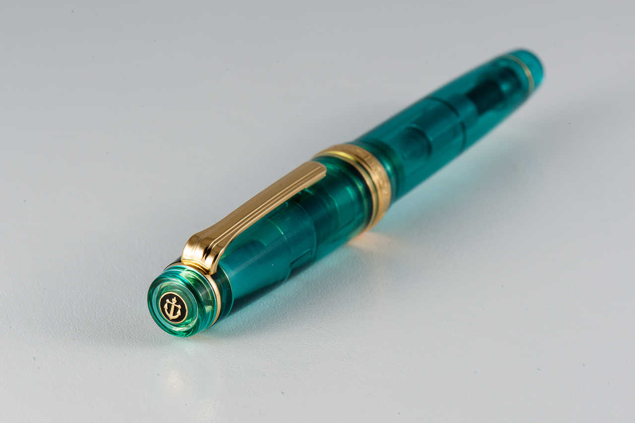
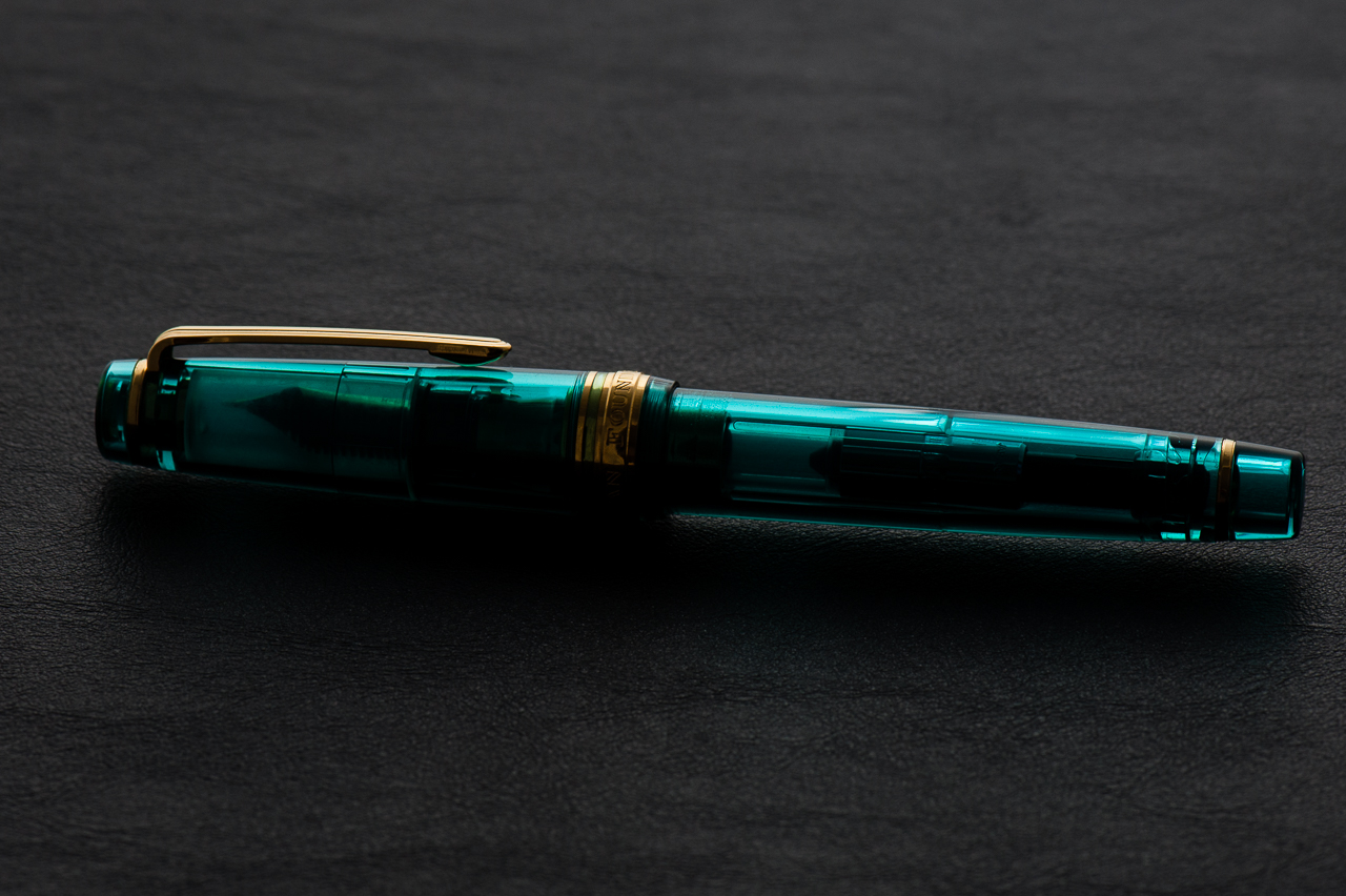
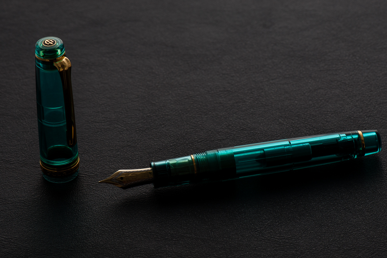
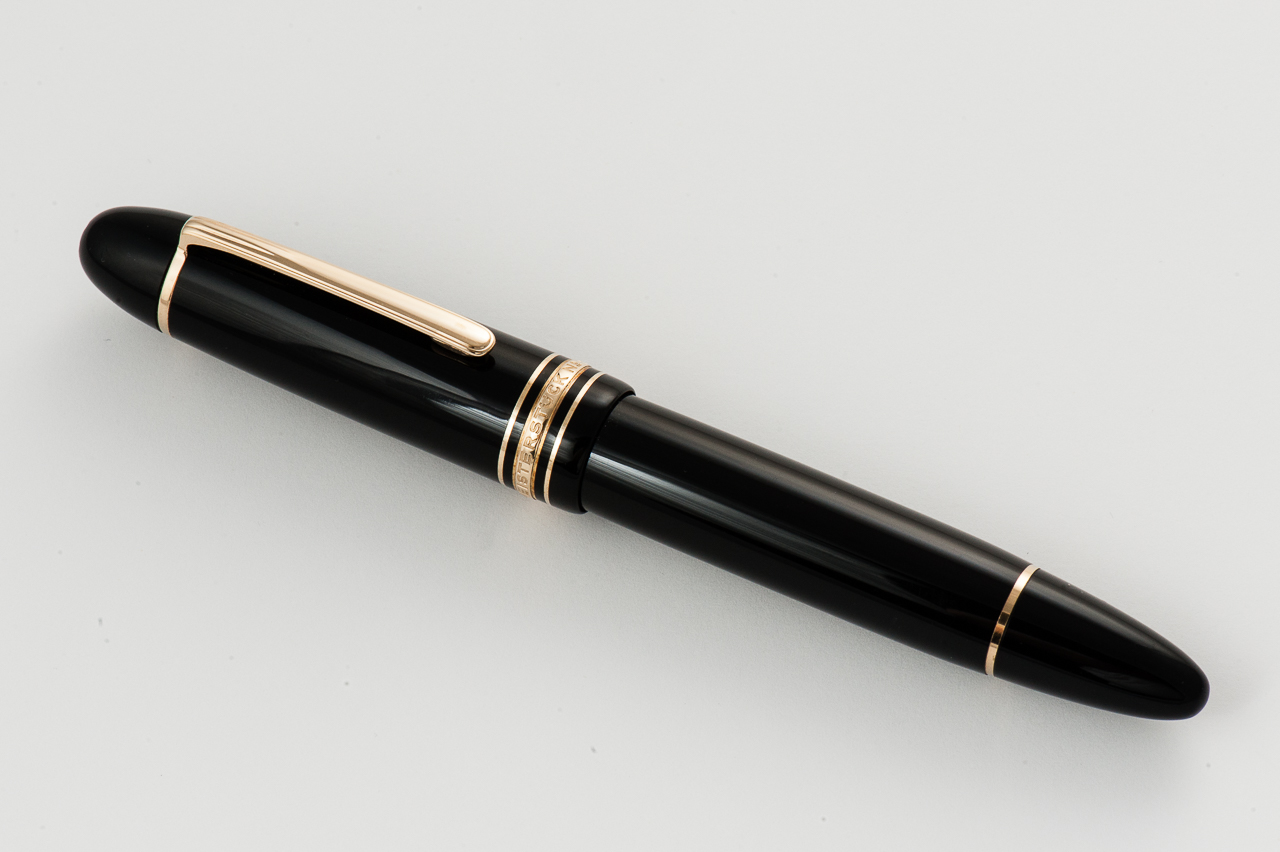
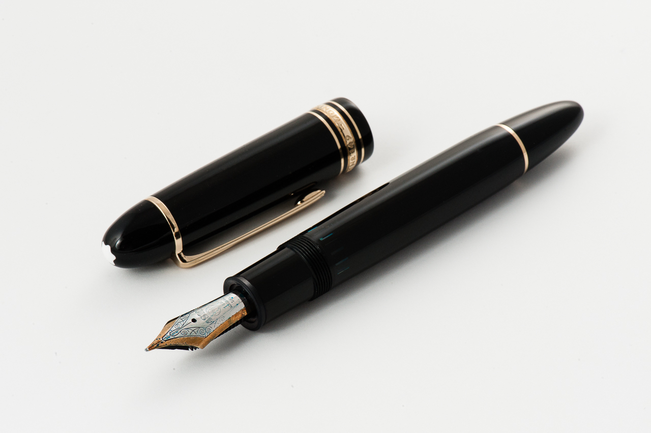
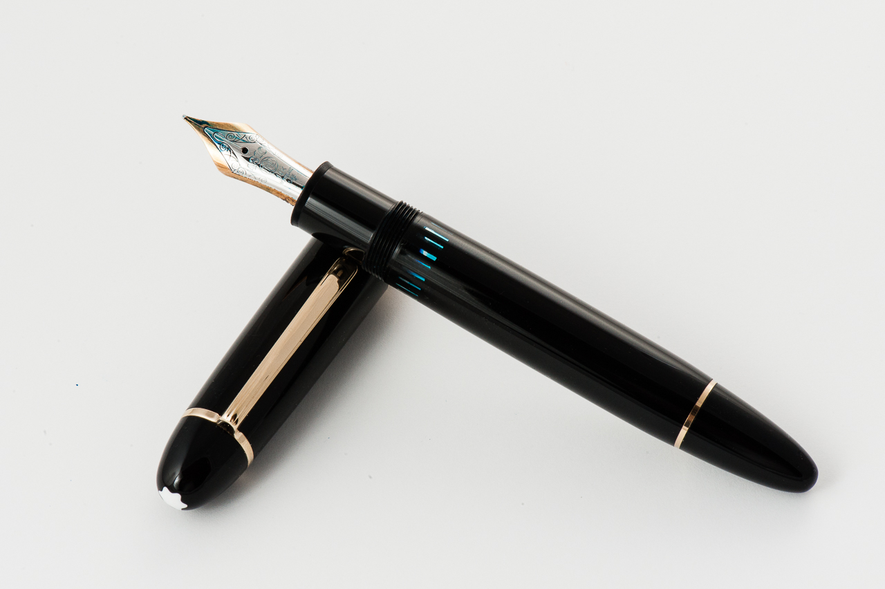
Pen Photos (click to enlarge)