Prospective Look at the 2017 San Francisco International Pen Show

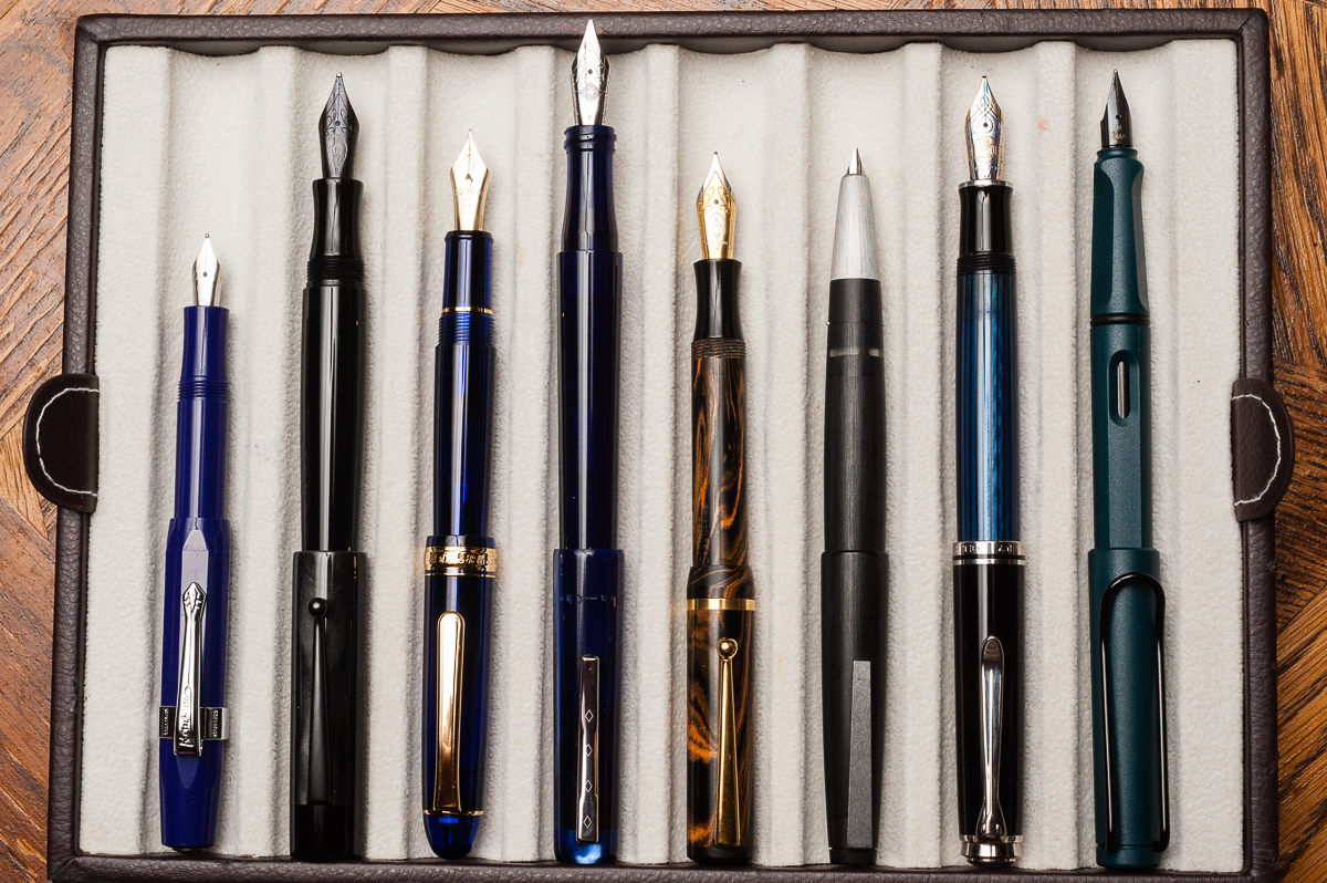
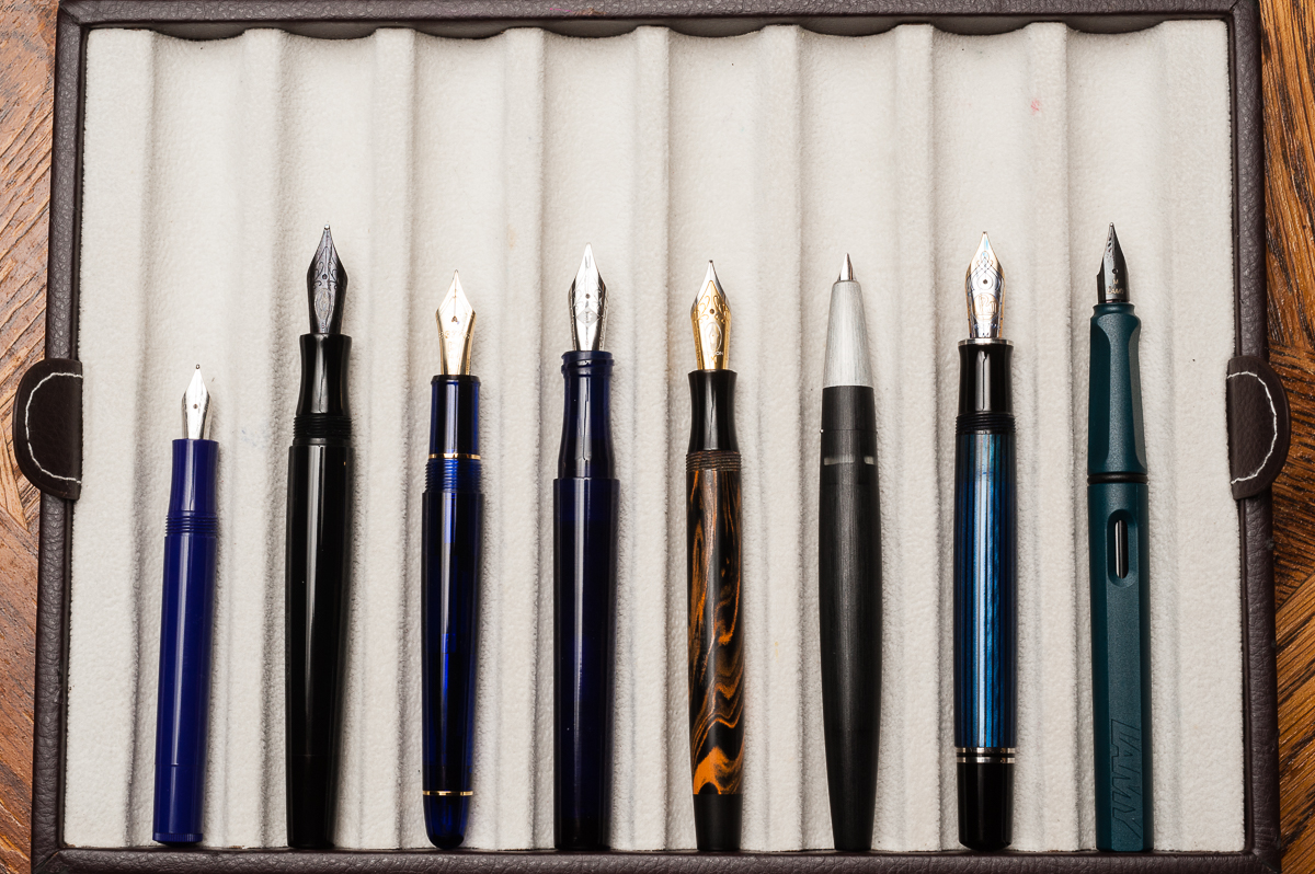
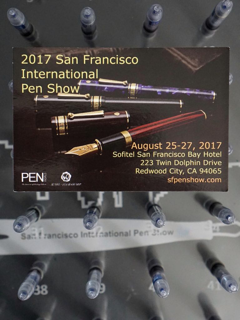
The San Francisco Pen show is just around the corner for the HOTP crew! Here is a sneak peek of some of the things that will be at the pen show and what we are each looking forward to for 2017!


Pam:  It’s odd to think that I met Franz at the registration desk of the SF pen show in 2015, 2 years ago! That said, my first full experience of the SF Pen Show was last year. With the knowledge from last year, I can say that I am really looking forward to:

  • Starting bright eyed and bushy tailed on Saturday morning! To start, I will be at the registration desk to greet you and very likely at the HOTP table soon after. Stop by to check out the amazing show exclusive stamps that Katherine has made! And the “Pay-It-Forward” loot!
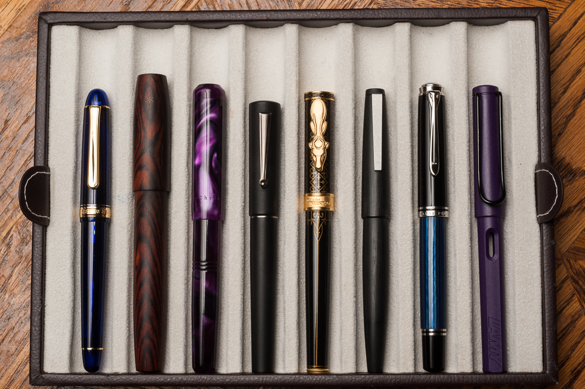
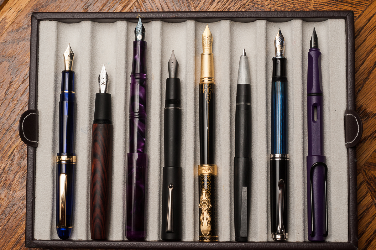
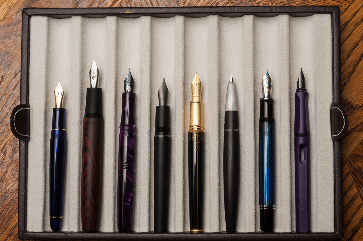
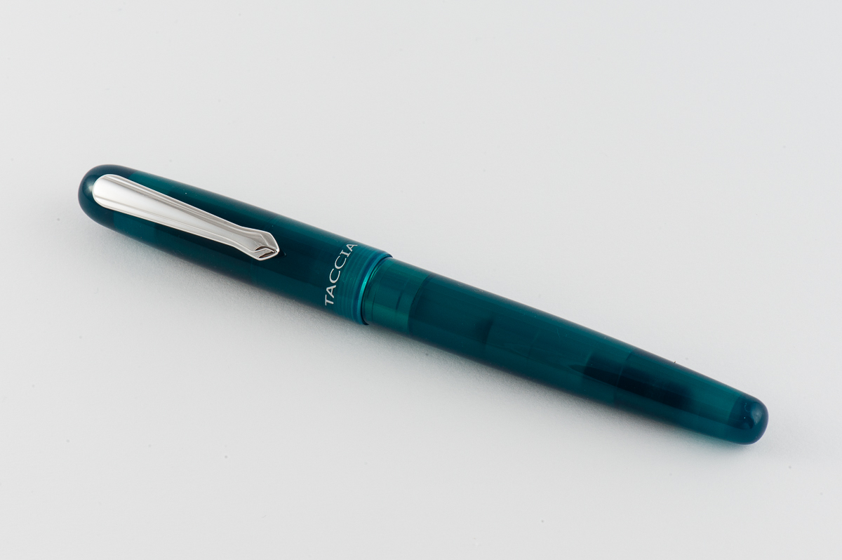
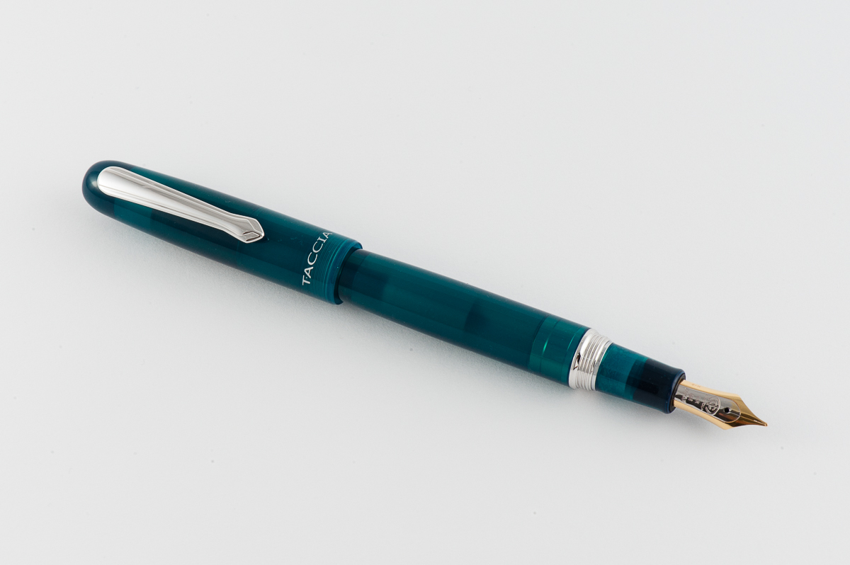
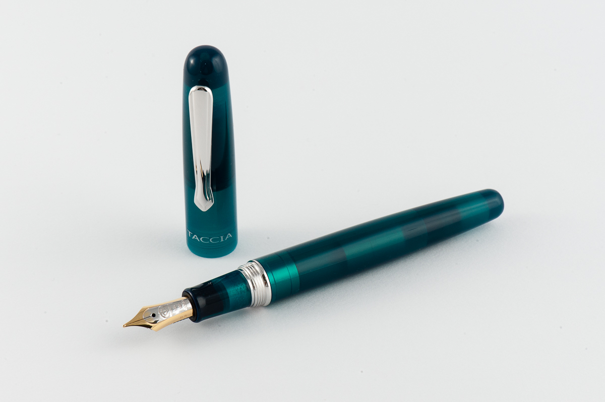
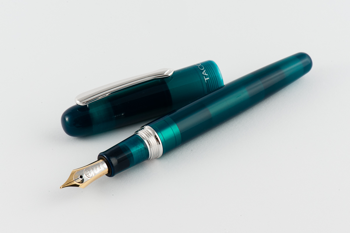
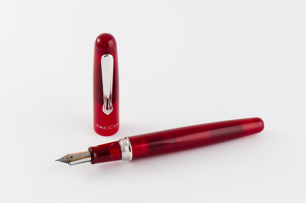
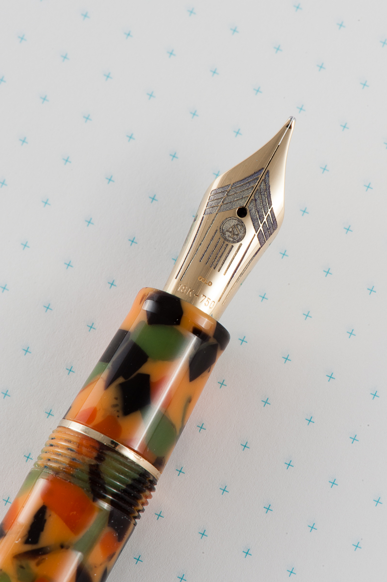
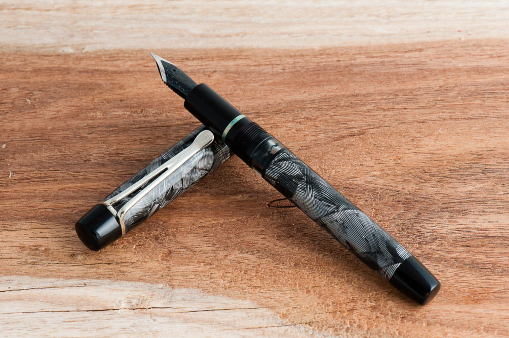
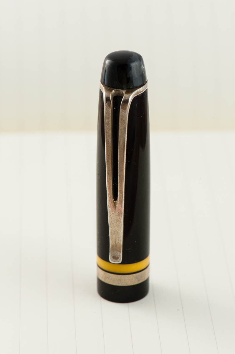
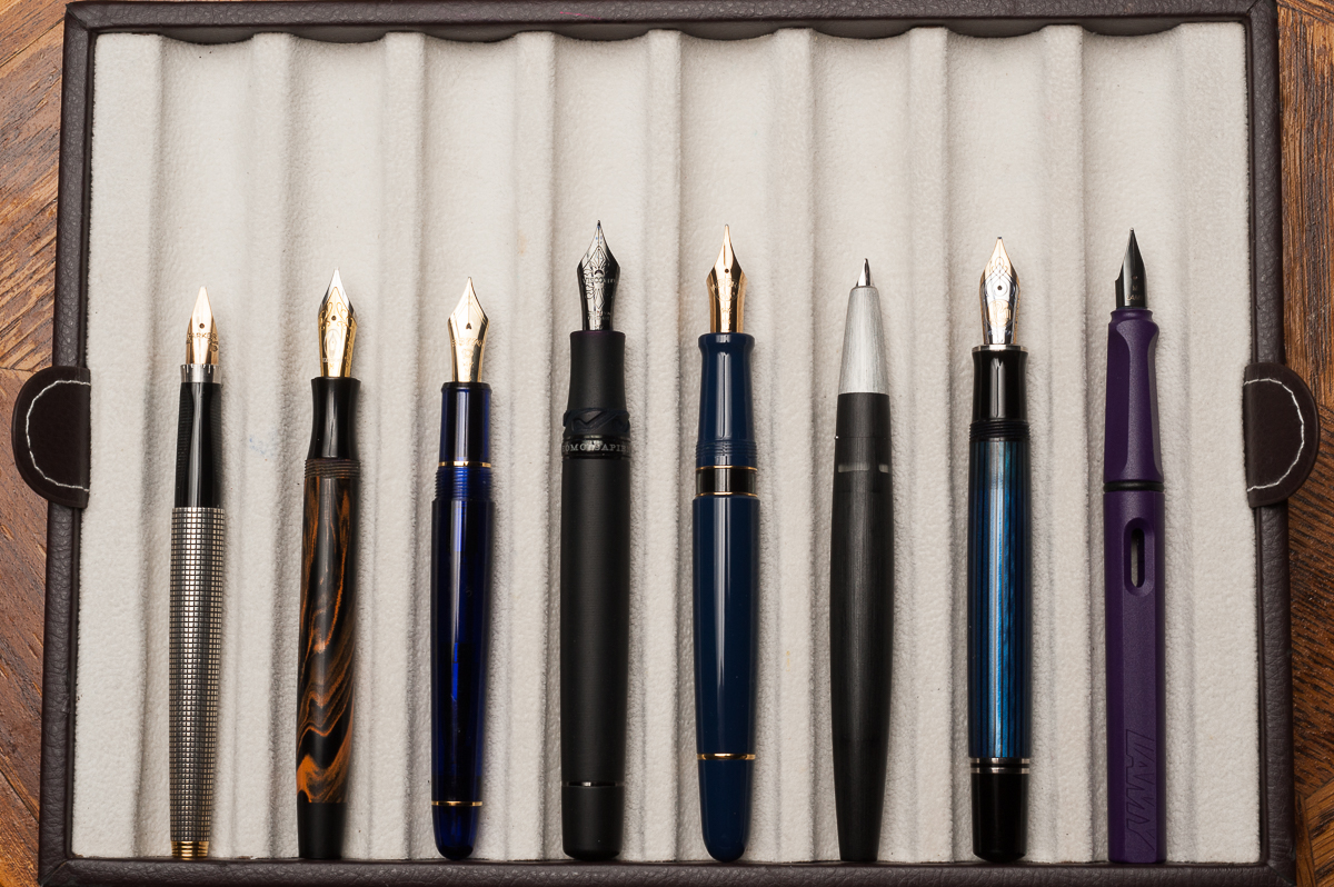
  • I will also likely be making a majority of my pen purchases that day. I am most excited to get a “sea glass” pen from Troy at Brute Force Designs!! I hope to get the great Mike Masuyama to work on some of my pens.
  • Don’t forget the planner meet up! We will be meeting at 1pm on Saturday in Salon 4. The Pen Addict meet up is a must for me. It’s very surreal to see a face to go with the voice for me each time I meet THE Brad Dowdy (Downy). And finally, I will be ending the night by attending Susan Wirth’s Memorial.
  • Sunday is class day! I will be attending Nik Pang’s Copperplate class, the Hanko (Japanese seals) class by Rui Saito and a mystery class by the amazing Leigh Reyes. Oh, yes, Leigh Reyes will be at the SF Pen Show. May the fangirling commence. ::squeal!::

Itinerary aside, I am just really excited to meet pen friends, new and old, near and far. The pen show is a great time and place for me to nerd out with all things pens and stationary with nerds just like me. And at the end of the day/weekend, it’s just what it’s all about. See you all at the FUN pen show by the Bay!


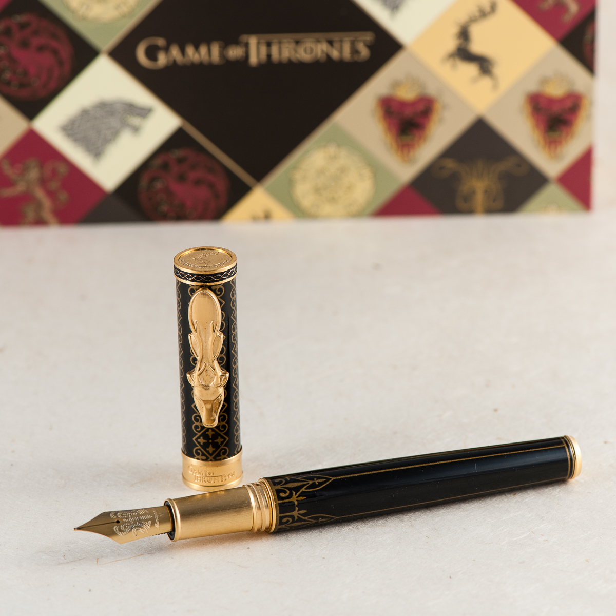
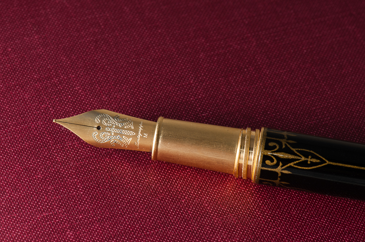
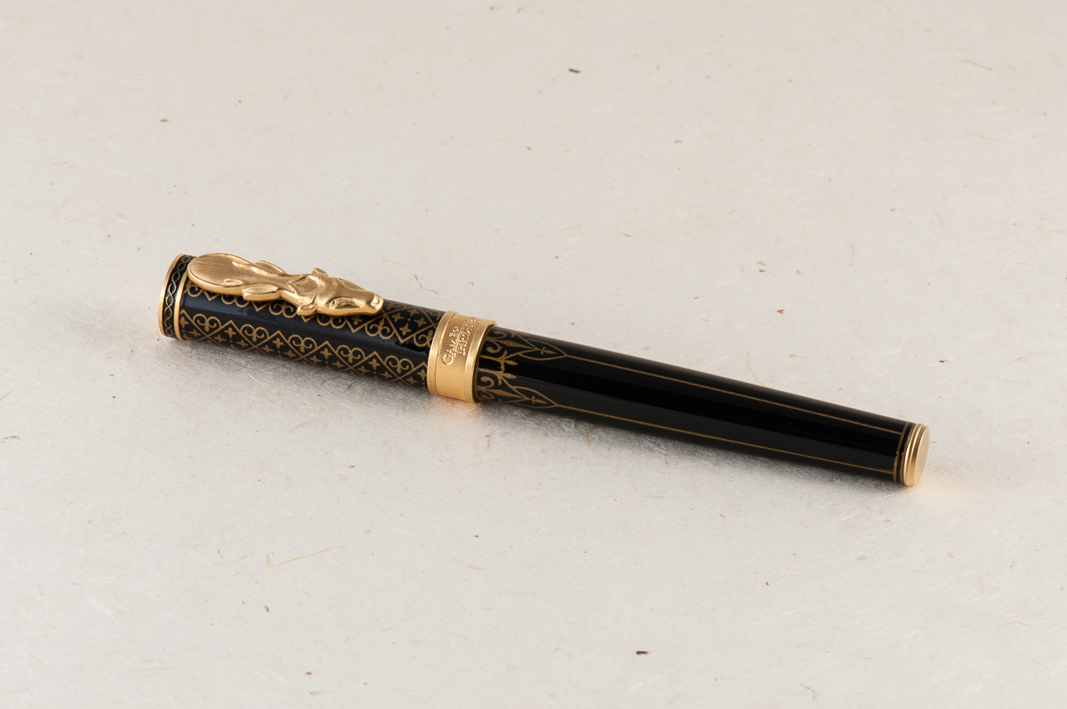
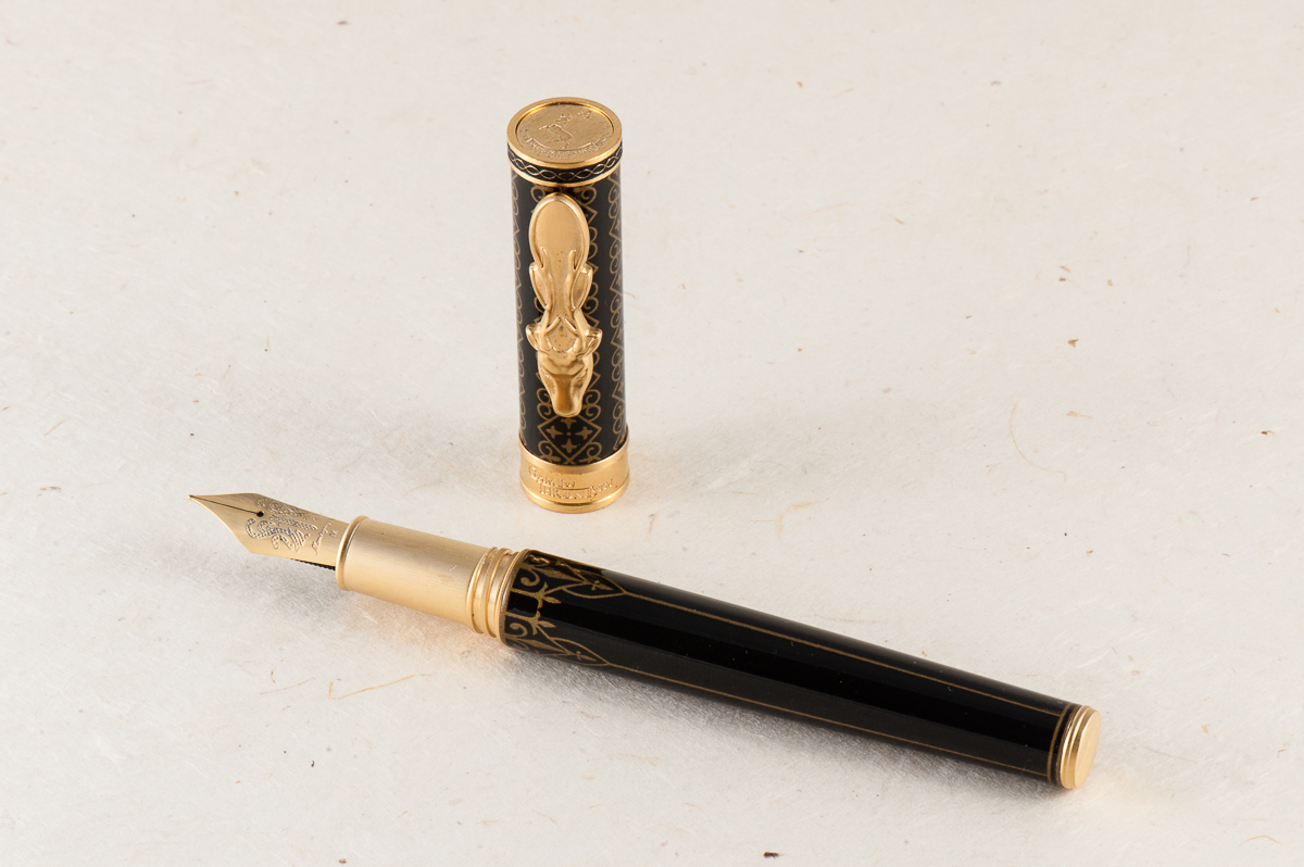
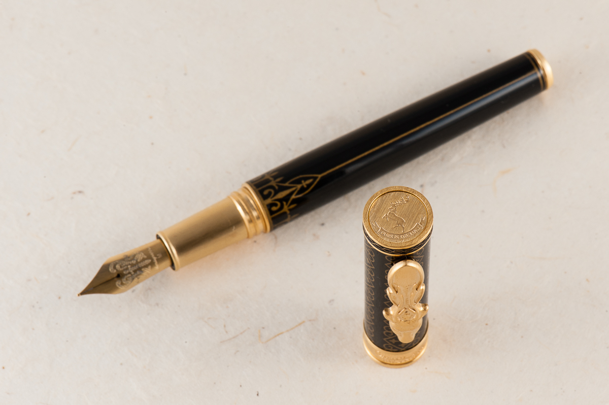
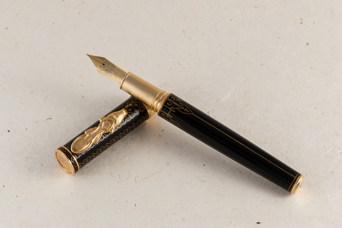
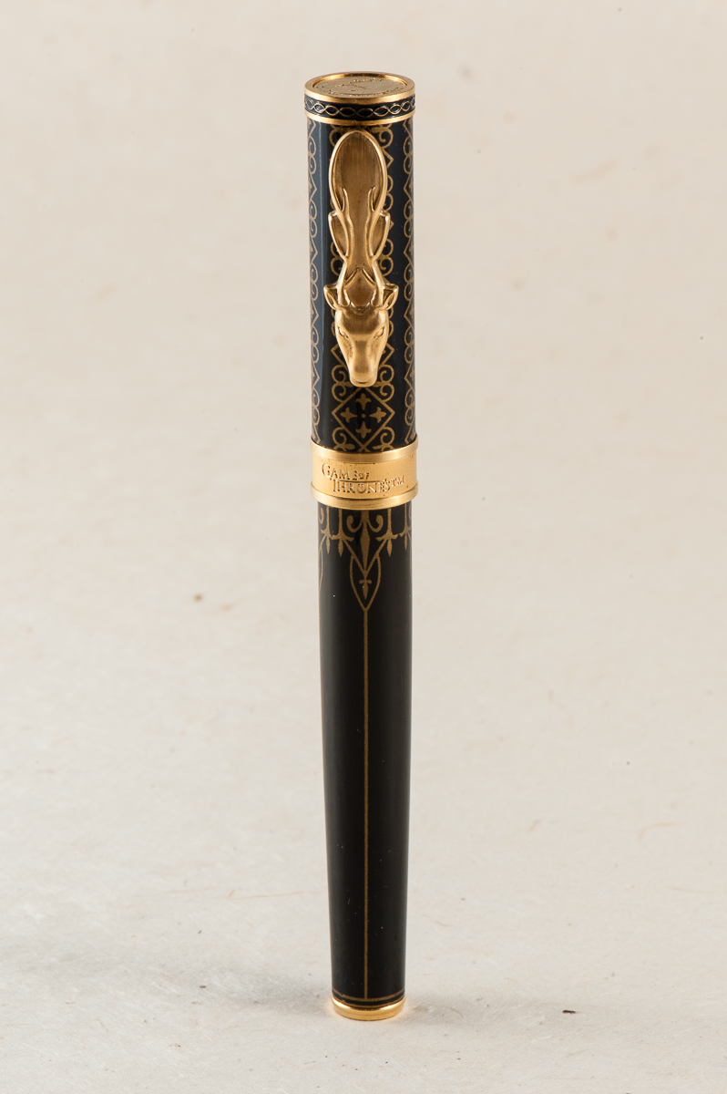
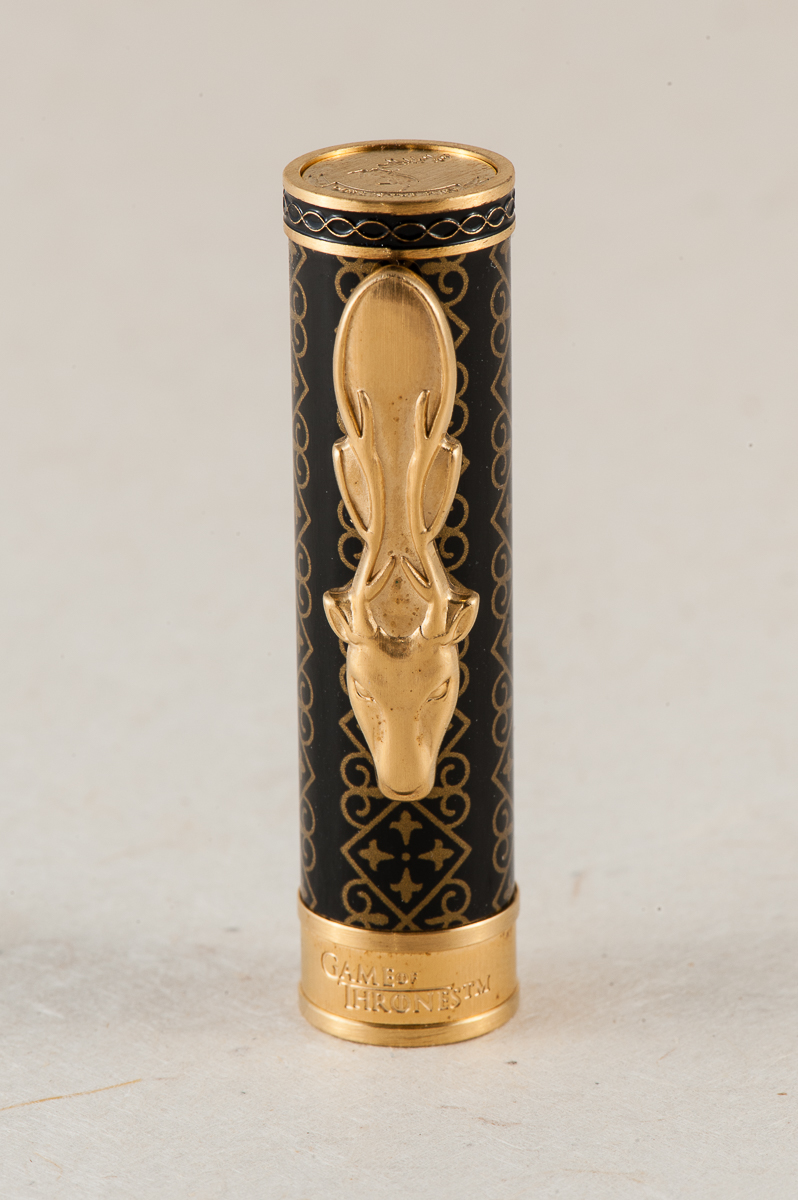
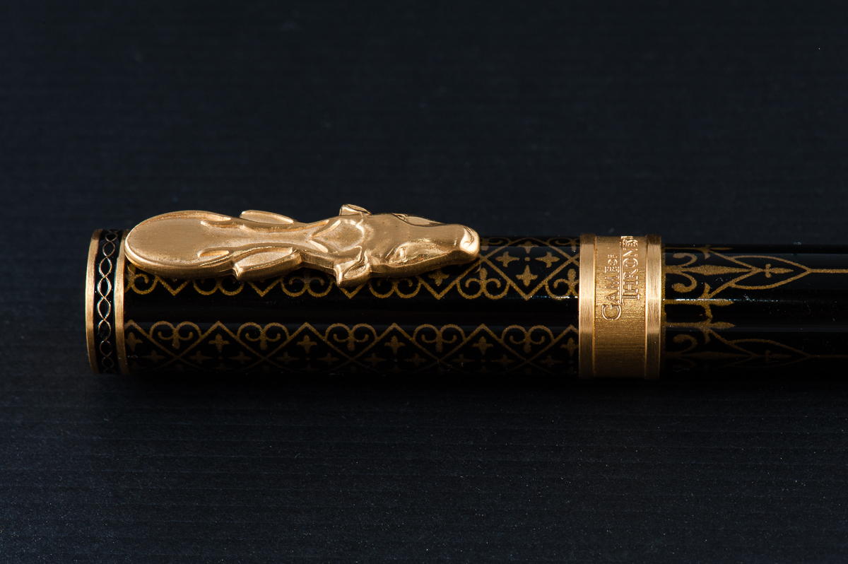
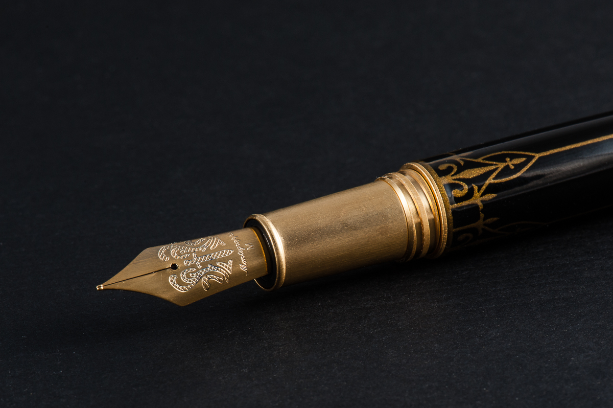
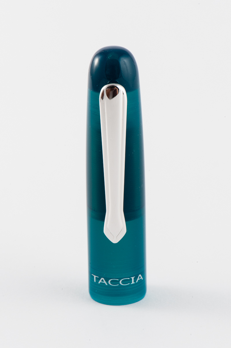
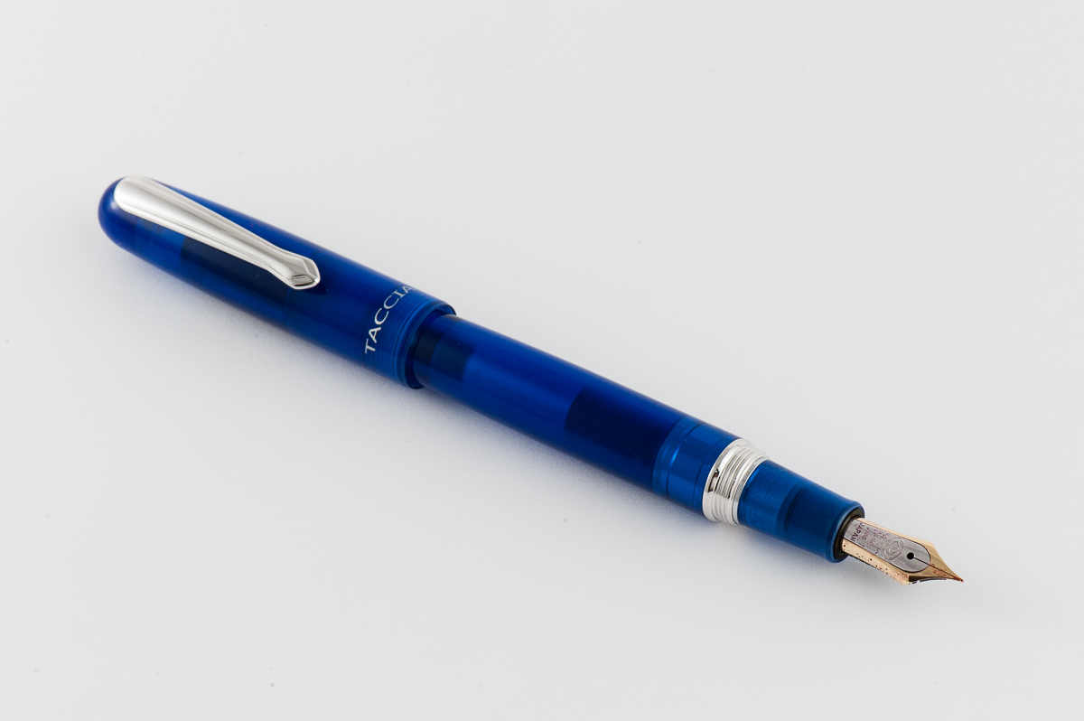
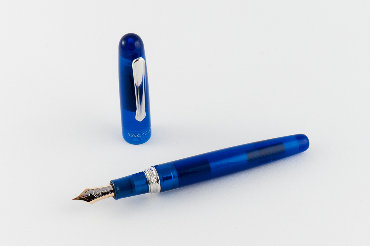
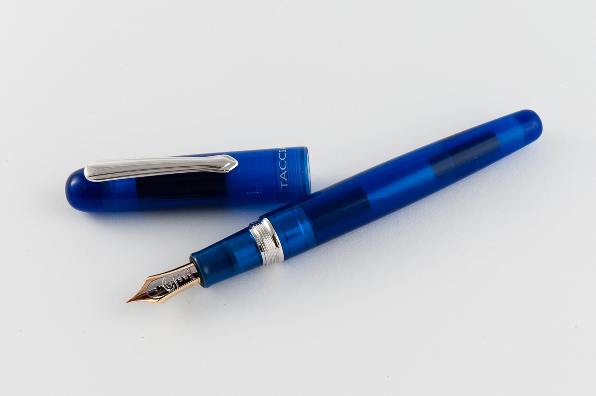
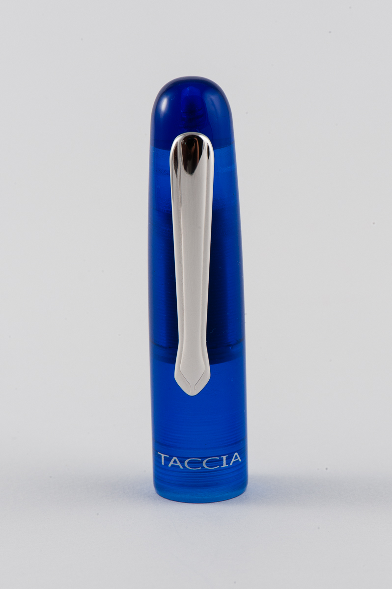
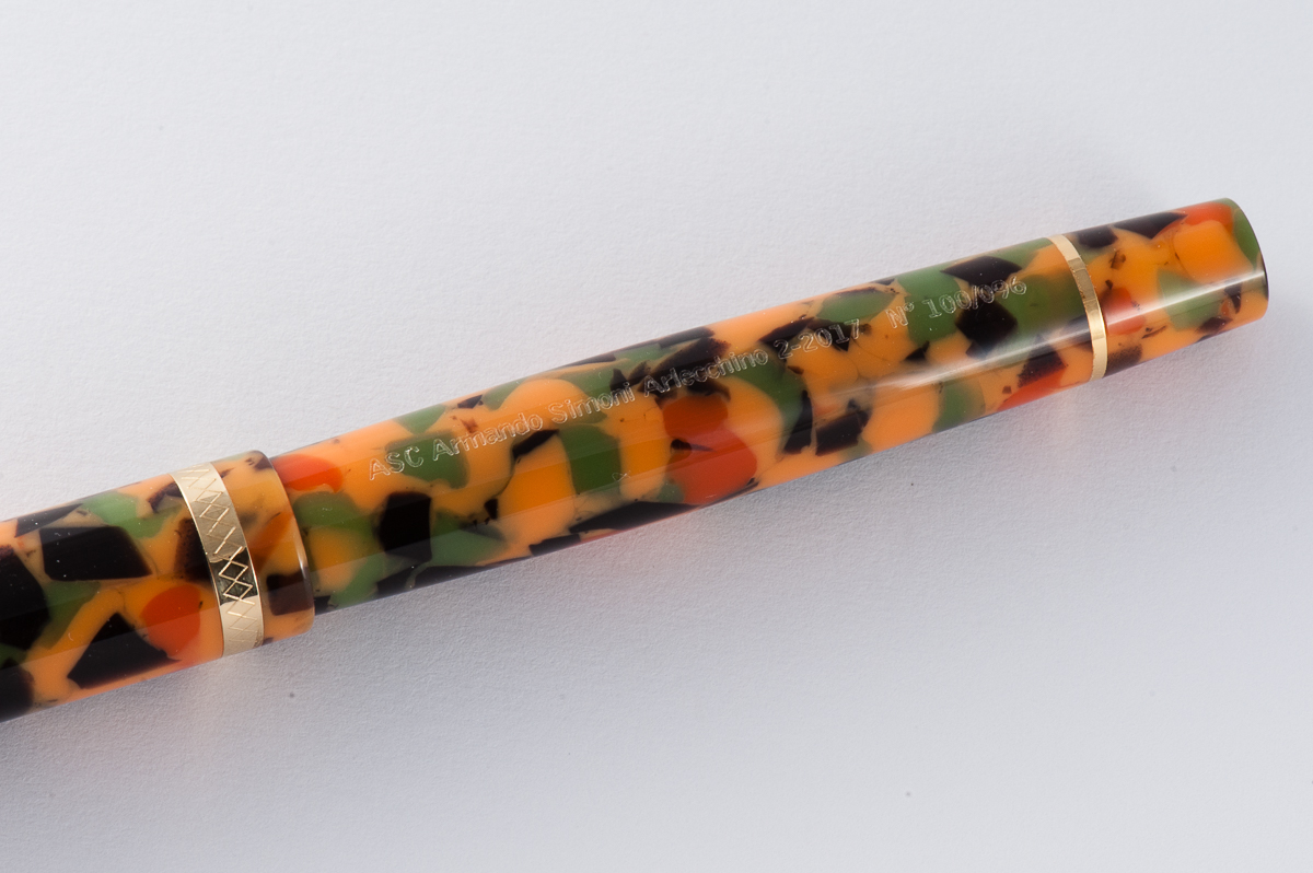
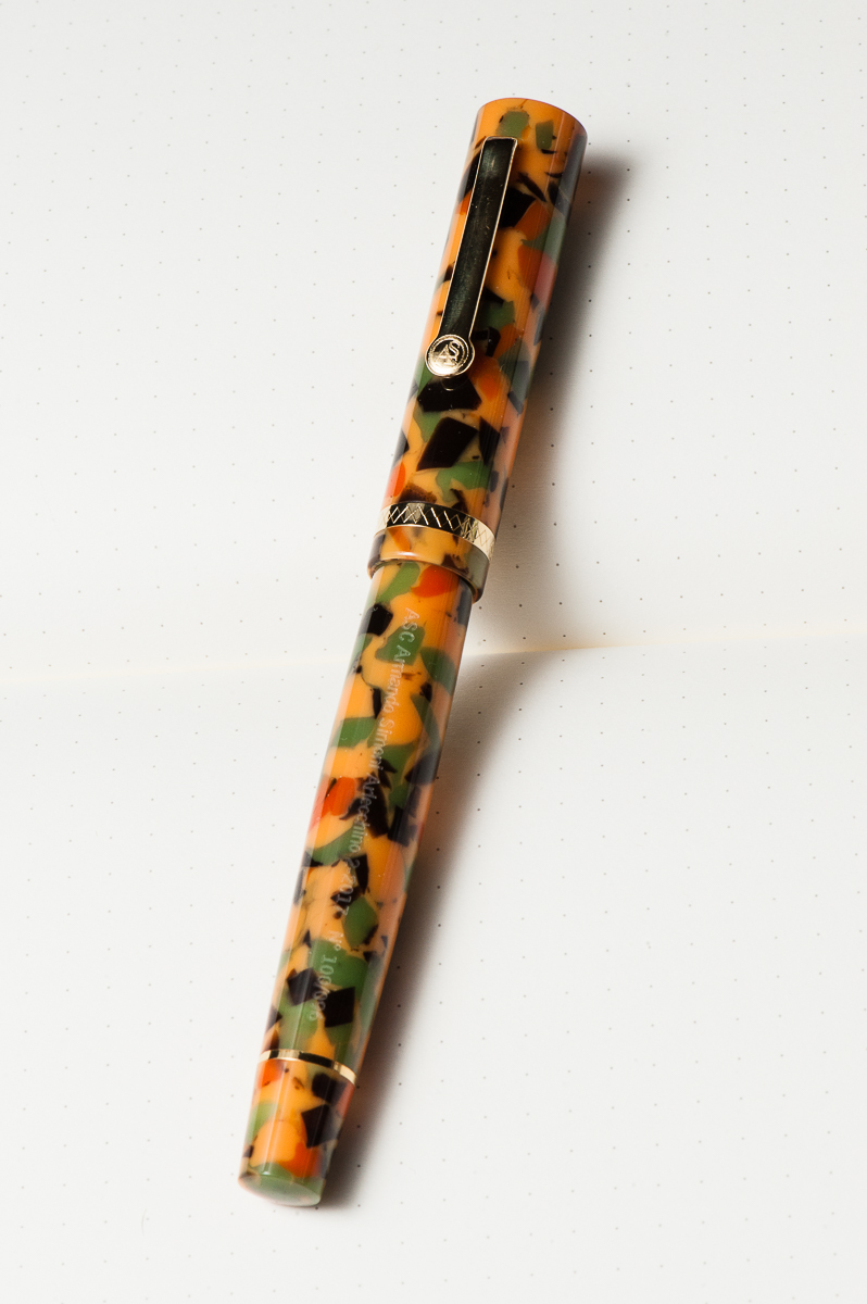
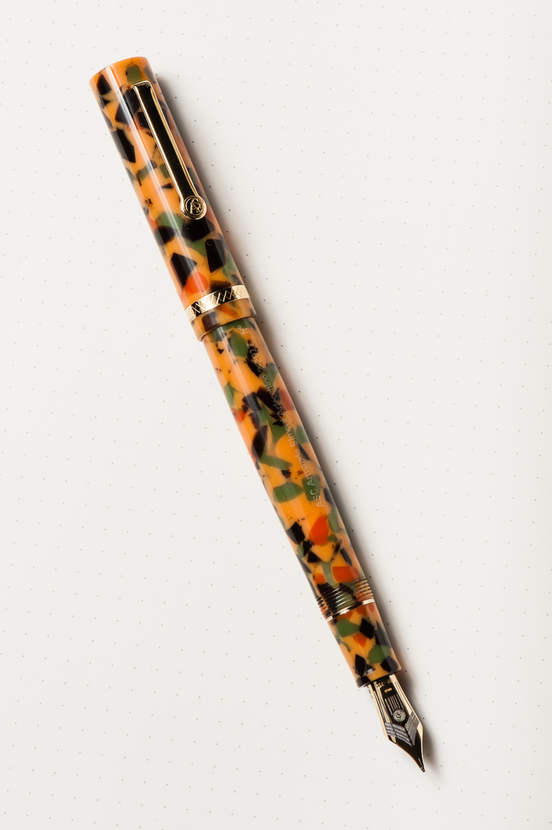
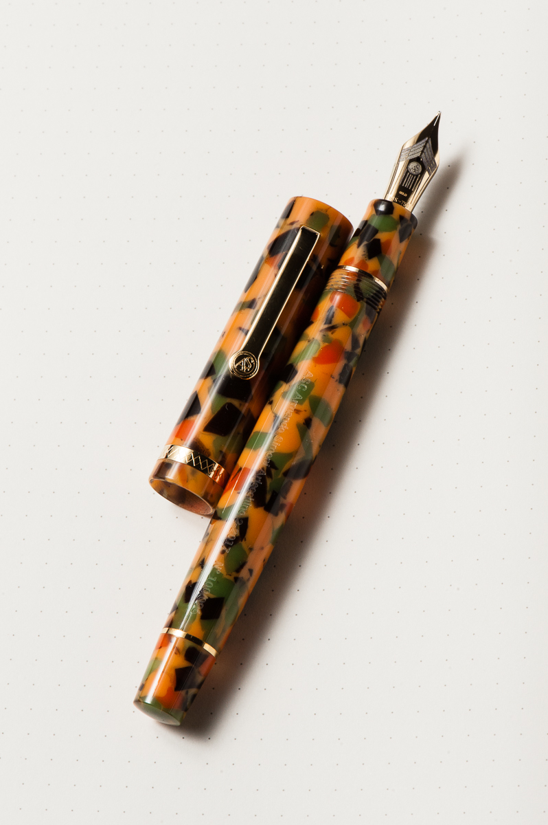
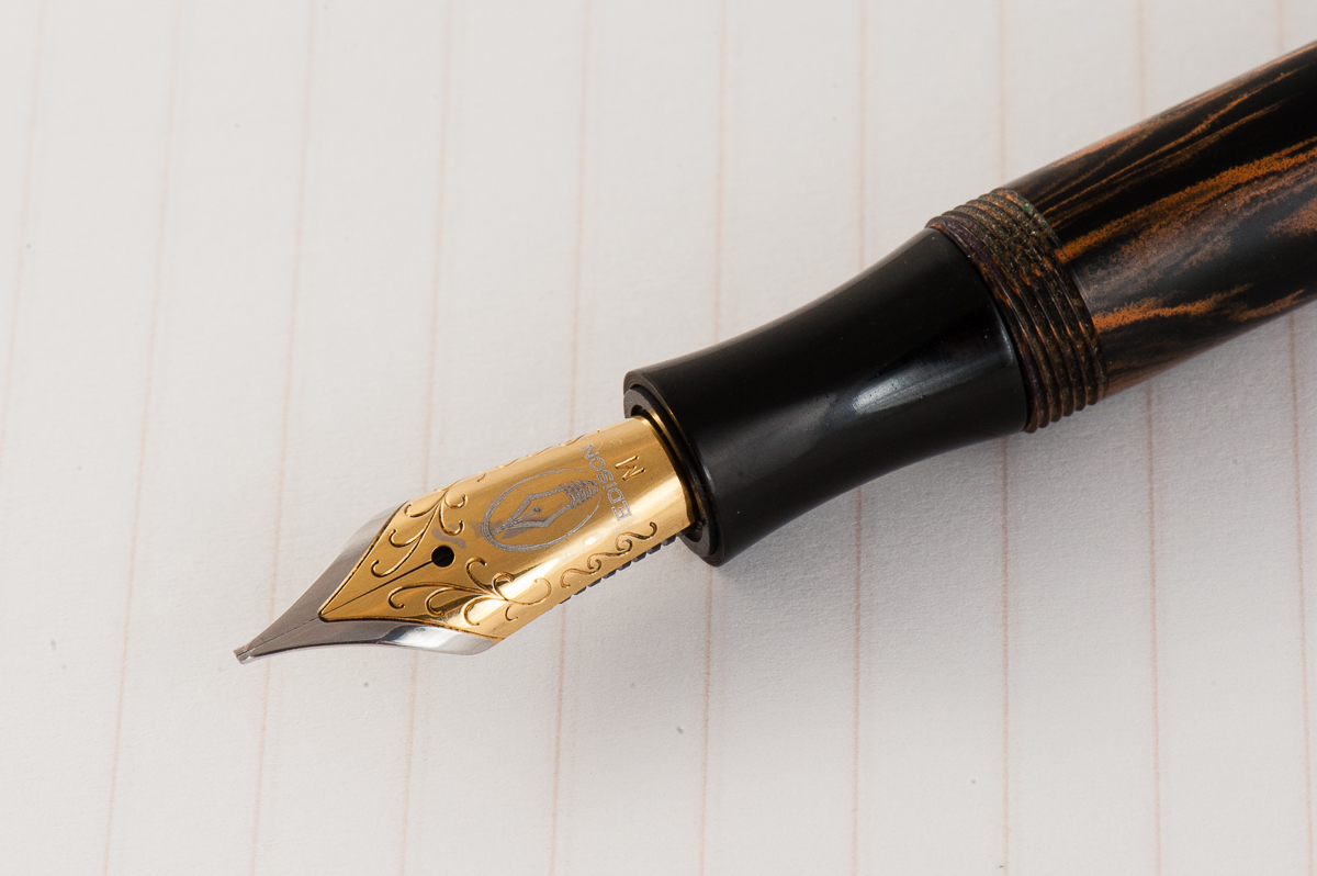
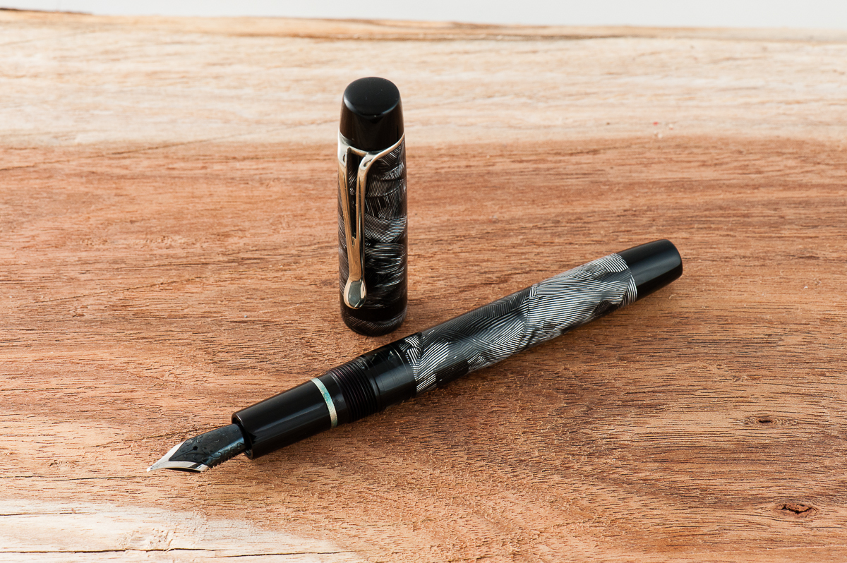
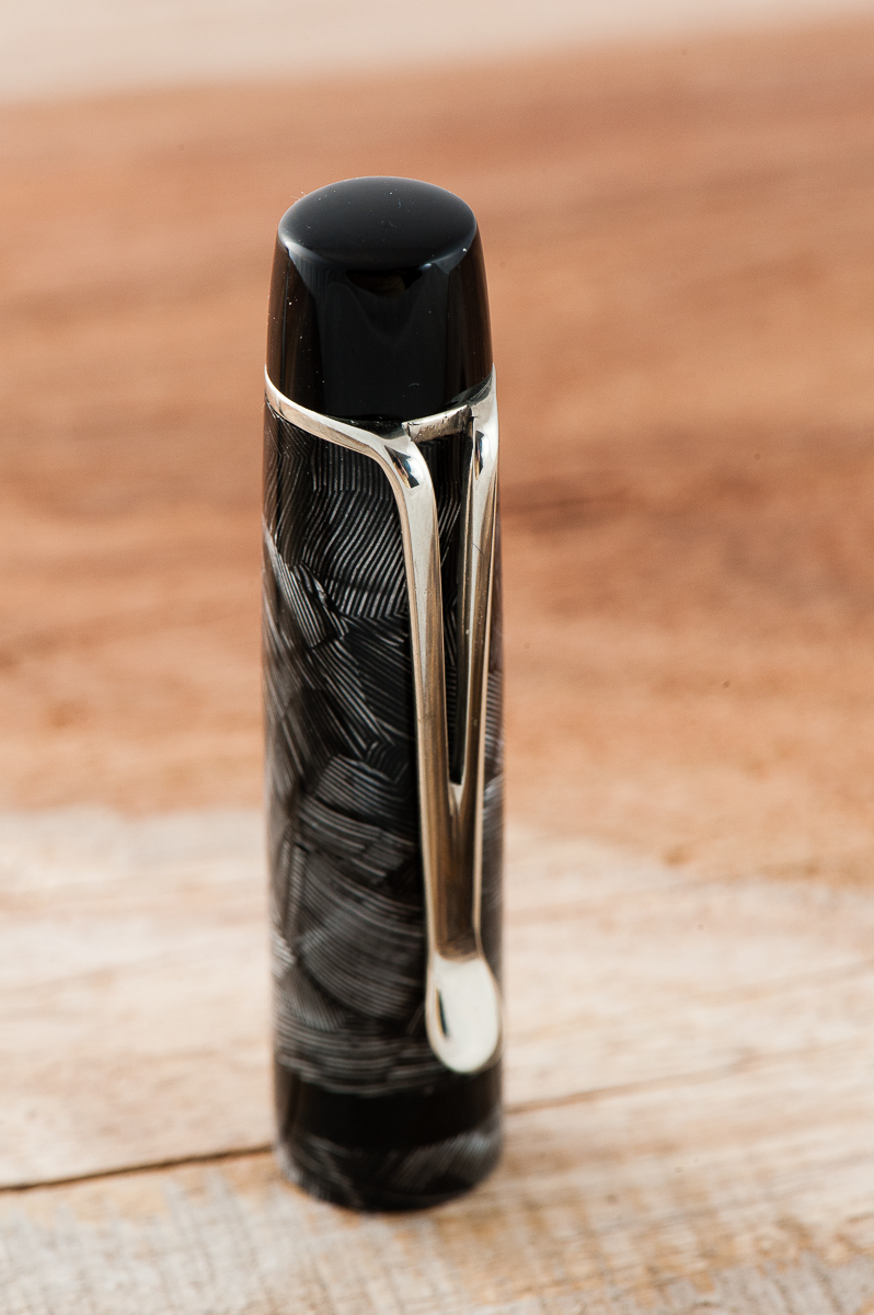
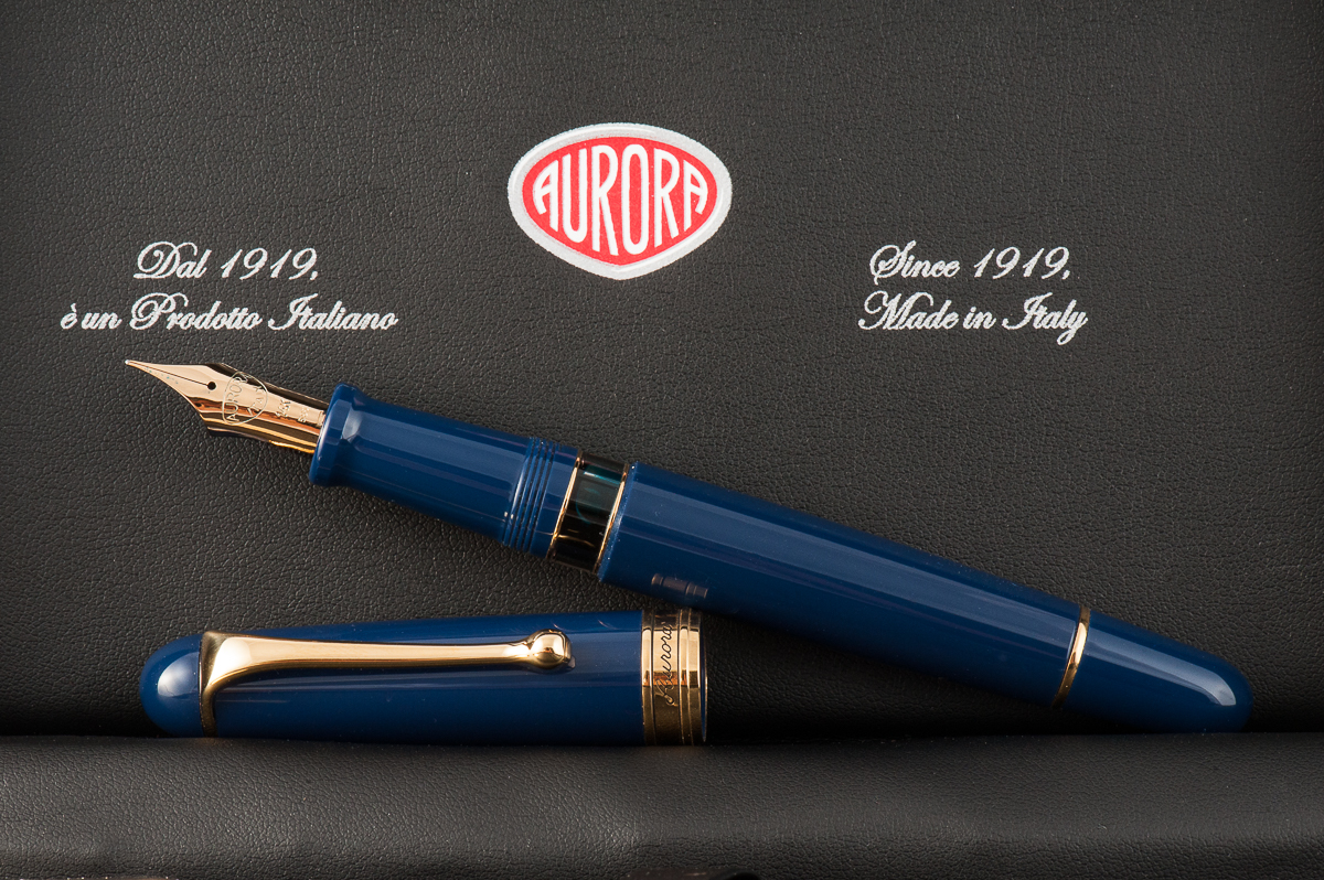
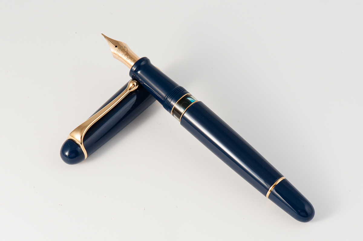
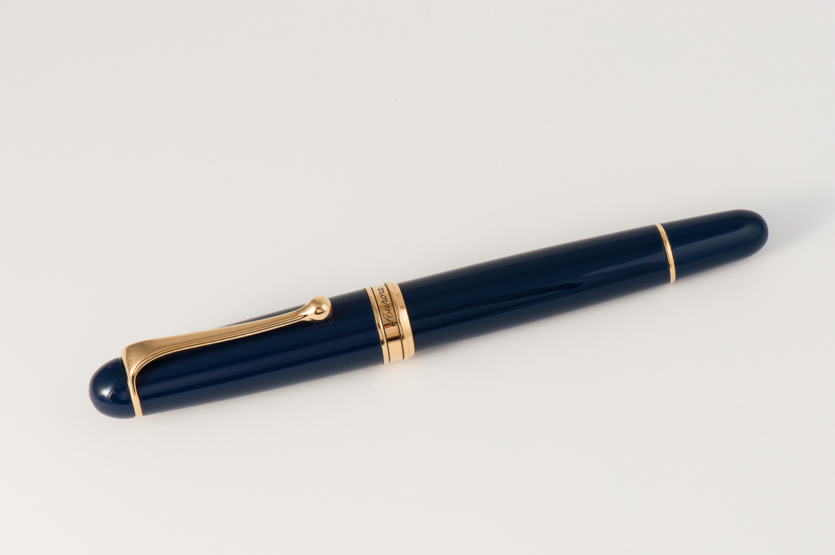
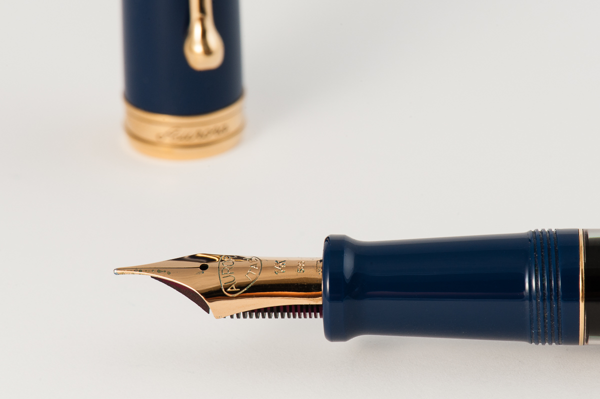
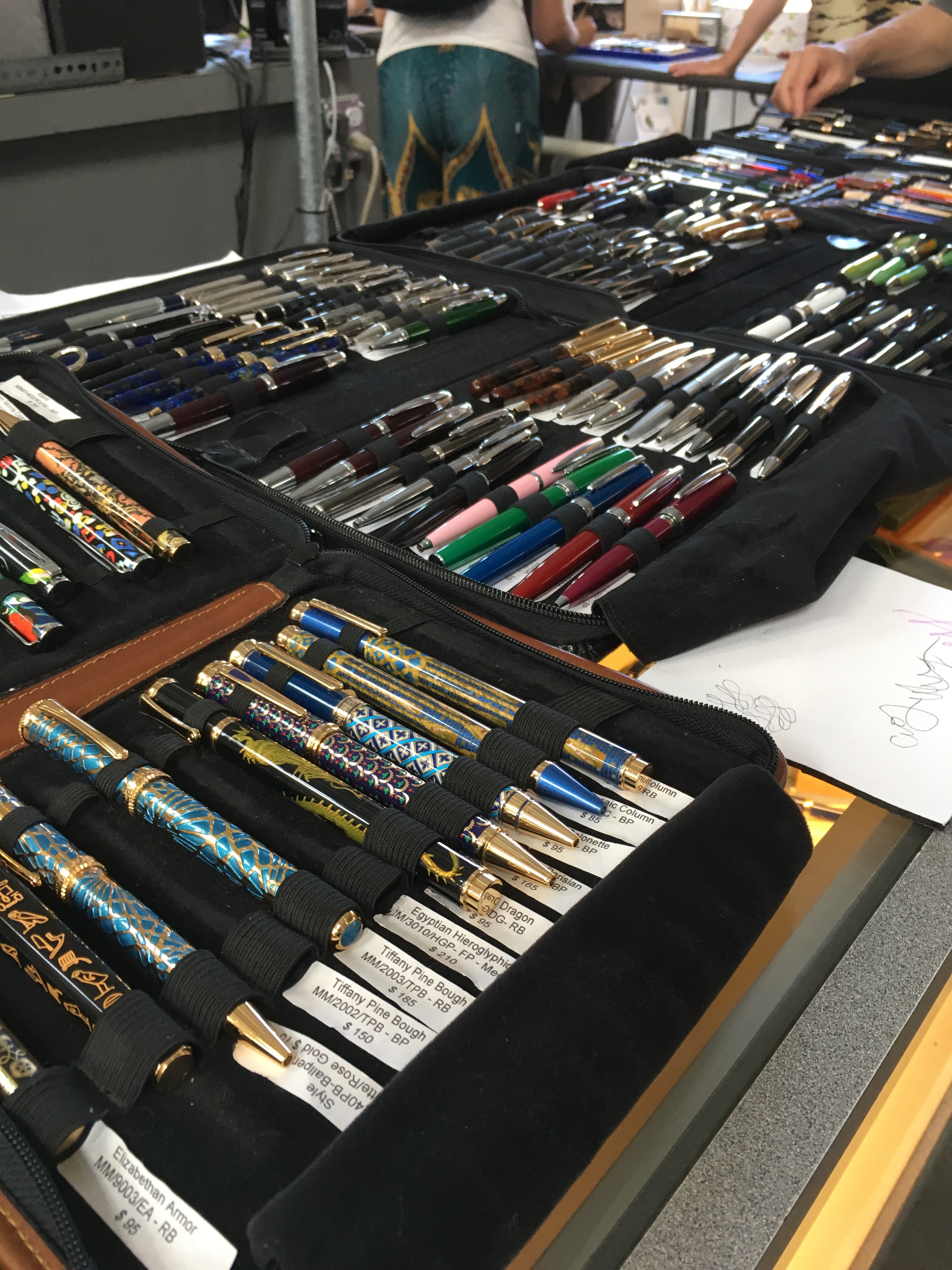
Katherine: I’m mostly on the hunt for unusual pens and have been excited to hear that there will be a couple of European vendors that are new to the show AND Stylo Art will be there! My wallet quakes in fear. I’d love to pick up an Aurora Novum, but we’ll see if I can find one that fits in my budget. -____-

I’m also sharing a table with a couple friends from Pen Posse, where I’ll be selling washi tape and hand carved stamps. Keep an eye out for me in the lobby! 🙂


Franz: Whoa! It’s been a year already since the 2016 SF Pen Show and now I can hardly wait for next week! Year over year, the SF pen show seems to become much bigger and busier. I try my best to help out at the show with assisting at the registration desk. Pen Posse members try to take shifts in manning the desk to make sure that we help people get in the show, or direct them to classes and seminars. Being at the desk lets me see old friends when they arrive and make new friends as well.

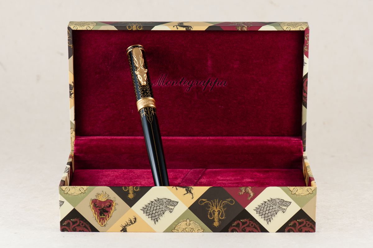
This year, the pen show has more vendors attending that weren’t present in 2016. Some vendors off the top of my head: Shawn Newton (Newton Pens), Hugh and Karol (Kanilea Pen Co.), John Mottishaw (Classic Fountain Pens), Motoshi Kuzuno and wife, Shuko (Stylo Art Karuizawa), Claire Rice (WrittenInRice), Miroslav Tischler (Penkala Pens), and A LOT more!

Events that I’m looking forward for the weekend:

  • I will attend an actual live pen auction sponsored by the Pen Collectors of America (PCA) on Friday. I just don’t know if I can control myself from over-bidding on a few lots.
  • As Pam said, there’s a planner meetup on Saturday. I’m not a planner kinda person but I do use my Hobonichi Planner as a daily quotes, and gratitude journal. I’m curious to see what other people do.
  • Saturday afternoon, Pen World Magazine will hold a ceremony to announce this year’s Readers Choice award winners.
  • Of course after the show on Saturday, the Pen Addict Meetup is a thing to attend. I love getting to sit down and talk pens with the attendees and dealers. There are door prizes too! Last year, Pam won an ink bottle from Vanness Pens that is so awesome and I’m still secretly planning to steal…oops… ssshhh!
  • And yes, a memorial to the Queen of Ink Susan Wirth at 7:30pm Saturday.
  • On Sunday, I’m hoping to attend Leigh Reyes’ seminar in the morning and then John Mottishaw’s in the afternoon.

The San Francisco Pen Show for me has evolved into primarily a social gathering. I love seeing the different vintage and modern pens offered for sale and I may buy a pen, or two, or three! ;-P But what really floats my boat is seeing old friends, visiting with the pen show vendors, meeting Instagram friends in real life.


Pay-It-Forward


This year, we will have the Hand Over That Pen table to host the Pay-It-Forward initiative. The Penthusiast Oscar Rodriguez along with a lot of awesome pen people started this fantastic PIF table to provide beginners, and children who are attending the show with pen starter kits. It was a great success at the D.C. Pen Show a few weeks ago. There will also be a “Give a pen. Take a pen.” part wherein people can donate pens they no longer use and just want to donate instead of selling. People can also take a pen that they would want to own. This will be a little bit smaller than what they did at the recently held D.C. Pen Show but we believe it’s important to keep the ball rolling.

To learn more about the PIF table, it’s all documented on Oscar’s site: https://www.thepenthusiast.com/dc-pen-show-pay-it-forward-table. If you would like to donate money, pens, notebooks, etc. please let us know via the comments or direct message Franz on Instagram: @franzdimson


Hope to see you at the #SFPenShow2017! 🙂

8 Comments

Pen & Ink Pairing: July ’17

Katherine: As many of you know, I’ve been “upgrading” my collection at a pretty rapid clip over the last year. The SF Show quickly approaches and about a year ago, my most expensive pen was a Danitrio… but other than that, I’d never spent more than $120 on a pen. That’s changed quite a bit, so this month I thought I’d revisit the cheaper side of the hobby — I inked up a Lingmo blue demonstrator with some Hero Pink ink (the entire set of ten colors was $30!). It’s a slim pen, but I love the pairing of a bright ink on the clear feed of the Lingmo! A bright and sunny combo for the summer!


Pam:  July is the peak of the summer months here in California.  My inky homage to the cloudless (and hot) days and swimming pools during this time of year is Sailor Souten!  I was lucky enough to get my hands on a Pilot MYU with a Fine nib.  (Thank you Andrew!) The feed has a chip on it that creates a wetter ink flow.  (It writes more of a Medium Fine to me.)  With the extra flow of the pen, and the unique design, I had a hard time finding an ink and pen combination that I loved…until I tried Sailor Souten.  Sailor Souten is reminiscent (if not identical) to Sailor Sky High.  The bright color and sheen really comes through with the extra wetness with this Pilot MYU.  The bright color of the ink is a great compliment to the minimalistic design and color of the MYU.  It’s like the unexpected bright pocket square to a gray suit.  Or maybe this is a pen-ink version of the mullet:  The pen looks like it means business, but the ink is a party.


Franz: Aww man! July has been a busy month for me and I’m “grateful” that I have my pen friends and my pens to keep me going. #hotpGratefulInJuly! It took me a while to decide which pen and ink pairing I’d be highlighting for July for I have a “few” pens inked up. I’ve decided to feature my 2016 Limited Edition Stealth Glenmont from the Edison Pen Co. I acquired number 101 of 150 last October of 2016 and I was lucky because this pen was sold out less than 12 hours when it was announced by Brian Gray. Being that this is a black pen, the ink options are unlimited and I initially inked it up last year with a blue-black ink.

This month, I was reminded of what my friend Gerald (@mycoffeepot) once said. “Stealth pens crave pink ink”, April 2013. (And by the way, he does pen reviews on YouTube) So, I got myself a bottle of Pilot Iroshizuku Tsutsuji and satisfied my stealth pen’s craving. With the broad cursive italic nib customized by Dan “The Nibsmith” Smith, the juicy ink flow brings out Tsutsuji’s gorgeous color. And that sheen! =) I’ve been happily journaling with this pen and it’s almost time to refill the converter.


3 Comments

Review: Montegrappa Game of Thrones Baratheon

We would like to thank Mr. Detlef Bittner of Bittner Pens for letting us review this Montegrappa Game of Thrones Baratheon fountain pen. His family pen store is located in the beautiful town of Carmel, California, and is well known in the pen shows in the United States.

And as always, the opinions here are our own and we were not compensated (monetarily, or otherwise) for this review.

Hand Over That Pen, please!

Katherine: It’s a cool looking pen — though I was a littttle disappointed that there wasn’t more texture to the barrel, which makes it feel more mass produced and gimmicky to me. But really, I’m not sure what I expected, I think my standards may just be unreasonable here. Out of all the GoT pens, I like this one the most, which is a litttle disappointing, since the Baratheons aren’t a terribly interesting house to me.

Pam:  Fan disclaimer:  I am only on book 2 of the series so I have been holding out on watching the series in its entirety.  Therefore, I have to say, this is a really good representation of the houses from the awesome fantasy series.  My biggest gripe about the set of 4 is that I believe that they could have made a set of 5 to include the Tyrells because who doesn’t love an experienced, witty woman throwing some shade?  (Think of an edgier Dowager Violet Crawley from Downton Abbey for those not familiar with the glorious shad-ability of Olenna Tyrell.)

House Baratheon is one of my least favorite, but I think of all the pens, the Baratheon pen is the best made and unique of the bunch.  The clip is perfect representing the Baratheon stag.  I find the other clips, Lannister’s Lion, Stark’s Wolf, and Targaryen’s Dragon, to be too triangular and similar in shape and less pleasing to the eye. The stag is the most unique and well done of all the clips in my opinion. There was so much potential for the dragon on the Targaryen’s pen for it to be more serpentine in shape or maybe even wings!  The rest of the decor are similar among all the pens, with the exception of the colors to represent each house.

Thank you again Bittner Pens for allowing us to borrow this beauty!

Franz: So… let me just say it. I have not watched a single episode, segment, nor even a second of Game of Thrones. *cringe*.  Nothing against the show but I just haven’t given it a chance yet. So my approach with this pen review is just all about the design, performance, and of course the Hand-le-ability of the Montegrappa GoT Baratheon. I think I will let the person who has the most knowledge of the pen’s theme handle the rest of what the pen represents. Right Pam? ;-P

Just by handling the pen, I loved its overall looks and the heavier weight is more what I prefer. The brushed cap finial, cap band, and section ties up the design of the pen as well. And that clip design. Wow. Love the clip!

In the Hand: Montegrappa GoT Baratheon (posted) — from left to right: Franz, Katherine, and Pam
In the Hand: Montegrappa GoT Baratheon (unposted) — from left to right: Franz, Katherine, and Pam

The Business End

Katherine: I enjoyed this nib — it was smooth, wet (and least when dipped, but I’m pretty sure I wrote enough to get over the initial super wetness of a dip) and prettily matching. However, I wouldn’t buy this pen for the nib, it was solid, but not unique. No surprise there.

Pam:  Montegrappa did not skimp on the nib and did a wonderful job making it fit in with the Game of Thrones theme.  I am pretty sure that all the nibs are the same design, with a sword in the center, but a different color to match the clip colorjng.  Montegrappa did a great job with that detail.

I found the nib to write wonderfully.  I can’t particularly comment on flow or saturation since we dipped the pens.  The nib was smooth with little feedback and was very pleasant to write with.

Franz:  Oh yeah, the Baratheon’s steel nib also has brushed background for the engraved sword. Such a pretty thing to look at. As for its writing performance, it wrote smoothly and didn’t skip at all. It was a well tuned nib out of the box.

Write It Up

Katherine: Overall this pen was well balanced and comfortable for me… BUT, I did notice the threads. They weren’t terrible, but I did notice they were there and was a little annoyed. Nothing major, but worth mentioning because I typically don’t notice sharp threads because I hold my pens pretty far forward. Despite my grip, I still noticed the threads on this pen.

Pam:  I didn’t end up writing with this pen for the 20 minute time span because it just plain hurt to do so.  The step is pretty sharp on this pen and pretty unforgiving with my iron fist grip.  I ended up with indentations of the step along the skin between my pointer finger and thumb.  Yes, I understand that I could just loosen my grip and that would ease some misery, but the step is sharp enough that I wouldn’t recommend this pen for those with “fisty grips,” particularly if it’s around the step.

Franz: The length and girth of the Baratheon was comforable for me either when it was posted or unposted. The only issue I had was that the brushed steel section made my fingers slip closer to the nib as I wrote with it. So writing with the cap posted afforded me to grip the pen higher above the threads and my fingers did not slip anymore.

EDC-ness

Katherine: I didn’t carry this — but it seems very solidly made. The clip is solid and I’d be comfortable clipping the pen to a shirt pocket — but not springy enough for me to clip it to jeans.

Pam:  Since the pen was borrowed, it stayed in the case until we were ready to write with it.  The clip seems solid and able to clip onto fabrics well.  The weight of the pen is considerable for this pen and I can see where it might drag down a shirt pocket.  I don’t know if the clip will prevent it from slipping out.  Also, given the pristine finish of the pen, I wouldn’t recommend it being thrown in a jeans pocket with your keys either.  This pen would be great in a pen case on the go.  Like a sword, this pen deserves a proper sheath.  😛

Franz: Since it is a pen on loan, we did not fill it up with ink and we didn’t get to use the pen at a work setting. However, as Katherine said, the clip works very nicely and clips on to my shirt pocket. The Baratheon has a cartridge/converter filling system so a full fill will last me a good 2-3 days if I would use it at work. Now something I love about the pen for its EDC-ness? The acme threads allow the cap to be unscrewed with just one turn. Love that quick deploy!

Final Grip-ping Impressions

Katherine: Ehhhh. I’m not big on franchise merchandise, and this pen was no exception. BUT, if you’re a GoT fan and you enjoy themed stuff, this pen could be perfect for you. It’s a well made, solid writer and seems like it can withstand the rigors of daily life (and hopefully your life is less stressful than any of the characters…).

Pam:  I genuinely enjoyed this pen, not only due to the theme and the details involved in making these four into reality. The set of pens is a great collectors item for both fountain pen and Game of Thrones enthusiasts alike.  Notably, these pens would be more of a “collectors” item for me than practical due to the price.  At around $300 per pen, it’s a bit of an investment for one pen, let alone all four.  That being said, the details and construction of the pen are fantastic and deserve to be rewarded.  If you are in the perfect cross section of GoT and fountain pen fandoms (and your favorite house is represented with these four options), this is a great pen for you! You will get a quality writing instrument and wave your house banner high at the same time!

Franz: I truly appreciate the design of the Montegrappa GoT Baratheon pen sans the Game of Thrones knowledge. The Baratheon actually inspired me to take more pen photos than usual so please enjoy them below. The pen is comfortable for my use in terms of its dimensions, and nib performance. I just wish that metal sections did not make my fingers slip.

With an MSRP of $350, this might be a justifiable buy when you are a great fan of the show. For me, the price is just a little too high even if I do love the design and build of the pen. A pen’s value (or any other item), is both all relative, and subjective.

Once again, big thanks to Detlef Bittner of Bittner Pens for lending us this Montegrappa GoT Baratheon pen!

Pen Comparisons

Closed pens from left to right: Platinum 3776, Ryan Krusac Legend L-16, Franklin-Christoph Model 31, Delta Unica, *Montegrappa GoT Baratheon*, Lamy 2000, Pelikan M805, and Lamy Safari
Posted pens from left to right: Platinum 3776, Ryan Krusac Legend L-16 (did not post), Franklin-Christoph Model 31, Delta Unica, *Montegrappa GoT Baratheon*, Lamy 2000, Pelikan M805, and Lamy Safari
Unposted pens from left to right: Platinum 3776, Ryan Krusac Legend L-16, Franklin-Christoph Model 31, Delta Unica, *Montegrappa GoT Baratheon*, Lamy 2000, Pelikan M805, and Lamy Safari

Pen Photos (click to enlarge)

No Comments

Review: Taccia Spectrum


The Taccia pen company was very generous in letting us review their Spectrum pen line. Multiple units were provided so we were able to try out their steel and gold nibs. We very much appreciate this opportunity! And special thanks goes to Ron L. for connecting us with Ms. Shu-Jen.

As always, the opinions here are our own and we were not compensated (monetarily, or otherwise) for this review.


Hand Over That Pen, please!

Katherine: I’m not a big fan of the aesthetics of this pen. I think the colors are pretty, but the semi-opaqueness (you can see the converter, but it’s not really clear enough to be a demonstrator) just isn’t my thing. I think it looks messy. But, that’s the super, super subjective part of this review. On we go!

Pam:  The Spectrum is a very modern feeling pen with both the shape and material.  The material with the odd balance of translucence and opacity gives the pen a “space age” feel for me.  I do really enjoy the different colors.  Each of them are rich and very pleasant. My favorite is the teal, it reminds me of one of my favorite inks, Yama-dori.

Franz: Taccia has been a pen brand that I’ve seen around especially at pen shows I’ve attended but I haven’t had the chance to try their pens out until now. The colors of the Spectrum are quite pleasing to the eye and its translucency is striking for me. The shape of the pen kind of resembles a Parker 51 or a vintage Conway Stewart. And I second Pam’s opinion of the green pen matching Sailor Yama-Dori ink

In the Hand: Taccia Spectrum (posted) — from left to right: Franz, Katherine, and Pam
In the Hand: Taccia Spectrum (unposted) — from left to right: Franz, Katherine, and Pam


The Business End

Katherine: The Taccia nibs are apparently made by Sailor. Interestingly, they look like Sailor nibs, but seem to be tuned differently (and it’s not necessarily a bad thing). The steel nibs are wetter than the comparable Sailor nib widths (though we were comparing against gold Sailor nibs) and have less of the signature Sailor feedback. It feels like a nib smack in the middle of Sailor feedback and fineness, and a western nib that’s a little smoother and wetter. Nice, but not the same as a Sailor nib, which is what I initially expected after being told they’re made by the same person. The gold nibs (Thank you for sending us the range, Taccia!) were even more western feeling, smoother and broader than the equivalent Taccia steel nib and Sailor gold nibs. What a difference tuning makes!

Pam: The non-Sailor Sailor nibs did not perform how I expected.  I was expecting it to perform like the Sailor nibs that I love and adore.  Instead, I felt that the steel nibs from Taccia was a big improvement of the Sailor steel nibs.  I find the Sailor steel nibs to be really dry.  The Taccia gold nibs provide slightly more feedback for me and also provide a wider line width.  I prefer the Taccia steel nibs and the Sailor gold nibs for my writing style/purposes. Comparisons of the nibs and how they perform on Rhodia paper in the picture below.

Franz: Taccia sent us 8 pens to try out and compare their steel and gold nibs. This ranged from fine to their music nib size. They sent us their “Spectrum” of nibs! And yes, these nibs are made by Sailor for Taccia. We really appreciate being able to write with the different nibs. Aesthetically, I like the engraving on the steel nib as it gives a nice border to the Taccia brand.

I had the same experience as the ladies above in that the steel nibs seem to be much smoother and less feedback-y and I liked that. As for their line widths, they seem to be the same to me but the 14k gold nibs do offer a little more bounce so the line width can be thicker. Also, the music nibs are so fun to play with and I got to write on a letter with it!

Nib comparisons written by Pam on Rhodia (she has the most consistent writing among us)
steel fine nib
14k gold broad nib


Write It Up

Katherine: I journaled quite a bit with this pen. Overall, I found it comfortable, but a tad bit heavy, perhaps because of the metal section. I did notice that after extended writing sessions, my hand got tired feeling — but took quite a bit to reach this point, so I don’t think it’s an issue.

Pam:  I really enjoy writing with the pen.  I prefer to write with it unposted due to length. It’s a bit front weighted and it can tire the hand.  I found the width of the pen to be quite comfortable.  Overall, it does well and I have no real complaints about the pen during a lengthy writing session.

Franz: Let me tell you right now, I did not journal with the Spectrum unposted as it is too small lengthwise and the section is quite thin. And the lip where the cap meets the pen dug into my finger. So posted it is! And posted, I found this pen quite comfy as I grip it on the barrel above the threads. The cap gave the pen balance for me and I did not feel any hand cramps after almost twenty minutes of writing.

EDC-ness

Katherine: The Taccia feels very well made and sturdy. It carried for a couple days at work and it was a champ — the clip is solid, no spitting into the cap & it’s solid enough that I’m not worried about the occasional fall. (Dear Taccia people who lent me this pen — I promise I didn’t drop it!)

Pam:  I kept the pen in my Nock Sinclair for several days and it did wonderfully! It gave me no trouble whatsoever.

Franz: As I used the Spectrum at work with its medium steel nib, I found it wrote nicely on copier paper. For quick notes, I can write with the pen unposted so it was a nice experience. And my co-workers loved the color of the Forest Green too!

My one nit is that it takes two and 3/4 turns before it uncaps. Kinda too long for my constant need to use at work. It’s a good pen to just stay on my desk during the day and write when I get to sit down.

Final Grip-ping Impressions

Katherine: At about $150 for the steel nibs, the Spectrum feels expensive. That’s just a little cheaper than it’s gold nibbed Sailor cousins, or the Platinum 3776 at US MSRP (but 2x the 3776 at Japanese prices). The price is my biggest gripe about the pen. Other than that, I don’t love the aesthetic, but know many people who do, but the pen is a comfortable writer with interesting nibs. If you see one on sale and like the way they look, I wouldn’t hesitate to pick one up!

Pam:  I really enjoyed playing with this pen.  I don’t know if I love the pen for the price.  For the $150 for the steel nib, I would consider getting a Sailor Pro Gear Slim and those come with a gold nib.  That being said, I really like the performance of the Taccia steel nib and the aesthetics of the pen.  If you are up for a modern aesthetic with a great steel nib and a splash of amazing color, this pen is for you.

Franz: The Spectrum is a fun, solidly built pen with stunning colors which for me brings value against the offered price. And then their steel nibs are fantastic writers out of the box.

The Taccia Spectrum is an awesome pen even if it is a bit small for my bear paw, I probably would get one for myself. I just need to decide between the Forest Green (which is a crowd favorite), or the Ocean Blue (because… blue!).

Thanks again to Taccia for lending (entrusting) us these pens and to our pen posse friend, Ron L. for being our liaison to Taccia.

Pen Comparisons


Closed pens from left to right: Pelikan M205, Sailor Pro Gear Slim, Lamy 2000, Platinum 3776, *Taccia Spectrum*, Franklin-Christoph Model 03, Pelikan M805, and Lamy Safari
Posted pens from left to right: Pelikan M205, Sailor Pro Gear Slim, Lamy 2000, Platinum 3776, *Taccia Spectrum*, Franklin-Christoph Model 03, Pelikan M805, and Lamy Safari
Unposted pens from left to right: Pelikan M205, Sailor Pro Gear Slim, Lamy 2000, Platinum 3776, *Taccia Spectrum*, Franklin-Christoph Model 03, Pelikan M805, and Lamy Safari


Pen Photos (click to enlarge)


Forest Green


Merlot Red


Ocean Blue

1 Comment

Review: Armando Simoni Club (ASC) Arlecchino 2 (Magic Flex 18K Nib)

Once again, we’d like to thank Mr. Detlef Bittner of Bittner Pens for lending us this ASC Pens Arlecchino 2 fountain pen for review. His family pen store is located in the beautiful town of Carmel, California, and is well known in the pen shows in the United States.

The opinions here are our own and we were not compensated (monetarily, or otherwise) for this review.

Hand Over That Pen, please!

Pam: The pen is a pretty and appealing shape.  The material however is quite busy.  For someone who really enjoys a lot of monochromatic pens, this is a bit of a shock to the system.  The material is unique, and unorthodox in a pen.  In summary, the shape and silhouette of the pen is wonderful, but the material is an acquired taste.

Katherine: I think the star of this pen is the Omas Arlecchino material. However, it’s just not my thing. It reminds me of pumpkin soup. Or the Filipino dessert commonly called “cathedral windows“. Or fall leaves that are turning. Anyway, reminds me a lot of things, mostly makes me hungry… but just isn’t my thing on a pen.

Claire: I really fell hard for this pen in the short time I had to write with it. I was quite surprised since this isn’t the sort of pen I would normally even bother to try. The barrel is a lot longer than what I normally find comfortable.  I do find the material to be a bit busy for my taste but other than that I like the shape of this pen.

Franz: I first saw the ASC Arlecchino 2 pen at the 2017 LA Pen Show when a friend from the San Francisco Bay Pen Posse bought one and I was immediately intrigued with the unique finish of the pen. Actually, I’m loving the design of the pen and the celluloid material.

This material was part of the Omas stock bought by ASC Pens when the Omas Pen Company sadly shut down in 2016. According to ASC pens, they acquired just enough of this rod stock to create a limited edition of 100 pens to pay homage to the original pen called, the Arlecchino (Italian for harlequin).

In the Hand: ASC Arlecchino 2 (posted) — from left to right: Franz, Claire, Katherine, and Pam
In the Hand: ASC Arlecchino 2 (unposted) — from left to right: Franz, Claire, Katherine, and Pam

The Business End

Pam: The nib itself is a great writer and performs well, as expected.  The nib was very enjoyable as a writing experience.  I did find the nib to be springy in the perfect Goldilocks kind of way.

Katherine: The nib on this pen is… okay. It’s a perfectly comfortable and usable writer, but it didn’t feel unique in any way, nor did it have much character to me. But, if you told me this was the only nib I could use for the rest of my life, I’d be a little annoyed, but I’d be okay with it. It’s inoffensive. (A glowing review, I know.)

Claire:  I loved the feel of the nib and the overall writing experience of the pen was pleasant.  The nib has a bit of  bounce without being so soft or mushy.  It’s not what I would reach for as a workhorse nib, but it’s great for a little extra pizzazz.

Franz: The Magic Flex nib is such a smooth writer and is quite springy which gives my writing some flair! The black ebonite feed kept up with my writing even when I flexed it a little.

Franz’ writing sample on Rhodia Dot Grid paper


Write It Up

Pam: The shape and size of the pen lends to great comfort for extended writing.  Honestly, maybe it was the nib, or the light weight of the pen, but the pen didn’t leave an impression for me.  It was a comfortable, well balanced pen, but no more, no less for me.

Katherine: This pen was pretty comfortable in the hand for a long period of time. The gentle taper of the body makes it a little more interesting than what I envision a “generic” pen to look like. This also (I think) makes it a better balanced pen.

Claire:  I had trouble putting this pen down when writing with this pen. I was more than a little disappointed when I had to let Pam, Katherine and Franz have a chance to give it a spin.  This pen is not like any of the pens in my collection and really was a lot of fun to write with. I had no trouble writing with this pen for pages on end.  There was no trace of hand fatigue or pain even after a few pages.

Franz: I really enjoyed writing with the Arlecchino 2 as it is light and well balanced when unposted. Writing with the cap posted made it a little too lengthy and I found it unbalanced. (Yes. Shocking, I know!) My only small wish is for the section/barrel to be just a hair thicker to be perfect for my bear paw. But that’s just me.

Arlecchino 2 on top of a Seven Seas Crossfield A5 journal notebook

EDC-ness

Pam:  This pen would be quite a show  stopper in any pocket or as a notebook companion with the colorful material and sweet nib.  The clip seems sturdy enough to be kept in shirt pockets.

Katherine: This was another loan from Bittner Pens — so once again, no real EDC usage. But, it seemed well made, and could hold up to every day use. It’s a solid pen that is a comfortable size both to use and to tuck into a pocket or notebook. And the clip feels solid enough to keep it firmly attached to a shirt pocket, if I had shirt pockets.

Claire: I didn’t have a chance to carry this pen with me for a few day, but I can see this being a daily writer in my arsenal. The diameter of the pen is just about perfect for long writing sessions which is ideal for me.

Franz: I was not able to fill this pen with ink and use at my workplace so no real world EDC report. But it’s important to note that it is piston-filled for a nice ink capacity, and the Arlecchino 2 is ready to write with just one twist of the cap.

And I believe my co-workers will see the colorful material and say, “What kinda pen is that?!”.

Final Grip-ping Impressions

Pam:  I very much appreciate the beauty of the pen and reliable writing experience.  That said, I can’t recommend this pen due to the price tag.  Particularly for a pen that didn’t actually leave an impression with me.  I prefer the writing experience of a Pelikan (ahem, Franz-fluence). The material is the only compelling reason to buy the pen for me. Luckily for my wallet, the material isn’t my style.

Katherine: This pen was perfectly usable — decent nib, good size, and comfortable in hand. However, it didn’t shine in any way for me. It was an okay, inoffensive pen, body material aside. In another material, it’s a pen I wouldn’t mind owning, but isn’t high on my list of must-acquire pens. In the Arlecchino material… I’d rather have a bowl of pumpkin soup. Maybe with some chives and a pinch of paprika to round out the colors.

Claire:  Overall, I really like this pen. the only gripe I have with this pen is that the inside of the cap was not polished.  For a pen at this price range, it seems a little bit sloppy to me.    Other than this pen is lovely, though I wouldn’t feel comfortable paying MSRP on this pen.   This brand has access to some of the hottest materials, and they are charging  for those materials.

Franz: I love this pen! I love its shape, its material finish, its springy nib, and the history that it represents. However, I just can’t love its price tag. Yes. I know that it’s a limited edition of 100 pens, it’s celluloid, it’s a “flexy” nib, etc. Believe me, I understand why it costs the way it costs and also please know the fact that I “want” it.  But my heart and mind says, “Hold on, not yet.” Perhaps it’s because I have a few other pens that I also want that has a lower price tag? I know that someday I’ll own the Arlecchino 2, but not yet.

If you want this LE pen and have no qualms about the price, grab it while it’s available. Reach out to Detlef of Bittner Pens.

Thank you for letting us review the Arlecchino 2 Detlef!


Pen Comparisons

Closed pens from left to right: Pilot Falcon, Pilot Vanishing Point, Franklin-Christoph Model 03, Nakaya Neo Standard, *ASC Arlecchino 2*, Lamy 2000, Pelikan M805, and Lamy Safari
Posted pens from left to right: Pilot Falcon, Pilot Vanishing Point, Franklin-Christoph Model 03, Nakaya Neo Standard, *ASC Arlecchino 2*, Lamy 2000, Pelikan M805, and Lamy Safari
Unposted pens from left to right: Pilot Falcon, Pilot Vanishing Point, Franklin-Christoph Model 03, Nakaya Neo Standard, *ASC Arlecchino 2*, Lamy 2000, Pelikan M805, and Lamy Safari

Pen Photos (click to enlarge)

No Comments

Pen & Ink Pairing: June ’17

Katherine: This month my pairing is a Platinum 3776 in the red “Bourgogne” color, with Sailor Okuyama. I picked up the 3776 (I previously rated it one of my top pens) because of the C nib. C stands for “coarse” and is Platinum’s BB nib. It’s quite broad, but, out of the box, not a gusher — which I like. Additionally it writes smoothly when upside down, so I can use it at work too! Overall I’m really enjoying the sheen of Okuyama, laid down by a nib that gets the sheen going, but isn’t gratuitous.


Franz: A co-worker of mine once said that Purple is the color of royalty, and madness. I totally agree! So for the month of June, my royal pen and ink pairing is the Franklin-Christoph Model 31 Omnis in Purpurae finish, and the Pelikan Edelstein Amethyst special edition ink. The deep purple and black swirls of the “Purpurae” madly matches the dark purple of the Amethyst ink. The acrylic has chatoyance that just can’t be captured on camera that well especially on the lighter swirls of the pen.

A quick aside, I got the Model 31 at the 2017 LA Pen Show and it was (at that time) the initial color prototype. Scott Franklin of Franklin-Christoph commented that this was the first purple 31 out there. I initially called the color “Purple Soul” but Franklin-Christoph recently introduced it as a regular part of their Model 31 line up as “Purpurae”. The Amethyst ink was Pelikan’s 2015 special edition Ink of the Year and has become my top favorite purple ink due to it being a darker color, and its sheen when ink pools in the writing.

Will this pen and ink pairing become an OTP (One True Pairing) for me? We shall see!


Pam:  Summer is in full swing but I still miss the rainy season so this pen is a reflection of having the best of both worlds.  My choice for the June pairing is Sailor Pro Gear Blue Lagoon with Akkerman Hofvijver Gris (#29) ink.  This is probably one of my favorite OTP/pen and ink pairings since I started collecting pen.

The Sailor progear has a really unique and whimsical color pairing with the neon green and soft blue.  The gentle blue with such a vibrant hue reminds me of the “Unicorn Barf” colorway with the blue and bright pink.  I have been trying to get the term “Unicorn Snot” for this blue and green combination to stick…but alas.  The Sailor nib is perfectly wet enough to show off the wonderful gray ink, as usual.

Akkerman #29 is my first ink from Akkerman and I couldn’t be happier with this ink.  It’s practically my “gateway” gray, getting me more interested and more inclined to try out more gray inks.  I had thought that gray inks would be only dilute and dull blacks.  I am so glad to be have been mistaken! Originally obtained via ink sample from Vanness Pens, I quickly tried to obtain a full bottle of this wonderful gray.  The gray reminds me alot of pencil graphite and I really enjoy the shading available in this ink.  Not to mention, the bottle of Akkerman ink is always a treat in itself!


Writing Samples (click to enlarge)

1 Comment

Review: Edison Beaumont (0.9mm cursive italic nib)

Hand Over That Pen, please!

Katherine: The Edison Beaumont comes in a variety of materials, but at it’s heart, it’s a slim pen with a very distinct flat-top cap. Overall, it strikes me as an updated version of very vintage styling (I guess flat-tops just do that for me), which I don’t mind, but I don’t love.

Pam: The Beaumont is relatively slim in width but a good length (may be too lengthy) for the pen.  The material reminded me of ebonite ripples which is an acquired taste that I am currently lacking.  Generally speaking, the pen’s proportions didn’t appeal to me.  I find the cap to be too chunky for such a slim pen.  That being said, it’s a well made pen and would work well for those in a business setting or going for a more classic and formal look.  The ripple material brings some interest, but not overly loud.  Not to mention, there are options for different materials.

Franz: This is an Edison Beaumont in Briar Swirl ebonite which I purchased very early at the start of my pen collecting. The Beaumont definitely has a vintage shape to it and reminds me of something like a vintage Parker Duofold Streamline pen. I really love how the black cap-top and barrel finial frames the creamy amber swirls of the ebonite.

In November 2012, it was the first ever celebration of Fountain Pen Day. This awesome day is celebrated annually on the first Friday of November. So for Fountain Pen Day, Edison Pen Co. was offering free nib grinds along with a purchase. I got this Beaumont from their “Current Inventory” and asked to get my first ever cursive italic grind. Working with Brian, and Andrea Gray was seamless and I got my pen within a couple days.

In the Hand: Edison Beaumont (posted) — from left to right: Franz, Katherine, and Pam
In the Hand: Edison Beaumont (unposted) — from left to right: Franz, Katherine, and Pam

The Business End

Katherine: The Beaumont I’ve been using has a MCI, ground by Brian Gray of Edison Pen Co. It’s a very comfortable nib with dramatic line variation, as one would expect of an MCI. It’s decently smooth, without being buttery or too wet, which I like. Overall, I really like the nib!

Pam:  The nib is my favorite part of the pen! I had no issues with the nib, it flowed well and provides just the right amount of feedbacky-ness. The cursive italic is well done and provides a great writing experience.  Bravo!

Franz: The 0.9mm cursive italic is such a dream to write with. This was the first custom ground nib I had and it’s got perfect flow for my light pressure, with crisp line variation. And that light bulb nib logo of Edison on the Jowo nib is just so cool too!


Write It Up

Katherine: This pen is a taaaad bit on the slim side, but ultimately still comfortable for me to write with for long periods of time, but I’m surprised that Franz can! The pen is light and comfortable, and the nib is complaint-free.

Pam:  The pen is very comfortable and light to use.  I didn’t have an issue with the slimness of the pen in both hand grips- tripod or “iron grip”.  In my weird “iron grip,” I did find the pen to be slightly top heavy or unbalanced when posted.  Hence why I felt that the initial design of this pen is just too lengthy for me, particularly since most of my usual grip is closer towards the nib end.

Franz: The Edison Beaumont is one of the smaller pen models in their offering. As shown on the “In The Hand” photos above, the Beaumont is a bit small in my hands especially when unposted. I do prefer writing with the cap posted and my grip is above the barrel threads for a thicker grip. The concave grip section is quite small for me and causes my hand to cramp up.

For about 15 minutes, I wrote with the cap posted and it was a comfortable journaling session with a nice balance.

Franz’ writing sample on Rhodia Dot pad


EDC-ness (Every Day Carry)

Katherine: There’s something about the way the cap and the cap threads are designed that’s a little… strange. I found that if I cap the pen and twist, sometimes it doesn’t catch — it gets caught on a lip or something, and I have to wiggle to get the threads started. This is kind of annoying for me, since usually, if I want to cap a pen… I want to cap it. Other than that, it’s a small, light pen that seems durable and clips securely to pockets. I ran some errands with it clipped in my poncho pocket, and it held on securely! (Edit: Since writing this, Franz has informed me that the weird threading was a design flaw with the initial Beaumont, but it has since been fixed! Hurray!)

Pam: It’s a great pen for EDC and the clip did just fine in my white coat pocket.  The cap took a little more than 1 full rotation so it wasn’t too bothersome for me to carry around and use for quick jots.

Franz: I’ve used the Beaumont at work for a good amount of time and because of the cursive italic grind, it became a pen specifically for signatures. The 0.9mm line was a nice width for the copier paper used in my office. The length of the pen was perfect for my dress shirt pocket and it clips easily onto my shirt.

This Beaumont is filled via cartridge/converter and using this daily at work makes me need to re-ink it after 2-3 days. Not a very big deal but it is something I have to keep on checking daily. That’s due to being spoiled by my piston-filled pens. The pen can be eye-dropper filled as well but I’ve never done that (yet).

Final Grip-ping Impressions

Katherine: All in all, the Beaumont is a nice pen. It’s comfortable, solidly made and writes well. However, it’s on the slimmer/smaller side and it feels a touch overpriced. I think I’m conflating flat-tops in my head, but I’d flip and the Conklin Duragraph in terms of price points… and all would be what I expect.

Pam:  The pen is great for those who enjoy a modern take to the vintage aesthetic and can appreciate the workmanship that is guaranteed by the Edison pen company.  Again, I see this pen doing great in a business or formal setting, or for those who have more vintage fountain pens than modern ones.  This one would be a great addition to your collection.

It wouldn’t be my first pen to recommend to someone due to the price point but it’s not a fair comparison in terms of price point with giants like Lamy or Pilot to the personal service and workmanship of Brian Gray.  Amongst the “custom” pen makers, this is a pretty good price point.  Alternatively, I would also consider a Franklin-Christoph if you are looking for an American company with great service and a bit more modern/unique design aesthetic.

Franz: As I was starting my pen collecting, the Edison Beaumont was my most-expensive pen. This pen we reviewed in the Briar Swirl ebonite finish was part of their Signature Line and as of June 2017, they are currently priced at $250. There are Production Line Edison Beaumont pens that can be purchased currently for $149 and I think that is such a great value. If you want to have a more unique pen with all different materials Brian has, paying the $100 premium is worth it as well.

Even though the Beaumont is smaller than what I prefer, I still enjoy writing with it especially with the custom ground 0.9mm CI nib. If size is the only category to consider, my large hands prefer the Edison Glenmont, and the Pelikan M805 which are included in the pen comparisons section below.

I recommend this Edison Beaumont for more smaller, or medium size hands and as I said above, the Edison Pen Co.’s Production Line Beaumont provides bang for your buck.


Pen Comparisons

Closed pens from left to right: Kaweco Sport, Edison Glenmont, Platinum 3776, Franklin-Christoph Model 03, *Edison Beaumont*, Lamy 2000, Pelikan M805, and Lamy Safari
Posted pens from left to right: Kaweco Sport, Edison Glenmont, Platinum 3776, Franklin-Christoph Model 03, *Edison Beaumont*, Lamy 2000, Pelikan M805, and Lamy Safari
Unposted pens from left to right: Kaweco Sport, Edison Glenmont, Platinum 3776, Franklin-Christoph Model 03, *Edison Beaumont*, Lamy 2000, Pelikan M805, and Lamy Safari

Pen Photos (click to enlarge)


No Comments

Pen Maker Review: Romulus Pens (John Albert) Custom Pens

Pen Maker Extraordinaire: John Albert

This is a review of working with custom pen maker John Albert, of Romulus Pens. Since he doesn’t have pre-defined ‘models’, we thought it would make more sense to review more general aspects of his pens instead of diving deep on a specific pen. (Also check out his Instagram here)

Hand Over That Pen, please!

Katherine: To me, this is where John shines. He went to art school and it shows. His pens are classically inspired, but, if you choose, he’ll work with you to incorporate personal and modern touches (sometimes with gentle steering to save you from clashing asks or bad design choices). But, he’s also willing to experiment and try new things. My second pen from him, a purple “nonagon” was at least partially caused by my grousing about being unable to find a Nakaya Decapod Mini and my love for facets — and what a beautiful experiment that has turned out to be! Experiment or not, he takes an immense amount of pride in his work and everything is always immaculately finished — metal bands are tight and smooth, everything is buffed and threads are never tight.


Pam:  John has the eye of an artist and the patience of a saint.  I haven’t had any experience in designing a pen with all the options available.  Particularly since John will work with alot of different materials including hard woods, acrylic (and many more) and with the number of design elements in a pen from the cap, barrel, finials, and clip the possibilities are endless.  I started telling John what I wanted in a pen with only one material in mind as the working inspiration.  With my initially obscenely long emails of wants, wishes and “I don’t know what to do with this aspect of the pen” and alot of John’s patience and help as a vacillated between all the different possibilities, the “Sherlock” (my name for the pen, not his) was born.

John is great to work with and really does have some great input to fine tune your design to a particular feel or look.


The Business End

John typically uses Jowo nib units, but can work with other nibs if supplied by the customer. He doesn’t do any grinds or adjustments.

Katherine: While I like Jowo nibs, I don’t love the idea of having a bunch of Jowo-holders. As a result, the first pen I commissioned from John (the grey and yellow one) fits Pelikan m400/600 nibs. I chose to go with an eyedropper, not a piston filler, and it’s written fantastically with little leaking! More recently, John has been building pens around all sorts of nib units, including ones that are entirely friction fit. I don’t own one of these pens (so far) but am excited to do so once I find an appropriate nib.

A Pelikan M600 nib on Katherine’s first Romulus Pen

Pam:  I was fine with a Jowo nib for my first pen, particularly with the awesome black/rhodium finish.  John was able to get me 2 nib units for my pen, one with a 0.4 cursive italic and one in EF, to suit whatever writing mood I might be in.  I really enjoy both nibs and they write as expected.  John is branching out to other nib units and I look forward to having all kinds of custom pens that hold some pretty amazing nibs.  One day John! One day!

A two tone black oxide #6 steel nib for Pam’s first pen from Romulus Pens

Final Grip-ping Impressions

A Pen Maker’s Goal: A customer to own enough pens to have Wolverine claws with… ;-P

Katherine: I love all three of the Romulus pens I have — a grey celluloid with yellow accents, the first/prototype “nonagon”, in clear acrylic, and the second “nonagon” in a grape stripe resin. All three are immaculately finished, well balanced and well designed. I look forward to working with John on many more custom pens, I already have quite a few ideas queued up…

Pam:  John has great workmanship and the “Sherlock” is flawless.  The pen is so well polished that the barrel and the finials are seamless to the touch.   I joke with John that we can either have a custom pen subscription for me where I just send him money in regular increments until enough money accumulates for me to get another pen by him, or establish a punch card system with the number of ideas I have and get excited about.  I don’t keep the ideas to myself mind you, John gets the blitzes of communication when inspiration strikes and he takes it all in stride with great feedback.  Did I mention he’s a saint?  He also makes all my pen dreams come true.

No Comments

Review: Aurora 88 (Fine Flex Nib)

Hand Over That Pen, please!

Katherine: I prefer the aesthetic of the square-ended Optima. I thought this was a pretty boring (or perhaps classic?) looking pen, but in a quite unique shade of grey-purple-ish blue.

Pamela:  The Aurora Flex 88 has a beautiful blue gray material that is somewhat complimented by the yellow gold hardware.  I am curious if a rhodium trim would be a better compliment since the material has a pretty cool tone to it.  Shapewise, the pen is a simple cigar shape that does little to convey how special this pen is given all the hype to the “modern flex” pen.  The clip is a unique fluid design that doesn’t appeal to me, but does have a clean aesthetic to it.  My favorite part of the pen is the ink window.  Always a plus for me.

Franz: The Aurora 88 is a visually pleasing pen with a design that makes it timeless. Now this may mean boring for some people …cough… Katherine… cough… ;-P, but the rounded ends look elegant to me. The elongated and tapered barrel makes it a comfortable pen in my hand either posted or unposted.

Going back to the pen being timeless, the Aurora 88 design has been in existence since 1947. Albeit, the original 88 design was a bit thinner, had a slip cap, and a hooded nib. Unfortunately, I do not have any photos of a vintage Aurora 88 but an image search for “vintage Aurora 88” will display adequate photos of it. In the 1980’s however, the Aurora 88’s design was altered into what it is right now which is a thicker pen, twist cap, a full size nib, and incorporated with their hidden reservoir system.

Note: This pen history information was taken from Andreas Lambrou’s “Fountain Pens of the World” book.

In the Hand: Aurora 88 (posted) — from left to right: Franz, Katherine, and Pam
In the Hand: Aurora 88 (unposted) — from left to right: Franz, Katherine, and Pam

The Business End

Katherine: I was excited to try Aurora’s much talked about flex nib… but ultimately, I was disappointed. It’s a perfectly usable, and even enjoyable and interesting to use… but, to me, it didn’t live up to the hype. My Pilot 742 FA is significantly softer and offers me much more line variation, while being a fraction of the price. But, if you like the look of the pen, and like soft nibs, this is great — just not what I’d call “flex”.

Pamela: The is a unique shape which provides it the structure needed for this modern flex.  Since this pen was on loan from a friend at the SF Pen Posse, I didn’t feel comfortable pushing the limits of this pen.  That said, the “flex” is more of a middle ground; it is not as soft as a vintage flex, but softer than the Platinum soft fine nib.

Franz: I really like the shape of Aurora’s nibs especially this fine flex one. The tines are quite longer and cool looking. As for the flex nib and echoing my colleagues above, I feel that it really isn’t a match towards vintage flex nibs. There definitely is line variation but not what you would expect when it is called a flexible nib. I did experience some railroading but as long as I took it slow, it didn’t reoccur anymore.

Overall, Aurora’s nibs are great and I’ve had pleasant experiences with them from writing with other people’s pens. I personally own a factory italic nib that writes quite juicy and sharp. Without any pressure on this fine flex nib, it wrote very smoothly with a fine line.

Write It Up

Katherine: The Aurora 88 is comfortable and enjoyable to write with for long periods. It’s quite light, which I find comfortable and usable for long durations.

Pamela:  The 88 is has a very light material, almost too light for me.  However, the girth of the pen is very comfortable to use as it cruises over the pages.  For this particular nib, I held the pen in a tripod grip.  (Yes, even in the tripod, I still grip the pen too tight…).  The length of the pen is pretty comfortable both posted and unposted.  The material is light enough that posting the pen doesn’t add too much weight or unbalance the pen.

Franz: I enjoyed my journal time with the Aurora 88. I wrote comfortably with the cap posted for about ten minutes, and then unposted for another ten. I do prefer the cap posted on the pen for the extra length but I did not experience any fatigue even when the pen was unposted. Now that’s a rare thing and it’s one of the biggest selling points of the 88 for me.

Katherine’s comparison of modern flex nibs (on Tomoe River)


Franz’ writing sample on Rhodia Dot Pad

EDC-ness (Every Day Carry)

Katherine: This was a loan from a friend in the San Francisco Pen Posse — so no EDC-ing for me. But, it has all the makings of being a great EDC pen: A solid and strong clip for pockets (though probably not thick denim), and it uncaps quickly, but not too quickly (one and a quarter turns).

Pamela: Since this pen is on loan, I didn’t trial this pen on the road at work. Instead, the pen is a good size for a daily carry with a strong clip for suit pockets.  I wouldn’t recommend throwing this pen into a pair of jeans as the material will probably get pretty scratched up.  With the relatively unsubstantial weight, it may also be forgotten in a deep pocket somewhere.

Franz: I used the Aurora 88 at my workplace for a good two days and it was a splendid pen for my work setting. The quick deploy of one and a quarter turns made it convenient for me, as well as the fine width of the nib. As I signed my name, I applied a little bit of pressure and the slight flex gave my signature a bit of flair that I enjoyed very much.

The Aurora 88 has a piston-filler system that carries a good amount of ink and is perfect for an everyday use pen. You can see the ink level quite clearly via the ink window. When you’re running out of ink, fully extend the piston towards the section to activate the hidden reservoir to be able to write a little bit longer. That is a pretty neat feature.

The Aurora 88’s ink window is quite clear.

Final Grip-ping Impressions

Katherine: I have no complaints about this pen, other than the marketing and expectations set by the “flex” label. I’d call this “soft”. That aside, it’s a smooth, comfortable nib that is capable of some line variation (more than a Platinum 3776 SF, but less than a Pilot 742), in a solid and classic body. But, as with many pens in the $500+ category… whether or not it’s worth that price tag is a pretty subjective mater. To me, it’s not, but there aren’t many options for nibs like this, and if you don’t like black Pilots, this is the most line variation I’ve seen from a modern pen.

Pamela:  I am torn in my final recommendation for this pen.  On one hand, the pen and nib is a modern feat in trying to emulate the infamous vintage flex.  On the other hand, there are still vintage flex nibs and pens out there for a substantially smaller price tag.  I applaud Aurora for adding more flex and softness to the modern nib options and for those individuals who have the funds and the willingness to support such an endeavor, I would highly recommend this pen to them.  For those who lack the funds but still want to try a flex pen, I would recommend taking the time to research vintage pens and flex nibs, and finding a good deal via the Pen Addict slack, reddit or your local pen show.

Franz: It’s interesting how the two ladies above and myself have about the same sentiments on the Aurora 88. The pen itself is very nice to write with and my larger hand was not even a bit uncomfortable/fatigued. If you like the shape of this pen like I do, you may currently acquire one below the $500 price point with the round nibs (Extra Fine, Fine, Medium, and Broad). Now if you want the Fine Flex nib option, you’ll be paying a premium since the flex nib is only available in their limited edition releases. I mean, that’s quite a chunk of money knowing that you can obtain a decent vintage flexible nib for a lot less money. But then of course, the limited edition colors are quite nice as well. The blue finish of this Aurora 88 is very enticing to a blue pen lover like me.

As for my final thoughts on the Aurora 88, I like it. A LOT. This is definitely on my list of pens to one day own and add to my growing Italian pen collection.

Thank you Michael for lending us your Aurora 88 Flex pen. You’ve been very generous my friend. See you at the Pen Posse meetups soon!

Pen Comparisons

Closed pens from left to right: Parker 75, Edison Beaumont, Platinum 3776, Visconti Homosapiens, *Aurora 88*, Lamy 2000, Pelikan M805, and Lamy Safari
Posted pens from left to right: Parker 75, Edison Beaumont, Platinum 3776, Visconti Homosapiens, *Aurora 88*, Lamy 2000, Pelikan M805, and Lamy Safari
Unposted pens from left to right: Parker 75, Edison Beaumont, Platinum 3776, Visconti Homosapiens, *Aurora 88*, Lamy 2000, Pelikan M805, and Lamy Safari


Pen Photos (click to enlarge)


3 Comments

Flax Pen Faire Report

This post features Moogle as a guest poster. He’s been silently present (or under the table) for so many of our photo shoots, so we gave him his own post!

Every year (or maybe twice a year?) Flax in Oakland hosts a pen fair!

This year, I embarked on a journey across town to take a look at some pens and attend my first pen fair! (My human hasn’t figured out if the SF Pen Show is dog friendly.)

It was the small gathering at the front of the store, with about 5-6 tables of pens, and some shelves of ink and paper. The rows and rows of pens were pawsitively overwhelming! (And all at 20% off MSRP)

Several brands were represented, and while it’s nice to see pens in person, if you spend a lot of time online, the selection (and 20% off MSRP) aren’t terribly exciting or novel. But, Flax is dog friendly, so there were also other dogs to bark at. (I’m a jerk like that)

Taccia and Sailor were also there, with a table off to the side. Sailor had a couple interesting pens available — a maki-e pen, a clear KOP and a Pro Gear with a sabi togi grind, but unfortunately the last of those wasn’t inked. Taccia (photo above) had a selection of gorgeous and unique urushi pens that I hadn’t seen anywhere online, which were mighty tempting — but I doggedly stuck to my budget.

Overall, the best part were the people! Pam gave me a hug and Franz gave me many pets.

I was exhausted the rest of the day.

No Comments