2017 Pen Wrap Up

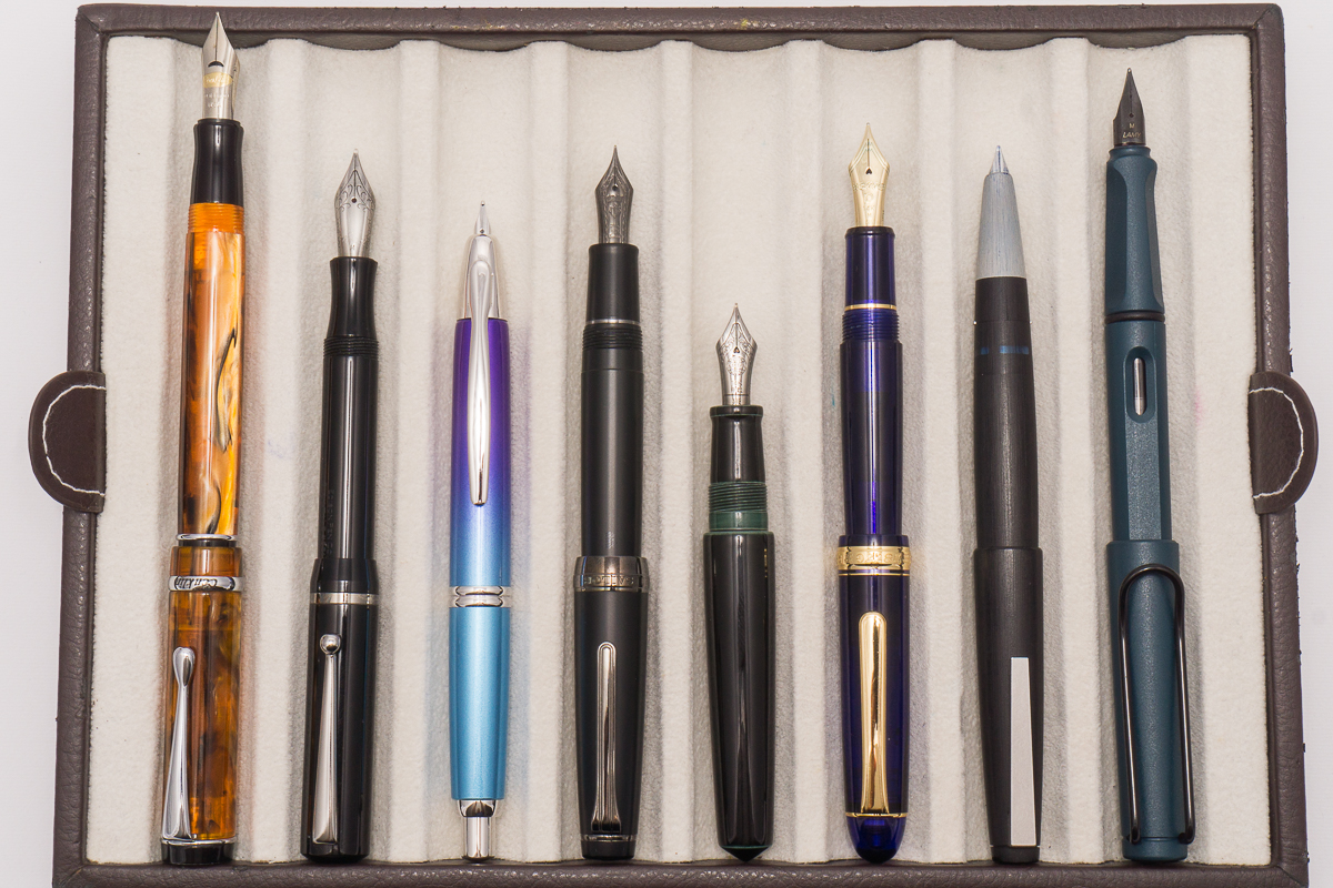
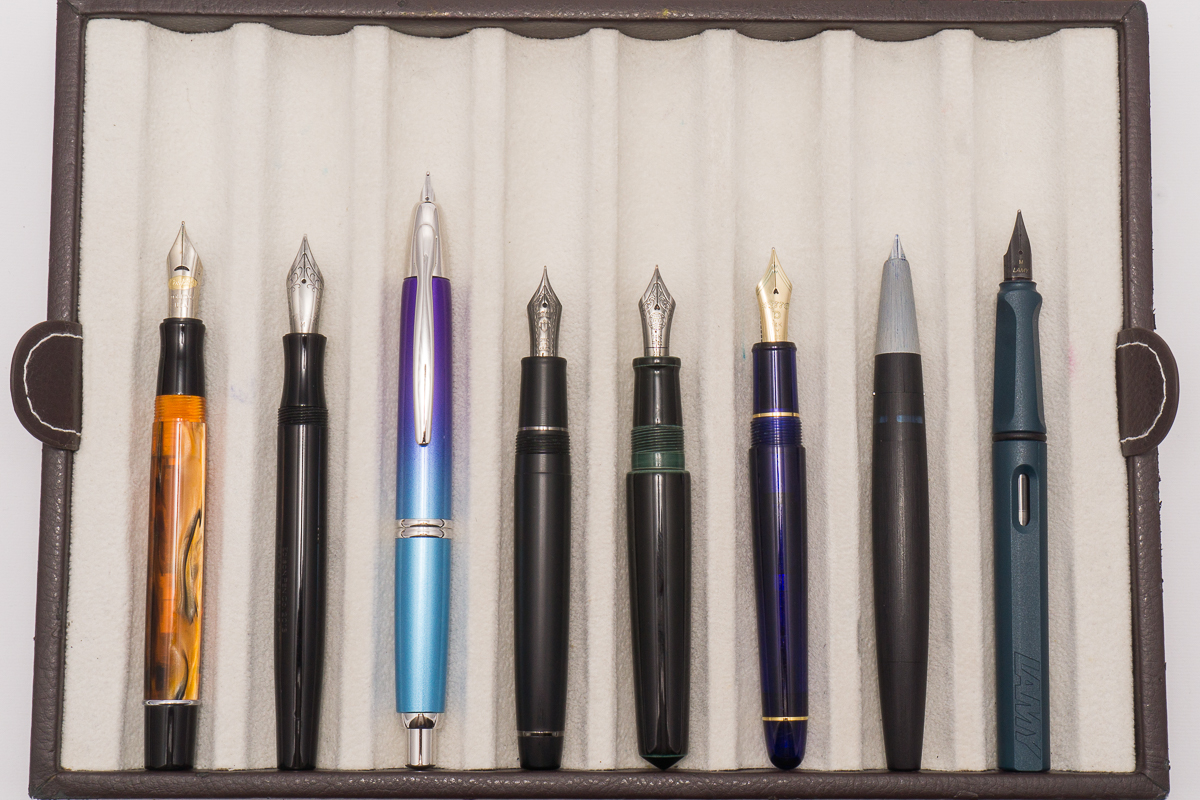
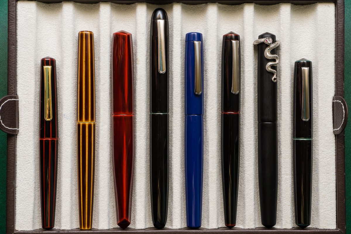
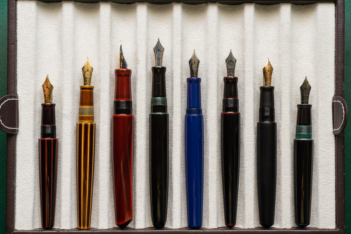
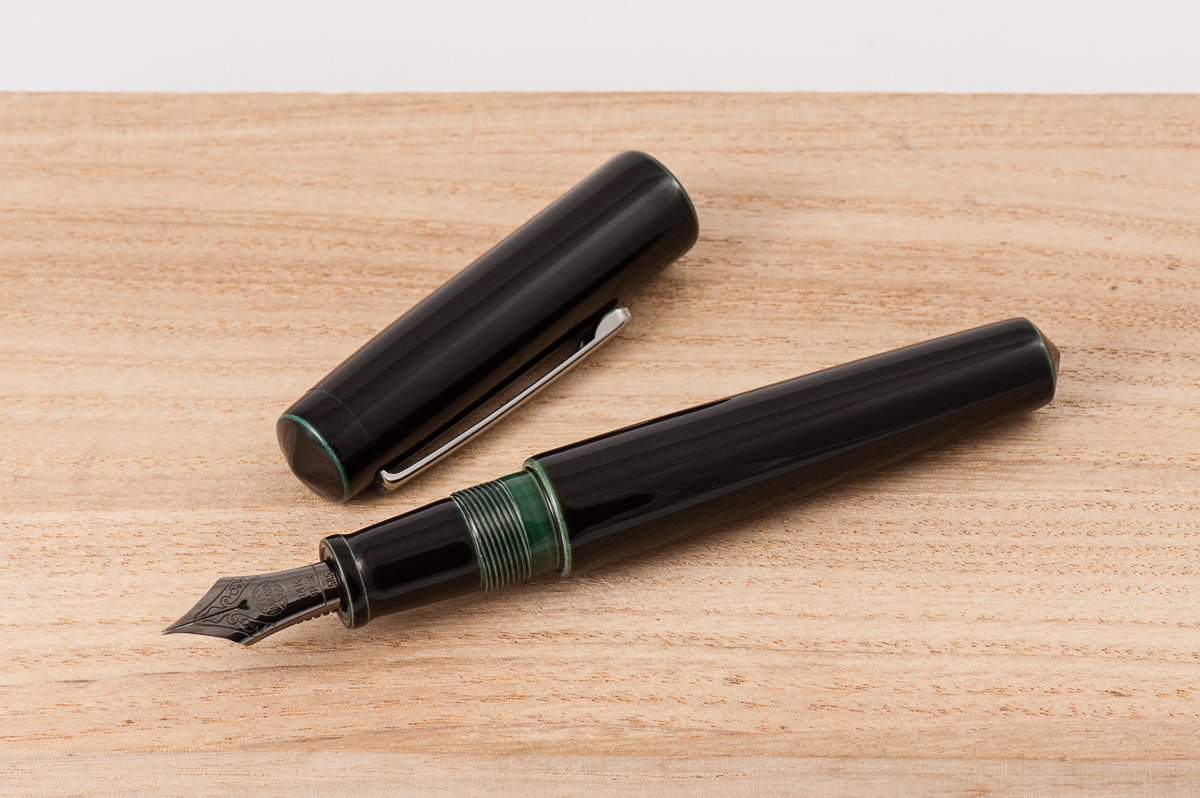
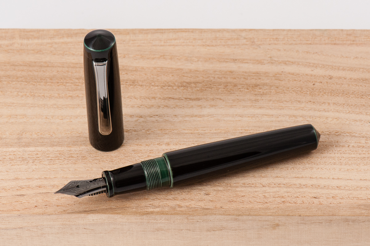
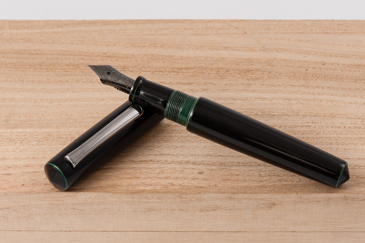
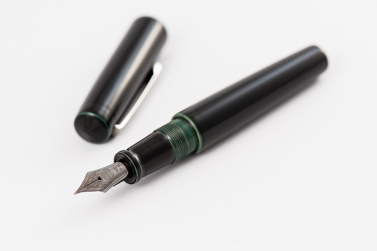
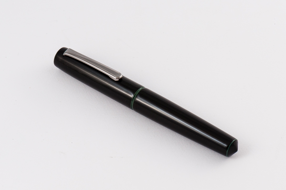
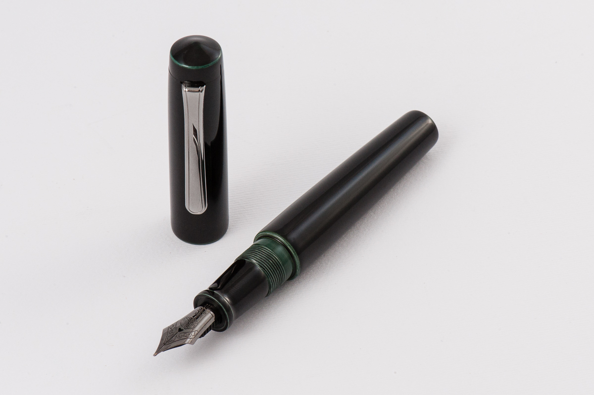
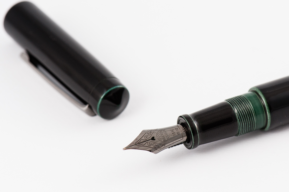
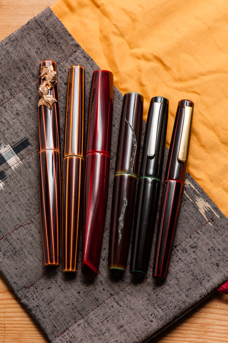
Katherine: We’d agreed on a prompt of top five acquisitions, I think. But I’m rebelling. 2017 was the year of the Nakaya for me — I went from zero to six, so let’s talk about that.

To start, some insight into my head — I place a lot of value in things that aren’t mass produced and are made by masters of a craft (see also my love for fine dining). Second, I’m willing to pay much more for things I can’t make/do myself (see my love for absurd molecular gastronomy, much less for anything I could conceivably cook at home). Third, I’m pretty busy with work, but I’m obsessive and I tend to be willing to try to do a lot of things (see the hours I’ve spent in the kitchen making my own sous vide egg foams).

Given those things, and my love of pens, I think Nakaya are a natural fit for me. I won’t lie, I’ve dabbled with my own finishes and urushi lacquer, and it’s still something I want to learn more about.  Until then, Nakaya is a delightful mix of beautiful forms*, masterful craftsmanship and daily indulgence, all bundled together in a utilitarian writing instrument.

And, because the adventure doesn’t have to end — Nakaya I still want: another Mini Decapod (vaguely considering letting one go? let me know!), a pen in ishime suzu (black and silver) and a Decapod Twist in midori-tamenuri (a mini deca in midori-tamenuri would be amazing… but my odds are so low).

* I have a soft spot for pens with gently conical ends, and a (excuse my language) massive hard on for faceted pens.
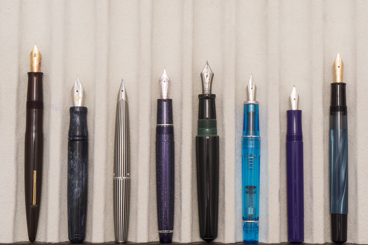
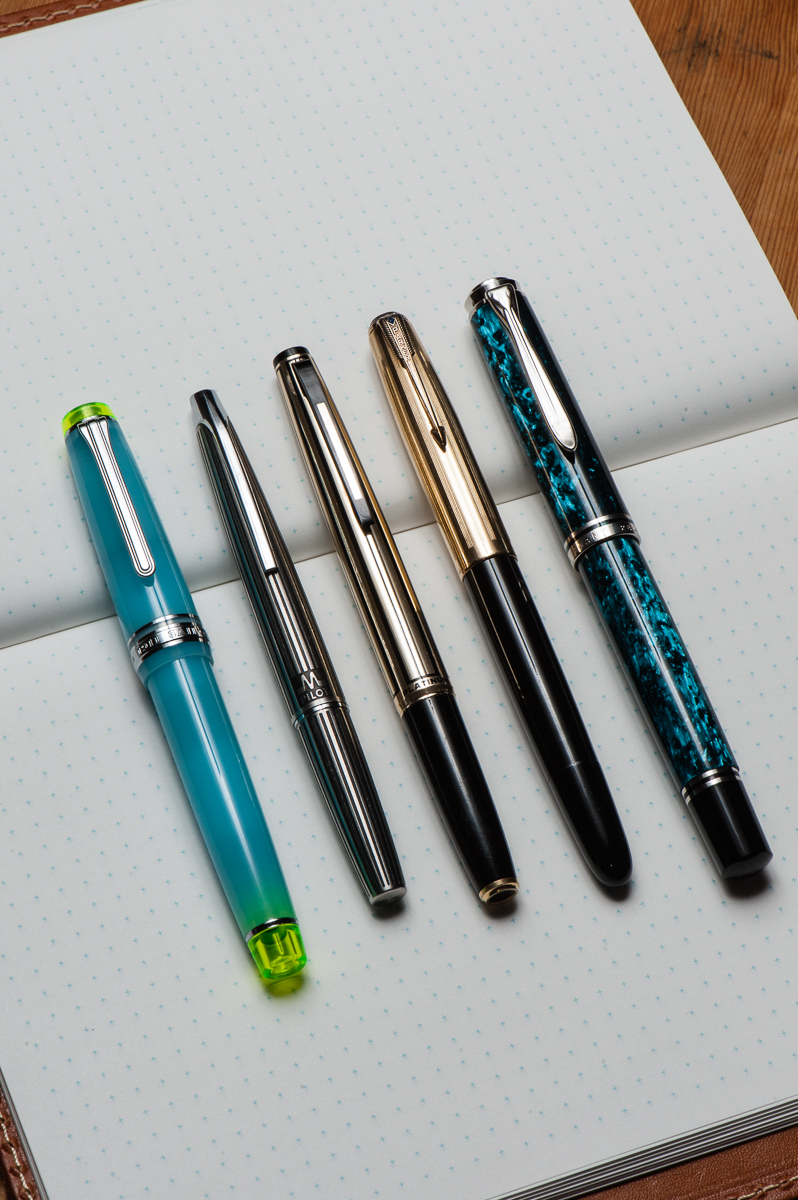
Pam:  2017 was a year of acquiring and within that process refining what my writing preferences are.  It has been the most adventurous and sentimental year yet for me with 2 pen shows and great pen friends.  The five pens I chose is a reflection of my experiences in 2017 as well as the direction that my pen use and “collection” is headed in 2018.

No surprise to the Sailor ProGear Blue Lagoon.  It’s by far my favorite Sailor (don’t tell the Progear Slims) for it’s color combination and performance.  It has solidified my love for the Sailor Progear and Progear Slims.  With all the special limited editions that Sailor keeps coming out with, like the Purple Cosmos, all I can say is that Sailor is going to be keeping my wallet pretty slim.  The Pelikan m800 Ocean Swirl was a very pleasant surprise by my pen-spirators (Katherine, Franz and Roz) that included my non-fountain-pen-bestie getting me a very extravagant gift for my 31st birthday.  I am a very lucky girl. After having an m800 of my own I am wondering why I was so hesitant to try the m800 size before this year.  It’s a great size for pretty much any hand size and so well balanced!

I am actually surprised by the remaining 3 pens on my list given that I never thought of myself as a vintage girl. However, vintage pens have an affinity for small hands as the form factor of the pens are naturally slim and compact.  It’s a great match.  I am enamored by “short long” pens which are pocket pens that cap into a “normal” size pen.  There aren’t that many short long pens with Japanese fine nibs on the modern market; only the Pilot Elite comes to mind. This “gap” is actually well fulfilled by the vintage pens.  All three of the Japanese firms (Sailor, Pilot and Platinum) made short-longs/pocket pens back in the day, going as far as to mimic each other’s designs.  The black stripe Myu by Pilot and this unique Platinum black and silver pen really opened my eyes to treasures of the vintage world.  What I love about the vintage pen world is that everyone has a “niche” in terms of what they get excited about and what they collect.  With the influence of a fellow pen friend, Andrew, I may have slipped down this rabbit hole and I can’t wait to see where it will lead in 2018.

Lastly but certainly the greatest of surprises for me is the Parker 51.  I don’t typically talk about Parkers and why haven’t I?  The nib on this Parker is FANTASTIC, the smooth body and width of the pen is super comfortable for my handwriting, and it’s vintage?! This pen broke me of the idea that vintage pens were “stuffy.” How do you revive a “stuffy” pen?  Put a bright ink in it.  Inspired by Franz’s post of “black pens want pink ink” on Instagram and following that advice, I found great joy and a wonderful writing experience with this pen.

All I can say is that 2017 was eye-opening.  I think 2018 is going to be a year of continual refinement and potentially slowing down the rate of acquiring. Some people have a word of the year and if I had to choose one for my pen use/collection, it would be “intentional” and being more cognizant of my own pen habits and use case (at least until the next Sailor Progear  limited edition or vintage pocket pen comes my way).
Franz: Wow! 2017 is almost over and HELLO 2018!

I’ve enjoyed this hobby very much especially because of all the great people I meet along the way. Lots of highlights and events that passed this year. Here’s just a few I’d like to share.

  • In February, I went to the LA Pen Show and it was all about fun, and food! I mean, pens are great and all but you’ve gotta enjoy some great food too. That restaurant in Korea town with the awesome iced tea was a highlight. Tin Roof Bistro dinner was a success too. Got to spend some time with my sister as well.
  • In April, went to the Atlanta Pen Show for the very first time. I got to meet up with a family friend who has been into fountain pens long before myself and showed him around for his first pen show. Got to see the live Pen Addict podcast. Late night food at the Waffle House… yum.
  • In August, got to attend the SF Pen Show and once again assist with their classes and seminars. That show is just phenomenal. Got to host the Pay-It-Forward table with my Mom and a few other Pen Posse friends.
  • In September, Pelikan Hubs was held, and it was great listening to Mr. Rick Propas provide a history if my favorite pen brand.
  • All year round, Pen Posse meetups happen with the Food sub-committee meetups as well. The pen posse is a great group of people and happy to be part of it!

Also, I’m very thankful that this Hand Over That Pen blog continues to be. My friendship with Katherine and Pam is just… extraordinary.

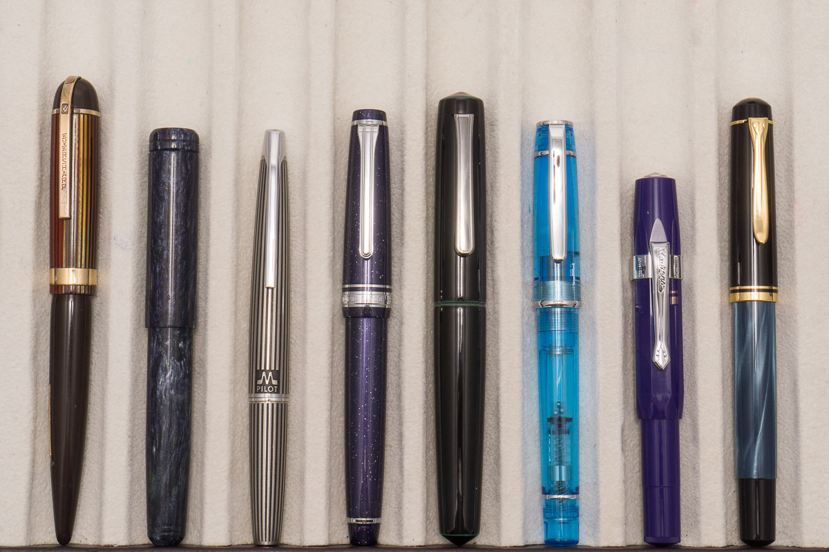
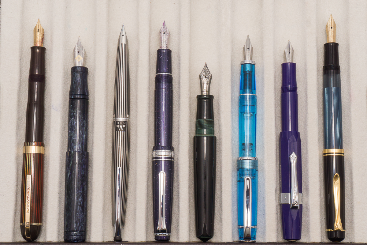
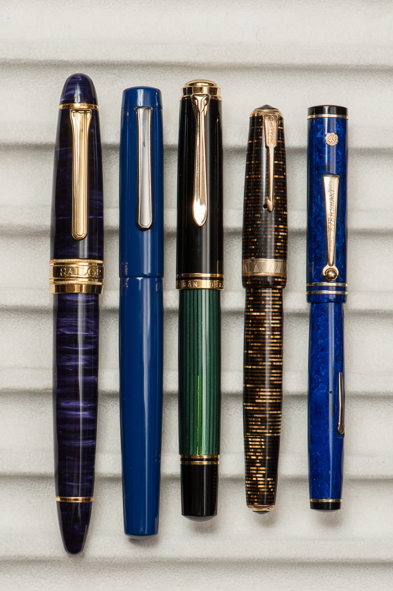
Here’s my top 5 pens for 2017 in accordance to being inked up and mostly used during the year.

  • Classic Pens LB5, Tairiku (continent) in Amethyst Mauve, Broad nib. This pen was part of my top 5 last year as well. It just shows that I love writing with this pen. The 21-karat Sailor King of Pen nib is very nice especially on Tomoe River paper. The length of the pen is perfect for my hand. It still has Pelikan Edelstein Amethyst ink in it.
  • Nakaya Neo Standard, Kikyo, Medium nib. This is a new pen for me in 2017 that I got from the secondary market. Just like the LB5, the length of the pen is perfect for me. The dark blue is understated and it’s a pen I’ve been using a lot at work. The ruthenium clip and nib made it an even more subtle and beautiful pen for me. Thanks to J. of Classic Fountain Pens! The medium nib is perfect for either the cheap copier paper or Tomoe River paper that I use a lot. The Neo Standard is paired with Pilot Blue Black ink as it matches the dark blue finish.
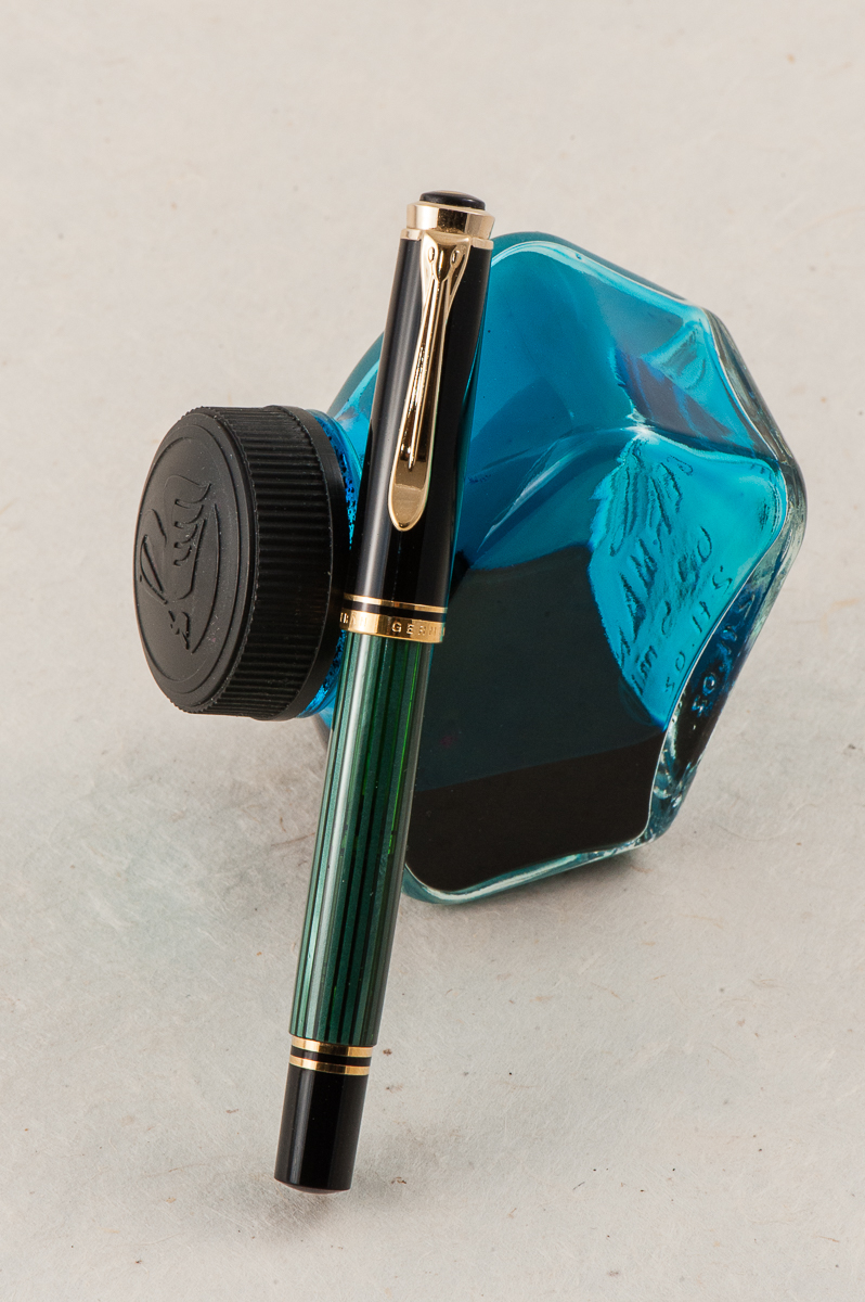
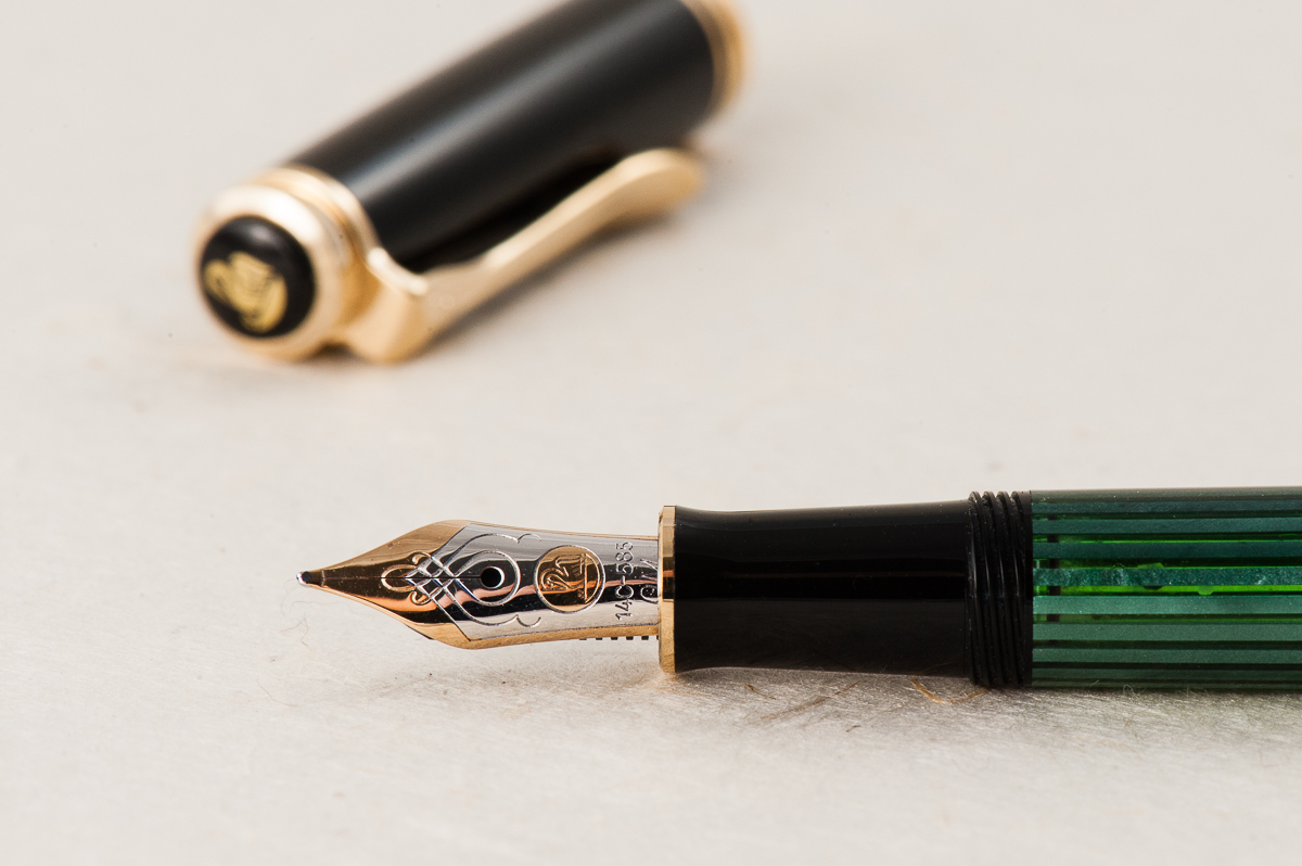
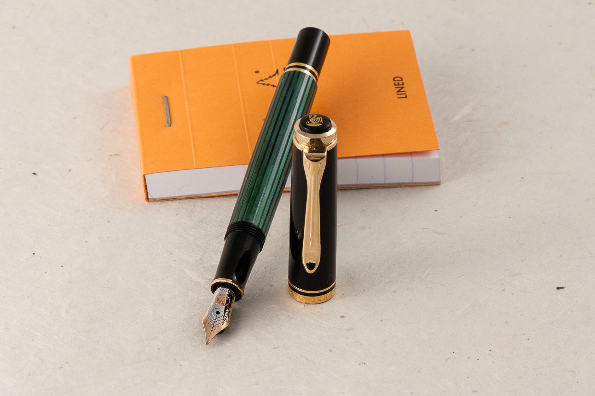
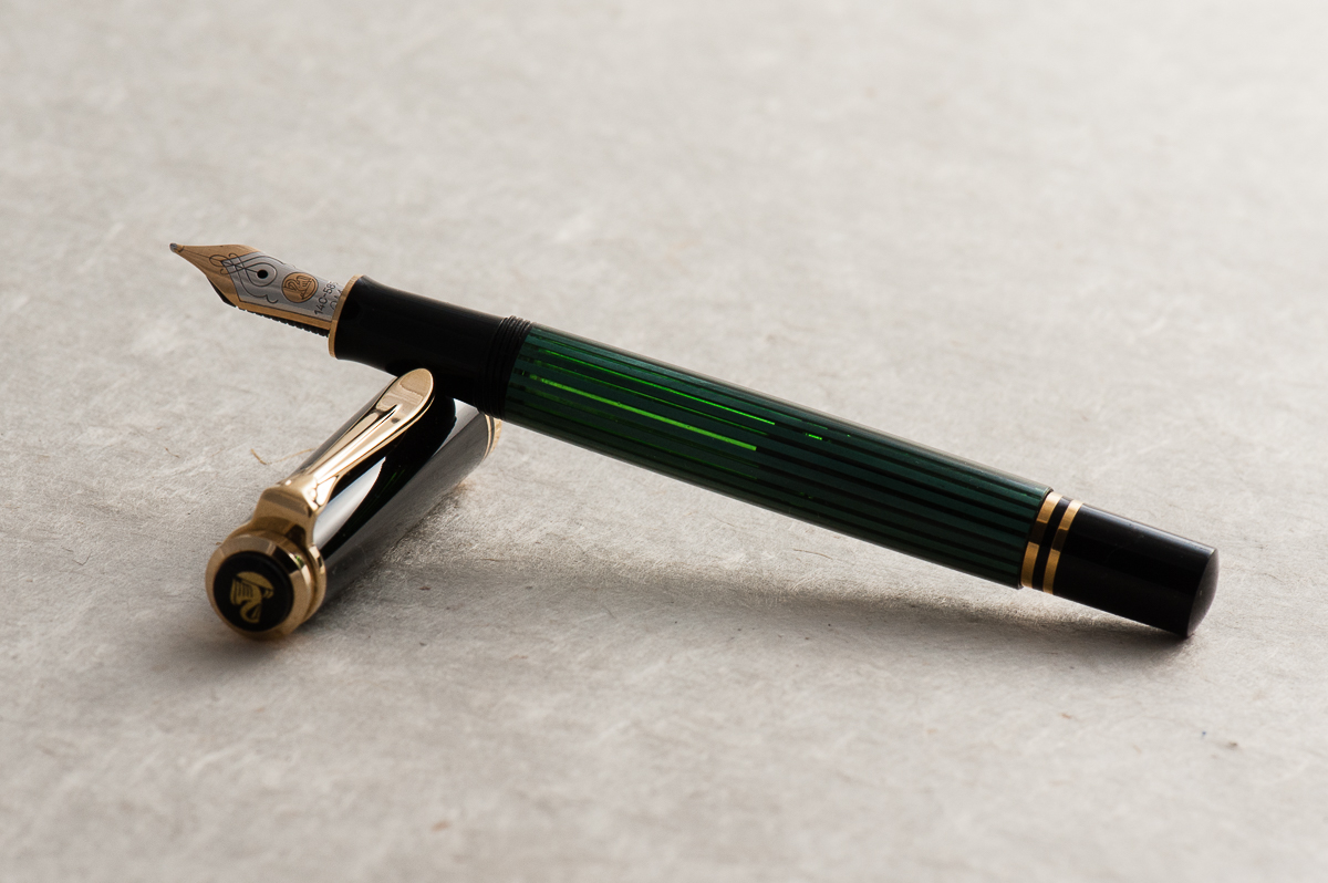
  • Pelikan M1000, Green Striated, Fine cursive italic nib. I’ve had this pen since 2016 but I only had the nib turned into a cursive italic by Mr. Dan Smith at the 2017 LA Pen Show. Since then, the M1000 has not been un-inked and I’ve used it almost every day. The nib is springy and wet just like it should. I am a self-confessed Pelikan Addict and this flagship pen is perfect! It has been paired with my top favorite ink, Pelikan 4001 Turquoise.
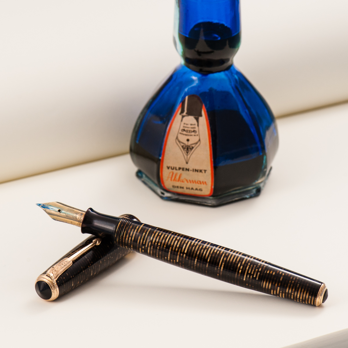
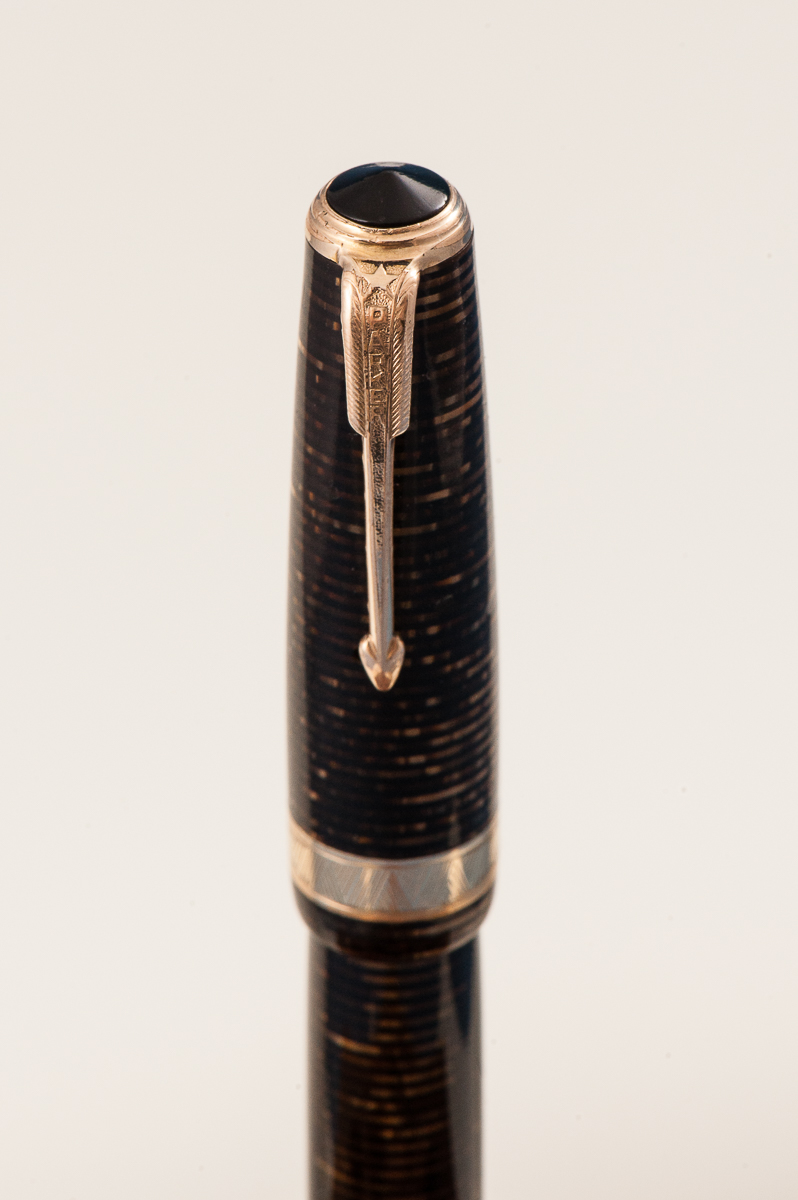
  • Parker Vacumatic Maxima, Golden Brown, Medium nib. I have such a love for the Parker Vacumatic pens and I always have at least one Vacumatic inked up. The stacked coin design is so beautiful with these Vacumatic pens. I was looking for a Vacumatic Maxima during the 2017 SF Pen Show but couldn’t find one with a great price, and nib preference. But at a Pen Posse right after the show, I was presented this pen for a great price and it has a medium flexy nib. It also sports a Star clip which was a transitional clip in 1939 before Parker chose the Blue Diamond clip. The Maxima is one of the “bigger” pens in its time and I find it comfortable to write with even unposted. Posted, the length makes it perfect, but I avoid doing so because the cap lip might crack. I love using this at work and every time I use it, it places a smile on my face. It has been inked up with Akkerman 05 Shocking Blue ever since.
  • Wahl-Eversharp Personal Point Gold Seal, Lazulitic Blue, Medium nib. Ok, Parker pens seems to always get my attention but Wahl-Eversharp pens do so occasionally as well. I’ve been on the lookout for larger sized W-E pens but haven’t really seen much that is within the budget. I saw this W-E pen in person in early 2016 and did not act on it and thought that it was sold. Fast forward to July 2017, I found this pen again and I immediately sold a pen to buy it. That’s how much I wanted it. No regrets at all and has been in use since bought! The blue material of this Personal Point is just stunning especially for a blue pen lover like yours truly. Just like the Vacumatic Maxima, it has a flexy medium nib which writes oh so smoothly. Currently inked with Pilot Blue Black.
 

Happy New Year to you all and may 2018 bring you more blessings and happiness!
3 Comments

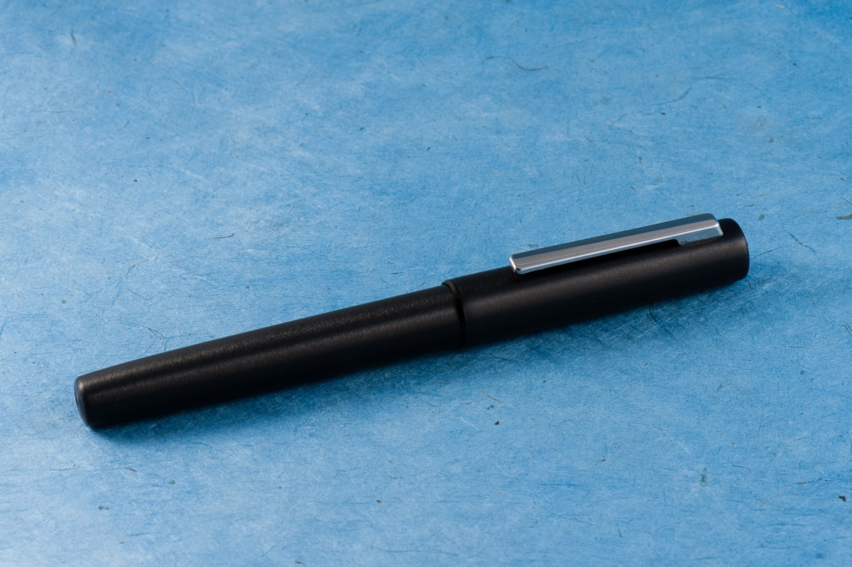
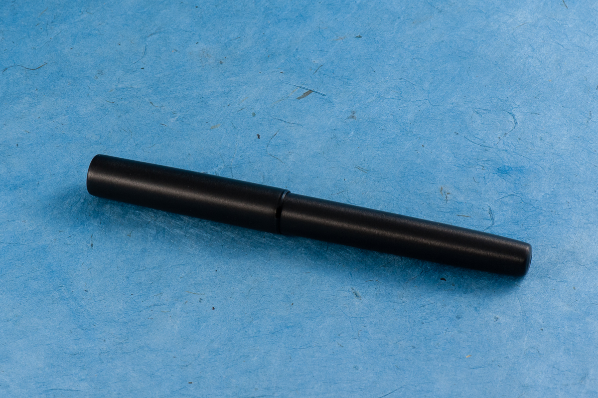
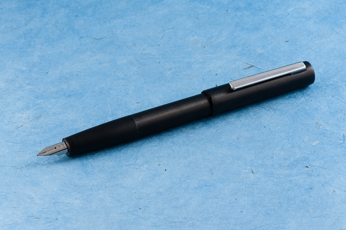
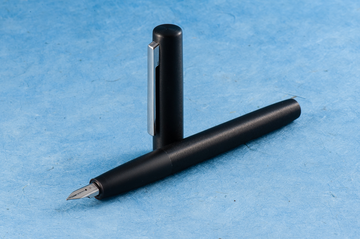
Review: Lamy Aion (Black, Medium Nib)


Our lefty guest reviewer is joining us again! Roz helped us provide thoughts on this new Lamy Aion fountain pen.  Thanks very much Roz!

Hand Over That Pen, please!

Katherine: The Aion just ain’t my thing. It looks okay — but the different textures on the section and the rest of the pen bug me. Also, it looks really long? (But we already know that Lamy style and I generally aren’t bffs)

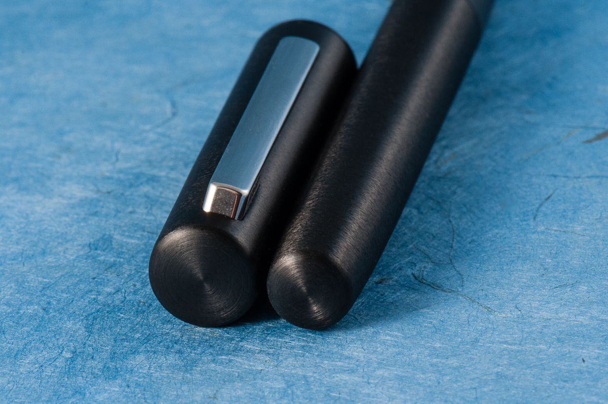
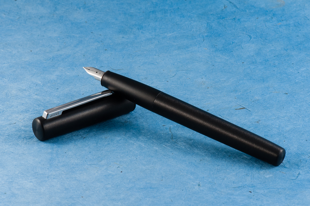
Pam:  Why hello there Mr. Minimalist design.  It’s unsurprisingly a Lamy pen, with shape and feel that is similar to the Lamy 2000 and the Lamy Studio.  In my mind’s eye, if the Lamy 2000 was the James Bond of the Lamy line with it’s sleek and beautiful shape, the Aion is the buffer, larger and less graceful cousin.  It reminds me of the fine line Sharpie markers with the squared off profile in the cap.  Aesthetically, I have mixed feelings about this pen.  In hand however, its a different story.  It feels as it looks:  heavy, sturdy, and very comfortable (with a seamless body and section), all pluses in my book.

Roz: I pretty much fell in love with the Aion the moment I got to hold it. Brushed metal, black & silver, and clean lines – yes please. The weight surprised me as well. It was definitely heavier than most pens I would gravitate to, but what was surprising to me was that it was a comfortable weight to hold, even while writing.

Franz: Lamy introduced the Aion a few months ago in the summer of 2017 but U.S. retailers did not get these pens until late November or early December. My co-worker who went to Germany in August for a vacation surprised me with this Aion fountain pen. I was surprised at how nice the brushed aluminum felt in my hands mainly because I’ve found that metallic pens especially their sections get a little slippery for me. The Aion was smooth but the texture allowed me to grip it without issues. It does look like a fatter Lamy 2000 or a VERY beefed up Lamy CP1. I’m loving it so far.

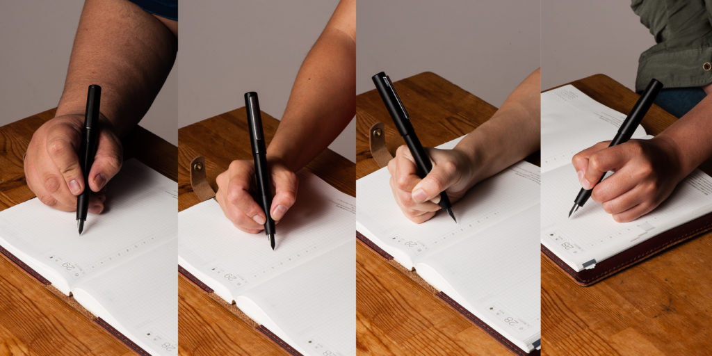
In the Hand: Lamy Aion (posted) – from left to right: Franz, Katherine, Pam, and Roz
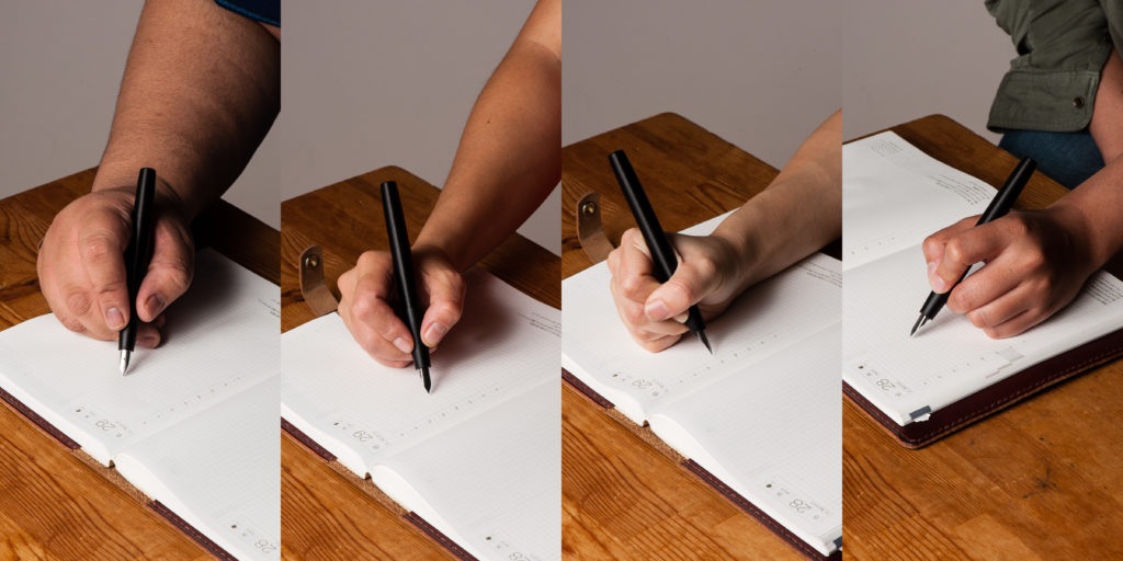
In the Hand: Lamy Aion (unposted) – from left to right: Franz, Katherine, Pam, and Roz


The Business End

Katherine: Like most Lamy nibs, I find the Aion’s nib wayyyy too smooth. On Tomoe River, it’s almost nails-on-chalkboard-y for me. On less smooth paper, like copy paper, it’s more usable — and perfectly fine.

Pam:  The nib was perfectly smooth and glided over paper superbly.  The wetter nib tended to feather on copy paper, so I kept it on Tomoe River paper most of the time.  It left a well saturated  consistent line with no skipping.

Roz: The nib was easy to write with. Admittedly I prefer a finer nib so there were times when I felt I was almost painting with the pen, but the nib was smooth and the ink was consistent.

Franz: As detailed by the ladies above, the writing performance is smooth and wet. It writes like what a medium nib from Lamy does. One thing to note though, the Aion’s steel nib is stiffer than a Safari’s steel nib. Uhh… I do not recommend putting too much pressure on their steel nibs but the Safari does give a teeny bit of variation.

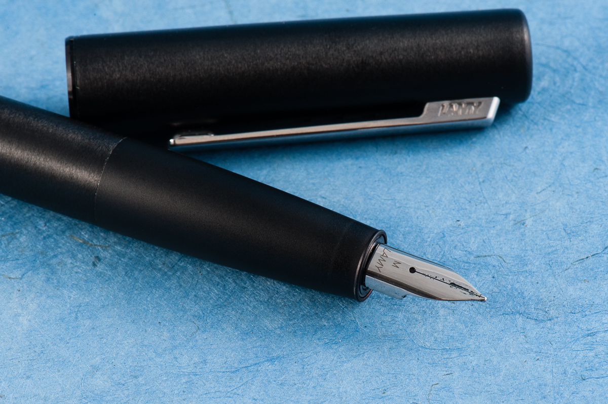
The shape of the nib is different compared to a Safari’s as well. The Aion nib looks curvy which complements the section. Since I’ve done so myself, the Safari nibs are interchangeable with the Aion.

The Aion nib.


Write It Up

Katherine: I do most of my writing on Tomoe River… so this wasn’t my favorite pen to write with for a long duration. But, ignoring the nib, it’s a comfortable pen for me. The section is within my range and it’s a well balanced pen. I expected my fingers to sliiiide down the section slowly, but they didn’t!

Pam:  I am excited that this pen can be another home for the Lamy Safari nibs given that I have a harder time with the Lamy Safari’s section.  The section with the matte finish/brush metal is a joy for my particular grip and sweaty hands. There is no step! It makes up for my reservations about the aesthetics of the pen. It’s heftier than most pens, but that’s to be expected with an all metal pen (and a bonus for me).  I wouldn’t recommend posting this pen for those with smaller hands as it makes the pen more top heavy and can tire out the hands.

Overall, I savor writing with this pen given how comfortable it is.  The width and the non-slip grip section is spot on, even for those with petite, fisty, grips.

Roz: Writing is awesome with the Aion. I prefer to write with it unposted, the balance seems to suit me better. It was amazingly easy to write with this pen, the slope of the section is so well done it didn’t leave any impressions.

Franz: Using the Aion to journal with is awesome. I wrote with the cap either posted or unpsoted and it was comfy both ways. The unposted length is quite perfect for me but if I wanted a little more weight, the posted length wasn’t too long. One thing to note, although the cap posted on the barrel for more than an inch there were a couple instances when it slid off the pen. It does post securely at first but in my 10 minutes of writing, the cap loosened and slipped off twice. Perhaps I was writing voraciously? I don’t know… haha!

It was still a nice writing experience for 20 minutes and I liked that the section did not have a mark of where my grip should be like that triangular-ish section on a Safari.

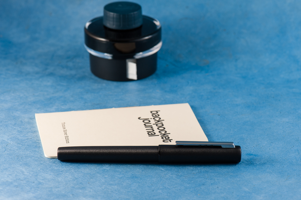
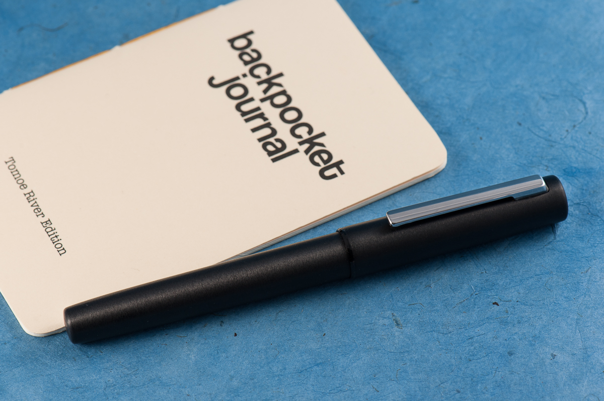
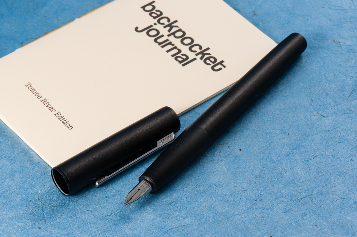
The Aion beside a Curnow Backpocket Journal. A Lamy ink bottle in the background.

EDC-ness

Katherine: The snap cap is super convenient. And makes a nice clicky sound. Click click. Definitely an EDC-able pen, but wouldn’t be my go to for the reasons listed previously.

Pam:  I would have no problems taking this pen around at work given it’s sturdiness and snap cap.  It harkens back to the days (and present time) of how I prefer snap caps and fast access to jot things down at work.  It’s weight also is a good reminder that it’s in your pocket or the fact that it’s not, if you are forgetful like me.

Roz: The Aion fit well in my carrier, but was a bit too heavy for me to wield throughout the day. What I did enjoy doing was sitting and writing with it for a solid chunk of time.

Franz: Before we decided to review the Aion, I’ve used it at work for about two weeks. The quick deploy of the snap cap, the spring loaded clip for the shirt pocket, and the black finish made for a distraction-free every day carry pen. I’m only wishing it had a fine nib because there were times when the line width was too thick for the cheap copier paper we use at work. I also used the Aion with my Curnow Backpocket Journal. Now that juicy medium nib was perfect for the Tomoe River paper in that journal.

The Aion is filled via either the Lamy cartridges or the supplied Z26 converter. During my two weeks of use, I refilled it three times. I did miss my Lamy 2000’s piston filler capacity but it’s far from being a deal breaker.


Final Grip-ping Impressions

Katherine: Lamy pens and I don’t really seem to get along and the Aion is no different. But, all of my gripes are very subjective — if you like the smoothness of Lamy nibs and the aesthetic agrees with you, there’s no (surprise) reason you won’t love this pen. It feels well made and finished.

Pam:  I haven’t been this excited over a “less than $100” pen in a long time.  If you are looking for an upgrade to your Lamy Safari and enjoy the more industrial, minimalist design, this is the pen for you.  If you enjoy writing with a sturdy, metal pen at a very reasonable price, this is the pen for you.  If you don’t want to spring for the Lamy 2000 (yet) and wonder what else Lamy has to offer after the Safari or Studio, this pen is worth a shot.  Honestly, in this price range, there aren’t that many pens I could recommend over the Lamy Aion with the features mentioned throughout this post.  My only reservation is on the bulky cap, but in terms of writing experience, I have no complaints.

Roz: I *really* enjoyed this pen, everything about it. I think I’m going to put this at the top of my pens-to-get-soon list 🙂

Franz: The Lamy Aion is a knockout pen. Period. =)

It’s a very unassuming pen that brings great value. I love using this pen and will be inked up in rotation quite a few times. I kinda wish they had more color choices though. If they come out with other colors other than black, and silver, I’d probably get another one.

Within the four of us, we have different hand sizes and we found it a comfortable pen to write with. So the Lamy Aion is definitely a pen you should try to write with!


The cap and barrel finials are circular and simple.

Pen Comparisons

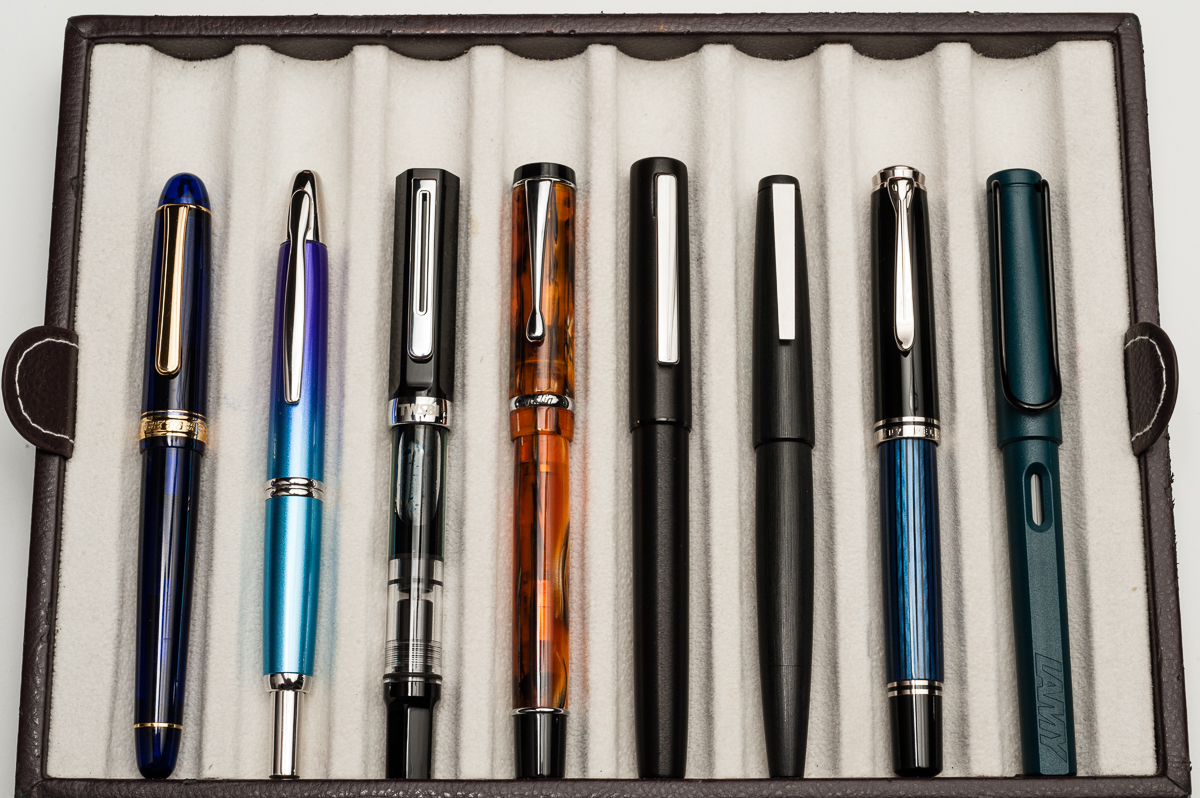
Closed pens from left to right: Platinum 3776, Pilot Vanishing Point, TWSBI Eco, Conklin Duragraph, *Lamy Aion*, Lamy 2000. Pelikan M805, and Lamy Safari
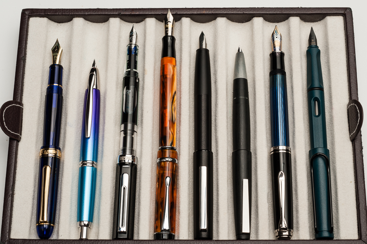
Posted pens from left to right: Platinum 3776, Pilot Vanishing Point, TWSBI Eco, Conklin Duragraph, *Lamy Aion*, Lamy 2000. Pelikan M805, and Lamy Safari
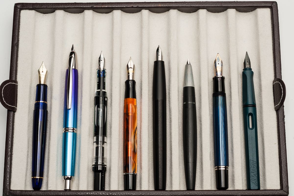
Unposted pens from left to right: Platinum 3776, Pilot Vanishing Point, TWSBI Eco, Conklin Duragraph, *Lamy Aion*, Lamy 2000. Pelikan M805, and Lamy Safari

Pen Photos (click to enlarge)

1 Comment

Pen & Ink Pairing: Dec ’17

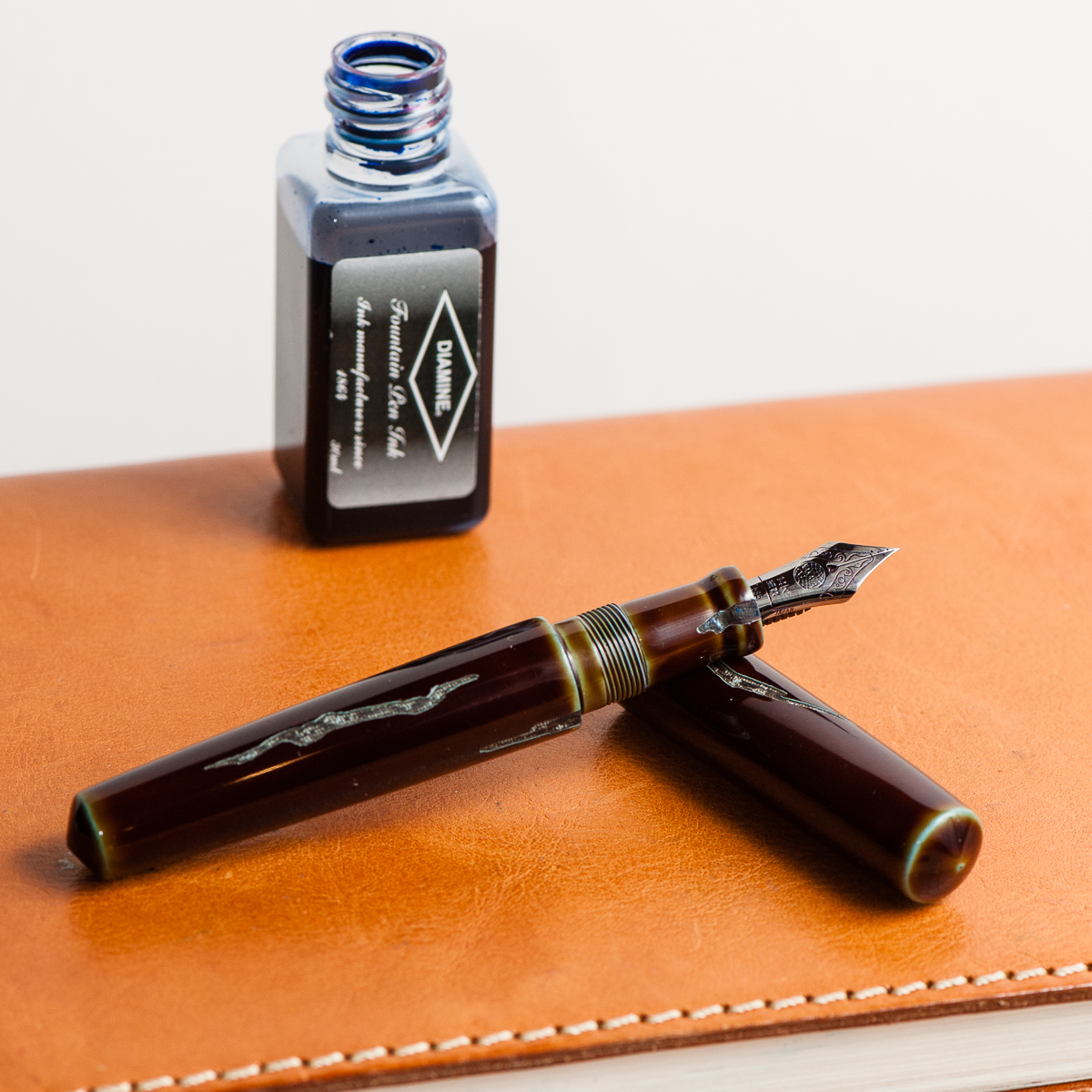
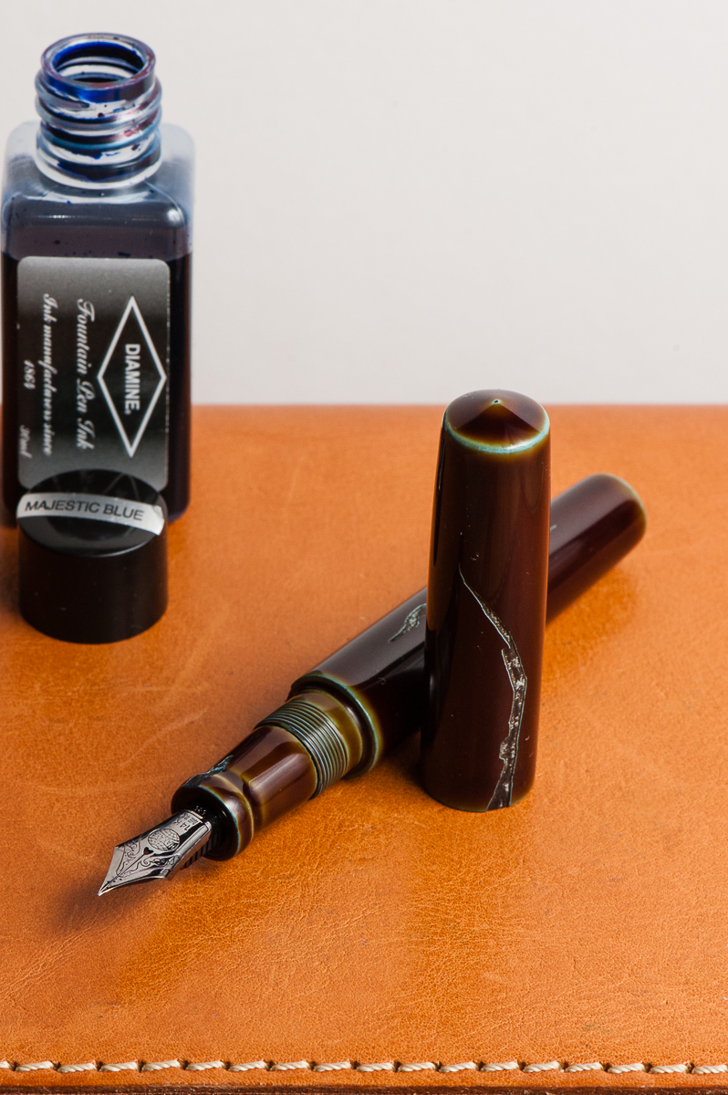
Katherine: December has been a crazy month of trying to not drown. The year is wrapping up at work and I feel so behind on everything, and slightly sick. In light of that, I decided on an EDC that is both practical but also brings me so much happiness every time I pull it out to use it. Diamine Majestic Blue for work-friendly writing, paired with a Nakaya Piccolo in Heki-Tamenuri Negoro and a Mottishaw Spencerian nib for lots of joy. To tell the truth, I barely flex the nib, but I do enjoy the bounce it has and how fine it is — I can cram lots of to-dos in my Hobonichi weeks. 😐


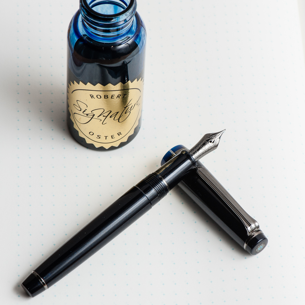
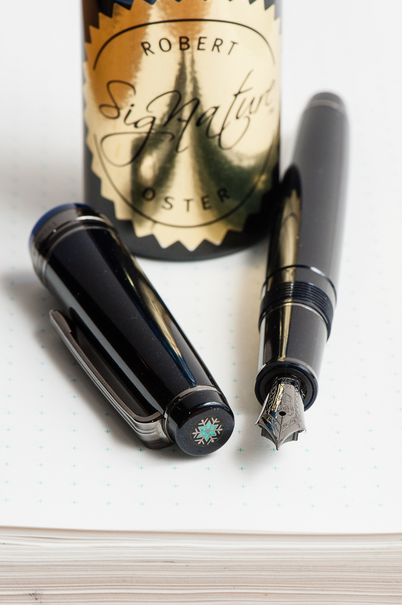
Pam:  December is a month that I look forward to the most due to the holiday season.  One of my favorite pens that was an ode to this magical time of year is Bungbox’s Silent Night, a limited edition made available last year, 2016. I don’t have an affinity to blue black inks such as Silent Night or Bungbox 4B. Blue grays, however, like Pilot Iroshizuku Tsuki-yo, is one of my favorite inks of all time.  Therefore, it would only seem fair to try Robert Oster Blue Night in the Silent Night. Blue Night reminds me of Tsuki-yo, but has more shading, at least in this pen with an Japanese F nib.  I do wonder if the shading properties would differ in a wetter nib. Given that I have only inked it for less than 24 hours, I will report an update on Blue Night to determine if it’s a keeper.


Franz: For the month of December, I chose a vintage pen. But it ain’t just any vintage pen, it’s my Parker Vacumatic Senior Maxima in a Golden Brown finish. I recently got the pen this year and it’s in such great condition for a pen made in 1939. I always adore that stacked coin design of the Vacumatic celluloids. Something special about this pen is that it has a Star clip. This was a transitional clip in models made in 1938 thru 1939 before Parker came up with the Blue Diamond in 1939 as well. The size of the Maxima fits my hand very well.

I chose Akkerman #05 Shocking Blue as my ink because the blue ink complements the beautiful brown celluloid finish of the pen. Plus it’s an ink that I’m comfortable using in my vintage pens.

Happy holidays to you all! And keep enjoying your pens and ink!

Pen Closeups (click to enlarge)

No Comments

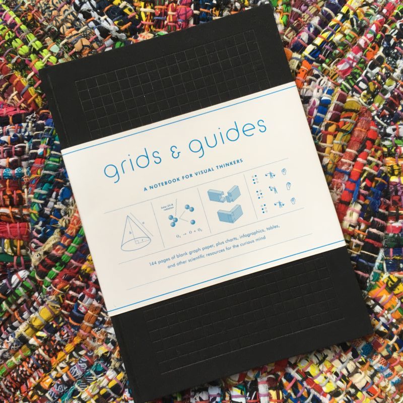
Mini Review: Grids & Guides Notebook

Hello! It’s Katherine again. Apparently I have a lot of random stationery that is of unknown fountain pen friendliness. I was gifted this one by a coworker, but you can buy your own from Amazon.

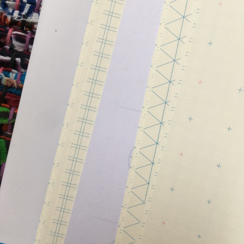
If you’re unfamiliar with this notebook, the pages have an assortment of different patterns — grid, boxes, circles and some things I don’t know how to describe. Sorry. Here’s some of a preview:

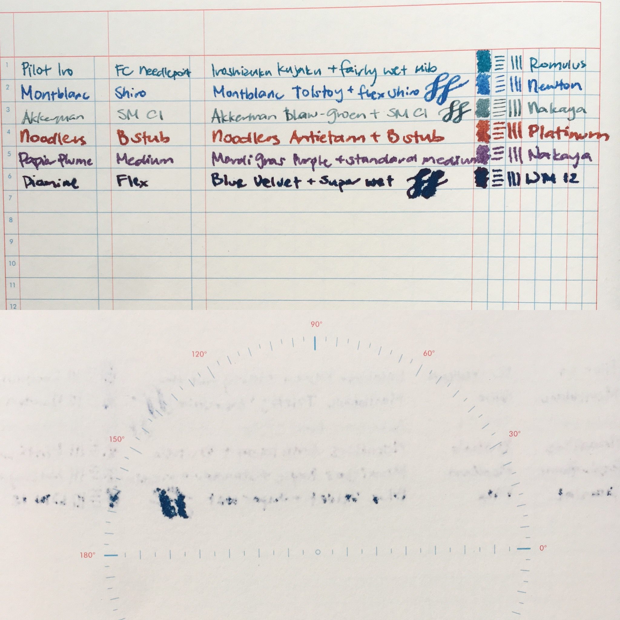
Unfortunately though, the paper doesn’t get along well with fountain pens. And it bleeds through quite a bit. :/ (The second half of the below photo is the back of the writing sample)

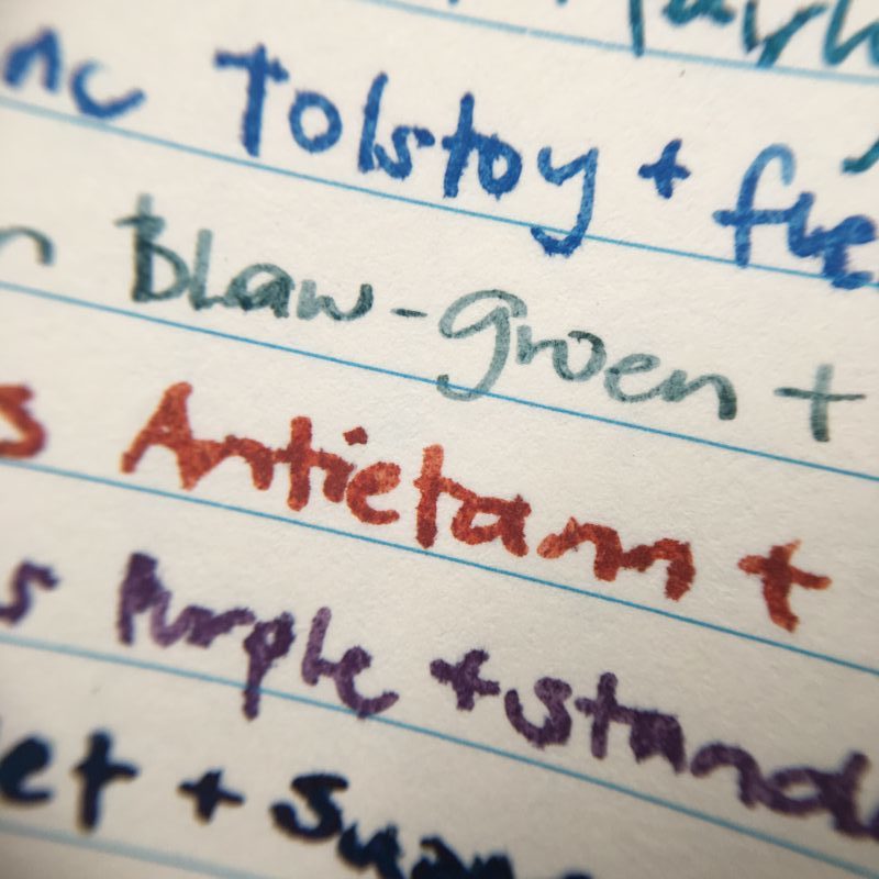
And a close up of the writing sample and it’s feathering. Particularly fine and dry pens are likely fine, but you’ll still see a little bit of shadowing.

The paper is pretty smooth and decently heavy, but just can’t hold ink. 🙁

Overall, I’d say these are fountain pen unfriendly. A neat idea, but not a friend for your fountain pens.

1 Comment

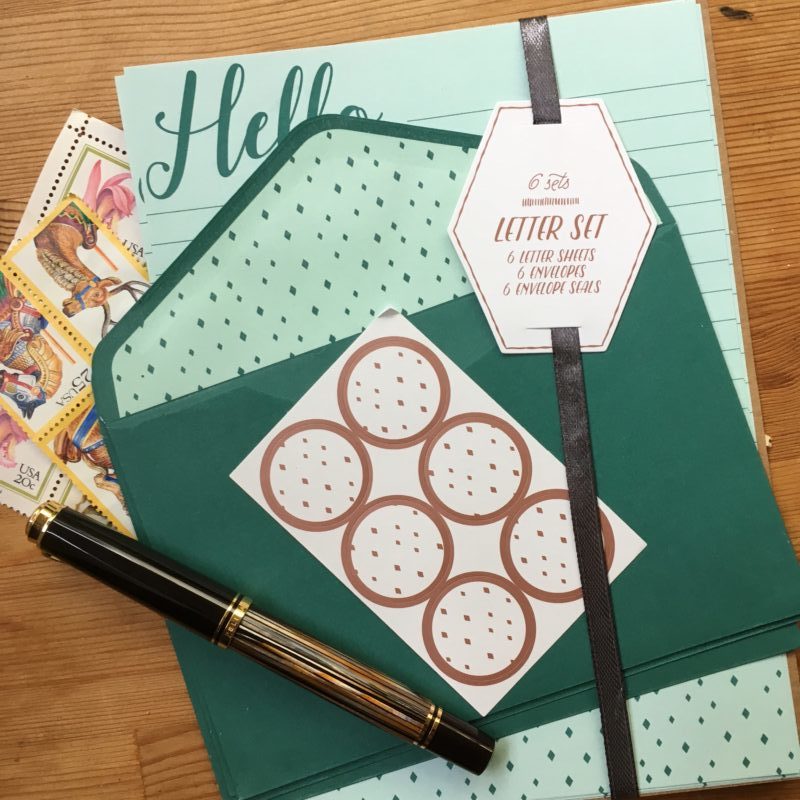
Mini Review: Target $1 Letter Set (mint)

Hello! It’s Katherine. (thus the mediocre iPhone photos instead of Franz’s awesome ones with proper light balance)

I don’t think I’ve written about how I got sucked into the rabbit hole that is the fountain pen Instagram community… long story short, it was via the fantastic stationary goodies Target sells in the “dollar spot”, now called the bullseye playground.

I’ve been buying cards, post its and other paper goodies from them for a couple years now, and have found them to generally be fountain pen tolerable — so when I picked up this stationery set earlier today, I thought I’d do a quick review!

First things first — it’s $1 (+sales tax) for a matching set of six envelopes, six sheets of paper and six sticker seals.

The paper is a light mint, but there is also a pink/magenta themed set in stores right now. The bullseye playground lines seem to rotate fairly often, so I thought I should get this review up sooner than later. The stationary is manufactured by Madeforretail, who also seems to manufacture quite a few of their other paper products.

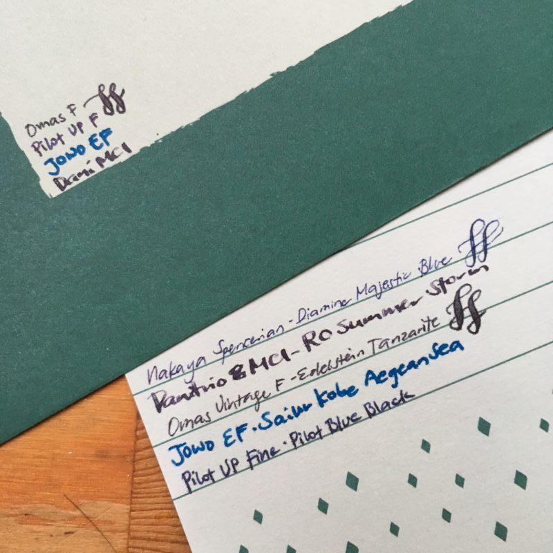
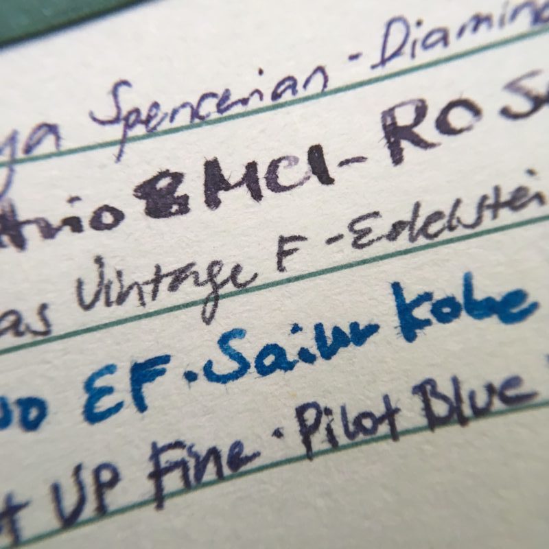
There’s a close up of the different inks above. I’d say the paper is comfortably usable with Japanese fines, but for anything broader than that, there will be some feathering, but the amount varies from ink to ink.

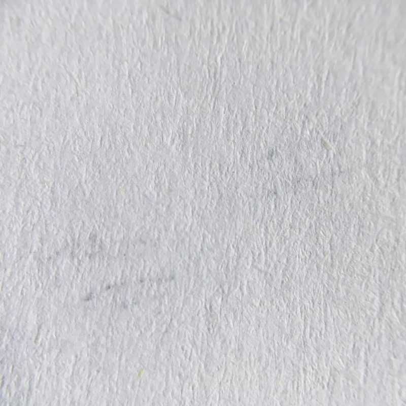
It’s a thick paper, with almost no show through. This is a close up of the page where the flex curls are. You can see the texture of the paper in this shot — decently smooth, but not coated, the way Rhodia is. I had no issues writing on it with a fine, or even a Spencerian grind nib, but I do have a light hand. I’d say it’s very similar in texture to most copy paper.

Here’s a writing sample on the envelope. Surprisingly, it’s a little better than the inside sheets!

Overall, at a $1 per pack, I think it’s a good buy if you like the aesthetic and don’t plan to use a super broad or wet nib on it. I wrote a letter on it using my fine VP, which, if you squint at it, does have a little feathering, but is totally readable. My one complaint is that you have six envelopes and six inside sheets — that means each letter is only 1 page long? That’s pretty short! Alternately, I’ll have leftover envelopes, which, given the cute inside envelope liners, may not be a bad thing!
No Comments

Review: Pelikan Souverän M300 (Green-Striped, Oblique Medium nib)


We are once again joined by our guest reviewer, Roz and she contributed her thoughts on this Pelikan pen. She is also our first left-handed reviewer and we are glad to have her persepctive. Thanks very much Roz!


Hand Over That Pen, please!

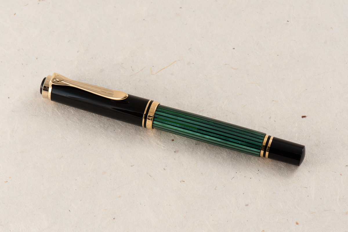
Roz:  Classy and petite! The green, black and gold made me feel fancy just looking at it. I don’t usually seek out gold accents, but this pen makes me question that inclination. Definitely the smallest pen I was ever going to write seriously with, so I’m really looking forward to it!

Katherine: I love the styling of classic Pelikans, and this one is no different. Plus, its adorable! ❤

Pam:  Great things come in small packages so when you make a Pelikan petite, it’s adorable.  My wallet is very lucky that the white tortie did not come in this size.  I don’t normally enjoy the “classic” styling of the Pelikan, but in a small package, it harkens back to the vintage Peter Pan pens.

Franz: Hey! Did someone leave a Pelikan M1000 in the drier, or did it shrink from ink starvation? Harharhar!

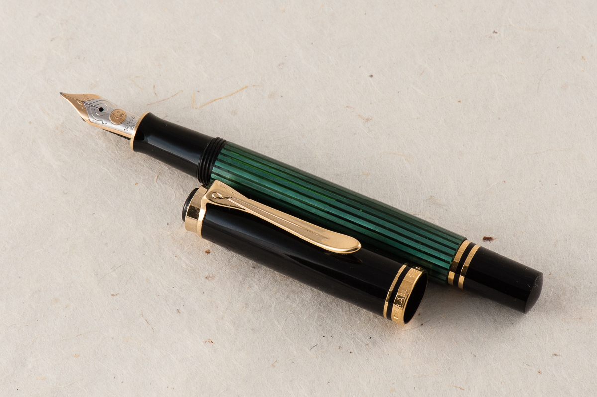
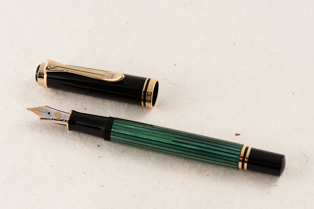
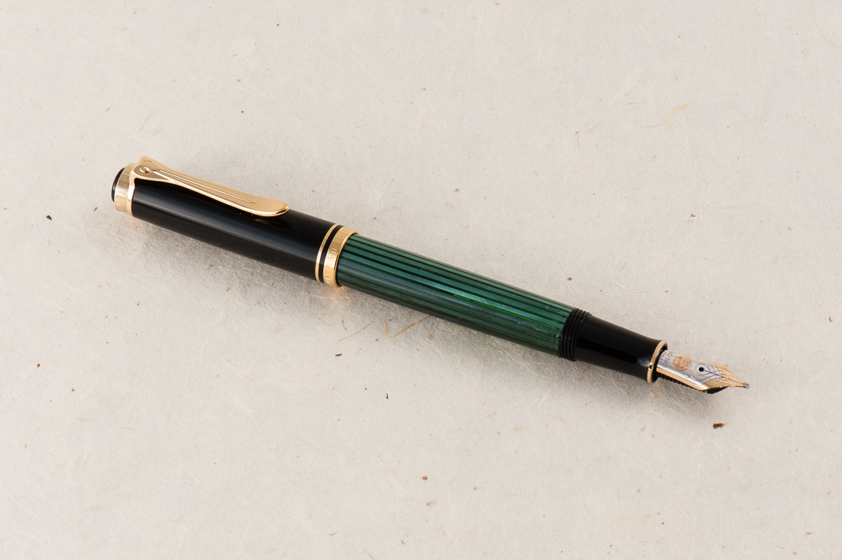
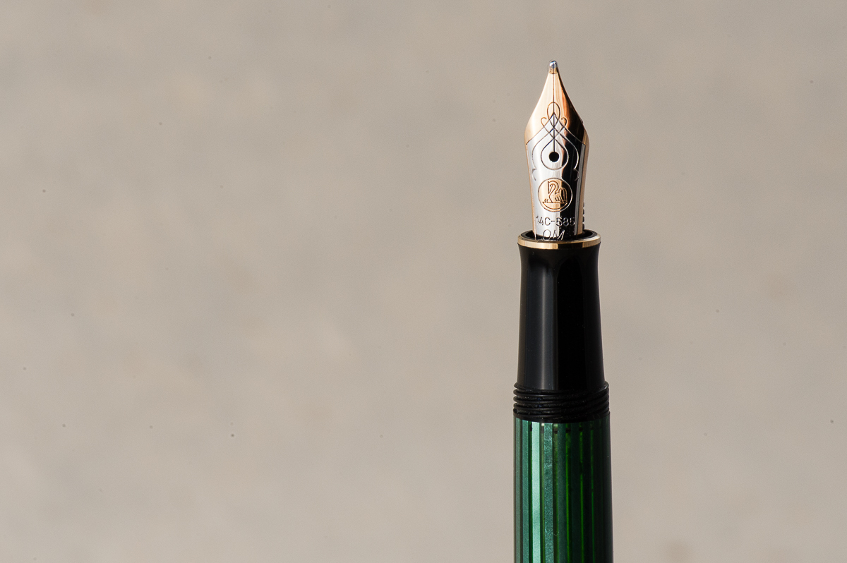
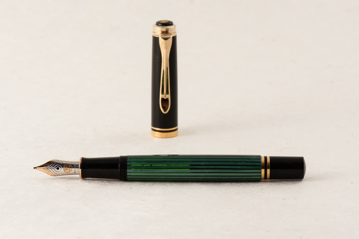
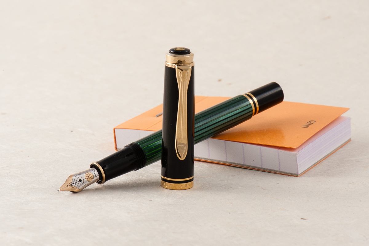
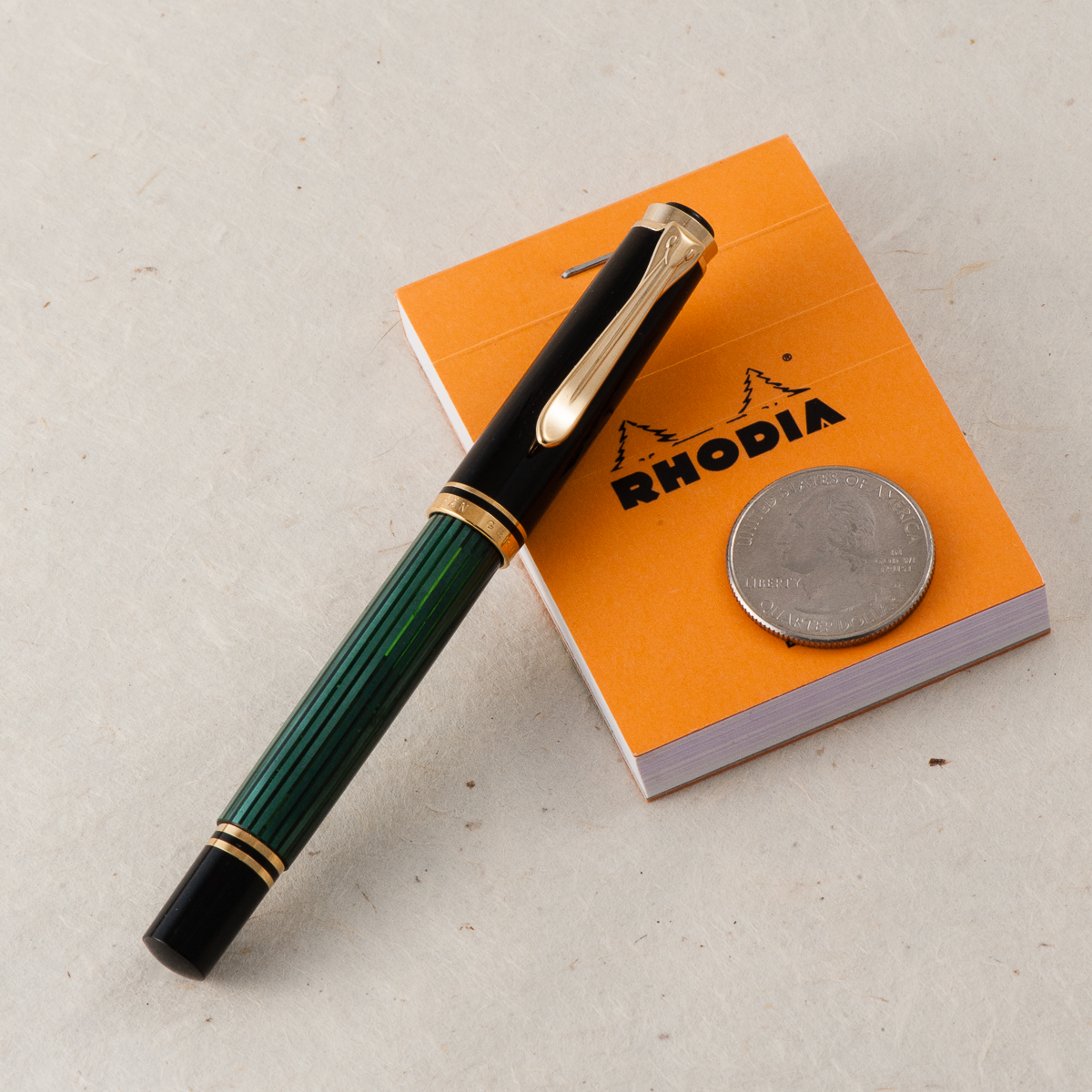
Yep, it’s that familiar and elegant green stripe of a Pelikan in their smallest pen ever. They introduced this pocket pen version in 1998 and the green-striped finish is a standard finish as well as a black barrel one. Pelikan also produced a few special edition finishes in the year 2000’s. The M300 is unmistakably a Pelikan Souverän pen.

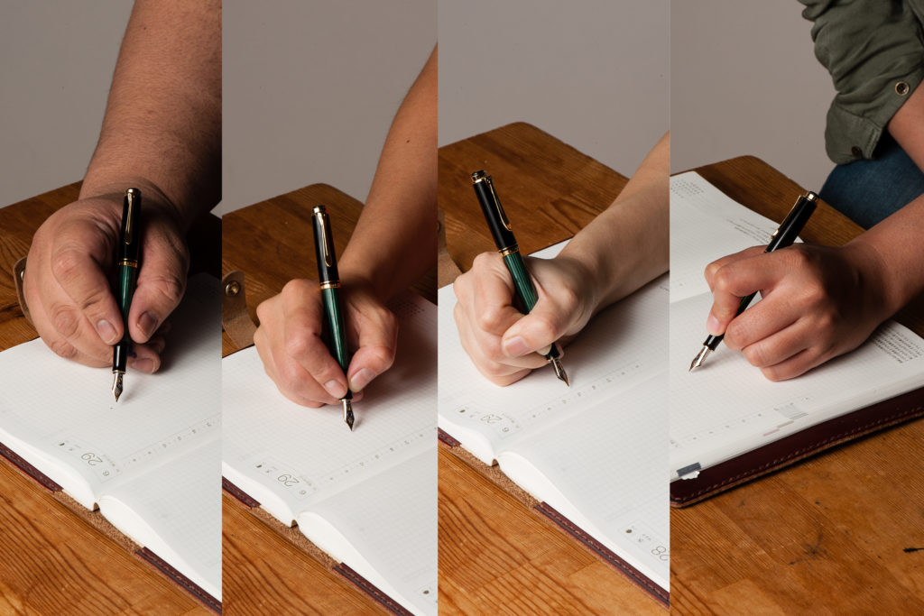
In the Hand: Pelikan M300 (posted) — from left to right: Franz, Katherine, Pam, and Roz
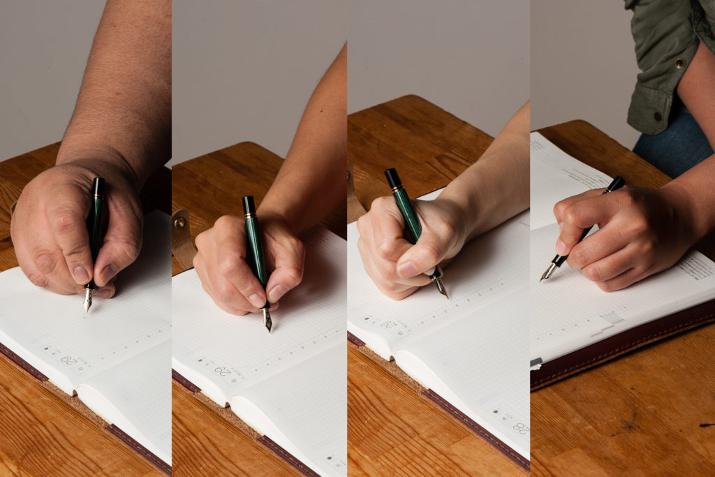
In the Hand: Pelikan M300 (unposted) — from left to right: Franz, Katherine, Pam, and Roz


The Business End

Roz: Springy! Honestly, I had a lot of trouble writing with this nib. I wasn’t expecting the amount of bounce back, so my natural writing pace had a lot of adjusting to do. I also learned (thank you Pam!) that this is an oblique medium nib, maybe my inexperience with this type of nib added to my inconsistent writing.

Katherine: I liked this nib more than I expected. The only other oblique Pelikan nib I’ve written with much was a vintage OB, and that was an unusable angle for me. This one was comfortable, forgiving and surprisingly wet (I’m not sure why I expect small pens to be drier? Not like this one can’t hold a lot of ink…)

Pam:  I find the oblique nib to be too inconsistent for my writing style.  I always feel that I am apply more pressure to the “longer tine,” if that makes sense.  That being said, like all Pelikan nibs, I find the nib to be smooth and enjoyable to write with.  This nib somehow reminds me of an ice skater gliding over the ice on one leg.

Franz: The M300’s 14-carat nib is quite springy and I love it! An oblique nib’s characteristic always seem weird to me at first but I eventually get used to it. It’s just being conscious of turning the pen at the right angle. But yes, this nib’s flow is quite generous and I enjoyed it.


Write It Up

Roz: The diameter of the pen being so small, especially because I tend to grip low on the section, made it difficult for me to find a comfy grip position and my hand got tired pretty quickly as a result.

Katherine: This pen is usable for me for quick notes… But not the pinnacle of comfort for longer writing sessions. Overall though, not bad. Much more usable than I expected, but definitely more of an on-the-go pen than a sit-at-my-desk-and-write-about-my-deep-dark-feelings.

Pam:  When I said that this pen reminds me of the Peter Pan pens, it’s likely due to how I see this pen being used.  For quick notes in a pocketbook.  I find the diameter of the pen to be too slim for a prolonged period of time.  I am always fearful of snapping this petite pen with my iron grip.

Franz: At 4.3 inches closed, it’s a small pen. I went into the 20-minute writing session already expecting that my hand wouldn’t be comfortable. And I’m glad I managed my expectations because I did feel fatigued after ten minutes. The section and barrel’s thinness contributed to that fatigue. I only used the pen with the cap posted because unposted, the M300 was almost disappearing in my hand.


EDC-ness

Roz: At first I was super worried I would lose this pen because of its size. However, the clip on the M300 is really strong and it did great in my carrier. I admit though that for my day to day writing, I did not use the M300 much due to the size of the pen being difficult for me to hold for long periods of time.

Katherine: Great pen for EDC! The clip is strong, the size is perfect and the nib makes notes enjoyable. My only gripe is that the typical Pelikan wetness, paired with a medium nib doesn’t make for the fastest drying notes. That’s easily solved by getting a different nib though. 10/10, would EDC again.

Pam:  In a checkbook, pocket book or a dainty pocket, it’s perfect!  Perhaps it’s the size, but I feel that it’s more fragile than the normal size pens so I wouldn’t throw it into a jeans pockets if you plan on sitting down or putting your keys in the same pocket.

Franz: The M300’s Every Day Carry-ness is what won me over though. Definitely fits in my shirt pocket, and it’s ready to write with only one turn of the cap. It may be too short for my hand unposted but is perfectly usable for a fast signature, jotting down a phone number, or whatever quick note one needs. If I know I’ll use it for more than five words, I’ll post the cap and it does so securely. Unlike Pam’s thoughts, I didn’t find the M300 more fragile than any other pen. Granted, I wouldn’t dare to sit on this pen (or any other pen) but it’s quite durable for everyday usage.

And just like any other Pelikan Souverän, it’s a piston-filled pen and the piston operates very smoothly. As shown in the photo below, you can see through the barrel’s stripes and see the ink level clearly. The smaller barrel definitely means a smaller ink capacity though. And it holds about 50% less ink than an M1000. At 0.7mm, the ink capacity is just like a converter for other pens.


Final Grip-ping Impressions

Roz: The M300 is a beautiful pen. I would like to give it another try down the road, maybe when my experience with oblique, springy nibs develops a bit more. ^_^;

Katherine: A great pocket pen! Classy looking, fantastic nib and the perfect size. My only gripe is the price, for $200+, I would likely get a vintage 400 instead (fairly easily found at around $150) and I’d still have a reasonably small pocket pen, but one that can play dual duty as a normal writer as well.

Pam:  Despite my love for pocket sized pens, I would have to say that this pen is an acquired taste given the size.  It’s not as practical as the M200 or M400 in size.  For those with average and larger size hands, it may be a challenge to use for an extended writing session.  For those who love Peter Pan pens or pocket pens, I would highly recommend trying out this pen before committing your wallet to it.

Franz: Clearly, the Pelikan M300 is for people with smaller hands or for people who wants to have an elegant looking pocket pen. Also, it’s a great pen for a Pelikan pen addict (like myself). Have you guessed who owns this pen yet? =) For my large hands, the M300 is a novelty. I love it but I don’t see myself using this pen comfortably on a daily basis. My hand is definitely happier writing with a M800 or M1000.

The M300’s Souverän styling gives it a serious and classic look but it’s tininess makes it a “cute” pen.


Pen Comparisons

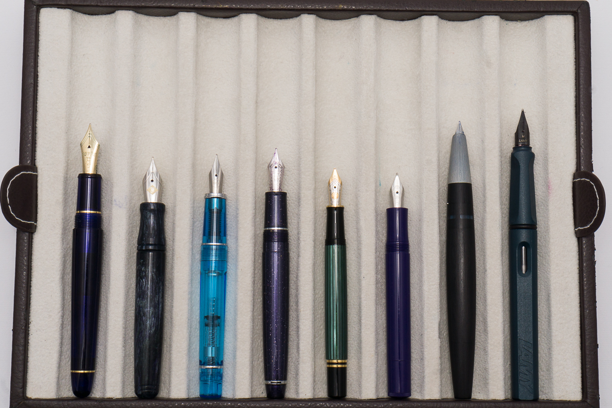
Closed pens from left to right: Platinum 3776, Franklin-Christoph Pocket 20, Pilot Prera, Sailor Professional Gear Slim, *Pelikan M300*, Kaweco Sport, Lamy 2000. Lamy Safari
Posted pens from left to right: Platinum 3776, Franklin-Christoph Pocket 20, Pilot Prera, Sailor Professional Gear Slim, *Pelikan M300*, Kaweco Sport, Lamy 2000. Lamy Safari
Unposted pens from left to right: Platinum 3776, Franklin-Christoph Pocket 20, Pilot Prera, Sailor Professional Gear Slim, *Pelikan M300*, Kaweco Sport, Lamy 2000. Lamy Safari


Pelikan Pen Comparison

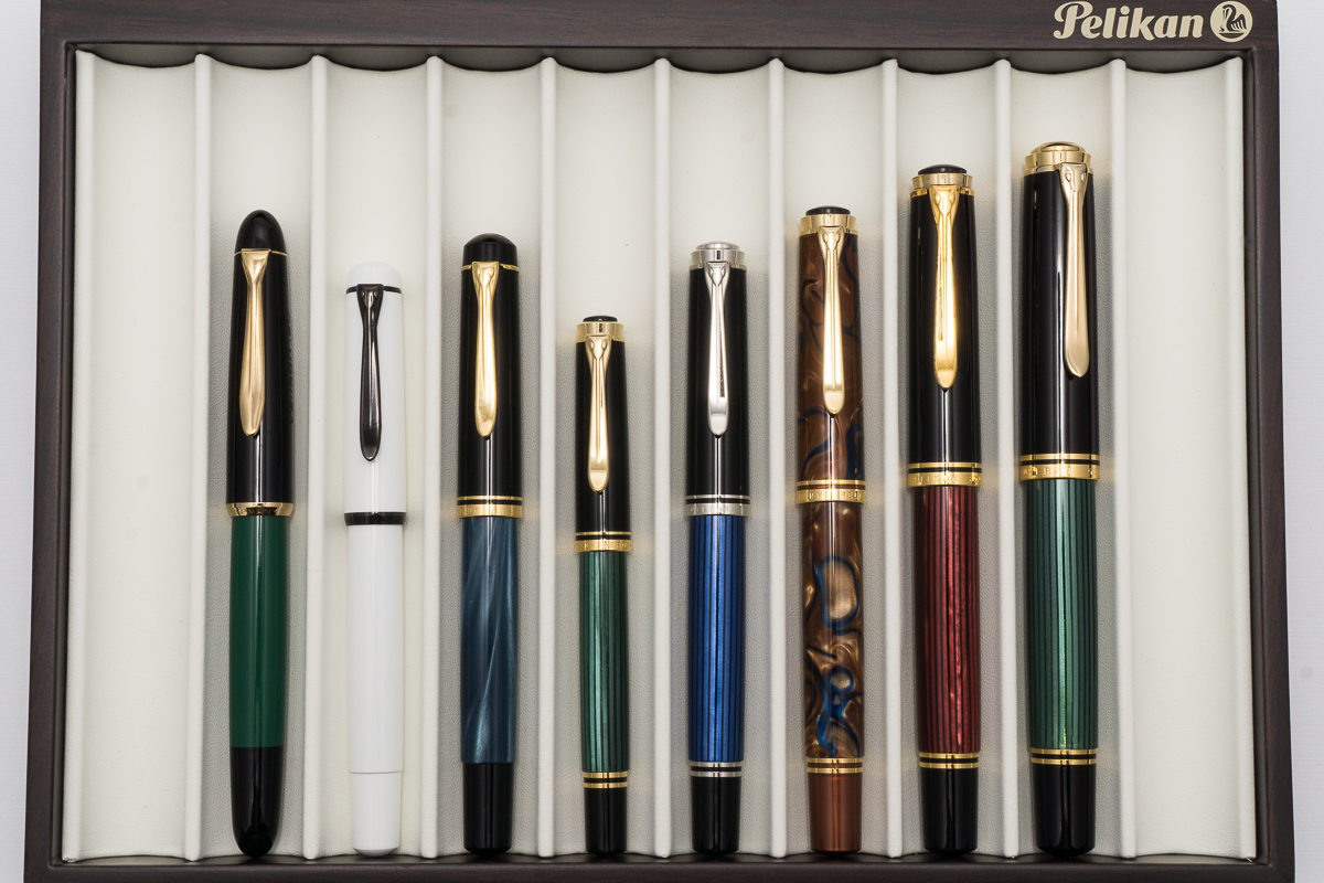
Closed pens from left to right: 120, M100, M200, M300, M405, M620, M800 and M1000
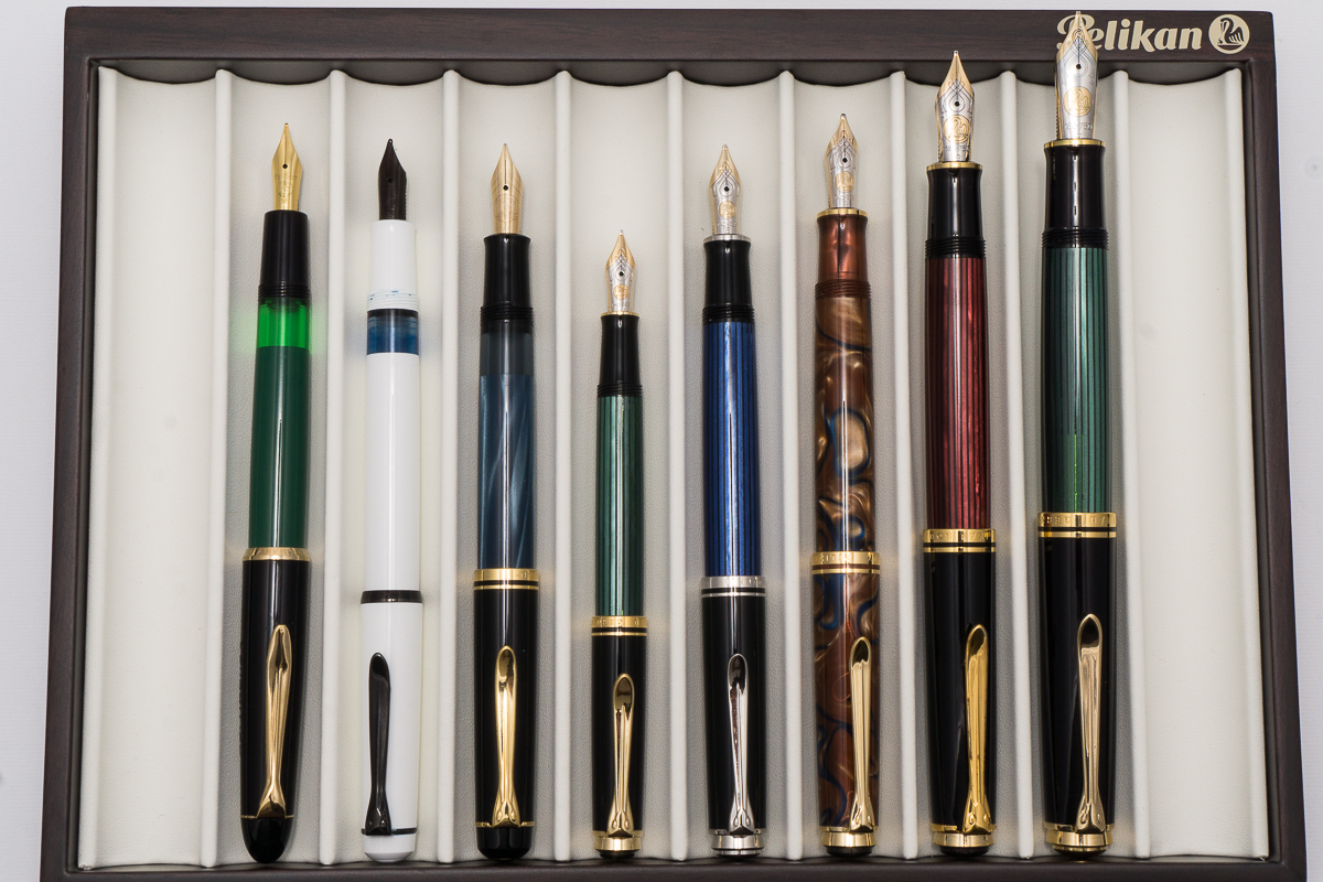
Posted pens from left to right: 120, M100, M200, M300, M405, M620, M800 and M1000
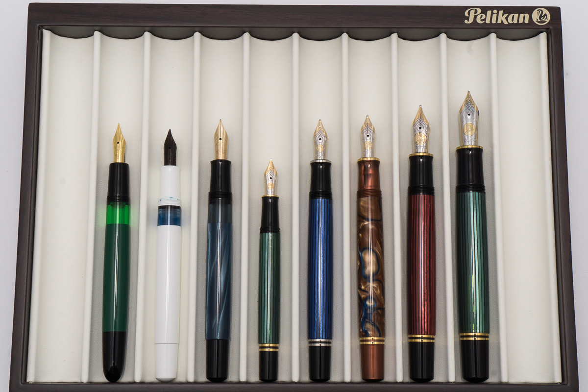
Unposted pens from left to right: 120, M100, M200, M300, M405, M620, M800 and M1000


Pen Photos (click to enlarge)

No Comments

Nakaya Piccolo (Ao-Tamenuri, Soft Medium CI)

In this review, we have included our guest reviewer Claire (@writteninrice). She creates and sells pen wraps via her etsy site as well as at the San Francisco pen show. Thanks for joining us in reviewing this Nakaya pen Claire!


Hand Over That Pen, please!

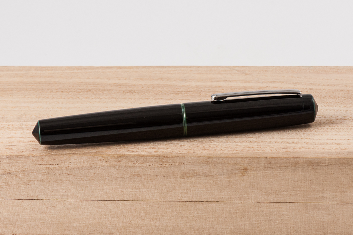
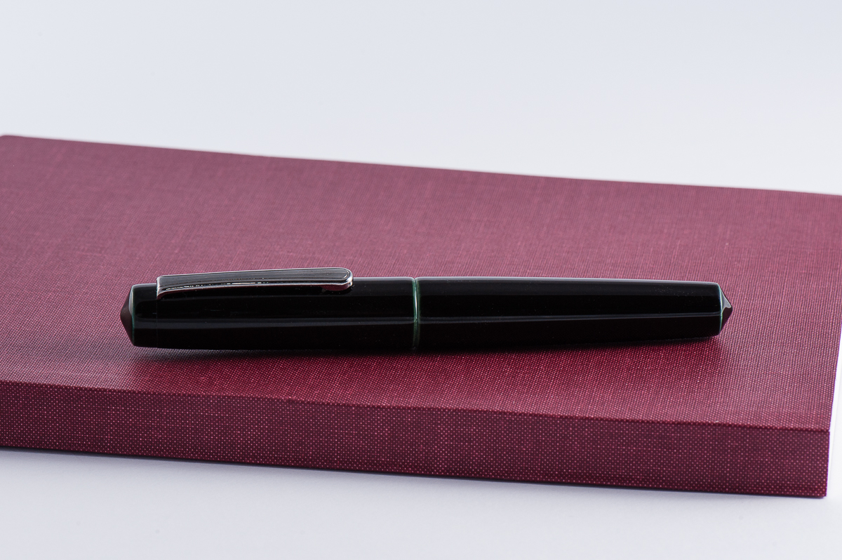
Katherine: The Nakaya Piccolo is one of my favorite shapes — it’s short, lovingly chubby, but also has pointed ends that give it some visual interest. In addition, the two I own are both in Nakaya’s lovely layered tamenuri urushi finishes. The Ao-tamenuri in the pen pictured is the more subtle of the two — the pen looks black at a quick glance, but upon closer look (or uncapping) there are hints of blue green.

Claire: It is hard to beat urushi in terms of beauty and depth.  Don’t get me wrong, there are a lot of amazing materials and finishes out there, but as far as I’m concerned, urushi will always take the cake.   The Piccolo is the perfect size for my hand. I have found the other Nakaya shapes to be just a little bit too long for my taste and almost feel a little awkward in my hand.

Pam:  The Piccolo is a great compact pen that is similar in size to the Pilot Prera and the Sailor Pro Gear Slim, so it would not be surprising that Piccolo is my favorite Nakaya model to hold.  (The dorsal fin version 2 is my favorite to behold, if that makes sense.)  I greatly appreciate that the shape is not the ubiquitous cigar shape, but rather has tapered ends which is much more streamline in my opinion.  Although I greatly appreciate the craftsmanship of urushi, I am also really intimidated to own a urushi pen.  Perhaps the cost plays a role in it, but I am almost afraid to damage the pen or the finish.  I am just not in the urushi-comfy zone yet.

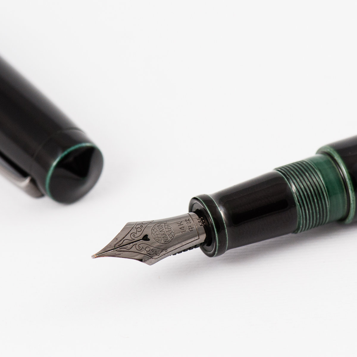
Franz: The Nakaya Piccolo has a very appealing aesthetic. As Katherine “pointed” out, the pointed ends are a nice feature and when you see it, you know that it’s a Piccolo model. Notice that the barrel’s finial is pointier than the cap’s? I really like that detail. And the Ao-tamenuri finish is lovely especially the sliver of color where the cap and barrel meet as well as on the threads. Sadly, it has been a couple years now since Nakaya discontinued the Ao-tamenuri finish. The Piccolo is still available in a variety of colors and finishes though.

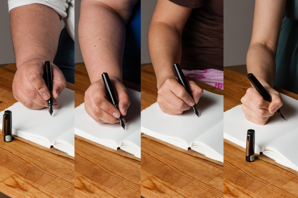
In the Hand: Nakaya Piccolo (unposted) — from left to right: Franz, Claire, Katherine, and Pam


The Business End

Katherine: Nakaya nibs are some of my favorite overall (as are Platinum nibs) and this one is my favorite out of all of them. The base nib was a Soft Medium which gives it some lovely springiness and bounce. Then Mottishaw ground it down to a Cursive Italic that gives my small writing wonderful line variation. The nib does have a specific sweet spot though, if you don’t find it (luckily it lines up with how I naturally hold my pen) the nib can feel scratchy.

Claire: The first thing I said when I tried Katherine’s pen was that I needed to get a nib like this on my next Nakaya. The Soft Medium CI is amazing. I am a huge fan of soft nibs, not looking for line variation, but the spring in the nib gives a feedback.  The CI gives some line variation even when my handwriting isn’t super tiny.

Pam:  If I was to purchase a Nakaya, or have another custom pen built, it would have a soft nib from Platinum.  Platinum has done “soft” nibs the right way.  It has a wonderful bounciness and allows for writing variation without straining your hand.  However, if you write light enough, you can still get a consistent line.  The feed dealt with the extra need for ink with no problems.  Adding a CI grind to this nib was a genius decision because it allowed for more versatility and variability in your writing depending on writing pressure.  I like a bit of a bite with my CIs and this grind by Mottishaw had a pretty great sweet spot.  Of course with a CI I prefer to hold it in a tripod grip but for modeling purposes, my iron grip was photographed.

Franz: I have tried Nakaya nibs before especially with John Mottishaw’s cursive italic treatment however, this was my first time to use a “soft” nib and it was pleasant to write with. The bounce of the nib while writing was delightful. It does have a sweet spot because it already is a fine nib and then transformed into a cursive italic. When you’re not writing in the correct angle, the nib will definitely let you know. Trust me, I know. But when you have it in the right angle, it’s perfect!

And I believe that that heart-shaped breather hole adds to the love of writing with Nakaya nibs.


Write It Up

Katherine: The Piccolo is a perfect size for me. It’s short, which fits my hand wonderfully, but not too narrow. It has the section width of a full size pen (it tapers from 12.25mm to 10.75mm) which makes it comfortable to hold for long periods of time.

Claire: My Piccolo is the first pen I reach for when its time to write anything down. I might have burned through a good deal of my finished bottle of Shin Kai with this pen. There are not many pens I can sit down and write with for hours on end. Usually, I tend to switch pens every few pages of writing to keep things interesting.

Pam:  I did borrow a Piccolo from Katherine and had a hard time returning it.  It was a really great pen with such wonderful craftsmanship that can literally be felt as you handle and write with the pen.  The threads are not sharp for iron grip purposes and the section is fantastic, so comfortable for the tripod grip.  The variation that the nib provides really kept my attention and interest as I wrote with this pen.

Franz: Ah yes, the 20-minute writing experience. I gotta say that my hand wasn’t really happy writing with the Piccolo for a long period of time. Actually, after five minutes of writing my hand felt fatigued. I found the section to be a bit narrow so my grip landed on the barrel section and the short length of the pen was not really comfortable for me. I also tried to lower my grip to the section like the ladies above but it just didn’t feel natural for me.


EDC-ness

Katherine: The concern with EDCing a Nakaya is the cost — this wouldn’t be a cheap pen to replace. But, it’s perfectly suited for the job: it uncaps in one and a quarter turns, it can have a clip (this writer does, my other one is a cigar, which doesn’t), it has a fantastic nib that has never spat into it’s cap and it has a very durable finish. But, I know for many folks, the idea of a scratch in the urushi is terrifying — so the Piccolo can certainly be an EDC, but it’s all about your comfort level! Personally, this is part of my bring-to-work rotation, but I work a lazy desk job. 🙂

Claire: There are not too many pens in my collection that I would bring with me to work. Though I don’t have a job where fountain pens would be remotely useful. That being said, when I am going to sit down and take notes or journal, this is one of the first pens I reach for. and the reason is just how comfortable it is to write with. This is key especially for long note taking sessions .

Pam:  Not being the owner of the Piccolo, I kept the pen safe at home. Again, this pen is a work of art and at the risk of sounding pretentious, it should be savored while in use.  This pen is best enjoyed in long and slow writing sessions.

Franz: The Piccolo’s smaller size qualifies it to be called a pocket pen and definitely is a convenient pen to bring along anywhere. It is also a nice pen to use at my work setting. The nib was fine but smooth for copier paper. When I need to write a quick note or signature, the fast uncapping helps a lot. The clip definitely secured the pen on my shirt pocket during the day. The pen is a cartridge/converter filled so you may find yourself re-inking after 2-3 days if you use it a lot.


Final Grip-ping Impressions

Katherine: If I could only keep one pen and nib, this might be it (please don’t make me though). It’s a fantastic pairing of an excellent (and interesting) nib and a visually interesting body that’s truly a work of art. The Piccolo is certainly a short pen, but it’s an unusual combination of shortness without the typical small-pen narrowness — and that fits my hand perfectly.

Claire: There are no two ways around it, I love this pen. The size, shape and weight are perfect for long writing sessions, though I wish the converter could hold more ink since I am refilling the pen constantly. I don’t think this could be the only pen I owned for just this reason. The small ink capacity would make it difficult as a daily writer for me since it seems that I rarely run out of ink when I’m home.

Pam:  Honestly, if I had to recommend “if you can only write with one pen for the rest of your life,” I would be hard pressed to find any other pen that could compare to the performance, beauty, uniqueness and craftsmanship to this pen with a soft nib- especially for those with petite hands. (I feel like such a traitor to my Sailor collection by admitting this.)

Franz: I like the Nakaya Piccolo for it’s aesthetics and nib performance. But the very reason that the ladies above love this pen is the same reason that I wouldn’t own one. It’s just too darn small for my big hands especially when it comes to journaling or writing letters. To solve this issue is to just post the cap, right? But that isn’t something you do with an urushi laquered pen because it will mar the finish. Most people would like to take care of their pen’s appearance especially when it costs something like a Nakaya.

Overall, small to average sized hands, try the Piccolo out because you will more than likely want it. For people with larger hands who like the shape, skip the Piccolo and look for either a Long Piccolo or a Naka-Ai. Both are exclusive pens sold by Aesthetic Bay in Singapore. and Classic Fountain Pens, Inc. in California, respectively.


Pen Comparisons

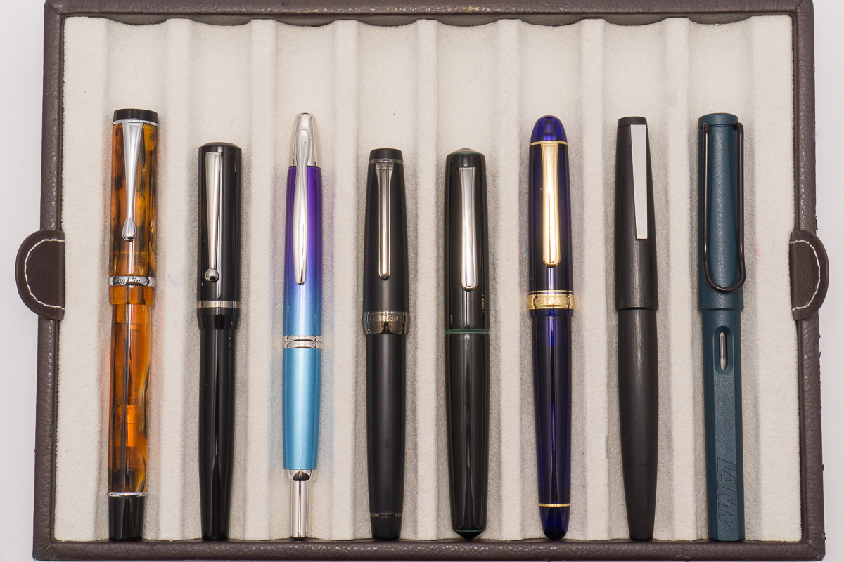
Closed pens from left to right: Conklin Duragraph, Edison Beaumont, Pilot Vanishing Point, Sailor Professional Gear Classic, *Nakaya Piccolo*, Platinum Century 3776, Lamy 2000, and Lamy Safari
Posted pens from left to right: Conklin Duragraph, Edison Beaumont, Pilot Vanishing Point, Sailor Professional Gear Classic, *Nakaya Piccolo*, Platinum Century 3776, Lamy 2000, and Lamy Safari

Smaller/Pocket Pen Comparisons

Closed pens from left to right: Wahl-Eversharp Skyline, Franklin-Christoph Pocket 20, Pilot MYU, Sailor Professional Gear Slim, *Nakaya Piccolo*, Pilot Prera, Kaweco Sport, and Pelikan M200
Posted pens from left to right: Wahl-Eversharp Skyline, Franklin-Christoph Pocket 20, Pilot MYU, Sailor Professional Gear Slim, *Nakaya Piccolo*, Pilot Prera, Kaweco Sport, and Pelikan M200
Unposted pens from left to right: Wahl-Eversharp Skyline, Franklin-Christoph Pocket 20, Pilot MYU, Sailor Professional Gear Slim, *Nakaya Piccolo*, Pilot Prera, Kaweco Sport, and Pelikan M200

Other Nakaya Pen Comparisons

Closed Pens (from left to right): Decapod Mini, Decapod, Dorsal Fin 2, Long, Neo Standard, Naka-Ai, Long Piccolo, and Piccolo
Unposted Pens (from left to right): Decapod Mini, Decapod, Dorsal Fin 2, Long, Neo Standard, Naka-Ai, Long Piccolo, and Piccolo


Pen Photos (click to enlarge)

No Comments

2017 Fountain Pen Day Giveaway Winners!

Woohoo! Congratulations to our 3 winners of the FPD Giveaway we held on November 3, 2017. The giveaway was open for anyone to join either via commenting on the blog post, or via Instagram.

We had 184 entries and 3 were randomly chosen between the three of us. Thank you all very much for joining in and being a part of the awesome community!

And the winners are:

Oeste Prera in Green Demonstrator – @theclarkm via Instagram

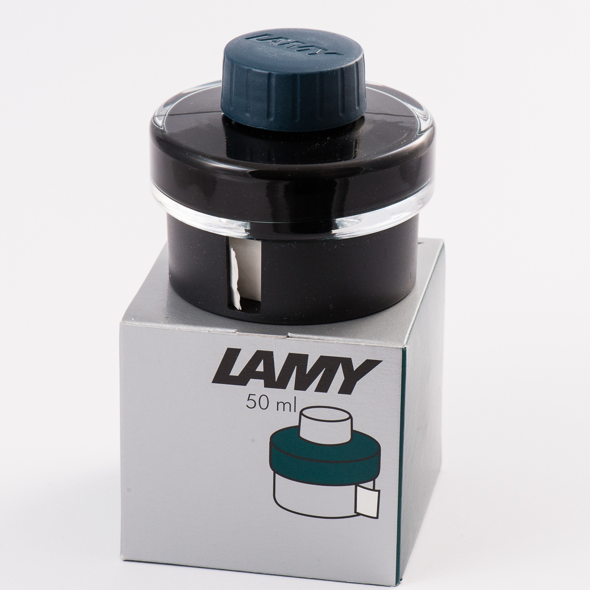
Lamy Petrol ink bottle – @inkydipper via Instagram

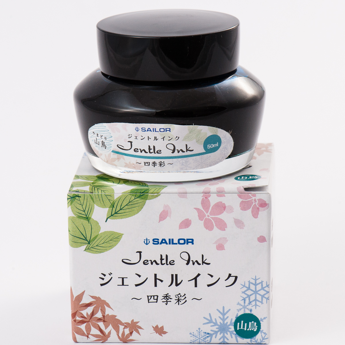
Sailor Yama-dori ink bottle – @inkdabbler via Instagram

Congratulations again! Always have fun with your pens and inks! Until the next giveaway.

No Comments

2017 Fountain Pen Day Giveaway!

It’s that time of the year again — Fountain Pen Day!

While we absolutely believe that every day is fountain pen day, the first Friday of November is quite special because we get to celebrate our favorite writing instrument throughout the world in unison. This is also a day or a weekend wherein different deals and discounts are offered by our favorite retailers. Check out the Sponsors tab of the FPD website for more info on these deals.

More importantly, Fountain Pen Day is also a great time to share the joys of writing with a fountain pen to family, and friends!

To celebrate, we the trio, are running a giveaway with three prizes for three lucky winners:

  1. A limited edition green demonstrator Oeste Prera fountain pen
  2. A bottle of the 2017 limited edition Lamy Petrol ink
  3. A bottle of one of our favorite inks — Sailor Jentle Yama-dori

To Enter:

  1. Follow us on instagram, @handoverthatpen & regram our giveaway image or post a picture of your favorite fountain pen and ink with the hashtag #hotp2017FPDGAW (Please make sure your account is public so we can find it! And no giveaway accounts.) or —
  2. Comment on this blog entry with your favorite fountain pen and ink (not necessarily a pairing)

The giveaway is open from now, 11/03/2017 until 11/10/2017 11:59pm Pacific time. One entry per person please.

The giveaway is open internationally, but we aren’t responsible for any taxes, customs fees or duties that may be applied, and will be shipping without tracking due to cost.

66 Comments

Pen & Ink Pairing: Oct ’17

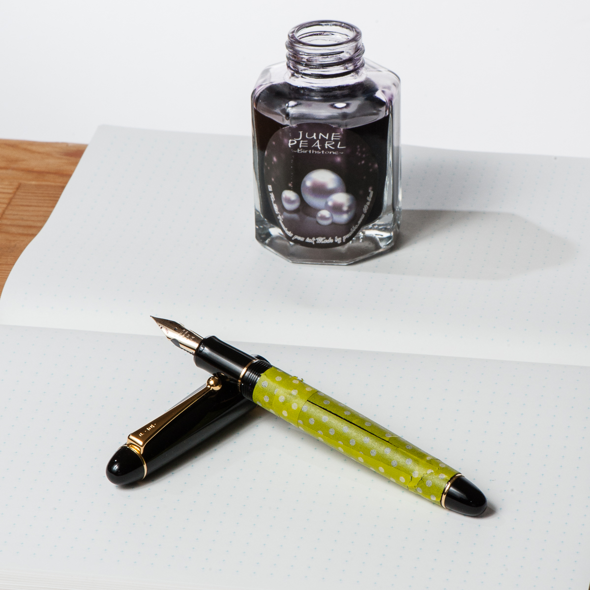
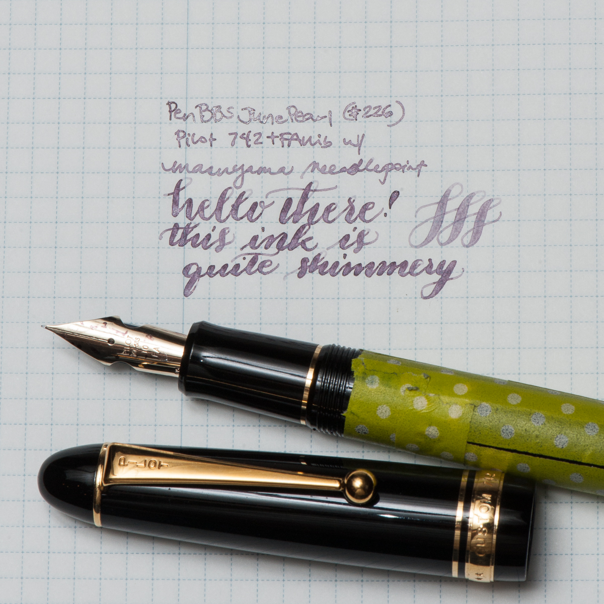
Katherine: My pairing for the month isn’t thematic in any way, just a pen and ink combo I was (and am) excited to use — Pen BBS June Pearl (picked up from Straits Pens at the SF Show a few months ago) paired with a Pilot 742 FA sporting a Masuyama Needlepoint grind. Ignore the washi, I was trying to decide how something looked… and now it’s just there.

I love the pairing of the pale shimmer ink with the soft flexy nib of the 742. Written in a fine line, June Pearl is pretty light, but in the FA I get swirls of shimmer and more readable text. All in all, I really enjoy writing with the 742 and the FA nib, I’m just (unfortunately) not a big fan of the body.


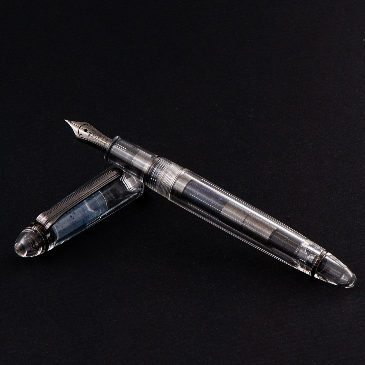
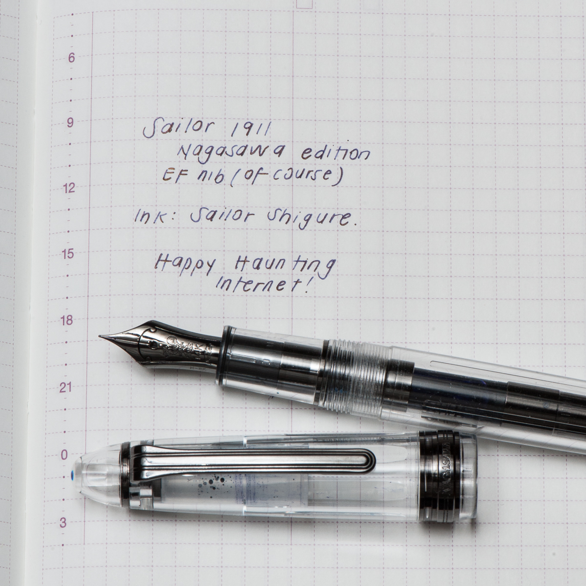
Pam: For October, the month of Halloween, it would seem most appropriate to bring out the Sailor 1911, Nagasawa edition; a demonstrator with the ruthenium trim.  Even the converter has the ruthenium trim!  It is one my favorite colorways: monochromatic. Honestly, I was not a fan of the 1911, but this particular finish was so unique (at the time) that acquiring it from Claire was instantaneous.  (Thank you Claire!!)

I wanted a dark ink to complement the “darkness” of the 1911, but not a black ink.  The only ink that came to mind for me was Sailor Shigure.  The dark and deep purple is a wonderful complement to the rhuthenium trim.  It’s also one of the few inks that I adore that doesn’t have an obvious sheen to it.  That only adds to the mysterious and haunting vibe of the ink when paired with this pen during the Halloween season.


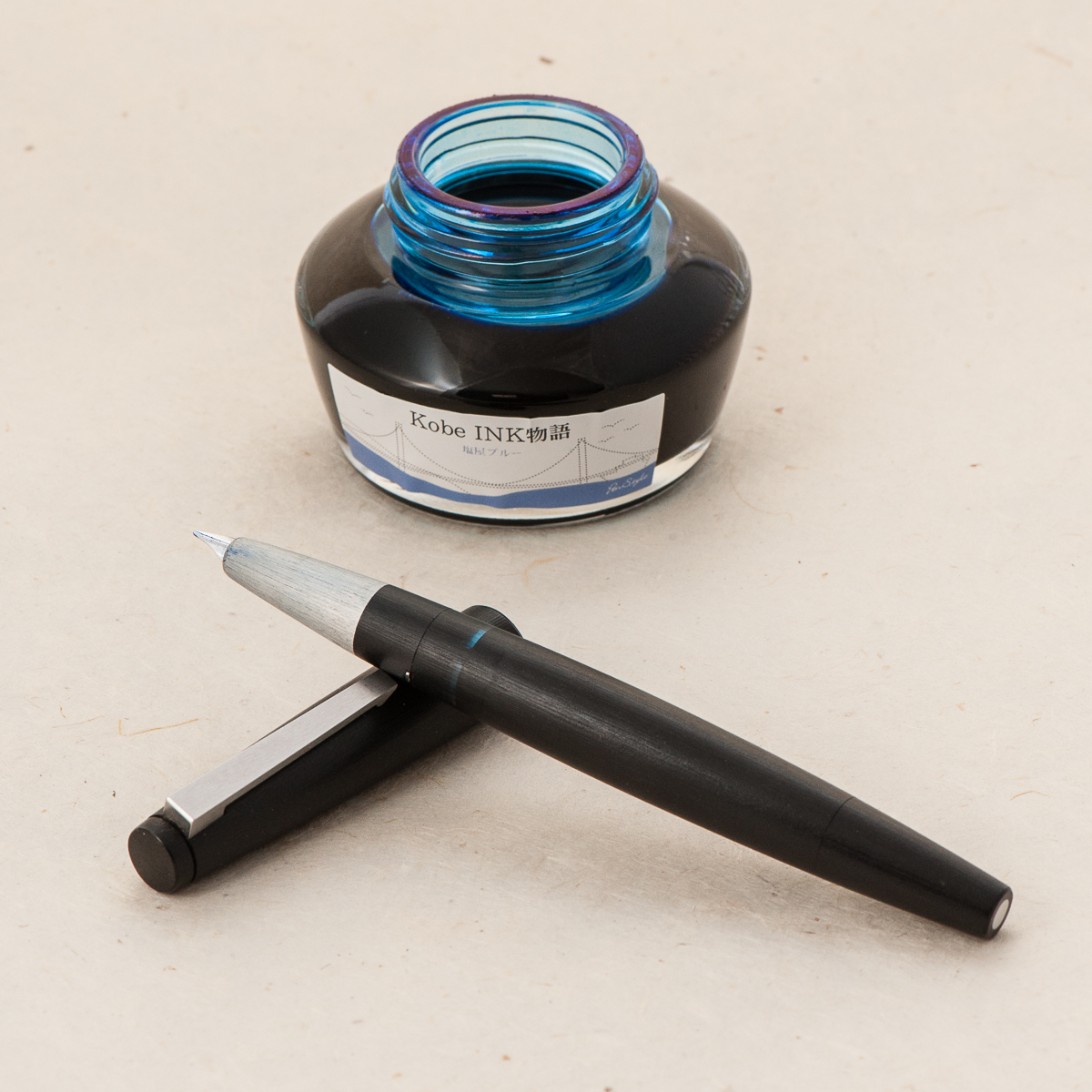
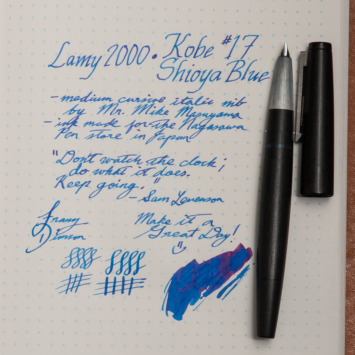
Franz: This month, my pairing is more of a discovery and rediscovery of sorts. First, the pen. I haven’t written with my Lamy 2000 for almost a year and I’ve definitely missed it. The 2000 is easily one of my favorite black pens of all time.  And now for the ink, I recently bought a bottle of Kobe’s #17 Shioya Blue without trying a sample but I figured it could be a suitable ink for work.

So a pen and nib I know very well, and a new ink. As expected, the Kobe ink flowed very well with the cursive italic nib. Actually, the italic nib showed the shading properties of this ink very nicely. I’m so glad I did this pairing and since I wrote with the 2000 a lot, the ink level is now below 50% . I’ll most likely top off the ink in a week or so. Thank you for reading our inky thoughts here.

Wishing you a Happy Halloween! And please comment what pen and ink combo are you are currently using.


Writing Samples (click to enlarge)

Katherine’s Pilot Custom 742 and Pen BBS June Pearl on Nanami Seven Seas Crossfield Tomoe River paper
Pams Sailor 1911S with Sailor Shigure ink on Hobonichi paper
Franz’s Lamy 2000 and Kobe #17 Shioya Blue on Nanami Seven Seas Crossfield Tomoe River paper
No Comments
1 2 3 5